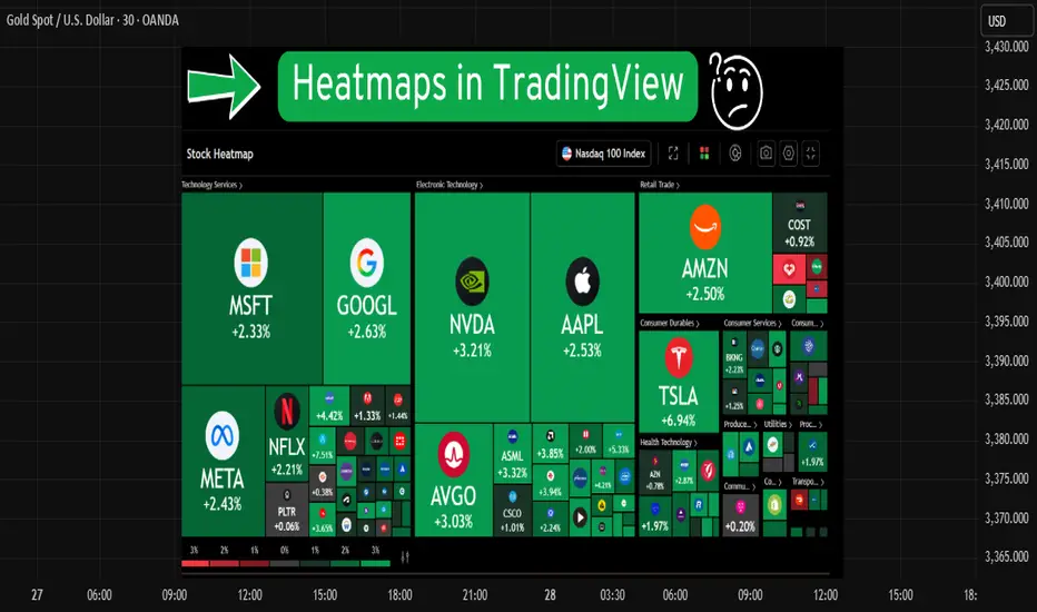
Heatmaps help you quickly see which stocks or cryptos are going up or down. In this guide, you'll learn how to use the heatmap on TradingView in a simple way.
📍 Step 1: Go to TradingView
Go to the website: [tradingview.com](tradingview.com)
Make sure you're logged into your account.
Click on the Three lines located on the right top corner then click on "Products".

📍 Step 2: Open the Heatmap
Move your mouse to the top menu and hover over "Screeners"
Click on "Heatmaps" from the dropdown.
You’ll see two options:
Stock Heatmap 📈
Crypto Heatmap 💰
Pick the one you want to explore.


📍 Step 3: Choose Your Market
By default, it may show US stocks. You can change that.
Use the options at the top to filter by:
Exchange (like NSE, NYSE, etc.)
Sector (like Tech, Energy, Banks, etc.)
Market cap, price, or volume

📍 Step 4: Understand the Colors
Green boxes mean the price is going up ✅
Red boxes mean the price is going down ❌
Darker color means a stronger move
Bigger boxes mean bigger companies or higher volume
📍 Step 5: Hover Over a Box
When you move your mouse over a box, it shows more details:
Ticker symbol
Current price
% change
Market cap
If you click on a box, it will open the chart.
📍 Summary
The heatmap is a simple tool that gives a quick view of the market.
Use it daily to track market trends, find trade setups, and stay updated on what’s moving.
Disclaimer :
This Post is not financial advice, it's for educational purposes only highlighting the power of Tradingview and its features.
📍 Step 1: Go to TradingView
Go to the website: [tradingview.com](tradingview.com)
Make sure you're logged into your account.
Click on the Three lines located on the right top corner then click on "Products".
📍 Step 2: Open the Heatmap
Move your mouse to the top menu and hover over "Screeners"
Click on "Heatmaps" from the dropdown.
You’ll see two options:
Stock Heatmap 📈
Crypto Heatmap 💰
Pick the one you want to explore.
📍 Step 3: Choose Your Market
By default, it may show US stocks. You can change that.
Use the options at the top to filter by:
Exchange (like NSE, NYSE, etc.)
Sector (like Tech, Energy, Banks, etc.)
Market cap, price, or volume
📍 Step 4: Understand the Colors
Green boxes mean the price is going up ✅
Red boxes mean the price is going down ❌
Darker color means a stronger move
Bigger boxes mean bigger companies or higher volume
📍 Step 5: Hover Over a Box
When you move your mouse over a box, it shows more details:
Ticker symbol
Current price
% change
Market cap
If you click on a box, it will open the chart.
📍 Summary
The heatmap is a simple tool that gives a quick view of the market.
Use it daily to track market trends, find trade setups, and stay updated on what’s moving.
Disclaimer :
This Post is not financial advice, it's for educational purposes only highlighting the power of Tradingview and its features.
Shivam mandai
Penafian
Maklumat dan penerbitan adalah tidak bertujuan, dan tidak membentuk, nasihat atau cadangan kewangan, pelaburan, dagangan atau jenis lain yang diberikan atau disahkan oleh TradingView. Baca lebih dalam Terma Penggunaan.
Shivam mandai
Penafian
Maklumat dan penerbitan adalah tidak bertujuan, dan tidak membentuk, nasihat atau cadangan kewangan, pelaburan, dagangan atau jenis lain yang diberikan atau disahkan oleh TradingView. Baca lebih dalam Terma Penggunaan.
