Timeless Command | QuantEdgeB
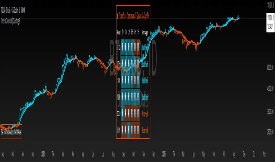
Timeless Command is a multi-asset, multi-timeframe “sentiment dashboard” built around a custom Universal Strategy. It fuses two independent proprietary oscillators into one normalized signal, then snapshots that signal across six user-chosen assets and six user-chosen timeframes—right on your price chart. You instantly see whether Bitcoin, Ethereum, Gold, the U.S. Dollar Index, the S&P 500 or the Nasdaq are “Bullish” or “Bearish” from the 2-day down to the 15-minute horizon, plus an overall bias and bar-color overlays.
✨ Key Features
• 🧠 Universal Strategy
o Combines two independent strategic modules into a single oscillator.
o Applies upper/lower thresholds to generate Long/Short/Neutral signals.
• 🌐 Multi-Asset, Multi-TF Grid
o Up to six symbols (e.g. BTC, ETH, SPX, NDX, GOLD, DXY).
o Six configurable timeframes (days, hours, minutes).
o Automatic conversion of “4H” → “240” minutes for seamless request.security calls.
• 📊 Live Sentiment Table
o Arrow icons per asset/timeframe (“⬆️” vs “⬇️”).
o Per-asset average bias (“Bullish” / “Bearish” / “Neutral”), color-coded.
o Clean, right-aligned table overlay with asset labels and timeframe headers.
• 🎨 Chart Overlays
o Bar coloring driven by the first asset’s average TPI bias.
o Two EMAs (default 12/21) filled to show trend direction.
o Optional mini info table to explain bar-color logic.
⚙️ How It Works
1. Signal Calculation
o Applies thresholds (±0.1) to yield discrete signals from a Universal Strategy: +1 (long), –1 (short), 0 (neutral).
2. Multi-TF Signal Gathering
o For each asset, the script uses request.security to pull the TPI on each selected timeframe, locking values at bar close for consistency.
o Converts each reading into a binary direction (up/down).
3. Averaging & Labeling
o Averages the six directional values per asset to gauge overall bias.
o Renders a “Bullish” or “Bearish” label (or “Neutral” if exactly zero).
4. Visual Overlay
o Bar Color: The chart’s candles recolor based on the first asset’s average bias—blue for bullish, orange for bearish, gray for neutral.
o EMAs: Two exponential moving averages sweep the chart, filled to highlight trending regimes.
5. Dashboard Table
o Rows = assets, columns = timeframes + “Average” column.
o Each cell shows an arrow icon with background shading.
o Last column spells out the per-asset average bias in styled text and color.
🎯 Who Should Use It
• Macro Traders who want a quick cross-market heatmap.
• Multi-Asset Strategists balancing exposure across crypto, equities, FX and commodities.
• Systematic & Discretionary players looking for unified, threshold-based signals.
• Risk Managers needing a real-time sentinel on regime shifts across key markets.
⚙️ Default Settings
• Assets: BTCUSD, ETHUSD, SPX, NDX, GOLD, DXY
• Timeframes: 2D, 1D, 12H, 4H, 1H, 15m
• Thresholds: ±0.1 for long/short entries
📌 Conclusion
With Timeless Command, you gain an at-a-glance “command center” for cross-market sentiment. It turns complex, multi-TF oscillator data into a simple arrow-and-table view, coloring your price bars to reinforce the prevailing bias. Whether you’re hunting trend continuations, regime changes or mean-reversion setups, this overlay gives you the high-level context you need—without digging through six different charts.
🔹 Disclaimer: Past performance is not indicative of future results. No trading strategy can guarantee success in financial markets.
🔹 Strategic Advice: Always backtest, optimize, and align parameters with your trading objectives and risk tolerance before live trading.
Skrip jemputan sahaja
Hanya pengguna disahkan oleh penulis boleh mengakses skrip ini. Anda perlu memohon dan mendapatkan kebenaran untuk menggunakannya. Keizinan selalunya diberikan selepas pembayaran. Untuk lebih butiran, ikuti arahan penulis di bawah atau hubungi QuantEdgeB secara terus.
TradingView TIDAK menyarankan pembayaran atau penggunaan skrip kecuali anda mempercayai sepenuhnya penulis dan memahami bagaimana ia berfungsi. Anda juga boleh menjumpai alternatif sumber terbuka dan percuma yang lain di dalam skrip komuniti kami.
Arahan penulis
whop.com/basetrustcapital 💎
🔹 Unlock our free toolbox:
tradinglibrary.carrd.co/ 🛠️
Disclaimer: All resources and indicators provided are for educational purposes only
Penafian
Skrip jemputan sahaja
Hanya pengguna disahkan oleh penulis boleh mengakses skrip ini. Anda perlu memohon dan mendapatkan kebenaran untuk menggunakannya. Keizinan selalunya diberikan selepas pembayaran. Untuk lebih butiran, ikuti arahan penulis di bawah atau hubungi QuantEdgeB secara terus.
TradingView TIDAK menyarankan pembayaran atau penggunaan skrip kecuali anda mempercayai sepenuhnya penulis dan memahami bagaimana ia berfungsi. Anda juga boleh menjumpai alternatif sumber terbuka dan percuma yang lain di dalam skrip komuniti kami.
Arahan penulis
whop.com/basetrustcapital 💎
🔹 Unlock our free toolbox:
tradinglibrary.carrd.co/ 🛠️
Disclaimer: All resources and indicators provided are for educational purposes only