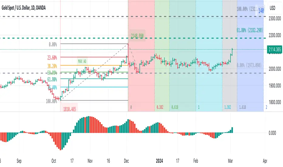
Visible bars count on chart + highest/lowest bars, max/min AOThe indicator displays the number of visible bars on the screen (in the upper right corner), including the prices of the highest and lowest bars, the maximum or minimum value of the Awesome Oscillator (similar to MACD 5-34-5) for identify the 3-wave Elliott peak in the interval of 100 to 140 bars according to the Profitunity strategy of Bill Williams. The values change dynamically when scrolling or changing the scale of the graph.
In the indicator settings, you can hide labels, lines and change any parameters for the AO indicator - method (SMA, Smoothed SMA, EMA and others), length, source (open, high, low, close, hl2 and others).
‼️ The values are updated within 2-3 seconds after changing the number of visible bars on the screen.
***
Индикатор отображает количество видимых баров на экране (в правом верхнем углу), в том числе цены самого высокого и самого низкого баров, максимальное или минимальное значение Awesome Oscillator (аналогично MACD 5-34-5), чтобы определить пик 3-волны Эллиота в интервале от 100 до 140 баров по стратегии Profitunity Билла Вильямса. Значения меняются динамически при скроллинге или изменении масштаба графика.
В настройках индикатора вы можете скрыть метки, линии и изменить любые параметры для индикатора AO – метод (SMA, Smoothed SMA, EMA и другие), длину, источник (open, high, low, close, hl2 и другие).
‼️ Значения обновляются в течении 2-3 секунд после изменения количества видимых баров на экране.
Penunjuk Bill Williams
Candle Range ExtensionThis script defines an indicator called "Candle Range Extension" that calculates the range of each candle (high minus low) and then multiplies that range by 3 to get the extension distance. It then plots two lines on the chart: one line that extends 3 times the candle range above the candle's high (in green) and another line that extends 3 times the candle range below the candle's low (in red).

[The_lurker] RSI-MFI-WPR Indicatoris an advanced trading indicator developed for the TradingView platform, which synergistically refers to the insights of three popular technical analysis tools: the Relative Strength Index (RSI), the Money Flow Index (MFI) and the Williams Indicator. Percentage range (WPR). This indicator is precisely designed to help traders identify potential buy and sell opportunities by accurately interpreting market momentum, volume, and price position relative to recent highs and lows.
The primary goal of the RSI-MFI-WPR Indicator is to provide a comprehensive tool that leverages the combined power of RSI, MFI and WPR to detect overbought and oversold conditions, indicating potential market reversal points. This multi-faceted approach aims to provide traders with a more robust framework for making informed decisions, and enhance their trading strategy through multi-indicator analysis.
Explanation of the indicator conditions
The essence of this indicator lies in its strategic conditions that indicate possible entry and exit points:
Oversold Condition (Condition): This is determined when the RSI and MFI are below 30, and the WPR drops below -91, indicating a strong oversold condition in the market. Such a scenario usually indicates a buying opportunity, assuming that the market may rebound from this oversold state.
Divergence Condition (Condition 1): Checks if the MFI exceeds 2.1 times the RSI. This unique case aims to highlight instances where there is a significant inflow of funds into an asset, which is not proportionately reflected in its RSI, which may indicate an upcoming price increase or highlight an unusual market situation for further From the analysis.
Overbought Warning (conditionExit): An exit signal is triggered when both the MFI and RSI exceed 85, and the WPR is above -15. This combination indicates an overbought condition in the market, indicating that the asset may be overvalued and that a price correction or reversal may be imminent, thus indicating a potential selling opportunity or a warning of initiating new positions.
Application and visualization
The RSI-MFI-WPR Indicator not only provides numerical insights but also displays these conditions on a TradingView chart. Through the use of color coding and plotting, it provides traders with an intuitive way to distinguish market conditions, enabling quick and effective decision-making. Incorporating alert conditions ensures that traders are immediately notified of important market events, in line with their strategic trading objectives.
Planning and alerts in “RSI-MFI-WPR Indicator”
Collected alert status
CombinedAlertCondition is a logical statement that combines all individual conditions (Condition, Condition1, Condition Exit, and The_lurkerMFI_oversold) into a single alert trigger. This condition becomes true and triggers an alert if any of the conditions specified for potential trading opportunities or warnings are met. It is designed to provide a comprehensive alert system that informs the trader of any important signal identified by the indicator, including entry and exit signals as well as oversold conditions.
Visual indicators
Background color for oversold condition: The script sets the background color to a specific shade of blue ( with 90% transparency) when the custom MFI indicates an oversold condition (The_lurkerMFI_oversold). This visual signal helps traders quickly recognize periods when the market may be undervalued and potentially poised for a rebound.
Drawing warning and exit signs:
Entry Signals: For Condition and Condition 1, which identify potential entry points, the indicator draws upward pointing triangles below the price bars. These triangles are colored in specific shades to differentiate signals from a fundamental oversold condition and a divergence condition, making it intuitive for traders to recognize the type of signal.
Exit Signals: For an exit condition, which indicates overbought conditions that may indicate an impending price correction, red downward-pointing triangles are drawn above the price bars. This serves as a clear visual warning to consider exiting positions or proceed with caution.
Configure the alarm
The script uses the conditional alert function to create an alert based on the AlertCondition combination. When this condition is met, any of the predefined signals are indicated
Conclusion
In short, the “RSI-MFI-WPR Indicator” stands out as a versatile and dynamic indicator that enriches a trader's toolkit by combining the analytical strengths of RSI, MFI and WPR. By setting clear conditions for entry and exit points from the market, it facilitates a proactive approach to trading, based on a detailed examination of market dynamics. This indicator demonstrates how mixing multiple technical tools can lead to more informed and accurate market analysis, with the aim of elevating the trading experience on Tradingview.
==================================================================================
هو مؤشر تداول متقدم تم تطويره لمنصة TradingView،
والذي يشير بشكل تآزري إلى رؤى ثلاث أدوات تحليل فني شائعة:
1- مؤشر القوة النسبية (RSI)،
2- مؤشر تدفق الأموال (MFI)،
3- مؤشر ويليامز. نطاق النسبة المئوية (WPR).
تم تصميم هذا المؤشر بدقة لمساعدة المتداولين على تحديد فرص الشراء والبيع المحتملة من خلال التفسير الدقيق لزخم السوق وحجمه وموقع السعر بالنسبة إلى الارتفاعات والانخفاضات الأخيرة.
الهدف الأساسي لمؤشر RSI-MFI-WPR هو توفير أداة شاملة تستفيد من القوة المشتركة لمؤشر RSI وMFI وWPR للكشف عن ظروف ذروة الشراء والمبالغة في البيع، مما يشير إلى نقاط انعكاس السوق المحتملة. ويهدف هذا النهج متعدد الأوجه إلى تزويد المتداولين بإطار أكثر قوة لاتخاذ قرارات مستنيرة، وتعزيز استراتيجية التداول الخاصة بهم من خلال تحليل متعدد المؤشرات.
شرح شروط المؤشر
يكمن جوهر هذا المؤشر في ظروفه الإستراتيجية التي تشير إلى نقاط الدخول والخروج المحتملة:
حالة ذروة البيع (الحالة): يتم تحديد ذلك عندما يكون مؤشر القوة النسبية RSI وMFI أقل من 30، وينخفض WPR إلى أقل من -92، مما يشير إلى حالة ذروة بيع قوية في السوق. يشير مثل هذا السيناريو عادةً إلى فرصة شراء، على افتراض أن السوق قد ينتعش من حالة ذروة البيع هذه.
شرط الاختلاف (الشرط 1): يتحقق مما إذا كانت السيولة تتجاوز 2.1 مرة مؤشر القوة النسبية. تهدف هذه الحالة الفريدة إلى تسليط الضوء على الحالات التي يوجد فيها تدفق كبير للأموال إلى أحد الأصول، وهو ما لا ينعكس بشكل متناسب في مؤشر القوة النسبية الخاص به، مما قد يشير إلى زيادة قادمة في الأسعار أو يسلط الضوء على وضع غير عادي في السوق لمزيد من التحليل.
تحذير ذروة الشراء (conditionExit): يتم إطلاق إشارة خروج عندما يتجاوز مؤشر MFI ومؤشر القوة النسبية 85، ويكون WPR أعلى من -15. يشير هذا المزيج إلى حالة ذروة الشراء في السوق، مما يشير إلى أن الأصل قد يكون مبالغًا في قيمته وأن تصحيح السعر أو انعكاسه قد يكون وشيكًا، مما يشير إلى فرصة بيع محتملة أو تحذير ببدء مراكز جديدة.
التطبيق والتصور
لا يوفر مؤشر RSI-MFI-WPR رؤى رقمية فحسب، بل يعرض أيضًا هذه الشروط على مخطط TradingView. من خلال استخدام الترميز اللوني والتخطيط، فإنه يوفر للمتداولين طريقة بديهية للتمييز بين ظروف السوق، مما يتيح اتخاذ قرارات سريعة وفعالة. يضمن دمج شروط التنبيه إخطار المتداولين على الفور بأحداث السوق المهمة، بما يتماشى مع أهدافهم التجارية الإستراتيجية.
التخطيط والتنبيهات في مؤشر RSI-MFI-WPR
حالة التنبيه التي تم جمعها ( CombinedAlertCondition ) عبارة منطقية تجمع كل الشروط الفردية
Condition، Condition1، Condition Exit، وThe_lurkerMFI_oversold في مشغل تنبيه واحد.
ليصبح هذا الشرط صحيحًا ويطلق تنبيهًا في حالة استيفاء أي من الشروط المحددة لفرص التداول المحتملة أو التحذيرات. وهو مصمم لتوفير نظام تنبيه شامل يُعلم المتداول بأي إشارة مهمة يحددها المؤشر، بما في ذلك إشارات الدخول والخروج بالإضافة إلى ظروف ذروة البيع.
المؤشرات البصرية
لون الخلفية لحالة ذروة البيع: يقوم البرنامج النصي بتعيين لون الخلفية إلى ظل معين من اللون الأزرق (بشفافية 90٪) عندما تشير مؤسسة التمويل الأصغر المخصصة إلى حالة ذروة البيع (The_lurkerMFI_oversold). تساعد هذه الإشارة المرئية المتداولين على التعرف بسرعة على الفترات التي قد تكون فيها السوق مقومة بأقل من قيمتها الحقيقية ومن المحتمل أن تكون مستعدة للانتعاش.
رسم علامات التحذير والخروج:
إشارات الدخول: بالنسبة للحالة والحالة 1، التي تحدد نقاط الدخول المحتملة، يرسم المؤشر مثلثات تشير إلى الأعلى أسفل أشرطة السعر. يتم تلوين هذه المثلثات بظلال محددة لتمييز الإشارات عن حالة ذروة البيع الأساسية وحالة التباعد، مما يجعل من السهل على المتداولين التعرف على نوع الإشارة.
إشارات الخروج: بالنسبة لحالة الخروج، التي تشير إلى ظروف ذروة الشراء التي قد تشير إلى تصحيح وشيك للسعر، يتم رسم مثلثات حمراء تشير إلى الأسفل فوق أشرطة السعر. يعد هذا بمثابة تحذير مرئي واضح للنظر في الخروج من المواقف أو المضي قدمًا بحذر.
تكوين المنبه
يستخدم البرنامج النصي وظيفة التنبيه الشرطي لإنشاء تنبيه بناءً على مجموعة AlertCondition. عند استيفاء هذا الشرط، تتم الإشارة إلى أي من الإشارات المحددة مسبقًا
خاتمة
باختصار، يبرز "مؤشر RSI-MFI-WPR" كمؤشر متعدد الاستخدامات وديناميكي يثري مجموعة أدوات المتداول من خلال الجمع بين نقاط القوة التحليلية لـ RSI وMFI وWPR. ومن خلال وضع شروط واضحة لنقاط الدخول والخروج من السوق، فإنه يسهل اتباع نهج استباقي للتداول، بناءً على فحص تفصيلي لديناميكيات السوق. يوضح هذا المؤشر كيف أن الجمع بين أدوات فنية متعددة يمكن أن يؤدي إلى تحليل سوق أكثر استنارة ودقة، بهدف رفع مستوى تجربة التداول على Tradingview.
==================================================================================
باختصار :
1- ظهور المثلث الاصفر يعني تواجد سيولة كبيره ( مفيد جدا لعملات البومب ) .
2- ظهور المثلث الأبيض يعني وصول الى مستويات تشبع البيع وهي فرصة ممتازه للشراء ( منطقة دخول ).
3- ظهور خط افقي يعني قرب عكس الاتجاه الى أعلى ( منطقة دخول ) .
4- ظهور مثلث أحمر يعني قرب عكس الاتجاه الى أسفل ( منطقة خروج ) .
5- التنبيه يعمل على جميع ما ذكر أعلاه في تنبيه واحد حتى تسهل المراقبة .
6- أفضل فواصل الاستخدام ( 4 ساعات ، 12 ساعه ، يوم ) .

Optimized Alligator RateA less conventional way of utilizing the "Williams Alligator," the Optimized Rate uses the rate of change of the averages within the Alligator in order to potentially forecast with greater accuracy. The true optimization comes from the calculation of the "McGinley Dynamic" to create zero lag smoothed moving averages. It's important to note the standard Alligator has always used the SMMA. Lastly, divergence between the rates has been calculated in plotting for clarification.

Non-Repainting Awesome Oscillator[TV1ndicator]Non-Repainting Awesome Oscillator (NRAO) is an improved standard Awesome Oscillator
NRAO, unlike the built-in AO , does not repaint the values calculated on real-time bars when using an alternative timeframe .
The modification is based on the current version of the built-in Awesome Oscillator - 27.0
Comparison of AO and NRAO
In the following screenshot AO(gaps on), AO(gaps off), NRAO\ (non-repainting off), NRAO(non-repainting on) , the chart timeframe is 1 minute, and the indicator timeframe is 10 minutes:
Starting from 9:17, the chart worked in real time.
The following screenshot shows the same indicators for the same period, but after refreshing the page at 10:21:
The repainting of the built-in AO's minute-to-minute data when the "Wait for timeframe closes" option is turned off is obvious.
Even turning on the "Wait for timeframe closes" option, which in theory should prevent repainting, does not help. On historical data, the value is calculated at the close of the bar of an alternative timeframe, and is displayed at 9, 19, 29,39,... minutes of the chart.
On real data, the AO value is calculated at the close of the first bar of the chart timeframe, the opening of which coincides with the opening of a bar of an alternative timeframe, and is displayed at 10, 20, 30, 40,... minutes of the chart.
In addition, AO displays a value on the first real-time bar, which will disappear if you refresh the page after some time.
NRAO(non-repainting off) works similarly to AO(gaps off).
NRAO(non-repainting on) calculates and displays values in the same way both in history and in real time.
P.S. I publish this indicator in order to describe the problem using its example. The vast majority of built-in indicators are subject to such repaint. Unfortunately, sometimes repaint can lead to an erroneous trading decision. Not only beginners, but sometimes even experienced traders face this problem. Over many years of practice, I have repeatedly encountered situations where my clients were disappointed in their strategies as soon as they realized that standard indicators on alternative timeframes were repainting, and the strategy I wrote using indicators without repainting did not work quite as they expected.
I hope this example will help in the future to avoid unnecessary mistakes when using built-in indicators on alternative timeframes.
If you find this modification useful for other built-in indicators, write what other indicators without repainting you would like to see.
Non-Repainting Awesome Oscillator (NRAO) - это усовершенствованный стандартный Awesome Oscillator
NRAO в отличии от встроенного AO не перерисовывает значения, рассчитанные на барах реального времени при использовании альтернативного таймфрейма.
За основу модификации взята актуальная версия встроенного Awesome Oscillator - 27.0
Сравнение работы AO и NRAO
На следующем скриншоте отображены AO(gaps on), AO(gaps off), NRAO(non-repainting off), NRAO(non-repainting on) на таймфрейме графика 1 минута, и таймфрейме индикаторов 10 минут:
Начиная с 9:17 график работал в реальном времени.
На следующем скриншоте отображены те же индикаторы за тот же период, только после обновления страницы в 10:21:
Перерисовка ежеминутных данных встроенного AO при выключенной опции "Дождаться закрытия интервала" видна сразу.
Даже включение опции "Дождаться закрытия интервала", которая по идее должна была бы исключить перерисовку, не избавляет встроенный AO от неё. На исторических данных значение рассчитывается на закрытии бара альтернативного таймфрейма, и отображается на 9, 19, 29,39,... минутах графика.
На реальных данных значение AO рассчитывается на закрытии первого бара таймфрейма графика, открытие которого совпадает с открытием бара альтернативного таймфрейма, и отображается на 10, 20, 30, 40,... минутах графика.
Кроме того AO отображает значение на первом баре реального времени, которое не будет отображено, если обновить страницу спустя некоторое время.
NRAO(non-repainting off) работает аналогично AO(gaps off).
NRAO(non-repainting on) рассчитывает и отображает значения одинаково как на истории, так в реальном времени.
P.S. Я публикую этот индикатор для того, чтобы на его примере описать проблему. Подобной перерисовке подвержено абсолютное большинство встроенных индикаторов. К сожалению, иногда подобная перерисовка может привести к ошибочному торговому решению. С этой проблемой сталкиваются не только новички, но иногда и бывалые трейдеры. За многолетнюю практику я не один раз сталкивался с ситуациями, когда мои клиенты были разочарованы в своих стратегиях, как только они понимали, что стандартные индикаторы на альтернативных таймфреймах иногда перерисовываются, и написанная мной стратегия с использованием индикаторов без перерисовки работает не совсем так как они ожидали. Искренне надеюсь, что этот пример поможет вам в будущем избежать лишних ошибок при использовании встроенных индикаторов на альтернативных таймфреймах.
Если вы считаете полезным такую доработку для других встроенных индикаторов, пишите в отзывах какие еще индикаторы без перерисовки вы бы хотели видеть.

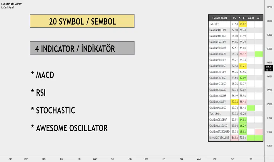
FxCanli PanelEN - FxCanli TradingView Panel Indicator shows the status of RSI, Stochastic, MACD and AO indicators in many TradingView symbols at the same time.
You can follow the market by geting an alarm instantly or at candle close about these indicators.
AT THE DEMO VERSION, YOU CAN FOLLOW ONLY 2 SYMBOL AT THE SAME TIME
TR - FxCanli TradingView Panel Göstergesi aynı anda birçok TradingView sembolünde RSI, Stokastik, MACD ve AO göstergelerinin durumunu gösterir.
Bu göstergeler hakkında anlık veya mum kapanışında alarm alarak piyasayı takip edebilirsiniz.
DEMO VERSİYONUNDA AYNI ANDA SADECE 2 SEMBOLÜ TAKİP EDEBİLİRSİNİZ
RSI Indicator details / RSI İndikatörü detayları
Green box / Yeşil Kutu
EN - At Over Sold Zone
TR - Aşırı Satım Bölgesinde
Pink box / Pembe Kutu
EN - At Over Bought Zone
TR - Aşırı Alım Bölgesinde
Yellow box / Sarı Kutu
EN - Exit from Over Bought/Sold Zone
TR - Aşırı Alım/Satım Bölgesinden Çıkınca
Stochastic Indicator details / Stochastic İndikatörü detayları
Green box / Yeşil Kutu
EN - At Over Sold Zone
TR - Aşırı Satım Bölgesinde
Pink box / Pembe Kutu
EN - At Over Bought Zone
TR - Aşırı Alım Bölgesinde
Yellow box / Sarı Kutu
EN - Exit from Over Bought/Sold Zone
TR - Aşırı Alım/Satım Bölgesinden Çıkınca
MACD Indicator details / MACD İndikatörü detayları
Green box / Yeşil Kutu
EN - MACD Line crossing UP SIGNAL Line
TR - MACD Çizgisi, SİNYAL Çizgisini YUKARI Keser
Pink box / Pembe Kutu
EN - MACD Line crossing DOWN SIGNAL Line
TR - MACD Çizgisi, SİNYAL Çizgisini AŞAĞI Keser
AO Indicator details / AO İndikatörü detayları
Green box / Yeşil Kutu
EN - AO crossing UP ZERO Level
TR - AO Sıfır Seviyesini YUKARI Keser
Pink box / Pembe Kutu
EN - AO crossing DOWN ZERO Level
TR - AO Sıfır Seviyesini ASAGI Keser
Alerts and Notifications / Alarm ve Bildirimler
EN - You can get ALL or ANY of these Alerts
TR - Herhangi birinin veya tamamının alarmlarını alabilirsiniz
DEMO - FxCanli PanelEN - FxCanli TradingView Panel Indicator shows the status of RSI, Stochastic, MACD and AO indicators in many TradingView symbols at the same time.
You can follow the market by geting an alarm instantly or at candle close about these indicators.
AT THE DEMO VERSION, YOU CAN FOLLOW ONLY 2 SYMBOL AT THE SAME TIME
TR - FxCanli TradingView Panel Göstergesi aynı anda birçok TradingView sembolünde RSI, Stokastik, MACD ve AO göstergelerinin durumunu gösterir.
Bu göstergeler hakkında anlık veya mum kapanışında alarm alarak piyasayı takip edebilirsiniz.
DEMO VERSİYONUNDA AYNI ANDA SADECE 2 SEMBOLÜ TAKİP EDEBİLİRSİNİZ
RSI Indicator details / RSI İndikatörü detayları
Green box / Yeşil Kutu
EN - At Over Sold Zone
TR - Aşırı Satım Bölgesinde
Pink box / Pembe Kutu
EN - At Over Bought Zone
TR - Aşırı Alım Bölgesinde
Yellow box / Sarı Kutu
EN - Exit from Over Bought/Sold Zone
TR - Aşırı Alım/Satım Bölgesinden Çıkınca
Stochastic Indicator details / Stochastic İndikatörü detayları
Green box / Yeşil Kutu
EN - At Over Sold Zone
TR - Aşırı Satım Bölgesinde
Pink box / Pembe Kutu
EN - At Over Bought Zone
TR - Aşırı Alım Bölgesinde
Yellow box / Sarı Kutu
EN - Exit from Over Bought/Sold Zone
TR - Aşırı Alım/Satım Bölgesinden Çıkınca
MACD Indicator details / MACD İndikatörü detayları
Green box / Yeşil Kutu
EN - MACD Line crossing UP SIGNAL Line
TR - MACD Çizgisi, SİNYAL Çizgisini YUKARI Keser
Pink box / Pembe Kutu
EN - MACD Line crossing DOWN SIGNAL Line
TR - MACD Çizgisi, SİNYAL Çizgisini AŞAĞI Keser
AO Indicator details / AO İndikatörü detayları
Green box / Yeşil Kutu
EN - AO crossing UP ZERO Level
TR - AO Sıfır Seviyesini YUKARI Keser
Pink box / Pembe Kutu
EN - AO crossing DOWN ZERO Level
TR - AO Sıfır Seviyesini ASAGI Keser
Alerts and Notifications / Alarm ve Bildirimler
EN - You can get ALL or ANY of these Alerts
TR - Herhangi birinin veya tamamının alarmlarını alabilirsiniz

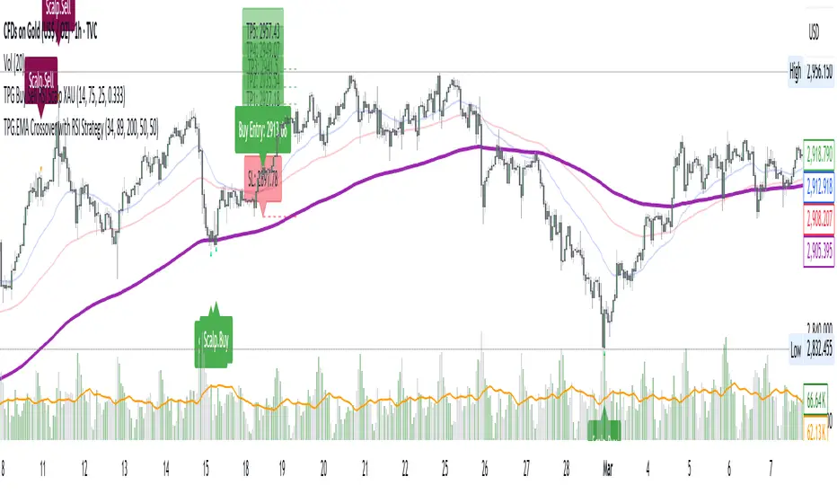
TPG.Buy sell RSI Scapl XAUThis is a tool that is widely used
Especially for Overbought and Oversold systems, but I have made some changes in this indicator,
How to use it...
I have set it as the default setting
- RSI Length: 6 (<10 for scalping - 5m-15m)
- Overbought: 70
- Oversold: 30
What is unique about this tool?
we can see 3 conditions:
1) RSI Overbought / Oversold with Bullish Engulfing / Bearish Engulfing
2) RSI Overbought / Oversold with Hammer and Shooting Star
3) RSI Overbought / Oversold with 2 Bullish Bars / 2 Bearish Bars
4) RSI Overbought / Oversold with All Patterns at the same time
When the RSI reaches its Oversold line, the code will wait for Bullish Engulfing pattren, when oversold and Bullish engulfing matched, This indicator will generate a buy signal when the condition is met,
and same as for Bear market, When the RSI reaches its Overbought line, the code will wait for Bearish Engulfing pattren, This indicator will generate a sell/exit signal when the condition is met,
2nd condition is that a Hammer candle will be waited for when RSI touches the Overbought line, for Bullish Move
and Shooting Star candle will be waited for when RSI touches the Overbought line, for Bullish Move, for Bearish Move
3rd Condition is also the same as Condition 1 and Condition 2,
When the RSI reaches its Oversold line, the code will wait for 2 Bullish Bars, when oversold and 2 Bullish Bars matched then this indicator will generate a buy signal, and same as for Bear market,
When the RSI reaches its Overbought line, the code will wait for 2 Bearish Bars, when overbought and 2 Bearish Bars matched then this indicator will generate a Sell signal,
4th Condition is that we can use All Conditions at the same time,
- Bullish Engulfing / Bearish Engulfing
- Hammer and Shooting Star
- 2 Bullish Bars / 2 Bearish Bars
Williams %R SKGThis is William% R indicator alongwith EMA and RSI overbought and oversold background

Combined Indicator by rocky vermaThe combined indicator you've provided consists of three different indicator logics. Here's how to use it:
1. **Indicator 1: Trend Trader AVR Strategy**
- This indicator is based on the Trend Trader AVR Strategy.
- It uses three input parameters: `Length1`, `LengthMA1`, and `Multiplier1`.
- The indicator plots a moving average (`nResMA1`) and changes the bar color based on certain conditions.
- The conditions for changing the bar color are defined in the `pos1` variable.
2. **Indicator 2: HYE Trend Hunter**
- This indicator is based on the HYE Trend Hunter strategy.
- It uses various input parameters such as `slowtenkansenPeriod`, `slowkijunsenPeriod`, `fasttenkansenPeriod`, and `fastkijunsenPeriod`.
- The logic of this indicator is not fully provided in your code snippet, but it seems to calculate various values related to the HYE Trend Hunter strategy.
3. **Indicator 3: Phenom**
- This indicator provides EMA (Exponential Moving Average) lines with different lengths.
- It allows you to configure whether to display EMA lines and their colors.
- Additionally, it provides options to display stop loss levels based on ATR (Average True Range).
To use this combined indicator:
- Apply it to a chart in TradingView by copying the entire code snippet and pasting it into the Pine Script editor.
- Configure the input parameters for each of the three indicator logics as desired. You can adjust the input values in the indicator's settings panel on the chart.
- You can also modify the indicator's appearance by changing the plot colors or turning on/off specific components.
- Once you have configured the input parameters and appearance settings to your liking, you can then interpret the signals and information provided by the three indicator logics on the chart.
Keep in mind that this is a basic combination of the three indicators you provided, and it may require further customization to meet your specific trading strategy and preferences. Additionally, ensure you thoroughly understand the strategies and conditions used by each of the indicators to make informed trading decisions.

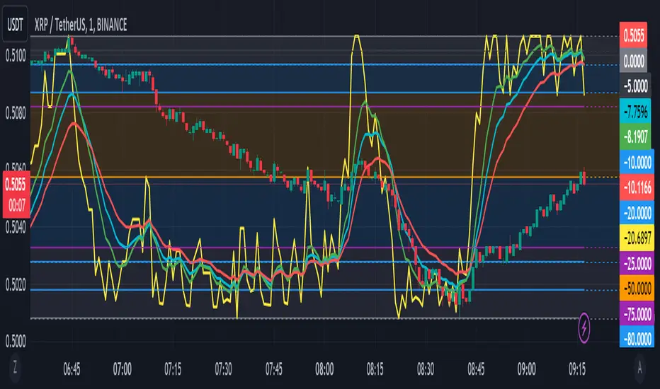
Williams %R with EMA'sThe provided Pine Script code presents a comprehensive technical trading strategy on the TradingView platform, incorporating the Williams %R indicator, exponential moving averages (EMAs), and upper bands for enhanced decision-making. This strategy aims to help traders identify potential buy and sell signals based on various technical indicators, thereby facilitating more informed trading decisions.
The key components of this strategy are as follows:
**Williams %R Indicator:** The Williams %R, also known as the "Willy," is a momentum oscillator that measures overbought and oversold conditions. In this code, the Williams %R is calculated with a user-defined period (default 21) and smoothed using an exponential moving average (EMA).
**Exponential Moving Averages (EMAs):** Two EMAs are computed on the Williams %R values. The "Fast" EMA (default 8) responds quickly to price changes, while the "Slow" EMA (default 21) provides a smoother trend-following signal. Crossovers and divergences between these EMAs can indicate potential buy or sell opportunities.
**Candle Color Detection:** The code also tracks the color of candlesticks, distinguishing between green (bullish) and red (bearish) candles. This information is used in conjunction with other indicators to identify specific trading conditions.
**Additional Upper Bands:** The script introduces upper bands at various levels (-5, -10, -20, -25) to create zones for potential buy and sell signals. These bands are visually represented on the chart and can help traders gauge the strength of a trend.
**Alert Conditions:** The code includes several alert conditions that trigger notifications when specific events occur, such as %R crossing certain levels, candle color changes within predefined upper bands, and EMA crossovers.
**Background Highlighting:** The upper bands and the zero line are visually highlighted with different colors, making it easier for traders to identify critical price levels.
This code is valuable for traders seeking a versatile technical strategy that combines multiple indicators to improve trading decisions. By incorporating the Williams %R, EMAs, candlestick analysis, and upper bands, it offers a holistic approach to technical analysis. Traders can customize the parameters to align with their trading preferences and risk tolerance. The use of alerts ensures that traders are promptly notified of potential trade setups, allowing for timely execution and risk management. Overall, this code serves as a valuable tool for traders looking to make more informed decisions in the dynamic world of financial markets.
Pivotal MomentsPivotal Moments draws lines for each of up to 500 pivot high and pivot low levels that have never been revisited at the present moment in time. After the Pivotal Moments indicator has been loaded onto chart and any of the subsequent realtime bars that are formed touch or cross a pivot level it is deleted. The duration for how long any touched or crossed pivot levels remain on chart before deletion may be extended by N bars or N units of time.
There are user selectable options for the following:
• Pivot Bars Left : the number of lower highs or higher lows that must be formed before a possible pivot bar can occur.
• Right : the number of lower highs or higher lows that must be formed after potential pivot to validate a pivot bar.
• Lines Show As : the choice of line style to use for the drawn pivot levels includes Dashed, Dotted, or Solid.
• Wide : the number of lines wide for how thick the drawn pivot levels are desired to be on the chart.
• Delay Removal : the number of units that touched or crossed pivot levels will persist on chart.
• Units : the choice of which delay unit type includes nBars, nSecs, nMins, nHrs, or nDays.
• Extend Right : the number of bars right of current bar to extend drawn pivot levels.
• Show : the number of maximum recent drawn pivot levels to keep on chart.
• Colors Used : the colors used for pivots high, low, and dual pivot bars.
• Show Price Labels : the choice whether to show prices for levels.
• On Right : the choice to move prices to right of pivot levels.
• Show Pivot Bars : the choice to colorize pivot bars.
If desired, alerts can be received for whenever new touches or crosses occur for both pivot highs and pivot lows by creating a single Alert. Note that these alerts are triggered by realtime bars which by their very nature are repainting prices, thus the alert creation window will warn of this with an orange exclamation symbol. For an illustration of how to create alerts for this indicator click the chart below:
Credit: this indicator was originally built for @Luckshury, who has graciously given me permission to publish it publicly.
NOTICE: This is an example script and not meant to be used as an actual strategy. By using this script or any portion thereof, you acknowledge that you have read and understood that this is for research purposes only and I am not responsible for any financial losses you may incur by using this script!

TTF SMC ToolkitGreetings and welcome to another community indicator from TTF! This indicator is our attempt to build a suite of tools for use in Smart Money Concepts (SMC) and Price Action style trading strategies. If you aren't familiar with these models, we'd encourage you to do some independent research on them to find out how to properly use these models and the tools included in this indicator.
Important! To utilize all features of this indicator fully, please select "Bring to front" under the visual order menu.
All of the fundamental concepts of this toolkit revolve around smart money concepts and price action trading, here are some key concepts of this indicator's different features:
DR (defining range): This is a technique that uses the candle wicks (high and low of price) during a specific hour of a trading session to create a trading framework to help visualize order flow. When price breaks the high of the range, there is a very high statistical probability based on price action history, that the bottom of the range won't be traded past for the rest of that trading session. Vice versa for price breaking the low of the range.
IDR (implied defining range): Similar to DR above, this method uses the candle body (open and close of price) of price during a specific hour of a trading session to help create a trading framework to help visualize order flow.
Equilibrium: Any range can be objectively divided into a top and bottom half. The equilibrium represents the 50% mark between a range high and a range low. It is most often plotted with a fibonacci tool.
Fair Pricing Model: This is a hypothesis postulating that "big money" (a.k.a. "market movers", "institutional investors", etc.) seeks to buy in the discount area of any given price range, and sell in the premium area of that same range. See DR and IDR for examples of possible techniques to help identify and define the price range to apply to this model.
Non-discretionary Levels: This is essentially a fancy way of saying that the levels drawn by this indicator are strictly rules-based, and will always behave in the following manner:
1. For a given trading session, once the levels are drawn, they will remain constant throughout the rest of the trading session, no matter what price does afterwards.
2. The levels drawn will be drawn using the same rules every single day, without human bias or discretion.
Williams Fractals: This fractal pattern is based upon a specific candlestick pattern sequence. For a bullish Williams fractal, you will see X number of falling candles, followed by X number of rising candles. The candle at the fulcrum (bottom or top of the fractal structure) is where the fractal will print. a bearish fractal will be the inverse of this pattern. Note that this is a lagging indicator as it takes X candles after the fulcrum candle for the fractal pattern to complete. In most common cases, the value of X is 2 (2 falling candles, the fulcrum candle, and 2 rising candles) for a total of 5 candles to complete the fractal pattern. You can find more information in this article, which describes this type of fractal: www.investopedia.com
Fractal Wyckoff Accumulation/Distribution: The Wyckoff Method is used by investors and traders to determine market trends, select investments, and time the placement of trades. It can help them identify the times at which big players are accumulating (or distributing) positions in a security. Fractal Wyckoff accumulation/distribution refers to watching the process occur on a lower timeframe, from a higher timeframe. For more information on the Wycoff Theory, you can see this article: www.investopedia.com
Now that we've covered some terms and definitions, let's cover the 4 major components included in this indicator.
ICT NY Midnight/NY Open (08:30 NY time):
The first piece of the indicator being displayed here is the ICT midnight and 8:30am NY price lines. These lines can be used as non-discretionary levels, or as intra-day premium/discount as part of a fair-pricing model.
DR/IDR:
Initially developed by TheMas7er, DR stands for defining range, and it highlights a range during high volume periods of the day that can act as non-discretionary levels, with very high historical accuracy.
Williams Fractals
Williams Fractals denote fractal market structure, and can be used to mechanically create ranges and view potential liquidity pools in a similar manner to using pivot points.
Triple M:
This tool highlights wicks that represent fractal Wyckoff accumulation and distribution. This pattern can be used an a potential entry trigger when paired with other confluences.
And now that we've covered the core concepts/definitions and an overview of each major component of this indicator, it's time to bring everything together by giving an example of how these tools can be used to define a strategy.
Before NYSE open, turn on the price lines to get a sense of whether price is in the premium or discount of the daily fair-pricing model.
Once NYSE market opens, wait for DR/IDR to establish and break its range.
If the bias from DR/IDR aligns with the fair pricing model from the ICT price lines, you could look for a fractal Wyckoff entry during a retracement.
Disclaimer: This strategy is provided purely as an example and has not been tested by us. Please do your own due diligence by thoroughly backtesting and forward-testing on a demo account befor using any proposed strategy live market with real money!
Important! To utilize all features of this indicator fully, please select "Bring to front" under the visual order menu.

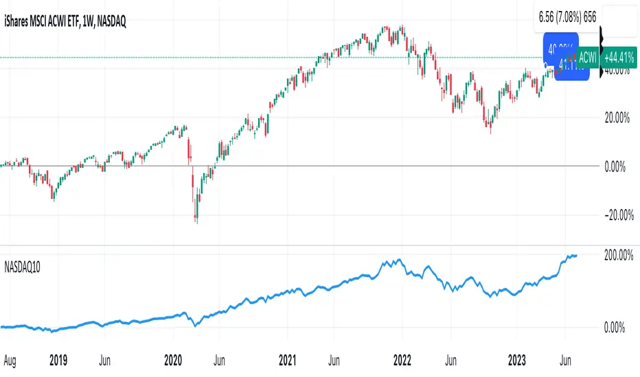
DrNon_NASDAQ10Title: NASDAQ 10 Index with TOP 10 Securities
Introduction:
TradingView offers traders and investors a powerful platform for technical analysis and trading. One of its notable features is the ability to create custom indices based on the values of multiple individual securities. In this blog post, we will explore how to build a custom index with 10 securities in TradingView using Pine Script, the platform's proprietary programming language.
Description:
Custom indices allow market participants to track the performance of a specific group of securities, providing valuable insights into the collective performance of the chosen assets. By leveraging Pine Script, traders can easily develop and deploy custom indicators and strategies to build their own indices.
The script provided focuses on creating a custom index with 10 securities. The selected securities include popular stocks such as AAPL (Apple Inc.), MSFT (Microsoft Corporation), GOOG (Alphabet Inc.), AMZN (Amazon.com Inc.), NVDA (NVIDIA Corporation), TSLA (Tesla Inc.), META (Facebook, Inc.), AVGO (Broadcom Inc.), PEP (PepsiCo, Inc.), and COST (Costco Wholesale Corporation).
Using the security() function in Pine Script, we retrieve the closing prices of each individual security to ensure accurate data for the index calculation.
The index value is then calculated by summing the closing prices of the 10 securities. This simple arithmetic operation captures the overall performance of the custom index.
To visualize the index, we use the plot() function to display the index value on the chart. Traders can observe the custom index alongside other technical indicators or price action, aiding in decision-making and market analysis.
By building a custom index with 10 securities in TradingView, traders gain a consolidated view of the performance of these chosen assets. This allows for easier tracking of sector trends, evaluation of specific strategies, and the ability to compare the performance of individual portfolios against the broader market.
Conclusion:
TradingView's Pine Script provides traders and investors with a flexible solution to build custom indices. By defining the 10 individual securities, calculating the index value, and plotting it on the chart, traders can monitor the collective performance of these chosen assets. Custom indices offer insights into sector performance, enable the evaluation of specific strategies, and provide a benchmark for comparing portfolio performance. By harnessing the power of custom indices in TradingView, traders can enhance their decision-making process and gain a competitive edge in the market.
Higher Fibonacci EMAOverall image:
If the closing price is higher than the three Fibonacci EMAs (uptrend):
Thanks to @ZenAndTheArtOfTrading and his indicator "Higher Timeframe EMA", URL =
This is a trend-discriminating indicator that uses 3 EMAs.
The Williams Alligator is the underlying philosophy, and we have applied it to capture the larger trend.
It is set up for the current time frame + 2 higher time frames.
One of the upper time legs has a daily EMA length of 13 Fibonacci numbers.
The top-level time leg has a weekly EMA with a length of 5 Fibonacci.
If the current closing price of the ticker leg is higher than these three EMAs, the bar color will be green. If it is lower, it will be red. If it is neither, it will be gray.
If the bar color is green, it suggests that the trend is upward. If it is red, you can consider entering short. If it is gray, it is best not to enter anything.

Alpha Fractal BandsWilliams fractals are remarkable support and resistance levels used by many traders. However, it can sometimes be challenging to use them frequently and get confirmation from other oscillators and indicators. With the new "Alpha Fractal Bands", a unique blend of Williams Fractals and Bollinger Bands emerges, offering a fresh perspective. Extremes can be utilized as price reversals or for taking profits. I look forward to hearing your thoughts. Best regards... Happy trading!
An easy solution for long positions is to:
Identify a bullish trend or a potential entry point for a long position.
Set a stop-loss order to limit potential losses if the trade goes against you.
Determine a target price or take-profit level to lock in profits.
Consider using technical indicators or analysis tools to confirm the strength of the bullish trend.
Regularly monitor the trade and make necessary adjustments based on market conditions.
An easy solution for short positions could be to follow these steps:
Identify a bearish trend or a potential entry point for a short position.
Set a stop-loss order to limit potential losses if the trade goes against you.
Determine a target price or take-profit level to lock in profits.
Consider using technical indicators or analysis tools to confirm the strength of the bearish trend.
Regularly monitor the trade and make necessary adjustments based on market conditions.
Remember, it's important to conduct thorough research and analysis before entering any trade and to manage your risk effectively.
To stay updated with the content, don't forget to follow and engage with it on TV, my friends. Remember to leave comments as well :)

Advanced Support & Resistance Zone DetectionAdvanced Support & Resistance Zone Detection Indicator: A Comprehensive Overview
The "Advanced Support & Resistance Zone Detection" indicator, developed by @HarryCTC, is a powerful tool designed to identify support and resistance levels in trading markets. This indicator helps traders identify areas where the price is likely to encounter obstacles and potentially reverse its direction. By understanding these key levels, traders can make more informed decisions and improve their overall trading strategies.
This indicator is based on the Williams Fractal Indicator.
The indicator employs a fractal-based approach to identify support and resistance levels. Fractals are patterns that indicate potential price reversals. The indicator scans the price data and looks for specific fractal patterns that signify the presence of support or resistance.
For support levels, the indicator searches for downward fractals, where a lower low is formed surrounded by higher lows on both sides. This pattern suggests a potential support level as the price has temporarily stopped declining and may reverse its direction.
Conversely, for resistance levels, the indicator looks for upward fractals, where a higher high is formed surrounded by lower highs on both sides. This pattern indicates a potential resistance level where the price has temporarily halted its ascent and may reverse downwards.
The indicator applies certain conditions and filters to ensure the significance of the identified support and resistance levels. These conditions prevent the inclusion of minor price fluctuations and focus on capturing major turning points in the market.
Once a support or resistance level is detected, the indicator plots it on the chart either as a zone or a line, based on user preferences. The indicator also keeps track of previously identified levels and updates them as new levels are found.
By utilizing fractal analysis, the "Advanced Support & Resistance Zone Detection" indicator provides traders with valuable insights into key levels where price reversals are likely to occur. Traders can use this information to plan their entries, exits, and overall trading strategies more effectively.
The indicator utilizes several input parameters that allow users to customize its behavior according to their preferences and trading styles. Let's explore each of these parameters in detail:
1. Periods: This parameter determines the number of periods considered when identifying support and resistance levels. It indicates the length of the lookback period used to analyze price action and detect potential zones.
2. S&R Distance: The S&R distance parameter specifies the minimum distance, in pips, between the identified support and resistance levels. It helps filter out insignificant price fluctuations and focuses on significant price zones.
3. Number of S&R Levels to Show: This parameter controls the maximum number of support and resistance levels displayed on the chart. Users can set the desired number to avoid cluttering the chart with excessive information.
4. Draw S&R Zones: If enabled, this parameter allows the indicator to draw support and resistance zones on the chart. These zones represent areas where price reversals are likely to occur. Traders can visually analyze the chart and observe the significance of these zones.
5. Draw S&R Lines: This parameter determines whether the indicator should draw lines representing support and resistance levels on the chart. These lines provide a clear visual representation of the detected levels.
6. Resistance Zone Color: Users can customize the color of the resistance zones drawn on the chart. By choosing distinct colors, traders can easily differentiate between support and resistance zones.
7. Support Zone Color: Similarly, this parameter allows users to specify the color of the support zones displayed on the chart.
8. Resistance Line Color: Traders can choose the color of the lines representing resistance levels. This color customization helps in visually distinguishing resistance levels from other elements on the chart.
9. Support Line Color: This parameter determines the color of the lines representing support levels.
10. S&R Zone & Line Extension: The S&R zone and line extension parameter defines the extension of support and resistance zones and lines to the right side of the chart. It provides traders with a visual projection of the potential future behavior of these levels.
11. S&R Line Width: Users can adjust the width of the lines representing support and resistance levels. This customization option helps traders emphasize or de-emphasize these lines based on their preferences.

Support & Resistance ZonesTitle: A Comprehensive Guide to the Support & Resistance Zones Indicator
Introduction
In the world of technical analysis, the Support & Resistance Zones indicator plays a crucial role in identifying potential trading opportunities. These zones are essential for traders looking to capitalize on bounces or break and retests. In this article, we will delve into the specifics of the Support & Resistance Zones indicator, outlining how it works, how it finds and marks zones, and the various options available for traders.
What the indicator is about
The Support & Resistance Zones indicator, developed by @HarryCTC, is a powerful tool for detecting areas of potential price reversal or consolidation in a financial market. These zones are significant as they can act as a guide for traders to make informed decisions on entering or exiting positions. Specifically, the indicator helps identify:
1. Support Zones: Areas where the price has a tendency to bounce back up after falling, indicating a potential buying opportunity.
2. Resistance Zones: Areas where the price has a tendency to reverse after rising, indicating a potential selling opportunity.
How the indicator finds its zones
The Support & Resistance Zones indicator utilizes pivot points to identify potential support and resistance levels. By analyzing the fractal structure of the price chart, the indicator identifies key turning points, known as bull and bear fractals. The bull fractal is a high pivot point, while the bear fractal is a low pivot point.
The fractal structure is determined by the 'Switch Zone Period' input, which can be adjusted to suit the trader's preferences. A higher value will result in fewer zones being identified, while a lower value will result in more zones.
How it marks zones and why it marks zones
The indicator marks the support and resistance zones by creating rectangular boxes around the identified fractal points. The zones are extended horizontally from the fractal point, allowing traders to visualize the potential areas of price reversal.
The zones are marked for the following reasons:
1. To provide a clear visual representation of potential support and resistance levels.
2. To help traders identify potential entry and exit points based on the price's reaction to these zones.
3. To serve as a reference for stop-loss and take-profit levels when planning trades.
The indicator's for traders trading bounces or break and retests
Traders who focus on trading bounces or break and retests can benefit immensely from the Support & Resistance Zones indicator. By providing a visual representation of key support and resistance levels, the indicator enables traders to:
1. Identify potential buying opportunities at support zones where the price is likely to bounce back up.
2. Identify potential selling opportunities at resistance zones where the price is likely to reverse after rising.
3. Make informed decisions on stop-loss and take-profit levels based on the price's proximity to support and resistance zones.
4. Monitor the market for potential breakouts or breakdowns when the price breaches these zones.
Indicator options
The Support & Resistance Zones indicator offers several customizable options to suit the trader's preferences. These options include:
1. Switch Zone Period: Adjusts the number of periods used to calculate the fractal structure, influencing the number of identified zones.
2. No. of Displayed Zones: Determines the maximum number of zones displayed on the chart, ranging from 1 to 8.
3. Zone Extension: Adjusts the horizontal extension of the support and resistance zones.
4. Resistance Zone Color: Customizes the color of the resistance zone boxes.
5. Support Zone Color: Customizes the color of the support zone boxes.
6. Zone Border Color: Customizes the color of the zone box borders.
Conclusion
The Support & Resistance Zones indicator is a valuable tool for traders looking to identify potential trading opportunities based on the price's interaction with support and resistance levels. By providing a clear visual representation of these zones, the
indicator allows traders to make informed decisions on entry and exit points, stop-loss, and take-profit levels. With customizable options, the indicator can be tailored to suit individual trading preferences and strategies.
Awesome Cumulative Volume OscillatorThe indicator is called the "Awesome Cumulative Volume Oscillator" (ACVO), which analyzes the cumulative trading volume of the underlying asset.
The indicator also plots the deviation of the cumulative trading volume from the first SMA value, which is referred to as the "Cumulative Volume Deviation". The zero-line is plotted as a reference point.
If the "Cumulative Volume Deviation" is greater than 0, it indicates an uptrend, as the cumulative trading volume is above the first SMA value. If the "Cumulative Volume Deviation" is less than 0, it indicates a downtrend, as the cumulative trading volume is below the first SMA value.
However, it is important to note that using a single indicator is not sufficient to conduct a comprehensive market analysis. It is necessary to combine multiple indicators and analysis methods to make informed trading decisions.
WillyCycle Oscillator&DoubleMa/ErkOzi/version 2This oscillator can be customized by adjusting the length of the Willy period, the length of Willy's EMA, and the upper and lower bands. The upper and lower bands help traders identify overbought and oversold conditions.
The WillyCycle Oscillator is a technical analysis tool used to measure the momentum of an asset and identify overbought and oversold conditions based on the price range of a specific period and calculating the percentage of the closing price in that range. The WillyCycle Oscillator consists of two main components: Willy and Willy's EMA. The Willy component is the percentage calculation of the asset's price range, and Willy's EMA is the exponential moving average of the Willy component. Willy's EMA is used to smooth out the Willy component and make it easier to identify trends.
*** When the oscillator is above the 80 level, it indicates that the asset is overbought, and when it is below the 20 level, it indicates that the asset is oversold. Traders can use these levels as a guide for buying and selling signals.
***Traders can also use the WillyCycle Oscillator to identify trend reversals. When the oscillator rises above the 50 level, it signals a potential uptrend, and when it falls below the 50 level, it signals a potential downtrend.
***I have added a smoothed line option to the WillyCycle Oscillator, which allows traders to see a more smoothed version of the oscillator. This option can be enabled by setting the 'smoothed' input to true. The default value for the smoothed line is 15.
***We have also changed the value range of the WillyCycle Oscillator from -100 to 100 to 0 to 100. This change was made to make the oscillator more user-friendly and easier to read.
In conclusion, the WillyCycle Oscillator is a versatile tool that can help traders identify potential trading opportunities and trend reversals. Traders can customize the oscillator to fit their trading style and preferences. Adding a smoothed line and changing the value range can enhance the user experience and make the oscillator easier to use.

Volume change [ Unlimited ]This indicator displays volume and volume change information on a chart. It is designed to help traders analyze changes in trading volume over time and identify potential trading opportunities.
The indicator takes an input from the user to set the length of the exponential moving average (EMA) applied to the volume data. This EMA is used to smooth out short-term fluctuations in volume and highlight the overall trend in volume.
The indicator calculates whether the current bar is up or down and calculates the change in volume. It then sets the color of the volume and volume change columns based on whether the bar is up or down and whether the volume change is positive or negative.
By displaying this information on a chart, the indicator can help traders identify patterns or trends in volume and volume change that may indicate potential trading opportunities. For example, increasing volume along with rising prices could indicate strong buying pressure and a potential bullish trend, while decreasing volume along with falling prices could indicate weak selling pressure and a potential bearish trend.
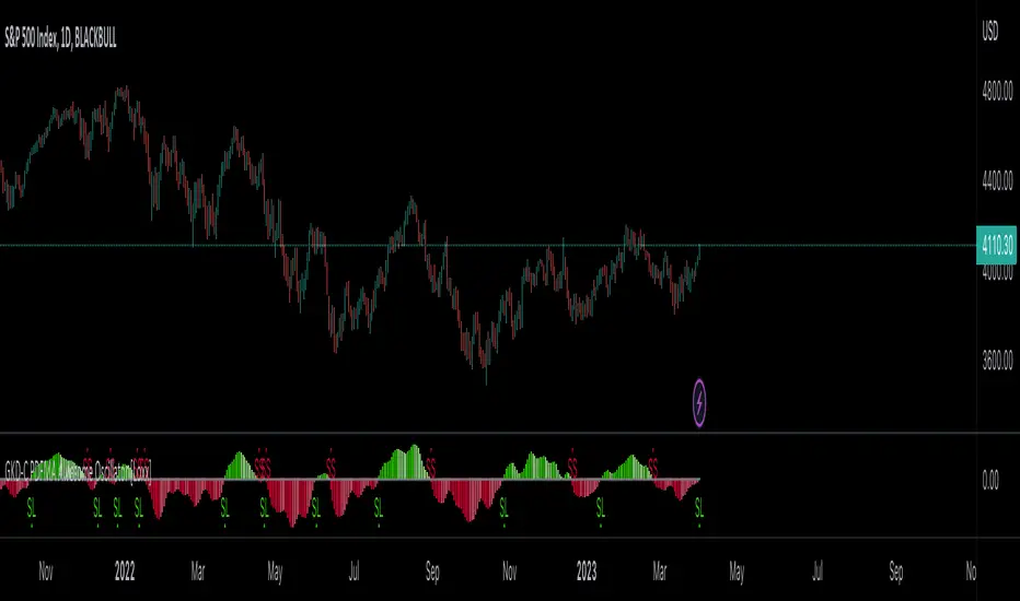
GKD-C PDFMA Awesome Oscillator [Loxx]Giga Kaleidoscope GKD-C PDFMA Awesome Oscillator is a Confirmation module included in Loxx's "Giga Kaleidoscope Modularized Trading System".
█ Giga Kaleidoscope Modularized Trading System
What is Loxx's "Giga Kaleidoscope Modularized Trading System"?
The Giga Kaleidoscope Modularized Trading System is a trading system built on the philosophy of the NNFX (No Nonsense Forex) algorithmic trading.
What is the NNFX algorithmic trading strategy?
The NNFX (No-Nonsense Forex) trading system is a comprehensive approach to Forex trading that is designed to simplify the process and remove the confusion and complexity that often surrounds trading. The system was developed by a Forex trader who goes by the pseudonym "VP" and has gained a significant following in the Forex community.
The NNFX trading system is based on a set of rules and guidelines that help traders make objective and informed decisions. These rules cover all aspects of trading, including market analysis, trade entry, stop loss placement, and trade management.
Here are the main components of the NNFX trading system:
1. Trading Philosophy: The NNFX trading system is based on the idea that successful trading requires a comprehensive understanding of the market, objective analysis, and strict risk management. The system aims to remove subjective elements from trading and focuses on objective rules and guidelines.
2. Technical Analysis: The NNFX trading system relies heavily on technical analysis and uses a range of indicators to identify high-probability trading opportunities. The system uses a combination of trend-following and mean-reverting strategies to identify trades.
3. Market Structure: The NNFX trading system emphasizes the importance of understanding the market structure, including price action, support and resistance levels, and market cycles. The system uses a range of tools to identify the market structure, including trend lines, channels, and moving averages.
4. Trade Entry: The NNFX trading system has strict rules for trade entry. The system uses a combination of technical indicators to identify high-probability trades, and traders must meet specific criteria to enter a trade.
5. Stop Loss Placement: The NNFX trading system places a significant emphasis on risk management and requires traders to place a stop loss order on every trade. The system uses a combination of technical analysis and market structure to determine the appropriate stop loss level.
6. Trade Management: The NNFX trading system has specific rules for managing open trades. The system aims to minimize risk and maximize profit by using a combination of trailing stops, take profit levels, and position sizing.
Overall, the NNFX trading system is designed to be a straightforward and easy-to-follow approach to Forex trading that can be applied by traders of all skill levels.
Core components of an NNFX algorithmic trading strategy
The NNFX algorithm is built on the principles of trend, momentum, and volatility. There are six core components in the NNFX trading algorithm:
1. Volatility - price volatility; e.g., Average True Range, True Range Double, Close-to-Close, etc.
2. Baseline - a moving average to identify price trend
3. Confirmation 1 - a technical indicator used to identify trends
4. Confirmation 2 - a technical indicator used to identify trends
5. Continuation - a technical indicator used to identify trends
6. Volatility/Volume - a technical indicator used to identify volatility/volume breakouts/breakdown
7. Exit - a technical indicator used to determine when a trend is exhausted
What is Volatility in the NNFX trading system?
In the NNFX (No Nonsense Forex) trading system, ATR (Average True Range) is typically used to measure the volatility of an asset. It is used as a part of the system to help determine the appropriate stop loss and take profit levels for a trade. ATR is calculated by taking the average of the true range values over a specified period.
True range is calculated as the maximum of the following values:
-Current high minus the current low
-Absolute value of the current high minus the previous close
-Absolute value of the current low minus the previous close
ATR is a dynamic indicator that changes with changes in volatility. As volatility increases, the value of ATR increases, and as volatility decreases, the value of ATR decreases. By using ATR in NNFX system, traders can adjust their stop loss and take profit levels according to the volatility of the asset being traded. This helps to ensure that the trade is given enough room to move, while also minimizing potential losses.
Other types of volatility include True Range Double (TRD), Close-to-Close, and Garman-Klass
What is a Baseline indicator?
The baseline is essentially a moving average, and is used to determine the overall direction of the market.
The baseline in the NNFX system is used to filter out trades that are not in line with the long-term trend of the market. The baseline is plotted on the chart along with other indicators, such as the Moving Average (MA), the Relative Strength Index (RSI), and the Average True Range (ATR).
Trades are only taken when the price is in the same direction as the baseline. For example, if the baseline is sloping upwards, only long trades are taken, and if the baseline is sloping downwards, only short trades are taken. This approach helps to ensure that trades are in line with the overall trend of the market, and reduces the risk of entering trades that are likely to fail.
By using a baseline in the NNFX system, traders can have a clear reference point for determining the overall trend of the market, and can make more informed trading decisions. The baseline helps to filter out noise and false signals, and ensures that trades are taken in the direction of the long-term trend.
What is a Confirmation indicator?
Confirmation indicators are technical indicators that are used to confirm the signals generated by primary indicators. Primary indicators are the core indicators used in the NNFX system, such as the Average True Range (ATR), the Moving Average (MA), and the Relative Strength Index (RSI).
The purpose of the confirmation indicators is to reduce false signals and improve the accuracy of the trading system. They are designed to confirm the signals generated by the primary indicators by providing additional information about the strength and direction of the trend.
Some examples of confirmation indicators that may be used in the NNFX system include the Bollinger Bands, the MACD (Moving Average Convergence Divergence), and the Stochastic Oscillator. These indicators can provide information about the volatility, momentum, and trend strength of the market, and can be used to confirm the signals generated by the primary indicators.
In the NNFX system, confirmation indicators are used in combination with primary indicators and other filters to create a trading system that is robust and reliable. By using multiple indicators to confirm trading signals, the system aims to reduce the risk of false signals and improve the overall profitability of the trades.
What is a Continuation indicator?
In the NNFX (No Nonsense Forex) trading system, a continuation indicator is a technical indicator that is used to confirm a current trend and predict that the trend is likely to continue in the same direction. A continuation indicator is typically used in conjunction with other indicators in the system, such as a baseline indicator, to provide a comprehensive trading strategy.
What is a Volatility/Volume indicator?
Volume indicators, such as the On Balance Volume (OBV), the Chaikin Money Flow (CMF), or the Volume Price Trend (VPT), are used to measure the amount of buying and selling activity in a market. They are based on the trading volume of the market, and can provide information about the strength of the trend. In the NNFX system, volume indicators are used to confirm trading signals generated by the Moving Average and the Relative Strength Index. Volatility indicators include Average Direction Index, Waddah Attar, and Volatility Ratio. In the NNFX trading system, volatility is a proxy for volume and vice versa.
By using volume indicators as confirmation tools, the NNFX trading system aims to reduce the risk of false signals and improve the overall profitability of trades. These indicators can provide additional information about the market that is not captured by the primary indicators, and can help traders to make more informed trading decisions. In addition, volume indicators can be used to identify potential changes in market trends and to confirm the strength of price movements.
What is an Exit indicator?
The exit indicator is used in conjunction with other indicators in the system, such as the Moving Average (MA), the Relative Strength Index (RSI), and the Average True Range (ATR), to provide a comprehensive trading strategy.
The exit indicator in the NNFX system can be any technical indicator that is deemed effective at identifying optimal exit points. Examples of exit indicators that are commonly used include the Parabolic SAR, the Average Directional Index (ADX), and the Chandelier Exit.
The purpose of the exit indicator is to identify when a trend is likely to reverse or when the market conditions have changed, signaling the need to exit a trade. By using an exit indicator, traders can manage their risk and prevent significant losses.
In the NNFX system, the exit indicator is used in conjunction with a stop loss and a take profit order to maximize profits and minimize losses. The stop loss order is used to limit the amount of loss that can be incurred if the trade goes against the trader, while the take profit order is used to lock in profits when the trade is moving in the trader's favor.
Overall, the use of an exit indicator in the NNFX trading system is an important component of a comprehensive trading strategy. It allows traders to manage their risk effectively and improve the profitability of their trades by exiting at the right time.
How does Loxx's GKD (Giga Kaleidoscope Modularized Trading System) implement the NNFX algorithm outlined above?
Loxx's GKD v1.0 system has five types of modules (indicators/strategies). These modules are:
1. GKD-BT - Backtesting module (Volatility, Number 1 in the NNFX algorithm)
2. GKD-B - Baseline module (Baseline and Volatility/Volume, Numbers 1 and 2 in the NNFX algorithm)
3. GKD-C - Confirmation 1/2 and Continuation module (Confirmation 1/2 and Continuation, Numbers 3, 4, and 5 in the NNFX algorithm)
4. GKD-V - Volatility/Volume module (Confirmation 1/2, Number 6 in the NNFX algorithm)
5. GKD-E - Exit module (Exit, Number 7 in the NNFX algorithm)
(additional module types will added in future releases)
Each module interacts with every module by passing data between modules. Data is passed between each module as described below:
GKD-B => GKD-V => GKD-C(1) => GKD-C(2) => GKD-C(Continuation) => GKD-E => GKD-BT
That is, the Baseline indicator passes its data to Volatility/Volume. The Volatility/Volume indicator passes its values to the Confirmation 1 indicator. The Confirmation 1 indicator passes its values to the Confirmation 2 indicator. The Confirmation 2 indicator passes its values to the Continuation indicator. The Continuation indicator passes its values to the Exit indicator, and finally, the Exit indicator passes its values to the Backtest strategy.
This chaining of indicators requires that each module conform to Loxx's GKD protocol, therefore allowing for the testing of every possible combination of technical indicators that make up the six components of the NNFX algorithm.
What does the application of the GKD trading system look like?
Example trading system:
Backtest: Strategy with 1-3 take profits, trailing stop loss, multiple types of PnL volatility, and 2 backtesting styles
Baseline: Hull Moving Average
Volatility/Volume: Hurst Exponent
Confirmation 1: PDFMA Awesome Oscillator as shown on the chart above
Confirmation 2: Williams Percent Range
Continuation: Fisher Transform
Exit: Rex Oscillator
Each GKD indicator is denoted with a module identifier of either: GKD-BT, GKD-B, GKD-C, GKD-V, or GKD-E. This allows traders to understand to which module each indicator belongs and where each indicator fits into the GKD protocol chain.
Giga Kaleidoscope Modularized Trading System Signals (based on the NNFX algorithm)
Standard Entry
1. GKD-C Confirmation 1 Signal
2. GKD-B Baseline agrees
3. Price is within a range of 0.2x Volatility and 1.0x Volatility of the Goldie Locks Mean
4. GKD-C Confirmation 2 agrees
5. GKD-V Volatility/Volume agrees
Baseline Entry
1. GKD-B Baseline signal
2. GKD-C Confirmation 1 agrees
3. Price is within a range of 0.2x Volatility and 1.0x Volatility of the Goldie Locks Mean
4. GKD-C Confirmation 2 agrees
5. GKD-V Volatility/Volume agrees
6. GKD-C Confirmation 1 signal was less than 7 candles prior
Continuation Entry
1. Standard Entry, Baseline Entry, or Pullback; entry triggered previously
2. GKD-B Baseline hasn't crossed since entry signal trigger
3. GKD-C Confirmation Continuation Indicator signals
4. GKD-C Confirmation 1 agrees
5. GKD-B Baseline agrees
6. GKD-C Confirmation 2 agrees
1-Candle Rule Standard Entry
1. GKD-C Confirmation 1 signal
2. GKD-B Baseline agrees
3. Price is within a range of 0.2x Volatility and 1.0x Volatility of the Goldie Locks Mean
Next Candle:
1. Price retraced (Long: close < close or Short: close > close )
2. GKD-B Baseline agrees
3. GKD-C Confirmation 1 agrees
4. GKD-C Confirmation 2 agrees
5. GKD-V Volatility/Volume agrees
1-Candle Rule Baseline Entry
1. GKD-B Baseline signal
2. GKD-C Confirmation 1 agrees
3. Price is within a range of 0.2x Volatility and 1.0x Volatility of the Goldie Locks Mean
4. GKD-C Confirmation 1 signal was less than 7 candles prior
Next Candle:
1. Price retraced (Long: close < close or Short: close > close )
2. GKD-B Baseline agrees
3. GKD-C Confirmation 1 agrees
4. GKD-C Confirmation 2 agrees
5. GKD-V Volatility/Volume Agrees
PullBack Entry
1. GKD-B Baseline signal
2. GKD-C Confirmation 1 agrees
3. Price is beyond 1.0x Volatility of Baseline
Next Candle:
1. Price is within a range of 0.2x Volatility and 1.0x Volatility of the Goldie Locks Mean
3. GKD-C Confirmation 1 agrees
4. GKD-C Confirmation 2 agrees
5. GKD-V Volatility/Volume Agrees
█ GKD-C PDFMA Awesome Oscillator
What is the Awesome Oscillator?
The Awesome Oscillator (AO) is a technical indicator used in financial analysis to measure the momentum of an asset's price movement. Developed by Bill Williams, it is a histogram-style indicator that calculates the difference between a 34-period and a 5-period Simple Moving Average (SMA) of the asset's price.
The AO indicator is calculated by subtracting the 34-period SMA from the 5-period SMA. The resulting value is plotted as a histogram, with bars above the zero line indicating bullish momentum and bars below the zero line indicating bearish momentum.
Traders use the Awesome Oscillator to identify trends and potential reversals in the price movement of an asset. When the histogram is above the zero line, it indicates that bullish momentum is strong and traders may consider buying the asset. Conversely, when the histogram is below the zero line, it indicates that bearish momentum is strong and traders may consider selling the asset.
In addition to identifying trends and potential reversals, the AO indicator can also be used to confirm the strength of a trend. If the histogram is increasing in height, it indicates that the momentum of the trend is increasing as well. If the histogram is decreasing in height, it indicates that the momentum of the trend is decreasing as well.
Traders often use the Awesome Oscillator in conjunction with other technical indicators to confirm trading signals and improve the accuracy of their trades. While it is not a standalone indicator, it can be a valuable tool for identifying and confirming trends in the price movement of an asset.
What is Probability Density Function?
Probability Density Function ( PDF ) is a statistical function used to describe the likelihood of a continuous random variable taking on a particular value or range of values. In other words, it describes the probability distribution of a random variable over a continuous range of values.
The PDF is defined as the derivative of the cumulative distribution function (CDF) of a continuous random variable. The CDF of a continuous random variable is the probability that the random variable takes on a value less than or equal to a given value. The PDF is a non-negative function that integrates to 1 over the entire range of the random variable.
The PDF is used to calculate the probability of the random variable taking on a value within a specific range. This is done by integrating the PDF over that range. The height of the PDF at a particular value of the random variable indicates the relative likelihood of that value occurring.
The PDF is an essential tool in many areas of statistics, including hypothesis testing, confidence interval estimation, and Bayesian inference.
Probability density function based MA is a sort of weighted moving average that uses probability density function to calculate the weights.
What is the PDFMA Awesome Oscillator?
This indicator is an Awesome Oscillator that makes use of PDFMA smoothing. There is only one varaible input: variance. This adjusts the smoothness of the oscillator. Higher values, smoother oscillator but introduces additional lag.
Requirements
Inputs
Confirmation 1 and Solo Confirmation: GKD-V Volatility / Volume indicator
Confirmation 2: GKD-C Confirmation indicator
Outputs
Confirmation 2 and Solo Confirmation Complex: GKD-E Exit indicator
Confirmation 1: GKD-C Confirmation indicator
Continuation: GKD-E Exit indicator
Solo Confirmation Simple: GKD-BT Backtest strategy
Additional features will be added in future releases.
Fractals PivotsWhich trader does not know pivots? There are a lot of varieties of pivots indicators of which some are a default on most trading platforms. So what better way to challenge yourself then to create your own kind of pivots. Let's welcome the idea of Fractal Pivots.
Williams Fractal or fractals is a technical analysis indicator introduced by the famous trader Bill Williams in his book ‘Trading Chaos’. He developed it on the basis of the Chaos Theory and trading psychology. The indicator is centred around the idea that there is repetition in price behaviour and fractals can provide an insight into those repetitive patterns.
How does the indicator turn these into pivot lines?
The user will set a time period in which the script will look for fractals. It will then remember all the fractals that happen during that time period.
Let's say you are trading the hourly chart with a weekly pivot setting like in the chart this script is published on. The script will highling the 1h fractals that are happening. Then the next week it will use these exact fractals from previous week to draw the pivot lines.
Another example here is an 8h chart. Look how it uses the previous week fractals this week.
Let me know if you find a very great fractal length+timeframe setting where the levels really get respected. I would really appreciate that.
