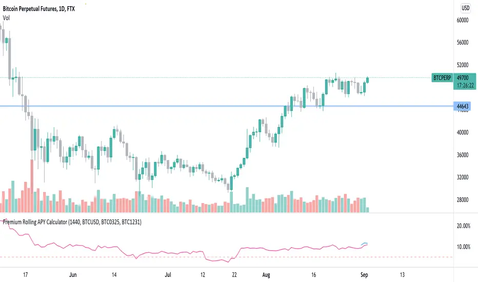
Premium Rolling APY CalculatorThis script can see the rolling APY of future premiums calculated based on the remain days to expire date.
By default you can see the rolling APY for FTX BTC0924, and APY for BTC1231. You can also change the symbol from chart settings to whatever you need and still calculate in the same way.
Btc!
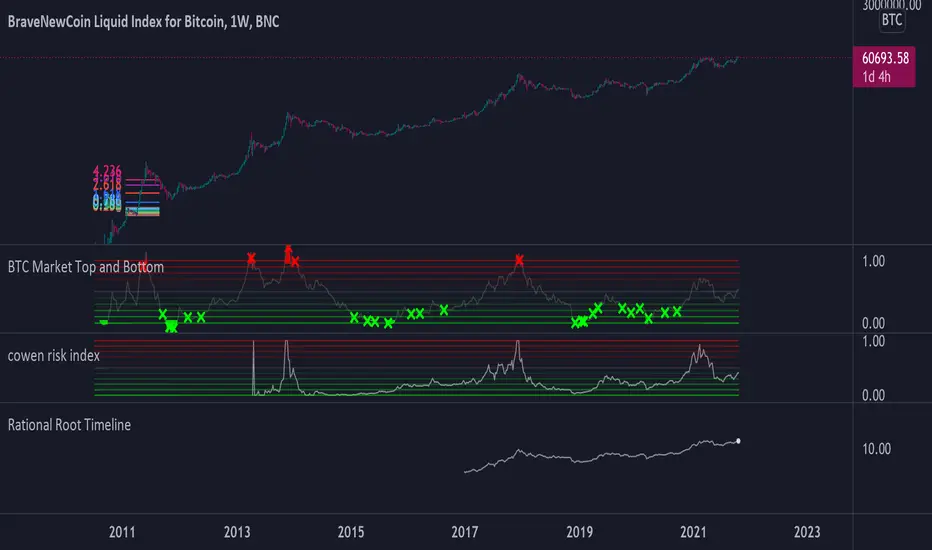
PI_GRM Bitcoin Golden Ratio Multipier [wozdux]Golden Ratio Multiplier
Formula GRM=MA350(BTC USD) * (1.6;2;3;5;8;13;21)
The multiplier examines medium-and long-term time cycles.
For this, a multiple of 350 MA is used to determine the areas of potential resistance.
Additionally, fibo levels from the main line.
version 2021 year modification

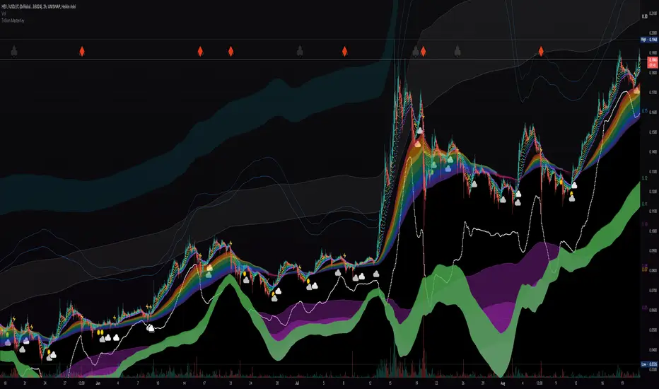
Liquidity Rainbow - Trillion ResearchThis indicator uses regression along with RSI and moving averages from multiple time frames to help you visualize the market in a single view. After learning the notations, you will be able to identify pockets of liquidity and determine high/low probability price zones without drawing a single line.
Booster symbols help confirm short term trends and breakouts based off of two waveform functions, one long period, the other with a much shorter period. You get the buy signal that everyone else sees plus the confirmation!
This is a system that is not fully developed, PNL is not available yet. Strategy version is coming soon, still back testing.
I am tuning this model for crypto specifically, although it works for anything with a price chart.
2 EMAs (configurable to MA)
Dragonskin - RGB circle plots eMA
Rainbow - RGB area plots eMA
+When you see the rainbow appear it means that the price is above the slowest ema baseline. Generally bullish as price tends to ride the rainbow. Ideally, you will see a white cloud at the origin.
-When you see white step line cutting into the upper colors of the rainbow.
Once the price has traded below the rainbow for the FIRST time, not just wicked. You can set a target that's just above the previous high bodys above the rainbow. Do not sell the dip, let the floppers flop.
The second time price cuts down through a thick rainbow is usually bearish .
What makes me so sure? Liquidity
In order to be successful, we need to understand liquidity, the juiciest pockets of profit.
I will reveal more of the strategy in the second script.
For now, use:
SUN symbol - Notice how the price always seems to come back and sweep up any SUNs that get left behind (up and down) this is a liquidity nugget
CLOUD(s) indicators of support. Meaning that on ema trend we expect a lower price but each time that happens, it gets bought up above baseline. weak->strong (little gray - light blue - white)
LIGHTNING indicator of resistance. Meaning the price is not being allowed to recover, each time it rises above baseline, it is sold down again.
YELLOW CROSS - Classically known as a whale manipulation indicator. It tends to indicate a strong bearish move incoming or the reversal of an ongoing bearish move. There's dumping. "Get ready something is happening" indicator.
HEARTS = BUY
SPADES = Buy
CLUBS = Sell
DIAMONDS = SELL
*do not use these during periods of consolidation. consolidation is a period when the price swings in both directions but not too much. In a narrow range the indicators can pop up.
Why does this happen?
Short periods, during which exchanges stabilize the prices, are necessary for the redistribution of assets over the course of trading. Sometimes they happen multiple times a week and can last 24 or 48hours. Also it is a great time to eat up algo traders and that's why you'll see noise.
You want to focus on the period immediately following a consolidations. Don't rush it, they really do take 20 hours+
If you realize that you are in one of these consolidation ranges, limit order the tips of the wicks, nothing in the middle. There is not much profit here but also there is minimal risk.
If you're confirmed in a consolidation, exchanges will work to buoy the price to the appropriate mark price even if there is a big buy/sell order. A lot of time price will go up the congruent amount afterwards to compensate the toxic vwap .
I hope this helps people see the bigger picture and become even more successful with bigger gains.
I've tested this on all the major cryptos. Bitcoin BTC Ethereum ETH HEX
Honestly, I have tested very few stonks with this, later.
-Market Enemy
RaBot V1.0.0Rabot is an indicator for new users as well as experienced users.
This indicator tries to predict both buy and sell signals. You can configure it for both scalping and swing trading.
It has two modes, one more "conservative", where the number of entries will be less than the other "greedy" mode.
Based on the famous and complex indicator "Koncorde" that combines both trend and volume knowing the manipulation of strong and weak hands, patterns, and crossing of emas customized by us; for example: a buy signal in conservative mode will only open if the trend is bullish and vice versa.
The user can configure the way they like by opening many positions or few but more secure based on their trading style.
The indicator also has the option to configure which chart we want to obtain the trend from, this is to avoid perhaps opening shorts in a very bullish trend line for example.
Rabot is a fairly complex indicator, which can be used for automatic use of inputs and outputs, as well as manual.
You also have the option of NOT opening a position if there is one currently open, and the option for the next signal to be the opposite of the last one.
5TPs, 1SL, and Breakeven after take profit achieved.
Finally version 1.0.0 is now available! :)
This version does not have backtesting (we have another that yes)
We are continuously working, testing and updating bugs and improvements.
Do not hesitate to get in touch for a feedback, it will be welcome and we will take it into account.

RaBot V1.0.0 - BacktestingRabot is an indicator for new users as well as experienced users.
This indicator tries to predict both buy and sell signals. You can configure it for both scalping and swing trading.
It has two modes, one more "conservative", where the number of entries will be less than the other "greedy" mode.
Based on the famous and complex indicator "Koncorde" that combines both trend and volume knowing the manipulation of strong and weak hands, patterns, and crossing of emas customized by us; for example: a buy signal in conservative mode will only open if the trend is bullish and vice versa.
The user can configure the way they like by opening many positions or few but more secure based on their trading style.
The indicator also has the option to configure which chart we want to obtain the trend from, this is to avoid perhaps opening shorts in a very bullish trend line for example.
Rabot is a fairly complex indicator, which can be used for automatic use of inputs and outputs, as well as manual.
You also have the option of NOT opening a position if there is one currently open, and the option for the next signal to be the opposite of the last one.
5TPs, 1SL, and Breakeven after take profit achieved.
Finally version 1.0.0 is now available! :)
This version contains backtesting with 5000 backbars to see if it is being profitable or not.
We are continuously working, testing and updating bugs and improvements.
Do not hesitate to get in touch for a feedback, it will be welcome and we will take it into account.

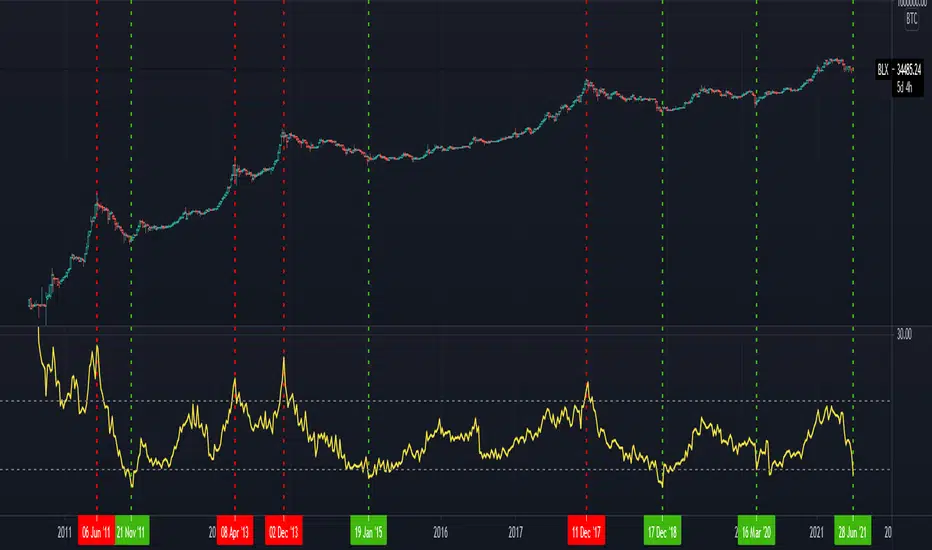
BTC Market Top and BottomThis script is a logarithmic moving average oscillator for the daily BTC chart (Or any asset ideally with data more than 4 years in length) to help find the top and bottom of the entire cycle. The idea is to buy when the oscillator is near green and sell when things are near the red. Should be used in conjunction with shorter timeframe indicators to find your best entries. This just shows the overall position of the cycle.
Instructions:
Use on a Daily BTCUSD chart or BLX chart. The more data the better.
Adjust the length to around 1000-1500 (this mainly controls the green line)
Adjust the denominator (this mainly controls the red line)
Adjust the smoothness (for visual appeal and noise reduction)
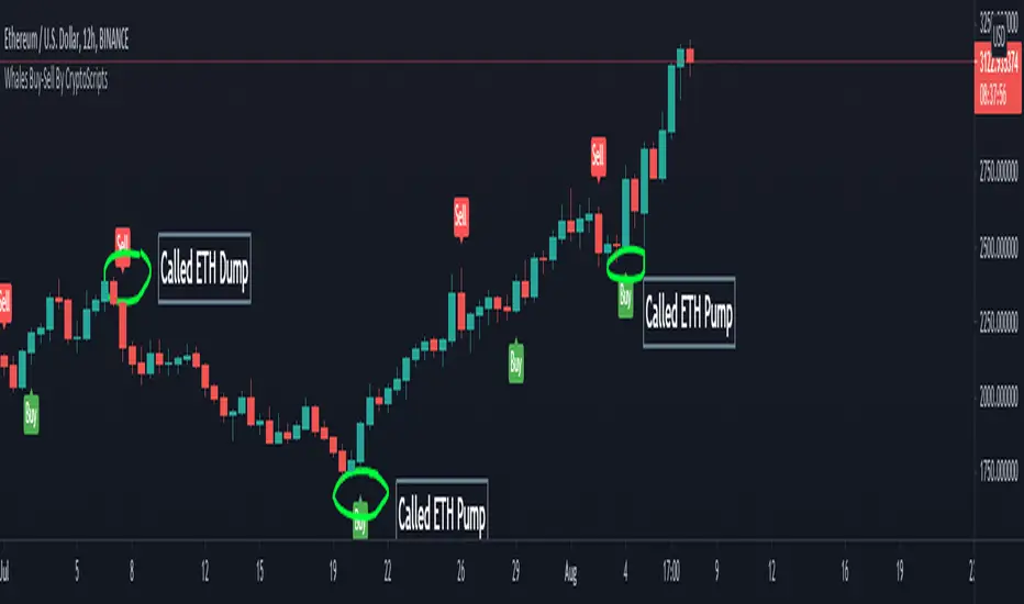
Whales Buy-Sell By CryptoScriptsThe Whales Buy-Sell indicator is very unique because it uses a combination of the smoothing range, average ranges, and hi-band/low-bands combined with various moving averages to nail whenever the overall trend is changing. This is extremely important during periods of high volatility and large moves. It helps to keep someone in a trade longer and get out fast if the trend is changing. The big caveat I can stress is waiting until the candle closes so that you know the signal is confirmed! Use the Bar Replay feature to further understand the intricacies of how the indicator produces signals. I find it is better on larger timeframes (1h and higher) because it's measuring larger trends. It can still be used on smaller timeframes but may not be as accurate. The big shortcoming is that is doesn't do well in choppy environments (i.e barely any price movement up or down) and you may get a lot of back and forth buy/sell signals so PLEASE keep that in mind. Experiment with various tickers/timeframes and see what works best for you :)
This indicator is a trend analysis indicator. Trend analysis is a technique used in technical analysis that attempts to predict future stock price movements based on recently observed trend data. Trend analysis is based on the idea that what has happened in the past gives traders an idea of what will happen in the future, but that is NOT always the case! Past performance is NOT indicative of future returns. There are three main types of trends: short-, intermediate- and long-term. Trend analysis tries to predict a trend, such as a bull market run, and then ride that trend until data suggests a trend reversal, such as a bull-to-bear market.
Alerts
You can set alerts for either a 'Buy Signal' or 'Sell Signal'. I recommend setting alerts for the candle close so that you know the signal is confirmed! If the "Add Alerts" option is greyed out for the indicator, just refresh your tradingview page and you should be able to see it :)
PM me to obtain access and please let me know if you have any questions!
3x EMA fast, 3 x MA slow + BB + PsarThis is a trend system which combines multiple fast EMA + mulitple slower SMA together with bollinger band channel and PSAR.
For entry rules the ones that I use are:
Long
We are inside BB channel, psar is ascending, and our close is above all moving averages or below all EMA'S + 1 SMA
WE can exit either when our close is below all EMA's or when PSAR is descending or when we hit upper/lower BB levels
Short
We are inside BB channel, psar is descnending, and our close is below all moving averages or below all EMA's + 1 SMA
WE can exit either when our close is above all EMA's or when PSAR is ascending or when we hit upper/lower BB levels
If you have any questions, let me know

RSVP Extractor By CryptoScriptsThis indicator has the same alerts as the VP Extractor except I overlaid the RSI on top of it (yellow line) to help take advantage when the RSI is overbought/oversold while also being able to see what the VP extractor is saying :)
It highlights yellow any time the RSI is below 30 (potential buy signal) and highlights orange anytime the RSI is above 70 (potential sell signal). You can also adjust the settings so that it'll highlight yellow when RSI is below 25 or 20 etc. so you can pick whatever value you want and the colors will adjust accordingly :) You can also set alerts for RSI overbought/oversold!
Please see the VP Extractor Alerts below! Those are still the same as before but since I now have RSI then you can be more confident in your signals if RSI is flashing a yellow shaded area (oversold) and the VP extractor is flashing a rocket symbol (buy), then both together would be a very strong buy signal. Using the RSI signals with the VP Extractor signals below will make you VERY successful with this indicator :)
The VP Extractor signals is a combination of the Volume Extractor and Price Extractor. There was a lot of coding involved in this one and it involves a Volume / Price Oscillator derived from various volume /price metrics combined with Bollinger Bands and Overbought/Oversold levels. This indicator is unique because it not only measures the standard deviations whenever the oscillator crosses outside the BBs but it does so at ranges that are most advantageous for the trader to identify KEY buy/sell levels (as shown above). I'll break down each signal below and how to best take advantage of them so you can get the best entries and capture the most profit per trade.
*This indicator works best on the Binance or Bybit exchange for crypto but also works for stocks and forex. It's best used on small-medium timeframes such as the 15min, 1h, 4h, 8hr, or 12h. It tends to give more false signals on the 1D timeframes and higher.
Red Alarm - this signal indicates that the volume and/or price oscillators are overbought and/or crossing outside of the bollinger bands . This is a STRONG sell signal but should still be combined with support/resistance levels and confirmed with other indicators.
Red Diamond - this signal indicates that the volume and price oscillators are crossing outside of the bollinger bands above the 20 level but is not yet overbought. This is a potential sell signal but should still be combined with support/resistance levels and confirmed with other indicators.
Red Shaded Area - this indicates the volume and price oscillators are overbought. This is a potential sell signal but should still be combined with support/resistance levels and confirmed with other indicators.
Rocket - this signal indicates that the volume and/or price oscillators are oversold and/or crossing outside of the bollinger bands . This is a STRONG buy signal but should still be combined with support/resistance levels and confirmed with other indicators.
Green Diamond - this signal indicates that the volume and price oscillators are crossing outside of the bollinger bands below the 20 level but is not yet oversold. This is a potential buy signal but should still be combined with support/resistance levels and confirmed with other indicators.
Green Shaded Area - this indicates the volume and price oscillators are oversold. This is a potential buy signal but should still be combined with support/resistance levels and confirmed with other indicators.
Input Options
Show 80 Levels - This checkbox will create a red zone and green zone for the 60-80 levels on the indicator. This is useful if the volume and price oscillators reaches one of these levels, you can be sure it's going to reverse soon and can have more confidence if it crosses outside of the BBs in addition to that.
VEO Length - This changes the height of the oscillator and will change how your signals flash (more or less often). Use this if you find you're getting too many signals or not enough. I find this is best at 21 but feel free to test out what works for you depending on your timeframe.
Moving Average Volume Source - This is currently set to None but you can change it to Exponential, Hull, or Simple moving average . I found that None works best but feel free to test out the different options.
Moving Average Length - Changing this length will do nothing to your chart if None is selected for the Moving Average Volume Source, therefore you will most likely keep this setting default at 9.
Alerts
I've set alerts on this indicator for each icon (Red Alarm, Red Diamond, Overbought, Rocket, Green Diamond, Oversold). I HIGHLY recommend setting the alerts for Candle Close so that you can be sure the signal is confirmed.
You may notice that the indicator can give multiple signals back-to-back or be overbought/oversold for multiple candles. When this happens, it's best to look at other indicators such as the RSI , MFI Pro, etc to nail the best entry and have confluence with your decision. With that said, having multiple signals back-to-back can also be an indication that the move is close to happening.
This indicator is a strong indicator by itself but works best when combined with my other indicators just as the Whales Buy-Sell and the MFI Pro as well as the RSI , and MACD i.e taking a trade when all indicators are showing overbought, "Buy", "Sell", etc. Measuring volume and price action is an extremely important aspect of trading and one I believe should not be overlooked. I hope I made everything as clear as possible and please let me know if I didn't.
PM me to obtain access and please let me know if you have any questions! :D

Aggregated Volume Colored (Bitcoin, ETH, Altcoins, everything)BITSTAMP:BTCUSD
This indicator aggregates trading volume data of up to 10 symbols and can display the individual data by color.
It is useful for assets which are traded on multiple exchanges, like cryptocurrencies, commodities, forex and derivatives showing you what is happening across the market and on the individual exchanges to give you beter insights.
You can change the symbols from which the indicator gathers data in the settings under inputs, just like the colors, and you can add a moving average.
By default trading volume is aggregated from the following symbols:
Binance, BTC /USDT
Binance, BTC /BUSD
Bingbon, BTC /USD
Huobi, BTC /USDT
OkeX, BTC /USDT
Coinbase, BTC /USD
Bitfinex, BTC /USD
Gemini, BTC /USD
Kraken, XBT/USD
Bitstamp, BTC /USD

Fed Balance Sheet Growth Rate p.a.Plots the rate of change in the Fed Balance sheet.
Defaults to annual rate of change.
Option to plot the raw balance sheet data.

[BCT] Can BTC be predicted or is it purely random?Variance Ratio**This indicator can be applied to the ticker of your choice (not just BTC)**
Markets are said to be "efficient". An efficient market is by definition unpredictable - no matter the amount of ML, computation, or indicators thrown at it. In particular, in an efficient market, TA will not be of help.
An illustration of efficient markets is the WSJ's longstanding monkey vs. human contest:Blindfolded Monkey Beats Humans With Stock Picks, granted there are several flaws to it.
BTC is a relatively new market. New markets are typically highly inefficient (easier to make money) and become more and more efficient over time (harder to make money). How much more efficient is BTC becoming?
We apply the Variance Ratio method and apply it to BTC.
BACKGROUND ON THE VARIANCE RATIO METHOD
Based on 1988 MacKinlay's seminal paper "Stock Market Prices do not Follow a Random Walk", the idea is to exploit a phenomenon called "variance scaling".
For those keen on looking into the math, the short version of it is under the assumption of iid (random walk) we have the following:
H0: Var(Sum(returns over K bars))=Sum(Var(returns over 1 bar))=k*Var(return over 1 bar)
We look to reject or not H0 depending on the observations.
In this script, we compare the variance of the (log) returns for the chart selected between:
(1) The (average) variance over k bars (call this Vk)
(2) The (average) variance over 1 bar (call this V1)
H0 simply says that Vk=k*V1 if the stock follows a random walk.
We compute the Variance Ratio VR(k)=Variance(returns over k bar)/(Sum(Var(returns over 1 bar)))-1
We then compute the associated Z-score which we chart out for a configurable k number of bars.
HOW TO INTERPRET THE CHART
The line drawn is the Z-Score for VR(k). It represents the number of standard deviations of VR(k) from 0 - the further out, the less random.
- If the line is close / hovers around 0, the ticker appears to follow a random walk (i.e. may not be predictable)
- If the line is consistently > 2 or <-2, the ticker likely does not follow a random walk (i.e. may have predictable features)
- If the line is positive, it means that the Variance on the k bars is larger than the variance on 1 bar (more variance on longer timeframes)
- If the line is negative, it means that the Variance on the k bars is smaller than the variance on 1 bar (more variance on smaller timeframes)
USE CASES
- Identify timeframes where you won't be able to make money
- Identify whether a stock cannot be predicted (forget about TA, indicators etc. -- a random walk is not predictable)
- Identify whether a stock is becoming less and less predictable (Z-score amplitude will decrease over time)
FEATURES
- select the number of K bar to compare vs. 1 bar (default = 16) - ideally a power of 2 but any other number will work. The chart is based off this selection
- select the lookback period for the analysis (500 bars by default)
- select the source to analyze (default = close, but you may select other inputs to calculate the returns from)
- results form the statistical tests on different K's in the table on the right/bottom side of the chart (H0 rejected = not random walk; H0 not rejected = it essentially looks rather random and we can't conclude that it's not a random walk)
COMMENTARY ON BTC
- It appears BTC's absolute value of the ZScore on the Variance Ratio is declining year after year - corroborating an increasingly efficient market as new participants join.
- However, we can still detect a fair amount of potential inefficiency using this simple test.
As usual, this is not investment advice. DYOR.
With love,
🐵BCT🐵

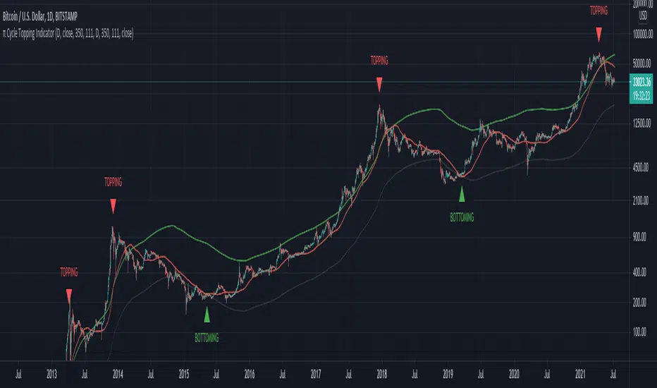
π Cycle Market Tops & Bottoms Performante IndicatorWhy is it called the Pi Cycle Tops & Bottoms Indicator?
When the 111-Day moving average crosses over the (350-Day moving average X 2), we've seen the price come to a key top or bottom within the Bitcoin market for the past 3 cycles.
350 divided by 111 is very close to π - hence the name the Pie cycle!
Yes, we are selecting arbitrary numbers initially, but through the use of proper back-testing, we are able to find key cycle shifts using mathematical numbers (fibs, Pi, etc)
We use this topping & bottoming signal when things look overbought over oversold within the market.
The "topping" label turns on as soon as we see the 111-Day moving average cross above the 350-Day moving average.
The "bottoming" signal turns on as soon as we see the 111-day moving average cross below the 350-Day moving average.
This indicator should only be used on the daily timeframe!
Historically speaking, we've seen this indicator become impressively accurate.
Performante's Golden Ratio SupportsThis dataset projects the MA for BTC divided by the golden ratio (1.6) as well as the Fibonacci sequence (0, 1, 1, 2, 3, 5, 8, etc).
These numbers are intertwined with markets, and have been an effective support level for key inflection points for Bitcoin's lows.
This indicator is mainly focused on the large timeframe and is set to work best on the daily timeframe . The daily is it's primary use-case.
As the market cap of BTC continues to grow, it will become progressively more and more difficult to grow at the previous appreciation rate.
This slowing growth in the market cap is demonstrated by the Fibonacci sequence support levels that are keeping the price from total capitulation dump like previous bear markets.
As we can see, the dark green MA is a great area for potential buy opportunities, while the lime green (on the bottom) have only been touched a couple times. This is a major capitulation for BTC and the crypto market.
These zones are great opportunities for investment entries as they are relatively low compared to the historic price action.

Value Area OscillatorThis is an oscillator version of the Value Area Indicator. The Value Area Indicator employs a custom, volatility-weighted moving average formula, which produces a moving average that becomes more reactive during volatile periods. The indicator then provides fibonacci channels above and below the main MA line. The fibonacci channels are sized based on the "golden ratio." This indicator may be helpful to show when the particular cryptocurrency or other instrument is oversold or overbought. If you are looking to add to your position, this indicator can help determine the best times to do so.

Value Area IndicatorThe Value Area Indicator employs a custom, volatility-weighted moving average formula, which produces a moving average that becomes more reactive during volatile periods. The indicator then provides fibonacci channels above and below the main MA line. The fibonacci channels are sized based on the "golden ratio." This indicator may be helpful to show when the particular cryptocurrency or other instrument is oversold or overbought. If you are looking to add to your position, this indicator can help determine the best times to do so.

Binance Futures BasisCONCEPT
The futures basis for multiple coins based on the Binance coin margin quarterly futures contracts.
If you need a run down of what the futures basis is, check out this short educational post (click on the chart):
In short: the futures basis is the premium at which futures contracts are trading compared to the spot market.
FEATURES
Futures basis for the following coins:
BTC
ETH
LTC
BNB
ADA
DOT
BCH
LINK
There's also an average futures basis which is an average premium of all the coins I just listed.
As you can see there's also a zero line which you can turn on in the settings.
This is quite useful for when the futures start trading in or close to backwardation.
It's possible to show all the premiums at the same time.
This makes it easy to look for outliers.
You can choose the candle source too.
By default it's set on "close" which probably makes the most sense.
All data will be based on candle closes.
However if you're looking at higher timeframes sometimes crucial info is lost when you keep it on "close".
As you can see in this BTC futures basis example with "close" as a candle source you don't seen anything peculiar even though there were two violent liquidation cascades that temporarily had a huge impact on the futures basis.
If you then select "ohlc4" for example which uses an average value of each candle you can clearly see the impact that those drops had.
Basically when you're looking at most recent data I prefer candle close, but when looking at higher timeframes for historic data the ohlc4 option is more useful.
At the time of publishing this indicator it's using the September quarterly futures contracts (which is the closest expiration).
I'll update this every time the expiration happens.
However, in the settings you'll find the code for these futures contracts.
If you want to take a look at the next expiration for example, which is December right now, you can just fill in the Binance code of those contracts and it'll re-calculate everything and print the futures basis for the December futures.
This way you can also update the indicator yourself each time contracts expire (to make sure the indicator keeps working just in case I were to disappear or something).
The code for the current (September) contracts is U2021.
The code for the next expiration (December) is Z2021.
This will become out dated of course.
TRADING
You can find more info on how it's useful for trading in the educational post I linked.
Some short notes...
This premium works very similar to the perpetuals basis or funding.
Simply put a high premium could be a sign that the market is overbought and a very low premium could be a sign that the market is oversold.
Backwardation (below 0) is very rare and usually only happens after a violent crash. Historically those are good buying opportunities.
Divergences also often work really well.
If you want access send me a private message so we can discuss it.
Cheers.

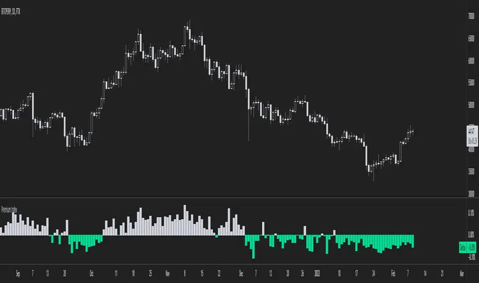
Binance Premium IndexCONCEPT
An indicator with official Binance premium index data for BTC and a bunch of altcoins.
The premium index is based on the difference in price between the perpetual swap contract last price and the price of a volume weighted spot index.
Simply put: it shows you for each coin whether the spot market is trading higher than the Binance perp or not.
FEATURES
Premium index for:
BTC
ETH
LTC
BNB
ADA
DOGE
DOT
UNI
SOL
LINK
There's also an average premium based on the premiums of all these coins combined.
You can also choose in the settings to display all the premiums at the same time.
This makes it easy to find outliers.
There are two extra features that need some explaining.
First of all: the clamp.
It doesn't happen often, but sometimes as a result of massive liquidation cascades there's temporarily a huge spot premium (or derivs premium, but usually spot premium).
In such a scenario the value of the premium dwarfs all other historical data and the indicator becomes nearly unreadable.
The clamp option allows you to put a cap on how extreme the values can get so that the indicator becomes easier to read again.
In the settings you can also change what you want the max value to be.
When you select the option that shows all premiums you'll definitely run into this problem as well.
But you can put a clamp on these too.
The second option is more straight forward: smoothing.
The premium can sometimes be a bit all over the place. It's possible to display the data as a smoothed moving average.
Here's an example of the raw data of the global average premium.
Now with smoothing. Looks a lot more clean.
TRADING
This premium index data is what the funding rate is based on.
Thus it has a direct impact on the perpetual swap contract.
If there's a spot premium (negative values in green) funding will be negative and shorts will have to pay longs.
If there's a derivatives premium (positive values in grey) funding will be positive and longs will have to pay shorts.
Simply put, a spot premium is usually bullish and a derivatives premium is usually bearish.
A lot of people look at this stuff when it comes to bitcoin, but for altcoins it's also definitely relevant.
So here's an indicator with the premium index for 10 different coins.
I don't use more than 10 coins because otherwise the indicator will become very slow.
If you want access to the indicator send me a private message so we can discuss it.
Cheers.
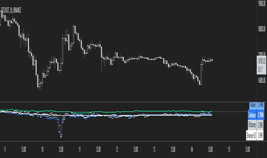
MarketsCONCEPT
This indicator gives a clean overview of how markets are trading relatively to each other.
The line in the middle represents a global market average price (a combination of spot and perpetuals).
The dots, which represent individual markets, float around that line.
This way you can easily tell which markets are more expensive (or cheaper) than others.
Markets used:
Coinbase spot (USD)
Bitfinex spot (USD)
Binance spot (USDT)
FTX spot (USDT)
Bitmex perp (coin margin)
Bybit perp (coin margin)
Binance perp (dollar margin)
FTX perp (dollar margin)
The indicator works for both BTC and ETH.
FEATURES
Markets
The main use is to see if spot exchanges are trading above or below derivatives exchanges.
You'll notice that usually when bottoms form it's when derivs start trading below the market average and spot above.
It's considered bearish when derivs trade way above the market average. It's quite normal that derivs trade a little bit above baseline but if they trade pretty far above spot it becomes worrisome.
I personally think it's most useful on lower timeframes like the 4h or 1h, but it works the same on all timeframes.
Distortion
There's also a distortion metric which shows how big the spread is between all exchanges.
Normally speaking all exchange prices trade very closely together, but sometimes the market gets more turbulent and then prices move apart.
The higher the distortion levels the more turbulent the market.
It's interesting to look at once in a while but it's probably not very useful for trading.
I have noticed though that high distortion usually happens after a violent drop and it often marks bottoms.
But then the obvious question is "what is high distortion" and I can't give you an answer because it varies.
In this screenshot I used ohlc4 for the candle source.
Both
You can also choose for the indicator to show both the markets and the distortion at the same time.
All spot markets are green and all derivatives are grey because that's just the theme I use, but you can change the colours in the settings.
You can choose the candle source as well. By default it's set on candle close prices (which makes the most sense in my opinion).
TRADING
Like I already mentioned, the indicator's main purpose is to show you how individual markets are trading relatively to the global market average price.
The most important aspect of it is to see if spot markets are trading higher than derivs. Spot trading above the average while derivs trade below is usually bullish.
Local bottoms often print when spot trading significantly above the rest.
You can also use the indicator to identify arbitrage opportunities because some times there's one market that suddenly starts trading way above or below every other market.
This is obviously a more niche use case of course.
If you want access to this indicator send me a private message so we can discuss it.
Cheers.

Aggregated Perpetuals VolumeCONCEPT
An aggregated crypto perpetual swap contracts volume indicator that works both for BTC and ETH.
The volume is denominated in USD.
FEATURES
It shows the combined perpetuals volume of 6 of the most prominent derivatives exchanges in crypto, which can be displayed in 4 different ways.
Exchanges used:
Binance (USDT)
Huobi (USD)
Bybit (USD)
FTX (USD)
Bitmex (XBT)
Deribit (USD)
In the settings you can choose to exclude certain exchanges and then that volume is removed from the calculation.
There are 4 different display modes.
stacked
Index
Normal
Delta
For more info check out the spot volume version of this indicator:
TRADING
This is indicator is pretty straight forward... It's volume .
The cool thing about this indicator is that it shows combined volume of a couple of the most important crypto exchanges and it can be displayed in multiple different ways and it works both for bitcoin and ethereum .
It's free so if you add it to your favourites you can start using it right away (it's possible that you'll have to refresh Tradingview before it actually works).
Cheers.

Aggregated Spot VolumeCONCEPT
An aggregated crypto spot volume indicator that works both for BTC and ETH.
FEATURES
It shows the combined volume of 6 of the most prominent exchanges in crypto, which can be displayed in 4 different ways.
Exchanges used:
Binance (USDT)
Okex (USDT)
Huobi (USDT)
Coinbase (USD)
Bitfinex (USD)
FTX (USD)
In the settings you can choose to exclude certain exchanges and then that volume is removed from the calculation.
There are 4 different display modes.
Stacked
This stacks the volume so that you can see exactly which portion of each volume bar each exchange is responsible for.
Index
The indexed format shows you percentage wise the volume of each exchange so that it's even more clear which exchanges are more dominant.
Normal
For the people who like classic volume bars, but still want to use aggregated volume.
Delta
The delta separates buy volume and sell volume.
It's a fun way to display the volume, but take this one with a grain of salt because on Tradingview we can't actually see the exact difference between market buys and sell.
This delta counts a positive candle close as "up" volume and a negative candle close as "down" volume.
TRADING
This is indicator is pretty straight forward... It's volume.
The cool thing about this indicator is that it shows combined volume of a couple of the most important crypto exchanges and it can be displayed in multiple different ways and it works both for bitcoin and ethereum.
It's free so if you add it to your favourites you can start using it right away (it's possible that you'll have to refresh Tradingview before it actually works).
Cheers.

Tether DataCONCEPT
A toolkit with a bunch of different metrics for the widely used stablecoin called tether (USDT).
It's very easy to use, just select in the settings what data you want to look at.
FEATURES
Value index.
The "index" setting shows a volume weighted index of different exchanges to give the most accurate average USDT/USD price.
Market cap.
Very straight forward. This shows you the current tether market cap.
Market cap changes.
This gives you a better visualization of increases (or sometimes decreases) in the tether market cap.
Dominance
This shows tether dominance in the market, same concept as bitcoin dominance.
It compares the USDT mcap to the total crypto mcap and then shows the dominance percentage wise.
It's considered bearish when USDT dominance goes up because it means people want to get out of coins and flee to something more stable.
BTC buying power.
This compares the tether market cap and compares it to the bitcoin market cap to give you an idea of how much BTC buying power has in theory.
The higher this ratio the more bitcoin could be bought with all the tether available.
You'll notice that this often looks very similar to the dominance metric.
Exchanges.
The tether price of multiple exchanges.
In the settings you can select which ones you want the indicator to show.
TRADING
I can't tell you exactly how useful this indicator is for trading, I don't have strong opinions on it.
Some people think a high tether price and dominance is bearish.
Some think the market cap increasing (because of new prints) is bullish.
The buying power metric can give you an idea of how much dry powder there is in the market.
The exchanges metric shows you where you can get the cheapest USDT...
Just some ideas.
This indicator is free so if you add it to your favourites you can start using it immediately (it's possible that you have to refresh Tradingview before it actually works).
Source code is visible for learning purposes.
Cheers.
B1rd's Puell MultipleThis metric looks at the supply side of Bitcoin's economy - bitcoin miners and their revenue.
It explores market cycles from a mining revenue perspective. Bitcoin miners are sometimes referred to as compulsory sellers due to their need to cover fixed costs of mining hardware in a market where price is extremely volatile. The revenue they generate can therefore influence price over time.
The Puell Multiple is calculated by dividing the daily issuance value of bitcoins (in USD) by the 365-day moving average of daily issuance value.
So far, buying below 0.5 and taking profit above 4.0 has been proven profitable over the years.
This version allows you to expiriment with different moving average types.
I might update this version in the future with more expirimental tools of measurements, I just need some idea's to work with. So feel free to comment on what you'd like to see added to this version.