Shifted Buy PressureDifferentiated Buy Pressure Indicator Documentation
Overview: The Differentiated Buy Pressure indicator is a custom Pine Script™ indicator designed to measure and visualize buy and sell pressure in the market. It calculates buy pressure based on a combination of volume, range, and gap, and provides a differentiated buy pressure which is shifted by 90°, offering predictive insights.
Inputs:
Window Size: The window size for average calculation (default: 20).
Show Overlay: Option to show the price overlay (default: false).
Overlay Boost Factor: Boosting factor for overlaying the price (default: 0.01).
Calculations:
Relative Range: Calculated as (high - low) / close.
Average Range: Simple moving average of the relative range over the specified window.
Average Volume: Simple moving average of the volume over the specified window.
Relative Gap: Calculated as open / close .
Average Gap: Simple moving average of the relative gap over the specified window.
Buy Pressure: Calculated using the formula: buy_pressure = -math.log(relative_range / avg_range * volume / avg_volume * relative_gap / avg_gap)
Differentiated Buy Pressure: Calculated as the difference between the current and previous buy pressure: diff_buy_pressure = buy_pressure - buy_pressure
Plots:
Zero Line: A horizontal line at zero for reference.
Buy Pressure: Plotted in blue, representing the calculated buy pressure.
Differentiated Buy Pressure: Plotted in red, representing the differentiated buy pressure.
Overlay: Optionally plots the price overlay boosted by the differentiated buy pressure.
Labels:
Labels are created to display the buy pressure and differentiated buy pressure values on the chart.
Usage: This indicator helps traders visualize the buy and sell pressure in the market. Positive values indicate buy pressure, while negative values indicate sell pressure. The differentiated buy pressure, shifted by 90°, provides predictive insights into future market movements.
This documentation provides a comprehensive overview of the Differentiated Buy Pressure indicator, explaining its purpose, inputs, calculations, and usage.
Forecasting

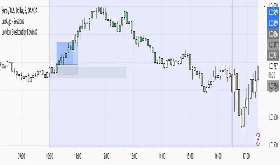
London Breakout by Edwin KPurpose:
The strategy visualizes breakouts based on price action during the London session. It highlights the candles from 09:59 AM to 01:59 PM UTC+3 with different colors depending on whether the price is above or below the high/low from the 10 AM candle.
Key Parts:
Timestamps:
The code defines specific times for the 09:59 AM candle, 10:00 AM candle, and 01:59 PM UTC+3 times.
The timestamp('UTC+3', ...) function creates the timestamps for those moments.
High and Low of the 10 AM Candle:
The high and low of the 10 AM candle are captured and stored in the ten_am_high and ten_am_low variables.
Bullish and Bearish Conditions:
If the price breaks above (bullish_break) or below (bearish_break) the high or low of the 10 AM candle, respectively.
Bar Coloring:
If the conditions are met (price breaking above or below the 10 AM levels), the script colors the candles during the time frame (09:59 AM to 01:59 PM).
Green color is applied for bullish breakouts.
Red color is applied for bearish breakouts.
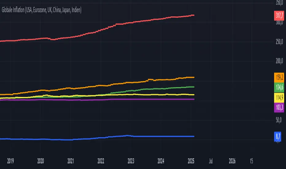
Global Inflation Indicator🔹 Overview:
The Global Inflation Indicator is a macro-analysis tool designed to track and compare inflation trends across major economies. It pulls Consumer Price Index (CPI) data from multiple regions, helping traders and investors analyze how inflation impacts global markets, particularly gold, forex, and commodities.
📊 Key Features:
✅ Tracks inflation in six major economies:
🇺🇸 USA (CPIAUCSL) – Key driver for USD and gold prices
🇪🇺 Eurozone (CPHPTT01EZM659N) – Euro inflation impact
🇬🇧 United Kingdom (GBRCPIALLMINMEI) – GBP & economic trends
🇨🇳 China (CHNCPIALLMINMEI) – Emerging market impact
🇯🇵 Japan (JPNCPIALLMINMEI) – Yen & inflation control policies
🇮🇳 India (INDCPIALLMINMEI) – Key gold-consuming economy
✅ Real-time Inflation Trends:
Provides a visual comparison of inflation levels in different regions.
Helps traders identify inflationary cycles & their effect on global assets.
✅ Macro-Driven Trading Decisions:
Gold & Forex Correlation: High inflation may increase demand for gold.
Interest Rate Expectations: Central banks respond to inflation shifts.
Currency Strength: Inflation impacts USD, EUR, GBP, JPY, CNY, INR.
📉 How to Use It:
Gold traders can assess inflation trends to predict potential price movements.
Forex traders can compare inflation effects on major currency pairs (EUR/USD, USD/JPY, GBP/USD, etc.).
Stock investors can evaluate how inflation affects central bank policies and interest rates.
📌 Conclusion:
The Global Inflation Indicator is a powerful tool for macroeconomic analysis, providing real-time insights into global inflation trends. By integrating this indicator into your gold, forex, and commodity trading strategies, you can make more informed investment decisions in response to economic changes.
Opening ScoreOverview:
The Composite Open Strategy Indicator is designed to provide traders with a unified, early-session directional bias by aggregating multiple non-correlated signals. By combining diverse analytical methods—spanning price action, volume, volatility, and time—the indicator helps you gauge whether the market is leaning bullish or bearish during the critical opening hours.
How It Works:
• Open Range Breakout (ORB) Signal:
The indicator captures the opening range (defined up to a user-specified time, e.g., 9:45 AM ET) and assigns a bullish signal when the price breaks above the high of that range, and a bearish signal when it drops below the low.
• VWAP Signal:
It compares the current price to the Volume Weighted Average Price (VWAP). A price above VWAP suggests buying pressure, while below indicates selling pressure.
• Trend Signal:
Using a simple moving average (with an adjustable period, typically around 20 bars), the indicator determines the prevailing trend. Price above the MA contributes a bullish bias, and price below contributes a bearish bias.
• Volatility Signal:
A volatility filter is applied via the Average True Range (ATR). An increasing ATR relative to the previous bar suggests rising volatility (bullish if combined with upward moves), whereas a decreasing ATR indicates the opposite.
Each of these four signals is assigned an equal weight (modifiable as needed), and their sum forms the composite score.
Display and Timing:
• Separate Panel:
The composite score is plotted as a histogram in its own indicator panel, ensuring your main price chart remains uncluttered.
• Session Filter:
The indicator is active only during the early session—from 9:30 AM to 12:30 PM Eastern Time—when the initial directional move is most relevant. Outside this time window, the indicator remains inactive.
Trading Insights:
• A positive composite score suggests a bullish bias, indicating that the aggregated signals lean toward an upward trend.
• A negative composite score points to a bearish bias, indicating a downward directional outlook.
Usage:
Ideal for traders looking to capture the market’s early trend direction, this indicator can be used as part of a broader strategy. Its design encourages consistency by combining multiple perspectives (price, volume, volatility, time) into one clear signal, allowing you to focus on setups that align with the dominant early-session move.
Before fully automating your trading approach, you can test and refine this composite method on TradingView using the built-in manual review process. Once confident in its performance, further automation can help integrate this directional bias seamlessly into your overall trading strategy.

Averaged Stochastic RSI by TenozenSimplicity beats everything! Averaged Stochastic RSi is calculated using the 2 points of stochastic of the RSI, where the difference is by 2 (larger), and averaged out the stochastic's values. In result it is less noisy and more responsive towards the market's momentum.
I hope you guys find this indicator useful! So far this is the best indicator I ever had! And I also learned that simplicity is better than complex blurry/abstract problems. Ciao!

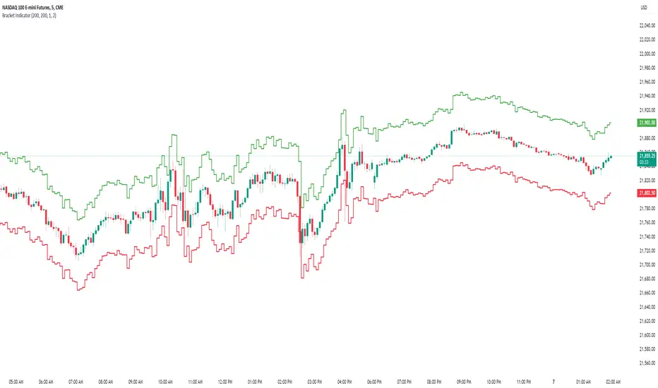
Bracket IndicatorThis is an indicator that shows tick target above and below the chart. Allows for visualizing continual bracket target moving with price before getting into trade.
So, for example, if you are watching price and wanting to target 10 points above or below. You can set this bracket indicator on the chart and you will be able to in real time see 10 points above/below the current price.
Share SizeA helpful tool that estimates the amount of times you can trade at your current share size in a small account.
You can adjust the numbers in the settings page!

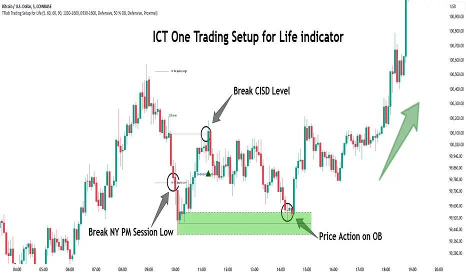
One Trading Setup for Life ICT [TradingFinder] Sweep Session FVG🔵 Introduction
ICT One Trading Setup for Life is a trading strategy based on liquidity and market structure shifts, utilizing the PM Session Sweep to determine price direction. In this strategy, the market first forms a price range during the PM Session (from 13:30 to 16:00 EST), which includes the highest high (PM Session High) and lowest low (PM Session Low).
In the next session, the price first touches one of these levels to trigger a Liquidity Hunt before confirming its trend by breaking the Change in State of Delivery (CISD) Level. After this confirmation, the price retraces toward a Fair Value Gap (FVG) or Order Block (OB), which serve as the best entry points in alignment with liquidity.
In financial markets, liquidity is the primary driver of price movement, and major market participants such as institutional investors and banks are constantly seeking liquidity at key levels. This process, known as Liquidity Hunt or Liquidity Sweep, occurs when the price reaches an area with a high concentration of orders, absorbs liquidity, and then reverses direction.
In this setup, the PM Session range acts as a trading framework, where its highs and lows function as key liquidity zones that influence the next session’s price movement. After the New York market opens at 9:30 EST, the price initially breaks one of these levels to capture liquidity.
However, for a trend shift to be confirmed, the CISD Level must be broken.
Once the CISD Level is breached, the price retraces toward an FVG or OB, which serve as optimal trade entry points.
Bullish Setup :
Bearish Setup :
🔵 How to Use
In this strategy, the PM Session range is first identified, which includes the highest high (PM Session High) and lowest low (PM Session Low) between 13:30 and 16:00 EST. In the following session, the price touches one of these levels for a Liquidity Hunt, followed by a break of the Change in State of Delivery (CISD) Level. The price then retraces toward a Fair Value Gap (FVG) or Order Block (OB), creating a trading opportunity.
This process can occur in two scenarios : bearish and bullish setups.
🟣 Bullish Setup
In a bullish scenario, the PM Session High and PM Session Low are identified. In the following session, the price first breaks the PM Session Low, absorbing liquidity. This process results in a Fake Breakout to the downside, misleading retail traders into taking short positions.
After the Liquidity Hunt, the CISD Level is broken, confirming a trend reversal. The price then retraces toward an FVG or OB, offering an optimal long entry opportunity.
The initial take-profit target is the PM Session High, but if higher timeframe liquidity levels exist, extended targets can be set.
The stop-loss should be placed below the Fake Breakout low or the first candle of the FVG.
🟣 Bearish Setup
In a bearish scenario, the market first defines its PM Session High and PM Session Low. In the next session, the price initially breaks the PM Session High, triggering a Liquidity Hunt. This movement often causes a Fake Breakout, misleading retail traders into taking incorrect positions.
After absorbing liquidity, the CISD Level breaks, indicating a shift in market structure. The price then retraces toward an FVG or OB, offering the best short entry opportunity.
The initial take-profit target is the PM Session Low, but if additional liquidity exists on higher timeframes, lower targets can be considered.
The stop-loss should be placed above the Fake Breakout high or the first candle of the FVG.
🔵 Setting
CISD Bar Back Check : The Bar Back Check option enables traders to specify the number of past candles checked for identifying the CISD Level, enhancing CISD Level accuracy on the chart.
Order Block Validity : The number of candles that determine the validity of an Order Block.
FVG Validity : The duration for which a Fair Value Gap remains valid.
CISD Level Validity : The duration for which a CISD Level remains valid after being broken.
New York PM Session : Defines the PM Session range from 13:30 to 16:00 EST.
New York AM Session : Defines the AM Session range from 9:30 to 16:00 EST.
Refine Order Block : Enables finer adjustments to Order Block levels for more accurate price responses.
Mitigation Level OB : Allows users to set specific reaction points within an Order Block, including: Proximal: Closest level to the current price. 50% OB: Midpoint of the Order Block. Distal: Farthest level from the current price.
FVG Filter : The Judas Swing indicator includes a filter for Fair Value Gap (FVG), allowing different filtering based on FVG width: FVG Filter Type: Can be set to "Very Aggressive," "Aggressive," "Defensive," or "Very Defensive." Higher defensiveness narrows the FVG width, focusing on narrower gaps.
Mitigation Level FVG : Like the Order Block, you can set price reaction levels for FVG with options such as Proximal, 50% OB, and Distal.
Demand Order Block : Enables or disables bullish Order Block.
Supply Order Block : Enables or disables bearish Order Blocks.
Demand FVG : Enables or disables bullish FVG.
Supply FVG : Enables or disables bearish FVGs.
Show All CISD : Enables or disables the display of all CISD Levels.
Show High CISD : Enables or disables high CISD levels.
Show Low CISD : Enables or disables low CISD levels.
🔵 Conclusion
The ICT One Trading Setup for Life is a liquidity-based strategy that leverages market structure shifts and precise entry points to identify high-probability trade opportunities. By focusing on PM Session High and PM Session Low, this setup first captures liquidity at these levels and then confirms trend shifts with a break of the Change in State of Delivery (CISD) Level.
Entering a trade after a retracement to an FVG or OB allows traders to position themselves at optimal liquidity levels, ensuring high reward-to-risk trades. When used in conjunction with higher timeframe bias, order flow, and liquidity analysis, this strategy can become one of the most effective trading methods within the ICT Concept framework.
Successful execution of this setup requires risk management, patience, and a deep understanding of liquidity dynamics. Traders can enhance their confidence in this strategy by conducting extensive backtesting and analyzing past market data to optimize their approach for different assets.
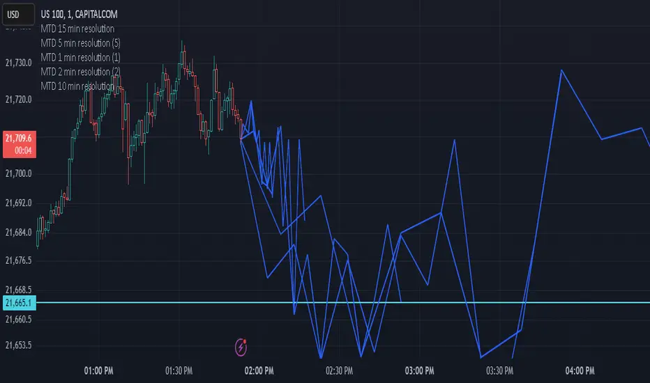
Multi-timeframe Difference Forecast (MTD)Description:
The Multi-timeframe Difference Forecast indicator projects potential future price levels by comparing open prices across multiple timeframe pairs. It uses 12 predefined timeframe pairs where each pair consists of a lower and a higher timeframe. For each pair, the indicator calculates a forecast value by adding the difference between the lower timeframe’s open and the higher timeframe’s open to the current bar’s close. These forecast values are then plotted as points into the future and connected by blue line segments, forming a continuous projection line on your chart.
How It Works:
Timeframe Pairs:
The indicator defines 12 pairs. For example:
Pair 1: Lower timeframe = 15 minutes; Higher timeframe = 150 minutes
Pair 2: Lower timeframe = 30 minutes; Higher timeframe = 165 minutes
⋮
Pair 12: Lower timeframe = 180 minutes; Higher timeframe = 720 minutes
Forecast Calculation:
For each pair, the forecast is computed as:
forecast = close + (lower timeframe open - higher timeframe open)
This produces a series of forecast values that are then plotted on the chart.
Time Offset:
Each forecast point is offset into the future by a number of bars calculated as the ratio between the lower timeframe’s duration (in seconds) and the current chart’s timeframe (in seconds). This adjustment helps align the forecast points correctly on the time axis.
Visualization:
The indicator draws blue lines (width = 2) connecting the current price to each forecast point sequentially, forming a polyline that visually represents the projected price trajectory.
How to Use:
Overlay on Chart:
Apply this indicator to any chart, and it will automatically overlay the forecast line on your current price chart.
Timeframe Flexibility:
The calculations adjust to the chart’s timeframe, so you can use it on various timeframes without needing to change the code.
Interpretation:
The forecast line is intended to provide a visual estimate of potential future price movement based on historical open price differences. It is meant to serve as an additional analytical tool rather than a standalone trading signal.
Disclaimer:
This script is provided for educational and informational purposes only and should not be construed as financial or trading advice. Trading involves significant risk, and past performance is not indicative of future results. You should perform your own analysis and consult with a qualified professional before making any trading decisions. Use this indicator at your own risk.
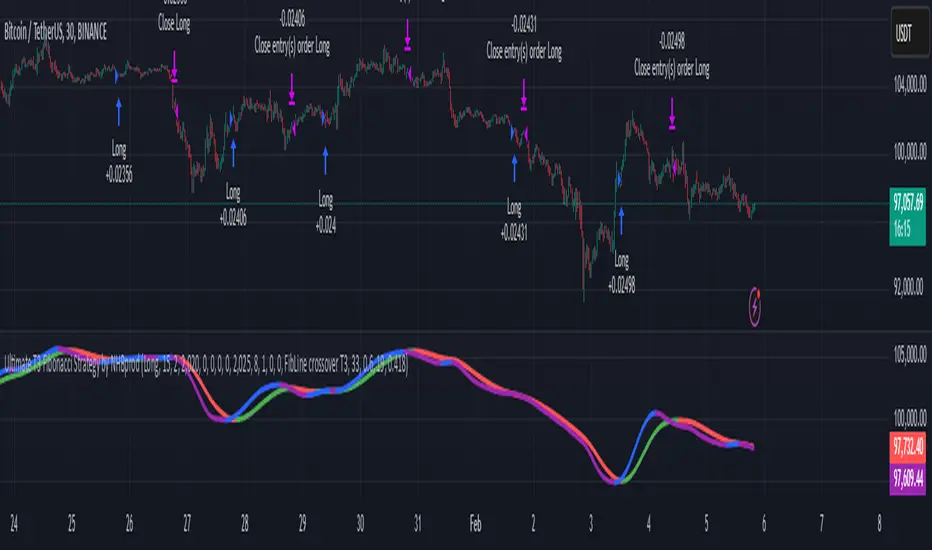
Ultimate T3 Fibonacci for BTC Scalping. Look at backtest report!Hey Everyone!
I created another script to add to my growing library of strategies and indicators that I use for automated crypto trading! This strategy is for BITCOIN on the 30 minute chart since I designed it to be a scalping strategy. I calculated for trading fees, and use a small amount of capital in the backtest report. But feel free to modify the capital and how much per order to see how it changes the results:)
It is called the "Ultimate T3 Fibonacci Indicator by NHBprod" that computes and displays two T3-based moving averages derived from price data. The t3_function calculates the Tilson T3 indicator by applying a series of exponential moving averages to a combined price metric and then blending these results with specific coefficients derived from an input factor.
The script accepts several user inputs that toggle the use of the T3 filter, select the buy signal method, and set parameters like lengths and volume factors for two variations of the T3 calculation. Two T3 lines, T3 and T32, are computed with different parameters, and their colors change dynamically (green/red for T3 and blue/purple for T32) based on whether the lines are trending upward or downward. Depending on the selected signal method, the script generates buy signals either when T32 crosses over T3 or when the closing price is above T3, and similarly, sell signals are generated on the respective conditions for crossing under or closing below. Finally, the indicator plots the T3 lines on the chart, adds visual buy/sell markers, and sets alert conditions to notify users when the respective trading signals occur.
The user has the ability to tune the parameters using TP/SL, date timerames for analyses, and the actual parameters of the T3 function including the buy/sell signal! Lastly, the user has the option of trading this long, short, or both!
Let me know your thoughts and check out the backtest report!
Combined SmartComment & Dynamic S/R LevelsDescription:
The Combined SmartComment & Dynamic S/R Levels script is designed to provide valuable insights for traders using TradingView. It integrates dynamic support and resistance levels with a powerful Intelligent Comment system to enhance decision-making. The Intelligent Comment feature generates market commentary based on key technical indicators, delivering real-time actionable feedback that helps optimize trading strategies.
Intelligent Comment Feature:
The Intelligent Comment function continuously analyzes market conditions and offers relevant insights based on combinations of various technical indicators such as RSI, ATR, MACD, WMA, and others. These comments help traders identify potential price movements, highlighting opportunities to buy, sell, or wait.
Examples of the insights provided by the system include:
RSI in overbought/oversold and price near resistance/support: Indicates potential price reversal points.
Price above VAH and volume increasing: Suggests a strengthening uptrend.
Price near dynamic support/resistance: Alerts when price approaches critical support or resistance zones.
MACD crossovers and RSI movements: Provide signals for potential trend shifts or continuations.
Indicators Used:
RSI (Relative Strength Index)
ATR (Average True Range)
MACD (Moving Average Convergence Divergence)
WMA (Weighted Moving Average)
POC (Point of Control)
Bollinger Bands
SuperSignal
Volume
EMA (Exponential Moving Average)
Dynamic Support/Resistance Levels
How It Works:
The script performs real-time market analysis, assessing multiple technical indicators to generate Intelligent Comments. These comments provide traders with timely guidance on potential market movements, assisting with decision-making in a dynamic market environment. The script also integrates dynamic support and resistance levels to further enhance trading accuracy.

GOLD Volume-Based Entry StrategyShort Description:
This script identifies potential long entries by detecting two consecutive bars with above-average volume and bullish price action. When these conditions are met, a trade is entered, and an optional profit target is set based on user input. This strategy can help highlight momentum-driven breakouts or trend continuations triggered by a surge in buying volume.
How It Works
Volume Moving Average
A simple moving average of volume (vol_ma) is calculated over a user-defined period (default: 20 bars). This helps us distinguish when volume is above or below recent averages.
Consecutive Green Volume Bars
First bar: Must be bullish (close > open) and have volume above the volume MA.
Second bar: Must also be bullish, with volume above the volume MA and higher than the first bar’s volume.
When these two bars appear in sequence, we interpret it as strong buying pressure that could drive price higher.
Entry & Profit Target
Upon detecting these two consecutive bullish bars, the script places a long entry.
A profit target is set at current price plus a user-defined fixed amount (default: 5 USD).
You can adjust this target, or you can add a stop-loss in the script to manage risk further.
Visual Cues
Buy Signal Marker appears on the chart when the second bar confirms the signal.
Green Volume Columns highlight the bars that fulfill the criteria, providing a quick visual confirmation of high-volume bullish bars.
Works fine on 1M-2M-5M-15M-30M. Do not use it on higher TF. Due the lack of historical data on lower TF, the backtest result is limited.

Dynamic 200 EMA with Trend-Based ColoringDescription:
This script plots the 200-period Exponential Moving Average (EMA) and dynamically changes its color based on the trend direction. The script helps traders quickly identify whether the price is above or below the 200 EMA, which is widely used as a long-term trend indicator.
How It Works:
The script calculates the 200 EMA based on the closing price.
If the price is above the EMA, it suggests a bullish trend, and the EMA line turns green.
If the price is below the EMA, it suggests a bearish trend, and the EMA line turns red.
An optional background color is added to enhance visual clarity, highlighting the current trend direction.
Use Cases:
Trend Confirmation: Helps traders determine if the overall trend is bullish or bearish.
Support and Resistance: The 200 EMA is often used as dynamic support/resistance.
Entry & Exit Signals: Traders can use crossovers with the 200 EMA as potential trade signals.
This script is designed for traders looking for a simple yet effective way to incorporate trend visualization into their charts. It is fully open-source and can be customized to fit individual trading strategies.

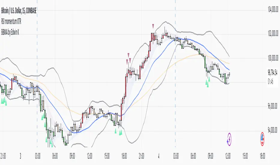
RSI XTR with selective candle color by Edwin KThis tradingView indicator named "RSI XTR with selective candle color", which modifies the candle colors on the chart based on RSI (Relative Strength Index) conditions. Here's how it works:
- rsiPeriod: Defines the RSI calculation period (default = 5).
- rsiOverbought: RSI level considered overbought (default = 70).
- rsiOversold: RSI level considered oversold (default = 30).
- These values can be modified by the user in the settings.
RSI Calculation
- Computes the RSI value using the ta.rsi() function on the closing price (close).
- The RSI is a momentum indicator that measures the magnitude of recent price changes.
Conditions for Candle Coloring
- when the RSI is above the overbought level.
- when the RSI is below the oversold level.
How It Works in Practice
- When the RSI is above 70 (overbought) → Candles turn red.
- When the RSI is below 30 (oversold) → Candles turn green.
- If the RSI is between 30 and 70, the candle keeps its default color.
This helps traders quickly spot potential reversal zones based on RSI momentum.
EMA & Bollinger BandsThis indicator combines three main functionalities into a single script:
1. Exponential Moving Average (EMA):
- Purpose: Calculates and plots the EMA of a chosen price source.
- Inputs:
- EMA Length: The period for the EMA calculation.
- EMA Source: The price series (such as close) used for the EMA.
- EMA Offset: Allows shifting the EMA line left or right on the chart.
- Output: A blue-colored EMA line plotted on the chart.
2. Smoothing MA on EMA:
- Purpose: Applies a secondary moving average (MA) on the previously calculated EMA. There is also an option to overlay Bollinger Bands on this smoothed MA.
- Inputs:
- Smoothing MA Type: Options include "None", "SMA", "SMA + Bollinger Bands", "EMA", "SMMA (RMA)", "WMA", and "VWMA".
- Selecting "None" disables this feature.
- Choosing "SMA + Bollinger Bands" will additionally plot Bollinger Bands around the smoothed MA.
- Smoothing MA Length: The period used to calculate the smoothing MA.
- BB StdDev for Smoothing MA: The standard deviation multiplier for the Bollinger Bands (applies only when "SMA + Bollinger Bands" is selected).
- Calculation Details:
- The chosen MA type is applied to the EMA value.
- If Bollinger Bands are enabled, the script computes the standard deviation of the EMA over the smoothing period, multiplies it by the specified multiplier, and then plots an upper and lower band around the smoothing MA.
- Output:
- A yellow-colored smoothing MA line.
- Optionally, green-colored upper and lower Bollinger Bands with a filled background if the "SMA + Bollinger Bands" option is selected.
3. Bollinger Bands on Price:
- Purpose: Independently calculates and plots traditional Bollinger Bands based on a moving average of a selected price source.
- Inputs:
- BB Length: The period for calculating the moving average that serves as the basis of the Bollinger Bands.
- BB Basis MA Type: The type of moving average to use (options include SMA, EMA, SMMA (RMA), WMA, and VWMA).
- BB Source: The price series (such as close) used for the Bollinger Bands calculation.
- BB StdDev: The multiplier for the standard deviation used to calculate the upper and lower bands.
- BB Offset: Allows shifting the Bollinger Bands left or right on the chart.
- Calculation Details:
- The script computes a basis line using the selected MA type on the chosen price source.
- The standard deviation of the price over the specified period is then multiplied by the provided multiplier to determine the distance for the upper and lower bands.
- Output:
- A basis line (typically drawn in a blue tone), an upper band (red), and a lower band (teal).
- The area between the upper and lower bands is filled with a semi-transparent blue background for easier visualization.
---
How It Works Together
- Integration:
The script is divided into clearly labeled sections for each functionality. All parts are drawn on the same chart (overlay mode enabled), providing a comprehensive view of market trends.
- Customization:
Users can adjust parameters for the EMA, the smoothing MA (and its optional Bollinger Bands), as well as the traditional Bollinger Bands independently. This allows for flexible customization depending on the trader's strategy or visual preference.
- Utility:
Combining these three analyses into one indicator enables traders to view:
- The immediate trend via the EMA.
- A secondary smoothed trend that might help reduce noise.
- A volatility measure through Bollinger Bands on both the price and the smoothed EMA.
---
This combined indicator is useful for technical analysis by providing both trend-following (EMA and smoothing MA) and volatility indicators (Bollinger Bands) in one streamlined tool.

John Bob-Trading-BotDeveloped by Ayebale John Bob with the help of his bestie, this innovative strategy combines advanced Smart Money Concepts with practical risk management tools to help traders identify and capitalize on key market moves.
Key Features:
Smart Money Concepts & Fair Value Gaps (FVG):
The strategy monitors price action for fair value gaps, which are visualized as extremely faint horizontal lines on the chart. These FVGs signal potential areas where institutional traders might have entered or exited positions.
Dynamic Entry Signals:
Buy signals are triggered when the price crosses above the 50-bar lowest low or when a bullish FVG is detected. Conversely, sell signals are generated when the price falls below the 50-bar highest high or a bearish FVG is identified. Each signal is visually marked on the chart with clear buy (green) and sell (red) labels.
Multi-Level Order Execution:
Once an entry signal occurs, the strategy places five separate orders, each with its own take-profit (TP) level. The TP levels are calculated dynamically using the Average True Range (ATR) and a set of predefined multipliers. This allows traders to scale out of positions as the market moves favorably.
Dynamic Risk Management:
A stop-loss is automatically set at a distance determined by the ATR, ensuring that risk is managed in accordance with current market volatility.
Real-Time Trade Information Table:
In the bottom-right corner of the chart, a trade information table displays essential details about the current trade:
Side: Displays "BUY NOW" (with a dark green background) for long entries or "SELL NOW" (with a dark red background) for short entries.
Entry Price & Stop-Loss: Shows the entry price (highlighted in green) and the corresponding stop-loss level (highlighted in red).
Take-Profit Levels: Lists the five TP levels, each of which turns green once the market price reaches that target.
Timer: A live timer in minutes counts from the moment the current trade trigger started, helping traders track the duration of their active trades.
Visual Progress Bar:
A histogram-style progress bar is plotted on the chart, visually representing the percentage gain (or loss) relative to the entry price.
This strategy was meticulously designed to incorporate both technical analysis and smart risk management, offering a robust trading solution that adapts to changing market conditions. Whether you're a seasoned trader or just starting out, the AyebaleJohnBob Trading Bot equips you with the tools and visual cues needed to make well-informed trading decisions. Enjoy a seamless blend of strategy and style—crafted with passion by Ayebale John Bob and his bestie!
