Larry Williams COT Analysis Enhanced [tradeviZion]Larry Williams COT Analysis Enhanced - Complete Description
📖 Introduction
Welcome to the Larry Williams COT Analysis Enhanced indicator. This comprehensive description explains every setting, feature, and capability of this advanced Commitments of Traders (COT) analysis tool.
This indicator implements Larry Williams' professional COT analysis methodology with enhanced features including statistical validation, combination analysis, and adaptive signal generation.
---
🎯 Quick Start
Add the indicator to your chart
The script will automatically detect your symbol's CFTC code and asset type
Review the main COT analysis table (displayed by default)
Customize settings based on your trading style
Review the Trading Edge & Signals section for signal information
---
⚙️ Settings Groups Overview
The indicator is organized into 9 logical groups of settings:
1. Core COT Settings - Data source and report configuration
2. Analysis Parameters - Calculation methods and lookback periods
3. Signal Generation - Buy/sell signals and trend weighting
4. Plot Display Settings - Visual customization of chart lines
5. Smoothing Settings - Data smoothing options
6. COT Proximity Index Settings - Price-based proxy indicator configuration
7. Common Table Settings - Shared table appearance
8. Main Table Display Settings - Main analysis table customization
9. Historical Comparison Settings - Historical data table configuration
---
📋 Group 1: Core COT Settings
COT Report Type
Options: Legacy | Disaggregated | Financial
What it is: Selects the type of COT report data to analyze.
Legacy - Traditional COT report format. Recommended for most users. Uses "Commercial Positions" and "Noncommercial Positions" metrics. Shows Commercial, Non-Commercial, and Small Speculator positions in the classic format.
Commercials: "Commercial Positions"
Speculators: "Noncommercial Positions"
Small Specs: "Nonreportable Positions"
Disaggregated - Separates managed money from other speculators. Uses different metrics than Legacy format.
Commercials: "Producer Merchant Positions"
Speculators: "Managed Money Positions"
Small Specs: "Nonreportable Positions"
Important: When using Disaggregated report type, the table will still show "Non-Comm" as the label, but the data displayed is actually " Managed Money Positions " (hedge funds and CTAs). The underlying data changes based on your report type selection, even though the table label remains "Non-Comm" for consistency.
Where you'll see this data:
📊 Current Positions section - The "Non-Comm" row shows Managed Money long, short, and net positions
📊 Open Interest Analysis section - "Non-Comm" net changes reflect Managed Money position changes
📈 Analysis section - "Non-Comm" percentile and LW Index values are calculated from Managed Money positions
Chart plots - The blue "Non-Commercial" line shows Managed Money net positions
Useful when you want to analyze hedge funds (Managed Money) separately from other large speculators. The "Commercial" row will show " Producer Merchant Positions " instead of general "Commercial Positions".
Financial - Designed for financial instruments (currencies, bonds, stock indices). Uses financial-specific metrics.
Commercials: "Dealer Positions"
Speculators: "Leveraged Funds Positions"
Small Specs: "Nonreportable Positions"
Important: When using Financial report type, the table will still show "Commercial" and "Non-Comm" as labels, but the data displayed is actually " Dealer Positions " (commercials) and " Leveraged Funds Positions " (speculators). The underlying data changes based on your report type selection.
Where you'll see this data:
📊 Current Positions section - "Commercial" row shows Dealer long/short/net, "Non-Comm" row shows Leveraged Funds positions
📊 Open Interest Analysis section - Net changes reflect Dealer and Leveraged Funds position changes
📈 Analysis section - Percentile and LW Index values are calculated from Dealer and Leveraged Funds positions
Chart plots - Lines show Dealer and Leveraged Funds net positions
Use this for currency futures, bond futures, and stock index futures.
Trading Use: Most traders use Legacy as it provides the most comprehensive view and works with all asset types. Switch to Disaggregated if you want to analyze managed money positions separately. Use Financial specifically for financial instruments (currencies, bonds, stock indices).
---
Include Options Data
Default: Off (false)
What it is: Toggles whether to include options positions in addition to futures positions.
Trading Use: Larry Williams observed no significant difference in COT analysis when including options data. Keep this disabled unless you specifically need options data. Most traders leave it off for cleaner analysis.
---
Auto-detect CFTC Code
Default: On (true)
What it is: Automatically finds the correct CFTC code for your symbol.
Trading Use: Keep this enabled unless you need a specific CFTC code. The script automatically detects codes for:
- Currency futures: CME:6E1! , CME:6B1! , CME:6J1!
- Stock index futures: CME_MINI:ES1! , CBOT_MINI:YM1! , CME_MINI:NQ1!
- Commodities: NYMEX:CL1! , COMEX:GC1! , CBOT:ZC1!
- And many more
Only disable if you're analyzing a symbol that requires a specific CFTC code not in the auto-detection database.
---
Manual CFTC Code
Default: Empty
What it is: Enter a specific CFTC code manually (e.g. for E-mini S&P 500). "13874+"
Trading Use: Only used when Auto-detect CFTC Code is disabled. Most users never need this setting.
---
📊 Group 2: Analysis Parameters
Display Mode
Options: COT Report | COT Index | COT Proximity Index
What it is: Controls what data is displayed on the chart and in the table.
COT Report - Shows raw position data (Long, Short, Net positions) plus analysis. Best for detailed analysis. Displays Commercial, Non-Commercial, Small Speculator, and Open Interest lines.
COT Index - Shows index values based on your selected Analysis Method (Percentile or LW Index). Best for quick sentiment analysis. Displays index lines for Commercial, Non-Commercial, Small Speculator, and Open Interest. Percentile can exceed 0-100% for extremes, LW Index stays 0-100%.
Percentile can exceed 0-100% for extremes
LW Index stays 0-100%
COT Proximity Index - Shows a price-based proxy indicator. Useful when COT data is delayed or unavailable. Calculates sentiment based on price action patterns.
Trading Use:
- Use COT Report for comprehensive analysis
- Use COT Index when you want to focus on extreme sentiment levels
- Use COT Proximity Index as a backup when COT data is delayed or unavailable.
---
Analysis Method
Options: Percentile | LW Index
What it is: Selects the calculation method for position rankings.
Percentile - Professional approach. Excludes current bar from range calculation. Can show extremes (>100% or <0%) when today's value breaks historical range. More sensitive to recent extremes.
LW Index - Original Larry Williams method. Includes current bar in range, always 0-100%. Traditional approach.
Trading Use:
Percentile - Better for catching new extremes and recent market shifts
LW Index - Better for traditional Larry Williams analysis
Most traders prefer Percentile for its ability to show when positions break historical ranges.
---
Lookback Mode
Options: Auto | Manual
What it is: Controls how the historical lookback period is determined.
Auto - Automatically sets lookback period based on detected asset type
Manual - Choose your own lookback period
Trading Use: Use Auto unless you have a specific reason to customize. The script automatically sets optimal periods:
Currencies: 26 weeks
Metals: 13 weeks
Grains: 26 weeks
Stocks/Indices: 13 weeks
Bonds: 52 weeks
Energies: 13 weeks
---
Manual Lookback Period
Options: 1 Month | 3 Months | 6 Months | 1 Year | 3 Years | Asset-specific presets | Manual
What it is: How far back to look for historical comparison. Only used when Lookback Mode is set to Manual .
---
Manual Lookback Weeks
Default: 18 weeks | Range: 1-500
What it is: Exact number of weeks to look back. Only used when Manual Lookback Period is set to Manual .
Trading Use: Set a custom period if you want precise control. 18 weeks = approximately one quarter (3 months).
---
🎯 Group 3: Signal Generation
Show Signal Arrows
Default: Off (false)
What it is: Displays buy/sell arrows on the chart when extreme positions are detected.
Trading Use: Enable to get visual alerts for signals. Signals use strict multi-factor conditions requiring:
- Commercial extreme positioning
- Speculator positioning alignment
- Open Interest confirmation
- Trend consistency
- And more...
---
Show Background Colors
Default: Off (false)
What it is: Colors the chart background during extreme market conditions.
Trading Use: Enable for visual market state awareness:
- Strong signals = Darker background colors
- Moderate signals = Lighter background colors
- Green background = Bullish extreme
- Red background = Bearish extreme
Useful for quick visual assessment of market conditions.
---
Use Price Trend Weighting
Default: On (true)
What it is: Weights signals based on price trend alignment.
How it works:
Uptrend + Commercials long = Stronger bullish signal
Downtrend + Commercials short = Stronger bearish signal
Counter-trend signals = Harder to trigger (more conservative)
Trading Use: Keep enabled for more reliable signals. Commercials aligned with price trend are historically more accurate.
This feature makes signals easier to trigger when commercials align with the trend and harder when they're counter-trend.
---
Trend MA Period
Default: 40 | Range: 1-200
What it is: Moving average period for price trend detection.
How it works:
Price above MA with the MA rising = Uptrend
Price below MA with the MA declining = Downtrend
---
📈 Group 4: Plot Display Settings
Commercial Line Settings
Default Color: Red | Default Width: 2
What it is: Controls the Commercial traders net position line appearance.
Trading Use: Commercials are considered "smart money." Watch for:
Extreme long positions (high index ≥74%) = Heavy buyers = BULLISH signal
Extreme short positions (low index ≤26%) = Heavy sellers = BEARISH signal
Red is traditional for commercials. When Commercials are heavy buyers (high index), it's a bullish signal. When they're heavy sellers (low index), it's a bearish signal.
---
Non-Commercial Line Settings
Default Color: Blue | Default Width: 2
What it is: Controls the Non-Commercial (Large Speculators) net position line appearance.
Trading Use: Large speculators are often trend-followers. Watch for:
Extreme long = Potential top (contrarian sell signal)
Extreme short = Potential bottom (contrarian buy signal)
They're often wrong at extremes - use as contrarian indicator.
---
Small Speculator Line Settings
Default Color: Green | Default Width: 2
What it is: Controls the Small Speculators net position line appearance.
Trading Use: Small specs are typically wrong at extremes:
Extreme long = Potential top (sell signal)
Extreme short = Potential bottom (buy signal)
Exception: In Meats markets, small specs are accurate (like commercials).
---
Small Speculator Multiplier
Default: 5.0x | Range: 0.1-20.0
What it is: Multiplies Small Speculator PLOTTED values for visual comparison.
Important: This only affects the visual plot line, NOT calculations or table values. Raw values used in all calculations remain unchanged.
Trading Use: Small spec positions are often much smaller than commercials. Use multiplier (default 5.0x) to scale the line for easier visual comparison.
---
Open Interest Line Settings
Default Color: Black | Default Width: 1
What it is: Controls the Open Interest line appearance.
Trading Use: Open Interest shows market participation:
Rising OI = New money entering (confirms trend)
Falling OI = Money leaving (potential reversal)
Watch WHO is driving OI changes - This is critical
---
Scale Open Interest
Default: On (true)
What it is: Scales Open Interest values to fit chart range.
Important: Only affects plotted lines, not table values. Scaling changes based on lookback period:
- Shorter lookback = More compressed range
- Longer lookback = Wider range
Trading Use: Keep enabled for better visual comparison. Disable if you want absolute OI values.
---
Show Reference Lines
Default: Off (false)
What it is: Toggles the display of horizontal reference lines at 0%, 50%, and 100% levels on the chart.
What it shows:
Zero Line (0%) - Dotted gray line at 0% level
Midline (50%) - Solid gray line at 50% level
100 Line (100%) - Dotted gray line at 100% level
Trading Use: Enable when you want visual reference points for:
0% = Extreme bearish positioning
50% = Neutral/middle range
100% = Extreme bullish positioning
---
🔄 Group 5: Smoothing Settings
Smoothing Method
Options: None | SMA | EMA | WMA | RMA
What it is: Selects the moving average type for smoothing data.
None - Use raw data (no smoothing)
SMA - Simple Moving Average (equal weight to all periods)
EMA - Exponential Moving Average (more weight to recent data)
WMA - Weighted Moving Average (linear weighting)
RMA - Relative Moving Average (Wilder's smoothing)
Trading Use:
None - Best for catching extremes quickly
SMA - Most common, balanced smoothing
EMA - More responsive to recent changes
WMA/RMA - Advanced smoothing methods
Smoothing reduces noise but may delay signal detection. Use None for most responsive signals.
---
Smoothing Period
Default: 4 | Range: 2-20
What it is: Number of periods for the moving average smoothing.
Trading Use:
Shorter periods (2-5) = Less smoothing, more responsive
Longer periods (10-20) = More smoothing, less noise
Default 4 = Good balance
Only used when Smoothing Method is not None.
---
Smooth COT Report Plots
Default: Off (false)
What it is: Applies smoothing to COT Report plotted lines (Commercial, Non-Commercial, Small Speculators, Open Interest).
Trading Use: Enable if you want smoother chart lines. Note: Smoothing affects visual display but calculations use raw data unless Smooth COT Index Plots is also enabled.
---
Smooth COT Index Plots
Default: Off (false)
What it is: Applies smoothing to COT Index plotted lines.
Trading Use: Enable if you want smoother index lines. Important : When enabled, smoothed values are used in table displays and signal calculations. This affects the "user-facing" index values shown in the table and used for signals.
---
📊 Group 6: COT Proximity Index Settings
Proximity Length Mode
Options: Auto | Manual
What it is: Controls how the proximity index calculation period is determined.
Auto - Calculates length based on ZigZag patterns (dynamic)
Manual - Uses fixed length setting
Trading Use: Use Auto for adaptive calculation. Use Manual if you want consistent period regardless of market conditions.
---
Manual Proximity Length
Default: 8 bars | Range: 1+
What it is: Fixed number of bars for COT Proximity Index calculation. Only used when Proximity Length Mode is Manual .
Trading Use: Set based on your timeframe. 8 bars works well for weekly chart.
---
Heavy Buyers Level
Default: 74% | Range: 50-100
What it is: COT Index level above which commercials are considered heavy buyers (extreme long positioning).
Trading Use: This threshold is used for:
- Signal generation
- Market state calculation
- Entry level recommendations
Default 74% means commercials are "heavy buyers" when LW Index ≥ 74%.
---
Heavy Sellers Level
Default: 26% | Range: 0-50
What it is: COT Index level below which commercials are considered heavy sellers (extreme short positioning).
Trading Use: This threshold is used for:
- Signal generation
- Market state calculation
- Entry level recommendations
Default 26% means commercials are "heavy sellers" when LW Index ≤ 26%.
---
ZigZag Deviation
Default: 1.0% | Range: 1-100.0
What it is: Minimum price change (%) required to create a new ZigZag pivot point.
Trading Use:
Smaller values = More sensitive, more pivots
Larger values = Less sensitive, fewer pivots
Used for Auto proximity length calculation.
---
ZigZag Depth
Default: 1 | Range: 1+
What it is: Minimum number of bars between pivot points.
Trading Use: Higher values filter out minor pivots. Default 1 captures all significant pivots.
---
Extend ZigZag to Last Bar
Default: Off (false)
What it is: Draws ZigZag lines to the current bar (may show incomplete patterns).
Trading Use: Enable to see current ZigZag pattern, but be aware it may change as new bars form.
---
Show ZigZag Lines
Default: Off (false)
What it is: Displays ZigZag pivot lines on the chart for visual reference.
Trading Use: Enable to see the ZigZag pattern used for proximity index calculation. Useful for understanding how Auto mode works.
---
🎨 Group 7: Common Table Settings
Color Theme
Options: Dark | Light | Midnight Blue | Ocean Blue | Forest Green | Amber Gold | Slate Gray
What it is: Color scheme for both main and historical comparison tables.
Trading Use: Choose based on your preference:
Dark/Light - Classic themes
Midnight Blue - Professional dark theme
Ocean Blue - Calming blue tones
Forest Green - Natural green theme
Amber Gold - Warm gold tones
Slate Gray - Modern gray theme
Theme applies to both tables simultaneously for consistency.
---
📋 Group 8: Main Table Display Settings
Show COT Table
Default: On (true)
What it is: Toggles the main COT analysis table display.
Trading Use: Disable only if you want to use chart plots only. Most traders keep this enabled for comprehensive analysis.
---
Table Mode
Options: Full | Compact
What it is: Controls the detail level of the main table.
Full - Complete analysis table with all sections
Compact - Essential info only (mobile-friendly)
Trading Use:
Full - Desktop trading, comprehensive analysis
Compact - Mobile trading, quick reference
See "Table Modes Explained" section below for details.
---
Table Position
Options: Top Right | Top Left | Bottom Right | Bottom Left | Middle Right | Middle Left
What it is: Position of the main COT analysis table on the chart.
Trading Use: Choose based on your chart layout and preference. Top Right is default and works well for most traders.
---
Table Text Size
Options: Tiny | Small | Normal | Large
What it is: Size of text in the COT analysis table.
---
Section Visibility Controls
All default: On (true)
What it is: Individual toggles to show/hide specific table sections.
⚙️ Settings - Report Type, CFTC Code, Options setting
📊 Current Positions - Long, Short, Net positions for each group
📈 Analysis - LW Index, Percentile, Market State
🎯 Trading Edge & Signals - Current Signal, Entry Level, Best Setup
💡 Trading Tips - Context-aware trading insights
📈 Trend Analysis - Trend Direction, Strength, Cum Change, ROC, vs MA
🔄 Market Maker Activity - Spreading, Activity Level, Trading Edge
Trading Use: Customize your table to show only what you need:
Quick traders - Show only Trading Edge & Signals
Detailed analysis - Show all sections
Mobile users - Hide less critical sections
Each section can be toggled independently for maximum customization.
---
📊 Group 9: Historical Comparison Settings
Show Historical Comparisons
Default: On (true)
What it is: Toggles the historical comparison table display.
Trading Use: This table shows how current positions rank over different time periods (1M, 3M, 6M, 1Y, 3Y, All Time). Very useful for context.
---
Historical Table Mode
Options: Full | Compact
What it is: Controls the detail level of the historical comparison table.
Full - Complete historical comparison with all time periods (1M, 3M, 6M, 1Y, 3Y, All Time) and all COT groups
Compact - Essential periods only (1M, 3M, 6M, 1Y, All Time) showing Commercial % only
Trading Use:
- Full - Comprehensive historical analysis
- Compact - Quick reference, mobile-friendly
---
Table Position (Historical)
Options: Top Right | Top Left | Bottom Right | Bottom Left
What it is: Position of the historical comparison table on the chart.
---
Table Text Size (Historical)
Options: Tiny | Small | Normal | Large
What it is: Size of text in the historical comparison table.
---
Trading Days
Options: Weekdays | 24/7
What it is: How to calculate time periods for historical comparisons.
Weekdays - Calculate based on trading days only (5 days/week)
24/7 - Include all calendar days (7 days/week), Use for 24/7 markets like cryptocurrencies
Used for both main COT data and COT Proximity Index historical comparisons.
---
📊 Table Modes Explained
Full Mode - Main Table
The Full mode displays all available sections:
⚙️ Settings - Report type, CFTC code, options setting
📊 Current Positions - Long, Short, Net for Commercial, Non-Commercial, Small Speculators
📊 Open Interest Analysis - OI value, change, who's driving changes, concentration
📈 Analysis - Percentile ranks, LW Index values, Market State
🎯 Trading Edge & Signals - Current Signal, Entry Level, What to Watch, Best Setup
💡 Trading Tips - Context-aware insights
📈 Trend Analysis - Trend Direction, Strength, Consistency, Cumulative Change, ROC %, vs MA
🔄 Market Maker Activity - Spreading %, Activity Level, Interpretation, Trading Edge
Best for: Desktop trading, comprehensive analysis, detailed market assessment
---
📋 Understanding Each Table Section
This section explains what each part of the main table means and how to use it for trading decisions.
⚙️ Settings Section
Report Type - Shows which COT report format you're using (Legacy, Disaggregated, or Financial). Verify this matches your asset type.
Options - Indicates if options data is included ("Included") or excluded ("Excluded"). Most traders exclude options for cleaner analysis.
CFTC Code - Unique identifier for your futures contract. Shows "Auto" when automatically detected, or displays the manual code if set.
Trading Use: Always verify your CFTC code is correct. Wrong code = wrong data = wrong signals.
---
📊 Current Positions Section
Shows the actual position sizes for each trader group.
What Each Column Means:
Long - Total long contracts held by this group
Short - Total short contracts held by this group
Net - Net position (Long - Short). This is the key number.
How to Interpret:
Commercial Net Position:
- Negative (Net Short) = Commercials expect prices to fall
- Positive (Net Long) = Commercials expect prices to rise
- Commercials are "smart money" - their positioning often precedes major moves
Non-Commercial Net Position:
- Positive (Net Long) = Large speculators bullish
- Negative (Net Short) = Large speculators bearish
- Often trend-followers, can be caught at extremes
Small Spec Net Position:
- Positive (Net Long) = Small traders bullish
- Negative (Net Short) = Small traders bearish
- Often contrarian indicator - wrong at extremes
Trading Edge: Watch for extremes in Commercial net positions. When Commercials are heavy buyers (high index ≥74%), it's a bullish signal. When they're heavy sellers (low index ≤26%), it's a bearish signal.
---
📊 Open Interest Analysis Section
Open Interest - Total number of outstanding contracts. Shows market participation level.
Change - Week-over-week change in Open Interest. Rising OI = new money entering, Falling OI = money leaving.
Net Changes - Shows which group is driving Open Interest changes. This is Larry Williams' most important insight.
🎯 Critical Question: Who is Driving OI Changes?
EXTREMELY BULLISH SIGNAL (Very Rare - Pay Close Attention):
- Commercials driving OI increase + Commercials raising positions + Uptrend market
- Meaning: Smart money (commercials) accumulating long positions while market is rising
- Action: Extremely bullish - very rare setup, pay close attention to this signal
- This is the strongest bullish signal possible
BULLISH SIGNAL (Strong Buy):
- Commercials driving OI increase + Commercials net long
- Meaning: Smart money accumulating long positions
- Action: Strong bullish setup
BEARISH SIGNAL (Strong Sell - Market Topping):
- Commercials exiting + OI increasing due to Small Specs + Non-Commercials
- Meaning: Smart money leaving while speculative money entering
- Action: Market top forming - most likely scenario for bearish reversal
- This indicates speculative excess and potential market top
BEARISH SIGNAL (Speculative Excess):
- Small Specs + Non-Commercials driving OI increase + They are net long
- Meaning: Speculative excess, "dumb money" driving market
- Action: Bearish reversal likely
Trading Use:
- Rising OI = New money entering (confirms trend)
- Falling OI = Money leaving (potential reversal)
- Watch WHO is driving OI changes - This is critical
- When Commercials drive OI increases while raising positions in an uptrend = Extremely bullish and very rare - pay attention
- When Commercials exit while OI increases due to Small Specs and Non-Commercials = Market topping signal
Concentration - Shows how much of the market is controlled by the largest traders:
- Top 4 - Four largest traders' share of total OI
- Top 8 - Eight largest traders' share of total OI
Trading Use: High concentration (>30%) means fewer dominant players, potential for volatility. Low concentration means more distributed positions, healthier market.
---
📈 Analysis Section
Proximity Index (when in COT Proximity Index mode):
- Value: Current proximity index reading (0-100%)
- Length: Number of bars used in calculation
- Status: Heavy Buyers, Heavy Sellers, or Neutral
Analysis Method - Shows whether you're using Percentile or LW Index calculation.
Small Spec Mode - Shows how Small Speculators are interpreted:
- Contrarian (Traditional) - Small specs are wrong at extremes (default)
- Accurate (Meats) - Small specs are accurate like commercials (for Meats markets)
Market State - Overall market sentiment assessment:
- STRONG BULLISH - Multiple factors aligned bullish, strong buy signal
- MODERATE BULLISH - Several bullish factors, moderate buy signal
- LEANING BULLISH - Slight bullish bias, watch for confirmation
- NEUTRAL - Mixed signals, trade with existing trend
- LEANING BEARISH - Slight bearish bias, watch for confirmation
- MODERATE BEARISH - Several bearish factors, moderate sell signal
- STRONG BEARISH - Multiple factors aligned bearish, strong sell signal
Trading Use: Start your analysis here. Market State gives you the overall picture before diving into details.
---
🎯 Trading Edge & Signals Section
Current Signal - Shows which combination is active based on current positioning extremes and its expected accuracy percentage:
- Comm+Spec+OI - All three groups at extremes (highest accuracy)
- Comm+Spec - Commercials and specs at extremes (opposite extremes - Larry Williams' favorite)
- Comm+OI - Commercials and Open Interest at extremes (smart money + participation)
- Commercials - Only Commercials at extreme (smart money indicator)
- Wait - No extremes detected, wait for setup
Entry - Trading signal based on Commercial positioning:
- LONG - Commercials are heavy buyers (≥Heavy Buyers Level), bullish signal
- SHORT - Commercials are heavy sellers (≤Heavy Sellers Level), bearish signal
- Wait - Commercials neutral, no clear signal
Best Setup - Shows the historically highest accuracy combination found in the data:
- Comm+Spec+SmallSpec+OI - All four groups aligned (strongest signal)
- Comm+Spec+OI (All) - Commercials + Speculators + Open Interest aligned
- Comm+Spec+SmallSpec - Commercials + Speculators + Small Specs aligned
- Comm+Spec (Both) - Commercials + Speculators (opposite extremes - Larry Williams' favorite)
- Comm+OI (Both) - Commercials + Open Interest (participation confirms smart money)
- Comm+SmallSpec - Commercials + Small Specs (especially strong in Meats markets)
- Commercials Alone - Commercial positioning only (baseline - smart money indicator)
Trading Use: This is your action center . Focus on Entry signals when Market State confirms. Higher accuracy setups (shown in Best Setup) are more reliable.
---
💡 Trading Tips Section
Context-aware insights based on current market conditions.
What You'll See:
Commercial positioning assessment (extreme long/short, favorable/unfavorable)
Speculator positioning (contrarian support or warning)
Open Interest guidance (who's driving changes)
Trend assessment (aligning or conflicting)
Information about entry timing, position sizing, and confirmation needs
Trading Use: Review these tips when analyzing. They provide context-specific information tailored to current conditions.
---
📈 Trend Analysis Section
Trend Direction - Overall price trend:
- Bullish - Price trending up
- Bearish - Price trending down
- Mixed - No clear direction
Consistency - How stable the trend is:
- Consistent - Trend is stable and maintaining direction
- Mixed - Trend is unstable, direction changing
- Accelerating - Trend is gaining momentum
Strength - Trend intensity:
- Strong - Powerful trend
- Steady - Moderate trend
- Weak - Weak trend
This Week - Net position change this week (percentage).
Cumulative Change - Total net position change over different periods:
- 4W - 4-week cumulative change
- 13W - 13-week cumulative change (one quarter)
- 26W - 26-week cumulative change (half year)
ROC % - Rate of Change percentage over different periods. Shows momentum.
vs MA - Current net position compared to moving average:
- Positive = Above average (strong positioning)
- Negative = Below average (weak positioning)
Trading Use: Align COT signals with trend direction for higher accuracy. When COT signals align with price trend, signals are more reliable. Counter-trend signals require more confirmation.
---
🔄 Market Maker Activity Section
Total Spreading - Percentage of open interest in spread positions (simultaneous long and short in different months).
Percentile - Where current spreading level ranks historically. High percentile = unusual spreading activity.
13W Trend - 13-week trend in spreading activity (+ = increasing, - = decreasing).
Activity Level - Market maker activity intensity:
- High - Very active, expect volatility
- Moderate - Normal activity
- Low - Quiet, less volatility expected
vs 13W Avg - Current activity compared to 13-week average.
Trading Edge - Interpretation of market maker activity:
- High & Rising - Expect volatility, market makers hedging risk
- High & Stable - Active hedging, monitor for changes
- Low & Falling - Reduced activity, potential for directional moves
Trading Use: High market maker activity often precedes volatility. Use this to adjust position sizing and risk management. When spreading is high and rising, expect choppy conditions.
---
📋 Understanding Compact Mode Fields
The Compact mode provides essential information for quick trading decisions. Here's what each field means:
State
Shows the overall market sentiment based on combined COT analysis.
Possible Values:
- STRONG BULLISH - Multiple factors aligned bullish, strong buy signal
- MODERATE BULLISH - Several bullish factors, moderate buy signal
- LEANING BULLISH - Slight bullish bias, watch for confirmation
- NEUTRAL - Mixed signals, trade with existing trend
- LEANING BEARISH - Slight bearish bias, watch for confirmation
- MODERATE BEARISH - Several bearish factors, moderate sell signal
- STRONG BEARISH - Multiple factors aligned bearish, strong sell signal
Trading Use: Start your analysis here. Strong signals (STRONG BULLISH/BEARISH) indicate higher confidence setups. Neutral means trade with price trend.
---
Entry
Your actionable trading signal based on Commercial positioning.
Possible Values:
- LONG - Commercials are heavy buyers (≥Heavy Buyers Level), bullish signal
- SHORT - Commercials are heavy sellers (≤Heavy Sellers Level), bearish signal
- Wait - Commercials neutral, no clear signal
Trading Use: This is your go/no-go decision point. Only take trades when Entry shows LONG or SHORT. When Entry = Wait, stay on sidelines until clearer signal develops.
---
Comm Index
Commercial LW Index percentage showing where Commercial net position ranks historically.
Range: 0% to 100%
- 0-26% = Commercials heavy sellers (bearish positioning)
- 27-73% = Commercials neutral (no extreme)
- 74-100% = Commercials heavy buyers (bullish positioning)
Trading Use: Commercial extremes are most reliable. Values ≥74% (heavy buyers/extreme long) = BULLISH signal. Values ≤26% (heavy sellers/extreme short) = BEARISH signal. When Commercials are heavy buyers, it indicates bullish sentiment. When they're heavy sellers, it indicates bearish sentiment.
---
OI Status
Open Interest condition showing market participation level and trend.
Format: Status (Percentile %)
Examples:
- High (100.0%) - OI at extreme high, strong participation
- Moderate (50.0%) - OI at average level
- Low (10.0%) - OI at extreme low, weak participation
Trend Indicators:
- Rising - OI increasing (new money entering)
- Falling - OI decreasing (money leaving)
- Stable - OI unchanged
Trading Use: High OI with rising trend = strong market participation, confirms directional moves. Falling OI = watch for potential reversals. Low OI = reduced participation, potential for volatility.
---
Best Setup
Shows which combination of factors has the highest historical accuracy.
Format: Combination Name (Accuracy %)
Examples:
- Commercials Alone (75.3%) - Commercial positioning only
- Commercials + Speculators (68.2%) - Commercials and specs aligned
- Commercials + Open Interest (72.1%) - Commercials with OI confirmation
- Commercials + Speculators + OI (82.1%) - All factors aligned (strongest)
Trading Use: Higher accuracy values indicate signals with higher historical accuracy. When Best Setup shows "Commercials + Speculators + OI" with high accuracy, it indicates a combination with strong historical performance.
---
Trend
13-week cumulative trend direction based on net position changes.
Possible Values:
- Bullish - Net positions trending bullish over 13 weeks
- Bearish - Net positions trending bearish over 13 weeks
- Mixed - No clear directional trend
Trading Use: Align Entry signals with Trend for higher accuracy. When Entry = LONG and Trend = Bullish, signal is stronger. When Entry = LONG but Trend = Bearish, wait for price confirmation before entering. Counter-trend signals require more confirmation.
---
Full Mode - Historical Table
The Full historical mode shows:
All time periods: 1 Month, 3 Months, 6 Months, 1 Year, 3 Years, All Time
All COT groups: Commercial, Non-Commercial, Small Speculators, Open Interest
Complete header with asset type and lookback information
Best for: Comprehensive historical analysis, understanding long-term positioning
---
Compact Mode - Historical Table
The Compact historical mode shows:
Essential periods only: 1M, 3M, 6M, 1Y, All Time
Commercial % only (most important indicator)
Simplified header
Best for: Quick reference, mobile-friendly, focused analysis
---
🎯 How to Use Each Feature for Trading
Using Display Modes
COT Report Mode - Use for:
Understanding raw position sizes
Analyzing net position changes
Comparing absolute positions across groups
Detailed market structure analysis
COT Index Mode - Use for:
Quick sentiment assessment
Identifying extremes (Percentile can show >100% or <0%, LW Index shows 0-100%)
Comparing relative positioning
Signal generation
COT Proximity Index Mode - Use for:
When COT data is delayed
Real-time sentiment estimation
Price-action based analysis
---
Using Analysis Methods
Percentile Method - Use when:
You want to catch new extremes (>100% or <0%)
You need responsive signals
You're analyzing recent market regime changes
You want to use the professional approach (excludes current bar from range)
LW Index Method - Use when:
You want traditional Larry Williams analysis
You prefer stable, conservative signals
You're doing long-term analysis
You want always 0-100% range
---
Using Signal Generation
Enable Signal Arrows when:
You want visual alerts for high-quality setups
You're scanning multiple charts
You want to catch extreme positioning
Enable Background Colors when:
You want quick visual market state assessment
You're monitoring multiple timeframes
You want to see market conditions at a glance
Use Price Trend Weighting to:
Increase signal reliability
Align COT signals with price action
Filter counter-trend signals
---
Using Smoothing
No Smoothing - Best for:
Catching extremes quickly
Responsive signal generation
Active trading
With Smoothing - Best for:
Reducing noise
Trend identification
Swing trading
Remember: Smoothing affects visual display. Enable "Smooth COT Index Plots" if you want smoothed values in calculations.
---
Using Heavy Buyers/Sellers Levels
Default 74%/26% - Good starting point
Tighter levels (80%/20%) - More conservative, fewer signals
Wider levels (70%/30%) - More signals, less extreme
Trading Use: Adjust based on your risk tolerance and signal frequency preference.
---
Using Table Sections
Settings - Verify your configuration
Current Positions - Understand current market structure
Analysis - Identify extremes and market state
Trading Edge & Signals - Most important - Entry signals based on Commercial positioning
Trading Tips - Context-aware insights
Trend Analysis - Understand momentum and direction
Market Maker Activity - Assess market maker positioning
---
💡 Key Trading Concepts
Market State Interpretation
STRONG BULLISH - Multiple factors aligned bullish. Strong buy signal.
MODERATE BULLISH - Several bullish factors. Moderate buy signal.
LEANING BULLISH - Slight bullish bias. Watch for confirmation.
NEUTRAL - Mixed signals. Trade with existing trend.
LEANING BEARISH - Slight bearish bias. Watch for confirmation.
MODERATE BEARISH - Several bearish factors. Moderate sell signal.
STRONG BEARISH - Multiple factors aligned bearish. Strong sell signal.
---
Entry Level Signals
LONG - Commercials are heavy buyers (≥Heavy Buyers Level). Bullish signal.
SHORT - Commercials are heavy sellers (≤Heavy Sellers Level). Bearish signal.
Wait - Commercials neutral. No clear signal.
When Commercials are heavy buyers (high index), it indicates bullish sentiment. When they're heavy sellers (low index), it indicates bearish sentiment.
---
Best Setup Interpretation
The Best Setup shows the historically highest accuracy combination:
Commercials Alone - Commercial positioning is most reliable
Commercials + Speculators - Both groups aligned
Commercials + Open Interest - Commercials + OI confirmation
Commercials + Speculators + OI - All factors aligned (strongest)
Higher accuracy = More reliable signal. Use this to prioritize which signals to follow.
---
Open Interest Analysis
Critical Question: Who is driving Open Interest changes?
EXTREMELY BULLISH (Very Rare):
Commercials driving OI increase + Commercials raising positions + Uptrend = EXTREMELY BULLISH
This is very rare - pay close attention when this occurs
STRONG BULLISH:
Commercials driving OI increase + Commercials long = STRONG BULLISH
BEARISH (Market Topping):
Commercials exiting + OI increasing due to Small Specs + Non-Commercials = BEARISH (market topping)
Most likely scenario for bearish reversal - speculative excess
BEARISH (Speculative Excess):
Speculators driving OI increase + Speculators long = BEARISH (speculative excess)
TREND CONFIRMATION:
Rising OI = Confirms trend (new money entering)
Falling OI = Potential reversal (money leaving)
This is one of Larry Williams' most important insights. When Commercials drive OI increases while raising positions in an uptrend, it's extremely bullish and very rare - pay attention. When Commercials exit while Small Specs and Non-Commercials drive OI increases, the market is likely topping.
---
🚀 Practical Trading Workflow
Daily Analysis Routine
Check Market State - Overall assessment
Review Entry Level - Actionable signal
Check Best Setup - Signal reliability
Review Trading Tips - Context-aware insights
Analyze Trend Analysis - Momentum confirmation
Check Historical Comparison - Context over time
Verify Open Interest - Who's driving changes
---
Signal Confirmation Checklist
Before taking a trade based on COT signals:
✓ Market State shows clear bias (not Neutral)
✓ Entry Level matches Market State
✓ Best Setup shows high accuracy (>60%)
✓ Price trend aligns with signal (if using trend weighting)
✓ Open Interest confirms (rising for trend continuation, falling for reversal)
✓ Historical comparison shows extreme positioning
✓ Price action confirms (wait for price confirmation)
---
⚠️ Important Notes
COT data is weekly - Updates every Friday afternoon
Extremes can persist - Don't expect immediate reversals
Combine with price action - COT is one tool among many
Historical context matters - Consider market conditions
Meats markets are special - Small specs are accurate (like commercials)
Signals are rare - High-quality signals don't appear every week
---
This description covers all settings and features of the Larry Williams COT Analysis Enhanced indicator. Larry Williams recommends combining COT analysis with other indicators for setup signals: Williams Sentiment Index, Williams Valuation Index, Williams True Seasonal, Pinch and Paunch Signal, along with price action, technical analysis, and fundamental factors.
---
📖 Conclusion
The Larry Williams COT Analysis Enhanced indicator provides a sophisticated framework for understanding market sentiment through the lens of different participant groups. By combining mathematical analysis with behavioral insights, it displays COT positioning data, calculates index values, and generates signals based on extreme positioning.
Remember: This is a tool for analysis, not a crystal ball. Consider combining COT analysis with other Larry Williams indicators, price action, technical analysis, and fundamental factors.
Practice with the indicator, study historical signals, and develop your understanding of how different market participants behave. Signals with multiple factors aligned - Commercials at extremes, Open Interest changes driven by the right groups, and price action confirming the COT signals - have shown higher historical accuracy.
This description provides comprehensive documentation for the Larry Williams COT Analysis Enhanced indicator. For the most current data and analysis, always refer to the latest COT reports and market conditions.
---
Acknowledgment
This tool builds upon the foundational work of Larry Williams, who developed the Commitments of Traders (COT) analysis methodology and the principles for interpreting COT data. It also incorporates enhancements including statistical validation, combination analysis, adaptive signal generation, and comprehensive historical comparison features.
Note: Always practice proper risk management and thoroughly test the indicator to ensure it aligns with your trading strategy. Past performance is not indicative of future results.
Historicalanalysis

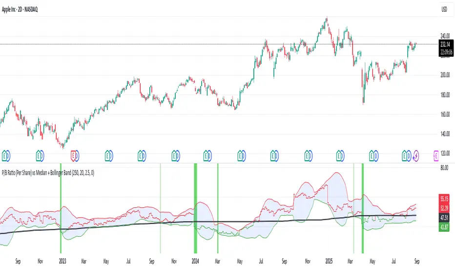
P/B Ratio (Per Share) vs Median + Bollinger Band- 📝 This indicator highlights potential buying opportunities by analyzing the Price-to-Book (P/B) ratio in relation to Bollinger Bands and its historical median.
- 🎯 The goal is to provide a visually intuitive signal for value-oriented entries, especially when valuation compression aligns with historical context.
- 💡 Vertical green shading is applied when the P/B ratio drops below the lower Bollinger Band, which is calculated directly from the P/B ratio itself — not price. This condition often signals the ticker may be oversold.
- 🟢 Lighter green appears when the ratio is below the lower band but above the median, suggesting a possible shorter-term entry with slightly more risk.
- 🟢 Darker green appears when the ratio is both below the lower band and below the median, pointing to a potentially stronger, longer-term value entry.
- ⚠️ This logic was tested using 1 and 2-day time frames. It may not be as helpful in longer time frames, as the financial data TradingView pulls in begins in Q4 2017.
- ⚠️ Note: This script relies on financial data availability through TradingView. It may not function properly with certain tickers — especially ETFs, IPOs, or thinly tracked assets — where P/S ratio data is missing or incomplete.
- ⚠️ This indicator will not guarantee successful results. Use in conjunction with other indicators and do your due diligence.
- 🤖 This script was iteratively refined with the help of AI to ensure clean logic, minimalist design, and actionable signal clarity.
- 📢 Idea is based on the script "Historical PE ratio vs median" by haribotagada
- 💬 Questions, feedback, or suggestions? Drop a comment — I’d love to hear how you’re using it or what you'd like to see changed.
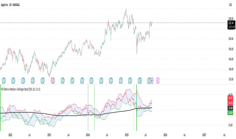
P/E Ratio vs Median + Bollinger Band- 📝 This indicator highlights potential buying opportunities by analyzing the Price-to-Earnings (P/E) ratio in relation to Bollinger Bands and its historical median.
- 🎯 The goal is to provide a visually intuitive signal for value-oriented entries, especially when valuation compression aligns with historical context.
- 💡 Vertical green shading is applied when the P/E ratio drops below the lower Bollinger Band, which is calculated directly from the P/E ratio itself — not price. This condition often signals the ticker may be oversold.
- 🟢 Lighter green appears when the ratio is below the lower band but above the median, suggesting a possible shorter-term entry with slightly more risk.
- 🟢 Darker green appears when the ratio is both below the lower band and below the median, pointing to a potentially stronger, longer-term value entry.
- ⚠️ This logic was tested using 1 and 2-day time frames. It may not be as helpful in longer time frames, as the financial data TradingView pulls in begins in Q4 2017.
- ⚠️ Note: This script relies on financial data availability through TradingView. It may not function properly with certain tickers — especially ETFs, IPOs, or thinly tracked assets — where P/S ratio data is missing or incomplete.
- ⚠️ This indicator will not guarantee successful results. Use in conjunction with other indicators and do your due diligence.
- 🤖 This script was iteratively refined with the help of AI to ensure clean logic, minimalist design, and actionable signal clarity.
- 📢 Idea is based on the script "Historical PE ratio vs median" by haribotagada
- 💬 Questions, feedback, or suggestions? Drop a comment — I’d love to hear how you’re using it or what you'd like to see changed.
Historical Year OverlayThis script allows you to simply source any historical calendar year and overlay it over any other year (usually a historical year overlaying a year in the future). It was made using an LLM for coding help and logic.
It is great for working out potential pivots and it also maps the previous profit/loss from the source year over the plot year so that we can see the connection to price levels throughout the plot year and also with the yearly close (we get a horizontal line for the close).
It uses the year open as a price reference to plot the P&L over the plot year (if use plot year option is selected).
if the year has not started yet you can use the "manual opening price" OR it will auto set to the current price (great for "replay mode", it will catch the actual opening price once it happens).
The settings are self explanatory. Choose a source year and plot year.
Choose a multiplier if you'd like (it simply multiplies the plot year P&L by that number; ie: 1 means the same as it was, 0.5 means half of what is was, 2 means 2x the source P&L)
The resolution is max default 50 line segments but you can simplify if you'd like.
I've released the code open-source so you can see what it is doing.
Please update it with all the enhancements you can think of.
Please let me know if you do this as I will be very interested!

Predict Trend [Cometreon]Predict Trend is a forward-looking indicator that compares the current market trend with historical patterns, providing statistically based forecasts. Using advanced algorithms, it continuously scans for price behaviors similar to those in the past and projects average outcomes based on those patterns.
This innovative approach offers traders a powerful tool to anticipate market movements, refine strategies, and make data-driven decisions.
🔷 Key Features
🟩 Historical Pattern Analysis:
The indicator identifies and compares the current trend with similar historical patterns, providing predictions based on concrete and historical data.
🟩 Customizable Precision:
Offers the ability to adjust various parameters such as distance and percentage variation between levels, improving the accuracy of pattern search.
🟩 Historical Average-Based Predictions:
Displays the predicted movement based on the average of all historical patterns found, allowing for informed trading decisions.
🟩 Specific Pattern Search:
In addition to automatic search based on the active trend, Predict allows searching for specific patterns by manually entering the necessary data for analysis.
🟩 Forecast Visualization:
Provides a detailed table with all values found and a line representing the average of results, offering a clear view of predictions based on historical data.
🔷 Technical Details and Customizable Inputs
1️⃣ Precision Parameters - Allows adjusting the length of levels, pattern precision, and the number of subsequent values to obtain after identifying historical patterns.
2️⃣ Specific Pattern Search - Allows manual data entry to search for specific patterns, offering greater flexibility in analysis.
3️⃣ Timeframe - Predict works on any timeframe, with greater precision on higher timeframes.
4️⃣ Chart Compatibility - It is compatible with all chart types, allowing analysis and comparison of historical patterns regardless of the chart type used.
5️⃣ Level 1 - First correlation level for patterns. "Last Bar to Check" allows choosing the number of Pivots to check for searching patterns in the past with the same values (e.g., HH, LL, LH, and HL).
6️⃣ Level 2 - Checks the candle distance between each level. "Error Value Up-Down" allows adding a margin value between distances.
7️⃣ Level 3 - Verifies the percentage distance between levels. "Error Percent" allows adding an error margin to the percentage distance.
8️⃣ Bar to Have - Determines how many values after each pattern to display in the table.
9️⃣ Timezone - Enter the chart's time zone to display the precise start time of the pattern.
🔟 Manual Search - Allows searching for specific patterns by manually entering up to 8 values, including special values such as:
High Value : "HH" (Higher High) or "LH" (Lower High)
Low Value : "LL" (Lower Low) or "HL" (Higher Low)
Top / Bottom : "HH" or "LL"
Mid Level : "LH" or "HL"
1️⃣1️⃣ Approximate Trend - Shows a trend based on the average of values for each pattern in each section. Allows customizing up to 4 colors, line thickness, and style.
1️⃣2️⃣ Pattern Table - Shows the values of identified patterns. You can customize the number of patterns to show, display order, position, size, and table style.
1️⃣3️⃣ Displayed Elements - Customize elements shown on the table, such as Number, Date, or subsequent Swing values.
1️⃣4️⃣ Style Label - Modify the visual appearance of labels by selecting colors for background and text.
These options allow optimizing the indicator for different trading styles and market conditions, ensuring accurate and customized technical analysis.
🔍 How to Use Predict Trend
📌 Past Movement Analysis
Use the patterns found to compare past movements with the current trend, gaining a clear vision of possible future directions.
📊 Using Value Averages
Analyze the average of values from found patterns to get a more direct and synthetic view of past market behavior.
🎯 Specific Pattern Search
In addition to automatic search based on the active trend, Predict allows searching for specific patterns by entering the necessary data for targeted analysis.
☄️ With Predict Trend , you can simplify your market analysis, saving time and improving the accuracy of your decisions with predictions based on concrete and verifiable historical data.
Don't waste any more time and take advantage of the precision of historical pattern analysis to gain a competitive edge in the market.

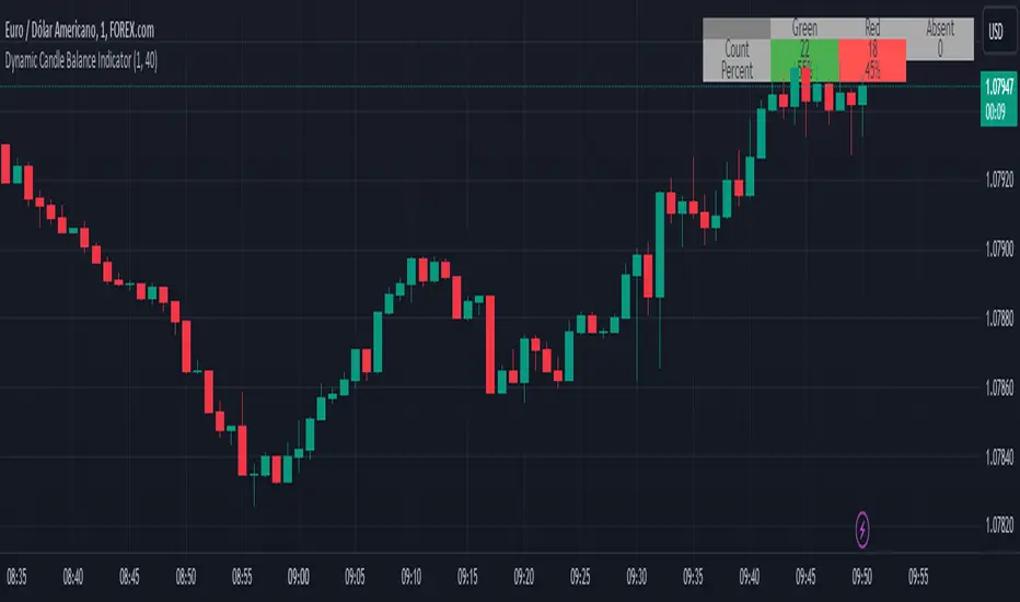
Dynamic Candle Balance Indicator (Binary)
Dynamic Candle Balance Indicator
The Dynamic Candle Balance Indicator is a powerful tool designed to identify imbalances in candle colors on a chart, which can indicate potential reversals or changes in market direction. This indicator is specifically developed for traders operating on short timeframes, such as 1-minute candles, and is particularly useful for identifying opportunities in binary options.
How to Use:
Set Parameters
Initial Position: Specify the number of initial candles to be considered for calculation.
Count: Determine the total number of candles to be analyzed, including the initial position.
Interpret Results:
Green: Indicates the number of bullish candles (where the closing price is higher than the opening price).
Red: Indicates the number of bearish candles (where the closing price is lower than the opening price).
Absent: Indicates the number of candles that were not considered due to the selected interval.
Performance Analysis:
The indicator calculates the percentage of green and red candles relative to the total number of analyzed candles, providing insights into market balance or imbalance.
Identify Trading Opportunities:
Significant imbalances between candle colors can indicate potential reversals or changes in market direction.
Traders can use this information to make informed decisions about their trading strategies, such as identifying entry or exit points.
Example:
In the last 40 candles, there were 13 green candles and 27 red candles, indicating a higher likelihood of the next candle being green.
Usage Tips:
The indicator is most effective when used on a 1-minute timeframe for binary options trading, especially during periods of high imbalance.
Adjust the parameters according to your trading strategy and the timeframe being analyzed.
Combine the Dynamic Candle Balance Indicator with other technical analysis tools to confirm trading signals.
Legal Disclaimer:
This indicator is provided for educational and informational purposes only. It represents a theory and should be used as part of a comprehensive trading strategy. Past performance is not indicative of future results. Traders should always conduct their own analysis before making trading decisions.
Try out the Dynamic Candle Balance Indicator and leverage its functionalities to identify trading opportunities on short-term charts, especially in 1-minute timeframes for binary options trading during periods of high imbalance. Remember to test the indicator on a practice account before using it on a real account.
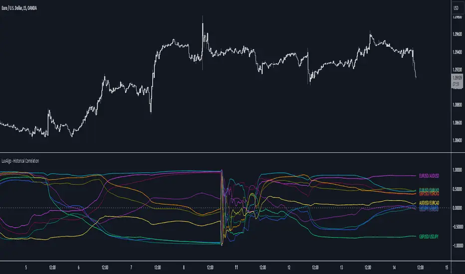
Historical Correlation [LuxAlgo]The Historical Correlation tool aims to provide the historical correlation coefficients of up to 10 pairs of user-defined tickers starting from a user-defined point in time.
Users can choose to display the historical values as lines or the most recent correlation values as a heat map.
🔶 USAGE
This tool provides historical correlation coefficients, the correlation coefficient between two assets highlight their linear relationship and is always within the range (-1, 1).
It is a simple and easy to use statistical tool, with the following interpretation:
Positive correlation (values close to +1.0): the two assets move in sync, they rise and fall at the same time.
Negative correlation (values close to -1.0): the two assets move in opposite directions: when one goes up, the other goes down and vice versa.
No correlation (values close to 0): the two assets move independently.
The user must confirm the selection of the anchor point in order for the tool to be executed; this can be done directly on the chart by clicking on any bar, or via the date field in the settings panel.
For the parameter Anchor period , the user can choose between the following values NONE, HOURLY, DAILY, WEEKLY, MONTHLY, QUARTERLY and YEARLY. If NONE is selected, there will be no resetting of the calculations, otherwise the calculations will start from the first bar of the new period.
There is a wide range of trading strategies that make use of correlation coefficients between assets, some examples are:
Pair Trading: Traders may wish to take advantage of divergences in the price movements of highly positively correlated assets; even highly positively correlated assets do not always move in the same direction; when assets with a correlation close to +1.0 diverge in their behavior, traders may see this as an opportunity to buy one and sell the other in the expectation that the assets will return to the likely same price behavior.
Sector rotation: Traders may want to favor some sectors that are expected to perform in the next cycle, tracking the correlation between different sectors and between the sector and the overall market.
Diversification: Traders can aim to have a diversified portfolio of uncorrelated assets. From a risk management perspective, it is useful to know the correlation between the assets in your portfolio, if you hold equal positions in positively correlated assets, your risk is tilted in the same direction, so if the assets move against you, your risk is doubled. You can avoid this increased risk by choosing uncorrelated assets so that they move independently.
Hedging: Traders may want to hedge positions with correlated assets, from a hedging perspective, if you are long an asset, you can hedge going long a negative correlated asset or going short a positive correlated asset.
Traders generally need to develop awareness, a key point is to be aware of the relationships between the assets we hold or trade, the historical correlation is an invaluable tool in our arsenal which allows us to make better informed decisions.
On this chart we have an example of historical correlations for several futures markets.
We can clearly see how positively correlated the Nasdaq100 and Dow30 are with the SP500 over the whole period, or how the correlation between the Euro and the SP500 falls from almost +85% to almost -4% since 2021.
As we can see, correlations, like everything else in the market, are not static and vary over time depending on many factors, from macro to technical and everything in between.
🔹 Heatmap
The chart above shows the tool with the default settings and the Drawing Mode set to 'HEATMAP'.
We can see the current correlation between the assets, in this case the FX pairs.
The highest positive correlation is +90% (+0.90) between EURUSD and GBPUSD.
The highest negative correlation is -78% (-0.78) between EURUSD and USDJPY.
The pair with no correlation is AUDUSD and EURCAD with 1% (0.01)
On the above chart we can see the current correlations for the futures markets.
Currently, the assets that are less correlated to the SP500 are NaturalGas and the Euro, the more positive correlations are Nasdaq100 and Dow20, and the more negative correlations are the Yen, Treasury Bonds and 10-Year Notes.
🔶 DETAILS
🔹 Anchor Period
This chart shows the standard FX correlations with the Anchor Period set to `MONTHLY`.
We can clearly see how the calculations restart with the new month, in this case we can clearly see the differences between the correlations from month to month.
Let us look at the correlation coefficient between GBPUSD and USDJPY
In January, their correlation started at close to -100%, rose to close to +50%, only to fall to close to 0% and remain there for the second half of the month.
In February it was -90% in the first few days of the month and is now around -57%.
And between AUDUSD and EURCAD
Last month their correlation was negative for most of the month, reaching -70% and ending around -14%.
This month their correlation has never gone below +21% and at the time of writing is close to +53%.
🔶 SETTINGS
Anchor point: Starting point from which the tool is executed
Anchor period: At the beginning of each new period, the tool will reset the calculations
Pairs from 1 to 10: For each pair of tickers, you can: enable/disable the pair, select the color and specify the two tickers from which you wish to obtain the correlation
🔹 Style
Drawing Mode: Output style, `LINES` will show the historical correlations as lines, `HEATMAP` will show the current correlations with a color gradient from green for correlations near 1 to red for correlations near -1.
Historical Price Projection [LuxAlgo]The Historical Price Projection tool aims to project future price behavior based on historical price behavior plus a user defined growth factor.
The main feature of this tool is to plot a future price forecast with a surrounding area that exactly matches the price behavior of the selected period, with or without added drift.
Other features of the tool include:
User-selected period up to 500 bars anywhere on the chart within 5000 bars
User selected growth factor from 0 (no growth) to 100, this is the percentage of drift to be used in the forecast.
User selected area wide
Show/hide forecast area
🔶 USAGE
This tool generates a price projection with exactly the same price behavior over the period selected by the user, plus a growth factor .
The user must confirm the selection of the anchor point in order for the tool to be executed; this can be done directly on the chart by clicking on any bar, or via the date field in the settings panel.
As we can see on this chart, the four phases of the market cycle are clearly defined and marked, so we choose the distribution phase as our anchor point because in our analysis, we want to see how the market would behave if we were currently at the same point in the cycle.
In the image above, the growth factor parameter is set to 0 so that the projection matches the selection. The tool will use up to 500 bars after the selection point.
The growth factor is defined as the percentage of drift that the tool will use.
Drift is defined as follows:
For periods with a positive return: average negative return within the period
For negative return periods: average positive return within the period
On the chart above, we have selected the same period but added a growth factor of 10, so that the tool uses a 10% drift in its calculations of future prices.
As the return in the selected period is negative, the added drift will make the projection more bearish than the prices from the selection.
On this chart we have changed the selected period, we have chosen the accumulation phase of the last cycle as the anchor point, again with a growth factor of 10%.
As we can see, prices explode higher, making the projection very bullish, as the added effect of both the bullish selected period and the 10% drift is taken into account.
This last chart is a long-term chart, a quarterly chart of the Dow, and it will serve as a review exercise.
What if... everything goes south and the crash of '29 is repeated?
The answer is in the chart, and it is not for the faint of heart
In this case we have chosen a growth factor of 0 to see exactly the same price behaviour projected into the future.
🔶 SETTINGS
🔹 Data Gathering
Anchor point: Starting point for data collection, up to 500 bars will be used.
🔹 Data Transformation
Growth Factor: Values from 0 to 100, is the amount of drift used to calculate the next price in the series.
Area Width: Values from 0 to 100, controls the width of the area around the forecast as an increment/decrement of the growth factor.
🔹 Style
Price line width: Size of the price line.
Bullish color
Bearish color
Show Area: Show forecast area.
Area color

Seasonal Tendencies - SMC IndicatorsA Seasonal Tendency refers to a historical price action behaviour that tends to repeat during specific times of the year, month over month.
It's a roadmap to navigate price action on the daily chart to help determine the medium to long-term bias.
Seasonal Tendencies are NOT an exact prediction of future price action but rather serve as a guideline for spotting high-probability opportunities when combined with other elements of SMC Price Action analysis, such as Order Blocks, Fair Value Gaps, etc...
The Seasonal Tendencies Indicator has been tested to match what ICT has taught in his lectures. It can be applied to any Market or Asset. However, it's limited by the maximum number of years available on tradingview.
Traders can use this Seasonal Tendencies indicator to support their already existing analysis as an added confirmation tool. This indicator should not be used as a main reason to enter a trade idea.
The Seasonal Tendencies Indicator can be used in 2 ways:
1) To look for potential points of long-term reversals during specific times of the year.
2) To look for confirmation and align with an existing long-term trend.
So how does it work?
The Seasonal Tendencies Indicator takes the averages of the last 30, 10, and 5 years' prices by default and compares them to the current year's price action (Green Line).
However, the number of years chosen for the averages can be modified in the indicator's setting.
When looking at the historical price action lines, generally, the price tends to make the lows and highs during specific times of the year.
Note that we should not look at the exact dates these lows and highs form, but we take time periods conceptually instead.
In the example below, the SP500 5-year average made the low on 14 March, and the SP500 10-year average made the low on 23 March.
This gives us the idea that "generally" SP500 makes the low of the year around the 2nd to 3rd week of March every year.
So, IF the trader's analysis was pointing out that SP500 is Bullish, then we use the information that we derived from the Seasonal Tendencies Indicator to look for long setups around the 2nd to 3rd week of March for medium to long-term swing trades.
The Seasonal Tendencies Indicator can also be useful for day traders as it helps support their daily bias to look for trades within the direction of the higher timeframe trend.
How do we measure the strength of the Seasonal Tendencies?
When using the Seasonal Tendencies Indicator, it's important to look for periods where the averages converge and get closer to each other. This usually indicates that during those specific periods, there is a high probability for the price to behave in a certain way.
So the closer the averages are to each other, the more likely the price would respect the Seasonal Tendencies.
Bonus Feature
Premium Discount Range
As a bonus feature, split the Seasonal Tendencies Indicator's Range into 4 quarters to indicate when the price is at a Premium (above the 50% level in Red) and when the price is at a Discount (below the 50% level in blue).
Each Premium and Discount range is also split into 2 halves.
Those levels can also be used to identify potential turning points when comparing the Current Year's price positioning in the Yearly Range to historical price action.
As you can see from the example below, most major turning points happen at around key price levels.

Price Range Volume Profile++ [Pt]█ Introduction
The Price Range Volume Profile++ (PRVP++) is an advanced, feature-rich indicator specifically designed for volume profile users for in-depth volume analysis. Unlike most other volume profile tools that are limited to a 5000-bar lookback, PRVP++ can utilize all available candles on the chart, offering an unparalleled scope of historical data analysis.
█ Main Features
Full Chart Historical Lookback : PRVP++ sets a new standard with its ability to analyze the entire history of candles available on a chart, far exceeding the typical 5000-bar limit of other tools. This feature allows traders to conduct a comprehensive and detailed study of volume data over extensive time periods.
Volume Profile Analysis : The tool provides an in-depth volume profile analysis, showcasing the distribution of trading activity across different price levels. This is crucial for identifying key areas of interest in the market.
Bull/Bear Strength Profile : A standout feature that displays the relative strength of buyers (bulls) and sellers (bears) at different price levels. This visual representation helps traders gauge market sentiment and power dynamics.
Automatic HVN and LVN Identification : PRVP++ automatically highlights High Volume Nodes (HVNs) and Low Volume Nodes (LVNs), making it easier for traders to identify significant zones of trading activity and potential breakout areas.
Customization and Visual Enhancements : Offers customization for the profile's width, horizontal offset, and a sophisticated gradient color scheme for HVNs and LVNs, enhancing the tool's visual appeal and analytical utility.
█ Input Parameters
Price Range : Sets the percentage distance for the volume profile relative to the current closing price, determining the extent of volume data analysis.
Profile Step Size (Tick Size) : Users can choose automatic sizing or set a specific tick step size, offering flexibility in the granularity of the volume profile.
Volume Profile Options : Includes settings for gradient power and color selections for high and low volume areas, along with a fun mode for random color variations.
Profile Placement and Appearance : Adjustments for profile width, horizontal offset, and the option for background fill to enhance visibility.
Background Fill : Allows users to fill the background of the volume profile range, enhancing the visual impact and readability.
Time Weighted Profile : An option that weights the volume profile to give more emphasis to recent trading activities, highlighting the impact of recent market movements.
Smooth Filter : A feature that smoothens the volume profile to reduce noise and fluctuations, offering a clearer view of dominant volume levels.
High and Low Volume Node Settings : Customizable detection settings for HVNs and LVNs, line styles, label text sizes, and the option to extend lines for clearer market analysis.
Extra Settings : Includes displaying the current price on the profile, a customizable settings table with adjustable location and font size, and table opacity.
Random Color Generation : A feature for dynamically changing the colors used in the volume profile.
█ Possible Use Cases
Long-Term Market Analysis : Due to its ability to analyze all available candles on the chart, PRVP++ is exceptionally suited for long-term market analysis. Traders can study the historical volume profile over extended periods, identifying significant volume trends and shifts that could impact long-term investment strategies.
Identifying Key Support and Resistance Levels : The automatic HVN and LVN identification feature of PRVP++ makes it easier for traders to spot potential support and resistance levels. HVNs often correspond to strong support or resistance zones where significant trading activity has occurred, while LVNs may indicate levels where the price could break through more easily.
Gauging Market Sentiment with Bull/Bear Strength Profile : The Bull/Bear Strength Profile helps traders understand the prevailing market sentiment at different price levels. By analyzing the dominance of buying or selling pressure, traders can align their trades with the market's direction or prepare for potential reversals.
Intraday Trading and Scalping : For intraday traders and scalpers, the time-weighted feature and the ability to adjust profile step size offer valuable insights. By emphasizing recent trading activity and adjusting the granularity of the profile, traders can make more informed decisions based on short-term price movements and volume changes.
Breakout Trading : By utilizing the LVN identification, traders can pinpoint areas with low trading activity that might serve as potential breakout points. This information can be instrumental in formulating strategies to capitalize on sudden price movements.
Volume Gap Analysis : PRVP++ can be used to identify volume gaps, which are areas with significantly low volume. These gaps can act as important indicators for price movements, as prices may move quickly through these levels due to the lack of historical trading activity.
Risk Management and Position Sizing : Understanding the volume profile can aid in better risk management and position sizing. By recognizing areas of high and low volume, traders can set stop-loss orders more effectively and adjust their position sizes according to the perceived strength of support or resistance levels.
Swing Trading : For swing traders, the comprehensive historical lookback and HVN/LVN analysis provide critical information about where to enter and exit trades. Swing traders can utilize these features to identify trend reversals and momentum shifts.
█ Best Practices and Tips
Start with a Clear Understanding : Before utilizing PRVP++, ensure you have a solid grasp of volume profile concepts. Understanding High Volume Nodes (HVNs), Low Volume Nodes (LVNs), and their implications on market behavior is crucial.
Combine with Other Analysis Tools : While PRVP++ is powerful, it's most effective when used in conjunction with other technical analysis tools and indicators. Combining volume profile data with price action analysis, trend lines, and technical indicators can provide a more comprehensive market view.
Customize According to Your Trading Style : Tailor the tool's settings to fit your trading strategy. Day traders might prefer a more detailed profile, while long-term investors may benefit from broader data analysis.
Pay Attention to HVNs and LVNs : HVNs can indicate potential support or resistance areas, while LVNs might suggest breakout points. Monitor these areas closely for trading opportunities.
Utilize the Full Historical Lookback Feature : For a broader perspective, use the full historical lookback feature to understand long-term volume patterns and their impact on current price movements.
Keep an Eye on Bull/Bear Strength : Use the Bull/Bear Strength Profile to gauge market sentiment at different price levels. This can help in predicting potential price movements.
Regularly Update Your Strategy : As market conditions change, regularly review and adjust your use of PRVP++ to ensure it aligns with current market dynamics.
Stay Informed About Market News : Be aware of how economic news and global events might affect the volume and price, as these factors can significantly impact the effectiveness of volume-based strategies.
█ Disclaimers and Risk Advice
No Guarantee of Profits : Trading involves risk, and the use of the PRVP++ tool does not guarantee profits. Always be aware of the potential for loss.
Educational Purposes Only : The information provided by PRVP++ is for educational purposes only and should not be considered financial advice.
Not a Standalone Tool : PRVP++ should not be used as a standalone decision-making tool. Combine it with comprehensive market analysis and personal judgment.
Past Performance Not Indicative of Future Results [/b: Historical data and trends analyzed by PRVP++ do not guarantee future market behavior.
Use Risk Management : Always employ sound risk management strategies, including setting stop-loss orders and managing position sizes to protect your capital.
Personal Responsibility : Trading decisions remain the responsibility of the individual trader. Use PRVP++ as one of several tools in your decision-making process.

Historical Volatility StudyThe goal of this script it to provide you an idea to forecast the future momentum by looking at historical volatility.
This chart has basically three parts.
1. Three lines are there. The multi color line represents the historical annualized volatility in terms of minimum look back period . The white line represents the historical annualized volatility in terms of medium term look back period . The green line represents the historical annualized volatility in terms of longer term look back period .
2. The back ground color has three components. Green zone is the zone where overall volatility is on the lower side. Red zone is the zone where overall volatility is on the higher side. Purple zone means fluctuating volatility.
3. The multi color line has three colors. Red color means volatility moving towards extreme low. Yellow means it is moving towards extreme high. Purple means it is in normal course of action.
This tool can be used as a confirmation tool with other studies to aid you to make better decisions. For example- look at the diagram below.
Make your thorough study before making any trading decision. Thanks.

Price Range Volume Profile [Pt]█ Introduction
The Price Range Volume Profile (PRVP) is a revolutionary indicator. This tool stands out from its peers due to its unique ability to capture the entire price chart history, thus providing a comprehensive volume profile of the entire asset's trading history, as available on TradingView chart. It's worth noting that I believe this tool is the first of its kind to accomplish such a feat. A much recommended tool if you are a volume profile trader.
█ Main Features
► Historical Lookback: This feature dives deep into the past, grasping all the historical data of an asset. It's equipped to handle up to 20,000 bars, although users without a premium TradingView account are advised to keep it at a maximum of 10,000 bars, or just use the "Full Historical Lookback" feature.
► Volume Profile / POC: Displays the distribution of volume across price levels for the selected price range. The Point of Control (POC), which is the price level with the highest traded volume, is also highlighted.
► Customization: Users have the flexibility to adjust the profile's appearance, including profile width, horizontal offset, and the option to fill the background of the profile range.
► Time Weighting: This feature allows users to give more weight to recent trading activity, which can be especially useful for intraday traders or during times of high volatility. Note that this feature will impact the volume profile and POC level.
► Settings Table: A settings table is displayed on the chart for users to quickly reference their input parameters.
█ Input Parameters
► Lookback Timeframe: Determines the period for which the volume profile is generated.
► Price Range: The percentage distance to consider for the profile, adjusted above and below the current closing price.
► Profile Step size: The granularity of the volume profile. Users can opt for automatic step size based on a predefined calculation or set their preferred tick step size.
► Historical Bars Lookback: Determines the number of bars to include in the volume profile calculation.
► Profile Visuals: Adjust the appearance and layout of the volume profile on the chart.
► Extra: Additional settings including the display of a settings table and its location.
█ Basic Understanding of Volume Profile - How to use PRVP?
Volume Profile is a valuable tool for traders who want insights into where the majority of trading activity has occurred. Here are some tips to make the most of it:
► Understand the Basics: Before using the Volume Profile, ensure you understand the difference between it and the standard volume histogram. While both represent volume, the former displays it against price while the latter shows it against time.
► Identify High Volume Nodes (HVN) and Low Volume Nodes (LVN):
◊ HVN: Areas where there's a lot of trading activity and where the price has spent a lot of time. These areas can act as strong support or resistance.
◊ LVN: Areas where there's a lack of trading activity. Prices might move quickly through these areas, and they can act as potential breakpoints or accelerators for price movement.
► Locate the Point of Control (POC): This is the price level with the highest traded volume for a specified period. It often acts as a magnet for price, and it can serve as a pivot or reference point.
► Trend Confirmation: A shift in the volume profile from one price level to another can confirm a trend. For instance, if higher volume starts to build at higher price levels, it may indicate a strong uptrend.
► Watch for Volume Gaps: If there's a significant gap in the volume profile, prices may move quickly through these levels as there's little historical trading activity to act as support or resistance.
█ Other Usage Tips
◊ For optimal performance, ensure that the chosen timeframe aligns closely with the chart timeframe. Differences in timeframes may lead to minor discrepancies in the volume profile.
◊ To address any errors arising from too many levels displayed on the volume profile, consider increasing the Profile Step size or reducing the Price Range.

Seasonal Performance for Stocks & CryptoThe Seasonal Performance indicator quickly allows you to see if you are in a bullish or bearish time of year for an underlying security and where the current performance stacks up compared to the same time of year historically. Table is fully customizable from colors to what data to see.
Table Displays
Average Performance
Best Performance
Worst Performance
Last Performance
Current Performance
Note this indicator will only work with Stocks, ETF's, Index's or Crypto.
XAUXXXThis simple script is meant to get around the limitations some data providers have, in terms of the length of historical data they choose to provide traders. Inspired by OANDA's XAUCAD pair only having data as far back as 2005, whereas XAUUSD has data back to to the 19th century.
By taking the OHLC data from XAUUSD and multiplying it by the price of USD in a desired currency you are able to see further back in time, the limitation now being the length of FX data available instead of the price of Precious metal / currency pair. As shown in the chart you can now see the price of Gold in CAD as far back as the late 1960s, a nearly half century of data uncovered for all to see!

Price Data LabelThis indicator gives you the ability to see historical data for each bar on the chart by simply hovering over the high of the bar, similar to the functionality of MarketSmith.
Data for each bar includes:
Open
High
Low
Close + Change
Percentage Change
Closing Range
Volume
Volume Percent based on 50 day average
Distance to 4 selectable moving averages
Example of stats on a historical bar:
* Note this only works on the last 500 historical bars. If you use bar replay it will work with 500 historical bars from the last bar.
* If you have multiple indicators on your chart, in order to see the data you will need to use visual order to bring to front. This can be done by clicking the three dots next to the indicator name and selecting visual order.
Implied and Historical Volatility v4There is a famous option strategy📊 played on volatility📈. Where people go short on volatility, generally, this strategy is used before any significant event or earnings release. The basic phenomenon is that the Implied Volatility shoots up before the event and drops after the event, while the volatility of the security does not increase in most of the scenarios. 💹
I have tried to create an Indicator using which you
can analyse the historical change in Implied Volatility Vs Historic Volatility.
To get a basic idea of how the security moved during different events.
Notes:
a) Implied Volatility is calculated using the bisection method and Black 76 model option pricing model.
b) For the risk-free rate I have fetched the price of the “10-Year Indian Government Bond” price and calculated its yield to be used as our Risk-Free rate.
Seasonal tendency: week-on-week % change and 10yr Averages-shows week-on-week % change, and 10yr averages of these % changes
-scan across the 10yr averages to get a good idea of the seasonality of an asset
-best used on commodities with strong seasonal tendencies (Gold, Wheat, Coffee, Lean hogs etc)
-works only on daily timeframe
-by default it will compare SMA(length) in the following way, BTC: Sunday cf previous Sunday | ES/Gold: Monday cf previous Monday
-for most assets, 5 daily bars in a week (SMA(5)) => that's the default. For BTC can change this to 7.
~~inputs:
-change input year to show any previous decade of asset's history; the table will display over that year on the chart
-choose expression for Average of % change week on week: SMA, ohlc4, vwma, vwap (default SMA)
-choose number of daily bars in a week (i.e. SMA length)
-change label sizes/colors
~~notes:
-When applied to current year: will print the 10yr average for previous weeks in the year; 9yr average for future weeks in the year
-drawings and SMA plot on the above chart are just to show visually how the week's average is calculated, and how this lines up with the label
-current week of year will highlight in large font orange by default
-the first 2 weeks of the year are omitted because of a bug i can't figure out, which throws out bad numbers.
-cannot print all the values for each of previous 10yrs; 'code too long' error. Could likely do this via using matrices but would require a rewrite
17th Dec 2022
@twingall
Percent ResearchPercent Research is an indicator that will plot a color / column on the chart in case custom requirements are met.
The requirements are:
- Price : Price requirement (equal or above input).
- Change % Up : Amount the price have moved up in percent (equal or above input).
- Change % Down : Amount the price have moved down in percent (equal or below input).
- Change Interval : Amount of bars the above move happened over.
- Volume : Volume requirement (equal or above input).
- Volume Interval : Amount of bars in a row that each require the above volume.
Example: In case one wants to plot whenever price has made a 20 percent move up or down in a week with minimum 100 000 volume for each of the last 2 days one can use.
Change % Up: 20
Change % Down: -20
Change Interval: 5
Volume: 100 000
Volume Interval: 2
The indicator will plot a color on the chart whenever the requirements are met, which then can be used to look into price action for each colored time period.
The values can be customized dependent on preference, example 100% movers over a month or 20% movers over a week etc.

Average Daily Pip Ranges by monthShows historical average daily pip ranges for specific months for FOREX pairs
useful for guaging typical seasonal volatility; or rough expected daily pip ranges for different months
works on both DXY and foreign currencies
option to plot 10yrs worth of data; with 10yr average of the average daily range for specific months
cast back to any previous 10yrs of your choosing
@twingall
Daily SeasonalityDay trading trend filter indicator designed to hep get better entries or exits based on historical opens and closes each hour.
This indicator is NOT designed as an entry or exit signal. The purpose behind it is to give you statistical information about how likely certain times of day are either bullish , bearish or neutral and use that to confirm or reject other trading signals.
For example you might be anticipating a breakout based on your strategy or another indicator but see that the next few days are usually bearish and re-evaluate entering the trade.
The Daily Seasonality indicator calculates the percentage of candles per day of the week that had a higher close than open.
Default settings are:
- a look-back of 52 weeks (1 year).
- extreme bullish ( bright green) above 74%
-extreme bearish ( bright red) below 25%
- bullish (green) above 55%
- bearish (red) below 45%
- neutral (white) exactly 50%
- no trend (gray) 46% - 54%
All of these are updatable via the settings.
This indicator is designed to work only on the Daily timeframe.

Intraday SeasonalityDay trading trend filter indicator designed to hep get better entries or exits based on historical opens and closes each hour.
This indicator is NOT designed as an entry or exit signal. The purpose behind it is to give you statistical information about how likely certain times of day are either bullish, bearish or neutral and use that to confirm or reject other trading signals.
For example you might be anticipating a breakout based on your strategy or another indicator but see that the next few hours are usually bearish and re-evaluate entering the trade.
The Intraday Seasonality indicator calculates the percentage of candles per hour that had a higher close than open.
Default settings are:
- a look-back of 90 days.
- extreme bullish (bright green) above 74%
-extreme bearish (bright red) below 25%
- bullish (green) above 55%
- bearish (red) below 45%
- neutral (white) exactly 50%
- no trend (gray) 46% - 54%
All of these are updatable via the settings.
This indicator is designed to work only on the 1 hour timeframe.
To use the indicator set your local timezone offset in the indicator settings.
*Due to daylight savings and certain timezones changing throughout the year there is a timezone override in the indicator settings if the indicator doesn't pick up the correct local time.
