Daily O/C Span (Real Values & SMA Comparison)This Pine Script indicator helps you visualize and track the "momentum" or "strength" of each trading day, and compares it to a recent average. It essentially measures the net movement of the price from when the market opens to when it closes.
What the Script Does
The script performs the following actions:
Calculates Daily Movement: For every single trading day, it calculates the difference between the closing price and the opening price (Close - Open).
Plots the "Span": These daily differences are plotted as vertical bars (a histogram) in a separate window below your main price chart.
-Green bars mean the stock closed higher than it opened (a strong day).
-Red bars mean the stock closed lower than it opened (a weak day).
Calculates the Average: It calculates the Simple Moving Average (SMA) of these daily spans over an adjustable period (default is 30 days).
Plots the Average Line: A blue line is plotted over the green/red bars, showing the typical magnitude of daily movement.
Displays Comparison: A table in the top-right corner provides a quick, real-time numerical comparison of today's span versus the 30-day average span.
How It Can Improve Trading
This indicator helps you understand the character and conviction of price action, offering several trading insights:
Gauging Momentum: It clarifies whether the stock's moves are generally strong and sustained within a day (large spans) or hesitant (small spans).
Identifying Trends: During an uptrend, you might expect the average span line to be consistently positive (above zero), and vice versa for a downtrend. A positive average span indicates buyers are consistently closing the day stronger than where they started it.
Spotting Reversals: If a stock is in a strong uptrend but you suddenly see a series of large red bars (large negative spans), it could signal a shift in momentum and potential upcoming reversal.
Volatility Context: By comparing the current day's bar to the blue average line, you can quickly determine if today is an unusually strong/weak day relative to recent history.
In short, it helps you see the underlying buyer/seller conviction within each day, making it easier to gauge the overall market sentiment and anticipate potential shifts.
Prices

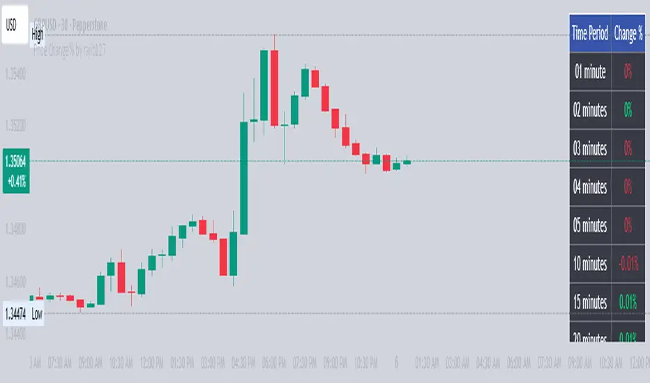
Price Change % by rajib127Price Change % by rajib127
🎯 Key Features:
• Real-Time Multi-Timeframe Analysis - Track price changes across 15 different time periods (1 minute to 3 hours)
• Smart Color Coding - Green (profit), Red (loss), White (neutral) for instant visual recognition
• Highly Customizable Display - Toggle any timeframe on/off, adjust table position, size, and colors
• Universal Compatibility - Works on any chart timeframe without recalculation issues
• Clean Table Interface - Professional-looking data table that doesn't clutter your chart
📊 Supported Timeframes:
• Short-term: 1min, 2min, 3min, 4min, 5min, 10min
• Medium-term: 15min, 20min, 25min, 30min, 40min, 50min
• Long-term: 1 hour, 2 hours, 3 hours
⚙️ Customization Options:
• Individual Control - Enable/disable each timeframe independently
• Flexible Positioning - 9 different table positions (top, middle, bottom × left, center, right)
• Size Adjustment - 4 text size options (tiny, small, normal, large)
• Color Themes - Customizable background and text colors
💡 Perfect For:
• Day Traders - Quick percentage overview for scalping decisions
• Swing Traders - Monitor momentum across multiple timeframes
• Risk Management - Instant view of price volatility patterns
• Market Analysis - Compare short vs long-term price movements
🔧 Technical Advantages:
• 1-Minute Data Precision - Uses direct 1-minute data for accurate calculations
• No Lag Issues - Real-time updates without historical data delays
• Memory Efficient - Lightweight code that doesn't slow down your charts
• Error-Free Calculations - Handles all edge cases and data availability issues
📈 Use Cases:
• Monitor breakout strength across multiple timeframes
• Identify trending vs ranging market conditions
• Set alerts based on percentage thresholds
• Compare current volatility with recent periods
• Make informed entry/exit decisions
Installation: Simply add to chart and customize settings in the indicator panel. Works immediately on any symbol and timeframe!
Price Widget on ScreenSimple yet useful script, to see the PRICE/CHANGE of the chart you are on. I use it in my 6/8 charts screen, so you can see the graph and the price.
Gann Single Square Swing Trading System with Gann AnglesGann Single Square Swing Trading System
This script automatically detects "squares" - geometric patterns where price movement equals time movement. When price moves the same distance as the number of bars (time), it creates powerful support/resistance levels based on Gann theory.
Key Visual Elements
• Box: The detected square pattern
• Dark Blue Line (50%): Most important trading level
• Green Lines: Profit target levels (125%, 150%)
• Red Lines: Stop loss levels (-25%, -50%)
• Colored Angle Lines: Gann angles for trend direction
• Quality Score: Blue label showing setup strength (aim for 70%+)
Simple Trading Rules
LONG Trades (Green 🟢 Square)
1. Entry: Buy when price touches the dark blue 50% line from above
2. Stop Loss: Place below the red -25% line
3. Take Profit: Exit at green 125% line (first target) or 150% line (second target)
SHORT Trades (Red 🔴 Square)
1. Entry: Sell when price touches the dark blue 50% line from below
2. Stop Loss: Place above the red -25% line
3. Take Profit: Exit at green 125% line (first target) or 150% line (second target)
Entry Checklist
✅ Square quality score > 70%
✅ Price touches 50% level (dark blue line)
✅ Volume above average (if volume filter enabled)
✅ Clear square formation visible
Alerts
The script generates automatic alerts when price reaches the 50% trading level. Enable alerts in TradingView to get notified of setups.
Bottom Line: Wait for the alert → Check quality score → Enter at 50% level → Set stop at red line → Take profit at green line.

Angled Gann Time-Price Squares with S/RThis is a Pine Script indicator that implements Angled Gann Time-Price Squares based on W.D. Gann's trading theory. Here's what it does:
Core Functionality
Detects pivot highs and lows using a configurable lookback period
Creates angled squares by connecting pivot points to current price action when specific geometric conditions are met
Validates square formation by checking if the price movement follows proper Gann angles (typically 45°, 135°, etc.) within a tolerance range
Key Features
Real-time square tracking: Shows both completed squares and forming squares in progress
Support/Resistance levels: Automatically generates S/R lines from:
Square edge extensions
Diagonal extensions (pivot centers)
Quarter/half levels within squares (25%, 50%, 75%)
Visual feedback: Color-coded squares (green for up, red for down, orange for forming)
Projection lines: Predicts where squares might complete based on Gann angle theory
Gann Theory Application
The indicator follows Gann's principle that time and price move in geometric harmony. It looks for price movements that form perfect squares when plotted on a chart, where the diagonal of the square represents the natural flow of price and time at specific angles.
The generated support/resistance levels are particularly valuable because they're based on completed geometric patterns rather than just horizontal price levels, making them potentially more significant according to Gann methodology.
Overlay Candles with MultiplierCompare Price Movements Between Two Symbols Visually
This indicator overlays the price action of a secondary symbol on your current chart, allowing you to directly compare the relative movement of two instruments — for example, Gold (XAUUSD) and Silver (XAGUSD).
By applying a customizable multiplier to the overlayed symbol's price data, the indicator scales the second symbol to fit your chart, making it easier to visually identify correlations, divergences, or relative strength between the two assets.
You can choose between candle or line display styles for the overlay, and easily switch between two distinct color schemes for better clarity and personal preference.
Use Cases:
Compare precious metals like Gold and Silver side-by-side.
Visualize correlations between related forex pairs or indices.
Monitor relative price movement for pairs trading or spread strategies.

Dynamic Auto RangesBrief Overview:
The "Dynamic Auto Ranges" indicator automatically detects and displays dynamic price range levels around the current market price. This indicator was initially designed and optimized for price movements on Nasdaq, but may also be useful for other instruments with input adjustments. Its purpose is to help traders identify potential support/resistance zones or other key price levels in an adaptive manner. All range lines and their labels are displayed in red for clear visibility.
Key Features:
Automatic Main Range Detection: The indicator intelligently calculates a primary price range block (e.g., 21600-21800) based on the real-time price.
Adjustable Main Range Block Size: Users can select the size of this main range block via settings (e.g., 50, 100, 200, 500 points, etc.), allowing flexibility for various instruments and trading styles.
Automatic Subdivisions: Within the detected dynamic main range, the indicator automatically draws subdivision lines at intervals that are also user-configurable (e.g., every 25 points).
Full Horizontal Lines: All range lines are displayed as full horizontal lines extending to both the left and right sides of the chart (extend.both), providing a clear visualization of levels across history and into the future.
Informative Price Labels: Each subdivision line is accompanied by a clear price label, positioned below the line for easy readability. The label text size has also been adjusted to be larger and more visible (size.small).
Contrasting Red Visuals: Lines and price label text are displayed in red to ensure they stand out on your chart.
Line Style Configuration: Users can customize the line style (Solid, Dashed, Dotted) and the line width for general subdivisions, as well as for the main boundaries of the range block.
Real-time Updates: The range levels and their subdivisions will automatically shift and update as the market price moves into new main range blocks.
How to Use:
Add the "Dynamic Auto Ranges" indicator to your chart (optimized for Nasdaq, but can be tested on other instruments).
Open the indicator's settings (the gear icon next to the indicator name).
Adjust the "Main Range Block Size" to determine how large you want the primary range block to be around the current price.
Set the "Subdivision Step" to determine the interval for the lines within that main range.
Use the displayed lines as a reference for your price action analysis.
Customizable Settings:
Main Range Block Size: Choose the size of the main range block.
Subdivision Step: Set the interval for subdivision lines.
Style: Select the line style (Solid, Dashed, Dotted).
Width: Set the line width for subdivisions.
Main Boundary Width: Set a specific width for the main range block boundary lines.
Note:
This indicator is designed to provide visual guidance based on mathematical calculations of price movements. Like all trading tools, it should be used as part of a comprehensive trading strategy and not as the sole basis for making trading decisions.

Sessions by MikinoAn indicator that draws lines from major price levels, made especially for NQ, ES and YM futures.
Features
• Show and hide any lines you want and don't need individually
• Customize how far the lines and labels are drawn (in bar length)
• Change label text, color, width and line type of any line drawn
Price levels (in NY time)
• "Show session open" - price at the beginning of the session at 6:00 PM
• "Show Asia open" - price at 8:00 PM
• "Show Asia high" - highest price during Asia session from 8 PM - midnight
• "Show Asia low" - lowest price during Asia session from 8 PM - midnight
• "Show London open" - price at 3:00/4:00 AM (depending on daylight savings time), at the start of London session
• "Show London high" - highest price during London session from 3:00/4:00 AM - 5:00/6:00 AM
• "Show Asia low" - lowest price during London session from 3:00/4:00 AM - 5:00/6:00 AM
• "Show midnight open" - price at midnight
• "Show New York open" - price at 9:30 AM
• "Show New York 10 am" - price at 10:00 AM (10 AM reversal)
• "Show previous day high" - highest price during yesterdays session (from 6:00 PM until 6:00 PM)
• "Show previous day low" - lowest price during yesterdays session (from 6:00 PM until 6:00 PM)
Limitations
All of the lines/labels will be drawn on the chart on up to hourly chart, with the exemption of PDH/PDL that can be drawn on up to 4 hour chart. PDH/PDL tracks each trading day from from 6:00 PM until 6:00 PM, Asia range from 8:00 PM until midnight, London from 3:00 AM until 05:00 AM. The indicator will work on different indices other than NQ, ES and YM, but some of the features might not work correctly due to what is considered a trading day.
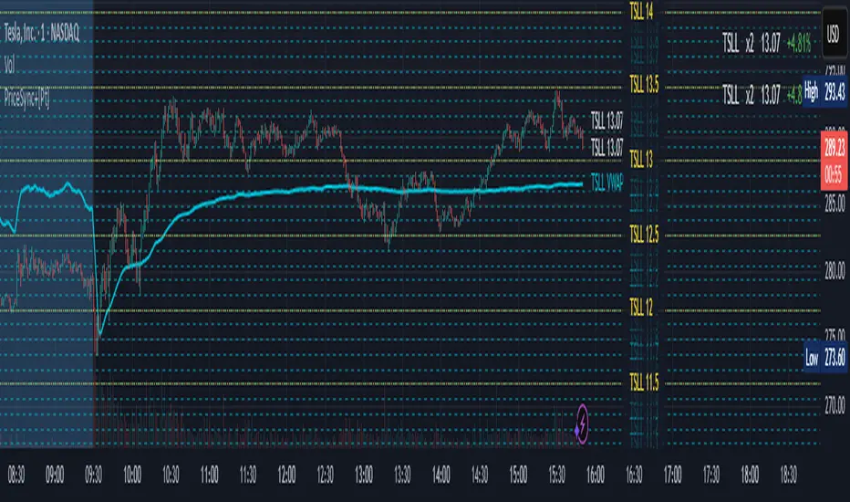
Price Sync Mapper+ [Pt]█ Description:
Price Sync Mapper is a robust TradingView indicator designed to plot correlated price levels of related assets onto the primary chart. This tool is particularly useful for traders who want to trade one asset while monitoring the price action and key levels on another correlated asset, such as leveraged ETFs, inverse ETFs , and other correlated trading pairs. By mapping the price levels of one asset onto another, traders can gain insights into relative price movements and potential trading opportunities.
█ Key Features:
► Multiple Asset Mapping: Supports mapping up to two different tickers onto the primary chart, each with customizable settings, including leverage and inverse properties.
► Dynamic Price Levels: Define the number of price levels to map based on the price movements of the correlated asset, with the scale defined by the multiplier setting.
► VWAP Integration: Option to display Volume Weighted Average Price (VWAP) lines for each mapped ticker, providing additional context on average trading prices. Users can also choose to smooth the VWAP line with a moving average.
► Custom Target Levels: Set and display custom price targets with detailed labels, allowing visualization of key price levels for trading strategies. Users can define labels, tickers, and offsets for up to 8 custom price targets.
► Flexible Update Frequency: Choose to update the indicator on every tick or at the close of each candle, providing flexibility based on trading style and preferences.
► Extended Hours Highlighting: Option to highlight extended trading hours sessions, helping to differentiate between regular and extended trading periods.
► Price Change Display: Displays the percentage price change for each mapped ticker, providing quick insights into the relative performance of correlated assets.
► Table Display: Option to show a table with the current prices, leverage factors, and percentage changes of the mapped tickers, enhancing overall usability and information accessibility. The table can be positioned at various locations on the chart and its font size can be customized.
█ Usage Examples:
► Example 1:
Map the price levels of the Direxion Daily TSLA Bull 2X Shares (TSLL) onto the primary chart of Tesla Inc. (TSLA). This allows traders to see how the leveraged ETF's price movements align with the underlying stock, providing insights into potential trading opportunities based on leverage effects.
► Example 2:
Trade ProShares UltraPro Short QQQ (SQQQ) price levels on Invesco QQQ Trust (QQQ). By mapping the inverse 3x leveraged ETF's price levels onto the underlying asset, traders can set their targets directly on the QQQ chart without flipping between charts and 'guess-timate' which level correspond to which level.
█ Cautionary Note:
Price mapping may not work properly during extended trading hours due to lack of price data, and different trading dynamics and volume.
JaT - Max/Min Labels ProDescription:
The JaT - Max/Min Labels Pro is a powerful and customizable tool designed for traders who want clear, precise, and visually appealing identification of local price extremes. This indicator dynamically detects local maxima and minima based on user-defined sensitivity and displays their values as labels directly on the chart.
Key Features:
Dynamic Extremes Detection: Automatically identifies local highs and lows using a user-configurable lookback period and sensitivity setting.
Customizable Label Offset: Allows you to position labels further away from the bars for enhanced visibility.
Clear Visualization: Labels are color-coded for clarity:
Green for Highs: Transparent green text (50% opacity) displayed above the bar.
Red for Lows: Transparent red text (50% opacity) displayed below the bar.
Efficient Performance: Utilizes optimized Pine Script arrays to manage labels dynamically and avoid clutter.
User-Friendly: Simple configuration with adjustable parameters for lookback period, sensitivity, and label offset.
Parameters:
Lookback Period: Defines the range of bars to analyze for extremes.
Sensitivity: Adjusts the smoothing level for extreme detection using a moving average.
Label Offset: Controls the vertical distance of labels from the bar, ensuring they are easy to read without overlapping.
Who is it for?
This indicator is ideal for traders who rely on technical analysis to spot potential reversal points, breakout levels, or key support/resistance zones. Whether you're a day trader, swing trader, or long-term investor, the JaT - Max/Min Labels Pro provides an elegant and practical solution for enhancing your charting workflow.
How to Use:
Add the indicator to your chart.
Configure the settings to suit your trading style:
Adjust the Lookback Period to define how far back the indicator analyzes.
Set the Sensitivity to control how frequently highs and lows are detected.
Use the Label Offset to adjust label placement for better visibility.
Observe the dynamically generated labels highlighting price extremes.
Feel free to tweak or expand this description if you'd like to emphasize other features or include additional instructions. Let me know if there's anything else you'd like to add or adjust! 😊

TMB LevelsDescription:
Improved "Hourly Midline" indicator. It displays high, middle and low levels of every candle with specified timeframe (can be hourly, daily, or any other timeframe). You can change the source for the levels (either high and low of candle, or open and close of candle). Additionally, you can turn on the "Line chart", which essentially connects every midline, making a line chart of middle prices.
Parameters:
- Timeframe -> use data from this timeframe ("30" would mean 30 minutes, "60" would mean 1 hour, etc.)
- Source -> source for calculating the middle level
- Top -> parameters of the top level lines
- Middle -> parameters of the middle level lines
- Bottom -> parameters of the bottom level lines
- Line chart -> connect every midline, making a line chart

Equilibrium╭━━━╮╱╱╱╱╱╱╭╮╱╭╮
┃╭━━╯╱╱╱╱╱╱┃┃╱┃┃
┃╰━━┳━━┳╮╭┳┫┃╭┫╰━┳━┳┳╮╭┳╮╭╮
┃╭━━┫╭╮┃┃┃┣┫┃┣┫╭╮┃╭╋┫┃┃┃╰╯┃
┃╰━━┫╰╯┃╰╯┃┃╰┫┃╰╯┃┃┃┃╰╯┃┃┃┃
╰━━━┻━╮┣━━┻┻━┻┻━━┻╯╰┻━━┻┻┻╯
╱╱╱╱╱╱┃┃
╱╱╱╱╱╱╰╯
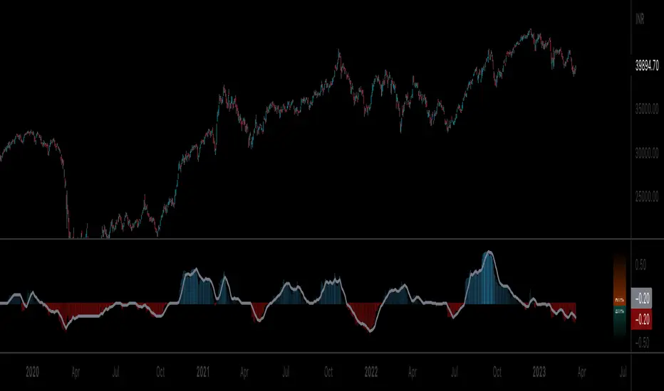
Overview
Equilibrium is a tool designed to measure the buying & selling pressure in the market. It is depicted as a “pressure gauge” that automatically adjusts as new candles are formed, providing a real-time indication of who's on top right now, buyers or sellers?
Background
Supply & demand is considered to be the main driving force of our modern economies, where the interaction between the two parties(sellers & buyers) leads to the determination of the fair price for a given product. Stock markets are no exception, they operate very much based around the idea of supply & demand.
In simple terms, supply refers to the availability of a product, and demand is the willingness of consumers to buy that product at a given price. It is obvious that different vendors may sell the same product at slightly different prices, and similarly, different customers may choose to buy the same product from different vendors at varying prices. The idea is that the price is allowed to fluctuate from time to time, but in a free & fair market, the price will eventually settle down to a value that makes both the parties happy. Such a state is known as the “Price-Equilibrium”, and this process is also referred to as the market mechanism.
This is the basic assumption around which this tool is based, the market is always trying to move towards a state of equilibrium.
Calculations
This tool takes a simplistic approach to estimate the degree of imbalance between buyers & sellers, here’s a brief summary of how the pressure is calculated:
- We compute the total lengths of red & green candles for a given period, i.e. price range multiplied by the volume for that candle.
- Then the distribution of each type of candle is calculated.
- Assuming more red candles denote more selling pressure, and green candles denote buying pressure, the gauge is populated cell by cell.
- As the pressure on one side increases, the intensity of the cell color also increases, signifying the extent to which one side is dominating.
How to use it
- The indicator is designed as a pressure gauge that moves up(vertical alignment) or to the right(horizontal alignment) as the buying pressure increases, and moves down or to the left as the selling pressure increases. How it is to be used & applied, that completely depends on your trading methodology. But, the general idea is that we expect the market to be in a state of equilibrium, and if that is not the case the tool will highlight that, and this is also where the opportunity lies to find suitable trades.
- Just by having an idea about who’s dominating the market currently, a trader can also pick sides wisely. Remember, the market is always striving to come back a state of equilibrium, and a slight imbalance can indicate the current trend, and more importantly, who’s more likely to make the next move.
User Settings
The tool offers some minimal configurations for the end user:
- You can choose to display the actual percentage value in the gauge(Show Text).
- You can adjust colors that denote buyers & sellers.
- You can change the layout of gauge, default is vertical(right side of the screen).
- Last, and most important, you can adjust the number of candles to traverse for calculating the pressure. Default is 50, can go upto 1000.
Candle Price FinderCandle Price Finder
A simple script that finds a candle (or candles) with user defined price levels. Search prices of a candle's high, low, open, close (or any element of the candle).
How To Use:
You can search prices with whole numbers and/or decimals. The search is tail end so if you are looking for a whole number that ends with 00 you type in 00 in search.
Indicator can be used to detect levels of interest, locked in range/points of consolidation. Originally coded to be used with anchored vwap.
Alerts included
In action:

Multiple Popular Prices (x16)Up to 16 popular prices in 16 periods.
Lookback Period: Up to 5,000.
Support 01 volume profile (histogram) on price axis for the last period with up to 100 price ranges.
Histogram of 3 colors (up/down/sideways).
Markets: All.
Timeframes: All from 10s.
Usage: Price moves slowly in the popular price area (PPA) and moves fastly in the unpopular price area (UPA). When price breakouts a PPA, it could be forming an entry to a new PPA or an existing PPA. PPA of a period will move up if price continuously increases or is in an uptrend, and vice versa. It means that this indicator is led by price. Note that, when short-term PPA is higher/lower than long-term PPA, price did move and it is not a buy/sell entry.
Note: If calculation is timeout (“Loop takes too long to execute (> 500 ms)”), try to remove the indicator and reapply it, or try to increase the timeframe, or try to reduce the number of periods used to calculate popular prices.
Multi Oscillators Price LevelsThis script draws price levels corresponding to the highest price reached in overbought situations, and the lowest price reached in oversold situations, depending on the oscillator and the timeframe the user has configured.
These levels correspond, most of time, to good supports and resistances prices.
Price levels drawings can be based on the following indicators:
Stochastic RSI (default)
Stochastic CCI
RSI
CCI
You can customize this indicator with the following options:
Source: The candle source to use in indicators calculation
Source Indicator: The indicator on which you cant to base your levels
Timeframe: The timeframe on which you want to apply the selected indicator, and calculate levels
Show supports/resistances: enable/disable price levels, depending on there status (overbought - resistances) / (oversold - supports)
Lines width: width of price levels. (set to 10 by default in order to draw "zones")
Supports/Resistances source: Select the candle data you cant to use to draw supports and resistances levels
Extend levels: Select the line extension for price levels
Levels color: Select the desired color for price levels
And of course , all parameters corresponding to the supported indicators (Stoch, RSI, CCI)
Here are a few examples of different configurations:
This script will probably be modified in the future, don't hesitate to suggest any improvement.

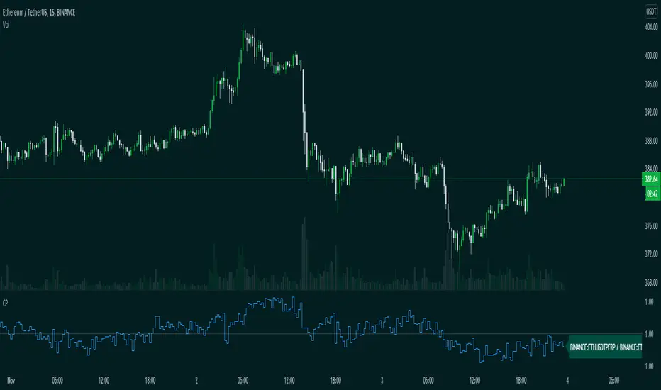
CompareThis indicator compare(Futures Price / Spot Price) futures and spot prices of an asset.
This indicator is made to work with crypto assets mainly.
Inputs:
1. Auto Symbols Selection: Select the symbols for comparision from the selected chart symbol (This option only works with Binance futures symbols)
2. Symbol 1: Symbol 1 for comparison
3. Symbol 2: Symbol 2 for comparison
4. Timeframe: Timeframe for comparison
Happy trading.
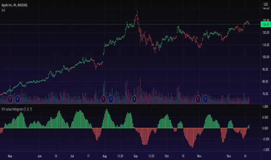
Price/Volume Value HistogramAn interesting implementation of mine to measure an asset changes based on asset price velocity and volume velocity. The indicator acts as asset value calculator. Long and Short.
==Points System Rules==
UPTRENDING
If Current Close is higher than previous Close and Current Volume is bigger than previous Volume: Adds Close Points and Volume Points
Otherwise check
If Current Close is higher than previous Close: Adds Only Close Points
DOWNTRENDING
If Current Close is lower than previous Close and Current Volume is bigger than previous Volume: Reduces Close Points and Volume Points
Otherwise check
If Current Close is lower than previous Close: Reduces Only Close Points
==Plotting==
Result of the values are summed up to a histogram.
Obviously on increasing prices and volume the histogram will be above zero line and on the Bullish side (green color), otherwise, on the Bearish side (red color).
You can't cheat the price movement, it's just what it is.
Optional to smooth it by EMA (set to true by default).
Like if you Like and Enjoy!
Follow for upcoming indicators.
Significant Prices by entropy 86Script that will show significant price barriers on forex pairs. Requires modification to work properly on other instruments.

52 Week High/Low52 Week High / Low Indicator
A simple, unobtrusive indicator that can be used on any timeframe to display the 52 week high/low values.
Features
Works on any timeframe.
Unobtrusive: Simple horizontal lines showing only the current 52 week values.
Allows the user to select whether to calculate the 52-week values from candle close values or the respective highs/lows.
For full overview and code commentary - Visit the backtest-rookies website.
