BTC-Trend
BTC-Trend
BTC-Trend is a technique that shows how much BTC is dominating the market and it's effect over the whole Crypto Market.
*** Features
* Color grading to show you the Increase of domination effect (Green).
* Color grading to show you the Decrease of domination effect (Red) .
* Better understanding to the market ,and that will help you with a very good timed trades at the best trading times .
/////////////////////////////////////////////
*Note
Special thanks for Lazybear for his momentum algorithm .
Cari dalam skrip untuk "BTC"

BTC Avarage Volume Indicator 2This indicator shows that volume and candle color of "BTC" pairs on one of the top 4 "BTC" exchanges.
You can easily see the volumes and candle color for "BTC" trading.
* Currently, this indicator can be used by selected people in order to complete private beta test.
* Once testing is completed, this indicator can be purchased.
* If you'd like to use this, please "DM" me and I will provide PayPal information.
About Inputs
* Default Ticker IDs are set as "BITMEX:XBT", "BITFINEX:BTCUSD", "BITFLYER:BTCJPY" and "BINANCE:BTCUSDT".
* Ticker ID can be changed.
* Ticker Label Color can be changed.
* Scale Value Of Sum Of Other Volume can be changed. See the following Important Notice.
* Ticker Label Color can be changed depending on theme color.
* Show/Hide warning(Show=0, Hide=100) can be changed. See the following Important Notice.
* Interval (Timeframe) can be changed depending on timeframe of current chart.
Specification
* barmerge is set as barmerge.gaps_off and barmerge.lookahead_off for every calculation.
Important Notice
* Volume of some exchange is over 100x times compared to other volumes. In this case, value of column chars is manipulated since other column chars come to be invisible and warning will be displayed on the right side of last chart.
* Manipulated column charts is calculated as sum of other volumes by scale which can be changed from "Scale Value Of Sum Of Other Volume" on Inputs

BTC World Price: Multi-Exchange VWAPBTC World Price: Multi-Exchange VWAP
__________________________
WHAT IT DOES
What you see above are not Bitmex candles, but this indicator's.
Bitcoin is listed on multiple exchanges. Many people have called for a single global index that would quote BTC price and volume across all exchanges: this script is such a virtual aggregate (formerly: Multi-Listed , Volume-Weighted Average Price ).
It will, independently for each tick, for any time-frame:
- Quote the price (O, H, L, C) and volume from Bitfinex (USD), Binance (USDT), bitFlyer (Yen), Bithumb (S. Korean Won), Coinbase (USD), Kraken (EUR) and even Bitmex (USD Contracts).
- Weight each price with the corresponding volume of the exchange.
- Quote the FOREX conversion rate in USD for each currency (USDJPY etc.)
- Finally return global average price (candles) in USD.
- Additionally provide (H+L)/2 etc. values.
No more "on Coinbase this" or "on Bitstamp that", you've now got a global overview!
See CoinMarketCap: Markets for reference. I've included alternative exchanges in the comments at the top of the script.
__________________________
HOW TO USE IT
Basically just add it to your chart and use the indicator's candles instead of the chart's main ticker.
By default, BTC World Price will display candles only, but you can also display OHLC & averages (in whichever style you want).
You may indeed want to hide the main symbol (top-left corner, click the 'eye' button next to its name), or switch it to something else than candles/bars (e.g. line).
Make sure "Scale Price Chart Only" is disabled if you want to use the auto-zoom feature. (if other indicators are messing your zoom, you can try to select "Line with Breaks" or "Area with Breaks" to allow these to overflow from the main window)
By clicking the triangle next to the indicator's name, you can select "Visual Order" (e.g "Bring to Front").
You can select regular Candles or Heikin-Ashi in Options.
In the Format > Inputs tab, you can select which exchanges to quote. By default, all of them are enabled.
The script also exposes the following typical values to the backend, which you can use as Price Source for other indicators: (e.g. MA, RSI, in their "Format > Input" tab)
Open Price (grey)
High Price (green)
Low Price (red)
Close Price (white)
(H + L)/2 (light blue)
(H + L + C)/3 (blue)
(O + H + L + C)/4 (purple)
They are all hidden by default (by means of maximum transparency).
In the Format > Style tab, you can change their color, transparency and style (line, area, etc), as well as uncheck Candles and Wicks to hide these.
If you are using "Indicator Last Value" and want to clear the clutter from all these values, simply uncheck them in Style. They will still be available as Price Source for other indicators.
You can also choose to scale it to the left, right (default) or "screen" (no scaling).
Once you're satisfied with your Style, you may click "Default"> "Save as default" in the botton-left. Everytime you load the indicator, it will look the same. ("Reset Settings" will reset to the script's defaults)
__________________________
Please leave feedback below in comments or pm me directly for bugs and suggestions.

btc fractal history by @cryptoshebadds btc price history for observation of fractals in price action. default settings overlay 2013 btc bubble on 2017 btc bubble to show striking similarity between the two.

BTC ETF Flow Monitor🚀 Bitcoin ETF Flow Monitor - Track Institutional Money Flows
Monitor real-time dollar flows across major Bitcoin ETFs with this professional-grade indicator inspired by Dune Analytics. Perfect for tracking institutional sentiment and Bitcoin adoption trends.
📊 Key Features: • Real Dollar Flows : Display actual estimated flows in millions USD, not abstract indices
• 5 Major ETFs : IBIT (BlackRock), FBTC (Fidelity), ARKB (ARK), BITB (Bitwise), GBTC (Grayscale)
• Dune Analytics Style : Clean, professional visualization with meaningful thresholds
• Smart Alerts : Get notified of significant flow changes and BTC price divergences
• Enhanced Summary Table : Live stats including total flows, trends, and market sentiment
💡 How It Works: Combines volume, price action, and momentum to estimate institutional dollar flows. Positive values = inflows (buying pressure), negative values = outflows (selling pressure). Scale shows millions of USD for easy interpretation.
🎯 Perfect For:
- Tracking institutional Bitcoin adoption
- Identifying accumulation/distribution phases
- Spotting divergences between ETF flows and BTC price
- Understanding market sentiment shifts
⚡ Professional Grade: Built with advanced Pine Script techniques, optimized performance, and real-world trading applications in mind.

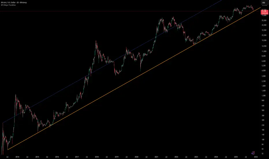
[Algoros] BTC Major Trendline# BTC Major Trendline - Long-Term Bitcoin Trend Analysis
## Overview
BTC Major Trendline is a comprehensive technical analysis tool designed to track Bitcoin's long-term bullish trajectory using historically significant price points. This indicator establishes a primary upward trendline anchored to two major Bitcoin cycle lows, along with optional parallel channels and Fibonacci-based price projections.
## ⚠️ Important Requirements
**This indicator requires a Bitcoin chart with sufficient historical data dating back to at least April 2013.**
**✅ Recommended Charts:**
- `INDEX:BTCUSD` - Bitcoin Index (comprehensive history)
- `BITSTAMP:BTCUSD` - Bitstamp Bitcoin (default setting)
**❌ Will NOT work properly on:**
- Charts with limited history (Like hourly charts)
- Exchanges that launched after 2013
- Altcoin pairs or other cryptocurrencies
If the indicator doesn't display correctly, switch to one of the recommended Bitcoin charts above.
## Key Features
### 📈 Primary Trendline
- Anchored to two historically significant lows:
- **Start Point**: July 6, 2013 - Early Bitcoin accumulation phase
- **End Point**: November 21, 2022 - FTX collapse bottom
- Automatically calculates and extends the trendline based on these anchor points
- Displayed as a solid orange line
### 🔷 Parallel Channel Line (Optional)
- Creates an upper boundary by connecting historical high points:
- April 10, 2013 and June 11, 2017
- Helps identify potential resistance zones and channel breakouts
- Displayed as a blue dotted line for easy distinction
### 🎯 Fibonacci Trendline Multipliers (Optional)
- Seven Fibonacci-based projection lines: **1.6x, 2x, 3x, 5x, 8x, 13x, and 21x**
- Each multiplier creates a parallel trendline above the main trend
- Color-coded from teal to maroon for clear visual separation
- Useful for identifying potential profit-taking zones and long-term price targets
### 📉 Negative Fibonacci Trendlines (Optional)
- Seven division-based support lines: **÷1.6, ÷2, ÷3, ÷5, ÷8, ÷13, and ÷21**
- Projects downward channels below the main trendline
- Displayed in yellow tones for easy identification
- Helps identify extreme oversold conditions and potential bounce zones
## Customization Options
- **Symbol Input**: Track any Bitcoin pair with sufficient history (default: BITSTAMP:BTCUSD)
- **Show/Hide Components**: Toggle parallel line, Fibonacci multipliers, and negative Fibonacci lines independently
- **Line Extension**: Extend lines right, left, both directions, or none
- **Multi-Timeframe Compatible**: View on any timeframe once loaded on a compatible chart
## How to Use
1. **Setup**: First, open a Bitcoin chart with sufficient history (INDEX:BTCUSD or BITSTAMP:BTCUSD recommended)
2. **Trend Confirmation**: The main orange trendline represents the long-term bullish trajectory. Price staying above this line suggests the bull market remains intact.
3. **Channel Trading**: Use the parallel line (blue dotted) as a potential upper boundary for the long-term channel.
4. **Price Targets**: Enable Fibonacci multiplier lines to identify ambitious long-term price targets during bull runs. Higher multipliers (13x, 21x) represent parabolic extension zones.
5. **Support Identification**: Enable negative Fibonacci lines to spot potential support zones during corrections or bear markets.
6. **Risk Management**: Breaking below the main trendline could signal a shift in long-term trend, warranting caution.
## Technical Implementation
- Uses `request.security()` to fetch precise daily prices at historical timestamps
- Requires access to Bitcoin price data from April 2013 onwards
- Calculates slope dynamically based on anchor points
- All lines update in real-time as new price data emerges
- Efficient rendering system minimizes performance impact
## Best Used For
✅ Long-term Bitcoin investors and HODLers
✅ Identifying major trend direction
✅ Setting realistic long-term price targets
✅ Spotting potential support/resistance zones
✅ Multi-timeframe analysis (on compatible charts)
✅ Educational purposes (understanding logarithmic growth)
## Troubleshooting
**Lines not appearing?**
- Ensure you're viewing INDEX:BTCUSD or BITSTAMP:BTCUSD
- Check that the chart has data back to April 2013
- Verify the symbol input matches your chart
- Try switching to a daily or weekly timeframe first
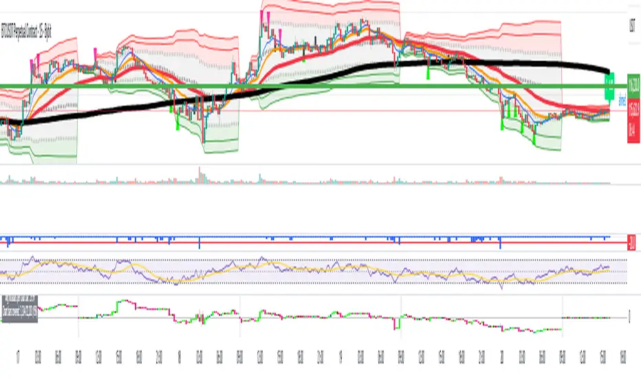
BTC Lead(v3.32)Summary
A 15-minute, BTC-focused lead/divergence indicator designed for simple execution: when a ▲/▼ appears, start scaling in with small clips; when a ■ (black square) prints, it means the indicator’s edge has weakened (not that the market trend is over). Real-time expected move label and alert templates included. Do not fade the signal—if you must try the opposite side, wait until a ■ appears.
How to read the signals
▲ Green → Long bias increased
▼ Pink → Short bias increased
■ Black → Edge weakened; consider taking profits/standing aside
Multiple level markers on the same bar (L2/L3/L4) = stronger setup
Live label (top of chart)
A single line shows the Expected Move (%) with arrow and color-coded background (↑ green / ↓ pink) for instant direction clarity.
Tip: Use Replay to watch label → ▲/▼ → ■ sequences on past data.
Confidence filter (important)
|Expected Move| < 1% → treat as noise / ignore
If considering the opposite direction, wait for a ■ first (edge reduced).
Scope
Internal calculations are fixed to 15-minute resolution.
Built for BTC 15m. It may display on other crypto symbols/timeframes, but performance is not guaranteed.
Alerts
Ready-made conditions: ENTRY LONG / ENTRY SHORT / EXIT LONG / EXIT SHORT. Add an alert on this indicator and choose the condition you want.
Risk note
For research/education only. Past behavior doesn’t guarantee future results. Predefine position sizing, stops, and profit-taking, and execute consistently.

BTC Lead(v3.31)Summary
A 15-minute, BTC-focused lead/divergence indicator designed for simple execution: when a ▲/▼ appears, start scaling in with small clips; when a ■ (black square) prints, it means the indicator’s edge has weakened (not that the market trend is over). Real-time expected move label and alert templates included. Do not fade the signal—if you must try the opposite side, wait until a ■ appears.
How to read the signals
▲ Green → Long bias increased
▼ Pink → Short bias increased
■ Black → Edge weakened; consider taking profits/standing aside
Multiple level markers on the same bar (L2/L3/L4) = stronger setup
Live label (top of chart)
A single line shows the Expected Move (%) with arrow and color-coded background (↑ green / ↓ pink) for instant direction clarity.
Tip: Use Replay to watch label → ▲/▼ → ■ sequences on past data.
Confidence filter (important)
|Expected Move| < 1% → treat as noise / ignore
If considering the opposite direction, wait for a ■ first (edge reduced).
Scope
Internal calculations are fixed to 15-minute resolution.
Built for BTC 15m. It may display on other crypto symbols/timeframes, but performance is not guaranteed.
Alerts
Ready-made conditions: ENTRY LONG / ENTRY SHORT / EXIT LONG / EXIT SHORT. Add an alert on this indicator and choose the condition you want.
Risk note
For research/education only. Past behavior doesn’t guarantee future results. Predefine position sizing, stops, and profit-taking, and execute consistently.
BTC Power Law Valuation BandsBTC Power Law Rainbow
A long-term valuation framework for Bitcoin based on Power Law growth — designed to help identify macro accumulation and distribution zones, aligned with long-term investor behavior.
🔍 What Is a Power Law?
A Power Law is a mathematical relationship where one quantity varies as a power of another. In this model:
Price ≈ a × (Time)^b
It captures the non-linear, exponentially slowing growth of Bitcoin over time. Rather than using linear or cyclical models, this approach aligns with how complex systems, such as networks or monetary adoption curves, often grow — rapidly at first, and then more slowly, but persistently.
🧠 Why Power Law for BTC?
Bitcoin:
Has finite supply and increasing adoption.
Operates as a monetary network , where Metcalfe’s Law and power laws naturally emerge.
Exhibits exponential growth over logarithmic time when viewed on a log-log chart .
This makes it uniquely well-suited for power law modeling.
🌈 How to Use the Valuation Bands
The central white line represents the modeled fair value according to the power law.
Colored bands represent deviations from the model in logarithmic space, acting as macro zones:
🔵 Lower Bands: Deep value / Accumulation zones.
🟡 Mid Bands: Fair value.
🔴 Upper Bands: Euphoria / Risk of macro tops.
📐 Smart Money Concepts (SMC) Alignment
Accumulation: Occurs when price consolidates near lower bands — often aligning with institutional positioning.
Markup: As price re-enters or ascends the bands, we often see breakout behavior and trend expansion.
Distribution: When price extends above upper bands, potential for exit liquidity creation and distribution events.
Reversion: Historically, price mean-reverts toward the model — rarely staying outside the bands for long.
This makes the model useful for:
Cycle timing
Long-term DCA strategy zones
Identifying value dislocations
Filtering short-term noise
⚠️ Disclaimer
This tool is for educational and informational purposes only . It is not financial advice. The power law model is a non-predictive, mathematical framework and does not guarantee future price movements .
Always use additional tools, risk management, and your own judgment before making trading or investment decisions.

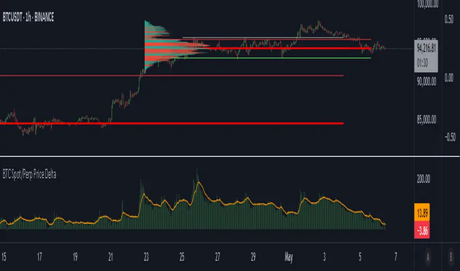
BTC Spot/Perp Price DeltaThe indicator gathers price from 3 btc spot pairs (largest by volume) and 3 btc perp pairs (also largest by volume).
The average Spot and Perp prices are then derived.
The indicator plots the price difference between the Spot average and the Perps average (Spot minus Perps).
Green plot above the zero line means Spot price is higher than the Perp price at a candle close - Contango.
Red plot below the zero line means Spot Price is lower than the Perp price at a candle close - Backwardation.
The orange line is the EMA. Default value is 100 periods. Changeable by User.
Use cases:
1. Perp market is way larger than the Spot market, measured by traded Volume. We may say that the Perps market is more "stable", because it is more liquid. When Spot price deviates a lot from the Perps price, in both positive and negative directions, we may expect a mean reversion.
High Green or Red indicator values = expect price reversion.
2. Helps to observe absorption. If the indicator values are high (in both directions), but the price is barely moving, we can come to a conclusion that the opposite side Limit orders are being deployed to absorb Spot market orders.
Typically, this also indicates mean reversion.
3. You are welcome to use the indicator and perhaps find your own use cases.
Any suggestions on how to improve this indicator are welcome.
BTC Coinbase PremiumThis script is designed to compare the price of Bitcoin on two major exchanges: Coinbase and Binance. It helps you see if there’s a difference in the price of Bitcoin between these two exchanges, which is known as a “premium” or “discount.”
Here’s how it works in simple terms:
Getting the Prices:
The script first fetches the current price of Bitcoin from Coinbase and Binance. It looks at the closing price, which is the price at the end of the selected time period on your chart.
Calculating the Difference:
It then calculates the difference between these two prices. If Bitcoin is more expensive on Coinbase than on Binance, this difference will be positive, indicating a “premium.” If it’s cheaper on Coinbase, the difference will be negative, indicating a “discount.”
Visualizing the Difference:
The script creates a visual chart that shows this price difference over time. It uses green bars to show when there’s a premium (Coinbase is more expensive) and red bars to show when there’s a discount (Coinbase is cheaper).
Optional Table Display:
If you choose to, the script can also show this price difference in a small table at the top right corner of your chart. The table displays the words “Coinbase Premium” and the exact dollar amount of the premium or discount.
Why does it matter?
Traders and investors have spotted a correlation between bullish strength on BTC and a strong Coinbase premium along with the inverse of a strong Coinbase discount and BTC price weakness.

BTC Purchasing Power 2009-20XX! Hello, today I'm going to show you something that shifts our perspective on Bitcoin's value, not just in nominal terms, but adjusted for the real buying power over the years. This Pine Script TAS developed for TradingView does exactly that by taking into account inflation rates from 2009 to the present.
As you know, inflation erodes the purchasing power of money. That $100 in 2009 does not buy you the same amount in goods or services today. The same concept applies to Bitcoin. While we often look at its price in terms of dollars, pounds, or euros, it's crucial to understand what that price really means in terms of purchasing power.
What this script does is adjust the price of Bitcoin for cumulative inflation since 2009, allowing us to see not just how the nominal price has changed, but how its value as a means of purchasing goods and services has evolved.
For example, if we see Bitcoin's price at $60,000 today, that number might seem high compared to its early years. However, when we adjust this price for inflation, we might find that in terms of 2009's purchasing power, the effective price might be somewhat lower. This adjusted price gives us a more accurate reflection of Bitcoin's true value over time.
This script plots two lines on the chart:
The Original BTC Price: This is the unadjusted price of Bitcoin as we typically see it.
BTC Purchasing Power: This line shows Bitcoin's price adjusted for inflation, reflecting how many goods or services Bitcoin could buy at that point in time compared to 2009.
By comparing these lines, we can observe periods where Bitcoin's purchasing power significantly increased, even if the nominal price was not at its peak. This can help us identify moments when Bitcoin was undervalued or overvalued in real terms.
This analysis is crucial for long-term investors and traders who want to understand Bitcoin's value beyond the surface-level price movements. It helps us appreciate Bitcoin's potential as a store of value, especially in contexts where traditional currencies are losing purchasing power due to inflation.
Remember, investing is not just about riding price waves; it's about understanding the underlying value. And that's precisely what this script helps us to uncover

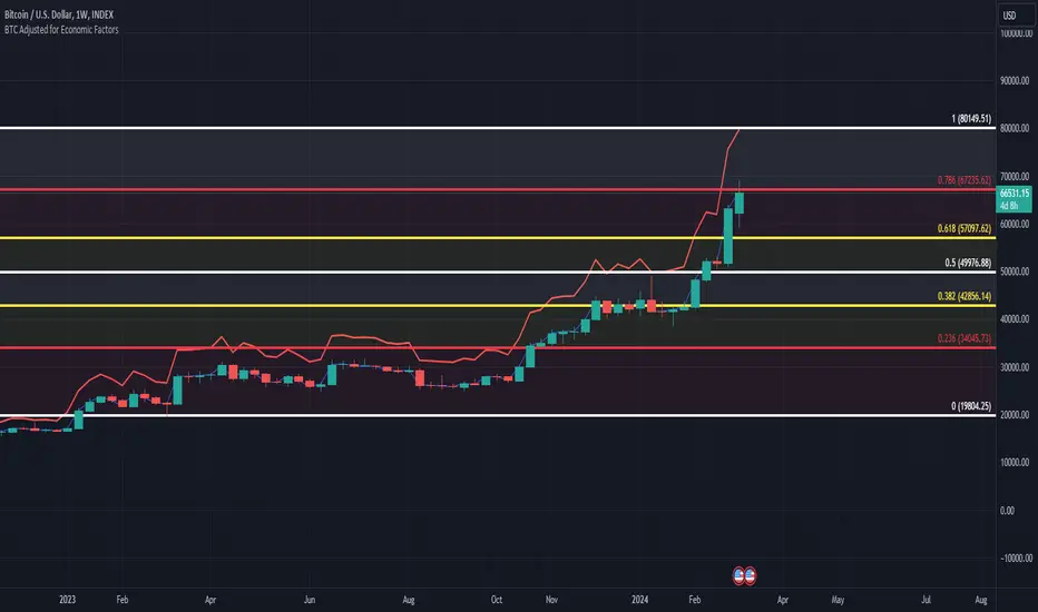
BTC/USD Inflation priced in! ~Period 2009 - 2023 (by TAS)The script creates a custom indicator titled "BTC Adjusted for Economic Factors.
Adjusted BTC Price is plotted in red, making it more prominent. The adjusted price is Bitcoin's historical closing prices adjusted for cumulative inflation over time, based on the Core Consumer Price Index (CPI) annual inflation rates from 2009 onwards.
The script calculates the adjusted price of Bitcoin by taking into account the effect of inflation on its value. It uses annual CPI rates for each year from 2009 to 2022 to calculate a cumulative inflation factor. The script assumes a placeholder inflation rate of 2.5% for 2023, indicating that this value should be updated when the actual rate is available. The script suggests adding CPI rates for additional years as they become available to maintain the accuracy of the adjustment.
Here's a breakdown of how the script works:
Core CPI Annual Inflation Rates: It starts by defining the annual inflation rates for each year from 2009 to 2022, expressed as a percentage divided by 100 to convert to a decimal.
Cumulative Inflation Calculation: The script calculates cumulative inflation starting from the year 2009 up to the current year. For each year that has passed since 2009, it multiplies the cumulative inflation factor by (1 + cpiRate), where cpiRate is the inflation rate for that year. This effectively compounds the inflation rate over time.
Adjusting Bitcoin's Price: The script then adjusts Bitcoin's closing price (close) for the calculated cumulative inflation to get the adjusted price (adjustedPrice).
Plotting the Prices: Finally, it plots both the original and the adjusted Bitcoin prices on the chart, allowing users to visually compare how inflation has theoretically impacted Bitcoin's value over time.
--------------------------------------------------------------------------------------------------
Important to notice, Fib. Retracements from the 2017 cycle top to the recent top (¬80K) doesn't look invalidated.
--------------------------------------------------------------------------------------------------
Inputs and feedback are welcome!
BTC Halving [YinYangAlgorithms]This Indicator not only estimates what it thinks may be the PRICE for the Start, High and Low of the Halving, but likewise estimates WHEN the Start, High and Low of Halving may be. It then creates Trend Lines based on these predictions so that you may get an evaluation towards if the Price is currently Overbought or Oversold. These Trend Lines may be very useful for seeing the Slope in which the Price may move if it is to reach the estimated Price by the estimated Date. By evaluating the Prices location based on these Trend Lines we may determine if the Price is currently Overbought or Oversold.
These Trend Lines likewise may help identify locations of Support and Resistance. If the Price is much higher than its current Trend Line it is Overbought. There is a chance it will Consolidate back to the Trend Line or it may even correct with a dump all the way back to it; the opposite is true if it is much lower than its current Trend Line.
Trend Lines and Estimates are not all that is featured within this Indicator however. There are also Price Zones which may help identify if the price is currently:
Very Overbought (Red)
Slightly Overbought (Orange)
Neutral (Yellow)
Slightly Oversold (Teal)
Very Oversold (Green)
These zones may help give you an idea of how the price is currently fairing and its potential for movement. Likewise, it may help define where Support and Resistance may be found.
The trend line estimates are done with an algorithm created to evaluate the difference between price and % change that has occurred between the Start, High and Low of all the halvings over how many days between each data type. This may allow us to make an educated estimate towards what Price and Date the Start, High and Low will occur at.
Our Zones are created by evaluating the current Market Cap and circulating supply vs Max Supply of BTC. This may help give us an evaluation of what Price may be considered to be Overbought and Oversold; and likewise may help with estimations of where there may be Support and Resistance based on these Zones.
Tutorial:
In the example above we’re displaying the Halving Start Trend Line, our Information Tables and our Estimated Halving Vertical Marker. This Trend Line may help to display not only the trajectory and slope the Price needs to take to reach the Estimated Halving Price by the Estimated Halving Date; but it may also help to show if the price is Overvalued or Undervalued based on its position above or below this Trend Line.
Based on the Trajectory of the Estimated High Upward Trend Line (Green Line) in the photo above and from the ‘High Date’ estimated in the Information tables; we may attempt to estimate the location the ATH of this Bull Market will create and the price slope it may follow in doing so. This Trajectory may be very useful for understanding the price action that may occur for it to reach the High estimated Price by the High estimated Date.
We currently allow for two different types of zones within our Settings, one called ‘Fast’ displayed in the example above; and the other called ‘Slow’ displayed in the example below.
Our Fast Zone aims to move the Zone Levels Faster in an attempt to move with volatility and parabolic movement. This may help to keep the Very Overbought (Red) and Very OverSold (Green) Levels more accurate by attempting to keep the price within them. By doing so, we may aim to keep all of the Slightly Overbought, Slightly Oversold and Neutral Levels more accurate as well.
The Levels within these zones are defined by the Bright (less transparent) Lines. Whereas the Darker (more transparent) lines represent the Basis Lines between two different levels. These Basis lines may likewise act as a Support and Resistance Location too, but generally hold less weight than the actual Levels themselves.
What you may see is that during the Bull Market, the price is within the very Overbought Zones and even touches again the Very Overbought Level a few times. Likewise, during the Bear Market, the price is within the very Oversold Zones and even slightly drops below the Very Oversold Level. This may be expected and likewise may help to give estimates at potential for growth and decay within the Price based on which condition the Market is within.
Slow Zones move a little slower than Fast Zones, however they may still be accurate. Likewise, it is up to you to decide which Zone works better for your specific Trading Style; however, by default, the Zone type is set to Fast.
If you refer to both the Fast and Slow examples above, you may notice in the Fast the Price is only slightly above the ‘Slightly Oversold’ (Teal) line. Also, In the Fast, the Price where the ‘Very Overbought’ Level is 100k. This is one of the many reasons we’ve opted for ‘Fast’ as the default, and it is because it allows more room for movement; and in our opinion, potentially accuracy as well.
If you refer to the Slow example, you’ll see that the price is currently facing the Neutral Level as a Resistance location. However, if you refer to the price residing at the Slows ‘Very Overbought’ Level, it is only 81.5k, compared to the 100k of Fast.
The BTC Halving is a major event that takes place roughly every 4 years. It historically has a major impact on the market, and some may even say it signifies the Start, or close to start of the Bull Market. Therefore, since historically there may be cycles that BTC and potentially crypto itself follows, we’ve developed this Indicator in hopes that it may solve one of the biggest questions traders face. What Date will the Start, High and Low of the Halving occur and also at what Price.
Hopefully this Tutorial has given you some guidance as to how this Indicator may be used to help identify some of these key levels; including the slope at which the price may have to move if it is to reach its projection Price by its projected Date.
Settings:
1. Show Prediction Trend Lines:
- Options:
All
Start + High
Start + Low
High + Low
Start
High
Low
None
- Description:
Prediction Trend Lines may be an important way to see the Slope the Price needs to take to reach the Predicted Price by the Predicted Date. This may be useful for identifying if the Price is currently Overbought or Oversold.
2. Zone Type:
- Options:
Fast
Slow
- Description:
Zone types change the way the Zones expand.
3. Show Zones:
- Options:
All
Zones
Basis
None
- Description:
Zones are a way of seeing Overbought and Oversold Price locations based on Market Cap and Circulating Supply vs Max Supply.
4. Vertical Markers:
- Options:
All
Line
Label
None
- Description:
Vertical Markers display where the Halving has occurred with a Vertical Line and Label.
5. Show Tables:
Tables may be useful for seeing the Price and Date for when the Start, High and Low of the Halving may occur.
6. Fill Zones:
Filling in Zones may help to identify which Zone the Price is currently in.
If you have any questions, comments, ideas or concerns please don't hesitate to contact us.
HAPPY TRADING!

BTC 1D Safety tradeImportant: use only the BTC/USD pair on the 1D timeframe
The indicator is designed to determine the zones for entry to buy or sell, as well as for closing deals.
The indicator is based on a moving average with a period of 12.
The parameters are not changeable, since the optimal settings (Safety trade) were used for the BTC/USD pair on the 1D timeframe.
The code is open, please change it according to your parameters.
Upper zones for closing long or opening short.
Lower zones for opening long or closing short.

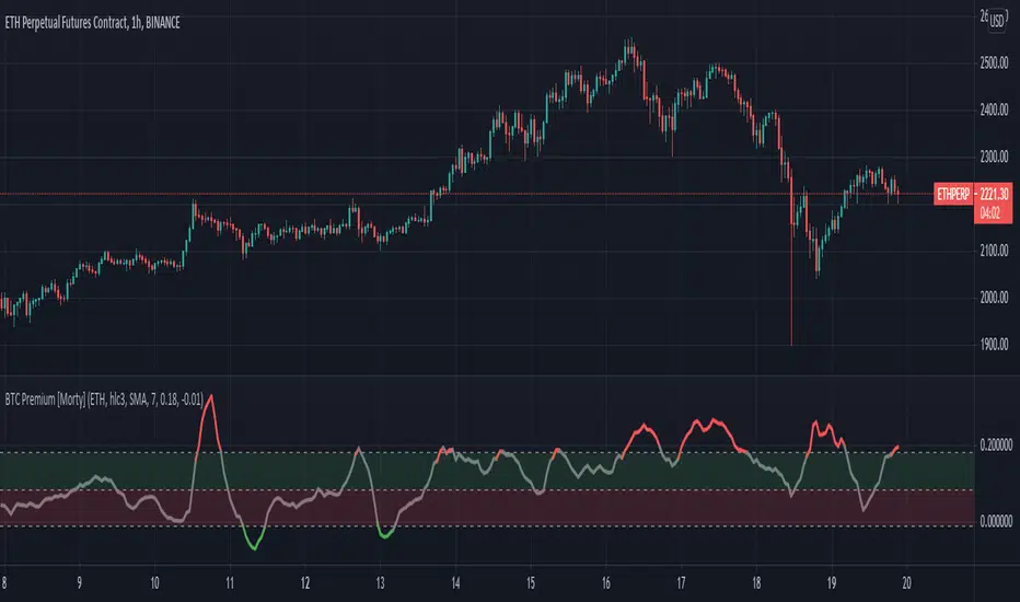
BTC Perpetual Futures Premium [Morty]Version 1.0, 20210409
This is an oscillator indicator that shows the premium between BTC perpetual futures and spot prices.
The prices of futures and spot are weighted average prices, weighted by the exchange's trading volume.
When the indicator is in the upper half of the region, the funding rate of perpetual contracts is relatively high, and the market trend is bullish.
When the indicator is in the upper half of the region, the funding rate of perpetual contracts is relatively high, and the market trend is bearish.
You can set the upper and lower limits of the premium. When the indicator exceeds the upper or lower limit, the trend usually reverses.
Buy the dip, Sell the high.
----------------------------------------------------------
Version 1.0, 20210409
这是一个振荡器指标,它显示了BTC永续期货和现货之间的溢价。
期货和现货的价格是加权平均价格,由交易所的交易量加权。
当指标在上半部区域时,永续合约的资金费率相对较高,市场趋势是牛市。
当指标在上半部区域时,永续合约的资金费率相对较高,市场趋势是熊市。
您可以设置溢价的上限和下限。当指标超过上限或者下限,通常会趋势反转。
Buy the dip, Sell the high.
BTC Transaction/On-Chain Volume (Basic)Description:
Whale: Whale utilizing discounted prices (increasing on-chain volume & decreasing price)
Recovering: Positive momentum in price after potential whale activity
Cycle Volume Support: The transaction volume support during a cycle
What’s the best time to invest?
After institutions make up their mind at low price levels.
How’s on-chain volume related to whales or institutional money?
On-chain volume is contributed not only by using BTC as payment methods, but more importantly by large custodians using the BTC chain to settle internal whale trades. When OTC volume is estimated 2-3 times of exchange volume, and when total on-chain volume is only a small fraction of the exchange volume, the OTC settlement plays a big factor in moving the on-chain volume around.
Why does the price drop further after spotting whale money?
Does new money equal higher true value? Yes.
Does new money equal higher price? No.
Whales could not only ladder in when they see the price on discount, but also push the price further down to accumulate at better price levels. However, either route chosen, it’s most likely for the price to rise to a higher level compared to the level when the whales enter. Whales are here to make money after all.

BTC Mining Cost - IndicatorBTC Mining Cost Indicator
- Adjust the Emission Rate after each halving, currently it's 12.5
- Current settings are for the Antminer S17 with an average cost of 12 cents per kWh
As you can see, a bounce usually follows when the price hits the cost of mining 1 BTC .
I would love to hear your feedback, and if you like it please gimme a thumbs up ❤️
Happy Trading!

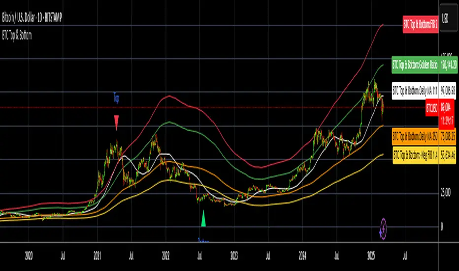
BTC Top and Bottom PickerBTC Top and Bottom Picker
This study predicts BTC tops and bottoms using Bitstamp's daily close data/
It is based on Philip Swift's The Golden Ratio Multiplier post on Medium
In a nutshell:
The top is calculated when 111 daily SMA crossing 350 daily SMA
The bottom is calculated by dividing 350 daily SMA by 1.4
If you like this, please like and share it and follow me.
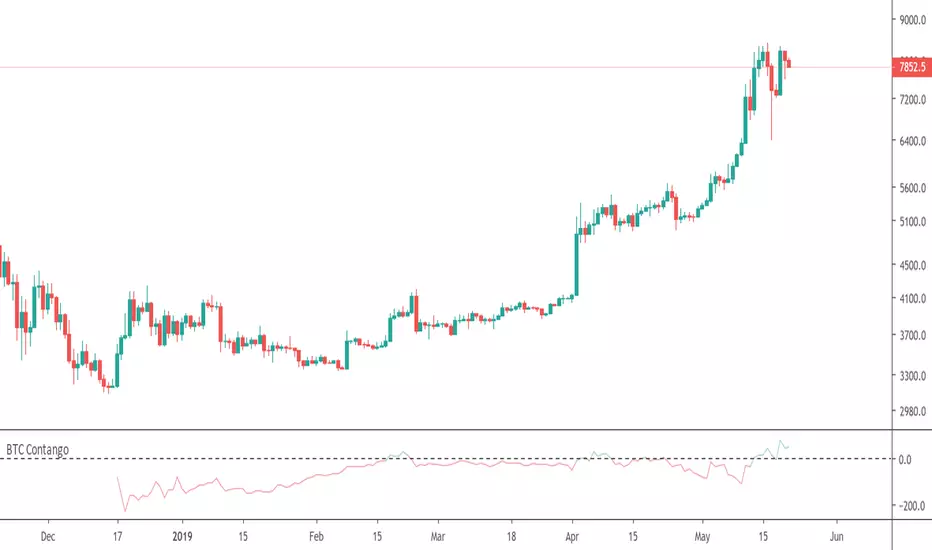
BTC Contango indicatorThis is a Bitcoin contango indicator, which tells you the difference in price between the price of the specified BTC futures contract and the current spot price. A viable strategy is to sell when "contango" occurs, which means the futures price is greater than the spot price (green line, above 0), and buy when it is below.
If you found this indicator useful, please feel free to tip so that I can continue making more free indicators!
BTC: 1JkcVwaPZfvpqxGio4iz2aENa2gj8oowxi
ETH: 0x71d509eeb9f86296c3f55bb7e882d9e69e393b2a
EOS: 0x71d509eeb9f86296c3f55bb7e882d9e69e393b2a
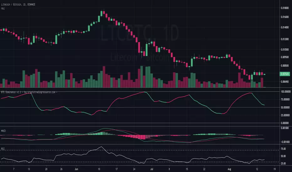
BTC Dominance - by @cryptomrdavis -Simple tool for your trading assets. Check the dominance from BTC agains other Alts and trade safe.
You can find a short description on the chart above.
Website coming soon: cryptotradingresource.com
Happy trading
+++ use this tool on your own risk. i'm not responsible for your loses. DYOR +++
____________________________________________________________________________
BTC: 1GVRDK3HHr9CKM5SF2CGpCNXFuavB3L4j9
ETH: 0x7b825fa752b9926D3E8397cDb1d9E5473D074646
XLM: GAXUQJSW55C7MAC4GI26NZUGIKSHFDVFRFKZCXPLMPY4HCADSDT55XK6
BCH: qz57n04ud6mn42u00aymqkku8tfh0lk4jv9c28mjvv
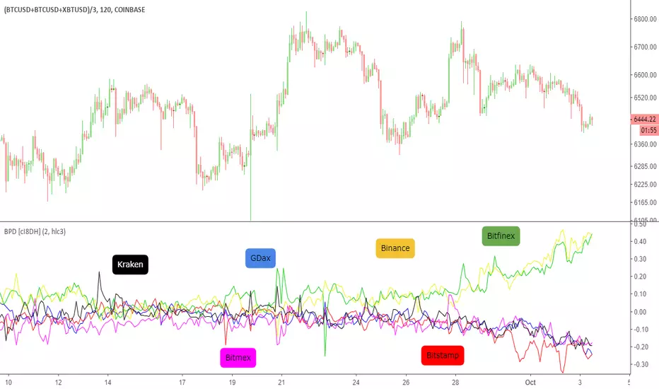
BTC Price Deviation % and Tether price (BPD) [cI8DH]This indicator shows Bitcoin price deviation from average of price across difference exchanges in percentage. As you can see, price at Bitfinex and Binance (both BTC/Tether pairs) are going up relative to BTC/USD pairs. This means Tether price is going down for some fishy reason(s). In the next
update, I will add Tether price calculation.
BTC ETF Premium IndicatorThe "BTC ETF Premium Indicator" (BEPI) is a sophisticated tool designed for investors and traders who seek to analyze the performance of Bitcoin ETFs relative to the actual market price of Bitcoin. This indicator provides a comprehensive visualization of the premium or discount at which each ETF is trading compared to its Net Asset Value (NAV).
Functionality:
ETF Selection: Users can toggle the visibility of individual ETFs to customize their view, focusing on the ETFs most relevant to their trading or analysis strategies.
Premium Computation: BEPI calculates the premium of each selected ETF by comparing its market share price to its NAV, expressed as a percentage. A positive percentage indicates a premium, while a negative percentage suggests a discount.
Aggregate View: The indicator can plot an average premium based on the selection, providing a consolidated perspective of the overall market sentiment across the chosen ETFs.
Customizable Display: With the option to display only the average or individual ETF premiums, the BEPI offers flexibility in data presentation, ensuring that users can quickly glean the insights that matter most to them.
Visual Clarity: Premiums are visualized with color-coded columns, making it easy to distinguish between ETFs performing above or below their NAV. A zero baseline is included for reference, indicating no premium or discount.
Dynamic Labels: For real-time analysis, dynamic labels present the latest premium values for each ETF, ensuring users have up-to-date information at their fingertips.
Currently, BEPI supports Blackrock, ARK 21Shares, and Valkyrie ETFs, reflecting the most active segments of the market. As the landscape of Bitcoin ETFs evolves, there are plans to expand the indicator's capabilities to include a broader range of ETFs, enhancing its utility for a wider audience.
Whether you're looking for arbitrage opportunities, assessing ETF performance, or simply keeping an eye on the market, BEPI is the go-to indicator for a clear and concise overview of Bitcoin ETF premiums.
