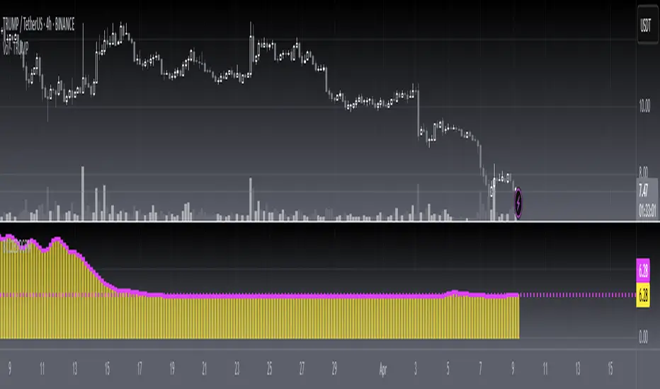
TOTAL3ES/ETH Mean ReversionTOTAL3ES/ETH Mean Reversion Indicator
Overview
The TOTAL3ES/ETH Mean Reversion indicator is a specialized tool designed exclusively for analyzing the ratio between TOTAL3 excluding stablecoins (TOTAL3ES) and Ethereum's market capitalization. This ratio provides crucial insights into the relative performance and valuation cycles between altcoins and ETH, making it an essential tool for cryptocurrency portfolio allocation and market timing decisions.
What This Indicator Measures
This indicator tracks the market cap ratio of all altcoins (excluding ETH and stablecoins) to Ethereum's market cap. When the ratio is:
Above 1.0 (Parity): Altcoins have a larger combined market cap than ETH
Below 1.0 (Parity): ETH's market cap exceeds the combined altcoin market cap
Key Features
Historical Context
Historical Range: 0.64 (July 2017 low) to 3.49 (all-time high)
Midpoint: 2.065 - the mathematical center of the historical range
Parity Line: 1.0 - the psychological level where altcoins = ETH market cap
Mean Reversion Zones
The indicator identifies extreme valuation zones based on historical data:
Upper Extreme Zone (~2.92 at 80% threshold): Suggests altcoins may be overvalued relative to ETH
Lower Extreme Zone (~1.21 at 80% threshold): Suggests altcoins may be undervalued relative to ETH
Visual Elements
Color-coded zones: Red shading for bearish reversion areas, green for bullish reversion areas
Multiple reference lines: Parity, midpoint, and historical extremes
Information table: Real-time metrics including current ratio, range position, and reversion pressure
Customizable display: Toggle zones, lines, and adjust transparency
How to Use This Indicator
Market Cycle Analysis
Extreme High Zone (Red): When ratio enters this zone, consider potential ETH outperformance
Extreme Low Zone (Green): When ratio enters this zone, consider potential altcoin season
Parity Crossovers: Monitor when ratio crosses above/below 1.0 for sentiment shifts
Portfolio Allocation Signals
High Ratio Values: May indicate overextended altcoin valuations relative to ETH
Low Ratio Values: May suggest undervalued altcoins relative to ETH
Midpoint Reversions: Historical tendency to revert toward the 2.065 midpoint
Alert Conditions
The indicator includes built-in alerts for:
Entering extreme high/low zones
Parity crossovers (above/below 1.0)
Mean reversion signals
Input Parameters
Display Settings
Show Reversion Zones: Toggle colored extreme zones on/off
Show Midpoint: Display the historical midpoint line
Show Parity Line: Show the 1.0 parity reference line
Zone Transparency: Adjust shaded area opacity (70-95%)
Calculation Settings
Reversion Strength Period: Moving average period for reversion calculations (10-50)
Extreme Threshold: Percentage of historical range defining extreme zones (0.5-1.0)
Information Table Metrics
The bottom-right table displays:
Current Ratio: Live TOTAL3ES/ETH value
Range Position: Current position within historical range (%)
From Parity: Distance from 1.0 parity level (%)
Reversion Pressure: Intensity of mean reversion forces (%)
Zone: Current market zone classification
Historical Range: Reference boundaries (0.64 - 3.49)
Midpoint: Historical center value
Important Notes
Chart Compatibility
Exclusively designed for CRYPTOCAP:TOTAL3ES/CRYPTOCAP:ETH
Built-in validation ensures proper chart usage
Will display error message if applied to incorrect charts
Trading Considerations
This is an analytical tool, not trading advice
Mean reversion is a tendency, not a guarantee
Consider multiple timeframes and confirmations
Factor in overall market conditions and trends
Risk Disclaimer
Past performance does not guarantee future results. Cryptocurrency markets are highly volatile and unpredictable. Always conduct your own research and consider your risk tolerance before making investment decisions.
Ideal Use Cases
Portfolio rebalancing between ETH and altcoins
Market cycle timing for position adjustments
Sentiment analysis of crypto market phases
Long-term allocation strategies based on historical patterns
Risk management through extreme zone identification
This indicator serves as a quantitative framework for understanding the cyclical relationship between Ethereum and the broader altcoin market, helping traders and investors make more informed allocation decisions based on historical valuation patterns.ons
- Factor in overall market conditions and trends
### Risk Disclaimer
Past performance does not guarantee future results. Cryptocurrency markets are highly volatile and unpredictable. Always conduct your own research and consider your risk tolerance before making investment decisions.
Cari dalam skrip untuk "Cycle"
cycle144 dr ramy After Given Date📌 Description for Script Publishing
Cycle144 dr ramy After Given Date is a visual tool that highlights time-based cycles on the chart by marking specific candles that occur after a user-defined starting point.
🔹 How It Works:
You choose a specific date and time.
The script automatically identifies and labels the 18th, 36th, 54th, 72nd, 90th, 108th, 126th, and 144th candles after your selected date.
At each of those candles, the script:
Places a label (e.g., "18th Candle", "36th Candle", etc.).
Draws horizontal lines from the candle's high and low, extended to the right.
🔹 Purpose:
This indicator helps traders observe and analyze market behavior at regular cycle intervals after a significant date. It's useful for cycle-based strategies, time symmetry analysis, or just to visualize how price reacts at recurring time steps.
🛠️ No signals or strategies are included — this is a charting utility only.
Gann & Fibonacci Analysis for MSTRYes! Below is a step-by-step guide to performing Gann Analysis on MSTR in TradingView for the last year.
Step 1: Set Up the Chart
Open TradingView and search for MSTR (MicroStrategy).
Select the 1-day (D) timeframe to analyze the past year.
Set your chart to logarithmic scale (⚙ Settings → Scale → Log).
Enable grid lines for alignment (⚙ Settings → Appearance → Grid Lines).
Step 2: Identify Key Highs and Lows (Last Year)
Find the 52-week high and 52-week low for MSTR.
As of now:
52-Week High: ~$999 (March 2024).
52-Week Low: ~$280 (October 2023).
Step 3: Plot Gann Angles
Using TradingView's Gann Fan Tool:
Select "Gann Fan" (Press / and type “Gann Fan” to find it).
Start at the 52-week low (~$280, October 2023) and drag upwards.
Adjust the angles to match key levels:
1x1 (45°) → Main trendline
2x1 (26.5°) → Strong uptrend
4x1 (15°) → Weak trendline
1x2 (63.75°) → Strong resistance
Repeat the process from the 52-week high (~$999, March 2024) downward to see bearish angles.
Step 4: Apply Fibonacci & Gann Retracement Levels
Using Fibonacci Retracement:
Select "Fibonacci Retracement" tool.
Draw from 52-week high ($999) to 52-week low ($280).
Enable key Fibonacci levels:
23.6% ($816)
38.2% ($678)
50% ($640)
61.8% ($550)
78.6% ($430)
Watch for price reactions near these levels.
Using Gann Retracement Levels:
Select "Gann Box" in TradingView.
Draw from 52-week high ($999) to low ($280).
Enable key Gann retracement levels:
12.5% ($912)
25% ($850)
37.5% ($768)
50% ($640)
62.5% ($550)
75% ($480)
87.5% ($350)
Identify confluences with Gann angles and Fibonacci levels.
Step 5: Identify Significant Dates & Time Cycles
Use "Date Range" Tool in TradingView.
Mark major turning points:
High → Low: ~180 days (Half-year cycle).
Low → High: ~90 days (Quarter cycle).
Use Square-Outs (Time = Price method):
Example: If MSTR hit $500, check 500 days from key events.
Mark key anniversaries of past highs/lows for possible reversals.
Step 6: Analyze and Trade Execution
✅ If MSTR is at a Gann angle + Fibonacci level + key date → Expect a reaction.
✅ Use RSI, MACD, and Volume for extra confirmation.
✅ Set Stop-Loss at nearest Gann support/resistance.
Dominant Direction (DD)The Dominant Direction indicator is a custom technical analysis tool that uses the Dominant Cycle Estimators library to identify the dominant trend direction in the market. The indicator utilizes the MAMA Cycle function, which is a part of the library, to calculate the period of the data. The resulting period is then used to plot lines on the chart that represent the dominant trend direction.
The indicator takes two inputs, the source of data, and the high and low values of the source. The MAMA Cycle function is used to calculate the period of the data, with the lower bound and upper bound of the dynamic length defined by the user. The indicator then plots lines on the chart to represent the dominant trend direction. The lines are plotted from the current bar to the bar that is a certain number of periods away, as defined by the MAMA Cycle function, in the direction of the trend.
The indicator also has a feature of removing the lines when the trend is no longer confirmed. If the bar state is confirmed, the line is deleted and this helps the user to have a clearer view of the chart.
In summary, the Dominant Direction indicator is a powerful tool for identifying the dominant trend direction in the market. It uses the MAMA Cycle function to calculate the period of the data and plots lines on the chart to represent the dominant trend direction. This can help traders identify potential entry and exit points, and make more informed trading decisions.
IPDA TIMES GWU369Between 2:30 AM and 16:00 PM NY occur 270 where the hours or the sum of the hours plus the minutes generate a sequence of 3,6 or 9. Examples: 03:00, 09:30. 04:20= 0+4+2+0=6, 07:05=0+7+5+0=12 12= 1+2=3 etc.
And between each opening and closing, a range is generated that dictates the OF of the next range and is how the timed price is delivered by time cycles.
This is how you can detect when an SMR or CSD will occur very accurately.
Earnings Season Highlighter (Jan/Apr/Jul/Oct)Purpose:
This indicator visually highlights the four “earnings season” months — January, April, July, and October — on any TradingView chart. It is designed for traders and investors who want a quick visual cue of when companies typically report quarterly earnings.
Features:
Highlights Jan, Apr, Jul, and Oct with a light blue background.
Works on any timeframe: intraday, daily, weekly, or monthly charts.
No dependency on price data — purely a time-based visual overlay.
Simple, lightweight, and easy to apply to any chart.
Usage:
Apply the indicator to your chart.
During the highlighted months, the background will turn light blue, signaling earnings season.
Ideal for planning trades, earnings plays, or simply monitoring market cycles.
Trading Sessions with Holidays & Timer🌍 Trading Sessions Matter
Markets breathe in cycles. When Tokyo, London, or New York steps in, liquidity shifts and price often reacts fast.
Example: New York closed BTC at $110K, and when traders woke up, the price was already $113K. That gap says everything about overnight pressure and the next move.
⚡ Indicator Features
✅ Session boxes (Tokyo, London, NY) with custom colors & time zones
✅ Open/close lines → spot gaps & momentum
✅ Average price per session → see where pressure builds
✅ Tick range → quick volatility check
✅ 🏖 Holiday markers → avoid false quiet markets
✅ Live status table → session OPEN / CLOSED + countdown timer
🚀 How to Use
Works on intraday timeframes (1m–4h)
Watch session opens/closes → liquidity shift points
Compare ranges & averages between Tokyo, London, NY
Use the timer to prep before the next wave
This tool helps you visualize the heartbeat of global markets session by session.
🔖 #BTCUSDT #Forex #TradingSessions #Crypto #DayTrading
True Open CalculationsIndicator Description: True Open Calculations
This custom Pine Script indicator calculates and plots key "True Open" levels based on specific time intervals and trading sessions. The True Open levels represent significant price points on the chart, helping traders identify key reference points tied to various market opening times. These levels are important for understanding price action in relation to market sessions and trading cycles. The indicator is designed to plot lines corresponding to different "True Opens" on the chart and display labels with the associated information.
Key Features:
True Year Open:
This represents the opening price on the first Monday of April each year. It serves as a reference point for the yearly price level.
Plot Color: Green.
True Month Open:
This represents the opening price on the second Monday of each month. It helps in identifying monthly trends and provides a key reference for monthly price movements.
Plot Color: Blue.
True Week Open:
This represents the opening price every Monday at 6:00 PM. It gives traders a level to track weekly opening movements and can be useful for weekly trend analysis.
Plot Color: Orange.
True Day Open:
This represents the opening price at 12:00 AM (midnight) each day. It serves as a daily benchmark for price action at the start of the trading day.
Plot Color: Red.
True New York Session Open:
This represents the opening price at 7:30 AM (New York session start time). This level is crucial for traders focused on the New York trading session.
Plot Color: Purple.
Additional Features:
Labels: The indicator displays labels to the right of each plotted line to describe which "True Open" it represents (e.g., "True Year Open," "True Month Open," etc.).
Dynamic Plotting: The lines are only plotted on the current candle, and the lines are dynamically updated for each time period based on the corresponding "True Open."
Visual Cues: The colors of the plotted lines (green, blue, orange, red, purple) help quickly distinguish between different "True Open" levels, making it easy for traders to track price action and make informed decisions.
Use Cases:
Yearly, Monthly, Weekly, Daily, and Session Benchmarking: This indicator provides traders with important price levels to use as benchmarks for the current year, month, week, and day, helping to identify trends and potential reversals.
Session Awareness: It is particularly useful for traders who want to track key market sessions, such as the New York session, and their impact on price movement.
Long-term Analysis: By including the yearly open, this indicator helps traders gain a broader perspective on market trends and provides context for analyzing shorter-term price movements.
Benefits:
Helps identify important reference points for longer-term trends (yearly, monthly) as well as shorter-term moves (daily, weekly, and session).
Visually intuitive with color-coded lines and labels, allowing quick and easy identification of key market open levels.
Dynamic and real-time: The indicator plots and updates the True Open levels dynamically as the market progresses.
Trading Sessions Highs/Lows | InvrsROBINHOODTrading Sessions Highs/Lows | InvrsROBINHOOD
🚀 A powerful indicator for tracking key trading sessions and the highs and lows of each session!
📌 Description
The Trading Sessions Highs/Lows indicator visually marks the most critical trading sessions—Asia, London, and New York—using small colored dots at the bottom of the candle. It also tracks and plots the highs and lows of each session, along with the Daily Open and Weekly Open levels.
This tool is designed to help traders identify session-based liquidity zones, price reactions, and potential trade setups with minimal chart clutter.
Key Features:
✅ Session markers (Asia, London, NY AM, NY Lunch, NY PM) plotted as small dots
✅ Plots session highs and lows for market structure insights
✅ Daily Open line for intraday reference
✅ Weekly Open line for higher timeframe bias
✅ Alerts for session high/low breaks to capture momentum shifts
✅ User-defined UTC offset for global traders
✅ Customizable session colors for personal preference
📖 How to Use the Indicator
1️⃣ Understanding the Sessions
Asia Session (Yellow Dot) → Marks liquidity buildup & pre-London moves
London Session (Blue Dot) → Strong volatility, breakout opportunities
New York AM Session (Green Dot) → Major trends & institutional participation
New York Lunch (Red Dot) → Low volume, ranging market
New York PM Session (Dark Green Dot) → End-of-day movements & reversals
2️⃣ Session Highs & Lows for Market Structure
Session Highs can act as resistance or breakout points.
Session Lows can act as support or stop-hunt zones.
Break of a session high/low with volume may indicate continuation or reversal.
3️⃣ Using the Daily & Weekly Open
The Daily Open (Black Line) helps gauge the intraday trend.
Above Daily Open → Bearish Bias
Below Daily Open → Bullish Bias
The Weekly Open (Red Line) sets the higher timeframe directional bias.
4️⃣ Alerts for Breakouts
The indicator will trigger alerts when price breaks session highs or lows.
Useful for setting stop-losses, breakout trades, and risk management.
💡 Why This Indicator is Important for Beginners
1️⃣ Avoids Overtrading:
Many beginners trade in low-volume periods (NY Lunch, Asia session) and get stuck in choppy price action.
This indicator highlights when volatility is high so traders focus on better opportunities.
2️⃣ Session-Based Liquidity Traps:
Market makers often run stops at session highs/lows before reversing.
Watching session breaks prevents traders from falling into liquidity grabs.
3️⃣ Reduces Emotional Trading:
If price is above the Daily Open, a beginner shouldn’t look for shorts.
If price is below a key session low, it may signal a fake breakout.
4️⃣ Aligns with Institutional Trading:
Smart money traders use session highs/lows to set stop hunts & reversals.
Beginners can use this indicator to spot these zones before entering trades.
🛡️ How to Mitigate Risk with This Indicator
✅ Wait for Confirmations – Don’t trade blindly at session highs/lows. Look for wicks, rejections, or break/retests.
✅ Use Stop-Loss Above/Below Session Levels – If you’re going long, set SL below a session low. If short, set SL above a session high.
✅ Watch Volume & News Events – Breakouts without strong volume or news may be fake moves.
✅ Combine with Other Strategies – Use price action, trendlines, or EMAs with this indicator for higher probability trades.
✅ Use the Weekly Open for Trend Bias – If price stays below the Weekly Open, avoid bullish setups unless key support holds.
🎯 Who is This Indicator For?
📌 Beginners who need clear session-based trading levels.
📌 Day traders & scalpers looking to refine their intraday setups.
📌 Smart money traders using liquidity concepts.
📌 Swing traders tracking higher timeframe momentum shifts.
🚀 Final Thoughts
This indicator is an essential tool for traders who want to understand market structure, liquidity, and volatility cycles. Whether you’re trading forex, stocks, or crypto, it helps you stay on the right side of the market and avoid unnecessary risks.
🔹 Set it up, customize your colors, define your UTC offset, and start trading smarter today! 🏆📈
Yearly Profit BackgroundDescription:
The Yearly Profit Background indicator is a powerful tool designed to help traders quickly visualize the profitability of each calendar year on their charts. By analyzing the annual performance of an asset, this indicator colors the background of each completed year green if the year was profitable (close > open) or red if it resulted in a loss (close < open). This visual representation allows traders to identify long-term trends and historical performance at a glance.
Key Features:
Annual Profit Calculation: Automatically calculates the yearly performance based on the opening price of January 1st and the closing price of December 31st.
Visual Background Coloring: Highlights each completed year with a green (profit) or red (loss) background, making it easy to spot trends.
Customizable Transparency: The background colors are set at 90% transparency, ensuring they don’t obstruct your chart analysis.
Optional Price Plots: Displays the annual opening (blue line) and closing (orange line) prices for additional context.
How to Use:
Add the indicator to your chart.
Observe the background colors for each completed year:
Green: The year was profitable.
Red: The year resulted in a loss.
Use the optional price plots to analyze annual opening and closing levels.
Ideal For:
Long-term investors analyzing historical performance.
Traders looking to identify multi-year trends.
Anyone interested in visualizing annual market cycles.
Why Use This Indicator?
Understanding the annual performance of an asset is crucial for making informed trading decisions. The Yearly Profit Background indicator simplifies this process by providing a clear, visual representation of yearly profitability, helping you spot patterns and trends that might otherwise go unnoticed.
Macro Timing Window Signal ⏱️ Macro Timing Window Signal – Check/X Indicator
This indicator displays a green check mark ✔️ or red X ✖️ in the top-right corner of the chart based on a repeating macro time cycle that divides every hour into active and inactive windows.
How it works:
• ✔️ Green Check (Active Macro Window):
Appears from xx:45 → xx:15 of the next hour (30-minute macro window).
• ✖️ Red X (Inactive Macro Window):
Appears from xx:16 → xx:44 (mid-hour cooldown window).
• Optional flash signal at the exact macro flip points (xx:45, xx:00, xx:15) to highlight transitions.
• Supports sound alerts so you never miss the start or end of a macro window.
This tool is designed for traders who incorporate macro-driven time cycles, liquidity sessions, or algorithmic delivery windows into their strategy.
The display is fixed on-screen, clean, and unobtrusive, ensuring instant recognition of the current macro state without cluttering the chart.
Maancyclus Volatiliteitsindicator (2025)This Moon Cycle Volatility Indicator for TradingView is designed to help traders track and analyze market volatility around specific lunar phases, namely the Full Moon and New Moon. The indicator marks the dates of these moon phases on the chart and measures volatility using the Average True Range (ATR) indicator, which gauges market price fluctuations.
Key Features:
Moon Phase Markers: The indicator marks the Full Moon and New Moon on the chart using labels. Blue labels are placed below bars for Full Moons, while red labels are placed above bars for New Moons. These markers are based on a manually curated list of moon phase dates for the year 2025.
Volatility Calculation: The indicator calculates market volatility using the ATR (14), which provides a sense of market movement and potential risk. Volatility is plotted as histograms, with blue histograms representing volatility around Full Moons and red histograms around New Moons.
Comparative Analysis: By comparing the volatility around these moon phases to the average volatility, traders can spot potential patterns or heightened market movements. This can inform trading strategies, such as anticipating increased market activity around specific lunar events.
In essence, this tool helps traders identify potential high-volatility periods tied to lunar cycles, which could impact market sentiment and price action.
US Construction Spending & Manufacturing Employment YoY % ChangeUsage Notes: Timeframe: Use a monthly chart, as TTLCONS and MANEMP are monthly data. Other timeframes result in interpolation.
Data Availability: As of October 2025, TTLCONS is available until July 2025 and MANEMP until August 2025 (automatically via TradingView).
The Unsung Heroes: Why C&M Are the True Indicators
Imagine the economy is a highly sensitive vehicle. Quarterly reported GDP is like a quarterly glance at the odometer—it's slow, often delayed, and clearly refers to the past. Anyone who wants to predict future developments needs something much faster.
This is where construction and manufacturing come into play. These two sectors are the machine builders of the economy and provide us with real-time feedback. They form the backbone of economic forecasting for several important reasons:
1. Monetary policy indicators: Both sectors are highly sensitive to monetary policy developments, such as interest rate changes. If developers are unable to finance large residential or commercial projects and manufacturers postpone capital-intensive factory expansions, for example, declines in construction demand would quickly affect other sectors.
2. The backbone of the secondary sector: These industries constitute the secondary sector of the economy, meaning they are concerned with the actual transformation and production of goods, not just the extraction of raw materials or the provision of intangible services. One could argue that while they only account for about 15% of GDP in the US, their impact is massive and cyclical.
3. The timeliness advantage: Forget quarterly lags. Both construction output and manufacturing employment data are released monthly. This timely, frequent data allows analysts to assess economic momentum much more quickly than if they had to wait for delayed GDP reports.
In the US, some analysts have even titled their articles with the bold claim: "Housing construction is the business cycle." Fluctuations in housing construction are frequent and large, and a decline in activity is almost always accompanied by a subsequent decline in GDP.
Smoothed ROC Z-Score with TableSmoothed ROC Z-Score with Table
This indicator calculates the Rate of Change (ROC) of a chosen price source and transforms it into a smoothed Z-Score oscillator, allowing you to identify market cycle tops and bottoms with reduced noise.
How it works:
The ROC is calculated over a user-defined length.
A moving average and standard deviation over a separate window are used to standardize the ROC into a Z-Score.
This Z-Score is further smoothed using an exponential moving average (EMA) to filter noise and highlight clearer cycle signals.
The smoothed Z-Score oscillates around zero, with upper and lower bands defined by user inputs (default ±2 standard deviations).
When the Z-Score reaches or exceeds ±3 (customizable), the value shown in the table is clamped at ±2 for clearer interpretation.
The indicator plots the smoothed Z-Score line with zero and band lines, and displays a colored Z-Score table on the right for quick reference.
How to read it:
Values near zero indicate neutral momentum.
Rising Z-Scores towards the upper band suggest increasing positive momentum, possible market tops or strength.
Falling Z-Scores towards the lower band indicate negative momentum, potential bottoms or weakness.
The color-coded table gives an easy visual cue: red/orange for strong positive signals, green/teal for strong negative signals, and gray for neutral zones.
Use cases:
Identify turning points in trending markets.
Filter noisy ROC data for cleaner signals.
Combine with other indicators to time entries and exits more effectively.
FX Rotation Dashboard – FX vs DXYFX Rotation Dashboard
This FX Rotation Dashboard indicator offers a clear, at-a-glance overview of the relative strength and momentum of major FX pairs when measured against the US Dollar Index (DXY). It helps identify which currency pairs are leading or lagging in performance and how their relative positioning is evolving over time.
🔎 Structure
Each row in the table represents a currency pair and provides the following data:
Symbol: The FX pair (e.g., EURJPY, GBPUSD, AUDNZD)
RS: The current relative strength ratio vs. DXY
MOM: The momentum of the RS – showing whether strength is accelerating or decelerating
Quadrant:
🔴 Lagging: Underperforming and losing momentum
🔵 Improving: Underperforming but gaining momentum
🟢 Leading: Outperforming with rising momentum
🟡 Weakening (not visible in current table): Outperforming but slowing down
Meaning: A descriptive label summarizing the quadrant status
🧭 Interpretation
Currency pairs in the Leading quadrant (e.g., EURJPY, GBPJPY, CHFJPY, CADJPY) are currently outperforming the USD with rising momentum – often indicating strength across both RS and MOM dimensions.
Pairs in the Improving quadrant (e.g., GBPUSD, EURUSD, AUDUSD) are showing positive momentum but still lagging in relative strength – potential early signs of rotation into leadership.
Pairs in the Lagging quadrant (e.g., USDCHF, USDJPY, AUDCHF) are underperforming and continue to weaken – often considered the least attractive at the current stage of the cycle.
🧠 Purpose
This FX Rotation visualization is particularly useful for:
Macro-level FX rotation analysis
Spotting emerging trends before they are fully priced in
Tracking performance of G10 and cross pairs against USD
It provides context for currency strength beyond individual price movements by placing them in a relative performance framework.
⚠️ Disclaimer: This indicator is for informational and analytical purposes only. It does not constitute investment advice or a recommendation to buy or sell any financial instrument. Always conduct your own research before making trading decisions.
Ultimate Trend System — FINAL MASTER EDITIONUltimate Trend System — FINAL MASTER EDITION
A complete, multi‑layered trend‑detection engine designed for precision execution and clarity.
This final edition fuses trend, momentum, volatility, and filtering into one symmetrical logic system — enabling traders to instantly visualize directional strength and avoid false signals during choppy markets.
🔹 System Overview
The Ultimate Trend System consolidates several classic trading frameworks into a unified model.
It dynamically generates BUY, SELL, and STOP tags directly on the chart — each derived from clean, interlinked conditions that measure both momentum and structure.
In addition, a built‑in information panel summarizes live indicator states for quick decision‑making without checking multiple indicators.
⚙️ Core Logic Components
SMA (20‑period): Identifies trend slope; rising → bullish bias, falling → bearish bias.
VWAP: Defines fair‑value position — Above, Below, or Inside volume‑weighted average price.
QQE‑Lite (RSI): Tracks internal momentum shifts by comparing RSI to its EMA smoothing.
ATR Strength: Classifies current volatility regime as Turbo, Strong, or Weak.
SuperTrend: Confirms structural trend direction using an ATR‑based trailing model.
Choppiness Filter: Suppresses signals when short‑term volatility contracts or range noise dominates.
Fakeout Detection: Prevents false triggers after deceptive breakouts or reversals.
🧩 Execution Logic
BUY Signal: All major trend engines align bullishly, with clean structure and momentum.
SELL Signal: All major engines align bearishly, with clean structure and momentum.
STOP Phase: Appears once per cycle to mark neutral or transition zones; automatically locks further stops until a new entry signal is confirmed.
🟩🟥 Visual Elements
Green Labels: Confirmed bullish entry (BUY).
Red Labels: Confirmed bearish entry (SELL).
Yellow Labels: STOP state (trend exhaustion or consolidation).
Panel: Displays live readings for VWAP, SMA, QQE, ATR regime, and SuperTrend direction.
🧠 Design Philosophy
Built for simplicity, speed, and precision — the Final Master Edition strips away noise without losing analytical depth.
It can serve as a standalone trend system or foundation layer for more advanced frameworks like auto‑execution or multi‑engine HUDs.
PIPSTA - Elliott Wave# 🎯 SK-Trading ABC - Stefan Style ULTIMATE
## Overview
This indicator implements an advanced ABC Elliott Wave pattern detection system with the unique "Stefan Style" approach. It identifies high-probability swing trading setups with multiple entry zones, automatic risk-reward calculation, and comprehensive alert system for hands-free trading.
---
## 🔑 Key Features
### 1️⃣ **Intelligent ABC Pattern Recognition**
- Automatic detection of bullish and bearish ABC structures
- Validates retracement ratios (38.2% - 78.6%) for quality setups
- Configurable swing length for different timeframes
- Works on all markets: Forex, Stocks, Crypto, Indices
### 2️⃣ **Dual-Zone Entry System**
#### 🟣 **GKL-Zone (0→A) - Aggressive Entries**
- Available BEFORE pattern activation
- 4 Fibonacci entry levels: 0.5, 0.559, 0.618, 0.667
- For traders who want early positioning
- Purple-colored zone with clear labels
#### 🔵 **BC-Zone (B→A2) - Main Entry System** ⭐
- The "Stefan Style" innovation
- Activates AFTER close breaks Point A
- Tracks A2 (new high/low after activation)
- Entries based on B→A2 retracement (not traditional B→A)
- Tighter risk, better reward ratios
- Blue-colored zone - this is your PRIMARY trading area
### 3️⃣ **Smart Activation Logic**
✅ **Close-Based Activation** (Default)
- Waits for candle CLOSE beyond Point A
- Reduces false breakouts
- More reliable signals
⚡ **A2 Tracking with Locking**
- Monitors new extreme after activation
- Locks A2 on first activation to prevent whipsaws
- Creates stable entry zone
### 4️⃣ **Comprehensive Alert System** 🔔
Never miss a trade with 15+ alert types:
**Setup Alerts:**
- ✅ Pattern Activation (with entry instructions)
- 📍 4 GKL Entry levels (pre-activation)
- 🎯 4 BC-Zone Entry levels (post-activation)
**Trade Management Alerts:**
- 🛑 Stop Loss breach (auto-invalidation)
- 💰 Take Profit 1 (1.618 extension - move to BE)
- 💰 Take Profit 2 (1.809 extension)
- 💰💰 Take Profit 3 (2.0 extension - full target)
All alerts are **alert.freq_once_per_bar** to prevent spam!
### 5️⃣ **Built-in Risk Management**
- Fixed pip-based stop loss (default: 20 pips)
- Minimum RR ratio filter (default: 2.5:1)
- Auto-calculates R-multiples (2R, 3R markers)
- Shows individual RR for each entry level
- Visual SL and TP lines on chart
### 6️⃣ **Professional Dashboard** 📊
Real-time information panel showing:
- ✅ Trade Status: "TRADE BC-ZONE" or "WAIT"
- 📈 Trend Direction
- 🎯 Active Zone (GKL vs BC)
- 💵 All entry levels with prices
- 📍 Stop Loss and Take Profit levels
- 📏 Distance from current price to entries
- ⚖️ Individual RR ratio for each entry
### 7️⃣ **Visual Clarity**
- Color-coded zones and levels
- Clear 0-A-B-C labeling with prices
- "Consumed zones" tracking (grays out touched levels)
- Projection box for C target (1.618-2.0)
- GKL-Box for new cycle after C is reached
- A2 tracking line (dashed orange)
- Trade route arrow visualization
---
## ⚙️ **Settings & Customization**
### Structure Settings
- **Swing Length**: 5-30 (default: 10) - adjust for timeframe
- **Max Sequences**: 1-5 patterns displayed simultaneously
### Display Options
- Toggle C Target Box (1.618-2.0 extension)
- Toggle Activation Line
- Toggle R-Multiple markers
- Toggle GKL-Box after Point C
- Toggle GKL Pre-Activation Zone
- Toggle BC-Zone (main entry area)
### Trade Settings
- **Stop Loss**: 5-100 pips (default: 20)
- **Minimum RR**: 1.0-5.0 (default: 2.5)
### SK System Specific
- ✅ **Close-based Activation**: More reliable than wick breaks
- **Show GKL Pre-Zone**: See aggressive entries before activation
- **Show BC-Zone**: Your main trading area (B→A2)
---
## 📚 **How to Trade This System**
### 🟢 **Conservative Approach** (Recommended)
1. **Wait for Pattern Formation**: 0→A→B structure appears
2. **Wait for Activation Alert**: "🚀 BULLISH/BEARISH ACTIVATED"
3. **Check Dashboard**: Look for "✅ TRADE BC-ZONE"
4. **Set Limit Orders**: In BC-Zone (B→A2) at 0.5, 0.559, 0.618, 0.667 levels
5. **Set Stop Loss**: Below/Above Point B (shown in dashboard)
6. **Set Take Profits**: TP1 (1.618), TP2 (1.809), TP3 (2.0)
7. **Manage Trade**: Move SL to BE at TP1, partial profits at each TP
### ⚡ **Aggressive Approach** (Advanced)
1. **Enter GKL-Zone Pre-Activation**: Use purple zone (0→A retracements)
2. **Risk**: Pattern may not activate
3. **Reward**: Better entry prices if pattern works
4. **Alert**: "🟢/🔴 GKL ENTRY X REACHED - Aggressiv"
### 🎓 **Best Practices**
- ✅ Trade in direction of higher timeframe trend
- ✅ Use multiple entry levels (scale in)
- ✅ Respect minimum RR ratio
- ✅ Let TP3 run for full extension
- ❌ Don't chase after BC-zone is consumed
- ❌ Don't ignore activation requirement
- ❌ Don't trade against major news events
---
## 📊 **Recommended Timeframes**
- **H1 (1-Hour)**: Swing trades, 1-3 day holds
- **H4 (4-Hour)**: Multi-day swings
- **D1 (Daily)**: Position trades, weeks to months
- **Lower timeframes**: Possible but more noise
---
## 🎯 **What Makes This Different?**
### Traditional ABC vs. Stefan Style:
**Traditional ABC:**
- Entries: 50-61.8% retracement of A→B
- Based on original wave measurements
**Stefan Style (This Indicator):**
- Waits for activation (close beyond A)
- Tracks A2 (new extreme after activation)
- Entries: 50-66.7% of B→A2 (the BC-Zone)
- Tighter entries, better RR ratios
- More adaptive to actual price action
### Why BC-Zone Works:
After Point A is broken, the market often makes a new extreme (A2) before retracing. By using B→A2 as your entry reference, you're entering at better prices with tighter stops than traditional methods.
---
## 🔔 **Alert Setup Instructions**
1. Click "Add Alert" on TradingView
2. Condition: Select this indicator
3. Message: Use the built-in alert text (includes prices and instructions)
4. Options: "Once Per Bar Close" (already handled by indicator)
5. Send to: Email, SMS, Webhook, etc.
**You'll receive alerts for:**
- New setups detected
- Activation confirmations
- Entry level touches
- SL breaches
- TP levels reached
---
## 📈 **Performance Tips**
1. **Reduce Visual Load**: Disable unused features in settings
2. **Limit Sequences**: Set Max Sequences to 1-2 for cleaner charts
3. **Timeframe Sync**: Match swing length to your timeframe:
- M15: Swing 5-8
- H1: Swing 8-12
- H4: Swing 10-15
- D1: Swing 12-20
---
## ⚠️ **Disclaimers**
- This indicator is for **educational purposes** only
- Not financial advice - trade at your own risk
- Past performance doesn't guarantee future results
- Always use proper risk management (1-2% per trade)
- Test on demo account first
- Works best in trending conditions, avoid ranging markets
---
## 🛠️ **Technical Details**
- **Pine Script Version**: v6
- **Indicator Type**: Overlay
- **Resources**: Max 150 boxes, 200 lines, 120 labels
- **Pattern Detection**: Pivot-based with ratio validation
- **Alert Frequency**: Once per bar to prevent spam
---
## 📞 **Support & Community**
Join our Telegram channel for:
- Strategy discussions
- Setup examples
- Updates and improvements
- Community support
**Telegram**: @simpleforextools
---
## 🔄 **Version History**
**Current Version**: Ultimate Edition
- ✅ Dual-zone entry system
- ✅ Close-based activation
- ✅ A2 tracking with locking
- ✅ 15+ alert types
- ✅ Consumed zones tracking
- ✅ Professional dashboard
- ✅ RR calculation per entry
- ✅ GKL pre-activation zone
---
## 🏆 **Who Is This For?**
✅ **Perfect for:**
- Swing traders
- Elliott Wave practitioners
- Alert-based traders
- Systematic rule-followers
- Traders who scale into positions
❌ **Not ideal for:**
- Scalpers (too slow)
- Complete beginners (complex system)
- Range-bound market traders
---
## 💡 **Pro Tips**
1. **Confluence is King**: Best results when BC-Zone aligns with:
- Support/Resistance levels
- Fibonacci from higher timeframe
- Round numbers
- Previous structure
2. **Multi-Timeframe Approach**:
- HTF (H4/D1): Identify trend
- LTF (H1): Execute entries
- Use indicator on execution timeframe
3. **Risk Management**:
- Never risk more than 1-2% per trade
- Use multiple entries = divide risk across levels
- Move SL to BE aggressively after TP1
DCA Position vs Cash HoldingThis indicator visualizes the performance of a simulated dollar-cost averaging (DCA) strategy compared to simply holding cash. It models the cumulative position size and value of buying a fixed dollar amount of the asset per candle over a configurable lookback period.
🔍 What It Shows:
Simulates buying $1 (or any amount) of the asset per candle
Tracks the total units accumulated and their current market value
Plots the difference between the DCA position value and total cash spent
Highlights when DCA buyers are underwater — a potential contrarian buy zone
📈 How to Use:
Values above zero indicate DCA outperformance vs cash
Values below zero signal structural drawdown — often a high-conviction bulk-buy opportunity
Use as a sentiment overlay to time discretionary adds or confirm regime shifts
⚙️ Inputs:
Lookback Window: Number of candles used to simulate DCA accumulation
DCA Amount: Dollar value purchased per candle
This tool is ideal for traders seeking to quantify accumulation efficiency, identify cycle inflection points, and visualize sentiment-weighted cost basis dynamics.
PRT Cycle (replica 1:1) — linea verde/rossaIndicatore di ciclo ispirato a quello che usavo su un altro sistema di grafici finanziari
Shadow Corp 90min Boxes90-min cycle boxes, marks 90min session highs and lows with color coded boxes.
ShadowCorp Time Cycle'sThis indicator marks key intraday windows — 7:00–8:30, 8:30–10:00 (NYO), 10:00–11:30, 11:30–13:00, 13:00–14:30, 14:30–16:00, and 18:00–19:00 — and draws a true **price-range box** for each window.
Each box builds **in real time** from that window’s running **high/low**, then **persists on the chart** after the window ends for historical study. It’s **timezone-aware** (configurable) and gives you **per-window color** controls. Use it to visualize session volatility, ranges, and liquidity sweeps across the day on any intraday chart.
GOLDEN SCALP DEXDescription:
This tool is designed for traders who want to capture momentum shifts that occur within larger timeframe structures. The strategy identifies unique breakout opportunities inside the HTF cycle and provides precise entry and exit signals without cluttering the chart.
The system focuses on:
Pinpointing immediate momentum breakouts
Clean chart visualization with intuitive buy/sell markers
Full backtesting capability through TradingView’s Strategy Tester
Customizable position sizing for futures, forex, and crypto traders
It is especially useful for traders who prefer fast, rule-based signals during high-impact intraday moves.
⚠️ Disclaimer: This is a trading tool, not financial advice. Results may vary depending on market conditions, and proper risk management is essential.
Intraday Time Cycle Levels (Labels + Alerts + Colors)Jag japp detta spelet fram och tbx.
Tack för ert förtoende.


