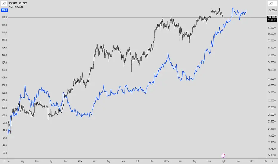
dmn's ICT AMD-Goldbach█ OVERVIEW
This script is built on ICT time & price theory and the theory of algorithmic market maker models, and visualizes the intraday divided using powers of three into accumulation, manipulation and distribution cycles.
It also includes an automatically calculated and plotted Goldbach level (a.k.a. IPDA level or Huddleston level) overlay, to help visualize where in the current market maker profile price is in relation to the AMD cycles, and where it might trade to.
█ CONCEPTS
Accumulation, Manipulation, Distribution Cycles
A 24 hour day, with the default set to start at 20:00 CET (the start of the Forex CLS Settlement operational timeline) is split in three parts - 9, 6 and 9 hours for the three cycles (roughly corresponding with Asia, London Open and New York + London Close sessions).
Since charts are fractals, there's also intra-cycle time fibs available in the script, to highlight the smaller fractal equivalents in each cycle.
These cycles are used to visualize the three phases (AMD) for easier identification of the current daily profile by analyzing during what cycle highs and lows of the day are made.
An example of a bullish day could be price rallying before making a low during the accumulation cycle, being manipulated higher and retracing to form an optimal trade entry during the manipulation cycle, expanding and creating the high of the day before selling off during the distribution cycle, with a potential reversal before it ends.
Goldbach levels
The Goldbach levels are based on the size of a price range (or price swing, if you will) expressed as a factor of power of three (3^n).
To decide what number to tell the script to use for the calculation, we look at what 3^n number best fits an average swing on the preferred timeframe we're trading.
For example; PO3 27 (3^3)might be fit for scalping, while PO3 243 (3^5) may correspond to the daily or weekly range, depending on the asset.
The script then calculates a range high and a range low using a power of three formula based on the current price and divides it into levels using Goldbach numbers.
At these levels one might expect to see price form various "blocks" as defined in concept by Michael J. Huddleston.
The blocks that correspond to the Goldbach levels are labeled with abbreviations as follows:
Ext = External range
Low = Range low
High = Range high
FVG = Fair value gap
RB = Rejection block
OB = Order block
LV = Liquidity void
BR = Breaker
MB = Mitigation block
Using these levels and said blocks we identify where in the current running market maker profile price is offered, and trade the preferred timeframe in line with the AMD cycles accordingly.
█ FEATURES
Custom AMD time cycles session times.
Custom time fib for fractal cycles.
Color and style customization.
Show only current or also historical cycles.
Equilibrium mode for Goldbach levels (show only high/low and midpoint)
Autodetection of asset type, with manual override.
█ NOTE
The default timings for the AMD cycles are set up for Forex pairs. For other asset types, such as indices, other timings are nessecary for optimal results.
Goldbach levels requires the correct symbol type setting for the calculation to work properly. Disable the script's autodetection and enable/disable the Forex option according to the type of chart if it fails.
Cari dalam skrip untuk "Cycle"
BTI - Bitcoin (BTC) Top Indicator [Logue]Bitcoin top indicator. This indicator is a combination of multiple on-chain and seasonality BTC macro cycle top indicators, plus the Pi-Cycle top moving average. Because there is no magic single indicator to detect macro cycle tops in bitcoin, the BTI detects confluence of multiple indicators to select tops of each BTC macro cycle. The individual indicators used for the BTI are:
1) Cumulative Value Days Destroyed (CVDD) - The CVDD was created by Willy Woo and is the ratio of the cumulative value of Coin Days Destroyed in USD and the market age (in days). While this indicator is used to detect bottoms normally, an extension is used to allow detection of BTC tops. When the BTC price goes above the CVDD extension, BTC is generally considered to be overvalued. Because the "strength" of the BTC tops has decreased over the cycles, a logarithmic function for the extension was created by fitting past cycles as log extension = slope * time + intercept. This indicator is triggered when the BTC price is above the CVDD extension.
2) Net Unrealized Profit Loss (NUPL) - The NUPL measures the profit state of the bitcoin network to determine if past transfers of BTC are currently in an unrealized profit or loss state.
Values above zero indicate that the network is in overall profit, while values below zero indicate the network is in overall loss. Highly positive NUPL values indicate overvaluation of the BTC network. Based on decreasing "strength" of BTC tops, a decreasing linear function (trigger = slope * time + intercept) was fit to past cycle tops. Therefore, future trigger values can be calculated over time. This indicator is triggered when the NUPL is above the trigger value.
3) Market Value-Realized Value Z-score (MVRV-Z) - The MVRV-Z measures the value of the bitcoin network by comparing the market cap to the realized value and dividing by the standard deviation of the market cap (market cap – realized cap) / std(market cap)). When the market value is significantly higher than the realized value, the bitcoin network is "overvalued". Very high values have signaled cycle tops in the past. This indicator is triggered when the MVRVZ value is above 55.
4) Puell multiple (PUELL) - PUELL is the ratio between the daily coin issuance in USD and its 365-day moving average. This multiple helps to measure miner profitability. When the PUELL goes to extremely high values relative to historical values, it indicates the profitability of the miners is very high and a top may be near. This indicator triggers when the PUELL is above 3.33.
5) Calendar Seasonality Index (CSI) - The CSI takes advantage of the consistency of BTC cycles. Past cycles have formed macro tops every four years between October 21st and December 12th. Therefore, this indicator triggers at set times that are marked every four years between these two dates.
6) Halving Seasonality Index (HSI) - The HSI, as with the CSI, takes advantage of the consistency of BTC cycles following the major event that is the halving. Aside from the first halving cycle, cycles have formed macro tops approximately 538 days after each halving. Therefore, this indicator triggers at set times that are marked 528 to 548 days (i.e., 538 +- 10 days) after each halving.
7) Polylog Regression (PLR) - The BTC cycle tops and bottoms were separately fit using a polynomial regression for the PLR. The bottom band was fit on much more data than the top band, so is likely to be more reliable. The shape of the regression into the future was estimated, so may not be accurate into the future, but is the best fit of tops and bottoms to date. This indicator is used to estimate when tops and bottoms are near when the price goes into the top or bottom bands. This triggers when the BTC price is inside or above the upper polylog regression channel.
8) Realized Price (RP) - The RP is summation of the value of each BTC when it last moved divided by the total number of BTC in circulation. This gives an estimation of the average "purchase" price of BTC on the bitcoin network based on when it was last transacted. This indicator tells us if the average network participant is in a state of profit or loss. This indicator is normally used to detect BTC bottoms, but an extension can be used to detect when the bitcoin network is "highly" overvalued. Because the "strength" of the BTC tops has decreased over the cycles, a logarithmic function for the extension was created by fitting past cycles as log extension = slope * time + intercept. This indicator triggers when the BTC price is above the realized price extension.
9) Pi-cycle Top (PCT) - The PCT indicator is simply the cross of the 111-day moving average above a 2x multiple of the 350-day moving average of the BTC price. While there is no fundamental reasoning behind why this works, it has worked to indicate previous bitcoin tops by taking advantage of the cyclicality of the BTC price and measurement overextension of BTC price. This indicator triggers when the fast moving average (111-day) crosses above the 2x multiple of the slow moving average (350-day).
10) Transaction Fee Spike (TFS) - Transaction fees on the bitcoin network can signal a mania phase when they increase well above historical values. This mania phase may indicate we are near a top in the BTC price. The daily transaction fee total in USD is divided by the number of daily transactions to calculate the average transaction fee paid on the bitcoin network. The transaction fees increasing above $40 trigger this indicator.
The on-chain indicators (CVDD, NUPL, MVRV-Z, PUELL, RP, and TFS) work together to give a health check of the BTC price as compared to its network health. The seasonality indicators (CSI, HSI, and PLR) work together to map the macro cycles of BTC. The PCT gives a view of the overvaluation of the BTC price. Each of these indicators is weighted evenly when selected and if over 45% of the indicators are triggering on a candle (i.e., at least 5 of 10), the overall BTI indicator prints a clear signal -- a red dot with a white middle portion between the white horizontal lines at the top of the indicator. This signal is meant to indicate when the macro cycle top is likely already hit or is near. Each of the individual indicators used for the BTI are proven macro top indicators over multiple cycles.
Each of the individual indicators are shown in their own rows to visualize which indicators are triggering. You are able to deselect any indicator you do not wish to have considered and select it back again. To prepare you for indicators triggering, the BTI shows dark blue or dark green when the indicator is close to triggering (i.e., generally around 20% from the trigger value, a less intense background will appear, and 10% from the trigger value, a more intense background will appear). The color of the individual indicators turns pink when they are triggered. The background color of the BTI becomes blue when at least 30% of the indicators considered are triggering and it becomes purple/pink when the BTI fully triggers. See the BTC chart above the indicator showing the performance of the indicator in picking out macro top regions (red dots with white middle portion). Because not all daily data for BTC can be shown on one chart, ensure you also play with the indictor yourself. The BLX is most appropriate, but the indicator works on all BTC/USD charts. Because of the limits imposed by TradingView, the indicator doesn't work on time frames lower than 4 h or higher than the weekly.
You can use this indicator to help you understand when the BTC price is more likely topping based on past performance of these indicators. This indicator pairs with the BBI (Bitcoin (BTC) Bottom Indictor) and the BTB (Bitcoin Top and Bottom indicator).
Use this indicator at your own risk. I make no assertions that this indicator will work to detect any future top since we all know that past performance is no guarantee of future results.
Thiru 369 LabelsThiru 369 Labels
**Thiru 369 Labels** is a sophisticated time-based indicator that calculates the numerical sum of time digits and displays visual labels when the sum matches harmonic values (3, 6, or 9). Based on the mathematical principles popularized by Nikola Tesla, this indicator helps traders identify potential market timing opportunities during major trading sessions.
📊 What It Does
This indicator monitors the current time (hour and minute) and calculates the sum of all digits, reducing it to a single digit. When this final sum equals 3, 6, or 9, a label is displayed on the chart. The indicator specifically focuses on three major trading sessions:
- **London Session**: 02:30 - 07:00 (GMT-5)
- **NY AM Session**: 07:00 - 11:30 (GMT-5)
- **NY PM Session**: 11:30 - 16:00 (GMT-5)
🔢 How It Works
### Time Sum Calculation
The indicator uses a standard mathematical reduction method:
1. **Extract Digits**: Takes the hour and minute (e.g., 09:51)
2. **Sum All Digits**: Adds all digits together (0 + 9 + 5 + 1 = 15)
3. **Reduce to Single Digit**: Continues reducing until single digit (15 → 1 + 5 = 6)
4. **Check Match**: If result equals 3, 6, or 9, displays label
Examples:
- **03:30** → 0 + 3 + 3 + 0 = **6** ✅ (Perfect 6)
- **12:06** → 1 + 2 + 0 + 6 = **9** ✅ (Perfect 9)
- **09:51** → 0 + 9 + 5 + 1 = 15 → 1 + 5 = **6** ✅
- **14:22** → 1 + 4 + 2 + 2 = 9 ✅ (Perfect 9)
Session Detection
The indicator automatically detects when the current time falls within active trading sessions and only displays labels during these periods. This ensures you're only seeing relevant timing signals during market hours.
Cycle Detection
The indicator can also detect different time cycles within sessions:
- **90-minute cycles**: Major session periods
- **30-minute cycles**: Sub-cycles within sessions
- **10-minute cycles**: Detailed intervals
🎯 Key Features
✅ Time Sum Detection
- Calculates time sum using standard 369 method
- Displays labels when sum matches 3, 6, or 9
- Customizable target sums (default: 3, 6, 9)
✅ Session Monitoring
- London Session (02:30 - 07:00)
- NY AM Session (07:00 - 11:30)
- NY PM Session (11:30 - 16:00)
- Enable/disable individual sessions
✅ Cycle Detection
- 90-minute cycles
- 30-minute cycles
- 10-minute cycles
- Optional cycle information display
✅ Visual Customization
- Label size options (Auto, Tiny, Small, Normal, Large, Huge)
- Custom colors for each sum (3, 6, 9)
- Session-based colors (Purple=London, Green=NY AM, Blue=NY PM)
- Label transparency control
- Text-only labels (no background box)
✅ Display Options
- Show/hide time text
- Show/hide cycle information
- Drawing limit options (Current Day, Last 2/3/5 Days, All Days)
- Debug table for real-time monitoring
✅ Advanced Settings
- Timezone selection (27 timezone options)
- Swing sensitivity for label positioning
- Label offset control
- Confirmed bars only option
📖 How to Use
Step 1: Add Indicator to Chart
1. Open TradingView
2. Click "Indicators" button
3. Search for "Thiru 369 Labels"
4. Click to add to chart
Step 2: Configure Basic Settings
**Time Sum Settings:**
- Enable Time Sum Detection: ✅ (default: ON)
- Target Sums: "3,6,9" (default)
- Label Size: Choose your preferred size
- Drawing Limit: "All Days" (default) or limit to specific periods
**Session Settings:**
- Monitor London Session: ✅ (default: ON)
- Monitor NY AM Session: ✅ (default: ON)
- Monitor NY PM Session: ✅ (default: ON)
**Cycle Settings:**
- 90 Minute Cycles: ✅ (default: ON)
- 30 Minute Cycles: ✅ (default: ON)
- 10 Minute Cycles: ✅ (default: ON)
Step 3: Customize Appearance
**Label Colors:**
- Use Custom Sum Colors: OFF (default) - Uses session colors
- OR Enable to use: Blue (3), Red (6), Maroon (9)
**Display Settings:**
- Label Transparency: Adjust as needed
- Show Time Text: Optional
- Show Cycle Information: Optional
- Show Debug Table: ✅ (recommended for monitoring)
Step 4: Set Timezone
**General Settings:**
- Session Timezone: Select your timezone (default: GMT-5)
- Choose from 27 timezone options
Step 5: Monitor Labels
- Labels will automatically appear when:
- Time sum equals 3, 6, or 9
- Current time is within an active session
- Drawing limit allows it
💡 Use Cases
1. Market Timing Entries
Use 3, 6, 9 labels as potential entry signals when combined with other technical analysis:
- Wait for label to appear
- Confirm with price action
- Enter trade with proper risk management
2. Session Analysis
Identify optimal trading times within sessions:
- Monitor which sessions show most labels
- Track label frequency per session
- Plan trading around high-frequency periods
3. Cycle Recognition
Understand market rhythm patterns:
- 90-minute cycles for major moves
- 30-minute cycles for intermediate moves
- 10-minute cycles for precise timing
4. Time-Based Confirmation
Use labels to confirm other indicators:
- Combine with price action
- Use with support/resistance levels
- Confirm with volume analysis
⚙️ Settings Overview
Time Sum Settings
- **Enable Time Sum Detection**: Master switch for the indicator
- **Target Sums**: Comma-separated list of target values (default: "3,6,9")
- **Label Size**: Size of displayed labels
- **Show Time Text**: Display time along with sum
- **Show Cycle Information**: Display cycle type (90m, 30m, 10m)
- **Drawing Limit**: Limit labels to specific time periods
- **Show Debug Table**: Real-time monitoring table
- **Only Show on Confirmed Bars**: Wait for bar confirmation
Session Settings
- **Monitor London Session**: Enable/disable London session (02:30-07:00)
- **Monitor NY AM Session**: Enable/disable NY AM session (07:00-11:30)
- **Monitor NY PM Session**: Enable/disable NY PM session (11:30-16:00)
Cycle Settings
- **90 Minute Cycles**: Enable 90-minute cycle detection
- **30 Minute Cycles**: Enable 30-minute cycle detection
- **10 Minute Cycles**: Enable 10-minute cycle detection
Display Settings
- **Label Transparency**: Control label background transparency
Label Colors
- **Color for Sum 3**: Custom color for sum = 3
- **Color for Sum 6**: Custom color for sum = 6
- **Color for Sum 9**: Custom color for sum = 9
- **Use Custom Sum Colors**: Toggle between custom and session colors
General Settings
- **Session Timezone**: Select timezone for calculations (27 options)
- **Swing Sensitivity**: Bars for swing detection
- **Label Offset**: Vertical spacing for labels
🔍 Debug Table
The debug table provides real-time information:
- **Time**: Current time with seconds
- **Sum**: Calculated time sum
- **Session**: Active session (London, NY AM, NY PM, or None)
- **Cycle**: Active cycle (90min, 30min, 10min, or None)
- **Status**: Match status (MATCH! or No Match)
- **Targets**: Configured target sums
- **Next**: Next potential sum value
Enable the debug table to monitor the indicator's calculations in real-time.
📊 Examples
Example 1: Perfect 6
**Time**: 03:30
**Calculation**: 0 + 3 + 3 + 0 = 6
**Result**: Label "6" appears (if in active session)
Example 2: Perfect 9
**Time**: 12:06
**Calculation**: 1 + 2 + 0 + 6 = 9
**Result**: Label "9" appears (if in active session)
Example 3: Reduced to 6
**Time**: 09:51
**Calculation**: 0 + 9 + 5 + 1 = 15 → 1 + 5 = 6
**Result**: Label "6" appears (if in active session)
Example 4: Reduced to 3
**Time**: 11:10
**Calculation**: 1 + 1 + 1 + 0 = 3
**Result**: Label "3" appears (if in active session)
🎨 Visual Features
Label Display
- **Text Only**: Clean text labels without background boxes
- **Color Coded**: Different colors for different sums or sessions
- **Smart Positioning**: Labels positioned above/below candles based on swing detection
- **Adaptive Offset**: Automatic spacing to avoid overlap
Session Colors (Default)
- **London Session**: Purple labels
- **NY AM Session**: Green labels
- **NY PM Session**: Blue labels
Custom Colors (Optional)
- **Sum 3**: Blue
- **Sum 6**: Red
- **Sum 9**: Maroon
📜 License & Attribution
**Copyright**: © 2025 ThiruDinesh
**License**: Mozilla Public License 2.0
**Contact**: TradingView @ThiruDinesh
This indicator is based on mathematical principles of numerical reduction and harmonic numbers, concepts popularized by Nikola Tesla and used in various trading methodologies.
Multi-Asset Trend Background [SwissAlgo]Multi-Asset Trend Background
---------------------------------------------------------
Purpose
This indicator colors the chart background green (uptrend) or red (downtrend) to show the broad phases of a selected asset or ratio (for example SP500, or Gold), regardless of the current ticker on the chart (for example BTC).
The aim is not to generate signals, but to show when the selected asset (such as SP500 or Gold) was in a sustained uptrend or downtrend, so you can compare another chart (for example BTC) against that backdrop.
It helps frame price action in context, highlighting how macro drivers often align with or diverge from other markets.
From mid-2016 to late-2017, the SP500 was in a clear uptrend — Bitcoin rallied strongly in the same period, showing alignment between equities and crypto risk-taking.
When Gold trended higher, the SP500 often weakened, reflecting their tendency to move inversely in longer cycles.
As HYG/TLT turned down in early 2020, QQQ also struggled — illustrating how credit risk appetite is linked to equity performance.
During periods of DXY strength, Gold frequently showed the opposite trend, consistent with the historical dollar–gold relationship.
When RSP/SPY trended down, rallies in the S&P 500 were driven by a narrow group of large-cap stocks, while a rising ratio indicated broad market participation.
---------------------------------------------------------
Why it May Help You
Provides context for asset correlations.
Helps identify whether a chart is moving with or against its macro environment.
Useful for cycle mapping and historical study of market phases.
Filters noise and emphasizes established trends rather than short swings.
---------------------------------------------------------
How it Works
You select an asset or ratio from a dropdown.
The script calculates a mid-term moving average, then measures its slope, slope change, and slope acceleration to quantify the trend’s direction and consistency.
A longer-term moving average filter defines whether the long-term backdrop is bullish or bearish.
Background Coloring rules:
Green = slope strongly positive in line with long-term uptrend, or downtrend showing constructive reversal signs.
Red = slope strongly negative in line with long-term downtrend, or uptrend showing weakening slope.
No shading = neutral or mixed conditions.
This slope-based approach avoids the limitations of simple MA crosses, aiming to capture broad, consistent trend phases across different assets, with a mid/long-term view.
---------------------------------------------------------
Assets You Can Select
EQUITIES – good reference to gauge risk appetite in financial markets
SP500 = broad benchmark. Uptrend = strength in US equities signalling risk-on conditions; downtrend = weakness, risk-off market phase.
NASDAQ = tech and growth stocks. Uptrend = technology/growth leadership, risk appetite; downtrend = tech underperformance and fading risk appetite.
DOW = industrial and value stocks. Uptrend = industrial/value strength/economic strength; downtrend = weakness in traditional sectors and potential economic downturn.
RUSSELL2000 = small caps. Uptrend = typical in risk-on environments and FOMO; downtrend = small-cap underperformance, "flight to safety".
COMMODITIES – proxies for inflation, industry, and safe-haven demand.
GOLD = safe-haven. Uptrend = defensive demand rising/risk-off/inflation fears; downtrend = weaker demand for safety.
SILVER = partly industrial, partly safe-haven. Uptrend = stronger industrial cycle, or precious metals demand and risk appetite.
COPPER = industrial barometer. Uptrend = stronger industrial activity; downtrend = economic slowdown concerns.
CRUDE OIL = energy prices. Uptrend = rising energy/inflation pressures; downtrend = weaker demand or supply relief.
NATURAL GAS = volatile energy prices. Uptrend = higher energy costs and inflation pressure; downtrend = easing energy conditions.
BONDS / FX – monetary policy, credit, and risk appetite signals.
TLT = long-term US bonds. Uptrend = falling yields (bond demand)/flight to safety; downtrend = rising yields (risk on)
HYG = high-yield credit. Uptrend = strong credit appetite; downtrend = risk aversion in credit markets.
DXY = US dollar index. Uptrend = dollar strength (weaker EUR, GBP, SEK, etc); downtrend = dollar weakness.
USDJPY = carry trade proxy. Uptrend = stronger USD vs JPY (risk appetite); downtrend = JPY strength (risk-off).
CHFUSD = Swiss franc. Uptrend = franc strength (defensive flow); downtrend = franc weakness.
YIELD INVERSION = US10Y–US02Y. Uptrend = curve steepening; downtrend = inversion deepening (higher recession risk).
HOME BUILDERS = US housing sector. Uptrend = housing sector strength (risk on); downtrend = weakness (risk off).
EURUSD = euro vs dollar. Uptrend = euro strength (risk appetite); downtrend = euro weakness (risk aversion).
CRYPTO – digital asset benchmarks.
BITCOIN = digital gold. Uptrend = BTC strength; downtrend = BTC weakness.
CRYPTO_TOTAL = entire crypto market cap. Uptrend = broad crypto growth; downtrend = contraction.
CRYPTO_ALTS = altcoin market cap. Uptrend = altcoin expansion (often “alt season”); downtrend = contraction.
RATIOS – relative measures to extract macro signals.
COPPER/BTC = compares industrial cycle vs Bitcoin cycle. Uptrend = copper outperforming BTC; downtrend = BTC outperforming copper. Seems aligned with BTC macro tops and bottoms in the mid/long run.
RSP/SPY = market breadth (equal-weight vs cap-weighted). Uptrend = strong broad participation in market growth; downtrend = narrow leadership (fewer stocks leading the growth).
PCE/CPI = Fed’s inflation measure (PCE) vs consumer perceived inflation (CPI). Uptrend = PCE rising faster than CPI; downtrend = CPI running hotter than PCE. Fluctuates around 1; values above 1 may indicate hawkish Fed stands, values < 1 may indicate more dovish Fed stands.
HYG/TLT = credit vs bonds. Uptrend = risk appetite (high-yield outperforming long-term
treasury bonds); downtrend = risk aversion.
GOLD/SILVER = defensive vs cyclical metals. Uptrend = gold outperforming (risk-off tilt); downtrend = silver outperforming (risk-on tilt).
EURUSD/BTC = fiat vs crypto. Uptrend = EUR strengthening vs BTC; downtrend = BTC strengthening vs EUR. In general, the BTC trend is aligned EUR/USD trend.
---------------------------------------------------------
Limitations
Trend detection may lag by design to reduce noise.
Ratios rely on the availability and session rules of their components.
Background colors update on bar close; intra-bar values may differ.
Parameters are fixed and may not suit all assets equally.
---------------------------------------------------------
Disclaimer
This script is for educational and research purposes only. It does not provide financial advice or trade recommendations. Historical trend alignment does not guarantee future outcomes. Use with additional independent analysis.
BBI - Bitcoin (BTC) Bottom Indicator [Logue]This indicator is a combination of multiple on-chain and seasonality BTC macro cycle bottom indicators. Because there is no magic single indicator to detect macro cycle bottoms in bitcoin, the BBI detects confluence of multiple indicators to select bottoms of each BTC macro cycle. The individual indicators used for the BBI are:
1) Cumulative Value Days Destroyed (CVDD) - The CVDD was created by Willy Woo and is the ratio of the cumulative value of Coin Days Destroyed in USD and the market age (in days). When the BTC price goes below this value, BTC is generally considered to be undervalued. This indicator is triggered when the BTC price is below the CVDD.
2) Net Unrealized Profit Loss (NUPL) - The NUPL measures the profit state of the bitcoin network to determine if past transfers of BTC are currently in an unrealized profit or loss state.
Values above zero indicate that the network is in overall profit, while values below zero indicate the network is in overall loss. Highly negative NUPL values indicate an undervaluation of the BTC network. This indicator is triggered when the NUPL is below -15.
3) Market Value-Realized Value Z-score (MVRV-Z) - The MVRV-Z measures the value of the bitcoin network by comparing the market cap to the realized value and dividing by the standard deviation of the market cap (market cap – realized cap) / std(market cap)). When the market value is significantly lower than the realized value, the bitcoin network is "undervalued". Very low values have signaled cycle bottoms in the past. This indicator is triggered when the MVRVZ value is below 4.
4) Puell multiple (PUELL) - PUELL is the ratio between the daily coin issuance in USD and its 365-day moving average. This multiple helps to measure miner profitability. When the PUELL goes to extremely low values relative to historical values, it indicates the profitability of the miners is low and a bottom may be near. This indicator triggers when the PUELL is below 0.4.
5) Calendar Seasonality Index (CSI) - The CSI takes advantage of the consistency of BTC cycles. Past cycles have formed macro bottoms every four years between December and February. Therefore, this indicator triggers at set times that are marked every four years in December, January, or February.
6) Halving Seasonality Index (HSI) - The HSI, as with the CSI, takes advantage of the consistency of BTC cycles following the major event that is the halving. Past cycles have formed macro bottoms approximately 948 days after each halving. Therefore, this indicator triggers at set times that are marked 903-993 days (i.e., 948 +- 45 days) after each halving.
7) Polylog Regression (PLR) - The BTC cycle tops and bottoms were separately fit using a polynomial regression for the PLR. The bottom band was fit on much more data than the top band, so is likely to be more reliable. The shape of the regression into the future was estimated, so may not be accurate into the future, but is the best fit of tops and bottoms to date. This indicator is used to estimate when tops and bottoms are near when the price goes into the top or bottom bands. This triggers when the BTC price is inside or below the lower polylog regression channel.
8) Realized Price (RP) - The RP is summation of the value of each BTC when it last moved divided by the total number of BTC in circulation. This gives an estimation of the average "purchase" price of BTC on the bitcoin network based on when it was last transacted. This indicator tells us if the average network participant is in a state of profit or loss. This indicator triggers when the BTC price is below the realized price.
9) Hash Rate Capitulation (HRC) - The HRC indicator measures the rate of change of the hash rate. Steadily increasing hash rate is a sign of health of the bitcoin network. This indicator uses moving averages (20- and 100-day) of the hash rate to indicate when a decrease in the rate of change is has occurred (i.e., the 20-day MA goes below the 100-day MA). This indicator triggers when the 20-day moving average of the hash rate going below the 100-day moving average.
The on-chain indicators (CVDD, NUPL, MVRV-Z, PUELL, RP, and HRC) work together to give a health check of the BTC price as compared to its network health. The seasonality indicators (CSI, HSI, and PLR) work together to map the macro cycles of BTC. Each of these indicators is weighted evenly when selected and if over 40% of the indicators are triggering on a candle (i.e., at least 4 of 9), the overall BBI indicator prints a clear signal -- a green dot with a white middle portion between the white horizontal lines at the top of the indicator. This signal is meant to indicate when the macro cycle bottom is likely already hit or is near. Each of the individual indicators used for the BBI are proven macro bottom indicators over multiple cycles.
Each of the individual indicators are shown in their own rows to visualize which indicators are triggering. You are able to deselect any indicator you do not wish to have considered and select it back again. To prepare you for indicators triggering, the BBI shows dark blue or dark green when the indicator is close to triggering (i.e., generally around 20% from the trigger value, a less intense background will appear, and 10% from the trigger value, a more intense background will appear). The color of the individual indicators turns pink when they are triggered. The background color of the BBI becomes blue when at least 30% of the indicators considered are triggering and it becomes green when the BBI fully triggers. See the BTC chart above the indicator showing the performance of the indicator in picking out macro bottom regions (green dots with white middle portion). Because not all daily data for BTC can be shown on one chart, ensure you also play with the indictor yourself. The BLX is most appropriate, but the indicator works on all BTC/USD charts. Because of the limitations of moving averages in TradingView, the indicator doesn't work on time frames lower than 4 h.
You can use this indicator to help you understand when the BTC price is more likely bottoming based on past performance of these indicators. This indicator pairs with the BTI (Bitcoin (BTC) top indictor) and the BTB (Bitcoin top and bottom) indicators.
Use this indicator at your own risk. I make no assertions that this indicator will work to detect any future bottom since we all know that past performance is no guarantee of future results.
BTC Runner V1Bitcoin Runner V1 — advanced proprietary visual tool created specifically for long-term Bitcoin cycle research on 1D, 1W and 1M timeframes.
The indicator operates in two fundamentally different visual modes:
Buffett Mode (4-Year Halving Cycle Logic)
Fully built on Bitcoin’s historical ~4-year halving cycle. Using an original mathematical formula and real-time price data, the indicator continuously tracks whether the current cycle has reached the structural point that historically marked the final phase of previous bull markets.
As soon as ALL formula conditions are met for the first time:
- Chart background instantly changes color (green → red at cycle top, red → green at cycle bottom reversal)
- A large permanent non-repainting banner appears showing the exact date and price of the All-Time High (ATH) of the current cycle
- Fixed label “ATH” with price and timestamp is plotted and remains on the chart forever
Examples on charts:
- Chart #1 (20 Jan 2018) — green background still active, bull phase ongoing
- Chart #2 (22 Jan 2018) — exact moment all conditions triggered: background turns red + permanent ATH banner with unchangeable data appears
The same logic works in reverse when a bear cycle ends and a new bull cycle begins.
Cramer Mode (Historical Correction & Drawdown Zones Logic)
Based on over 10 years of personal observation of recurring percentage zones across multiple Bitcoin cycles:
• Major corrections historically reaching up to ~84% from local highs
• Intermediate drawdowns typically 20–55%
When ALL conditions of the multi-stage proprietary formula are satisfied for the first time after a prolonged decline or consolidation, the indicator automatically draws in real time:
1. Large green background banner with bold white text “AP” (Analyzed Point) — marking the price level where, according to many years of observation across several cycles, such deep corrections have historically completed.
2. Dynamic floating label “TP” (Tracked Progress) — a temporary price marker that moves with the current price in real time.
As soon as price touches or exceeds this level, the entire banner instantly and permanently turns blue and the text changes to “AP Completed”.
All banners, colors, and labels appear strictly automatically in live mode and never repaint.
Important:
- The script contains over 500 lines of completely original closed-source code.
- No standard indicators are used (moving averages, Fibonacci, waves, volume, volume profile, etc.). Only pure original mathematical modeling.
- The indicator is intended exclusively for research, educational, and informational purposes.
- It contains no trading recommendations, investment advice, or calls to action of any kind.
Respectful note to TradingView moderators and users:
If any visual elements or logic seem similar to previously published open-source scripts — feel free to use those open-source versions instead.
Bitcoin Runner V1 is a 100% original closed-source tool based on the author’s personal multi-year research and observations.
True Opens 🧪 [Pro +] | cephxsTRUE OPENS 🧪
This indicator reflects, and is based on Public Domain Information available online. Utilizing concepts by Daye and ICT.
Multi-timeframe True Open indicator displaying key price levels across Micro, 90-minute, Daily, Weekly, and Monthly cycles with automatic timeframe visibility gating.
OVERVIEW
True Opens identifies the opening price of the second quadrant (Q2) across multiple "quarterly" cycles. In quarterly cycle theory, Q2 represents the "True Open" - a significant reference point where price often returns to during the cycle. This indicator automatically plots these levels across five timeframes, helping you identify key premium/discount zones and potential reversal areas.
WHAT IS A TRUE OPEN?
Each market cycle divides into four quarters (Q1-Q4). The Q2 opening price - the "True Open" - acts as a gravitational level that price tends to respect throughout the cycle. Understanding where these levels sit across multiple timeframes gives you confluence zones for higher-probability trade setups depending on your strategy. It is mostly tailored to quarterly theory traders.
FEATURES
5 Cycle Levels: Micro (~22min), 90-minute, Daily (6H sessions), Weekly, and Monthly True Opens
Auto Display Mode: Automatically shows relevant True Opens based on your chart timeframe
Session Labels: Clear identification of Asia, London, NY, and PM session True Opens
Smart Weekly Detection: Uses trading day logic for accurate Weekly True Open on all assets
DST-Aware: Timezone handling automatically adjusts for daylight saving time
Visual Clarity: Dashed lines during active Q2, solid lines after confirmation
Historical Mode: Option to display past True Opens for backtesting reference
CYCLE BREAKDOWN
Micro: 64 sessions per day (~22.5 min each), 16 micro cycles - ideal for scalping
90-Minute: 4 major sessions (Asia, London, NY, PM) each with 4 quarters - intraday trading
Daily: 4 x 6-hour sessions per day - swing/intraday trade reference, slightly longer term
Weekly: Tuesday open = Weekly True Open (Q2 of the week) - swing trading
Monthly: Second week of month = Monthly True Open - macro bias
INPUTS
Master Toggles
Show Micro True Opens: Toggle micro-level True Opens
Show 90m True Opens: Toggle 90-minute session True Opens
Show Daily True Opens: Toggle daily cycle True Opens
Show Weekly True Opens: Toggle weekly True Opens
Show Monthly True Opens: Toggle monthly True Opens
Display Mode
Auto: Automatically shows appropriate True Opens for current timeframe
Custom: Define your own visibility ranges per cycle level
Colors
Fully customizable colors for each cycle level
Settings
Active Line Bar Offset: How far labels extend from current bar
Show Historical True Opens: Display past cycle True Opens
HOW TO USE
Add indicator to your chart
Use Auto mode for automatic timeframe-appropriate display
Watch for price reactions at True Open levels
Look for confluence when multiple True Opens align
RECOMMENDED TIMEFRAMES
1-minute: Micro True Opens visible
3-5 minute: 90m True Opens visible
15min - 1H: Daily True Opens visible
1H - 4H: Weekly True Opens visible
4H - Daily: Monthly True Opens visible
BEST PRACTICES
Combine with market structure analysis for confirmation
True Opens can be used as time based Premium and Discount Levels
Multiple True Opens near same price = strong confluence zone (Stacked True Opens)
Weekly and Monthly True Opens carry more weight for directional bias
Use Micro True Opens for precision entries on lower timeframes
ASSETS
Works on all markets: Forex, Crypto, Indices, Stocks, and Futures. Weekly True Open detection uses smart trading-day logic that handles assets with non-standard session opens (e.g., ES futures opening Sunday 6PM).
DISCLAIMER
This indicator is for educational and informational purposes only. It does not constitute financial advice. Past performance does not guarantee future results. Always conduct your own research and use proper risk management. Trade responsibly.
CHANGELOG
v1.0: Initial release with 5-level True Open system
with ❤️ from cephxs
BTB - Bitcoin (BTC) Top and Bottom Indicator [Logue]This indicator is a combination of multiple on-chain, seasonality, and momentum BTC macro cycle bottom and top indicators. The BTB detects confluence of multiple indicators to select bottoms and tops of each BTC macro cycle. More detail can be seen on the BTI and BBI indicators. The BTB indicators are:
1) Cumulative Value Days Destroyed (CVDD) - The CVDD is the ratio of the cumulative value of coin days destroyed in USD and the market age (in days). When the BTC price goes below this value, BTC is generally considered to be undervalued. The bottom indicator is triggered when the BTC price is below the CVDD or above the CVDD extension. Because the "strength" of the BTC tops has decreased over the cycles, a logarithmic function for the extension was created by fitting past cycles as log extension = slope * time + intercept.
2) Net Unrealized Profit Loss (NUPL) - The NUPL measures if past transfers of BTC are currently in an unrealized profit or loss state. Historically positive or negative NUPL values indicate an over/undervaluation of the BTC network. The bottom indicator is triggered when the NUPL is below -15 and the top is triggered above an adjusted value based on decreasing "strength" of BTC tops. A decreasing linear function (trigger = slope * time + intercept) was fit to past cycle tops and used to determine overvaluation.
3) Market Value-Realized Value Z-score (MVRV-Z) - The MVRV-Z measures the value of the bitcoin network by comparing the market cap to the realized value and dividing by the standard deviation of the market cap (market cap – realized cap) / std(market cap)). The bottom indicator is triggered when the MVRVZ value is below 4 and tops are above 55.
4) Puell multiple (PUELL) - PUELL is the ratio between the daily coin issuance in USD and its 365-day moving average. This multiple helps to measure miner profitability. Extremes in PUELL may indicate tops or bottoms. The bottom indicator triggers when the PUELL is below 0.4 and top is triggered above 3.33.
5) Calendar Seasonality Index (CSI) - The CSI takes advantage of the consistency of BTC cycles. Past cycles have formed macro bottoms every four years between December and February which triggers the bottom indicator. Past cycles have formed macro tops every four years between October 21st and December 12th, triggering the top indicator.
6) Halving Seasonality Index (HSI) - Past cycles have formed macro bottoms approximately 948 days after each halving, triggering this indicator at set times, 948 +- 45 days, after each halving. Aside from the first halving, cycles have formed macro tops approximately 538 days after each halving. Therefore, this indicator triggers at 538 +- 10 days after each halving.
7) Polylog Regression (PLR) - The BTC cycle tops and bottoms were separately fit using a polynomial regression. The shape of the regression into the future was estimated and a fit was used to estimate when tops and bottoms are near. This triggers when the BTC price is inside or below the lower polylog regression channel and when the BTC price is inside or above the upper polylog regression channel.
8) Realized Price (RP) - The RP is summation of the value of each BTC when it last moved divided by the total number of BTC in circulation. This gives an estimation of the average "purchase" price of BTC. This indicator triggers when the BTC price is below the realized price or above an RP extension. Because the "strength" of the BTC tops has decreased over the cycles, a logarithmic function for the extension was created by fitting past cycles as log extension = slope * time + intercept.
9) Plus Directional Movement (PDM) weekly index - The PDM is a momentum indicator that measures the strength of a trend in the positive direction. The weekly PDM is calculated by determining the difference between the week's high price and the previous week's high price smoothed by a 14-period moving average. Higher PDM values indicate higher momentum in the positive (higher price) direction. Based on decreasing "strength" of BTC tops, a decreasing linear function (trigger = slope * time + intercept) was fit to past cycle tops for this indicator. This indicator is triggered when the PDM is above the trigger value or below 14.
10) Logarithmic Moving Average Convergence Divergence (LMACD) weekly indicator - The LMACD is a momentum indicator that measures the strength of a trend using the difference of the log values of the 12-period and 26-week exponential moving averages. Larger positive numbers indicate a larger positive momentum. Based on decreasing "strength" of BTC tops, a decreasing linear function (trigger = slope * time + intercept) was fit to past cycle tops for this indicator. This indicator is triggered when the PDM is above the trigger value or below -0.06.
11) Hash Rate Capitulation (HRC) - The HRC indicator measures the rate of change of the hash rate. Steadily increasing hash rate is a sign of health of the bitcoin network. This indicator uses moving averages (20- and 100-day) of the hash rate to indicate when a decrease in the rate of change is has occurred (i.e., the 20-day MA goes below the 100-day MA). This indicator triggers when the 20-day moving average of the hash rate going below the 100-day moving average.
12) Pi-cycle Top (PCT) - The PCT indicator is simply the cross of the 111-day moving average above a 2x multiple of the 350-day moving average of the BTC price. While there is no fundamental reasoning behind why this works, it has worked to indicate previous bitcoin tops by taking advantage of the cyclicality of the BTC price and measurement overextension of BTC price. This indicator triggers when the fast moving average (111-day) crosses above the 2x multiple of the slow moving average (350-day).
13) Transaction Fee Spike (TFS) - Transaction fees on the bitcoin network can signal a mania phase when they increase well above historical values. This mania phase may indicate we are near a top in the BTC price. The daily transaction fee total in USD is divided by the number of daily transactions to calculate the average transaction fee paid on the bitcoin network. The transaction fees increasing above $40 trigger this indicator.
The on-chain indicators (CVDD, NUPL, MVRV-Z, PUELL, RP, and HRC) work together to give a health check of the BTC price as compared to its network health. The seasonality indicators (CSI, HSI, and PLR) work together to map the macro cycles of BTC. The momentum indicators (PDM and LMACD) give the strength of the BTC trend. Each of these indicators is weighted evenly when selected and if over 45% of the indicators are triggering on a candle, the overall BTB indicator prints a clear signal. This signal is meant to indicate when the macro cycle bottom or top is likely hit or is near.
You are able to deselect any indicator you do not wish to have considered and select it back again. To prepare you for indicators triggering, the BTB shows dark blue or dark green when the indicator is close to triggering. The background color of the BBI becomes blue when at least 30% of the indicators considered are triggering and it becomes green when the BBI fully triggers. The BLX is most appropriate chart, but the indicator works on all BTC/USD charts. Because of the limitations of TradingView, the indicator doesn't work on time frames lower than 4 h or over one week.
Use this indicator at your own risk. I make no assertions that this indicator will work to detect any future bottom or top since we all know that past performance is no guarantee of future results.
Sentient FLDOverview of the FLD
The Future Line of Demarcation (FLD) was first proposed by JM Hurst in the 1970s as a cycle analysis tool. It is a smoothed median price plotted on a time-based chart, and displaced into the future (to the right on the chart). The amount of displacement is determined by performing a cycle analysis, the line then plotted to extend beyond the right hand edge of the chart by half a cycle wavelength.
Interactions between price and the FLD
As price action unfolds, price interacts with the FLD line, either by crossing over the line, or by finding support or resistance at the line.
Targets
When price crosses an FLD a target for the price move is generated. The target consists of a price level and also expected time.
When price reaches that target it is an indication that the cycle influencing price to move up or down has completed that action and is about to turn around.
If price fails to reach a target by the expected time, it indicates bullish or bearish pressure from longer cycles, and a change in mood of the market.
Sequence of interactions
Price interacts with the FLD in a regular sequence of 8 interactions which are labelled using the letters A - H, in alphabetical order. This sequence of interactions occurs between price and a cycle called the Signal cycle. The full sequence plays out over a single wave of a longer cycle, called the Sequence cycle. The interactions are:
A category interaction is where price crosses above the FLD as it rises out of a trough of the Sequence cycle.
B & C category interactions often occur together as a pair, where price comes back to the FLD line and finds support at the level of the FLD as the first trough of the Signal cycle forms.
D category interaction is where price crosses below the FLD as it falls towards the second trough of the Signal cycle.
E category interaction is where price crosses above the FLD again as it rises out of the second trough of the Signal cycle.
F category interaction is where price crosses below the FLD as it falls towards the next trough of the Sequence cycle.
G & H category interactions often occur together as a pair, where price comes back to the FLD line and finds resistance at the level of the FLD before a final move down into the next Sequence cycle trough.
Trading Opportunities
This sequence of interactions provides the trader with trading opportunities:
A and E category interactions involve price crossing over the FLD line, for a long trading opportunity.
D and F category interactions involve price crossing below the FLD line, for a short trading opportunity.
B and C category interactions occur where price finds support at the FLD, another long trading opportunity.
G and H category interactions occur where price finds resistance at the FLD, another short trading opportunity.
3 FLD Lines Plotted
The Sentient FLD indicator plots three FLD lines, for three primary cycles on your time-based charts:
The Signal cycle (pink color, can be changed in the settings), which is used to generate trading signals on the basis of the sequence of interactions between price and the FLD
The Mid cycle (orange color, can be changed in the settings), which is used for confirmation of the signals from the signal cycle FLD.
The Sequence cycle (green color, can be changed in the settings) which is the cycle over which the entire A - H sequence of interactions plays out.
Cycle Analysis
In addition to plotting the three FLD lines, the Sentient FLD indicator performs a cycle phasing analysis and identifies the positions of the troughs of five cycles on your chart (The Signal, Mid & Sequence cycles and two longer cycles for determining the underlying trend).
The results of this analysis are plotted by using diamond symbols to mark the timing of past troughs of the cycles, and circles to mark the timing of the next expected troughs, with lines extending to each side to represent the range of time in which the trough is expected to form. These are called circles-and-whiskers. The diamonds are stacked vertically because the troughs are synchronized in time. The circles-and-whiskers therefore are also stacked, creating a nest-of-lows which is a high probability period for a trough to form.
Identifying the Interactions
The Sentient FLD also identifies the interactions between price and each one of the three FLDs plotted on your chart, and those interactions are labelled so that you can keep track of the unfolding A - H sequence.
Next Expected Interaction
Because the Sentient FLD is able to identify the sequence of interactions, it is also able to identify the next expected interaction between price and the FLD. This enables you to anticipate levels of support or resistance, or acceleration levels where price is expected to cross through the FLD.
Cycle Table
A cycle table is displayed on the chart (position can be changed in settings). The cycle table comprises 6 columns:
The Cycle Name (CYCLE): the name of the cycle which is its nominal wavelength in words.
The Nominal Wavelength (NM): The nominal wavelength of the cycle measured in bars.
The Current Wavelength (CR): The current recent wavelength of the cycle measured in bars.
The Variation (VAR): The variation between the nominal wavelength and current wavelength as a percentage (%).
The relevant Sequence Cycle (SEQ): The cycle over which the sequence of interactions with this FLD plays out.
The Mode (MODE): Whether the cycle is currently Bearish, Neutral or Bullish.
Benefits of using the Sentient FLD
The cycle analysis shown with diamonds and circles marking the troughs, and next expected troughs of the cycles enable you to anticipate the timing of market turns (troughs and peaks in the price), because of the fact that cycles, by definition, repeat with some regularity.
The results of the cycle analysis are also displayed on your chart in a table, and enable you to understand at a glance what the current mode of each cycle is, whether bullish, bearish or neutral.
The identification of the sequence of interactions between price and the FLD enables you to anticipate the next interaction, and thereby expect either a price cross of the FLD or dynamic levels of support and resistance at the levels of the FLD lines, only visible to the FLD trader.
When the next expected interaction between price and the FLD is an acceleration point (price is expected to cross over the FLD), that level can be used as a signal for entry into a trade.
Similarly when the next expected interaction between price and the FLD is either support or resistance, that level can be used as a signal for entry into a trade when price reacts as expected, finding support or resistance.
The targets that are generated as a result of price crossing the FLD represent cycle exhaustion levels and times, and can be used as take profit exits, or as levels after which stops should be tightened.
The indicator optionally also calculates targets for longer timeframes, and displays them on your chart providing useful context for the influence of longer cycles without needing to change timeframe.
Example
In this image you can see an example of the different aspects of the indicator working on a 5 minute chart (details below):
This is what the indicator shows:
The 3 FLD lines are for the 100 minute (pink), 3 hour (orange) and 6 hour (green) cycles (refer to the cycle table for the cycle names).
Previous targets can be seen, shown as pointed labels, with the same colors.
The cycle table at the bottom left of the chart is colour coded, and indicates that the cycles are all currently running a bit long, by about 14%.
Note also the grey-colored 6 hour target generated by the 15 x minute timeframe at 12:20. When targets are close together their accuracy is enhanced.
At the foot of the chart we can see a collection of circles-and-whiskers in a nest-of-lows, indicating that a 12 hour cycle trough has been due to form in the past hour.
The past interactions between price and the signal cycle are labelled and we can see the sequence of E (with some +E post-interaction taps), F and then G-H.
The next interaction between price and the signal is the A category interaction - a long trading opportunity as price bounces out of the 12 hour cycle trough.
Notice the green upward pointing triangles on the FLD lines, indicating that they are expected to provide acceleration points, where price will cross over the FLD and move towards a target above the FLD.
The cycle table shows that the cycles of 6 hours and longer are all expected to be bullish (with the 12 hour cycle neutral to bullish).
On the basis that we are expecting a 12 hour trough to form, and the 6 hour cycle targets have been reached, and the next interaction with the signal cycle is an A category acceleration point, we can plan to enter into a long trade.
Two hours later
This screenshot shows the situation almost 2 hours later:
Notes:
The expected 12 hour cycle trough has been confirmed in the cycle analysis, and now displayed as a stack of diamonds at 12:25
Price did cross over the signal cycle FLD (the 100 minute cycle, pink FLD line) as expected. That price cross is labelled as an A category interaction at 13:00.
A 100 minute target was generated. That target was almost, but not quite reached in terms of price, indicating that the move out of the 12 hour cycle trough is not quite as bullish as would be expected (remember the 12 hour cycle is expected to be neutral-bullish). The time element of the target proved accurate however with a peak forming at the expected time. Stops could have been tightened at that time.
Notice that price then came back to the signal FLD (100 minute) line at the time that the next 100 minute cycle trough was expected (see the pink circle-and-whiskers between 13:40 and 14:25, with the circle at 14:05.
Price found support (as was expected) when it touched the signal FLD at 13:55 and 14:00, and that interaction has been labelled as a B-C category interaction pair.
We also have a 3 hour target above us at about 6,005. That could be a good target for the move.
Another 2 hours later
This screenshot shows the situation another 2 hours later:
Notes:
We can see that the 100 minute cycle trough has been confirmed at 13:45
The nest-of-lows marking the time the 3 hour cycle trough was expected is between 15:00 and 15:45, with a probable trough in price at 15:00
The sequence of interactions is labelled: A at 13:00; B-C at 14:00; another B-C (double B-C interactions are common) at 14:30; E at 15:10; +E (a post E tap) at 16:20
Price has just reached a cluster of targets at 6005 - 6006. The 3 hour target we noted before, as well as a 6 hour target and a 12 hour target from the 15 x minute timeframe.
Notice how after those targets were achieved, price has exhausted its upward move, and has turned down.
The next expected interaction with the signal cycle FLD is an F category interaction. The downward pointing red triangles on the line indicate that the interaction is expected to be a price cross down, as price moves down into the next 6 hour cycle trough.
Other Details
The Sentient FLD indicator works on all time-based charts from 10 seconds up to monthly.
The indicator works on all actively traded instruments, including forex, stocks, indices, commodities, metals and crypto.
TASC 2025.01 Linear Predictive Filters█ OVERVIEW
This script implements a suite of tools for identifying and utilizing dominant cycles in time series data, as introduced by John Ehlers in the "Linear Predictive Filters And Instantaneous Frequency" article featured in the January 2025 edition of TASC's Traders' Tips . Dominant cycle information can help traders adapt their indicators and strategies to changing market conditions.
█ CONCEPTS
Conventional technical indicators and strategies often rely on static, unchanging parameters, which may fail to account for the dynamic nature of market data. In his article, John Ehlers applies digital signal processing principles to address this issue, introducing linear predictive filters to identify cyclic information for adapting indicators and strategies to evolving market conditions.
This approach treats market data as a complex series in the time domain. Analyzing the series in the frequency domain reveals information about its cyclic components. To reduce the impact of frequencies outside a range of interest and focus on a specific range of cycles, Ehlers applies second-order highpass and lowpass filters to the price data, which attenuate or remove wavelengths outside the desired range. This band-limited analysis isolates specific parts of the frequency spectrum for various trading styles, e.g., longer wavelengths for position trading or shorter wavelengths for swing trading.
After filtering the series to produce band-limited data, Ehlers applies a linear predictive filter to predict future values a few bars ahead. The filter, calculated based on the techniques proposed by Lloyd Griffiths, adaptively minimizes the error between the latest data point and prediction, successively adjusting its coefficients to align with the band-limited series. The filter's coefficients can then be applied to generate an adaptive estimate of the band-limited data's structure in the frequency domain and identify the dominant cycle.
█ USAGE
This script implements the following tools presented in the article:
Griffiths Predictor
This tool calculates a linear predictive filter to forecast future data points in band-limited price data. The crosses between the prediction and signal lines can provide potential trade signals.
Griffiths Spectrum
This tool calculates a partial frequency spectrum of the band-limited price data derived from the linear predictive filter's coefficients, displaying a color-coded representation of the frequency information in the pane. This mode's display represents the data as a periodogram . The bottom of each plotted bar corresponds to a specific analyzed period (inverse of frequency), and the bar's color represents the presence of that periodic cycle in the time series relative to the one with the highest presence (i.e., the dominant cycle). Warmer, brighter colors indicate a higher presence of the cycle in the series, whereas darker colors indicate a lower presence.
Griffiths Dominant Cycle
This tool compares the cyclic components within the partial spectrum and identifies the frequency with the highest power, i.e., the dominant cycle . Traders can use this dominant cycle information to tune other indicators and strategies, which may help promote better alignment with dynamic market conditions.
Notes on parameters
Bandpass boundaries:
In the article, Ehlers recommends an upper bound of 125 bars or higher to capture longer-term cycles for position trading. He recommends an upper bound of 40 bars and a lower bound of 18 bars for swing trading. If traders use smaller lower bounds, Ehlers advises a minimum of eight bars to minimize the potential effects of aliasing.
Data length:
The Griffiths predictor can use a relatively small data length, as autocorrelation diminishes rapidly with lag. However, for optimal spectrum and dominant cycle calculations, the length must match or exceed the upper bound of the bandpass filter. Ehlers recommends avoiding excessively long lengths to maintain responsiveness to shorter-term cycles.
Bitcoin Value Capture HeatmapBTC Value Capture Heatmap answers a question originally posed by Willy Woo:
"How much pressure on Bitcoin's market cap does one dollar of purchasing power exert?"
The higher the print, the more market cap grows per dollar invested -- adjusted for global M2 growth.
Bitcoin Value Capture Heatmap = ( market cap / global M2 ) / realized cap
A NOVEL INGREDIENT REVEALS A UNIQUE USE CASE
Adjusting bitcoin's market cap for global M2 growth sharpens a legacy metric with a normalizing factor that 'stabilizes' its view across cycles.
The metric peaked at identical levels (4.2), three bitcoin bull markets in a row. On the same day bitcoin price volatility peaked for the cycle, every time.
One might naturally expect this to coincide with cycle tops. But it doesn't.
It precede's cycle's tops: in a consistent, very specific way, that predisposing a unique use case.
BITCOIN'S VOLATILTY TOP
The metric's true use case only comes into clear focus when paired with an unrelated insight:
Whether in distribution (in Spring 2021) or a parabolic blow off top (2017 & 2013), each of the last 3 bitcoin cycle tops shows tight consistent adherence to the Wykoff Distribution Schematic.
"But Wykoff schematics apply to distribution tops, not to blow off tops."
A closer look at the last 15-20 years of parabolic blow off tops, across all asset classes , viewed through a Wykoff lens, reveals recurring tight adherence to Wykoff's Distribution Schematic.
Including (and especially) BTC's parabolic top in Dec 2017; BTC's parabolic top in 2013; and ETH's blow off top in Jan 2018.
In our age of automation, this makes sense. Wykoff's schematics mirror the timeless archetypal goal of his 'Composite Operator': max pain for all other market participants.
A process that lends itself to automation, optimized a bit more each passing year.
Peak cycle volatility maps directly to the Wykoff Distribution Schematic's 'Buying Climax'.
An event that preceded parabolic cycle tops, by about 2 weeks.
Future BTC parabolas (should they recur) would come at exponentially higher market caps, so they may take longer to unfold -- I don't take the 2 week pattern too seriously.
But Parabolic Distribution as an emergent archetypal market structure is likely encoded.
PUTTING IT ALL TOGETHER
Bitcoin Value Capture Heatmap signals peak cycle volatility, on a daily close of 4.2 on the metric's Y axis. It has never reached that level twice in the same cycle.
Awareness that:
(a) peak volatility for the cycle has likely been reached, and
(b) peak volatility has a history of tightly preceding bitcoin cycle tops, can
(c) empowers traders with a data-driven 'guide post' to their likely exactly location in an increasingly archetypal topping process.
SPECIFIC USES IN AN EXIT STRATEGY
When the Heatmap's signal level is reached, one might (for instance):
* Hedge, since bitcoin is likely closing in on its cycle top, OR
* Start to DCA out, over a pre-planned time period OR
* Rotate up the risk curve, since BTC probably doesn't have much upside left, OR
* Wait for acceptance one leg higher, which (consistent with Wykoff logic) is the likeliest place to expect an actual cycle top.
Though the ratio (in the past) touched 4.2 each cycle, a closer look shows subtly lower peaks per cycle, like most other on-chain cycle oscillators.
Extrapolating out, one might expect bitcoin's next top on volatility to print on any touch of 4.0 or higher.
Or one might give it more room to run, consistent with record institutiional flows this cycle.
Alerts are enabled for both options.
The metric works on any timeframe, but should only be used on the 1D chart.
Cycle Trend SROverview:
This indicator draws resistance and support lines calculated by market cycles.
By default, blue dots are resistance and red dots are support.
How to calculate market cycle?:
It use sine wave indicator by John Ehlers to calculate the market cycle.
How to determine support and resistance levels?:
There are two conditions for the depiction of a resistance and support lines.
The sine wave indicator has two lines(sine and lead sine).
The first condition is the crossing of these two lines.
The second condition is a new high or low.
- In the case of a resistance, it is a move below the low of the previous candle.
- In the case of a support, it is a move above the high of the previous candle.
When the two conditions are fulfilled, the highest or lowest price of the past few candles is used.
The default setting is three, but this can be changed in parameter settings.
Cycle changes and market reversals do not always occur at the same time.
This is because price movements are not created by cycles, but by the results of trades.
This allows us to understand the true support or resistance line, not the theoretical one.
How to use?:
This indicator assumes that price movements are formed by cycles and trends.
The first step is to determine whether the cycle or the trend is stronger.
- When the price is above support or below resistance, the Cycle dominates the market.
- When the price is below support or above resistance, the Trend dominates the market.
In a cycle-dominated situation, enter the market at the time when support or resistance lines is depicted.
It is better to target only those cycles that match the upper time frame.
In a trend-dominated situation, think about riding the trend.
The timing to go outside of support and resistance is a trigger.
PB(pullback) will be drawn only in case of a strong trend.
A strong uptrend is when the price goes above a resistance line and the next support line depicted is above the resistance line.
There is a threshold for this, which is twice as high as the price of ATR for period 14.
A strong downtrend is the opposite of this.
At the end of the cycle after the PB, the END is described.
This can be used as a sign of a market reversal.
If PB and END are not needed, hide them in the settings.
cd_Quarterly_cycles_SSMT_TPD_CxGeneral
This indicator is designed in line with the Quarterly Theory to display each cycle on the chart, either boxed and/or in candlestick form.
Additionally, it performs inter-cycle divergence analysis ( SSMT ) with the correlated symbol, Terminus Price Divergence ( TPD ), Precision Swing Point ( PSP ) analysis, and potential Power of Three ( PO3 ) analysis.
Special thanks to @HandlesHandled for his great indicator, which I used while preparing the cycles content.
Details & Usage:
Optional cycles available: Weekly, Daily, 90m, and Micro cycles.
Displaying/removing cycles can be controlled from the menu (cycles / candles / labels).
All selected cycles can be shown, or you can limit the number of displayed cycles (min: 2, max: 4).
The summary table can be toggled on/off and repositioned.
What’s in the summary table?
• Below the header, the correlated symbol used in the analysis is displayed (e.g., SSMT → US500).
• If available, live and previous bar results of the SSMT analysis are shown.
• Under the PSP & TPD section, results are displayed when conditions are met.
• Under Alerts, the real-time status of conditions defined in the menu is shown.
• Under Potential AMD, possible PO3 analysis results are displayed.
Analysis & Symbol Selection:
To run analyses, a correlated symbol must first be defined with the main symbol.
Default pairs are preloaded (see below), but users should adjust them according to their exchange and instruments.
If no correlated pair is defined, cycles are displayed only as boxes/candles.
Once defined pairs are opened on the chart, analyses load automatically.
Pairs listed on the same row in the menu are automatically linked, so no need to re-enter them across rows.
SSMT Analysis:
Based on the chart’s timeframe, divergences are searched across Weekly, Daily, 90m, and Micro cycles.
The code will not produce results for smaller cycles than the current timeframe.
(Example: On H1, Micro cycles will not be displayed.)
Results are obtained by comparing the highs and lows of consecutive cycles in the same period.
If one pair makes a new high/low while the other does not, this divergence is added to SSMT results.
The difference from classic SMT is that cycles are used instead of bars.
PSP & TPD Analysis:
A correlated symbol must be defined.
For PSP, timeframe options are added to the menu.
Users toggle timeframes on/off by checking/unchecking boxes.
In selected timeframes, PSP & TPD analysis is performed.
• PSP: If candlesticks differ in color (bullish/bearish) between symbols and the bar is at a high/low of the timeframe (and higher/lower than the bars before/after it), it is identified as a PSP. Divergences between pairs are interpreted as potential reversal signals.
• TPD: Once a PSP occurs, the closing price of the previous bar and the opening price of the next bar are compared. If one symbol shows continuation while the other does not, it is marked as a divergence.
Example:
Let’s assume Pair 1 and Pair 2 are selected in the menu with the H4 timeframe, and our cycle is Weekly (Box).
For Pair 1, the H4 candle at the Weekly high level:
• Is positioned at the Weekly high,
• Its high is above both the previous and the next candle,
• It closed bearish (open > close).
For Pair 2, the same H4 candle closed bullish (close > open).
→ PSP conditions are met.
For TPD, we now check the candles before and after this PSP (H4) candle on both pairs.
Comparing the previous candle’s close with the next candle’s open, we see that:
• In Pair 1, the next open is lower than the previous close,
• In Pair 2, the next open is higher than the previous close.
Pair 1 → close > open
Pair 2 → close < open
Since they are not aligned in the same direction, this is interpreted as a divergence — a potential reversal signal.
While TPD results are displayed in the summary table, whenever the conditions are met in the selected timeframes, the signals are also plotted directly on the chart. (🚦, X)
• Higher timeframe TPD example:
• Current timeframe TPD example:
Alerts:
The indicator can be conditioned based on aligned timeframes defined within the concept.
Example (assuming random active rows in the screenshot):
• Weekly Bullish SSMT → Tf2 (menu-selected) Bullish TPD → Daily Bullish SSMT.
Selecting “none” in the menu means that condition is not required.
When an alert is triggered, it will be displayed in the corresponding row of the table.
• Example with only condition 3 enabled:
Potential PO3 Analysis:
According to Quarterly Theory, price moves in cycles, and the same structures are assumed to continue in smaller timeframes.
From classical PO3 knowledge: before the main move, price first manipulates in the opposite direction to trap buyers/sellers, then makes its true move.
The cyclical sequence is:
(A)ccumulation → (M)anipulation → (D)istribution → (R)eversal / Continuation.
Within cycle candles, the first letter of each phase is displayed.
So how does the analysis work?
If the active cycle is in (M)anipulation or (D)istribution phase, and it sweeps the previous cycle’s high or low but then pulls back inside, this is flagged in the summary table as a possible PO3 signal.
In other words, it reflects the alignment of theoretical sequence with real-time price action.
Confluence with SSMT and TPD conditions further strengthens the expectation.
Final Note:
No single marking or alert carries meaning on its own — it must always be evaluated in the context of your concept knowledge.
Instead of trading purely on expectations, align bias + trend + entry confirmations to improve your success rate.
Feedback and suggestions are welcome.
Happy trading!
BAERMThe Bitcoin Auto-correlation Exchange Rate Model: A Novel Two Step Approach
THIS IS NOT FINANCIAL ADVICE. THIS ARTICLE IS FOR EDUCATIONAL AND ENTERTAINMENT PURPOSES ONLY.
If you enjoy this software and information, please consider contributing to my lightning address
Prelude
It has been previously established that the Bitcoin daily USD exchange rate series is extremely auto-correlated
In this article, we will utilise this fact to build a model for Bitcoin/USD exchange rate. But not a model for predicting the exchange rate, but rather a model to understand the fundamental reasons for the Bitcoin to have this exchange rate to begin with.
This is a model of sound money, scarcity and subjective value.
Introduction
Bitcoin, a decentralised peer to peer digital value exchange network, has experienced significant exchange rate fluctuations since its inception in 2009. In this article, we explore a two-step model that reasonably accurately captures both the fundamental drivers of Bitcoin’s value and the cyclical patterns of bull and bear markets. This model, whilst it can produce forecasts, is meant more of a way of understanding past exchange rate changes and understanding the fundamental values driving the ever increasing exchange rate. The forecasts from the model are to be considered inconclusive and speculative only.
Data preparation
To develop the BAERM, we used historical Bitcoin data from Coin Metrics, a leading provider of Bitcoin market data. The dataset includes daily USD exchange rates, block counts, and other relevant information. We pre-processed the data by performing the following steps:
Fixing date formats and setting the dataset’s time index
Generating cumulative sums for blocks and halving periods
Calculating daily rewards and total supply
Computing the log-transformed price
Step 1: Building the Base Model
To build the base model, we analysed data from the first two epochs (time periods between Bitcoin mining reward halvings) and regressed the logarithm of Bitcoin’s exchange rate on the mining reward and epoch. This base model captures the fundamental relationship between Bitcoin’s exchange rate, mining reward, and halving epoch.
where Yt represents the exchange rate at day t, Epochk is the kth epoch (for that t), and epsilont is the error term. The coefficients beta0, beta1, and beta2 are estimated using ordinary least squares regression.
Base Model Regression
We use ordinary least squares regression to estimate the coefficients for the betas in figure 2. In order to reduce the possibility of over-fitting and ensure there is sufficient out of sample for testing accuracy, the base model is only trained on the first two epochs. You will notice in the code we calculate the beta2 variable prior and call it “phaseplus”.
The code below shows the regression for the base model coefficients:
\# Run the regression
mask = df\ < 2 # we only want to use Epoch's 0 and 1 to estimate the coefficients for the base model
reg\_X = df.loc\ [mask, \ \].shift(1).iloc\
reg\_y = df.loc\ .iloc\
reg\_X = sm.add\_constant(reg\_X)
ols = sm.OLS(reg\_y, reg\_X).fit()
coefs = ols.params.values
print(coefs)
The result of this regression gives us the coefficients for the betas of the base model:
\
or in more human readable form: 0.029, 0.996869586, -0.00043. NB that for the auto-correlation/momentum beta, we did NOT round the significant figures at all. Since the momentum is so important in this model, we must use all available significant figures.
Fundamental Insights from the Base Model
Momentum effect: The term 0.997 Y suggests that the exchange rate of Bitcoin on a given day (Yi) is heavily influenced by the exchange rate on the previous day. This indicates a momentum effect, where the price of Bitcoin tends to follow its recent trend.
Momentum effect is a phenomenon observed in various financial markets, including stocks and other commodities. It implies that an asset’s price is more likely to continue moving in its current direction, either upwards or downwards, over the short term.
The momentum effect can be driven by several factors:
Behavioural biases: Investors may exhibit herding behaviour or be subject to cognitive biases such as confirmation bias, which could lead them to buy or sell assets based on recent trends, reinforcing the momentum.
Positive feedback loops: As more investors notice a trend and act on it, the trend may gain even more traction, leading to a self-reinforcing positive feedback loop. This can cause prices to continue moving in the same direction, further amplifying the momentum effect.
Technical analysis: Many traders use technical analysis to make investment decisions, which often involves studying historical exchange rate trends and chart patterns to predict future exchange rate movements. When a large number of traders follow similar strategies, their collective actions can create and reinforce exchange rate momentum.
Impact of halving events: In the Bitcoin network, new bitcoins are created as a reward to miners for validating transactions and adding new blocks to the blockchain. This reward is called the block reward, and it is halved approximately every four years, or every 210,000 blocks. This event is known as a halving.
The primary purpose of halving events is to control the supply of new bitcoins entering the market, ultimately leading to a capped supply of 21 million bitcoins. As the block reward decreases, the rate at which new bitcoins are created slows down, and this can have significant implications for the price of Bitcoin.
The term -0.0004*(50/(2^epochk) — (epochk+1)²) accounts for the impact of the halving events on the Bitcoin exchange rate. The model seems to suggest that the exchange rate of Bitcoin is influenced by a function of the number of halving events that have occurred.
Exponential decay and the decreasing impact of the halvings: The first part of this term, 50/(2^epochk), indicates that the impact of each subsequent halving event decays exponentially, implying that the influence of halving events on the Bitcoin exchange rate diminishes over time. This might be due to the decreasing marginal effect of each halving event on the overall Bitcoin supply as the block reward gets smaller and smaller.
This is antithetical to the wrong and popular stock to flow model, which suggests the opposite. Given the accuracy of the BAERM, this is yet another reason to question the S2F model, from a fundamental perspective.
The second part of the term, (epochk+1)², introduces a non-linear relationship between the halving events and the exchange rate. This non-linear aspect could reflect that the impact of halving events is not constant over time and may be influenced by various factors such as market dynamics, speculation, and changing market conditions.
The combination of these two terms is expressed by the graph of the model line (see figure 3), where it can be seen the step from each halving is decaying, and the step up from each halving event is given by a parabolic curve.
NB - The base model has been trained on the first two halving epochs and then seeded (i.e. the first lag point) with the oldest data available.
Constant term: The constant term 0.03 in the equation represents an inherent baseline level of growth in the Bitcoin exchange rate.
In any linear or linear-like model, the constant term, also known as the intercept or bias, represents the value of the dependent variable (in this case, the log-scaled Bitcoin USD exchange rate) when all the independent variables are set to zero.
The constant term indicates that even without considering the effects of the previous day’s exchange rate or halving events, there is a baseline growth in the exchange rate of Bitcoin. This baseline growth could be due to factors such as the network’s overall growth or increasing adoption, or changes in the market structure (more exchanges, changes to the regulatory environment, improved liquidity, more fiat on-ramps etc).
Base Model Regression Diagnostics
Below is a summary of the model generated by the OLS function
OLS Regression Results
\==============================================================================
Dep. Variable: logprice R-squared: 0.999
Model: OLS Adj. R-squared: 0.999
Method: Least Squares F-statistic: 2.041e+06
Date: Fri, 28 Apr 2023 Prob (F-statistic): 0.00
Time: 11:06:58 Log-Likelihood: 3001.6
No. Observations: 2182 AIC: -5997.
Df Residuals: 2179 BIC: -5980.
Df Model: 2
Covariance Type: nonrobust
\==============================================================================
coef std err t P>|t| \
\------------------------------------------------------------------------------
const 0.0292 0.009 3.081 0.002 0.011 0.048
logprice 0.9969 0.001 1012.724 0.000 0.995 0.999
phaseplus -0.0004 0.000 -2.239 0.025 -0.001 -5.3e-05
\==============================================================================
Omnibus: 674.771 Durbin-Watson: 1.901
Prob(Omnibus): 0.000 Jarque-Bera (JB): 24937.353
Skew: -0.765 Prob(JB): 0.00
Kurtosis: 19.491 Cond. No. 255.
\==============================================================================
Below we see some regression diagnostics along with the regression itself.
Diagnostics: We can see that the residuals are looking a little skewed and there is some heteroskedasticity within the residuals. The coefficient of determination, or r2 is very high, but that is to be expected given the momentum term. A better r2 is manually calculated by the sum square of the difference of the model to the untrained data. This can be achieved by the following code:
\# Calculate the out-of-sample R-squared
oos\_mask = df\ >= 2
oos\_actual = df.loc\
oos\_predicted = df.loc\
residuals\_oos = oos\_actual - oos\_predicted
SSR = np.sum(residuals\_oos \*\* 2)
SST = np.sum((oos\_actual - oos\_actual.mean()) \*\* 2)
R2\_oos = 1 - SSR/SST
print("Out-of-sample R-squared:", R2\_oos)
The result is: 0.84, which indicates a very close fit to the out of sample data for the base model, which goes some way to proving our fundamental assumption around subjective value and sound money to be accurate.
Step 2: Adding the Damping Function
Next, we incorporated a damping function to capture the cyclical nature of bull and bear markets. The optimal parameters for the damping function were determined by regressing on the residuals from the base model. The damping function enhances the model’s ability to identify and predict bull and bear cycles in the Bitcoin market. The addition of the damping function to the base model is expressed as the full model equation.
This brings me to the question — why? Why add the damping function to the base model, which is arguably already performing extremely well out of sample and providing valuable insights into the exchange rate movements of Bitcoin.
Fundamental reasoning behind the addition of a damping function:
Subjective Theory of Value: The cyclical component of the damping function, represented by the cosine function, can be thought of as capturing the periodic fluctuations in market sentiment. These fluctuations may arise from various factors, such as changes in investor risk appetite, macroeconomic conditions, or technological advancements. Mathematically, the cyclical component represents the frequency of these fluctuations, while the phase shift (α and β) allows for adjustments in the alignment of these cycles with historical data. This flexibility enables the damping function to account for the heterogeneity in market participants’ preferences and expectations, which is a key aspect of the subjective theory of value.
Time Preference and Market Cycles: The exponential decay component of the damping function, represented by the term e^(-0.0004t), can be linked to the concept of time preference and its impact on market dynamics. In financial markets, the discounting of future cash flows is a common practice, reflecting the time value of money and the inherent uncertainty of future events. The exponential decay in the damping function serves a similar purpose, diminishing the influence of past market cycles as time progresses. This decay term introduces a time-dependent weight to the cyclical component, capturing the dynamic nature of the Bitcoin market and the changing relevance of past events.
Interactions between Cyclical and Exponential Decay Components: The interplay between the cyclical and exponential decay components in the damping function captures the complex dynamics of the Bitcoin market. The damping function effectively models the attenuation of past cycles while also accounting for their periodic nature. This allows the model to adapt to changing market conditions and to provide accurate predictions even in the face of significant volatility or structural shifts.
Now we have the fundamental reasoning for the addition of the function, we can explore the actual implementation and look to other analogies for guidance —
Financial and physical analogies to the damping function:
Mathematical Aspects: The exponential decay component, e^(-0.0004t), attenuates the amplitude of the cyclical component over time. This attenuation factor is crucial in modelling the diminishing influence of past market cycles. The cyclical component, represented by the cosine function, accounts for the periodic nature of market cycles, with α determining the frequency of these cycles and β representing the phase shift. The constant term (+3) ensures that the function remains positive, which is important for practical applications, as the damping function is added to the rest of the model to obtain the final predictions.
Analogies to Existing Damping Functions: The damping function in the BAERM is similar to damped harmonic oscillators found in physics. In a damped harmonic oscillator, an object in motion experiences a restoring force proportional to its displacement from equilibrium and a damping force proportional to its velocity. The equation of motion for a damped harmonic oscillator is:
x’’(t) + 2γx’(t) + ω₀²x(t) = 0
where x(t) is the displacement, ω₀ is the natural frequency, and γ is the damping coefficient. The damping function in the BAERM shares similarities with the solution to this equation, which is typically a product of an exponential decay term and a sinusoidal term. The exponential decay term in the BAERM captures the attenuation of past market cycles, while the cosine term represents the periodic nature of these cycles.
Comparisons with Financial Models: In finance, damped oscillatory models have been applied to model interest rates, stock prices, and exchange rates. The famous Black-Scholes option pricing model, for instance, assumes that stock prices follow a geometric Brownian motion, which can exhibit oscillatory behavior under certain conditions. In fixed income markets, the Cox-Ingersoll-Ross (CIR) model for interest rates also incorporates mean reversion and stochastic volatility, leading to damped oscillatory dynamics.
By drawing on these analogies, we can better understand the technical aspects of the damping function in the BAERM and appreciate its effectiveness in modelling the complex dynamics of the Bitcoin market. The damping function captures both the periodic nature of market cycles and the attenuation of past events’ influence.
Conclusion
In this article, we explored the Bitcoin Auto-correlation Exchange Rate Model (BAERM), a novel 2-step linear regression model for understanding the Bitcoin USD exchange rate. We discussed the model’s components, their interpretations, and the fundamental insights they provide about Bitcoin exchange rate dynamics.
The BAERM’s ability to capture the fundamental properties of Bitcoin is particularly interesting. The framework underlying the model emphasises the importance of individuals’ subjective valuations and preferences in determining prices. The momentum term, which accounts for auto-correlation, is a testament to this idea, as it shows that historical price trends influence market participants’ expectations and valuations. This observation is consistent with the notion that the price of Bitcoin is determined by individuals’ preferences based on past information.
Furthermore, the BAERM incorporates the impact of Bitcoin’s supply dynamics on its price through the halving epoch terms. By acknowledging the significance of supply-side factors, the model reflects the principles of sound money. A limited supply of money, such as that of Bitcoin, maintains its value and purchasing power over time. The halving events, which reduce the block reward, play a crucial role in making Bitcoin increasingly scarce, thus reinforcing its attractiveness as a store of value and a medium of exchange.
The constant term in the model serves as the baseline for the model’s predictions and can be interpreted as an inherent value attributed to Bitcoin. This value emphasizes the significance of the underlying technology, network effects, and Bitcoin’s role as a medium of exchange, store of value, and unit of account. These aspects are all essential for a sound form of money, and the model’s ability to account for them further showcases its strength in capturing the fundamental properties of Bitcoin.
The BAERM offers a potential robust and well-founded methodology for understanding the Bitcoin USD exchange rate, taking into account the key factors that drive it from both supply and demand perspectives.
In conclusion, the Bitcoin Auto-correlation Exchange Rate Model provides a comprehensive fundamentally grounded and hopefully useful framework for understanding the Bitcoin USD exchange rate.
RSI3M3+ v.1.8RSI3M3+ v.1.8 Indicator
This script is an advanced trading indicator based on Walter J. Bressert's cycle analysis methodology, combined with an RSI (Relative Strength Index) variation. Let me break it down and explain how it works.
Core Concepts
The RSI3M3+ indicator combines:
A short-term RSI (3-period)
A 3-period moving average to smooth the RSI
Bressert's cycle analysis principles to identify optimal trading points
RSI3M3+ Indicator VisualizationImage Walter J. Bressert's Cycle Analysis Concepts
Walter Bressert was a pioneer in cycle analysis trading who believed markets move in cyclical patterns that can be measured and predicted. His key principles integrated into this indicator include:
Trading Cycles: Markets move in cycles with measurable time spans from low to low
Timing Bands: Projected periods when the next cyclical low or high is anticipated
Oscillator Use: Using oscillators like RSI to confirm cycle position
Entry/Exit Rules: Specific rules for trade entry and exit based on cycle position
Key Parameters in the Script
Basic RSI Parameters
Required bars: Minimum number of bars needed (default: 20)
Overbought region: RSI level considered overbought (default: 70)
Oversold region: RSI level considered oversold (default: 30)
Bressert-Specific Parameters
Cycle Detection Length: Lookback period for cycle identification (default: 30)
Minimum/Maximum Cycle Length: Expected cycle duration in days (default: 15-30)
Buy Line: Lower threshold for buy signals (default: 40)
Sell Line: Upper threshold for sell signals (default: 60)
How the Indicator Works
RSI3M3 Calculation:
Calculates a 3-period RSI (sRSI)
Smooths it with a 3-period moving average (sMA)
Cycle Detection:
Identifies bottoms: When the RSI is below the buy line (40) and starting to turn up
Identifies tops: When the RSI is above the sell line (60) and starting to turn down
Records these points to calculate cycle lengths
Timing Bands:
Projects when the next cycle bottom or top should occur
Creates visual bands on the chart showing these expected time windows
Signal Generation:
Buy signals occur when the RSI turns up from below the oversold level (30)
Sell signals occur when the RSI turns down from above the overbought level (70)
Enhanced by Bressert's specific timing rules
Bressert's Five Trading Rules (Implemented in the Script)
Cycle Timing: The low must be 15-30 market days from the previous Trading Cycle bottom
Prior Top Validation: A Trading Cycle high must have occurred with the oscillator above 60
Oscillator Behavior: The oscillator must drop below 40 and turn up
Entry Trigger: Entry is triggered by a rise above the price high of the upturn day
Protective Stop: Place stop slightly below the Trading Cycle low (implemented as 99% of bottom price)
How to Use the Indicator
Reading the Chart
Main Plot Area:
Green line: 3-period RSI
Red line: 3-period moving average of the RSI
Horizontal bands: Oversold (30) and Overbought (70) regions
Dotted lines: Buy line (40) and Sell line (60)
Yellow vertical bands: Projected timing windows for next cycle bottom
Signals:
Green up arrows: Buy signals
Red down arrows: Sell signals
Trading Strategy
For Buy Signals:
Wait for the RSI to drop below the buy line (40)
Look for an upturn in the RSI from below this level
Enter the trade when price rises above the high of the upturn day
Place a protective stop at 99% of the Trading Cycle low
For Sell Signals:
Wait for the RSI to rise above the sell line (60)
Look for a downturn in the RSI from above this level
Consider exiting or taking profits when a sell signal appears
Alternative exit: When price moves below the low of the downturn day
Cycle Timing Enhancement:
Pay attention to the yellow timing bands
Signals occurring within these bands have higher probability of success
Signals outside these bands may be less reliable
Practical Tips for Using RSI3M3+
Timeframe Selection:
The indicator works best on daily charts for intermediate-term trading
Can be used on weekly charts for longer-term position trading
On intraday charts, adjust cycle lengths accordingly
Market Applicability:
Works well in trending markets with clear cyclical behavior
Less effective in choppy, non-trending markets
Consider additional indicators for trend confirmation
Parameter Adjustment:
Different markets may have different natural cycle lengths
You may need to adjust the min/max cycle length parameters
Higher volatility markets may need wider overbought/oversold levels
Trade Management:
Enter trades when all Bressert's conditions are met
Use the protective stop as defined (99% of cycle low)
Consider taking partial profits at the projected cycle high timing
Advanced Techniques
Multiple Timeframe Analysis:
Confirm signals with the same indicator on higher timeframes
Enter in the direction of the larger cycle when smaller and larger cycles align
Divergence Detection:
Look for price making new lows while RSI makes higher lows (bullish)
Look for price making new highs while RSI makes lower highs (bearish)
Confluence with Price Action:
Combine with support/resistance levels
Use with candlestick patterns for confirmation
Consider volume confirmation of cycle turns
This RSI3M3+ indicator combines the responsiveness of a short-term RSI with the predictive power of Bressert's cycle analysis, offering traders a sophisticated tool for identifying high-probability trading opportunities based on market cycles and momentum shifts.
THANK YOU FOR PREVIOUS CODER THAT EFFORT TO CREATE THE EARLIER VERSION THAT MAKE WALTER J BRESSERT CONCEPT IN TRADINGVIEW @ADutchTourist
BTC Mercenary ModelBitcoin Market Cycle Evaluation Using Subjective Z-Scores
Introduction:
I've crafted a unique indicator for Bitcoin that synthesizes multiple market indicators into a single, actionable Z-score, aiming to offer insights into the current market cycle phase. Here's the methodology:
Methodology:
Alpha Validation: Each component indicator has been tested for its predictive power (alpha) against Bitcoin's market cycle peaks and troughs from at least the last two cycles. This ensures each indicator contributes meaningfully to our model.
Z-Score Synthesis: By converting each indicator's value into a Z-score, we normalize their contributions. The average of these Z-scores provides a refined signal, indicating whether Bitcoin is in an overbought or oversold state relative to historical norms.
Features:
Individual Indicator Customization: Users can tweak inputs to optimize each indicator's alpha, enhancing the model's predictive accuracy.
Historical Averages: The script provides visibility into how both technical and fundamental indicators have scored in the past, offering a benchmark for current conditions.
ROC Flexibility: Adjust the Rate of Change (ROC) period to suit your analysis timeframe, allowing for more personalized market cycle interpretation.
Indicators Integrated:
Fundamental:
MVRV (Market Value to Realized Value) - Measures market sentiment vs. actual value.
Bitcoin Thermocap - Relates Bitcoin's market cap to its transaction volume.
NUPL (Net Unrealized Profit/Loss) - Indicates holder's profit or loss status.
CVDD (Coin Days Destroyed) - Shows the movement of long-held coins.
SOPR (Spent Output Profit Ratio) - Highlights whether coins are being spent at a profit or loss.
Technical:
RSI (Relative Strength Index) - Identifies overbought/oversold conditions.
CCI (Commodity Channel Index) - Detects cyclical turns in Bitcoin's price.
Multiple Moving Averages - For trend analysis over various time frames.
Sharpe Ratio - Evaluates risk-adjusted return.
Pi Cycle Indicator - Predicts cycle tops based on moving average crossovers.
Hodrick-Prescott Filter - Separates trend from cycle in price data.
VWAP (Volume Weighted Average Price) - Provides a trading benchmark.
How It Works Together:
This model uses a weighted average of Z-scores from these indicators to give a comprehensive view of Bitcoin's market cycle. The Z-scores are not just summed but considered in context; for example, when fundamental indicators like MVRV suggest an overvaluation while technical ones like RSI indicate a near-term correction, the model's output reflects this nuanced interaction.
Future Developments:
The next step is to include sentiment analysis, potentially from social media or news sentiment, to further refine our cycle predictions.
Chart Example:
Symbol/Timeframe: BTCUSD on a daily chart.
Script Name: Bitcoin Cycle Z-Score Evaluator
Feedback Encouraged:
I'm eager to receive feedback on how this model could be further tailored or expanded for better market insights.
-CM
Retrograde Planets - CERetrograde Planets - Community Edition
Welcome to the Retrograde Planets - Community Edition, a specialized tool designed to empower traders with W.D. Gann’s time-theory principles by highlighting planetary retrograde cycles. This feature-complete indicator allows traders to visualize critical retrograde periods for market analysis across equities, forex, commodities, and cryptocurrencies. As a seamless add-on to the Gann ToolBox, it enhances time-based trading strategies with precision and clarity.
Overview
The Retrograde Planets - Community Edition identifies and highlights retrograde cycles for Mercury, Venus, Mars, Jupiter, Saturn, Uranus, and Neptune, key periods often associated with market volatility and trend shifts in Gann’s methodology. By calculating ecliptic longitudes with high accuracy, the script plots historical and future retrograde periods (up to 365 days ahead) on your chart, complete with visual highlights and labels. This tool is ideal for traders leveraging astrological cycles to anticipate market turning points.
Key Features
Retrograde Cycle Highlighting : Displays retrograde periods for Mercury, Venus, Mars, Jupiter, Saturn, Uranus, and Neptune, marking start and end points with vertical lines and labels.
Historical and Future Projections : Visualizes past retrograde cycles and projects future ones up to a year in advance with minute-level precision.
Customizable Planet Selection : Choose from seven planets to focus on specific retrograde cycles relevant to your analysis.
24/7 Market Optimization : Enable extended future data for continuous markets like crypto, improving performance and projection accuracy.
Styling Flexibility : Customize the highlight color for retrograde periods to enhance chart clarity and align with your visual preferences.
Labeled Visuals : Includes labels (e.g., “℞ Starts,” “℞ Ends”) with tooltips for easy identification of retrograde cycle boundaries.
How It Works
Open Settings : Access the script’s settings to configure your preferences.
Select a Planet : Choose from Mercury, Venus, Mars, Jupiter, Saturn, Uranus, or Neptune to analyze its retrograde cycles.
Enable Retrograde Cycles : Check the box to activate retrograde highlighting for the selected planet.
Customize Highlight Color : Adjust the color of the highlighted retrograde periods for better chart visibility.
Enable 24/7 Mode (Optional) : For crypto or continuous markets, activate the 24/7 setting to include extended future data.
Analyze and Trade : Use the highlighted retrograde periods and labeled lines to identify potential market volatility or trend changes, integrating Gann’s time-theory into your strategy.
Get Started
As a gift to the TradingView community and Gann traders, the Retrograde Planets - Community Edition is provided free of charge. With no features locked, this tool offers full access to retrograde cycle analysis for precise market timing. Trade wisely and harness the power of planetary cycles!
Quarterly Theory ICT 04 [TradingFinder] SSMT 4Quarter Divergence🔵 Introduction
Sequential SMT Divergence is an advanced price-action-based analytical technique rooted in the ICT (Inner Circle Trader) methodology. Its primary objective is to identify early-stage divergences between correlated assets within precise time structures. This tool not only breaks down market structure but also enables traders to detect engineered liquidity traps before the market reacts.
In simple terms, SMT (Smart Money Technique) occurs when two correlated assets—such as indices (ES and NQ), currency pairs (EURUSD and GBPUSD), or commodities (Gold and Silver)—exhibit different reactions at key price levels (swing highs or lows). This lack of alignment is often a sign of smart money manipulation and signals a lack of confirmation in the ongoing trend—hinting at an imminent reversal or at least a pause in momentum.
In its Sequential form, SMT divergences are examined through a more granular temporal lens—between intraday quarters (Q1 through Q4). When SMT appears at the transition from one quarter to another (e.g., Q1 to Q2 or Q3 to Q4), the signal becomes significantly more powerful, often aligning with a critical phase in the Quarterly Theory—a framework that segments market behavior into four distinct phases: Accumulation, Manipulation, Distribution, and Reversal/Continuation.
For instance, a Bullish SMT forms when one asset prints a new low while its correlated counterpart fails to break the corresponding low from the previous quarter. This usually indicates absorption of selling pressure and the beginning of accumulation by smart money. Conversely, a Bearish SMT arises when one asset makes a higher high, but the second asset fails to confirm, signaling distribution or a fake-out before a decline.
However, SMT alone is not enough. To confirm a true Market Structure Break (MSB), the appearance of a Precision Swing Point (PSP) is essential—a specific candlestick formation on a lower timeframe (typically 5 to 15 minutes) that reveals the entry of institutional participants. The combination of SMT and PSP provides a more accurate entry point and better understanding of premium and discount zones.
The Sequential SMT Indicator, introduced in this article, dynamically scans charts for such divergence patterns across multiple sessions. It is applicable to various markets including Forex, crypto, commodities, and indices, and shows particularly strong performance during mid-week sessions (Wednesdays and Thursdays)—when most weekly highs and lows tend to form.
Bullish Sequential SMT :
Bearish Sequential SMT :
🔵 How to Use
The Sequential SMT (SSMT) indicator is designed to detect time and structure-based divergences between two correlated assets. This divergence occurs when both assets print a similar swing (high or low) in the previous quarter (e.g., Q3), but in the current quarter (e.g., Q4), only one asset manages to break that swing level—while the other fails to reach it.
This temporal mismatch is precisely identified by the SSMT indicator and often signals smart money activity, a market phase transition, or even the presence of an engineered liquidity trap. The signal becomes especially powerful when paired with a Precision Swing Point (PSP)—a confirming candle on lower timeframes (5m–15m) that typically indicates a market structure break (MSB) and the entry of smart liquidity.
🟣 Bullish Sequential SMT
In the previous quarter, both assets form a similar swing low.
In the current quarter, one asset (e.g., EURUSD) breaks that low and trades below it.
The other asset (e.g., GBPUSD) fails to reach the same low, preserving the structure.
This time-based divergence reflects declining selling pressure, potential absorption, and often marks the end of a manipulation phase and the start of accumulation. If confirmed by a bullish PSP candle, it offers a strong long opportunity, with stop-losses defined just below the swing low.
🟣 Bearish Sequential SMT
In the previous quarter, both assets form a similar swing high.
In the current quarter, one asset (e.g., NQ) breaks above that high.
The other asset (e.g., ES) fails to reach that high, remaining below it.
This type of divergence signals weakening bullish momentum and the likelihood of distribution or a fake-out before a price drop. When followed by a bearish PSP candle, it sets up a strong shorting opportunity with targets in the discount zone and protective stops placed above the swing high.
🔵 Settings
⚙️ Logical Settings
Quarterly Cycles Type : Select the time segmentation method for SMT analysis.
Available modes include: Yearly, Monthly, Weekly, Daily, 90 Minute, and Micro.
These define how the indicator divides market time into Q1–Q4 cycles.
Symbol : Choose the secondary asset to compare with the main chart asset (e.g., XAUUSD, US100, GBPUSD).
Pivot Period : Sets the sensitivity of the pivot detection algorithm. A smaller value increases responsiveness to price swings.
Activate Max Pivot Back : When enabled, limits the maximum number of past pivots to be considered for divergence detection.
Max Pivot Back Length : Defines how many past pivots can be used (if the above toggle is active).
Pivot Sync Threshold : The maximum allowed difference (in bars) between pivots of the two assets for them to be compared.
Validity Pivot Length : Defines the time window (in bars) during which a divergence remains valid before it's considered outdated.
🎨 Display Settings
Show Cycle :Toggles the visual display of the current Quarter (Q1 to Q4) based on the selected time segmentation
Show Cycle Label : Shows the name (e.g., "Q2") of each detected Quarter on the chart.
Show Bullish SMT Line : Draws a line connecting the bullish divergence points.
Show Bullish SMT Label : Displays a label on the chart when a bullish divergence is detected.
Bullish Color : Sets the color for bullish SMT markers (label, shape, and line).
Show Bearish SMT Line : Draws a line for bearish divergence.
Show Bearish SMT Label : Displays a label when a bearish SMT divergence is found.
Bearish Color : Sets the color for bearish SMT visual elements.
🔔 Alert Settings
Alert Name : Custom name for the alert messages (used in TradingView’s alert system).
Message Frequency :
All: Every signal triggers an alert.
Once Per Bar: Alerts once per bar regardless of how many signals occur.
Per Bar Close: Only triggers when the bar closes and the signal still exists.
Time Zone Display : Choose the time zone in which alert timestamps are displayed (e.g., UTC).
Bullish SMT Divergence Alert : Enable/disable alerts specifically for bullish signals.
Bearish SMT Divergence Alert : Enable/disable alerts specifically for bearish signals
🔵 Conclusion
The Sequential SMT (SSMT) indicator is a powerful and precise tool for identifying structural divergences between correlated assets within a time-based framework. Unlike traditional divergence models that rely solely on sequential pivot comparisons, SSMT leverages Quarterly Theory, in combination with concepts like liquidity sweeps, market structure breaks (MSB) and precision swing points (PSP), to provide a deeper and more actionable view of market dynamics.
By using SSMT, traders gain not only the ability to identify where divergence occurs, but also when it matters most within the market cycle. This empowers them to anticipate major moves or traps before they fully materialize, and position themselves accordingly in high-probability trade zones.
Whether you're trading Forex, crypto, indices, or commodities, the true strength of this indicator is revealed when used in sync with the Accumulation, Manipulation, Distribution, and Reversal phases of the market. Integrated with other confluence tools and market models, SSMT can serve as a core component in a professional, rule-based, and highly personalized trading strategy.
Jinny Gann ArJinny Gann AR is a comprehensive technical analysis indicator designed to empower traders with the tools to analyze market movements using Gann square of 9 theory. Developed by Magic_xD, this indicator integrates various features inspired by the legendary trader W.D. Gann's methods.
The trading techniques by WD Gann are widely seen as innovative and are still studied and used by traders today. He used angles and various geometric constructions. Gann angles divide time and price into proportionate parts and are often used to predict areas of support and resistance, key tops and bottoms and future price moves. The method is based on the notion that markets rotate from angle to angle and when an angle is broken, price moves towards the next one. Several angles together make up a Gann Fan.
- Jinny Gann AR Might accurately Shows you when and what price might be the end of the Cycle,
-Gives The important pivot points
- This Allows you to Detect Next Level of Resistance/Support And when a Possible Reversal might occur ahead so you can Catch a reversal in time.
- Its Multi Language User interface English - Arabic.
Ability to customize Every thing visually.
Some Features Explained on USOIL Chart :
Gann Square of 9 Levels for USOIL:
Charts Shows and Up Cycle Started 4 May 2023 From bottom of 63.61
Indicating Important Levels and Expected End of 1 Cycle at 99.5 on 25 Sep 2024
Gann Star With Levels And Time Lines :
Vertical Dashed Lines are The time lines
Jinny Gann Grid Based on Shape Type not Static 45 Angle:
Jinny Gann Grid + Levels :
Jinny Gann Fan For Up Cycle:
Jinny Gann Fan Reverse Same Cycle:
Ability To Show Both Up/Reversal Fans on The chart:
The Number of Fann Levels you need on the chart can be customized by changing Shape Type... But Price Will Respect it Pretty Well.
Key Features:
Direction Selection: Choose between "Up" or "Down" to specify the market direction you want to analyze.
Automatic Settings Adjustment: Enable this option to allow the indicator to automatically adjust settings for optimal analysis.
Original Gann Levels: Display original Gann theory levels Based on Gann Square of 9 Equations.
Auto Detect Tops/Bottoms: Determine the number of previous candles used to automatically detect Top or Bottom in the market.
Spacing Configuration: Adjust the spacing or offset between Gann levels to fine-tune your analysis.
Manual Starting Point: Manually set the starting point for your analysis.
Geometric Shape Selection: Choose from various geometric shapes including straight lines, triangles, quadrilaterals, and more...
Custom Angle Selection: Define custom angles for geometric shapes .
Time Interval Selection: Select time intervals such as 360 or 720 Etc...
Cycle Analysis: Determine the number of cycles to analyze market movements effectively.
Decimal Precision: Customize the number of decimal places displayed for accurate analysis.
Automatic Spacing (Under Development): Future feature to automatically select spacing for enhanced user experience.
Time Levels Display: Visualize time levels to gain insights into market timing.
Gann Star Display: Show Gann stars to identify critical market points.
Star Modification: Modify the appearance of Gann stars for better visualization.
Gann Grid Display: Display Gann grids to identify key support and resistance levels.
Grid Extension: Extend Gann grid lines for extended analysis.
Gann Fan Display: Show Gann fans to analyze trend lines and potential reversals.
Reverse Fan Display: Visualize Gann fans in reverse to explore alternative analysis perspectives.
Additional Fan Options: Explore more options for Gann fan analysis.
Time Line Adjustment: Move time lines to the right or left for flexible analysis.
Star Line Extension: Extend Gann star lines for deeper insights.
Fan Line Extension: Extend Gann fan lines for comprehensive trend analysis.
Customizable Colors: Customize colors for various indicators to suit your preference.
Width Adjustment: Adjust the width of trend lines for better visualization.
Label Customization: Customize colors and positions of level and price labels for clarity.
PA-Adaptive Hull Parabolic [Loxx]The PA-Adaptive Hull Parabolic is not your typical trading indicator. It synthesizes the computational brilliance of two famed technicians: John Ehlers and John Hull. Let's demystify its sophistication.
█ Ehlers' Phase Accumulation
John Ehlers is well-known in the trading community for his digital signal processing approach to market data. One of his standout techniques is phase accumulation. This method identifies the dominant cycle in the market by accumulating the phases of individual cycles. By doing so, it "adapts" to real-time market conditions.
Here's the brilliance of phase accumulation in this code
The indicator doesn't merely use a static look-back period. Instead, it dynamically determines the dominant market cycle through phase accumulation.
The calcComp function, rooted in Ehlers' methodology, provides a complex computation using a digital signal processing approach to filter out market noise and pinpoint the current cycle's frequency.
By measuring and adapting to the instantaneous period of the market, it ensures that the indicator remains relevant, especially in non-stationary market conditions.
Hull's Moving Average
John Hull introduced the Hull Moving Average (HMA) aiming to reduce lag and improve smoothing. The HMA's essence lies in its weighted average computation, prioritizing more recent prices.
This code takes an adaptive twist on the HMA
Instead of a fixed period, the HMA uses the dominant cycle length derived from Ehlers' phase accumulation. This makes the HMA not just fast and smooth, but also adaptive to the dominant market rhythm.
The intricate iLwmp function in the script provides this adaptive HMA computation. It's a weighted moving average, but its length isn't static; it's based on the previously determined dominant market cycle.
█ Trading Insights
The indicator paints the bars to represent the immediate trend: green for bullish and red for bearish.
Entry points, both long ("L") and short ("S"), are presented visually. These are derived from crossovers of the adaptive HMA, a clear indication of a potential shift in the trend.
Additionally, alert conditions are set, ready to notify a trader when these crossovers occur, ensuring real-time actionable insights.
█ Conclusion
The PA-Adaptive Hull Parabolic is a masterclass in advanced technical indicator design. By marrying John Ehlers' adaptive phase accumulation with John Hull's HMA, it creates a dynamic, responsive, and precise tool for traders. It's not just about capturing the trend; it's about understanding the very rhythm of the market.
Leonid's Bitcoin Macro & Liquidity Regime Tracker🧠 Macro Overlay Score (Bitcoin Liquidity Regime Tracker)
This indicator combines the most important macroeconomic and on-chain inputs into a single unified score to help investors identify Bitcoin’s long-term cycle phases. Each input is normalized into a 0–100 score and blended using configurable weights to generate a dynamic, forward-looking macro regime tracker.
✅ Best used on the **Bitcoin All Time History Index with Weekly resolution** (`INDEX:BTCUSD`) for maximum historical context and signal clarity.
---
📈 Why Macro?
Macro liquidity conditions — interest rates, monetary expansion, dollar strength, credit risk — drive Bitcoin cycles . Risk assets like BTC thrive during periods of:
Monetary easing
Liquidity injections
Expansionary central bank policy
This overlay surfaces those periods *before* price follows. It captures cycle shifts in the business cycle, monetary policy, and investor sentiment — making it ideal for long-term allocators, macro-aligned investors, and cycle-focused BTC holders.
🔔 This is **not** designed for short-term or swing trading. It is optimized for **macro trend confirmation and regime awareness** — not fast entry/exit signals.
---
🔍 What It Tracks
Macro Inputs:
- 🏭 ISM 3M Trend (Business Cycle)
- 💹 CPI YoY (Inverted Inflation)
- 💵 M2 YoY + M2 Acceleration
- 🇨🇳 China M2 (Global Liquidity)
- 💱 DXY 3M Trend (USD Strength)
- 🏦 TGA & RRP YoY (Treasury / MMF Flows)
- 🏛 Fed Balance Sheet (WALCL)
- 💳 High Yield Spread (Credit Conditions)
- 💧 Net Liquidity Composite = WALCL – TGA – RRP
On-Chain Inputs:
- ⚠️ MVRV Ratio (Valuation Cycles)
- 🚀 Mayer Multiple Acceleration (200DMA Momentum)
---
🧩 How It Works
Each input is:
Normalized to a 0–100 score
Weighted by importance (fully configurable)
Combined into a **composite Macro Score**, then normalized across history
The chart will display:
🔷 A 0–100 **Macro Score Line**
🧭 **Cycle Phase classification**: Accumulation, Expansion, Distribution, Capitulation
📊 Optional **debug table** with all sub-scores
---
🧠 Interpreting the Signal
| Signal Type | Meaning |
|-------------------|---------------------------------------------|
| Macro Score ↑ | Liquidity improving → Bullish regime forming |
| Macro Score ↓ | Liquidity deteriorating → Caution warranted |
| Score < 40 & Rising | 🔵 Accumulation cycle likely beginning |
| Score > 70 & Falling | 🟡 Distribution / Macro exhaustion |
| Net Liquidity ↑ | Strong driver of BTC upside historically |
---
❓ FAQ
Q: Why did the Macro Score peak in March 2021, but Bitcoin topped in November?
> The indicator reflects **macro liquidity**, not price momentum. M2 growth slowed, DXY bottomed, and the Fed stopped expanding WALCL by Q1 2021 — all signs of macro exhaustion. BTC continued on **residual momentum**, but the smart money began exiting months earlier.
Q: What does the score range mean?
- 0–25 : Tight liquidity, unfavorable conditions
- 50 : Neutral environment
- 75–100 : Strong easing, liquidity surge
Q: Is this good for short-term signals?
> No. This is a **macro-level overlay**, best used for 3–12 month context shifts, not day trades.
Q: Can I adjust the weights?
> Yes. You can tune the influence of each input to match your thesis (e.g., overweight on-chain, or global liquidity).
Q: Do I need special data access?
> No. All symbols are public TradingView datasets (FRED, CryptoCap, etc.). Just use this on a BTC chart like `BTCUSD`.
---
✅ How to Use
- Load on **`INDEX:BTCUSD`**, set to **Weekly timeframe**
- Confirm long-term bottoms when score is low and rising (Accumulation → Expansion)
- Watch for tops when score is high and falling (Distribution → Capitulation)
- Combine with price structure, realized profit/loss, and market sentiment
---
🚀 If you're serious about understanding Bitcoin's macro regime, this is your alpha map. Share it, clone it, and build on it.
[GYTS-CE] Market Regime Detector🧊 Market Regime Detector (Community Edition)
🌸 Part of GoemonYae Trading System (GYTS) 🌸
🌸 --------- INTRODUCTION --------- 🌸
💮 What is the Market Regime Detector?
The Market Regime Detector is an advanced, consensus-based indicator that identifies the current market state to increase the probability of profitable trades. By distinguishing between trending (bullish or bearish) and cyclic (range-bound) market conditions, this detector helps you select appropriate tactics for different environments. Instead of forcing a single strategy across all market conditions, our detector allows you to adapt your approach based on real-time market behaviour.
💮 The Importance of Market Regimes
Markets constantly shift between different behavioural states or "regimes":
• Bullish trending markets - characterised by sustained upward price movement
• Bearish trending markets - characterised by sustained downward price movement
• Cyclic markets - characterised by range-bound, oscillating behaviour
Each regime requires fundamentally different trading approaches. Trend-following strategies excel in trending markets but fail in cyclic ones, while mean-reversion strategies shine in cyclic markets but underperform in trending conditions. Detecting these regimes is essential for successful trading, which is why we've developed the Market Regime Detector to accurately identify market states using complementary detection methods.
🌸 --------- KEY FEATURES --------- 🌸
💮 Consensus-Based Detection
Rather than relying on a single method, our detector employs two complementary detection methodologies that analyse different aspects of market behaviour:
• Dominant Cycle Average (DCA) - analyzes price movement relative to its lookback period, a proxy for the dominant cycle
• Volatility Channel - examines price behaviour within adaptive volatility bands
These diverse perspectives are synthesised into a robust consensus that minimises false signals while maintaining responsiveness to genuine regime changes.
💮 Dominant Cycle Framework
The Market Regime Detector uses the concept of dominant cycles to establish a reference framework. You can input the dominant cycle period that best represents the natural rhythm of your market, providing a stable foundation for regime detection across different timeframes.
💮 Intuitive Parameter System
We've distilled complex technical parameters into intuitive controls that traders can easily understand:
• Adaptability - how quickly the detector responds to changing market conditions
• Sensitivity - how readily the detector identifies transitions between regimes
• Consensus requirement - how much agreement is needed among detection methods
This approach makes the detector accessible to traders of all experience levels while preserving the power of the underlying algorithms.
💮 Visual Market Feedback
The detector provides clear visual feedback about the current market regime through:
• Colour-coded chart backgrounds (purple shades for bullish, pink for bearish, yellow for cyclic)
• Colour-coded price bars
• Strength indicators showing the degree of consensus
• Customizable colour schemes to match your preferences or trading system
💮 Integration in the GYTS suite
The Market Regime Detector is compatible with the GYTS Suite , i.e. it passes the regime into the 🎼 Order Orchestrator where you can set how to trade the trending and cyclic regime.
🌸 --------- CONFIGURATION SETTINGS --------- 🌸
💮 Adaptability
Controls how quickly the Market Regime detector adapts to changing market conditions. You can see it as a low-frequency, long-term change parameter:
Very Low: Very slow adaptation, most stable but may miss regime changes
Low: Slower adaptation, more stability but less responsiveness
Normal: Balanced between stability and responsiveness
High: Faster adaptation, more responsive but less stable
Very High: Very fast adaptation, highly responsive but may generate false signals
This setting affects lookback periods and filter parameters across all detection methods.
💮 Sensitivity
Controls how sensitive the detector is to market regime transitions. This acts as a high-frequency, short-term change parameter:
Very Low: Requires substantial evidence to identify a regime change
Low: Less sensitive, reduces false signals but may miss some transitions
Normal: Balanced sensitivity suitable for most markets
High: More sensitive, detects subtle regime changes but may have more noise
Very High: Very sensitive, detects minor fluctuations but may produce frequent changes
This setting affects thresholds for regime detection across all methods.
💮 Dominant Cycle Period
This parameter allows you to specify the market's natural rhythm in bars. This represents a complete market cycle (up and down movement). Finding the right value for your specific market and timeframe might require some experimentation, but it's a crucial parameter that helps the detector accurately identify regime changes. Most of the times the cycle is between 20 and 40 bars.
💮 Consensus Mode
Determines how the signals from both detection methods are combined to produce the final market regime:
• Any Method (OR) : Signals bullish/bearish if either method detects that regime. If methods conflict (one bullish, one bearish), the stronger signal wins. More sensitive, catches more regime changes but may produce more false signals.
• All Methods (AND) : Signals only when both methods agree on the regime. More conservative, reduces false signals but might miss some legitimate regime changes.
• Weighted Decision : Balances both methods with equal weighting. Provides a middle ground between sensitivity and stability.
Each mode also calculates a continuous regime strength value that's used for colour intensity in the 'unconstrained' display mode.
💮 Display Mode
Choose how to display the market regime colours:
• Unconstrained regime: Shows the regime strength as a continuous gradient. This provides more nuanced visualisation where the intensity of the colour indicates the strength of the trend.
• Consensus only: Shows only the final consensus regime with fixed colours based on the detected regime type.
The background and bar colours will change to indicate the current market regime:
• Purple shades: Bullish trending market (darker purple indicates stronger bullish trend)
• Pink shades: Bearish trending market (darker pink indicates stronger bearish trend)
• Yellow: Cyclic (range-bound) market
💮 Custom Colour Options
The Market Regime Detector allows you to customize the colour scheme to match your personal preferences or to coordinate with other indicators:
• Use custom colours: Toggle to enable your own colour choices instead of the default scheme
• Transparency: Adjust the transparency level of all regime colours
• Bullish colours: Define custom colours for strong, medium, weak, and very weak bullish trends
• Bearish colours: Define custom colours for strong, medium, weak, and very weak bearish trends
• Cyclic colour: Define a custom colour for cyclic (range-bound) market conditions
🌸 --------- DETECTION METHODS --------- 🌸
💮 Dominant Cycle Average (DCA)
The Dominant Cycle Average method forms a key part of our detection system:
1. Theoretical Foundation :
The DCA method builds on cycle analysis and the observation that in trending markets, price consistently remains on one side of a moving average calculated using the dominant cycle period. In contrast, during cyclic markets, price oscillates around this average.
2. Calculation Process :
• We calculate a Simple Moving Average (SMA) using the specified lookback period - a proxy for the dominant cycle period
• We then analyse the proportion of time that price spends above or below this SMA over a lookback window. The theory is that the price should cross the SMA each half cycle, assuming that the dominant cycle period is correct and price follows a sinusoid.
• This lookback window is adaptive, scaling with the dominant cycle period (controlled by the Adaptability setting)
• The different values are standardised and normalised to possess more resolving power and to be more robust to noise.
3. Regime Classification :
• When the normalised proportion exceeds a positive threshold (determined by Sensitivity setting), the market is classified as bullish trending
• When it falls below a negative threshold, the market is classified as bearish trending
• When the proportion remains between these thresholds, the market is classified as cyclic
💮 Volatility Channel
The Volatility Channel method complements the DCA method by focusing on price movement relative to adaptive volatility bands:
1. Theoretical Foundation :
This method is based on the observation that trending markets tend to sustain movement outside of normal volatility ranges, while cyclic markets tend to remain contained within these ranges. By creating adaptive bands that adjust to current market volatility, we can detect when price behaviour indicates a trending or cyclic regime.
2. Calculation Process :
• We first calculate a smooth base channel center using a low pass filter, creating a noise-reduced centreline for price
• True Range (TR) is used to measure market volatility, which is then smoothed and scaled by the deviation factor (controlled by Sensitivity)
• Upper and lower bands are created by adding and subtracting this scaled volatility from the centreline
• Price is smoothed using an adaptive A2RMA filter, which has a very flat and stable behaviour, to reduce noise while preserving trend characteristics
• The position of this smoothed price relative to the bands is continuously monitored
3. Regime Classification :
• When smoothed price moves above the upper band, the market is classified as bullish trending
• When smoothed price moves below the lower band, the market is classified as bearish trending
• When price remains between the bands, the market is classified as cyclic
• The magnitude of price's excursion beyond the bands is used to determine trend strength
4. Adaptive Behaviour :
• The smoothing periods and deviation calculations automatically adjust based on the Adaptability setting
• The measured volatility is calculated over a period proportional to the dominant cycle, ensuring the detector works across different timeframes
• Both the center line and the bands adapt dynamically to changing market conditions, making the detector responsive yet stable
This method provides a unique perspective that complements the DCA approach, with the consensus mechanism synthesising insights from both methods.
🌸 --------- USAGE GUIDE --------- 🌸
💮 Starting with Default Settings
The default settings (Normal for Adaptability and Sensitivity, Weighted Decision for Consensus Mode) provide a balanced starting point suitable for most markets and timeframes. Begin by observing how these settings identify regimes in your preferred instruments.
💮 Finding the Optimal Dominant Cycle
The dominant cycle period is a critical parameter. Here are some approaches to finding an appropriate value:
• Start with typical values, usually something around 25 works well
• Visually identify the average distance between significant peaks and troughs
• Experiment with different values and observe which provides the most stable regime identification
• Consider using cycle-finding indicators to help identify the natural rhythm of your market
💮 Adjusting Parameters
• If you notice too many regime changes → Decrease Sensitivity or increase Consensus requirement
• If regime changes seem delayed → Increase Adaptability
• If a trending regime is not detected, the market is automatically assigned to be in a cyclic state
• If you want to see more nuanced regime transitions → Try the "unconstrained" display mode (note that this will not affect the output to other indicators)
💮 Trading Applications
Regime-Specific Strategies:
• Bullish Trending Regime - Use trend-following strategies, trail stops wider, focus on breakouts, consider holding positions longer, and emphasize buying dips
• Bearish Trending Regime - Consider shorts, tighter stops, focus on breakdown points, sell rallies, implement downside protection, and reduce position sizes
• Cyclic Regime - Apply mean-reversion strategies, trade range boundaries, apply oscillators, target definable support/resistance levels, and use profit-taking at extremes
Strategy Switching:
Create a set of rules for each market regime and switch between them based on the detector's signal. This approach can significantly improve performance compared to applying a single strategy across all market conditions.
GYTS Suite Integration:
• In the GYTS 🎼 Order Orchestrator, select the '🔗 STREAM-int 🧊 Market Regime' as the market regime source
• Note that the consensus output (i.e. not the "unconstrained" display) will be used in this stream
• Create different strategies for trending (bullish/bearish) and cyclic regimes. The GYTS 🎼 Order Orchestrator is specifically made for this.
• The output stream is actually very simple, and can possibly be used in indicators and strategies as well. It outputs 1 for bullish, -1 for bearish and 0 for cyclic regime.
🌸 --------- FINAL NOTES --------- 🌸
💮 Development Philosophy
The Market Regime Detector has been developed with several key principles in mind:
1. Robustness - The detection methods have been rigorously tested across diverse markets and timeframes to ensure reliable performance.
2. Adaptability - The detector automatically adjusts to changing market conditions, requiring minimal manual intervention.
3. Complementarity - Each detection method provides a unique perspective, with the collective consensus being more reliable than any individual method.
4. Intuitiveness - Complex technical parameters have been abstracted into easily understood controls.
💮 Ongoing Refinement
The Market Regime Detector is under continuous development. We regularly:
• Fine-tune parameters based on expanded market data
• Research and integrate new detection methodologies
• Optimise computational efficiency for real-time analysis
Your feedback and suggestions are very important in this ongoing refinement process!
Adaptive Qualitative Quantitative Estimation (QQE) [Loxx]Adaptive QQE is a fixed and cycle adaptive version of the popular Qualitative Quantitative Estimation (QQE) used by forex traders. This indicator includes varoius types of RSI caculations and adaptive cycle measurements to find tune your signal.
Qualitative Quantitative Estimation (QQE):
The Qualitative Quantitative Estimation (QQE) indicator works like a smoother version of the popular Relative Strength Index (RSI) indicator. QQE expands on RSI by adding two volatility based trailing stop lines. These trailing stop lines are composed of a fast and a slow moving Average True Range (ATR).
There are many indicators for many purposes. Some of them are complex and some are comparatively easy to handle. The QQE indicator is a really useful analytical tool and one of the most accurate indicators. It offers numerous strategies for using the buy and sell signals. Essentially, it can help detect trend reversal and enter the trade at the most optimal positions.
Wilders' RSI:
The Relative Strength Index ( RSI ) is a well versed momentum based oscillator which is used to measure the speed (velocity) as well as the change (magnitude) of directional price movements. Essentially RSI , when graphed, provides a visual mean to monitor both the current, as well as historical, strength and weakness of a particular market. The strength or weakness is based on closing prices over the duration of a specified trading period creating a reliable metric of price and momentum changes. Given the popularity of cash settled instruments (stock indexes) and leveraged financial products (the entire field of derivatives); RSI has proven to be a viable indicator of price movements.
RSX RSI:
RSI is a very popular technical indicator, because it takes into consideration market speed, direction and trend uniformity. However, the its widely criticized drawback is its noisy (jittery) appearance. The Jurk RSX retains all the useful features of RSI , but with one important exception: the noise is gone with no added lag.
Rapid RSI:
Rapid RSI Indicator, from Ian Copsey's article in the October 2006 issue of Stocks & Commodities magazine.
RapidRSI resembles Wilder's RSI , but uses a SMA instead of a WilderMA for internal smoothing of price change accumulators.
VHF Adaptive Cycle:
Vertical Horizontal Filter (VHF) was created by Adam White to identify trending and ranging markets. VHF measures the level of trend activity, similar to ADX DI. Vertical Horizontal Filter does not, itself, generate trading signals, but determines whether signals are taken from trend or momentum indicators. Using this trend information, one is then able to derive an average cycle length.
Band-pass Adaptive Cycle:
Even the most casual chart reader will be able to spot times when the market is cycling and other times when longer-term trends are in play. Cycling markets are ideal for swing trading however attempting to “trade the swing” in a trending market can be a recipe for disaster. Similarly, applying trend trading techniques during a cycling market can equally wreak havoc in your account. Cycle or trend modes can readily be identified in hindsight. But it would be useful to have an objective scientific approach to guide you as to the current market mode.
There are a number of tools already available to differentiate between cycle and trend modes. For example, measuring the trend slope over the cycle period to the amplitude of the cyclic swing is one possibility.
We begin by thinking of cycle mode in terms of frequency or its inverse, periodicity. Since the markets are fractal ; daily, weekly, and intraday charts are pretty much indistinguishable when time scales are removed. Thus it is useful to think of the cycle period in terms of its bar count. For example, a 20 bar cycle using daily data corresponds to a cycle period of approximately one month.
When viewed as a waveform, slow-varying price trends constitute the waveform's low frequency components and day-to-day fluctuations (noise) constitute the high frequency components. The objective in cycle mode is to filter out the unwanted components--both low frequency trends and the high frequency noise--and retain only the range of frequencies over the desired swing period. A filter for doing this is called a bandpass filter and the range of frequencies passed is the filter's bandwidth.
Included:
-Toggle on/off bar coloring
-Customize RSI signal using fixed, VHF Adaptive, and Band-pass Adaptive calculations
-Choose from three different RSI types
Visuals:
-Red/Green line is the moving average of RSI
-Thin white line is the fast trend
-Dotted yellow line is the slow trend
Happy trading!


