Moonhub Cycle IndexMoonhub Cycle Index is a composite index derived from three popular technical analysis indicators: Moving Average Convergence Divergence (MACD), Schaff Trend Cycle (STC), and Detrended Price Oscillator (DPO). The indicator is designed to help identify potential trends and market sentiment by combining the unique characteristics of each indicator.
Key components of the indicator include:
Input Parameters:
COEMA Length (len_DIema): The length of the Exponential Moving Average (EMA) applied to the Custom Index. Default is set to 9.
COSMA Length (len_DIsma): The length of the Simple Moving Average (SMA) applied to the Custom Index. Default is set to 30.
Indicators:
MACD: A momentum oscillator that shows the relationship between two moving averages of a security's price. It is calculated using the difference between the 12-period and 26-period EMA, and a 9-period EMA (signal line) of the MACD.
STC: A cyclic indicator that identifies cyclical trends in the market. It is calculated using the Stochastic oscillator formula applied to the close, high, and low prices over a 10-period lookback window.
DPO: A price oscillator that eliminates the trend from price data to focus on underlying cycles. It is calculated using a custom function that shifts the price by half the length and subtracts the SMA from the shifted price.
Custom Index: The composite index is calculated by taking the average of the MACD line, STC, and DPO.
COEMA and COSMA: Exponential and Simple Moving Averages applied to the Custom Index using the lengths specified by the input parameters (len_DIema and len_DIsma).
Plots: The Custom Index, COEMA, and COSMA are plotted with different colors and line widths to visualize their interaction and provide insights into potential market trends.
This Custom Index Indicator can be useful for traders who want to analyze the market using a combination of these indicators to make more informed decisions. It can also help identify potential trends and market sentiment by combining the unique characteristics of each indicator.
Cari dalam skrip untuk "Cycle"

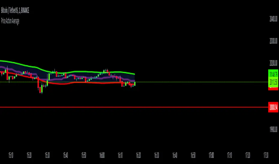
Price Action AverageThis indicator is perfect for scalping in 1 minute, it consists of a channel and a line that is made up of the average of the highs and lows of the price in 12 and 64 cycles.
The channel has as its center a 7 cycles SMA, when the average line (Called Signal, the purple one) crosses the upper band it is time to make a Long.
If it crosses the lower band it is time to make a short, if the line returns to the channel a signal appears to close the operation.
The indicator works with all timeframes, I use it on the 1 hour chart and I do the trades in 1 minute.
PA-Adaptive TRIX Log [Loxx]PA-Adaptive TRIX Log is a Phase Accumulation Adaptive TRIX Log indicator. This adaptation smooths the signal to catch larger trends.
What is TRIX?
TRIX is a momentum oscillator that displays the percent rate of change of a TEMA . It was developed in the early 1980's by Jack Hutson, an editor for "Technical Analysis of Stocks and Commodities" magazine. With its triple smoothing, TRIX is designed to filter insignificant price movements. In his article he uses a logarithm of a price (which is in many versions, left out).
What is the Phase Accumulation Cycle?
The phase accumulation method of computing the dominant cycle is perhaps the easiest to comprehend. In this technique, we measure the phase at each sample by taking the arctangent of the ratio of the quadrature component to the in-phase component. A delta phase is generated by taking the difference of the phase between successive samples. At each sample we can then look backwards, adding up the delta phases.When the sum of the delta phases reaches 360 degrees, we must have passed through one full cycle, on average.The process is repeated for each new sample.
The phase accumulation method of cycle measurement always uses one full cycle’s worth of historical data.This is both an advantage and a disadvantage.The advantage is the lag in obtaining the answer scales directly with the cycle period.That is, the measurement of a short cycle period has less lag than the measurement of a longer cycle period. However, the number of samples used in making the measurement means the averaging period is variable with cycle period. longer averaging reduces the noise level compared to the signal.Therefore, shorter cycle periods necessarily have a higher out- put signal-to-noise ratio.
Included
Bar coloring
2 signal options
Alerts

Half-Pi Cycle CKB top indicator (insanely experimental)This is an insanely experimental script. It's a modified version of the Bitcoin pi-cycle top indicator.
It changes the Bitcoin pi-cycle top formula by halving the number of days in the two DMAs used in calculation, from 350/111 to 175/56. So I call it the half-pi cycle. It correctly picked the top of CKB (Nervos Network) vs USDT on Huobi in spring 2021 within three days.
It probably is a coincidence, and could very easily not pick the next cycle peak correctly at all. Using such a short number of days makes it a little dubious, but I had no choice since there's only so much price history for this coin. I strongly advise you to not make any trades based on this script ! I cannot be held accountable if you lose money due to this script. It hasn't been shown to be accurate multiple times like the Bitcoin pi-cycle top indicator. I simply find this interesting and want to see if it works next time.

Morphed Sine WaveIntroduction
If you rescale a sine wave to the price you will need to correlate it with it in order to show good results, today i present a different method that does not involve correlation to "morph" a sine wave to the price in order to provide forecast's and highlight market periodic patterns.
Parameters
length control the period of the sine wave, power control the "morphing" amount, if you see for example that the results are going nuts try to increase power , if the results are just the price and the delayed price try to decrease power .
power = 1
power = 100
Those settings might be different depending on which market you are in.
Various Uses
You can do a lot of things with this indicator, use filters as source :
Use the indicator as source for oscillators in order to create cycles indicators :
And certainly many more things
Conclusion
I presented a way to morph a sine wave to the price i order to highlight cycles. You can use any function that return a value between -1 and 1 instead of sin , this can be a scaled rsi/stochastic or correlation coefficient, its up to you :)
If you need help don't hesitate to commend or pm me. I hope you will like the indicator and that it will inspire you to make great things.
Thanks for reading !

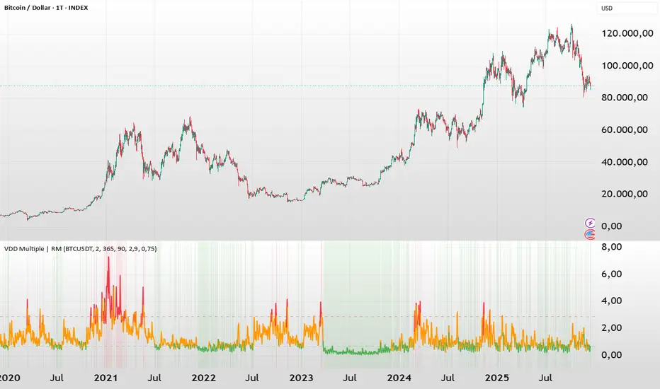
BTC - VDD Multiple (Approx)Overview & Philosophy
⚠️ Note: This indicator is optimized for the Daily (1D) Timeframe. Please switch your chart to 1D for accurate signal reading.
The BTC – VDD Multiple (Approx) is an advanced oscillator designed to identify market overheating and cycle tops by analyzing the velocity of value moving through the market.
In traditional On-Chain Analysis, Value Days Destroyed (VDD) is a premier metric for spotting macro tops. It multiplies the coin age (how long a coin was held) by the price at which it was moved. When old coins (HODLer money) move at high prices, VDD spikes, signaling massive profit-taking.
The Problem: Real "Coin Days Destroyed" (CDD) data is typically locked behind institutional paywalls or unavailable on standard TradingView plans.
The Solution: This script calculates a Deterministic Proxy. By analyzing the relationship between Exchange Volume, Price, and a Dormancy Constant, we can approximate the structure of the VDD Multiple without needing a premium data feed.
Methodology
The VDD Multiple works by comparing short-term market velocity against a long-term baseline.
1. The Proxy Calculation
Since we cannot directly access the age of coins on TradingView, we model the economic weight of the move:
Proxy Value = Exchange Volume * Price * Dormancy Factor
This creates a synthetic representation of "Value Throughput."
2. The Multiple
We compare the immediate heat of the market against the yearly trend:
• Short-Term MA (2 Days): Captures flash spikes and sudden liquidity exit events.
• Long-Term MA (365 Days): Represents the baseline "hum" of network activity.
VDD Multiple = Short Term MA / Long Term MA
How to Read the Chart
The indicator plots the Multiple as a line and uses background highlighting to signal extreme regimes.
🔴 The Red Zone (Overheated > 2.9)
Meaning: Current value transfer is ~3x higher than the yearly average.
Interpretation: Historically, sharp spikes into the Red Zone correlate with Local or Cycle Tops. This indicates that massive volume is changing hands at high prices—typically a sign of "Smart Money" distributing into "Dumb Money" FOMO.
Note: In strong bull runs, price can push higher even after a VDD spike, but the risk/reward ratio is extremely poor here.
🟢 The Green Zone (Undervalued < 0.75)
Meaning: Market activity is quiet and below the yearly baseline.
Interpretation: These are periods of apathy or accumulation. Historically, extended time spent in the Green Zone (the "flatline") has offered the best asymmetric buying opportunities.
🟠 The Orange Line (Neutral)
Meaning: The market is in transition or equilibrium.
Strategy & Context
This indicator is best used as a Macro Cycle Tool, not a day-trading signal.
• Exit Strategy: Look for "Clusters" of Red Spikes. A single spike often marks a local correction, but a cluster of intense spikes while price makes new highs (Divergence) is a strong Cycle Top warning.
• Entry Strategy: Historically the best entries occur when the indicator flattens out in the Green Zone for weeks or months. This suggests sellers are exhausted and the market has reached a floor.
Credits
This script is an approximation of the original VDD Multiple concept. Full credit for the underlying on-chain theory goes to the pioneers of this metric:
• Concept: The original Value Days Destroyed metric was popularized by Hans Hauge and Glassnode.
• The Multiple: The specific application of a Short/Long MA Multiple on VDD is widely attributed to analysts like TXMC and Bitbo.
This script adapts these concepts for the free TradingView environment using exchange volume proxies.
Settings
• Data Source: Defaults to BINANCE:BTCUSDT to capture high-volume liquidity.
• Short MA: Default is 2 Days to capture rapid velocity spikes.
• Long MA: Default is 365 Days to track the annual trend.
Disclaimer
This tool is an approximation based on exchange volume, not raw blockchain data. While exchange volume and on-chain volume are highly correlated during cycle extremes, they are not identical. This script is for educational and research purposes only. Past performance does not guarantee future results.
Tags
bitcoin, btc, onchain, vdd, cdd, valuation, cycle, top, bottom, Rob Maths
PyraTime Harmonic 369Concept and Methodology PyraTime Harmonic 369 is a quantitative time-projection tool designed to apply Modular Arithmetic to market analysis. Unlike linear time indicators, this tool projects non-linear integer sequences derived from Digital Root Summation (Base-9 Reduction).
The core logic utilizes the mathematical progression of the 3-6-9 constants. By anchoring to a user-defined "Origin Pivot," the script projects three distinct harmonic triads to identify potential Temporal Confluence—moments where mathematical time cycles align with price action.
Technical Features This script focuses on the Standard Scalar (1x) projection of the Digital Root sequence:
The Root-3 Triad (Red): Projects intervals of 174, 285, 396. (Mathematical Sum: 1+7+4=12→3)
The Root-6 Triad (Green): Projects intervals of 417, 528, 639. (Mathematical Sum: 4+1+7=12→3, inverted)
The Root-9 Triad (Blue): Projects intervals of 741, 852, 963. (Mathematical Sum: 7+4+1=12→3... completion to 9)
How to Use
Set Anchor: Input the time of a significant High or Low in the settings.
Select Resolution: This tool is optimized for 1-minute (Micro-Harmonics) and 15-minute (Intraday Harmonics) charts.
Analyze Clusters: The vertical lines represent calculated harmonic intervals. Traders look for "Clusters" where a Root-3 and Root-9 cycle land on adjacent bars, indicating a high-probability pivot.
System Architecture & Version Comparison This script represents the foundational layer of the PyraTime ecosystem.
This Script (PyraTime Harmonic 369):
Scalar: Standard 1x Multiplier only.
Focus: Intraday & Micro-structure (1m, 15m).
Engine: Core Digital Root Integers.
PyraTime Harmonic Matrix (Advanced Edition):
Scalar Engine: Unlocks Quad-Fractal (4x), Tri-Fractal (3x), and Bi-Fractal (2x) multipliers for institutional cycle analysis.
Apex Logic: Auto-detection of the "963" Completion Sequence (Gold Highlight).
Event Horizon: Includes a live Predictive Dashboard that calculates the time-delta to the next harmonic event across all scalar groups.
Disclaimer This tool is for the educational analysis of Number Theory in financial markets. It projects time intervals and does not predict price direction. Past performance does not guarantee future results.

21DMA Structure Counter (EMA/SMA Option)21DMA Structure Counter (EMA/SMA Option)
Overview
The 21DMA Structure Counter is an advanced technical indicator that tracks consecutive periods where price action remains above a 21-period moving average structure. This indicator helps traders identify momentum phases and potential trend exhaustion points using statistical analysis.
Key Features
Moving Average Structure
- Configurable MA Type: Choose between EMA (Exponential Moving Average) or SMA (Simple Moving Average)
- 21-Period Default: Optimized for the widely-watched 21-period moving average
- Triple MA Structure: Tracks high, close, and low moving averages for comprehensive analysis
Statistical Analysis
- Cycle Counting: Automatically counts consecutive periods above the MA structure
- Historical Data: Maintains up to 2,500 historical cycles (approximately 10 years of daily data)
- Z-Score Calculation: Provides statistical context using mean and standard deviation
- Multiple Standard Deviation Levels: Displays +1, +2, and +3 standard deviation thresholds
Visual Indicators
Color-Coded Bars:
- Gray: Below 10-year average
- Yellow: Between average and +1 standard deviation
- Orange: Between +1 and +2 standard deviations
- Red: Between +2 and +3 standard deviations
- Fuchsia: Above +3 standard deviations (extreme readings)
Breadth Integration
- Multiple Breadth Options: NDFI, NDTH, NDTW (NASDAQ breadth indicators), or VIX
- Background Shading: Visual alerts when breadth reaches extreme levels
- High/Low Thresholds: Customizable levels for breadth analysis
- Real-time Display: Current breadth value shown in data table
Smart Reset Logic
- High Below Structure Reset: Automatically resets count when daily high falls below the lowest MA
- Flexible Hold Period: Continues counting during temporary weakness as long as structure isn't violated
- Precise Entry/Exit: Strict criteria for starting cycles, flexible for maintaining them
How to Use
Trend Identification
- Rising Counts: Indicate sustained momentum above key moving average structure
- Extreme Readings: Z-scores above +2 or +3 suggest potential trend exhaustion
- Historical Context: Compare current cycles to 10-year statistical averages
Risk Management
- Breadth Confirmation: Use breadth shading to confirm market-wide strength/weakness
- Statistical Extremes: Exercise caution when readings reach +3 standard deviations
- Reset Signals: Pay attention to structure violations for potential trend changes
Multi-Timeframe Application
- Daily Charts: Primary timeframe for swing trading and position management
- Weekly/Monthly: Longer-term trend analysis
- Intraday: Shorter-term momentum assessment (adjust MA period accordingly)
Settings
Moving Average Options
- Type: EMA or SMA selection
- Period: Default 21 (customizable)
- Reset Days: Days below structure required for reset
Visual Customization
- Standard Deviation Lines: Toggle and customize colors for +1, +2, +3 SD
- Breadth Selection: Choose from NDFI, NDTH, NDTW, or VIX
- Threshold Levels: Set custom high/low breadth thresholds
- Table Styling: Customize text colors, background, and font size
Technical Notes
- Data Retention: Maintains 2,500 historical cycles for robust statistical analysis
- Real-time Updates: Calculations update with each new bar
- Breadth Integration: Uses security() function to pull external breadth data
- Performance Optimized: Efficient array management prevents memory issues
Best Practices
1. Combine with Price Action: Use alongside support/resistance and chart patterns
2. Monitor Breadth Divergences: Watch for breadth weakness during strong readings
3. Respect Statistical Extremes: Exercise caution at +2/+3 standard deviation levels
4. Context Matters: Consider overall market environment and sector rotation
5. Risk Management: Use appropriate position sizing, especially at extreme readings
Disclaimer
This indicator is for educational and informational purposes only. It should not be used as the sole basis for trading decisions. Always combine with other forms of analysis and proper risk management techniques.
Compatible with Pine Script v6 | Optimized for daily timeframes | Best used on major indices and liquid stocks
Adaptive Fisherized CMOIntroduction
Heyo, here is another no-repaint adaptive fisherized indicator.
I added Inverse Fisher Transform, Ehlers dominant cycle analysis and smoothing to the Chande Momentum Oscillator (CMO).
Usage
The CMO is a momentum oscillator which shows the usual movement of an asset.
I recommend to use it from a lower timeframe with a higher timeframe set.
Signals
(Signal mode will come soon.)
Zero Line
CMO crosses above zero line => enter long
CMO cross below zero line => ente short
Overbought/Oversold
CMO crosses above bottom band => enter long
CMO crosses under top band => enter short
MA (Maybe this signals will vary. Then, check update notes.)
CMO crosses above MA => enter long
CMO crosses below MA => enter short
Enjoy and share your experience with it!
More to read: CMO Explanationsp

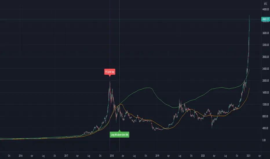
Pi Cycle indicator for Bitcoin bull market cyclesA simple implementation of the Pi cycle indicator for BTC. Plots the 111 days SMA and 2*(350 days SMA).
When the 111 days MA reaches above the 350 one, we can consider the market got too high too fast.
Checked for the last cycles of BTC.

Dominant Cycle Adaptive MACDThis Indicator is based on classic MACD but with an exceptional smoothing.
This smoothing eliminates the noise of the classic MACD as you see in the Chart
Adaptive MACD is compiled using with two adaptive moving averages, one adaptive to the dominant cycle and the other adaptive to twice the dominant cycle. As the basic behind the MACD is the difference of two moving averages we cannot find much difference between the conventional MACD (12, 26) and the adaptive MACD. However the adaptive MACD is less prone for less whipsaws and it catches the trends very well at the same time the catches the turning points in time. The Adaptive MACD is definite one notch better than the conventional MACD.
Dominant Cycle Period is calculated using Ehler's Method {Mentioned in the code}
This is how the Adaptiveness Impacts the Price Chart
1. (12, 26 EMA) VS Adaptive Dominant Cycle EMA
2. See how the Adaptive Lengths {both FastLength and SlowLength changes with time!}
Enjoy!
Pi Cycle Bitcoin Top IndicatorThe script implements the Pi Cycle Top indicator
This indicator identifies tops in the bitcoin market cycle. Historically, the Pi Cycle Top indicator has called out tops in the price of bitcoin within three days.
The script is very easy to use and it is possible to change the following parameters:
the time interval (default value is day);
the days of long moving average (default value is 365)
the days of short moving average (default value is 111)
show the moving average plots
show the Pi Cycle Top label highlighting the cross-point
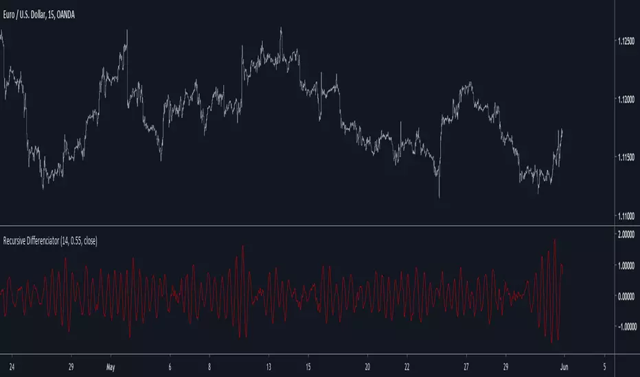
Recursive DifferenciatorIntroduction
Cycles can be spotted by using a wide range of methods, most of them will involve bandpass filtering, here i will show a method using recursion with the change() function.
The Indicator
As i explained in other indicators using recursion i posted rescaling the input is important, i will use the rsi of an exponential moving average as input. alpha control the amount of output the indicator will use as input, values closer to 0.5 will use more input resulting in more periodic results.
Lowering alpha when length is higher can help get more periodic results.
Conclusion
I have showed a new cycle indicator using recursion. Recursion with oscillators can highlights cycles in price thus being easier to predict.
Thanks for reading !
Madrid SinewaveThis implements the Even Better Sinewave indicator as described in the book Cycle Analysis for Traders by John F. Ehlers .
In the example I used 36 as the cycle to be analyzed and a second cycle with a shorter period, 9, the larger period tells where the dominant cycle is heading, and the faster cycle signals entry/exit points and reversals.
deKoder | Ultra High Timeframe Moving Average & Log StDev BandsdeKoder | Ultra High Timeframe Moving Average & Log StDev Bands
Identify long-term statistical extremes and map the core trend with the deKoder | uHTF MA indicator. Designed for macro analysis, this tool uses ultra high timeframe moving averages and logarithmic standard deviation bands to frame price action, providing clear signals for when an asset is statistically cheap, fairly priced, or expensive.
KEY FEATURES
• Ultra High Timeframe (uHTF) Moving Average:
• Acts as a dynamic long term fair value equilibrium line. Choose from periods like 1-Year, 2-Year, or 'Long Time'.
• Select your MA type: SMA, EMA, Hull MA, or a Rolling VWAP .
• Automatically fetches optimal data (4H/D) for smoother plotting on lower timeframes.
• Probabilistic Logarithmic Bands:
• The bands are calculated using log-standard deviation , creating a framework that adapts to exponential growth. As such, your chart price scale should be set to log.
• ~68% of price action typically occurs between the ±1σ bands (fair value zone).
• Trading in the ±1σ to ±2σ channel is typical in a strongly trending market. Moves towards the ±3σ bands can indicate that the market is becoming overextended. Expect strong price moves here and pay attention for signs of reversal.
• Bitcoin Halving Timeline:
• Integrated vertical lines and labels for all Bitcoin halvings.
• Correlates technical extremes with fundamental scarcity events.
• 4-Year Cycle Visual Aid:
• The background color cycle highlights yearly changes.
• Red years have historically aligned with bear markets, while the subsequent green zone has marked accumulation phases.
• Note: The bands provide the primary information - the background color is a contextual guide based on historical patterns around the BTC 4 year halving cycle that may not persist in future. It's quite possible that the market will act differently going forward considering the new types participants such as ETFs and government reserve funds.
HOW TO USE & INTERPRET
• Fair Value & Extremes:
• Price between ±1σ Bands: The asset is trading within a statistically fair value range.
• Price at +2σ / +3σ Bands: The asset is statistically expensive. Statistically, the price is overextended in this region, although you do NOT want to fade it based only upon this information.
• Price at -2σ / -3σ Bands: The asset is statistically cheap. These zones have frequently coincided with the end of bear markets and profound long-term buying opportunities.
• Dynamic Support & Resistance:
• The uHTF MA and its bands tend to act as support and resistance areas of interest on daily, weekly and monthly charts.
INPUTS & CUSTOMIZATION
• Toggles : Master switch for the MA, Bands, and Halving markers.
• uHTF Moving Average Filter : Select instrument (default: BITSTAMP:BTCUSD), price source, MA length, and type.
• Colours : Fine-tune the appearance of all elements.
PRO TIPS
• While created for Bitcoin, this principle will work well on other high-growth assets and major indices.
• The most reliable signals occur on the Daily, Weekly and Monthly timeframes.
• This is a lagging, macro-filter indicator. It is not for timing short-term entries but for confirming the long-term trend and cycle phase.
"Be Fearful When Others Are Greedy and Greedy When Others Are Fearful." - The deKoder | uHTF MA is here to help you quantify that greed and fear on a macro scale.

Pulse of Cycle Oscillator"Pulse of Cycle" Oscillator: Logic and Usage
What Is It and How Does It Work?
The "Pulse of Cycle" is an oscillator that measures the cycles of price rises and falls, helping you spot overbought and oversold conditions. Unlike classic indicators, it doesn’t focus on how much the price moves but tracks its direction (up or down) like a "pulse." Here’s the logic:
Price Movement:
If the price rises compared to the previous bar, it adds +1.
If the price falls, it subtracts -1.
If the price stays the same, it adds 0.
Decay Factor: Each step, the previous value is multiplied by a factor (e.g., 0.9) to shrink it slightly. This keeps the oscillator from growing too big and focuses it on recent price action.
Signals: The oscillator moves around zero. When it crosses certain levels (e.g., 5 and 10), it warns you about overbought or oversold zones:
Weak Signal: Above ±5, the market might be stretching a bit.
Strong Signal: Above ±10, a reversal is more likely.
In short, it tracks the "rhythm" of price streaks (consecutive ups or downs) and signals when things might be getting extreme.
How It Looks on the Chart
Line: The oscillator moves around a zero line.
Colors:
Blue: Normal zone (between -5 and +5).
Orange: Weak overbought (+5 and up) or oversold (-5 and down).
Red: Strong overbought (+10 and up).
Lime: Strong oversold (-10 and down).
Threshold Lines: You’ll see lines at 0, ±5, and ±10 on the chart to show where you are.
How to Use It?
Here’s how to trade with this oscillator:
Buy Opportunity (Long Position):
When?: The oscillator drops below -5 (weak) or -10 (strong), then starts moving back toward zero. This suggests the price has hit a bottom and might rise.
Example: It falls to -12 (lime), then rises to -8. You could buy, expecting a bounce.
Tip: Wait for a green candle to confirm if you want to be safer.
Sell Opportunity (Short Position):
When?: The oscillator rises above +5 (weak) or +10 (strong), then starts dropping back toward zero. This indicates the price might have peaked and could fall.
Example: It hits +11 (red), then drops to +7. You could sell, expecting a decline.
Tip: Look for a red candle to confirm the turn.
Neutral Zone: If it’s between -5 and +5, the market is balanced. You can wait for a clearer signal.
Practical Steps to Use
Add to TradingView:
Paste the code into Pine Editor and click “Add to Chart.”
Adjust Settings (Optional):
Decay (0.9): Lower to 0.7 for faster response, raise to 0.95 for smoother movement.
Thresholds (5 and 10): Change them (e.g., 4 and 8) based on your market.
Watch Signals:
Follow the color changes and threshold crossings.
Set Alerts:
Right-click the oscillator > “Add Alert” to get notified on overbought/oversold signals.
Things to Watch Out For
Confirmation: Pair it with support/resistance levels or candlestick patterns for stronger signals.
Market Type: Works best in range-bound (sideways) markets. In strong trends (all up or down), signals might mislead.
Risk: Always use a stop loss—below the last low for buys, above the last high for sells.
Summary
The "Pulse of Cycle" is a simple yet powerful tool that tracks price movement streaks. Use it to catch reversals at strong signals (-10/+10) or get early warnings at weak signals (±5). The colors and lines on the chart make it easy to see when to act.

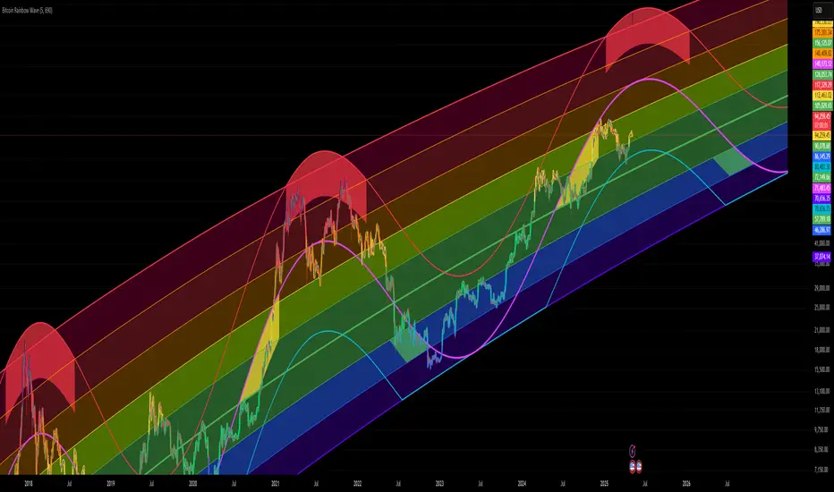
Bitcoin Rainbow WaveBitcoin ultimate price model:
1. Power Law + 2. Rainbow Narrowing Bands + 3. Halving Cycle Harmonic Wave + 3. Wave bands
This powerful tool is designed to help traders of all levels understand and navigate the Bitcoin market. It works exclusively with BTC on any timeframe, but looks best on weekly or daily charts. The indicator provides valuable insights into historical price behavior and offers forecasts for the next decade, making it essential for both mid-term and long-term strategies.
How the Model Works
Power Law (Logarithmic Trend) : The green line represents the expected long-term price trajectory of Bitcoin based on a logarithmic regression model (power law). This suggests that Bitcoin's price generally increases as a power of 5.44 over time passed.
Rainbow Chart : Colored bands around the power law trend line illustrate a range of potential price fluctuations. The bands narrow esponentially over time, indicating increasing model accuracy as Bitcoin matures. This chart visually identifies overbought and oversold zones, as well as fair value zones.
Blue Zone : Below the power law trend, indicating an undervalued condition and a potential buying zone.
Green Zone : Around the power law trend, suggesting fair value.
Yellow Zone : Above the power law trend, but within the rainbow bands. Exercise caution, as the price may be overextended.
Red Zone : Far above the power law trend, indicating strong overbought conditions. Consider taking profits or reducing exposure.
Halving Cycle Wave : The fuchsia line represents the cyclical wave component of the model, tied to Bitcoin's halving events (approximately every four years). This wave accounts for the price fluctuations that typically occur around halvings, with price tending to increase leading up to a halving and correct afterwards. The amplitude of the wave decreases over time as the impact of halvings potentially lessens. Additional bands around the wave show the expected range of price fluctuations, aiding traders in making informed decisions.
Customizing Parameters
You can fine-tune the model's appearance by adjusting these input parameters:
show Power Law (true/false): Toggle visibility of the power law trend line.
show Wave (true/false): Toggle visibility of the halving cycle wave.
show Rainbow Chart (true/false): Toggle visibility of the rainbow bands.
show Block Marks (true/false): Toggle visibility of the 70,000 block interval markers.
Using the Model in Your Trading Strategy
Combine this indicator with technical analysis, fundamental analysis, and risk management techniques to develop a comprehensive Bitcoin trading strategy. The model can help you identify potential entry and exit points, assess market sentiment, and manage risk based on Bitcoin's position relative to the power law trend, halving cycle wave, and rainbow chart zones.
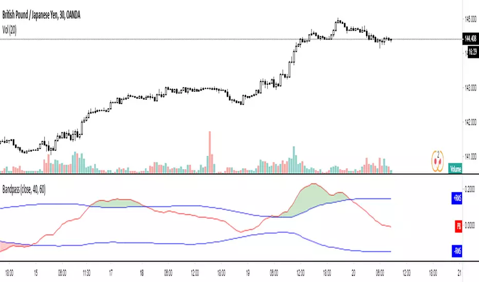
Bandpass Cycle Indicator [Ehlers]This indicator is NOT used for entry and exit conditions when trading. Instead, it's purpose is to tell you what the state of the market is: trending or cyclical.
>WHO IS THIS FOR?
This is especially useful for strategies that use scalping or martingale betting to turn a profit. You don't want to be caught in a bullish trend with several open short orders. Algo traders welcome.
>HOW DOES IT WORK?
I'm glad you asked. It's based on Ehlers' work regarding signal filtering. Essentially, it uses a bandpass filter to reduce noise that is inherent in the market and display the underlying frequency.
First, we get rid of the high-frequency noise - think jitters, long wicks, etc... price action that usually effects EMAs and other MAs. We don't want any of that.
Next, we get rid of low-frequency noise - this is a little more difficult to picture, but we're essentially ignoring cycles (Elliot waves) from other longer time frames. We don't care if the Daily bars are just about to reverse if it doesn't affect our scalping strategy.
Finally, we find the root mean square (RMS) of the high and low points of our newly created signal (red) and plot them (black). These will act as triggers to tell us if a market is in cycle or trending.
>HOW DO YOU READ IT?
Background colors:
-Blue is cycle - you're safe.
-Red is trending down
-Green is trending up
Crossovers:
-Red above Upper Black: Uptrend
-Red below Lower Black: Downtrend
-Red in the middle: Cycle
>IS IT PREDICTIVE?
Momentum tends to pick up quickly and decline quickly, so if you'll often see a small Red or Green strip before a large price movement.
After long periods of cyclic movement (or consolidation), there isn't much momentum in the system, so any small price action will be considered a trend -> these small movements are picked up by other human traders and bots. Trading volume increases more and more until you have a swing in one direction.
So yes, it can be predictive due to the nature of signals and oscillation. Maybe not necessarily predictive of which direction price will go, but when volatility is about to increase.
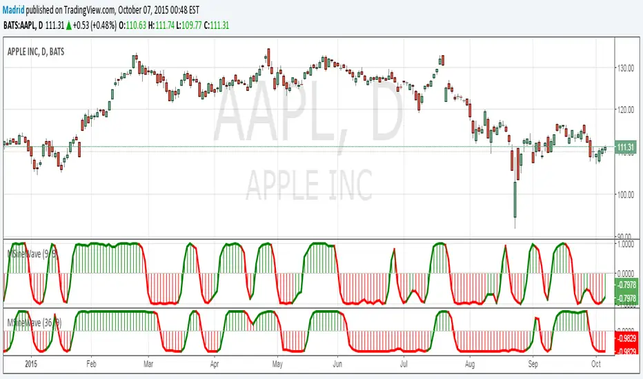
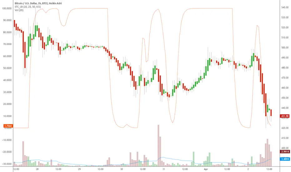
Indicator: Schaff Trend Cycle (STC)Another new indicator for TV community :)
STC detects up and down trends long before the MACD. It does this by using the same exponential moving averages (EMAs), but adds a cycle component to factor instrument cycle trends. STC gives more accuracy and reliability than the MACD.
More info: www.investopedia.com
Feel free to "Make mine" this chart and use the indicator in your charts. Appreciate any feedback on how effective this is for your instrument (I have tested this only with BTC).
For people trading BTC:
-------------------------------
Try 3/10 or 9/30 for MACD (fastLength/slowLength). They seem to catch the cycles better than the defaults. :)
Macro Risk SentimentOverview
This indicator provides a simple traffic light for your trading: green means go, red means slow down.
The background color appears directly on your price chart and in the oscillator pane below. When green, macro conditions favor risk assets and you can trade with full conviction. When red, the indicator suggests reducing position sizes, tightening stops, or stepping aside entirely.
The oscillator pane shows the underlying calculation so you can see how close the market is to flipping regimes.
The Core Idea
Markets move in risk cycles. When institutional money is confident, it flows into equities, high-yield bonds, and away from safe havens. When fear takes over, money rotates into treasuries, the dollar strengthens, and volatility spikes.
This indicator reads those flows by monitoring four markets simultaneously:
Risk-On Signals (good for stocks when rising)
TLT - Long-term Treasury bonds
JNK - High-yield corporate credit
Risk-Off Signals (bad for stocks when rising)
DXY - US Dollar strength
VIX - Market volatility
When bonds and credit are strong relative to their recent history while the dollar and volatility are weak, the background turns green. You have a tailwind. When the opposite occurs, the background turns red. You are fighting the current.
How It Works
Step 1: Z-Score Normalization
Each input is converted to a z-score: how many standard deviations the current value is from its 252-day rolling average. This puts all four inputs on a comparable scale regardless of their absolute price levels.
Step 2: Composite Calculation
Macro Score = (TLT z-score + JNK z-score) minus (DXY z-score + VIX z-score)
Risk-on inputs contribute positively when elevated. Risk-off inputs subtract when elevated. The result is clamped between -1.5 and +1.5 and smoothed with EMAs.
Step 3: State Machine
The indicator uses crossover-based transitions with memory:
RISK ON triggers when the smoothed macro line crosses above its signal line.
RISK OFF triggers when the macro line crosses below its signal line, or when price breaks below its EMA while the macro value is negative (double confirmation exit).
How to Use It
Green Background - Full Steam Ahead
Macro conditions support risk-taking. This is when trend-following strategies tend to work best. Use normal position sizes, take breakout trades, and hold winners longer.
Red Background - Reduce Risk
The macro wind is against you. Consider smaller positions, quicker profit-taking, or sitting out entirely. Mean-reversion setups may work better than trend-following during these periods. Many major drawdowns occur during red regimes.
The Oscillator Pane
The colored line is the macro reading, the white line is its signal. When the colored line crosses above the signal, conditions turn bullish. When it crosses below, conditions turn bearish. The zero line represents neutral. Positive values mean macro conditions are better than the one-year average.
What Makes This Original
This implementation combines z-score normalization across multiple asset classes with a state machine approach that reduces whipsaws. The price filter acts as a circuit breaker but only triggers exits when macro conditions are also deteriorating, preventing premature exits during temporary price weakness.
Settings Guide
Main Settings
Z-Score Lookback (default 252) - Period for calculating mean and standard deviation. 252 bars equals one trading year on daily charts.
Macro EMA (default 7) - Smoothing applied to the raw composite score.
Signal EMA (default 8) - Secondary smoothing for the crossover signal line.
Price Filter
Enable Price Filter (default On) - When enabled, price breaking below the EMA triggers an exit only if the macro value is also negative.
EMA Length (default 20) - The EMA period for the price filter.
Data Sources
Each source (TLT, JNK, DXY, VIX) can be enabled or disabled and weighted from 0 to 3. Default is equal weighting (1.0) for all sources.
Limitations
This is a daily-timeframe indicator. On intraday charts, signals reflect yesterday's macro reading until the day closes.
The z-score lookback creates recency bias. What was normal over the past year may not reflect longer-term historical norms.
Intermarket correlations can change. What worked in recent decades may shift in different monetary regimes.
Not all equity drawdowns come with macro warning. Flash crashes and idiosyncratic events can occur without macro deterioration.
The indicator identifies conditions, not predictions. Green does not guarantee gains. Red does not guarantee losses.
Disclaimer
This indicator is for educational and informational purposes only. It does not constitute financial advice.
Green background does not mean buy. Red background does not mean sell. These are environmental readings to help you calibrate your risk-taking, not trade signals.
Past intermarket relationships do not guarantee future behavior. Always conduct your own research. Consider your personal risk tolerance. Never risk more than you can afford to lose.

TASC 2026.01 The Reversion Index█ OVERVIEW
This script implements the Reversion Index as presented by John F. Ehlers in the January 2026 edition of the TASC Traders' Tips , "Identifying Peaks And Valleys In Ranging Markets”. This indicator was created to provide timely buy and sell signals for mean reversion strategies.
█ CONCEPTS
Ehlers came up with the idea for the Reversion Index following the development of the "Continuation Index" (featured in the September 2025 edition). While the Continuation Index provides indications for trend onset, continuation, and exhaustion; the Reversion Index serves as its counterpart for mean-reversion trading.
The raw Reversion Index value is calculated as the net change in price normalized to the sum of the absolute value of change in price over the same period; for clarity, it is then smoothed using Ehlers' SuperSmoother.
The Smooth Reversion Index value is led by a "Trigger" line, which is created by smoothing the raw data to half the smoothing period of the smoothed index.
Note: Ehlers suggests the smoothing lengths be left at 8 and 4 (Reversion Index & Trigger). For this reason these lengths are hard-coded in the script but can be easily modified in the code.
█ USAGE
In order to identify peaks and valleys effectively, the "Length" should ideally be set to half of that of the expected cycle of the data. If the expected cycle of your trading data is 20 bars, a 10 bar length should be set.
Note: The Reversion Index is intended to identify peaks and valleys within a cycle, not over a large sample period. Ehlers suggests that this would create an estimation of trend, which is not the goal here.
Once the length is set, peaks and valleys are interpreted as the cross of the "Trigger" and "Smooth" lines.

Bitcoin Power Law Deviation Z-ScoreIntroduction While standard price charts show Bitcoin's exponential growth, it can be difficult to gauge exactly how "overheated" or "cheap" the asset is relative to its historical trend.
This indicator strips away the price action to visualize pure Deviation. It compares the current price to the Bitcoin Power Law "Fair Value" model and plots the result as a normalized Z-Score. This creates a clean oscillator that makes it easy to identify historical cycle tops and bottoms without the noise of a log-scale chart.
How to Read This Indicator The oscillator centers around a zero-line, which represents the mathematical "Fair Value" of the network. 0.0 (Center Line): Price is exactly at the Power Law fair value. Positive Values (+1 to +5): Price is trading at a premium. Historically, values above 4.0 have coincided with cycle peaks (Red Zones). Negative Values (-1 to -3): Price is trading at a discount. Historically, values below -1.0 have been excellent accumulation zones (Green/Blue Zones).
The Math Behind the Model This script uses the same physics-based Power Law parameters as the popular overlay charts: Formula: Price = A * (days since genesis)^b Slope (b): 5.78 Amplitude (A): 1.45 x 10^-17 The "Z-Score" is calculated by taking the logarithmic difference between the actual price and the model price, divided by a standard scaling factor (0.18 log steps).
How to Use Cycle Analysis: Use this tool to spot macro-extremes. Unlike RSI or MACD which reset frequently, this oscillator provides a multi-year view of market sentiment. Confluence: This tool works best when paired with the main "Power Law Rainbow" chart overlay to confirm whether price is hitting major resistance or support bands.
Credits Based on the Power Law theory by Giovanni Santostasi and Corridor concepts by Harold Christopher Burger .
Disclaimer This tool is for educational purposes only. Past performance of a model is not indicative of future results. Not financial advice.

50, 100 & 200 Week MA (SMA/EMA Switch)Clean, multi-timeframe weekly moving average indicator displaying the classic 50, 100, and 200-week MAs directly on any chart timeframe.
Features:
True weekly calculations using request.security (accurate, no daily approximation)
Switch between SMA and EMA with one click
Individually toggle each MA (50w orange, 100w purple, 200w blue)
Perfect for long-term trend analysis, golden/death crosses, and institutional-level support/resistance
Ideal for swing traders, investors, and anyone tracking major market cycles. Lightweight and repaints-free.
