timing marketIntraday time cycle . it is valid for nifty and banknifty .just add this on daily basis . ignore previous day data Penunjuk Pine Script®oleh YogaRaj55166
BTC Pi MultipleThe Pi Multiple is a function of 350 and 111-day moving average. When both intersect and the 111-day MA crosses above, it has historically coincided with a cycle top with a 3-day margin. With the Pi Multiple, this intersection is visible when the line crosses zero upwards. The indicator is called the Pi Multiple because 350/111 is close to Pi. It is based on the Pi Cycle Top Indicator developed by Philip Swift and has been modified for better readability by David Bertho.Penunjuk Pine Script®oleh cryptoonchain22188
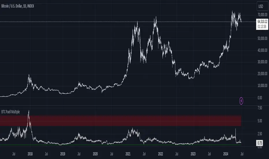
Bitcoin Fundamentals - Puell MultipleThis is an indicator that derives from Bitcoin Mining daily generated Income. It does show a perfect track record on calling Bitcoin cycle tops and cycle bottoms. For those of you willing to experiment, I've enabled the ability to set custom periods (365 by default). The indicator includes custom alerts to notify the entry and the exit from OverBought (OB) & OverSold (OS) bands. Credits: David Puell twitter.comPenunjuk Pine Script®oleh gliderfundTelah dikemas kini 1818 1.1 K
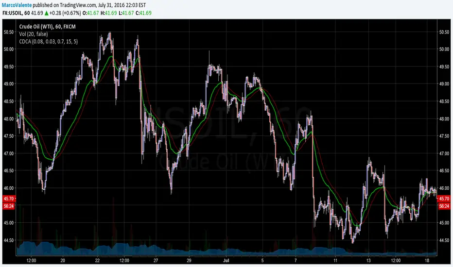
Cycle Dynamic Composite AverageThis MA uses the formula of simple cycle indicator to find 2 cycles periods length's . The CDCA is the result of 8 different ma to control and filter the price. The regression line is the signal , don t need to look candles, but just the cross between MA and reg lin. Penunjuk Pine Script®oleh MarcoValente99398
SQ9 Positional System + ADR + VWAP (Clean)Gann concept of SQ9 is used for level and entry is based on crossing 0 deg and previous 315 degree is used as stop loss and 315 degree is used for target. Combined with VWAP for trailing stop loss (yellow line) and also Added ADR concept to avoid late entry or early exit. Best for positional trade is daily and 1 hr time frame combination with good RR ratio. Scalping trade is used for 15 and 5 min time frame. Vertical lines in blue gives you time cycle.Penunjuk Pine Script®oleh dc4uonly14
Square of Nine Harmonics [SQ9]The Solution Traders often struggle to reconcile the relationship between Price and Time using standard linear indicators. SQ9 solves this by mathematically projecting the geometric relationships derived from W.D. Gann’s Square of 9 directly onto your chart. It removes the subjectivity of manual harmonic mapping, providing a standardized framework to identify potential reversal zones and trend continuations based on time/price squaring. How it Works SQ9 automates the calculation of harmonic "corners" and cardinal crosses. It operates on the principle that market pivots often align with specific geometric degrees when Price is converted to Time (and vice versa). How to Use SQ9 1. Auto-Pivot Standardization The core of the script utilizes a standardized Auto-Pivot logic. Action: Apply the script to your chart. The script automatically detects significant high/low anchor points based on your lookback settings. Observation: Ensure the pivot anchors align with visually significant market structures. These anchors serve as the "Zero Point" for the harmonic projections. 2. Reading the Slope Display The dashboard features a Slope readout designed for readability. Usage: Monitor the Slope value to gauge the intensity of the current vector. Interpretation: A steepening slope indicates aggressive price action relative to time, while a flattening slope suggests consolidation or potential exhaustion of the current harmonic cycle. 3. Interpreting Context-Aware Signals SQ9 employs Context-Aware Signals to filter noise. Logic: Signals are not generated randomly; they are filtered against the Master Angle. Execution: Look for signals that align with the dominant trend defined by the Master Angle. If the Master Angle is bullish, bearish signals are muted (or flagged as counter-trend) to prevent false positives in strong trends. Reference: View SQ9 Chart Example Settings Configuration Lookback Period: Adjusts the sensitivity of the Auto-Pivot detection. Increase this value for higher timeframe analysis; decrease for intraday scalping. Master Angle Filter: Toggles the context-awareness. improving signal reliability by respecting the macro vector. Risk Disclaimer This script is for educational and analytical purposes only. Past performance of geometric harmonics does not guarantee future results. Trading involves significant risk. Always use proper risk management. Penunjuk Pine Script®oleh PyraTime9
VB Sigma Smart Momentum IndicatorVB Sigma Smart Momentum Indicator (VBSSMI) The VBSSMI provides a consolidated decision-support framework that surfaces market participation, trend integrity, and liquidity conditions in a single visual environment. The tool integrates four analytical modules: MCDX Flow Mapping, Donchian Regime Layers, Banker Flow Modeling, and Chop Zone Trend Classification. Together, these components convert raw price movement into an actionable interpretation of who is in control, whether momentum is durable, and what phase the instrument is currently cycling through. How to Use the Indicator (Practical Workflow) 1. Start with Institutional / Banker Flow (Pink/Red/Yellow/Green Candles) This is the primary signal layer. It tells you when high-capacity participants are increasing, reducing, or reversing risk. Yellow Candle — Entry Bias Indicates a potential institutional initiation when their trend metric crosses above their accumulation threshold. Operational signal: instrument enters “monitor for entry” state. Green Candle — Accumulation State Fund-trend > bullbearline. Operational signal: trend integrity improving; pullbacks are generally buyable. White Candle — Distribution / Cooling Fund-trend weakening but not broken. Operational signal: tighten stops; momentum deteriorating. Red Candle — Exit / Trend Failure Fund-trend < bullbearline. Operational signal: momentum regime invalidated; avoid long risk. Blue Candle — Weak Rebound A temporary uptick within broader weakness. Operational signal: do not mistake this for a durable reversal. 2. Validate alignment with Flow Chips (Retail / Trader / Institutional) These three flow columns (MCDX layers) answer: who is actually participating? Retailer Flow (Locked Chips – Green) High values imply retail conviction, often late-cycle. Good for confirming trend strength, not timing entries. Trader Zone Flow (Float Chips – Yellow) When this spikes, volatility and tactical positioning increase. Signal: strong short-term engagement, supports breakout/trend continuation. Institutional Flow (Profitable Chips – Red/Pink) This is the “true north” of momentum. Rising values = institutions controlling price discovery. Signal: long setups have statistical tailwind. The operational guidance is straightforward: Institutional Flow > Trader Flow > Retail Flow is the healthiest configuration for sustainable upside momentum. 3. Confirm Breakout / Breakdown Conditions with Donchian Regime Columns The vertical Donchian stack illustrates trend regime in a time-compressed format. Bright Blue/Cyan Structure expanding upward (breakout cluster). Dark Purple/Red Structure breaking downward (breakdown cluster). Mixed Columns Transitional or indecisive conditions. Interpret it as a “momentum backdrop”: If Donchian columns and Banker Flow candles disagree, avoid entries. 4. Consult the Chop Zone Strip Before Committing Capital The Chop Zone uses EMA angle to determine whether the market is trending or congested. Greens/Blues → Trend phase (favorable environment for continuation trades). Yellows/Oranges/Reds → High noise probability; expect false signals. Operationally: Never enter breakout setups during yellow/orange/red chop. 5. Final Decision Framework (Checklist) A long setup typically requires: Green or Yellow Banker Flow Candle Institutional Flow rising Donchian columns in bullish regime colors Chop Zone in a trend color (not red/yellow/orange) A short setup is the exact inverse. Recommended Use Cases Momentum trading Swing position building Institutional-flow confirmation Trend-filtering before deploying breakout systems Screening for strong/weak symbols in multi-asset rotation strategiesPenunjuk Pine Script®oleh TheSigmaMentorTelah dikemas kini 66757
Auto Fibonacci Retracements with Alerts [SwissAlgo]AUTO-FIBONACCI RETRACEMENT: LEVELS, ALERTS & PD ZONES Automatically maps Fibonacci retracement levels with Premium/Discount (PD) zones and configurable alerts for technical analysis study. ------------------------------------------------------------------ FEATURES Automatic Fibonacci Levels Detection Identifies swing extremes (reference high and low to map retracements) from a user-defined trend start date and trend indication automatically Calculates 20 Fibonacci levels (from -2.618 to +2.618) automatically Dynamically updates Fib levels as price action develops, anchoring the bottom (in case of uptrends) or the top (in case of downtrends) Detects potential Trend's Change of Character automatically Premium/Discount (PD) zone visualization based on trend and price extremes Visual Components Dotted horizontal lines for each Fibonacci level 'Premium' and 'discount' zone highlighting Change of Character (CHoCH) marker when a trend anchor breaks (a bottom is broken after an uptrend, a top is broken after a downtrend) Adaptive label colors for light/dark chart themes Alert System Configurable alerts for all Fibonacci levels Requires 2 consecutive bar closes for confirmation (reduces false signals) CHoCH alert when a locked extreme is broken Set up using "Any alert() function call" option ------------------------------------------------------------------ USE CASES Two Primary Use Cases: 1. PROSPECTIVE TREND MAPPING (Real-Time Tracking) Set start date at or just before an anticipated swing extreme to track levels as the trend develops: For Uptrend : Place start date near a bottom. The bottom level locks after consolidation, while the top updates in real-time as the price climbs higher For Downtrend : Place start date near a top. The top-level locks after consolidation, while the bottom updates in real-time as the price falls lower This mode tracks developing price action against Fibonacci levels as the swing unfolds. 2. RETROSPECTIVE ANALYSIS (Historical Swing Study) Set the start date at a completed swing extreme to analyze how the price interacted (and is interacting) with the Fibonacci levels: Both high and low are already established in the historical data Levels remain static for analysis purposes Useful for analyzing price behavior relative to Fibonacci levels, studying retracement dynamics, and assessing a trading posture ------------------------------------------------------------------ HOW TO USE Set 'Start Date' : Select Start Date (anchor point) at or just before the swing extreme (bottom for uptrend, top for downtrend) Choose Trend Direction (Up or Down): direction is known for retrospective analysis, uncertain for prospective analysis Update the start date when significant structure breaks occur to begin analyzing a new swing cycle. Configure alerts as needed for your analysis ------------------------------------------------------------------ TECHNICAL DETAILS ♦ Auto-Mapped Fibonacci Retracement Levels: 2.618, 2.000, 1.618, 1.414, 1.272, 1.000, 0.882, 0.786, 0.618, 0.500, 0.382, 0.236, 0.118, 0.000, -0.272, -0.618, -1.000, -1.618, -2.000, -2.618 ♦ Premium/Discount (PD) Zones: Uptrend: Green (discount zone) = levels 0 to 0.5 | Red (premium zone) = levels 0.5 to 1.0 Downtrend: Red (premium zone) = levels 0 to 0.5 | Green (discount zone) = levels 0.5 to 1.0 The yellow line represents the 0.5 equilibrium level ♦ Lock Mechanism: The indicator monitors for new extremes to detect a Change of Character in the trend (providing visual feedback and alerts). It locks the anchor swing extreme after a timeframe-appropriate consolidation period has elapsed (varies from 200 bars on second charts to 1 bar on monthly charts) to detect such potentially critical events. ------------------------------------------------------------------ IMPORTANT NOTES This is an educational tool for technical analysis study. It displays historical and current price relationships to Fibonacci levels but does not predict future price movements or provide trading recommendations. DISCLAIMER: This indicator is for educational and informational purposes only. It does not constitute financial advice or trading signals. Past price patterns do not guarantee future results. Trading involves substantial risk of loss. Always conduct your own analysis and consult with qualified financial professionals before making trading decisions. By using this indicator, you acknowledge and agree to these limitations.Penunjuk Pine Script®oleh SwissAlgoTelah dikemas kini 105
Stage 2 BasesStage 2 Bases What is a Stage 2 Base? Stage 2 = Advancing Phase in Stock price cycle. Stocks in Stage 2 are in uptrend (50 > 150 > 200-day moving averages). A pause (consolidation) in an ongoing uptrend. Price moves sideways for weeks to months after an advance. Builds energy for the next leg up and allows accumulation. Strong prior uptrend before the base. Base length typically 4+ weeks. Base depth generally 10–40% pullback. Volume contracts during consolidation. Breakout occurs above prior highs on strong volume. ⸻⸻⸻⸻⸻⸻⸻⸻⸻⸻⸻⸻⸻⸻ Why They Matter? Institutions accumulate shares during the base. Resets overbought conditions without breaking the trend. Valid breakout often leads to next strong rally. ⸻⸻⸻⸻⸻⸻⸻⸻⸻⸻⸻⸻⸻⸻ How to read this indicator? Complete Stage 2 bases in Daily Timeframe Complete Stage 2 bases in Weekly Timeframe ⸻⸻⸻⸻⸻⸻⸻⸻⸻⸻⸻⸻⸻⸻ Key Characteristics Works on Daily and Weekly Timeframes Past Stage 2 Bases are marked as well Base Counts, Depth, Consolidation Range, Move from one base to another and No of days/weeks move are marked Base 1 are marked when a stock is coming out of Stage 1 (After Golden cross 50SMA > 200 SMA) Base count is increased when a move from base is more than 20% (Can be modified in Indicator settings) Base resets to 1 when the base undercuts the previous base Base markings are stopped when the 200 SMA > 50 SMA ⸻⸻⸻⸻⸻⸻⸻⸻⸻⸻⸻⸻⸻⸻ Indicator Settings ⸻⸻⸻⸻⸻⸻⸻⸻⸻⸻⸻⸻⸻⸻ Limitations Base markings are stopped when the 200 SMA > 50 SMA but if a stock doesn't go down beyond 40% and the Price action is good within the base then its good to keep the stock in watchlist. This scenario is not handled. ⸻⸻⸻⸻⸻⸻⸻⸻⸻⸻⸻⸻⸻⸻ Disclaimer This indicator is created purely for educational and informational purposes. It is not a buy or sell recommendation , nor should it be considered financial advice. Trading and investing in the stock market involves risk, and you should do your own research or consult with a qualified financial advisor before making any investment decisions. The creator of this indicator is not responsible for any losses incurred by using this tool. ⸻⸻⸻⸻⸻⸻⸻⸻⸻⸻⸻⸻⸻⸻ Penunjuk Pine Script®oleh EquityCraze901
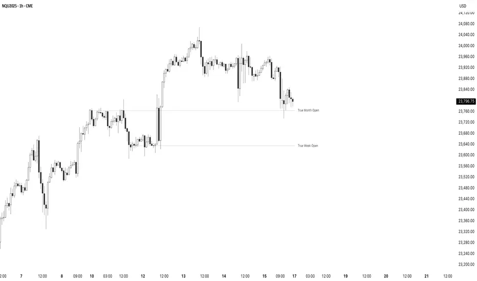
True Opens - (SpeculatorBryan)Overview This indicator provides a complete framework of key institutional levels by plotting the "True Open" price for the Month, Week, Day, and Intraday Sessions. Instead of using standard chart opens, it uses specific, globally significant times (based in the NY timezone) to identify levels that price action traders watch closely for support, resistance, and market direction. What It Does True Monthly Open (TMO): The key macro level, marking the start of the month's trading. True Weekly Open (TWO): Arguably the most important level, defining the weekly bias. Based on the Sunday evening start of the forex trading week. True Daily Open (TDO): The New York midnight open, marking the true start of the institutional 24-hour cycle. True Session Opens (TSO): Key intraday opens (e.g., London, NY) for finding entries and exits on lower timeframes. Key Features Clean Forward Projection: All lines and labels project into the future, so you always see the levels in your current price action. Full Styling Control: Customize the color, style (solid, dashed, dotted), and text for every level to match your chart theme. Intelligent Display: Levels automatically show on appropriate timeframes to keep your chart clutter-free. Use the "Stacked Opens" feature to override this. Lightweight & Efficient: Optimized to run smoothly without lagging your chart. How to Use It Look for price to react at these levels. A bounce can signal a continuation, while a clean break and retest can signal a change in market structure. Use the higher-timeframe opens (TMO, TWO) as major anchors for your overall bias and the lower-timeframe opens (TDO, TSO) for fine-tuning your entries and exits.Penunjuk Pine Script®oleh SpeculatorBryan1189
Election Year GainsShows the yearly gains of the chart in U.S. Election years. Use the options to turn on other years in the cycle. For use with the 12M chart. Will show non-sensical data with other intervals. Penunjuk Pine Script®oleh dharmatechTelah dikemas kini 22
BTC VWAP Anual vs Realized Price (CYCLE LONG ENTRY V2)Indicator that identifies potential LONG opportunity zones in BTC when the annual VWAP crosses below the on-chain Realized Price while maintaining a negative slope. It combines long-term volume-weighted price with on-chain metrics to detect capitulation scenarios and potential macro reversals. Note: This indicator is intended to be used on the 4-hour timeframe (4H) and should be applied in a discretionary manner. It is not meant to be used as a standalone trading signal.Penunjuk Pine Script®oleh jammer_x14
Rolling sharpe ratio with SMARolling sharpe ratio with SMA, period can be changed. Recommend 365 day period to detect high value and low value areas (cycle lows and highs). As Sharpe ratio reaches extremes can signal good zones to DCA in or out of the market. Penunjuk Pine Script®oleh niallhaughey5Telah dikemas kini 2
BTC vs M2 Global Index[MIT]Indicator Name: M2 Global Liquidity Index vs BTC (Normalized + Deviation) Description: This powerful macro indicator compares the Global M2 Liquidity Index (USD-denominated broad money supply from major economies) with Bitcoin price, both normalized to the same scale. It displays: Normalized Global M2 (yellow line) — adjusted for its own 200-period moving average Normalized BTC (white line) — adjusted for its own 200-period moving average Deviation Bar (green/red columns) — shows how much M2 liquidity is leading or lagging BTC Key Features: Optional 108-day or 78-day forward offset on M2 data Toggle between Base (5 major economies) and Extended (13 economies) versions Clear deviation visualization: Positive (green) = M2 is outperforming BTC → bullish for risk assets; Negative (red) = M2 is lagging → caution or potential correction Clean, professional layout in a separate pane Best Use Cases: Identify when global liquidity is expanding faster than BTC (early bull signal) Spot liquidity divergences before major BTC tops or bottoms Macro timing for Bitcoin, altcoins, and risk-on assets A must-have tool for macro-driven BTC traders and liquidity cycle analysts. 中文版本 指标名称: 全球M2流动性指数 vs BTC 归一化偏差指标 指标介绍: 这是一个专为宏观交易者设计的专业级指标,通过将全球M2广义货币供应量(以美元计价)和比特币价格进行归一化处理,实现两者趋势的直观对比与偏差分析。 核心显示内容: 归一化全球M2曲线(黄色粗线) 归一化BTC价格曲线(白色线) M2相对BTC的偏差柱状图(绿色/红色柱子) 主要功能: 支持 M2 数据前移 108 天或 78 天(领先显示) 可切换基础版(中美欧日英)与扩展版(13个主要经济体) 偏差柱清晰展示:绿色正偏差 = M2 流动性强于 BTC(利好风险资产);红色负偏差 = M2 滞后于 BTC(需警惕调整) 采用 200 周期归一化,使两者处于同一数量级,便于直接对比趋势强弱Penunjuk Pine Script®oleh MITAlphaLibrary6
Sakalau02 Weekly Daily SessionsSakalau02: Weekly Daily Sessions – The Architecture of the Trading Week The "Sakalau02 Weekly Daily Sessions" is a high-definition visual mapping tool designed to dissect the trading week into distinct daily blocks. More than just a period separator, this script defines the "field of play" for each day, allowing you to visualize where liquidity builds and how price interacts with temporal boundaries. Here is why this script is the cornerstone of a professional Top-Down analysis: 📅 High-Definition Daily Structure The indicator transforms your chart into a logical map of the week, providing visual support for all 7 days, with a focus on active trading from Monday to Friday. Visual Identity: Each day is assigned its own unique color, helping you instantly recognize repetitive market signatures (like the "Tuesday Reversal" or "Mid-week Expansion"). Timezone Precision: Featuring a dedicated Timezone Input, the script ensures that daily boxes open exactly at 00:00 according to your chosen financial hub (UTC, New York, London, etc.). 📐 Range and Liquidity Analysis Through its Dynamic Box System, the script monitors price evolution in real-time: High/Low Tracking: Automatically expands the box boundaries as price carves out new daily highs or lows. The 0.5 Level (Daily Equilibrium): Automatically calculates the midpoint of the entire day. This is the critical "Fair Value" zone where price decides whether to trend or mean-revert. Open/Close Trajectory: A discreet line tracks price relative to the daily open, providing an instant read on the intraday bias (Bullish/Bearish). ⚡ Precision Alert System Never miss a structural shift. The indicator comes equipped with built-in alerts for: Session Starts: Be notified the moment a new daily cycle begins. Liquidity Sweeps (New High/Low): Receive alerts the second price breaches the current day’s high or low—perfect for executing Judas Swings or Expansion setups. 💎 Versatile Display Modes Boxes Mode: Encapsulates price for a clear view of market structure. Zones Mode: Highlights the background for a cleaner integration with secondary indicators. Timeline Mode: Marks the base of the chart, keeping the price action area completely untouched. Piața nu este doar preț, este ritm. În timp ce alții se pierd în zgomotul fiecărei secunde, eu definesc limitele zilei. O structură creată pentru traderul care știe că volumul urmează timpul, iar profitul urmează disciplina — păstrați ochii pe echilibrul zilei!" — Semnat, Andrei (Sakalau02) ⏳Penunjuk Pine Script®oleh Aa0021
Sakalau02 Weekly Daily SessionsSakalau02: Weekly Daily Sessions – The Architecture of the Trading Week The "Sakalau02 Weekly Daily Sessions" is a high-definition visual mapping tool designed to dissect the trading week into distinct daily blocks. More than just a period separator, this script defines the "field of play" for each day, allowing you to visualize where liquidity builds and how price interacts with temporal boundaries. Here is why this script is the cornerstone of a professional Top-Down analysis: 📅 High-Definition Daily Structure The indicator transforms your chart into a logical map of the week, providing visual support for all 7 days, with a focus on active trading from Monday to Friday. Visual Identity: Each day is assigned its own unique color, helping you instantly recognize repetitive market signatures (like the "Tuesday Reversal" or "Mid-week Expansion"). Timezone Precision: Featuring a dedicated Timezone Input, the script ensures that daily boxes open exactly at 00:00 according to your chosen financial hub (UTC, New York, London, etc.). 📐 Range and Liquidity Analysis Through its Dynamic Box System, the script monitors price evolution in real-time: High/Low Tracking: Automatically expands the box boundaries as price carves out new daily highs or lows. The 0.5 Level (Daily Equilibrium): Automatically calculates the midpoint of the entire day. This is the critical "Fair Value" zone where price decides whether to trend or mean-revert. Open/Close Trajectory: A discreet line tracks price relative to the daily open, providing an instant read on the intraday bias (Bullish/Bearish). ⚡ Precision Alert System Never miss a structural shift. The indicator comes equipped with built-in alerts for: Session Starts: Be notified the moment a new daily cycle begins. Liquidity Sweeps (New High/Low): Receive alerts the second price breaches the current day’s high or low—perfect for executing Judas Swings or Expansion setups. 💎 Versatile Display Modes Boxes Mode: Encapsulates price for a clear view of market structure. Zones Mode: Highlights the background for a cleaner integration with secondary indicators. Timeline Mode: Marks the base of the chart, keeping the price action area completely untouched. Piața nu este doar preț, este ritm. În timp ce alții se pierd în zgomotul fiecărei secunde, eu definesc limitele zilei. O structură creată pentru traderul care știe că volumul urmează timpul, iar profitul urmează disciplina — păstrați ochii pe echilibrul zilei!" — Semnat, Andrei (Sakalau02) ⏳Penunjuk Pine Script®oleh Aa0024
Titan V40.0 Optimal Portfolio ManagerTitan V40.0 Optimal Portfolio Manager This script serves as a complete portfolio management ecosystem designed to professionalize your entire investment process. It is built to replace emotional guesswork with a structured, mathematically driven workflow that guides you from discovering broad market trends to calculating the exact dollar amount you should allocate to each asset. Whether you are managing a crypto portfolio, a stock watchlist, or a diversified mix of assets, Titan V40.0 acts as your personal "Portfolio Architect," helping you build a scientifically weighted portfolio that adapts dynamically to market conditions. How the 4-Step Workflow Operates The system is organized into four distinct operational modes that you cycle through as you analyze the market. You simply change the "Active Workflow Step" in the settings to progress through the analysis. You begin with the Macro Scout, which is designed to show you where capital is flowing in the broader economy. This mode scans 15 major sectors—ranging from Technology and Energy to Gold and Crypto—and ranks them by relative strength. This high-level view allows you to instantly identify which sectors are leading the market and which are lagging, ensuring you are always fishing in the right pond. Once you have identified a leading sector, you move to the Deep Dive mode. This tool allows you to select a specific target sector, such as Semiconductors or Precious Metals, and instantly scans a pre-loaded internal library of the top 20 assets within that industry. It ranks these assets based on performance and safety, allowing you to quickly cherry-pick the top three to five winners that are outperforming their peers. After identifying your potential winners, you proceed to the Favorites Monitor. This step allows you to build a focused "bench" of your top candidates. by inputting your chosen winners from the Deep Dive into the Favorites slots in the settings, you create a dedicated watchlist. This separates the signal from the noise, letting you monitor the Buy, Hold, or Sell status of your specific targets in real-time without the distraction of the rest of the market. The final and most powerful phase is Reallocation. This is where the script functions as a true Portfolio Architect. In this step, you input your current portfolio holdings alongside your new favorites. The script treats this combined list as a single "unified pool" of candidates, scoring every asset purely on its current merit regardless of whether you already own it or not. It then generates a clear Action Plan. If an asset has a strong trend and a high score, it issues a BUY or ADD signal with a specific target dollar amount based on your total equity. If an asset is stable but not a screaming buy, it issues a MAINTAIN signal to hold your position. If a trend has broken, it issues an EXIT signal, advising you to cut the position to zero to protect capital. Smart Logic Under the Hood What makes Titan V40.0 unique is its "Regime Awareness." The system automatically detects if the broad market is in a Risk-On (Bull) or Risk-Off (Bear) state using a global proxy like SPY or BTC. In a Risk-On regime, the system is aggressive, allowing capital to be fully deployed into high-performing assets. In a Risk-Off regime, the system automatically forces a "Cash Drag," mathematically reducing allocation targets to keep a larger portion of your portfolio in cash for safety. Furthermore, the scoring engine uses Risk-Adjusted math. It does not simply chase high returns; it actively penalizes volatility. A stock that is rising steadily will be ranked higher than a stock that is wildly erratic, even if their total returns are similar. This ensures that your "Maintenance" positions—assets you hold that are doing okay but not spectacular—still receive a proper allocation target, preventing you from being forced to sell good assets prematurely while ensuring you are effectively positioned for the highest probability of return.Penunjuk Pine Script®oleh johnthetrader986
US Recessions - ShadingThis indicator shades the chart background during every U.S. recession as dated by the National Bureau of Economic Research (NBER). Recessions are defined using NBER’s business cycle peak-to-trough months, and the script shades from the peak month through the trough month (inclusive) using monthly boundaries. What it does * Applies a shaded overlay on your chart **only during recession periods**. * Works on any symbol and any timeframe (crypto, equities, FX, commodities, bonds, indices). * Includes options to: - Toggle shading on/off - Choose your preferred shading colour - Adjust transparency for readability Why this overlay is important for analysing any asset class Even if you trade or invest in assets that aren’t directly tied to U.S. GDP (like crypto or commodities), U.S. recessions often coincide with major shifts in: -Risk appetite (risk-on vs risk-off behaviour) -Liquidity conditions (credit availability, financial stress) -Interest-rate expectations and central bank response -Earnings expectations and corporate defaults -Volatility regimes (large, sustained changes in volatility) Having recession shading directly on the price chart helps you quickly see whether price action is happening in a historically “normal” expansion environment, or in a macro regime where behaviour can change dramatically. This is particularly useful in a deeper analysis like comparing GOLD to SPX. This chart makes it clear how in recessions the S&P bleeds against Gold therefor making the concept more visual and better for understanding. Of course this is just an example of how it can be used, there are plenty of other factors which can be overlayed like unemployment and interest rates for an even better understanding. Please DM majordistribution.inc on Instagram for any info - FREE - NO Course Penunjuk Pine Script®oleh Giovanni_Ambrosio2
Lunar Phases & DistanceHigh Precision Lunar Phases & Distance Indicator Our Beautiful Companion in the Night: At New Moon, the Moon sits between Earth and the Sun. The side facing us is completely dark, so the Moon is invisible (except during a solar eclipse). At Full Moon, the Moon is on the opposite side of Earth from the Sun, so sunlight hits the entire face we see—creating that big, beautifully bright Ball in the night sky. Right after New Moon, a thin Waxing Crescent appears low in the western evening sky, growing into the half-lit First Quarter, then a bulging waxing gibbous until reaching Full Moon. After Full, it shrinks through Waning Gibbous, Last Quarter (half-lit visible in the morning sky), finishing with a Waning Crescent (thin sliver again) just before disappearing at the next New Moon. The Moon’s orbit is elliptical, so its distance from Earth varies. When Full and near Perigee(closest approach) it appears larger and up to 30% brighter leading way to the name, Super Moon. Near Apogee(farthest distance) the Moon will look smaller and dimmer, or Micro Moon. These extreme alignments tend to cluster in "seasons" because the point of closest approach slowly drifts around the orbit, completing a full cycle every 18.6 years. This indicator places clear markers on your chart for every exact New and Full Moon. Super Moon events use larger circles, Micro Moon events use smaller ones (both optional based on distance at event). Chart zoomed out to highlight the seasonal behavior: Accuracy: New and Full Moon times are typically within ±few minutes & Distances are typically within ±10–100 km of astronomically true. A small info table sits in the top-right corner and shows: Current phase name (e.g., "Waxing Gibbous" or "Super Full Moon") Live geocentric distance to the Moon right now Name of the next New or Full Moon, with a countdown timer (days:hours:minutes) Expected distance at that upcoming event Settings Thresholds group: Two "Enable" checkboxes completely turn supermoon and micromoon highlighting on or off Distance inputs let you set your own km cutoffs for what counts as super or micro (defaults are common values around 367,000 km and 405,000 km) Start Date and End Date control the time range the script scans for events (default 2010–2028) BackGround group: "Current Phase" checkbox turns the waxing/waning background colours on or off Colour pickers let you choose your own waxing (default soft purple) and waning (default soft blue) shades Information group: "Show Info Table" turns the top-right panel on or off "(New/Full)" debug checkbox adds detailed labels directly on New/Full bars with exact UTC time and distance (useful for verification) Powered by the open-source (telephonejack/LunarSolver/1) library using multiple 50-term approximations of the ELP2000-82B lunar theory. Disclaimer: The script was developed with assistance from Grok 4.1, always under human supervision and decision-making.Penunjuk Pine Script®oleh telephonejack5
Weekly Financial Liquidity IndexSkylark Digital Assets’ Weekly Financial Liquidity Index (FLI) is an index-style representation of macro financial conditions on the weekly timeframe, built to provide a clean, trendable “liquidity tape” you can overlay on any market. Rather than plotting conditions as a bounded oscillator, the Weekly FLI converts the weekly liquidity environment into a continuous index series. This makes it easier to compare against price, identify regime persistence, and visualize structural turns without the compression effects of 0–100 indicators. What you see Weekly FLI (index line): A continuous index reflecting the direction and persistence of broader financial conditions. Regime behavior: Sustained advances tend to reflect improving conditions; flattening or sustained pullbacks tend to reflect tightening or deterioration. Optional trend confirmation (minimal): Optional confirmation markers/filters may be enabled to help highlight structural trend shifts while keeping the chart uncluttered. How to use it Overlay context: Keep the Weekly FLI on your chart as a macro backdrop for crypto, equities, FX, rates, or commodities. Trend alignment: Compare the slope and turns of the FLI to the asset you’re analyzing to see when price is moving with (or against) broader conditions. Cycle awareness: Weekly FLI is best used for multi-week to multi-month context—ideal for identifying transitions, not short-term entries. Notes This indicator is intended for research and visualization only. It does not provide guaranteed signals and should be paired with independent confirmation and risk management.Penunjuk Pine Script®oleh Skylark_Digital_Assets4
Daily Financial Liquidity IndexSkylark Digital Assets’ Daily Financial Liquidity Index (FLI) is a daily, index-style view of macro financial conditions designed to provide a clean “liquidity tape” you can overlay against any asset. Unlike bounded oscillators, the Daily FLI is structured as a continuous index: it translates daily changes in financial conditions into a smooth, price-like series that can trend, plateau, or roll over as regimes shift. The goal is not to predict a specific asset, but to offer a consistent, comparable reference for risk-on / risk-off conditions across time. What you see Daily FLI (index line): A continuous index representation of the underlying liquidity environment. Regime behavior: Strong, persistent uptrends tend to reflect broadly improving conditions; flattening or drawdowns tend to reflect tightening or deteriorating conditions. Optional confirmation markers: Minimal, non-intrusive markers can be enabled for additional trend confirmation while keeping the chart clean. How to use it Overlay context: Use the FLI as a background “macro state” overlay on crypto, equities, FX, rates, or commodities. Trend confirmation: Compare the slope and turning points of the FLI to the asset you’re analyzing to identify periods when price is moving with or against broader conditions. Cycle awareness: The Daily FLI is best interpreted as a regime tool—ideal for multi-week to multi-month context rather than short-term entries. Notes This script is intended for research and visual analysis. It is not a trading strategy, does not generate guaranteed signals, and should be used alongside risk management and independent confirmation.Penunjuk Pine Script®oleh Skylark_Digital_Assets1
BTC - StableFlow: Pit-Stop & Refuel EngineBTC – StableFlow: Pit-Stop & Refuel Engine | RM Strategic Context: The Institutional Gas Station In the high-speed race of the crypto markets, Stablecoins (USDT, USDC, DAI) represent the Fuel, and Bitcoin is the Race Car. Most traders only look at the car's speed (Price), but they ignore the gas tank. The StableFlow Engine is a telemetry dashboard designed to monitor the "Fuel Pressure" within the ecosystem, identifying exactly when the car is being refueled and when it is running on empty. The Telemetry Logic: How to Read the Race The indicator operates on a Relative Velocity model. We aren't just looking at how many Stablecoins exist; we are measuring the Acceleration of Stablecoin Market Cap relative to the Acceleration of BTC Price. 1. The Fuel Reservoir (The Histogram) • Cyan Zones (Refuel): The gas station is open. Institutional "Dry Powder" is flowing into stables faster than it is being spent on BTC. The tank is filling up. • Orange Zones (Exhaust): The "Overdrive." The car is driving faster than the gas can be pumped. Price is outperforming the stablecoin supply—this is unsustainable and usually precedes a stall. 2. Lap Transitions (The Grey Lines) These vertical markers signify a Regime Shift . They trigger the moment the momentum crosses the zero-axis, visually distinguishing the transition between a "Net-Refueling" period and a "Net-Exhaustion" period. While not used as direct entry signals, they define the Macro Lap we are currently in. Operational Playbook: The Pit-Stop Signals We don't just buy because the tank is full; we buy when the car exits the pits and begins to accelerate. This is captured by our proprietary Pit-Stop Pips. • Blue Pip (Pit-Stop Buy): Triggered when the Refuel momentum has peaked and is now rotating back into the market. The refuel is complete; the car is rejoining the race with a full tank. • Red Pip (Exhaust Sell): Triggered when the price acceleration has overextended relative to its fuel source and begins to "roll over." The tank is near empty; time for a tactical pull-back. Settings & Calibration: The Pit Wall Dashboard Signal Mode & Logic The engine features a dual-mode signaling system to adapt to different market conditions (or your personal preferred logic): • Consecutive Mode: Best for high-velocity trends. Fires a pip after n bars of momentum reversal (Default: 2 bars). • Percentage (%) Mode: Best for structural fades. Fires a pip when the momentum retraces by a specific percentage (e.g., 15%) from its local peak, regardless of the bar count. Recommended Calibration While the engine is versatile across various timeframes, the Weekly (1W) chart is the preferred setting for identifying high-conviction macro signals. Lower timeframes provide tactical speed, but the 1W frame offers significantly cleaner signals by filtering out the daily market noise. Weekly (1W) — The Macro Signal (Preferred): * Velocity Lookback: 20 | Smoothing: 5. Peak Lookback: 25 (Represents roughly half a year of telemetry data). This is a good starting point for identifying major cycle rotations. Daily (1D) — The Tactical Pulse: * Velocity Lookback: 20 | Smoothing: 5. Peak Lookback: 25 (Represents one trading month of telemetry). Useful for active swing traders looking for entry/exit timing within an established macro trend. Technical Documentation Data Sourcing & Aggregation The script utilizes request.security to aggregate a "Big Three" Stablecoin Market Cap (USDT + USDC + DAI). This prevents "False Exhaustion" signals caused by capital simply migrating between different stablecoin assets. Mathematical Foundation The core engine calculates the Rate of Change (ROC) for the Aggregate Stablecoin Supply and BTC Price over a synchronized lookback window. Formula Logic: Fuel Pressure = EMA ( ROC(Stables) - ROC(BTC) ) The Pit-Stop Pips utilize a local peak-finding algorithm via ta.highest and ta.lowest within a rolling 25-bar window to calculate the Relative Retracement Magnitude . This ensures signals are mathematically tied to the volatility of the current market regime. The Dual-Fuel Framework: StableFlow x Liquisync The StableFlow Engine is designed to function as the tactical counterpart to the Liquisync: Macro Pulse Engine . While Liquisync monitors the Global Supply Line (the "Tanker Truck" of M2 Liquidity moving from Central Banks toward the track with a 60-day lead), StableFlow measures the Immediate Fuel Pressure (the "Dry Powder" already in the pit lane, ready to be pumped into the car). By using both indicators in tandem, you can follow the Dual-Fuel Strategy: Liquisync identifies the fundamental macro regime, while StableFlow identifies the specific "Refuel" and "Exhaustion" pivots within that regime. We will be providing a comprehensive breakdown of this synchronized telemetry in our upcoming Substack Masterclass: The Dual-Fuel Architecture. Risk Disclaimer & Credits The StableFlow is a thematic macro tool tracking on-chain liquidity proxies. Stablecoin data is subject to exchange reporting delays. This is not financial advice; it is a telemetry model for institutional education. Rob Maths is not liable for losses incurred via use of this model. Tags: indicator, bitcoin, btc, stablecoins, usdt, flow, liquidity, macro, refuel, institutional, robmaths, Rob MathsPenunjuk Pine Script®oleh Rob_Maths13