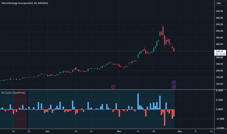
RCP Global Liquidity IndexThe RCP Global Liquidity Index tracks global liquidity conditions by combining central bank balance sheets and money supply figures from the world's largest economies. This comprehensive macro indicator helps traders monitor liquidity trends that often precede major market movements.
INCLUDES:
• Major economies making up 80%+ of global GDP
• Both central bank assets and money supply metrics
• All components standardized to USD
FEATURES:
• Weekly data visualization
• Adjustable time shift parameter (defaults to 12 weeks)
• Optional RSI mode for momentum analysis
USAGE:
• Add to weekly charts for best results
• For RSI analysis, add the indicator twice with different settings
• Compare liquidity trends with asset price movements
A valuable tool for macro investors seeking to understand global liquidity conditions that influence multiple asset classes.
© 2025 Roller Coaster Partners, LLC
Cari dalam skrip untuk "Cycle"
Horizontal Lines from Arrayđây công cụ kẻ
cực hữu dụng
cho trend ngang
quá tuyệt với
đánh mọi khung thời gian
Dungpt Signal (Lineee)This is a personal signal script that provides simple and clear Buy and Sell signals based on custom conditions. The script displays Buy and Sell labels directly on the chart and supports optional alerts, allowing users to receive real-time notifications when a signal appears. Designed for ease of use, this script is lightweight and focused purely on entry signals without clutter. Users can enable or disable alert notifications through input settings.
MA backgroundAllows you to use various MAs with % bands set as a background. What it does is divides the % range selected into 1/4's and colors the bottom 1/4 green (your choice) and the top 1/4 red (your choice) then it stacks these ranges above and below the initial selected range. Screenshot is sma 16 but you can do session vwap with .1% measured moves, etc. I use it as a background under some other indicators but you can use it standalone for a pretty clean chart. It's an experiment...
s255When a buy signal appears from a lower indicator (such as a positive momentum indicator or a bullish formation on the chart), it indicates underlying price strength. However, for a more reliable trade, it's best to wait for confirmation from another indicator, especially those that provide signals from above (such as a resistance break or the price moving above a moving average). This reduces the likelihood of a false signal and increases the chances of success.
s2When a buy signal appears from a lower indicator (such as a positive momentum indicator or a bullish formation on the chart), it indicates underlying price strength. However, for a more reliable trade, it's best to wait for confirmation from another indicator, especially those that provide signals from above (such as a resistance break or the price moving above a moving average). This reduces the likelihood of a false signal and increases the chances of success.
Contexte de Marché USA (Mois Ajustables, Filtre Contextes)
identifies the US economic market context (Expansion, Reflation, Deflation, Stagflation) using three indicators: USGDPYY (GDP growth), USIRYY (inflation), and FRED:UNRATE (unemployment), all set to confirm directions over a user-defined number of consecutive months
Contexts:
Expansion: Growth ↑, Inflation ↓, Unemployment ↓
Reflation: Growth ↑, Inflation ↑, Unemployment ↓
Deflation: Growth ↓, Inflation ↓, Unemployment ↑
Stagflation: Growth ↓, Inflation ↑, Unemployment ↑
Price % Above/Below 20 EMADelta between current price and EMA20, calculated as percent difference between EMA and closing price.
Octoalgo Buy sell OB 1.0Explore the effectiveness of precision trading with the "Octoalgo Buy Sell OB 1.0" indicator on TradingView. Designed to improve your decision-making, this sophisticated tool provides timely Buy and Sell signals to help you seize market opportunities.
Key Features:
-Dynamic Signal Alerts: Get instant alerts for optimal entry and exit points, clearly marked on your chart with "BUY" and "SELL" labels.
-Adaptive Candle Coloring: Easily visualize market trends with color-coded candles—green indicates buying opportunities, while red signals selling conditions.
-RSI-Based Order Blocks: Enhance your strategy with advanced RSI Order Block detection featuring adjustable sensitivity and mitigation methods. Identify and manage key market zones with customizable bullish and bearish block markers.
-Flexible Visualization Options: Customize settings to match your trading style, including the number of visible Order Blocks and RSI thresholds, for a tailored trading experience.
This indicator is available at: www.octoalgo.com
Incorporate the Octoalgo Buy Sell OB 1.0 into your trading strategy today to stay ahead in dynamic markets and maximize your trading potential with clarity and precision
for your comparison: Global M2 Money Supply // Days Offset =📈 Global M2 Money Supply Overlay – Offset Adjustable
This script plots an aggregated, FX-adjusted global M2 money supply index directly on your TradingView chart. It pulls M2 data from multiple global regions—including North America, Europe, Asia, Latin America, and more—and normalizes it for comparison in USD terms.
You can apply a custom time offset to the M2 line using the settings, allowing you to test potential leading or lagging correlations between global liquidity and market price action (e.g., Bitcoin, equities, commodities).
💡 Ideal for macro traders, long-term investors, and anyone interested in liquidity-driven market behavior.
Features:
Combines M2 data from 20+ countries and currency zones
FX-adjusted for consistency in USD terms
Offset slider to shift M2 data forward or backward in time
Scaled to trillions for readability
Plots directly on the main chart for visual comparison
The Hebrew CalendarThis indicator displays the current Hebrew (Jewish) calendar date based on the real-time Gregorian calendar. Features included:
Calculates and displays the current Hebrew day, month, and year.
Recognizes leap years and adjusts month counts accordingly.
Aligns with traditional Hebrew month names (Tishrei, Cheshvan, Kislev, etc.).
The calculations align with the Hebrew Calendar Converter from:
👉 www.chabad.org
The results are shown in a table overlay on your chart's top-right corner. This indicator is great for symbolic traders, astro enthusiasts, or anyone interested in ancient timekeeping systems woven into financial timeframes. Enjoy, time travelers! ⌛
Dungpt-SignalThis is a personal signal script that provides simple and clear Buy and Sell signals based on custom conditions. The script displays Buy and Sell labels directly on the chart and supports optional alerts, allowing users to receive real-time notifications when a signal appears. Designed for ease of use, this script is lightweight and focused purely on entry signals without clutter. Users can enable or disable alert notifications through input settings.
Auto Step Horizontal LinesAuto Step Horizontal lines by custom range
Create automatic horizontal lines by specifying the price range for each line, with each line serving as an observation point for support and resistance levels.
BTC Markup/Markdown Zones v1 by Koenigsegg📈 BTC Markup/Markdown Zones — by Koenigsegg
A handcrafted indicator designed to mark Bitcoin's most critical High Time Frame (HTF) structure shifts. This tool overlays true institutional-level Markup and Markdown Zones, selected manually after deep market review. Whether you're testing strategies or actively trading, this tool gives you the bigger picture at all times.
🔍 Key Features:
✅ HTF Markup & Markdown Zones
Every zone is manually selected — no indicators, no repainting. Just raw market history and real structure.
✅ Two Display Modes
• Background Zones — soft overlays with low opacity for visual context (see lower screenshot) — with the option to increase opacity manually if desired (see main screenshot)
• Start Candle Highlight — sharply highlighted candle marking the final pivot before a macro reversal
✅ Custom Color Controls (Style Tab)
All visual styling lives in the Style tab, with clearly labeled fields:
• Markup Zone
• Markdown Zone
• Start Candle Highlight Markup
• Start Candle Highlight Markdown
✅ Minimal Input Section
Just one toggle: display mode. Everything else is kept clean and intuitive.
🧠 Purpose:
This script is made for any timeframe:
• Zoom into lower timeframes to know whether you're trading inside a Markup or Markdown
• Use it during strategy testing for true structural awareness
• Apply it in live trading to avoid trading blindly against the macro move
📅 Handpicked Macro Turning Points (Koenigsegg Zones™):
Each zone originates from a manually confirmed candle — the last meaningful candle before a shift in control between bulls and bears:
• FRI 19 AUG 2011 12PM – MARK DOWN
• THU 20 OCT 2011 12AM – MARK UP
• WED 10 APR 2013 12PM – MARK DOWN
• FRI 12 APR 2013 12PM – MARK UP
• SAT 30 NOV 2013 12AM – MARK DOWN
• WED 14 JAN 2015 12PM – MARK UP
• SUN 17 DEC 2017 12PM – MARK DOWN
• SAT 15 DEC 2018 12PM – MARK UP
• WED 14 APR 2021 4AM – MARK DOWN
• TUE 22 JUN 2021 12PM – MARK UP
• WED 10 NOV 2021 12PM – MARK DOWN
• MON 21 NOV 2022 8PM – MARK UP
• THU 14 MAR 2024 4AM – MARK DOWN
• MON 5 AUG 2024 12PM – MARK UP
• MON 20 JAN 2025 4AM – MARK DOWN
💡 Zones are manually updated after each new confirmed Markup or Markdown.
🔮 Coming in V2: Fractal Markup/Markdown Zones (MTF)
Price is fractal — and so are structure shifts. In Version 2, Koenigsegg will hand-select sub-zones within existing HTF zones, breaking each major Markup/Markdown into smaller segments that reflect Medium Timeframe (MTF) shifts. No auto-detection — just sharp, intentional structure division inside the macro moves.
💡 Pro Tip:
When price is inside a Markup Zone, shorting becomes riskier — you're trading against a macro bullish structure.
When inside a Markdown Zone, longing becomes riskier — you're fighting against confirmed bearish momentum.
Use this tool to stay aligned with the broader move, especially when zoomed into smaller timeframes or managing entries/exits during intraday setups.
⚠️ Disclaimer
This indicator is for educational and analytical use only. It is not financial advice and should not be relied on for decision-making without personal analysis.
This is not a predictive tool. No indicator can forecast upcoming price movements.
What you see here is based purely on past market behavior — specifically, historical tops and bottoms that marked the start of confirmed reversals.
This script does not know where the next reversal begins, nor can it determine where a new Markup or Markdown starts or ends. It is designed to provide context, not prediction.
Always trade with responsibility and perform your own due diligence.
SPY Trend-Based Buy Signals🔹 Overview
This indicator identifies potential buy signals on any asset by combining MACD and Stochastic Oscillator crossovers, while using the SPY’s trend (via exponential moving averages) as a broader market filter.
It helps traders stay aligned with macro momentum and avoid counter-trend entries.
🔍 How it works
SPY Trend Filter (Daily Timeframe):
Pulls SPY (S&P 500 ETF) data using EMAs (5, 20, 80)
Categorizes SPY market trend with color codes:
🟢 Green: Strong uptrend (EMA5 > EMA20 > EMA80)
🟡 Yellow: Potential uptrend / early momentum (EMA5 < EMA20 > EMA80)
🔴 Red: Downtrend (EMA5 < EMA20 < EMA80)
🔵 Blue: Possible trend reversal or mixed trend (EMA5 > EMA20 < EMA80)
Buy Signal Conditions (Combined Logic):
A signal is only triggered when:
- SPY trend is either yellow or blue (indicating a neutral-to-bullish or early recovery environment)
-The Stochastic Oscillator's %D line is below 50, showing possible upside
- A bullish MACD crossover occurs on the current symbol
🟢 Green signal: MACD crossover occurs below 0 (early reversal)
🟠 Orange signal: MACD crossover occurs above 0 (momentum continuation)
📈 Visual Output
🟢 Green label below the bar when an early reversal setup occurs
🟠 Orange label above the bar when a trend continuation signal appears
✅ Best Use Case
Ideal for:
Swing traders and position traders
LEAPS (long-term options) traders aligning entries with SPY trend
Anyone seeking clean, contextual entries filtered by market momentum
⚠️ Note: This indicator is most effective when used on fundamentally strong stocks that are sector leaders with solid earnings growth and market presence. Use technical signals as a complement to quality fundamentals.
ℹ️ Clarification: The moving averages displayed on the chart (e.g., on QQQ) are for visual reference only, to help users understand the color logic of the SPY trend filter. The actual logic and signals are based on SPY’s moving averages, regardless of the charted symbol.
SPDR Sectors TableThis script generates an interactive and customizable SPDR Sectors Table designed to monitor and analyze the performance of the 11 main sectors of the S&P 500 via sector-specific ETFs. It offers a dynamic overview of daily or periodic sector movements, making it a valuable tool for traders, analysts, and investors implementing sector rotation strategies.
█ DEFINITIONS
SPDR Sectors ETFs are exchange-traded funds managed by State Street Global Advisors, which divide the S&P 500 into the following 11 sectors:
- Communication Services (XLC)
- Consumer Discretionary (XLY)
- Consumer Staples (XLP)
- Energy (XLE)
- Financials (XLF)
- Health Care (XLV)
- Industrials (XLI)
- Materials (XLB)
- Real Estate (XLRE)
- Technology (XLK)
- Utilities (XLU)
These ETFs aim to replicate the performance of their respective sectors as defined by the Global Industry Classification Standard (GICS). The funds are periodically rebalanced to match changes in the S&P 500 composition, offering an accurate snapshot of sectoral trends.
█ INDICATOR
The table displays each sector's ticker and full name, following official GICS terminology and SPDR color coding. It also shows percentage performance, calculated daily on intraday charts or based on the selected time frame.
Users can sort the table by either percentage performance or the relative weight of each ETF in the S&P 500. The default weight values reflect data updated as of 17 April 2025, and can be manually adjusted based on the most recent sector weightings available on the official SPDR website.
Bounty SeekerBounty Seeker - Advanced Market Structure & Order Block Detection
A sophisticated indicator that identifies high-probability reversal zones through the analysis of market structure, volume patterns, and institutional order blocks. This tool helps traders spot potential reversals and fake-outs with precision.
Core Components:
1. Pivot Detection System
• Smart pivot high/low identification
• Volume-enhanced confirmation
• RSI confluence validation
• Real-time market structure analysis
2. Order Block Detection
• Institutional buying/selling zones
• Historical support/resistance levels
• Smart volume threshold analysis
• Dynamic level adaptation
Signal Types:
1. Bull Pivots (White X)
• Strong volume confirmation
• RSI oversold conditions
• Price action validation
• Order block confluence
2. Bear Pivots (Purple X)
• Volume surge confirmation
• RSI overbought alignment
• Bearish price action
• Resistance zone validation
3. Fake Pivots (Orange X)
• Low volume warning signals
• Trap zone identification
• False breakout detection
• Risk management guide
Visual Elements:
• Dashed Lines: Order block zones
• White/Purple X's: Major pivot points
• Orange X's: Potential fake moves
• Dynamic support/resistance levels
Best Usage Practices:
• Most effective on 1H+ timeframes
• Focus on major market pairs
• Wait for complete signal formation
• Combine with trend direction
• Monitor volume confirmation
• Use proper position sizing
The indicator excels at:
1. Identifying potential reversal zones
2. Detecting institutional order blocks
3. Warning of potential fake moves
4. Providing clear entry/exit levels
5. Highlighting strong volume zones
Risk Management:
• Always wait for signal confirmation
• Use appropriate stop loss levels
• Consider multiple timeframe analysis
• Don't trade against major trends
• Monitor volume for validation
This indicator combines advanced market structure analysis with volume profiling to help traders identify high-probability trading opportunities while warning of potential traps and fake-outs.
Note: Past performance does not guarantee future results. Always use proper risk management techniques.
Opening Price Levels (by Period)This indicator draws clean horizontal lines at the opening prices of key time periods: Year, Quarter, Month, Week, and Day.
Each line is plotted only within its own time range, so there's no visual clutter or vertical jumps between periods.
Perfect for traders who want to:
Identify and react to institutional levels.
Track price behavior relative to major opens.
Keep charts clean and easy to read.
Features:
✅ Toggle visibility for each period (Year, Quarter, Month, Week, Day).
🎯 Accurate open levels, aligned with your chart's timeframe and session settings.
✨ Clean segments — each line only spans its original period.
Buffett Indicator (Wilshire 5000 / GDP)The Buffett Indicator (Wilshire 5000 / GDP) is a macroeconomic metric used to assess whether the U.S. stock market is overvalued or undervalued. It is calculated by dividing the total market capitalization (represented by the Wilshire 5000 Index) by the U.S. Gross Domestic Product (GDP). A value above 1 (or 100%) may indicate an overvalued market, while a value below 1 suggests potential undervaluation. This indicator is best suited for long-term investment analysis.
Hourly OHLC Lines UTC-4Hourly OHLC Lines Indicator (UTC-4)
This custom Pine Script indicator plots the Open, High, and Low prices for each hour, adjusted to UTC-4 time. The lines are dynamically drawn and updated for every new hour, with the option to set a maximum number of lines to display on the chart. The label for each hour can be customised with user inputs to change the color, size, and font.
Features:
• Hourly Open, High, Low Lines: The script draws separate lines for the Open, High, and Low prices for each hour (in UTC-4).
• Customizable Labels: Easily modify the label color, font size, and text color for each hourly mark.
• Automatic Hourly Update: The script automatically adjusts as the chart progresses, maintaining up to the most recent lines for up to 24 hours (or a custom limit).
• Time Zone Adjustment: Converts the chart’s time to UTC-4 to fit the requirements for users in specific time zones (such as New York or Eastern Time).
• Line and Label Visibility: You can adjust the maximum number of lines to keep the chart clean, allowing for effective tracking without overcrowding.
Customization Options:
• Max Lines to Display: Set the maximum number of lines visible at any time (default is 24 hours).
• Label Settings: Fully customize the appearance of labels with options for color, size, and font style.
Use Cases:
• Ideal for traders who need to track key hourly levels (Open, High, Low) in the Eastern Time Zone (UTC-4).
• Great for monitoring hourly price action in relation to key levels across the trading day.
• Can be used for intraday strategies to mark key support and resistance levels as each new hour unfolds.
⸻
90-Day Beta to BTCOverview:
The 90-Day Beta to BTC indicator measures the volatility of a specific token relative to Bitcoin (BTC) over the past 90 days. Beta is a widely used statistical measure in financial markets that indicates how much a token's price moves in relation to BTC. A higher beta means the token is more volatile compared to BTC, while a lower beta means it is less volatile or moves similarly to BTC.
How It Works:
This indicator calculates the daily logarithmic returns of both the token and Bitcoin, then computes the covariance between their returns and the variance of Bitcoin’s returns. The resulting Beta value reflects the degree to which the token’s price fluctuates relative to Bitcoin's price over the past 90 days.
Beta > 1: The token is more volatile than Bitcoin, showing higher price swings.
Beta = 1: The token moves in lockstep with Bitcoin, exhibiting similar volatility.
Beta < 1: The token is less volatile than Bitcoin, showing smaller price fluctuations.
Beta = 0: The token's price movement is uncorrelated with Bitcoin’s price.
Negative Beta: The token moves opposite to Bitcoin, indicating an inverse relationship.
Use Case:
This indicator is particularly useful for traders or investors looking to identify tokens with high speculative volatility. Tokens with Beta values above 1 are typically high-risk, high-reward assets, often driven by hype, social trends, or market speculation. Conversely, tokens with Beta values below 1 offer a more stable price relationship with Bitcoin, making them less volatile and potentially safer.
In the context of a Trash Token Tournament, tokens with a higher Beta (greater than 1) may be more attractive due to their heightened volatility and potential for larger price swings, making them the “wild cards” of the market.
Visual Representation:
The Beta value is plotted as a line chart beneath the main price chart, offering a visual representation of the token’s volatility relative to Bitcoin over the last 90 days. Spikes in Beta indicate periods of increased volatility, while drops suggest stability.
AI-123's BTC vs Gold (Lag Correlation)
DISCLAIMER
I made this indicator with the help of ChatGPT and using what I have learned so far from The Pine Script Mastery Course, LOTS of edits based on what I have learned so far had to be made as well as additions and modifications to my liking thanks to what I have learned so far. I am aware this already exists but I have done my best to make a first ever script/indicator while learning how to properly publish as well, so please bear that in mind.
Overview
This indicator analyzes the correlation between Bitcoin (BTC) and Gold (XAUUSD), with a customizable lag applied to the Gold price, providing insight into the macro relationship between these two assets.
It is designed for traders and investors who want to track how Bitcoin and Gold move in relation to each other, particularly when Gold is lagged by a specific number of days.
Key Features:
BTC and Gold (Lagged) Price Overlay: Display Bitcoin (BTC) and Gold (XAUUSD) prices on the chart, with an adjustable lag applied to the Gold price.
Rolling Correlation Calculation: Measures the correlation between Bitcoin and lagged Gold prices over a customizable lookback period.
Adjustable Lag: The number of days that Gold is lagged relative to Bitcoin is fully customizable (default: 20 days).
Customizable Correlation Length: Allows you to choose the lookback period for the correlation (default: 50 days), providing flexibility for short-term or long-term analysis.
Normalized Plotting: Prices of Bitcoin and Gold are normalized for better visual alignment with the correlation values. BTC is divided by 1000, and Gold by 100.
Correlation Scaling: The correlation value is amplified by 10 for better visual clarity and comparison with price data.
Zero Line: Horizontal line representing a correlation of 0, making it easier to identify positive or negative correlation shifts.
Maximum Correlation Lines: Horizontal lines at +10 and -10 values for extreme correlation scenarios.
Input Settings:
Gold Symbol: Customize the Gold ticker (default: OANDA:XAUUSD).
Bitcoin Symbol: Customize the Bitcoin ticker (default: BINANCE:BTCUSDT).
Lag (in trading days): Adjust the number of trading days to lag the Gold price relative to Bitcoin (default: 20).
Correlation Length (days): Set the number of days over which the rolling correlation is calculated (default: 50).
How to Use:
Price Comparison: The BTC (Spot) and Lagged Gold plots give you a side-by-side visual comparison of the two assets, normalized for clarity.
Correlation Line: The correlation line helps you gauge the strength and direction of the relationship between BTC and lagged Gold. Positive values indicate a strong positive correlation, while negative values indicate a negative correlation.
Visual Analysis: Watch how the correlation shifts with changes in lag and correlation length to identify potential market dynamics between Bitcoin and Gold.
Potential Applications:
Macro Trading: Track how Bitcoin and Gold behave in relation to each other during periods of economic uncertainty or inflation.
Sentiment Analysis: Use the correlation data to understand the sentiment between digital and traditional assets.
Strategic Timing: Identify potential opportunities where Bitcoin and Gold show a strong correlation or diverge based on the lag adjustment.
Understanding Macro Trends/Correlations.
Disclaimer:
This indicator is for informational purposes only. The correlation between Bitcoin and Gold does not guarantee future performance, and users should conduct their own research and use risk management strategies when making trading decisions.
Notes: This script uses historical data, so results may vary across different timeframes.
Customization options allow users to adjust the lag and correlation length to better fit their trading strategy.
Future Enhancements: Additional Correlation Line: A second correlation line for different lengths of lag or different assets.
Color-Coding of Correlation: Future updates may include color-coded correlation strength, visually indicating positive or negative correlation more effectively.
[itradesize] ICT Opening range
This indicator automatically annotates the opening ranges of the AM and PM sessions. It should be used on the 1-minute timeframe , although you can check and build a further models when using a 2-3-4 or even 5-minute timeframe. You can customize this under the settings tab.
Additionally, it includes features such as standard deviations and the initial fair value gap presented. Everything is based on what ICT said in his algorithmic timing video.
The algorithm will continue to adjust prices higher or lower until it reaches a predetermined target price. This process will occur within specific time frames: the last 10 minutes before the hour and the first 10 minutes after a new hour begins.
For the AM session opening range, this is from 9:30 to 10:00 , and for the PM session, it's from 13:30 to 14:00 . Defining these ranges allows us to identify the first presented fair value gaps there, as the algorithm is designed to leave these signatures for smart money. This process of time-based delivery precision repeats every day. You can build a whole New York model on this.
It's important to journal and backtest your results results. If the market breaks the opening range on either side and there is evident liquidity, it is highly likely that it will pursue that liquidity.
However, before doing so, the market should retrace back to the first fair value gap if it hasn’t already occurred or back to the 0.75 or 0.5 level of the range at maximum.
When does this happen? Typically, when a macro event occurs— for example, during the lunch macro from 11:30 to 12:00 . In most cases, you can expect a retracement during lunch macro. If the market retraces beyond these levels, there is a higher probability that the expected scenario will not play out.
The algorithm primarily refers to the 30-minute opening range each time. The standard deviation levels can be used to establish algorithmic delivery targets and anticipate another run after the PM session opening range has occurred. The AM session often helps determine the likely direction of movement after the PM session range concludes.
The PM macro runs from 15:15 to 15:45 . At this time, the market will typically operate within the narrative that is currently underway.