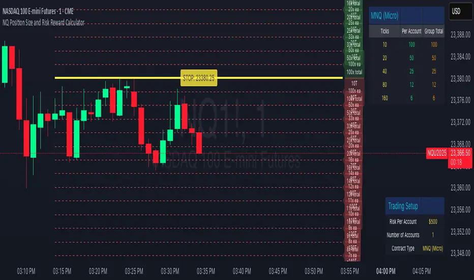
NQ Position Size CalculatorNQ Position Size Line Calculator is designed specifically for Nasdaq 100 futures (NQ) and micro futures (MNQ) traders who want to maintain disciplined risk management. This visual tool eliminates the guesswork from position sizing by displaying distance lines and contract calculations directly on your chart.
The indicator creates horizontal lines at 10-tick intervals from your stop loss level, showing you exactly how many contracts to trade at each distance to maintain your predetermined risk amount. Whether you're trading regular NQ contracts or micro MNQ contracts, this calculator ensures you never risk more than intended while providing instant visual feedback for optimal position sizing decisions.
How to Use the Indicator
Step 1: Configure Your Settings
Stop Loss Price: Enter your exact stop loss level (e.g., 20000.00)
Risk Amount ($): Set your maximum dollar risk per trade (e.g., $500)
Contract Type: Choose between:
NQ (Regular): $5 per tick - for larger accounts
MNQ (Micro): $0.50 per tick - for smaller accounts or conservative sizing
Display Options:
Max Lines: Number of distance lines to show (default: 30)
Show Labels: Toggle tick distance and contract count labels
Line Color: Customize the color of distance lines
Label Size: Choose tiny, small, or normal label sizes
Step 2: Read the Visual Display
Once configured, the indicator displays:
Stop Loss Line:
Thick yellow line marking your exact stop loss level
Yellow label showing the stop loss price
Distance Lines:
Dashed red lines at 10-tick intervals above and below your stop loss
Lines appear on both sides for long and short position planning
Labels (if enabled):
Green labels (right side): For long positions above your stop loss
Red labels (left side): For short positions below your stop loss
Format: "20T 5x" means 20 ticks distance, 5 contracts maximum
Step 3: Use the Information Tables
The indicator provides two helpful tables:
Position Size Table (top-right):
Shows common tick distances (10, 20, 40, 80, 160 ticks)
Displays risk per contract at each distance
Contract count for your specified risk amount
Total risk with rounded contract numbers
Settings Table (bottom-right):
Confirms your current risk amount
Shows selected contract type
Displays current settings for quick reference
Step 4: Apply to Your Trading
For Long Positions:
Look at the green labels on the right side of your chart
Find your desired entry level
Read the label to see: distance in ticks and maximum contracts
Example: "30T 8x" = 30 ticks from stop, buy 8 contracts maximum
For Short Positions:
Look at the red labels on the left side of your chart
Find your desired entry level
Read the label for tick distance and contract count
Example: "40T 6x" = 40 ticks from stop, sell 6 contracts maximum
Step 5: Trading Execution
Before Entering a Trade:
Identify your stop loss level and input it into the indicator
Choose your entry point by looking at the distance lines
Note the contract count from the corresponding label
Verify the risk amount matches your trading plan
Execute your trade with the calculated position size
Risk Management Features:
Contract rounding: All position sizes are rounded down (never up) to ensure you don't exceed your risk limit
Zero position filtering: Lines only show where position size is at least 1 contract
Dual-sided display: Plan both long and short opportunities simultaneously
Cari dalam skrip untuk "NQ"
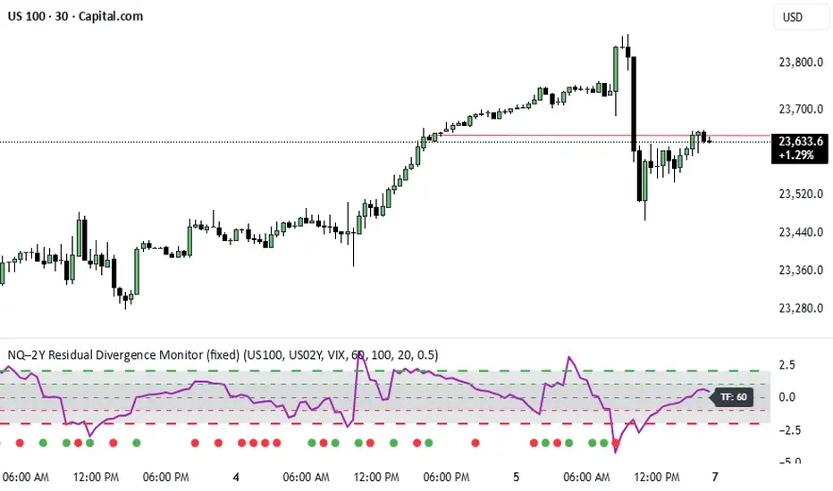
NQ–2Y CorrelationThis indicator tracks the relationship between the Nasdaq futures (NQ) and the US 2-Year Treasury yield (US02Y). The two typically move in opposite directions. This tool highlights when that relationship breaks down, and when moves become stretched to extremes. This can be useful for traders to find inflection points in price representing either overbought or oversold extremes.
Key Features
Residual Z-Score: Shows how far NQ’s returns deviate from what would be expected given moves in the 2Y. Useful for spotting stretched conditions (+/- 2σ bands).
Correlation Tracking: Fast and slow correlations between NQ and inverted 2Y returns. Helps identify regime shifts in the relationship.
Same-Direction Signals: Green dots mark when NQ and 2Y both move strongly in the same direction (rare alignment). Red dots mark strong opposing moves.
Alerts: Triggers available for residual stretches, correlation flips, and significant same-direction or opposite moves.
Usage
Monitor Z-Score to identify when the equity–rates linkage is stretched beyond typical bounds. I typically use this on the H1 or H4 timeframe.
Watch for correlation regime shifts to spot changing market dynamics. Typically price falling into support or moving into resistance as there is a false correlation or a flip.
Same-direction dots help flag unusual synchronized moves between risk assets and yields - these are especially useful for identifying false moves.
NQ-Market Momentum CompassNQ-Market Momentum Compass: User Guide
Overview
NQ-Market Momentum Compass is a comparative momentum tool that helps you visualize the relative strength between Nasdaq futures (NQ) and a volume-weighted composite of other major US index futures (ES, RTY, and YM). This indicator plots two oscillator lines that move above and below zero, making it easy to identify momentum shifts and potential divergences between tech-heavy Nasdaq and the broader market.
What You're Looking At
The indicator displays two main components:
NQ Oscillator (Blue Line): Shows the percentage change in NQ futures over your selected lookback period.
Composite Oscillator (Orange Line): Shows the volume-weighted average percentage change of S&P 500 (ES), Russell 2000 (RTY), and Dow Jones (YM) futures over the same period.
Zero Line (Gray): The center reference line dividing positive and negative momentum.
How It Works
Core Calculation
The indicator calculates percentage change over a lookback period:
For each index, it computes: (current_price - price_n_bars_ago) / price_n_bars_ago * 100
The NQ line shows this calculation for Nasdaq futures
The composite line weights the other indices by their relative trading volumes
Volume Weighting
Instead of a simple average, the composite line incorporates trading volume to give more weight to indices with higher participation. This provides a more accurate representation of overall market momentum.
How to Interpret the Indicator
Basic Interpretation
Above Zero: Price is higher than it was at the lookback period ago (positive momentum)
Below Zero: Price is lower than it was at the lookback period ago (negative momentum)
Steepness: Indicates the strength of the momentum (steeper = stronger momentum)
Comparative Analysis
When Lines Move Together: NQ is moving in harmony with the broader market
When Lines Diverge:
NQ above composite: Tech/growth is outperforming the broader market
Composite above NQ: Broader market is outperforming tech/growth
Key Signals to Watch
Crossovers Between Lines: Potential shift in sector leadership
NQ crossing above composite: Tech starting to outperform
NQ crossing below composite: Tech starting to underperform
Zero-Line Crossovers: Change in overall momentum direction
Crossing above zero: Shift to positive momentum
Crossing below zero: Shift to negative momentum
Divergences: When one line makes a new high/low while the other doesn't, suggesting potential reversal
Practical Applications
Market Rotation Analysis: Identify shifts between tech and broader market leadership
Trend Confirmation: Validate trends by checking if both oscillators are in agreement
Early Warning System: Spot when tech starts to diverge from the broader market
Relative Strength Analysis: Determine which segment of the market has stronger momentum
Customization Options
The indicator offers two main customization groups:
Calculation Settings:
Momentum Window: The lookback period for calculating percentage change (default: 20)
Price Smoothing: EMA smoothing applied to prices before calculation (default: 5)
Display Settings:
NQ Line Color: Customize the color of the NQ oscillator line
Composite Line Color: Customize the color of the composite oscillator line
Tips for New Users
Start with the Defaults: The default settings (20-period momentum window, 5-period smoothing) work well across most timeframes
Focus on Relationships: The absolute values matter less than the relationship between the two lines
Use Multiple Timeframes: Check the oscillator on both short and longer timeframes for confirmation
Watch for Extremes: When either line reaches unusually high or low values, expect potential reversion
Combine with Other Indicators: For best results, use alongside trend and volatility indicators
This oscillator is particularly useful for traders who want to understand the intermarket dynamics between tech stocks and the broader market, helping to identify sector rotation and potential trading opportunities.

NQ-VIX Expected Move LevelsNQ -VIX Daily Price Bands
This indicator plots dynamic intraday price bands for NQ futures based on real-time volatility levels measured by the VIX (CBOE Volatility Index). The bands evolve throughout the trading day, providing volatility-adjusted price targets.
Formulas:
Upper Band = Daily Open + (NQ Price × VIX ÷ √252 ÷ 100)
Lower Band = Daily Open - (NQ Price × VIX ÷ √252 ÷ 100)
The calculation uses the square root of 252 (trading days per year) to convert annualized VIX volatility into an expected daily move, then scales it as a percentage adjustment from the current day's open.
Features:
Real-time band calculation that updates throughout the trading session
Upper band (green) extends from the current day's open
Lower band (red) contracts from the current day's open
Inner upper band (green) at 50% of expected move
Inner lower band (red) at 50% of expected move
Middle Inner upper band (green) at 80% of expected move
Middle Inner lower band (red) at 80% of expected move
Information table displaying:
Current NQ price and VIX level
Daily Open
Expected move

NQ-VIX Expected Move LTF LevelsNQ -VIX LTF Price Bands
This indicator plots dynamic intraday price bands for NQ futures based on real-time volatility levels measured by the VIX (CBOE Volatility Index). The bands evolve throughout the trading day, providing volatility-adjusted price targets.
Formulas:
Upper Band = (Input TF Open) + (NQ Price × VIX x √(Input TF ÷ (23h in min) ) ÷ 100
Lower Band = Daily Open - (NQ Price × VIX x √(Input TF ÷ (23h in min) ) ÷ 100
The calculation uses the square root of Input TF ÷ (23h in min) to convert annualized VIX volatility into an expected TF move, then scales it as a percentage adjustment from the current TF input's open.
Features:
Real-time band calculation that updates throughout the trading session
Upper band (green) extends from the current TF's open
Lower band (red) contracts from the current TF's open
Inner upper band (green) at 50% of expected move
Inner lower band (red) at 50% of expected move
Middle Inner upper band (green) at 80% of expected move
Middle Inner lower band (red) at 80% of expected move
Information table displaying:
Current input TF
Current NQ price and VIX level
Current input TF Open
Expected move

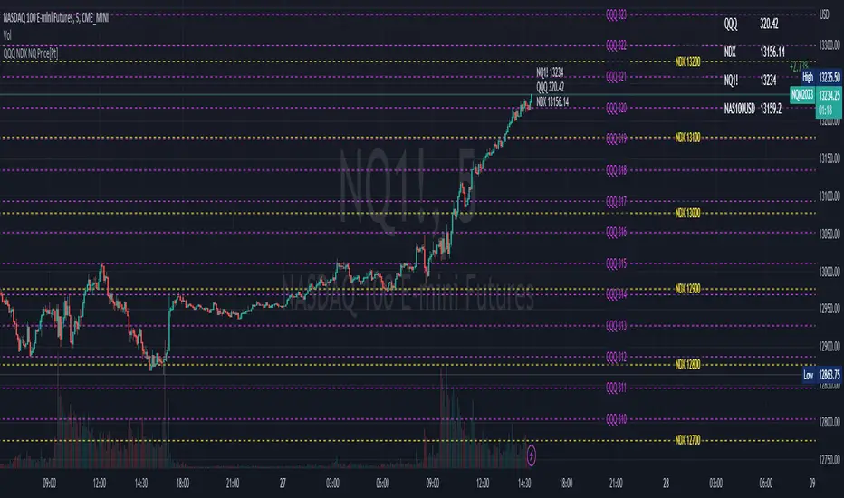
QQQ NDX NQ Price Converter [Pt]A must have tool for QQQ NDX NQ traders~!!!
Description
The QQQ NDX NQ Price Converter is a powerful and easy-to-use tool that allows traders to view corresponding price levels for linked instruments in real-time. This includes QQQ, NDX, NQ, and NAS100USD. Although these instruments often move in sync, differences in price movements, volume, and trading hours can create unique key levels and support/resistance areas for each. By mapping these levels on the same chart, traders can more easily spot trading opportunities and improve their chances of success.
Customizable features
- multiplier from the closest whole number price level
- line color
- line style
- label position / size
- # of levels to display
- toggle current price display table

Overnight QQQ/ NQ Auto LevelsUsing QQQ Overnight pricing to have correct levels on the NQ Future Chart.

SPY to ES or QQQ to NQThis indicator is used to automatically map SPY VWAP and 10 levels of your choice to ES / MES or map QQQ VWAP and 10 levels of your choice to NQ / MNQ . Since SPY and QQQ have the same price action as their futures iteration, there seems to a direct correlation between their levels and VWAP. This indicator is made to easily map the key levels of your choice to the appropriate futures instrument.


NQ Hourly Retracements - 12y Stats with LevelsHour Stats with Levels - TradingView Indicator Description
IMPORTANT: NQ FUTURES ONLY
This indicator is specifically designed for and calibrated to NQ (Nasdaq-100 E-mini) futures only. The statistical data is derived exclusively from 13 years of NQ price action (2013-2025). Do not use this indicator on any other asset, ticker, or market as the statistics will not be applicable and may lead to incorrect trading decisions.
Overview
"Hour Stats with Levels" is a statistical analysis indicator that provides real-time probability-based insights into hourly price behavior patterns. The indicator combines historical pattern recognition with live price action to help traders anticipate potential sweep and reversal scenarios within each trading hour.
Originality and Core Concept
This indicator is based on a comprehensive statistical analysis of 12y years of 1-minute NQ futures data, examining a specific price pattern: when an hourly candle opens inside the previous hour's range. Unlike generic support/resistance indicators, this tool provides hour-specific, context-aware probabilities based on 30,000+ historical occurrences of this pattern.
The originality lies in three key areas:
Pattern-Specific Statistics: Rather than applying generic technical analysis, the indicator only activates when the current hour opens within the previous hour's range, providing relevant statistics for this exact scenario.
Context-Aware Probabilities: Statistics are differentiated based on whether the current hour opened above or below the previous hour's open, recognizing that bullish and bearish opening contexts produce different behavioral patterns.
Comprehensive Retracement Tracking: The indicator tracks four independent retracement levels after a sweep occurs, showing the probability of price returning to: the swept level itself (90+% probability), the 50% level, the current hour's open, and the opposite extreme.
How It Works
The Core Pattern
The indicator monitors a specific price structure:
Setup Condition: The current hourly candle opens inside (between) the previous hour's high and low
Sweep Event: Price then breaks above the previous high (high sweep) or below the previous low (low sweep)
Retracement Analysis: After a sweep, the indicator tracks whether price retraces to key levels
Statistical Foundation
The underlying analysis processed 1-minute bar data from 2013-2025, identifying every instance where an hourly candle opened inside the previous hour's range. For each occurrence, the system tracked:
Whether the high, low, or both were swept during that hour
The distance of the sweep measured as a percentage of the previous hour's range
Whether price retraced to four key levels: the swept level, the 50% point, the current open, and the opposite extreme
These measurements were aggregated for all 24 hours of the trading day, with separate statistics for bullish contexts (opening above previous open) and bearish contexts (opening below previous open), creating 48 unique statistical profiles.
Sweep Distance Percentiles
The "reversal levels" are drawn based on historical sweep distance distributions:
25th Percentile: 75% of historical sweeps were larger than this distance. This represents a conservative reversal zone where smaller, contained sweeps typically reverse.
Median (50th Percentile): The midpoint of all historical sweep distances. Half of all sweeps reversed before reaching this level, half extended beyond it.
75th Percentile: Only 25% of sweeps extended beyond this distance. This represents an extended sweep zone where price has historically shown exhaustion.
For example, if the previous hour's range was 20 points and the median high sweep distance is 40% of range, the median reversal level would be placed 8 points above the previous high.
How to Use the Indicator
Sweeps were calculated using 1m data - as such, it's recommended to use the indicator on a 1min chart
Visual Components
Hour Delimiter (Gray Vertical Line)
Marks the start of each new hour
Helps identify when new statistics become active
Sweep Markers
Green "H" label: High sweep has occurred this hour
Red "L" label: Low sweep has occurred this hour
Markers appear on the exact bar where the sweep happened
Target Levels (Blue Lines)
Prev Open: Previous hour's opening price
Prev High: Previous hour's highest price (sweep target)
Prev Low: Previous hour's lowest price (sweep target)
Prev 50%: Midpoint of previous hour's range
Current Open: Current hour's opening price (key retracement target)
Reversal Levels (Purple Dashed Lines)
Positioned beyond the previous high/low based on historical sweep percentiles
Three levels above previous high (for high sweeps)
Three levels below previous low (for low sweeps)
These represent statistically-derived zones where sweeps typically exhaust
The Statistics Table
The table dynamically updates each hour and displays different statistics based on whether the current hour opened above or below the previous hour's open.
Status Row
Shows current state: waiting for sweep, or which sweep(s) have occurred
If waiting, indicates which sweep is more probable based on historical data
SWEEP PROBABILITIES Section
High Sweep: Historical probability (%) that price will sweep the previous high this hour
Low Sweep: Historical probability (%) that price will sweep the previous low this hour
Both Sweeps: Historical probability (%) that price will sweep both levels this hour
These probabilities are derived from counting how many times each pattern occurred in similar historical contexts. For example, "High Sweep: 73.18%" means that in 73.18% of historical occurrences where the hour opened in this same context (same hour of day, same position relative to previous open), price swept the previous high before the hour closed.
AFTER HIGH SWEEP → Section
These statistics activate only after a high sweep has occurred. They show the probability of price retracing to various levels:
→ Prev High: Probability that price returns to (or below) the level it just swept. This is typically 90%+ because sweeps often act as "false breakouts" or liquidity grabs before reversal.
→ 50% Level: Probability that price retraces at least halfway back into the previous hour's range. This represents a moderate retracement.
→ Current Open: Probability that price retraces all the way back to where the current hour opened. This indicates a complete reversal of the sweep move.
→ Prev Low: Probability that price retraces entirely through the previous range to touch the opposite extreme. This represents a full reversal pattern.
AFTER LOW SWEEP → Section
Mirror of the above, but for low sweeps:
→ Prev Low: Retracement to the swept low level (90%+ probability)
→ 50% Level: Retracement to middle of range
→ Current Open: Full retracement to current hour's open
→ Prev High: Complete reversal to opposite extreme
Important Note on Retracement Statistics: These percentages are tracked independently. A 90% probability of returning to the swept level doesn't mean there's only a 10% chance of deeper retracement. Price can (and often does) retrace through multiple levels sequentially. The percentages show how many times price reached at least that level, not where it stopped.
Trading Applications
Anticipating Sweeps
When an hour opens inside the previous range, check the probabilities. If "High Sweep: 70%" and "Low Sweep: 30%", you know there's a 70% historical likelihood of an upside sweep occurring this hour. This doesn't guarantee it will happen, but provides statistical context for potential setups.
Reversal Trading
The most reliable pattern in the data is the 90%+ retracement probability to swept levels. When a sweep occurs, traders can anticipate a retracement back to at least the swept level in the vast majority of cases. The reversal level percentiles help identify where sweeps may exhaust.
Position Management
The retracement probabilities help manage existing positions. For example, if you're long and a high sweep occurs, you know there's a 90%+ chance of at least some retracement to the swept level, which might inform profit-taking or stop-loss decisions.
Confluence with Current Open
The "Current Open" retracement statistics (typically 60-70%) highlight the magnetic quality of the hour's opening price. After a sweep, price frequently returns to test this level.
Customization Options
The indicator offers extensive visual customization:
Toggle on/off: hour delimiters, sweep markers, target levels, reversal levels, statistics table
Customize colors, line widths, and styles for all visual elements
Adjust label sizes and table position
Show/hide individual target levels and reversal percentiles
Limitations and Considerations
Pattern-Specific: The indicator only provides statistics when the current hour opens inside the previous hour's range. If the hour opens outside this range (gaps up or down), the statistics are not applicable.
Historical Probabilities: The percentages represent historical frequencies, not predictions. A 70% probability means it happened 70% of the time historically, not that it will definitely happen 7 out of 10 times going forward.
NQ-Specific Calibration: All statistics are derived from NQ futures data. Market behavior, volatility, and patterns differ across assets.
Hour-Specific Behavior: Different hours show dramatically different statistics. For example, the 9 AM EST hour (market open) shows much higher sweep probabilities (80%+) than the 5 PM EST hour (30-50%) due to differing liquidity and volatility conditions.
No Guarantee of Execution: While a 90% retracement probability is high, it means 10% of the time, price did NOT retrace. Always use proper risk management.
Technical Notes
The indicator uses hourly timeframe data via request.security() to determine previous hour values
Sweep detection occurs in real-time on the chart's timeframe
Statistics are hardcoded from the comprehensive backtested analysis (not calculated on-the-fly)
The indicator stores static values at the start of each hour to ensure consistency as the hour progresses
All percentage values are rounded to one decimal place for clarity
This indicator provides a statistically-grounded framework for understanding hourly price behavior in NQ futures. By combining real-time pattern detection with comprehensive historical analysis, it offers traders probabilistic insights to inform decision-making process within the specific context of each trading hour.

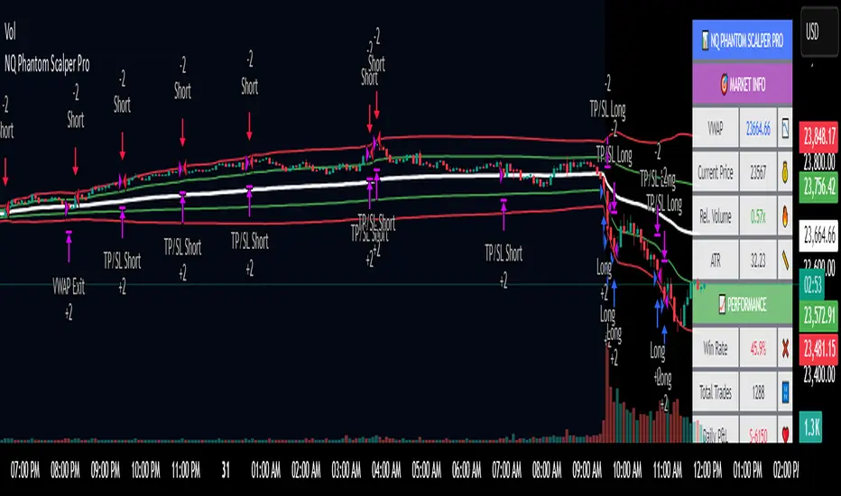
NQ Phantom Scalper Pro# 👻 NQ Phantom Scalper Pro
**Advanced VWAP Mean Reversion Strategy with Volume Confirmation**
## 🎯 Strategy Overview
The NQ Phantom Scalper Pro is a sophisticated mean reversion strategy designed specifically for Nasdaq 100 (NQ) futures scalping. This strategy combines Volume Weighted Average Price (VWAP) bands with intelligent volume spike detection to identify high-probability reversal opportunities during optimal market hours.
## 🔧 Key Features
### VWAP Band System
- **Dynamic VWAP Bands**: Automatically adjusting standard deviation bands based on intraday volatility
- **Multiple Band Levels**: Configurable Band #1 (entry trigger) and Band #2 (profit target reference)
- **Flexible Anchoring**: Choose from Session, Week, Month, Quarter, or Year-based VWAP calculations
### Volume Intelligence
- **Volume Spike Detection**: Only triggers entries when volume exceeds SMA by configurable multiplier
- **Relative Volume Display**: Real-time volume strength indicator in info panel
- **Optional Volume Filter**: Can be disabled for testing alternative setups
### Advanced Time Management
- **12-Hour Format**: User-friendly time inputs (9 AM - 4 PM default)
- **Lunch Filter**: Automatically avoids low-liquidity lunch period (12-2 PM)
- **Visual Time Zones**: Color-coded background for active/inactive periods
- **Market Hours Focus**: Optimized for peak NQ trading sessions
### Smart Risk Management
- **ATR-Based Stops**: Volatility-adjusted stop losses using Average True Range
- **Dual Exit Strategy**: VWAP mean reversion + fixed profit targets
- **Adjustable Risk-Reward**: Configurable target ratio to opposite VWAP band
- **Position Sizing**: Percentage-based equity allocation
### Optional Trend Filter
- **EMA Trend Alignment**: Optional trend filter to avoid counter-trend trades
- **Configurable Period**: Adjustable EMA length for trend determination
- **Toggle Functionality**: Enable/disable based on market conditions
## 📊 How It Works
### Entry Logic
**Long Entries**: Triggered when price touches lower VWAP band + volume spike during active hours
**Short Entries**: Triggered when price touches upper VWAP band + volume spike during active hours
### Exit Strategy
1. **VWAP Mean Reversion**: Early exit when price returns to VWAP center line
2. **Profit Target**: Fixed target based on percentage to opposite VWAP band
3. **Stop Loss**: ATR-based protective stop
### Visual Elements
- **VWAP Center Line**: Blue line showing volume-weighted fair value
- **Green Bands**: Entry trigger levels (Band #1)
- **Red Bands**: Extended levels for target reference (Band #2)
- **Orange EMA**: Trend filter line (when enabled)
- **Background Colors**: Yellow (lunch), Gray (after hours), Clear (active trading)
- **Info Panel**: Real-time metrics display
## ⚙️ Recommended Settings
### Timeframes
- **Primary**: 1-5 minute charts for scalping
- **Validation**: Test on 15-minute for swing applications
### Market Conditions
- **Best Performance**: Ranging/choppy markets with good volume
- **Trend Markets**: Enable trend filter to avoid counter-trend trades
- **High Volatility**: Increase ATR multiplier for stops
### Session Optimization
- **Pre-Market**: Generally avoided (low volume)
- **Morning Session**: 9:30 AM - 12:00 PM (high activity)
- **Lunch Period**: 12:00 PM - 2:00 PM (filtered by default)
- **Afternoon Session**: 2:00 PM - 4:00 PM (good volume)
- **After Hours**: Generally avoided (wide spreads)
## ⚠️ Risk Disclaimer
This strategy is for educational purposes only and does not constitute financial advice. Past performance does not guarantee future results. Trading futures involves substantial risk of loss and is not suitable for all investors. Users should:
- Thoroughly backtest on historical data
- Start with small position sizes
- Understand the risks of leveraged trading
- Consider transaction costs and slippage
- Never risk more than you can afford to lose
## 📈 Performance Tips
1. **Volume Threshold**: Adjust volume multiplier based on average NQ volume patterns
2. **Band Sensitivity**: Modify band multipliers for different volatility regimes
3. **Time Filters**: Customize trading hours based on your timezone and preferences
4. **Trend Alignment**: Use trend filter during strong directional markets
5. **Risk Management**: Always maintain consistent position sizing and risk parameters
**Version**: 6.0 Compatible
**Asset**: Optimized for NASDAQ 100 Futures (NQ)
**Style**: Mean Reversion Scalping
**Frequency**: High-Frequency Trading Ready
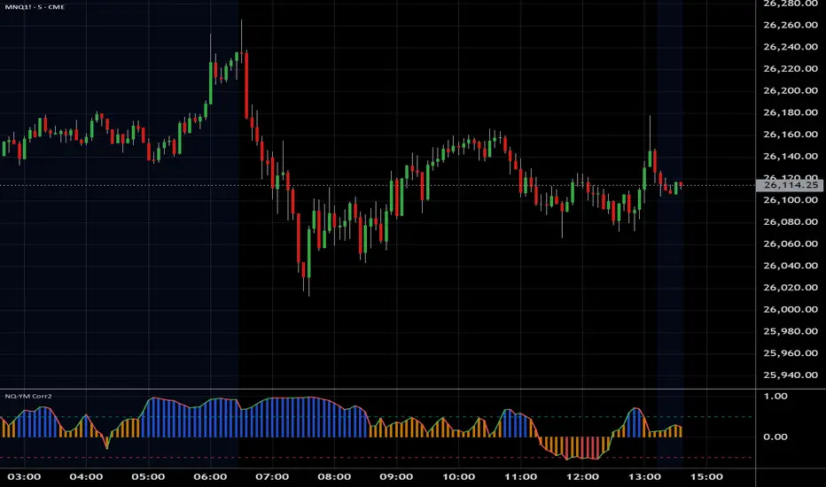
NQ YM Correlogram Meter TypeOverview
This indicator provides a real-time, visual "meter" of the correlation between the Nasdaq 100 (NQ) and the Dow Jones (YM) futures. It is designed as a clean, non-intrusive dashboard panel that displays only the current correlation value, making it an ideal companion for pairs traders who need to see the live relationship at a glance.
Unlike a traditional oscillator that plots historical data, this tool focuses exclusively on the "right now" to aid in immediate trade decisions.
Key Features
Real-Time Correlation Meter: A single vertical bar displays the current correlation, visually mapping the -1.0 to +1.0 range.
Clear Visual Cues: The bar's color gradient (from red for negative correlation to green for positive correlation) and fill level provide an instant understanding of the market relationship.
Precise Value Display: The exact numerical correlation (e.g., 0.85 or -0.50) is shown clearly at the bottom of the meter.
Contextual Y-Axis: Static labels (+1.0, +0.5, 0.0, -0.5) provide quick reference points for the meter's reading.
Dashboard Panel: Renders cleanly as an overlay table on the right side of your chart, saving screen real estate.
How to Use
This indicator is best used as a confirmation tool alongside a primary pairs trading strategy or a historical correlation oscillator.
High Green Bar (near +1.0): Indicates a strong positive correlation. NQ and YM are moving in sync.
Bar near 0.0: Indicates little to no linear relationship.
Low Red Bar (near -1.0): Indicates a strong negative (inverse) correlation. NQ and YM are moving in opposite directions.
For a pairs trader, this meter provides an instant check to confirm if the two assets are in their expected state of correlation at the moment of execution.
Settings & Customization
Correlation Period: Set the lookback length for the correlation calculation.
Symbols: Fully customizable, though it defaults to YM1! and NQ1!.
Panel Appearance: Adjust the Table Size (Small/Large) and Chart Theme (Light/Dark).
Text Size: Independently control the font size for the numerical Value Text and the Y-Axis Labels to perfectly fit your display.

NQ YM Correlation 1 min dataOverview
This indicator plots the correlation between Nasdaq 100 (NQ) and Dow Jones (YM) futures. It is specifically designed to act as an "Engine RPM" gauge for pairs traders who trade divergence or spread breakouts—not mean reversion.
To ensure consistent readings, this indicator always calculates using a 1-minute timeframe data, regardless of the chart timeframe you are currently viewing.
The core idea is:
High Correlation (Blue Zone): "Low RPM" or "Engine Idle." NQ and YM are moving together. The spread is flat. This is a no-trade zone.
Low Correlation (Red Zone): "High RPM" or "Engine Hot." NQ and YM are diverging. The spread is moving. This is the primary trade zone.
NQ Bias — Fixed Session (6PM & Midnight Opens)📰 Script Summary — NQ Bias (Fixed Session)
📌 Purpose:
This Pine Script helps traders track bias shifts on Nasdaq futures (NQ) using ICT-style reference points like the 6PM open, Midnight open, and 4PM close.
⚙️ How It Works:
Plots session opens (6PM, Midnight) as bias reference lines.
Highlights when price is trading above or below the 4PM New York Close → tells you if the market is leaning bullish or bearish.
Uses background coloring (green/red) to visually show bias.
Lets you filter by specific trading dates for focused backtesting.
Designed with ICT principles → focus on daily opens, session shifts, and premium/discount logic.
📈 Trader Benefit:
Quickly see if NQ is in bullish or bearish context relative to key opens.
Simplifies daily bias framework into an easy chart overlay.
Helps align trades with the higher-probability side of the market.

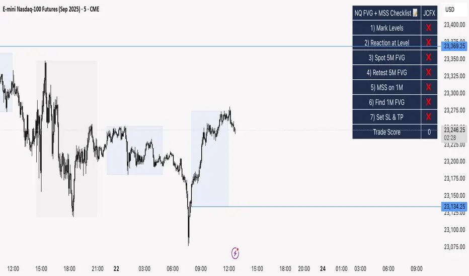
NQ FVG + MSS ChecklistThe NQ FVG + MSS Quick Checklist is a visual trading HUD for Nasdaq 100 (NQ) futures. It helps traders quickly track key setup elements: session & previous day levels, 5M FVG, retests, 1M MSS, and 1M FVG inside MSS.
Each step can be manually ticked, and a Trade Score shows setup strength at a glance. The checklist table sits on top of all chart elements for easy reference without interfering with your analysis.
Features:
Step-by-step NQ trading checklist
Manual inputs with visual ✅/❌
Trade Score for quick setup confirmation
Table overlay always on top of the chart
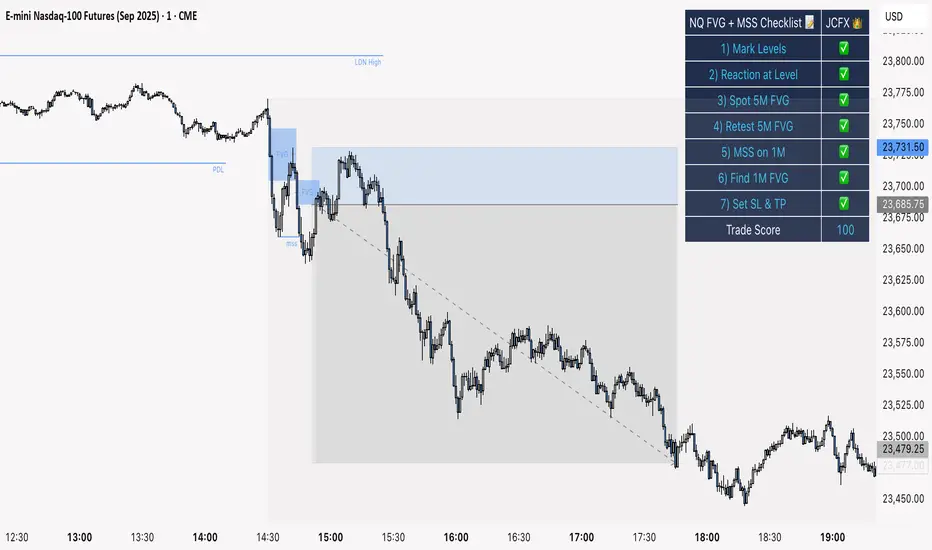
NQ FVG + MSS ChecklistThe NQ FVG + MSS Quick Checklist is a simple yet powerful visual tool for traders focusing on the Nasdaq 100 (NQ) futures. It provides a step-by-step checklist to assess trade setups based on key market concepts like Fair Value Gaps (FVG), Market Structure Shifts (MSS), session highs/lows, and previous day levels.
This indicator helps you quickly see which elements of your trading plan are met before entering a trade. Each checklist item can be manually toggled, and a cumulative Trade Score provides a quick visual guide to setup strength.
Key Features:
Step-by-step checklist for NQ trading setups
Track levels: Session highs/lows & Previous Day High/Low
Spot 5M FVG and Retests
Identify MSS on 1M and find 1M FVG inside MSS
Manual SL & TP guidance
Trade Score for quick setup strength assessment
Fully visible table overlay on top of the chart
How to Use:
Mark session & previous day levels
Observe reaction at key levels (Sweep or Continue)
Identify 5M FVG and any retests
Spot 1M MSS and 1M FVG inside MSS
Set SL/TP based on FVG extremes and next session levels
Check the cumulative Trade Score for setup confirmation
Note: This indicator is manual input-based, letting traders tick off items as they analyze the chart, making it a lightweight trading checklist HUD that stays on top of all chart elements.
NQ 2026 Strategic Levels + Market MemoryTitle: NQ Strategic Levels 2026: Volume Profile & Market Memory
Description: This indicator plots the critical institutional levels for NQ (Nasdaq-100) heading into 2026. It is designed to help traders visualize the "Market Structure" map based on the 2025 yearly volume profile and key historical events.
How it Works: The script projects three dynamic "Zones" and three fixed "Historical Markers" to the right of your chart. It does not clutter the past price action; it focuses on future price discovery.
1. The 2026 Active Zones (Boxes):
🛑 Resistance (Supply Zone): Derived from the "Trapped Buyers" of late 2025. This is where overhead supply is likely to cause profit-taking.
⚖️ The Pivot (Equilibrium): Based on the Q4 2025 High Volume Node (HVN). This is the "Line in the Sand." Above this zone, the weekly bias is Bullish. Below it, the bias shifts to Bearish/Correction.
💰 The Buy Zone (Support): The Yearly Value Area Low (VAL). This represents the strongest institutional support and a high-probability area for "Buy the Dip" programs.
2. The 2025 Market Memory (Dashed Lines):
Triple Witch Liquidity: The December 2025 rejection high.
AI Summer Breakout: The key breakout level from mid-2025 that flipped from resistance to support.
Tariff Scare Floor: The macro bottom established during the volatility of April 2025.
How to Use:
Trend Followers: Watch the Pivot Zone. If price holds above it, target the Resistance Zone.
Mean Reversion Traders: Look for rejections at the Resistance Zone or bounces at the Buy Zone.
Risk Management: Use the Historical Markers as invalidated points or profit targets.
Disclaimer: These levels are based on volume analysis and historical price action. Not financial advice. Trade at your own risk.

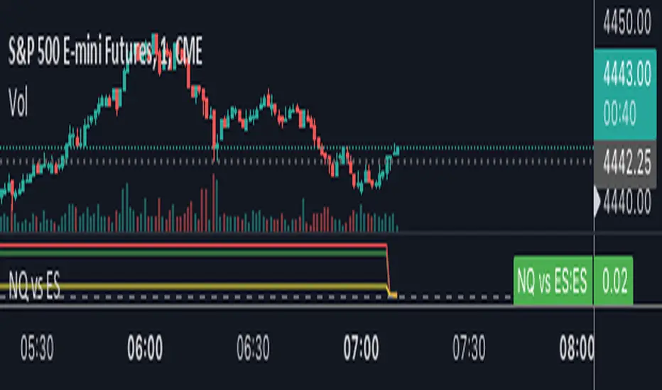
NQ vs ESThe script shows the spread between the realtime NQ and ES percentage change from the day before, from which it is possible to see if NQ is outperforming or underperforming the ES.
NQ Order Blocks (Smart Money)Shows the order blocks for different time frames
Detects Bullish Order Blocks (last down candle before impulsive up move)
Detects Bearish Order Blocks (last up candle before impulsive down move)
Plots rectangles (zones) on the chart
Works well on NQ 1m–15m and HTF confirmation
Lightweight & free

NQ vs ES-RTY-YM Divergence MTF OSOpen source script version for my NQ vs ES-RTY-YM Divergence MTF indicator

NQ Command Center [EOD Predictor]This is a sophisticated Macro-correlated Dashboard designed specifically for trading NQ (Nasdaq 100). It attempts to predict how the daily candle will close (Green or Red) by combining Price Action (Market Structure) with External Market Drivers (Yields, Volatility, Dollar, and Breadth).
How This Script Works
The script assigns a "Score" to current market conditions. The higher the score, the more bullish the prediction. The lower the score, the more bearish.
1. The "Structure" Score (Price Action) It looks at the Daily High/Low (PDH/PDL) and recent daily trend:
Bullish (+1): We are making Higher Highs/Higher Lows, or price is holding in the top 33% of yesterday's range.
Breakout (+2): Price has broken above the Previous Daily High (PDH).
Bearish (-1/-2): We are making Lower Highs, or price has broken below the Previous Daily Low (PDL).
2. The "Macro" Score (External Data) It pulls data from 5 external tickers to see if the environment supports a move:
ADDQ (Breadth): If > 0, more stocks are advancing than declining (Bullish).
VXN (Volatility): If falling, fear is decreasing (Bullish).
DXY (Dollar) & US10Y (Yields): If these are dropping, it is usually good for Tech/Nasdaq (Bullish).
CVD (Volume): Estimates if volume is dominated by buyers or sellers.
3. The Prediction (The Output) It sums these scores.
Total Score ≥ 4: "STRONG GREEN CLOSE 🚀" (High confidence Longs)
Total Score ≤ -4: "STRONG RED CLOSE 🩸" (High confidence Shorts)
Near 0: "CHOP / NEUTRAL" (Avoid trading or take quick scalps).
How to Use It Effectively
Symbol: Open a chart for NQ1! (Nasdaq Futures) or NDX.
Timeframe: This is designed for Intraday trading. Use 5m, 15m, or 1h charts. (Do not use on Daily chart, as the table lines up intraday data against daily history).
The Dashboard: Look at the table in the top right.
Focus on "AI Forecast": If it says STRONG GREEN, look for Long setups (pullbacks to support).
Check Confidence: If Confidence is "LOW", the macro data might be conflicting with price action (e.g., Price is going up, but Volume is selling). Be careful.
The Lines: The script plots Green (PDH) and Red (PDL) lines on your chart.
These are key reaction points. If price breaks the Green line, the "Live Status" on the dashboard will switch to BREAKOUT.

NQ Pro Dashboard (Master Fix)This indicator is a "Head-Up Display" designed specifically for trading NQ (Nasdaq-100 Futures). It aggregates data from the broader market (volatility) and the specific stocks that drive the Nasdaq index (The "Magnificent 7") to give you a single Trend Power Score.
Here is a breakdown of how the logic works under the hood:
1. The Inputs (Data Feed)
The script watches 9 specific assets in real-time (daily timeframe data):
Fear Gauges:
VIX: The volatility index for the S&P 500.
VXN: The volatility index specifically for the Nasdaq-100.
The Engine (Mag 7):
NVDA, AAPL, MSFT, AMZN, GOOGL, META, TSLA.
2. The Logic: "Weighted" Market Strength
Instead of treating every stock equally, the script applies a Weighting Multiplier to the Mag 7 stocks based on their approximate impact on the Nasdaq-100 index.
Heavyweights (1.5x): NVDA, AAPL, MSFT (These move the market the most).
Middleweights (1.0x): AMZN, GOOGL, META.
Lightweight (0.7x): TSLA (Has the least pull of the group).
It calculates a single percentage number (MAG 7 (W)) representing the combined push or pull of these stocks.
3. The "Trend Power" Score (0-100)
This is the core signal. It starts at a neutral 50 and adds/subtracts points based on market conditions.
Fear Factor:
If VIX or VXN drops > 2% (Fear dying), it adds points (Bullish).
If VIX or VXN spikes > 2% (Fear rising), it subtracts points (Bearish).
Stock Strength:
If the Weighted Mag 7 Average is > 1.0% (Strong Rally), it adds a massive 30 points.
If it's negative (Sell-off), it subtracts points.
The Score Breakdown:
80 - 100 (Green): STRONG BULL. The engines are firing (stocks up) and the brakes are off (VIX down). Do not short.
0 - 20 (Red): STRONG BEAR. Panic selling is occurring. Do not buy.
40 - 60 (Orange): CHOP / RANGE. Conflicting signals (e.g., stocks are up but VIX is also up). Be careful.
4. The "Exhaustion" Meter (ATR)
The RANGE row tells you if the market has "gas left in the tank."
It compares Today's Range (High - Low) to the 14-Day Average Range (ATR).
< 50% (Yellow): Compressed. The market hasn't moved much yet. Expect a breakout soon.
> 120% (Purple): Extended. The market has moved massive amounts today. A reversal or pause is statistically likely (mean reversion).
5. The Visuals (Leaders Row)
The bottom row gives you a quick visual scan of the individual stocks:
N▲ (Green): Nvidia is up.
T▼ (Red): Tesla is down.
This helps you spot "divergences"—for example, if the Trend Score is high but NVDA is Red, the rally might be fragile.
