Euclidean Distance Predictive Candles [SS]Finally releasing this, its been in the works for the past 2 weeks and has undergone many iterations.
I am not sure if I am 100% happy with it yet, but I guess its best to release and get feedback to make improvements.
So this is the Euclidean distance predictive candle indicator and what it does is exactly what it sounds like, it uses Euclidean distance to identify similar candles and then plot the candles and range that immediately proceeded like candles.
While this is using a general machine learning/data science approach (Euclidean distance), I do not employ the KNN (Nearest Neighbors) algo into this. The reason being is it simply offered no predictive advantage than isolating for the last case. I tried it, I didn't like it, the results were not improve and, at times, acutally hindered so I ditched it. Perhaps it was my approach but using some other KNN indicators, I just don't really find them all that more advantageous to simply relying on the Law of Large Numbers and collecting more data rather than less data (which we will get into later in this explanation).
So using this indicator:
There is a lot of customizability here. And the reason is, not all settings are going to work the same for all tickers. To help you narrow down your parameters, I have included various backtest results that show you how the model is performing. You see in the AMZN chart above, with the current settings, it is performing optimally, with a cumulative range pass of 99% (meaning that, of all the cases, the indicator accurately predicted the next day high OR low range 99% of the time), and the ability to predict the candle slightly over 52%.
The recommended settings, from me, are as follows:
So these are generally my recommended settings.
Euclidian Tolerance: This will determine the parameters to look for similar candles. In general, the lower the tolerance, the greater the precision. I recommend keeping it between 0.5, for tickers with larger prices (like ES1! futures or NQ1!) or 0.05 for tickers with lower TPs, like SPY or QQQ.
If the ED Tolerance is too extreme that the indicator cannot find identical setups, it will alert you:
But in general, the more precise you can get it, the better.
Anchor Type: You will see the option to anchor by "Predicted Open" or by "Previous Close". I suggest sticking with anchoring by predicted open. All this means is, it is going to anchor your range, candle, high and low targets by the predicted open price. Anchoring by previous close will anchor by the close of yesterday. Both work okay, but in general the results from anchoring to predicted open have higher pass rates and more accurately depict the candle.
Euclidean Distance Measurement Type: You can choose to measure by candle body or from high to low wicks. I haven't played around with measuring from high to low wicks all that much, because candle body tends to do the job. But remember, ED is a neutral measurement. Which means, its not going to distinguish between a red or green candle, just the formation of the candle. Thus, I tend to recommend, pragmatically, not to necessarily rely on the candle being red or green, but one the formation of the candle (where are the wicks going, are there more bearish wicks or bullish wicks) etc. Examples will follow.
Range Prediction Type: You can filter the range prediction type by last instance (in which, it will pull the previous identical candle and plot the next candle that followed it, adjusted for the current ranges) or "Average of All Cases". So this is where we need to talk a little bit about the law of large numbers.
In general, in statistics, when you have a huge amount of random data, the law of large numbers stipulates that, within this randomness should be repeated events. This is why sometimes chart patterns work, sometimes they don't. When we filter by the average of all cases, we are relying on the law of large numbers. In general, if you are getting good Backtest readings from Last Instance, then you don't need to use this function. But it provides an alternative insight into potential candle formations next day. Its not a bad idea to compare between the two and look for similarities and differences.
So now that we have covered the boring details, let's get into how to use the indicator and some examples.
So the indicator is plotting the range and candle for the next day. As such, we are not looking at the current candle being plotted, but we are looking at the previous candle (see image below for example):
The green arrow shows the prediction for Friday, along with the corresponding result. The purple arrow shows the prediction for Monday which we have yet to realize.
So remember when you are using this, you need to look at the previous candle, and not the candle that it is currently plotting with realtime data, because it is plotting for the next candle.
If you are plotting by last instance, the indicator will tell you which day it is pulling its data from if you have opted to toggle on the demographic data:
You can see the green arrow pointing to the date where it is pulling from. This data serves as the example candle with the candle proceeding this date being the anchored candle (or the predicted candle).
Price Targets and Probability:
In the chart, you can see the green arrow pointing to the green portion of the table. In this table, it will give you the current TPs. These represent the current time target price, which means, the TPs shown here are for Friday. On Monday, the table will update with the TPs for Monday, etc. If you want to view the TPs in advance, you can view them from the actual candle itself.
Below the TPs, you see a bullish 7:6. It means, in a total of 13 cases, the next candle was bullish 7 times and bearish 6 times. Where do we see the number of cases? In the demographic table as well:
Auxiliary functions
Because you are using the previous candle, if you want to avoid confusion, you can have the indicator plot the price targets over the predicted candle, to anchor your attention so to speak. Simply select "Label" in the "Show Price Targets" section, which will look like this:
You can also ask the indicator to plot the demographic data of Higher High, Low, etc. information. What this does is simply looks at all the cases and plots how many times higher highs, lows, lower lows, highs etc. were made:
This will just count all of the cases identified and plot the number of times higher highs, lows, etc. were made.
Concluding Remarks
This is a kind of complex indicator and I can appreciate it may take some getting used to.
I will try to post a tutorial video at some point next week for it, so stay tuned for that.
But this isn't designed to make your life more complicated, just to help give you insights into potential outcomes for the next day or hour or 5 minute (it can be used on all timeframes).
If you find it helpful, great! If not, that's okay, too :-).
Please be aware, this is not my forte of indicators. I am not a data scientist or programmer. My background is in Epi and we don't use these types of data science approaches, so if you have any suggestions or critiques, feel free to share them below.
Otherwise, I hope you enjoy!
Take care everyone and safe trades!
Cari dalam skrip untuk "Table"

buyer_seller_scalping_indicatorThis code is a custom script designed for analyzing trading volume within a specific time window on the TradingView platform. It offers a comprehensive analysis of buying and selling activity during a defined period and provides visual aids and data summaries for traders to make informed decisions. Here's a detailed breakdown of its functionality and how to use it:
1. Custom Time Period: The script starts by allowing you to specify a custom time period for analysis. In this example, it's set from 04:00 to 09:29. You can modify these time values to suit your specific trading needs.
2. Volume Calculation: The script calculates buying and selling volume based on price levels. It takes into account the open, high, low, and close prices to determine whether buying or selling pressure is dominant during the specified time frame.
3. Total Volume Calculation: It calculates the total volume within the custom time period. This can help you gauge the overall activity and liquidity during the chosen time window.
4. Visualizations: The script then plots visual elements on the chart:
- A volume histogram, which provides a graphical representation of the total volume during the time period.
- Buying and selling volume indicators, which are shown as circles on the chart, highlighting the relative strength of buyers and sellers.
- An average volume line, represented in gray, which helps you identify the average trading volume over a 50-period moving average.
5. Volume Type Determination: The script determines whether buyers or sellers dominate the market during the specified time period. It labels this as "Buyers Volume > Sellers Volume," "Sellers Volume > Buyers Volume," or "Buyers Volume = Sellers Volume." This information can be crucial for assessing market sentiment.
6. Percentage Breakdown: The script calculates the percentage of buying and selling volume in relation to the total volume, helping you understand the distribution of market participants. These percentages are displayed in a table.
7. Table Display: Finally, the script creates a table that displays the following information:
- The current volume type (buyers, sellers, or balanced), with corresponding text colors.
- The percentage of buyers and sellers in the market.
How to Use:
1. Copy the script and add it as a custom script on TradingView.
2. Apply the script to your desired financial chart.
3. Adjust the custom time period if needed.
4. Interpret the visual elements and table to gain insights into market sentiment and volume distribution during the specified time frame.
5. Use this information to inform your trading decisions and strategies, especially when trading within the chosen time window.
This script is a valuable tool for traders seeking to understand market dynamics and volume behavior during specific trading hours, ultimately aiding in more informed trading decisions.
Disclaimer:
The indicator provided herein is experimental and has not undergone comprehensive testing. Its usage is solely at your own risk.
The publisher assumes no responsibility for any trading decisions made based on the utilization of this indicator.

AlpHay : ToolKitToolKit:
First Impressions for Securities; (like crime scene investigators) 🧐
Our first job is to understand "What did happen here?" (historically, like Price Ranges or Price Performances) 🤔
Secondly, we try to figure out "where are we now?" (like common indicators or Moving Averages) 🤔
Then "What was the chain of events?" (macro, local, fundamentals, shorts, etc.)
Note: There are a lot of useful scripts out there, but If you want to see my approach for "Fundamentals" or "Finra Short Report" scripts, have a look.
Now we have a Clue. 😎
Includes;
1. Daily Metrics (Price performance, Price Difference, Volume, Trade)
2. Historic Price Performances
3. Historic Price ranges
4. RSI and MACD (you can change) Indicators for four "Time Frame" (you can change also)
5. Moving Averages (also shows daily values on the chart)
* Easy to customize.
* You can be positioned where ever you need. (be careful about overlays)
* You can turn on/off tables for your daily usage.
* You can flip Horizontally for some of the tables.
* Always look at tooltips (mouse over for Averages etc.)
I hope you enjoy it.
Disclaimer and Warning!
* Do not forget this is my Interpolation of the data sets. You can't invest in relying on this indicator. This is just a visual representation of the data sets.
* Just be careful what you wish for. And search for anomalies.
// ToDO List.
* Pre/Post Market Price and Volume

Candle Trend Counter [theEccentricTrader]█ OVERVIEW
This indicator counts the number of confirmed candle trend scenarios on any given candlestick chart and displays the statistics in a table, which can be repositioned and resized at the user's discretion.
█ CONCEPTS
Green and Red Candles
• A green candle is one that closes with a high price equal to or above the price it opened.
• A red candle is one that closes with a low price that is lower than the price it opened.
Swing Highs and Swing Lows
• A swing high is a green candle or series of consecutive green candles followed by a single red candle to complete the swing and form the peak.
• A swing low is a red candle or series of consecutive red candles followed by a single green candle to complete the swing and form the trough.
Muti-Part Green and Red Candle Trends
• A multi-part green candle trend begins upon the completion of a swing low and continues until a red candle completes the swing high, with each green candle counted as a part of the trend.
• A multi-part red candle trend begins upon the completion of a swing high and continues until a green candle completes the swing low, with each red candle counted as a part of the trend.
█ FEATURES
Inputs
Start Date
End Date
Position
Text Size
Show Sample Period
Show Plots
Table
The table is colour coded, consists of seven columns and, as many as, thirty-one rows. Blue cells denote the multi-part candle trend scenarios, green cells denote the corresponding green candle trend scenarios and red cells denote the corresponding red candle trend scenarios.
The candle trend scenarios are listed in the first column with their corresponding total counts to the right, in the second column. The last row in column one, displays the sample period which can be adjusted or hidden via indicator settings.
The third column displays the total candle trend scenarios as percentages of total 1-candle trends, or complete swing highs and swing lows. And column four displays the total candle trend scenarios as percentages of the, last, or preceding candle trend part. For example 4-candle trends as a percentage of 3-candle trends. This offers more insight into what might happen next at any given point in time.
Plots
I have added plots as a visual aid to the various candle trend scenarios listed in the table. Green up-arrows, with the number of the trend part, denote green candle trends. Red down-arrows, with the number of the trend part, denote red candle trends.
█ HOW TO USE
This indicator is intended for research purposes, strategy development and strategy optimisation. I hope it will be useful in helping to gain a better understanding of the underlying dynamics at play on any given market and timeframe.
It can, for example, give you an idea of whether the next candle will close higher or lower than it opened, based on the current scenario and what has happened in the past under similar circumstances. Such information can be very useful when conducting top down analysis across multiple timeframes and making strategic decisions.
What you do with these statistics and how far you decide to take your research is entirely up to you, the possibilities are endless.
█ LIMITATIONS
Some higher timeframe candles on tickers with larger lookbacks such as the DXY , do not actually contain all the open, high, low and close (OHLC) data at the beginning of the chart. Instead, they use the close price for open, high and low prices. So, while we can determine whether the close price is higher or lower than the preceding close price, there is no way of knowing what actually happened intra-bar for these candles. And by default candles that close at the same price as the open price, will be counted as green. You can avoid this problem by utilising the sample period filter.
The green and red candle calculations are based solely on differences between open and close prices, as such I have made no attempt to account for green candles that gap lower and close below the close price of the preceding candle, or red candles that gap higher and close above the close price of the preceding candle. I can only recommend using 24-hour markets, if and where possible, as there are far fewer gaps and, generally, more data to work with. Alternatively, you can replace the scenarios with your own logic to account for the gap anomalies, if you are feeling up to the challenge.
It is also worth noting that the sample size will be limited to your Trading View subscription plan. Premium users get 20,000 candles worth of data, pro+ and pro users get 10,000, and basic users get 5,000. If upgrading is currently not an option, you can always keep a rolling tally of the statistics in an excel spreadsheet or something of the like.

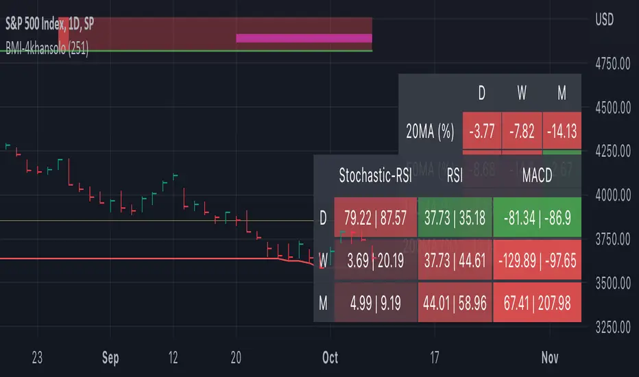
Bearish Market Indicator V2Definition
Have you ever wonder whether if the stock/index/market is "bearish" ? A Bearish Market Indicator (B.M.I) is not a new concept, the definition is simply 20% lower from the recent (term: short-term, recent: usually within a year, a.k.a 1 year) highs (closing price with in the recent period or within in a year or simply a 52-Week High). It is called “bearish” by definition when the closing price is below 20% from the highest price within the year (52-Week high: Green Line). To visualize the “20%” below the recent highs, there is a plot (line: light yellow color in the middle) called a Bearish Market By Definition Value. For example, the SPX 500 has been in a bearish market which is why there is a purple color highlight over the 52-Week High (green line) since September 21, 2022 because the closing price is below the Bearish Market By Definition Value (light yellow color) or “20% below the recent highs”. Finally, there is a red line under in the graph and it is the lowest price within a year. So when you hear, “this ticker is at a 52-Week Low”, you know what it means.
Line Summary:
Green Color Line = 52-Week High
Yellow Color Line = 20% away from the 52-Week High or Bearish Market By Definition Value
Red Color Line = 52-Week Low
Color Summary:
Red Color = Bad
Saturated Red Color = Very Bad
Purple Color = Bearish (It may look pink: red + purple)
White Color = Less Bad (That’s because there is no certainty only probability)
Green Color = Not too Bad (That’s because there is no certainty only probability)
Now to more complicated Metrics
>> If you do not like the technical indicators, go to the indicator settings, uncheck the tables. Otherwise, please continue reading. <<
Pre-requisites
+ Understand that the indicators are lagging indicators.
+ Using it under “D” or “Day” interval
+ Already Understand: Moving Averages, Stochastic-RSI, RSI, Super Trend and MACD.
+ Please be aware that this might not be compatible with traders!
Indicators
This B.M.I is fused (comprised, combined) with multiple indicators:
- Moving Averages
I would not rely just on the Moving Averages (MA) since it is a lagging indicator. The values are derived by finding the differences with respect to the MAs (between the closing price and with the respect MA).
- Stochastic-RSI
Stochastic and RSI combo with RSI-Color coating. The first value is the rsi-stochastic-k followed by the rsi-stochastic-d both are compartmentalized with “|”.
Parameter:
Numbers > 80 Not Good
Numbers < 20 Is it time? (You can manually verify the lines (k, d) or the values from them)
- Relative Strength Index (RSI)
The first value is the rsi followed by the rsi-ma both are compartmentalized with “|”. It is also coated with RSI-color.
Parameter:
Numbers > 70 Overbought | Color Red
If the RSI > RSI’s MA = Green
If the RSI < RSI’s MA = Red
Numbers < 30 Oversold | Color Red
- Moving Averages Convergence Divergence (MACD)
The first value is the MACD-line followed by the signal-line both are compartmentalized with “|”.
Macd-line > signal line = green
Macd-line < signal line = red
- Supertrend (please look up from the documentation; i can not embed the link)
Think of this way, you’re riding a wave. If the wave is climbing, expect the price to follow.
Direction < 0 = Green
Direction > 0 = Red
- Other Trend similar to supertrend
This is similar to the Super Trend according the some. Imagine you’re drawing a trend line manually within 6 months.
Within the period, the line gets smoothed over and over til the n=9.
> If the closing is less than the 9th value, it implies the trend is slowing down.
Usage
Adjustments
+ Since there are different holidays from different countries, you can change the BMI-Period from the indicator settings “BMI-4khansolo”.
+ You can hide Technical Indicator Tables, it is also under the settings (see above).
> This will show red over the 52-Week high if it tests for positive .
Purpose
Do you like eating the same food over and over? No! I love different food! I also love a variety of indicators. Especially, I love having MULTIPLE indicators presented in one canvas at the same time (personalized).
After spending a lot of time, I want to share my “FOOD” which is made of different ingredients (indicators) with someone who appreciates food! This Makes me a chef isn't it? Yes! Chef!
Questions?
If you have questions or spotted errors, please comment them below so that I can improve.
Sources
All the materials (i.e., functions like ta.rsi, etc...) used in here are available in the platform.
All the references or sources materials are commented with the code since the I am not allowed to put them here.
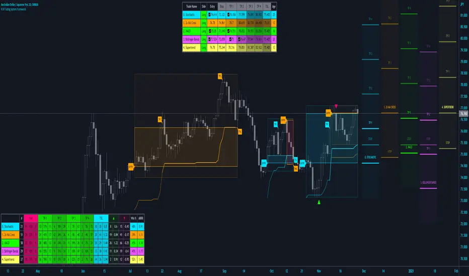
R:R Trading System FrameworkFirst off, huge thanks to @fikira! He was able to adapt what I built to work much more efficiently, allowing for more strategies to be used simultaneously. Simply put, I could not have gotten to this point without you. Thanks for what you do for the TV community. Second, I am fairly new to pinescript writing, so I welcome criticism, thoughtful input and improvement suggestions. I would love to grow this concept into something even better, if possible. So please let me know if you have any ideas for improvement. However I do juggle a lot of different things outside of TV, so implementations may be delayed.
I have decided, at this time, not to add alerts. First, because I feel most people looking to adapt this framework can add their own pretty easily. Also, given how customized the framework is currently, while also attempting to account for all the possible ways in which people may want alerts to function after they customize it, it seems best to leave them out as it doesn't exactly fit the idea of a framework.
For best viewing, I recommend hovering over the script's name > ... > Visual order > Bring to front. Also I found hollow candles with mono-toned colors (like pictured) are more visually appealing for me personally. I HIGHLY RECOMMEND USING WITH BAR REPLAY TO BETTER UNDERSTAND THE FRAMEWORK'S FUNCTIONALITY.
▶️ WHAT THIS FRAMEWORK IS
- A huge collection of concepts and capabilities for those trying to better understand, learn, or teach pinescript.
- A system designed to showcase Risk:Reward concepts more holistically by providing all of the most popular components of retail trading to include backtesting, trade visual plotting, position tracking, market condition shifts, and useful info while positioned to help highlight changes in your risk:reward based decision-making processes.
- A system that can showcase individual strategies regardless of trade direction, allowing you to develop hedging strategies without having multiple indicators that do not correlate with each other.
- Designed around the idea that you trade less numbers of assets but manage your positions and risk based on multiple concurrently running strategies to manage your risk exposure and reward potential.
- An attempt to combine all the things you need to execute with an active trading management style.
- A framework that uses backtested results (in this case the number of averaged bars it takes to hit key levels) in real-time to inform your risk:reward decision-making while in-trade (in this case in your Trade Tracking Table using dynamic color to show how you might be early, on-time, or late compared to the average amount of backtested time it normally takes to hit that specific key level).
▶️ WHAT THIS FRAMEWORK IS NOT
- A complete trading product. DO NOT USE as-is. It is a FRAMEWORK for you to generate ideas of your own and fairly easily implement your own triggering conditions in the appropriate sections of the script.
▶️ USE CASES
- If you decide you like the Stop, Target, Trailing Stop, and Risk:Reward components as-is, then just understanding how to plug in your Entry and Bullish / Bearish conditions (Triangles) and adjust the input texts to match your custom naming will be all you need to make it your own!
- If you want to adapt certain components, then this system gives you a great starting point to adapt your different concepts and ideas from.
▶️ SYSTEM COMPONENTS
- Each of the system's components are described via tooltips both in the input menu and in the tables' cells.
- Each label on the chart displays the corresponding price at those triggered conditions on hover with tooltips.
- The Trailing Stop only becomes active once it is above the Entry Price for that trade, and brightens to show it is active. The STOP line (right of price) moves once it takes over for the Entry Stop representing the level of the Trailing Stop at that time for that trade.
- The Lines / Labels to the right of price will brighten once price is above for Longs or below for Shorts. The Trade Tracking Table cells will add ☑️ once price is above for Longs or below for Shorts.
- The brighter boxes on the chart show the trades that occurred based on your criteria and are color coded for all components of each trade type to ensure your references are consistent. (Defaults are TV built-in strategies)
- The lighter boxes on the chart show the highest and lowest price levels reached during those trades, to highlight areas where improvements can be made or additional considerations can be accounted for by either adjusting Entry triggers or Bullish / Bearish triggers.
- Default Green and Red Triangles (Bullish / Bearish) default to having the same triggering condition as the Entry it corresponds to. This is to highlight either a pyramiding concept, early exit, or you can change to account for other things occurring during your trades which could help you with Stop and Target management/considerations.
TradingView and many of its community members have done a lot for me, so this is my attempt to give back.
Crypto Terminal [Kioseff Trading]Hello!
Introducing Crypto Terminal (:
The indicator makes use of cryptocurrency data provided by vendor INTOTHEBLOCK.
NOTE: The cryptocurrency on your chart must be paired with USD or USDT. Data won't load otherwise - possibly transient. For instance, BTCUSD or BTCUSDT, ETHUSD or ETHUSDT.
Provided datasets:
Twitter Sentiment Data
Telegram Sentiment Data
Whale Data (i.e. % of Asset Belonging to Whales)
$100,000+ Transactions
Bulls/Bears (Bulls Buying | Bears Selling)
Current Position PnL (Currently Open Positions for the Coin are Retrieved and Plotted. Data is Split into Currently Profitable Positions, Losing Positions, and B/E Positions)
Average Balance
Holders/Traders Percentage (Addresses are Retrieved and Classified as Holding Accounts or Trader Accounts)
Correlation
Futures OI
Perpetual OI
Zero Balance Addresses
Flow (Money Inflow & Outflow)
Active Addresses
Average Transaction Time
Realized PnL (Addresses with Realized Profits, Realized Losses, and B/E)
Cruisers
A few more data points are provided.
Additionally, you can plot the values of any dataset in a pane below price.
Below are images of plottable data; different cryptocurrencies will be shown for each example (:
Twitter sentiment data.
Assess this data lightly; difficult to confirm accuracy.
Telegram sentiment data.
Assess this data lightly; difficult to confirm accuracy.
Percentage of asset belonging to whales.
$100,000+ transactions (volume oriented)
Bulls buying; bears selling.
Current positions at profit; current positions at loss; current positions at breakeven.
Average balance.
Percentage of asset belonging to traders; percentage of asset belonging to holders.
Asset's 30-interval correlation to BTC.
Perpetual open interest.
Zero-balance addresses.
Flows.
Active addresses.
Average transaction time.
Addresses at realized profit; addresses at realized loss; addresses at breakeven.
Cruiser data.
Futures open interest.
Naturally, this data isn't provided for every cryptocurrency; NaN values are returned in some instances.
Table 1
I provided three data tables, which load independently, so you don't have to change plotted data to access values.
Table 2
Lastly, you can create a 10-asset crypto index and run calculations against it.
The image shows an example.
I'll update this script with additional calculations/data in the near future. If you've any suggestions - please let me know!
Enjoy (:

Currency Strength Meter [HeWhoMustNotBeNamed]⬜ Note: This is not the strength of currency pairs. But, in this script we are trying to derive strength of individual currencies by matching against single base currency.
⬜ Process
This is based on similar concept as that of Magic Numbers for stocks. Idea is simple.
▶ Calculate strength of each currency against USD. Derive the strength for both price movement and volume movement.
▶ Similarly calculate momentum of price and volume change.
▶ If USD is base currency, inverse momentum and strength index for the given symbol.
▶ Once these calculations are done, rank each currencies based on individual score on given things.
▶ Add up all the ranks to derive combined rank
▶ sort the currencies in the ascending order of overall rank.
⬜ USAGE
▶ Identify a base currency. In our case, we have used USD as base currency as it is easy to get pairs of all currencies with USD.
▶ Identify most used combos for all other currencies which are paired with USD. Fx pair can either have USD as base currency or quote currency. It is desirable to use the pair which is most traded. For example, USDJPY is more traded pair than JPYUSD - hence it is advisable to use USDJPY instead of JPYUSD. Similarly AUDUSD is more traded than USDAUD - hence choosing AUDUSD for the purpose of this exercise is better approach. Notice that USDJPY has USD as base currency whereas AUDUSD has USD as quote currency. These calculations are handled internally to derive the right outcome irrespective of position of USD in the pair.
▶ Identify the forex broker which has all the selected forex tickers. All comparison is done against a single broker. Hence, choosing broker which does not wide range of forex pairs will show NAN for many rows.
▶ Once we set these, we get tabular output containing strength and oscillator based trend indexes for both price and volume indicator. Currencies are ordered in descending order of strength. Hence, top of the list can be considered as currency having highest strength and bottom of the table can be considered as currency having lowest strength. Please note that the calculation is valid only for selected timeframe and users can set other parameters such as moving average type, oscillator type, length etc which can alter the outcome.
▶ Use multiple timeframes to find out stronger and weaker currencies. Use directional indicators to understand where they are heading. Combine all these info to come up with currency pair you would like to trade :)
⬜ Settings
▶ Main settings and Currencies
Base Currency : This is set to USD by default as rest of the tickers used are paired with USD. Whatever the base currency is selected, rest of the tickers should follow the same combination.
Timeframe : Timeframe for which rankings need to be calculated.
Currencies : These should be the currency pair which involve base currency defined in the setting on either side.
▶ Display
Table : Allows users to set table location and size of the table. By default this is set to middle center and default size is normal. If user want to use multiple timeframes side by side, they can do so by changing these display settings.
Stat Type : To show either comparative ranking or actual indicator values

vx_termsUSAGE
--------
This script helps train your intuition for changes in the VX term structure. I recommend using it on the VIX chart, so you can compare changes in the terms to changes in VIX. It's also nice for calendar spread traders who want to get a feel for the same changes.
1. Select a day, month, and year using the inputs
2. Observe the data table.
3. Open the input again and increment or decrement the day (and month, year as necessary).
4. Click "Ok".
5. Click to deselect the indicator, which allows the chart to load new data.
6. The data table will be reloaded with the next/previous day's data.
The data table has the following columns:
- contract: the VX contracts, in sequence. refer to the CBOE for month codes (F for January, etc.)
- close: the closing price of the contract.
- ma:mb: the spread (difference) between this row and the next row.
- ma:mb chg: the spread's change from prior close.
For example, given the following values for the first two columns:
VXQ2021, 16.5, -3.1, -0.2
VXU2021, 19.6, ..., ...
The front month (Q = august) closed at 16.5, $3.1 below the s\September contract. The negative spread enlarged by $0.20 from $2.90 on the previous trading day.
BUGS, ODDITIES, AND LIMITATIONS:
-------------------------------------------
- The first column will be greyed out after expiration day, which is the 3rd Tuesday of that month. Unfortunately, I can't load the next month's contract due to some limitations with TV.
- The active date is highlighted with a yellow background. When a non-trading date is selected, the highlight will disappear. However, the data table will sometimes fill with the nearest trading date, prematurely. No worries, just know that the data is probably for the previous Friday.
- The script is clunky and slow, but this is the best I can do with TV. Hopefully they add more continuous contracts or allow true dynamic symbol loading.
SPECIAL THANKS:
---------------------
Thanks to HeWhoMustNotBeNamed for helping me get through some messiness. Very helpful guy.
www.tradingview.com

BankNifty Multi-TimeFrames Price Panel [MaestroTrader]█ OVERVIEW
Price Panel provides Nifty /BankNifty Index comprehensive Price Insights on different time intervals. It helps to determine the trend of Index using top Index Heavy Weights along with Dow, India VIX & Index Spot Prices. It helps to determine the price behavior of the underlying Index/stock to make informed decisions while trading.
█ FEATURES
a) Displays Price in Multi Time Frames for Multi time frame analysis
b) Displays Weighted Securities price for Weighted INDEX price analysis.
c) Displays INDIA VIX and DOW for Combined INDIX VOLATALITY Analysis
█ MUTLI TIME FRAME ANALYSIS
How to use Multiple time frame analysis?
Multiple time frame analysis follows a top-down approach when trading and allows traders to gauge the longer-term trend while spotting ideal entries on a smaller time frame. Traders can then conduct technical analysis using multiple time frames to confirm or reject their trading bias.
Multiple time frame analysis, is the process of viewing the same symbols under different time frames. Usually, the larger time frame is used to establish a longer-term trend, while a shorter time frame is used to spot ideal entries into the market.
Let’s Say 75 & 15 TF’s Trend is up, then shorter time 5M is used to spot ideal entries on long side.
█ WEIGHTED INDEXS PRICE ANALYSIS
How to use Weighted Index Price Movement in Multi timeframes?
The index future trading price is based on the trading prices of the individual securities (stocks) that comprise the index basket. In other words, the stocks with higher weights will have more impact on the movement of the index. Price Panel provides the insights of these heavy weight stock price movement in different time frames, that can help you confirm or reject your trading bias.
HDFC Bank (28% Weight) will have more impact on the BankNifty Movement. By looking the top 4 bank's price movement in different timeframes, you can derive the BankNifty price trend.
█ VOLATALITY ANALYSIS
India VIX is a short form for India Volatility Index. It is the volatility index that measures the market’s expectation of volatility over the near term.
A lower VIX level usually implies that the market is confident about the movement and is expecting lower volatility and a stable range.
A higher VIX level usually signals high volatility and lower trader confidence about the current range of the market. A major directional move can be expected in the market and a quick broadening of range can be expected.
█ SETTINGS
• Time Frame Settings: Configure Time Frames 5 Min, 15 Min, 75 Min
• Table Settings: Configure Table Styles- Position- Font Color
• Symbol Settings: Configure Securities. Toggle (on/Off) Securities display.
• Index Settings: Display Bank Nifty or Nifty Heavy Weights.
█ PANEL DISPLAY VARIATIONS
BANK NIFTY VIEW
NIFTY VIEW
WITHOUT STOCKS - ONLY INDEX, VIX, DOW
█ THANKS
Thanks to Pine Team for this new great feature tables & Thanks to PineCoders for the `f_strRightOf` function.
█ DISCLIAMER
Indicator is built for educational purposes. Test it before use.
Hope - These features help you get quick insights of the price movement to take informed trades.
You are free to use the code, please share the credit for reuse.
Happy Trading !!

PineGIF - Display Gifs & Images In Tradingview [LuxAlgo]Pinescript is not designed to create or display images, let alone gifs, but it's very fun to try, and that's what this script does. This script allows the user to display three different gifs. In this post, we explain how we managed to display images/gif's using pinescript tables.
1. Image Pre-Processing
Due to pinescript limitations, we can't possibly display images with an excessively high resolution. As such we targeted pixel art as a primary image source. We used a pixel art gif of the magnificent Octocat (the mascot for the source-code hosting service GitHub) for our first try.
We first extract each frame from the gif and resize them to a 50x50 resolution which returns frames made of 2500 pixels. This process was done using python.
Getting Individual Pixels RGBA Values
Python can easily return a matrix containing each pixel's rgba value. For convenience, we converted the rgba values to hex.
We then create a simple code allowing us to return a pinescript array containing the 2500 pixel hex colors. We do this process for each frame.
2. Defining Table Cell Color
In the code, each frame is its own array. We create a new table with dimensions equal to len(frame1)^2 (we assume height = width).
The color of a cell is defined by the color of the image pixel at the same exact location. When a new bar is created, we do this exact process using a different frame which ultimately allows a new frame to be displayed.
3. Playing The GIFs
By default, the script will play the gif of the Tradingview cloud logo raining. In order to play the gif, simply use the replay mode. The replay speed allows the user to determine the frame rate (0.1 for the raining cloud and Nyan cat works best, 0.5 for Octocat).
We included the frames of the Octocat and Nyan cat gifs in the script.
4. Some Other Cool Images
Displaying static images is possible and involves the same process described above.
An original idea of the lizard, implemented by the wizard.

RSI Trend Authority [JOAT]RSI Trend Authority - VAR-RSI with OTT Trend Detection System
Introduction
RSI Trend Authority is an open-source overlay indicator that combines Variable Index Dynamic Average (VAR) smoothed RSI with the Optimized Trend Tracker (OTT) to create a complete trend detection and signal generation system. Unlike traditional RSI which oscillates in a separate pane, this indicator scales the RSI to price and overlays it directly on your chart, making trend analysis more intuitive.
The indicator generates clear BUY and SELL signals when the smoothed RSI crosses the OTT trailing stop line, providing actionable entry points with trend confirmation.
Originality and Purpose
This indicator is NOT a simple mashup of RSI and moving averages. It is an original implementation that transforms RSI into a trend-following overlay system:
Why VAR Smoothing? Traditional RSI is noisy and produces many false signals. The Variable Index Dynamic Average (VAR) is an adaptive smoothing algorithm based on the Chande Momentum Oscillator principle. It adjusts its smoothing factor based on market conditions - responding quickly during trends and smoothing out during choppy markets. This creates an RSI that filters noise while preserving genuine momentum shifts.
Why OTT Trailing Stop? The Optimized Trend Tracker (OTT) is a percentage-based trailing stop mechanism that only moves in the direction of the trend. When VAR-RSI crosses above OTT, a bullish trend is confirmed; when it crosses below, a bearish trend is confirmed. This provides clear, actionable signals rather than subjective interpretation.
Price Scaling Innovation: By scaling RSI (0-100) to price using the formula (RSI * close / 50), the indicator overlays directly on the price chart. This allows traders to see how momentum relates to actual price levels, making trend analysis more intuitive than a separate oscillator pane.
ATR Boundaries: Optional volatility-based boundaries show when price is extended relative to its normal range, helping identify potential reversal zones.
How the components work together:
VAR smoothing removes RSI noise while preserving trend information
OTT provides a dynamic trailing stop that generates clear crossover signals
Price scaling allows direct overlay on the chart for intuitive analysis
ATR boundaries add volatility context for profit target estimation
Core Components
1. VAR-RSI (Variable Index Dynamic Average RSI)
The foundation of this indicator is the VAR smoothing algorithm applied to RSI. VAR is an adaptive moving average that adjusts its smoothing factor based on the Chande Momentum Oscillator principle:
f_var_calc(float data, int length) =>
int a = 9
float b = data > nz(data ) ? data - nz(data ) : 0.0
float c = data < nz(data ) ? nz(data ) - data : 0.0
float d = math.sum(b, a)
float e = math.sum(c, a)
float f = nz((d - e) / (d + e))
float g = math.abs(f)
float h = 2.0 / (length + 1)
float x = ta.sma(data, length)
This creates an RSI that:
Responds quickly during trending conditions
Smooths out during choppy, sideways markets
Reduces false signals compared to raw RSI
2. OTT (Optimized Trend Tracker)
The OTT acts as a dynamic trailing stop that follows the VAR-RSI:
In uptrends, OTT trails below the VAR-RSI line
In downtrends, OTT trails above the VAR-RSI line
The OTT Percent parameter controls how closely it follows
When VAR-RSI crosses above OTT, a bullish trend is confirmed. When VAR-RSI crosses below OTT, a bearish trend is confirmed.
3. Price Scaling
The RSI (0-100 scale) is converted to price scale using:
float scaleFactor = close / 50.0
float varRSIScaled = varRSI * scaleFactor
This allows the indicator to overlay directly on price, showing how momentum relates to actual price levels.
Visual Components
VAR-RSI Line (Cyan/Magenta)
The main indicator line with gradient coloring:
Cyan gradient when RSI is above 50 (bullish)
Magenta gradient when RSI is below 50 (bearish)
Line thickness of 3 for clear visibility
OTT Line (Yellow Circles)
The trailing stop line displayed as circles:
Acts as dynamic support in uptrends
Acts as dynamic resistance in downtrends
Crossovers generate trading signals
Trend Fill
The area between VAR-RSI and OTT is filled:
Cyan fill during bullish trends
Magenta fill during bearish trends
Fill transparency allows price visibility
Buy position and LONG on Dashboard with a Uptrend:
ATR Boundaries (Optional)
Dotted lines showing volatility-based price boundaries:
Upper band: Close + (ATR x Multiplier)
Lower band: Close - (ATR x Multiplier)
Color matches current trend direction
Buy/Sell Signals
Clear labels appear at signal points:
BUY label below bar when VAR-RSI crosses above OTT
SELL label above bar when VAR-RSI crosses below OTT
Additional glow circles highlight signal bars
Bar Coloring
Optional feature that colors price bars:
Cyan bars during bullish trend
Magenta bars during bearish trend
Dashboard Panel
The 8-row dashboard provides comprehensive status information:
Signal: Current position - LONG or SHORT (large text)
VAR-RSI: Current smoothed RSI value (large text)
RSI State: OVERBOUGHT, OVERSOLD, BULLISH, or BEARISH
OTT Trend: UPTREND or DOWNTREND based on OTT direction
Bars Since: Number of bars since last signal
Price: Current close price (large text)
OTT Level: Current OTT trailing stop value
Input Parameters
RSI Settings:
RSI Length: Period for RSI calculation (default: 100)
Source: Price source (default: close)
VAR Settings:
VAR Length: Adaptive smoothing period (default: 50)
OTT Settings:
OTT Period: Trailing stop calculation period (default: 30)
OTT Percent: Distance percentage for trailing stop (default: 0.2)
ATR Trend Boundaries:
Show ATR Boundaries: Toggle visibility (default: enabled)
ATR Length: Period for ATR calculation (default: 14)
ATR Multiplier: Distance multiplier (default: 2.0)
Display Options:
Show Buy/Sell Signals: Toggle signal labels (default: enabled)
Show Status Table: Toggle dashboard (default: enabled)
Table Position: Choose corner placement
Color Bars by Trend: Toggle bar coloring (default: enabled)
Color Scheme:
Bullish Color: Main bullish color (default: cyan)
Bearish Color: Main bearish color (default: magenta)
OTT Line: Trailing stop color (default: yellow)
VAR-RSI Line: Main line color (default: teal)
ATR colors for boundaries
How to Use RSI Trend Authority
Signal-Based Trading:
Enter LONG when BUY signal appears (VAR-RSI crosses above OTT)
Enter SHORT when SELL signal appears (VAR-RSI crosses below OTT)
Use the OTT line as a trailing stop reference
Trend Confirmation:
Cyan fill indicates bullish trend - favor long positions
Magenta fill indicates bearish trend - favor short positions
Check RSI State in dashboard for momentum context
Using the Dashboard:
Monitor "Bars Since" to assess signal freshness
Check RSI State for overbought/oversold warnings
Use OTT Level as a reference for stop placement
ATR Boundaries:
Price near upper ATR band in uptrend suggests extension
Price near lower ATR band in downtrend suggests extension
Boundaries help identify potential reversal zones
Parameter Optimization
For Faster Signals:
Decrease RSI Length (try 50-80)
Decrease VAR Length (try 30-40)
Decrease OTT Period (try 15-25)
For Smoother Signals:
Increase RSI Length (try 120-150)
Increase VAR Length (try 60-80)
Increase OTT Period (try 40-50)
For Tighter Stops:
Decrease OTT Percent (try 0.1-0.15)
For Wider Stops:
Increase OTT Percent (try 0.3-0.5)
Alert Conditions
Three alert conditions are available:
Buy Signal: VAR-RSI crosses above OTT
Sell Signal: VAR-RSI crosses below OTT
Trend Change: OTT direction changes
Understanding the OTT Calculation
The OTT uses a percentage-based trailing mechanism:
float farkOTT = mavgOTT * ottPercent * 0.01
float longStopCalc = mavgOTT - farkOTT
float shortStopCalc = mavgOTT + farkOTT
longStop := mavgOTT > nz(longStop ) ? math.max(longStopCalc, nz(longStop )) : longStopCalc
shortStop := mavgOTT < nz(shortStop ) ? math.min(shortStopCalc, nz(shortStop )) : shortStopCalc
This ensures the trailing stop only moves in the direction of the trend, never against it.
Best Practices
Use on 1H timeframe or higher for more reliable signals
Wait for signal confirmation before entering trades
Consider RSI State when evaluating signal quality
Use ATR boundaries for profit target estimation
The longer RSI length (100) provides smoother trend detection
Combine with support/resistance analysis for better entries
Limitations
Signals may lag during rapid price movements due to smoothing
Works best in trending markets; may whipsaw in ranges
The overlay nature means RSI values are scaled, not absolute
Default parameters are optimized for crypto and forex; adjust for other markets
Technical Notes
This indicator is written in Pine Script v6 and uses:
VAR (Variable Index Dynamic Average) for adaptive smoothing
OTT (Optimized Trend Tracker) for trailing stop calculation
ATR for volatility-based boundaries
Gradient coloring for intuitive trend visualization
The source code is open and available for review and modification.
Disclaimer
This indicator is provided for educational and informational purposes only. It is not financial advice. Trading involves substantial risk of loss. Past performance does not guarantee future results. Always conduct your own analysis and use proper risk management.
-Made with passion by officialjackofalltrades

Momentum Trader ToolboxMomentum Traders Toolbox Pro combines three daily-anchored tools into one overlay so momentum traders can see trend, extension, and volatility context without stacking multiple indicators.
What it includes:
Daily EMAs: plots the 8/21/50 EMAs calculated on the daily timeframe on any chart. A fill between the 8 and 21 EMA helps visualize short-term momentum.
ADR/ATR table: optional rows show daily ATR, ADR%, distance from the daily low, distance from the selected daily EMA (default 8), and an extension reading: EMA extension (x) = (EMA distance %) ÷ (ADR%). The extension value is color-coded by thresholds you can customize.
VIX regime: pulls daily VIX and calculates a z-score over your lookback, then labels the environment as risk-on, risk-off, or neutral. The VIX values are daily-based by design, so on non-daily charts the table shows a reminder to use the daily timeframe for the VIX score.
Notes:
Daily values can update intraday until the daily candle closes.
The EMA plots include an optional Offset; keep it at 0 if you don’t want shifted lines.

Trade with TreandThink of this script as a filter and a signal light for trading Gold. It helps you avoid trading in the wrong direction and tells you exactly when the price momentum is shifting.
The Three Main Parts
The Ultimate Trend (The Filter):
This is the big table in the top-right corner.
Bullish (Green): Only look for BUY signals.
Bearish (Red): Only look for SELL signals.
It uses a "300 SMA" (a long-term average) to make sure you aren't "swimming against the tide."
The Entry Signals (The Crossover):
The script watches two lines on your chart (a 20-period and a 10-period).
When they cross, it places a BUY or SELL label on your screen.
The 4 Alerts (The Notifications):
You don't have to stare at the screen all day.
You get a notification for Buy entries, Sell entries, or when the Main Trend flips from Bullish to Bearish (or vice versa).
Simple Rules for Trading
To be successful with this script, follow these four rules:
Rule 1: Check the Table. If it says "Bearish," ignore all "BUY" labels.
Rule 2: Wait for the Label. Only enter a trade when a "BUY" or "SELL" label appears and it matches the trend table.
Rule 3: Protect Your Money. Look at the last 5 candles. Put your Stop Loss just past the highest or lowest point of those candles.
Rule 4: Aim for the Target. Your profit target should be at least double the amount of money you are risking (Risk:Reward 1:2).
How to use the Settings
When you click the Settings icon on the script, you can change:
SMA Filter: Change the "300" if you want the trend to be faster or slower.
Trend Gap: Adjust how far the trailing line stays away from the price.

ADR Dashboard with Move, Left and AlertsIndicator Name: ADR Dashboard with Move, Left and Alerts
Overview
The ADR Dashboard is a powerful real-time trading tool that tracks how much a stock, crypto, or other asset has moved today relative to its Average Daily Range (ADR). It provides a clear visual representation of:
1. Today’s price movement (Move)
2. Remaining potential movement left to reach ADR (Left)
3. Percentage of ADR covered (% Covered)
4.Additionally, it provides automated alerts for key movement thresholds.
A) What it Does
1.Calculates the Average Daily Range (ADR):
2. Uses True Range over a user-defined lookback period (default 14 days).
3. ADR measures typical daily volatility.
B) Tracks Today’s Move:
1. Move = Current Price – Today’s Open (Realtime)
2. Positive → bullish move, Negative → bearish move
C) Tracks Remaining Potential (Left):
1. Left = ADR – |Move| (Realtime)
2. Shows how much of the ADR is still available for today’s move
3. Percentage Covered:
4. % Covered = |Move| / ADR × 100
D) Color-coded for visual clarity:
1. Green (<50%) → small move, plenty of range left
2. Yellow (50–80%) → moderate move, watch for acceleration
3. Orange (80–100%) → strong move, ADR almost reached
4. Red (>100%) → ADR exceeded, momentum may be exhausted
E) Dashboard Table:
1. Columns: ADR | Move | Left | % Covered
2. Position: middle-right of the chart
F) Left column color-coded:
1. Green → some ADR left
2. Red → ADR fully reached or exceeded
3. Move column: usually yellow for visibility, but could be enhanced for positive/negative moves
G) Alerts
The indicator provides directional alerts:
Bullish Alerts (upward moves):
1. 90% ADR warning: fires when Move ≥ 90% of ADR → early warning of strong bullish momentum
2. 100% ADR breach: fires when Move ≥ ADR → full daily range reached
Bearish Alerts (downward moves):
1. 90% ADR warning: fires when Move ≤ -90% of ADR → early warning of strong bearish momentum
2. 100% ADR breach: fires when Move ≤ -ADR → full daily range reached
All alerts are unique and fire once per session per threshold.
H) How Traders Can Use This Indicator
Momentum Trading:
1. Identify strong intraday moves approaching ADR.
2. Enter positions early at 90% ADR warning or take profits near 100% ADR.
Scalping & Intraday Trading:
1. Gauge how much of today’s range is left for quick entries/exits.
2. Avoid trades when ADR is almost fully consumed → reduces risk of reversals.
Swing Trading:
1. Combine with trend indicators to see if today’s move is significant relative to historical volatility.
I) Risk Management:
1. Set profit targets or stop-loss levels based on Move and Left values.
Visual Efficiency:
At-a-glance view of Move, Left, % Covered, and alert status without manual calculations.
Key Features
1. Real-time Move and Left updates
2. Color-coded % Covered and Left for quick visualization
3. Alerts for 90% and 100% ADR levels, bullish and bearish
4. Clean dashboard table at middle-right of the chart
5. Works across stocks, crypto, forex, and other markets
J) Why This Indicator is Powerful
1. Combines volatility (ADR) with real-time price tracking
2. Provides visual clarity and actionable alerts
3. Helps traders stay ahead of intraday moves, manage risk, and time entries/exits effectively

Next Candle PredictorAdvanced TradingView Indicator for Precise Buy and Sell Signals
Overview:
The Predicta Futures - Next Candle Predictor is a cutting-edge TradingView indicator designed to forecast the next candle's direction in futures and cryptocurrency markets. Leveraging a multi-indicator confluence strategy, this tool provides traders with actionable long and short prediction percentages, enhanced by dynamic ADX-based thresholds and visual projection candles. Ideal for scalping, day trading, or swing trading on platforms like MEXC or Binance futures, it combines Supertrend, MACD, RSI, Stochastic, ADX, and volume analysis to deliver high-probability buy and sell signals while minimizing false positives.
Key Features:
• Multi-Indicator Confluence Scoring:
Integrates Supertrend for trend direction, EMAs (8, 21, 50) for alignment, MACD for momentum crossovers, RSI for overbought/oversold conditions, Stochastic for divergence detection, ADX for trend strength, and volume ratios for confirmation. A customizable confluence score (0-6) ensures signals meet user-defined criteria, reducing whipsaws in volatile markets.
• Dynamic Prediction Thresholds:
ADX-driven adjustments lower the required prediction percentage (e.g., 60% in strong trends) for "PERFECT TIME" entries, adapting to market conditions like ranging or trending phases.
• Visual Analysis Table:
A sleek, color-coded dashboard displays progress bars for each indicator, prediction percentages, and status (e.g., "PERFECT TIME" or "WAIT"). Supports long and short analyses with intuitive ASCII bars for quick scans.
• Projection Candles:
Simulates potential next-candle outcomes with volatility-scaled (via Bollinger Bands width) green long and red short candles, aiding in visualizing price targets.
• Buy/Sell Signals and Alerts:
Generates labeled "BUY" and "SELL" arrows on EMA crossovers within confirmed trends, with separate alerts for basic signals and high-confluence "PERFECT TIME" opportunities.
• Customizable Inputs:
Adjust ATR periods, Supertrend factors, minimum confluence scores, and volume ratios to tailor the indicator for stocks, forex, or crypto perpetual futures.
How It Works:
This TradingView script calculates long and short scores using weighted contributions from key indicators, normalizing them into prediction percentages. A confluence check—factoring trend, EMA alignment, MACD, Stochastic, volume, and ADX—triggers "PERFECT TIME" only when conditions align robustly. For example:
• In a downtrend (Supertrend red), with bearish MACD and Stochastic, and sufficient volume, the indicator highlights short opportunities.
• Dynamic thresholds ensure aggressive entries in strong trends (ADX >25) and conservative ones in weak trends.
• Backtested for reliability, it excels in identifying reversals and continuations, making it a must-have for traders seeking an edge in futures trading strategies.
Usage Instructions:
1. Add the indicator to your TradingView chart. (Search: Next Candle Predictor)
2. Customize settings via the inputs panel (e.g., set minConfluence to 5 for stricter signals).
3. Monitor the analysis table for predictions and confluence scores.
4. Act on "BUY/SELL" labels or "PERFECT TIME" alerts, combining with your risk management.
5. Enable projection candles for visual forecasting of the next bar.
Compatible with all timeframes, from 1-minute scalping to daily swings. Note: This is not financial advice; always verify signals with additional analysis.
Join thousands of traders enhancing their strategies—add it to your charts today and elevate your trading performance!
Please rate and review if it boosts your trades!
Thank you!
