GM-8 and ADX Strategy with Second EMADescription:
This TradingView script implements a trading strategy based on the Moving Average (GM-8), the Average Directional Index (ADX), and the second Exponential Moving Average (EMA). The strategy utilizes these indicators to identify potential buy and sell signals on the chart.
Indicators:
GM-8 (Moving Average 8): This indicator calculates the average price of the last 8 periods and is used to identify trends.
ADX (Average Directional Index): The ADX measures the strength of a trend and is used to determine whether the market is moving in a particular direction or not.
Second EMA (Exponential Moving Average): This is an additional EMA line with a period of 59, which is used to provide additional confirmation signals for the trend.
Trading Conditions:
Buy Condition: A buy signal is generated when the closing price is above the GM-8 and the second EMA, and the ADX value is above the specified threshold.
Sell Condition: A sell signal is generated when the closing price is below the GM-8 and the second EMA, and the ADX value is above the specified threshold.
Trading Logic:
If a buy condition is met, a long position is opened with a user-defined lot size.
If a sell condition is met, a short position is opened with the same user-defined lot size.
Positions are closed when the opposite conditions are met.
User Parameters:
Users can adjust the periods for the GM-8, the second EMA, and the ADX, as well as the threshold for the ADX and the lot size according to their preferences.
Note:
This script has been developed for use on a $100,000 account with FTMO, therefore the account size is set to $100,000. Please ensure that the strategy parameters and settings meet the requirements of your trading strategy and carefully review the results before committing real capital.
--------------------------------------------------------------------------------------------------------------
Beschreibung:
Dieses TradingView-Skript implementiert eine Handelsstrategie, die auf dem gleitenden Mittelwert (GM-8), dem Average Directional Index (ADX) und der zweiten exponentiellen gleitenden Durchschnittslinie (EMA) basiert. Die Strategie verwendet diese Indikatoren, um potenzielle Kauf- und Verkaufssignale auf dem Chart zu identifizieren.
Indikatoren:
GM-8 (Gleitender Mittelwert 8): Dieser Indikator berechnet den Durchschnittspreis der letzten 8 Perioden und wird verwendet, um Trends zu identifizieren.
ADX (Average Directional Index): Der ADX misst die Stärke eines Trends und wird verwendet, um festzustellen, ob sich der Markt in eine bestimmte Richtung bewegt oder nicht.
Zweite EMA (Exponential Moving Average): Dies ist eine zusätzliche EMA-Linie mit einer Periode von 59, die verwendet wird, um zusätzliche Bestätigungssignale für den Trend zu liefern.
Handelsbedingungen:
Kaufbedingung: Es wird ein Kaufsignal generiert, wenn der Schlusskurs über dem GM-8 und der zweiten EMA liegt und der ADX-Wert über dem angegebenen Schwellenwert liegt.
Verkaufsbedingung: Es wird ein Verkaufssignal generiert, wenn der Schlusskurs unter dem GM-8 und der zweiten EMA liegt und der ADX-Wert über dem angegebenen Schwellenwert liegt.
Handelslogik:
Wenn eine Kaufbedingung erfüllt ist, wird eine Long-Position mit einer benutzerdefinierten Losgröße eröffnet.
Wenn eine Verkaufsbedingung erfüllt ist, wird eine Short-Position mit derselben benutzerdefinierten Losgröße eröffnet.
Positionen werden geschlossen, wenn die Gegenbedingungen erfüllt sind.
Benutzerparameter:
Benutzer können die Perioden für den GM-8, die zweite EMA und den ADX sowie den Schwellenwert für den ADX und die Losgröße nach ihren eigenen Präferenzen anpassen.
Hinweis:
Dieses Skript wurde für die Verwendung auf einem $100.000-Konto bei FTMO entwickelt, daher ist die Kontogröße auf $100.000 festgelegt. Bitte stellen Sie sicher, dass die Strategieparameter und -einstellungen den Anforderungen Ihrer Handelsstrategie entsprechen und dass Sie die Ergebnisse sorgfältig überprüfen, bevor Sie echtes Kapital einsetzen.
Cari dalam skrip untuk "adx"

Advanced ADX[Intellection]█ OVERVIEW
"ADX" is a popular technical analysis indicator used to determine trend strength.
Advanced ADX is divided in two main sectors:
Default ADX
Higher time frame ADX analysis and trend phase
█ DESCRIPTION
You have two ADX's, One has the same time frame as your chart and the other one can be set by yourself in settings, Named Vision time frame.
Default value of "Vision ADX" is on 240minutes means 4hour, We recommend for time frames less than 1h using 4h "Vision time frame".
"Vision main plot" is also based on higher time frame analysis. The higher time frame analysis uses a combination of Three exponential moving averages (67, 89 and 111 periods) and the ADX to determine the position for long or short trades. The "Vision main plot" is shaded and changes color:
Green means bull phase
Red means bear phase
Gray means not defined or neutral
█ TRADING GUIDES
You can filter your signals based on "Vision ADX" value and color
Some trading tips:
When in green zone we don't recommend going short or just lower your risk for short positions. Simply for when ever your position is opposite of the color.
When ADX stays for a long period under 30 then it crosses 30 you might consider a volatility is about to come!
Good volatilities come when there is huge distance between default "ADX" and "Vision ADX"
█ Recap
"Advanced ADX" indicates three analysis:
1-Indicates default "ADX" based on your time frame.
2-Indicates higher time frame "ADX" based on the time frame you choose in settings.
3-Indicates higher time frame trend phase.
Don't forget to take time and learn it before trading it.

Adaptive Regime Master: The Dual-Engine FrameworkAdaptive Regime Master: The Dual-Engine Framework
Overview
The Adaptive Regime Master: The Dual-Engine Framework is a sophisticated technical analysis tool designed to solve the "Indicator Paradox"—the reality that trend-following tools fail in sideways markets, and mean-reversion tools fail in strong trends.
Instead of forcing a single mathematical model onto an ever-changing market, this framework utilizes a Master Switch logic. It continuously analyzes market volatility and directional strength to dynamically toggle between two specialized trading engines. By identifying the current "Market Regime," the indicator automatically reconfigures its visual interface and signal logic to match the environment.
The Dual-Engine Architecture
The framework operates on a logic-gate system powered by the Average Directional Index (ADX) :
1. The Momentum Engine (Trendy Regime):
Activation: Triggered when ADX rises above the 25 threshold, signaling a confirmed trend.
Logic: Utilizes a combination of Exponential Moving Averages (EMA) for trend-following and MACD Histogram for momentum confirmation.
Visuals: The chart de-clutters to show only the EMA trend-line and momentum-based signals.
2. The Mean-Reversion Engine (Choppy Regime):
Activation: Triggered when ADX falls below 25, signaling a range-bound or consolidating market.
Logic: Switches to Bollinger Bands and the Relative Strength Index (RSI) to identify overextended price action at the range extremes.
Visuals: The EMA disappears, and the chart displays Bollinger Bands to help users visualize the "value area" and potential reversal zones.
Key Features
Alternating Signal Logic: Built-in state management ensures that signals always alternate (Buy → Sell → Buy). This prevents "signal clustering" and provides a clean, actionable roadmap for the user.
Dynamic ATR-Based Protection: The indicator calculates Stop Loss (SL) and Take Profit (TP) levels using the Average True Range (ATR) . Crucially, the multipliers adjust based on the regime: wider stops for volatile trends and tighter stops for quiet ranges.
Intrabar Execution Guard: To prevent "false exits," the framework includes a calculation safeguard that prevents SL/TP triggers on the same candle as the entry, ensuring the trade has room to breathe.
Real-Time Regime Dashboard: An on-chart table provides an immediate summary of the current ADX value, the active engine mode, and the current position status.
Visual Regime Indicator: Background color changes dynamically—Blue for Trend Mode, Orange for Range Mode.
Comprehensive Alert System: Built-in alerts for Long Entry, Short Entry, TP Hit, and SL Hit events.
How to Use
Identify the Background: A Blue background indicates the Momentum Engine is active; an Orange background indicates the Mean-Reversion Engine is active.
Execution: Follow the BUY and SELL labels. The framework handles the logic of whether it is a "breakout" or a "reversal" based on the active engine.
Risk Management: Once a signal appears, Red (SL) and Lime (TP) crosses will appear on the chart. These are your mathematical boundaries for the trade.
The Exit: The position is considered closed when price hits the SL/TP markers (indicated by orange/yellow crosses) or when an opposing signal is generated.
Monitor the Dashboard: Use the top-right table to track the current regime, ADX value, active mode, and position status in real-time.
Input Parameters
ADX Length: Period for ADX calculation (default: 14)
ADX Smoothing: Smoothing period for ADX (default: 14)
ADX Trend Threshold: Threshold to distinguish trend from range (default: 25)
EMA Length: Period for the Exponential Moving Average (default: 20)
BB Length: Period for Bollinger Bands (default: 20)
BB Multiplier: Standard deviation multiplier for Bollinger Bands (default: 2.0)
RSI Length: Period for RSI calculation (default: 14)
ATR Length: Period for Average True Range (default: 14)
ATR Mult (Trend): ATR multiplier for stop loss in trend mode (default: 1.5)
ATR Mult (Range): ATR multiplier for stop loss in range mode (default: 0.8)
Min SL % (of price): Minimum stop loss as percentage of price (default: 0.5%)
Pros and Cons
Pros:
Versatility: Performs in all market conditions, reducing the need for multiple separate indicators.
Reduced Fakeouts: Filters out "trend signals" during flat markets and "reversal signals" during parabolic moves.
Visual Clarity: Only shows the indicators relevant to the current market state, reducing cognitive load and chart clutter.
Automated Risk-Reward: Automatically plots 1:2 Risk-Reward levels based on current volatility.
Professional-Grade Logic: Implements state management to prevent signal conflicts and ensure clean alternating entries.
Multi-Timeframe Compatibility: Works on any timeframe, though optimized for intraday and swing trading.
Cons:
Lagging Nature: Like all ADX-based systems, there is a slight lag when the market transitions from a range to a trend.
Threshold Sensitivity: The default ADX threshold of 25 may need tuning for extremely low-volatility assets or different timeframes.
Not a "Holy Grail": While it filters many bad trades, sudden fundamental news or black swan events can still bypass technical logic.
Requires Discipline: Users must follow the signals and respect the SL/TP levels for the framework to be effective.
Learning Curve: New users may need time to understand the regime-switching concept and trust the automated logic.
Why Use This Framework?
Most traders lose money because they apply the wrong tool to the wrong market. They use RSI to "sell the top" of a breakout, or use Moving Averages to "buy the dip" in a sideways grind. The Adaptive Regime Master removes the emotional guesswork by mathematically defining the market state and forcing the strategy to adapt.
This is a professional-grade framework for traders who value:
Logic over emotion
Discipline over impulse
Chart cleanliness over indicator overload
Adaptive systems over static strategies
Whether you're a scalper, day trader, or swing trader, this framework provides a systematic approach to reading market conditions and executing high-probability setups with predefined risk management.
Best Practices
Never forget to adjust Stop Loss and Take Profit level related to the interval you (will) use. (Default parameters are optimized for 60m)
Always backtest the indicator on your specific asset and timeframe before live trading
Adjust the ADX threshold based on the volatility characteristics of your market
Use the framework in conjunction with proper position sizing and account risk management
Pay attention to the regime dashboard—avoid forcing trades when the market is transitioning between regimes
Set up alerts for all signal types to avoid missing opportunities
Consider fundamental analysis and news events alongside technical signals
Detailed Disclaimer
FINANCIAL RISK WARNING:
Trading foreign exchange, stocks, indices, cryptocurrencies, and commodities on margin carries a high level of risk and may not be suitable for all investors. The high degree of leverage can work against you as well as for you. Before deciding to invest in any financial instrument, you should carefully consider your investment objectives, level of experience, and risk appetite. The possibility exists that you could sustain a loss of some or all of your initial investment; therefore, you should not invest money that you cannot afford to lose.
NO INVESTMENT ADVICE:
The "Adaptive Regime Master: The Dual-Engine Framework" is an educational tool designed to assist in technical analysis. It does not constitute investment advice, financial advice, trading advice, or a recommendation to buy or sell any security or financial instrument. All content provided by this indicator is for informational and educational purposes only.
PAST PERFORMANCE:
Past performance is not indicative of future results. Hypothetical or simulated performance results have certain limitations. Unlike an actual performance record, simulated results do not represent actual trading and may not be impacted by brokerage and other slippage fees. Simulated trading programs in general are also subject to the fact that they are designed with the benefit of hindsight.
NO GUARANTEE:
No representation is being made that any account will or is likely to achieve profits or losses similar to those shown in any backtests or forward tests. The author and developers of this indicator make no warranties, expressed or implied, regarding the accuracy, completeness, or reliability of the information provided.
USER RESPONSIBILITY:
Users should perform their own due diligence and test the logic on a demo or paper trading account before applying it to live capital. You are solely responsible for your own investment and trading decisions. The author and developers assume no responsibility for any financial losses, damages, or adverse consequences incurred through the use of this tool.
ACCEPTANCE OF TERMS:
Use of this indicator constitutes acceptance of these terms and acknowledgment that you understand the risks involved in trading financial instruments.
REGULATORY NOTICE:
This indicator is not affiliated with, endorsed by, or approved by any financial regulatory authority. Always consult with a licensed financial advisor before making investment decisions.

EMA-RSI-ADX Trend Bands
📌 EMA-RSI-ADX Trend Bands (ERA Trend Bands)
🔥 Overview
The ERA Trend Bands indicator combines Exponential Moving Average (EMA), Relative Strength Index (RSI), and Average Directional Index (ADX) into a powerful multi-factor trend system.
It helps traders:
Identify trend direction (Bullish / Bearish)
Measure trend strength using EMA deviation bands
Confirm momentum with RSI & ADX filters
Visualize conditions with dynamic colors, labels, tables, and signals
⚡ Key Features
📍 EMA Trend Bands
EMA100 with gradient glow effect showing trend bias
Strength bands around EMA (Very Weak → Hyper levels)
Bands color-coded for bullish/bearish extremes
📊 RSI + ADX Confluence
Bullish Signal: RSI ≥ threshold & ADX ≥ threshold → 🟢
Bearish Signal: RSI ≤ threshold & ADX ≤ threshold → 🔴
Candles recolored when conditions are met
Auto-generated labels show live RSI/ADX values
🧩 Strength Levels
Classifies deviation from EMA into 8 levels:
Neutral → Very Weak → Weak → Moderate → Strong → Very Strong → Extreme → Hyper
Dashboard table shows deviation % ranges & strength colors
Dynamic labels display Trend, Strength, Deviation %, RSI & ADX
🎨 Visual Enhancements
Gradient EMA line with glow effect
Bullish (greens) & bearish (reds) vibrant palettes
Background coloring (optional) based on strength
Symbols & labels for entry confirmation
🎯 How to Use
Trend Direction – EMA color + deviation bands show whether market is bullish or bearish.
Strength Confirmation – Use strength labels & dashboard table to gauge overextension.
Entry Signals – Watch for RSI/ADX confluence (green/red labels on chart).
Exits – Monitor when strength fades back toward Neutral/Weak levels.
⚙️ Settings & Inputs
EMA Settings → Length, Line Width, Gradient Intensity
RSI Settings → Length & Thresholds (Bullish / Bearish)
ADX Settings → Length & Thresholds (Bullish / Bearish)
Bands → Enable/disable EMA deviation bands
Labels/Table → Toggle strength info display
Colors → Fully customizable vibrant palettes
🚨 Alerts & Signals
Bullish Condition → RSI & ADX above thresholds
Bearish Condition → RSI & ADX below thresholds
Visual confirmation with labels, candles, and background
⚠️ Disclaimer
This script is for educational purposes only.
It does not constitute financial advice.
Always backtest and use proper risk management before trading live.
✨ Add EMA-RSI-ADX Trend Bands (ERA Trend Bands) to your chart to trade with clarity, strength, and precision.

Aroon ADX/DIUnified trend-strength (ADX/DI) + trend-age (Aroon) with centered scaling, gated signals, regime tints, and a compact readout.
What is different about this script:
- Purpose-built mashup of ADX/DI tells trend strength and side, while Aroon Oscillator tracks trend emergence/aging. Combining them into a scaled chart creates a way to separate “strong-but-late” trends from “newly-emerging” ones.
- Unified scale: Centering the maps into a common +/- 100 range so all lines are directly comparable at a glance (no units mismatch or fumbling with scales).
- Signal quality gating: DI cross signals can be gated by minimum ADX so crosses in chop are filtered out.
- Regime context: Background tints show low-strength chop, developing, and strong regimes using your ADX thresholds.
- Operator-focused UI: Clean fills, color-blind palette, and a two-column table summarizing DI+, DI−, ADX, Aroon, and a plain-English Bias/Trend status.
How it works:
- DI+/DI−/ADX: Wilder’s DI is smoothed; DX → ADX via SMA smoothing.
- Aroon Oscillator: highlights new highs/lows frequency to infer trend
- Centering: Maps DI/ADX from 5-95 and ±100, with your Midpoint controlling where “0” sits in raw mode.
- Signals:
- Bullish/Bearish DI crosses, optionally allowed only when ADX ≥ Min.
- ADX crosses of your Low/High thresholds.
- Aroon crosses of 0, +80, −80 (fresh trend thresholds).
- Display aids: Optional fill between DI+/DI−; thin guides for thresholds; single-pane table summary.
How to use:
- For this to be useful, centering should stay on, modify ADX Low/High and monitor DI crosses with ADX.
- Interpretations:
Bias: DI+ above DI− = bull; below = bear.
Strength level: ADX < Low = chop, Low–High = developing, > High = strong.
Freshness: Aroon > +80 or crossing up 0 suggests new or continued bull push; < −80 or crossing down 0 suggests new or continued bear push.
- Alerts: Use built-ins for DI crosses, ADX regime changes, and Aroon thresholds.

Pullback Pro Dow Strategy v7 (ADX Filter)
### **Strategy Description (For TradingView)**
#### **Title:** Pullback Pro: Dow Theory & ADX Strategy
---
#### **1. Summary**
This strategy is designed to identify and trade pullbacks within an established trend, based on the core principles of Dow Theory. It uses market structure (pivot highs and lows) to determine the trend direction and an Exponential Moving Average (EMA) to pinpoint pullback entry opportunities.
To enhance trade quality and avoid ranging markets, an ADX (Average Directional Index) filter is integrated to ensure that entries are only taken when the trend has sufficient momentum.
---
#### **2. Core Logic: How It Works**
The strategy's logic is broken down into three main steps:
**Step 1: Trend Determination (Dow Theory)**
* The primary trend is identified by analyzing recent pivot points.
* An **Uptrend** is confirmed when the script detects a pattern of higher highs and higher lows (HH/HL).
* A **Downtrend** is confirmed by a pattern of lower highs and lower lows (LH/LL).
* If neither pattern is present, the strategy considers the market to be in a range and will not seek trades.
**Step 2: Entry Signal (Pullback to EMA)**
* Once a clear trend is established, the strategy waits for a price correction.
* **Long Entry:** In a confirmed uptrend, a long position is initiated when the price pulls back and crosses *under* the specified EMA.
* **Short Entry:** In a confirmed downtrend, a short position is initiated when the price rallies and crosses *over* the EMA.
**Step 3: Confirmation & Risk Management**
* **ADX Filter:** To ensure the trend is strong enough to trade, an entry signal is only validated if the ADX value is above a user-defined threshold (e.g., 25). This helps filter out weak signals during choppy or consolidating markets.
* **Stop Loss:** The initial Stop Loss is automatically and logically placed at the last market structure point:
* For long trades, it's placed at the `lastPivotLow`.
* For short trades, it's placed at the `lastPivotHigh`.
* **Take Profit:** Two Take Profit levels are calculated based on user-defined Risk-to-Reward (R:R) ratios. The strategy allows for partial profit-taking at the first target (TP1), moving the remainder of the position to the second target (TP2).
---
#### **3. Input Settings Explained**
**① Dow Theory Settings**
* **Pivot Lookback Period:** Determines the sensitivity for detecting pivot highs and lows. A smaller number makes it more sensitive to recent price swings; a larger number focuses on more significant, longer-term pivots.
**② Entry Logic (Pullback)**
* **Pullback EMA Length:** Sets the period for the Exponential Moving Average used to identify pullback entries.
**③ Risk & Exit Management**
* **Take Profit 1 R:R:** Sets the Risk-to-Reward ratio for the first take-profit target.
* **Take Profit 1 (%):** The percentage of the position to be closed when TP1 is hit.
* **Take Profit 2 R:R:** Sets the Risk-to-Reward ratio for the final take-profit target.
**④ Filters**
* **Use ADX Trend Filter:** A master switch to enable or disable the ADX filter.
* **ADX Length:** The lookback period for the ADX calculation.
* **ADX Threshold:** The minimum ADX value required to confirm a trade signal. Trades will only be placed if the ADX is above this level.
---
#### **4. Best Practices & Recommendations**
* This is a trend-following system. It is designed to perform best in markets that exhibit clear, sustained trending behavior.
* It may underperform in choppy, sideways, or strongly ranging markets. The ADX filter is designed to help mitigate this, but no filter is perfect.
* **Crucially, you must backtest this strategy thoroughly** on your preferred financial instrument and timeframe before considering any live application.
* Experiment with the `Pivot Lookback Period`, `Pullback EMA Length`, and `ADX Threshold` to optimize performance for a specific market's characteristics.
---
#### **DISCLAIMER**
This script is provided for educational and informational purposes only. It does not constitute financial advice. All trading involves a high level of risk, and past performance is not indicative of future results. You are solely responsible for your own trading decisions. The author assumes no liability for any financial losses you may incur from using this strategy. Always conduct your own research and due diligence.
Combo RSI + MACD + ADX MTF (Avec Alertes)✅ Recommended Title:
Multi-Signal Oscillator: ADX Trend + DI + RSI + MACD (MTF, Cross Alerts)
✅ Detailed Description
📝 Overview
This indicator combines advanced technical analysis tools to identify trend direction, capture reversals, and filter false signals.
It includes:
ADX (Multi-TimeFrame) for trend and trend strength detection.
DI+ / DI- for directional bias.
RSI + ZLSMA for oscillation analysis and divergence detection.
Zero-Lag Normalized MACD for momentum and entry timing.
⚙️ Visual Components
✅ Green/Red Background: Displays overall trend based on Multi-TimeFrame ADX.
✅ DI+ / DI- Lines: Green and red curves showing directional bias.
✅ Normalized RSI: Blue oscillator with orange ZLSMA smoothing.
✅ Zero-Lag MACD: Violet or fuchsia/orange oscillator depending on the version.
✅ Crossover Points: Colored circles marking buy and sell signals.
✅ ADX Strength Dots: Small black dots when ADX exceeds the strength threshold.
🚨 Included Alert System
✅ RSI / ZLSMA Crossovers (Buy / Sell).
✅ MACD / Signal Line Crossovers (Buy / Sell).
✅ DI+ / DI- Crossovers (Buy / Sell).
✅ Double Confirmation DI+ / RSI or DI+ / MACD.
✅ Double Confirmation DI- / RSI or DI- / MACD.
✅ Trend Change Alerts via Background Color.
✅ ADX Strength Alerts (Above Threshold).
🛠️ Suggested Configuration Examples
1. Short-Term Reversal Detection:
RSI Length: 7 to 14
ZLSMA Length: 7 to 14
MACD Fast/Slow: 5 / 13
ADX MTF Period: 5 to 15
ADX Threshold: 15 to 20
2. Long-Term Trend Following:
RSI Length: 21 to 30
ZLSMA Length: 21 to 30
MACD Fast/Slow: 12 / 26
ADX MTF Period: 30 to 50
ADX Threshold: 20 to 25
3. Scalping / Day Trading:
RSI Length: 5 to 9
ZLSMA Length: 5 to 9
MACD Fast/Slow: 3 / 7
ADX MTF Period: 5 to 10
ADX Threshold: 10 to 15
🎯 Why Use This Tool?
Filters false signals using ADX-based background coloring.
Provides multi-source alerting (RSI, MACD, ADX).
Helps identify true market strength zones.
Works on all markets: Forex, Crypto, Stocks, Indices.
TASC 2024.12 Dynamic ADX Histogram█ OVERVIEW
This script introduces a new version of the ADX oscillator, designed by Neil Jon Harrington and featured in the "Revisualizing The ADX Oscillator" article from the December 2024 edition of TASC's Traders' Tips .
█ CONCEPTS
The directional movement index (DMI+ and DMI−) and average directional index (ADX) indicators have long been popular with technical analysts. Developed by J. Welles Wilder in the 1970s, these indicators provide information about the direction and strength of price movements across bars. The DMI+ measures positive price movement, the DMI- measures negative price movement, and the ADX gauges the average strength of price trends. Although these indicators can provide helpful insights into price action and momentum, Neil Jon Harrington argues they are often misunderstood or misapplied.
Harrington's indicator, the Dynamic ADX Histogram (DADX), applies directional information to the ADX based on DMI+ and DMI- values to create a single oscillator centered around 0. The indicator displays the oscillator as a histogram with dynamic colors based on ADX movements and user-defined strength thresholds. The author believes this modification of the ADX and DMI data offers a more intuitive visualization of the information provided by Wilder's calculations.
An additional feature of the DADX is the option to use average (smooth) DMI+ and DMI- values in the oscillator's calculation, which reduces noise and choppiness at the cost of added lag.
█ USAGE
The "ADX Length" input determines the number of bars in the DMI and ADX calculation. The "DMI Smoothing Length" input controls the number of bars in the DMI smoothing calculation. Use a value of 1 for non-smoothed DMI data.
The sign of the DADX indicates the direction of price movements based on the difference between the smoothed DMI+ and DMI- values. The absolute value of the oscillator corresponds to the ADX, representing the trend strength.
The "Low Threshold" and "High Threshold" inputs define the ADX thresholds for categorizing trending, non-trending, and exhaustion states. The low threshold specifies the minimum absolute oscillator value required to indicate a trend, and the high threshold marks the absolute value where trend strength is excessive, possibly suggesting an upcoming consolidation or reversal. The indicator colors the histogram based on these thresholds and changes in the ADX, with brighter colors denoting a strengthening trend and darker colors signaling a weakening trend.

Regression Lineal con ADX EyachayEsta métrica es una derivación de Lazybear y de BeikabuOyaji
En esta metrica proveemos una combinacion de linear regression y del ADX .
Cuando combinamos ambas estrategis podemos identificar los mejores momentos para un short o long.
La metrica te informa del short o long usando la linea cero con circulos. Si el circulo es verde tienes un potencial long y si es rojo puedes tener un potencial short.
Existen 4 niveles de detección:
Normal: Solo te muestra las tendencias claras. Cuando la regresion lineal es positiva y el adx tiene potencia positiva y con fuerza positiva.
Intermidiate: Te muestra el long/short ignorando el nivel de ADX (23)
Avanzado: Ignora la pendiente negativa del ADX solo le importa si tiene fuerza postiva o negativa.
Danger: En este nivel te muestra dos niveles un verde oscuro, verde rojo oscuro y rojo. Los oscuros te muestran una tendencia en desarrollo usando el ADX y la regresion Lineal., pero ignorando el adx a menos que tenga fuerza.
el color verde y rojo usan las mismas reglas del avanzado.
This metric was derivated of the work of Lazybear and BeikabuOyaji
In this metric, we improve a linear regression with adx to calculate the flow of the movement in the trend.
When we combine both strategies, we can identify the best moments to make a short or long.
The current metric provides information using the circles in the 0 line. When this circle is green, it shows us a potential long. If it is red, it shows us a potential short. We also transform the adx visualization to quickly detect the tendency.
There are 4 levels in the long short detection:
Normal: just show you when there is an strong tendency with circle green or red. Green circle if there is a clear tendency with linear regression slope positive and adx slope positive and postive. If there is an slope negative and adx slope positive and negative force the circle will be red.
Intermidiate: show you a long/short ignoring the adx level.
Advanced: Show you a long/short ignoring the adx if it has slope negative.
Danger: Show you a long/short with two level dark green, green or darkred, red. Where dark color represents a none clear tendency. Here ignore the ADX if it doesnt have a positive slope.

Filtered MACD with Backtest [UAlgo]The "Filtered MACD with Backtest " indicator is an advanced trading tool designed for the TradingView platform. It combines the Moving Average Convergence Divergence (MACD) with additional filters such as Moving Average (MA) and Average Directional Index (ADX) to enhance trading signals. This indicator aims to provide more reliable entry and exit points by filtering out noise and confirming trends. Additionally, it includes a comprehensive backtesting module to simulate trading strategies and assess their performance based on historical data. The visual backtest module allows traders to see potential trades directly on the chart, making it easier to evaluate the effectiveness of the strategy.
🔶 Customizable Parameters :
Price Source Selection: Users can choose their preferred price source for calculations, providing flexibility in analysis.
Filter Parameters:
MA Filter: Option to use a Moving Average filter with types such as EMA, SMA, WMA, RMA, and VWMA, and a customizable length.
ADX Filter: Option to use an ADX filter with adjustable length and threshold to determine trend strength.
MACD Parameters: Customizable fast length, slow length, and signal smoothing for the MACD indicator.
Backtest Module:
Entry Type: Supports "Buy and Sell", "Buy", and "Sell" strategies.
Stop Loss Types: Choose from ATR-based, fixed point, or X bar high/low stop loss methods.
Reward to Risk Ratio: Set the desired take profit level relative to the stop loss.
Backtest Visuals: Display entry, stop loss, and take profit levels directly on the chart with
colored backgrounds.
Alerts: Configurable alerts for buy and sell signals.
🔶 Filtered MACD : Understanding How Filters Work with ADX and MA
ADX Filter:
The Average Directional Index (ADX) measures the strength of a trend. The script calculates ADX using the user-defined length and applies a threshold value.
Trading Signals with ADX Filter:
Buy Signal: A regular MACD buy signal (crossover of MACD line above the signal line) is only considered valid if the ADX is above the set threshold. This suggests a stronger uptrend to potentially capitalize on.
Sell Signal: Conversely, a regular MACD sell signal (crossunder of MACD line below the signal line) is only considered valid if the ADX is above the threshold, indicating a stronger downtrend for potential shorting opportunities.
Benefits: The ADX filter helps avoid whipsaws or false signals that might occur during choppy market conditions with weak trends.
MA Filter:
You can choose from various Moving Average (MA) types (EMA, SMA, WMA, RMA, VWMA) for the filter. The script calculates the chosen MA based on the user-defined length.
Trading Signals with MA Filter:
Buy Signal: A regular MACD buy signal is only considered valid if the closing price is above the MA value. This suggests a potential uptrend confirmed by the price action staying above the moving average.
Sell Signal: Conversely, a regular MACD sell signal is only considered valid if the closing price is below the MA value. This suggests a potential downtrend confirmed by the price action staying below the moving average.
Benefits: The MA filter helps identify potential trend continuation opportunities by ensuring the price aligns with the chosen moving average direction.
Combining Filters:
You can choose to use either the ADX filter, the MA filter, or both depending on your strategy preference. Using both filters adds an extra layer of confirmation for your signals.
🔶 Backtesting Module
The backtesting module in this script allows you to visually assess how the filtered MACD strategy would have performed on historical data. Here's a deeper dive into its features:
Backtesting Type: You can choose to backtest for buy signals only, sell signals only, or both. This allows you to analyze the strategy's effectiveness in different market conditions.
Stop-Loss Types: You can define how stop-loss orders are placed:
ATR (Average True Range): This uses a volatility measure (ATR) multiplied by a user-defined factor to set the stop-loss level.
Fixed Point: This allows you to specify a fixed dollar amount or percentage value as the stop-loss.
X bar High/Low: This sets the stop-loss at a certain number of bars (defined by the user) above/below the bar's high (for long positions) or low (for short positions).
Reward-to-Risk Ratio: Define the desired ratio between your potential profit and potential loss on each trade. The backtesting module will calculate take-profit levels based on this ratio and the stop-loss placement.
🔶 Disclaimer:
Use with Caution: This indicator is provided for educational and informational purposes only and should not be considered as financial advice. Users should exercise caution and perform their own analysis before making trading decisions based on the indicator's signals.
Not Financial Advice: The information provided by this indicator does not constitute financial advice, and the creator (UAlgo) shall not be held responsible for any trading losses incurred as a result of using this indicator.
Backtesting Recommended: Traders are encouraged to backtest the indicator thoroughly on historical data before using it in live trading to assess its performance and suitability for their trading strategies.
Risk Management: Trading involves inherent risks, and users should implement proper risk management strategies, including but not limited to stop-loss orders and position sizing, to mitigate potential losses.
No Guarantees: The accuracy and reliability of the indicator's signals cannot be guaranteed, as they are based on historical price data and past performance may not be indicative of future results.

Advanced EMA Cross with Normalized ATR Filter, Controlling ADX
Description:
This strategy is based on EMA cross strategy and additional filters are used to get better results, a normalized ATR filter, and ADX control...
It aims to provide traders with a code base that generates signals for long positions based on market conditions defined by various indicators.
How it Works:
1. EMA: Uses short (8 periods) and long (20 periods) EMAs to identify crossovers.
2. ATR: Uses a 14-period ATR, normalized to its 20-period historical range, to filter out noise.
3. ADX: Uses a 14-period RMA to identify strong trends.
4. Volume: Filters trades based on a 14-period SMA of volume.
5. Super Trend: Uses a Super Trend indicator to identify the market direction.
How to Use:
- Buy Signal: Generated when EMA short crosses above EMA long, and other conditions like ATR and market direction are met.
- Sell Signal: Generated based on EMA crossunder and high ADX value.
Originality and Usefulness:
This script combines EMA, ATR, ADX, and Super Trend indicators to filter out false signals and identify more reliable trading opportunities.
USD Strength in the code is not working, just simulated it as PSEUDO CODE:
Strategy Results:
- Account Size: $1000
- Commission: Not considered
- Slippage: Not considered
- Risk: Manageable through parameters, now less than 5% per trade
- Dataset: Aim for more than 100 trades for a sufficient sample size
- Test Conditions: Test in 30 min chart for BTCUSDT
IMPORTANT NOTE: This script should be used for educational purposes and should not be considered as financial advice.
Chart:
- The script's output is plotted as Buy and Sell signals on the chart.
- No other scripts are included for clarity.
- Have tested with 30mins period
- You are encouraged to play with parameters, let me know if it helps you and/or if you can upgrade the code to a better level.
WHY DID I USE ATR AND ADX?
ATR filter is usually used for the following purposes.
Market Volatility: ATR measures how volatile the market is. High ATR values indicate that the price is experiencing significant fluctuations.
Filtering: Crossing a certain ATR threshold may indicate that the market is active enough to present trading opportunities.
Risk Management: ATR can also be used to set stop-loss and take-profit levels, helping to manage risk effectively.
And ADX is usually used for;
Trend Strength: ADX measures the strength of a trend. High ADX values indicate a strong trend.
Filtering: An ADX value above a certain level suggests that the trend is strong and it might be safer to trade.
Versatility: ADX does not indicate the direction of the trend, only its strength. This makes it useful in both bullish and bearish markets.
Using these indicators together can help filter out false signals and produce more reliable trading signals. While ATR helps to determine if the market is active enough, ADX measures the strength of the trend. Combined, they can create a more complex and effective trading strategy.
I've used ADX data to support generating a buy signal after a golden cross (bullish trend) and waiting until this is a strong trend. It sounds good to check for different trend strengths for bullish and bearish markets to decide a buy signal. Additionally I used ATR to check if the market has enough fluctuations.

MrBS:Directional Movement Index [Trend Friend]I started this project with the goal of making a DMI/ADX that was easy to read at a glance. Its since become a little more then just colouring the slopes. The majority of the time, the best returns come from trending markets (THE TREND IS YOUR FRIEND... until the end) and I hope this helps people become good friends with the trends.
----- Features
- A function to change the values used for calculation from real OHLC and Heikin Ashi. This allows us to look at different chart types but see the specific ADX we choose. Originally HA values were used for calculation since it is easier to see trend on HA charts. However when testing it was not as effective as the ADX calculated from the real values on normal charts. So the default function was flipped and real OHLC values are used as default.
- Two ADX plots so we can see two different smoothness's. With a smoothing of 2, a slight slow down in PA can cause a negative slope but the smoother ADX will stay trending unless its a major change. 2nd ADX is slightly transparent.
- There is an EMA of the main ADX that can be used as a exit signal filter. If the ADX starts going down but has not crossed the EMA we would stay in a trade.
- Plots (excluding EMA) are coloured based on positive or negative slopes.
- Fibonacci numbers have been used to create different trend levels, instead of the standard 25, 50, 100.
- Alerts for every useful situation to help save time and not have to manually enter levels or crosses each time.
- In the code there are 8 EMAs and 3 ADXs but it was too much so they have been slashed out, but are fully functional if you choose to activate and use them. To reactivate the 3rd ADX delete slashes on lines 50, 65, 78, 92-95, 165. The slashed out EMAs are much more obvious and easy to reactivate.
Colours:
ADX going up = Green
ADX going down = Red
DMI+ going up = Bright Aqua
DMI+ going down = Turquoise / Dark Aqua
DMI- going up = Bright Purple
DMI- going down = Dark Purple
EMA = White (50% transparent)
If there is anything that would be useful, let me know and I will add it in. I've already got some improvements/changes planned and some of my notes can be found in the code.
There is also a strategy to go with this indicator that will be uploaded very soon.
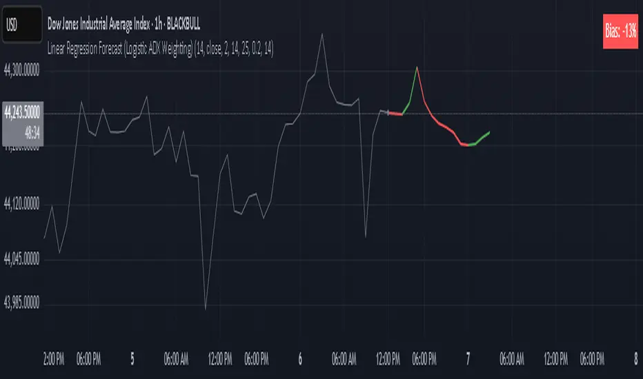
Linear Regression Forecast (ADX Adaptive)Linear Regression Forecast (ADX Adaptive)
This indicator is a dynamic price projection tool that combines multiple linear regression forecasts into a single, adaptive forecast curve. By integrating trend strength via the ADX and directional bias, it aims to visualize how price might evolve in different market environments—from strong trends to mean-reverting conditions.
Core Concept:
This tool builds forward price projections based on a blend of linear regression models with varying lookback lengths (from 2 up to a user-defined max). It then adjusts those projections using two key mechanisms:
ADX-Weighted Forecast Blending
In trending conditions (high ADX), the model follows the raw forecast direction. In ranging markets (low ADX), the forecast flips or reverts, biasing toward mean-reversion. A logistic transformation of directional bias, controlled by a steepness parameter, determines how aggressively this blending reacts to price behavior.
Volatility Scaling
The forecast’s magnitude is scaled based on ADX and directional conviction. When trends are unclear (low ADX or neutral bias), the projection range expands to reflect greater uncertainty and volatility.
How It Works:
Regression Curve Generation
For each regression length from 2 to maxLength, a forward projection is calculated using least-squares linear regression on the selected price source. These forecasts are extrapolated into the future.
Directional Bias Calculation
The forecasted points are analyzed to determine a normalized bias value in the range -1 to +1, where +1 means strongly bullish, -1 means strongly bearish, and 0 means neutral.
Logistic Bias Transformation
The raw bias is passed through a logistic sigmoid function, with a user-defined steepness. This creates a probability-like weight that favors either following or reversing the forecast depending on market context.
ADX-Based Weighting
ADX determines the weighting between trend-following and mean-reversion modes. Below ADX 20, the model favors mean-reversion. Above 25, it favors trend-following. Between 20 and 25, it linearly blends the two.
Blended Forecast Curve
Each forecast point is blended between trend-following and mean-reverting values, scaled for volatility.
What You See:
Forecast Lines: Projected future price paths drawn in green or red depending on direction.
Bias Plot: A separate plot showing post-blend directional bias as a percentage, where +100 is strongly bullish and -100 is strongly bearish.
Neutral Line: A dashed horizontal line at 0 percent bias to indicate neutrality.
User Inputs:
-Max Regression Length
-Price Source
-Line Width
-Bias Steepness
-ADX Length and Smoothing
Use Cases:
Visualize expected price direction under different trend conditions
Adjust trading behavior depending on trending vs ranging markets
Combine with other tools for deeper analysis
Important Notes:
This indicator is for visualization and analysis only. It does not provide buy or sell signals and should not be used in isolation. It makes assumptions based on historical price action and should be interpreted with market context.
MACD, ADX & RSI -> for altcoins# MACD + ADX + RSI Combined Indicator
## Overview
This advanced technical analysis tool combines three powerful indicators (MACD, ADX, and RSI) into a single view, providing a comprehensive analysis of trend, momentum, and divergence signals. The indicator is designed to help traders identify potential trading opportunities by analyzing multiple aspects of price action simultaneously.
## Components
### 1. MACD (Moving Average Convergence Divergence)
- **Purpose**: Identifies trend direction and momentum
- **Components**:
- Fast EMA (default: 12 periods)
- Slow EMA (default: 26 periods)
- Signal Line (default: 9 periods)
- Histogram showing the difference between MACD and Signal line
- **Visual**:
- Blue line: MACD line
- Orange line: Signal line
- Green/Red histogram: MACD histogram
- **Interpretation**:
- Histogram color changes indicate potential trend shifts
- Crossovers between MACD and Signal lines suggest entry/exit points
### 2. ADX (Average Directional Index)
- **Purpose**: Measures trend strength and direction
- **Components**:
- ADX line (default threshold: 20)
- DI+ (Positive Directional Indicator)
- DI- (Negative Directional Indicator)
- **Visual**:
- Navy blue line: ADX
- Green line: DI+
- Red line: DI-
- **Interpretation**:
- ADX > 20 indicates a strong trend
- DI+ crossing above DI- suggests bullish momentum
- DI- crossing above DI+ suggests bearish momentum
### 3. RSI (Relative Strength Index)
- **Purpose**: Identifies overbought/oversold conditions and divergences
- **Components**:
- RSI line (default: 14 periods)
- Divergence detection
- **Visual**:
- Purple line: RSI
- Horizontal lines at 70 (overbought) and 30 (oversold)
- Divergence labels ("Bull" and "Bear")
- **Interpretation**:
- RSI > 70: Potentially overbought
- RSI < 30: Potentially oversold
- Bullish/Bearish divergences indicate potential trend reversals
## Alert System
The indicator includes several automated alerts:
1. **MACD Alerts**:
- Rising to falling histogram transitions
- Falling to rising histogram transitions
2. **RSI Divergence Alerts**:
- Bullish divergence formations
- Bearish divergence formations
3. **ADX Trend Alerts**:
- Strong trend development (ADX crossing threshold)
- DI+ crossing above DI- (bullish)
- DI- crossing above DI+ (bearish)
## Settings Customization
All components can be fine-tuned through the settings panel:
### MACD Settings
- Fast Length
- Slow Length
- Signal Smoothing
- Source
- MA Type options (SMA/EMA)
### ADX Settings
- Length
- Threshold level
### RSI Settings
- RSI Length
- Source
- Divergence calculation toggle
## Usage Guidelines
### Entry Signals
Strong entry signals typically occur when multiple components align:
1. MACD histogram color change
2. ADX showing strong trend (>20)
3. RSI showing divergence or leaving oversold/overbought zones
### Exit Signals
Consider exits when:
1. MACD crosses signal line in opposite direction
2. ADX shows weakening trend
3. RSI reaches extreme levels with divergence
### Risk Management
- Use the indicator as part of a complete trading strategy
- Combine with price action and support/resistance levels
- Consider multiple timeframe analysis for confirmation
- Don't rely solely on any single component
## Technical Notes
- Built for TradingView using Pine Script v5
- Compatible with all timeframes
- Optimized for real-time calculation
- Includes proper error handling and NA value management
- Memory-efficient calculations for smooth performance
## Installation
1. Copy the provided Pine Script code
2. Open TradingView Chart
3. Create New Indicator -> Pine Editor
4. Paste the code and click "Add to Chart"
5. Adjust settings as needed through the indicator settings panel
## Version Information
- Version: 2.0
- Last Updated: November 2024
- Platform: TradingView
- Language: Pine Script v5

Trend Fusion: ADX&EMA+Ichimoku (Custom)SAME AS THE ORIGINAL (WITHOUT BOTTOM PART)
Trend Fusion: ADX & EMA+Ichimoku is an innovative indicator designed to provide traders with comprehensive insights into market trends. Combining the power of the Average Directional Index (ADX) with Exponential Moving Averages (EMA) and the Ichimoku Cloud, this indicator offers a sophisticated approach to trend analysis.
This indicator stands out for its unique integration of multiple trend-following indicators, offering traders a holistic view of market dynamics. Unlike traditional trend indicators that focus solely on price movements, Trend Fusion incorporates the ADX, EMA, and Ichimoku Cloud to provide a more nuanced understanding of trend strength and direction. By combining these indicators, traders can make more informed decisions and enhance their trading strategies.
How it works:
Trend Fusion generates buy and sell signals based on the convergence of these indicators. A combination of strong ADX readings, EMA crossovers, and alignment with the Ichimoku Cloud confirms trend direction and provides entry and exit points for traders.
Average Directional Index (ADX): Measures the strength of the prevailing trend by analyzing price movements. A rising ADX indicates a strengthening trend, while a falling ADX suggests weakening momentum.
Exponential Moving Averages (EMA): Detects potential trend reversals through crossover signals. A bullish crossover (fast EMA crossing above slow EMA) suggests an uptrend, while a bearish crossover indicates a downtrend.
Ichimoku Cloud: Provides support and resistance levels along with trend direction. Price movements above the cloud indicate bullish sentiment, while movements below the cloud suggest bearish sentiment.
How to useColour codes:
Green Candles: Represent a strong uptrend, indicating robust buying momentum. The intensity of green color deepens with increasing trend strength.
Red Candles: Indicate a strong downtrend, signaling significant selling pressure in the market. The intensity of red color deepens with increasing trend strength.
Yellow Candles: Suggest a weak trend, characterized by indecision and lack of clear direction. The intensity of yellow color varies based on the strength of the trend, with lighter shades indicating weaker trends and darker shades suggesting slightly stronger trends.
Trend Strength: Monitor the ADX to gauge the strength of the prevailing trend. Higher ADX values indicate stronger trends, while lower values suggest weaker trends.
Trend Direction: Confirm trend direction using EMA crossovers and Ichimoku Cloud signals. Look for bullish crossovers and price movements above the cloud for uptrends, and bearish crossovers and movements below the cloud for downtrends.
Entry and Exit Signals: Enter trades when all components align, signaling a strong trend. Use EMA crossovers and cloud confirmations to identify potential entry points, and consider exiting trades when these signals reverse.
The ADX calculation and signal logic are based on the ADX script by PineCoders, with modifications to integrate it into this indicator.
The EMA crossover logic is adapted from the GDAX EMA Cross script by stefano98.
The Ichimoku Cloud calculation and plotting are adapted from the Ichimoku Cloud script by lonesometheblue.
Trading involves risk, and past performance is not indicative of future results. It is recommended to use this indicator alongside other technical analysis tools and risk management strategies.

Trend Fusion: ADX&EMA+IchimokuTrend Fusion: ADX & EMA+Ichimoku is an innovative indicator designed to provide traders with comprehensive insights into market trends. Combining the power of the Average Directional Index (ADX) with Exponential Moving Averages (EMA) and the Ichimoku Cloud, this indicator offers a sophisticated approach to trend analysis.
This indicator stands out for its unique integration of multiple trend-following indicators, offering traders a holistic view of market dynamics. Unlike traditional trend indicators that focus solely on price movements, Trend Fusion incorporates the ADX, EMA, and Ichimoku Cloud to provide a more nuanced understanding of trend strength and direction. By combining these indicators, traders can make more informed decisions and enhance their trading strategies.
How it works:
Trend Fusion generates buy and sell signals based on the convergence of these indicators. A combination of strong ADX readings, EMA crossovers, and alignment with the Ichimoku Cloud confirms trend direction and provides entry and exit points for traders.
Average Directional Index (ADX): Measures the strength of the prevailing trend by analyzing price movements. A rising ADX indicates a strengthening trend, while a falling ADX suggests weakening momentum.
Exponential Moving Averages (EMA): Detects potential trend reversals through crossover signals. A bullish crossover (fast EMA crossing above slow EMA) suggests an uptrend, while a bearish crossover indicates a downtrend.
Ichimoku Cloud: Provides support and resistance levels along with trend direction. Price movements above the cloud indicate bullish sentiment, while movements below the cloud suggest bearish sentiment.
How to use
Colour codes:
Green Candles: Represent a strong uptrend, indicating robust buying momentum. The intensity of green color deepens with increasing trend strength.
Red Candles: Indicate a strong downtrend, signaling significant selling pressure in the market. The intensity of red color deepens with increasing trend strength.
Yellow Candles: Suggest a weak trend, characterized by indecision and lack of clear direction. The intensity of yellow color varies based on the strength of the trend, with lighter shades indicating weaker trends and darker shades suggesting slightly stronger trends.
Trend Strength: Monitor the ADX to gauge the strength of the prevailing trend. Higher ADX values indicate stronger trends, while lower values suggest weaker trends.
Trend Direction: Confirm trend direction using EMA crossovers and Ichimoku Cloud signals. Look for bullish crossovers and price movements above the cloud for uptrends, and bearish crossovers and movements below the cloud for downtrends.
Entry and Exit Signals: Enter trades when all components align, signaling a strong trend. Use EMA crossovers and cloud confirmations to identify potential entry points, and consider exiting trades when these signals reverse.
The ADX calculation and signal logic are based on the ADX script by PineCoders, with modifications to integrate it into this indicator.
The EMA crossover logic is adapted from the GDAX EMA Cross script by stefano98.
The Ichimoku Cloud calculation and plotting are adapted from the Ichimoku Cloud script by lonesometheblue.
Trading involves risk, and past performance is not indicative of future results. It is recommended to use this indicator alongside other technical analysis tools and risk management strategies.

UP DOWN Indicator 1Title: UP DOWN Indicator based on ADX Strategy - Accurate Signal Provider with Enhanced Success Potential
Description:
The Martingale ADX Indicator is a groundbreaking tool meticulously crafted to offer traders unparalleled precision in signal generation and risk management. Leveraging the power of the Average Directional Index (ADX), this indicator provides 100% non-repaint signals on the current candle, guiding traders to opportune and prepare for trade entry with remarkable accuracy.
With a focus on empowering traders across various financial markets, including Forex and Binary Options, this ADX Strategy-1 Indicator introduces a unique approach to trading dynamics. By seamlessly integrating the renowned Martingale Step-1 risk management strategy, this indicator not only minimizes losses but also enhances the potential for success, even in volatile market conditions.
Key Features:
Non-Repaint Signals: The Martingale ADX Indicator stands as a testament to reliability, offering 100% non-repaint signals. Traders can trust in the consistency and not removing losing Signals which is very important to trust the previous generated signals also, eliminating uncertainties and facilitating confident decision-making.
ADX-Based Precision: Built upon the robust framework of the Average Directional Index (ADX), this indicator delivers precise signals tailored to prevailing market trends and volatility levels. Whether trading in longer timeframes or engaging in Binary Options, traders can rely on the Martingale Step-1 ADX Indicator for superior insights.
Next Candle Trading: Seamlessly integrated into trading strategies, signals from the Martingale ADX Indicator prompt action on the subsequent candle. This real-time approach ensures traders stay ahead of market movements, seizing opportunities as they emerge. Giving Signals Once Candle ahead makes traders to prepare early and decide whether they want to enter the trade on presented Signal or not as per their own experience too. If the trading candle is loss then the very next candle shall be used for taking Martingale Sep-1 to enhance the Accuracy.
Enhanced Success Potential: With Martingale Step-1 risk management, this ADX Indicator offers more than just signal accuracy – it presents the potential for heightened success rates. Through strategic position sizing and leveraging experience and Price Action insights, traders can elevate overall accuracy to levels ranging from 80% to 90%.
Conclusion:
The UP DOWN Strategy-1 Indicator represents a paradigm shift in trading technology, combining precision signal generation with advanced risk management strategies. Whether you're a seasoned trader or just starting your journey, this indicator empowers you to navigate financial markets with confidence and achieve consistent results.
Experience the difference with the Martingale ADX Indicator – where reliability meets profitability, and success becomes attainable with every trade.
Trade wisely, and may your ventures be marked by prosperity and fulfillment.
Pardon for any descriptive language grammatical error and comment about this indicator and to get my other strategy as well. Happy trading !!
Risk Disclaimer:
Trading in financial markets carries inherent risks and should be approached with caution. It is imperative to exercise sound judgment and trade only with funds that you can afford to lose. We strongly advise against using borrowed funds for trading purposes. First practice on demo for own learning then make decision wisely.

jaems_Combo: StochRSI + MACD + ADX [QuantDev]//@version=6
strategy("jaems_Combo: StochRSI + MACD + ADX ", overlay=false, initial_capital=10000, currency=currency.USD, commission_type=strategy.commission.percent, commission_value=0.05, slippage=1)
// ==========================================
// 1. 사용자 입력 (User Inputs)
// ==========================================
//
grp_time = "Backtest Period"
useDateFilter = input.bool(true, "기간 필터 적용", group=grp_time)
startDate = input.time(timestamp("2023-01-01 00:00"), "시작일", group=grp_time)
endDate = input.time(timestamp("2099-12-31 23:59"), "종료일", group=grp_time)
inDateRange = not useDateFilter or (time >= startDate and time <= endDate)
//
grp_stoch = "1. Stochastic RSI Settings"
stoch_len = input.int(14, "RSI Length", group=grp_stoch)
stoch_k = input.int(3, "K", group=grp_stoch)
stoch_d = input.int(3, "D", group=grp_stoch)
rsi_len = input.int(14, "Stochastic Length", group=grp_stoch)
//
grp_macd = "2. MACD Settings (Normalized)"
macd_fast = input.int(12, "Fast Length", group=grp_macd)
macd_slow = input.int(26, "Slow Length", group=grp_macd)
macd_sig = input.int(9, "Signal Length", group=grp_macd)
macd_norm_len = input.int(100, "Normalization Lookback", group=grp_macd)
//
grp_adx = "3. ADX Settings"
adx_len = input.int(14, "ADX Smoothing", group=grp_adx)
di_len = input.int(14, "DI Length", group=grp_adx)
adx_thresh = input.int(25, "ADX Threshold", group=grp_adx)
//
grp_risk = "4. Risk Management"
stopLossPct = input.float(2.0, "손절매 (Stop Loss %)", step=0.1, group=grp_risk) / 100
takeProfitPct = input.float(4.0, "익절매 (Take Profit %)", step=0.1, group=grp_risk) / 100
// - 신규 추가 (Alert Configuration)
grp_alert = "5. Alert Configuration"
msg_long_entry = input.string("Long Entry Triggered", "Long 진입 메시지", group=grp_alert)
msg_short_entry = input.string("Short Entry Triggered", "Short 진입 메시지", group=grp_alert)
msg_long_exit = input.string("Long Position Closed", "Long 청산 메시지", group=grp_alert)
msg_short_exit = input.string("Short Position Closed", "Short 청산 메시지", group=grp_alert)
// ==========================================
// 2. 데이터 처리 및 지표 계산
// ==========================================
// Stoch RSI
rsi_val = ta.rsi(close, rsi_len)
k = ta.sma(ta.stoch(rsi_val, rsi_val, rsi_val, stoch_len), stoch_k)
d = ta.sma(k, stoch_d)
// ADX
= ta.dmi(di_len, adx_len)
// Normalized MACD (0~100 Scale)
= ta.macd(close, macd_fast, macd_slow, macd_sig)
highest_macd = ta.highest(macd_line, macd_norm_len)
lowest_macd = ta.lowest(macd_line, macd_norm_len)
// 분모가 0이 되는 예외 처리
denom = (highest_macd - lowest_macd)
norm_macd = denom != 0 ? (macd_line - lowest_macd) / denom * 100 : 50
norm_signal = denom != 0 ? (macd_signal - lowest_macd) / denom * 100 : 50
// ==========================================
// 3. 시각화 (Dark Mode Optimized Colors)
// ==========================================
color gridColor = color.new(#787B86, 50)
hline(0, "Bottom", color=gridColor)
hline(50, "Middle", color=gridColor, linestyle=hline.style_dotted)
hline(100, "Top", color=gridColor)
plot(k, "Stoch K", color=color.new(#00E5FF, 0), linewidth=1) // Neon Cyan
plot(d, "Stoch D", color=color.new(#EA00FF, 0), linewidth=1) // Neon Magenta
plot(adx, "ADX", color=color.new(#FFEB3B, 0), linewidth=2)
hline(adx_thresh, "ADX Threshold", color=color.new(#FFEB3B, 50), linestyle=hline.style_dashed)
plot(norm_macd, "Norm MACD", color=color.new(#76FF03, 60), style=plot.style_area)
plot(norm_signal, "Norm Signal", color=color.new(#FF1744, 20), linewidth=1)
// ==========================================
// 4. 전략 로직 (Strategy Logic) - 요청하신 내용으로 전면 수정
// ==========================================
// 조건: K가 D보다 크고(AND) K가 Norm Signal보다 큰 상태
bool is_bullish = (k > d) and (k > norm_signal)
// 조건: K가 D보다 작고(AND) K가 Norm Signal보다 작은 상태
bool is_bearish = (k < d) and (k < norm_signal)
// 진입 신호: "이전 봉에는 아니었는데, 지금 봉에서 두 조건을 동시에 만족했을 때" (돌파 순간)
longCondition = is_bullish and not is_bullish
shortCondition = is_bearish and not is_bearish
// 주문 실행 (Confirmed Bar Only) + Alert Message 연결
if inDateRange and barstate.isconfirmed
if longCondition
strategy.entry("Long", strategy.long, alert_message=msg_long_entry)
if shortCondition
strategy.entry("Short", strategy.short, alert_message=msg_short_entry)
// ==========================================
// 5. 청산 및 신호 강조 (Alert Message 추가)
// ==========================================
if strategy.position_size > 0
strategy.exit("Long Exit", "Long", stop=strategy.position_avg_price * (1 - stopLossPct), limit=strategy.position_avg_price * (1 + takeProfitPct), alert_message=msg_long_exit)
if strategy.position_size < 0
strategy.exit("Short Exit", "Short", stop=strategy.position_avg_price * (1 + stopLossPct), limit=strategy.position_avg_price * (1 - takeProfitPct), alert_message=msg_short_exit)
// 배경 신호
bgcolor(longCondition ? color.new(#76FF03, 90) : na, title="Long Signal BG")
bgcolor(shortCondition ? color.new(#FF1744, 90) : na, title="Short Signal BG")

ROC+ADX Trend & Momentum System### Code Analysis: ROC+ADX Trend & Momentum System (v5 Pine Script)
#### **Core Function**
This Pine Script indicator integrates **Rate of Change (ROC)** and **Average Directional Index (ADX)** to build a professional trend-momentum trading system, which identifies trend strength, momentum changes, price divergences and generates actionable long/short trading signals for financial markets (stocks, crypto, forex). It features coordinated visual display, adaptive volatility adjustment and a comprehensive scoring mechanism for trend evaluation.
#### **Key Features (Concise)**
1. **Hybrid Indicator Logic**
Combines **ROC (12/6-period, EMA-smoothed)** (measures price momentum) and **ADX (14-period)** (identifies trend strength/direction, with +DI/-DI for trend bias), forming a dual-dimension analysis of trend + momentum.
2. **Adaptive Dynamic Threshold**
Adjusts momentum thresholds in real time based on **14-period ATR volatility**; higher market volatility raises thresholds, lower volatility lowers them, ensuring signal accuracy across different market conditions.
3. **Multi-Category Trading Signals**
Generates 4 core signal types: trend breakout (long/short), momentum boost/drop, trend reversal, and price-ROC bullish/bearish divergence, all filtered by ADX trend validity.
4. **Comprehensive Trend Scoring System**
Calculates a **0-100 trend score** (integrates ADX strength, ROC momentum, direction consistency, momentum persistence) and classifies trend intensity into 5 levels (Extreme/Strong/Medium/Weak/None).
5. **Coordinated Visual Display**
Supports scalable unified display for ROC & ADX values (custom scale factors), with color-coded lines, momentum histograms, heatmap background and reference lines for intuitive trend judgment.
6. **Informative Dashboard & Alerts**
Embeds a top-right info panel showing real values (ROC, ADX, volatility), trend level and active signals; includes multi-tier alert conditions for all key signals (breakout, reversal, divergence).
7. **High Customizability**
Full input configurability for all core parameters (periods, thresholds, scale factors) and visual toggles (show/hide ROC/ADX, signals, heatmap, reference lines).
#### **Technical Highlights**
- Uses EMA smoothing for ROC/ADX to reduce false signals;
- Identifies ROC momentum & acceleration for precise trend phase judgment;
- ADX grading (strong/weak/oscillation) filters invalid signals in sideways markets;
- Color-coded elements (lines, histograms, heatmap) reflect real-time trend/momentum status;
- Non-overlay layout ensures clear separation from price charts, optimized for multi-screen analysis.

FibADX MTF Dashboard — DMI/ADX with Fibonacci DominanceFibADX MTF Dashboard — DMI/ADX with Fibonacci Dominance (φ)
This indicator fuses classic DMI/ADX with the Fibonacci Golden Ratio to score directional dominance and trend tradability across multiple timeframes in one clean panel.
What’s unique
• Fibonacci dominance tiers:
• BULL / BEAR → one side slightly stronger
• STRONG when one DI ≥ 1.618× the other (φ)
• EXTREME when one DI ≥ 2.618× (φ²)
• Rounded dominance % in the +DI/−DI columns (e.g., STRONG BULL 72%).
• ADX column modes: show the value (with strength bar ▂▃▅… and slope ↗/↘) or a tier (Weak / Tradable / Strong / Extreme).
• Configurable intraday row (30m/1H/2H/4H) + D/W/M toggles.
• Threshold line: color & width; Extended (infinite both ways) or Not extended (historical plot).
• Theme presets (Dark / Light / High Contrast) or full custom colors.
• Optional panel shading when all selected TFs are strong (and optionally directionally aligned).
How to use
1. Choose an intraday TF (30/60/120/240). Enable D/W/M as needed.
2. Use ADX ≥ threshold (e.g., 21 / 34 / 55) to find tradable trends.
3. Read the +DI/−DI labels to confirm bias (BULL/BEAR) and conviction (STRONG/EXTREME).
4. Prefer multi-TF alignment (e.g., 4H & D & W all strong bull).
5. Treat EXTREME as a momentum regime—trail tighter and scale out into spikes.
Alerts
• All selected TFs: Strong BULL alignment
• All selected TFs: Strong BEAR alignment
Notes
• Smoothing selectable: RMA (Wilder) / EMA / SMA.
• Percentages are whole numbers (72%, not 72.18%).
• Shorttitle is FibADX to comply with TV’s 10-char limit.
Why We Use Fibonacci in FibADX
Traditional DMI/ADX indicators rely on fixed numeric thresholds (e.g., ADX > 20 = “tradable”), but they ignore the relationship between +DI and −DI, which is what really determines trend conviction.
FibADX improves on this by introducing the Fibonacci Golden Ratio (φ ≈ 1.618) to measure directional dominance and classify trend strength more intelligently.
⸻
1. Fibonacci as a Natural Strength Threshold
The golden ratio φ appears everywhere in nature, growth cycles, and fractals.
Since financial markets also behave fractally, Fibonacci levels reflect natural crowd behavior and trend acceleration points.
In FibADX:
• When one DI is slightly larger than the other → BULL or BEAR (mild advantage).
• When one DI is at least 1.618× the other → STRONG BULL or STRONG BEAR (trend conviction).
• When one DI is 2.618× or more → EXTREME BULL or EXTREME BEAR (high momentum regime).
This approach adds structure and consistency to trend classification.
⸻
2. Why 1.618 and 2.618 Instead of Random Numbers
Other traders might pick thresholds like 1.5 or 2.0, but φ has special mathematical properties:
• φ is the most irrational ratio, meaning proportions based on φ retain structure even when scaled.
• Using φ makes FibADX naturally adaptive to all timeframes and asset classes — stocks, crypto, forex, commodities.
⸻
3 . Trading Advantages
Using the Fibonacci Golden Ratio inside DMI/ADX has several benefits:
• Better trend filtering → Avoid false DI crossovers without conviction.
• Catch early momentum shifts → Spot when dominance ratios approach φ before ADX reacts.
• Consistency across markets → Because φ is scalable and fractal, it works everywhere.
⸻
4. How FibADX Uses This
FibADX combines:
• +DI vs −DI ratio → Measures directional dominance.
• φ thresholds (1.618, 2.618) → Classifies strength into BULL, STRONG, EXTREME.
• ADX threshold → Confirms whether the move is tradable or just noise.
• Multi-timeframe dashboard → Aligns bias across 4H, D, W, M.
⸻
Quick Blurb for TradingView
FibADX uses the Fibonacci Golden Ratio (φ ≈ 1.618) to classify trend strength.
Unlike classic DMI/ADX, FibADX measures how much one side dominates:
• φ (1.618) = STRONG trend conviction
• φ² (2.618) = EXTREME momentum regime
This creates an adaptive, fractal-aware framework that works across stocks, crypto, forex, and commodities.
⚠️ Disclaimer : This script is provided for educational purposes only.
It does not constitute financial advice.
Use at your own risk. Always do your own research before making trading decisions.
Created by @nomadhedge
EMA Ribbon + ADX MomentumHere's a description for your TradingView indicator publication:
The EMA Ribbon + ADX Momentum indicator combines exponential moving averages (EMA) with the Average Directional Index (ADX) to identify strong trends and potential trading opportunities. This powerful tool offers:
🎯 Key Features:
EMA Ribbon (10, 21, 34, 55) for trend direction
ADX integration for trend strength confirmation
Clear visual signals with color-coded backgrounds
Real-time trend status display
Strength metrics with exact percentage values
📊 How It Works:
EMA Ribbon: Four EMAs form a ribbon pattern that shows trend direction through their stacking order
ADX Integration: Confirms trend strength when above the threshold (default 25)
Visual Signals:
Green background: Strong bullish trend
Red background: Strong bearish trend
Gray background: Neutral or weak trend
📈 Trading Signals:
STRONG BULL: EMAs properly stacked bullish + high ADX + DI+ > DI-
STRONG BEAR: EMAs properly stacked bearish + high ADX + DI- > DI+
BULL/BEAR TREND: Shows regular trend conditions without strength confirmation
NEUTRAL: No clear trend structure
🔧 Customizable Parameters:
ADX Length: Adjust trend calculation period
ADX Threshold: Modify strength confirmation level
ADX Panel Toggle: Show/hide the ADX indicator panel
💡 Best Uses:
Trend following strategies
Entry/exit timing
Trade confirmation
Market structure analysis
Risk management tool
This indicator helps traders identify not just trend direction, but also trend strength, making it particularly useful for both position entry timing and risk management. The clear visual signals and real-time metrics make it suitable for traders of all experience levels.
Note: As with all technical indicators, best results are achieved when used in conjunction with other forms of analysis and proper risk management.
Multi-TF AI SuperTrend with ADX - Strategy [PresentTrading]
## █ Introduction and How it is Different
The trading strategy in question is an enhanced version of the SuperTrend indicator, combined with AI elements and an ADX filter. It's a multi-timeframe strategy that incorporates two SuperTrends from different timeframes and utilizes a k-nearest neighbors (KNN) algorithm for trend prediction. It's different from traditional SuperTrend indicators because of its AI-based predictive capabilities and the addition of the ADX filter for trend strength.
BTC 8hr Performance
ETH 8hr Performance
## █ Strategy, How it Works: Detailed Explanation (Revised)
### Multi-Timeframe Approach
The strategy leverages the power of multiple timeframes by incorporating two SuperTrend indicators, each calculated on a different timeframe. This multi-timeframe approach provides a holistic view of the market's trend. For example, a 8-hour timeframe might capture the medium-term trend, while a daily timeframe could capture the longer-term trend. When both SuperTrends align, the strategy confirms a more robust trend.
### K-Nearest Neighbors (KNN)
The KNN algorithm is used to classify the direction of the trend based on historical SuperTrend values. It uses weighted voting of the 'k' nearest data points. For each point, it looks at its 'k' closest neighbors and takes a weighted average of their labels to predict the current label. The KNN algorithm is applied separately to each timeframe's SuperTrend data.
### SuperTrend Indicators
Two SuperTrend indicators are used, each from a different timeframe. They are calculated using different moving averages and ATR lengths as per user settings. The SuperTrend values are then smoothed to make them suitable for KNN-based prediction.
### ADX and DMI Filters
The ADX filter is used to eliminate weak trends. Only when the ADX is above 20 and the directional movement index (DMI) confirms the trend direction, does the strategy signal a buy or sell.
### Combining Elements
A trade signal is generated only when both SuperTrends and the ADX filter confirm the trend direction. This multi-timeframe, multi-indicator approach reduces false positives and increases the robustness of the strategy.
By considering multiple timeframes and using machine learning for trend classification, the strategy aims to provide more accurate and reliable trade signals.
BTC 8hr Performance (Zoom-in)
## █ Trade Direction
The strategy allows users to specify the trade direction as 'Long', 'Short', or 'Both'. This is useful for traders who have a specific market bias. For instance, in a bullish market, one might choose to only take 'Long' trades.
## █ Usage
Parameters: Adjust the number of neighbors, data points, and moving averages according to the asset and market conditions.
Trade Direction: Choose your preferred trading direction based on your market outlook.
ADX Filter: Optionally, enable the ADX filter to avoid trading in a sideways market.
Risk Management: Use the trailing stop-loss feature to manage risks.
## █ Default Settings
Neighbors (K): 3
Data points for KNN: 12
SuperTrend Length: 10 and 5 for the two different SuperTrends
ATR Multiplier: 3.0 for both
ADX Length: 21
ADX Time Frame: 240
Default trading direction: Both
By customizing these settings, traders can tailor the strategy to fit various trading styles and assets.
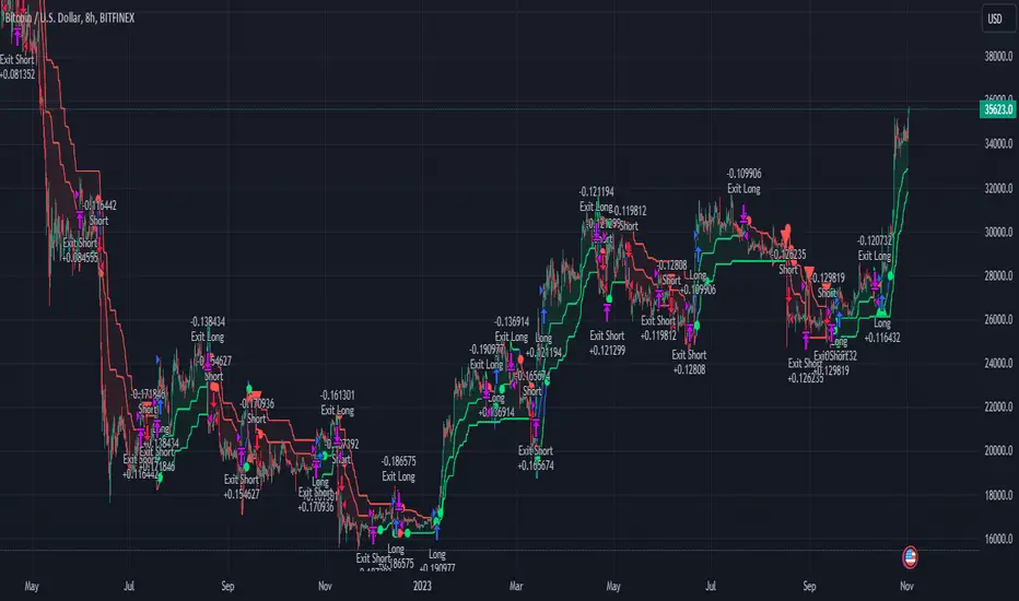
Alpine Predictive BandsAlpine Predictive Bands - ADX & Trend Projection is an advanced indicator crafted to estimate potential price zones and trend strength by integrating dynamic support/resistance bands, ADX-based confidence scoring, and linear regression-based price projections. Designed for adaptive trend analysis, this tool combines multi-timeframe ADX insights, volume metrics, and trend alignment for improved confidence in trend direction and reliability.
Key Calculations and Components:
Linear Regression for Price Projection:
Purpose: Provides a trend-based projection line to illustrate potential price direction.
Calculation: The Linear Regression Centerline (LRC) is calculated over a user-defined lookbackPeriod. The slope, representing the rate of price movement, is extended forward using predictionLength. This projected path only appears when the confidence score is 70% or higher, revealing a white dotted line to highlight high-confidence trends.
Adaptive Prediction Bands:
Purpose: ATR-based bands offer dynamic support/resistance zones by adjusting to volatility.
Calculation: Bands are calculated using the Average True Range (ATR) over the lookbackPeriod, multiplied by a volatilityMultiplier to adjust the width. These shaded bands expand during higher volatility, guiding traders in identifying flexible support/resistance zones.
Confidence Score (ADX, Volume, and Trend Alignment):
Purpose: Reflects the reliability of trend projections by combining ADX, volume status, and EMA alignment across multiple timeframes.
ADX Component: ADX values from the current timeframe and two higher timeframes assess trend strength on a broader scale. Strong ADX readings across timeframes boost the confidence score.
Volume Component: Volume strength is marked as “High” or “Low” based on a moving average, signaling trend participation.
Trend Alignment: EMA alignment across timeframes indicates “Bullish” or “Bearish” trends, confirming overall trend direction.
Calculation: ADX, volume, and trend alignment integrate to produce a confidence score from 0% to 100%. When the score exceeds 70%, the white projection line is activated, underscoring high-confidence trend continuations.
User Guide
Projection Line: The white dotted line, which appears only when the confidence score is 70% or higher, highlights a high-confidence trend.
Prediction Bands: Adaptive bands provide potential support/resistance zones, expanding with market volatility to help traders visualize price ranges.
Confidence Score: A high score indicates a stronger, more reliable trend and can support trend-following strategies.
Settings
Prediction Length: Determines the forward length of the projection.
Lookback Period: Sets the data range for calculating regression and ATR.
Volatility Multiplier: Adjusts the width of bands to match volatility levels.
Disclaimer: This indicator is for educational purposes and does not guarantee future price outcomes. Additional analysis is recommended, as trading carries inherent risks.