EMA9, EMA200 with Bollinger BandsThe indicator includes the EMA9 line, the EMA200 line and the Bollinger Bands into a single indicator plot. Penunjuk Pine Script®oleh MIJASM15
Official USD Staggered Bands - ArgentinaOfficial USD Staggered Bands - Argentina The Central Bank, under the administration of Javier Milei (La Libertad Avanza), announced on Friday, April 11, 2025, a series of measures to eliminate the so-called "exchange rate restriction." In this new phase, the dollar's exchange rate on the Free Exchange Market (MLC) will be able to fluctuate within a band between $1,000 and $1,400 , the limits of which will be expanded at a rate of 1% monthly. The lines evolve daily, increasing as the public administration predicts. This way, you can know the likelihood of a Central Bank intervention to correct the variation and return the peso to a price within the band. The script runs under the ticker USDARSPenunjuk Pine Script®oleh arielm0020
HILo Ema Squeeze BandsThis indicator combines uses ema to identify price squeeze before a big move. The ema gets initialised at new high low. It used 3 ema's lengths. For result use x, 2x ,4x ie 50, 100, 200 or 100,200,400 and so on . On more volatile asset use a higher settings like 100,200,400. The inner band is divided into 4 zones, which can give support resistance. As you use it you will become aware of subtle information that it can give at times. Like you may be able to find steps at which prices move, when the market is trending Just like in Bollinger bands, in a trending market the price stays within sd=1 and sd=2 so does in the inner band the price will remain in band1 and band2. But Bollinger band cannot print steps this indicator shows stepsPenunjuk Pine Script®oleh krisozTelah dikemas kini 55101
Bollinger Bands with Narrow ConsolidationThe indicator is based on the standard Bollinger Bands indicator in TradingView. Its main difference is the ability to display narrow consolidation zones (with an adjustable percentage) and generate signals in these zones. Narrow consolidation zones can be considered as a signal before the start of a strong trend, whether upward or downward. Индикатор построен на стандартном индикаторе полос боллинджера в трейдинг вью. Его отличие заключается в том, что здесь есть возможность отображения зон узкой консолидации (процент настраивается) и генерации сигналов на этих зонах. Зоны узкой консолидации можно рассматривать как сигнал перед началом сильного треда как восходящего, так и нисходящего. Penunjuk Pine Script®oleh golovine198739
TMA Bands TMA (Triangular Moving Average): Üçgen hareketli ortalamalar, fiyat verilerini yumuşatarak trendi daha net göstermek için kullanılır. "Centered Asymmetric Bands" terimi, bu indikatörün merkezlenmiş bir yapıda çalıştığını ve farklı genişliklerde bantlar içerdiğini gösteriyor.Penunjuk Pine Script®oleh Ruppen_BuffettTelah dikemas kini 49
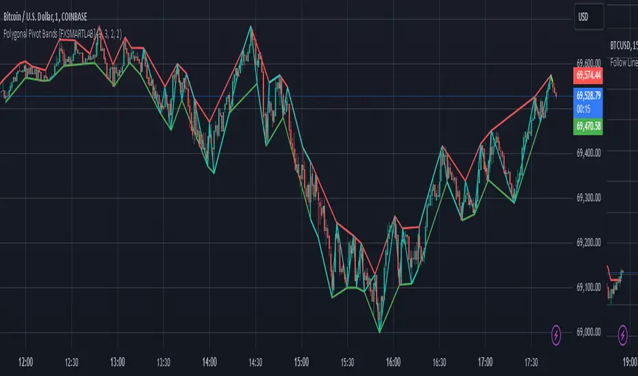
Polygonal Pivot Bands [FXSMARTLAB]The Polygonal Pivot Bands highlights key price pivots, dynamic support and resistance levels, and recent price action on a trading chart. This indicator connects pivot highs and lows with a zigzag line, extends a real-time dashed line to the latest price point, and plots diagonal support/resistance levels that adapt to price movement. These elements together provide traders with a view of significant price zones and potential trend shifts. Key Components of the Indicator Pivots are calculated based on user-defined lengths, specifying how many bars on either side of a high or low are required to validate it as a pivot. Adjustable left and right pivot lengths allow traders to control the sensitivity of pivot detection, with higher values resulting in fewer, more prominent pivots, and lower values increasing sensitivity to price changes. Zigzag Line The zigzag line connects consecutive pivot points, filtering out smaller fluctuations and emphasizing the broader direction of price movement. Users can customize the line's color and thickness to match their preferences, helping them focus on larger trends and potential reversal points. By linking pivot highs and lows, the zigzag pattern highlights the overall trend and potential points of reversal. Real-Time Connector Line A dashed line extends from the last confirmed pivot to the latest price point, providing a real-time, bar-by-bar update of the current price relative to the previous pivot. This line does not project future price direction but maintains an up-to-date connection with the current price, showing the distance from the last pivot. Its color and thickness are customizable for improved visibility on the chart. Dynamic Support and Resistance Levels The indicator plots dynamic support and resistanc e levels by connecting recent pivot highs and lows, resulting in lines that may appear diagonal rather than strictly horizontal. These levels move in line with price action, adapting to the natural direction of trends, and offer visual cues where price may encounter support or resistance. Colors and thickness of these lines can be set individually, allowing traders to adjust visibility according to their preferences. Enabling these lines gives traders an ongoing reference for critical price boundaries that align more closely with the overall trend. Penunjuk Pine Script®oleh FXSMARTLAB99
Dynamic GANN Square Of 9 BandsDynamic GANN Square Of 9 Bands Created on 3 Sept 2023 Adjust Increment Value: Customize increment to match symbol and price characteristics for accuracy. Green Line: 200 EMA. Identifies trend direction; moves with the prevailing trend. Red Lines: Mark prominent reversal levels closer to the red range; ideal for mean reversion strategies. Crossing red levels may indicate trend continuation to the next red level. Grey Lines: Show immediate target reversal levels; watch for potential reversals. Key Features: Levels are different from Standard Deviation Lines. Levels remain fixed and parallel, unaffected by volatility. Despite its dynamism, it can serve as a leading indicator, revealing potential trend changes. Primarily designed for trend-following strategies. Additional Tips: Use additional confirmations Manage predefined risk and quantity Additional Resources: GANN Square Of 9 Pivots: Penunjuk Pine Script®oleh Arun_K_Bhaskar99636
Bollinger Bands Lab - by InFinitoVariation of the Moving Average Lab that includes Bollinger Bands functionality for any manually created Moving Average. It includes: - Standard Deviations for any MA - Fixed Symmetrical Deviations for any MA that remain at a constant % away from the MA - The same Moving Average creation settings from the Moving Average Lab "The Moving Average Lab allows to create any possible combination of up to 3 given MAs. It is meant to help you find the perfect MA that fits your style, strategy and market type. This script allows to average, weight, double and triple multiple types and lengths of Moving Averages Currently supported MA types are: SMA EMA VWMA WMA SMMA (RMA) HMA LSMA DEMA TEMA Features: - Double or Triple any type of Moving Average using the same logic used for calculating DEMAs and TEMAs - Average 2 or 3 different types and lengths of Moving Average - Weight each MA manually - Average up to 3 personalized MAs - Average different Moving Averages with different length each " The preview screenshot shows: - The combination of: - 200 LSMA - Weight: 1 - 200 HMA - Weight: 2 - 200 VWMA - Weight: 1 - Double - The regular Bollinger Band setting, 2 standard deviations - Two fixed symmetrical deviations at 15% and 20% away from the XMA Penunjuk Pine Script®oleh In_Finito_57
Multi Bollinger Bands with Over ZoneThis indicator is called "Multi Bollinger Bands with Over Zone". The indicator uses linear regression to calculate the regression line and standard deviation to calculate the upper and lower deviation lines. It also plots filled areas between the deviation lines to highlight overbought and oversold zones. The indicator has several customizable inputs, including the length of the regression period, depth, and deviations used to calculate the deviation lines. The regression line is plotted in green color with circle markers. The upper and lower deviation lines are plotted in blue and red colors, respectively. The area between the deviation lines is filled with light blue color for the overbought zone and light pink color for the oversold zone. This indicator helps traders in identifying trends and potential price reversals. When the price is above the upper deviation line, it indicates a potential overbought zone, while when the price is below the lower deviation line, it indicates a potential oversold zone. Please note that this indicator is only a tool for analysis and does not provide direct trading signals. It is important to combine this indicator with additional analysis and appropriate trading strategies.Penunjuk Pine Script®oleh anonub_id11158
Bollinger Bands %B (ValueRay)One of the key features of this BB%B is its ability to highlight overbought and oversold conditions. This allows you to make informed decisions on when to enter and exit a trade, helping you maximize your profits and minimize your losses. - Bollinger Bands %B with the ability to change to a different Time Frame.(Defaults to current Chart Time Frame). - Ability To Turn On/Off Background Highlighting if BB %B is Above/Below 0 / 1 thresholds. - Ability To Turn On/Off Background Highlighting when BB %B Crosses back above/unser 0/1 thresholds. --- My personal recommandation use: combine with CM_Ultimate RSI Multi Time Frame (ChrisMoody) and have solid oversold/overbought levels, when hes RSI and my BB %B are bot red/green Penunjuk Pine Script®oleh derMatzeImNetzTelah dikemas kini 112
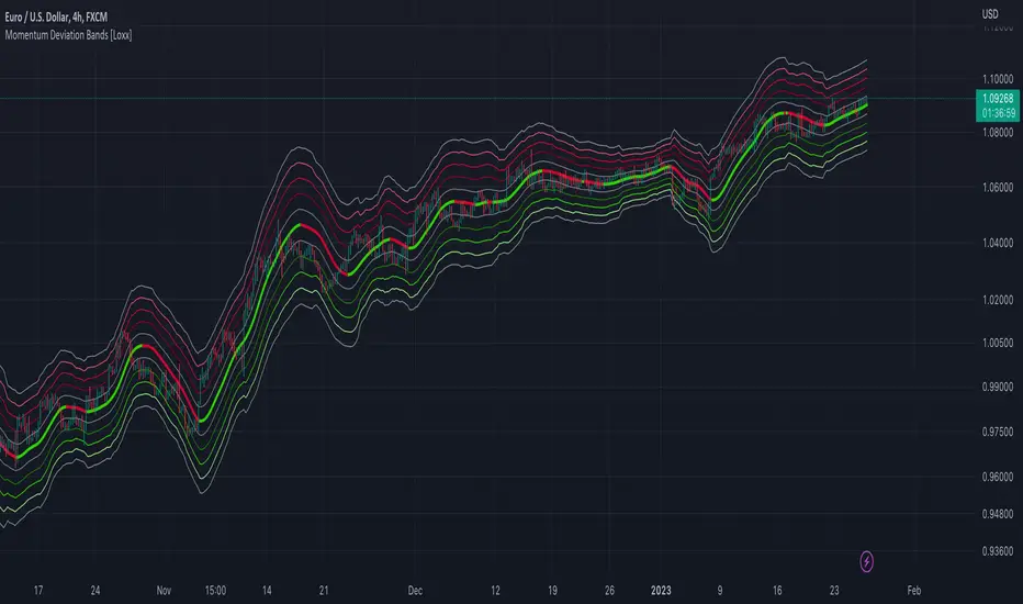
Momentum Deviation Bands [Loxx]Momentum Deviation Bands uses a variation of standard deviation. Instead of using price to calculate standard deviation, this uses momentum. This is another type of volatility that will be used in future indicators. This indicator serves more as an educational tool, but can also be used in trading. You can read about the included moving averages here: Included Bar coloring Penunjuk Pine Script®oleh loxxTelah dikemas kini 11160
VWMA Fibonacci Bands (VFIBs)This is a momentum indicator , utilizing Volume Weighted Moving Averages (VWMAs), Average True Range (ATR), and Fibonacci Levels. This indicator can be used in most, if not all, financial markets. I have personally found it to be most useful in mid or large cap stocks, index funds, and cryptocurrencies in the top 25 by market cap. I have not tested this indicator in Forex markets, but I imagine that it would function well there, too. The idea behind proper use of this indicator centers around mean reversion. If price is low compared to previous price action, mean reversion implies that it is likely to revert back to the mean, over time. If price is high, it implies that it will move lower. Generally, the different period VWMAs (center lines) will act as support when in an uptrend and resistance when in a downtrend. Additionally, it is rare for price to go above the upper bounds or lower bounds of the Fibonacci Bollinger Bands . Price action doing so may indicate a potential short or long position, respectively. This indicator is intended to be used in tandem with the oscillator 'VFIBs Agreement', to be published shortly. As we can see in the chart, the 50 week VWMA has been acting as resistance and recently dipped down to the bottom range of the band, only to bounce back. Holding above the 50 VWMA might indicate a bullish reversal, treating it as support moving forward.Penunjuk Pine Script®oleh jpwall27
Distance Bands Oscillator_KT █ OVERVIEW This tool is based on both Bollinger Bands and Keltner Channels, and measures 3 distances between the two, respectively. Upper Kelt to Upper Bollinger Band Lower Kelt to Lower Bollinger Band Kelt Basis to Bollinger Basis Basis Similar to the Band Width indicator, this can be used as a measure of volatility, and can be used to measure uptrend, downtrend and chop regions on a given chart. Happy Trading, ET Penunjuk Pine Script®oleh kingthies21
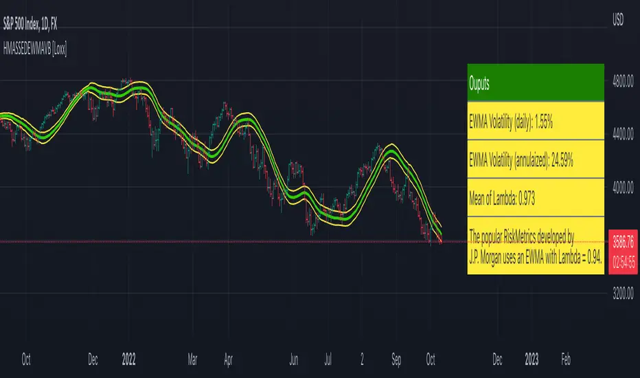
HMA w/ SSE-Dynamic EWMA Volatility Bands [Loxx]This indicator is for educational purposes to lay the groundwork for future closed/open source indicators. Some of thee future indicators will employ parameter estimation methods described below, others will require complex solvers such as the Nelder-Mead algorithm on log likelihood estimations to derive optimal parameter values for omega, gamma, alpha, and beta for GARCH(1,1) MLE and other volatility metrics. For our purposes here, we estimate the rolling lambda (λ) value used to calculate EWMA by minimizing of the sum of the squared errors minus the long-run variance--a rolling window of the one year mean of squared log-returns. In practice, practitioners will use a λ equal to a standardized value put out by institutions such as JP Morgan. Even simpler than this, others use a ratio of (per - 1) / (per + 1) to derive λ where per is the lookback period for EWMA. Due to computation limits in Pine, we'll likely not see a true GARCH(1,1) MLE on Pine for quite some time, but future closed source indicators will contain some very interesting industry hacks to get close by employing modifications to EWMA. Enjoy! Exponentially weighted volatility and its relationship to GARCH(1,1) Exponentially weighted volatility--also called exponentially weighted moving average volatility (EWMA)--puts more weight on more recent observations. EWMA is calculated as follows: σ*2 = λσ(n - 1)^2 + (1 − λ)u(n - 1)^2 The estimate, σn, of the volatility for day n (made at the end of day n − 1) is calculated from σn −1 (the estimate that was made at the end of day n − 2 of the volatility for day n − 1) and u^n−1 (the most recent daily percentage change). The EWMA approach has the attractive feature that the data storage requirements are modest. At any given time, we need to remember only the current estimate of the variance rate and the most recent observation on the value of the market variable. When we get a new observation on the value of the market variable, we calculate a new daily percentage change to update our estimate of the variance rate. The old estimate of the variance rate and the old value of the market variable can then be discarded. The EWMA approach is designed to track changes in the volatility. Suppose there is a big move in the market variable on day n − 1 so that u2n−1 is large. This causes our estimate of the current volatility to move upward. The value of λ governs how responsive the estimate of the daily volatility is to the most recent daily percentage change. A low value of λ leads to a great deal of weight being given to the u(n−1)^2 when σn is calculated. In this case, the estimates produced for the volatility on successive days are themselves highly volatile. A high value of λ (i.e., a value close to 1.0) produces estimates of the daily volatility that respond relatively slowly to new information provided by the daily percentage change. The RiskMetrics database, which was originally created by JPMorgan and made publicly available in 1994, used the EWMA model with λ = 0.94 for updating daily volatility estimates. The company found that, across a range of different market variables, this value of λ gives forecasts of the variance rate that come closest to the realized variance rate. In 2006, RiskMetrics switched to using a long memory model. This is a model where the weights assigned to the u(n -i)^2 as i increases decline less fast than in EWMA. GARCH(1,1) Model The EWMA model is a particular case of GARCH(1,1) where γ = 0, α = 1 − λ, and β = λ. The “(1,1)” in GARCH(1,1) indicates that σ^2 is based on the most recent observation of u^2 and the most recent estimate of the variance rate. The more general GARCH(p, q) model calculates σ^2 from the most recent p observations on u2 and the most recent q estimates of the variance rate.7 GARCH(1,1) is by far the most popular of the GARCH models. Setting ω = γVL, the GARCH(1,1) model can also be written: σ(n)^2 = ω + αu(n-1)^2 + βσ(n-1)^2 What this indicator does Calculate log returns log(close/close(1)) Calculates Lambda (λ) dynamically by minimizing the sum of squared errors. I've restricted this to the daily timeframe so as to not bloat the code with additional logic required to derive an annualized EWMA historical volatility metric. After the Lambda is derived, EWMA is calculated one last time and the result is the daily volatility This daily volatility is multiplied by the source and the multiplier +/- the HMA to create the volatility bands Finally, daily volatility is multiplied by the square-root of days per year to derive annualized volatility. Years are trading days for the asset, for most everything but crypto, its 252, for crypto is 365. Penunjuk Pine Script®oleh loxxTelah dikemas kini 44202
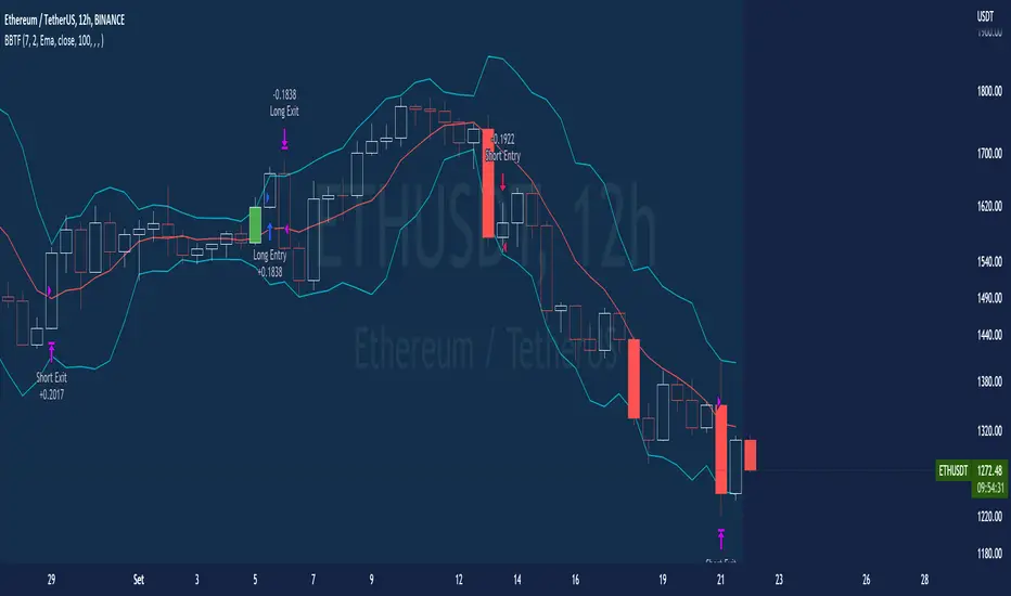
BT-Bollinger Bands - Trend FollowingEsse script foi criado para estudo de Backtest. O script usa as Bandas de Bollinger para indicar o início de uma tendência, a entrada é configurada quando o preço abre abaixo e fecha acima da banda superior ou para venda quando o preço abre acima e fecha abaixo da banda inferior. Não há um stop fixo e nem alvo fixo a saída se dá quando o preço toca a média da banda. Você pode usar uma média móvel como filtro combinado com a estratégia. O Script também pode ser usado com algum serviço de bot como 3commas.io , basta colocar as mensagens de entrada e saída para o bot. Autor : Credsonb - Nick: M4TR1X_BR Neste gráfico estou usando as seguintes configurações: Bandas Bollinger: 7 Desvio Padrão: 1.5 Time Frame: 12hs Ticker: ETH This script was created for Backtest study. script uses Bollinger Bands to indicate the start of a trend, entry is set when price opens below and closes above the upper band or for short when price opens above and closes below the lower band. There is no fixed stop and no fixed target, the exit occurs when the price touches the average of the band. You can use a moving average as a filter combined with the strategy. The Script can also be used with some bot service like 3commas. io , just put the input and output messages to the bot. Author : Credsonb - Nick: M4TR1X_BR Strategi Pine Script®oleh Credsonb126
Polynomial Regression Bands w/ Extrapolation of Price [Loxx]Polynomial Regression Bands w/ Extrapolation of Price is a moving average built on Polynomial Regression. This indicator paints both a non-repainting moving average and also a projection forecast based on the Polynomial Regression. I've included 33 source types and 38 moving average types to smooth the price input before it's run through the Polynomial Regression algorithm. This indicator only paints X many bars back so as to increase on screen calculation speed. Make sure to read the tooltips to answer any questions you have. What is Polynomial Regression? In statistics, polynomial regression is a form of regression analysis in which the relationship between the independent variable x and the dependent variable y is modeled as an nth degree polynomial in x. Polynomial regression fits a nonlinear relationship between the value of x and the corresponding conditional mean of y, denoted E(y |x). Although polynomial regression fits a nonlinear model to the data, as a statistical estimation problem it is linear, in the sense that the regression function E(y | x) is linear in the unknown parameters that are estimated from the data. For this reason, polynomial regression is considered to be a special case of multiple linear regression . Related indicators Polynomial-Regression-Fitted Oscillator Polynomial-Regression-Fitted RSI PA-Adaptive Polynomial Regression Fitted Moving Average Poly Cycle Fourier Extrapolator of Price w/ Projection Forecast Penunjuk Pine Script®oleh loxx99754
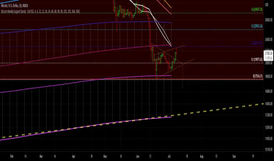
Bitcoin Support BandsSMA and EMA support/resistance bands for Bitcoin. Based on 4 week multiples; 1 month, 3 month, 6 month, 1 year, 2 year, 4 year. Penunjuk Pine Script®oleh Ryukobushi44
Bollinger Bands SqueezeBollinger Bands set to only display when a squeeze is taking place. Squeeze will be highlighted. Penunjuk Pine Script®oleh s3raphic333Telah dikemas kini 33324
SMA EMA Bands [CraftyChaos]This indicator creates bands for SMA and EMA averages and adds an average of the two with the idea that price often touches one of them at support and resistance levels. Saves indicator space by combining all into one indicator Penunjuk Pine Script®oleh CraftyChaos31
Bollinger Bands + EMA 9A 1 minute scalping strategy. Uses Bollinger Bands (no basis line) and a 9 period EMA. Waits for price to close below the lower Bollinger Band and the next candle to close bullish above the lower Bollinger Band but below the 9 Period EMA. If all conditions are met, the script enters a long position with TP at the 9 Period EMA.Strategi Pine Script®oleh D499Telah dikemas kini 44697
Steven Primo's bollinger bands strategyHi, this strategy is taken from a video made by Steven Primo. You can look it up on YouTube if you want to know about it. It is a mean-reversion strategy based on the Bollinger Bands, in which we wait for 5 consecutive closes above the upper band, and for a short-term top. Once it happens, we place an entry order on this top, with a stop at the nearest bottom before the movement started, and use the difference from the stop and entry point to determine the target. For shorting, it's the same process, but for the downside. From my testing, only long orders were profitable, but you can configure whichever you want. It works well for directional markets with a low level of noise, as you can see with the BTCUSD chart. One of its caveats is the short number of occurrences, and the long stop loss and target. You can enable a trailing stop, but from my testings, it just made the results worse. I made some modifications, like removing the MA requirement, since the entry point was above it almost all the time, and I forced the BB to use a log version of the prices, so that discrepancies are eliminated. You'll also notice that you can't select an extension that is lower than 100, and that is intentional, since you're not supposed to enter a trade in which you can lose more than what you can earn. I chose not to implement any kind of risk management, but I might do that in the future. You can leave your suggestions in the comments.Strategi Pine Script®oleh EduardoMattje11196
Greedy MA & Greedy Bollinger Bands This moving average takes all of the moving averages between 1 and 700 and takes the average of them all. It also takes the min/max average (donchian) of every one of those averages. Also included is Bollinger Bands calculated in the same way. One nice feature I have added is the option to use geometric calculations for. I also added regular bb calculations because this can be a major hog. Use this default setting on 1d or 1w. Enjoy! ps, I call it greedy because the default settings wont work on lower time framesPenunjuk Pine Script®oleh The_Peaceful_Lizard7786
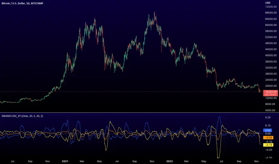
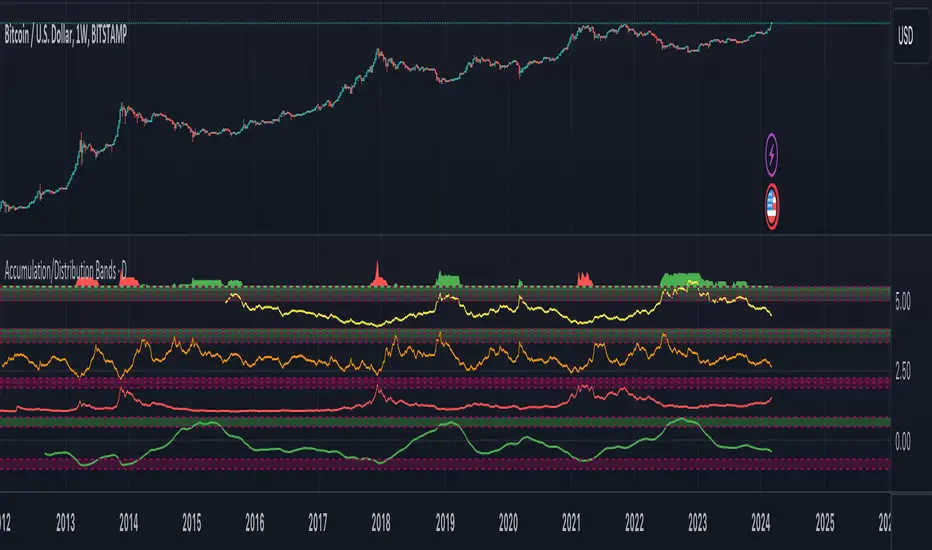
Accumulation/Distribution Bands & Signals (BTC, 1D, BITSTAMP) This is an accumulation/distribution indicator for BTC/USD (D) based on variations of 1400D and 120D moving averages and logarithmic regression. Yellow plot signals Long Term Accumulation, which is based on 1400D (200W) ALMA, orange plot signals Mid Term Accumulation and is based on 120D ALMA, and finally the red plot signals Long Term Distribution that's based on log regression. It should be noted that for red plot to work BTC 1D BITSTAMP graph must be used, because the function of the logarithmic regression was modified according to the x axis of the BITSTAMP data. Signal bands have different coefficients; long term accumulation (yellow) and and the log regression (red) plots have the highest coefficients and mid term accumulation (orange) has the lowest coefficients. Coefficients are 6x, 3x and 1.5x for the red (sell) and yellow (buy) plots and 1x, 2x and 3x for the orange (buy) plot. Selling coefficient for the yellow and the orange plots are respectively 2x and 1x. Buy and sell signals are summed up accordingly and plotted at the top of the highest band. Acknowledgement: Credits for the logarithmic regression function are due @memotyka9009 and Benjamin Cowen Penunjuk Pine Script®oleh spacekadet17Telah dikemas kini 1010168