Big Candle Touches Bollinger BandWhat It Does:
This indicator helps you spot important trading signals by combining Bollinger Bands with big candles.
Key Features:
Bollinger Bands: These bands show the average price (middle band) and the range of price movement (upper and lower bands) over a set period. The bands widen when prices are more volatile and narrow when they are less volatile.
Big Candle Detection: A "big candle" is a candle that has a larger body compared to the average price movement over a period. This is determined using the Average True Range (ATR), which measures market volatility.
How It Works:
Detects Big Candles: It checks if a candle’s body (the difference between its open and close prices) is bigger than usual, based on a multiplier of the ATR.
Touching Bollinger Bands: It looks for candles that touch or cross the upper or lower Bollinger Bands.
Highlights Important Signals:
Sell Signal: When a big candle touches the upper Bollinger Band, it marks it as a "Sell" signal with a red label.
Buy Signal: When a big candle touches the lower Bollinger Band, it marks it as a "Buy" signal with a green label.
Alerts:
You'll get alerts when a big candle touches the upper or lower Bollinger Bands, so you don’t miss these potential trading opportunities.
Visuals:
Bollinger Bands: Shown as three lines on the chart — the upper band (red), the lower band (green), and the middle band (blue).
Labels: Red labels for sell signals and green labels for buy signals when a big candle touches the bands.
This indicator helps you identify potential trading opportunities by focusing on significant price movements and how they interact with the Bollinger Bands.
Cari dalam skrip untuk "bands"

[MAD] CurveBuilderThe CurveBuilder is a versatile indicator that constructs channels using selectable input averages weighted together.
It also incorporates scalable and shiftable offsets on the resulting bands.
This indicator allows users to customize various settings to tailor the channel construction according to their trading strategy.
here a example screenshot of 3 different settings overlayed
Key Features:
-------------------
1. Moving Average Timeframe: Select the timeframe for the moving average calculation on the middle line.
-------------------
2. Middleline Settings:
Allow you to customize the parameters related to the middle line of the channel.
The middle line is constructed using two moving averages, which can be selected from the various types available.
Here are the details of the Middleline Settings:
1. MA Type: This setting allows you to choose the type of moving average for the first average. You have the following options:
Weighted Moving Average (WMA), Hull Moving Average (HMA), Volume Weighted Moving Average (VWMA), Linear Moving Average (LMA),
Regular Moving Average (RMA), Simple Moving Average (SMA), Exponential Moving Average (EMA), EMA, Ehlers Gaussian,
Ehlers Smoother, Ehlers Supersmoother, Ehlers Butterworth, ChebyshevI, ChebyshevII
Length (1st MA): This parameter allows you to set the length or period of the first moving average. The length determines the number of bars considered in the calculation of the moving average.
2. MA Type: Similar to the first moving average, this setting lets you choose the type of moving average for the second average.
Length (2nd MA): This parameter sets the length or period of the second moving average. The length determines the number of bars considered in the calculation of the moving average.
3. Weighting:
This option allows you to adjust the weighting factor when merging from the first moving average to the second moving average.
By modifying the weighting, you can control the influence of the first average on the second average.
By selecting different moving average types, adjusting their lengths, and modifying the weighting factor, you can fine-tune the behavior of the middle line in the channel.
This flexibility allows you to customize the indicator to align with your preferred trading strategy and market conditions.
Best results are given when there is a maximum hitrate on retraces to the middleline, and many relevant directionchanges are near that line.
-------------------
3. Averaging Settings:
Offset of Curve in Bars: Shifts the indicator into the future by specifying the number of bars.
-------------------
4. Band Settings:
The Band Settings in the Multitimeframe Channel Builder indicator allow you to configure the parameters related to the construction of the bands around the middle line.
The bands provide an upper and lower boundary that help define the width of the channel. Here are the details of the Band Settings:
Band Mode:
This setting determines the method used to calculate the bands. You have the following options:
Off: Bands are turned off, and no calculations are performed.
True Range: Bands are calculated using the True Range.
Average True Range: Bands are calculated using the Average True Range.
Standard Deviation: Bands are calculated using the Standard Deviation.
Rate of Change: Bands are calculated using the Rate of Change.
Relative Strength Index: Bands are calculated using the Relative Strength Index.
Length (Bands):
This parameter sets the length or period used in the calculation of the bands. The length determines the number of bars considered when calculating the bands.
Band 1-3 Multiplicator:
These parameters allow you to adjust the scaling factor for each band. The multiplicative factor determines the width of the bands relative to the middle line.
Higher values result in wider bands, while lower values result in narrower bands.
Offset in % (Bands):
These parameters enable you to specify the offset percentage for each band. The offset represents the distance between the middle line and the bands.
A positive offset moves the bands further away from the middle line, while a negative offset brings the bands closer to the middle line.
By selecting the desired band mode, adjusting the length parameter, and modifying the multiplicators and offsets,
you can customize the width and positioning of the bands.
This flexibility allows you to adapt the indicator to different market conditions and trading strategies.
Note that if the Band Mode is set to "Off," the bands will not be displayed, regardless of the other band settings.
-------------------
5. Band Final Smooth:
The Band Final Smooth settings in the Multitimeframe Channel Builder indicator enable you to apply a smoothing technique to the constructed bands.
By selecting the desired smoothing type and adjusting the length parameter, you can customize the level of smoothing applied to the bands.
This helps to filter out short-term fluctuations and emphasize the underlying trend, providing a clearer visualization of the price channel.
Smooth Bands: This option allows you to enable or disable the smoothing of the bands. When enabled, the indicator applies the selected smoothing technique to the bands.
Smooth Type: You can choose the type of smoothing to apply to the bands. The available options include:
Weighted Moving Average (WMA), Hull Moving Average (HMA), Volume Weighted Moving Average (VWMA), Linear Moving Average (LMA),
Regular Moving Average (RMA), Simple Moving Average (SMA), Exponential Moving Average (EMA), EMA, Ehlers Gaussian,
Ehlers Smoother, Ehlers Supersmoother, Ehlers Butterworth, ChebyshevI, ChebyshevII
Length (Smooth Bands): This parameter sets the length or period of the smoothing technique applied to the bands.
A longer length will result in a smoother representation of the bands, while a shorter length will provide more responsiveness to price changes.
Final Smooth settings are optional, and you can choose to exclude smoothing if it does not align with your trading strategy or preferences.
-------------------
6. Alert Settings:
The Alert Settings in the Multitimeframe Channel Builder indicator allow you to configure the parameters related to the generation of alert notifications based on specific conditions.
Alerts can help you stay informed about potential trading opportunities. Here are the details of the Alert Settings:
Alert Mode: This setting determines the type of alert triggered by the indicator. You have the following options:
Band-outside: Generates an alert when the price moves outside the constructed channel bands.
Band-crossin: Generates an alert when the price crosses above or below the channel bands.
Band-crossout: Generates an alert when the price crosses back inside the channel bands.
Trend: Generates an alert when there is a significant trend change (over or under the middleline).
Oscillator: Generates an alert based on the behavior of the oscillator, if in Oscillator mode.
Spikedetection: This option allows you to enable or disable spike detection in the alerts. When enabled, the indicator considers spikes or sudden price movements when generating alerts.
By selecting the appropriate Alert Mode and configuring spike detection, you can receive alert notifications that align with your trading strategy and help you identify potential trading opportunities.
It's important to note that alert settings alone do not place trades automatically.
They serve as notifications for you to review and analyze the situation before making trading decisions.
Make sure to have a proper understanding of the selected alert mode and its implications in your trading strategy.
-------------------
7. Operation Mode:
The Multitimeframe Channel Builder indicator offers three operation modes: Channels, Oscillator, and Noplot.
This setting determines how the indicator is displayed on the chart and what type of information it provides.
Channels Mode:
When the indicator is set to channel mode, it will be displayed as an overlay on the chart. It generates channel lines based on the selected moving average types and their lengths.
These channels can help identify support and resistance levels or potential price breakout points. The channel lines are plotted on the chart,
providing a visual representation of the price movements within the channels.
Oscillator Mode: In Oscillator mode, the indicator is presented on a separate plane below or above the main chart, which you need to move manually.
It generates an oscillator based on the configured settings, including the selected moving averages and their lengths.
The oscillator provides insights into the market's momentum and overbought/oversold conditions.
It consists of horizontal lines representing different levels, such as upper and lower boundaries, and a middle line.
Traders can analyze the oscillator's movements and crossovers to identify potential trading signals.
Noplot Mode: Setting the indicator to Noplot mode disables all visual plotting on the chart. However, the indicator still generates alerts based on the configured settings.
This mode is useful if you only want to receive alert notifications for trading opportunities without cluttering the chart with additional visual elements.
Channels mode is ideal for analyzing price movements within defined channels,
Oscillator mode provides insights into market momentum, and
Noplot mode allows for focus on alert notifications without visual distractions on the chart.
-------------------
8. Oscillator Settings (Only applicable in Oscillator mode):
Hline from highest to lowest: Set the values for the highest to lowest horizontal lines.
POW-Compression: Adjust the compression factor for the oscillator.
Multiplier: Set the multiplier for the oscillator.
Oscillator Normalization Lockback: Specify the minimum time for normalization in the oscillator.
Detection Length and Filter Length: Set the lengths for the oscillator detection and filter.
Show Acceleration: Enable or disable the display of acceleration.
-------------------
9. Label Settings:
Decimals for Labels: Choose the number of decimals for label values.
Show Alerts (L1, L2, L3): Toggle the visibility of alerts for each level. Alert 1 is a minor alert, 3 a major
Label Color: Set the color for the labels.
Display Lines: Show or hide the lines on the chart.
Display Prices: Show or hide the price levels on the chart.
-------------------
10. Signal Config:
This Indicator offers a signal transmission configuration section specifically for Multibit implementation.
This feature allows you to transmit signals between multiple instances of the indicator, creating a daisychain effect. Here are the details of the Multibit implementation settings:
Signal Type: This setting determines the type of signal transmission used. You have the following options:
MultiBit: Enables the Multibit signal transmission.
MultiBit_pass: Enables the Multibit signal transmission with infusion.
NoInput: Disables the signal transmission.
Select Incoming Indicator: This parameter allows you to select the incoming indicator for signal transmission. You can choose any valid input source, such as the closing price or another indicator.
Channel configuration:
Channel long signal 1: Specify the channel used to transmit long signals for the first instance in the daisychain. Choose a value from -1 to 15 to represent different channels.
Channel short signal 1: Specify the channel used to transmit short signals for the first instance in the daisychain. Choose a value from -1 to 15 to represent different channels.
Channel long signal 2: Specify the channel used to transmit long signals for the second instance in the daisychain.
Channel short signal 2: Specify the channel used to transmit short signals for the second instance in the daisychain.
Channel long signal 3: Specify the channel used to transmit long signals for the third instance in the daisychain.
Channel short signal 3: Specify the channel used to transmit short signals for the third instance in the daisychain.
Channel Sideways only: Specify the channel used to transmit signals related to sideways movements.
Channel Trend: Specify the channel used to transmit signals related to trend movements.
Here's a overview of the current settings.
-------------------
Librarys used:
djmad/Signal_transcoder_library
djmad/MAD_MATH
djmad/Mad_Standardparts

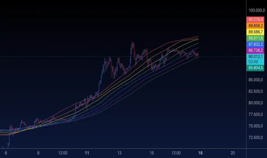
MA Rainbow-AYNETSummary of the "MA Rainbow"
The 200 MA Rainbow script creates a visually appealing representation of multiple moving averages (MAs) with varying lengths and colors to provide insights into price trends and market momentum.
Key Features:
Base Moving Average:
A starting point (ma_length, default 200) is used as the foundation for all other bands.
Rainbow Bands:
The script generates multiple moving averages (bands) with increasing lengths, spaced by a user-defined band_spacing multiplier.
The number of bands is controlled by rainbow_bands, allowing up to 7 bands.
Moving Average Types:
Users can select the MA type: Simple (SMA), Exponential (EMA), or Weighted (WMA).
Dynamic Colors:
Each band is assigned a unique color from a predefined rainbow palette, making the chart visually distinct.
Inputs for Customization:
ma_length: Adjust the base period of the moving average.
rainbow_bands: Set the number of bands to display.
band_spacing: Control the spread between bands.
How It Works:
Precomputing Bands:
Each band’s length is calculated based on the base length (ma_length) and a multiplier (band_spacing).
For example, if ma_length = 200 and band_spacing = 0.2, the lengths of the first 3 bands will be:
Band 1: 200
Band 2: 240
Band 3: 280
Global Plotting:
Each band’s moving average is precomputed using the selected type (SMA, EMA, or WMA).
Bands are plotted globally to avoid scope issues, ensuring compatibility with Pine Script rules.
Color Cycling:
Colors are assigned dynamically from a rainbow palette (red, orange, yellow, green, blue, purple, teal).
Use Case:
The 200 MA Rainbow helps traders:
Visualize market trends with multiple layers of moving averages.
Identify areas of support and resistance.
Gauge momentum through the spread and alignment of bands.
Customization:
Users can:
Change the base moving average length (ma_length).
Adjust the number of bands (rainbow_bands).
Control the spread between bands with band_spacing.
Select the moving average type (SMA, EMA, WMA).
Application:
Copy the script into the Pine Editor in TradingView.
Apply it to your chart to observe the Rainbow MA visualization.
Adjust inputs to match your trading style or strategy.
This script is a versatile tool for both beginner and advanced traders, providing a colorful way to track price trends and market conditions. 🌈
VWAP Wave System ToolkitGENERAL OVERVIEW:
The VWAP Wave System Toolkit is an all-in-one trading indicator based on rules from Auction Market Theory. The indicator is built around Volume-Weighted Average Prices (VWAP), Initial Balance (IB) levels, session/composite volume profiles, low-volume zones, optional candle coloring, trade checklists, dashboard readings, and a watermark.
This indicator was developed by Flux Charts in collaboration with Chris Drysdale (Trader Drysdale), author of the best-selling book VWAP Wave System.
What’s the purpose of this indicator?
The VWAP Wave System Toolkit helps traders see where market value is forming, shifting, or being rejected across different timeframes. It’s built on the ideas of Auction Market Theory, which views the market as a continuous auction between buyers and sellers searching for fair value. The indicator combines VWAPs, Initial Balance levels, and volume profiles into one system that shows how price interacts with value throughout the day, week, and month. By combining short-term and higher-timeframe data, it helps traders understand when the market is balanced and when it’s starting to discover new price areas.
What’s the theory behind this indicator?
This indicator is built on Auction Market Theory, introduced by J. Peter Steidlmayer. The theory says that markets operate as continuous auctions, constantly seeking a fair price where buyers and sellers agree on value. When price stays within a narrow range and volume builds up, the market is balanced around a value area. When price moves away from that area, the market enters price discovery, searching for a new zone of balance. VWAPs represent an evolving measure of value, while Volume Profiles and Initial Balance visualize how the auction developed during each session. Low Volume Zones often show where the market moved too quickly to trade efficiently, making them potential areas of interest for future reactions. By combining these elements, the indicator provides a picture of how the market is auctioning and where value may shift next.
VWAP WAVE SYSTEM TOOLKIT FEATURES:
The VWAP Wave System Toolkit indicator includes 7 main features:
Initial Balance Levels
Multi-Timeframe VWAPs
Session Volume Profile
Composite Volume Profile
Low Volume Zones
Checklist
Watermark
Initial Balance Levels:
🔹What is the Initial Balance?
The Initial Balance (IB) is defined by the high and low prices that form within a specific time window. Typically, this time window is the first hour after the regular day trading session starts (09:30 - 10:30 AM EST).
The high and low formed during this window create the foundation for the day’s price structure. From these two points, the indicator automatically calculates several key reference levels that show how far price has extended beyond the initial range or where it may still be balanced. Understanding how these levels are derived and how to interpret them is essential to using the Initial Balance effectively.
🔹How Initial Balance Levels are calculated:
Once the IB window closes, the indicator plots a full set of reference levels derived from the IB range. These levels are:
IB High
IB Low
IB Midpoint
x2 High / x2 Low
x2 Midpoints (x1.5 High/Low)
x3 High / x3 Low
x3 Midpoints (x2.5 High/Low)
🔹IB High & IB Low
The IB High is the highest price reached during the IB session window, and the IB Low is the lowest price reached.
🔹IB Midpoint
The IB Midpoint is the average of the IB High and IB Low.
🔹x2 High & x2 Low
The x2 levels are calculated by projecting one full IB Range above and below the Initial Balance. The IB Range is the distance between the IB High and IB Low.
🔹x2 High Midpoint & x2 Low Midpoint
The x2 High Midpoint (x1.5 High) is the average of the IB High and x2 High. The x2 Low Midpoint (x1.5 Low) is the average of the IB Low and x2 Low.
🔹x3 High & x3 Low
The x3 High/Low levels are calculated by projecting two full IB Range above and below the Initial Balance.
🔹x3 High Midpoint & x3 Low Midpoint
The x3 High Midpoint (x2.5 High) is the average of the x2 High and x3 High. The x3 Low Midpoint (x2.5 Low) is the average of the x2 Low and x3 Low.
🔹Breaks & Retests:
For every Initial Balance level, the indicator automatically tracks when price retests or breaks through them.
A Break occurs when a candle closes above or below an IB level. When this happens, the indicator plots a small blue triangle.
A Retest occurs when price approaches and touches an IB Level, and then reverses in the opposite direction. When this happens, the indicator plots a small green or red triangle.
Green Triangle: Bullish Retest - Price comes down to a level, touches it, and continues up.
Red Triangle: Bearish Retest - Price comes up to a level, touches it, and continues down.
Both breaks and retests are plotted directly on the chart for every toggled IB level. Once detected, they remain fixed and are not repainted.
Other Settings:
🔹Shade IB Range
When enabled, this setting fills the area between the IB High and IB Low (IB Range). The fill helps visually separate the Initial Balance range from the rest of the session, making it easier to identify when price is trading inside or outside of the IB. The color and opacity can also be adjusted through the settings.
🔹Apply One Color
When this setting is enabled, all toggled IB levels use the same color instead of the user’s inputted colors.
🔹Levels Labels
When enabled, text labels that identify each IB level (for example, “IB High,” “x2 High,” or “x2.5 Low”) appear next to each level.
🔹Price Labels
When enabled, the indicator displays the real-time price value of each IB level directly on the chart. These labels update automatically as price changes or when the levels shift due to recalculation from a new session.
🔹Extend Levels Right
When enabled, all toggled IB Levels will be extended infinitely to the right of the chart.
🔹Align Text Right
This setting aligns all level and price labels to the right edge of the plotted line. When disabled, text labels will be aligned to the left edge of each level.
Multi-Timeframe VWAPs:
🔹Why does this indicator include VWAPs?
This indicator includes VWAPs because they show where the most trading activity has occurred within each timeframe, helping identify the market’s fair value area. According to Auction Market Theory, price moves between periods of balance and imbalance as buyers and sellers seek fair value. VWAPs represent those balance points where the majority of trading has taken place. By plotting the Intraday, Weekly, and Monthly VWAPs, the indicator shows how value shifts across different timeframes and whether the market is balanced or moving toward a new area of value.
🔹Intraday VWAP
The Intraday VWAP measures the average traded price for the current trading session and resets each day at market open. It shows where most of the session’s trading has taken place, acting as a real-time fair value line. When price trades near the Intraday VWAP, the market is considered balanced. When price moves far above or below it, the market is exploring new value areas.
🔹Candle Coloring:
The Intraday VWAP candle coloring highlights how far price is trading from the session’s average value using the first and second standard deviation bands as visual reference zones. This feature helps users see whether price is balanced around fair value or expanding into an overextended area.
When candle coloring is enabled, each candle’s color changes based on where it closes relative to the two standard deviation bands surrounding the Intraday VWAP. The first band represents one standard deviation (1.0 STD) and the second represents one and a half standard deviations (1.5 STD).
If a candle closes above the upper 1.5 standard deviation band, it is colored a brighter green, showing strong movement above fair value. Candles closing between the upper 1.0 and 1.5 standard deviation bands are a lighter green, showing moderate strength. If a candle closes below the lower 1.5 standard deviation band, it is colored a brighter red, showing strong movement below fair value. Candles closing between the lower 1.0 and 1.5 standard deviation bands are a lighter red, showing moderate weakness. Candles that close within the ±1.0 standard deviation range remain their normal color, showing that price is balanced near the session’s average.
Both the VWAP line and its bands can be customized in the Intraday VWAP settings. Users can adjust the VWAP line color, band colors, and fill transparency. The candle colors can also be modified. The band sizes (1.0 STD and 1.5 STD by default) can be changed through their input multipliers, allowing users to control the sensitivity of the zones.
Please Note: This candle coloring applies only to the Intraday VWAP
🔹Weekly VWAP
The Weekly VWAP measures the average traded price across the current trading week and resets at the start of each new week. It reflects the fair value area that has developed over multiple trading days, providing a broader view of market balance compared to the Intraday VWAP. When price stays close to the Weekly VWAP, it indicates that the week’s trading activity is balanced. When price consistently trades above or below it, the market is moving away from that balance and forming value in a new area.
Standard Deviation Bands:
The Weekly VWAP includes optional standard deviation bands. Users can toggle 1x and 1.5x STD bands. Users can also adjust the multipliers.
Customization:
All colors for the Weekly VWAP and its standard deviation bands can be changed in the indicator’s settings. Users can adjust the VWAP line color, band colors, and fill transparency.
🔹Monthly VWAP
The Monthly VWAP measures the average traded price for the current month and resets on the first trading day of each new month. It provides the broadest view of value within this indicator, showing where the majority of trading has occurred during the current month. When price remains near the Monthly VWAP, it reflects long-term balance.
Standard Deviation Bands:
The Monthly VWAP includes optional 1x and 1.5x standard deviation bands that can be enabled or disabled. In the settings, users can adjust the standard deviation multipliers.
Customization:
The Monthly VWAP line, band colors, and fill transparency can all be modified in the indicator’s settings.
🔹VWAP Dashboard
The VWAP Dashboard provides a quick real-time overview of how price is positioned relative to the Intraday, Weekly, and Monthly VWAPs. It is displayed directly on the chart and updates automatically with each new candle.
The dashboard is divided into five labeled sections:
Intraday
Weekly
Monthly
Weekly STD
Monthly STD
Intraday, Weekly, and Monthly Sections:
These three sections show whether price is currently trading Above or Below each VWAP.
If price is above a VWAP, that section displays “Bullish”
If price is below a VWAP, that section displays “Bearish”
Weekly STD and Monthly STD:
These sections display whether price is currently inside or outside the standard deviation bands of the Weekly and Monthly VWAPs.
When price is trading within the ±1.0 standard deviation zone, the dashboard output is “Balanced Market”
When price is above the upper standard deviation, price is extending up beyond the week’s or month’s fair value, and the dashboard output is “Bullish Price Discovery”
When price is below the lower standard deviation, price is extending down beyond the week’s or month’s fair value, and the dashboard output is “Bearish Price Discovery”
🔹What is a Balanced Market
A balanced market occurs when price is trading within the ±1.0 standard deviation range of a VWAP. This shows that buyers and sellers are in general agreement on value, and trading activity is taking place around the fair value area. In this state, price tends to rotate around the VWAP rather than trend strongly away from it. Balance reflects stability in the auction process, where neither side is dominant and value is being built at current prices.
🔹What is Bullish Price Discovery
Bullish Price Discovery occurs when price trades above the upper standard deviation of a VWAP. This indicates that buyers are accepting higher prices and that value may be shifting upward. In terms of Auction Market Theory, the market is moving away from balance as it searches for a new fair value area above the prior range.
🔹What is Bearish Price Discovery
Bearish Price Discovery occurs when price trades below the lower standard deviation of a VWAP. This shows that sellers are accepting lower prices and that value may be developing beneath the prior area of balance. The market is moving out of equilibrium as participants test lower prices to find new fair value.
Session Volume Profile:
🔹Why this feature is included:
The Session Volume Profile is included to show where trading activity occurred within each session. It visually represents the volume traded at each price, helping to identify where market participants considered value to be. This ties directly to Auction Market Theory, which views markets as auctions seeking balance between buyers and sellers. The profile highlights those balance areas and shows where volume thins out, helping distinguish between value areas and areas of rejection.
🔹How is the Session Volume Profile calculated and displayed:
At the start of each selected session window, the indicator creates a new volume profile and tracks every bar in that session. For each candle, it saves the high, low, open, close, volume, and time. When the HD (High Definition) setting is enabled, and your chart is between the 1-minute and 30-minute timeframes (recommended), the indicator requests lower-timeframe data and feeds the profile with 1-minute candlesticks for more detail. The running session high and low define the vertical bounds of the volume profile. That span is split into a fixed number of rows. Each row represents a price slice. For every bar and every price row, the indicator checks whether the bar’s high-low range touches that row. If it does, it adds part of the bar’s volume to that row. The allocation uses a step-to-bar-size ratio, so that narrow bars do not overload a tall row and tall bars contribute proportionally across all rows they cross. If the bar closes above its open, that row’s “up” volume bucket is incremented. If it closes below its open, the “down” bucket is incremented. After all bars are processed, the row with the highest total becomes the Point of Control (POC). Starting from that row, the indicator expands upward and downward, adding adjacent rows until the cumulative total reaches your Value Area percentage. The upper boundary is Value Area High (VAH), and the lower boundary is Value Area Low (VAL).
For rendering, each price row becomes a horizontal box drawn from the session start time to a length proportional to that row’s volume versus the session’s maximum row volume. If you choose “Up / Down” volume, the row is split into two adjoining boxes that show the up and down portions. If you choose “Total,” a single box is drawn to the total length. If you choose “Delta,” the length reflects the absolute difference between up and down. The POC is drawn as a line across the row midpoint. VAH and VAL are drawn at the exact prices of the top and bottom value rows. While a session is open the profile keeps updating as new bars form. When the session ends, the script fixes its start and end and stops changing that profile. To avoid any issues with drawing limits, the indicator only renders the two most recent session volume profiles.
Settings:
🔹Enabled
Turns the Session Volume Profile on or off. When disabled, no session profiles, lines, or volume boxes are displayed.
🔹HD
Stands for High Definition. When enabled, the indicator requests data from the 1-minute timeframe to build a smoother, more detailed volume profile. This produces finer row distribution and more accurate POC, VAH, and VAL positioning, especially on higher chart timeframes.
🔹POC Line
Toggles the visibility of the Point of Control line. The POC represents the price level with the highest traded volume in the session. It’s drawn horizontally across the chart at that price, and its color can be customized in settings.
🔹VAH
Controls the display of the Value Area High line. The VAH is the top boundary of the range that contains the specified percentage of total traded volume (default 70%). It marks where volume starts to thin out above fair value. Users can turn it on or off and customize its color.
🔹VAL
Controls the display of the Value Area Low line. The VAL is the lower boundary of the value area and marks where volume thins out below fair value. Its visibility and color can also be customized.
🔹Session
This setting allows users to define the start and end time of the trading session used to calculate the session volume profile. Only bars within this time window are included in the volume profile. When a session ends, the volume profile locks, and a new one begins automatically when the next session begins based on the user’s input.
🔹Volume
Controls how the histogram rows are displayed:
Up/Down: Splits each price row into two parts: one for bullish candles (Up volume) and one for bearish candles (Down volume). This helps visualize buying versus selling pressure at each price.
Total: Combines both Up and Down volume into a single-colored bar for each price level. Since direction isn’t separated, this view focuses purely on where trading activity was concentrated, regardless of which side was in control. A tall bar means strong participation and interest at that price.
Delta: Displays the difference between up and down volume (Up/Down) for each row, highlighting which side controlled that price area.
🔹Value Area Volume
The Value Area Volume setting defines how much of the total session volume is considered the “value area.” By default, it’s 70%, meaning the indicator finds the price range where 70% of all trading took place during that session. This area is where buyers and sellers agreed the most on price, also known as the fair value zone.
If you increase the percentage (for example, to 80%), the value area becomes wider and includes more of the session’s trading range. Lowering it (for example, to 60%) makes it narrower, focusing only on the prices with the heaviest activity.
🔹Row Size
The Row Size controls how detailed the volume profile looks. It decides how many price levels (rows) the profile is divided into. Smaller values make the profile smoother and easier to read but less precise. Larger values add more detail and show exactly where volume clustered, but they can make the profile look denser.
The maximum value is 450 rows, and the minimum value is 5 rows. Higher values (especially above 200) can make the volume profile appear more detailed but may also cause performance issues or partial rendering on TradingView charts due to the platform’s drawing object limits. For most users, values between 50–150 give a good balance between clarity and performance.
25 Rows vs. 200 Rows:
Composite Volume Profile:
The Composite Volume Profile shows how volume is distributed across a larger selected range instead of just one session. It helps traders see where the most trading activity has taken place over multiple days. This gives a picture of long-term balance areas and important price zones that have repeatedly attracted buyers and sellers.
The Composite Profile uses the same base logic and visual settings as the Session Volume Profile, including POC Line, VAH, VAL, Volume Type, Value Area Volume, Row Size, and Colors. Any customization applied to those settings also affects the Composite Profile, ensuring a consistent appearance across both features.
🔹Session Count Setting:
This setting controls how many past sessions are merged into one composite volume profile. For example, if the Session Count is set to 5, and each session represents one trading day, the profile combines data from the last 5 trading days. A “session” refers to the time window defined in the Session Volume Profile settings.
🔹How is the Composite Volume Profile used?
In Auction Market Theory, markets move through phases of balance and imbalance as traders agree on value before moving to explore new ones. The Composite Volume Profile shows where that long-term balance has formed. Large, wide areas on the profile indicate zones where multiple sessions agreed on value. Thin areas show prices that were quickly rejected, where less time and volume were traded. Combining short-term session profiles into a composite helps identify when the market is holding near established value or entering new price discovery, confirming transitions between balance and price discovery.
Low Volume Zones:
🔹What are Low Volume Zones?
Low Volume Zones (LVZs) are price areas where trading activity was minimal compared to surrounding levels. On a volume profile, they appear as thin “valleys” between two high-volume “peaks.” These valleys show where the market moved too quickly for significant two-way trade to occur. In Auction Market Theory, they represent inefficient areas, meaning the market didn’t find fair value, so price either skipped through or rejected those levels.
🔹How are Low Volume Zones found?
The indicator identifies Low Volume Zones (LVZs) directly from Session Volume Profiles (SVPs) by analyzing the shape of its volume distribution. Each SVP is built from a series of horizontal rows, where each row represents the total traded volume within a narrow price range. The longer the row, the higher the trading activity at that price.
The indicator first locates the two largest high-volume peaks on the profile. These peaks represent the strongest areas of market activity. Once these two main peaks are found, the indicator looks on both sides of each peak for the lowest-volume row in the surrounding area. Those small-volume dips define the boundaries of the Low Volume Zones.
Each high-volume peak can therefore generate two LVZs (one above and one below it), resulting in a maximum of four Low Volume Zones per volume profile. If two LVZs overlap or share the same price range, they are automatically merged into a single larger zone, which may reduce the total count to three or fewer.
🔹How are Low Volume Zones used?
Low Volume Zones (LVZs) mark areas where the market previously traded with little participation. In Auction Market Theory, these zones represent inefficient price areas where buyers and sellers failed to agree on value. When price returns to an LVZ, it may act as an area where price tends to react differently due to lower previous trading activity. If the market still sees that area as unfair, price will reject it and reverse quickly. If the market now accepts that price level, volume builds and price moves through it smoothly as the auction seeks new balance. Traders use LVZs to identify where price may react sharply or move quickly through thin areas. When price approaches a zone from above or below, it signals potential rejection or continuation.
🔹LVZ Breaks and Retests
The indicator automatically tracks how price interacts with every detected LVZ.
A Break occurs when price fully moves through the entire LVZ and closes past it. When this happens, the indicator plots a small blue triangle.
A Retest occurs when price touches an LVZ and reverses away, showing rejection. When price comes down to a level, taps it, and continues up, it’s considered a bullish retest, and a small green triangle is plotted. When price comes up to a level, taps it, and continues down, it’s considered a bearish retest, and a small red triangle is plotted.
🔹LVZ Settings
Enabled:
Toggles LVZ detection and visualization on or off.
Realtime:
Allows LVZs to form dynamically as the current session develops, updating live as volume builds or thins out. When disabled, zones only appear once the session closes.
Please note: When this setting is enabled, zones may update or shift while the current session is still forming. Because the Session Volume Profile is continuously recalculating with new data, both the volume distribution and detected zones can change until the session closes.
Row Pivot Length:
Controls how far above and below each price row the indicator looks when identifying the highest and lowest volume points that define each Low Volume Zone. Larger values make the indicator compare a wider range of rows, while smaller values keep the analysis closer to each row’s immediate area.
Last SVPs:
Defines how many recent Session Volume Profiles are used for LVZs. For example, setting it to 3 limits LVZ detection to the last three sessions only.
Retests and Breaks:
Enables or disables the display of the retest and break markers described above.
Checklist:
The Checklist is a manual on-chart dashboard that allows traders to keep track of specific market conditions before entering a trade. Each checklist item can be toggled on or off in the indicator’s settings. When enabled, a checkmark emoji appears next to that item on the dashboard. When disabled, an X emoji appears next to that item.
This feature is designed to help traders visually confirm important steps in their process, such as reviewing trend direction, VWAP alignment, or session context. The checklist can also be repositioned anywhere on the chart using the “Location” setting for better visibility and layout preference.
Watermark:
The Watermark feature displays key chart information directly in the background, including the current ticker symbol, selected timeframe, and date. The watermark’s size, color, and transparency can be adjusted in the settings.
UNIQUENESS:
The VWAP Wave System Toolkit is unique because it brings every part of Auction Market Theory to the chart. It shows how value builds and shifts by combining Initial Balance levels, multi-timeframe VWAPs, and volume profiles. The indicator automatically marks low-volume zones where the market moved too quickly, highlights breaks and retests, and tracks how price interacts with fair value across sessions, weeks, and months. Every feature works together to give a simple view of balance, imbalance, and value development as the auction unfolds.

WaveTrend Dynamic (Lazy Bear Style)█ OVERVIEW
The WaveTrend Dynamic indicator (in the style of Lazy Bear) is an advanced tool based on the Exponential Smoothing Average (ESA), which adapts to the volatility and price of a financial instrument. It is more flexible than the classic WaveTrend but shares a similar concept of bands around a main oscillator line.
The indicator uses dynamic bands calculated as distances from the ESA, with their width adjustable via the "level" parameter. This allows it to be tailored to various markets, timeframes, and volatility conditions, making it easier to identify trends, reversal points, and buy/sell signals.
█ CONCEPTS
The WaveTrend Dynamic combines oscillator functions with trend analysis. Below, we explain the key components in a simple way, understandable even for beginner users.
Core Calculations
The indicator relies on the adaptive ESA and a few straightforward steps:
1 — ESA (Adaptive Average): Calculated as a smoothed average of the price (from high, low, and close, or HLC3) using the ESA Length parameter (default: 10). This number determines how many past candles are considered in the calculation. The ESA quickly responds to price changes, helping to track trends.
2 — Deviation (D): Measures how much the price deviates from the ESA, factoring in market volatility. This allows the indicator to adapt to different instruments.
3 — Price Distance Indicator (CI): Shows how far the price is from the ESA relative to market volatility. This forms the basis for the main indicator line, reacting to price movements.
4 — WT1 (WaveTrend 1): The main line, smoothing the Price Distance Indicator (CI) with the Average Length parameter (default: 21). It reflects the direction of price movement and momentum.
5 — WT2 (WaveTrend 2): A signal line that further smooths WT1 (with a period of 4). It helps confirm signals through crossovers with WT1.
6 — Bands (UpperBand and LowerBand): These form a dynamic channel around the ESA. Their width depends on the level parameter (default: 100). Wider bands result in fewer but more reliable signals. In the original WaveTrend, the oscillator bands use lower values, such as 50 or 60. To achieve classic oscillator signals (more frequent WT1/WT2 crossovers outside the bands), set the level to 50–60.
Trend Identification
The indicator identifies two types of trends:
• Major Trend: Determined by the position of WT1 relative to the ESA. When WT1 is above the ESA, it indicates a bullish trend. When below, it signals a bearish trend. Line and fill colors reflect this trend.
• Mini-Trend: Based on WT1 and WT2 crossovers. When the lines cross, they change to the same color, signaling short-term changes or reversal points. This is ideal for quick trading decisions.
Visuals and Effects
• WT1 and WT2 Lines: Scaled to price and displayed on the price chart for easier analysis.
• Fills: Between the bands (UpperBand/LowerBand) and between WT1/WT2, with a "wave" effect that adjusts transparency based on the trend (green for bullish, red for bearish).
• Signals: Three types—return-to-band, WT1/WT2 crossovers outside the bands, and crossovers inside the bands. Signals are displayed as triangles with different colors for buy and sell.
█ FEATURES
Detailed features of the indicator, aligned with the order of settings in the script:
• Basic Parameters: ESA Length — controls ESA smoothing; Average Length — affects WT1 responsiveness; level (WT Level) — adjusts band width for signal filtering.
• Display Elements: Options to show/hide ESA, bands, WT1/WT2; customizable colors for lines, fills, and the wave effect.
• Signals: Three signal groups (return-to-band, crossovers outside bands, crossovers inside bands) with display and color customization options.
█ HOW TO USE
1 — Add the indicator to your TradingView chart and adjust parameters: — Increase ESA Length and Average Length for low-volatility markets (e.g., stocks), or decrease for cryptocurrencies or forex. — Set level to 50–60 for classic WaveTrend signals with WT1/WT2 crossovers outside bands. The default value of 100 creates wider bands and fewer signals.
2 — Analyze trends: — Major trend (WT1 vs. ESA) shows the overall market direction. — Mini-trends (WT1/WT2 crossovers) help time short-term entries.
3 — Use signals: — Return-to-band: Buy at the lower band, sell at the upper band (mean-reversion). — Crossovers outside bands: Indicate strong momentum (with a lower level, e.g., 50). — Crossovers inside bands: Signal weaker trend changes.
4 — Combine with other tools: Use with volume, RSI, or support/resistance for better decisions. Test on historical data to optimize settings.

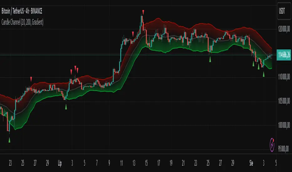
Candle Channel█ OVERVIEW
The "Candle Channel" indicator is a versatile technical analysis tool that plots a price channel based on the Simple Moving Average (SMA) of candlestick midpoints. The channel bands, calculated based on candlestick volatility, form dynamic support and resistance levels that adapt to price movements. The script generates signals for reversals from the bands and SMA breakouts, making it useful for both short-term and long-term traders. By adjusting the SMA length, the channel can vary in nature—from a wide channel encapsulating price movement to narrower support/resistance or trend-following bands. The channel width can be further customized using a scaling parameter, allowing adaptation to different trading styles and markets.
█ MECHANISM
Band Calculation
The indicator is based on the following calculations:
Candlestick Midpoint: Calculated as the arithmetic average of the candle’s high and low prices: (high + low) / 2.
Simple Moving Average (SMA): The average of candlestick midpoints over a specified length (default: 20 candles), forming the channel’s centerline.
Average Candle Height: Calculated as the average difference between the high and low prices (high - low) over the same SMA length, serving as a measure of market volatility.
Band Scaling: The user specifies a percentage of the average candle height (default: 200%), which is multiplied by the average height to create an offset. The upper band is SMA + offset, and the lower band is SMA - offset.Example: For an average candle height of 10 points and 200% scaling, the offset is 20 points, meaning the bands are ±20 points from the SMA.
Channel Characteristics: The SMA length determines the channel’s dynamics. Shorter SMA values (10–30) create a wide channel that contains price movement, ideal for scalping or short-term trading. Longer SMA values (above 30, e.g., 50–100) transform the channel into narrower support/resistance or trend-following bands, suitable for longer-term analysis. Band scaling further adjusts the channel width to match market volatility.
Signals
Reversal from Bands: Signals are generated when the price closes outside the band (above the upper or below the lower) and then returns to the channel, indicating a potential trend reversal.
SMA Breakout: Signals are generated when the price crosses the SMA upward (bullish signal) or downward (bearish signal), suggesting potential trend changes.
Visualization
Centerline: The SMA of candlestick midpoints, displayed as a thin line.
Channel Bands: Upper and lower channel boundaries, with customizable colors.
Fill: Options include a gradient (smooth color transition between bands) or solid color. The fill can also be disabled for greater clarity.
█ FEATURES AND SETTINGS
SMA Length: Determines the moving average period (default: 20). Values of 10–30 are suitable for a wide channel containing price movement, ideal for short-term timeframes. Longer values (e.g., 50–100) create narrower support/resistance or trend-following bands, better suited for higher timeframes.
Band Scaling: Percentage of the average candle height (default: 200%). Adjusts the channel width to match market volatility—smaller values (e.g., 50–100%) for narrower bands, larger values (e.g., 200–300%) for wider channels.
Fill Type: Gradient, solid, or no fill, allowing customization to user preferences.
Colors: Options to change the colors of bands, fill, and signals for better readability.
Signals: Options to enable/disable reversal signals from bands and SMA breakout signals.
█ HOW TO USE
Add the script to your chart in TradingView by clicking "Add to Chart" in the Pine Editor.
Adjust input parameters in the script settings:
SMA Length: Set to 10–30 for a wide channel containing price movement, suitable for scalping or short-term trading. Set above 30 (e.g., 50–100) for narrower support/resistance or trend-following bands.
Band Scaling: Adjust the channel width to market volatility. Smaller values (50–100%) for tighter support/resistance bands, larger values (200–300%) for wider channels containing price movement.
Fill Type and Colors: Choose a gradient for aesthetics or a solid fill for clarity.
Analyze signals:
Reversal Signals: Triangles above (bearish) or below (bullish) candles indicate potential reversal points.
SMA Breakout Signals: Circles above (bearish) or below (bullish) candles indicate trend changes.
Test the indicator on different instruments and timeframes to find optimal settings for your trading style.
█ LIMITATIONS
The indicator may generate false signals in highly volatile or consolidating markets.
On low-liquidity charts (e.g., exotic currency pairs), the bands may be less reliable.
Effectiveness depends on properly matching parameters to the market and timeframe.
Ultimate Volatility CloudUltimate Volatility Cloud
The Ultimate Volatility Cloud is a powerful and highly customizable indicator designed to help traders visualize market volatility, easily identify trend, and overextended moves in price with adaptive bands. It combines the strengths of the Arnaud Legoux Moving Average, Kaufman's Adaptive Moving Average, ATR Channels, and Standard Deviation bands, offering multiple pre-configured profiles and extensive customization options.
Key Features:
Dynamic Volatility Bands: The indicator plots multiple layers of volatility bands around a central basis line, providing a comprehensive view of price deviation.
Hybrid Band Calculation: Bands are a sophisticated blend of Keltner Channels, KAMA ATR Channels and Standard Deviation, allowing for a nuanced representation of volatility.
Adaptive Smoothing: Bands are smoothed using either Exponential Moving Average (EMA) or Kaufman's Adaptive Moving Average (KAMA) based on the selected profile, ensuring responsiveness tailored to market conditions.
Layered Fills: The cloud uses distinct color fills for different volatility levels, making it easy to visually interpret price action relative to its typical range.
Customizable Color Themes: Choose from a variety of pre-set color themes, including "Rainbow," "Wild," and "Monochrome," or stick with classic options to suit your visual preference.
Optional Basis Line Plots: Display the EMA or KAMA basis lines (used in Keltner Channel calculations) separately on the chart for additional analysis.
Understanding the Profiles:
The indicator comes with several pre-configured "Settings Profiles" that adjust the internal parameters (Keltner Channel/KAMA Channel/Standard Deviation band blend, and band smoothing) to suit different trading styles or market environments.
1. Standard Profile:
Blend: 60% Keltner Channel, 40% Standard Deviation.
Smoothing: EMA smoothing of 3 periods.
Purpose: A balanced, general-purpose profile suitable for a wide range of market conditions. It offers a good blend of trend following and volatility awareness.
2. Responsive Profile:
Blend: 40% Keltner Channel, 60% Standard Deviation.
Smoothing: EMA smoothing of 2 period.
Purpose: Designed for traders who need quick reactions to price changes. The higher Standard Deviation blend and minimal smoothing make it highly sensitive to immediate volatility shifts, ideal for short-term analysis or identifying early moves.
3. Ranging Market Profile:
Blend: 80% KAMA ATR Channel, 20% Standard Deviation.
Smoothing: KAMA smoothing.
Purpose: Optimized for sideways or consolidating markets. By utilizing KAMA-based ATR bands and KAMA for band smoothing, this profile adapts its responsiveness to reduce whipsaws in choppy conditions, providing clearer boundaries for range-bound price action.
4. Trend Following Profile:
Blend: 90% Keltner Channel, 10% Standard Deviation.
Smoothing: EMA smoothing of 5 periods.
Purpose: Tailored for riding strong trends. The heavy emphasis on the Keltner Channel and slightly smoother bands help filter out minor fluctuations, allowing traders to focus on the dominant directional movement.
5. Conservative Profile:
Blend: 65% KAMA ATR Channel, 35% Standard Deviation.
Smoothing: EMA smoothing of 10 periods.
Purpose: Aims to provide more filtered signals and reduce noise. The KAMA basis for the Keltner Channel combined with a longer EMA smoothing period offers a slower, more confirmed view of volatility, suitable for traders seeking higher conviction entries or exits.
Example of the Ranging Market Profile
How to Use:
The volatility cloud can be interpreted in various ways:
Price within the inner bands: May indicate consolidation or a period of lower volatility.
Price pushing into outer bands: Suggests increasing volatility and potential for a strong move.
Price breaking out of extreme outer bands: Can signal significant momentum and the start or continuation of a strong trend.
Cloud expansion/contraction: Visually indicates periods of increasing or decreasing market energy.
Experiment with different profiles and settings to find the combination that best suits your trading strategy and the instruments you trade.

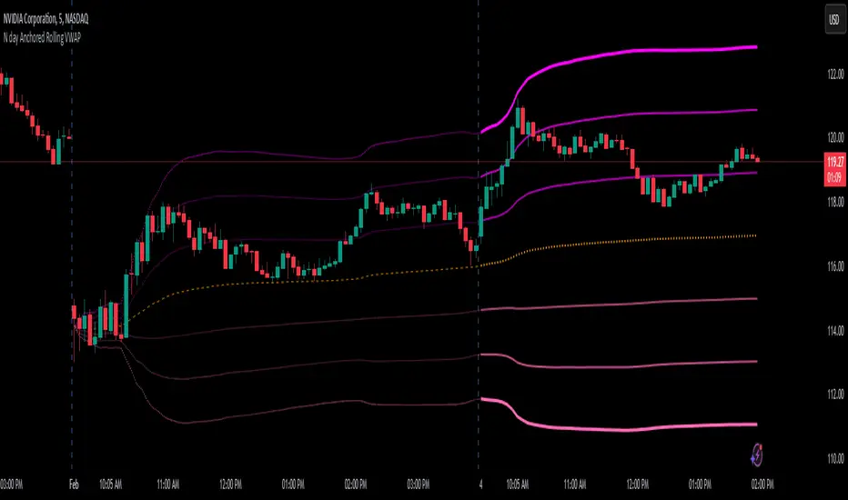
N day Anchored Rolling VWAP
⭐ Overview
The N-Day Anchored Rolling VWAP is designed to automate and simplify the use of anchored VWAP for traders, making it an invaluable tool for those who rely on VWAP for trend filtering, support/resistance identification, or strategy implementation. This indicator removes the tedious and repetitive manual process of setting the anchored VWAP for multiple charts or stocks in a watchlist. Once added, the indicator dynamically maintains and updates the anchor point across charts, allowing users to focus on their analysis instead of time-consuming adjustments.
________________________________________
⭐ Goal of the Indicator
The primary goal of this indicator is to automate the manual process of anchoring the VWAP for multiple charts or stocks. By removing the need to manually set the anchor every day, this script simplifies the workflow and saves valuable time for traders.
The examples and chart illustrations provided showcases some of the most common and widely used ways traders utilize anchored VWAP in their strategies. They are intended as demonstrations, not exhaustive applications, as specific use cases may vary based on individual trading approaches.
________________________________________
⭐ Why the Name?
1).N-Day Anchored:
The term "N-Day Anchored" reflects the flexibility of the anchor point. Users can specify the number of days prior to the present day where the VWAP calculation should begin. For
example:
🟢"0" anchors the VWAP to the current day's opening.
🟢"1" anchor it to the previous day's opening.
🟢"2" anchors it to the day before yesterday, and so on.
2).Rolling:
The "Rolling" aspect signifies that the anchor point remains consistent relative to the current day. For instance:
If the anchor is set to the day before yesterday, the indicator will continuously adjust to
ensure the anchor remains two days prior, even as new trading days begin. This means the
lines plotted always reflect the VWAP anchored to the chosen
relative day, regardless of how many days have passed.
________________________________________
⭐ Inputs, Settings, and Functionality
1). Anchor Point (Days Prior): Use the "Days prior" input to set the anchor point for VWAP:
🟢"0": Anchors the VWAP to the start of the current day's trading session.
🟢"1": (default): Anchors the VWAP to the start of the previous day's trading session.
🟢"2": Anchors the VWAP to the day before yesterday, and so on.
This input determines the starting point for the VWAP calculation and updates dynamically each day.
2). VWAP Line Customization: The orange dashed line represents the anchored VWAP.
You can adjust its color through the input’s menu.
3). Standard Deviation Bands:
⭕ Three Bands: The indicator plots three upper and three lower bands to represent standard deviation levels from the VWAP.
➡️ On the current day, these bands are plotted as thick, solid lines with bright colors, providing clear real-time plotting.
➡️ On historical days, the bands appear as faint, dotted lines, offering a visual
representation of the anchored VWAP without cluttering the chart.
⭕ Customizable Settings:
➡️Multiplier: Set the distance of each band from the VWAP.
➡️Colors: Choose separate colors for the upper and lower bands.
➡️Visibility Toggle: Enable or disable specific bands as needed.
This clear differentiation ensures traders can easily distinguish between real-time plotting (current day) and the visualization of historical anchoring.
________________________________________
⭐ Example Use Cases
1). Trend Filter: Use the anchored VWAP as a trend filter:
➡️When the price is above the anchored VWAP, the trend is bullish.
➡️When the price is below the anchored VWAP, the trend is bearish.
2). 2-Day Anchored VWAP Strategy: This strategy uses the VWAP anchored to the
previous day’s opening candle, continuing through today’s price action. Traders can
identify entry and exit points based on how the price interacts with this 2-day anchored VWAP.
3). Standard Deviation Bands as Support or Resistance: Utilize the standard deviation
bands to find potential support and resistance levels, as prices often react near these
bands.
4). VWAP Rejection (VWAP Bounce): Look for rejections near the anchored VWAP to
confirm a continuation of the current trend. For example, if the price rejects the 2-day
anchored VWAP, it can signal a strong continuation in the current trend direction.
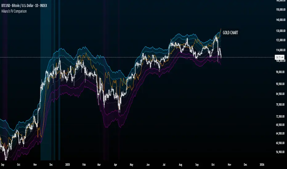
Hikaru's FV Comparison
Hikaru's FV Comparison allows you to compare any two assets using Hikaru Bands. This indicator shows where your comparison asset sits within its own bands while you're viewing another chart. Perfect for spotting divergences between correlated markets - see if SPX is overbought while BTC isn't, or check if ETH and SOL are aligned in their band positions.
The orange line (customizable color) represents the comparison asset's relative position mapped to your current chart's Hikaru Bands. When the comparison asset touches its lower extreme band, the line appears at your chart's lower extreme. When it's overbought, the line moves to the corresponding overbought zone on your chart.
█ FEATURES
Comparison Symbol Selection
• Choose any symbol to compare against your current chart (default: CRYPTO:ETHUSD)
• Works with stocks, crypto, forex, indices, or any TradingView symbol
• Confirmation dialog on first load to select your comparison asset
Visual Clarity
• Customizable comparison line color (default: orange) for easy visibility
• Grey line indicates periods with no data available for the comparison symbol
• Single clean line overlay - no clutter, just the essential information
Full Hikaru Bands Customization
All original Hikaru Bands features are included:
• 10 component indicators: EMA Spread, CCI, BB%, Crosby Ratio, Sharpe Ratio, ROC, Z-Score, PGO, RSI, and Omega Ratio
• Multiple color schemes: Extremes, VAMS Style, Copper, Ocean, Washed Out, Neon, Warm, Cool
• Adjustable normalization lookback, basis length, band multiplier, and smoothing
█ HOW TO USE
Setting Up
1 — Add the indicator to your chart. A dialog will prompt you to select a comparison symbol.
2 — Choose the asset you want to compare (e.g., TVC:SPX to compare with the S&P 500).
3 — Adjust the comparison line color in the Style settings if needed (it's at the top for easy access).
Interpreting the Comparison Line
• When the line is near your chart's upper bands: The comparison asset is in its overbought zone
• When the line is near your chart's lower bands: The comparison asset is in its oversold zone
• When the line is near the middle basis: The comparison asset is trading near its equilibrium
• Grey line: No historical data available for the comparison asset during that period
Trading Applications
• Divergence Detection: Spot when correlated assets are moving in opposite band directions
• Correlation Confirmation: Verify that related markets are showing similar strength or weakness
• Leading Indicators: Watch for one asset reaching extremes before the other follows
• Risk Assessment: Check if macro indices like SPX are overbought when considering crypto longs
█ EXAMPLES
ETH vs SOL
Compare Ethereum against Solana to see if they're aligned. If ETH is at its lower bands but SOL shows (via the comparison line) at its upper bands, this divergence might indicate a rotation between the two assets.
Crypto vs GOLD
Compare your crypto chart against TVC:GOLD (GOLD Index) to see money flow correlations.
█ DISCLAIMER
This tool is designed for technical analysis and should not be used as a standalone signal for trading.
Predictive Order Blocks [CryptoSea]The Predictive Order Blocks Indicator is a unique and innovative tool that enhances market analysis by identifying support and resistance blocks based on standard deviations from a median line. Unlike traditional indicators that rely solely on the close price, this indicator leverages the median line and standard deviations to form areas of interest, rather than targeting a single price point. This approach provides a more accurate representation of market structure, especially during periods of consolidation and expansion.
Key Features
Multi-Term Length Analysis: The indicator offers short, medium, and long-term settings, allowing traders to customise the analysis based on their preferred trading strategy and timeframe. This flexibility ensures that the tool is adaptable to various market conditions and trading styles.
Standard Deviation-Based Order Blocks: The core functionality of the indicator revolves around calculating standard deviations from a median line to form support and resistance blocks. These blocks provide a clearer and more reliable picture of market structure compared to single-point levels. By focusing on areas rather than exact price levels, the indicator helps traders identify zones where price is likely to react, leading to more informed trading decisions.
Dynamic Box Creation: The indicator dynamically creates breakout boxes based on user-selected standard deviation ranges. These boxes are formed at the start of market expansion following periods of consolidation. This feature is particularly useful because it highlights key levels where price is likely to retrace after breaking out, providing traders with actionable insights during market transitions.
Proximity-Based Gradient Colors: The indicator features gradient colors that change based on the price's proximity to the standard deviation bands. This visual aid helps traders quickly assess the current market condition and the potential significance of the support and resistance blocks.
Adaptive Display Options: To accommodate different trading preferences, the indicator includes options to toggle the display of the trend line (median line) and the standard deviation bands. This flexibility allows traders to customise their chart view to match their analysis style, whether they prefer a more clutter-free view or a detailed breakdown of market levels.
In the example below, the indicator shows the bands compressing during a period of consolidation, highlighting the potential for a breakout.
How it Works
Median Line Calculation: The indicator calculates the median line using a user-defined period. This line serves as the central reference point from which the standard deviations are calculated. By using the median line instead of just the close price, the indicator provides a more stable and reliable baseline for identifying support and resistance areas.
Standard Deviation Bands: Around the median line, the indicator calculates multiple standard deviation bands. These bands represent areas where price is statistically likely to find support or resistance. By focusing on these areas, traders can better anticipate where price might react, rather than relying on arbitrary levels.
Dynamic Box Creation and Expansion Detection: The indicator monitors the compression and expansion of the standard deviation bands. During periods of low volatility (squeeze), the bands compress, indicating consolidation. Once the bands start expanding, it signals the potential for a breakout. At this point, the indicator dynamically creates predictive order blocks based on the selected standard deviation range. These blocks highlight key levels where price might retrace or react, providing traders with valuable entry and exit points.
Color-Coded Proximity Alerts: To further enhance usability, the indicator uses color gradients to indicate how close the current price is to the calculated bands. This visual representation helps traders quickly assess the potential significance of the price's current position relative to the support and resistance areas.
In the example below, the indicator shows the bands expanding with the price, triggering the formation of the predictive order block.
In the final example, the price retraces into the order block before bouncing back to the upside, demonstrating the effectiveness of the identified support area.
Alerts
Trend Line Alerts: The indicator provides alerts when the price crosses above or below the trend line (median line). This feature is crucial for traders looking to identify potential trend changes early, allowing them to act quickly on emerging opportunities.
Band Alerts: Alerts are also triggered when the price crosses above or below the upper or lower bands for each standard deviation level. This helps traders identify potential breakout or breakdown scenarios, ensuring they are notified of significant market movements as they happen.
Customisable Alert Conditions: To cater to different trading strategies, the indicator allows users to set alert conditions for each standard deviation band and the trend line. This level of customisation ensures that traders receive alerts that are relevant to their specific trading style and market analysis.
Application
Strategic Decision-Making: The Predictive Order Blocks Indicator assists traders in making informed decisions by providing detailed analysis of potential breakout zones. By identifying key support and resistance areas, the indicator helps traders plan their entries and exits with greater precision.
Trend Confirmation: The indicator reinforces trading strategies by identifying key levels where price is likely to react. This confirmation is crucial for traders looking to enter trades with higher confidence.
Customized Analysis: The indicator adapts to various trading styles with extensive input settings that control the display and calculation of order blocks. Whether you're a day trader, swing trader, or long-term investor, the indicator can be tailored to meet your specific needs.
Visual Clarity: With customizable color settings and display options, the indicator enhances chart readability, allowing traders to quickly and easily interpret market data.
The Predictive Order Blocks Indicator by CryptoSea is an invaluable addition to a trader's toolkit, offering depth and precision in market trend analysis to navigate complex market conditions effectively.

EMA Hierarchy Score V.1.0
EMA Hierarchy Score V.1.0
Purpose
The EMA Hierarchy Score indicator assesses the relative positioning of multiple Exponential Moving Averages (EMAs) for a financial asset. This tool provides insights into trend strength by calculating ideal and non-ideal configurations of EMAs, allowing for effective interpretation when used alongside standard EMA charts.
Variables and Inputs
The indicator organizes a set of EMAs and other metrics into a hierarchy for scoring:
* Primary Variables (A–J):
A: Close price
B: Open price
C: Previous close price
D to J: EMAs of configurable periods (5, 9, 13, 21, 26, 52, 100).
* User Inputs:
* Customizable periods for each EMA, allowing users to adjust the indicator’s sensitivity.
* Customizable period and standard deviation multiplier for Bollinger Bands, enabling further control over the indicator’s analysis.
Mathematical Method
The EMA Hierarchy Score calculates how closely the current EMA structure aligns with an “ideal” configuration through a structured scoring system:
1- Hierarchy Scoring:
* Ideal Order: Defined as A > B > C > D > E > F > G > H > I > J, representing a strong upward trend where each EMA progressively increases.
* Non-Ideal Order: Defined as J > I > H > G > F > E > D > C > B > A, indicating a weak or downward trend where each EMA progressively decreases.
* Optimal Order: Calculated based on achieving maximum alignment with the ideal configuration for each EMA across the chosen period.
* Sub-Optimal Order: The least-aligned structure across the same period.
2- Score Calculation:
* The indicator calculates a score by comparing all EMA pairs in values. For each comparison, a score increment of +1 (ideal) or -1 (non-ideal) is applied.
* The final score reflects the EMA configuration’s deviation from the ideal order:
- Positive Score: Indicates closer alignment with the ideal structure.
- Negative Score: Indicates deviation toward a non-ideal structure.
3- Smoothed and Signal Lines:
* A smoothed score is created using a Simple Moving Average (SMA) of the raw hierarchy score.
* A signal line (an SMA of the smoothed score) further aids in tracking directional shifts in the score.
4- Trend Labels and Bollinger Bands:
* Trend Labels: Display "UP" or "DOWN" based on the smoothed score’s relationship to the signal line.
* Bollinger Bands: Plotted around a selected source (smoothedLine, signalLine, or score) to analyze score volatility and deviations from the mean. The period and standard deviation multiplier for Bollinger Bands are user-configurable.
Result Definition
The Ideal and Non-Ideal Scores represent the upper and lower bounds of achievable configurations, ensuring the score does not exceed these values.
1- Ideal and Non-Ideal Result:
* Calculated based on how closely the current EMA configuration follows the “ideal” ascending or descending order.
* Ideal Score: Defined as +165, representing perfect alignment with the ideal configuration.
* Non-Ideal Score: Defined as -165, indicating full alignment with the descending, non-ideal structure.
* The score is bounded by these values and will not go above or below this range.
2- Optimal and Sub-Optimal Scores:
* Optimal Score: The highest score over the selected scoring period, calculated with the same period as the Bollinger Bands. Using consistent periods reinforces the reliability of the score by aligning with the period already used to gauge volatility.
* Sub-Optimal Score: The lowest score over the same period, capturing points of minimal alignment with the ideal order.
Interpretation and Analysis
1- Use with EMA Charts:
* This indicator is designed to be used alongside EMA charts, as its results provide insights into the relative order of EMAs and their alignment with trend strength.
* The EMA Hierarchy Score interprets the underlying EMA structure, offering additional context on whether current trends are aligned with optimal or non-optimal EMA configurations.
2- Ideal and Non-Ideal Analysis:
* A positive EMA Hierarchy Score indicates an orderly, ideal upward trend, suggesting stronger alignment with the ideal structure.
* A negative score signals a potential downward trend or deviation from the ideal structure.
3 - Trend Indicators and Bands:
* Trend Labels: The "UP" and "DOWN" labels offer real-time feedback on trend direction shifts, based on the smoothed score and signal line relationship.
* Bollinger Bands: Visualize the range of score fluctuations, helping to identify breakout or breakdown points.
4 - Optimal and Sub-Optimal Scores:
* Use the Optimal Score to understand peak trend alignment and Sub-Optimal Score to spot potential reversal or correction zones.
* A consistently high score over time indicates trend stability, while variations may suggest instability.
Quick Reference Table
The table displayed at the top right provides an at-a-glance view of key metrics:
* Ideal and Non-Ideal Score: Fixed at ±165 to represent the calculated ideal and non-ideal configuration.
* Optimal and Sub-Optimal Scores: Show maximum and minimum scores over the scoring period, color-coded green for positive and red for negative values.
This concise table helps users quickly assess indicator values, reducing the need to interpret multiple chart lines and making it easier to understand overall trend strength.
Disclaimer
The EMA Hierarchy Score V.1.0 is a technical analysis tool designed to assist in understanding the alignment and strength of trends as defined by EMA configurations. This indicator does not constitute investment advice, nor does it make specific recommendations for buying or selling assets. Users should consult with a financial advisor before making any trading decisions, as past performance or technical signals do not guarantee future results. The developers of this indicator disclaim all liability for potential financial losses arising from reliance on this tool. Users assume full responsibility for interpreting and applying the indicator’s outputs in their investment decisions.
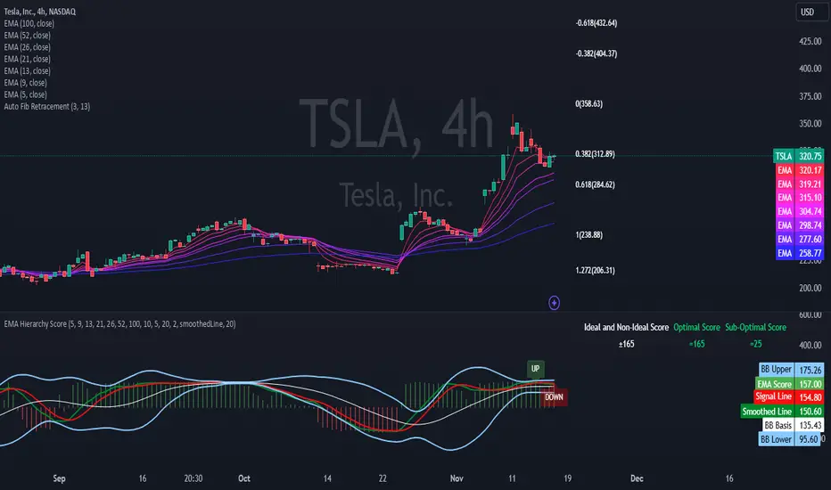
Volume MAs Oscillator | Lyro RSVolume MAs Oscillator | Lyro RS
Overview
The Volume MAs Oscillator is a powerful volume‑adjusted momentum tool that combines custom‑weighted moving averages on volume‑weighted price with smoothed deviation bands. It offers dynamic insights into trend direction, overbought/oversold conditions, and relative valuation — all within a single indicator
Key Features
Volume‑Adjusted Moving Averages: Moving averages can be volume‑weighted using the following formula: a moving average of (Price × Volume) divided by a moving average of Volume. This formula is applied across more than 14 different moving averages; however, it is not used with the VWMA, as VWMA is inherently a volume-weighted moving average.
Percentage Oscillator: Displays the normalized difference: (source – MA) / MA * 100, centered around zero for easy interpretation of strength and direction.
Deviation Bands: Builds upper and lower bands from standard deviation of the oscillator over a selected lookback, with distinct positive/negative multipliers and optional smoothing to reduce noise.
Inputs: Band Length, Band Smoothing, Positive Band Multiplier, Negative Band Multiplier.
Multi‑Mode Signal System:
1. Trend Mode – Colors oscillator according to breaks above (bullish) or below (bearish) respective bands.
2. Reversion Mode – Inverses color logic: signals overextensions beyond bands as reversion opportunities, greys inside the bands.
3. Valuation Mode – Applies a gradient color scale (UpC ⇄ DnC) to reflect relative valuation strength.
Customizable Visuals: Select from 5 pre‑set palettes—Classic, Mystic, Major Themes, Accented, Royal—or define your own custom bullish/bearish colors.
Chart enhancements include color‑coded oscillator line, deviation bands, glow‑effect midline at zero, background shading and candlestick/bar coloring aligned to signal mode.
Built‑In Signals: Automatically plots ▲ oversold and ▼ overbought markers upon crosses of lower/upper bands (in trend or reversion modes), enhancing signal clarity.
How It Works
MA Calculation – Applies the selected MA type to price × volume (normalized by MA of volume) or direct VWMA.
Oscillator Output – Calculates the % difference of source vs. derived MA.
Band Construction – Computes rolling standard deviation; applies user‑defined multipliers; smooths bands with exponential blending.
Mode-Dependent Coloring & Signals –
• Trend: Highlights strength trends via band cross coloring.
• Reversion: Flags extremes beyond bands as potential pullbacks.
• Valuation: Uses gradient to reflect oscillator’s position relative to recent range.
Signal Markers – Deploys arrows and color rules to flag overbought (▼) or oversold (▲) conditions when bands are breached.
Practical Use
Trend Confirmation – In Trend Mode, use upward price_diff cross above upper band as bullish; downward cross below lower band as bearish.
Mean Reversion – In Reversion Mode, fading extremes beyond bands may precede a retracement.
Relative Valuation – Valuation Mode shines when assessing how extended price_diff is, with gradient colors indicating valuation zones.
Bars/candles color‑coded to oscillator state boosts clarity of market tone and allows for rapid visual scanning.
Customization
Adjust MA type/length to tune responsiveness vs. smoothing.
Configure band settings for volatility sensitivity.
Toggle between signal modes for trend-following or reversion strategies.
Stylish visuals: pick or customize color schemes to match your chart setup.
⚠️Disclaimer
This indicator is a tool for technical analysis and does not provide guaranteed results. It should be used in conjunction with other analysis methods and proper risk management practices. The creators of this indicator are not responsible for any financial decisions made based on its signals.

Triple SRSI-MFI Ⅲ - Multi TimeframeTriple SRSI-MFI Ⅲ - Multi Timeframe Indicator
Description
The Triple SRSI-MFI Ⅲ - Multi Timeframe indicator is a powerful tool designed to combine Stochastic RSI (SRSI) and Money Flow Index (MFI) across multiple timeframes (higher, current, and lower). It provides a comprehensive view of market momentum and potential overbought/oversold conditions by calculating a weighted hybrid of SRSI-MFI values from three different timeframes. The indicator also integrates Bollinger Bands to help identify trend direction and volatility.
This indicator is ideal for traders who want to analyze market conditions across multiple timeframes without switching charts. It automatically adjusts settings based on the current timeframe and includes a dynamic weighting system optimized for Bitcoin volatility. Additionally, a real-time information panel displays the market state (buy/sell) and signal strength.
Key Features
Multi-Timeframe Analysis: Combines SRSI-MFI from higher, current, and lower timeframes for a holistic view.
Dynamic Weighting: Automatically adjusts weights for each timeframe based on Bitcoin volatility, with an option for manual customization.
Bollinger Bands Integration: Visualizes trend direction and volatility using Bollinger Bands, with customizable source selection.
Real-Time Info Panel: Displays market state (buy/sell) and signal strength (%) in the top-right corner of the chart.
Customizable Settings: Allows users to tweak MFI source, Bollinger Bands parameters, and visibility of individual components.
How to Use
Add to Chart: Add the "Triple SRSI-MFI Ⅲ - Multi Timeframe" indicator to your chart.
Interpret Signals:
Market State (Buy/Sell): Shown in the info panel. "Buy" when the average SRSI-MFI is above the Bollinger Bands basis, "Sell" when below.
Strength (%): The relative position of the average SRSI-MFI within the Bollinger Bands, scaled from 0% to 100%.
Overbought/Oversold Levels: The indicator plots horizontal lines at 80 (overbought) and 20 (oversold). Use these as potential reversal zones.
Combine with Price Action: Use the indicator in conjunction with price action or other tools for better decision-making.
Adjust Settings: Customize the settings (e.g., Bollinger Bands length, weights, visibility) to match your trading style.
Settings
MFI Source: Select the source for MFI calculation (default: "hlc3"). Options include "close", "open", "high", "low", "hl2", "hlc3", "ohlc4".
Bollinger Bands:
Length: Period for Bollinger Bands calculation (default: 20).
Multiplier: Standard deviation multiplier for the bands (default: 2.0).
Source: Choose which SRSI-MFI value to use for Bollinger Bands ("averageHybrid", "hybrid_higher", "hybrid_current", "hybrid_lower"; default: "hybrid_higher").
Weights:
Auto Weight Enabled: Enable/disable automatic weights based on Bitcoin volatility (default: true).
Higher/Current/Lower Weights: Manually set weights for each timeframe if auto-weight is disabled (defaults: 1.5, 1.0, 0.5).
Indicator On/Off:
Toggle visibility for Higher SRSI-MFI, Current SRSI-MFI, Lower SRSI-MFI, Average SRSI-MFI, and Bollinger Bands.
How It Works
SRSI-MFI Calculation:
Stochastic RSI (SRSI) and Money Flow Index (MFI) are calculated for three timeframes: higher, current, and lower.
The hybrid value (SRSI * (MFI / 100)) is computed for each timeframe.
Weighted Average:
The hybrid values are combined into a weighted average (averageHybrid) using dynamic or manual weights.
Bollinger Bands:
Bollinger Bands are applied to the selected source (e.g., hybrid_higher) to identify trend direction and volatility.
Relative Position:
The position of averageHybrid within the Bollinger Bands is scaled to a percentage (0% to 100%) for strength assessment.
Visualization:
Plots individual SRSI-MFI lines, Bollinger Bands, and overbought/oversold levels.
A real-time info panel provides market state and signal strength.
Notes
This indicator is best used as part of a broader trading strategy. It is not a standalone signal generator and should be combined with other forms of analysis.
The automatic weights are optimized for Bitcoin (BTC) volatility. For other assets, you may need to adjust the weights manually.
The indicator may require sufficient historical data to calculate higher and lower timeframe values accurately.
Uptrick: Volatility Weighted CloudIntroduction
The Volatility Weighted Cloud (VWC) is a trend-tracking overlay that combines adaptive volatility-based bands with a multi-source smoothed price cloud to visualize market bias. It provides users with a dynamic structure that adapts to volatility conditions while maintaining a persistent visual record of trend direction. By incorporating configurable smoothing techniques, percentile-ranked volatility, and multi-line cloud construction, the indicator allows traders to interpret price context more effectively without relying on raw price movement alone.
Overview
The script builds a smoothed price basis using the open, and close prices independently, and uses these to construct a layered visual cloud. This cloud serves both as a reference for price structure and a potential area of dynamic support and resistance. Alongside this cloud, adaptive upper and lower bands are plotted using volatility that scales with percentile rank. When price closes above or below these bands, the script interprets that as a breakout and updates the trend bias accordingly.
Candle coloring is persistent and reflects the most recent confirmed signal. Labels can optionally be placed on the chart when the trend bias flips, giving traders additional visual reference points. The indicator is designed to be both flexible and visually compact, supporting different strategies and timeframes through its detailed configuration options.
Originality
This script introduces originality through its combined use of percentile-ranked volatility, adaptive envelope sizing, and multi-source cloud construction. Unlike static-band indicators, the Volatility Weighted Cloud adjusts its band width based on where current volatility ranks within a defined lookback range. This dynamic scaling allows for smoother signal behavior during low-volatility environments and more responsive behavior during high-volatility phases.
Additionally, instead of using a single basis line, the indicator computes two separate smoothed lines for open and close. These are rendered into a shaded visual cloud that reflects price structure more completely than traditional moving average overlays. The use of ALMA and MAD, both less commonly applied in volatility-band overlays, adds further control over smoothing behavior and volatility measurement, enhancing its adaptability across different market types.
Inputs
Group: Core
Basis Length (short-term): The number of bars used for calculating the primary basis line. Affects how quickly the basis responds to price changes.
Basis Type: Option to choose between EMA and ALMA. EMA provides a standard exponential average; ALMA offers a centered, Gaussian-weighted average with reduced lag.
ALMA Offset: Determines the balance point of the ALMA window. Only applies when ALMA is selected.
Sigma: Sets the width of the ALMA smoothing window, influencing how much smoothing is applied.
Basis Smoothing EMA: Adds additional EMA-based smoothing to the computed basis line for noise reduction.
Group: Volatility & Bands
Volatility: Choose between StDev (standard deviation) and MAD (median absolute deviation) for measuring price volatility.
Vol Length (short-term): Length of the window used for calculating volatility.
Vol Smoothing EMA: Smooths the raw volatility value to stabilize band behavior.
Min Multiplier: Minimum multiplier applied to volatility when forming the adaptive bands.
Max Multiplier: Maximum multiplier applied at high volatility percentile.
Volatility Rank Lookback: Number of bars used to calculate the percentile rank of current volatility.
Show Adaptive Bands: Enables or disables the display of upper and lower volatility bands on the chart.
Group: Trend Switch Labels
Show Trend Switch Labels: Toggles the appearance of labels when the trend direction changes.
Label Anchor: Defines whether the labels are anchored to recent highs/lows or to the main basis line.
ATR Length (offset): Length used for calculating ATR, which determines label offset distance.
ATR Offset (multiplier): Multiplies the ATR value to place labels away from price bars for better visibility.
Label Size: Allows selection of label size (tiny to huge) to suit different chart setups.
Features
Adaptive Volatility Bands: The indicator calculates volatility using either standard deviation or MAD. It then applies an EMA smoothing layer and scales the band width dynamically based on the percentile rank of volatility over a user-defined lookback window. This avoids fixed-width bands and allows the indicator to adapt to changing volatility regimes in real time.
Volatility Method Options: Users can switch between two volatility measurement methods:
➤ Standard Deviation (StDev): Captures overall price dispersion, but may be sensitive to spikes.
➤ Median Absolute Deviation (MAD): A more robust measure that reduces the effect of outliers, making the bands less jumpy during erratic price behavior.
Basis Type Options: The core price basis used for cloud and bands can be built from:
➤ Exponential Moving Average (EMA): Fast-reacting and widely used in trend systems.
➤ Arnaud Legoux Moving Average (ALMA): A smoother, more centered alternative that offers greater control through offset and sigma parameters.
Multi-Line Basis Cloud: The cloud is formed by plotting two individually smoothed basis lines from open and close prices. A filled area is created between the open and close basis lines. This cloud serves as a dynamic support or resistance zone, allowing users to identify possible reversal areas. Price moving through or rejecting from the cloud can be interpreted contextually, especially when combined with band-based signals.
Persistent Trend Bias Coloring: The indicator uses the last confirmed breakout (above upper band or below lower band) to determine bias. This bias is reflected in the color of every subsequent candle, offering a persistent visual cue until a new signal is triggered. It helps simplify trend recognition, especially in choppy or sideways markets.
Trend Switch Labels: When enabled, the script places labeled markers at the exact bar where the bias direction switches. Labels are anchored either to recent highs/lows or to the main basis line, and spaced vertically using an ATR-based offset. This allows the trader to quickly locate historical trend transitions.
Alert Conditions: Two built-in alert conditions are available:
➤ Long Signal: Triggered when the close crosses above the upper adaptive band.
➤ Short Signal: Triggered when the close crosses below the lower adaptive band.
These conditions can be used for custom alerts, automation, or external signaling tools.
Display Control and Flexibility: Users can disable the adaptive bands for a cleaner layout while keeping the basis cloud and candle coloring active. The indicator can be tuned for fast or slow response depending on the strategy in use, and is suitable for intraday, swing, or position trading.
Summary
The Volatility Weighted Cloud is a configurable trend-following overlay that uses adaptive volatility bands and a structured cloud system to help visualize market bias. By combining EMA or ALMA smoothing with percentile-ranked volatility and a four-line price structure, it provides a flexible and informative charting layer. Its key strengths lie in the use of dynamic envelopes, visually persistent trend indication, and clearly defined breakout zones that adapt to current volatility conditions.
Disclaimer
This indicator is for informational and educational purposes only. Trading involves risk and may not be suitable for all investors. Past performance does not guarantee future results.

BandBreak Pro (BB×ST×SRC) — Live-Sync Indicator📌 Overview
BandBreak Pro is a volatility + trend confirmation indicator designed to provide traders with clean breakout signals.
It synchronizes Bollinger Bands (BB), a selectable SRC line (price source), and Super trend (ST) into one unified logic.
⚡ Signals only trigger when price breaks the Bollinger Bands and the Super trend confirms the same direction.
📖 Basics & Definitions
1. Bollinger Bands (BB)
Bollinger Bands measure volatility by building an envelope around price.
Middle line (Basis) = Simple Moving Average (SMA).
Upper Band = SMA + (Multiplier × Standard Deviation).
Lower Band = SMA – (Multiplier × Standard Deviation).
👉 Meaning: A break above the upper band often suggests bullish strength, while a break below the lower band suggests bearish momentum.
2. SRC Line (Source Line)
The SRC line is a chosen price input: close, hlc3, or ohlc4.
It acts as the backbone since both BB and ST derive from it.
Benefit: Ensures everything is perfectly synchronized and avoids repainting issues.
3. Super trend (ST)
Supertrend is an ATR (Average True Range) based trend filter.
If price is above the ST line → Uptrend (Green).
If price is below the ST line → Downtrend (Red).
👉 Meaning: ST is a simple yet powerful filter to confirm trend direction and reduce false breakouts.
📌 CONCEPTS (with Calculations)
Hybrid Sync (History vs Realtime)
History: All calculations use confirmed OHLC via request.security (no lookahead) → no repaint.
Realtime: (if ON) calculations follow live chart OHLC → what you see is what you get.
Strict No-Repaint: Forces realtime bar to also use confirmed OHLC values.
👉 Formula:
if strict = true → use confirmed OHLC only
else if realtime and followChart = true → use chart OHLC
else → use confirmed OHLC
SRC Line (Selected Source)
User can select close, hlc3 = (high+low+close)/3, or ohlc4 = (open+high+low+close)/4.
This SRC drives Bollinger Bands and Supertrend.
👉 Formula:
SRC = close | hlc3 | ohlc4 (user choice)
Bollinger Bands (BB Break Logic)
Basis:
Basis = SMA(SRC, Length)
Standard Deviation:
Dev = StDev(SRC, Length)
Bands:
Upper = Basis + (Multiplier × Dev)
Lower = Basis - (Multiplier × Dev)
Breakout Filter:
UpBB = Upper × (1 + Buffer%)
DnBB = Lower × (1 – Buffer%)
👉 Meaning: Breakouts only count when price crosses filtered bands.
Supertrend (Directional Filter)
True Range:
TR = max(High – Low, |High – PrevClose|, |Low – PrevClose|)
ATR:
ATR = RMA(TR, ST_Length)
Bands:
BasicUp = (High+Low)/2 + (ST_Factor × ATR)
BasicDn = (High+Low)/2 – (ST_Factor × ATR)
Final Line (flip logic):
If Close > PrevUp → Trend = UP → use Dn line
If Close < PrevDn → Trend = DOWN → use Up line
Signal Formation (Confirmed Bar Only)
Long Condition:
Long = crossover(SRC, UpBB) AND Supertrend = UP
Short Condition:
Short = crossunder(SRC, DnBB) AND Supertrend = DOWN
Validation: Signals trigger only on barstate.isconfirmed (bar close).
🛠️ FEATURES
Clean, synced plots: Bollinger Bands, Basis line, SRC line, Supertrend line.
Hybrid sync modes: live-follow or strict no-repaint.
Bollinger controls: length, multiplier, buffer %, show/hide.
Supertrend controls: enable, ATR length, factor, show/hide.
Signal labels: BB×ST ↑ and BB×ST ↓.
Alerts: Built-in LONG/SHORT ready to use.
Overlay = true; optimized for intraday with higher label capacity.
📊 HOW TO USE
Timeframes: 5m–1H intraday; 2H–1D for swing trades.
Markets: Crypto, Forex, Indices, Equities.
Workflow:
Keep chart clean with only BandBreak Pro.
Start BB = 20 length, 2.0 multiplier. Use buffer 0.25–0.75% in choppy pairs.
Keep Supertrend ON to reduce false signals. Lower factor = faster flips.
After breakout, manage trades using S/R or BB midline.
SL = opposite ST line, TP = midline or nearest support/resistance.
⚠️ LIMITATIONS
Ranging markets may produce whipsaws.
Strict mode = safest but slower signals.
Not a strategy → no backtesting/PnL.
Parameters must be tuned for volatile/illiquid assets.
Always use with risk management.
🔔 ALERTS
BB×ST LONG → SRC crosses above upper band + ST = UP.
BB×ST SHORT → SRC crosses below lower band + ST = DOWN.
👉 Recommended: “Once Per Bar Close”.
NOTES
Buffer % = micro filter, useful for high-volatility assets.
Higher ST factor = fewer flips, more trend fidelity.
Lower ST factor = faster flips, more frequent signals.
🌟 Why BandBreak Pro is Unique
✅ Both BB and ST are calculated from the same hybrid OHLC SRC source → perfectly aligned & repaint-free.
✅ Only issues dual-confirmation signals → fewer false breakouts.
✅ Beginner-friendly (clear definitions included) + Pro-level customization (buffer %, sync modes).
✅ Multi-market: Crypto, Forex, Indices, Stocks.
🙏 Thanks
Bollinger Bands = John Bollinger’s volatility framework.
Supertrend = ATR-based classic TA tool.
SRC + Hybrid Sync = original implementation adapted for TradingView.
Mean Reversion Bundle [ActiveQuants]The Mean Reversion Bundle indicator is a powerful and versatile toolkit designed for traders who specialize in mean reversion strategies . This comprehensive bundle integrates eight key technical indicators renowned for their ability to identify potential price reversals, overbought/oversold conditions, and market exhaustion points. By consolidating Moving Averages (Fast & Slow) , Bollinger Bands , RSI (with Divergence) , Stochastic , Keltner Channels , Standard Pivot Points , ATR , and the Choppiness Index into a single, efficient script, it significantly streamlines chart analysis and empowers robust strategy development.
This bundle operates on the core principle of mean reversion: prices tend to revert to their historical average or mean over time . The included indicators provide multiple perspectives to assess these potential turning points:
Dynamic Support/Resistance: Moving Averages, Bollinger Bands, Keltner Channels, Pivot Points.
Momentum Oscillators: RSI, Stochastic.
Overbought/Oversold Conditions: RSI, Stochastic, Bollinger Bands.
Volatility Assessment: ATR, Bollinger Bands, Keltner Channels.
Market Condition Filter: Choppiness Index (Range vs. Trend).
Reversal Signals: RSI Divergence, Bollinger Band recovery.
By enabling users to selectively activate, extensively customize, and visualize these tools ( often with multi-timeframe capabilities ), the Mean Reversion Bundle facilitates a nuanced and layered approach to identifying high-probability mean reversion setups.
█ KEY FEATURES
All-in-One Mean Reversion Suite: Access eight distinct mean reversion indicators within a single TradingView script slot, saving valuable indicator space.
Modular Design: Easily toggle each indicator (Fast MA, Slow MA, Bollinger Bands, RSI, Stochastic, Keltner Channels, Pivot Points, ATR, Choppiness Index) On or Off through the intuitive settings menu to tailor your analysis.
Deep Customization: Fine-tune a wide array of parameters for every indicator, including lengths, sources, MA types, colors, line styles, levels, and specific calculation methods to precisely match your trading strategy and the asset's characteristics.
Multi-Timeframe (MTF) Capability: Configure most indicator components to analyze data from a different timeframe than your main chart, providing crucial higher-level context for mean reversion signals (e.g., daily RSI on an hourly chart).
Integrated Alert System: Pre-built alert conditions for critical mean reversion events such as:
- Price Crossover/Crossunder (Fast MA)
- Price Crossover/Crossunder (Slow MA)
- Lower Bollinger Band Recovery
- Upper Bollinger Band Recovery
- Bullish RSI Divergence
- Bearish RSI Divergence
Set up these alerts directly through TradingView's alert creation dialog. (See section on "█ SETTING UP ALERTS " for more details).
Advanced MA & RSI Smoothing: Option to apply a secondary smoothing MA or even Bollinger Bands directly to the Fast MA, Slow MA, and RSI lines for refined signal generation.
Sophisticated Pivot Points Module: Includes multiple Pivot Point types (Traditional, Fibonacci, Woodie, Classic, DM, Camarilla) with flexible timeframes (Daily to Decennially) and dynamic drawing of historical levels.
RSI Divergence Detection: Automatically plots potential bullish and bearish divergences between price and the RSI, a classic reversal signal.
█ USER INPUTS
The settings panel is organized into distinct sections for each of the 8 core indicator components:
Fast MA & Slow MA: On/Off, MA Type, Source, Length, Color, Line Width, Smoothing Type (None, MA, or MA + BBs), Smoothing Length, BB StdDev (if smoothing with BBs), Timeframe, Wait TF Close.
Bollinger Bands: On/Off, Length, Basis MA Type, Source, StdDev Multiplier, Offset, Colors, Timeframe, Wait TF Close.
RSI: On/Off, Source, Length, Overbought/Middle/Oversold Levels, Color, Line Width, Smoothing Type (None, MA, or MA + BBs), Smoothing Length, BB StdDev (if smoothing with BBs), Plot Divergence, Divergence Lookback Left/Right, Timeframe, Wait TF Close.
Stochastic: On/Off, %K Length, %K Smoothing, %D Smoothing, Overbought/Middle/Oversold Levels, Colors, Timeframe, Wait TF Close.
Keltner Channels: On/Off, Length, Multiplier, Source, Use Exponential MA (for basis), Bands Style (ATR, TR, Range), ATR Length, Colors, Timeframe, Wait TF Close.
Pivot Points: On/Off, Type, Pivots Timeframe (Anchor), Number of Pivots Back, Use Daily-based Values, Show Labels, Show Prices, Labels Position, Line Width, Line Style, and individual color/visibility toggles for P, S1-S5, R1-R5.
ATR: On/Off, Length, Smoothing Type, Color, Timeframe, Wait TF Close.
Choppiness Index: On/Off, Length, Offset, Upper/Middle/Lower Band Levels, Color, Timeframe, Wait TF Close.
█ SETTING UP ALERTS
The Mean Reversion Bundle comes with several pre-configured alert conditions to notify you of potential trading opportunities. To set up an alert:
Click the " Alert " button (clock icon) on TradingView's right-hand toolbar or top panel.
In the " Condition " dropdown, select " Mean Reversion Bundle ".
A second dropdown will appear, allowing you to choose from the specific alert conditions built into the script (e.g., " Price Crossover (Fast MA) ", " Bullish RSI Divergence ", " Lower Bollinger Band Recovery ").
You can also create more complex alerts by selecting one of the indicator's plotted lines (e.g., " RSI ", " Stochastic %K ", " Bollinger Band Basis ") in the first condition box, then choosing a comparison (e.g., " Crossing Down ", " Greater Than "), and then selecting another value or plotted line from the indicator in the third box.
Choose your preferred " Trigger " option:
- " Only Once ": The alert triggers the first time the condition is met, even on an unclosed (intra-bar) candle. The alert then deactivates.
- " Once Per Bar Close ": (Recommended for most mean reversion signals) The alert triggers only after the current bar closes if the condition was true on that closed bar. This ensures signals are based on confirmed price action and allows the alert to re-trigger on subsequent bars if the condition remains true.
- Other options like " Once Per Bar " or " Once Per Minute " are also available for different needs.
Customize the alert name, message, and notification preferences.
Click " Create ".
█ STRATEGY EXAMPLES
The following examples are for illustrative purposes only to demonstrate how indicators in this bundle can be combined for mean reversion strategies. They are not financial advice. Always conduct thorough backtesting and research.
1. Bollinger Band Reversal with RSI Confirmation
Goal: Identify potential reversals when price touches an outer Bollinger Band and RSI shows overbought/oversold conditions.
Setup: Enable Bollinger Bands (e.g., 20,2), RSI (e.g., 14), and optionally the Choppiness Index.
Entry (Long):
- Price touches or briefly closes below the Lower Bollinger Band.
- RSI is in the oversold region (e.g., below 30) or shows bullish divergence.
- Optional Filter: Choppiness Index > 61.8 (indicating a ranging market favorable for BB mean reversion).
- Enter on a confirming candle (e.g., price closes back inside the Lower Band, or a bullish candle pattern forms).
Entry (Short): Reverse logic for Upper Bollinger Band and overbought RSI (e.g., above 70) or bearish divergence.
Management: Stop-loss beyond the recent swing low/high or a multiple of ATR. Target the Bollinger Band basis line or the opposite band.
2. Stochastic Oversold/Overbought with Pivot Point Support/Resistance
Goal: Trade bounces from key Pivot Point levels when confirmed by Stochastic extremes.
Setup: Enable Stochastic (e.g., 14,3,3), Pivot Points (e.g., Daily Traditional), and Fast MA (e.g., 9 EMA) for short-term trend context.
Entry (Long):
- Price approaches a significant Pivot Support level (S1, S2).
- Stochastic %K and %D lines are in the oversold region (e.g., below 20) and ideally show a bullish crossover (%K crosses above %D).
- Optional Filter: Price is above the Fast MA, or the Fast MA starts to slope up.
- Enter on signs of price rejection at the Pivot level.
Entry (Short): Reverse logic for Pivot Resistance levels (R1, R2) and overbought Stochastic (e.g., above 80) with a bearish crossover.
Management: Stop-loss below the Pivot Support (for longs) or above Pivot Resistance (for shorts). Target the next Pivot level or a fixed risk-reward ratio.
3. RSI Divergence at Keltner Channel Extremes
Goal: Capitalize on weakening momentum (divergence) as price tests the outer Keltner Channel bands.
Setup: Enable RSI (with Divergence plotting enabled), Keltner Channels (e.g., 20,2 EMA basis, ATR 10), and ATR (for stop placement).
Entry (Long):
- Price is testing or near the Lower Keltner Channel band.
- A Bullish RSI Divergence is plotted (price makes a lower low, but RSI makes a higher low).
- Enter once the divergence is confirmed and price shows signs of turning up.
Entry (Short):
- Price is testing or near the Upper Keltner Channel band.
- A Bearish RSI Divergence is plotted (price makes a higher high, but RSI makes a lower high).
- Enter once divergence is confirmed and price shows signs of turning down.
Management: Place stop-loss based on ATR (e.g., 1.5x ATR below entry for longs) or beyond the Keltner Channel. Target could be the Keltner basis line or a measured move.
█ CONCLUSION
The Mean Reversion Bundle offers a sophisticated yet user-friendly suite of tools essential for traders focusing on mean reversion. By consolidating these powerful indicators, providing extensive customization , multi-timeframe analysis , and integrated alerts , this bundle simplifies the analytical workflow and aids in the development of more robust and nuanced trading strategies. Whether identifying potential exhaustion points, confirming overbought/oversold conditions, or finding precise entry near dynamic support/resistance, this bundle is a versatile asset for your technical analysis toolkit.
█ IMPORTANT NOTES
⚠ Parameter Optimization: The default settings are starting points. Always adjust indicator parameters (lengths, multipliers, levels) based on the specific asset, its volatility, and the timeframe you are trading. Thorough backtesting is crucial.
⚠ Multi-Timeframe Dynamics: Using the " Timeframe " input can be very powerful. If " Wait TF Close " is enabled (default), signals from higher timeframes will only update upon the close of that higher timeframe bar. Disabling it may lead to signals changing intra-bar.
⚠ Confluence is Key: Avoid relying on a single indicator. The strength of this bundle lies in combining signals from multiple indicators to build a confluence case for a trade.
⚠ Chart Clarity: While many tools are available, only enable those pertinent to your current strategy to maintain a clear and actionable chart.
⚠ Signal Confirmation: Indicator signals are typically finalized on bar close. Be cautious when acting on intra-bar signals, as they can change before the bar is complete. Using " Once Per Bar Close " for alerts is generally recommended for mean reversion signals.
█ RISK DISCLAIMER
Trading involves a substantial risk of loss and is not suitable for all investors. The Mean Reversion Bundle indicator is provided for educational and informational purposes only . It does NOT constitute financial advice or a recommendation to buy or sell any asset. Indicator signals identify potential patterns based on historical data but do not guarantee future price movements or profitability. Always conduct your own thorough research, utilize multiple sources of information, and implement robust risk management practices before making any trading decisions. Past performance is not indicative of future results.
📊 Happy trading! 🚀

U-Oscillator Pro [UAlgo]The U-Oscillator Pro is a comprehensive technical analysis tool designed to assist traders in making informed decisions in financial markets. This indicator integrates various features including oscillator, bands, trend clouds divergences, and confluence signals to provide a comprehensive view of market dynamics.
🔶 Oscillator :
U-Oscillator uses an amalgamation of price, momentum, and volatility elements to provide a comprehensive market view. It provides a common output about the market and is easy to use.
Oscillator Features :
Customizable Oscillator Length : This parameter sets the length of the oscillator.
Use Machine Learning On Oscillator Calculation : By evaluating the output of the oscillator, this data set calculates a weighted average of the data set by taking each point with a certain weight and using these weights. This is often used in situations where some data points are more important or need to have more impact than others. A weight for each point that the oscillator calculates may represent the importance or impact of that point. By including all these calculations in the oscillator, it provides a result.
Reversal Signals : Determines whether to display reversal signals on the chart. When set to true, it enables the plotting of reversal signals based on certain conditions for both long (buy) and short (sell) signals. These signals can be interpreted as "potential" turning points of the market. Signals are represented by small shapes on the chart, with green indicating short (sell) signals and red indicating long (buy) signals.
🔶 Extreme Bands:
These regions can be described as the possible reversal regions of the price and obtained by deviations of oscillator values.
Extreme Bands Features:
Band Length : Determines the length of the bands.
Show Extreme Bands : Option to display the extreme bands.
Show Middle Line : Option to show the middle line.
Transparency Mode : Adjust the transparency level of the bands.
It would not be wrong to consider it as potential overbought and oversold regions.
Example:
🔶 Divergences :
The divergence calculation in this script identifies potential reversals by analyzing pivot points in the oscillator. Here's how it works:
Divergence Features :
Pivot Length: The user specifies the length of the divergence calculation (pivotLength), which determines the number of bars to consider for pivot analysis.
Pivot Identification: The script searches for pivot highs and lows within the specified length. These pivots indicate potential turning points in the oscillator.
Divergence Conditions: Different conditions are evaluated based on the identified pivots to determine the presence of bullish or bearish divergences:
Regular Bullish Divergence: Occurs when the oscillator makes a lower low while the price makes a higher low.
Hidden Bullish Divergence: Occurs when the oscillator makes a higher low while the price makes a lower low.
Regular Bearish Divergence: Occurs when the oscillator makes a higher high while the price makes a lower high.
Hidden Bearish Divergence: Occurs when the oscillator makes a lower high while the price makes a higher high.
Visualization: Detected divergences are plotted on the chart using shapes and lines, indicating potential reversal points. Users can choose which types of divergences to display using input options.
🔶 Trend Cloud :
This section can provide information about the long-term direction of the price and the current status of the trend. The increase in the visibility of the cloud can provide information about the strength of the trend.
Trend Cloud Features :
Show Trend Cloud: This setting allows you to choose whether the trend cloud is displayed on the chart or not.
Fast Trend Cloud Mode: This feature can be used to provide information about the cloud's shorter-term trend and its strength.
Classic Mode of Trend Cloud :
Fast Mode of Trend Cloud :
🔶 Confluence :
This section of the script aims to identify potential reversal confluences based on the deviation between the price and a combination of oscillator values. The confluence signals are categorized into light and heavy, representing different levels of potential reversal strength.
Confluence Features :
Show Light/Heavy Reversal Confluences: This setting allows users to control the visibility of the confluence signals on the chart.
Confluence Term: Users can select the term for calculating the confluence, which in turn affects the sensitivity of the confluence signals. The available options are Short, Medium, and Long.
Confluence Signal Conditions:
Light Bearish Reversal Confluence: This type of confluence occurs when there is a moderate deviation between the price and the oscillator values, indicating a potential shift towards a bearish reversal in the market sentiment.
Heavy Bearish Reversal Confluence: In contrast, a heavy bearish reversal confluence signifies a significant deviation between the price and the oscillator values, suggesting a strong indication of a bearish reversal in the market sentiment.
Light Bullish Reversal Confluence: Similar to light bearish reversal confluence, light bullish reversal confluence occurs with a moderate deviation between the price andthe oscillator values, indicating a potential shift towards a bullish reversal in the market sentiment.
Heavy Bullish Reversal Confluence: On the other hand, heavy bullish reversal confluence indicates a substantial deviation between the price andthe oscillator values, suggesting a strong indication of a bullish reversal in the market sentiment.
Plotting Confluence Signals: Shapes (triangles) are plotted on the chart to indicate the presence of confluence signals. Red triangles denote bearish signals, while green triangles denote bullish signals.
This confluence analysis provides traders with additional insights into potential reversal points or helping them make more informed trading decisions.
Example For Confluence :
🔶 Disclaimer:
Use with Caution: This indicator is provided for educational and informational purposes only and should not be considered as financial advice. Users should exercise caution and perform their own analysis before making trading decisions based on the indicator's signals.
Not Financial Advice: The information provided by this indicator does not constitute financial advice, and the creator (UAlgo) shall not be held responsible for any trading losses incurred as a result of using this indicator.
Backtesting Recommended: Traders are encouraged to backtest the indicator thoroughly on historical data before using it in live trading to assess its performance and suitability for their trading strategies.
Risk Management: Trading involves inherent risks, and users should implement proper risk management strategies, including but not limited to stop-loss orders and position sizing, to mitigate potential losses.
No Guarantees: The accuracy and reliability of the indicator's signals cannot be guaranteed, as they are based on historical price data and past performance may not be indicative of future results.

Setup Keltner Banda 3 e 5 - MMS + RSI + Distância Tabela
📊 Indicator Overview: Keltner Bands + RSI + Distance Table
This custom TradingView indicator combines three powerful tools into a single, visually intuitive setup:
Keltner Channels (Bands 3x and 5x ATR)
Relative Strength Index (RSI)
Dynamic Table Displaying RSI and Price Distance from Moving Average (MMS)
🔧 Components and Functions
1. Keltner Channels (3x and 5x ATR)
Based on a Simple Moving Average (MMS) and Average True Range (ATR).
Two sets of bands are plotted:
3x ATR Bands: Used for moderate volatility signals.
5x ATR Bands: Used for high volatility extremes.
Visual fills between bands help identify overextended price zones.
2. RSI (Relative Strength Index)
Measures momentum and potential reversal zones.
Customizable overbought (default 70) and oversold (default 30) levels.
RSI values are color-coded in the table:
Green for RSI ≤ 30 (oversold)
Blue for 30 < RSI ≤ 70 (neutral)
Red for RSI > 70 (overbought)
3. Distance Table (Price vs. MMS)
Displays the real-time distance between the current price and the MMS:
In points (absolute difference)
In percentage (relative to MMS)
Helps traders assess how far price has deviated from its mean.
📈 How to Use
Trend Reversal Signals
Look for price crossing back inside the 3x or 5x Keltner Bands.
Confirm with RSI:
RSI > 70 + price re-entering from above = potential short
RSI < 30 + price re-entering from below = potential long
Volatility Zones
Price outside the 5x band indicates extreme movement.
Use this to anticipate mean reversion or breakout continuation.
Table Insights
Monitor RSI and price distance in real time.
Use color cues to quickly assess momentum and stretch.
⚙️ Customization
Adjustable parameters for:
MMS period
ATR multipliers
RSI period and thresholds
Table position on chart
Fill colors between bands
This indicator is ideal for traders who want a clean, data-rich visual tool to track volatility, momentum, and price deviation in one place.

Multi-Band Trend LineThis Pine Script creates a versatile technical indicator called "Multi-Band Trend Line" that builds upon the concept of the popular "Follow Line Indicator" by Dreadblitz. While the original Follow Line Indicator uses simple trend detection to place a line at High or Low levels, this enhanced version combines multiple band-based trading strategies with dynamic trend line generation. The indicator supports five different band types and provides more sophisticated buy/sell signals based on price breakouts from various technical analysis bands.
Key Features
Multi-Band Support
The indicator supports five different band types:
- Bollinger Bands: Uses standard deviation to create bands around a moving average
- Keltner Channels: Uses ATR (Average True Range) to create bands around a moving average
- Donchian Channels: Uses the highest high and lowest low over a specified period
- Moving Average Envelopes: Creates bands as a percentage above and below a moving average
- ATR Bands: Uses ATR multiplier to create bands around a moving average
Dynamic Trend Line Generation (Enhanced Follow Line Concept)
- Similar to the Follow Line Indicator, the trend line is placed at High or Low levels based on trend direction
- Key Enhancement: Instead of simple trend detection, this version uses band breakouts to trigger trend changes
- When price breaks above the upper band (bullish signal), the trend line is set to the low (optionally adjusted with ATR) - similar to Follow Line's low placement
- When price breaks below the lower band (bearish signal), the trend line is set to the high (optionally adjusted with ATR) - similar to Follow Line's high placement
- The trend line acts as dynamic support/resistance, following the price action more precisely than the original Follow Line
ATR Filter (Follow Line Enhancement)
- Like the original Follow Line Indicator, an ATR filter can be selected to place the line at a more distance level than the normal mode settled at candles Highs/Lows
- When enabled, it adds/subtracts ATR value to provide more conservative trend line placement
- Helps reduce false signals in volatile markets
- This feature maintains the core philosophy of the Follow Line while adding more precision through band-based triggers
Signal Generation
- Buy Signal: Generated when trend changes from bearish to bullish (trend line starts rising)
- Sell Signal: Generated when trend changes from bullish to bearish (trend line starts falling)
- Signals are displayed as labels on the chart
Visual Elements
- Upper and lower bands are plotted in gray
- Trend line changes color based on direction (green for bullish, red for bearish)
- Background color changes based on trend direction
- Buy/sell signals are marked with labeled shapes
How It Works
Band Calculation: Based on the selected band type, upper and lower boundaries are calculated
Signal Detection: When price closes above the upper band or below the lower band, a breakout signal is generated
Trend Line Update: The trend line is updated based on the breakout direction and previous trend line value
Trend Direction: Determined by comparing current trend line with the previous value
Alert Generation: Buy/sell conditions trigger alerts and visual signals
Use Cases
Enhanced trend following strategies: More precise than basic Follow Line due to band-based triggers
Breakout trading: Multiple band types provide various breakout opportunities
Dynamic support/resistance identification: Combines Follow Line concept with band analysis
Multi-timeframe analysis with different band types: Choose the most suitable band for your timeframe
Reduced false signals: Band confirmation provides better entry/exit points compared to simple trend following
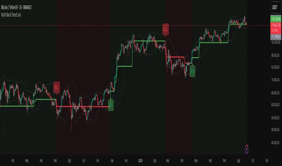
Delta Weighted Average Price (DWAP) @MaxMaserati 2.0MMM DWAP (Delta Weighted Average Price) - Trading Indicator Guide
Overview
The MMM DWAP (Delta Weighted Average Price) indicator analyzes volume-price relationships by incorporating buying and selling pressure (delta) to identify key support and resistance levels. This tool provides multi-timeframe analysis with momentum assessment and breakout detection capabilities.
Core Methodology
MMM DWAP calculates weighted average prices based on delta (buying vs selling pressure) rather than volume alone. This approach reveals where directional money flow creates sustainable support and resistance levels, providing traders with enhanced market analysis.
Key Innovation: Fair Value Magnetism
The market facilitates fair exchange between buyers and sellers. The indicator identifies dynamic fair value zones through delta-weighted cloud bands. Price tends to return to these levels, creating high-probability reaction points for trading decisions.
Technical Comparison
vs VWAP
- VWAP: Volume-weighted calculation showing where volume occurred
- MMM DWAP: Delta-weighted analysis revealing directional money flow with multi-timeframe integration
vs Moving Averages
- Moving Averages: Price-only calculation with inherent lag
- MMM DWAP: Real-time delta analysis providing delta-defended levels with market context
vs Bollinger Bands
- Bollinger Bands: Statistical volatility measures for squeeze detection
- MMM DWAP: Breakout prediction with confidence levels based on market pressure analysis
Visual Components
MMM DWAP Line (Orange): Primary fair value level based on delta weighting
Dynamic Cloud Bands: Overbought/oversold zones with fair value magnetism
Support/Resistance Lines: Multi-timeframe key levels with delta directional indicators
Squeeze Detection: Volatility compression alerts with breakout direction prediction
Analysis Table: Real-time consensus direction, momentum strength, and breakout predictions
Fair Value Zone Concept
Orange Line: Absolute Fair Value Price - the natural equilibrium level where price gravitates. Most important support/resistance level.
Price closed below the line
Price closed above the line
Upper Cloud = Bullish Fair Value Area (BuFV):
- When price is above Orange Line, Upper Cloud acts as support
- Price pullbacks to this zone create buying opportunities
- Represents fair value in bullish market conditions
Far Above Upper Cloud = "TOO HIGH" Zone:
- Price is overextended above fair value
- Overbought condition - likely to reverse DOWN to Upper Cloud (BuFV)
- Sell signal area or profit-taking zone for longs
Lower Cloud = Bearish Fair Value Area (BeFV):
- When price is below Orange Line, Lower Cloud acts as resistance
- Price rallies to this zone create selling opportunities
- Represents fair value in bearish market conditions
Far Below Lower Cloud = "TOO LOW" Zone:
- Price is overextended below fair value
- Oversold condition - likely to reverse UP to Lower Cloud (BeFV)
- Buy signal area or profit-taking zone for shorts
Rubber Band Effect:
- Upper Cloud (BuFV): If price stretches TOO FAR UP → snaps back DOWN to fair value area
- Lower Cloud (BeFV): If price stretches TOO FAR DOWN → snaps back UP to fair value area
Support & Resistance Intelligence
Resistance Line Behavior:
Red Arrow Down (R ↓):
- Bearish delta at resistance level
- Sellers are defending this resistance
- Strong selling pressure - price likely to reject downward
- Traditional resistance behavior - SELL zone
Green Arrow Up (R ↑):
- Bullish delta at resistance level
- Buyers are challenging this resistance
- Strong buying pressure pushing through
- Potential breakout signal - BUY zone
Support Line Behavior:
Green Arrow Up (S ↑):
- Bullish delta at support level
- Buyers are defending this support
- Strong buying interest - price likely to bounce up
- Traditional support behavior - BUY zone
Red Arrow Down (S ↓):
- Bearish delta at support level
- Sellers are overwhelming support
- Strong selling pressure breaking through
- Potential breakdown signal - SELL zone
When the arrow is → for the Support and Resistance line, it is a neutral state
4-Phase Breakout Cycle
Phase 1 - Normal Trading: Regular price movement with bands at normal width
Phase 2 - Band Tightening (SQUEEZE): Yellow diamonds appear as bands compress. Breakout direction prediction activates - early warning before the move.
Phase 3 - Balloon Formation: Bands expand outward, forming balloon shape around price. Preparation phase - volatility releasing but price still contained.
Phase 4 - Explosive Breakout: Price breaks decisively through expanded bands with volume surge and directional momentum. Execution phase.
Strategy Sequence:
- Tightening Phase = PREDICT (Get direction forecast)
- Balloon Phase = PREPARE (Confirm setup and position size)
- Breakout Phase = EXECUTE (Enter trade in predicted direction)
Trading Applications
Retest Strategy:
1. Identify trend bias through MMM DWAP line position
2. Monitor for breakouts above/below Orange Line
3. Wait for pullback to appropriate Fair Value zone (BuFV or BeFV)
4. Execute trades on reaction at fair value levels
High-Probability Setups:
- Bullish Breakout: Bullish consensus + Strong momentum + Resistance with strong buying delta
- Bearish Rejection: Bearish consensus + Strong momentum + Resistance with strong selling delta
- Support Bounce: Bullish consensus + Support with strong buying delta
Analysis Table Guide
Consensus Row: Overall market sentiment based on volume-weighted buying/selling pressure
- BULLISH: Look for long opportunities
- BEARISH: Look for short opportunities
Momentum Row: Current strength compared to recent average
- STRONG: High conviction moves - ride momentum
- WEAK: Low conviction moves - wait for better setups
Price Level Rows (R1, R2, S1, S2): Delta pressure at each level
- High positive delta = Buyers dominated (potential breakout level)
- High negative delta = Sellers dominated (potential rejection level)
Risk Management
- Stop Levels: Orange Line breaks or opposite band extremes
- Profit Targets: Opposite fair value zones
- Position Sizing: Based on momentum strength indicators
Technical Notes
- Delta Calculation: Bullish volume minus bearish volume for directional pressure
- Timeframe Independence: MMM DWAP and S/R levels can utilize different timeframes
- Squeeze Algorithm: Adaptive band width analysis for volatility compression
- Consensus Logic: Aggregate delta analysis across multiple price levels
- Fair Value Zones: Dynamic BuFV/BeFV adaptation based on Orange Line position
Note: This indicator combines volume-price analysis with order flow concepts. Effectiveness depends on market liquidity and proper application of fair value principles. Most effective setups occur when consensus direction, momentum strength, squeeze detection, and favorable delta history align.
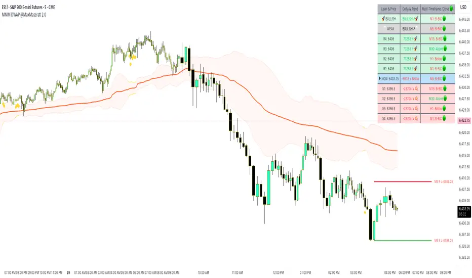
Trendilo ARTrendilo AR is a custom trading indicator designed to identify market trends using advanced techniques such as the Arnaud Legoux Moving Average (ALMA), volume confirmations, and dynamic volatility bands. This indicator provides a clear visualization of trends, including significant changes and custom alerts.
Review of Indicators Used
1. ALMA
Description:
ALMA is a moving average that applies an advanced filter to smooth price data, reducing noise and focusing on actual trends.
Usage in the Indicator:
Used to calculate the smoothed percentage price change and determine trend direction. Customizable parameters include:
- Length: Defines the number of bars to consider.
- Offset: Adjusts sensitivity toward recent prices.
- Sigma: Controls the degree of smoothing.
Advantages:
- Reduced lag in trend detection.
- Resistance to market noise.
2. ATR
Description:
ATR measures the market’s average volatility by considering the range between high and low prices over a given period.
Usage in the Indicator:
ATR is used to calculate "dynamic smoothing", adjusting the indicator’s sensitivity based on current market volatility.
Advantages:
- Adapts to high or low volatility conditions.
- Helps define dynamic support and resistance levels.
3. SMA
Description:
SMA calculates the average of prices or volume over a specific time period.
Usage in the Indicator:
Used to calculate the volume moving average (Volume SMA) to confirm whether the current volume supports the detected trend.
Advantages:
- Easy to understand and calculate.
- Provides volume-based trend confirmation.
4. RMS Bands
Description:
RMS Bands calculate the standard deviation of percentage price changes, creating upper and lower levels that act as overbought and oversold indicators.
Usage in the Indicator:
- Define the range within which the market is considered neutral.
- Crosses above or below the bands indicate trend changes.
Advantages:
- Visual identification of strong trends.
- Helps filter false signals.
Colors and Visuals Used in the Indicator
1. ALMA Line
Colors:
- Green: Indicates a confirmed uptrend (with sufficient volume).
- Red: Indicates a confirmed downtrend (with sufficient volume).
- Gray: Indicates a neutral phase or insufficient volume to confirm a trend.
2. RMS Bands
- Upper and Lower Lines:
- Purple (with transparency): These lines represent the RMS bands (upper and lower) and
adjust opacity based on trend strength.
- Stronger trends result in less transparency (more solid colors).
3. Highlighted Background (Strong Trends)
- Color:
- Light Green (transparent): Highlights a strong trend when the smoothed percentage change (ALMA) exceeds 1.5 times the RMS.
4. Horizontal Lines
- Baseline (0):
- Dark Gray: Serves as a central reference to identify the directionality of percentage changes.
- Additional Line (0.1):
- Blue: A customizable line to mark user-defined key levels.
5. Bar Colors
- Bar Colors:
- Green: When the price is in a confirmed uptrend.
- Red: When the price is in a confirmed downtrend.
- No color: When there is insufficient volume or no clear trend.
How to Use the Indicator
1. Initial Setup
1. Add the Indicator to Your Chart: Copy the code into the Pine Editor on TradingView and apply it to your chart.
2. Customize Parameters: Adjust values based on your trading strategy:
- Smoothing: Controls the level of smoothing for percentage changes.
- Lookback Length: Defines the observation period for calculations.
- Band Multiplier: Adjusts the width of RMS bands.
2. Signal Interpretation
1. Indicator Colors:
- Green: Confirmed uptrend.
- Red: Confirmed downtrend.
- Gray: No clear trend or insufficient volume.
2. RMS Bands:
- If the ALMA line (smoothed percentage change) crosses above the upper RMS band, it signals a potential uptrend.
- If it crosses below the lower RMS band, it signals a potential downtrend.
3. Volume Confirmation:
- The indicator's color activates only if the current volume exceeds the Volume SMA.
3. Alerts and Decisions
1. Trend Change Alerts:
- The indicator automatically triggers alerts when an uptrend or downtrend is detected.
- Configure these alerts to receive real-time notifications.
2. Strong Trend Signals:
- When the magnitude of the percentage change exceeds 1.5 times the RMS, the chart background highlights the strong trend.
4. Trading Strategies
1. Buy:
- Enter long positions when:
- The indicator turns green.
- Volume confirms the trend.
- Consider placing a stop-loss just below the lower RMS band.
2. Sell:
- Enter short positions when:
- The indicator turns red.
- Volume confirms the trend.
- Consider placing a stop-loss just above the upper RMS band.
3. Neutral:
- Avoid trading when the indicator is gray, as no clear trend or insufficient volume is present.
Disclaimer: As this is my first published indicator, please use it with caution. Feedback is highly appreciated to improve its performance.
Happy Trading!

Auto-Length Adaptive ChannelsIntroduction
The key innovation of the ALAC is the implementation of dynamic length identification, which allows the indicator to adjust to the "market beat" or dominant cycle in real-time.
The Auto-Length Adaptive Channels (ALAC) is a flexible technical analysis tool that combines the benefits of five different approaches to market band and price deviation calculations.
Traders often tend to overthink of what length their indicators should use, and this is the main idea behind this script. It automatically calculates length based on pivot points, averaging the distance that is in between of current market highs and lows.
This approach is very helpful to identify market deviations, because deviations are always calculated and compared to previous market behavior.
How it works
The indicator uses a Detrended Rhythm Oscillator (DRO) to identify the dominant cycle in the market. This length information is then used to calculate different market bands and price deviations. The ALAC combines five different methodologies to compute these bands:
1 - Bollinger Bands
2 - Keltner Channels
3 - Envelope
4 - Average True Range Channels
5 - Donchian Channels
By averaging these calculations, the ALAC produces an overall market band that generalizes the approaches of these five methods into a single, adaptive channel.
How to Use
When the price is at the upper band, this might suggest that the asset is overbought and may be due for a price correction. Conversely, when the price is at the lower band, the asset may be oversold and due for a price increase.
The space between the bands represents the market's volatility. Wider bands indicate higher volatility, while narrower bands suggest lower volatility.
Indicator Settings
The settings of the ALAC allow for customization to suit different trading strategies:
Use Autolength?: This allows the indicator to automatically adjust the length of the dominant cycle.
Usual Length: If "Use Autolength?" is disabled, this setting allows the user to manually specify the length of the cycle.
Moving Average Type: This selects the type of moving average to be used in the calculations. Options include SMA, EMA, ALMA, DEMA, JMA, KAMA, SMMA, TMA, TSF, VMA, VAMA, VWMA, WMA, and ZLEMA.
Channel Multiplier: This adjusts the distance between the bands.
Channel Multiplier Step: This changes the step size of the channel multiplier. Each next market band will be multiplied by a previous one. You can potentially use values below 1, which will plot bands inside the first, main channel.
Use DPO instead of source data?: This setting uses the DPO for calculations instead of the source data. Basically, this is how you can add or eliminate trend from calculation of an average leg-up / leg-down move.
Fast: This adjusts the fast length of the DPO.
Slow: This adjusts the slow length of the DPO.
Zig-zag Period: This adjusts the period of the zig-zag pattern used in the DPO.
(!) For more information about DPO visit official TradingView description here: link
Also, I want to say thanks to @StockMarketCycles for initial idea of Detrended Rhythm Oscillator (DRO) that I use in this script.
The Adaptive Average Channel is a powerful and versatile indicator that combines the strengths of multiple technical analysis methods.
In summary, with the ALAC, you can:
1 - Dynamically adapt to any asset and price action with automatic calculation of dominant cycle lengths.
2 - Identify potential overbought and oversold conditions with the adaptive market bands.
3 - Customize your analysis with various settings, including moving average type and channel multiplier.
4 - Enhance your trading strategy by using the indicator in conjunction with other forms of analysis.

S/R Clouds Overview
The S/R Clouds Indicator is a sophisticated TradingView tool designed to visualize support and resistance levels through dynamic cloud formations. Built on the principles of Keltner Channels, it employs a central moving average enveloped by volatility-based bands to highlight potential price reversal zones. This indicator enhances chart analysis with customizable aesthetics and practical alerts, making it suitable for traders across various strategies and timeframes.
Key Features
Dynamic Bands: Calculates upper and lower bands using a configurable moving average (SMA or EMA) offset by multiples of the average true range (derived from high-low ranges), capturing volatility deviations for precise S/R identification.
Cloud Visualization: Renders semi-transparent clouds between primary and extended bands, providing a clear, layered view of support (lower) and resistance (upper) areas.
Trend Detection: Incorporates a trend state logic based on price position relative to bands and moving average direction, aiding in bullish/bearish market assessments.
Customization Options:
Select from multiple color themes (e.g., Neon, Grayscale) or use custom colors for bands.
Enable glow effects for enhanced visual depth and adjust opacity for chart clarity.
Volatility Insights: Monitors band width to detect squeezes (low volatility) and expansions (high volatility), signaling potential breakouts.
Alerts System: Triggers notifications for price crossings of bands, trend changes, and other key events to support timely decision-making.
How It Works
At its core, the indicator centers on a user-defined period moving average. Volatility is measured via an exponential moving average of the high-low range, multiplied by adjustable factors to form the bands. This setup creates adaptive clouds that expand/contract with market volatility, offering a more responsive alternative to static S/R lines. The result is a clean, professional overlay that integrates seamlessly with other technical tools.
This high-quality indicator prioritizes usability and visual appeal, ensuring traders can focus on analysis without distraction.
