Edge-Preserving FilterIntroduction
Edge-preserving smoothing is often used in image processing in order to preserve edge information while filtering the remaining signal. I introduce two concepts in this indicator, edge preservation and an adaptive cumulative average allowing for fast edge-signal transition with period increase over time. This filter have nothing to do with classic filters for image processing, those filters use kernels convolution and are most of the time in a spatial domain.
Edge Detection Method
We want to minimize smoothing when an edge is detected, so our first goal is to detect an edge. An edge will be considered as being a peak or a valley, if you recall there is one of my indicator who aim to detect peaks and valley (reference at the bottom of the post) , since this estimation return binary outputs we will use it to tell our filter when to stop filtering.
Filtering Increase By Using Multi Steps Cumulative Average
The edge detection is a binary output, using a exponential smoothing could be possible and certainly more efficient but i wanted instead to try using a cumulative average approach because it smooth more and is a bit more original to use an adaptive architecture using something else than exponential averaging. A cumulative average is defined as the sum of the price and the previous value of the cumulative average and then this result is divided by n with n = number of data points. You could say that a cumulative average is a moving average with a linear increasing period.
So lets call CMA our cumulative average and n our divisor. When an edge is detected CMA = close price and n = 1 , else n is equal to previous n+1 and the CMA act as a normal cumulative average by summing its previous values with the price and dividing the sum by n until a new edge is detected, so there is a "no filtering state" and a "filtering state" with linear period increase transition, this is why its multi-steps.
The Filter
The filter have two parameters, a length parameter and a smooth parameter, length refer to the edge detection sensitivity, small values will detect short terms edges while higher values will detect more long terms edges. Smooth is directly related to the edge detection method, high values of smooth can avoid the detection of some edges.
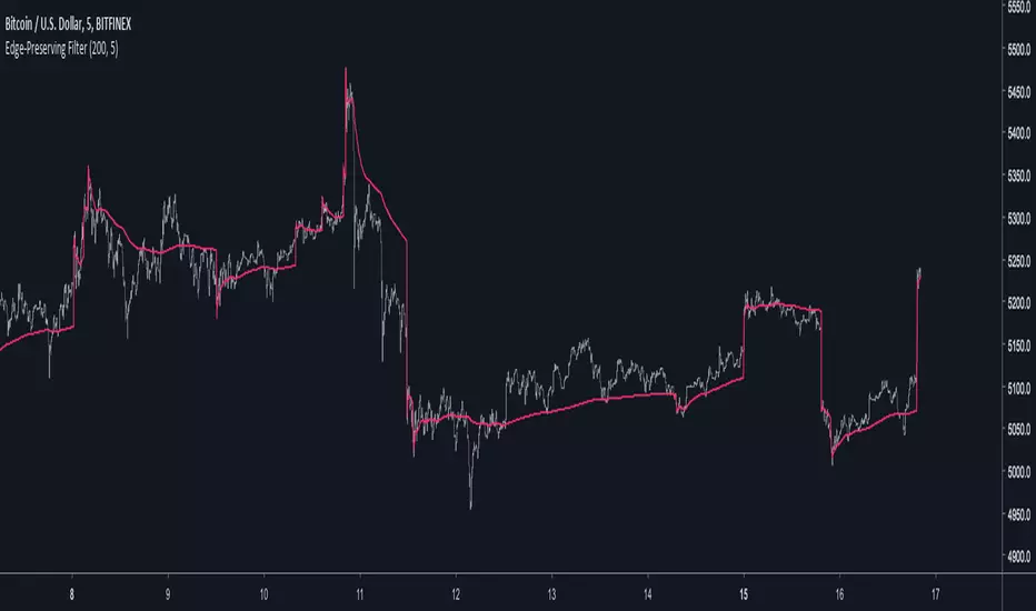
smooth = 200
smooth = 50
smooth = 3
Conclusion
Preserving the price edges can be useful when it come to allow for reactivity during important price points, such filter can help with moving average crossover methods or can be used as a source for other indicators making those directly dependent of the edge detection.
Rsi with a period of 200 and our filter as source, will cross triggers line when an edge is detected
Feel free to share suggestions ! Thanks for reading !
References
Peak/Valley estimator used for the detection of edges in price.
Cari dalam skrip untuk "binary"
Momentum Strategy, rev.2This is a revised version of the Momentum strategy listed in the built-ins.
For more information check out this resource:
www.forexstrategiesresources.com

EMA Strong Trend MarketUse this indicator with my binary blast v2 indicator for getting good binary signals if combine. Don't call or put option when this signal comes in a bar while using previous indicator.

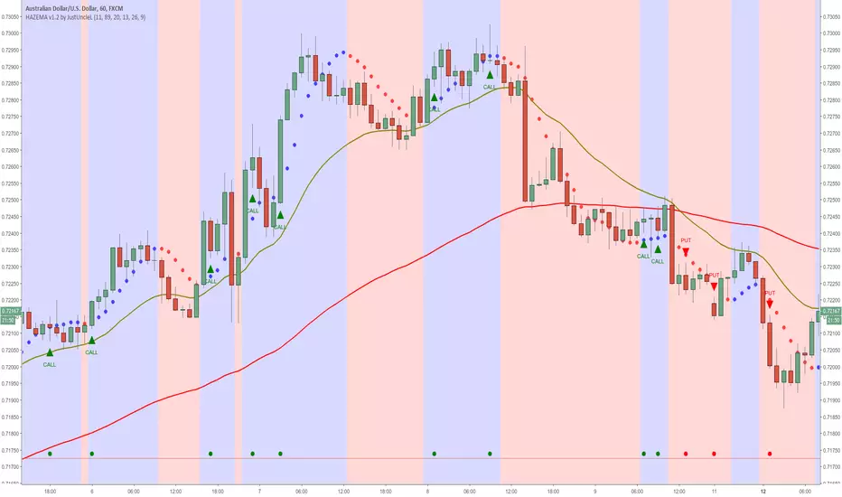
Heiken Ashi zero lag EMA v1.1 by JustUncleLI originally wrote this script earlier this year for my own use. This released version is an updated version of my original idea based on more recent script ideas. As always with my Alert scripts please do not trade the CALL/PUT indicators blindly, always analyse each position carefully. Always test indicator in DEMO mode first to see if it profitable for your trading style.
DESCRIPTION:
This Alert indicator utilizes the Heiken Ashi with non lag EMA was a scalping and intraday trading system
that has been adapted also for trading with binary options high/low. There is also included
filtering on MACD direction and trend direction as indicated by two MA: smoothed MA(11) and EMA(89).
The the Heiken Ashi candles are great as price action trending indicator, they shows smooth strong
and clear price fluctuations.
Financial Markets: any.
Optimsed settings for 1 min, 5 min and 15 min Time Frame;
Expiry time for Binary options High/Low 3-6 candles.
Indicators used in calculations:
- Exponential moving average, period 89
- Smoothed moving average, period 11
- Non lag EMA, period 20
- MACD 2 colour (13,26,9)
Generate Alerts use the following Trading Rules
Heiken Ashi with non lag dot
Trade only in direction of the trend.
UP trend moving average 11 period is above Exponential moving average 89 period,
Doun trend moving average 11 period is below Exponential moving average 89 period,
CALL Arrow appears when:
Trend UP SMA11>EMA89 (optionally disabled),
Non lag MA blue dot and blue background.
Heike ashi green color.
MACD 2 Colour histogram green bars (optional disabled).
PUT Arrow appears when:
Trend UP SMA11
Bollinger Bands NEW
var tradingview_embed_options = {};
tradingview_embed_options.width = 640;
tradingview_embed_options.height = 400;
tradingview_embed_options.chart = 's48QJlfi';
new TradingView.chart(tradingview_embed_options);
Vdub Binary Options SniperVX v1 by vdubus on TradingView.com
MLActivationFunctionsLibrary "MLActivationFunctions"
Activation functions for Neural networks.
binary_step(value) Basic threshold output classifier to activate/deactivate neuron.
Parameters:
value : float, value to process.
Returns: float
linear(value) Input is the same as output.
Parameters:
value : float, value to process.
Returns: float
sigmoid(value) Sigmoid or logistic function.
Parameters:
value : float, value to process.
Returns: float
sigmoid_derivative(value) Derivative of sigmoid function.
Parameters:
value : float, value to process.
Returns: float
tanh(value) Hyperbolic tangent function.
Parameters:
value : float, value to process.
Returns: float
tanh_derivative(value) Hyperbolic tangent function derivative.
Parameters:
value : float, value to process.
Returns: float
relu(value) Rectified linear unit (RELU) function.
Parameters:
value : float, value to process.
Returns: float
relu_derivative(value) RELU function derivative.
Parameters:
value : float, value to process.
Returns: float
leaky_relu(value) Leaky RELU function.
Parameters:
value : float, value to process.
Returns: float
leaky_relu_derivative(value) Leaky RELU function derivative.
Parameters:
value : float, value to process.
Returns: float
relu6(value) RELU-6 function.
Parameters:
value : float, value to process.
Returns: float
softmax(value) Softmax function.
Parameters:
value : float array, values to process.
Returns: float
softplus(value) Softplus function.
Parameters:
value : float, value to process.
Returns: float
softsign(value) Softsign function.
Parameters:
value : float, value to process.
Returns: float
elu(value, alpha) Exponential Linear Unit (ELU) function.
Parameters:
value : float, value to process.
alpha : float, default=1.0, predefined constant, controls the value to which an ELU saturates for negative net inputs. .
Returns: float
selu(value, alpha, scale) Scaled Exponential Linear Unit (SELU) function.
Parameters:
value : float, value to process.
alpha : float, default=1.67326324, predefined constant, controls the value to which an SELU saturates for negative net inputs. .
scale : float, default=1.05070098, predefined constant.
Returns: float
exponential(value) Pointer to math.exp() function.
Parameters:
value : float, value to process.
Returns: float
function(name, value, alpha, scale) Activation function.
Parameters:
name : string, name of activation function.
value : float, value to process.
alpha : float, default=na, if required.
scale : float, default=na, if required.
Returns: float
derivative(name, value, alpha, scale) Derivative Activation function.
Parameters:
name : string, name of activation function.
value : float, value to process.
alpha : float, default=na, if required.
scale : float, default=na, if required.
Returns: float
Whole NumbersThis is a simple indicator for the whole numbers.
It breaks down every pair for 10 pips.
Its also simple and nice to use

Stochastic with Outlier Labels/MTFTL;DR This indicator is an update to a simple stochastic ('Stoch_MTF' by binarytrader666) that provides a novel outlier highlighting feature
Improvements on stochastic:
1. Novel outlier highlighting that points out crosses that are the Nth consecutive cross or greater.
2. Allowing for multiple timeframes to be shown on the same chart
3. Highlighting/Labelling crosses and providing labels for alerts
A cross of the stochastics in the high or low zones establishes a trend. Successive crosses in the same region seem to indicate a continuation of that trend. The outlier functionality here provides a signal for when X number of crosses have been in the same trend, signaling further strength of that signal.
I also provided the necessary code for converting this to a strategy if you so wish at the bottom.
Linear Regression Trend Channel with Entries & AlertsPlease Use this Indicator If you understand the risk posed by linear regression trend channel
Features
Provides trend channel (best value for period is 40 on 5 minute timeframe
Provides BUY/SELL entries based on current channel
Provides custom color for channel
Best used with MattyPips strategy indicators
Risks : Please note, this script is the likes of Bollinger bands and poses a risk of falling in a trend range.
Entries may keep running on the same direction while the market is moving.
Price Volume Trend BBHey guys,
Ive been thinking about Price Volume Trend for a while and tried adding different moving averages to it, but seems its not as binary.
Therefore adding the bollinger bands as a no-trade-zone made it alot better. Indicator is pretty basic at the moment since I just implemented the idea but im planning to do some add-ons later on to make it easier to read.
Will keep you updated!

VEMA Band_v2 - 'Centre of GravityConcept taken from the MT4 indicator 'Centre of Gravity'except this one doesn't repaint.
Modified / BinaryPro 3 / Permanent Marker
Ema configuration instead of sma & centralised.

Vdub_Tetris_Stoch_V1Vdub_Tetris_Stoch_V1
A combination lower based indicators based on the period channel indicator Vdub_Tetris_V2
Blue line is more reactive fast moving, Red line in more accurate to highs / Lows with divergence.- Still testing
Code title error
Change % = Over Bought / Over Sold
Vdub Tetris_V2
Vdubus BinaryPro 2 /Tops&Bottoms
StochDM


ST | TTM SqueezeThis is a minimalist implementation of the classic "Squeeze" setup, designed to declutter your chart. Instead of complex histograms, this indicator focuses solely on the binary state of volatility compression.
How it works: It identifies periods where volatility contracts significantly, often preceding explosive moves.

TPOSmartMoneyLibLibrary "TPOSmartMoneyLib"
Library for TPO (Time Price Opportunity) and Smart Money concepts including session management, PDH/PDL detection, sweeping logic, and volume profile utilities
f_price_to_tick(p)
Convert price to tick
Parameters:
p (float) : Price value
Returns: Tick value
f_tick_to_row(t, row_ticks_in)
Convert tick to row
Parameters:
t (int) : Tick value
row_ticks_in (int) : Number of ticks per row
Returns: Row index
f_row_to_price(row, row_ticks_in)
Convert row to price (midpoint)
Parameters:
row (int) : Row index
row_ticks_in (int) : Number of ticks per row
Returns: Price at row midpoint
f_calc_row_ticks(natr_ref, row_gran_mult)
Calculate dynamic row size based on normalized ATR
Parameters:
natr_ref (float) : Daily normalized ATR reference value
row_gran_mult (float) : Row granularity multiplier
Returns: Number of ticks per row
f_more_transp_pct(c, pct)
Increase color transparency by percentage
Parameters:
c (color) : Input color
pct (float) : Percentage to increase transparency (0.0 to 1.0)
Returns: Color with increased transparency
f_dom_color(dom, buy_col, sell_col, gamma, transp_weak, transp_strong)
Calculate dominance color based on buy/sell ratio
Parameters:
dom (float) : Dominance ratio (-1 to 1, negative = sell, positive = buy)
buy_col (color) : Buy dominant color
sell_col (color) : Sell dominant color
gamma (float) : Gamma correction for color intensity
transp_weak (int) : Transparency for weak dominance
transp_strong (int) : Transparency for strong dominance
Returns: Blended color
f_sess_part(sess_str, get_start)
Parse session string to get start or end time
Parameters:
sess_str (string) : Session string in format "HHMM-HHMM"
get_start (bool) : True to get start time, false to get end time
Returns: Time string in HHMM format
f_hhmm_to_h(hhmm)
Convert HHMM string to hours
Parameters:
hhmm (string) : Time string in HHMM format
Returns: Hours (0-23)
f_hhmm_to_m(hhmm)
Convert HHMM string to minutes
Parameters:
hhmm (string) : Time string in HHMM format
Returns: Minutes (0-59)
f_prev_day_window_bounds(today_day_rth, win_start, win_end, session_tz)
Calculate previous day window bounds
Parameters:
today_day_rth (int) : Today's RTH start timestamp
win_start (string) : Window start time in HHMM format
win_end (string) : Window end time in HHMM format
session_tz (string) : Session timezone
Returns: Tuple of
f_default_session_colors()
Get default session colors
Returns: Array of 4 colors
f_session_names()
Get session names
Returns: Array of 4 session names
f_process_hl(arr, rng, keep_bars, lock_to_live)
Process high/low lines with sweeping detection
Parameters:
arr (array) : Array of HLLine objects
rng (float) : Price range for visibility filtering
keep_bars (int) : Maximum bars to keep lines
lock_to_live (bool) : Whether to lock line end to current bar
Returns: 0 (for chaining)
f_process_naked_lines(arr, calc_bars, bars_per_day, keep_to_day_end)
Process naked lines (POC/VAH/VAL) with sweeping detection
Parameters:
arr (array) : Array of NakedLine objects
calc_bars (int) : Maximum calculation bars
bars_per_day (int) : Bars per day for scope calculation
keep_to_day_end (bool) : Whether to extend to day end
Returns: 0 (for chaining)
f_update_pdhl_lines(pd_hl, pdh, pdl, new_day, pd_rng, bars_per_day, pdh_color, pdl_color)
Detect and create PDH/PDL lines
Parameters:
pd_hl (array) : Array to store HLLine objects
pdh (float) : Previous day high
pdl (float) : Previous day low
new_day (bool) : Whether it's a new day
pd_rng (float) : Price range for visibility
bars_per_day (int) : Bars per day
pdh_color (color) : PDH line color
pdl_color (color) : PDL line color
Returns: 0 (for chaining)
f_poc_from_vals(keys, vals)
Calculate POC from sorted keys and values
Parameters:
keys (array) : Sorted array of row keys
vals (array) : Array of volume values
Returns: POC row key
f_value_area(keys, vals, poc_key, va_pct)
Calculate Value Area from volume distribution
Parameters:
keys (array) : Sorted array of row keys
vals (array) : Array of volume values
poc_key (int) : POC row key
va_pct (float) : Value Area percentage (typically 0.70)
Returns: Tuple of
f_find_key_sorted(keys, target)
Find key in sorted array using binary search
Parameters:
keys (array) : Sorted array of keys
target (int) : Target key to find
Returns: Index of key, or -1 if not found
f_zscore_safe(x, len)
Safe z-score calculation using built-in functions
Parameters:
x (float) : Input series
len (int) : Lookback length
Returns: Z-score
HLLine
Represents a high/low line with sweeping detection
Fields:
ln (series line) : Line object
lb (series label) : Label object
lvl (series float) : Price level
startBar (series int) : Bar index where line starts
swept (series bool) : Whether the level has been swept
isHigh (series bool) : True if this is a high, false if low
col (series color) : Line color
NakedLine
Represents a naked POC/VAH/VAL line
Fields:
ln (series line) : Line object
lb (series label) : Label object
lvl (series float) : Price level
startBar (series int) : Bar index where line starts
swept (series bool) : Whether the level has been swept
sweptBar (series int) : Bar index where swept occurred
endBar (series int) : Bar index where line should end

Neeson Trend Price Oscillator Pulse EditionNeeson Trend Price Oscillator Pulse Edition: A Comprehensive Market Cycle Analysis Tool
Overview and Purpose
The Trend Price Oscillator Pulse Edition is a sophisticated technical analysis indicator designed to identify major market cycle tops and bottoms. This tool operates as a standalone oscillator in a subchart, providing clear visual signals of overbought and oversold conditions within the context of long-term market cycles. Developed for position traders and long-term investors, it focuses on capturing significant market turning points rather than short-term fluctuations.
Integration Rationale and Component Synergy
The indicator integrates three core analytical concepts into a cohesive system:
Detrended Price Oscillator (DPO) Foundation: Traditional DPO methodology isolates cyclical price movements by removing the underlying trend component. This creates a clearer view of oscillatory behavior without the distortion of long-term directional bias.
Normalization Framework: By converting raw DPO values to a standardized 0-100 scale, the indicator establishes consistent reference points for market extremes across different instruments and timeframes. This normalization enables meaningful comparison of oscillator readings regardless of absolute price levels.
Dynamic Threshold System: The implementation of adjustable threshold levels (default: 95% for overbought, 5% for oversold) creates adaptive boundaries that respond to changing market volatility and cycle characteristics.
These components work synergistically: The DPO extracts cyclical information from price action, the normalization process standardizes this information for consistent interpretation, and the threshold system provides actionable decision points based on historical extremes.
Operational Mechanism
The indicator calculates a detrended price value by comparing current price against a displaced moving average. This detrended value is then normalized against its historical range over a specified lookback period, transforming it into a percentage-based oscillator. A smoothing filter is applied to reduce noise and highlight significant movements.
The oscillator's movement through threshold zones generates four distinct market signals:
Entry into overbought territory (crossing above 95%)
Exit from overbought territory (crossing below 95%)
Entry into oversold territory (crossing below 5%)
Exit from oversold territory (crossing above 5%)
Each signal corresponds to a specific market condition hypothesis regarding institutional versus retail trader dynamics in major market cycles.
Practical Application Guidelines
Primary Use Cases:
Identification of potential major cycle turning points on weekly and monthly timeframes
Confirmation tool for existing trading strategies requiring cycle analysis
Risk management through recognition of extreme market conditions
Interpretation Framework:
Overbought Conditions (Oscillator ≥ 95%): Suggest potential selling pressure from major market participants. Consider reducing long exposure or implementing protective measures.
Oversold Conditions (Oscillator ≤ 5%): Indicate potential accumulation zones by institutional buyers. Consider establishing or adding to long positions using dollar-cost averaging strategies.
Threshold Crossings: Monitor for exits from extreme zones as potential confirmation that a cycle peak or trough may have formed.
Parameter Considerations:
Default parameters (548-period oscillator, 274-period offset, 1096-period lookback) are optimized for identifying major market cycles. Users may adjust these values for different market conditions or timeframes, though significant parameter changes will alter the indicator's sensitivity and signal frequency.
Originality and Distinctive Features
This implementation incorporates several innovative aspects:
Extended Cycle Focus: Unlike most oscillators designed for shorter timeframes, this tool employs exceptionally long calculation periods specifically for identifying primary market cycles.
Dynamic Normalization: The lookback-based normalization adapts to changing market conditions without requiring manual recalibration.
Multi-Signal Alert System: Four distinct alert conditions provide nuanced information about market state transitions rather than simple binary signals.
Integrated Risk Context: Each signal includes contextual information about potential market participant behavior, encouraging disciplined risk management.
Empirical Considerations and Limitations
The indicator provides probabilistic assessments based on historical price behavior, not predictive certainties. Market conditions may change, rendering historical patterns less reliable. Users should consider:
The indicator performs best in trending or cyclical markets; it may generate false signals during extended range-bound periods.
No technical indicator, including this one, can guarantee future market movements.
Proper position sizing and risk management should accompany all trading decisions, regardless of indicator signals.
Expected User Outcomes
When used as part of a comprehensive trading plan, this indicator can help users:
Identify potential reversal zones in major market cycles
Develop patience by focusing on significant rather than frequent trading opportunities
Maintain objective perspective during market extremes through quantitative assessment
Coordinate entry and exit timing with cycle analysis
The Trend Price Oscillator Pulse Edition represents a specialized tool for traders seeking to align their strategies with major market cycles through systematic analysis of price oscillation behavior relative to long-term trends.

Luminous Volume Flow [Pineify]Luminous Volume Flow
The Luminous Volume Flow is a specialized volume-based momentum oscillator designed to uncover the underlying buying and selling pressure within the market. Unlike traditional volume indicators that simply aggregate volume based on the close relative to the open, LVF analyzes intrabar dynamics—specifically the relationship between the close price and the high/low wicks—to estimate the dominance of buyers or sellers.
By smoothing this raw volume delta and applying a signal line, the LVF provides a clear visual representation of volume flow, helping traders identify trend strength, potential reversals, and momentum shifts with high-definition "luminous" visuals.
Key Features
Intrabar Pressure Analysis : Calculates buying and selling pressure based on wick dynamics and price polarity to provide a more granular view of market sentiment.
Multi-Type Smoothing : Offers selectable Moving Average types (SMA, EMA, RMA) for the main Flow Line to adapt to different market volatilities.
Luminous Visuals : Utilizes dynamic color gradients that brighten as momentum expands and darken as it contracts, offering immediate visual feedback on trend intensity.
Sentiment Cloud : Fills the area between the Flow and Signal lines to clearly visualize the prevailing bullish or bearish sentiment.
High-Contrast Signals : Optional high-contrast signal markers for clear crossover identification.
How It Works
The LVF operates on a multi-stage calculation process:
Pressure Calculation : The script compares the lower wick (Close - Low) against the upper wick (High - Close).
If the lower wick is longer, it suggests buying pressure (rejection of lower prices), and volume is assigned to Buy Pressure .
If the upper wick is longer, it suggests selling pressure (rejection of higher prices), and volume is assigned to Sell Pressure .
If equal, the Close > Open polarity is used as a tie-breaker.
Raw Delta : The difference between Buy and Sell Pressure is calculated to determine the net volume flow for the bar.
Flow Line : The Raw Delta is smoothed using a user-selected Moving Average (SMA, EMA, or RMA) over the Flow Length period. This creates the main oscillator line.
Signal Line : An EMA of the Flow Line is calculated to generate the Signal Line, similar to the MACD mechanic.
Histogram : The difference between the Flow Line and Signal Line determines the Histogram, which drives the "Luminous" color gradient logic.
Trading Ideas and Insights
Trend Confirmation : When the Flow Line is above the Signal Line and the Cloud is green, the bullish trend is supported by volume. Conversely, a red cloud indicates bearish volume dominance.
Momentum Crossovers : The triangle shapes indicate crossovers between the Flow and Signal lines. A triangle up (Green) suggests a potential bullish entry or invalidation of a short bias. A triangle down (Red) suggests a bearish turn.
Expansion vs. Contraction : Pay attention to the brightness of the histogram columns. Bright colors indicate expanding momentum (a strong move), while darker, fading colors suggest the move is losing steam, potentially preceding a consolidation or reversal.
How multiple components work together
This script combines the logic of Volume Delta analysis with Signal Line Crossover mechanics (popularized by MACD). By applying trend-following smoothing to raw volume data, we transform erratic volume spikes into a coherent flow. The "Luminous" visual layer is added to make the data interpretation intuitive—removing the need to mentally calculate the rate of change based on histogram height alone.
Unique Aspects
Adaptive Gradient Coloring : The histogram doesn't just show positive/negative values; it visually communicates the *acceleration* of the move via color intensity based on standard deviation.
Wick-Based Volume Attribution : Instead of a binary close-to-open comparison, LVF respects the price action within the candle (the wicks), acknowledging that a long lower wick on a red candle can actually represent significant buying interest.
How to Use
Add the indicator to your chart.
Adjust the Flow Length to match your trading timeframe (lower for scalping, higher for swing trading).
Select your preferred Smoothing Type (EMA is default and recommended for responsiveness).
Use the "Sentiment Cloud" filter: Look for long signals only when the cloud is green, and short signals when the cloud is red.
Monitor the Luminous Histogram for signs of exhaustion (colors fading) to manage exits.
Customization
Flow Length : Period for the main smoothing (Default: 14).
Signal Length : Period for the signal line (Default: 9).
Smoothing Type : Choose between SMA, EMA, or RMA.
Colors : Fully customizable colors for Bullish/Bearish phases and signals.
Chart Bars : Option to color the main chart candles based on the Flow direction.
Conclusion
The Luminous Volume Flow is a robust tool for traders who want to go beyond price action and understand the volume dynamics driving the market. By visualizing the flow of buying and selling pressure with advanced smoothing and reactive visuals, it provides a clearer picture of market sentiment than standard volume bars.

Neeson Vegas ChannelVegas Channel Indicator: A Comprehensive Multi-Timeframe Trend-Following System
Originality and Conceptual Foundation
This script implements an enhanced version of the classic "Vegas Tunnel" or "Vegas Channel" methodology, popularized by traders who follow the work associated with the "Vegas" technique. Its primary original contribution lies in its specific, rule-based multi-layered trend identification and visualization system. While the core uses well-known Exponential Moving Averages (EMAs), the originality is in the precise combination of periods and the strict, hierarchical logic for defining trend states and generating signals.
Unlike simpler moving average crossovers or single-tunnel systems, this script employs three distinct EMA pairs, each serving a unique purpose within the trend hierarchy:
Short-Term Momentum Pair (EMA 12 & 24): Acts as the primary signal trigger and momentum gauge.
Core Trend Tunnel (EMA 144 & 169): Serves as the central "channel" or "tunnel." A key visual and logical component is the shading between these two lines, which thickens and changes color with the trend, creating a dynamic channel.
Long-Term Foundation Pair (EMA 580 & 670): Represents the underlying, slower-moving trend foundation, providing context for the higher-timeframe bias.
The system's true innovation is its binary and exclusive trend definition logic. It does not rely on a single crossover. Instead, it defines a confirmed Uptrend only when both the short-term EMAs (12 and 24) are established above both lines of the core tunnel (144 and 169). Conversely, a Downtrend is confirmed only when both short-term EMAs are established below both core tunnel lines. This creates a high-confidence filter, reducing whipsaw signals that can occur when price oscillates around a single moving average.
Functionality, Implementation, and Usage
What It Does:
This indicator is a multi-timeframe trend identification and signal-generation tool. It visually condenses trend information from short, medium, and long-term perspectives onto a single chart. Its primary functions are:
Trend State Classification: It dynamically classifies the market into one of three states: Bull Trend (Blue), Bear Trend (Orange), or Sideways/Congestion (Gray). This is reflected in the chart's background color, the color of all EMA lines, and the fill of the central 144/169 channel.
Signal Generation: It plots discrete buy and sell arrows. A Buy Signal (blue upward triangle) appears the first bar the market transitions into the defined "Uptrend" state from a non-uptrend state. A Sell Signal (orange downward triangle) appears the first bar the market transitions into the defined "Downtrend" state.
Visual Structuring: It plots all six EMAs and prominently highlights the interaction zone between the 144 and 169 EMAs with a colored fill, making the "tunnel" a focal point for support/resistance and trend quality assessment.
How It's Implemented:
The logic is implemented through a clear sequence of conditional checks:
Calculation: All six EMAs are calculated based on user-definable periods (defaults as listed).
Trend Logic: The script continuously evaluates the position of EMA12 and EMA24 relative to EMA144 and EMA169 using strict AND conditions to define the uptrend and downtrend Boolean variables.
Signal Logic: A signal (buy or sell) is generated only on the change of the trend state. It uses a check of the form current_trend_state AND (NOT previous_bar_trend_state) to pinpoint the exact bar of transition.
Visual Feedback: All plot colors, the channel fill color, and the background color are unified and determined by the current trend state variable. Labels for the trend and each EMA line are drawn on the last bar for clarity.
How to Use It:
Traders employ this indicator primarily for trend-following and breakout confirmation. It is suited for swing trading or higher-timeframe positional trades rather than scalping, due to the lag inherent in its longer EMAs and its focus on confirmed states.
Trend Bias: The overall color scheme (blue/orange/gray background) provides an immediate, at-a-glance assessment of the dominant trend force. Trading in the direction of the colored background is considered aligned with the system's trend.
Signal Entry: The arrow signals are not meant for blind entry. They mark the point of a confirmed trend state transition.
A Buy Signal suggests the short-term momentum (12,24) has decisively broken above and established itself over the medium-term trend framework (144,169). This could be used as a trigger for long entries, preferably with the long-term EMAs (580,670) sloping upwards or flat, adding confluence.
A Sell Signal suggests the opposite breakdown.
Channel as Dynamic S/R: The filled area between EMA144 and EMA169 acts as a dynamic support zone in an uptrend and a resistance zone in a downtrend. Pullbacks into this "tunnel" that hold without triggering a sell signal (i.e., without both EMA12 & 24 closing back below both tunnel lines) can be viewed as potential continuation opportunities.
Filter for Other Systems: The clear trend state (uptrend/downtrend) can be exported or used as a filter for other trading systems or discretionary decisions, ensuring actions are only taken in the direction of the script's defined trend.
Core Computational Philosophy and Strategic Rationale
The script's logic is rooted in the philosophy of trend hierarchy and confirmation. It belongs to the category of Multi-Moving Average Convergence/Divergence Systems with State-Based Rules.
The 144/169 Tunnel: These numbers are derived from Fibonacci sequences (144, 169 is 12^2 and 13^2). They are believed by proponents to represent a natural rhythm or "heartbeat" of the market, defining a robust intermediate-term trend framework.
The 12/24 Pair: A standard fast-moving average pair commonly used to gauge short-term momentum and trigger entries.
The Strategic Innovation (Dual-Condition Crossover): The core idea is that a crossover of a single fast MA above a single slow MA can be false and noisy. By requiring both members of a fast pair to establish position relative to both members of a slower "tunnel" pair, the system demands a broader, more concerted move. This seeks to filter out weak, unsustainable breaks and only capture shifts in momentum strong enough to flip the entire short-term structure's position relative to the medium-term structure.
The 580/670 Pair: These very slow EMAs represent the "secular" trend. While not part of the direct signal logic, they provide critical context. A buy signal that occurs while price is above the 580/670 pair (which would be sloping up in a healthy bull market) carries more weight than one that occurs while price is below this long-term foundation, which might indicate a counter-trend rally.
In essence, this script is more than just moving averages on a chart. It is a systematic, rule-based framework for identifying when the market's short-term energy (12,24) has converged sufficiently to overcome and reposition itself against its medium-term equilibrium (144/169 tunnel), thereby signaling a high-probability phase change in trend, all while considering the backdrop of a long-term trend (580/670).

BTC - Satoshis Altcoin Graveyard OVERVIEW
The Satoshi's Altcoin Graveyard (SAG) is a macro-statistical engine designed to solve the problem of Survivorship Bias . It is a well-known phenomenon in the crypto markets that the "Top 10" list is in a constant state of flux. If you look at historical data from CoinMarketCap (CMC) year by year, you will see a revolving door of projects that once seemed "too big to fail" disappearing into obscurity. Meanwhile, Bitcoin has remained the undisputed #1 since inception.
While most traders have a "gut feeling" that Altcoins eventually depreciate against Bitcoin, I believe in measuring it and drawing it on a chart for better visibility. By locking in specific "Cohorts" of market leaders from the past, we can track their inevitable decay through the Satoshi Sieve .
THE 13-COIN STATISTICAL BUCKET
To ensure an objective, non-biased audit, each cohort (we look at 2018, 2020 and 2022) is constructed using a fixed market-cap methodology from the snapshot date (excluding stablecoins):
• The Core: The Top 10 non-stablecoin assets at that time by Marketcap.
• The Risk Alpha: Representative samples from the Top #25, #50, and #100 ranks. (By including lower-ranked "riskier" alts, we capture the full statistical decay of the market, not just the "Blue Chips.")
TECHNICAL ARCHITECTURE
This script is engineered to push the boundaries of the Pine Script engine. TradingView enforces a hard limit of 40 unique data requests . By tracking 3 cohorts of 13 assets plus the Bitcoin base, this indicator utilizes exactly 40/40 requests , providing the maximum possible data density in a single chart window.
THE SPS CONCEPT (Survival Probability Score)
The SPS measures the Breadth of Survival . It answers: "How many coins from this year (the year of the snapshot) are actually outperforming BTC?"
We use a binary logic system to determine if a coin is "Winning" or "Losing" against the only benchmark that matters: Bitcoin.
• The Status Formula: Status = Current_Alt_BTC_Ratio >= Entry_Alt_BTC_Ratio ? 1 : 0 . This means: Every single day, at the Daily Close , the script compares the current Alt/BTC ratio to the fixed ratio from the snapshot date. If the coin is worth more in Bitcoin today than it was back then, it is assigned a "1" (a Win). If it has lost value against Bitcoin, it gets a "0" (a Loss).
• The SPS Line: SPS Line = (Sum of 'Wins' / 13) * 100 This means: We add up all the "Winners" for that specific day and turn it into a percentage. For example, if the Aqua line is at 7.69% on your chart, it confirms that on that day , exactly 1 out of the 13 coins was successfully beating Bitcoin, while the other 12 were underperforming.
THE PERFORMANCE MATRIX
In the top-right corner, we provide a Weighted Portfolio Simulation . This answers the financial question: "If I swapped 1 BTC into an equal-weight basket of these 13 coins on the snapshot day, what is my BTC value today?".
• Value < 1.0 BTC: You lost purchasing power compared to holding Bitcoin.
• Value > 1.0 BTC: You successfully achieved "Alpha" over the benchmark.
HOW TO READ THE CHART
• The Waterfall: Lines generally trend downward as the "Satoshi Sieve" filters out assets that cannot maintain their BTC-relative value.
• Dynamic Winners: We dynamically print the names of the current survivors at the tip of each line. If a cohort shows "None," the graveyard is full.
HOW TO READ THE MATRIX
• The BTC Target: Any portfolio value in the matrix below 1.0 BTC represents a failed altcoin rotation.
• Class of 2018: A portfolio value near 0.15 BTC at the current date, means a 85% loss rate.
• Class of 2020: A portfolio value near 0.77 BTC at the current date, means an approx 20 % loss rate.
• Class of 2022: A portfolio value near 0.31 BTC at the current date, means an approx 70% loss rate.
DIFFERENCE FROM AN ALTCOIN INDEX
Standard Altcoin Indexes (like my ALSI Index ) "rebalance" by removing losers and adding new winners. This is deceptive. The Altcoin Graveyard never rebalances . It forces you to watch the "losers" decay, providing a realistic look at the long-term opportunity cost of "Buy and Hold" for anything other than Bitcoin.
CONCLUSION
The data revealed by the Satoshi Sieve leads to a singular, sobering "Lesson Learned": Picking the right coin to outperform Bitcoin is not just difficult—it is statistically improbable over a long-term horizon.
While the "Risk-Reward" of altcoins is often marketed as having higher upside, the Altcoin Graveyard proves that for the vast majority of assets, the reward does not justify the risk of total portfolio erosion in BTC terms.
• The Mathematical Odds: If you picked a Top 10 coin in 2018, your chance of outperforming BTC today is effectively 0%.
• The Rotation Trap: Most investors "HODL" these assets into the graveyard, hoping for a return to previous ATHs that never comes because the liquidity has already moved on to the next "Class" of winners.
The final conclusion is clear: Diversification into altcoins is often just a slow-motion transfer of wealth back to Bitcoin. If you cannot identify the 1-out-of-13 that survives the Sieve, your best risk-adjusted move has historically been to simply hold the benchmark.
DISCLAIMER
This script is for educational purposes only. It does not constitute financial advice. It is a mathematical study of historical opportunity cost and survivorship bias.
Tags
bitcoin, btc, satoshis graveyard, altseason, dominance, total3, rotation, cycle, index, alsi, Rob Maths, robmaths

MAD Supertrend [Alpha Extract]A sophisticated SuperTrend implementation that replaces traditional ATR calculations with Mean Absolute Deviation methodology for adaptive volatility measurement and band construction. Utilizing SMA baseline with MAD-based deviation bands and optional adaptive factor adjustments, this indicator delivers institutional-grade trend detection with strength-based filtering and dynamic visual feedback. The system's MAD approach provides superior noise reduction compared to ATR while maintaining responsiveness to genuine volatility changes, combined with momentum-based strength calculations for high-conviction signal generation.
🔶 Advanced MAD-Based Band Construction
Implements Mean Absolute Deviation calculation as volatility proxy, measuring absolute price deviations from mean and smoothing for stable band generation without ATR dependency. The system calculates SMA baseline, computes MAD from configurable lookback period, applies factor multipliers to create upper and lower bands, then implements classic SuperTrend ratcheting logic where bands only adjust when price violates previous levels or calculations warrant updates.
// Core MAD SuperTrend Framework
SMA_Value = ta.sma(src, SMA_Length)
Mean = ta.sma(src, MAD_Length)
Abs_Deviation = abs(src - Mean)
MAD_Value = ta.sma(Abs_Deviation, MAD_Length)
// Band Construction with Ratcheting
Upper_Band = SMA_Value + MAD_Factor * MAD_Value
Lower_Band = SMA_Value - MAD_Factor * MAD_Value
// Ratcheting logic prevents premature band adjustments
🔶 Adaptive Factor Adjustment Engine
Features optional adaptive multiplier system that modulates MAD factor based on normalized MAD magnitude relative to recent extremes, creating bands that automatically expand during high-volatility regimes and contract during consolidation. The system applies min-max normalization to MAD values over configurable lookback, multiplies by adaptation parameter, and adds to base factor for dynamic volatility sensitivity without manual recalibration.
🔶 Momentum-Based Strength Filter
Implements sophisticated strength calculation measuring price momentum relative to baseline divided by volatility-adjusted MAD bands, producing normalized 0-1 strength scores with exponential smoothing. The system calculates distance from SMA baseline, normalizes by MAD-derived band width, and applies configurable minimum threshold requiring sufficient momentum before trend signals activate, filtering weak or choppy market conditions.
🔶 SuperTrend Direction Logic
Utilizes classic SuperTrend methodology adapted for MAD bands where trend direction flips on opposite band violations with state persistence until confirmation. The system tracks whether price closes above upper band (bearish flip to bullish) or below lower band (bullish flip to bearish), maintains directional state until opposing violation occurs, and generates binary +1/-1 trend signals suitable for systematic position management.
🔶 Intelligent Candle Sticking System
Provides advanced line positioning option that anchors SuperTrend line to candle wicks or bodies rather than pure calculation values for enhanced visual clarity. The system supports two modes: Wick (positions at high/low extremes based on trend direction) and Body (constrains line between calculation and candle extremes), creating cleaner chart presentation while maintaining mathematical integrity of underlying signals.
🔶 Dynamic Gradient Visualization Framework
Implements color intensity modulation based on smoothed strength calculations, transitioning from muted to vivid hues as momentum conviction increases. The system applies gradient interpolation using strength ratio, creating visual feedback where strong trending moves display intense colors while weak or consolidating conditions show faded tones across trend line, channel bands, and candle coloring for immediate regime assessment.
🔶 MAD Channel Architecture
Features volatility-adjusted channel bands centered on baseline or candle-stuck line with configurable multiplier for support/resistance visualization. The system calculates upper and lower bounds using MAD values scaled by adaptive factors and channel multipliers, applies dynamic transparency based on trend strength, and creates filled regions that intensify during strong trends and fade during weak conditions.
🔶 Multi-Layer Glow Effect System
Provides sophisticated line rendering with triple-layer plot system creating glow effect through progressively wider and more transparent outer layers. The system plots core trend line at specified width with full color intensity, adds inner glow layer at +2 width with moderate transparency, and outer glow at +4 width with higher transparency, creating visual depth and emphasis without cluttering chart space.
🔶 Strength-Based State Management
Implements intelligent trend state logic requiring both directional signal and minimum strength threshold breach before confirming trend transitions. The system calculates raw SuperTrend direction, evaluates smoothed strength against configurable minimum, generates filtered trend state that can be bullish (+1), bearish (-1), or neutral (0), and maintains state persistence using hold logic that prevents oscillation during ambiguous conditions.
🔶 Comprehensive Alert Integration
Generates trend flip alerts when filtered state transitions from bearish to bullish or bullish to bearish with full confirmation requirements satisfied. The system detects state changes through comparison with previous bar, triggers single alert per transition rather than continuous notifications, and provides customizable message templates for automated trading system integration or manual notification preferences.
🔶 Performance Optimization Architecture
Utilizes efficient calculation methods with null value handling, nz() functions preventing errors during initialization bars, and optimized gradient calculations. The system includes intelligent state persistence minimizing recalculation overhead, streamlined MAD computation avoiding redundant mean calculations, and smooth visual updates maintaining consistent performance across extended historical periods.
This indicator delivers sophisticated SuperTrend analysis through Mean Absolute Deviation methodology providing superior statistical properties compared to traditional ATR-based approaches. MAD calculations offer more robust volatility measurement resistant to extreme outliers while maintaining sensitivity to genuine market regime changes. The system's adaptive factor adjustment, momentum-based strength filtering, and dynamic visual feedback make it essential for traders seeking reliable trend-following signals with reduced false breakouts during choppy conditions. The combination of MAD bands, candle-sticking options, gradient strength visualization, and comprehensive filtering creates institutional-grade trend detection suitable for systematic approaches across cryptocurrency, forex, and equity markets with clear entry/exit signals and comprehensive alert capabilities.

Sizing Coach HUD Long and Short This HUD is designed as a systematic execution layer to bridge the gap between technical analysis and mechanical risk management. Its primary purpose is to eliminate the "discretionary gap"—the moment where a trader’s "feeling" about volatility or spreads causes hesitation.
By using this tool, you are not just watching price; you are managing a business where Risk is a constant and Size is a variable.
Core Functionality: The Position Sizing Engine
The HUD automates the math of "Capital-Based Tiers". Instead of choosing an arbitrary share size, the system calculates your position based on three predefined levels of conviction:
Tier 1 (1% Notional): Low-confidence or high-volatility "tester" positions.
Tier 2 (3% Notional): Standard, high-probability setups.
Tier 3 (5% Notional): High-conviction trades where multiple timeframes and factors align.
Execution Workflow (The Poka-Yoke)
To use this HUD effectively and eliminate the "hesitation" identified in the Five Whys analysis, follow this workflow:
Toggle Direction: Set the HUD to Long or Short based on your setup (e.g., NEMA Continuation).
Define Invalidation: Identify your technical stop (default is High/Low of Day +/- 5%). The HUD will automatically calculate the distance to this level.
Check Risk $: Observe the Risk $ row. This tells you exactly how much you will lose in dollars if the stop is hit. If the volatility is extreme (like the NASDAQ:SNDK 14% plunge), the HUD will automatically shrink your Shares count to keep this dollar amount constant.
Execute via HUD: Transmit the order using the Shares provided in your selected Tier. Do not manually adjust the size based on "gut feeling".
Trade Management: The "R" Focus
The bottom half of the HUD displays your Targets (PnL / R).
VWAP & Fibonacci Levels: Automatically plots and calculates profit targets at key institutional levels (VWAP, 0.618, 0.786, 0.886).
Binary Exit Logic: The color-coded logic flags any target that yields less than 1R (Reward-to-Risk) as a warning.
Systematic Holding: Ride the trade to the targets or until your technical exit (e.g., 1M candle close above/below NEMA) is triggered, ignoring the fluctuating P&L.
