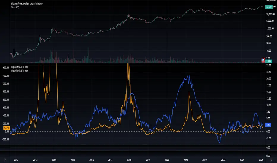
Blockchain Fundamentals: Liquidity & BTC YoYLiquidity & BTC YoY Indicator
Overview:
This indicator calculates the Year-over-Year (YoY) percentage change for two critical metrics: a custom Liquidity Index and Bitcoin's price. The Liquidity Index is derived from a blend of economic and forex data representing the M2 money supply, while the BTC price is obtained from a reliable market source. A dedicated limit(length) function is implemented to handle limited historical data, ensuring that the YoY calculations are available immediately—even when the chart's history is short.
Features Breakdown:
1. Limited Historical Data Workaround
- Functionality: limit(length) The function dynamically adjusts the lookback period when there isn’t enough historical data. This prevents delays in displaying YoY metrics at the beginning of the chart.
2. Liquidity Calculation
- Data Sources: Combines multiple data streams:
USM2, ECONOMICS:CNM2, USDCNY, ECONOMICS:JPM2, USDJPY, ECONOMICS:EUM2, USDEUR
- Formula:
Liquidity Index = USM2 + (CNM2 / USDCNY) + (JPM2 / USDJPY) + (EUM2 / USDEUR)
[b3. Bitcoin Price Calculation
- Data Source: Retrieves Bitcoin's price from BITSTAMP:BTCUSD on the user-selected timeframe for its historical length.
4. Year-over-Year (YoY) Percent Change Calculation
- Methodology:
- The indicator uses a custom function, to autodetect the proper number of bars, based on the selected timeframe.
- It then compares the current value to that from one year ago for both the Liquidity Index and BTC price, calculating the YoY percentage change.
5. Visual Presentation
- Plotting:
- The YoY percentage changes for Liquidity (plotted in blue) and BTC price (plotted in orange) are clearly displayed.
- A horizontal zero line is added for visual alignment, making it easier to compare the two copies of the metric. You add one copy and only display the BTC YoY. Then you add another copy and only display the M2 YoY.
-The zero lines are then used to align the scripts to each other by interposing them. You scale each chart the way you like, then move each copy individually to align both zero lines on top of each other.
This indicator is ideal for analysts and investors looking to monitor macroeconomic liquidity trends alongside Bitcoin's performance, providing immediate insights.
Cari dalam skrip untuk "bitcoin"
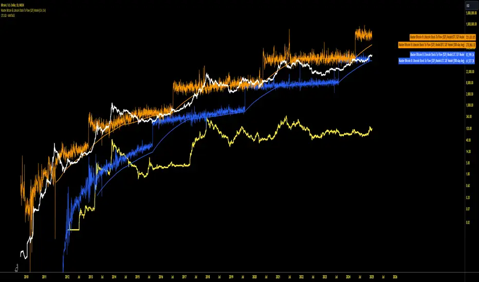
Master Bitcoin & Litecoin Stock To Flow (S2F) ModelMaster Bitcoin & Litecoin Stock-to-Flow (S2F) Model
This indicator visualizes the Stock-to-Flow (S2F) models for Bitcoin (BTC) and Litecoin (LTC) based on Plan B's methodology. It calculates S2F and projects price models for both assets, incorporating daily changes in circulating supply. The script is designed exclusively for daily timeframes.
Features:
LTC & BTC S2F Models:
Calculates Stock-to-Flow values for both assets using daily new supply and circulating supply data.
Models S2F values with a customizable multiplier for precise adjustments.
500-Day Moving Average Models:
Smoothens the S2F model by applying a 500-day (18-month) moving average, providing a long-term trend perspective.
Customizable Inputs:
Adjust LTC and BTC multipliers to fine-tune the models.
Alert for Timeframe:
Alerts users to switch to the daily timeframe if another period is selected.
Plots:
LTC S2F Model: Blue line representing Litecoin’s calculated S2F-based price model.
BTC S2F Model: Orange line representing Bitcoin’s calculated S2F-based price model.
500-Day Avg Models: Smoothened S2F models for both LTC and BTC.
Notes:
Requires daily timeframe (1D) for accurate calculations.
Supply data is sourced from GLASSNODE:LTC_SUPPLY and GLASSNODE:BTC_SUPPLY.
Disclaimer:
This model is derived from Plan B's S2F methodology and is intended for educational and entertainment purposes only. It does not reflect official predictions or financial advice. Always conduct your own research before making investment decisions.
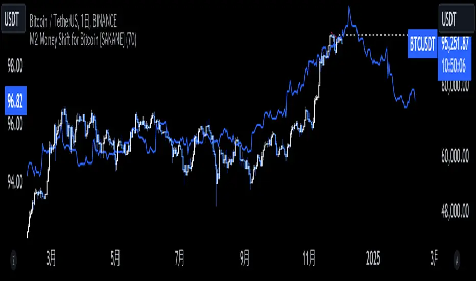
M2 Money Shift for Bitcoin [SAKANE]M2 Money Shift for Bitcoin was developed to visualize the impact of M2 Money, a macroeconomic indicator, on the Bitcoin market and to support trade analysis.
Bitcoin price fluctuations have a certain correlation with cycles in M2 money supply.In particular, it has been noted that changes in M2 supply can affect the bitcoin price 70 days in advance.Very high correlations have been observed in recent years in particular, making it useful as a supplemental analytical tool for trading.
Support for M2 data from multiple countries
M2 supply data from the U.S., Europe, China, Japan, the U.K., Canada, Australia, and India are integrated and all are displayed in U.S. dollar equivalents.
Slide function
Using the "Slide Days Forward" setting, M2 data can be slid up to 500 days, allowing for flexible analysis that takes into account the time difference from the bitcoin price.
Plotting Total Liquidity
Plot total liquidity (in trillions of dollars) by summing the M2 supply of multiple countries.
How to use
After applying the indicator to the chart, activate the M2 data for the required country from the settings screen. 2.
2. adjust "Slide Days Forward" to analyze the relationship between changes in M2 supply and bitcoin price
3. refer to the Gross Liquidity plot to build a trading strategy that takes into account macroeconomic influences.
Notes.
This indicator is an auxiliary tool for trade analysis and does not guarantee future price trends.
The relationship between M2 supply and bitcoin price depends on many factors and should be used in conjunction with other analysis methods.
Pulse DPO: Major Cycle Tops and Bottoms█ OVERVIEW
Pulse DPO is an oscillator designed to highlight Major Cycle Tops and Bottoms .
It works on any market driven by cycles. It operates by removing the short-term noise from the price action and focuses on the market's cyclical nature.
This indicator uses a Normalized version of the Detrended Price Oscillator (DPO) on a 0-100 scale, making it easier to identify major tops and bottoms.
Credit: The DPO was first developed by William Blau in 1991.
█ HOW TO READ IT
Pulse DPO oscillates in the range between 0 and 100. A value in the upper section signals an OverBought (OB) condition, while a value in the lower section signals an OverSold (OS) condition.
Generally, the triggering of OB and OS conditions don't necessarily translate into swing tops and bottoms, but rather suggest caution on approaching a market that might be overextended.
Nevertheless, this indicator has been customized to trigger the signal only during remarkable top and bottom events.
I suggest using it on the Daily Time Frame , but you're free to experiment with this indicator on other time frames.
The indicator has Built-in Alerts to signal the crossing of the Thresholds. Please don't act on an isolated signal, but rather integrate it to work in conjunction with the indicators present in your Trading Plan.
█ OB SIGNAL ON: ENTERING OVERBOUGHT CONDITION
When Pulse DPO crosses Above the Top Threshold it Triggers ON the OB signal. At this point the oscillator line shifts to OB color.
When Pulse DPO enters the OB Zone, please beware! In this Area the Major Players usually become Active Sellers to the Public. While the OB signal is On, it might be wise to Consider Selling a portion or the whole Long Position.
Please note that even though this indicator aims to focus on major tops and bottoms, a strong trending market might trigger the OB signal and stay with it for a long time. That's especially true on young markets and on bubble-mode markets.
█ OB SIGNAL OFF: EXITING OVERBOUGHT CONDITION
When Pulse DPO crosses Below the Top Threshold it Triggers OFF the OB signal. At this point the oscillator line shifts to its normal color.
When Pulse DPO exits the OB Zone, please beware because a Major Top might just have occurred. In this Area the Major Players usually become Aggressive Sellers. They might wind up any remaining Long Positions and Open new Short Positions.
This might be a good area to Open Shorts or to Close/Reverse any remaining Long Position. Whatever you choose to do, it's usually best to act quickly because the market is prone to enter into panic mode.
█ OS SIGNAL ON: ENTERING OVERSOLD CONDITION
When Pulse DPO crosses Below the Bottom Threshold it Triggers ON the OS signal. At this point the oscillator line shifts to OS color.
When Pulse DPO enters the OS Zone, please beware because in this Area the Major Players usually become Active Buyers accumulating Long Positions from the desperate Public.
While the OS signal is On, it might be wise to Consider becoming a Buyer or to implement a Dollar-Cost Averaging (DCA) Strategy to build a Long Position towards the next Cycle. In contrast to the tops, the OS state usually takes longer to resolve a major bottom.
█ OS SIGNAL OFF: EXITING OVERSOLD CONDITION
When Pulse DPO crosses Above the Bottom Threshold it Triggers OFF the OS signal. At this point the oscillator line shifts to its normal color.
When Pulse DPO exits the OS Zone, please beware because a Major Bottom might already be in place. In this Area the Major Players become Aggresive Buyers. They might wind up any remaining Short Positions and Open new Long Positions.
This might be a good area to Open Longs or to Close/Reverse any remaining Short Positions.
█ WHY WOULD YOU BE INTERESTED IN THIS INDICATOR?
This indicator is built over a solid foundation capable of signaling Major Cycle Tops and Bottoms across many markets. Let's see some examples:
Early Bitcoin Years: From 0 to 1242
This chart is in logarithmic mode in order to properly display various exponential cycles. Pulse DPO is properly signaling the major early highs from 9-Jun-2011 at 31.50, to the next one on 9-Apr-2013 at 240 and the epic top from 29-Nov-2013 at 1242.
Due to the massive price movements, the OB condition stays pinned during most of the exponential price action. But as you can see, the OB condition quickly vanishes once the Cycle Top has been reached. As the market matures, the OB condition becomes more exceptional and triggers much closer from the Cycle Top.
With regards to Cycle Bottoms, the early bottom of 2 after having peaked at 31.50 doesn’t get captured by the indicator. That is the only cycle bottom that escapes the Pulse DPO when the bottom threshold is set at a value of 5. In that event, the oscillator low reached 6.95.
Bitcoin Adoption Spreading: From 257 to 73k
This chart is in logarithmic mode in order to properly display various exponential cycles. Pulse DPO is properly signaling all the major highs from 17-Dec-2017 at 19k, to the next one on 14-Apr-2021 at 64k and the most recent top from 9-Nov-2021 at 68k.
During the massive run of 2017, the OB condition still stayed triggered for a few weeks on each swing top. But on the next cycles it started to signal only for a few days before each swing top actually happened. The OB condition during the last cycle top triggered only for 3 days. Therefore the signal grows in focus as the market matures.
At the time of publishing this indicator, Bitcoin printed a new All Time High (ATH) on 13-Mar-2024 at 73k. That run didn’t trigger the OB condition. Therefore, if the indicator is correct the Bitcoin market still has some way to grow during the next months.
With regards to Cycle Bottoms, the bottom of 3k after having peaked at19k got captured within the wide OS zone. The bottom of 15k after having peaked at 68k got captured too within the OS accumulation area.
Gold
Pulse DPO behaves surprisingly well on a long standing market such as Gold. Moving back to the 197x years it’s been signaling most Cycle Tops and Bottoms with precision. During the last cycle, it shows topping at 2k and bottoming at 1.6k.
The current price action is signaling OB condition in the range of 2.5k to 2.7k. Looking at past cycles, it tends to trigger on and off at multiple swing tops until reaching the final cycle top. Therefore this might indicate the first wave within a potential gold run.
Oil
On the Oil market, we can see that most of the cycle tops and bottoms since the 80s got signaled. The only exception being the low from 2020 which didn’t trigger.
EURUSD
On Forex markets the Pulse DPO also behaves as expected. Looking back at EURUSD we can see the marketing triggering OB and OS conditions during major cycle tops and bottoms from recent times until the 80s.
S&P 500
On the S&P 500 the Pulse DPO catched the lows from 2016 and 2020. Looking at present price action, the recent ATH didn’t trigger the OB condition. Therefore, the indicator is allowing room for another leg up during the next months.
Amazon
On the Amazon chart the Pulse DPO is mirroring pretty accurately the major swings. Scrolling back to the early 2000s, this chart resembles early exponential swings in the crypto space.
Tesla
Moving onto a younger tech stock, Pulse DPO captures pretty accurately the major tops and bottoms. The chart is shown in logarithmic scale to better display the magnitude of the moves.
█ SETTINGS
This indicator is ideal for identifying major market turning points while filtering out short-term noise. You are free to adjust the parameters to align with your preferred trading style.
Parameters : This section allows you to customize any of the Parameters that shape the Oscillator.
Oscillator Length: Defines the period for calculating the Oscillator.
Offset: Shifts the oscillator calculation by a certain number of periods, which is typically half the Oscillator Length.
Lookback Period: Specifies how many bars to look back to find tops and bottoms for normalization.
Smoothing Length: Determines the length of the moving average used to smooth the oscillator.
Thresholds : This section allows you to customize the Thresholds that trigger the OB and OS conditions.
Top: Defines the value of the Top Threshold.
Bottom: Defines the value of the Bottom Threshold.

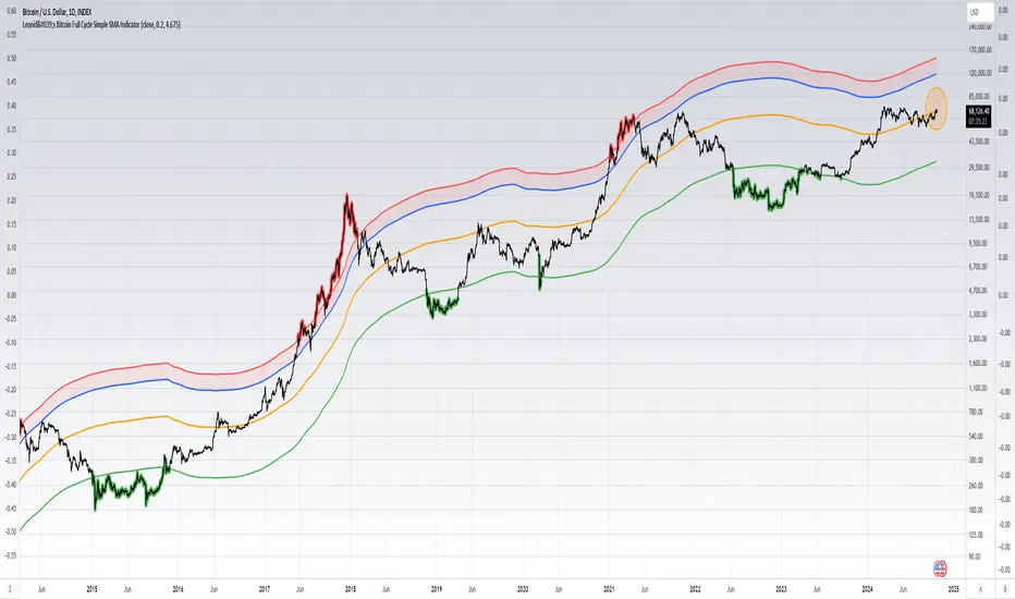
Leonid's Bitcoin Full Cycle Simple SMA IndicatorThis is a straight-forward and customizable indicator to track Bitcoin cycles, specifically used for helping investors understand where to buy and sell. This is done by using a two year SMA period as the base calculation. With that calculation you create lower and upper bounds for bull market peaks and bear market bottoms.
The novel idea here is that you can customize the SMA "strength" for both the upper and lower bounds as alpha decays over time and price get's less volatile with adoption increasing. The multiples are customizable for both the upper and lower bounds along with a mid-line that will adjust based on the settings input.
Indicators don't always have to rely on crazy math or outlandish ideas to be useful, sometimes even the simplest of inputs can give investors (especially those that are new) a great base case for their strategy. Something being simple does not diminish the idea or strength behind the data.
How to use this indicator: This script must be used on INDEX:BTCUSD (Bitcoin All-Time History Index) with the y-axis being set to Logarithmic scale.
Details & how to interpret: The price is colored green when Bitcoin enters a "value zone" meaning it is heavily oversold and likely near a bottom for the bear market cycle. The price is colored red when Bitcoin enters an "overbought zone" meaning it is heavily overbought and is likely near a top for the bull market cycle.
Along with the upper and lower bound I have plotted a mid-line (in orange) to establish a neutral zone which helps depict what phase of the cycle we're in (under mid-line = bearish/accumulation phase, over mid-line = bullish/distribution phase).
The inputs for the upper and lower bound are customizable and will need to be adjusted over time as alpha decay will occur as time goes on. Currently the numbers are as follows:
0.2 for the lower bound
4.675 for the upper bound
Both inputs can be modified depending on your risk tolerance. Mathematically it is safe to assume these numbers will decrease as time goes on and volatility during cycle peaks & troughs is reduced.
I've also plotted an upper bound "heat zone" which is shaded in green, this area is great for signaling when you should be preparing to begin taking profits. It takes the upper bound and subtracts the lower bound to derive the band.
All the colors are customizable and this indicator is best used on a line chart but can be customized to use on a bar chart/candlestick as well.
Simple Moving Averages are a very basic indicator but are often extremely powerful because the majority of traders/investors are looking at such levels which creates a psychological/herd effect. Another good example is the law of round numbers.
Regardless this script can be adapted with EMAs or additional standard deviations if necessary. If you have any questions or concerns please don't hesitate to message me.
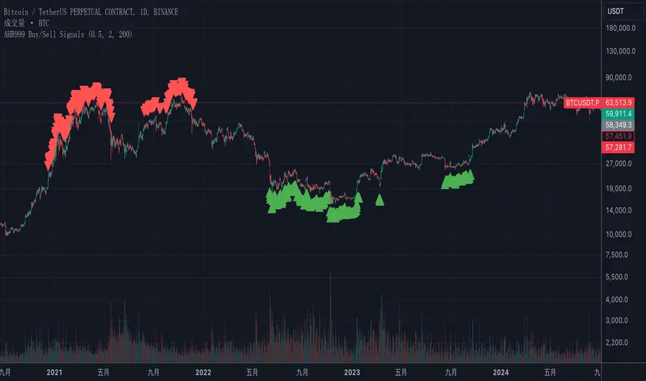
AHR999 Bitcoin Buy/Sell Signals Indicator - Accurate Trading OppThis Pine Script indicator combines the AHR999 metric with Bitcoin's historical price trends to provide clear buy and sell signals, assisting you in making informed trading decisions at crucial moments. It calculates the AHR999 index based on Bitcoin's 200-day Geometric Moving Average (GMA) and the estimated price, offering customizable buy and sell thresholds for precise entry and exit points. Ideal for traders looking to capture long-term investment trends, this indicator helps you effectively identify Bitcoin market opportunities.
BTC Coinbase PremiumThis script is designed to compare the price of Bitcoin on two major exchanges: Coinbase and Binance. It helps you see if there’s a difference in the price of Bitcoin between these two exchanges, which is known as a “premium” or “discount.”
Here’s how it works in simple terms:
Getting the Prices:
The script first fetches the current price of Bitcoin from Coinbase and Binance. It looks at the closing price, which is the price at the end of the selected time period on your chart.
Calculating the Difference:
It then calculates the difference between these two prices. If Bitcoin is more expensive on Coinbase than on Binance, this difference will be positive, indicating a “premium.” If it’s cheaper on Coinbase, the difference will be negative, indicating a “discount.”
Visualizing the Difference:
The script creates a visual chart that shows this price difference over time. It uses green bars to show when there’s a premium (Coinbase is more expensive) and red bars to show when there’s a discount (Coinbase is cheaper).
Optional Table Display:
If you choose to, the script can also show this price difference in a small table at the top right corner of your chart. The table displays the words “Coinbase Premium” and the exact dollar amount of the premium or discount.
Why does it matter?
Traders and investors have spotted a correlation between bullish strength on BTC and a strong Coinbase premium along with the inverse of a strong Coinbase discount and BTC price weakness.

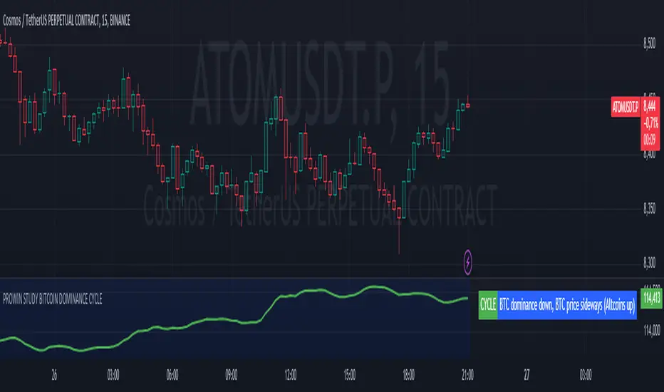
PROWIN STUDY BITCOIN DOMINANCE CYCLE**Title: PROWIN STUDY BITCOIN DOMINANCE CYCLE**
**Overview:**
This TradingView script analyzes the relationship between Bitcoin dominance and Bitcoin price movements, as well as the performance of altcoins. It categorizes market conditions into different scenarios based on the movements of Bitcoin dominance and Bitcoin price, and plots the Exponential Moving Average (EMA) of the altcoins index.
**Key Components:**
1. **Bitcoin Dominance:**
- `dominanceBTC`: Fetches the Bitcoin dominance from the "CRYPTOCAP:BTC.D" symbol for the current timeframe.
2. **Bitcoin Price:**
- `priceBTC`: Uses the closing price of Bitcoin from the current chart (assumed to be BTC/USD).
3. **Altcoins Index:**
- `altcoinsIndex`: Fetches the total market cap of altcoins (excluding Bitcoin) from the "CRYPTOCAP:TOTAL2" symbol.
4. **EMA of Altcoins:**
- `emaAltcoins`: Calculates the 20-period Exponential Moving Average (EMA) of the altcoins index.
**Conditions:**
1. **Bitcoin Dominance and Price Up:**
- `dominanceBTC_up`: Bitcoin dominance crosses above its 20-period Simple Moving Average (SMA).
- `priceBTC_up`: Bitcoin price crosses above its 20-period SMA.
2. **Bitcoin Dominance Up and Price Down:**
- `priceBTC_down`: Bitcoin price crosses below its 20-period SMA.
3. **Bitcoin Dominance Up and Price Sideways:**
- `priceBTC_lateral`: Bitcoin price change is less than 5% of its 10-period average change.
4. **Altseason:**
- `altseason_condition`: Bitcoin dominance crosses below its 20-period SMA while Bitcoin price crosses above its 20-period SMA.
5. **Dump:**
- `dump_altcoins_condition`: Bitcoin dominance crosses below its 20-period SMA while Bitcoin price crosses below its 20-period SMA.
6. **Altcoins Up:**
- `altcoins_up_condition`: Bitcoin dominance crosses below its 20-period SMA while Bitcoin price moves sideways.
**Current Condition:**
- Determines the current market condition based on the above scenarios and stores it in the `currentCondition` variable.
**Plotting:**
- Plots the EMA of the altcoins index on the chart in green with a linewidth of 2.
- Displays the current market condition in a table at the top-right of the chart, with appropriate background and text colors.
**Background Color:**
- Sets a semi-transparent blue background color for the chart.
This script helps traders visualize and understand the market dynamics between Bitcoin dominance, Bitcoin price, and altcoin performance, providing insights into different market cycles and potential trading opportunities.
Psychosis - BitcoinPsychosis - Bitcoin is a cutting-edge TradingView indicator inspired by the "spiderline" methodology, which has gained acclaim for its precision in marking critical market junctures. Our script uniquely adapts this method by plotting key lines from significant price movements between 2018 and the peak of 2019. Remarkably, these lines have not been updated since 2019, yet the market continues to respect them, highlighting their continued relevance and effectiveness.
Key Features:
Persistent Historical Lines: This indicator leverages lines established from 2018 to 2019, which continue to be pivotal in market analysis, demonstrating the enduring influence of these historical levels on current price action.
Dynamic Customization: Users can tailor the visibility, color, and width of the lines to match their trading preferences, ensuring a seamless integration into personal trading strategies.
Strategic Trade Boxes: Based on the proximity of current prices to these historical lines, our script automatically plots color-coded 'Buy' and 'Sell' boxes, simplifying the decision-making process by providing clear visual cues for potential trades.
Benefits:
Enhances technical analysis by using time-tested support and resistance lines that remain pertinent, providing traders with a reliable foundation for predicting price movements.
Adaptable to multiple markets, proving the method's robustness and wide-ranging applicability beyond just the cryptocurrency sector.
Intuitive visual aids and customization features make it easy for traders to adapt their strategies quickly, especially useful in the fast-paced cryptocurrency market.
Usage Guide:
To utilize this indicator, add it to your Bitcoin chart from the TradingView library. Configure the settings as desired, and employ the historical spiderlines along with the buy/sell boxes to pinpoint strategic trading opportunities. These lines serve as a guide for potential market responses, aiding in more informed trading decisions.
Originality and Utility:
"Psychosis - Bitcoin" revitalizes the traditional spiderline approach by focusing on historically significant lines that have proven their value over time, without the need for constant updates. This enduring relevance makes our script an indispensable tool for traders looking to leverage historical data for future gains.

Blockcircle Hard Forks & HalvingsThe Hard Forks & Halvings indicator simply displays the dates of system wide network upgrades being completed for Bitcoin and Ethereum.
Those upgrades are called hard forks and halvings.
In the screenshot you will see that March 13 marked for the system wide Ethereum network upgrade called "ETH Dencun", it is marked in blue.
HOW IT WORKS?
For example:
Bitcoin Halvings: Nov 28, 2012, Jul 9, 2016, May 11, 2020, etc..
Bitcoin Hard Forks: Aug 2015, Feb 2016, Mar 2016, Aug 2017, etc..
Ethereum Hard Forks: Jul 30, 2015, Mar 14, 2016, Mar 13, 2024, etc...
It's conveniently an indicator so it allows you to overlay it on top of any price chart, e.g. BTC/USD, ETH/USD, ARB/USD, MATIC/USD, OP/USD, RONIN/USD, STRK/USD, etc...so you can measure the exact impact each individual significant event had on the underlying asset price.
HOW TO USE IT?
You can apply this to examine price impact on competing Layer 1s and complimentary and key beneficiary Layer 2s like ARB/OP/MATIC/STRK, which are worth monitoring closely in light of the recent Ethereum Hard Fork Dencun Upgrade and Bitcoin Halving on April 18-19.
WHAT MAKES IT' USEFUL AND ORIGINAL?
I could not find an indicator that does anything remotely close to this, so decided to build it as it's so useful to track these key dates. You can plan ahead!
One of the key benefits is a sharp reduction in Layer 2 transaction processing fees, and will lay the ground work required for "Data Blobs", think of it as a form of transaction optimization to improve scalability for the entire Ethereum ecosystem.
This will strongly accelerate staking and retaking efforts. This indicator has already helped so much in being to forecast that we were going to experience a bit of a pull back post Dencun upgrade, because historically, we've generally reverted back to the mean post upgrade.
If you have any questions about it, please post it them! Thank you

BTB - Bitcoin (BTC) Top and Bottom Indicator [Logue]This indicator is a combination of multiple on-chain, seasonality, and momentum BTC macro cycle bottom and top indicators. The BTB detects confluence of multiple indicators to select bottoms and tops of each BTC macro cycle. More detail can be seen on the BTI and BBI indicators. The BTB indicators are:
1) Cumulative Value Days Destroyed (CVDD) - The CVDD is the ratio of the cumulative value of coin days destroyed in USD and the market age (in days). When the BTC price goes below this value, BTC is generally considered to be undervalued. The bottom indicator is triggered when the BTC price is below the CVDD or above the CVDD extension. Because the "strength" of the BTC tops has decreased over the cycles, a logarithmic function for the extension was created by fitting past cycles as log extension = slope * time + intercept.
2) Net Unrealized Profit Loss (NUPL) - The NUPL measures if past transfers of BTC are currently in an unrealized profit or loss state. Historically positive or negative NUPL values indicate an over/undervaluation of the BTC network. The bottom indicator is triggered when the NUPL is below -15 and the top is triggered above an adjusted value based on decreasing "strength" of BTC tops. A decreasing linear function (trigger = slope * time + intercept) was fit to past cycle tops and used to determine overvaluation.
3) Market Value-Realized Value Z-score (MVRV-Z) - The MVRV-Z measures the value of the bitcoin network by comparing the market cap to the realized value and dividing by the standard deviation of the market cap (market cap – realized cap) / std(market cap)). The bottom indicator is triggered when the MVRVZ value is below 4 and tops are above 55.
4) Puell multiple (PUELL) - PUELL is the ratio between the daily coin issuance in USD and its 365-day moving average. This multiple helps to measure miner profitability. Extremes in PUELL may indicate tops or bottoms. The bottom indicator triggers when the PUELL is below 0.4 and top is triggered above 3.33.
5) Calendar Seasonality Index (CSI) - The CSI takes advantage of the consistency of BTC cycles. Past cycles have formed macro bottoms every four years between December and February which triggers the bottom indicator. Past cycles have formed macro tops every four years between October 21st and December 12th, triggering the top indicator.
6) Halving Seasonality Index (HSI) - Past cycles have formed macro bottoms approximately 948 days after each halving, triggering this indicator at set times, 948 +- 45 days, after each halving. Aside from the first halving, cycles have formed macro tops approximately 538 days after each halving. Therefore, this indicator triggers at 538 +- 10 days after each halving.
7) Polylog Regression (PLR) - The BTC cycle tops and bottoms were separately fit using a polynomial regression. The shape of the regression into the future was estimated and a fit was used to estimate when tops and bottoms are near. This triggers when the BTC price is inside or below the lower polylog regression channel and when the BTC price is inside or above the upper polylog regression channel.
8) Realized Price (RP) - The RP is summation of the value of each BTC when it last moved divided by the total number of BTC in circulation. This gives an estimation of the average "purchase" price of BTC. This indicator triggers when the BTC price is below the realized price or above an RP extension. Because the "strength" of the BTC tops has decreased over the cycles, a logarithmic function for the extension was created by fitting past cycles as log extension = slope * time + intercept.
9) Plus Directional Movement (PDM) weekly index - The PDM is a momentum indicator that measures the strength of a trend in the positive direction. The weekly PDM is calculated by determining the difference between the week's high price and the previous week's high price smoothed by a 14-period moving average. Higher PDM values indicate higher momentum in the positive (higher price) direction. Based on decreasing "strength" of BTC tops, a decreasing linear function (trigger = slope * time + intercept) was fit to past cycle tops for this indicator. This indicator is triggered when the PDM is above the trigger value or below 14.
10) Logarithmic Moving Average Convergence Divergence (LMACD) weekly indicator - The LMACD is a momentum indicator that measures the strength of a trend using the difference of the log values of the 12-period and 26-week exponential moving averages. Larger positive numbers indicate a larger positive momentum. Based on decreasing "strength" of BTC tops, a decreasing linear function (trigger = slope * time + intercept) was fit to past cycle tops for this indicator. This indicator is triggered when the PDM is above the trigger value or below -0.06.
11) Hash Rate Capitulation (HRC) - The HRC indicator measures the rate of change of the hash rate. Steadily increasing hash rate is a sign of health of the bitcoin network. This indicator uses moving averages (20- and 100-day) of the hash rate to indicate when a decrease in the rate of change is has occurred (i.e., the 20-day MA goes below the 100-day MA). This indicator triggers when the 20-day moving average of the hash rate going below the 100-day moving average.
12) Pi-cycle Top (PCT) - The PCT indicator is simply the cross of the 111-day moving average above a 2x multiple of the 350-day moving average of the BTC price. While there is no fundamental reasoning behind why this works, it has worked to indicate previous bitcoin tops by taking advantage of the cyclicality of the BTC price and measurement overextension of BTC price. This indicator triggers when the fast moving average (111-day) crosses above the 2x multiple of the slow moving average (350-day).
13) Transaction Fee Spike (TFS) - Transaction fees on the bitcoin network can signal a mania phase when they increase well above historical values. This mania phase may indicate we are near a top in the BTC price. The daily transaction fee total in USD is divided by the number of daily transactions to calculate the average transaction fee paid on the bitcoin network. The transaction fees increasing above $40 trigger this indicator.
The on-chain indicators (CVDD, NUPL, MVRV-Z, PUELL, RP, and HRC) work together to give a health check of the BTC price as compared to its network health. The seasonality indicators (CSI, HSI, and PLR) work together to map the macro cycles of BTC. The momentum indicators (PDM and LMACD) give the strength of the BTC trend. Each of these indicators is weighted evenly when selected and if over 45% of the indicators are triggering on a candle, the overall BTB indicator prints a clear signal. This signal is meant to indicate when the macro cycle bottom or top is likely hit or is near.
You are able to deselect any indicator you do not wish to have considered and select it back again. To prepare you for indicators triggering, the BTB shows dark blue or dark green when the indicator is close to triggering. The background color of the BBI becomes blue when at least 30% of the indicators considered are triggering and it becomes green when the BBI fully triggers. The BLX is most appropriate chart, but the indicator works on all BTC/USD charts. Because of the limitations of TradingView, the indicator doesn't work on time frames lower than 4 h or over one week.
Use this indicator at your own risk. I make no assertions that this indicator will work to detect any future bottom or top since we all know that past performance is no guarantee of future results.

Qu_Trend+
composition
- Consists of a thick trend line and a thin yellow line.
- The largest (green/red) lines indicate rising and falling markets.
- This line represents the 13-candle moving average of Tilson T3.
- The reason for 13 candles is because it best matches the recent market price based on Bitcoin.
- This value cannot be changed, so if you need it, please modify the public code and use it.
- The yellow line is the MA20 line, the ‘Bollinger Band center line’
(UI will show whether this line has been breakout)
- The same algorithm as 20 of the basic moving average (close standard) is applied.
- The algorithm for breakthrough is calculated based on real-time prices, not based on closing prices.
An additional short-term SMA is created, and whether it crosses the SMA is classified as a breakout/resistance.
How to use it
- If the trend line becomes gentle, it may indicate a change in trend when + MA20 is broken.
- While the slope of the trend line is steep, it indicates that the trend is difficult to change.
(If the trend changes at this time, it is likely to move sideways)
- If the trend changes continuously, it is a sideways market.
At this time, watch out for the movement of the end point where the sideways trend ends.

BBI - Bitcoin (BTC) Bottom Indicator [Logue]This indicator is a combination of multiple on-chain and seasonality BTC macro cycle bottom indicators. Because there is no magic single indicator to detect macro cycle bottoms in bitcoin, the BBI detects confluence of multiple indicators to select bottoms of each BTC macro cycle. The individual indicators used for the BBI are:
1) Cumulative Value Days Destroyed (CVDD) - The CVDD was created by Willy Woo and is the ratio of the cumulative value of Coin Days Destroyed in USD and the market age (in days). When the BTC price goes below this value, BTC is generally considered to be undervalued. This indicator is triggered when the BTC price is below the CVDD.
2) Net Unrealized Profit Loss (NUPL) - The NUPL measures the profit state of the bitcoin network to determine if past transfers of BTC are currently in an unrealized profit or loss state.
Values above zero indicate that the network is in overall profit, while values below zero indicate the network is in overall loss. Highly negative NUPL values indicate an undervaluation of the BTC network. This indicator is triggered when the NUPL is below -15.
3) Market Value-Realized Value Z-score (MVRV-Z) - The MVRV-Z measures the value of the bitcoin network by comparing the market cap to the realized value and dividing by the standard deviation of the market cap (market cap – realized cap) / std(market cap)). When the market value is significantly lower than the realized value, the bitcoin network is "undervalued". Very low values have signaled cycle bottoms in the past. This indicator is triggered when the MVRVZ value is below 4.
4) Puell multiple (PUELL) - PUELL is the ratio between the daily coin issuance in USD and its 365-day moving average. This multiple helps to measure miner profitability. When the PUELL goes to extremely low values relative to historical values, it indicates the profitability of the miners is low and a bottom may be near. This indicator triggers when the PUELL is below 0.4.
5) Calendar Seasonality Index (CSI) - The CSI takes advantage of the consistency of BTC cycles. Past cycles have formed macro bottoms every four years between December and February. Therefore, this indicator triggers at set times that are marked every four years in December, January, or February.
6) Halving Seasonality Index (HSI) - The HSI, as with the CSI, takes advantage of the consistency of BTC cycles following the major event that is the halving. Past cycles have formed macro bottoms approximately 948 days after each halving. Therefore, this indicator triggers at set times that are marked 903-993 days (i.e., 948 +- 45 days) after each halving.
7) Polylog Regression (PLR) - The BTC cycle tops and bottoms were separately fit using a polynomial regression for the PLR. The bottom band was fit on much more data than the top band, so is likely to be more reliable. The shape of the regression into the future was estimated, so may not be accurate into the future, but is the best fit of tops and bottoms to date. This indicator is used to estimate when tops and bottoms are near when the price goes into the top or bottom bands. This triggers when the BTC price is inside or below the lower polylog regression channel.
8) Realized Price (RP) - The RP is summation of the value of each BTC when it last moved divided by the total number of BTC in circulation. This gives an estimation of the average "purchase" price of BTC on the bitcoin network based on when it was last transacted. This indicator tells us if the average network participant is in a state of profit or loss. This indicator triggers when the BTC price is below the realized price.
9) Hash Rate Capitulation (HRC) - The HRC indicator measures the rate of change of the hash rate. Steadily increasing hash rate is a sign of health of the bitcoin network. This indicator uses moving averages (20- and 100-day) of the hash rate to indicate when a decrease in the rate of change is has occurred (i.e., the 20-day MA goes below the 100-day MA). This indicator triggers when the 20-day moving average of the hash rate going below the 100-day moving average.
The on-chain indicators (CVDD, NUPL, MVRV-Z, PUELL, RP, and HRC) work together to give a health check of the BTC price as compared to its network health. The seasonality indicators (CSI, HSI, and PLR) work together to map the macro cycles of BTC. Each of these indicators is weighted evenly when selected and if over 40% of the indicators are triggering on a candle (i.e., at least 4 of 9), the overall BBI indicator prints a clear signal -- a green dot with a white middle portion between the white horizontal lines at the top of the indicator. This signal is meant to indicate when the macro cycle bottom is likely already hit or is near. Each of the individual indicators used for the BBI are proven macro bottom indicators over multiple cycles.
Each of the individual indicators are shown in their own rows to visualize which indicators are triggering. You are able to deselect any indicator you do not wish to have considered and select it back again. To prepare you for indicators triggering, the BBI shows dark blue or dark green when the indicator is close to triggering (i.e., generally around 20% from the trigger value, a less intense background will appear, and 10% from the trigger value, a more intense background will appear). The color of the individual indicators turns pink when they are triggered. The background color of the BBI becomes blue when at least 30% of the indicators considered are triggering and it becomes green when the BBI fully triggers. See the BTC chart above the indicator showing the performance of the indicator in picking out macro bottom regions (green dots with white middle portion). Because not all daily data for BTC can be shown on one chart, ensure you also play with the indictor yourself. The BLX is most appropriate, but the indicator works on all BTC/USD charts. Because of the limitations of moving averages in TradingView, the indicator doesn't work on time frames lower than 4 h.
You can use this indicator to help you understand when the BTC price is more likely bottoming based on past performance of these indicators. This indicator pairs with the BTI (Bitcoin (BTC) top indictor) and the BTB (Bitcoin top and bottom) indicators.
Use this indicator at your own risk. I make no assertions that this indicator will work to detect any future bottom since we all know that past performance is no guarantee of future results.

BTC Price to Hashrate Delta Ratio with MAHistorically, Hashrate and Bitcoin prices have a strong correlation. When hashrate increases more than Bitcoin price, it indicates a rise in Bitcoin price soon.
This indicator uses the formula:
Price/hashrate delta ratio = period price delta / period hashrate delta
Whenever the ratio between the price and hashrate of Bitcoin is positive, it indicates that the price is increasing at a faster rate than the hashrate. This, in turn, means that Bitcoin is becoming more expensive compared to any variations occurring in the hashrate. Using the Price/Hashrate Delta ratio, we can determine whether Bitcoin is overvalued or undervalued in relation to the hashrate. This can be a helpful indicator for assessing the current market conditions.

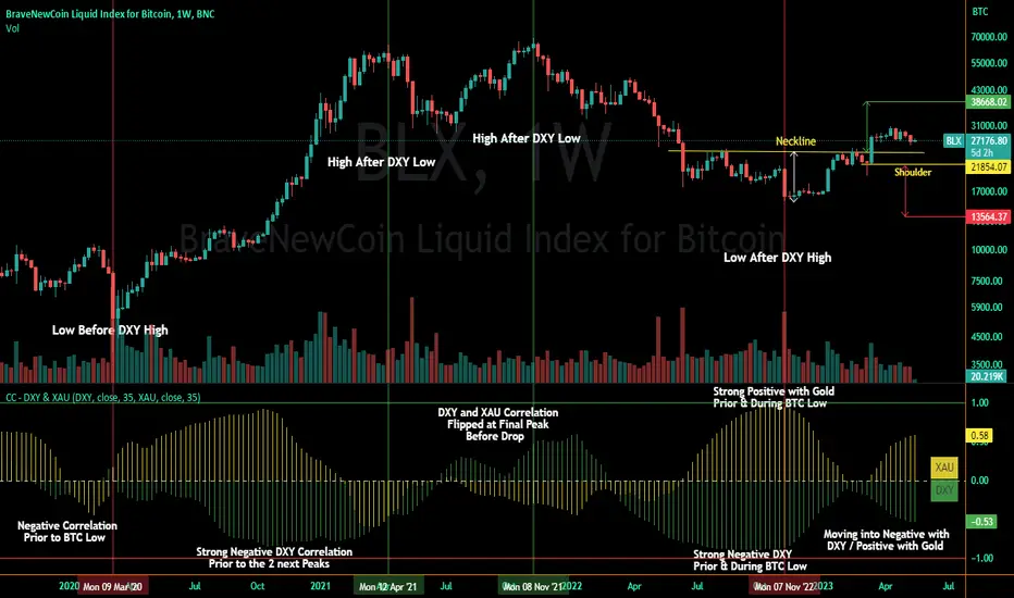
Correlation Coefficient - DXY & XAUPublishing my first indicator on TradingView. Essentially a modification of the Correlation Coefficient indicator, that displays a 2 ticker symbols' correlation coefficient vs, the chart presently loaded.. You can modify the symbols, but the default uses DXY and XAU, which have been displaying strong negative correlation.
As with the built-in CC (Correlation Coefficient) indicator, readings are taken the same way:
Positive Correlation = anything above 0 | stronger as it moves up towards 1 | weaker as it moves back down towards 0
Negative Correlation = anything below 0 | stronger moving down towards -1 | weaker moving back up towards 0
This is primarily created to work with the Bitcoin weekly chart, for comparing DXY and Gold (XAU) price correlations (in advance, when possible). If you change the chart timeframe to something other than weekly, consider playing with the Length input, which is set to 35 by default where I think it best represents correlations with Bitcoin's weekly timeframe for DXY and Gold.
The intention is that you might be able to determine future direction of Bitcoin based on positive or negative correlations of Gold and/or the US Dollar Index. DXY has been making peaks and valleys prior to Bitcoin since after March 2020 black swan event, where it peaked just after instead. In the future, it may flip over again and Bitcoin may hit major highs or lows prior to DXY, again. So, keep an eye on the charts for all 3, as well as the indicator correlations.
Currently, we've moved back into negative correlation between Bitcoin and DXY, and positive correlation with Bitcoin and Gold:
Negative Correlation b/w Bitcoin and DXY - if DXY moves up, Bitcoin likely moves down, or if DXY moves down, Bitcoin likely moves up (or if Bitcoin were to move first before DXY, as it did on March 2020, instead)
Positive Correlation b/w Bitcoin and Gold - Bitcoin and Gold will likely move up or down with each other.
DXY is represented by the green histogram and label, Gold is represented by the yellow histogram and label. Again, you can modify the tickers you want to check against, and you can modify the colors for their histograms / labels.
The inspiration from came from noticing areas of same date or delayed negative correlation between Bitcoin and DXY, here is one of my most recent posts about that:
Please let me know if you have any questions, or would like to see updates to the indicator to make it easier to use or add more useful features to it.
I hope this becomes useful to you in some way. Thank you for your support!
Cheers,
dudebruhwhoa :)
Crypto Performance Index1. The Crypto Performance Index (CPI) estimates the price appreciation of a crypto asset relative to the overall crypto market performance. The indicator is calculated using a Sharpe Ratio principle enhanced with time-domain normalization and cumulative parametrization.
2. The CPI is based on the idea that the performance of an asset should be evaluated not only in terms of its absolute price movement, but also in terms of its risk-adjusted returns compared to the broader market. The Sharpe Ratio, which takes into account both the asset's return and its volatility, is a commonly used measure of risk-adjusted performance.
3. The CPI takes the Sharpe Ratio principle further by incorporating a time-domain normalization technique that adjusts for differences in volatility across different time periods. The cumulative parametrization ensures that the CPI considers the overall performance of the asset over a specified period of time.
4. To use the indicator, select a timeframe and set the standard deviation period (default is 20). The CPI line can be compared against various market benchmarks, including the total crypto market cap (white line), altcoins total market cap (blue line), low-cap altcoins (without ETH), and Bitcoin.
5. An upward slope of the CPI line indicates strong price performance of an asset, with a relatively high chance for the asset to continue growing faster than the market in the future. Conversely, a downward slope of the CPI line indicates weak price performance of an asset, with a relatively high chance for the asset to depreciate in price with respect to the rest of the market in the future.
6. Overall, the CPI provides a comprehensive measure of an asset's price performance, taking into account both its absolute return and its risk-adjusted return relative to the broader market. This makes it a valuable tool for investors looking to evaluate the performance of their crypto holdings and make informed decisions about buying, selling, or holding assets.

Optimized Logarithmic Curve for Bitcoin (BTC/USD) by FICASHello everyone!
I'd like to share with you a handy tool that is incredibly useful for analyzing Bitcoin's price movements. This optimized logarithmic curve indicator is a refined version of the popular "My BTC log curve" indicator, originally created by @quantadelic.
We have made several improvements to enhance its predictive capabilities when it comes to identifying potential price bottoms for Bitcoin BTC/USD.
Description:
In this detailed analysis, we are excited to introduce you to an optimized version of the popular "My BTC log curve" indicator, originally created by @quantadelic. We have refined the indicator for enhanced predictive capabilities when it comes to identifying potential price bottoms for Bitcoin BTC/USD. By putting ourselves in the reader's shoes, we aim to provide a comprehensive and meaningful explanation of our analysis and predictions using this improved tool.
The logarithmic curve is a powerful tool for analyzing price movements in a non-linear fashion, allowing traders and investors to identify critical turning points and trends. With the optimized logarithmic curve, we can more accurately predict potential price bottoms, ultimately guiding better-informed trading and investment decisions.
Key Features of the Optimized Logarithmic Curve:
Improved predictive capabilities: The refined logarithmic curve has been optimized to provide more accurate predictions of potential price bottoms, enabling traders to make better-informed decisions.
Enhanced visualization: The optimized curve offers a clearer visual representation of Bitcoin's price movements, making it easier for traders to identify patterns and trends.
Adaptability: This indicator can be applied to various timeframes, providing insights for both short-term and long-term traders.
The optimized logarithmic curve indicator is based on a logarithmic regression of the USD price of Bitcoin, calculated according to the equation:
y = A * exp(beta * x^lambda + c) + m * x + b
where x is the number of days since the genesis block. All parameters are editable in the script options, allowing traders to customize the curve to their preferences.
Here are some of the key changes made to the original indicator to create the optimized logarithmic curve:
Midline Calculation: The optimized logarithmic curve utilizes an updated method for calculating the midline, which better represents the average price movement of Bitcoin over time. This improved midline calculation provides a more accurate representation of Bitcoin's historical price trajectory, making it easier to identify potential price bottoms.
Cross Line Calculation: We have modified the way cross lines are calculated in the optimized logarithmic curve. These new cross lines are derived from a combination of the updated midline calculation and historical support and resistance levels. This change allows traders to more accurately identify critical points in the market where price action is likely to reverse or continue its trend.
Table Display: a powerful visualization tool designed to provide a comprehensive overview of the relationships between various exponential curves and the Bitcoin price. This table display, integrated into the "FiCAS BTC log curve" indicator, enables traders and analysts to quickly compare and assess the impact of these curves on the market.
Our analysis using the optimized logarithmic curve suggests that Bitcoin might be at a critical price bottom, indicating that selling at this point may not be the most prudent course of action. Instead, traders and investors could consider taking advantage of the potential upswing as the market moves away from the identified price bottom.
Key highlights of this Optimized Logarithmic Curve for Bitcoin (BTC/USD) by FICAS:
Custom Pine Script: Pinescript code serves as the backbone of this strategy, providing a strong foundation for identifying potential opportunities based on the relationships between exponential curves and Bitcoin price.
MACD Indicator: The Moving Average Convergence Divergence (MACD) is integrated to help traders recognize trend reversals, bullish or bearish market conditions, and potential entry or exit points.
Momentum Indicator: By incorporating the Momentum (10, close) indicator, traders can identify the strength of price movements and potential trend continuations or reversals.
RSI and SMA: The Relative Strength Index (RSI) is used to assess overbought or oversold conditions, while the Simple Moving Average (SMA) with a period of 14 and an applied factor of 2 smoothens the data for better trend identification.
IMPORTANT:
While this indicator can be applied to traditional BTC/USD charts, we highly recommend using it on the following chart for optimal results in identifying price bottoms:
BITSTAMP:BTCUSD / CRYPTOCAP:BTC.D * 100
By employing the optimized logarithmic curve indicator on the recommended chart, traders can gain a more accurate perspective on potential price bottoms, leading to improved decision-making.
In conclusion, the optimized logarithmic curve indicator provides valuable insights into Bitcoin's price movements, allowing traders and investors to make more informed decisions. We encourage you to test this refined tool and share your thoughts in the comments section. Special thanks to @quantadelic, the first creator of this indicator, for inspiring us to develop this optimized version. If you have any questions or require further clarification, please feel free to ask. Wishing you success in your trading and investment endeavors!
Please ensure you understand and abide by the TradingView House Rules when using this indicator: www.tradingview.com
DXY Overlay CompareOverlays the DXY chart over the top of any other chart. When the dollar strength increases, asset prices can drop and vice versa. Was created personally to compare with the price of Bitcoin.

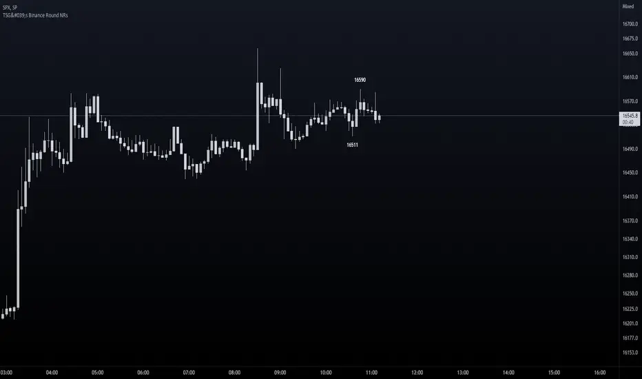
TSG's Binance Round NRs - only for BTCThis is good real-time / scalp indicator for those scalping Bitcoin.
It is based solely on Binance's BTCUSDT Perpetuals, but can be used on any BTCUSD pair as I am requesting info directly from Binance's chart.
IDEA
I have spotted that many times, round nrs (most likely caused by algo-trading) mark a top / bottom on a trend. Many times have catched extremes because of this technique and I have now coded it into an indicator on TradingView.
Feel free to test it out - It's not a 100% strategy - but if you spot round nrs around confluences - your odds go up big time.
SETUP
You are able to set the amount of candles you want to search for - default is 20.
Ofcourse we look only for extremes, therefore it will only look for extreme highs and lows within the amount of candles of your input.
HOW TO READ IT
The indicator will mark only the last High and Low matching the criteria - above and below the candle with the price number.
Good luck!
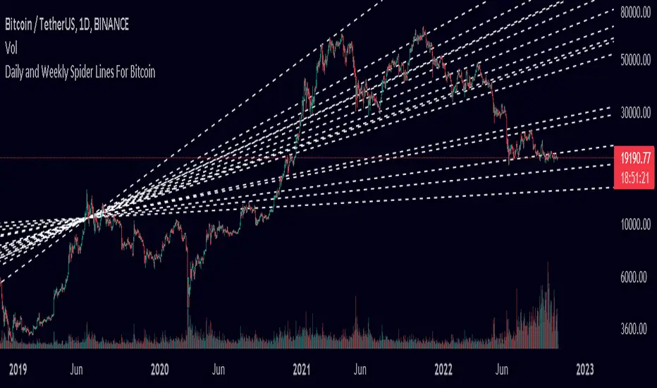
Spider Lines For Bitcoin (Daily And Weekly)I haven't seen any indicator do this, so I decided to publish this to form automatic Spider Charts without actually going through the effort of drawing them!
This script charts dotted lines (spider lines) all over, depicting support and resistance levels.
It works by connecting some candles from the 2018 bear market to the candle from 1st July 2019, followed by extending the lines to the right, making support and resistance levels for the future. The script works only for the daily and weekly charts for Bitcoin.
The levels are accurate to a good extent.
If the lines don't load, zoom out until the 2018 bear market top and it should load then.
Have fun with this indicator!
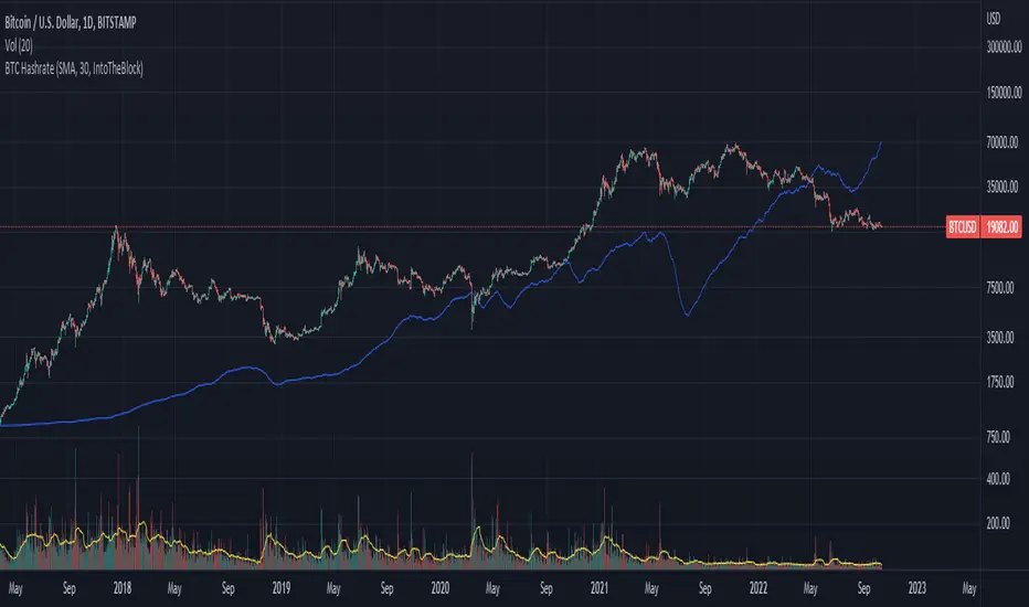
BTC Hashrate with smoothingBTC Hashrate with smoothing - thanks to the recent integration of IntoTheBlock data into Tradingview, we can now effortlessly show Hashrate data on our chart.
One popular use for Hashrate is to buy when the 30 day moving average crosses above the 60 day moving average, signifying that miner capitulation is over and recovery has started.
Definition
The Bitcoin hash rate is the number of times per second that computers on the Bitcoin network are hashing data to verify transactions and perform the encryption that secures the network. The hash rate is an indicator of how healthy the Bitcoin network is at any given time, and is driven primarily by difficulty mining and the number of miners. Generally, a high hash rate is considered a good thing.
More precisely, the Bitcoin hash rate is the number of times per second that computers on the Bitcoin network are hashing data to verify transactions and perform the encryption that secures the network.
TBT Base to Quote Currency ConverterKnowing how much volume is traded on a chart is essential, but only knowing the Base volume can be confusing- especially when it's for a token only worth 0.00000210 sats. Put away your calculators and use this indicator instead to instantly convert the Base traded volume to Quote.
For example, on the chart above for BTCUSDT:BINANCE, if you add the Volume indicator, it is showing volume traded in the Base currency, which is Bitcoin. But it's more important to know how much QUOTE currency has been traded, which would be USDT in this case.
This is particularly useful when trading low-volume charts for AB Trading, something we teach in several of our courses.
Lastly, we have included a 30-period SMA to show average trading volume over the last 30 periods. Keep in mind that this will be more helpful when used on the daily time frame to get a general idea of the average trading volume over time for a trading pair.

Mayer Multiple Bands [TXMC]This Bitcoin indicator provides level bands using price distance from the 200 day moving average, also known as the Mayer Multiple.
The percentage levels are based on historical distribution of the Mayer Multiple since Bitcoin's inception, and are meant to inform the user of price action probabilities.
Usage examples:
The 25% line means that 25% of Bitcoin's price history has traded below that distance away from the 200 day moving average.
A value of 95% means that only 5% of Bitcoin's price history has extended that far above the 200 day moving average.
Levels displayed:
5% (5% chance of trading below)
10% (10% chance of trading below)
20%
75%
90% (10% chance of trading above)
95% (5% chance of trading above)
This indicator is for information purposes only . Use at your own discretion.
