U.S. Stocks & Options CVI to Bitcoin Correlation [NeoButane]Conceptual indicator based on trying to find an inverse correlation between bitcoin and traditional markets due to bitcoin's usefulness as a hedge against economic downturns.
How to use this script: you look at it and see if there is a correlation or not between bitcoin/Ethereum price and either U.S. stock CVi, buy volume, sell volume, calls, puts, or the call/put ratio.
Cari dalam skrip untuk "bitcoin"

Bitcoin vs M2 Global Liquidity (Lead 3M) - Table Ticker═══════════════════════════════════════════════════════════════
Bitcoin vs M2 Global Liquidity - Regression Indicator
═══════════════════════════════════════════════════════════════
TECHNICAL SPECS
• Pine Script v6
• Overlay: false (separate pane)
• Data sources: 5 M2 series + 4 FX pairs (request.security)
• Calculation: Rolling OLS linear regression with configurable lead
• Output: Regression line + ±1σ/±2σ confidence bands + R² ticker
CORE FUNCTIONALITY
Aggregates M2 money supply from 5 central banks (CN, US, EU, JP, GB),
converts to USD, applies time-lead, runs rolling linear regression
vs Bitcoin price, plots predicted value with confidence intervals.
CONFIGURABLE PARAMETERS
Input Controls:
• Lead Period: 0-365 days (default: 90)
• Lookback Window: 50-2000 bars (default: 750)
• Bands: Toggle ±1σ and ±2σ visibility
• Colors: BTC, M2, regression line, confidence zones
• Ticker: Position, size, colors, transparency
Advanced Settings:
• Table display: R², lead, M2 total, country breakdown (%)
• Ticker customization: 9 position options, 6 text sizes
• Border: Width 0-10px, color, outline-only mode
DATA AGGREGATION
Sources (via request.security):
• ECONOMICS:CNM2, USM2, EUM2, JPM2, GBM2
• FX_IDC:CNYUSD, JPYUSD (others: FX:EURUSD, GBPUSD)
• Conversion: All M2 → USD → Sum / 1e12 (trillions)
REGRESSION ENGINE
• Arrays: m2Array, btcArray (dynamic sizing, auto-trim)
• Window: Rolling (lookbackPeriod bars)
• Lead: Time-shift via array indexing (i + leadPeriodDays)
• Calc: Manual OLS (covariance/variance), no built-in ta functions
• Outputs: slope, intercept, r2, stdResiduals
CONFIDENCE BANDS
±1σ and ±2σ calculated from standard deviation of residuals.
Fill zones between upper/lower bounds with configurable transparency.
ALERTS
5 pre-configured alertcondition():
• Divergence > 15%
• Price crosses ±1σ bands (up/down)
• Price crosses ±2σ bands (up/down)
TICKER TABLE
Dynamic table.new() with 9 rows:
• R² value (4 decimals)
• Lead period (days + months)
• M2 Global total (trillions USD)
• Country breakdown: CN, US, EU, JP, GB (absolute + %)
• Optional: Hide/show M2 details
VISUAL CUSTOMIZATION
All plot() elements support:
• Color picker inputs (group="Couleurs")
• Line width: 1-3px
• Transparency: 0-100% for zones
• Offset: M2 plot has +leadPeriodDays offset option
PERFORMANCE
• Max arrays size: lookbackPeriod + leadPeriodDays + 200
• Calculations: Only when array.size >= lookbackPeriod + leadPeriodDays
• Table update: barstate.islast (once per bar)
• Request.security: gaps_off mode
CODE STRUCTURE
1. Inputs (lines 7-54)
2. Data fetch (lines 56-76)
3. M2 aggregation (line 78)
4. Array management (lines 84-95)
5. Regression calc (lines 97-172)
6. Prediction + bands (lines 174-183)
7. Plots (lines 185-199)
8. Ticker table (lines 201-236)
9. Alerts (lines 238-246)
DEPENDENCIES
None. Pure Pine Script v6. No external libraries.
LIMITATIONS
• Daily timeframe recommended (1D)
• Requires 750+ bars history for optimal calculation
• M2 data availability: TradingView ECONOMICS feed
• Max lines: 500 (declared in indicator())
CUSTOMIZATION EXAMPLES
• Shorter lookback (200d): More reactive, lower R²
• Longer lookback (1500d): More stable, regime mixing
• No bands: Set showBands=false for clean view
• Different lead: Test 60d, 120d for sensitivity analysis
TECHNICAL NOTES
• Manual OLS implementation (no ta.linreg)
• Array-based lead application (not plot offset)
• M2 values stored in trillions (/ 1e12) for readability
• Residuals array cleared/rebuilt each calculation
OPEN SOURCE
Code fully visible. Modify, fork, analyze freely.
No hidden calculations. No proprietary data.
VERSION
1.0 | November 2025 | Pine Script v6
═══════════════════════════════════════════════════════════════

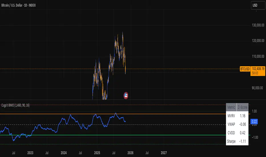
Bitcoin Macro Oscillator (Cuga)Bitcoin Macro Oscillator (BMO) — WooCharts-Style Composite Indicator
A single-number macro health check for Bitcoin, combining 4 key signals into one oscillator:
══════════════════════════════════════════════
HOW IT'S CALCULATED
══════════════════════════════════════════════
1. MVRV Z-Score
• Data: On-chain MVRV Ratio (INTOTHEBLOCK:BTC_MVRV)
• Z = (MVRV - μ_4yr) / σ_4yr
• Measures over/undervaluation vs. realized cost basis
2. VWAP Ratio Z-Score
• VWAP = Cumulative (Price × Volume) / Cumulative Volume
• Ratio = (Price / VWAP) - 1
• Z = (Ratio - μ_4yr) / σ_4yr
• Tracks deviation from volume-weighted fair value
3. CVDD Ratio Z-Score (Approximated)
• CVDD Proxy = 200-week SMA (long-term holder cost)
• Ratio = (Price / CVDD) - 1
• Z = (Ratio - μ_4yr) / σ_4yr
• Captures coin-age destruction & HODL cost basis
4. Sharpe Ratio Z-Score
• 90-day rolling Sharpe = (Daily Return) / σ_daily
• Z = (Sharpe - μ_4yr) / σ_4yr
• Measures risk-adjusted momentum quality
══════════════════════════════════════════════
FINAL BMO FORMULA
══════════════════════════════════════════════
BMO = 0.25 × (Z_MVRV + Z_VWAP + Z_CVDD + Z_Sharpe)
• Lookback: 1,460 days (~4 years) for mean & std dev
• Equal weighting → BMO oscillates ~ –2.5 to +2.5
• Optional 1-period SMA smoothing
══════════════════════════════════════════════
SIGNAL LEVELS
══════════════════════════════════════════════
< –1.5 → Deep Oversold (Macro Buy)
–1.5 to –0.8 → Oversold
–0.8 to +0.8 → Neutral
+0.8 to +1.5 → Overbought
> +1.5 → Deep Overbought (Macro Sell)
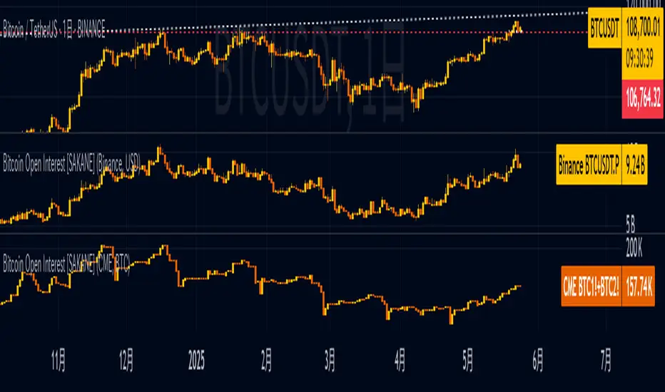
Bitcoin Open Interest [SAKANE]Bitcoin Open Interest
— Unveiling the True Flow of Capital
PurposeVisualize and compare Bitcoin open interest (OI) from CME and Binance, the leading derivatives exchanges, in a single intuitive chart, providing traders with clear insights into crypto market capital dynamics.
Background & MotivationIn the 24/7 crypto market, price movements alone reveal only part of the story. Open interest (OI)—the total outstanding futures contracts—offers critical clues to the market’s next move. Yet, accessing and interpreting OI data is challenging:
CME Constraints: Commitment of Traders (COT) reports are weekly, and standalone BTC1! or BTC2! OI is noisy due to contract rollovers, obscuring true OI changes.
Existing Tool Limitations: Most OI indicators are fixed to either USD or BTC, limiting flexible analysis.
This indicator overcomes these hurdles, enabling seamless comparison of CME and Binance OI to track the market’s “capital center of gravity” in real time.
Key Features
Synthetic CME OI: Combines BTC1! and BTC2! to deliver high-accuracy OI, eliminating rollover noise.
Multi-Timeframe Analysis: Displays daily CME OI as pseudo-candlestick (OHLC) on any timeframe (e.g., 4H), allowing intuitive capital flow tracking across timeframes.
CME/Binance One-Click Toggle: Instantly compare institutional-driven CME and retail-driven Binance OI.
USD/BTC Flexibility: Switch between BTC (real demand) and USD (margin) perspectives for OI analysis.
Robust Design: Concise, global-scope code ensures stability and adaptability to TradingView updates.
Insights & Use Cases
Holistic Market Sentiment: Analyze capital flows by region and exchange for a multidimensional view.
Signal Detection: E.g., a sharp drop in CME OI during a sell-off may signal institutional withdrawal.
Retail Trends: A surge in Binance OI suggests retail-driven inflows.
Event-Driven Insights: E.g., during a hypothetical April 2025 “Trump Tariff Shock,” instantly identify which exchange drives capital shifts.
Unique ValueUnlike price-centric indicators, this tool focuses on capital flow (OI). It’s the only indicator offering one-click multi-timeframe and multi-exchange OI comparison, empowering traders to uncover the market’s “true intent” and gain a strategic edge.
ConclusionBitcoin Open Interest makes the market’s hidden capital movements accessible to all. By capturing market dynamics and pinpointing the “leading forces” during events, it sets a new standard for traders seeking a revolutionary perspective.
Bitcoin Liquidity Breakout with ICT StrategiesBitcoin Liquidity Breakout with ICT Strategies
a one of many scripts developed by our engineers .
Check the results for yourself

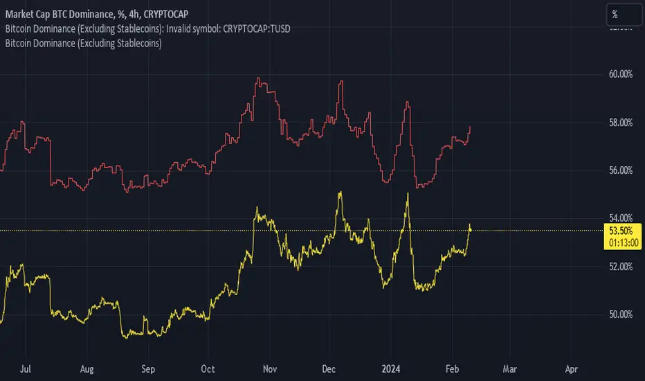
Bitcoin Dominance (Excluding Stablecoins)Bitcoin dominance as provided by Trading View's BTC.D ticker fails to account for the fact that crypto is an isolated market and should not include stablecoins in their calculations.
Godspeed anon.
[SM] Bitcoin cycles bull market
An indicator to determine the seasonality / cyclicality of bitcoin for long trades.
Application
- For traders: Identification of zones with lower risk of entering long positions
- For swing traders and investors: customizable calendar of entries into long position
Indicator structure
1. Vertical zones (green and red) of time ranges. Only for historical bars. The range width is adjustable in the indicator settings.
2. Table (in the form of a calendar) for determining the time of entering a trade in the future. The table is not editable. It displays the result of the configured zones on the historical bars.
General settings
- choose the color of the Tradingview theme (light or dark)
Table settings
- Turn table display on / off
- Set the number of months to be displayed in the table
Settings of vertical zones (green and red)
Each cycle (1 month summer, 1 month autumn, ...) has four dates
- start date of the green zone (day and month)
- date of the end of the green zone
- start date of the red zone
- date of the end of the red zone

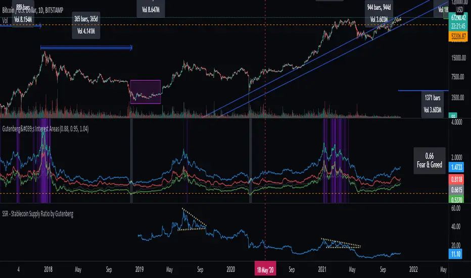
SSR - Stablecoin Supply Ratio - Bitcoin - CryptocurrencyThe Stablecoin Supply Ratio (SSR) is the ratio between Bitcoin supply and the supply of stablecoins, denominated in BTC.
When the SSR is low, the current stablecoin supply has more "buying power" to purchase BTC. It serves as a proxy for the supply/demand mechanics between BTC and USD.
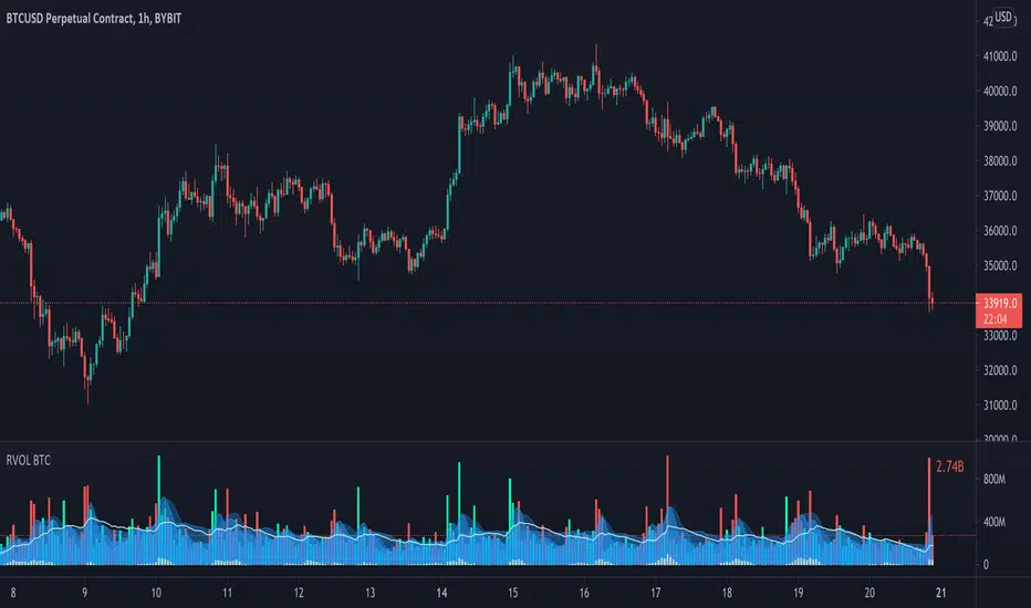
Relative Volume - BITCOINRelative Volume indicator that pulls data from 9 different Bitcoin exchanges. Please note that this indicator only works with BTC and will not use data from your current chart.
Includes the following exchanges:
BYBIT:BTCUSD
BITFINEX:BTCUSD
BITSTAMP:BTCUSD
INDEX:BTCUSD
COINBASE:BTCUSD
FTX:BTCUSD
PHEMEX:BTCUSD
BITTREX:BTCUSD
POLONIEX:BTCUSDT
Keltner + RSI Bitcoin Futures Trading [luca_badoer]This indicator combines the power of the Keltner channel with the power of the Relative Strength Indicator (RSI). It can help understand when the market is entering a bullish or a bearish trend.
Normally a Keltner channel would reference an Exponential Moving Average (EMA) of the price. In this case the Keltner Channel in the "Keltner + RSI Bitcoin Futures Trading " references the EMA of the 14-day RSI (white line). On top of that it overlays a 7-day RSI line (blue line). This produces some signals that are particularly useful in 2h, 4h and 1 day charts. The signals consist in the 7-day RSI line (blue line) crossing the upper (green) or lower (red) Keltner channels as well as the middle (white) line. Depending on the direction of the crossing (up or down) and the RSI level (from 0 to 100) at which the crossing takes place this produces bullish or bearish signals.
Examples:
- Bullish crossing: 7-day RSI (blue) crosses both the lower (red) and middle (white) lines upwards at a low to neutral RSI level (<70%)
- Bearish crossing: 7-day RSI (blue) cross both the upper (green) and middle (white) lines downwards at a high to neutral RSI (>30%)
Recommendations:
- Better to use it in 2h, 4h, and 1-day charts, thought it can also be used in lower timeframes. Confirmations of crossings in higher time-frames provide more certainty about the direction of the move.
- Use in combination with Heikin Ashi candles and volume indicators.

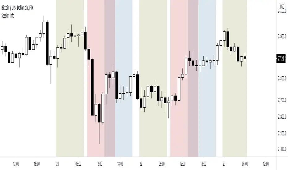
World market Session Information for bitcoinIt marks out different world markets active timings on the bitcoin charts.
You can also modify the script to a strategy and test out different strategies.
Bitmex Bitcoin BasisInspired by the Ugly Old Goat's articles about the Bitcoin basis - medium.com
with the help of @Plumptoiletduck this indicator was created to show the Bitmex futures premium or discount.
Note you need to add in the new futures ticker every 3 months.

Total Bitcoin Volume [@MetaDonTrader]Aggregates all the bitcoin volume from different exchanges. Note that new exchanges like Binance and Bitmex will have an affect on this data as well. Who's to say how much of it is legit and how much is wash trading.
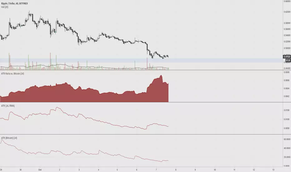
ATR Ratio vs. BitcoinAverage True Range is used to determine if a ticker's trading range is widening or narrowing, which is helpful for finding the trend or to use as a stop loss. The idea of this indicator is to compare the ATR of altcoins versus bitcoin, since volatility is low.
6 Simple Moving Averages 9,20,30,50,128,200 (bitcoin tested)I've condensed my SMAs down to these 6 and have found them to be most useful for Bitcoin, which is what I trade the most. They all have played their roll in acting as support and resistance and making decisions with the 30 period probably the least relevant, but relevant nonetheless. There is the option to change to exponential if desired.
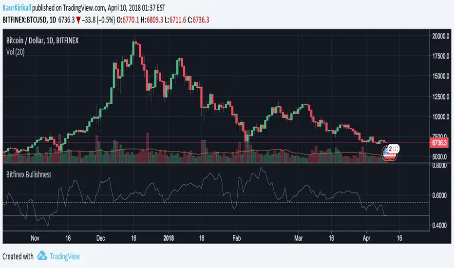
Bitfinex Bitcoin BullishnessBased on contrary opinion in futures, I've adjusted this to Bitcoin, more thoroughly Bitfinex margin longs & shorts. Those unfamiliar with the concept, contrary opinion illustrates the psychological sentiment in the market by determining the degree of bullishness or bearishness among participants in the market.
The principle holds that when the majority of people agree on anything, they are generally wrong, so following the principle you would analyse and look to take the other side of the trades.
Consider this, once the market is extremely bullish, all bulls have already entered the market to an extent that one can't commit any more funds to the position. Even though Bitfinex margin positions are not like future trading, that every short must have someone taking the long side, one should understand that the majority of people do not make money on the market, so whenever this indicator goes too low or too high, one should look for a trend reversal.
This indicator is in the range of 0 to 1 and the neutral position for a "healthy" market is 0.55ish. Some adjustments should probably be made according to the cryptocurrency markets and I might add this in the future updates, but as of now it's a good indicator for forecasts and to get a bigger picture on a timeframe of 1 DAY or longer charts.
The base of the indicator is simple, amount of longs divided by the sum of shorts and longs.
Also you can see, how only now, 10th of April, we are hitting new lows in the bearishness of the market.
[Bitcoin] Spot price vs Futures indicatorA handy script to detect opportunities in the futures market during extreme movement.
During rallies, futures usually tend to be US$10 above spot price, on the other hand it can be $1 below spot price when the price starts to decline.
You could also draw a trendline to it :) measuring the amount of risk people are willing to take just to predict future prices in the rally/decline.
Credits to lowstrife for the idea, I'm just implementing it :)

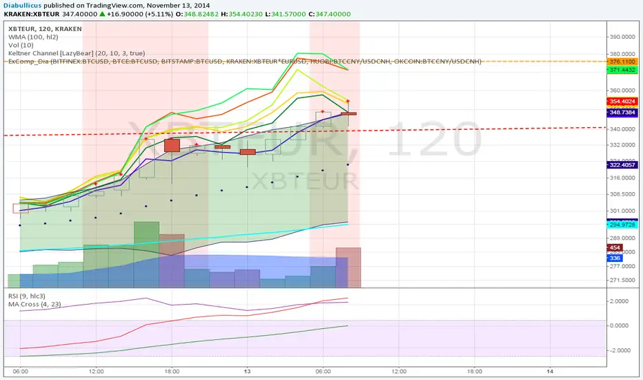
Exchange Comparison [Diabolicus]This script helps you compare bitcoin prices across different currency pairs and exchanges. Quickly judge at a glance if "your" exhange currently trades above or below the rest of the market.
Each colored line represents an exchange pair of your choice. Exchange pairs must be entered normalized to USD, so for BTCEUR or XBTEUR multiply by EURUSD, for BTCCNY divide by USDCNH respectively.
Bitcoin Impact AnalyzerSummary of the "Bitcoin Impact Analyzer" script, the adjustments users can make, and an explanation of what the chart and table represent:
Script Summary:
The "Bitcoin Impact Analyzer" script is designed to help traders and analysts understand the relationship between a chosen altcoin and Bitcoin (BTC). It does this by:
Fetching price data for the specified altcoin and Bitcoin.
Calculating several key comparative metrics:
Normalized Prices: Shows the percentage performance of both assets from a common starting point.
Price Correlation: Measures how similarly the two assets' prices move over a defined period.
Beta: Indicates the altcoin's volatility relative to Bitcoin.
Altcoin/BTC Ratio: Shows the altcoin's value expressed in Bitcoin.
Fetching and displaying Bitcoin Dominance (BTC.D) data.
Visualizing these metrics on the chart as distinct plots.
Displaying the current values of these key metrics in a data table on the chart for quick reference.
The script aims to provide insights into whether an altcoin is outperforming or underperforming Bitcoin, how closely its price movements are tied to Bitcoin's, and its relative volatility.
User Adjustments:
Users can customize the script's behavior through several input settings:
Symbol Inputs:
Altcoin Symbol: Users can enter the ticker symbol for any altcoin they wish to analyze (e.g., BINANCE:ETHUSDT, KUCOIN:SOLUSDT).
Bitcoin Reference Symbol: Users can specify the Bitcoin pair to use as a reference, though BINANCE:BTCUSDT is a common default.
Lookback for Correlation/Beta:
Lookback Period: This integer value (default 50 periods) determines how many past candles are used to calculate the price correlation and beta.
A shorter lookback makes the metrics more sensitive to recent price action.
A longer lookback provides a smoother, more stable indication of the longer-term relationship.
Plot Visibility Options:
Users can toggle on or off the display of each individual plot on the chart:
Normalized BTC & Altcoin Prices
Altcoin/BTC Ratio
Correlation Plot
Bitcoin Dominance (BTC.D)
Beta Plot
This allows users to focus on specific metrics and reduce chart clutter.
What the Chart Represents:
The chart visually displays the historical trends and relationships of the selected metrics:
Normalized Prices Plot: Two lines (typically orange for BTC, blue for the altcoin) show the percentage growth of each asset from the start of the loaded chart data (or the first available data point for each symbol). This makes it easy to see which asset has performed better over time on a relative basis.
Correlation Plot: A single line (purple) oscillates between -1 and +1.
Values near +1 indicate a strong positive correlation (altcoin and BTC prices tend to move in the same direction).
Values near -1 indicate a strong negative correlation (they tend to move in opposite directions).
Values near 0 indicate little to no linear relationship.
Lines at +0.7 and -0.7 are often plotted as thresholds for "strong" correlation.
Beta Plot (if enabled): A single line (teal) shows the altcoin's volatility relative to BTC.
A Beta of 1 (often marked by a dashed line) means the altcoin has, on average, the same volatility as BTC.
Beta > 1 suggests the altcoin is more volatile than BTC (moves by a larger percentage for a given BTC move).
Beta < 1 suggests the altcoin is less volatile than BTC.
Bitcoin Dominance Plot: An area plot (gray) shows the percentage of the total cryptocurrency market capitalization that Bitcoin holds. This helps understand broader market sentiment and capital flows.
Altcoin/BTC Ratio Plot: A line (fuchsia) shows the price of the altcoin denominated in BTC.
An upward trend means the altcoin is gaining value against Bitcoin (outperforming).
A downward trend means the altcoin is losing value against Bitcoin (underperforming).
What the Table Represents:
The data table, typically located in the bottom-right corner of the chart, provides a snapshot of the current values for the most important calculated metrics. It includes:
Altcoin: The ticker symbol of the analyzed altcoin.
Bitcoin Ref: The ticker symbol of the Bitcoin reference.
Correlation (lookback): The current correlation coefficient between the altcoin and BTC, based on the specified lookback period. The value is color-coded (e.g., green for strong positive, red for strong negative).
Beta (lookback): The current beta value of the altcoin relative to BTC, based on the specified lookback period. The value may be color-coded to highlight significantly high or low volatility.
BTC.D Current: The current Bitcoin Dominance percentage.
ALT/BTC Ratio: The current price of the altcoin expressed in Bitcoin.
The table offers a quick, at-a-glance summary of the present market dynamics between the two assets without needing to interpret the lines on the chart for their exact current values.

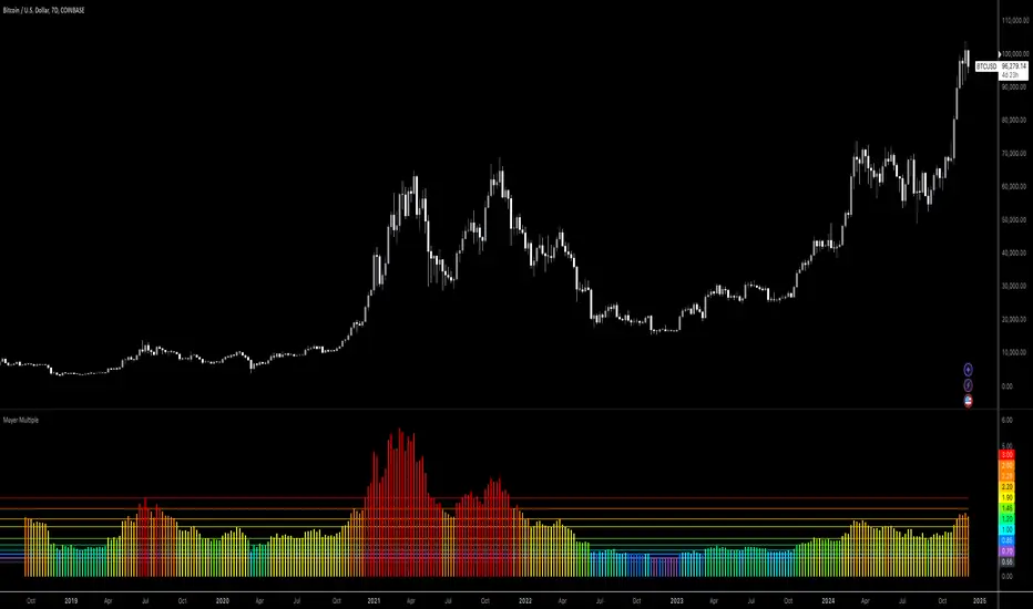
Bitcoin: Mayer MultipleMayer Multiple Indicator
The Mayer Multiple is a powerful tool designed to help traders assess market conditions and identify optimal buying or selling opportunities. It calculates the ratio between the current price and its 200-day simple moving average (SMA), visualizing key thresholds that indicate value zones, caution areas, and overheated markets.
Key Features:
Dynamic Market Zones: Clearly marked levels like "Smash Buy," "Boost DCA," and "Extreme Euphoria" to guide your trading decisions.
Customizable Input: Adjust the SMA length to fit your strategy.
Color-Coded Signals: Intuitive visualization of market sentiment for quick analysis.
Comprehensive Thresholds: Historical insights into price behavior with plotted reference levels based on probabilities.
This indicator is ideal for traders aiming to enhance their long-term strategies and improve decision-making in volatile markets. Use it to gain an edge in identifying potential turning points and managing risk effectively.
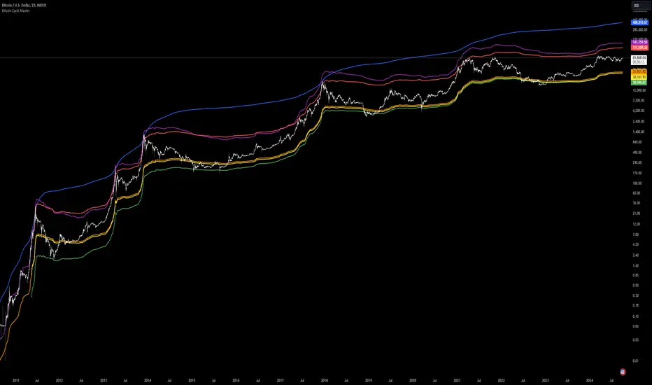
Bitcoin Cycle Master [InvestorUnknown]The "Bitcoin Cycle Master" indicator is designed for in-depth, long-term analysis of Bitcoin's price cycles, using several key metrics to track market behavior and forecast potential price tops and bottoms. The indicator integrates multiple moving averages and on-chain metrics, offering a comprehensive view of Bitcoin’s historical and projected performance. Each of its components plays a crucial role in identifying critical cycle points:
Top Cap: This is a multiple of the Average Cap, which is calculated as the cumulative sum of Bitcoin’s price (price has a longer history than Market Cap) divided by its age in days. Top Cap serves as an upper boundary for speculative price peaks, multiplied by a factor of 35.
Time_dif() =>
date = ta.valuewhen(bar_index == 0, time, 0)
sec_r = math.floor(date / 1000)
min_r = math.floor(sec_r / 60)
h_r = math.floor(min_r / 60)
d_r = math.floor(h_r / 24)
// Launch of BTC
start = timestamp(2009, 1, 3, 00, 00)
sec_rb = math.floor(start / 1000)
min_rb = math.floor(sec_rb / 60)
h_rb = math.floor(min_rb / 60)
d_rb = math.floor(h_rb / 24)
difference = d_r - d_rb
AverageCap() =>
ta.cum(btc_price) / (Time_dif() + btc_age)
TopCap() =>
// To calculate Top Cap, it is first necessary to calculate Average Cap, which is the cumulative sum of Market Cap divided by the age of the market in days.
// This creates a constant time-based moving average of market cap.
// Once Average cap is calculated, those values are multiplied by 35. The result is Top Cap.
// For AverageCap the BTC price was used instead of the MC because it has more history
// (the result should have minimal if any deviation since MC would have to be divided by Supply)
AverageCap() * 35
Delta Top: Defined as the difference between the Realized Cap and the Average Cap, this metric is further multiplied by a factor of 7. Delta Top provides a historically reliable signal for Bitcoin market cycle tops.
DeltaTop() =>
// Delta Cap = Realized Cap - Average Cap
// Average Cap is explained in the Top Cap section above.
// Once Delta Cap is calculated, its values over time are then multiplied by 7. The result is Delta Top.
(RealizedPrice() - AverageCap()) * 7
Terminal Price: Derived from Coin Days Destroyed, Terminal Price normalizes Bitcoin’s historical price behavior by its finite supply (21 million bitcoins), offering an adjusted price forecast as all bitcoins approach being mined. The original formula for Terminal Price didn’t produce expected results, hence the calculation was adjusted slightly.
CVDD() =>
// CVDD stands for Cumulative Value Coin Days Destroyed.
// Coin Days Destroyed is a term used for bitcoin to identify a value of sorts to UTXO’s (unspent transaction outputs). They can be thought of as coins moving between wallets.
(MCR - TV) / 21000000
TerminalPrice() =>
// Theory:
// Before Terminal price is calculated, it is first necessary to calculate Transferred Price.
// Transferred price takes the sum of > Coin Days Destroyed and divides it by the existing supply of bitcoin and the time it has been in circulation.
// The value of Transferred Price is then multiplied by 21. Remember that there can only ever be 21 million bitcoin mined.
// This creates a 'terminal' value as the supply is all mined, a kind of reverse supply adjustment.
// Instead of heavily weighting later behavior, it normalizes historical behavior to today. By normalizing by 21, a terminal value is created
// Unfortunately the theoretical calculation didn't produce results it should, in pinescript.
// Therefore the calculation was slightly adjusted/improvised
TransferredPrice = CVDD() / (Supply * math.log(btc_age))
tp = TransferredPrice * 210000000 * 3
Realized Price: Calculated as the Market Cap Realized divided by the current supply of Bitcoin, this metric shows the average value of Bitcoin based on the price at which coins last moved, giving a market consensus price for long-term holders.
CVDD (Cumulative Value Coin Days Destroyed): This on-chain metric analyzes Bitcoin’s UTXOs (unspent transaction outputs) and the velocity of coins moving between wallets. It highlights key market dynamics during prolonged accumulation or distribution phases.
Balanced Price: The Balanced Price is the difference between the Realized Price and the Terminal Price, adjusted by Bitcoin's supply constraints. This metric provides a useful signal for identifying oversold market conditions during bear markets.
BalancedPrice() =>
// It is calculated by subtracting Transferred Price from Realized Price
RealizedPrice() - (TerminalPrice() / (21 * 3))
Each component can be toggled individually, allowing users to focus on specific aspects of Bitcoin’s price cycle and derive meaningful insights from its long-term behavior. The combination of these models provides a well-rounded view of both speculative peaks and long-term value trends.
Important consideration:
Top Cap did historically provide reliable signals for cycle peaks, however it may not be a relevant indication of peaks in the future.