Replay Mode - Check HTF CandleThis indicator is intended to be used while using Replay Mode.
A vertical line will be drawn when you can safely check the 4H, Daily, or Weekly candle without seeing future price.
It is similar to the built-in Session Breaks, but has the benefit of not needing to remove one candle before checking the Daily.
When the line is the color of your 4H settings, it is safe to check the 4H candle.
When the line is the color of your Daily settings, it is safe to check the 4H and Daily candles.
When the line is the color of your Weekly settings, it is safe to check the 4H, Daily and Weekly candles
Cari dalam skrip untuk "candle"
Candle checker for long/short for scalping/day tradingHey.
This strategy is still in working.
For it I check a x amount of candles in the past if they been for example all red/green in row, and based on that I enter. For example candle 7 < candle 6 .... candle 3 < candle 2 .... candle 1 < candle current for long and viceversa for short.
After that,once the trade is initiated, I exit based on 2 possibilities : candle color is different than the color of candle when entry, or based tp/sl.
Let me know what you think of it.
I will try to make the process to calculate automatically and input the number of candles to check like 5-10-15 and so on.

Real Candles Heikin Ashi (HA) Candle functionsThis script plots both real and HA candles regardless or which are used on the chart in TV settings.
(and has the functions for you to use.)
Lots of people seem to misunderstand backtesting (or scam people) based on HA candles.
Backtesting with HA candles leads to impossible trades. ALWAYS backtest with real candles.
That doesn't mean you might not want to look at HA candle values to make trading decisions.
Add the code below to calculate HA candles from real and use that in your HA trading algo,
but test it on real charts.

Candles - Cheat SheetWhat is up y'all ? (french trying to sound American)
I found that in my script archives, way back in an old cave. I think this might be useful as a few really asked me how to define a green/red candle, how to capture the wick value, the body, etc..
This is not a fancy script as usual and I'm sure they're plenty of candles pattern scripts out there but I saw no one sharing a simple candle cheat sheet for pinescript coding
Being able to define candles using codes is an essential skill to have for any Pinescripter
Still on the train so won't write a roman as usual... Kidding... I actually did it here What-is-an-Hard-Exit-and-a-few-notes-on-trading-management/
It won't bring me as many likes as any magic p**p cannon accounts promising the moon at each trade but if I can help at least 1 trader a day not losing his/her money, I'll be happy and my daily goal will be fulfilled
All the best
Dave
____________________________________________________________
Be sure to hit the thumbs up
- I'm an officially approved PineEditor/LUA/MT4 approved mentor on codementor. You can request a coaching with me if you want and I'll teach you how to build kick-ass indicators and strategies
Jump on a 1 to 1 coaching with me
- You can also hire for a custom dev of your indicator/strategy/bot/chrome extension/python
MA CandlesOHLC calculated with a moving average.
You can replace sma with anything. EMA, Hull, sma(sma(sma(sma(close, etc.
You could also make it look clean like Heikin Ashi candlesticks if you include min/max for low/high wicks on candles.

Buyers & sellers Candle Control Dominance Zone @MaxMaserati 3.0Description
The Buyers & Sellers Candle Control Dominance Zone is a surgical price-action tool designed to identify and project key supply and demand zones derived from candle anatomy across multiple timeframes.
By splitting candles into "Sellers Control" (upper wick/shadow) and "Buyers Control" (lower wick/shadow) regions, this script visualizes exactly where price rejection and absorption are occurring. With the new HTF Engine, you can now view these institutional rejection zones from a Higher Timeframe (e.g., 4H) while trading on a Lower Timeframe (e.g., 15m).
How it Works
The indicator identifies specific "Control Zones" based on the battle between buyers and sellers:
Live Control (Current & HTF): Real-time monitoring of the developing candle. See a 4H wick forming live while watching the 1m chart.
Last Closed Control (Current & HTF): Projects the zones from the most recently completed candle.
Dominance Zones (BuBC & BeBC):
BuBC (Bullish Body Close): A "Dominance Zone" triggered when a candle closes above the previous candle's high. Signifies strong bullish momentum.
BeBC (Bearish Body Close): A "Dominance Zone" triggered when a candle closes below the previous candle's low. Signifies aggressive selling pressure.
Key Features
Multi-Timeframe (MTF) Overlay: Plot 4H, Daily, or Weekly control zones directly on your lower timeframe scalping charts.
Smart Labeling: HTF labels automatically update to show the zone type (e.g., "Sellers Control (Live) ") and whether the last candle was a Dominance candle (BuBC/BeBC).
Dynamic Extension: Zones are projected forward to help you catch retests of rejection levels.
Alerts Included: Built-in alerts trigger when price crosses into a Dominance Zone (BuBC/BeBC), allowing you to set it and forget it.
Can be use as:
Support & Resistance: Use Buyers Control zones (lower wicks) as demand zones for longs and Sellers Control zones (upper wicks) as supply zones for shorts.
Trend Confirmation: A BuBC zone often acts as a launchpad for continued upside. If price falls back into a BuBC zone and rejects, it is a high-probability continuation signal.
Fractal Entry: Use the HTF zones to find the "Big Picture" levels, then use the Current TF zones to refine your entry with precision.
Settings
Display Filter: Toggle Current TF zones (Live, Closed, BuBC, BeBC) independently.
Higher Timeframe Settings: Enable/Disable HTF overlay and select your preferred timeframe (e.g., 240 for 4H).
Visuals: Fully adjustable transparency, colors, and extension lengths to keep your chart clean.

Reversal Candlestick PatternsReversal Candlestick Patterns
Reversal Candlestick Patterns is an indicator designed to detect classic candlestick reversal patterns with additional market context filtering.
The indicator identifies ten well-known reversal candlestick patterns and displays them directly on the chart as visual blocks. Each pattern is detected using its own logic, based on candle structure, position relative to local extremes, and the direction of the current trend.
Bullish patterns:
> Bullish Engulfing
> Morning Star
> Hammer
> Inverted Hammer
> Three White Soldiers
Bearish patterns:
> Bearish Engulfing
> Evening Star
> Hanging Man
> Shooting Star
> Three Black Crows
Pattern configuration
Detection of each individual pattern, its short name displayed on the chart, and the color of the highlighting block can be configured separately in the first two settings groups:
Bullish Patterns and Bearish Patterns .
This allows you to fully customize which patterns are used, how they are labeled, and how they are visually represented.
Trend filtering
The indicator includes an optional trend filter based on two Simple Moving Averages.
It is enabled using the Check Trend setting. The Trend Detection Length parameter is used simultaneously for several calculations:
> Length of the fast moving average
> Half of the slow moving average length
> Number of consecutive bars required to confirm trend direction
This approach helps filter out reversal patterns that form against a well-established trend.
External filters
The indicator supports external confirmation filters for bullish and bearish patterns. External filter settings are located in the External Filters group. For each filter, you can specify the value of an external indicator that must be met for a pattern to be confirmed. This allows flexible integration with oscillators, volume-based indicators, or custom scripts.
Visualization settings
Visualization settings control:
> Pattern name display
> Text size
> Block fill transparency
These settings affect only the visual presentation and do not influence the detection logic.
Alerts
The indicator provides two types of alerts:
1. Global alert for any detected pattern. Created by selecting “Any alert() function call” when setting up an alert.
2. Dedicated alert conditions for:
> Each individual pattern
> Any bullish pattern
> Any bearish pattern
Please note: if detection of a specific pattern is disabled in the settings, alerts for that pattern will not trigger.
Important note
Candlestick patterns should not be used as standalone trading signals. This indicator is intended to be used as part of a broader analysis, together with trend structure, key levels, volume, and other analytical tools.

SVP + candle + Max volume [midst]
SVP + DALY CANDLE + MAX VOLUME
A comprehensive trading indicator that combines Session Volume Profile (SVP), Higher Timeframe (HTF) Candles, and Intrabar Max Volume Price Detection into one powerful tool. Perfect for traders who want to understand price action, volume distribution, and key levels all in one place.
KEY FEATURES
Session Volume Profile
• Real-time volume distribution across price levels for the current session
• Point of Control (POC) - identifies the price with the highest traded volume
• Value Area High (VAH) & Low (VAL) - shows where 70% of the volume occurred (customizable percentage)
• Color-coded volume bars - distinguish between up volume (bullish) and down volume (bearish)
• Value area highlighting - clearly see the most important price zones
Higher Timeframe Candle Display
• Visual daily (or custom timeframe) candle overlaid on your current chart
• OHLC labels - see Open, High, Low, and Close prices clearly marked
• Fully customizable colors - separate colors for bullish/bearish bodies, borders, and wicks
• Adjustable positioning - move the candle and labels to your preferred location
Max Volume Price Detection
• Identifies the exact price level with maximum volume within each bar
• Uses Lower Timeframe (LTF) data for precise volume analysis (Premium+ required)
• Simple mode fallback - works on all TradingView plans
• Previous max volume marker - displays previous bar's max volume as a reference dot
• Real-time calculation - updates as each bar forms
ATR Table
• Dynamic ATR-based stop levels - automatically calculates potential stop-loss levels
• Multiple smoothing methods - RMA, SMA, EMA, WMA
• Customizable multiplier - adjust for your risk tolerance
• Clean table display - shows ATR value, high stop, and low stop
PERFECT FOR
Day traders analyzing intrabar volume distribution
Swing traders wanting HTF context on lower timeframes
Volume profile traders looking for key support/resistance levels
Price action traders seeking high-probability entry zones
HOW TO USE
Volume Profile Analysis
POC often acts as a magnet for price. VAH/VAL are key support/resistance levels. High volume nodes indicate strong price acceptance, while low volume nodes suggest potential breakout zones.
HTF Candle Context
See daily range while trading on 5m-1h charts. Daily open often acts as pivot point. Daily high/low are key levels to watch.
Max Volume Price
Black line shows where most volume traded in each bar. Previous max volume (dot) helps identify institutional activity. Clusters of max volume create strong support/resistance. Can possibly indicate a Wick bounce
ATR Stops
Use ATR-based levels for logical stop placement. Adjust multiplier based on market volatility.
SETTINGS & CUSTOMIZATION
Positioning
Control the global offset to move both candle and profile together. Fine-tune with individual offsets for candle and profile spacing.
Volume Profile
Adjustable number of rows (50-500) for granular or simplified view. Customizable width and placement (left/right). Value Area percentage control. Full color customization for all volume components.
HTF Candle
Any timeframe selection (default: Daily). Full color customization for bull/bear candles. Adjustable candle width. Toggle OHLC labels on/off. Control label distance and line widths.
Max Volume Price
Choose between Simple (all plans) or LTF mode (Premium+). Auto or manual LTF resolution. Custom color and line width. Toggle current and previous markers independently.
TECHNICAL NOTES
Maximum 5000 bars lookback for volume calculations
Works on all timeframes
LTF max volume requires TradingView Premium or higher
Optimized for performance with efficient array operations
For best results, use on liquid instruments with reliable volume data
Most effective on intraday charts (5min-1hour) for day trading and scalping strategies
For Entertainment and information only
Created by midst

Daily Candle Bias Backtesting Stats @MaxMaserati This indicator, is a powerful backtesting and probability tool designed to quantify the "follow-through" of specific candle types across different market sessions.
It identifies specific price action setups and tracks whether price hits a "Target" (continuation) or an "Invalidation" (reversal) first, providing real-time win rates for your favorite sessions.
The Candle Bias Stats indicator automatically categorizes every candle based on the MMM candle bias and tracks their historical success rate. It calculates how often a candle's high/low is broken before its opposite end is touched. By breaking this data down into sessions (Asian, London, NY), it identifies high-probability "time-of-day" windows where specific price action setups are most reliable.
MMM CANDLE LOGIC
Bullish Expansion & Breakout Signatures
Bullish Body Close Plus (BuBC Plus): Represents strong bullish momentum where price closes above the previous high and near its own top, signaling that buyers are in complete control.
Bullish Body Close Minus (BuBC Minus): Indicates weak bullish momentum; while the price closes above the previous high, a long top wick shows sellers pushed back, suggesting a potential retest of the previous high.
Bearish Expansion & Breakout Signatures
Bearish Body Close Plus (BeBC Plus): A very strong bearish signal where price closes below the previous low and near its own bottom, indicating sellers are dominant.
Bearish Body Close Minus (BeBC Minus): Signifies weak bearish momentum; the price breaks the previous low but finishes with a long bottom wick as buyers push back, often leading to a retest of the old ceiling.
Bullish Reversal & Trap Signatures (Affinity)
Bullish Affinity Plus (BuAF Plus): A strong bullish reversal where a new low is made, but sellers hit a wall and get trapped, causing price to finish near its top with a long bottom wick.
Bullish Affinity Minus (BuAF Minus): A weak bullish bounce where a new low is made and price finishes back inside the previous range, but buyers lack the energy for a significant move.
Bearish Reversal & Trap Signatures (Affinity)
Bearish Affinity Plus (BeAF Plus): A strong bearish reversal; buyers are trapped after making a new high, and price finishes near its bottom with a long top wick.
Bearish Affinity Minus (BeAF Minus): A weak bearish drop where sellers stop the rise but lack the energy to push price significantly lower.
Neutral & Volatility Signatures
Close Inside Bullish (CI•BuAF): Bullish neutral state where price stays inside the previous candle’s range but finishes in the top half, indicating buyers are slightly more active.
Close Inside Bearish (CI•BeAF): Bearish neutral state where price remains inside the previous box and finishes in the bottom half.
Seek & Destroy Bullish (S&D•BuAF): Bullish volatility characterized by price moving above and below the previous candle before buyers win the battle and close price near the top.
Seek & Destroy Bearish (S&D•BeAF): Bearish volatility where sellers win a high-chaos battle, closing price near the bottom after sweeping both sides of the previous candle.
H4 CANDLE EXAMPLE
Deep Dive: Analysis of the 4H Statistics
The image presents a comprehensive backtest of 4,999 total candles from September 2022 to December 2025. Here is the breakdown of what the interface is telling us:
1. The Strategy: Target vs. Invalidation
The indicator tracks BuBC (Bullish Body Close) and BeBC (Bearish Body Close).
The Target: For a Bullish candle, the target is the High. For a Bearish candle, it is the Low.
The Invalidation: The opposite end of the candle (the Low for Bullish, the High for Bearish).
The Goal: To see which level is touched first in the subsequent bars.
2. Global Performance (The Top Right Table)
Looking at the BuBC (1402 samples) section:
Target First (67.8%): In nearly 7 out of 10 cases, once a 4H candle closes "bullish" (breaking the previous high), the price continues higher to break its own high before it ever returns to take out its own low.
Both Hit (17.7%): This is a critical metric. It represents "Stop Runs" or "Wicks" where price hits the target but also hits the invalidation within the same tracking period.
Efficiency (1.3 Bars): This tells us the "follow-through" is almost immediate. If the trade doesn't work within 1 or 2 candles, the statistical edge drops off significantly.
3. The Session Breakdown (The Bottom Left Table)
This is where the "Edge" is found. Not all hours of the day are created equal.
Asian Late (02:00-06:00) – The "Star" Performer: With a 72.9% Target rate, this is labeled "BEST." It has the lowest "Both%" (6.5%), meaning moves during these hours are incredibly "clean." If a setup forms here, price usually moves directly to the target without looking back.
London Open & Overlap (06:00-14:00): These sessions maintain a high win rate (approx. 70%). This suggests that the European session provides reliable trend continuation for the S&P 500.
NY Session (14:00-18:00) – The "Trap" Zone: This is labeled "WORST" for a reason. While the win rate is basically a coin flip (49.6%), the Both% spikes to 36.7%. This means that even if you are right about the direction, the market is highly likely to "sweep" your stop loss before going to the target. It is the most volatile and "fake-out" prone time for this specific setup.
Summary of the Data
The statistics show that the S&P 500 4H Candle Bias is a highly reliable trend-following indicator, provided you trade it at the right time.
The data suggests a clear three-step logic:
Directional Edge: Both Bullish and Bearish body closes have a natural ~67% probability of continuation.
Timing is Everything: Trading during the Late Asian and London sessions increases your probability of success to over 70% with very low risk of a "fake-out."
Risk Warning: Avoid "Body Close" breakout strategies during the NY Mid-day (14:00-18:00). The statistics prove that this window is dominated by "Seek and Destroy" price action, where price is mathematically likely to hit both your target and your stop, usually hitting the stop first.

30m Hollow Candle on 5m - SSThis indicator overlays 30-minute candles on a 5-minute chart using clean, hollow-style higher-timeframe (HTF) candles.
The design keeps your chart readable while giving you full insight into the 30m structure that drives intraday price movements.
Each 30-minute candle is drawn as a transparent, hollow outline, so your 5-minute candles remain perfectly visible. The indicator preserves all candle characteristics:
Wicks (high & low)
Open/close levels
Color-coded direction (green = bullish, red = bearish)
Invisible body to avoid overlapping or chart clutter
This tool allows intraday traders to track 30m market structure without constantly switching timeframes.

Squeeze Momentum Early In and Out CandlesJohn Carter presented some candles called "Early In and Out Candles". Although I couldn't imitate the exact candles and warnings I create better indications and bars in my opinion.
When the Candles are above Donchian MA then we have a bullish Momentum.
When the Candles are bellow Donchian MA then we have bearish momentum.
This indicator works best to get an WARNING to enter and close EARLY positions.
Bullish:
When the candles are Light Blue then we have early warning to enter.
When the candles are Dark Blue then we have early warning to close the position.
Bearish:
When the candles are Red then we have early warning to enter.
When the candles are Yellow then we have early warning to close the position.
IMPORTANT NOTES:
Always combine it with the Squeeze Pro indicator.
Suggested Donchian MA: 5 (You can adjust it).
Don't let candles only to be your closing indication once again there are EARLY WARNINGS therefore can move your stop loses to maximize your profits when you are exiting.
I tested my self and I found that is the best strategy when we get Dark Blue candle in the Bullish move I move my stop loss little bit bellow the candle.
Therefore here we go we have early warnings for In and Out.
Thank you and Good Luck.

3 Candle FVG with 5m S/R3 candle breakout indicator.
Shows EMA 50.
Shows Support and Resistance from the 5m chart on every timeframe.
Indicates every engulfing candle.
Indicates entry at 3 consecutive candles in the same direction where the middle candle has an FVG and it crosses the EMA.
Indicates entry at 3 consecutive candles in the same direction where the middle candle has an FVG and it does not cross the EMA.
Stop Hunt Candlesticks (Liquidity Wicks)🕯️ Stop Hunt Candlesticks
Wick Highlighter – Spot Extreme Wicks Instantly
This indicator highlights candles where the upper or lower wick exceeds a customizable percentage of the asset’s price — perfect for quickly spotting strong rejections, liquidity grabs, stop hunts or exhaustion moves.
💡 Key Features
Visual Background Highlight: Automatically colors the chart background when a wick surpasses your defined % threshold (default 1%).
Customizable Threshold: Adjust wick sensitivity to suit different assets or timeframes.
Upper & Lower Wick Filters: Choose whether to track upper wicks, lower wicks, or both.
Dynamic Price Basis: Compare wick size relative to Close, Open, HL2, or OC2.
Optional Labels: Display the exact wick percentage directly on the chart.
Alerts Ready: Get notified whenever a candle shows an extreme wick condition.
⚙️ How It Works
The script measures each candle’s wick size relative to your chosen price basis:
Upper wick % = (High − max(Open, Close)) / Basis × 100
Lower wick % = (min(Open, Close) − Low) / Basis × 100
If the result exceeds your chosen threshold, the chart background changes color.
Red for upper wicks, green for lower wicks by default.
🎯 Use Cases
Identify strong rejections or stop hunts near key levels.
Confirm price exhaustion or potential reversals.
Filter fake breakouts or high-volatility events.
🧩 Customization
Tweak colors, transparency, and label visibility to fit seamlessly into your chart setup.

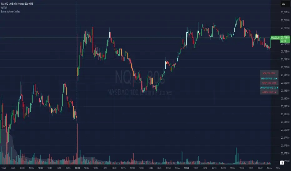
Burner Volume CandlesVisually see different candle colors based on volume relative to the look back period (default is last 20 candles).
This allows you to see if a current candle print is standard, high, or extreme sell/buy volume relative to the look back period.
This has been primarily used on the 30s timeframe on NQ.
It is also advised to take the NY open candle volume with a grain of salt as that is typically the extreme volume so it doesn't make this indicator as useful when it comes to those candles.
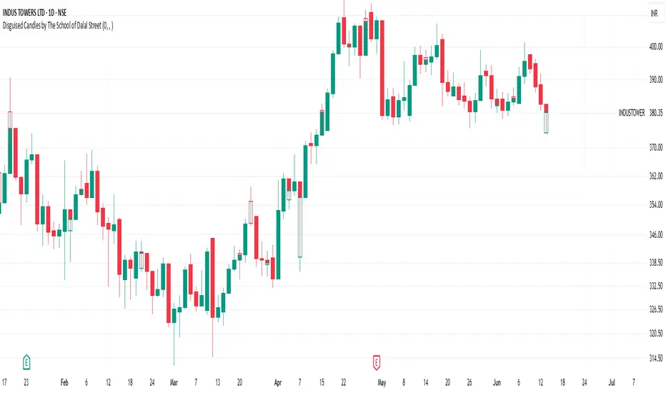
Disguised Candles by The School of Dalal StreetDisguised Candles corrects one of the subtle visual distortions present in normal candlestick charts — the mismatch between the close of one candle and the open of the next.
On many instruments (especially at day/session breaks), the next candle’s open often jumps due to price gaps or data feed behavior. This can make reading the flow of price action harder than necessary.
Disguised Candles fixes this by plotting synthetic candles where the open of each candle is forced to match the close of the previous one — creating a visually continuous flow of price.
Real candles are made fully transparent, so only the "corrected" candles are visible.
This allows traders to:
Visualize price flow as a smooth path
Better spot true directional shifts and trends
Avoid distractions caused by technical gaps that are not meaningful to their strategy
🚀 Pure visual clarity. No noise from false opens.
How it works:
The open of each synthetic candle = close of previous real candle
High, Low, Close remain unchanged
Colors are based on Close vs Corrected Open
Real chart candles are hidden under a transparent overlay
Use this as a clean canvas for trend analysis or as a foundation for building new visual systems.
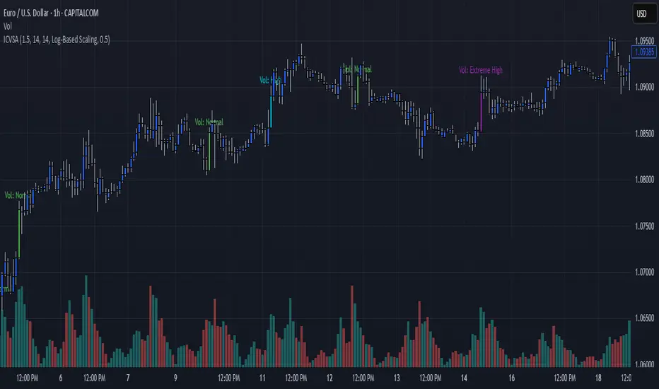
Impulse Candle with Volume & Std AnalysisImpulse Candle with Volume & Std Analysis
This indicator highlights “impulse” candles on your chart by combining price action and volume analysis to gauge the strength of market moves.
How It Works:
Impulse Candle Detection:
The indicator measures the candle’s body size and compares it to the Average True Range (ATR). When a candle’s body exceeds a user-defined multiple of the ATR (the “Impulse Factor”), it is flagged as an impulse candle.
Volume Analysis:
For each impulse candle, the indicator calculates the expected volume (Impulse Factor × average volume) and compares the actual volume against this expected value. It uses the standard deviation of volume over a specified period to classify the move’s volume as:
Extreme Low: More than 2 standard deviations below the expected volume
Low: Between 1 and 2 standard deviations below expected
Normal: Within 1 standard deviation of expected volume
High: Between 1 and 2 standard deviations above expected
Extreme High: More than 2 standard deviations above expected
Visual Cues:
The impulse candles are color-coded based on the volume classification.
A text-only label (with customizable text color) appears just above each impulse candle, indicating its volume category. The label has no background, ensuring a clean, unobtrusive look.
Customization:
Users can adjust parameters such as the Impulse Factor, ATR length, and volume averaging period to tailor the indicator to their trading style.
This tool is perfect for traders who want a quick visual representation of both significant price moves and the corresponding volume strength behind those moves.
Shaved Candle IdentifierThis script is different because it actually highlights the candle and is not just an icon. It will identify bars that have no wick. Each color represents a different type of candle.
Shaved candles represent major liquidity zones, and tend to get swept in the future.
Shaved candles are useful for spotting reversals and as price targets.
Green is when open = low
Red is when open = high
Blue is when close = high
Orange is when close = low
There is 0 tolerance for any deviation, if the price is 0.001 off, it will not be identified. Only absolutely shaved candles will be identified.

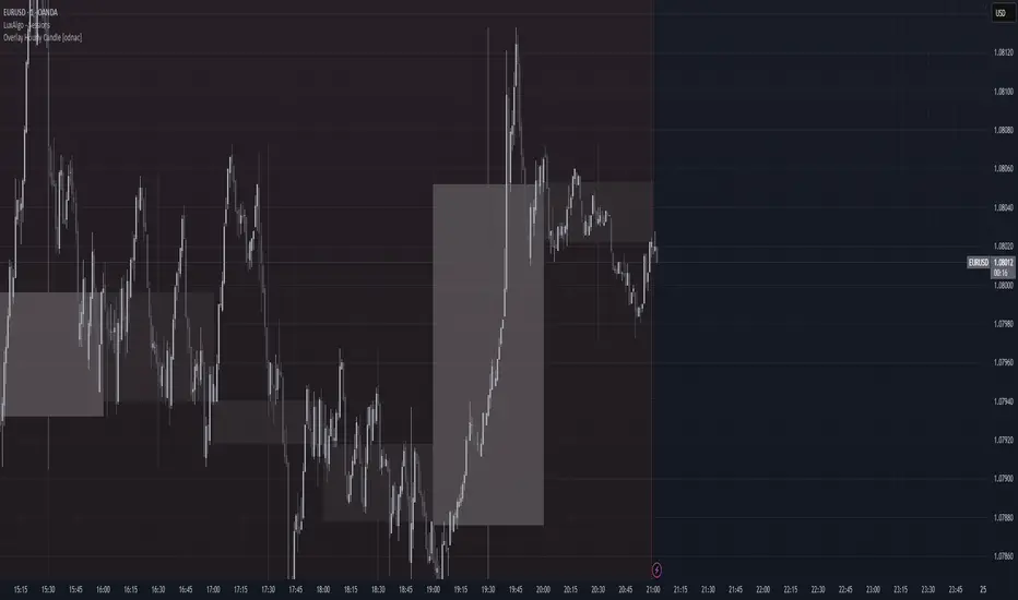
Overlay Hourly Candle [odnac] * This script overlays 1-hour candlestick representations on the chart.
* It captures the open, close, high, and low prices for each hourly period.
* The script dynamically updates as new hourly candles form and adjusts the
* box and wick positions accordingly.
*
* Features:
* - Draws an hourly candle with body and wicks.
* - Colors bullish candles in green and bearish candles in red.
* - Updates dynamically as new hourly candles form.
* - Uses TradingView's box and line functions to represent candle structures.
*
* Usage:
* - Add the script to your TradingView chart as an overlay.
* - Observe how the hourly candles appear distinctly on any timeframe.
Half Candle RetraceThis custom indicator draws a horizontal line at the 50% retracement level of each candlestick on the chart. It calculates the midpoint between the high and low of each candle, which is often used by traders to identify potential entry, exit and take-profit levels. Once price action returns to an untouched level, the line will be removed, leaving only the levels where price action is still missing.
Key Features:
Timeframe: Works on all timeframes.
Line Color: Customize the line color to suit your charting preferences.
Line Width: Adjust the thickness of the retracement line for better visibility.
Line Style: Choose between solid, dotted, or dashed lines.
Up/Down Candle Selection: Option to only display retracement lines for up (bullish) candles, down (bearish) candles, or both.
Full Customization: Control the transparency (opacity) of the line for enhanced visual clarity.
Simple Setup: No complicated settings – simply choose your preferred color, line style, and visibility options.
This indicator is perfect for traders who prefer to use price action and retracement levels to identify potential trade opportunities.
How It Works:
The indicator automatically calculates the 50% level (midpoint) for each candlestick, drawing a line at this level. It will only draw lines for candles that match your chosen criteria (up or down candles), ensuring the chart remains clean and relevant to your trading strategy. Lines are automatically removed as soon as price crosses them.
50% Candle RetraceThis custom indicator draws a horizontal line at the 50% retracement level of each candlestick on the chart. It calculates the midpoint between the high and low of each candle, which is often used by traders to identify potential entry, exit and take-profit levels. Once price action returns to an untouched level, the line will be removed, leaving only the levels where price action is still missing.
Key Features:
Timeframe: Works on all timeframes.
Line Color: Customize the line color to suit your charting preferences.
Line Width: Adjust the thickness of the retracement line for better visibility.
Line Style: Choose between solid, dotted, or dashed lines.
Up/Down Candle Selection: Option to only display retracement lines for up (bullish) candles, down (bearish) candles, or both.
Full Customization: Control the transparency (opacity) of the line for enhanced visual clarity.
Simple Setup: No complicated settings – simply choose your preferred color, line style, and visibility options.
This indicator is perfect for traders who prefer to use price action and retracement levels to identify potential trade opportunities.
How It Works:
The indicator automatically calculates the 50% level (midpoint) for each candlestick, drawing a line at this level. It will only draw lines for candles that match your chosen criteria (up or down candles), ensuring the chart remains clean and relevant to your trading strategy. Lines are automatically removed as soon as price crosses them.
HTF Candle Range Box (Fixed to HTF Bars)### **Higher Timeframe Candle Range Box (HTF Box Indicator)**
This indicator visually highlights the price range of the most recently closed higher-timeframe (HTF) candle, directly on a lower-timeframe chart. It dynamically adjusts based on the user-selected HTF setting (e.g., 15-minute, 1-hour) and ensures that the box is displayed only on the bars that correspond to that specific HTF candle’s duration.
For instance, if a trader is on a **1-minute chart** with the **HTF set to 15 minutes**, the indicator will draw a box spanning exactly 15 one-minute candles, corresponding to the previous 15-minute HTF candle. The box updates only when a new HTF candle completes, ensuring that it does not change mid-formation.
---
### **How It Works:**
1. **Retrieves Higher Timeframe Data**
The script uses TradingView’s `request.security` function to pull **high, low, open, and close** values from the **previously completed HTF candle** (using ` ` to avoid repainting). It also fetches the **high and low of the candle before that** (using ` `) for comparison.
2. **Determines Breakout Behavior**
It compares the **last closed HTF candle** to the **one before it** to determine whether:
- It **broke above** the previous high.
- It **broke below** the previous low.
- It **broke both** the high and low.
- It **stayed within the previous candle’s range** (no breakout).
3. **Classifies the Candle & Assigns Color**
- **Green (Bullish)**
- Closes above the previous candle’s high.
- Breaks below the previous candle’s low but closes back inside the previous range **if it opened above** the previous high.
- **Red (Bearish)**
- Closes below the previous candle’s low.
- Breaks above the previous candle’s high but closes back inside the previous range **if it opened below** the previous low.
- **Orange (Neutral/Indecisive)**
- Stays within the previous candle’s range.
- Breaks both the high and low but closes inside the previous range without a clear bias.
4. **Box Placement on the Lower Timeframe**
- The script tracks the **bar index** where each HTF candle starts on the lower timeframe (e.g., every 15 bars on a 1-minute chart if HTF = 15 minutes).
- It **only displays the box on those bars**, ensuring that the range is accurately reflected for that time period.
- The box **resets and updates** only when a new HTF candle completes.
---
### **Key Features & Advantages:**
✅ **Clear Higher Timeframe Context:**
- The indicator provides a structured way to analyze HTF price action while trading in a lower timeframe.
- It helps traders identify **HTF support and resistance zones**, potential **breakouts**, and **failed breakouts**.
✅ **Fixed Box Display (No Mid-Candle Repainting):**
- The box is drawn **only after the HTF candle closes**, avoiding misleading fluctuations.
- Unlike other indicators that update live, this one ensures the trader is looking at **confirmed data** only.
✅ **Flexible Timeframe Selection:**
- The user can set **any HTF resolution** (e.g., 5min, 15min, 1hr, 4hr), making it adaptable for different strategies.
✅ **Dynamic Color Coding for Quick Analysis:**
- The **color of the box reflects the market sentiment**, making it easier to spot trends, reversals, and fake-outs.
✅ **No Clutter – Only Applies to the Relevant Bars:**
- Instead of spanning across the whole chart, the range box is **only visible on the bars belonging to the last HTF period**, keeping the chart clean and focused.
---
### **Example Use Case:**
💡 Imagine a trader is scalping on the **1-minute chart** but wants to factor in **HTF 15-minute structure** to avoid getting caught in bad trades. With this indicator:
- They can see whether the last **15-minute candle** was bullish, bearish, or indecisive.
- If it was **bullish (green)**, they may look for **buying opportunities** at lower timeframes.
- If it was **bearish (red)**, they might anticipate **a potential pullback or continuation down**.
- If the **HTF candle failed to break out**, they know the market is **ranging**, avoiding unnecessary trades.
---
### **Final Thoughts:**
This indicator is a **powerful addition for traders who combine multiple timeframes** in their analysis. It provides a **clean and structured way to track HTF price movements** without cluttering the chart or requiring constant manual switching between timeframes. Whether used for **intraday trading, swing trading, or scalping**, it adds an extra layer of confirmation for trade entries and exits.
🔹 **Best for traders who:**
- Want **HTF structure awareness while trading lower timeframes**.
- Need **confirmation of breakouts, failed breakouts, or indecision zones**.
- Prefer a **non-repainting tool that only updates after confirmed HTF closes**.
Let me know if you want any adjustments or additional features! 🚀

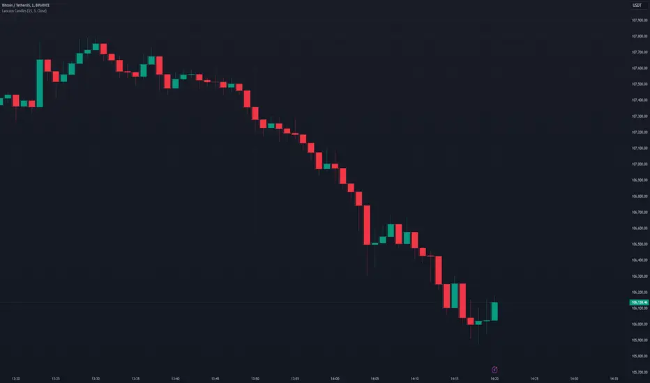
Lanczos CandlesThis indicator reconstructs price action using Lanczos resampling, incorporating lower timeframe data to create a more detailed representation of market movements. Traditional candle aggregation on higher timeframes tends to lose some price action detail - this indicator attempts to preserve more of that information through mathematical resampling.
The indicator samples price data from a lower timeframe and uses the Lanczos algorithm, a mathematical method commonly used in signal processing and image resampling, to reconstruct the price series at the chart's timeframe. The process helps maintain price movements that might otherwise be smoothed out in regular candle aggregation.
The main settings allow you to select the source timeframe for sampling, adjust the Lanczos filter width to balance smoothness versus detail preservation, and optionally enable Heikin Ashi calculation. The filter width parameter (default: 3) affects how aggressive the smoothing is - higher values produce smoother results while lower values retain more of the original variation.
This approach can be useful for technical analysis when you want to work with higher timeframes while maintaining awareness of significant price movements that occurred within those candles. The optional Heikin Ashi mode can help visualize trends in the resampled data.
The indicator works best when there's a clear ratio between your chart timeframe and the source timeframe (for example, using 1-minute data to build 5-minute candles).
Previous Daily Candle The Previous Daily Candle indicator is a powerful tool designed to enhance your intraday trading by providing clear visual cues of the previous day's price action. By outlining the high, low, open, and close of the previous daily candle and adding a middle dividing line, this indicator offers valuable context to inform your trading decisions.
🎯 Purpose
Visual Clarity: Highlight the key levels from the previous day's price movement directly on your intraday charts.
Trend Confirmation: Quickly identify bullish or bearish sentiment based on the previous day's candle structure.
Support and Resistance: Use the outlined high and low as potential support and resistance levels for your trading strategies.
Customizable Visualization: Tailor the appearance of the outlines and middle line to fit your trading style and chart aesthetics.
🛠️ Features
Outlined Candle Structure:
High and Low Lines: Clearly mark the previous day's high and low with customizable colors and line widths.
Open and Close Representation: Visualize the previous day's open and close through the outlined structure.
Middle Dividing Line:
Average Price Level: A horizontal line divides the candle in half, representing the average of the open and close prices.
Customizable Appearance: Adjust the color and thickness to distinguish it from the high and low outlines.
Bullish and Bearish Differentiation:
Color-Coded Outlines: Automatically change the outline color based on whether the previous day's candle was bullish (green by default) or bearish (red by default).
Enhanced Visual Feedback: Quickly assess market sentiment with intuitive color cues.
Customization Options:
Outline Colors: Choose distinct colors for bullish and bearish candle outlines to match your chart's color scheme.
Middle Line Color: Select a color that stands out or blends seamlessly with your existing chart elements.
Line Width Adjustment: Modify the thickness of all lines to ensure visibility without cluttering the chart.
Transparent Candle Body:
Non-Intrusive Display: The indicator only draws the outlines and middle line, keeping the candle body transparent to maintain the visibility of your primary chart data.
⚙️ How It Works
Data Retrieval: The indicator fetches the previous day's open, high, low, and close prices using TradingView's request.security function.
Candle Analysis: Determines whether the previous day's candle was bullish or bearish by comparing the close and open prices.
Dynamic Drawing: Upon the start of a new day, the indicator deletes the previous outlines and redraws them based on the latest data.
Time Synchronization: Accurately aligns the outlines with the corresponding time periods on your intraday chart.
📈 How to Use
Add to Chart:
Open TradingView and navigate to the Pine Editor.
Paste the provided Pine Script code into the editor.
Click on Add to Chart to apply the indicator.
Customize Settings:
Access the indicator's settings by clicking the gear icon next to its name on the chart.
Adjust the Bullish Outline Color, Bearish Outline Color, Middle Line Color, and Outline Width to your preference.
Interpret the Lines:
Bullish Candle: If the previous day's close is higher than its open, the outlines will display in the bullish color (default green).
Bearish Candle: If the previous day's close is lower than its open, the outlines will display in the bearish color (default red).
Middle Line: Represents the midpoint between the open and close, providing a quick reference for potential support or resistance.
Integrate with Your Strategy:
Use the high and low outlines as potential entry or exit points.
Combine with other indicators for confirmation to strengthen your trading signals.