ITG ScalperITG Scalper by Complector.
Inspired by Juboal-Rabaroansa Perosteck Alseyn Balveda dam T'seif
Methology:
- I am using a TEMA (triple EMA) to determine the local trend direction and to give buy & sell signals when the trend changes.
- An optional filter, using moving average convergence divergence (MACD), can be switched on to filter out 'false' signals.
- The calculation of the TEMA does not request data from a resolution higher or lower than the resolution of the main charts symbol,
However, the filter function does, if another resolution is chosen for the filter.
- Persistent variables are used for buy and sell prices, enabling color-coding of the sell-signal (profitable or not).
Features:
- Color coded TEMA - bullish=green , bearish=red
- Buy/Sell indicator - Sell indicator: green=profit, yellow=loss
- Optional noise filter
- Optional variable time-frame for noise filter
Remarks:
In my experience, the default values works best on the daily time frame. I encourage everyone to experiment with the values for best results.
Using the script on non-standard charts (Heikin Ashi, Renko etc.) can produce unrealistic results.
Using a resolution higher or lower than the main charts symbol for the filter can possibly lead to repainting.
Thanks to Iain M. Banks for making my life richer :-)
Cari dalam skrip untuk "charts"
RSI-Last-3-ExtremaThis script indicates when the current Relative Strength Index of the last 8 closes is beyond a level from center oscillation which signals the equity is likely to reverse course. When it is the lowest RSI reading of the prior 3 readings and below 25, a green vertical bar will appear signaling a potential BUY point. Likewise, the highest reading of the prior 3 RSI readings and above 75 will signal a vertical red bar or SELL signal. The bar has to have a final close price for the signal to be active. Reversal could take a few more bars to occur depending on the timeframe and equity symbol.
You will be able to find many charts that have this signal perfectly finding the top or bottom of a significant trend.
It successfully indicates profitable reversal around 80% of the time. So far, It is 85% accurate or better in determining downtrend start points on the Daily, 120, 60, 30 Minute charts according to the study of more than 10,000 occurrences. It is 86% accurate on the 30 Minute chart.
This is another tool I use in finding or confirming potential price action. Hope you find it useful.
To add this, favorite the script by clicking "Add to your Favorite Indicators" at the top of the code portion below. On your top tool bar is an "fx" button with a downward arrow to the right of it. Click on the downward arrow/caret and scroll down to "RSI-Last-3-Extrema". Click on this title and it should add to the bottom of your current chart. If you do not see BUY (green vertical bars) or SELL (red vertical bars) right away, try other charts and timeframes.
Donchian DipThe Donchian Dip
This strategy is designed to look for good "Buy the Dip" entries on stocks that are clearly in a strong 1-year upward trend. If you do not know how to identify those stocks on your own please do not use this system or continue your education until you do. The Donchian Dip strategy was designed on the daily time frame but works amazingly well on both daily and weekly timeframes. It does still work on intraday charts also if the current trend on the daily chart is in a strong uptrend.
Chart Setup:
3-period Donchian Channel with a 1-period offset (hide basis)
Bollinger Bands with the default settings of 20/2 (display basis)
Entry Signals:
There are 3 different entry signals that will be printed on the chart that have similar underlying criteria but are ranked based on skill level just like ski slope skill levels! I recommend only taking green entries until you are familiar with the system and the stocks you are trading.
Green Easy Entry:
This is the safest buy the dip entry that is normally found at or near a large retracement bottom. You might get one or two bad entries but be persistent and eventually, a great entry will present itself!
These are the specifics for the conditions that trigger a Green entry if you want to know what they are:
1. The current bar is an up bar (green or white bar) and closed above the lower Donchian channel
2. Previous bar or 2 bars back closed below the lower Donchian channel
3. Previous bar or 2 bars back closed below the Bollinger Band Basis (20 SMA )
4. The low of the previous bar or 2 bars back was below the lower Bollinger Band
Blue Intermediate Entry:
This is a decent entry if you missed the green entry, want to add to an existing position, or are not sure it will pull back far enough to even give a green entry. I would suggest only trade these entries to add to an existing pyramid position or get back into a trade that you were recently stopped out of. However, on high-flying stocks like TSLA these signals and the Black Diamond entry signals might be the only ones you get for a long time. Also, on the weekly chart, Blue or Black entries are sometimes all you will get for a year or more.
These are the specifics for the conditions that trigger a Blue entry if you want to know what they are:
1. The current bar is an up bar (green or white bar) and closed above the lower Donchian channel
2. Previous bar or 2 bars back closed below the lower Donchian channel
3. Previous bar or 2 bars back closed below the Bollinger Band Basis (20 SMA )
Black Diamond Advanced Rule:
This is normally just a small pullback re-entry signal on a strong trending stock like TSLA ...trade with extreme caution!!! You have been warned but daredevils feel free to give it a shot. I sometimes do trade these entries if the market and sector of the stock I am trading are extremely bullish or if I am looking to add to a position but I use a conservative stop.
These are the specifics for the conditions that trigger a Black entry if you want to know what they are:
1. The current bar is an up bar (green or white bar) and closed above the lower Donchian channel
2. Previous bar or 2 bars back closed below the lower Donchian channel
3. Previous bar or 2 bars back closed above the Bollinger Band Basis (20 SMA )
Exit Criteria:
The goal of this strategy is to buy the dip and hold as long as possible...let's practice some Paytience and exercise those holding muscles! RLT!!!
So, we don't want to exit early but we also want to protect our profits somehow. We do this by using the built-in trailing stops that are defined by dots of three different shades of purple on the chart (feel free to change these in the settings). Simply move your trailing stop to the highest current dot price level. Do not move the trailing stop down ever even if a lower dot is printed later. These are simply the suggested trailing stops and definitely use your own judgment for exits but if you backtest this strategy enough you will most likely discover that in the long run, these trailing stops work really well.
I hope this strategy helps you to identify good "Buy the Dip" entries on stocks you love as well as trains you to hold your winners longer for bigger gains.
***HOW TO ADD TO YOUR CHARTS***
1) Click the "Add to Favorite Scripts" button
2) Go to a stock chart and click the "Indicators" icon at the top
3) Next, on the left, click the "Favorites" and then click the "Naked Put - Growth Indicator v2"
4) It should appear on your charts, and you can click the "gear" icon on the study to edit a few settings.
5) Read the release notes above so you understand how it works.

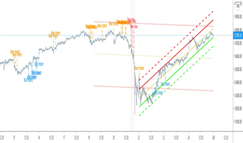
Pearsons R historic breaks ( for making strategy out of it )Pearsons R adjustments of linear regressions is a good tool to analyse visually the trend basis channeling of the market,
one of the common challenges in the scripts which i came across the tradingview community is the lack of the historic places put over the charts where the price actually crossed up/below the channel boundaries,
For me in order to do so we would have to replay the scripts over and over.
So I came up with an addon extension to a good script on the community ()
I have added the historic marks over the charts ( blue/green/red/orange Arrows which you see on the charts)
These arrows are the places where the price have crossed the channel boundaries historically
So,
Blue arrow = Bull Intent ,Place where the upper channel boundary line have been crossed
Orange arrow = Bear Intent , Place where the Lower channel boundary line have been crossed
Green arrow = Bull Max , Place where the Maximum Upper channel boundary line have been crossed
Red arrow = Bear Max , Place where the Minimum Lower channel boundary line have been crossed
For me this type of approach is good for making a strategy out of the concepts visually, in congestion to other indicators
I would suggest you guys to check this on alert basis with your setups to derive out the best from linear regressions
Lastly it would be a pleasure to give credits to the creators of Pearsons R scripts in Tradingview
@midtownsk8rguy
@TradeBoneDogs
@x11joe
Also thanking Tradingview for providing us such an awesome community and platform :)
[blackcat] L3 Ehlers Enhanced Corona Swing PositionLevel: 3
Background
John F. Ehlers introuced Enhaced Corona Swing Position Indicator in April, 2012.
Function
John Ehlers's corona indicators, "Corona Charts," provide a "multidimensional" view of market activity. In the article "Corona Charts" in Nov, 2008, John Ehlers further developed his earlier work on market cycles. A new kind of indicator was presented that uses a glow-like effect to present another dimension of data. Implementation of corona charts in pine v4 helps detect dominant cycles in data. It provides a corona chart for swing positions indicator. He made an enhanced version of corona chart after 4 years, which could be used as a range filter to detect sideways and trends. Dr . Ehlers claims that a corona is displayed when the market is in a trend and there is little cyclic component. The swing position indicator shows the phasing of the data within the dominant cycle. In a pure cycle the Swing Position will trace out the shape of a sine wave.
Key Signal
DomCyc ---> Dominant Cycle
Raster ---> Corona Raster Array
Pros and Cons
100% John F. Ehlers definition translation, even variable names are the same. This help readers who would like to use pine to read his book.
Remarks
The 79th script for Blackcat1402 John F. Ehlers Week publication.
Readme
In real life, I am a prolific inventor. I have successfully applied for more than 60 international and regional patents in the past 12 years. But in the past two years or so, I have tried to transfer my creativity to the development of trading strategies. Tradingview is the ideal platform for me. I am selecting and contributing some of the hundreds of scripts to publish in Tradingview community. Welcome everyone to interact with me to discuss these interesting pine scripts.
The scripts posted are categorized into 5 levels according to my efforts or manhours put into these works.
Level 1 : interesting script snippets or distinctive improvement from classic indicators or strategy. Level 1 scripts can usually appear in more complex indicators as a function module or element.
Level 2 : composite indicator/strategy. By selecting or combining several independent or dependent functions or sub indicators in proper way, the composite script exhibits a resonance phenomenon which can filter out noise or fake trading signal to enhance trading confidence level.
Level 3 : comprehensive indicator/strategy. They are simple trading systems based on my strategies. They are commonly containing several or all of entry signal, close signal, stop loss, take profit, re-entry, risk management, and position sizing techniques. Even some interesting fundamental and mass psychological aspects are incorporated.
Level 4 : script snippets or functions that do not disclose source code. Interesting element that can reveal market laws and work as raw material for indicators and strategies. If you find Level 1~2 scripts are helpful, Level 4 is a private version that took me far more efforts to develop.
Level 5 : indicator/strategy that do not disclose source code. private version of Level 3 script with my accumulated script processing skills or a large number of custom functions. I had a private function library built in past two years. Level 5 scripts use many of them to achieve private trading strategy.
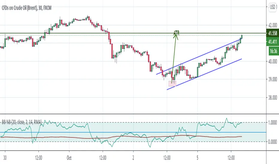
Bollinger Bands %B + ATR This indicator is best suitable for the 30-minutes interval OIL charts, due to ATR accuracy.
BB%B is great for showing oversold/overbought market conditions and offers excellent entry/exit opportunities for Day Trading (30 minutes chart), as well as reliable convergence/divergence patterns. ATR is conveniently combined and shows potential market volatility levels for the day when used in 30-minutes charts, thus demarcating your day trade exit point.
To use the ATR on this indicator: Just read the ATR value of the lowest (for a new bull trend) or the highest (for a new bear trend) candlestick of the newly formed trend leg. Let's suppose the ATR reads 0.2891, then you project a move of 2.891 points towards the given trend direction using the ruler tool (30-minutes charts). That's all, and there you have your take profit target!
Good Luck!!!
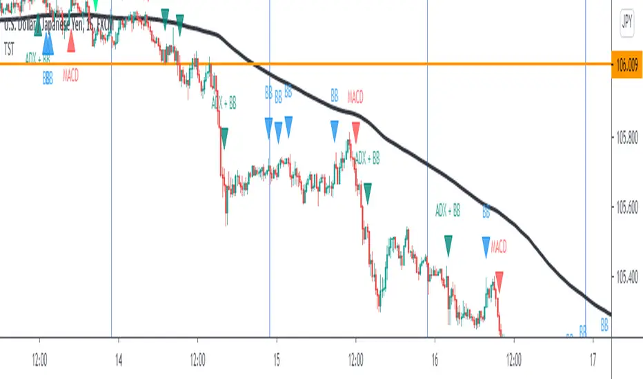
TST Signals & AlertsThis is an unofficial script for strategies tested on Trading Strategy Testing Youtube channel. Over time, most successful strategies will be added with an option to set strategy-specific alerts . TST Signals & Alerts will draw signals on the chart when the entry conditions are met. You can also opt for displaying indicators .
My script is meant for beginners but can be used by veterans too. Just pick one or two strategies, you don't want to flood your chart with conflicting signals. You may want to support your trades with a proper analysis. Is the market trending? Is there a fundament around the corner?
If a new signal occurs when there is still an open position, you are not supposed to take another.
The current version includes MACD and ADX + BB and BB strategies.
MACD strategy:
►Buy, when MACD crosses below the signal line when it is negative. The price must also be above 200 EMA.
►Sell, when MACD crosses above the signal line when it is positive. The price must also be below 200 EMA.
►This strategy was tested on 15-minute charts of EURUSD with reward-to-risk ratio 1,5 and win rate of 61% over 100 trades.
►►►MACD has to be added to your chart separately because it needs a new window. Ticking display indicators will not add MACD to your chart.
►►►MACD was also tested by a different channel I made a script for. You can view the results and the script here:
ADX + BB strategy:
►Buy, when the price is above 200 EMA and ADX becomes higher than 25.
►Sell, when the price is below 200 EMA and ADX becomes higher than 25.
►Stop-loss is either 200 EMA or Bollinger Bands level. Check the channel for more information.
►This strategy was tested on 5-minute charts of EURUSD, USDJPY, AUDUSD with reward-to-risk ratio 1,2 and win rate of 56% over 100 trades in total.
BB strategy:
►Buy, when the price is above 200 EMA and candle's low is below the lower Bollinger Band.
►Sell, when the price is below 200 EMA and candle's high is above the upper Bollinger Band.
►This strategy was tested on 15-minute charts of EURUSD with reward-to-risk ratio 1,5 and win rate of 52% over 100 trades in total.
►►►Due to the relatively low win rate of this strategy, you need to filter out potentially harmful signals with a proper analysis.
Bear in mind that backtesting performance doesn't guarantee future profitability. • Most systematic strategies are not suitable for each timeframe - if you use the different timeframe than the one it was tested on, the result can differ significantly. • You should perform your own backtest to base your trades on more data & to establish confidence in the selected strategy. • This script is not a replacement for proper analysis.
New strategies will be added when I have time. If I see multiple people asking for the same feature, I might agree to release it with a new version. I am not going to add input options in this script, it could come as a separate script though. I am in no way affiliated with the Youtube channel, so if you find the script helpful, shot me a message or send me some TradingView coins >)
If you encounter any bug, you can report it in a message or in comments. Support it with screenshot and relevant information such as a time when it occurred and what options were on etc.
Dekidaka-Ashi - Candles And Volume Teaming Up (Again)The introduction of candlestick methods for market price data visualization might be one of the most important events in the history of technical analysis, as it totally changed the way to see a trading chart. Candlestick charts are extremely efficient, as they allow the trader to visualize the opening, high, low and closing price (OHLC) each at the same time, something impossible with a traditional line chart. Candlesticks are also cleaner than bars charts and make a more efficient use of space. Japanese peoples are always better than everyone at an incredible amount of stuff, look at what they made, the candlesticks/renko/kagi/heikin-ashi charts, the Ichimoku, manga, ecchi...
However classical candlesticks only include historical market price data, and won't include other type of data such as volume, which is considered by many investors a key information toward effective financial forecasting as volume is an indicator of trading activity. In order to tackle to this problem solutions where proposed, the most common one being to adapt the width of the candle based on the amount of volume, this method is the most commonly accepted one when it comes to visualizing both volume and OHLC data using candlesticks.
Now why proposing an additional tool for volume data visualization ? Because the classical width approach don't provide usable data regarding volume (as the width is directly related to the volume data). Therefore a new trading tool based on candlesticks that allow the trader to gain access to information about the volume is proposed. The approach is based on rescaling the volume directly to the price without the direct use of user settings. We will also see that this tool allow to create support and resistances as well as providing signals based on a breakout methodology.
Dekidaka-Ashi - Kakatte Koi Yo!
"Dekidaka" (出来高) mean "Volume" in a financial context, while "Ashi" (足) mean "leg" or "bar". In general methods based on candlesticks will have "Ashi" in their name.
Now that the name of the indicator has been explained lets see how it works, the indicator should be overlayed directly to a candlestick chart. The proposed method don't alter the shape of the candlesticks and allow to visualize any information given by the candles. As you can see on the figure below the candle body of the proposed tool only return the border of the candle, this allow to show the high/low wick of the candle.
The body size of the candle is based on two things : the absolute close/open difference, and the volume, if the absolute close/open difference is high and the volume is high then the body of the candle will be clearly visible, if the volume is high but the absolute close/open difference is low, then the body will be less visible. This approach is used because of the rescaling method used, the volume is divided by the sum between the current volume value and the precedent volume value, this rescale the volume in a (0,1) range, this result is multiplied by the absolute close/open difference and added/subtracted to the high/low price. The original approach was based on normalization using the rolling maximum, but this approach would have led to repainting.
You have access to certain settings that can help you obtain a better visualization, the first one being the body size setting, with higher values increasing the body amplitude.
In green body with size 2, in red with size 1. The smooth parameter will smooth the volume data before being used, this allow to create more visible bodies.
Here smooth = 100.
Making Bands From The Dekidaka-Ashi
This tool is made so it output two rescaled volume values, with the highest value being denoted as "Dekidaka-high" and the lowest one as "Dekidaka-low". In order to get bands we must use two moving averages, one using the Dekidaka-high as input and the other one using Dekidaka-low, the body size parameter should be fairly high, therefore i will hide the tool as it could cause trouble visualizing the bands.
Bands with both MA's of period 20 and the body size equal to 20. Larger periods of the MA's will require a larger amount of body size.
Breakout Signals
There is a wide variety of signals that can be made from candles, ones i personally like comes from the HA candles. The proposed tool is no exception and can produce a wide variety of signals. The signals generated are basic ones based on a breakout methodology, here is each signal with their associated label :
Strong Bullish signal "⇈" : The high price cross the Dekidaka-high and the closing price is greater than the opening price
Strong Bearish signal "⇊" : The low price cross the Dekidaka-low and the closing price is lower than the opening price
Weak Bullish signal "↑" : The high price cross the Dekidaka-high and the closing price is lower than the opening price
Weak Bearish signal "↓" : The low price cross the Dekidaka-low and the closing price is greater than the opening price
Uncertain "↕" : The high price cross the Dekidaka-high and the low price cross the the Dekidaka-low
In order to see the signals on the chart check the "Show signals" option. Note that such signals are not based on an advanced study, and even if they are based on a breakout methodology we can see that volatile movement rarely produce signals, therefore signals mostly occur during low volume/volatility periods, which isn't necessarily a great thing.
Conclusion
A trading tool based on candlesticks that aim to include volume information has been presented and a brief methodology has been introduced. A study of the signals generated is required, however i'am not confident at all on their accuracy, i could work on that in the future. We have also seen how to make bands from the tool.
Candlesticks remain a beautiful charting technique that can provide an enormous amount of information to the trader, and even if the accuracy of patterns based on candlesticks is subject to debates, we can all agree that candlesticks will remain the most widely used type of financial chart.
On a side note i mostly use a dark color for a bullish candle, and a light gray for a bearish candle, with the border color being of the same color as the bullish candle. This is in my opinion the best setup for a candlestick chart, as candles using the traditional green/red can kill the eyes and because this setup allow to apply a wide variety of colors to the plot of overlayed indicators without the fear of causing conflict with the candles color.
Thanks for reading ! :3 Nya
A Word
This morning i received some hateful messages on twitter, the users behind them certainly coming from tradingview, so lets be clear, i know i'am not the most liked person in this community, i know that perfectly, but no one merit to be receive hateful messages. I'am not responsible for the losses of peoples using my indicators, nor is tradingview, using technical indicators does not guarantee long term returns, your ability to be profitable will mostly be based on the quality and quantity of knowledge you have.

[NG] Indicator - Altcoin Alpha - v1(Created for Client)
Alpha (Unique price action of asset) indicator for ALTcoins implementation, taking `BINANCE:BTCUSDT` as the market reference. Can be improved by adding more BTC charts from more sources, so as to get a unified chart of BTC for market representation.
Set `alpha period` to a value, wherein you want to see the unique price action of the asset. For short term trend, a value of 24 is good for `1H` charts (1 day), and value of 168 is good for long term trends on `1H` charts (1 week trend).
Corresponding values of `beta period` should be `168` (1 week for 1 day alpha) and `720` (1 month for 1 week alpha period).
You can set `alpha` and `beta` period as per your requirements.
Regards,

Bitfinex Longs/Shorts [m59]This indicator diplays the total value of long positions and short positions for an asset on Bitfinex. For example, for the Bitfinex BTCUSD symbol, a value of 30000 longs means the total value of all margin long contracts on Bitfinex is 30000 BTC.
"resolve_error" is normal and expected, depending on how you're using the indicator. I use it on the BitMEX XBTUSD chart for BTC, which required the "Symbol Selection Method" option to be set to "Manual".
If there is Bitfinex long/short data available on tradingview for the symbol of your chart and you're on a Bitfinex chart or a chart with a matching symbol, "Auto" will work. Otherwise, you need to enter the symbol manually.
You can search for "Longs" or "Shorts" in the TradingView symbols to see what is available.
See the options for various ways to render this indicator to get the view you're looking for. You may also want to click the indicator's title with the downward triangle/arrow and select "Merge Up" to overlay the indicator with the price.
PRINTED VALUES
Longs Value (green) | Shorts Value (red) | Longs Percent (green) | Shorts Percent (red)
OPTIONS
- Symbol Selection Method:
- Auto: Use the current chart's symbol. Only works for pairs that have margin data available on TradingView, and only on Bitfinex charts or charts with the same pair names, i.e. ZRXETH, XMRBTC, etc)
- Manual: Enter the Bitfinex pair/symbol manually
- Manual Symbol Choice: The Bitfinex pair/symbol to use when Symbol Selection Method" is set to "Manual"
- Render Longs / Render Shorts: Rendering both longs and shorts at the same time causes both to be indiscernible due to scaling.
I suggest adding the indicator to your chart twice, then toggle off "Render Shorts" on one and toggle off "Render Longs" on the other one.
- Display Type:
- Absolute: Render the regular, absolute values of the positions.
- Percent: Render the percentage of longs and shorts of the total value of both. Higher resolution charts offer better views of this.
- Highlight Extremes: Change the background color when longs or shorts are considerably unbalanced (see "Extreme Theshold" and "Interpretation").
- Extreme Threshold: The percentage value at which longs or shorts are considered extreme. 60% longs can signify overbought and 60% shorts can signify oversold.
INTERPRETATION
See the excellent material by Bitcoin Trading Challenge on YouTube: www.youtube.com
- Background (unless "Highlight Extremes" option is disabled):
- Green: The percentage of shorts is equal to or greater than the extreme threshold.
- Red: The percentage of longs is equal to or greater than the extreme threshold.
Tick Tick BoomThis is THE tick tick boom method from the GOLD MINDS group!
When we enter a trade the line changes color.
If your charts are not in UTC time then you can adjust the UTC offset time. If your charts are in UTC-9 then set this to 9, if you are in UTC+1 set this to -1, if your charts are un UTC then set this to 0.
I noticed daily pivots, support, and resistance levels are pretty useful targets here. Uncheck the box if you would like to see the levels.
Many thanks to Dimitri Wallace!

NeuraEdge ORB - Opening Range Breakout IndicatorOVERVIEW
NeuraEdge ORB is an open-source Opening Range Breakout indicator that automates the classic 15-minute ORB strategy. The indicator tracks the first 15 minutes of market action (9:30-9:45 AM ET), identifies breakouts above or below this range, and generates trading signals with automated stop loss and take profit calculations.
The Opening Range Breakout concept is based on the observation that the initial price action after market open often establishes directional bias for the trading session, as institutional order flow and overnight gap reactions manifest during this window.
CORE METHODOLOGY
Opening Range Construction:
The indicator uses session-based time detection to identify the 9:30-9:45 AM Eastern Time window. During this period, it tracks the highest high and lowest low to establish the opening range boundaries. The range is marked complete when the 15-minute window closes.
Calculation process:
OR High = Maximum high value during the 15-minute window
OR Low = Minimum low value during the 15-minute window
OR Midpoint = (OR High + OR Low) / 2
Range Size = OR High - OR Low (compared to 14-period ATR for context)
Breakout Detection:
The indicator identifies breakouts using close-price confirmation to reduce false signals from wicks:
Bullish breakout: Close above OR High (with previous close at or below OR High)
Bearish breakout: Close below OR Low (with previous close at or above OR Low)
The indicator tracks whether each direction has already broken to prevent duplicate signals on the same range.
Entry Type Logic:
Two entry methodologies are supported:
Breakout Mode - Signals immediately upon range break. Enters on the breakout bar when close confirms direction.
Retest Mode - Waits for price to break the range, then pullback to touch the range level before entering. Cancels if price moves too far beyond midpoint. This provides better entry prices with tighter stop losses.
Volume Confirmation:
Optional volume filter compares current bar volume to 20-period simple moving average. Requires volume > 1.2x average to validate breakout strength and filter low-conviction moves.
Fair Value Gap (FVG) Integration:
Optional confluence filter that checks for unfilled FVG in the breakout direction:
Bullish FVG detected when: current bar's low > two bars ago high (creating gap)
Bearish FVG detected when: current bar's high < two bars ago low (creating gap)
Minimum FVG size: 0.3x ATR to filter noise
FVG considered filled when price retraces to gap midpoint
Signals only generate when an unfilled FVG exists in the breakout direction, adding institutional order flow confluence.
Risk Management Calculations:
Three stop loss placement methods:
Opposite Side - SL at opposite end of opening range (classic ORB approach)
Midpoint - SL at range midpoint (tighter risk, lower reward potential)
ATR Based - SL at 1.5x ATR from entry (adaptive to volatility)
Take profit calculated as: Entry ± (Entry - Stop Loss) × Risk:Reward Ratio
Default 1.5:1 R:R ratio, adjustable from 1.0 to 5.0.
Performance Tracking:
The indicator maintains a trade history using Pine Script's type system:
Records entry price, stop loss, take profit, and direction for each signal
Tracks outcome when price hits stop loss or take profit levels
Auto-closes after 80 bars if neither level hit
Calculates rolling win rate from last 50 trades maximum
Displays W/L record in real-time dashboard
VISUAL COMPONENTS
Opening Range Box:
Semi-transparent blue box drawn from range start bar to current bar + 20, showing the established range boundaries visually.
Range Levels:
Green line at OR High (potential long entry level)
Red line at OR Low (potential short entry level)
Gray dotted line at OR Midpoint (reference level)
All lines extend 50 bars forward for anticipation.
Trade Signals:
Green up arrow with "LONG ORB Break" label below price
Red down arrow with "SHORT ORB Break" label above price
Dashed lines showing SL and TP levels extending 30 bars
Small labels marking SL and TP endpoints
Real-Time Dashboard:
Top-right panel displaying:
OR formation status (Forming / Complete / Waiting)
Current OR High, Low, and Range size (with ATR multiple)
Breakout status (Long / Short / None)
Volume status (High / Normal)
FVG presence (Bull / Bear / None)
Entry settings (Breakout/Retest, R:R, SL type)
Win rate percentage and W/L record
PRACTICAL APPLICATION
Ideal Market Conditions:
Liquid instruments: SPY, QQQ, IWM, high-volume stocks
Recommended timeframes: 1-minute or 5-minute charts for precise entries
Most effective during trending days with clear directional bias
Range size between 0.5-1.5x ATR typically provides best risk:reward
Usage Workflow:
Apply indicator at market open (9:30 AM ET)
Observe range formation during first 15 minutes
Wait for "Complete" status in dashboard
Monitor for breakout signals with volume/FVG confirmation
Enter on signal, place stop loss and take profit as marked
Avoid taking opposing signals on same day (trend following approach)
Retest vs Breakout Selection:
Use Breakout mode on high-momentum days with strong overnight gaps
Use Retest mode on slower days or when seeking better entry prices
Retest mode reduces signal frequency but improves entry quality
Time-of-Day Considerations:
The indicator includes a trading cutoff setting (default 3:00 PM ET) to avoid late-day chop and reduced liquidity. First-hour breakouts (10:00-11:00 AM) historically show strongest follow-through.
SETTINGS & CUSTOMIZATION
Display Options:
Toggle signals, opening range box, and dashboard independently
Clean visual design to reduce chart clutter
Opening Range Settings:
Opening range duration (5-60 minutes in 5-minute increments)
Default 15 minutes aligns with classic ORB methodology
Trading cutoff hour (10-16, representing 10:00 AM - 4:00 PM ET)
Entry Configuration:
Entry type (Breakout / Retest)
Volume confirmation toggle (requires 1.2x average volume)
FVG confluence toggle (requires unfilled gap in breakout direction)
Risk Management:
Stop loss placement (Opposite Side / Midpoint / ATR Based)
Risk:reward ratio (1.0 - 5.0, default 1.5)
Future: Trail stop after partial TP (currently placeholder)
Alert System:
Five alert conditions available:
Opening Range Complete
ORB Long Signal
ORB Short Signal
Breakout Up (range broken, regardless of signal)
Breakout Down (range broken, regardless of signal)
BEST PRACTICES
Recommended Usage:
Focus on highly liquid instruments with tight spreads
Use 1-5 minute charts for entry precision
Respect calculated stop losses (range defines maximum risk)
Typically 1-2 quality setups per day maximum
Consider overall market trend (SPY/QQQ direction)
Risk Considerations:
Very small ranges (< 0.3x ATR) prone to false breakouts
Very large ranges (> 2x ATR) may indicate gap day requiring adjusted expectations
Low volume breakouts fail more frequently
Avoid trading both directions on same day (pick strongest setup)
IMPORTANT DISCLOSURES
This indicator is provided free and open-source for educational purposes. The Opening Range Breakout strategy is a well-documented public domain trading concept. This implementation adds automation, visual clarity, and optional confluence filters.
No indicator guarantees profitable trades. Past performance does not predict future results. Traders are responsible for their own trading decisions and risk management. Always use appropriate position sizing and never risk more than you can afford to lose.

Evil's Weekly Momentum ScoreA momentum scoring system that ranks any ticker on a 0-100 scale based on multi-timeframe relative strength. Built for weekly rotation decisions - example, I like to check this every Tuesday when it's nice and quiet, then rotate into the 3 strongest names.
Works on sector ETFs (XLK, XLF, XLE, etc.), mega caps (AAPL, NVDA, MSFT, GOOGL), or any liquid ticker watchlist you'd like to rank. Sector ETFs are probably more stable, mega caps have higher volatility; build your watchlist according to your comfort threshold.
How It Works
The indicator combines four components into a single score:
13-Week Momentum (40%) - Quarterly relative strength vs SPY. Where are institutions rotating?
4-Week Momentum (25%) - Monthly trend confirmation. Is the medium-term move intact?
2-Week Acceleration (20%) - Is momentum speeding up or fading? Catches turns early.
10-Week MA (15%) - Trend filter. Price above or below the 10-week moving average.
Each component is measured relative to SPY by default, so you're seeing true outperformance - not just whether something is going up, but whether it's beating the market.
Signal Levels
90+ : ON FIRE 🔥
80-89 : STRONG BUY
70-79 : BUY
50-69 : HOLD
Below 50 : AVOID
In my opinion, cash is a valid position so I don't rotate into scores below 80.
Features
Toggle each component on/off — weights auto-redistribute
Compare to SPY or use absolute momentum
Dashboard overlay sits on your price chart
Position dashboard anywhere: top/bottom, left/right
Alerts for signal level crossings
How To Use It
Add to your watchlist and flip through charts. Compare scores across sectors or mega caps. Rotate into the highest-scoring names, trim or avoid the lowest. Green values in the dashboard = outperforming. Red = underperforming. Simple.
Best Used For
Weekly sector rotation
Mega cap relative strength ranking
Momentum-based stock selection
Identifying leadership shifts before they're obvious

Bollinger BandsThis indicator is a locked Bollinger Band system designed around a long-term volatility envelope. It uses an EMA(100) as the central “basis” line and builds the upper and lower bands at 3.5 standard deviations from the basis, creating a wide channel that highlights extreme price expansion rather than frequent mean-reversion touches. In addition to the standard bands, the script plots two intermediate guide lines located at 33.33% of the distance from the basis toward the upper and lower bands. These 1/3-zone lines help visually segment the band into core, mid, and extreme areas, making it easier to judge how far price has stretched relative to the EMA and current volatility. Traders can use the basis as a trend reference, the 33.33% lines as “early extension” or pullback checkpoints, and the outer bands as high-stretch boundaries for risk management, scaling, and contextual decision-making on intraday charts.

Bollinger Bands (Locked: EMA100, 3.5) + 33.33% LinesThis indicator is a locked Bollinger Band system designed around a long-term volatility envelope. It uses an EMA(100) as the central “basis” line and builds the upper and lower bands at 3.5 standard deviations from the basis, creating a wide channel that highlights extreme price expansion rather than frequent mean-reversion touches. In addition to the standard bands, the script plots two intermediate guide lines located at 33.33% of the distance from the basis toward the upper and lower bands. These 1/3-zone lines help visually segment the band into core, mid, and extreme areas, making it easier to judge how far price has stretched relative to the EMA and current volatility. Traders can use the basis as a trend reference, the 33.33% lines as “early extension” or pullback checkpoints, and the outer bands as high-stretch boundaries for risk management, scaling, and contextual decision-making on intraday charts.

Trend Sniper ProTrend Sniper Pro - Advanced Trend & Breakout Strategy
## 🚀 Overview
Trend Sniper Pro is not just another indicator; it is a professional trading system designed to filter out market noise and capture only high-probability moves. By combining **Price Action**, **Volume Confirmation**, and **Multi-Timeframe Analysis**, it operates with "sniper" precision.
It avoids the trap of "overtrading"—a trader's worst enemy—by only pulling the trigger when conditions are perfect.
💡 **IMPORTANT TIP:** This strategy yields the best results on **Stocks** (e.g., US Equities, BIST) on **DAILY** charts. It is optimized for patient investors looking to catch major trends.
## 🔑 Key Features
* **Dual-Layer Trend Filter**: Utilizes a modified SuperTrend alongside a robust Moving Average Alignment system to filter out false signals.
* **Smart Volume Validation**: Rising prices without volume are often traps. Signals are only generated when accompanied by significant volume volume.
* **Dynamic Risk Management**: Automatically plots **Risk/Reward Boxes** and **Trailing Stop Lines** (Teal for Bullish, Red for Bearish) upon entry.
* **Yearly High/Low Filter**: A macro filter that prevents you from buying at historical tops or selling at historical bottoms.
* **Compounding**: Automatically optimizes position size to compound gains during strong trends.
## 🆕 Crypto Mode
A special mode has been added for the more volatile Crypto markets. When you check the **"Crypto Mode"** box in the settings, the strategy applies much stricter filters to filter out "pump & dump" wicks and noise.
## 🛠️ How It Works
1. **Trend Alignment**: If the long-term trend is not in your favor, no trade is taken.
2. **Breakout**: Detects a breakout when Volatility (ATR) and Volume thresholds are exceeded.
3. **Entry Trigger**: A position is opened only when Price, Volume, and Trend align perfectly.
4. **Exit**: Positions are closed via ATR-based Stop Loss or a profit-locking Trailing Stop.
## ⚙️ Settings Guide
* **Crypto Mode**: Check this box for Cryptocurrencies. Leave unchecked for Stocks.
* **Main Settings**: Adjust SuperTrend sensitivity.
* **Risk Management**: Personalize your Stop Loss multiplier and profit targets.
* **Visual Settings**: Toggle target lines or boxes on/off.
## ⚠️ Disclaimer
This script is for educational purposes only and does not constitute financial advice. Past performance is not indicative of future results. Always backtest strategies on your specific pairs and timeframes before live trading.
---
*Developed for professional traders looking for a systematic edge in trending markets.*

Alpha Hunter System [MTF + Risk Manager] by Amit NamdeoThis is a comprehensive, "Institutional-Grade" Trend Following System. It is designed not just to give signals, but to filter out bad trades, manage risk automatically, and help you exit at the right time.
Here is a breakdown of exactly how your script works:
1. The Core Engine (High/Low Channel)
The Foundation: Instead of a single line, the script creates a Channel using two Exponential Moving Averages (EMAs).
Green Line: 50 EMA calculated on the Highs of the candles.
Red Line: 50 EMA calculated on the Lows of the candles.
The Logic: This creates a "No-Trade Zone" in the middle.
BUY Signal: Generated when price forcefully breaks above the Green High band.
SELL Signal: Generated when price forcefully breaks below the Red Low band.
2. The "Smart Filters" (Safety Mechanisms)
To prevent false signals (whipsaws), the script checks three separate conditions before showing a Buy or Sell label:
A. Sensitivity Filter (ATR): The price must not just touch the line; it must break it by a specific margin (based on Volatility/ATR). This filters out small wicks.
B. Volume Filter: A breakout is ignored if the Volume is low. The script requires the breakout candle's volume to be higher than the recent average. This ensures "Smart Money" supports the move.
C. Sideways Filter (ADX): Uses the Average Directional Index (ADX). If the trend is weak (ADX < 20), the channel turns Gray and blocks all signals. This saves you from trading in choppy, flat markets.
D. Multi-Timeframe (MTF) Consensus: This is the "60% Rule." The script secretly checks the trend on the 5m, 15m, 1H, 4H, and Daily charts. It only allows a signal if the majority of these timeframes agree with the direction.
3. Automatic Risk Management
This feature automates the math that professional traders usually do in Excel:
Dynamic Stop Loss (SL):
On a Buy, the SL is set to the Red (Low) Band.
On a Sell, the SL is set to the Green (High) Band.
Why? This adapts the SL to the current market volatility.
Take Profit Targets (TP):
It calculates your Risk (Entry - SL).
TP1: 1.5x Risk.
TP2: 2.5x Risk.
TP3: 4.0x Risk.
Visuals: It draws these lines on the chart immediately when a signal appears, so you know exactly where to place your orders.
4. Trailing Stop (The Purple Line)
What it is: A dynamic Purple Line that appears behind the candles.
How it works: It acts like a "Chandelier Exit."
As price moves in your favor, the line moves up to lock in profit.
It never moves backward.
Exit Rule: If a candle closes across this purple line, the trend is likely over, and you should exit.
Live Label: A label follows the line showing the exact price (e.g., "Trail SL: 1950.2") so you can update your order easily.
5. Alerts & Dashboard
Dashboard (Top Right): A live status panel showing:
Current Trend (Bullish/Bearish/Sideways).
MTF Consensus (Are the other timeframes agreeing?).
Volume Status (Pass/Fail).
Alerts: You can set phone/desktop notifications for:
Entries: Buy/Sell.
Targets: TP1, TP2, TP3 Hit.
Safety: Trailing Stop Hit (Exit trade).
Summary of Visual Colors
🟢 Green Channel: Bullish Trend (Look for Buys).
🔴 Red Channel: Bearish Trend (Look for Sells).
⚪ Gray Channel: Sideways Market (Do Not Trade).
🟣 Purple Line: Your Trailing Stop Loss.

PropKorea US10Y Monitor for NQPropKorea US10Y Monitor for NQ
Overview This indicator is specifically designed for Nasdaq (NQ) day traders and scalpers. It visualizes the real-time fluctuations of the US 10-Year Treasury Yield (US10Y), which historically has a strong Inverse Correlation with tech stocks.
By monitoring the US10Y yield in real-time, traders can gauge the macro pressure on the Nasdaq. This script features a Smart Smoothing Algorithm to filter out tick noise on lower timeframes (e.g., 1-minute chart) and uses a "Neon" visual effect to intuitively display market sentiment (Risk On/Off).
Key Features
Neon Trend Signals (Risk Gauge)
🔴 Red Zone: Yield is UP vs. Previous Close (Bearish pressure on NQ → Short Bias).
🟢 Green Zone: Yield is DOWN vs. Previous Close (Bullish pressure on NQ → Long Bias).
⚪ Gray (Neutral): Trend is reversing or consolidating (Wait or Exit signal).
Smart Smoothing (Noise Filter)
Apply a customizable Moving Average filter to ignore minor tick whipsaws on 1-minute charts.
Adjust the Smoothing Strength in settings to fit your trading style.
1:1 Candle Matching (Dot Style)
Supports "Line + Dots" style to align yield data points perfectly with NQ candles for precise timing.
Session Filter
The Neon effect activates only during the main NY Session (08:30 – 17:00 EST) to focus on high-liquidity hours.
How to Use
Add this indicator to a separate pane below your NQ chart.
Short Setup: If the background/line is Red, look for Short opportunities when NQ bounces.
Long Setup: If the background/line is Green, look for Long opportunities when NQ dips.
Caution: If the color turns Gray, the yield trend is losing momentum. Consider tightening stops or waiting.
Disclaimer This tool is for informational purposes only and does not guarantee profits. Please be aware that markets can decouple from yields during major news events (e.g., Earnings surprises).
개요 (Overview) 이 지표는 나스닥(NQ) 데이 트레이더와 스캘퍼를 위해 제작되었습니다. 기술주와 강력한 **역상관 관계(Inverse Correlation)**를 가지는 **미국 10년물 국채 금리(US10Y)**의 실시간 변동을 시각화하여 트레이딩에 도움을 줍니다.
1분봉 이하의 빠른 스캘핑 환경에서도 틱 노이즈(Noise)에 속지 않도록 스마트 스무딩(Smart Smoothing) 알고리즘이 적용되어 있으며, 네온(Neon) 효과를 통해 현재 시장의 분위기(Risk On/Off)를 직관적으로 파악할 수 있습니다.
핵심 기능 (Key Features)
네온 트렌드 신호 (Neon Trend)
🔴 레드존 (Red Zone): 전일 대비 금리 상승 중 (나스닥 하방 압력 → 매도 우위)
🟢 그린존 (Green Zone): 전일 대비 금리 하락 중 (나스닥 상방 압력 → 매수 우위)
⚪ 회색 (Gray): 추세 반전 또는 횡보 구간 (관망 또는 청산 신호)
스마트 스무딩 (노이즈 제거)
이동평균 필터를 적용하여 1분봉 차트에서의 자잘한 틱 튀김 현상을 걸러냅니다.
설정에서 노이즈 제거 강도를 조절하여 본인의 스타일에 맞게 튜닝할 수 있습니다.
1:1 캔들 매칭 (Dot Style)
"Line + Dots" 스타일을 지원하여 나스닥 캔들과 금리 데이터를 1:1로 매칭해 정확한 타점을 볼 수 있습니다.
세션 필터 (Session Filter)
유동성이 풍부한 뉴욕 본장(08:30~17:00 EST) 시간에만 네온 효과가 켜지고, 그 외 시간에는 눈의 피로를 줄이기 위해 차분한 회색으로 전환됩니다.
사용 가이드 (How to Use)
NQ 차트 하단 패널에 이 지표를 추가하십시오.
매도 진입: 배경과 선이 붉은색일 때, 나스닥이 반등하면 매도 포지션 진입을 고려합니다.
매수 진입: 배경과 선이 초록색일 때, 나스닥이 눌림목을 주면 매수 포지션 진입을 고려합니다.
주의: 선명하던 색상이 회색으로 변하면 금리 추세가 멈추거나 반전되고 있다는 신호이므로 주의가 필요합니다.
주의 사항 (Disclaimer) 본 지표는 보조 도구일 뿐이며 절대적인 수익을 보장하지 않습니다. 강력한 개별 호재(실적 발표 등)가 있는 날에는 금리와 디커플링(Decoupling) 될 수 있음을 유의하십시오.
Developed by PropKorea

AlgoYields - AAlgoYields A — Everyday Overlay for Clean, Actionable Context
Please follow — more indicators & ideas coming soon!
Equipped with alerts and customizable styles, this overlay is designed for daily use: attractive look for fast reads, low noise, high signal. It blends a few trusted tools into a single, elegant view so you can track trend, momentum, and breakouts without overcrowding.
What’s inside
Trading Session Backdrop
Quarter-tinted background (distinct color per quarter) for quick macro orientation; subtle week-to-week transparency shifts; CME pre-market, regular session, and post-market shading; weekends left clear.
Includes multiple curated color palettes. Ask if you want a custom theme.
EMA Cloud
A staircase of short EMAs for trend strength + two macro EMAs (defaults: 80 & 200). Macro EMAs auto-tint: blue when price is above, orange when below.
All lengths are user-configurable.
RSI-Derived Bar Colors
Contextual bar coloring by RSI level/zone to make strength/weakness instantly visible.
Comes with multiple palettes optimized for light/dark charts.
Price Channel & Breakouts
Select band source: Close (tight), HLC3 (medium), or High/Low (widest). Breakout dots print above/below bars and are color-coded by trend context:
Green : break below lower band in an uptrend (buy-the-dip candidates).
Yellow : break above upper band in an uptrend (potential exhaustion / quick scalp).
Orange : break below lower band in a downtrend (continuation shorts).
Red : break above upper band in a downtrend (fade-the-pop entries).
Buffer values can be tuned to reduce noise or enhance reactivity
How to use it
––––––––––
Bullish Breakdowns ( green dots) — often attractive dip-buys within uptrends.
Confirm with macro-EMA slope: steeper = stronger follow-through; flatting slope = take quicker profits and watch for potential rollover.
Bullish Breakouts ( yellow dots) — be selective. If RSI confirms strength, these can be solid for quick scalps; otherwise, beware “touch-and-fade” at the upper band.
Apply the same logic in reverse for shorts:
Bearish Breakouts ( red ) and Bearish Breakdowns ( orange ) favor short entries/continuations.
Inputs worth tweaking
EMA lengths (short stack + macro 80/200 defaults).
RSI bar-color palette (pick for light/dark themes).
Channel source (Close / HLC3 / High-Low) and breakout buffer.
Session/quarter palette selection.
Alerts
Choose from built-in signals (channel breaks, EMA crosses, significant RSI levels).
Notes & best practices
Backtest breakouts per asset/timeframe to tune buffers and TP/SL targets.
Use level + slope together: RSI/EMA levels flag conditions; slope confirms impulse/continuation.
Let the EMA cloud and macro EMAs set bias; use RSI bars and breakout dots for timing.

Levels by EVThis indicator plots a clean set of commonly used reference levels on the chart, including the prior day high and low (PDH/PDL), the current day open (DO), prior week high and low (PWH/PWL), prior month high and low (PMH/PML).
Daily, weekly, and monthly levels are sourced from their respective higher timeframes to keep the values stable and consistent across intraday charts. Session ranges are calculated using a selectable timezone and are updated in a controlled way to avoid unnecessary object creation and chart clutter. An optional setting allows developing session highs and lows to update while the session is active, or you can keep session levels fixed once the session ends.
Use these levels as context for liquidity, support/resistance, and session structure. Labels can be enabled or disabled, and can optionally be kept on the right edge so the chart remains readable on any zoom level.

WaveRider [Scalping-Algo]# 📊 TrendPulse Pro - Indicator Guide
## 🎯 What is it?
A clean all-in-one trend tool. Combines 4 smoothed MAs, candlestick patterns & session highlights. No clutter, just signals.
---
## 🔧 Features
### 📈 4 Smoothed Moving Averages
- **21 SMMA** (Cyan) → Fast trend, scalping
- **50 SMMA** (Green) → Swing entries
- **100 SMMA** (Gold) → Medium trend filter
- **200 SMMA** (Red) → Major trend direction
💡 *Price above all = strong bull. Below all = strong bear.*
---
### ⚡ 3 Line Strike Pattern
Rare but powerful reversal signal.
- 🟢 **Bull 3LS** → 3 red candles + 1 big green that closes above first candle
- 🔴 **Bear 3LS** → 3 green candles + 1 big red that closes below first candle
💡 *Best near support/resistance zones.*
---
### 💎 Engulfing Candles
Shows momentum shift.
- 🟢 **Bull Engulf** → Green candle swallows previous red
- 🔴 **Bear Engulf** → Red candle swallows previous green
💡 *Filter with trend direction for better win rate.*
---
### 🕐 Session Highlight
See your trading window clearly.
- Light shade = Pre-session (prep time)
- Darker shade = Active session (go time)
💡 *Default is CME hours. Adjust in settings.*
---
## 📝 Quick Setup
1. Add to chart
2. Pick your timeframe (works on any)
3. Toggle what you need ON/OFF
4. Set your session times
5. Trade with confidence
---
## 🎨 Color Guide
| Element | Default Color | Meaning |
|---------|---------------|---------|
| 21 MA | Cyan | Fast trend |
| 50 MA | Green | Swing trend |
| 100 MA | Gold | Filter |
| 200 MA | Red | Big picture |
| Fill Green | Light Green | Bullish bias |
| Fill Red | Light Red | Bearish bias |
---
## ⚠️ Tips
✅ Use MA stack for trend bias
✅ Wait for patterns AT key levels
✅ Combine with volume
✅ Respect the 200 MA
❌ Don't trade against all MAs
❌ Don't chase every signal
❌ Don't ignore session times
---
## 🚀 Best Practices
**For Scalping:**
- Focus on 21 & 50 MA
- Trade engulfing patterns
- Use 1-5 min charts
**For Swing:**
- Focus on 100 & 200 MA
- Trade 3 Line Strike
- Use 1H-4H charts
---
Made with ☕ by a trader, for traders.
*"Keep it simple. Let price do the talking."*

4H Session High/Low4H Asia Session Anchor Range Description: This indicator identifies and plots the price range of the specific 4-hour candle starting at 04:00 (local time). By utilizing Multi-Timeframe (MTF) logic, the high and low boundaries (wick-to-wick) remain fixed and accurate even when scaling down to lower timeframes like the 1-minute or 5-minute charts. The levels extend horizontally to the right, providing clear institutional support and resistance zones based on the early morning volatility.

Cumulative Volume Delta (CVD) Suite [QuantAlgo]🟢 Overview
The Cumulative Volume Delta (CVD) Suite is a comprehensive toolkit that tracks the net difference between buying and selling pressure over time, helping traders identify significant accumulation/distribution patterns, spot divergences with price action, and confirm trend strength. By visualizing the running balance of volume flow, this indicator reveals underlying market sentiment that often precedes significant price movements.
🟢 How It Works
The indicator begins by determining the optimal timeframe for delta calculation. When auto-select is enabled, it automatically chooses a lower timeframe based on your chart period, e.g., using 1-second bars for minute charts, 5-second bars for 5-minute charts, and progressively larger intervals for higher timeframes. This granular approach captures volume flow dynamics that might be missed at the chart level.
Once the timeframe is established, the indicator calculates volume delta for each bar using directional classification:
getDelta() =>
close > open ? volume : close < open ? -volume : 0
When a bar closes higher than it opens (bullish candle), the entire volume is counted as positive delta representing buying pressure. Conversely, when a bar closes lower than its open (bearish candle), volume becomes negative delta representing selling pressure. This classification is applied to every bar in the selected lower timeframe, then aggregated upward to construct the delta for each chart bar:
array deltaValues = request.security_lower_tf(syminfo.tickerid, lowerTimeframe, getDelta())
float barDelta = 0.0
if array.size(deltaValues) > 0
for i = 0 to array.size(deltaValues) - 1
barDelta := barDelta + array.get(deltaValues, i)
This aggregation process sums all the individual delta values from the lower timeframe bars that comprise each chart bar, capturing the complete volume flow activity within that period. The resulting bar delta then feeds into the various display calculations:
rawCVD = ta.cum(barDelta) // Cumulative sum from chart start
smoothCVD = ta.sma(rawCVD, smoothingLength) // Smoothed for noise reduction
rollingCVD = math.sum(barDelta, rollingLength) // Rolling window calculation
Note: This directional bar approach differs from exchange-level orderflow CVD, which uses tick data to separate aggressive buy orders (executed at the ask price) from aggressive sell orders (executed at the bid price). While this method provides a volume flow approximation rather than pure tape-reading precision, it offers a practical and accessible way to analyze buying and selling dynamics across all timeframes and instruments without requiring specialized data feeds on TradingView.
🟢 Key Features
The indicator offers five distinct visualization modes, each designed to reveal different aspects of volume flow dynamics and cater to various trading strategies and market conditions.
1. Oscillator (Raw): Displays the true cumulative volume delta from the beginning of chart history, accompanied by an EMA signal line that helps identify trend direction and momentum shifts. When CVD crosses above the signal line, it indicates strengthening buying pressure; crosses below suggest increasing selling pressure. This mode is particularly valuable for spotting long-term accumulation/distribution phases and identifying divergences where CVD makes new highs/lows while price fails to confirm, often signaling potential reversals.
2. Oscillator (Smooth): Applies a simple moving average to the raw CVD to filter out noise while preserving the underlying trend structure, creating smoother signal line crossovers. Use this when trading trending instruments where you need confirmation of genuine volume-backed moves versus temporary volatility spikes.
3. Oscillator (Rolling): Calculates cumulative delta over only the most recent N bars (configurable window length), effectively resetting the baseline and removing the influence of distant historical data. This approach focuses exclusively on current market dynamics, making it highly responsive to recent shifts in volume pressure and particularly useful in markets that have undergone regime changes or structural shifts. This mode can be beneficial for traders when they want to analyze "what's happening now" without legacy bias from months or years of prior data affecting the readings.
4. Histogram: Renders the per-bar volume delta as individual histogram bars rather than cumulative values, showing the immediate buying or selling pressure that occurred during each specific candle. Positive (green) bars indicate that bar closed higher than it opened with buying volume, while negative (red) bars show selling volume dominance. This mode excels at identifying sudden volume surges, exhaustion points where large delta bars fail to move price, and bar-by-bar absorption patterns where one side is aggressively consuming the other's volume.
5. Candles: Transforms CVD data into OHLC candlestick format, where each candle's open represents the CVD at the start of the bar and subsequent intra-bar delta changes create the high, low, and close values. This visualization reveals the internal volume flow dynamics within each time period, showing whether buying or selling pressure dominated throughout the bar's formation and exposing intra-bar reversals or sustained directional pressure. Use candle wicks and bodies to identify volume acceptance/rejection at specific CVD levels, similar to how price candles show acceptance/rejection at price levels.
▶ Built-in Alert System: Comprehensive alerts for all display modes including bullish/bearish momentum shifts (CVD crossing signal line), buying/selling pressure detection (histogram mode), and bullish/bearish CVD candle formations. Fully customizable with exchange and timeframe placeholders.
▶ Visual Customization: Choose from 5 color presets (Classic, Aqua, Cosmic, Ember, Neon) or create your own custom color schemes. Optional price bar coloring feature overlays CVD trend colors directly onto your main chart candles, providing instant visual confirmation of volume flow and making divergences immediately apparent. Optional info label with configurable position and size displays current CVD values, data source timeframe, and mode at a glance.
