ES-VIX Daily Price Bands - Inner bands (80% and 50%)ES-VIX Daily Price Bands
This indicator plots dynamic intraday price bands for ES futures based on real-time volatility levels measured by the VIX (CBOE Volatility Index). The bands evolve throughout the trading day, providing volatility-adjusted price targets.
Formulas:
Upper Band = Daily Low + (ES Price × VIX ÷ √252 ÷ 100)
Lower Band = Daily High - (ES Price × VIX ÷ √252 ÷ 100)
The calculation uses the square root of 252 (trading days per year) to convert annualized VIX volatility into an expected daily move, then scales it as a percentage adjustment from the current day's extremes.
Features:
Real-time band calculation that updates throughout the trading session
Upper band (green) extends from the current day's low
Lower band (red) contracts from the current day's high
Inner upper band (green) at 50% of expected move
Inner lower band (red) at 50% of expected move
Middle Inner upper band (green) at 80% of expected move
Middle Inner lower band (red) at 80% of expected move
Shaded zone between bands for visual clarity
Information table displaying:
Current ES price and VIX level
Running daily high and low
Current upper and lower band values
Cari dalam skrip untuk "daily"

ES-VIX Daily Price Bands - Inner bandsES-VIX Daily Price Bands
This indicator plots dynamic intraday price bands for ES futures based on real-time volatility levels measured by the VIX (CBOE Volatility Index). The bands evolve throughout the trading day, providing volatility-adjusted price targets.
Formulas:
Upper Band = Daily Low + (ES Price × VIX ÷ √252 ÷ 100)
Lower Band = Daily High - (ES Price × VIX ÷ √252 ÷ 100)
The calculation uses the square root of 252 (trading days per year) to convert annualized VIX volatility into an expected daily move, then scales it as a percentage adjustment from the current day's extremes.
Features:
Real-time band calculation that updates throughout the trading session
Upper band (green) extends from the current day's low
Lower band (red) contracts from the current day's high
Inner upper band (green) at 50% of expected move
Inner lower band (red) at 50% of expected move
Shaded zone between bands for visual clarity
Information table displaying:
Current ES price and VIX level
Running daily high and low
Current upper and lower band values

ES-VIX Daily Price BandsES-VIX Daily Price Bands
This indicator plots dynamic intraday price bands for ES futures based on real-time volatility levels measured by the VIX (CBOE Volatility Index). The bands evolve throughout the trading day, providing volatility-adjusted price targets.
Formulas:
Upper Band = Daily Low + (ES Price × VIX ÷ √252 ÷ 100)
Lower Band = Daily High - (ES Price × VIX ÷ √252 ÷ 100)
The calculation uses the square root of 252 (trading days per year) to convert annualized VIX volatility into an expected daily move, then scales it as a percentage adjustment from the current day's extremes.
Features:
Real-time band calculation that updates throughout the trading session
Upper band (green) extends from the current day's low
Lower band (red) contracts from the current day's high
Shaded zone between bands for visual clarity
Information table displaying:
Current ES price and VIX level
Running daily high and low
Current upper and lower band values

ES-VIX Expected Daily MoveThis indicator calculates the expected daily price movement for ES futures based on current volatility levels as measured by the VIX (CBOE Volatility Index).
Formula:
Expected Daily Move = (ES Price × VIX Price) / √252 / 100
The calculation converts the annualized VIX volatility into an expected daily move by dividing by the square root of 252 (the approximate number of trading days per year).
Features:
Real-time calculation using current ES futures price and VIX level
Histogram visualization in a separate pane for easy trend analysis
Information table displaying:
Current ES futures price
Current VIX level
Expected daily move in points
Expected daily move as a percentage

Karapuz Daily Context EngineKarapuz Daily Context Engine is designed for traders who want to understand the day’s context in advance and see how the market shapes its structure even before European liquidity hits the chart. It blends Asian session analysis with fractal structure, helping you quickly grasp the market’s intraday dynamics and potential directional bias.
The indicator automatically highlights the Asian session, reads its range, and compares it to the previous one. Based on this comparison, it generates a color-coded state — a daily sentiment marker that instantly shows whether buyers or sellers are taking the initiative.
The Asia box fills with color one hour before the Frankfurt open, giving you early access to the emerging context and making this tool perfect for your morning preparation.
Fractals act as clean structural cues, helping you identify key local highs and lows without cluttering the chart.
Key Features:
Intelligent detection and analysis of the Asian session.
Color-based daily context generated by comparing the current and previous Asian ranges.
True daily context that refreshes every new trading day.
Early visualization — session shading appears 1 hour before Frankfurt opens.
Adjustable fractals (3/5 bars) for clean structural insights.
Minimalistic, sharp visual design optimized for fast chart reading.
For contact or questions, you can reach me on Telegram: @KarapuzGG

ICT Key Levels: PDH / PDL / Daily Open//@version=5
indicator("ICT Key Levels: PDH / PDL / Daily Open", shorttitle="ICT Levels", overlay=true)
// --- Inputs
showPD = input.bool(true, "Mostrar PDH/PDL")
showOpen = input.bool(true, "Mostrar Daily Open")
pdhColor = input.color(color.new(color.green, 0), "Color PDH")
pdlColor = input.color(color.new(color.red, 0), "Color PDL")
openColor = input.color(color.new(color.orange, 0), "Color Daily Open")
lineWidth = input.int(1, "Ancho líneas", minval=1, maxval=4)
// --- Previous day high / low (using daily security)
pdh = request.security(syminfo.tickerid, "D", high )
pdl = request.security(syminfo.tickerid, "D", low )
// --- Daily open (current day's open on Daily timeframe)
dailyOpen = request.security(syminfo.tickerid, "D", open)
// --- Plots
plot(showPD and not na(pdh) ? pdh : na, title="PDH", color=pdhColor, linewidth=lineWidth, style=plot.style_line)
plot(showPD and not na(pdl) ? pdl : na, title="PDL", color=pdlColor, linewidth=lineWidth, style=plot.style_line)
plot(showOpen and not na(dailyOpen) ? dailyOpen : na, title="Daily Open", color=openColor, linewidth=lineWidth, style=plot.style_line)
// --- Optional: etiquetas en inicio de día (solo en la primera barra diaria)
isNewDay = ta.change(time("D"))
labelNewDayOpen = input.bool(true, "Mostrar etiqueta en apertura diaria")
if labelNewDayOpen and isNewDay
label.new(bar_index, dailyOpen, text="Open", style=label.style_label_down, color=color.new(openColor,50), textcolor=color.black, yloc=yloc.price)

SPY Daily Gamma Levels [Manual Input With Alerts]Overview This indicator plots key options-based support and resistance levels (Gamma Exposure / GEX) directly on your chart. Unlike standard technical analysis, these levels (Call Wall, Gamma Flip, Put Support, and Volatility Trigger) represent where Market Makers are positioned, often acting as "magnets" or "repellents" for price action.
Important Note: TradingView Pine Script cannot currently access external options open interest data natively. Therefore, this is a Manual Input Indicator. You must update the four price levels in the settings each morning before the market opens.
Key Features:
4 Key Levels: Plots the Call Wall, Gamma Flip (Zero Gamma), Put Support, and Volatility Trigger.
Auto-Cleaning: Automatically deletes yesterday's lines to keep your chart clean; lines only show for the current session.
Alerts Included: Built-in alert conditions allow you to set notifications when price crosses the Gamma Flip or breaks the Vol Trigger.
Customization: Fully customizable colors and line styles.
Best Practices:
Timeframe: Works best on 15-minute charts for trend identification and 5-minute charts for entry execution.
Strategy:
Above Gamma Flip: Market generally stabilizes; dealers buy dips.
Below Gamma Flip: Volatility expands; dealers sell rips.
Below Vol Trigger: "Danger Zone" – expect accelerated selling pressure.
How to Get the Data (The AI Workflow)
Since these numbers change daily, I use Google Gemini to fetch the data and remind me every morning. Here is how you can set up the same automated workflow:
1. The Prompt You can ask Gemini (or your preferred AI) the following prompt manually each morning:
"Find the daily SPY Call Wall, Gamma Flip, Put Support, and Vol Trigger levels for today to input into my TradingView indicator."
2. Automating the Routine I have set up a scheduled daily reminder with Gemini. To do this yourself, simply ask Gemini:
"Can you schedule a daily task to search for these SPY Gamma levels and send them to me every morning at 8:00 AM?"
3. Updating the Chart
Receive the notification from the AI.
Open the Indicator Settings in TradingView.
Type in the new numbers.
The chart updates instantly.
Disclaimer: This tool is for educational purposes only. Gamma levels are estimates based on Open Interest and Dealer Gamma exposure models. Always manage your risk.

ORB + Fair Value Gaps (FVG/iFVG) Suite with Daily 50% MidlineA complete smart-money–focused price-action toolkit combining the New York Open Range Breakout (ORB), ICT-style Fair Value Gaps, Inverted FVGs, and a dynamic Daily 50% Midline.
Designed for traders who want a clean, fast, and highly visual way to track liquidity, imbalances, and intraday directional bias.
📌 Key Features
1. NY Session ORB (09:30–09:45 New York Time)
Automatically plots:
ORB High
ORB Low
Labels for ORB high/low
Optional 5-minute chart restriction
Lines extend forward for easy reference
Used to identify breakout conditions, liquidity sweeps, and directional bias into the morning session.
📌 2. ICT-Style Fair Value Gaps (FVGs)
Full automated detection of bullish & bearish FVGs based on the classic 3-candle displacement structure:
Bullish FVG: high < low
Bearish FVG: low > high
Each FVG is drawn as a box with:
Custom colour
Custom border style (solid, dashed, dotted)
Automatic extension to the right until filled
Optional size text showing the gap in points (font size/colour adjustable)
Adjustable max lookback for performance
📌 3. Inverted FVGs (iFVGs)
Once price fully fills an FVG, it automatically becomes an iFVG, shown with:
Custom iFVG colour
Custom border style
Extension to the right
Once price trades through the zone from the opposite side, the iFVG is considered “consumed” and:
It stops extending
And optionally auto-deletes based on user settings
This makes it easy to track meaningful imbalances that turn into liquidity pockets.
📌 4. “Show Only After ORB” Filter
Optionally hide all FVGs/iFVGs formed before the ORB completes.
This is especially useful for intraday strategies focused on NY session structure only.
📌 5. Daily 50% Midline (OHLC Midpoint)
A dynamic, always-updating midpoint of the current daily candle:
Mid = (Daily High + Daily Low) / 2
Features:
Custom colour
Dashed styling
Extends left and right as a horizontal ray
Updates live as the daily candle forms
Great for bias filters, mean reversion, and daily liquidity zones.
📌 6. Performance-Optimized (Fast!)
Built with:
Fully configurable max lookback
Memory-efficient arrays
Auto-cleaning of old FVG/iFVG objects
Lightweight daily midline recalculation
This allows extremely fast rendering even on 1-minute charts.
📌 7. Alerts
Includes a clean alert condition:
Price returned to a Fair Value Gap
Works for both bullish and bearish FVG revisits.
🎯 Who This Indicator Is For
This tool is ideal for traders who use:
ICT / SMC concepts
Liquidity-based trading
ORB strategies
Imbalance-driven price action
Intraday or NY session-focused setups
Futures, crypto, forex, and equities
🎁 Summary
This indicator gives you:
A clean ORB framework
Automatic, dynamic FVG and iFVG analysis
Real-time daily candle context
Customizable visuals
Powerful session filtering
Efficient performance
All in one clean, intuitive package built for real-time decision making.

RSI Arrow Signals (Daily & Weekly)📘 Indicator Overview
This indicator identifies oversold conditions using RSI on two higher timeframes and plots visual signals directly on the chart. It is designed for traders who want to track multi-timeframe RSI exhaustion without switching charts.
🔍 How It Works
1. Daily RSI Signal (Orange Arrow)
The script pulls Daily RSI using request.security().
When the Daily RSI closes at 30 or below, an orange upward arrow is displayed beneath the bar.
2. Weekly RSI Signal (Red Arrow)
The script also retrieves Weekly RSI.
When the Weekly RSI closes at 30 or below, a red upward arrow appears beneath the bar.
Both signals use confirmed candle data to reduce repainting.
🎯 Purpose
This tool highlights potential oversold reversal zones across two key timeframes.
It helps traders quickly identify moments when price may be stretched to the downside on Daily or Weekly context
⚙️ Features
Multi-timeframe RSI (Daily & Weekly)
Color-coded arrow signals for quick visual recognition
Optional alert conditions for automated notifications
Works on any chart timeframe via request.security()
Repaint-safe (no lookahead_on)
📌 Important Notes
Signals only appear after the Daily or Weekly candle closes.
This indicator is not a buy/sell system; it serves as a market condition signal.
Use together with your own risk management and additional confluence.
*this indicator is helped by GPT

SVE Daily ATR + SDTR Context BandsSVE Daily ATR + SDTR Context Bands is a free companion overlay from The Volatility Engine™ ecosystem.
It plots daily ATR-based expansion levels and a Standardized Deviation Threshold Range (SDTR) to give traders a clean, quantitative view of where intraday price sits relative to typical daily movement and volatility extremes.
This module is designed as an SVE-compatible context layer—using discrete, RTH-aligned daily zones, expected-move bands, and a standardized volatility shell—so traders can build situational awareness even without the full SPX Volatility Engine™ (SVE).
It does not generate trade signals.
Its sole purpose is to provide a clear volatility framework you can combine with your own structure, Fibonacci, or signal logic (including SVE, if you use it).
🔍 What It Shows
* Daily ATR Bands (expHigh / expLow)
- Expected high/low based on smoothed daily ATR
- Updates at the RTH open
* Daily SDTR Bands (expHighSDTR / expLowSDTR)
- Standard deviation threshold range for volatility extremes
- Helps identify overextended conditions
Discrete RTH-aligned Zones
- Bands reset cleanly at each RTH session
No continuous carry-over from prior days
Daily ATR & SDTR stats label
Quick-reference box showing current ATR and SDTR values
🎯 Purpose
This tool helps traders:
- Gauge intraday context relative to expected daily movement
- Assess volatility state (quiet, normal, expanded, extreme)
- Identify likely exhaustion or expansion zones
- Frame intraday price action inside daily volatility rails
- Support decision-making with objective context rather than emotion
It complements any strategy and works on any intraday timeframe.
⚙️ Inputs
- ATR Lookback (default: 20 days)
- RTH Session Times
- SDTR Lookback
- Show/Hide Daily Stats Label
🧩 Part of the SVE Ecosystem
This module is part of the broader SPX Volatility Engine™ framework.
The full SVE system includes:
- Composite signal scoring
- Volatility compression logic
- Histogram slope and momentum analysis
- Internals (VIX / VVIX / TICK)
- Structural zone awareness
- Real-time bias selection
- High-clarity decision support
⚠️ Disclaimer
This tool is provided for educational and informational purposes only.
No performance claims are made or implied.
Not investment advice.

Average Daily Range DashboardThis script displays a non-intrusive ADR (Average Daily Range) dashboard designed to assist traders in monitoring real-time range expansion throughout the trading session. It compares the current day's high-low range to the average daily range calculated over a user-defined number of previous completed days (default: 5).
The tool provides a numerical ADR score (0–5) based on how much of the average daily range has been filled. It also includes optional visual cues and narrative descriptions to help contextualize current price behavior.
📘 Key Features:
Calculates ADR using fully completed daily bars (excluding the current session)
Tracks the current session’s intraday range live (high to low)
Outputs a score from 0 (low range expansion) to 5 (ADR fully filled or exceeded)
Optional alerts when ADR thresholds are crossed (e.g., 60%, 100%)
Displays optional debug values: ADR value, today’s range, session high/low
Customizable table position, size, colors, and visibility settings
🧮 Formula Transparency:
ADR = Simple Moving Average of (Daily High - Low) over the last N completed days
Intraday Range = Real-time (Session High - Session Low)
ADR Score is derived by comparing current range to ADR:
score = floor((sessionRange / adr) * 5), capped at 5
⚠️ Disclaimer:
This tool does not provide buy/sell signals, trading advice, or predictive forecasts. It is intended for educational and informational purposes only. Users should independently verify all data and apply their own analysis. Past performance of any range behavior is not indicative of future results.

ATR Daily (Classic vs Robust, NY-Fix, Spike Control)📘 What this indicator does
This tool provides an advanced view of daily market volatility by comparing two versions of the Average True Range (ATR):
• Classic ATR — standard Wilder smoothing
• Robust ATR — uses median-based filtering and spike-control logic to reduce distortion from abnormal candles
Both values are calculated using daily data aligned to the New York trading session, so volatility resets at the same moment each institutional trading day begins. This keeps readings consistent across crypto, forex and stocks, even on intraday charts.
⚙️ How it works (in simple terms)
The script evaluates each True Range (TR) value relative to a median-based threshold:
• Abnormally large ranges are either clamped to a limit or excluded from updating ATR
• A hard cap prevents single spikes from inflating the entire indicator
• The result is a smoother and more realistic representation of daily volatility
This allows ATR to reflect typical market behaviour instead of rare one-off events.
📊 What appears on the chart
• Two daily ATR lines (Classic and Robust)
• Histogram showing the percentage of daily range already completed
• Red bars when price exceeds 100% of daily ATR
• A data table with volatility metrics
• Background highlights on days with extreme values
💡 How traders can use it
• Identify when a market has already completed most of its typical daily move
• Compare Classic vs Robust ATR to spot news-driven distortion
• Use Robust ATR for more stable stop-loss and take-profit logic
• Track volatility expansion or contraction across sessions
⚙️ Key settings
Setting Purpose
ATR period Standard smoothing length (default 14)
Robust mode Clamp, Freeze or Off
MAD multiplier Sensitivity to outliers
Cap × median(TR) Maximum allowed spike size
Base for passed ATR Which ATR is used to measure daily %
Freeze weekends Keeps ATR unchanged on Sat/Sun
🧩 Unique concept
Unlike typical ATR indicators, this one combines robust statistics (median + MAD) with session-based fixation. ATR values update only once per New York session, creating stable volatility measurements that match institutional timing.
🔒 Source code
The script is published with protected source code to preserve its statistical structure and prevent unauthorized modification.
🧭 Summary
ATR Daily (Classic vs Robust, NY-Fix) provides a clearer and more reliable view of daily volatility.
It helps determine whether the market is still in the early phase of its daily range or already exhausted.

% Levels from previous Daily Close % Levels from Previous Close
This indicator plots up to three customizable percentage bands above and below the previous day's close, providing a clear visual reference for intraday price action relative to yesterday’s session.
Concept
Inspired by volatility studies (such as the SqueezeMetrics research showing that most SPX sessions close within ±1%), this tool helps traders visualize statistically relevant daily ranges.
The levels remain fixed for the entire day — they only update once a new daily session begins — allowing for consistent reference points throughout intraday trading.
Features
Up to three percentage levels (configurable in settings)
Static daily bands anchored to the previous close
Optional shaded zones between upper and lower levels
Optional midline showing the exact previous close
Works on any symbol and timeframe
Use cases
Identify high-probability daily range boundaries
Combine with VWAP or volume profile to locate confluence zones
Define structured intraday risk/reward targets
Analyze volatility expansion versus mean reversion
Note
Some CFD symbols may use a different daily session close compared to the underlying cash index.
For best accuracy, use the same session settings as the instrument you trade.

ICT Daily Wick QuadrantsICT DAILY WICK QUADRANTS
Inspired by ICT's teachings, this indicator allows you to view previous daily wicks (adjustable ratio to body threshold) on any timeframe chart, both at their origin and conveniently ahead of price.
Color coding, day of week labels, and directional arrows allow you to easily identify and visualize any notable daily candles wick in order to anticipate potential price behavior at that qaudrant. Keeping your chart clean and free of clutter is important.
Thanks to a great idea by @fadizeidan aka (fadi), the lines will remain muted to an adjustable degree according to a user adjusted distance of price. This will only highlight levels nearby and relevant to current price action, while fading out more distant levels. Of course this is optional and adjustable.
Each daily candle wick label contains options to show the percentage (0%,25%,50%,75%,100%), the direction of the candle (arrow up for up close, arrow down for down close), the open, close, lower quadrant, mid, upper quadrant, and high/low of that candle, and the day of the week. There is also a set of labels with the same option

Vwap Daily By SamsungTitle
Daily VWAP with Historical Lookback (Logic Fix)
Description
This script calculates and plots the daily Volume-Weighted Average Price (VWAP), an essential tool for intraday traders.
What makes this indicator special is its robust plotting logic. Unlike many simple VWAP scripts that struggle to show data for previous days, this version includes a crucial fix that allows you to reliably display historical VWAP lines for as many days back as you need. This allows for more comprehensive backtesting and analysis of how price has interacted with the VWAP on previous trading days.
This is an indispensable tool for traders who use VWAP as a dynamic level of support/resistance, a benchmark for trade execution quality, or a gauge of the day's trend.
Key Features
Historical VWAP Display: Easily plot VWAP for multiple past days on your chart. Simply set the number of lookback days in the settings.
Accurate Daily Calculation: The VWAP calculation correctly resets at the beginning of each new trading session (00:00 server time).
Fully Customizable: You have full control over the appearance of the VWAP line, including its color, width, and style (Solid or Stepped).
Robust Plotting Engine: This script solves the common Pine Script issue where conditionally plotted historical lines fail to render. It works reliably on all intraday timeframes.
Built-in Debug Mode: For advanced users or those curious about the inner workings, a comprehensive debug mode can be enabled to display raw VWAP values, cumulative volume, and timeframe warnings.
How to Use
Add the "Daily VWAP with Historical Lookback" indicator to your chart.
IMPORTANT: Make sure you are on an intraday timeframe (e.g., 1H, 30M, 15M, 5M, 1M). This indicator is designed for intraday analysis and will display a warning if used on a daily or higher timeframe.
Open the indicator's settings.
In the "VWAP Settings" tab, adjust the "Lookback Days to Display" to set how many previous days of VWAP you want to see. (e.g., 0 for today only, 1 for today and yesterday, 10 for the last 10 days).
Customize the line's appearance in the "Line Style" tab.
The "Logic Fix" Explained (For Developers)
A common challenge in Pine Script is conditionally plotting data for historical bars. Many scripts attempt this by dynamically changing the plot color to na (transparent) for bars that shouldn't be displayed. This method is often unreliable and can result in the entire plot failing to render.
This script employs a more robust and standard approach: manipulating the data series itself.
The Problem: plot(vwap, color = shouldPlot ? color.red : na) can be buggy.
The Solution: plot(shouldPlot ? vwap : na, color = color.red) is reliable.
Instead of changing the color, we create a new data series (plotVwap). This series contains the vwapValue only on the bars that meet our date criteria. On all other bars, its value is na (Not a Number). The plot() function is designed to handle na values by simply "lifting the pen," creating a clean break in the line. This ensures that the VWAP is drawn only for the selected days, with 100% reliability across all historical data.
Settings Explained
Lookback Days to Display: Sets the number of past days (from the last visible bar) for which to display the VWAP.
Line Color, Width, and Style: Standard cosmetic settings for the VWAP line.
Enable Debug Mode (Master Switch): Toggles all debugging features on or off. It is enabled by default to help new users.
Display Debug: Cumulative Volume: When enabled, it shows the daily cumulative volume in a gray area on a separate pane.
Display Debug: Raw VWAP Value: When enabled, it plots the raw, unfiltered VWAP calculation for all days on the chart, helping to verify the core logic.
This script is provided for educational and informational purposes. Trading involves significant risk. Always conduct your own research and analysis before making any trading decisions.
If you find this script useful, a 'Like' is always appreciated! Happy trading
Weekly & Daily Key LevelsWeekly & Daily Key Levels Indicator
This is a multi-timeframe support and resistance indicator that displays critical weekly and daily price levels for A+ -grade trading decisions.
What It Does:
Weekly Levels:
Current Weekly Open (purple) - Key pivot for the week
Previous Weekly High/Low (green/red) - Major support/resistance zones
Previous Weekly Close (gray) - Institutional reference point
Mid-Week Level (orange) - 50% retracement level between weekly high/low
Gap Zones - Visual highlighting of weekly gaps with fill tracking
Daily Levels:
Previous Day Open, High, Low, Close - Essential intraday reference points
Previous Day VWAP (Volume Weighted Average Price) - Institution money flow level
Key Features:
Support/Resistance Zones:
Adjustable zone width around weekly high/low
Color-coded fills (green resistance, red support)
Helps identify optimal entry/exit ranges vs precise lines
Gap Analysis:
Automatic weekly gap detection
Visual gap fill zones (lime = gap up, orange = gap down)
Gap fill tracking and alerts
Real-Time Analysis Table:
Current price position vs all weekly levels
Current price position vs all daily levels
Trading bias indicators (BULLISH/BEARISH/NEUTRAL)
Gap status monitoring
Smart Alerts:
Weekly high/low breakouts
Daily high/low breakouts
Weekly open and mid-level crosses
Gap fills
VWAP crosses
Best Use Cases:
Swing Trading: Use weekly levels for major support/resistance and trade direction
Day Trading: Combine daily levels with weekly context for high-probability setups
Institutional Trading: VWAP and weekly open are key levels where smart money operates
Gap Trading: Track and trade gap fill scenarios
Multi-Timeframe Analysis: See the "big picture" structure on any timeframe
Settings:
Toggle individual level displays
Adjustable zone widths
Customizable alerts
Clean visual presentation that doesn't clutter charts
Adjustments settings based on your trading style. Works on all instruments and timeframes. I am open to any suggested improvements.

Average Daily Range [Blaz]Version 1.0 – Published October 2025: Initial release
1. Overview & Purpose
The Average Daily Range is an advanced volatility assessment tool designed to give traders a clear, real-time view of the market's expected daily movement. It calculates the average range between daily highs and lows over a user-defined historical period and projects this average onto the current trading session.
By visualising the potential high and low boundaries for the day, this indicator assists in setting realistic profit targets, managing risk effectively, and identifying when price action is becoming overextended relative to its recent volatility profile. It is an essential tool for day traders and swing traders across all markets, including Forex, Stocks, Crypto, Futures, and Commodities.
2. Core Functionality & Key Features
The indicator provides a dynamic, multi-faceted analysis of daily volatility:
Historical ADR Calculation: Automatically computes the Average Daily Range based on the specified number of previous trading days (configurable from 1 to 20).
Real-Time Range Tracking: Monitors and displays the current day's live price range as it develops.
Percentage Used Metric: Shows the percentage of the historical ADR that the current day's range has already consumed, providing an immediate gauge of remaining volatility potential.
Remaining Range Projection: Visually highlights the potential upward and downward movement remaining to meet the average range, displayed as semi-transparent areas on the chart.
Daily Open Reference: Plots customisable vertical separation lines and horizontal price lines at the daily open to clearly anchor the current session's price action.
3. Visual Components & Analytical Insights
A fully configured Average Daily Range setup displays several key analytical components that work together to provide a comprehensive volatility overview.
3.1. Information Table
A highly customizable data table provides a concise summary of all critical metrics at a glance:
Historical Ranges: Displays the individual daily ranges for the selected lookback period.
ADR Value: The calculated average range.
Today's Range: The live, developing range for the current session.
% Used: A colour-coded percentage (turning orange upon exceeding 100% and red upon exceeding 150%) showing how much of the average volatility has been consumed.
3.2. Visual Range Projections
Remaining Range Zones: When the current day's range is below the historical average, semi-transparent zones extend from the current day's extreme high and low, illustrating the additional movement required to reach the ADR. This provides an instant visual cue for potential target zones.
Daily Open Markers: Clean, customisable lines mark the start of each trading day (vertical line) and the daily open price (horizontal line), helping to contextualise intraday price moves.
4. Input Parameters and Settings
4.1. General Settings
Lookback: Set the number of days used to calculate the Average Daily Range (1-20).
Set Alert: Configure alerts to be notified when the current day's range consumes a significant portion (e.g., 100% or more) of the historical ADR.
4.2. Table Customization
Visibility & Style: Toggle the table and historical data on/off. Fully customise the header and body colours, text colours, border style, and font sizes.
Placement & Orientation: Precisely position the table anywhere on the chart (Top/Bottom/Centre, Left/Right) and choose between Horizontal or Vertical layout to best suit your chart layout.
4.3. Visual Style Controls
Remaining Range: Toggle the projection zones on/off and customise their colour and transparency.
Daily Open Markers: Independently control the visibility, colour, style, and width of the daily separation line and the open price line.
5. Protected Logic & Original Design
The Average Daily Range indicator incorporates proprietary logic for efficiently tracking intraday extremes, managing historical data arrays, and dynamically rendering visual elements. The closed-source nature of this tool protects the author's original code structure and optimisation techniques, particularly the real-time area fill projection logic for the remaining daily range and the dynamic table management system. This ensures the indicator remains performant and reliable while being freely accessible to the entire TradingView community.
6. Disclaimer & Terms of Use
This indicator, titled Average Daily Range , has been independently developed by the author. The code and its structural logic are original and were written entirely from scratch to reflect a unique and efficient approach to volatility analysis. The internal mechanics were written from scratch and are not based on any publicly available script or third-party code.
This tool is provided solely for educational and informational purposes. It is not intended as financial advice, investment guidance, or a specific recommendation to buy or sell any financial instrument. The indicator is designed to assist with technical analysis based on volatility but does not guarantee accuracy or profitability.
Trading financial markets involves significant risk, including the possibility of loss of capital. By using this indicator, you acknowledge and accept that you are solely responsible for any decisions you make and for all trading outcomes. No part of this script should be considered a signal or assurance of success in the market.

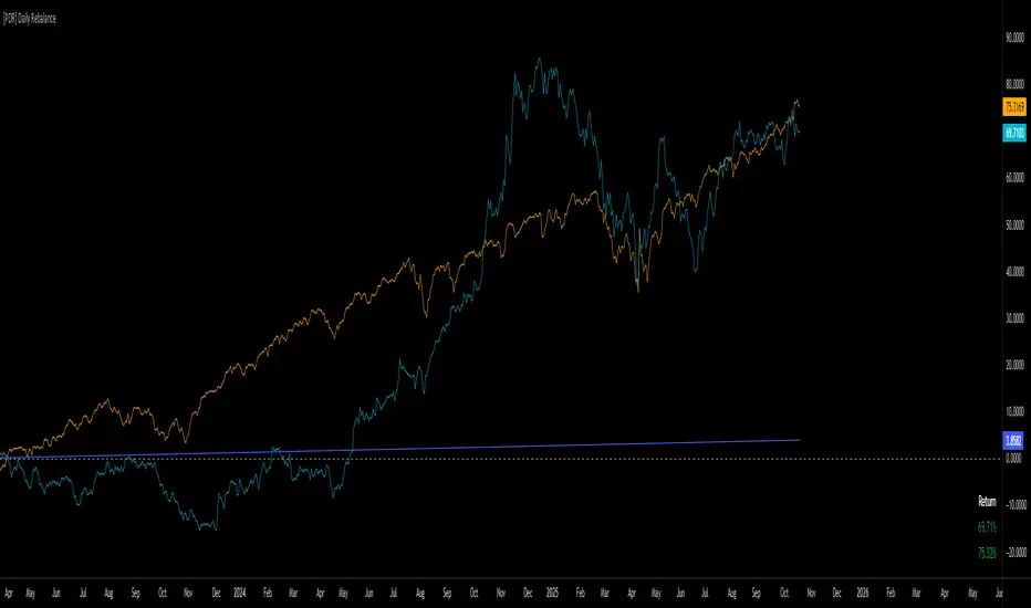
[PDR] Daily Rebalance█ OVERVIEW
This indicator is a powerful portfolio backtesting tool designed to simulate the performance of a static-weight, daily rebalancing strategy. It allows you to define a portfolio of up to 10 assets, set their target weights, and track its cumulative return against a user-defined benchmark and a risk-free rate.
The core of the script is its daily rebalancing logic, which calculates and logs every trade needed to bring the portfolio back to its target allocations at the close of each day. This provides a transparent and detailed view of how a static portfolio would have performed historically, including the impact of trading costs.
█ KEY FEATURES
Daily Rebalancing: Simulates a portfolio that is rebalanced at the close of every day to maintain target asset allocations.
Customizable Portfolio: Configure up to 10 different assets with specific weights. If all weights are left at 0, the script automatically creates an equal-weight portfolio from the selected assets.
Performance Comparison: Plots the portfolio's equity curve against a user-defined benchmark (e.g., SET:SET50 ) and a risk-free return, allowing for easy relative performance analysis.
Realistic Simulation: Accounts for trading costs like broker commission and minimum lot sizes for more accurate and grounded backtesting results.
Detailed Performance Metrics: An on-chart table displays real-time statistics, including Current Drawdown, Max Drawdown, and Total Return for both your portfolio and the benchmark.
Trade-by-Trade Logs: For full transparency, every rebalancing trade (BUY/SELL), including shares, price, notional value, and fees, is logged in the Pine Logs panel.
█ HOW TO USE
**Apply to a Daily Chart:** This script is designed to work exclusively on the daily ( 1D ) timeframe. Applying it to any other timeframe will result in a runtime error.
**Configure Settings:** Open the indicator's settings. Set your `Initial Capital`, `Start Time`, and the `Benchmark` symbol you wish to compare against.
**Define Your Assets:** In the 'Assets' group, check the box to enable each asset you want to include, select the symbol, and define its target `Weight (%)`.
**Set Trading Costs:** Adjust the `Broker Commission (%)` and `Minimal Buyable Lot` to match your expected trading conditions.
**Analyze the Results:** The performance curves are plotted in the indicator pane below your main chart. The key metrics table is displayed on the bottom-right of your chart.
**View Rebalancing Trades:** This is a crucial step for understanding the simulation. To see the detailed daily trades, you **must** open the **Pine Logs**. You can find this panel at the bottom of your TradingView window, next to the "Pine Editor" and "Strategy Tester" tabs. The logs provide a complete breakdown of every rebalancing action.
█ DISCLAIMER
This is a backtesting and simulation tool, not a trading signal generator. Its purpose is for research and performance analysis. Past performance is not indicative of future results. Always conduct your own research before making any investment decisions.
ATR DAILY PROGRESSION)Indicator: ATR Daily Progression — Final Compact Edition
1. Indicator Objective
The ATR Daily Progression indicator measures the progression of intraday volatility as a percentage of the daily Average True Range (ATR).
It provides a quick visual overview of whether the market has reached or exceeded its average daily range of movement.
This helps traders avoid entering low-probability continuation trades once the day’s ATR is already completed.
2. Visual Presentation
Horizontal bar ranging from 0% to 150% of the ATR.
Green color up to 100%, then red beyond that point.
Main ticks: 0, 25, 50, 75, 90, 100, and 150%.
Full-height white vertical lines at 0%, 100%, and 150%.
A floating badge displaying the current ATR completion percentage, always visible.
Compact Height mode enabled by default for optimal visual integration.
3. Key Features
Function Description
Precise alignment The transition from green to red occurs exactly after the 100% tick.
Audio & visual alerts Triggered at 75%, 90%, 100%, and 150%.
Session flash effects The filled bar blinks when the ATR is reached (100%) or exceeded (150%).
Dynamic badge Displays the current ATR %, green before 100%, red after.
Compact layout Three-line table format for better chart integration.
4. Recommended Settings
ATR Length (Daily): 14
Bar width (steps): 32–40 (depending on chart size)
Always green below 100%: enabled
Show floating % badge: enabled
Compact Height: enabled by default
Flash at 75% and 90%: enabled
Flash at 100% and 150%: enabled
5. Strategic Use
The ATR Done Today is a visual discipline tool designed to help traders:
Identify when the market has likely completed its daily move.
Avoid late-session counter-trend trades.
Visualize volatility compression or expansion.
Determine optimal times to take profits or pause trading.

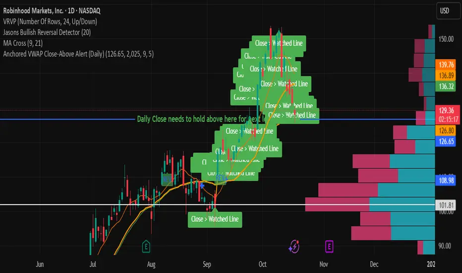
Anchored VWAP Close-Above Alert (Daily)This indicator is a daily anchored VWAP (Volume-Weighted Average Price) tracker that alerts you when price closes above a key pivot line you’ve defined — either dynamically (anchored VWAP from a date like 9/5) or statically (a fixed level like 126.65).
Here’s how each piece works:
1. The anchor date
You give it a date — say September 5, 2025. The script starts calculating VWAP from that day forward. That line represents the average price buyers and sellers have transacted at since that anchor. It’s a kind of “fair-value line” for that period.
2. The logic
Every bar after that date, it adds up (price × volume) and divides by total volume — giving a running VWAP from that starting point. You can instead lock it to a flat number (like 126.65) if you don’t want it recalculating.
3. The alert trigger
Once per day — when the daily candle closes — it checks:
“Did price close above my watched line?”
If yes, it fires an alert (and can draw a label) to tell you that the day’s candle reclaimed that level.
4. The why
That kind of move — a daily close reclaiming a major anchored VWAP — often signals a shift in sentiment or trend strength. Traders watch it to confirm rebounds or invalidations of downside moves.
So in your context:
You anchored to 9/5 (the downside pivot).
You want to know if price closes back above that VWAP (~126.65).
If it does, the alert lights up — confirming the “reclaim” you mentioned in your note.
It’s basically your guard dog for the daily close reclaim.
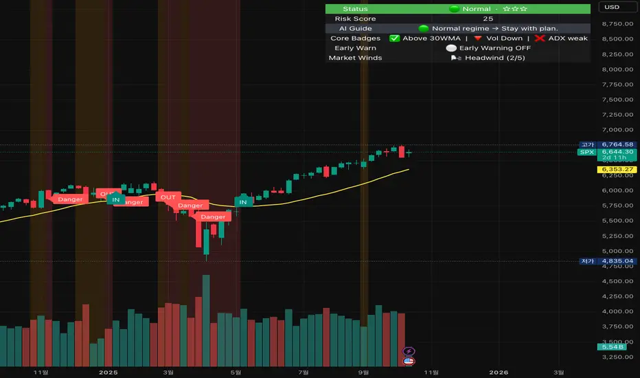
Crash Survival Indicator (SPX, Weekly/Daily)Short description
SPX-focused risk context tool using 30WMA/ATR/ADX and distance to 30WMA, with optional Hindenburg-Omen breadth and macro add-ons. Weekly is primary; Daily provides early-warning. Educational only.
Full description (English first)
What it is
Crash Survival Indicator (CSI) is a rules-based risk context indicator for the S&P 500 index (SPX). It helps keep decisions data-driven during stress by combining four weekly conditions into a weighted risk score and presenting them in a readable dashboard. Optional breadth (Hindenburg Omen cluster proxy) and macro add-ons give additional context. This is not a buy/sell system.
Why it’s original and useful
Weekly core with confirmation: Four classic conditions (30WMA regime, ATR(14) trend, ADX(14) > 20 & rising, and % distance from 30WMA) feed a 0–100 score. A 2-of-3 gate (WMA down / ATR up / ADX>20↑) must confirm before “Danger,” reducing false spikes.
Daily Early-Warning: A separate daily preview flags conditions approaching the Danger threshold (with a streak filter). It’s a heads-up only, not a timeframe switch.
Scope control to avoid confusion: Signals (labels/alerts) are restricted to SPX on Weekly/Daily by design. The dashboard can be shown SPX-only or on all symbols (configurable).
Clarity for all users: Beginner card view (plain badges) and Pro table view (detailed chips) improve readability without hiding logic.
How it works (mechanics)
Weekly core (primary frame)
30WMA regime: price vs 30-week WMA; IN/OUT labels on crosses.
ATR(14): rising ATR counts as volatility stress.
ADX(14): risk weight when ADX > 20 and rising.
Distance to 30WMA: % deviation flags potential overheat.
Scoring & thresholds: Weighted sum → Caution ≥ 40, Danger ≥ 60 (defaults). Danger also requires the 2-of-3 gate above.
Daily Early-Warning: Uses daily versions of the same ideas to detect near-Danger conditions with a streak requirement (heads-up only).
Optional breadth (Hindenburg Omen proxy): Elevated new highs and new lows while the NYSE Composite is above its 50DMA, with deteriorating breadth momentum; requires cluster confirmation to reduce noise.
Optional macro add-ons: VIX regime, DXY strength, credit stress (HYG/LQD vs MA), and TNX trend each add adjustable weights.
Inputs (overview)
Scope & Mode: SPX primary/alt tickers; signal restriction to SPX + Weekly/Daily; dashboard visibility (SPX-only vs all symbols); Beginner or Pro display.
Label Policy: Weekly-only / Weekly-core + Daily-early (default) / All (W/D); lookback windows and minimum bar gaps to prevent clutter.
Scoring: Weights for 30WMA down, ATR up, ADX>20↑, Overheat; Caution/Danger thresholds; Overheat % (distance).
Hindenburg Omen (optional): NYSE Composite and High/Low/AD series; cluster requirement.
Macro add-ons (optional): Symbols + weights for VIX, DXY, HYG, LQD, TNX.
Early Warning (Daily): Near-Danger buffer and streak length.
Visuals & Alerts: Background shading, labels on/off, font size, dashboard position, runtime
alerts.
Alerts (contextual; not trade signals)
OUT — 30WMA Down Break (Weekly)
IN — 30WMA Reclaim (Weekly)
Risk ≥ Danger + 2-of-3 Gate
Hindenburg Omen Cluster detected
Early Warning (Daily near Danger, streak)
Alerts provide context only. They are not buy/sell instructions.
Intended use and limitations
Use the Weekly panel for decisions; treat Daily Early-Warning as a heads-up.
Best used as risk framing alongside your own process (position sizing, liquidity, event risk).
Breadth/macro inputs depend on your data source; if unavailable, keep add-ons off.
No forward-looking data or lookahead; designed to avoid repainting.
Disclaimer
For educational purposes only. Not financial advice, not an investment recommendation, and not a solicitation to buy or sell any security. Past performance does not guarantee future results. Users are solely responsible for their decisions and regulatory compliance.
Optional Korean addendum (append after English)
한국어 안내 요약: 본 지표는 위기 상황에서 감정보다 데이터를 우선할 수 있도록 리스크 맥락을 제공합니다. 주봉이 핵심, 일봉은 조기경보(Heads-up)이며, 매수/매도 신호가 아닙니다. 심프님의 프로토타입 철학을 살리되 SPX 한정 신호, 라벨/알림 정책, 선택형 오멘/매크로 기능, 초보/프로 대시보드 등 가독성을 개선했습니다. 투자 판단과 책임은 전적으로 사용자에게 있습니다.
Privacy & format
Visibility: Public
Source: Protected (no source disclosure), compliant with Publishing Rules
Language: English title & description first; Korean addendum optional
Screenshot guidance (for your gallery)
Weekly SPX showing dashboard at “Danger” with an OUT label.
Weekly SPX with Hindenburg Omen Cluster label and shaded background.
Daily SPX with Early-Warning label as weekly approaches Danger.
Beginner vs Pro dashboard comparison on SPX.
Author certification (paste if needed)
I certify this publication contains no promotions, links, or solicitations, complies with TradingView House Rules and Script Publishing Rules, uses Pine v5, and is intended solely for educational purposes with no performance claims.
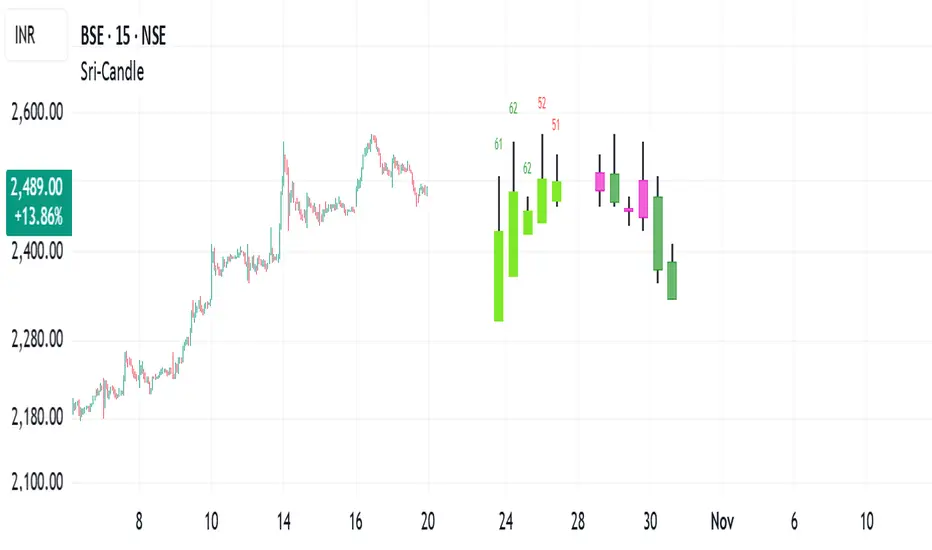
Sri - Daily & Weekly Candle Strength Sri - Daily & Weekly Candle Strength
Short Title: Sri-Candle
Overlay: Yes
Description:
The Sri - Daily & Weekly Candle Strength indicator is designed to visually display recent daily and weekly candle activity directly on your chart, highlighting buyer and seller dominance for each candle. It helps traders quickly assess the strength of bullish vs bearish pressure over recent periods and can be used with both Normal and Heikin Ashi candles. This tool is particularly useful for swing traders, position traders, and technical analysts who want a clear view of candle momentum without switching timeframes.
Features:
Multi-Timeframe Candles:
Displays the last several daily candles and weekly candles on your chart.
Supports Normal or Heikin Ashi candles for both daily and weekly views.
Candle Strength Analysis:
Calculates buyer strength and seller strength as percentages based on candle body relative to the total candle range.
Highlights the dominant strength (higher of buyer or seller) above each candle.
Option to round dominant strength percentages to whole numbers.
Customizable Colors:
Set separate bullish and bearish colors for daily and weekly candles.
Customize wick colors independently for daily and weekly candles.
Positioning and Layout Options:
Adjust horizontal offset, candle thickness, and gap between candles for both daily and weekly candles.
Choose label positions for date labels (Top, Bottom, Absolute level).
Flexible Text Display:
Choose label text size (Tiny, Small, Normal, Large, Huge).
Daily candles display the day of the month on the candle optionally.
Dynamic Candle Rendering:
Each candle is plotted as a box with wicks, accurately reflecting open, high, low, and close.
Dominant strength percentage label is colored green for bullish dominance and red for bearish dominance.
Inputs:
Daily Settings:
Show Daily Candles – Toggle daily candle visibility.
Daily Candle Type – Choose between Normal or Heikin Ashi.
Daily Timeframe – Select Daily (D), Weekly (W), or Monthly (M).
Bull Candle Color (D) – Color for bullish daily candles.
Bear Candle Color (D) – Color for bearish daily candles.
Wick Color (D) – Color for candle wicks.
Horizontal Offset (D) – Distance from current bar to start drawing.
Candle Thickness (D) – Width of candle boxes.
Gap Between Candles (D) – Space between consecutive candles.
Daily Label Position – Position for the date label.
Absolute Level – Y-axis level when using absolute label position.
Strength Label Text Size – Size of the dominant strength label.
Round Dominant % (No Decimals) – Round the displayed strength to whole numbers.
Weekly Settings:
Show Weekly Candles – Toggle weekly candle visibility.
Weekly Candle Type – Choose Normal or Heikin Ashi.
Weekly Timeframe – Select Daily (D), Weekly (W), or Monthly (M).
Bull Candle Color (W) – Color for bullish weekly candles.
Bear Candle Color (W) – Color for bearish weekly candles.
Wick Color (W) – Wick color for weekly candles.
Horizontal Offset (W) – Distance from current bar for weekly candles.
Candle Thickness (W) – Width of weekly candle boxes.
Gap Between Candles (W) – Space between consecutive weekly candles.
How It Works:
The script fetches candle data using the request.security() function for the selected timeframe and type (Normal or Heikin Ashi).
Each candle’s buyer and seller strength is calculated as:
Buyer Strength (%) = ((Close - Low) / (High - Low)) * 100
Seller Strength (%) = ((High - Close) / (High - Low)) * 100
Candles are drawn as boxes with wicks on the chart at the specified horizontal offset.
The dominant strength is displayed above each candle, colored green for bullish dominance or red for bearish dominance.
Daily candles can optionally show the day of the month as a label.
Use Cases:
Quickly identify recent bullish or bearish trends on daily and weekly timeframes.
Compare strength of buyers vs sellers across multiple periods.
Combine with other technical indicators for multi-timeframe analysis.
ICT Daily Levels & Liquidity Zones [HatefBW]ICT Daily Levels & Liquidity Zones
This indicator automatically detects and plots the daily high and low levels for the current day and the two previous days.
Each level dynamically tracks the exact candle that created it, allowing traders to identify where short-term liquidity pools form across multiple timeframes.
What makes this tool unique:
• Three-day structure: Displays current, previous, and 2-day-old highs/lows for contextual price action.
• Dynamic mapping: On lower timeframes, each level aligns precisely with the candle that created the daily high or low.
• Full customization: Traders can toggle each day’s levels, colors, label size, and extension behavior independently.
• Adaptive logic: Lines automatically extend or stay fixed depending on the chosen setting, avoiding chart clutter.
This tool helps ICT traders and smart money practitioners visualize daily liquidity zones — potential areas of stop hunts or institutional targeting.
The script is originally coded by @HatefBW from scratch, with no reused or modified open-source code
