Eminaest Pivots V2Simple Pivot Points plotting script.
You can choose to plot Daily, Weekly and Monthly Pivot Points. Separate or two of them or all together.
Cari dalam skrip untuk "daily"

Ichimoku V5 by ChrisMoody - Daily Kijun Mod by JDNIchimoku V5 by ChrisMoody with Daily Kijun-Sen Mod by JDN
This indicator has been modified to allow you to display the Daily Kijun-Sen on all time frames.

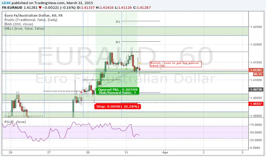
CM_Pivot Points Daily To IntradayNew Pivots Indicator With Options for Daily, 4 Hour, 2 Hour, 1 Hour, 30 Minute Pivot Levels!
Great for Forex Traders! - Take a Look at Chart with Weekly, Daily, and 4 Hour levels. Weekly Pivots Indicator is separate - Link is Below.
Plot one Pivot Level or Multiple at the Same Time via Check Boxes in the Inputs tab.
Defaults to 4 Hour Pivot Levels - Adjust in Inputs Tab.
S3 and R3 are turned off by Default - You can Activate Them In The Inputs Tab.
These Intraday Options were Requested By Users Using My CM_ Pivots Point Custom Indicator that Plots Daily, Weekly, Monthly, Quarterly, and Yearly Pivot Levels. Link is Below.
Now Both Longer-Term Traders and Shorter Term Traders Have All The Pivot Levels They Need. From Yearly Levels All The Way Down to 30 Minute Levels!
***The Candles On The Chart Are Custom Heikin-Ashi Paint Bars. Link is Below
CM_ Pivot Points Custom
Daily, Weekly, Monthly, Quarterly, Yearly Pivot Levels
Heikin-Ashi Paint Bars

DAPD - Daily Average Price Delta This indicator is similar to Bollinger Bands. It based on DAPD - Daily
Average Price Delta. DAPD is based upon a summation for each of the
highs (hod) for the 21 days prior to today minus the summation for
each of the lows (lod) for the last 21 days prior to today. The result
of this calculation would then be divided by 21.

Code Plots - High, Low, Open, Close—Daily, Weekly, & Monthly!!!Custom Code Plots High, Low, Open, Close
Plots Today And/Or Previous Day
Daily, Weekly, & Monthly TimeFrames
Default Settings:
Green = High
Silver = Open
Fuchsia = Close
Red = Low
Current D-W-M = Circles as Plots
Previous D-W-M = Cross as Plots
By Default The Current Days High, Low, Open, Close Plots. There are Check boxes On The Inputs Tab To Turn All Options On And Off.
***Tip - For Intra-Day Trades…I Find It Useful To Plot Previous Days High, Low, Open, Close For Support/Resistance, & Breakout Levels. Plotting the Current Weekly and Monthly Levels Is Also Very Useful.
***If You Trade Daily Charts The Previous Months Levels Are Very Useful as Support/Resistance, & Breakout Levels….
Code For High, Low, Open, Close
pastebin.com
Video On Importing Custom Indicators from PasteBin:
videos.tradingview.com

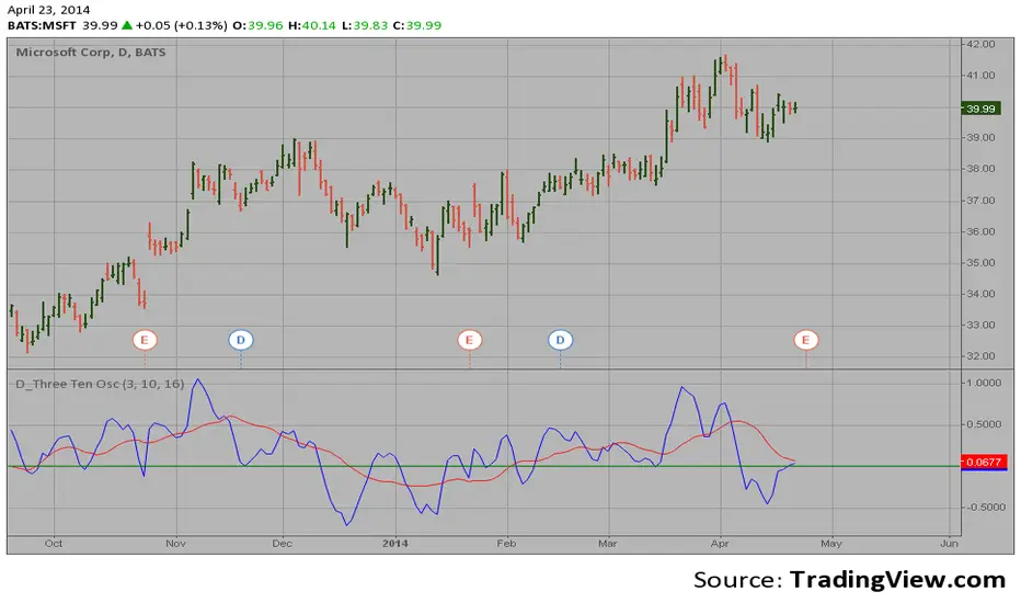
D_Three Ten Osc on the DailyHi
Let me introduce my D_Three Ten Osc script.
This indicator allows the
user to plot a daily 3-10 Oscillator on a Tick Bar Chart or any intraday interval.
Walter Bressert's 3-10 Oscillator is a detrending oscillator derived
from subtracting a 10 day moving average from a 3 day moving average.
The second plot is an 16 day simple moving average of the 3-10 Oscillator.
The 16 period moving average is the slow line and the 3/10 oscillator is
the fast line.
For more information on the 3-10 Oscillator see Walter Bressert's book
"The Power of Oscillator/Cycle Combinations"
trend&strengthwhen strength > 0, it's a bullish signal. more the strength value bigger ,more bullish.

Crypto Camp Day Key LevelsDaily key levels Daily key levels Daily key levels Daily key levels Daily key levels Daily key levels

5-Day & 20-Day Prior MA Lines (Gap Label)
Daily 5 & 20 Moving Average Levels
This indicator plots the Daily 5-period and Daily 20-period moving averages as horizontal levels on any timeframe. Each level starts at the first bar of the trading day and extends only to the current price, keeping the chart clean and focused on the active session.
The levels update once per day using confirmed daily data and are designed to act as intraday bias, support, and resistance references. Labels are aligned on the right side for a minimal, institutional-style presentation.
Useful for:
* Intraday trading on lower timeframes
* Identifying daily trend bias
* Mean reversion and pullback setups
* Futures, stocks, ETFs, and options
No future extension, no repainting, and no unnecessary clutter.

Timeframe Overlay 24HrDaily High–Low Box (00:00–23:59)
This indicator highlights each trading day with a shaded box spanning from 00:00 to 23:59 (based on the selected timezone) and covering the day’s highest and lowest price.
• Green box when the day closes above its open
• Red box when the day closes below its open
• Historical days are fully drawn for easy comparison
• Current day box builds dynamically as new candles form
Useful for visualising daily range, market bias, and intraday structure across all timeframes.

OFM Key LevelsDaily and Weekly Levels Only
Daily Levels Calculated from RTH Sessions
Weekly Levels Calculated ETH

AP Index - Geomagnetic disturbancesDaily AP index back to 2015-01-01.
Geomagnetic disturbances can be monitored by ground-based magnetic observatories recording the three magnetic field components. The global Kp index is obtained as the mean value of the disturbance levels in the two horizontal field components, observed at 13 selected, subauroral stations . The name Kp originates from "planetarische Kennziffer" ( = planetary index).
The three-hour index ap and the daily indices Ap, Cp and C9 are directly related to the Kp index. In order to obtain a linear scale from Kp, J. Bartels gave the following table to derive a three-hour equivalent range, named ap index.
Geomagnetic Ap Index: The daily index Ap is obtained by averaging the eight values of ap for each day.
Based on the data from Helmholtz Centre Potsdam GFZ German Research Centre for Geosciences.

daily_pivots_beta_persistenttraderDaily central pivots for today and tomorrow are plotted. This is strictly BETA version.
Irrespective of timeframe chosen for the charts, it's DAILY pivots that are plotted.
Pls note that this is made available as-is and I make it clear that I am not responsible for any profilt or loss or any other outcome directly or indirectly arising out of use of this formula.
3 MA(50,100,200)_DAILYDaily Moving Average (50, 100, 200) in one code, indicates daily MA values in all time frames

Daily 10 & 20 EMA (Shown on All Timeframes)The 10-day EMA is the quicker one. It hugs price closely, reacting fast to every twitch and hesitation. When price respects it, momentum feels alive. When price slices through it, you sense hesitation before it shows up elsewhere.
The 20-day EMA moves with more weight. It doesn’t flinch at noise. It represents the market’s short-term memory, the line price keeps returning to when trends are healthy. Above it, bias feels constructive. Below it, gravity takes over.
Together, they form a rhythm pair:
When the 10 EMA rides above the 20 EMA, the market is leaning forward.
When the 10 EMA sinks below the 20 EMA, momentum is cooling or rolling over.
When price compresses between them, indecision is building energy.
Across all timeframes, they scale like a fractal:
On lower timeframes, they act as tactical guides for entries, pullbacks, and exits.
On higher timeframes, they define structure, trend health, and whether moves are worth trusting.
They don’t predict. They contextualize.
They don’t command. They frame the battlefield

Daily Weekly Monthly ClosesFeatures:
Labels showing the close price for each period
Toggle visibility for day, week, and month closes
Customizable colors for each level
Adjustable line width and style (solid, dashed, dotted)
Labels appear on the right side of the chart


Daily Xth Percentile Volume SpikeA percentile is a statistical measure that indicates the relative standing of a specific value within a dataset by identifying the percentage of data points that fall at or below it. Volume percentile indicates how that trading compares to other days. For example, volume above the 95th percentile means more shares/contracts traded than in the last 20-days lookback period.

Daily ATR + DeltaThis indicator shows last value of ATR with this parameters: Length 14, Smoothing RMA, Timeframe 1 day i Wait for timeframe closes.
Also, it shows Delta in percentage.
Delta is calculated in this way: -((the last one-minute closing price of the previous day's stock exchange)-(last price at the moment))/(value of ATR) * 100
Notice:
If you are in postmarket or premarket, delta will be also calculated from the "the last one-minute closing prices of the previous day's stock exchange" not from the "the last one-minute closing price of the todays stock exchange".
You dont need to have indicator Average True Range for this indicator to be working.

Daily Upside LinePlots an intraday upside line.
Uses proprietary breakout score logic to show when intraday setups are ripe for continuation.
Finds the average of these lines to plot the upside line

Daily Opens (Today/Yesterday/Prev Week)Market open markers for Volume profile traders, Marks Current Day open, Previous Day open, Previous Week open.
