CE - 42MACRO Fixed Income and Macro This is Part 2 of 2 from the 42MACRO Recreation Series
However, there will be a bonus Indicator coming soon!
The CE - 42MACRO Fixed Income and Macro Table is a next level Macroeconomic and market analysis indicator.
It aims to provide a probabilistic insight into the market realized GRID Macro regimes,
track a multiplex of important Assets, Indices, Bonds and ETF's to derive extra market insights by showing the most important aggregates and their performance over multiple timeframes... and what that might mean for the whole market direction.
For traders and especially investors, the unique functionalities will be of high value.
Quick guide on how to use it:
docs.google.com
WARNING
By the nature of the macro regimes, the outcomes are more accurate over longer Chart Timeframes (Week to Months).
However, it is also a valuable tool to form an advanced,
market realized, short to medium term bias.
NOTE
This Indicator is intended to be used alongside the 1nd part "CE - 42MACRO Equity Factor"
for a more wholistic approach and higher accuracy.
Methodology:
The Equity Factor Table tracks specifically chosen Assets to identify their performance and add the combined performances together to visualize 42MACRO's GRID Equity Model.
For this it uses the below Assets:
Convertibles ( AMEX:CWB )
Leveraged Loans ( AMEX:BKLN )
High Yield Credit ( AMEX:HYG )
Preferreds ( NASDAQ:PFF )
Emerging Market US$ Bonds ( NASDAQ:EMB )
Long Bond ( NASDAQ:TLT )
5-10yr Treasurys ( NASDAQ:IEF )
5-10yr TIPS ( AMEX:TIP )
0-5yr TIPS ( AMEX:STIP )
EM Local Currency Bonds ( AMEX:EMLC )
BDCs ( AMEX:BIZD )
Barclays Agg ( AMEX:AGG )
Investment Grade Credit ( AMEX:LQD )
MBS ( NASDAQ:MBB )
1-3yr Treasurys ( NASDAQ:SHY )
Bitcoin ( AMEX:BITO )
Industrial Metals ( AMEX:DBB )
Commodities ( AMEX:DBC )
Gold ( AMEX:GLD )
Equity Volatility ( AMEX:VIXM )
Interest Rate Volatility ( AMEX:PFIX )
Energy ( AMEX:USO )
Precious Metals ( AMEX:DBP )
Agriculture ( AMEX:DBA )
US Dollar ( AMEX:UUP )
Inverse US Dollar ( AMEX:UDN )
Functionalities:
Fixed Income and Macro Table
Shows relative market Asset performance
Comes with different Calculation options like RoC,
Sharpe ratio, Sortino ratio, Omega ratio and Normalization
Allows for advanced market (health) performance
Provides the calculated, realized GRID market regimes
Informs about "Risk ON" and "Risk OFF" market states
Visuals - for your best experience only use one (+ BarColoring) at a time:
You can visualize all important metrics:
- GRID regimes of the currently chosen calculation type
- Risk On/Risk Off with background colouring and additional +1/-1 values
- a smoother GRID model
- a smoother Risk On/ Risk Off metric
- Barcoloring for enabled metric of the above
If you have more suggestions, please write me
Fixed Income and Macro:
The visualisation of the relative performance of the different assets provides valuable information about the current market environment and the actual market performance.
It furthermore makes it possible to obtain a deeper understanding of how the interconnected market works and makes it simple to identify the actual market direction,
thus also providing all the information to derive overall market health, market strength or weakness.
Utility:
The Fixed Income and Macro Table is divided in 4 Columns which are the GRID regimes:
Economic Growth:
Goldilocks
Reflation
Economic Contraction:
Inflation
Deflation
Top 5 Fixed Income/ Macro Factors:
Are the values green for a specific Column?
If so then the market reflects the corresponding GRID behavior.
Bottom 5 Fixed Income/ Macro Factors:
Are the values red for a specific Column?
If so then the market reflects the corresponding GRID behavior.
So if we have Goldilocks as current regime we would see green values in the Top 5 Goldilocks Cells and red values in the Bottom 5 Goldilocks Cells.
You will find that Reflation will look similar, as it is also a sign of Economic Growth.
Same is the case for the two Contraction regimes.
******
This Indicator again is based to a majority on 42MACRO's models.
I only brought them into TV and added things on top of it.
If you have questions or need a more in-depth guide DM me.
GM
Cari dalam skrip untuk "etf涨跌幅限制"

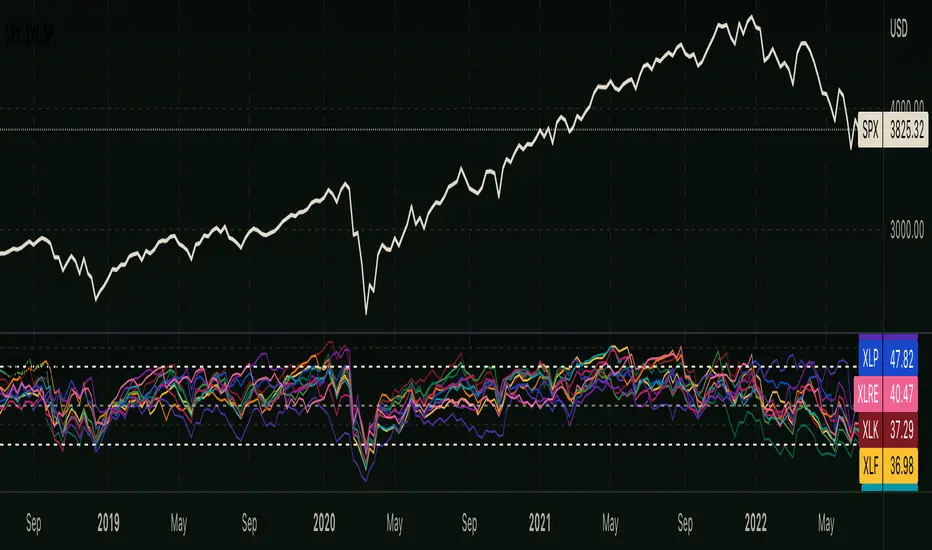
RSI - S&P Sector ETFsThe script displays RSI of each S&P SPDR Sector ETF
XLB - Materials
XLC - Communications
XLE - Energy
XLF - Financials
XLI - Industrials
XLK - Technology
XLP - Consumer Staples
XLRE - Real Estate
XLU - Utilities
XLV - Healthcare
XLY - Consumer Discretionary
It is meant to identify changes in sector rotation, compare oversold/overbought signals of each sector, and/or any price momentum trading strategy applicable to a trader.
InfoPanel - SeasonalityThis panel will show which is the best month to buy a stock, index or ETF or even a cryptocurrency in the past 5 years.
Script to use only with MONTHLY timeframe.
Thanks to: RicardoSantos for his hard work.
Please use comment section for any feedback.
RS Rating Multi-TimeframeRS Rating Multi-Timeframe (IBD-Style Relative Strength)
Short Description:
IBD-style Relative Strength Rating (1-99) comparing any stock's performance vs the S&P 500 across multiple timeframes.
Full Description:
Overview
This indicator calculates an IBD-style Relative Strength (RS) Rating that measures a stock's price performance relative to the S&P 500 over the past 12 months. The rating scale ranges from 1 (weakest) to 99 (strongest), telling you how a stock ranks against all other stocks in terms of relative performance.
How It Works
The RS Rating uses a weighted formula based on quarterly performance:
Last 63 days (1 quarter): 40% weight
Last 126 days (2 quarters): 20% weight
Last 189 days (3 quarters): 20% weight
Last 252 days (4 quarters): 20% weight
This weighting emphasizes recent performance while still accounting for longer-term strength.
Rating Interpretation
90-99 (Elite): Top 10% of all stocks - exceptional relative strength
80-89 (Excellent): Top 20% - strong leadership candidates
50-79 (Average): Middle of the pack
30-49 (Below Average): Underperforming the market
1-29 (Weak): Bottom 30% - avoid or consider shorting
Features
Multi-Timeframe: Works on any timeframe from 1-hour to weekly (always uses daily data for calculation)
Moving Average: Optional EMA or SMA of the RS Rating to smooth signals
Visual Zones: Color-coded zones for quick identification of strength/weakness
Signal Markers: Triangles appear when RS crosses key levels (80 and 30)
Info Table: Displays current RS Rating, change, MA value, and raw score
Alerts: Built-in alerts for key crossover events
Settings
Show Moving Average: Toggle MA line on/off
MA Length: Period for the moving average (default: 10)
MA Type: Choose between EMA or SMA
Benchmark Index: Change the comparison index (default: SP:SPX)
Show Rating Table: Toggle the info table on/off
How To Use
Buy candidates: Look for stocks with RS Rating above 80, ideally rising
Avoid: Stocks with RS Rating below 30 or falling rapidly
Confirmation: Use RS above its moving average as additional confirmation
Divergence: Watch for RS making new highs before price (bullish) or new lows before price (bearish)
Credits
RS Rating calculation methodology inspired by Investor's Business Daily (IBD) and adapted from Fred6724's RS Rating script. Percentile calibration based on analysis of ~6,600 US stocks.
Tags: relative strength, RS rating, IBD, momentum, CAN SLIM, benchmark, SPX, market leaders, stock ranking
Category: Relative Strength

RS Rating Trailing StrategyHow It Works:
StageActionEntryBuy when RS Rating crosses above 80TrackingTrack the highest RS Rating while in positionExitSell when RS Rating drops 5 points below the high
Example:
RS Rating crosses from 79 to 81 → BUY
RS Rating climbs to 85 → High RS = 85, Stop = 80
RS Rating climbs to 95 → High RS = 95, Stop = 90
RS Rating drops to 92 → Still holding (above 90 stop)
RS Rating drops to 90 → SELL (hit trailing stop)
Settings:
SettingDefaultDescriptionRS Entry Level80Buy when RS crosses above thisRS Trailing Drop5.0Sell when RS drops this many points from highBenchmark IndexSP:SPXIndex for RS calculation
Table Shows:
Current RS Rating
Position status (LONG/FLAT)
Entry RS (what RS was when you bought)
High RS (highest RS since entry)
Stop RS (current trailing stop level)
Cushion (how far above stop you are)
The cushion turns orange when close to stop, red when very close.

MACD Cross Long/Short Alert📌 MACD Cross Long/Short Alert — Indicator Description
📌 MACD 上/下穿信号线提醒指标说明
🇺🇸 English Description
This indicator provides clean and actionable MACD cross alerts, designed for traders who need quick “long/short” signals based on MACD line and Signal line interactions.
Key Features
Standard MACD Calculation
Uses customizable Fast EMA, Slow EMA, and Signal EMA.
Cross-Based Trading Signals
Bullish Cross (MACD crossover Signal) → Long setup
Bearish Cross (MACD crossunder Signal) → Short setup
Chart Markers
Triangles plotted directly on the chart for fast visual recognition.
Built-in Alerts
Automatically triggers alerts when MACD crosses above/below the signal line.
Works with any timeframe and any asset.
Use Cases
Intraday trend reversal detection
Momentum confirmation
Breakout retest validation
Simple auto-trading signal for strategies/robots
Quick scalp entries on 5m/10m/30m
This MACD tool is ideal for traders who need a fast, reliable long/short trigger without unnecessary complexity.
🇨🇳 中文说明
本指标提供 MACD 上穿/下穿信号线的即时做多/做空提醒,适用于所有周期与品种,是一个简洁、实用的趋势转折信号工具。
主要功能
标准 MACD 计算
快线 EMA、慢线 EMA、Signal EMA 均可自定义。
交叉交易信号
上穿 Signal → 多头信号(做多)
下穿 Signal → 空头信号(做空)
图表标记
图中自动绘制上/下三角形,方便肉眼快速发现信号。
内置警报提醒
自动推送 MACD 上下穿事件,可用于:
APP 推送
邮件提醒
自动化策略触发
日内做单提醒
适用场景
日内反转捕捉(5m / 10m / 30m)
动量确认
趋势切换点识别
回踩/突破后的方向确认
自动交易机器人信号源

SMC IndicatorTitle: Smart Money Concepts Structure & ZigZag
Description: Master market structure with this precision Smart Money Concepts (SMC) tool. Unlike standard ZigZag indicators that repaint (change the past) as price moves, this indicator utilizes a robust, non-repainting detection engine to objectively map Swing Highs, Swing Lows, and structural breaks.
It is designed to help traders identify the true trend direction and spot critical reversal points without the confusion of disappearing signals.
How It Works:
1. Non-Repainting Pivots: The core of this indicator is a custom ZigZag algorithm that "locks in" Swing Highs (H) and Swing Lows (L) only after they are statistically confirmed by a user-defined deviation. Once a label appears, it stays there.
2. Break of Structure (BoS):
Signal: Trend Continuation.
Logic: Triggers when price breaks and closes past a confirmed pivot in the direction of the current trend.
Use Case: confirms the trend is healthy and identifies opportunities to join the move.
3. Change of Character (CHoCH):
Signal: Trend Reversal.
Logic: Triggers when price breaks a key pivot in the opposite direction of the current trend.
Use Case: Serves as an early warning signal that the trend may be ending or reversing.
4. The Ghost Line: A dotted line connects the last confirmed pivot to the current live price. This helps you visualize the developing leg of the structure before it is confirmed.
Visual Guide:
🔵 Blue Label: Bullish Break of Structure (BoS).
🔴 Maroon Label: Bearish Break of Structure (BoS).
🟢 Aqua Label: Bullish Change of Character (CHoCH).
🟠 Orange Label: Bearish Change of Character (CHoCH).
H / L: Confirmed Swing Highs and Lows.
Features:
Precision Tuning: "Deviation %" input supports values as low as 0.01 for scalping on 1-minute charts.
Smart Tooltips: Hover over settings to see recommended values for Daily, Hourly, and Minute timeframes.
Clean Visuals: Uses text-only labels to keep the chart clutter-free.
Alerts: Fully alert-enabled for Bullish/Bearish BoS and CHoCH signals.
Credits: This script is built upon classic Market Structure theory and Smart Money Concepts (SMC), optimized for real-time reliability.

Ultimate Squeeze & BreakoutTitle: Ultimate Squeeze & Breakout
Description: This professional volatility indicator utilizes the power of Bollinger Bands and Keltner Channels to identify high-probability consolidation zones and explosive breakouts. It is designed to help traders spot "The Squeeze"—a critical period of low volatility where the market builds potential energy before a significant directional move.
How It Works:
1. The Energy (The Squeeze): Using the classic TTM Squeeze logic, the indicator monitors the relationship between price volatility (Bollinger Bands) and average range (Keltner Channels).
Red Cloud: Volatility is compressed. The Bollinger Bands have contracted inside the Keltner Channels. The market is coiling like a spring. This is the Setup Phase.
2. The Breakout (The Release): When price expands and closes outside the bands, the energy is released.
Momentum Filter: A unique filter checks the slope of the 20-period Basis Line (SMA). Breakout colors only trigger if the momentum slope agrees with the breakout direction, helping to filter out weak "fakeouts."
Visual Guide:
☁️ Cloud Colors (Volatility State):
🟥 Red: Squeeze ON (Consolidation/No Trade).
🟣 Fuchsia: Bullish Momentum Breakout.
🔵 Blue: Bearish Momentum Breakout.
⬜ Gray/Green: Normal Trending (Neutral).
Features:
Smart Filters: Breakouts are validated by the underlying momentum slope.
Trend Coloring: Option to switch the neutral trending cloud between Gray and Green.
Precision Tuning: Decimal inputs allow for fine-tuning of Standard Deviation and ATR multipliers.
Alerts: Full alert support for Squeeze Start, Bullish Breakouts, and Bearish Breakouts.
Credits: This script is built upon the foundational TTM Squeeze concept popularized by John Carter, enhanced with dynamic coloring and momentum filtering.

MM Wash Detector (Discreet)MM Wash Detector identifies weekly liquidity sweeps created by market makers.
It highlights two conditions:
Bull Wash – price wicks above the weekly range to grab liquidity, then reverses
Bear Wash – price wicks below the weekly range to grab liquidity, then reverses
This tool is designed for traders who want to spot engineered stop-hunts, liquidity grabs, and manipulation pockets where reversals often begin.
Labels are intentionally discreet for minimal chart clutter.
✅ 2. Short & Simple
Shows when market makers sweep liquidity above or below the weekly range.
Bull Wash = liquidity grab above
Bear Wash = liquidity grab below
Discreet labels. No clutter.
✅ 3. Aggressive / Smart-Money Style
Tracks weekly stop-hunts engineered by smart money.
A “Wash” prints when price creates an exaggerated wick outside the weekly range with a small body and volume confirmation.
These zones often mark liquidity collection before a reversal or displacement move.
✅ 4. Beginner-Friendly
This indicator helps you see when the price makes a long wick above or below the weekly candle — a sign that big players might be triggering stops and collecting liquidity.
These liquidity grabs are often followed by a reversal.
Bull Wash = sweep above
Bear Wash = sweep below

Echo Chamber [theUltimator5]The Echo Chamber - When history repeats, maybe you should listen.
Ever had that eerie feeling you've seen this exact price action before? The Echo Chamber doesn't just give you déjà vu—it mathematically proves it, scales it, and projects what happened next.
📖 WHAT IT DOES
The Echo Chamber is an advanced pattern recognition tool that scans your chart's history to find segments that closely match your current price action. But here's where it gets interesting: it doesn't just find similar patterns - It expands and contracts the time window to create a uniquely scaled fractal. Patterns don't always follow the same timeframe, but they do follow similar patterns.
Using a custom correlation analysis algorithm combined with flexible time-scaling, this indicator:
Finds historical price segments that mirror your current market structure
Scales and overlays them perfectly onto your current chart
Projects forward what happened AFTER that historical match
Gives you a visual "echo" from the past with a glimpse into potential futures
══════════════════════════════
HOW TO USE IT
This indicator starts off in manual mode, which means that YOU, the user, can select the point in time that you want to project from. Simply click on a point in time to set the starting value.
Once you select your point in time, the indicator will automatically plot the chosen historical chart pattern and correlation over the current chart and project the price forwards based on how the chart looked in the past. If you want to change the point in time, you can update it from the settings, or drag the point on the chart over to a new position.
You can manually select any point in time, and the chart will quickly update with the new pattern. A correlation will be shown in a table alongside the date/timestamp of the selected point in time.
You can switch to auto mode, which will automatically search out the best-fit pattern over a defined lookback range and plot the past/future projection for you without having to manually select a point in time at all. It simply finds the best fit for you.
You can change the scale factor by adjusting multiplication and division variables to find time-scaled fractal patterns.
══════════════════════════════
🎯 KEY FEATURES
Two Operating Modes:
🔧 MANUAL MODE - Select any historical point and see how it correlates with current price action in real-time. Perfect for:
• Analyzing specific past events (crashes, rallies, consolidations)
• Testing historical patterns against current conditions
• Educational analysis of market structure repetition
🤖 AUTO MODE - It automatically scans through your lookback period to find the single best-correlated historical match. Ideal for:
• Quick pattern discovery
• Systematic trading approach
• Unbiased pattern recognition
Time Warp Technology:
The time warp feature expands and compresses the correlation window to provide a custom fractal so you can analyze windows of time that don't necessarily match the current chart.
💡 *Example: Multiplier=3, Divisor=2 gives you a 1.5x time stretch—perfect for finding patterns that played out 50% slower than current price action.*
Drawing Modes:
Scale Only : Pure vertical scaling—matches price range while maintaining temporal alignment at bar 0
Rotate & Scale : Advanced geometric transformation that anchors both the start AND end points, creating a rotated fit that matches your current segment's slope and range
Visual Components:
🟠 Orange Overlay : The historical match, perfectly scaled to your current price action
🟣 Purple Projection : What happened NEXT after that historical pattern (dotted line into the future)
📦 Highlight Boxes : Shows you exactly where in history these patterns came from
📊 Live Correlation Table : Real-time correlation coefficient with color-coded strength indicator
══════════════════════════════
⚙️ PARAMETERS EXPLAINED
Correlation Window Length (20) : How many bars to match. Smaller = more precise matches but noisier. Larger = broader patterns but fewer matches.
Note: if this value is too high in auto mode, the script may time out from computational overload.
Multiplication Factor : Historical time multiplier. 2 = sample every 2nd bar from history. Higher values find slower historical patterns.
Division Factor : Historical time divisor applied after multiplication. Final sample rate = (Length × Factor) ÷ Divisor, rounded down.
Lookback Range : How far back to search for patterns. More history = better chance of finding matches but slower performance.
Note: if this value is too high in auto mode, the script may time out from computational overload.
Future Projection Length : How many bars forward to project from the historical match. Your crystal ball's focal length.
══════════════════════════════
💼 TRADING APPLICATIONS
Trend Continuation/Reversal :
If the purple projection continues the current trend, that's your historical confirmation. If it reverses, you've found a potential turning point that's happened before under similar conditions.
Support/Resistance Validation :
Does the projection respect your S/R levels? History suggests those levels matter. Does it break through? You've found historical precedent for a breakout.
Time-Based Exits :
The projection shows not just WHERE price might go, but WHEN. Use it to anticipate timing of moves.
Multi-Timeframe Analysis :
Use time compression to overlay higher timeframe patterns onto lower timeframes. See daily patterns on hourly charts, weekly on daily, etc.
Pattern Education :
In Manual Mode, study how specific historical events correlate with current conditions. Build your pattern recognition library.
══════════════════════════════
📊 CORRELATION TABLE
The table shows your correlation coefficient as a percentage:
80-100%: Extremely strong correlation—history is practically repeating
60-80%: Strong correlation—significant similarity
40-60%: Moderate correlation—some structural similarity
20-40%: Weak correlation—limited similarity
0-20%: Very weak correlation—essentially random match
-20-40%: Weak inverse correlation
-40-60%: Moderate inverse correlation
-60-80%: Strong inverse correlation
-80-100%: Extremely strong inverse correlation—history is practically inverting
**Important**: The correlation measures SHAPE similarity, not price level. An 85% correlation means the price movements follow a very similar pattern, regardless of whether prices are higher or lower.
══════════════════════════════
⚠️ IMPORTANT DISCLAIMERS
- Past performance does NOT guarantee future results (but it sure is interesting to study)
- High correlation doesn't mean causation—markets are complex adaptive systems
- Use this as ONE tool in your analytical toolkit, not a standalone trading system
- The projection is what HAPPENED after a similar pattern in the past, not a prediction
- Always use proper risk management regardless of what the Echo Chamber suggests
══════════════════════════════
🎓 PRO TIPS
1. Start with Auto Mode to find high-correlation matches, then switch to Manual Mode to study why that period was similar
2. Experiment with time warping on different timeframes—a 2x factor on a daily chart lets you see weekly patterns
3. Watch for correlation decay —if correlation drops sharply after the match, current conditions are diverging from history
4. Combine with volume —check if volume patterns also match
5. Use "Rotate & Scale" mode when the current trend angle differs from the historical match
6. Increase lookback range to 500-1000+ on daily/weekly charts for finding rare historical parallels
══════════════════════════════
🔧 TECHNICAL NOTES
- Uses Pearson correlation coefficient for pattern matching
- Implements range-based scaling to normalize different price levels
- Rotation mode uses linear interpolation for geometric transformation
- All calculations are performed on close prices
- Boxes highlight actual historical bar ranges (high/low)
- Maximum of 500 lines and 500 boxes for performance optimization

S&P Options Patterns Detector (6-20 Candles)Pattern detector for S&P options. Detects alerts for bullish or bearish signals for any stock in S&P 500

FUSED 9.5 INSTITUTIONAL [FINAL] - AgTradezInstitutional style Indicator that gives you trend direction, MSS, with Tp levels and much more.

Squeeze Momentum OscillatorTitle: Squeeze Momentum Oscillator
Description: This indicator is a panel-based oscillator that separates market momentum from volatility, designed to spot high-probability breakouts using the classic TTM Squeeze logic.
How It Works: The indicator uses a "traffic light" system on the zero line to indicate volatility states, while the histogram shows the strength and direction of the trend.
1. The Dots (Volatility State): These dots tell you if the market is consolidating or trending.
🔴 Red Dot: Squeeze is ON. Bollinger Bands are inside Keltner Channels. Volatility is compressed. Do not trade; wait for the release.
🟢 Green Dot: Squeeze is OFF. Volatility is normal.
🟣 Fuchsia Dot: Bullish Breakout! The squeeze has fired to the upside and is confirmed by positive SMA momentum.
🔵 Blue Dot: Bearish Breakout! The squeeze has fired to the downside and is confirmed by negative SMA momentum.
2. The Histogram (Momentum): This measures the strength of the move using Linear Regression.
Light Green: Bullish momentum is increasing.
Dark Green: Bullish momentum is waning (caution).
Light Red: Bearish momentum is increasing.
Dark Red: Bearish momentum is waning (caution).
Settings & Features:
Momentum Filter: Breakout dots (Fuchsia/Blue) only appear if the 20-period SMA slope agrees with the breakout direction, filtering out weak fakeouts.
Customizable: Adjust lengths and multipliers for Bollinger Bands and Keltner Channels to tune sensitivity.
Toggle: You can turn the specific "Breakout Colors" on or off in the settings.
Credits: Based on the TTM Squeeze concept popularized by John Carter, utilizing Linear Regression for momentum and standard deviation/ATR comparisons for volatility. Fixed and optimized for TradingView Pine Script v6.

Squeeze & StructureTitle: Ultimate Squeeze & Market Structure
Description: This all-in-one trading system combines two of the most powerful concepts in technical analysis: Volatility Compression (The Squeeze) and Market Structure (SMC).
It is designed to solve the biggest problem breakout traders face: False Breakouts. By waiting for a Volatility Squeeze to release energy, and confirming it with a structural Break of Structure (BoS) or Change of Character (CHoCH), traders can identify high-probability setups with precision.
How It Works (The "Trifecta" Logic):
1. The Energy (The Squeeze): Using the classic TTM Squeeze logic, the indicator monitors the relationship between Bollinger Bands (price volatility) and Keltner Channels (average range).
Red Cloud: Volatility is compressed. The market is coiling like a spring. This is the Setup Phase.
Breakout: When price expands outside the bands, the energy is released.
2. The Structure (SMC & ZigZag): Built on a custom Non-Repainting ZigZag engine, the indicator objectively maps swing highs and lows to define the trend.
BoS (Break of Structure): Signals trend continuation. Price breaks a previous pivot in the direction of the trend.
CHoCH (Change of Character): Signals potential reversal. Price breaks a significant pivot in the opposite direction of the trend.
Ghost Line: A dotted line shows the live, developing leg of the ZigZag before it is confirmed, helping you anticipate the next pivot.
3. The Confluence (The Strategy): The most powerful signals occur when these two forces align.
Example: A Red Squeeze releases into a Bullish Breakout (Fuchsia Cloud), immediately followed by a Bullish CHoCH. This confirms that not only is volatility expanding, but the structural trend has officially reversed to the upside.
Visual Guide:
☁️ Cloud Colors (Volatility):
🟥 Red: Squeeze ON (Consolidation).
🟣 Fuchsia: Bullish Momentum Breakout.
🔵 Blue: Bearish Momentum Breakout.
🟡 Yellow: Armed/Waiting for Pullback (if Pullback mode is active).
⬜ Gray/Green: Normal Trending.
🏷️ Labels (Structure):
H / L: Confirmed Swing Highs and Lows.
BoS: Break of Structure (Trend Continuation).
CHoCH: Change of Character (Trend Reversal).
Features:
Dual Entry Modes: Choose between "Breakout" (immediate signal) or "Pullback" (waits for a retest of the midline).
Momentum Filter: Breakouts are only colored if the 20 SMA slope agrees with the direction.
Fully Customizable: Adjust ZigZag Sensitivity (Depth/Deviation), Squeeze lengths, and all colors.
Alerts: Triggers available for Squeeze Start, Breakouts, and Armed status.
Credits: This script incorporates concepts from the TTM Squeeze and standard Smart Money Concepts (SMC) market structure analysis. It uses a custom, non-repainting pivot detection algorithm to ensure historical accuracy.

OBV + WaveTrend Volume Scalper [GratefulFutures]This script is a combination script of three different strategies that provides buy and sell signals based on the change of volume with momentum confirmations.
Sources used:
This script relies on the outstanding scripts of the great script writer LazyBear: LazyBear
The following scripts were used in this publication:
1. A modified "On-Balance Volume Oscillator" modified from LazyBear's original script:
2. Wavetrend Oscillator with crosses, Author: LazyBear
3. Squeeze Momentum Oscillator, Author: LazyBear
This script functions based on the following criteria being true:
1. On balance volume oscillator turning from negative to positive (buy) or positive to negative (sell)
2. Squeeze Momentum value is increasing (buy) or decreasing (sell)
3. Wavetrend 1 (wt1) is greater than wavetrend 2 (wt2) (buy)/ Wavetrend 1 (wt1) is less than wavetrend 2 (wt2) (sell)
By combining these factors the indicator is able to signal exactly when net buying turns to net selling (OBV) and when this change is most advantageous to continue based on the momentum and price action of the underlying asset (SQMOMO and Wavetrend).
This allows you to pair volume and price action for a powerful tool to identify where price will reverse or continue providing exceptional entries for short term trades, especially when combined with other aspects such as support and resistance, or volume profile.
How to use:
Simply adjust the settings to your preference and read the given signals as generated.
Settings
There are multiple ways to tune the signals generated. It is set standard for my preferred use on a 1 minute chart.
OBV Oscillator Settings
The first 4 dropdowns in the Inputs section tune the On Balance Volume Oscillator (OBVO) portion of the indicator. You can choose if you want it to calculate based on close, open, high, low, or other value.
The most impactful in the entire settings is going to be the length and smoothing of the OBVO EMA. Making this number lower increasing the sensitivity to changes in volume, making the signals come quicker but is more susceptible to quick fluctuations. A value of between (5-20) is reasonable for the OBVO EMA length. There is a separate smoothing factor titled OBV Smoothing Length and below that, OBV Smoothing Type , a value of (2) is standard with "SMA" for smoothing type with a value of between 2-10 being reasonable. You may also play with these values to see what you like for your trading style.
Wavetrend Settings
The next 3 options are to modify the wavetrend portion of the indicator. I do not modify these from standard, and feel that they work appropriately on all time frames at the following values: n1 length (10), n2 length (20), Wavetrend Signal SMA length (4)
Squeeze Momentum Settings
The following 5 options through the end modify the Squeeze momentum portion of the indicator. The only one that modifies the signals generated is the KC Length , Making this number lower increasing the sensitivity to changes in price action, making the signals come quicker but is more susceptible to quick fluctuations. A value of between (18-25) is reasonable for KC Length .
Style Setting
You may select if you want to see the buy and sell signals. The following 5 options Raw OBV Osc through Squeeze Momentum allow you to see where each specific requirement was met, posted as a vertical line, but for live use it is recommended to turn all of these vertical lines off and only use the buy and sell signals.
Time Frames:
While this script is most effective on shorter time frames (1 minute for scalping and daytrading) it is also viable to use it on longer timeframes, due to the nature of its components being independent of time frame.
Examples of use - (Green and red vertical lines are for visualization purpose and are not part of the script)
SPY 1 Minute (Factory Settings):
SPX 15 minutes (Factory Settings):
Considerations
This script is meant primarily for short term trading, trades on the basis of seconds to minutes primarily. While they can be a good indication of volume lining up with momentum, it is always wise to use them in combination with other factors such as support, resistance, market structure, volume levels, or the many other techniques out there...
As Always... Happy Trading.
-Not_A_Mad_Scientist (GreatfulFutures Trade University)

PVV StochRSI TrendAnother Price, Volume, Volatility Trend indicator. This one has an RSI factor to it.
Have fun and change what you want.
Adjusting the inputs to the timeframe traded on is encouraged.

PVV Trend Line (Lower Study)Doing my best to create something is uses rate of change on the Price, volume, and volatility. I know it's not perfect, but it does it's job for me.
It's useful use it, if it's not then don't.
You will need to change settings for the time frame you want to trade on.
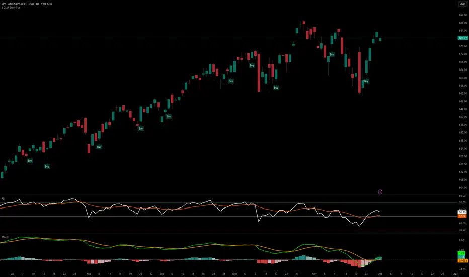
5 DMA Entry Plus5 DMA Entry Plus - Multi-Strategy Entry Signal Indicator
Overview:
The 5 DMA Entry Plus is a versatile entry signal indicator that combines multiple proven technical analysis methods to identify potential buy opportunities. This indicator is designed to be highly customizable, allowing traders to toggle between different entry strategies or combine them for confluence-based entries.
Key Features:
1. Multiple Entry Strategy Options:
Default Close Above Entry: Triggers when price closes above the 5-day moving average (with optional HMA filter)
Green Wick Candle Signal: Identifies bullish candles where the wick pierces above key moving averages, indicating rejection of lower prices
5DMA Zero/Upslope Entry: Generates signals when the 5DMA is flat or sloping upward, confirming momentum
HMA Cross Entry: Triggers when price crosses above the Hull Moving Average, a responsive momentum indicator
2. Adaptive HMA Filter:
Toggle the HMA (Hull Moving Average) filter on or off to adjust signal sensitivity. When enabled, price must be above both the 5DMA and 20 HMA for confirmation. When disabled, only the 5DMA is required, generating more frequent signals.
3. Smart Reset Logic:
The indicator includes intelligent reset functionality that prevents signal spam. Once an entry signal is generated, no new signals appear until price closes below the moving average(s), ensuring clean, actionable entries without clutter.
4. Visual Components:
5-Day Moving Average (Blue Line): The primary trend reference
20-Period Hull Moving Average (Orange Line): Fast-responding momentum filter
Buy Signals (Green Labels): Clear "Buy" labels appear below candles when entry conditions are met
Built-in Alerts: Set up custom alerts to be notified when entry signals trigger
Customizable Inputs:
Use HMA Filter: Enable/disable the 20 HMA confirmation requirement
Include Green Wick Candle Signal: Toggle wick-based entry detection
Use 5DMA Zero/Upslope Entry: Enable slope-based entry logic
Use HMA Cross Entry: Enable HMA crossover signals
HMA Length: Adjust the Hull Moving Average period (default: 20)
Best Use Cases:
Swing trading on daily and 4-hour timeframes
Identifying pullback entries in uptrends
Combining multiple confirmation signals for high-probability setups
Filtering entries in momentum-based strategies
Strategy Flexibility:
This indicator allows you to use each entry method independently or combine multiple methods for confluence. Test different combinations to find what works best for your trading style and the instruments you trade.
Risk Management Note:
This indicator identifies potential entry points but does not provide exit signals or stop-loss levels. Always use proper risk management and combine with your own exit strategy.
QQQ Quant Power STRATEGY v13.3 (Ribbon + TQQQ Specs)1. The Quant Engine (Data Processing)
Weighted Scoring: It assigns specific weights to stocks (e.g., NVDA gets 8.5% weight, TXN gets 1.0%).
Z-Score Pressure: It calculates how "unusual" the current buying/selling pressure is compared to the average (Standard Deviation).
Alignment Bonus: It boosts the "Conviction Score" if Mega Caps (Top 8) and Large Caps (Next 12) are moving in the same direction.
2. The Dashboard (Mission Control)
The dashboard gives you an X-Ray view of the market:
Main Status: Tells you if the market is BULLISH, BEARISH, or CHOP (Sit Out).
Conviction %: A probability score (0-99%). Higher = Safer trade.
Breadth: Counts how many of the top 20 stocks are above their EMA.
Chop Logic: If Breadth is mixed (between 6 and 14 stocks above EMA), it declares "CHOP" and blocks trades.
Mega/Large Net: Shows the net buying/selling pressure for each group.
3. Visuals
Pressure Line: The line on the chart isn't just a Moving Average; it's the Net Pressure of the 20 stocks pushing price up or down.
Conviction Ribbon: The squares at the bottom of the screen.
🟩 Green: High Probability Long (>77%).
🟥 Red: High Probability Short (>77%).
⬜ Gray: Low Conviction / Holding.
4. Strategy Logic (Automated Trading)
Entry: Enters when the "Basket" of stocks is aligned (Bull/Bear Pressure) AND the Conviction Score is high (>77%).
Exit: Closes the trade if Conviction drops (Signal fades) or hits a Hard Stop Loss.
Time Filters: Includes strict trading windows (e.g., No trading during lunch 12-1pm, closes all positions on Friday).
Summary
This is a Market Breadth & Momentum Strategy. It assumes that QQQ cannot sustain a trend unless its underlying components (NVDA, AAPL, etc.) are pushing it. It filters out "fake moves" where QQQ moves but the components don't support it.

REMS - Deep SynergyThis is a more flexible version of the REMS Synergy indicator. Like other indicators in the REMS family, it builds upon the foundations assessing the relationships between RSI, EMAs, MACDs, and Stochastic RSI across multiple timeframes. Designed to help traders identify less frequent, but high probability entries across 2 time frames. Uses 3 levels of confluence indicators for both long and short moves.
Features 3 levels of confluence across 2 timeframes. All 3 levels allow filtering of any combination of REMS filters. Features more options and customization than previous REMS Synergy.
Includes VWAP and 4 EMAs as optional visual representations.
Includes 'Enhanced Candles' than can colour code candlesticks for better visual identification. (off by default)
Originally designed with 5 minute and 2 minute timeframes in mind, and pairs well with REMS First Strike and/or REMS Snap Shot indicators.
This version features no hard-coded inputs and allows for more freedom than previous version. With the added flexibility comes the ability for the indicator to be more easily stacked.

Trend Flip Exhaustion SignalsThis Pine Script is designed to generate buy and short trading signals based on a combination of technical indicators. It calculates fast and slow EMAs, RSI, a linear regression channel, and a simplified TTM squeeze histogram to measure momentum.
- Short signals trigger when price is above both EMAs, near the upper regression channel, momentum is weakening, volume is fading, and RSI is overbought.
- Buy signals trigger when price is below both EMAs, near the lower regression channel, momentum is strengthening, volume is surging, and RSI is oversold.
- Signals are displayed as labels anchored to price bars (with optional plotshape arrows for backup).
- The script also plots the EMAs and regression channel for visual context.
In short - it’s a trend‑following entry tool that highlights potential exhaustion points for shorts and potential reversals for buys, with clear on‑chart markers to guide decision‑making.

Simple GapsSimple gaps indicator that shows gap downs or gap up.
It contains two filter
atr filter
To filter out small gaps from bigger gaps.
This is an extra option and is best left false.
Session filter
To remove gaps from lower time frames (outside of regular hours).

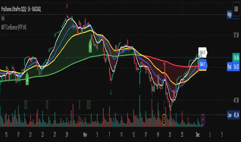
Multi-Factor Trend Confluence Indicator (PTP V4)Disclaimer: This is a technical analysis tool for educational and informational purposes only. It does not constitute investment advice, financial solicitation, or a recommendation to buy or sell any security or instrument. Trading involves significant risk, and past performance is not indicative of future results. Use at your own risk.
KEY Features and Strategic Methodology
This is a comprehensive trend and confluence indicator built on multiple factors to identify potential pullbacks within an established trend.
• Core Trend Filter: Uses a long-term EMA to confirm the overall market bias.
• Fibonacci Pullback Logic: Identifies potential low-risk entry zones by calculating a 61.8% Fibonacci Retracement over a user-defined lookback period.
• Multi-Factor Confluence: A signal is generated only when the price touches the Fib zone AND the following factors align (You can edit the script to adjust the confluence conditions.):
o RSI is above 50.
o Positive DI is above Negative DI (DMI Bullish Crossover).
o Price is above the fast EMA.
• Consecutive Signal Counter: Includes a unique counter that highlights bars where the confluence conditions have been met for a minimum number of consecutive candles (4 by default), aiding in the validation of strong momentum entries.
• Moving Average Visualization: Plots and color-fills 10 WMA, 21 EMA, 42 EMA, and 200 EMA to provide a full market context and visualize momentum shifts.
1. Short-Term Momentum (WMA10 vs. EMA42 Fill)
This fill area highlights immediate price acceleration and momentum shifts:
• Green Fill (Bullish Momentum): WMA10 > EMA42.
• Red Fill (Bearish Momentum): WMA10 < EMA42.
2. Long-Term Market Context (EMA200 vs. EMA42 Fill)
This fill area defines the dominant backdrop of the market, essential for strategic positioning:
• Green Fill (Bullish Context): EMA200 < EMA42.
• Red Fill (Bearish Context): EMA200 > EMA42.
EMA200 Line Coloration
The EMA200 line color itself also provides a visual cue for the long-term context:
• Red Line: When EMA200 > EMA42 (Bearish Context).
• Green Line: When EMA200 < EMA42 (Bullish Context).
Customization
The indicator is highly customizable via the settings menu, allowing users to adjust lengths for EMA, RSI, DMI, Pivot Points, and the specific parameters for the Fibonacci Retracement Strategy (tolerance and candle limits).