Time TradesThese indicators are part of the Time Trades service.
This script includes 2 timing indicators:
* Cheat Code displays green and purple timing periods
* Gann Waves displays yellow and blue vertical bars
Both indicators are based on natural cycles, and are visible into the future.
Visibility of both indicators is controlled via the Settings menu.
Cheat Code:
* Displays green periods and purple periods.
* Prices seem to trend more within a green period, both up and down.
* Often there’s major pivots around the middle of a green period, and about 3/4 through.
* Prices seem to chop more within a purple period with lots of volatility and reversals.
* Thin light grey lines appear at regular intervals that tend to align with local pivots.
* Thick grey lines appear around the middle of the green period that tens to align with major pivots
* You can use this information to vary your trading strategy to better match the expected price behavior.
Gann Waves
* Displays yellow and purple vertical bands that tend to align with local pivots.
* You can match this up with the symbol you’re analyzing to see what patterns tend to happen during similar periods.
* Sometimes stocks will make local highs for 3-4 yellow periods in a row, and then make a lower high. This would indicate a potential change in trend.
Cari dalam skrip untuk "gann"

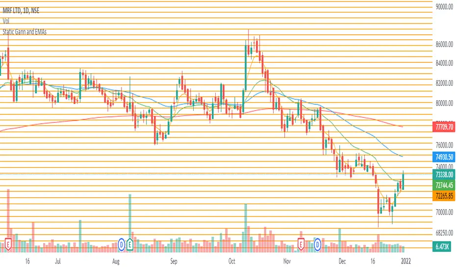
Static Gann and EMAsThis indicator gives static Gann levels for 45 degree and 225 degree. These are helpful for identifying support and resistance levels under Gann Square of 9 method. The static levels are marked out in orange and are updated till 32761 (I could not find levels beyond this to update in my script and I apologise for the same) but if someone can provide them, then I shall update them to levels beyond this.
Additionally, there are multiple EMAs to give extra information which are also helpful in identifying support and resistance levels. EMAs included are for the period of 5, 21, 50 and 200.
How to use:
Just select the indicator and enable the EMA(s) you wish to plot on the chart.
Noya Alpha - Mars Planetary LinesOne of W.D. Gann's most powerful planetary tools was the Gann Planetary Lines. These convert planetary angles to price in order to determine areas of support and resistance. Like many of W.D. Gann's other tools, these can be very very accurate with the right settings but requires user input and tuning to refine the lines to fit each individual asset's price action.
Inputs:
Radix : Default is 1. This represents the price/angle scale, adjust this in multiplies of 2 for best results. Negative and decimal values are supported and encouraged for use as well.
Angle Divisions (stdsplit) : The amount each major angle is split.
Number of Lines : Number of Plots to draw.
Featured are also crossovers for when the planet moves across each major area into a new constellation.
BB-Pivots-GANN-Levels-stockInshotHello everyone,
With help of open source WD gann codes, i combined this study with Bollinger band with entry & exit conditions.
For stock Selection you way chose fixed stock list .
These levels has been derived from daily WD GANN Astro Levels.
=== Rules ===
Long Entry Condition : Price must be above resistance line with Bollinger band blast will be the best entry . You may take the target with the help of this study.
Stop loss can be same candle low
Short Entry Condition : Price must be below support line with Bollinger band blast will be the best entry . You may take the target with the help of this study.
Stop loss can be same candle High
Please calculate the Risk Reward with the Future Target Price & Stop loss levels.
No Trading Zone Rules -
If price is in middle of support & Resistance .one way avoid such trades as it has been observed ,That most of the time stock goes sideways.
===Rules End ===
study has been kept open source for the understanding the concept.
Do your own Research with this study for better understanding with your trading style

SuTrading Gann Levels By NareshThis script is used to calculate the Gann square off 9 levels.
To Use this indicator Follow the below steps
1. open chart and add this indicator
2. at 9:35AM(IST) check the VWAP value of a stock and enter into scripts input then submit
3. scripts draws the recommended buy, sell and target levels on the chart by using Gann square off 9 algorithm.

Combo Strategy 123 Reversal & Gann Swing Oscillator This is combo strategies for get a cumulative signal.
First strategy
This System was created from the Book "How I Tripled My Money In The
Futures Market" by Ulf Jensen, Page 183. This is reverse type of strategies.
The strategy buys at market, if close price is higher than the previous close
during 2 days and the meaning of 9-days Stochastic Slow Oscillator is lower than 50.
The strategy sells at market, if close price is lower than the previous close price
during 2 days and the meaning of 9-days Stochastic Fast Oscillator is higher than 50.
Second strategy
The Gann Swing Oscillator has been adapted from Robert Krausz's book,
"A W.D. Gann Treasure Discovered". The Gann Swing Oscillator helps
define market swings.
WARNING:
- For purpose educate only
- This script to change bars colors.

Flexta TP Gann -(RM7-RM12) V1Flexta TP Gann - (RM7-RM12) V1
This indicator normally together with result generated from Flexta PVA Scanner.
It is a guideline to predict next target profit or stop loss price based on Flexta PVA trading rules.
Price Range from RM 7 to RM12.
How to Use :
1. Red line
- Very Strong Support/Resistance line
2. Blue Line
- Strong Support/Resistance line
3. Look back Days
- Set how many previous days to extend the gann line.
Flexta TP Gann -(RM2-RM7) V1Flexta TP Gann - (RM2-RM7) V1
This indicator used together with result generated from Flexta PVA Scanner.
It is a guideline to predict next target profit or stop loss price based on Flexta PVA trading rules.
Price Range from RM 2 to RM7.
How to Use :
1. Red line
- Very Strong Support/Resistance line
2. Blue Line
- Strong Support/Resistance line
3. Look back Days
- Set how many previous days to extend the gann line.

Flexta TP Gann -(RM0-RM2) V1Flexta TP Gann - (RM0-RM2) V1
This indicator used together with result generated from Flexta PVA Scanner.
It is a guideline to predict next target profit or stop loss price based on Flexta PVA trading rules.
Price Range from RM 0 to RM2.
How to Use :
1. Red line
- Very Strong Support/Resistance line
2. Blue Line
- Strong Support/Resistance line
3. Look back Days Input
- Set how many previous days to extend the gann line.

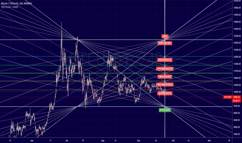
[RD] HLGO - GANN fibonacci (square/box, based on bars, h&l)==================================================================
Sept 24 - 2019 - HLGO - GANN V1
==================================================================
==================================================================
Description
==================================================================
Script to plot a gann related model (square / box ), try the different params.
Next version will be a time based version. Current version uses bars
(aka bar_index) so it can't plot beyond the last bar accept by extending
===================================================================
Version : v1 (notes
===================================================================
NaN
===================================================================
PLEASE -TIP- (we are trying to raise ₿100 to educate the wales)
===================================================================
BTC: 1C7sk3x8o2sX5eBV5HSz3KAgXJJ3FsF2Mo
ETH: 0xa14f3059EcDAE4aEe2E17826033E1D2C7e83233e
BNB: bnb1kwe3hqp4e8ch02ruhpclau4tvf0enzzh5tc2e3
Ichmoku + GannThe script combines Ichimoku Clouds with Gann levels. Kijunsen is used as basis of calculation of 4 Gann levels above and below it. By default Gann Leves at 360 degrees are plotted but one can choose the desired degrees separation.
Modified Gann HiLo ActivatorIntroduction
The gann hilo activator is a trend indicator developed by Robert Krausz published into W. D. Gann Treasure Discovered: Simple Trading Plans for Stocks & Commodities . This indicator crate a trailing stop aiming to show the direction of the trend.
This indicator is fairly easy to compute and dont require lot of skills to understand. First we calculate the simple moving average of both price high and price low, when the close price is higher than the moving average of the price high the indicator return the moving average of the price low, else the indicator return the moving average of the price high if the close price is lower than the moving average of the price low.
My indicator add a different calculation method in order to avoid whipsaw trades as well as adding significance to the moving average length. A Median method has been added to provide more robustness.
The Indicator
The indicator is a simple trailing stop aiming to show the direction of the trend. The indicator use a different source instead of the price high/low for its calculation. The first method is the "SMA" method which like the classic hilo indicator use a simple moving average for the calculation of the indicator.
Sma Method with length = 25
The "Median" use a moving median instead of a simple moving average, this provide more robustness.
Median Method with length = 25
The shape is less curved and the indicator can sometimes avoid whipsaw with high's length periods.
Mult Parameter
The mult parameter is a parameter set to be lower or equal to 1 and greater or equal to 0. High values allow the indicator to be far from the price thus avoiding whipsaw trades, lower ones lower the distance from the price. A mult parameter of 0.1 approximate the original hilo indicator.
In blue the indicator with mult = 0.1 and in radical red the original hilo activator.
Conclusion
The modifications allow more control over the indicator as well as adding more robustness while the original one is destined to fail when market price is more complex.
Thanks for reading :)
For any questions/suggestions feel free to pm me

Fibonacci Gann Support/Resistance (FGSR) Stochastic Cloud[cI8DH]This script shows Fib and Gann levels. It is basically reverse engineered stochastic. Default levels include golden ratios (0.618 and 0.382) and Gann ratios (0, 0.25, 0.5, 0.75, 1.0). There are two methods of calculating swings, one is based on time alone as in standard stochastic and another is partially time dependent. A comparison is shown in the chart below.
I found 0.42 and 0.58 are interesting retracement levels for BTC on long term swings as shown in the chart below.
Note that you should tune the length based on the instrument you are trading.
Here is a TL;DR list of my indicators to save you some time from looking at my obsolete indicators.

Bones1390's GANN Strategy AlertsThese are the alerts to go along with my GANN Strategy. You can find the strategy here:
If you like my stuff, leave me a comment below.
If you're feeling kind or want to show some appreciation, you can donate Bitcoin to this Address here:
3Jp9Kow1VxvzAiLLwCdeeQ2g11wKyaT4rC
Also if there's anything you want to talk about PM me! I'm free to speak about anything. Want a custom indicator? I can do my best to code it for you!
Thanks!
Bones

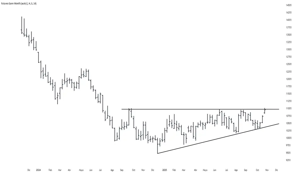
Futures Gann MonthBuilds a a continuous chart of the same month for a futures contract (e.g. ZSH2026).
This means such a chart consists of March '22, March '23, March '24, March '25, March '26...
The script goes back 20 years at most (depending on the current ticker selected in TradingView).
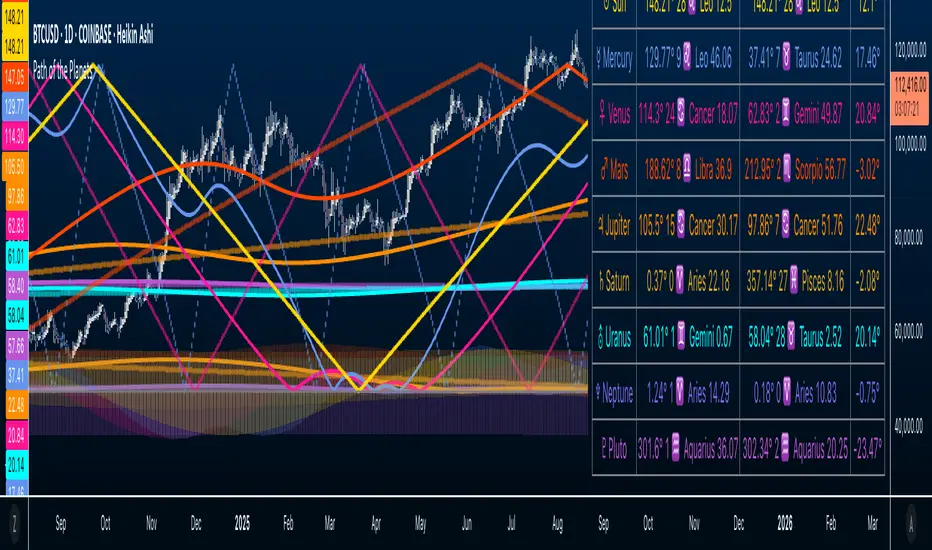
Path of the Planets🪐 Path of the Planets
Path of the Planets is an open-source Pine Script™ v6 indicator. It is inspired by W.D. Gann’s Path of Planets chart, specifically the Chart 5-9 artistic replica by Patrick Mikula "shown below". The script visualizes planetary positions so you can explore possible correlations with price. It overlays geocentric and heliocentric longitudes and declinations using the AstroLib library and includes an optional positions table that shows, at a glance, each body’s geocentric longitude, heliocentric longitude, and declination. This is an educational tool only and not trading advice.
Key Features
Start point: Choose a date and time to begin plotting so studies can align with market events.
Adjustments: Mirror longitudes and shift by 360° multiples to re-frame cycles.
Planets: Toggle geocentric and heliocentric longitudes and declinations for Sun, Mercury, Venus, Earth, Mars, Jupiter, Saturn, Uranus, Neptune, and Pluto. Moon declination is available.
Positions table: Optional color-coded table (bottom-right) with three columns labeled Geo, Helio, and Dec. Values show degrees with the zodiac sign for the longitudes and degrees for declinations.
Visualization: Solid lines for geocentric longitudes, circles for heliocentric longitudes, and columns for declinations. Includes a zero-declination reference line.
How It Works
Converts bar timestamps to Julian days via AstroLib.
Fetches positions with AstroLib types: geocentric (0), heliocentric (1), and declination (3).
Normalizes longitudes to the −180° to +180° range, applies optional mirroring and 360° shifts, and converts longitudes to zodiac sign labels for the table.
Plots and the table update only on and after the selected start time.
Usage Tips
Apply on daily or higher timeframes when studying broader cycles. For degrees, use the left scale.
Limitations at the moment: default latitude, longitude, and timezone are set to 0; aspects and retrogrades are not included; the focus is on raw paths.
License and Credits
Dependency: @BarefootJoey Astrolib
Contributions and observations are welcome.
Concentric Geometry – Invariant MetricsConcentric Geometry – Invariant Metrics
This indicator demonstrates the invariant concept of a concentric circle around a selected price range. By anchoring two points (A & B), it calculates a set of ratios and slopes that remain consistent under concentric scaling of price and time. These invariants include the raw slope (ΔP/N), concentric slope, π-adjusted ratios, and √2 offsets — all of which can be used to explore deeper geometric relationships in the market.
What has been demonstrated here is not an “out-of-the-box” trading system. Instead, the outputs provide the raw invariant metrics from which the trader must derive their own ratios and extensions. For example, price-to-bar ratio inputs are not fixed — they need to be derived from the invariants themselves, and experimenting with them is the key to uncovering harmonic alignments and scaling behaviors.
Key features include:
• Range & Bars Analysis – Price range (ΔP) and bar count (N) between anchors.
• Core Invariants – Midpoint, radius (price and bar units), upper/lower bounds.
• Linear Slope Metrics – ΔP/N and √2 concentric slope.
• π-Adjusted Price/Bar – Harmonic arc-length ratio.
• Circumference & Offsets – Circle circumference, √2 and 1/√2 offsets in price and bar units.
This tool is best suited for traders studying market geometry, W.D. Gann principles, harmonic ratios, or the geometric methods of Michael Jenkins. It does not generate buy/sell signals — instead, it equips the trader with building blocks for geometric exploration.
Key point: The trader must experiment with the ratios derived from these metrics. Playing with different price-to-bar relationships unlocks the true potential of concentric market geometry, whether applied to dynamic anchored VWAPs, concentric overlays, or Vesica Piscis structures.
Use it to:
• Compare slopes across swings
• Derive new ratios from invariant metrics
• Anchor dynamic anchored VWAPs to concentric nodes
• Explore concentric or Vesica Piscis overlays
• Support advanced geometric trading strategies

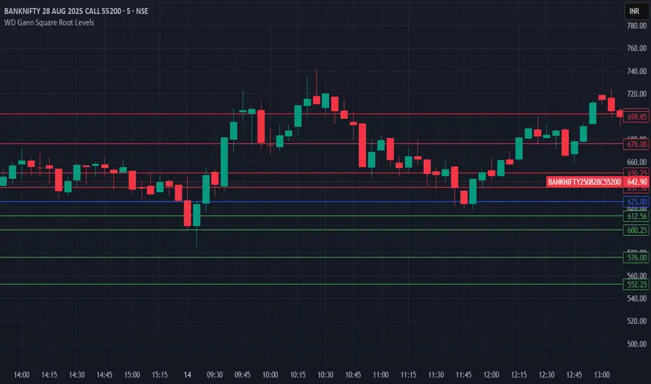
HTH - WD Gann Square Root LevelsHTH - WD Gann Square Root Levels will plot lines for support and resistance
Price to Bar Ratio - Scale / Scales / ScalingPrice to Bar Ratio - Scaling
The Price to Bar Ratio - Scaling indicator for TradingView is designed for traders who utilize Gann-based techniques, Michael Jenkins methodologies, or geometric market analysis. It calculates the relationship between price movement and time (bars), providing a bar-to-price ratio that traders can use to align their charts with structured scaling methods.
Key Features:
• Geometry-Based Scaling – Designed for traders using market geometry, time/price balancing, or cycle analysis.
• Automatic Ratio Calculation – Computes a bar-to-price ratio based on price movement and time.
• Square & Rectangle Modes – Provides different scaling approaches to suit various analytical methods.
• Balanced Chart Structure – Helps maintain a proportional relationship between price and time.
• Customizable Inputs – Adjustable parameters for flexibility across different markets, assets, and timeframes.
How to Use:
1. Apply the Price to Bar Ratio - Scaling indicator to your TradingView chart.
2. Enable Magnet Mode in TradingView to help anchor points snap accurately to price levels.
3. Manually select your range using the four anchor points to define the area for calculation.
4. The indicator will generate a table displaying the calculated bar-to-price ratio.
5. Copy the recommended value from the table.
6. Open the chart settings in TradingView.
7. Locate the "Lock Price to Bar Ratio" input field.
8. Paste the copied ratio value into the input field and apply the changes.
9. Due to TradingView's limitations on the magnet option for anchor points, it is recommended to add a new instance of the indicator rather than dragging the anchor points to a new range. This prevents unwanted snapping behavior and ensures accurate recalculations.
Will be adding more formulas in the future.
Indicator in use:

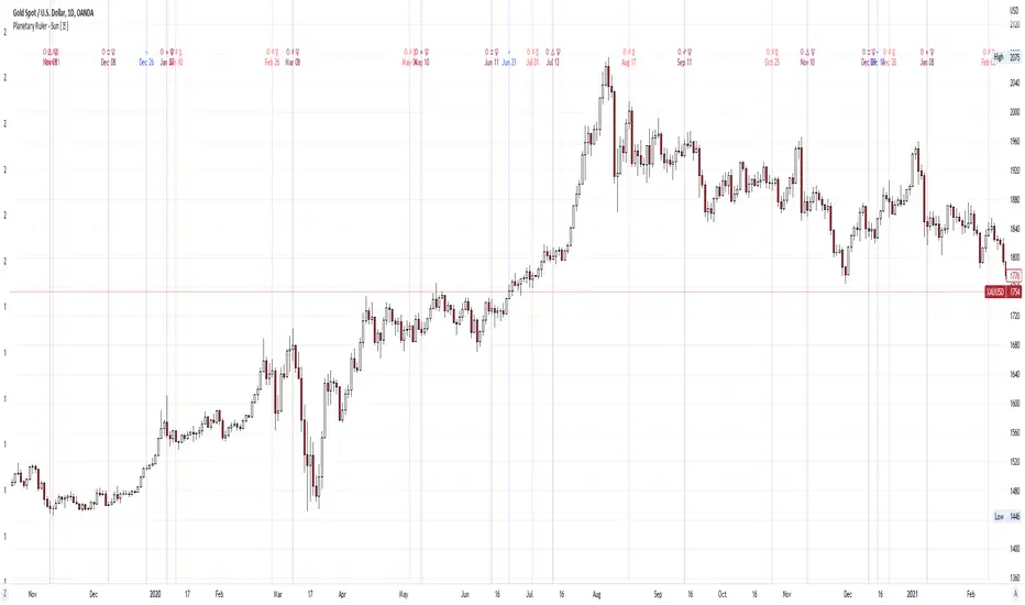
Planetary Ruler - Sun Hi Traders,
The objectives of this script are:
1. you can see the planetary schedule in certain periods (you can double check it in horoscopes.astro-seek.com)
2. you can see the correlation between planetary aspects and market reaction (is it turning or is it a swinghigh/ low? )
Those Dates are the planetary aspect happened (history & future), so when the planetary aspects arrived, we can forecast the turning or swinghigh/low in the market (cryptos, stocks, commoditties & indices)
in history we can observe what happened in stocks market if Sun Trine Saturn (example), if it made a turning or swinghigh/low,
and if the same planetary aspects happen again (in this case is Sun Trine Saturn), we can expect or forecast the turning or swinghigh/low will be happen again (history repeat itself).
Those lines are just a simply vertical lines that can help us backtesting easily, hopefully we can take profit from this planetary aspects..
Here is a glimpse of Financial Astrology..
FINANCIAL ASTROLOGY
Astrology is the study of the relationship between movements and interactions of the planets and human behaviour.
Financial Astrology is the study of the link between the movements and interactions of the planets with market behaviour
The alignment of planetary energy tends to provide a push or a force in one direction or another, can be positive or negative energies.
In financial astrology, each planet has a specific meaning.
Listed below is a general, simplified guide to how planets seem to affect current market movements, or what’s signified in a nation’s economy (after noting the aspects involved). In parentheses are the relevant industries to which each planetary energy belongs or ‘rules’.
Sun: Confidence, energy, often represents the business itself or its figurehead (Precious Metals speculation/stock market).
Mercury: Speed, movement and the principle of trading itself (telecommunications, the Media, publishing, travel and transport in general, footwear).
Venus: Small growth – traditionally the ‘minor benefic’ (clothing and fashion, the cosmetic industry, places of leisure/entertainment).
Mars: Energy, activity, speed, competition – traditionally the ‘minor malefic’ (sport, the military, weapons and armaments, steel).
Jupiter: Growth, expansion, high confidence (but also over-reaching ) success and speculation – traditionally the ‘Greater Benefic’ (‘Bull Markets’, banking, brokering, gambling institutions legal issues/law courts).consumer goods
Saturn: Stability, limits, downturns, pressure, low confidence, impediments, contraction – traditionally the ‘Greater Malefic’ (‘Bear Markets’, agriculture, construction, building and real estate).
Uranus: Change and volatility (the WorldWideWeb, inventions, digital technology, computing and innovation, the aeronautics industry; exploration/discovery, electricity, science and biotechnology).
Neptune: Uncertainty, often a negative for markets: unrealistic expectation (the advertising industry, fashion/glamour, shipping and maritime matters, tobacco/ alcohol, minerals, oil , medicine).
Pluto: Great power and its use, manipulation, drastic change – can represent Plutocracies, big business and monopolies (stocks and bonds, mining, nuclear industry, international crime and the Underworld).
This Planetary Aspects & Transits script (separately) only include:
1. Sun
2. Mercury
3. Venus
4. Mars
5. Jupiter
6. Saturn
7. Uranus
8. Neptune
9. Pluto
Aspects:
1. Conjuntion
2. Sextile
3. Square
4. Trine
5. Opposition
you can combine using 1 or more planets and aspects to get the best swinghigh/low or turning, due to time lag & time delay, +/- 1 day is stil valid for the turning or swinghigh/low
here are some examples of Planetary Ruler:
Planetary Ruler - Sun
DJI
XAUUSD
Planetary Ruler - Mercury
AAPL
FDX
Planetary Ruler - Venus
UA
PVH
Planetary Ruler - Mars
STLD
MT
Planetary Ruler - Jupiter
BTI
WMT
PG
Planetary Ruler - Saturn
FMC
MLM
Planetary Ruler - Uranus
NEE
VST
Planetary Ruler - Neptune
MDT
HUN
Planetary Ruler - Pluto
NIFTY50
BBCA
PS:
when you subscribe, you will get:
1. Planetary Aspects & Transits (9 Planets)
2. Retrogrades
3. Moon Phase, Moon Eclipse & 4 seasons
4. Easy Aspects (Trine & Sextile)
5. Hard Aspects (Opposition, Square & Conjuntion)
6. Gann Seasoanal Dates
7. Sun Ingress Zodiac
9. The symbols & dates will keep updated in the future
MTF EMA with Gann square of nineThis indicator can display Exponential Moving Average 200 (last point) at different timeframe simultaneously.
The default timeframe of EMA200 is 5min, 15min, 30min, 1H, 2H, 4H, 1D and 1W.
In addition, this script come with Gann square of nine nearest level.

Sun Ingress ZodiacHi Traders,
Astrological signs of the tropical zodiac remain fixed relative to seasonal markers, such as the equinox and solstice points on the sky’s dome.
The zodiac used for the calculations does not correspond to the astronomical zodiac, but to 12 zones of 30 degrees along the ecliptic, measured from the position of the Sun at the spring equinox. The ecliptic is the plane of the Earth’s orbit around the Sun.
This script allows you see how Sun Ingress Zodiac can affect the Crypto, Stock, Indices & Commodity market.
The objectives of this script are:
1. you can see the Zodiac schedules in certain periods (earthsky.org)
2. you can see the correlation between Sun Ingress Zodiac and market reaction (is it turning or is it a swing high/ low? )
Those Dates are the Zodiac schedule (history & future), so when the Zodiac dates arrived, we can forecast the turning or swing high/low in the market (crypto, stocks, commodities & indices), the turning or swing high/low is +/- 1 day.
Those lines are just a simply vertical lines that can help us backtesting easily, hopefully we can take profit from this..
Here are some examples of the specific Zodiac affect:
Sun Ingress Aries
Sun Ingress Taurus
Sun Ingress Gemini
Sun Ingress Cancer
Sun Ingress Leo
Sun Ingress Virgo
Sun Ingress Libra
Sun Ingress Scorpio
Sun Ingress Sagittarius
Sun Ingress Capricorn
Sun Ingress Aquarius
Sun Ingress Pisces
PS:
when you subscribe, you will get:
1. Planetary Aspects & Transits (9 Planetary Ruler)
2. Retrogrades
3. Moon Phase, Moon Eclipse & 4 seasons
4. Easy Aspects (Trine & Sextile)
5. Hard Aspects (Opposition, Square & Conjunction)
6. Gann Seasonal Dates
7. Sun Ingress Zodiac

NhaDuHanhFX - Gann SwingsThe swings indicator follows the smallest movements of price action. Can monitor and analyze the context of the market, trying to find bias of each timeframe.
If there is a candlestick completely above the previous swinghigh. It shows a good bullish momentum. The market is favoring the upward direction. If the candlestick is still in the previous swinghigh range, it shows a weak bullish momentum. The market is reluctant to go up.
If there is a candlestick completely below the previous swinglow. It presents a good bearish momentum. The market is favoring the downward direction. If the candlestick is still in the previous swinglow range, it shows a weak bearish momentum. The market is reluctant to go down.
