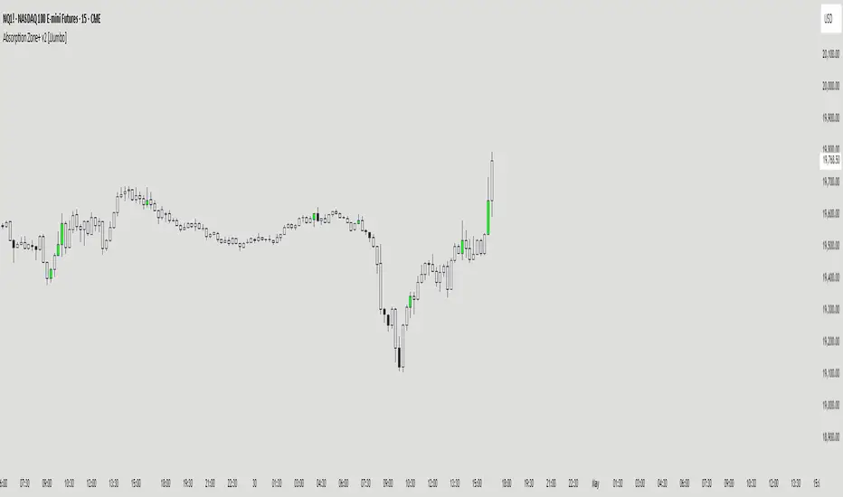
Absorption Zone+ v2 [JJumbo]Introduction
The Absorption Zone+ indicator identifies potential reversal zones by detecting high-volume absorption candles in the market where opposing orders get absorbed at key levels by the opposing party.
This script idea comes from orderflow trading, recreating what absorption would look like, it re-creates absorption based on the volumes of that specific candle or area (multiple candles), useful when trading reversals helping you identifying where influx of volume is coming in, combined with key levels it will help you understand whether a reversal is about to happen or continuation is expected during expansions.
An additional feature of Imbalances on the absorption candles is present, highlighting fair value gaps withing the absorption candles, with multi-timeframe plotting. This script is also applicable on all time frames.
This indicator is particularly valuable for traders focusing on order flow and institutional activity. Absorption candles often represent periods where smart money is actively accumulating or distributing positions while maintaining a tight price range, potentially signaling upcoming directional moves.
Key features
Bullish/Bearish candles color coding identifier:
The color coding for bullish/bearish candles help traders visualize where it is a bullish or bearish absorption identifying these zones at reversals or continuations.
Volume threshold and absorption isolation inputs:
This features let you set a threshold of the volume and percentage body to wick to set your preferred highlighting, and shading all non-absorption candles helping you identify only the absorptions present.
Absorption imbalances:
Imbalances (FVGs) bearish and bullish are shown on different time-frames, helping traders identify turnover areas or support and resistance within the absorptions, the imbalances also have a custom user defined time-frame selection to choose from and show on any time frame.
Additional inputs:
User Guidance
Custom Appearance: Adjust the style and colors of the imbalances for both bullish and bearish candles, this helps trader distinguish one from the other having a better understanding.
Custom time-frame imbalances: Choose your favorite time-frame to display its imbalances in any time-frame, helping trader visualize higher or lower time frame imbalances.
Absorption candles isolation: Isolation of the absorption candles to better identify the zones and specific candles where absorption is present.
Volume multiplier and threshold: Adjust the inputs of the absorption calculation thresholds to better taylor the volumes based on market volatility.
Conclusion
This tool is a great addition in the arsenal for the traders, whether you are a reversal trader or a continuation trader, this tool allows you to identify important areas of big amount of participants in specific candles and mixing it with fair value gap theory from The Inner Circle Trader it gives an additional factor of precision
Terms & Conditions
Our charting tools are products provided for informational and educational purposes only and do not constitute financial, investment, or trading advice. Our charting tools are not designed to predict market movements or provide specific recommendations. Users should be aware that past performance is not indicative of future results and should not be relied upon for making financial decisions. By using our charting tools, the purchaser agrees that the seller and the creator are not responsible for any decisions made based on the information provided by these charting tools. The purchaser assumes full responsibility and liability for any actions taken and the consequences thereof, including any loss of money or investments that may occur as a result of using these products. Hence, by purchasing these charting tools, the customer accepts and acknowledges that the seller and the creator are not liable nor responsible for any unwanted outcome that arises from the development, the sale, or the use of these products. We hold no reimbursement, refund, or chargeback policy. Once these Terms and Conditions are accepted by the Customer, before purchase, no reimbursements, refunds or chargebacks will be provided under any circumstances.
By continuing to use these charting tools, the user acknowledges and agrees to the Terms and Conditions outlined in this legal disclaimer.
Cari dalam skrip untuk "imbalance"
Volumatic Fair Value Gaps [BigBeluga]🔵 OVERVIEW
The Volumatic Fair Value Gaps indicator detects and plots size-filtered Fair Value Gaps (FVGs) and immediately analyzes the bullish vs. bearish volume composition inside each gap. When an FVG forms, the tool samples volume from a 10× lower timeframe , splits it into Buy and Sell components, and overlays two compact bars whose percentages always sum to 100%. Each gap also shows its total traded volume . A live dashboard (top-right) summarizes how many bullish and bearish FVGs are currently active and their cumulative volumes—offering a quick read on directional participation and trend pressure.
🔵 CONCEPTS
FVGs (Fair Value Gaps) : Imbalance zones between three consecutive candles where price “skips” trading. The script plots bullish and bearish gaps and extends them until mitigated.
Size Filtering : Only significant gaps (by relative size percentile) are drawn, reducing noise and emphasizing meaningful imbalances.
// Gap Filters
float diff = close > open ? (low - high ) / low * 100 : (low - high) / high *100
float sizeFVG = diff / ta.percentile_nearest_rank(diff, 1000, 100) * 100
bool filterFVG = sizeFVG > 15
Volume Decomposition : For each FVG, the indicator inspects a 10× lower timeframe and aggregates volume of bullish vs. bearish candles inside the gap’s span.
100% Split Bars : Two inline bars per FVG display the % Bull and % Bear shares; their total is always 100%.
Total Gap Volume : A numeric label at the right edge of the FVG shows the total traded volume associated with that gap.
Mitigation Logic : Gaps are removed when price closes through (or touches via high/low—user-selectable) the opposite boundary.
Dashboard Summary : Counts and sums the active bullish/bearish FVGs and their total volumes to gauge directional dominance.
🔵 FEATURES
Bullish & Bearish FVG plotting with independent color controls and visibility toggles.
Adaptive size filter (percentile-based) to keep only impactful gaps.
Lower-TF volume sampling at 10× faster resolution for more granular Buy/Sell breakdown.
Per-FVG volume bars : two horizontal bars showing Bull % and Bear % (sum = 100%).
Per-FVG total volume label displayed at the right end of the gap’s body.
Mitigation source option : choose close or high/low for removing/invalidating gaps.
Overlap control : older overlapped gaps are cleaned to avoid clutter.
Auto-extension : active gaps extend right until mitigated.
Dashboard : shows count of bullish/bearish gaps on chart and cumulative volume totals for each side.
Performance safeguards : caps the number of active FVG boxes to maintain responsiveness.
🔵 HOW TO USE
Turn on/off FVG types : Enable Bullish FVG and/or Bearish FVG depending on your focus.
Tune the filter : The script already filters by relative size; if you need fewer (stronger) signals, increase the percentile threshold in code or reduce the number of displayed boxes.
Choose mitigation source :
close — stricter; gap is removed when a closing price crosses the boundary.
high/low — more sensitive; a wick through the boundary mitigates the gap.
Read the per-FVG bars :
A higher Bull % inside a bullish gap suggests constructive demand backing the imbalance.
A higher Bear % inside a bearish gap suggests supply is enforcing the imbalance.
Use total gap volume : Larger totals imply more meaningful interest at that imbalance; confluence with structure/HTF levels increases relevance.
Watch the dashboard : If bullish counts and cumulative volume exceed bearish, market pressure is likely skewed upward (and vice versa). Combine with trend tools or market structure for entries/exits.
Optional: hide volume bars : Disable Volume Bars when you want a cleaner FVG map while keeping total volume labels and the dashboard.
🔵 CONCLUSION
Volumatic Fair Value Gaps blends precise FVG detection with lower-timeframe volume analytics to show not only where imbalances exist but also who powers them. The per-gap Bull/Bear % bars, total volume labels, and the cumulative dashboard together provide a fast, high-signal read on directional participation. Use the tool to prioritize higher-quality gaps, align with trend bias, and time mitigations or continuations with greater confidence.

BTC Future CME Cross-Market DetectorProject Spec: BTC CME Cross-Market Detector
1. Project Overview
Indicator Name
CME Cross-Market Detector
Objective
To identify high-probability trade setups by detecting and confirming "smart money" activity across two distinct market venues simultaneously: a primary crypto exchange (e.g., Bybit, Binance) and the institutional CME futures market.
Core Philosophy
Price movements are often preceded by the positioning of large, institutional players ("smart money"). While their activity can be seen on any single exchange, the signal becomes exceptionally reliable when the same footprint appears at the same time in both the broader crypto derivatives market and the highly regulated institutional futures market. This dual-market confirmation acts as a powerful noise filter, isolating signals that have a higher probability of follow-through.
2. Key Concepts & Signal Logic
The indicator's entire foundation rests on confirming that specific conditions are met on two datasets at the same time: (1) The user's current chart (e.g., BYBIT:BTCUSDT) and (2) The CME Bitcoin Futures chart (CME:BTC1!).
Smart Volume Analysis
To gauge buying vs. selling pressure, the total volume of a single candle is algorithmically split. This is not a perfect science but an effective estimation based on the candle's structure.
Buying Pressure is considered proportional to the distance the price closed from the low. Buying Pressure ≈ Total Volume × ((Close - Low) / (High - Low))
Selling Pressure is considered proportional to the distance the price closed from the high. Selling Pressure ≈ Total Volume × ((High - Close) / (High - Low))
Signal Trigger Conditions
For a potential signal to be identified on each market independently, two conditions must be met:
Volume Spike: The volume of the current candle must be significantly higher than the recent average volume (e.g., >150% of the 20-period moving average). This shows a sudden, high level of interest.
Pressure Imbalance: The estimated buying pressure must overwhelm the selling pressure by a certain factor (e.g., 3x), or vice versa for a sell signal. This indicates a clear directional intent.
The Final Confirmed Signal
A signal is only considered valid and plotted on the chart when the Signal Trigger Conditions (both Volume Spike and Pressure Imbalance) are met on both the primary chart and the CME chart on the very same candle.
3. Signal Strength Calculation
The percentage shown on the chart is a Signal Strength Score (0-100%), which rates the quality and conviction of the confirmed signal.
The score is calculated as follows:
Base Score Calculation (0-100 points): A base score is calculated for each market (primary and CME) by combining two factors:
Volume Component (0-50 pts): Measures the intensity of the volume spike. A 300% volume spike will score higher than a 150% spike.
Imbalance Component (0-50 pts): Measures the intensity of the buy/sell pressure ratio. A 5x imbalance will score higher than a 3x imbalance.
Advanced Modifiers (Bonus Points): The base score is then enhanced with bonus points for favorable conditions:
Trend Alignment (+10 pts): A buy signal that occurs during a clear uptrend receives extra points.
Candle Structure (+10 pts): A buy signal on a candle with a long lower wick (indicating rejection of lower prices) receives extra points.
Final Averaged Score: The final percentage you see is the average of the two individual strength scores calculated for the primary exchange and the CME market.
4. Visualization
Energy Waves: Signals are displayed as circles. Green for Buy Signals (below the candle) and Red for Sell Signals (above the candle).
Dynamic Sizing: The size of the circle directly reflects the Signal Strength Score, categorized into four distinct levels (e.g., 10%+, 40%+, 60%+, and 80%+) for at-a-glance interpretation.
Percentage Labels: Each signal is plotted with its precise, final strength score for clear analysis.
5. Summary: Steps to Replicate the Logic
To recreate this indicator, follow these high-level steps for each candle on the chart:
Gather Data: Fetch the Open, High, Low, Close, and Volume data for the primary chart asset AND for the corresponding CME Bitcoin Futures symbol (CME:BTC1!).
Calculate Buy/Sell Pressure: For both datasets, use the "Smart Volume Analysis" formula to estimate the buying and selling pressure for the current candle.
Check for Volume Spikes: For both datasets, calculate a simple moving average of the volume. Check if the current candle's volume exceeds this average by a set threshold (e.g., 150%).
Check for Pressure Imbalance: For both datasets, check if the buying pressure is greater than the selling pressure by a set multiplier (e.g., 3.0), or vice versa.
Confirm the Signal: A final signal is only valid if the conditions from both Step 3 and Step 4 are true for both datasets on the same candle.
Calculate Strength: If a signal is confirmed, compute a strength score (0-100) for each dataset based on the intensity of the volume spike and pressure imbalance. Add bonus points for confluence factors like trend alignment.
Finalize and Plot: Average the two strength scores from each market. Plot a colored, sized circle on the chart that visually represents this final averaged score, and display the score as a text label.
Last but not least, the idea of the indicator is inspired by 52SIGNAL

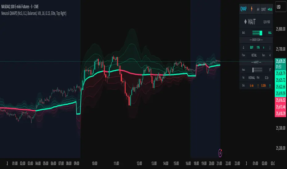
Nexural QWAPQWAP - Quantitative Weighted Average Price with True Order Flow Analysis
INTRODUCTION
This is legit one of the best indicators I can possibly make. Since I don't have access to tick data on tradingview I can't claim it's as accurate as possible but it is a very polished indicator for VWAP based trading and the bands are VERY useful for mean reverting trading.
QWAP Elite is an advanced Volume Weighted Average Price indicator that incorporates true order flow analysis through intrabar data decomposition. Unlike traditional VWAP indicators that simply calculate price multiplied by volume divided by total volume, this indicator attempts to identify the directional intent behind that volume by analyzing whether buying or selling pressure dominated each bar at a granular level.
The fundamental premise of this indicator is that not all volume is created equal. A bar with 10000 contracts where 8000 were aggressive buyers tells a very different story than a bar with 10000 contracts where 8000 were aggressive sellers, even if both bars close at the same price. Traditional VWAP treats these identically. QWAP attempts to weight the VWAP calculation based on this directional flow information.
This indicator was designed for traders who believe that institutional order flow leaves detectable footprints in price and volume data, and that identifying these footprints can provide an edge in determining likely future price direction. It is not a holy grail and it is not a replacement for proper risk management and trading discipline.
HOW THE INDICATOR WORKS
The True CVD Engine
The core of this indicator is its Cumulative Volume Delta calculation. Most indicators on TradingView approximate buying and selling volume by looking at whether a bar closed higher or lower than it opened. If the bar closed green, they assign all volume as buying volume. If it closed red, they assign all volume as selling volume. This is a crude approximation that misses significant nuance.
QWAP Elite uses the request security lower tf function to pull actual intrabar data. This means if you are on a 5 minute chart, the indicator is looking at the individual ticks or smaller timeframe bars that occurred within that 5 minute period. It then calculates how much volume occurred on up moves versus down moves within that bar, giving a much more accurate picture of whether buyers or sellers were more aggressive.
The Delta Ratio is calculated as the net delta divided by total volume, resulting in a value between negative one and positive one. A value of positive 0.6 means that 80 percent of volume was buying and 20 percent was selling. A value of negative 0.4 means that 70 percent was selling and 30 percent was buying. This ratio is then used to weight the VWAP calculation.
The intrabar precision is displayed in the dashboard as the number of bars analyzed. More bars means more granular data and theoretically more accurate delta calculation. The indicator automatically selects an appropriate lower timeframe based on your chart timeframe to balance accuracy with computational performance.
VIX Integration and Volatility Intelligence
The indicator pulls live VIX data and uses it to adjust its calculations dynamically. The VIX or CBOE Volatility Index represents the market expectation of 30 day forward looking volatility derived from SP500 option prices. When VIX is elevated, markets behave differently than when VIX is compressed.
Specifically, the indicator uses VIX to adjust the standard deviation bands around VWAP. In high volatility environments where VIX is above 25 or 30, the bands automatically widen to account for larger price swings. In low volatility environments where VIX is below 15, the bands tighten. This prevents false signals that would occur if static band widths were used across all market conditions.
The indicator also pulls VVIX which is the volatility of the VIX itself and VIX9D which is the 9 day VIX. By comparing VIX to VIX9D, the indicator can identify term structure conditions. When short term VIX is higher than longer term VIX, this is called backwardation and often indicates fear or stress in the market. When short term VIX is lower, this is contango and indicates complacency.
The VIX regime classification in the dashboard shows CALM when VIX is below 12, NORMAL between 12 and 20, ELEVATED between 20 and 30, and FEAR when above 30. Each regime suggests different trading approaches and position sizing considerations.
DETECTION SYSTEMS
Absorption Detection
Absorption occurs when large volume enters the market but price barely moves. This happens when one side is absorbing all the aggression from the other side. For example, if aggressive sellers are hitting the bid repeatedly but price is not dropping, it suggests there is a large buyer absorbing all that selling pressure. This often precedes reversals.
The indicator detects absorption by looking for bars with above average volume, below average range, and high wick ratios. A high wick ratio means the bar has long wicks relative to its body, indicating price moved but was pushed back. When these conditions coincide with strong delta in one direction, it suggests institutional absorption.
Liquidity Sweep Detection
Liquidity sweeps, also known as stop hunts, occur when price briefly exceeds a recent high or low to trigger stop losses, then reverses. Large traders need liquidity to fill their orders, and stops clustered above swing highs or below swing lows represent pools of liquidity they can tap into.
The indicator identifies sweeps by detecting when price exceeds the 5 or 20 bar high or low but closes back inside. A bull trap is identified when price sweeps above recent highs but closes below them, suggesting sellers trapped buyers who bought the breakout. A bear trap is the opposite, where price sweeps lows but closes above, trapping shorts.
Sweep detection is most useful when combined with delta analysis. A sweep with strong opposing delta, meaning price swept highs but delta was heavily negative, is a higher probability reversal signal than a sweep alone.
CVD Divergence Detection
Divergence between price and cumulative delta is one of the most reliable signals the indicator produces. When price is making higher highs but cumulative delta is making lower highs, it suggests that buying pressure is weakening even though price is still rising. This bearish divergence often precedes pullbacks or reversals.
Conversely, bullish divergence occurs when price makes lower lows but cumulative delta makes higher lows. This suggests that even though price is dropping, buying pressure is actually increasing, and sellers may be exhausted. These divergences are calculated over a 5 bar lookback period.
Stacked Imbalance Detection
Stacked imbalances occur when there are three or more consecutive bars with strong delta in the same direction. This represents sustained aggressive positioning by one side of the market. Three consecutive bars with delta above 0.5 suggests aggressive institutional buying. Three consecutive bars below negative 0.5 suggests aggressive institutional selling.
The count of consecutive imbalanced bars is displayed in the detection section. Four or more stacked imbalances is considered highly significant. This pattern often precedes continuation moves in the direction of the imbalance, as it suggests a committed directional player has entered the market.
Institutional Flow Detection
The indicator attempts to identify institutional activity by looking for the convergence of multiple factors. Specifically, it requires strong delta above 0.5 or below negative 0.5, volume persistence across multiple bars meaning above average volume for at least 2 to 3 bars in a row, and delta persistence meaning delta in the same direction for multiple consecutive bars.
When these factors align, the dashboard displays INST BUY or INST SELL instead of RETAIL. This classification should be viewed as a probability estimate rather than a certainty. Retail traders can produce similar patterns, and institutions can hide their activity. The designation is meant to highlight periods where the characteristics of flow are consistent with larger players.
ADAPTIVE WEIGHT SYSTEM
The indicator includes an adaptive system that automatically adjusts how much weight the CVD analysis has on the VWAP calculation. In quiet, low volatility markets, the CVD weight is reduced because the signal to noise ratio is lower. In active, high volatility markets with clear directional flow, the weight is increased.
The adaptation considers multiple factors including VIX regime, delta clarity meaning how strong and consistent the delta readings are, volume persistence, and time of day session weighting. The current adaptive weight is displayed in the dashboard and typically ranges from 0.05 to 0.50.
The adaptation speed setting controls how quickly the weight responds to changing conditions. A higher speed means faster adaptation but potentially more noise. A lower speed means smoother adaptation but potentially slower response to regime changes.
SESSION AWARENESS
Not all trading hours are equal. The indicator applies different weights to different trading sessions based on typical liquidity and reliability patterns. The open drive, which covers 9 30 to 10 30 AM Eastern time, receives a 1.4x weight multiplier because this is typically the highest volume and most directionally significant period of the day.
Power hour from 3 00 to 4 00 PM Eastern receives a 1.3x multiplier as institutional traders often execute their daily positioning in this final hour. The lunch hour from 11 00 AM to 2 00 PM receives a 0.9x multiplier due to typically lower volume and more choppy price action. Premarket receives 0.7x and after hours receives 0.5x due to thin liquidity and unreliable signals.
The current session is displayed in the dashboard header. Traders should consider reducing position sizes and widening stops during lower weight sessions, particularly premarket and after hours where the indicator readings are less reliable.
COMPOSITE SCORES
Bias Score
The Bias Score ranges from negative 100 to positive 100 and represents the indicators overall directional lean. It synthesizes delta analysis, VWAP momentum, and multi-timeframe confluence into a single number. A score above 50 indicates strong bullish bias. A score below negative 50 indicates strong bearish bias. Scores between negative 20 and positive 20 are considered neutral.
The visual bias meter in the dashboard shows this score as a bar that leans left for bearish or right for bullish. This provides an at a glance summary of the indicators current directional reading without needing to interpret multiple individual metrics.
Setup Quality Score
The Setup Quality Score ranges from 0 to 100 and measures how many factors are aligning to support a potential trade. It awards points for strong delta readings, volume persistence, multi-timeframe confluence, detection events like absorption or divergence, and favorable session timing. A score above 60 suggests multiple factors are confirming. A score below 30 suggests the setup lacks confirmation.
This score is designed to help traders filter trades. Rather than acting on every signal, traders can set a minimum quality threshold. For example, only taking trades when quality is above 50 will filter out lower probability setups. Higher thresholds mean fewer trades but potentially higher win rates.
Heat Score
The Heat Score measures overall market activity intensity and ranges from 0 to 100. It combines volume heat meaning how elevated current volume is relative to average, volatility heat based on ATR expansion or VIX levels, delta heat meaning how strong the current delta reading is, and deviation heat meaning how far price is from VWAP.
Markets with heat above 75 are classified as EXTREME and typically represent high opportunity but also high risk environments. Heat between 50 and 75 is ACTIVE and represents good trading conditions. Heat between 25 and 50 is NORMAL. Heat below 25 is QUIET and suggests range bound conditions where mean reversion strategies may outperform trend following.
DASHBOARD GUIDE
Header Row
The header row displays QWAP with a lightning bolt icon, the current session abbreviation like OPEN or POWER or LUNCH, the current regime classification, and VIX status with a colored indicator. Green indicates low VIX and favorable conditions. Yellow indicates elevated VIX. Red indicates high VIX or that VIX data is unavailable.
Signal Row
The signal row is the largest and most prominent element. It displays the primary signal which will be LONG, SHORT, REVERSAL, or WAIT. LONG appears when bias is strongly bullish and quality is high. SHORT appears when bias is strongly bearish and quality is high. REVERSAL appears when divergence or absorption is detected at an extreme sigma level. WAIT appears when conditions do not meet the threshold for a signal.
Next to the signal is the quality score displayed as Q followed by a number out of 100. This helps traders quickly assess how confirmed the signal is. A LONG signal with Q 72 is more compelling than a LONG signal with Q 45.
Order Flow Section
The delta row shows the current delta direction as BUY or SELL, the percentage strength, a visual indicator of strength with filled or empty circles, and an arrow indicating whether delta is accelerating or decelerating. The flow row shows whether activity is classified as INST BUY, INST SELL, or RETAIL, along with the number of intrabar data points used in the calculation.
Market Section
The heat row displays the heat score as a visual bar and numeric value. The vol row shows volatility state as EXPAND, COMPRESS, or NORMAL along with relative volume. The dist row shows distance from VWAP in sigmas and percentage, plus momentum direction.
Detection Section
This section only appears when detections are active. It displays warning icons next to detection types like BUY ABS, SELL ABS, BULL TRAP, BEAR TRAP, BULL DIV, BEAR DIV, BUY STACK, or SELL STACK. Each detection includes a score representing its strength or significance.
HOW TO USE THIS INDICATOR
Recommended Workflow
First, check the regime and session. If VIX is in FEAR mode or you are in premarket or after hours, consider reduced position sizing or waiting for better conditions.
Second, look at the primary signal and quality score. Signals with quality below 40 are low conviction. Consider requiring quality above 50 or 60 before acting.
Third, check the bias meter for overall directional lean. Ensure it aligns with your intended trade direction.
Fourth, review active detections. Absorption and divergence near VWAP bands increase reversal probability. Stacked imbalances support continuation.
Fifth, use VWAP and sigma bands for entry, stop, and target placement. The bands provide natural support and resistance levels based on statistical distribution.
Sixth, monitor for changes in delta and flow classification. Institutional activity transitioning to retail or delta reversing direction are warning signs.
TRADE EXAMPLES
Mean Reversion Setup
Price extended to 2.5 sigma above VWAP. Signal shows REVERSAL. Quality is 55. Absorption detected with BUY ABS showing score of 2.3. Delta is showing SELL at 45 percent despite price being elevated. This suggests buyers are being absorbed and a pullback to VWAP is likely. Enter short with stop above the 3 sigma band and target at VWAP or 1 sigma band.
Trend Continuation Setup
Signal shows LONG with quality 68. Bias meter shows STRONG BULL. BUY STACK detected with 4 consecutive imbalanced bars. Flow shows INST BUY. Price has pulled back to VWAP and is finding support. Heat is at 62 indicating ACTIVE conditions. Enter long on VWAP touch with stop below 1 sigma band and target at 2 sigma band.
Liquidity Sweep Setup
BEAR TRAP detected with score of 1.8. Price swept below recent lows but closed back above. Delta is showing BUY at 52 percent on the sweep bar. BULL DIV also active as price made lower low but delta made higher low. Signal shows REVERSAL with quality 58. Enter long with stop below the sweep low and target at VWAP.
HONEST ASSESSMENT OF STRENGTHS AND WEAKNESSES
Strengths
True CVD calculation using intrabar data is significantly more accurate than close greater than open approximations used by most indicators. This provides genuine insight into buying versus selling pressure.
VIX integration with term structure analysis is institutional grade thinking applied to a retail tool. Dynamic band adjustment prevents false signals in different volatility regimes.
Multiple detection systems provide different perspectives on the same market. Absorption, sweeps, divergence, and imbalances each capture different footprints of institutional activity.
Composite scores synthesize complex information into actionable numbers. Traders do not need to mentally integrate 15 different metrics. The quality score and bias score do this automatically.
Session awareness prevents trading during low quality periods. The automatic weighting helps filter out noise from premarket, after hours, and lunch periods.
Adaptive system self adjusts to market conditions. Traders do not need to manually tune parameters as volatility and activity change.
Weaknesses and Limitations
Intrabar data is still an approximation of true tick level order flow. Without actual tick data showing individual trades hitting bid versus lifting offer, even this calculation has error bars. Professional platforms like Sierra Chart or Quantower with direct exchange feeds will always have more accurate delta.
The indicator is computationally heavy. Users may experience slower chart loading particularly on lower end hardware or when viewing many bars. The optimization features help but cannot eliminate this cost entirely.
Institutional detection is probabilistic not definitive. Retail traders in aggregate can produce patterns that look institutional. Institutions can and do hide their activity. The INST BUY and INST SELL labels should be viewed as probability shifts not certainties.
The indicator works best on liquid instruments with significant volume. On thinly traded stocks or during illiquid periods, delta calculations become noisy and unreliable. The indicator is optimized for ES, NQ, SPY, QQQ, and similar high volume instruments.
VIX integration only works for US equity index products. If trading forex, crypto, or other asset classes, the VIX data is not directly applicable and should be disabled.
No indicator can predict the future. Order flow analysis shows what happened and what is happening. It cannot guarantee what will happen next. Large players can and do reverse their positioning. News events can invalidate any technical setup instantly.
The complexity of the indicator means there is a learning curve. New users may be overwhelmed by the number of metrics displayed. It takes time to develop intuition for what combinations of readings are significant.
The indicator does not include automated backtesting or historical performance statistics. Users cannot easily quantify the win rate or expected value of following its signals without manual journaling and analysis.
RISK MANAGEMENT GUIDELINES
This indicator is a tool not a trading system. It provides information that may help inform trading decisions but it does not make those decisions for you. Proper risk management is essential regardless of how compelling the indicator readings appear.
Position Sizing
Never risk more than 1 to 2 percent of your account on any single trade regardless of how high the quality score is. High quality setups still fail regularly. A setup with 70 percent win rate still loses 30 percent of the time, and those losses can come in clusters.
Consider reducing position size when VIX is in ELEVATED or FEAR regime, when trading during premarket or after hours sessions, when quality score is below 50, and when multiple detection systems are conflicting with each other.
Stop Loss Placement
The sigma bands provide natural levels for stop placement. For mean reversion trades, stops should typically be placed beyond the next sigma level. For example, if entering short at 2 sigma, place stop beyond 3 sigma. For trend trades entering at VWAP, consider stops beyond 1 sigma in the opposite direction.
Stops should also respect market structure. If there is a recent swing high or low near your calculated stop level, extend the stop beyond that swing point. Placing stops at obvious levels invites stop hunting.
In high VIX environments, consider wider stops. The VIX band multiplier automatically widens the sigma bands, and your stops should reflect this increased volatility. A stop that works in a 15 VIX environment may be too tight when VIX is 30.
Taking Profits
The sigma bands also provide natural profit targets. For mean reversion trades, VWAP itself is often the first target with the opposite 1 sigma band as an extended target. For trend trades, each sigma band can serve as a scaling point.
Pay attention to delta and flow changes as price approaches targets. If delta is weakening or flow classification shifts from institutional to retail, consider taking profits early. Conversely, if delta is strengthening into the target, consider holding for extension.
When to Avoid Trading
Consider sitting out when the signal shows WAIT and quality is below 30. In these conditions, the indicator is essentially saying there is no clear edge. Trading anyway is gambling not trading.
Avoid trading during major news events. The indicator cannot account for sudden information shocks. Economic releases, Fed announcements, earnings reports, and geopolitical events can invalidate any technical setup instantly.
Consider avoiding the first and last 5 minutes of regular trading hours. These periods often have erratic price action and unreliable delta calculations due to order imbalances at open and close.
SETTINGS REFERENCE
Core Engine Settings
VWAP Source determines what price is used for the VWAP calculation. The default HLC3 uses the average of high, low, and close which provides a balanced representation. HL2 uses just high and low average. Close uses only the closing price. Most traders should leave this at HLC3.
True CVD Engine should remain enabled for accurate order flow analysis. Disabling it falls back to close greater than open estimation which is significantly less accurate. Only disable if you are experiencing performance issues.
CVD Impact controls how much the delta analysis affects the VWAP calculation. Higher values mean delta has more influence. The default 0.2 provides a balance. Increase toward 0.5 if you want delta to have stronger effect. Decrease toward 0.1 if you want something closer to traditional VWAP.
Detection Sensitivity offers three presets. Conservative produces fewer signals but higher confidence. Balanced is the default middle ground. Aggressive produces more signals but with more false positives. New users should start with Balanced and adjust based on experience.
VIX Settings
VIX Integration should be enabled when trading US equity index products like ES, NQ, SPY, or QQQ. Disable it when trading forex, crypto, commodities, or individual stocks where VIX is not directly applicable.
VIX Symbol allows selection between VIX for SP500 volatility, VXN for Nasdaq volatility, and RVX for Russell 2000 volatility. Choose the one most relevant to your trading instrument.
VIX Baseline sets the historical average VIX level used for normalization. The default 16 represents the long term average. If trading in a persistently higher or lower VIX environment, adjusting this can help calibrate the regime classifications.
Display Settings
Dashboard Style offers three options. Compact shows only the signal and bias meter for minimal screen footprint. Elite adds order flow and market sections for balanced information. Full adds VIX details, detections, and adaptive system information for complete visibility.
FREQUENTLY ASKED QUESTIONS
Why does the indicator sometimes show WAIT when there is an obvious trend
The signal system is designed to identify high probability entry points not to constantly indicate trend direction. A strong uptrend may show WAIT because price is extended from VWAP and a pullback is likely before continuation. The indicator is trying to prevent you from buying the top of an impulse move.
Why is my delta reading different from another order flow tool
Different platforms calculate delta differently. Some use tick data. Some use time based aggregation. Some use volume based aggregation. The timeframe being analyzed matters as well. QWAP uses intrabar data which is more accurate than close versus open approximations but less accurate than true tick data from professional platforms.
Can I use this indicator for scalping
The indicator can be used on lower timeframes but becomes less reliable. On 1 minute charts, the intrabar decomposition has fewer data points to work with. For scalping, consider using 3 to 5 minute charts as a minimum. Also note that the session weighting and detection systems are calibrated for swing and intraday trading, not ultra short term scalping.
Does this indicator repaint
The VWAP line and sigma bands can adjust slightly as intrabar data comes in during a live bar. Once a bar closes, those values are fixed. The signals and detections are calculated on closed bars and do not repaint. For live trading, wait for bar close confirmation before acting on signals.
What markets does this work best on
The indicator is optimized for high liquidity US equity index products including ES, NQ, SPY, QQQ, IWM, and DIA. It can work on other liquid instruments but the VIX integration should be disabled for non equity products. Avoid using on low volume stocks or illiquid markets where delta calculations will be noisy.
DISCLAIMER
This indicator is provided for educational and informational purposes only. It is not financial advice. Past performance of any trading methodology is not indicative of future results. Trading futures, options, and other derivatives involves substantial risk of loss and is not suitable for all investors.
The creator of this indicator makes no guarantees about its accuracy or profitability. All trading decisions are the sole responsibility of the user. Before trading with real money, thoroughly test any strategy in simulation and ensure you understand the risks involved.
Order flow analysis provides information about market microstructure but cannot predict future price movements with certainty. Markets are complex adaptive systems influenced by countless variables including news events, economic data, central bank policy, geopolitical developments, and collective human psychology. No indicator can fully capture this complexity.
Use this tool as one input among many in your trading process. Combine it with sound risk management, proper position sizing, and continuous education. The best traders are those who remain humble about what they do not know and disciplined about protecting their capital.
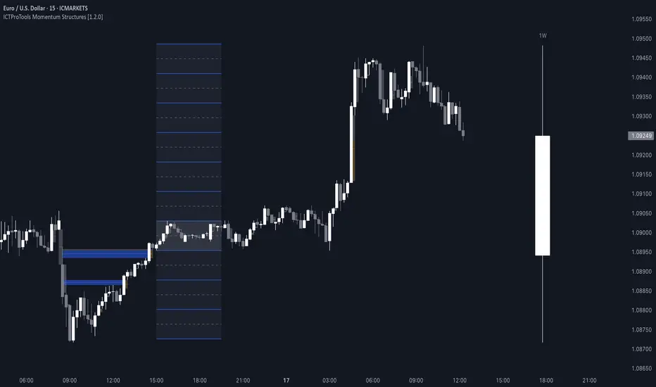
ICTProTools | ICT Insight - Momentum Structures🚀 INTRODUCTION
The Momentum Structures Indicator builds upon the principles of ICT (Inner Circle Trader) and Smart Money Concepts (SMC) to give traders a clearer view of market dynamics. These methods reveal how institutional trading activity shapes price movements, particularly through different types of market liquidity.
The indicator is designed to provide traders with advanced insights into market dynamics by focusing on key price imbalances and higher-timeframe structures . By combining these elements, the indicator allows users to analyze price behavior across multiple timeframes, helping them anticipate potential liquidity pools and price reversals. The emphasis on price imbalances and liquidity zones makes it a versatile tool for both intraday and longer-term strategies, providing critical insights for understanding market cycles and potential turning points.
💎 FEATURES
Imbalance Bar Colors / Zones
Imbalances are fundamental components of the ICT methodology, highlighting areas where price accelerates, creating gaps that may indicate a lack of liquidity . These voids often point to potential reversal or continuation zones in the price action.
An imbalance typically arises when supply and demand are out of balance, resulting in a gap between price levels. Traders keep a close eye on these gaps, as they could present opportunities to enter trades when the price revisits them , as they suggest a strong institutional interest.
We can notice two types of imbalances… A Fair Value Gap (FVG) usually forms from three consecutive candles, defining the space between the wicks of the first and last candle. Conversely, a Volume Imbalance (VI) occurs when a gap appears between the opening and closing prices of two consecutive candles. When these imbalances align with FVGs, they offer a well-rounded framework for assessing market strength.
By analyzing both FVGs and VIs together, traders can gain valuable insight into potential price movements and better evaluate the likelihood of continuation or reversal.
This chart illustrates the Fair Value Gaps (FVG) and Volume Imbalances (VI) within the GBPUSD price action. The FVG Bar Color and FVG Zone represent the same Fair Value Gaps, and similarly, the VI Bar Color and VI Zone display the same Volume Imbalances. They highlight areas where rapid price movements have created gaps in the market. These gaps indicate potential zones for trade entries or exits as the price may return to fill them. As we can see on the chart, the major part of imbalances created has already been filled. They constitute really interesting Point of Interest (POI).
The 50% FVG line marks the midpoint of the gap, which is often considered an important level for price action. A clear example appears in the Bearish FVG on the top left, where price first filled it below the midline, creating a small reaction. The price then liquidated this "fake mitigation" by moving just above the midline before beginning its significant downward movement. This demonstrates the crucial role of imbalances and how precisely price interacts with them.
Traders can use this information to identify potential buying or selling opportunities based on the interaction of price with these gaps and volume imbalances, aiding in the development of their trading strategies.
PO3 Candles (Power of Three)
The Power of Three is a critical concept in the ICT methodology that analyzes Higher Timeframe (HTF) candles focusing on the opening price, high wick, low wick, and closing price. This framework helps traders understand the current market cycle, in three phases , and its trading implications.
Accumulation Phase: In this initial phase, the price consolidates around the opening price as the market gathers liquidity. This often signals that larger players are positioning for the next move.
Manipulation Phase: Represented by the candle wicks, this phase indicates the extreme points where liquidity grabs often occur. Observing these wicks helps traders identify the end of the accumulation phase and potential turning points.
Distribution Phase: The candle body reflects a decisive price movement in one direction , following accumulation and manipulation. Traders align with the direction of this phase to capture the “real candle move”.
Our indicator provides you with the valuable capability to integrate the True Day Range, as defined by ICT. This concept, rooted in institutional logic, defines a trading day as starting at 00:00 New York time. You can customize it to match your trading style and analysis needs.
You can also overlay imbalances (FVG and VI) directly onto PO3 Candles, seamlessly combining imbalance detection with high-timeframe price action. This approach gives you a sharper market perspective, uncovering potential turning points with greater clarity.
In summary, PO3 Candles help traders assess the market structure and identify cycle positions on HTF candles, enabling them to make more strategic trading decisions, which allows for better entry and exit timing, avoiding traps, and seizing the best opportunities to capture significant market moves.
This chart illustrates the application of the Power of Three concept to EURUSD price action, highlighting key phases of market behavior.
In this example, we observe the Daily candles, where a significant Bullish imbalance appears from previous days, forming a Fair Value Gap (FVG). Additionally, there’s a small Volume Imbalance (VI) at the candle's opening, signaling liquidity that the price needs to fill.
Now, focusing on the Weekly candle, we can clearly identify its phases. First, there's an accumulation phase around the opening price, which, as shown by the Daily candles, took some time to develop. Then, the manipulation phase occurs, signaled by the upper wick of the Weekly candle, which liquidates the previously created accumulation. It’s time to look for a potential selling position... Finally, the price falls, beginning to form its bearish body and completing the real move of the week.
This framework allows traders to better understand the market structure and make informed decisions based on the current cycle.
Standard Deviation (STD)
The Standard Deviation (STD) is a concept within the ICT methodology that focuses on identifying periods of consolidation within the market. Specifically, it examines the Central Bank Dealers Range (CBDR) , which occurs between 13:00 and 23:00 New York time. During this period, the market often exhibits consolidation , creating an environment where price action stabilizes before making significant moves.
This consolidation forms the basis of the Standard Deviation (STD) concept. This is based on the idea that the volatility observed during this consolidation phase can be used to anticipate future market volatility. Once this consolidation is identified, the STD framework duplicates the established range both above and below the consolidation area.
As price approaches these duplicated levels, it offers traders critical information on where to anticipate potential reactions. If the price nears the upper boundary of the consolidation, it suggests a potential reversal point, indicating an opportunity to consider selling. Conversely, if the price approaches the lower boundary, it may signal an opportunity to look for buying positions . This duplication could enable traders to determine potential high and low points for the trading day or week for example.
Finally, the Standard Deviation (STD) concept provides a valuable framework for identifying potential key reaction points in the market by leveraging consolidation within the CBDR. By duplicating these ranges, traders can anticipate significant price movements and refine their strategies.
This chart illustrates the Standard Deviation (STD) concept applied to EURUSD price action. The highlighted areas in blue indicate high duplications and low duplications derived from the consolidation identified during the Central Bank Dealing Range (CBDR), marked by the dark gray rectangle.
The high duplications represent potential resistance levels, suggesting areas where the price may encounter selling pressure, while the low duplications signify potential support levels, indicating where buying interest could emerge.
The annotations emphasize how price reacts at these duplicated levels, showing the critical role of the STD in determining where price movements may stall or reverse. In this example, the price responded perfectly to both an upward and a downward duplication, confirming that these levels could represent the day's high and low, an observation validated here. This highlights the precision of price movements, with the price stopping exactly at the full duplication levels (but we can not that the price could also have paused at the midline levels, indicated by the dashed gray lines).
This visualization helps traders anticipate potential reactions and align their strategies with market dynamics, ensuring informed decision-making based on established price behavior.
✨ SETTINGS
Imbalance Bar Colors / Zones: Choose to display FVGs, VIs, or both, with customizable color settings. Choose to extend zones or set them to be removed when mitigated.
PO3 Candles: Customize the PO3 Candles for different timeframes (Daily, Weekly, Monthly), including the calculation Mode (Classic or True Day Range) and timezone associated, and set your body, border, and wick preferred colors. The Imbalance Bar Color and FVG Zones can also be displayed on these HTF candles, as they are configured in their settings.
STD: Select the timeframe on which to base it and configure the number of duplications and midline settings. You can also define the time range and timezone related to consolidation detection, giving you control over when and where the STD should apply.
🎯 CONCLUSION
The Momentum Structures Indicator combines the core principles of ICT and Smart Money Concepts to provide traders with advanced tools for understanding market dynamics. By focusing on key elements like imbalances and liquidity zones, it offers a comprehensive framework for analyzing price behavior. This indicator empowers traders to identify key market phases, anticipate potential reversals, and refine their entry and exit points with precision. While its features provide a valuable edge, it’s essential to remember that none should be used on its own and many more factors go into being a profitable trader.
Smart Money Setup 08 [TradingFinder] Binary Options Gold Scalper🔵 Introduction
In the Smart Money methodology, the market is understood as a structure driven by liquidity flow. This structure forms through the movement of large orders, the accumulation of liquidity, and the reactions that occur around key price zones. The logic of Smart Money is based on the idea that price movement is not random and usually evolves with the intention of collecting liquidity and creating price inefficiencies known as imbalances.
Within this framework, several important stages including the liquidity sweep, the formation of a point of interest, the appearance of an imbalance and the transition of market structure play major roles and collectively define the broader direction of price.
In many bullish scenarios, the market begins by sweeping sell side liquidity and targeting important lows in order to collect the liquidity resting below them. This liquidity collection often becomes the starting point for creating a point of interest which usually marks the area where Smart Money begins to enter the market.
After price moves away from this point, it breaks a structural high and forms a change of character. This shift marks a transition in the balance of power between buyers and sellers and is considered the first clear signal that the market structure is changing.
After the change of character, new institutional order flow often creates a strong and rapid movement that leaves behind an imbalance. This imbalance is one of the most important elements in Smart Money analysis because price tends to return to this area in order to complete structure and restore balance.
The return into the imbalance becomes meaningful when it occurs together with the liquidity sweep, the presence of a validated point of interest and a confirmed structural transition. These conditions frequently mark the beginning of powerful movements within the Smart Money cycle.
Understanding the sequence of liquidity, point of interest, imbalance, change of character and market structure builds the foundation of Smart Money analysis and provides a clear view of the true direction of institutional strength.
Bullish Setup :
Bearish Setup :
🔵 How to Use
To use this framework effectively, the trader must analyze the market through the principles of Smart Money and observe how liquidity drives price. A trade becomes valid only when several essential components appear together in a clear and consistent order.
These components include the liquidity sweep, the formation of a point of interest, the confirmation of a change of character, the transition of market structure and the return of price into an imbalance. The method is built on the understanding that the market first collects liquidity, then shifts order flow and finally provides an entry opportunity inside an inefficient area or inside a point of interest.
For this reason, the trader must follow the path of liquidity from the moment the sweep occurs, through the point of interest and the change of character and finally into the return of price toward the imbalance. When applied correctly, this approach creates entries that are more precise, more structural and more aligned with the real behavior of the market rather than with superficial signals.
🟣 Long Position
A bullish setup in Smart Money structure begins with a liquidity sweep on the sell side. The market first targets the areas where sell side liquidity is located and collects the stops and resting liquidity under previous lows. This collection is the condition that Smart Money requires to begin creating a new order flow. After this liquidity has been taken, a point of interest forms which is usually the last bearish candle or the effective demand zone that initiated the upward movement.
Price then moves away from the point of interest and breaks a structural high which creates a change of character. This event confirms that the market structure has moved from a bearish state to a bullish one and that buying pressure has taken control of the order flow. Following this shift, a strong upward movement often occurs and creates an imbalance between candles. This imbalance reflects the entrance of strong Smart Money orders and is seen as an important confirmation of bullish strength.
When price returns to this imbalance after the displacement, the market enters a phase where Smart Money aims to complete the corrective movement and continue the upward direction. The reaction inside the imbalance when combined with the liquidity sweep, the confirmed point of interest and the change of character completes the bullish setup and forms a structure that often leads to a continuation of the bullish trend.
🟣 Short Position
A bearish setup follows the same Smart Money logic but in the opposite direction. The market begins by collecting buy side liquidity and targets the highs where buy side liquidity and resting stops are located. This liquidity sweep on the buy side becomes the starting phase for Smart Money to initiate a downward order flow. After the liquidity is collected, a bearish point of interest forms which is usually the last bullish candle or the supply zone that created the initial drop.
Price then moves away from this point and breaks the first structural low. This creates a change of character to the downside which confirms that the market structure has transitioned from bullish to bearish and that selling pressure has gained control. After this shift, a strong downward displacement appears and leaves behind a bearish imbalance that clearly shows the dominance of sellers.
As price returns to this imbalance and corrects the inefficient movement, the bearish setup becomes complete as long as the market structure remains bearish. The combination of the buy side liquidity sweep, the bearish point of interest, the change of character, the imbalance and the corrective return creates the ideal structure that Smart Money uses to continue the downward movement and develop a reliable selling opportunity.
🔵 Settings
🟣 Logic Settings
Pivot Period : Defines how many bars are analyzed to identify swing highs and lows. Higher values detect larger, slower structures, while lower values respond to faster patterns. The default value of 5 offers a balanced sensitivity.
🟣 Alert Settings
Alert : Enables alerts for SMS08.
Message Frequency : Determines the frequency of alerts. Options include 'All' (every function call), 'Once Per Bar' (first call within the bar), and 'Once Per Bar Close' (final script execution of the real-time bar). Default is 'Once per Bar'.
Show Alert Time by Time Zone : Configures the time zone for alert messages. Default is 'UTC'.
🔵 Conclusion
The Smart Money approach demonstrates that price movement is not random or based on surface level patterns. Instead, it develops through a clear cycle of liquidity collection, structural transition and corrective movement toward key price zones. By recognizing events such as the liquidity sweep, the formation of the point of interest, the change of character and the return into the imbalance, the trader gains the ability to understand order flow more accurately and identify the true direction of market structure.
Both bullish and bearish setups show that the alignment of these elements creates a transparent view of institutional behavior and reveals the source of strong movements in the market. When the trader correctly identifies this sequence, entry points become more reliable and more aligned with liquidity flow. The combination of liquidity, structure and imbalance provides a consistent framework that removes guesswork and guides decisions through the real logic of the market.

Fractals + FVG [Combined]Звісно, ось варіант опису англійською, який можна використати для публікації індикатора в TradingView.
Description
This script combines two powerful and widely-used trading concepts into a single, comprehensive indicator: Bill Williams Fractals with dynamic support/resistance lines and Fair Value Gaps (FVG) based on the popular logic from LuxAlgo.
The goal is to provide a cleaner chart by merging two essential tools, allowing traders to analyze market structure and imbalances simultaneously.
Features
1. Williams Fractals with Invalidation Lines
This part of the indicator identifies classic Bill Williams fractals and enhances them with a unique visualization feature.
Fractal Detection: Automatically identifies both bullish (bottom) and bearish (top) fractals. You can choose between a 3-bar or 5-bar pattern in the settings.
Dynamic S/R Lines: A horizontal line is automatically drawn from every confirmed fractal, acting as a potential support or resistance level.
Automatic Invalidation: A line is considered "invalidated" or breached when the body of a candle closes past it. When this happens, the line stops extending, changes its color to the "invalidated" color, and remains on the chart as a historical reference. This provides a clear, objective signal that a level has been broken.
Customization: You can fully customize the colors for the support, resistance, and invalidated lines to match your chart theme.
2. Fair Value Gaps (FVG) / Imbalance
This module incorporates the robust FVG detection logic from LuxAlgo to automatically identify and display market imbalances.
FVG Detection: Highlights bullish and bearish Fair Value Gaps on the chart with colored boxes, representing inefficiencies in price delivery.
Automatic Mitigation: The FVG boxes are automatically removed from the chart once the price has "mitigated" or filled the gap, keeping your workspace clean and focused on active imbalances.
Multi-Timeframe (MTF): You can set the indicator to find and display FVGs from a higher timeframe directly on your current chart.
Dashboard: An optional on-screen dashboard provides a quick summary of the total count of bullish/bearish FVGs and the percentage that have been mitigated.
Full Customization: Control the colors of FVG boxes, extend their length, and configure other visual style settings.
How to Use
Fractal Lines: Use the active support and resistance lines as key levels for potential bounces or breaks. A line's invalidation can serve as confirmation of a shift in market structure.
FVG Zones: Fair Value Gaps often act as "magnets" for price. Use these zones as potential targets for your trades or as areas of interest for entries when price retraces to fill the imbalance.
Combined Strategy: The true power of this indicator comes from combining both concepts. For example, a bullish FVG forming near a key fractal support level can create a high-probability confluence zone for a long entry. Similarly, a break and invalidation of a fractal resistance line might signal that price is heading towards the next bearish FVG above.
This indicator is a tool for analysis and should be used in conjunction with your own trading strategy and risk management rules.
ICT First FVG - 9:30am & Custom (v4)ICT First FVG - 9:30am & Custom Time Ranges (v4)
📖 DESCRIPTION
This comprehensive Pine Script indicator identifies and displays Fair Value Gaps (FVGs), Volume Imbalances (VIs), and Liquidity Voids (LVs) based on Inner Circle Trading (ICT) concepts. The indicator offers dual functionality: traditional 9:30am New York session FVG detection and customizable time range analysis for maximum flexibility.
🚀 KEY FEATURES
Dual Detection System
9:30am NY Open FVG: Classic ICT first presentation detection after market open
Custom Time Range FVG: User-configurable time periods for specialized analysis
Independent Operations: Both systems work simultaneously without interference
Separate Controls: Each system has its own settings and previous days configuration
Advanced Gap Detection
Fair Value Gaps (FVG): Three-candle patterns showing price inefficiencies
Volume Imbalances (VI): Single candle volume-related gaps
Liquidity Voids (LV): Areas where price moved too fast, creating liquidity gaps
Consequent Encroachment (CE): Midpoint lines of detected inefficiencies
Precision Sizing System
Multi-Asset Support: Automatic point/pip calculation for Forex, Futures, and Indices
Forex Handling: Specialized pip calculation for major pairs and JPY crosses
Size Filtering: Minimum gap size filter to eliminate noise
Real-Time Display: Shows exact gap sizes in labels (e.g., "15.3 pips" or "12.7 pts")
Professional Visualization
Dual Display Modes: Choose between solid blocks or line representations
Color Coding: Different colors for current vs. previous day imbalances
Smart Labels: Configurable date, time, type, and size information
Extension Options: Extend gaps to session end or current bar
M1 Data Integration
High Accuracy: Uses 1-minute data regardless of chart timeframe
Better Detection: More precise gap identification on higher timeframes
Flexible Usage: Works on any timeframe ≤15 minutes
⚙️ CONFIGURATION GUIDE
General Settings
Visualization Type: Choose "Blocks" for filled areas or "Lines" for boundaries
Previous Days: Number of historical days to display (0 = today only)
Extend Imbalances: Project gaps to session end or current bar
Use M1 Data: Recommended ON for better accuracy
FVG Size Filter
Minimum FVG Size: Filter out gaps smaller than specified points
Enable Filter: Toggle size filtering on/off
🎯 RECOMMENDED MINIMUM SIZES:
USD/JPY: 0.01 points (1 pip)
Gold (XAUUSD): 1.6 points
NQ (Nasdaq-100): 0.2 points
Nasdaq CFD: 2.0 points
Other instruments: Experiment and discover optimal values
Custom FVG System
Enable Custom FVG: Activate secondary time range detection
Custom Time Range: Use session format (e.g., "1430-1600" for 2:30-4:00 PM)
Custom Previous Days: Independent historical period for custom ranges
Custom Label Color: Distinct color for custom time range gaps
Delete Default FVG 9:30: Use when running multiple instances with different timeframes
Imbalance Types
Fair Value Gaps: Main three-candle inefficiency patterns
Include Open/Close Gap: Additional gap calculation method
Volume Imbalances: Single-candle volume-based gaps
Liquidity Voids: Fast price movement gaps
C.E. (Consequent Encroachment): Midpoint reference lines
Label Customization
Show Labels: Toggle date/time information display
Include Time: Add timestamp to labels
Include Type: Display gap type (FVG, VI, LV)
Include Size: Show calculated gap size in points/pips
Position: Configure label placement (left/center/right, top/center/bottom)
Size & Color: Customize label appearance
Visual Styling
Colors: Separate colors for FVG, VI, LV types
Previous Day Colors: Distinct styling for historical gaps
Border Styles: Solid, dashed, or dotted borders
Line Widths: Configurable border thickness
📊 TECHNICAL SPECIFICATIONS
Supported Markets
Forex: All major and minor pairs with proper pip calculation
Futures: ES, NQ, YM, RTY, GC, SI, CL, etc.
Indices: SPX, NDX, DJI, and CFD versions
Stocks: Individual equities (adjust size filter accordingly)
Time Frame Compatibility
Recommended: 1m, 3m, 5m, 15m charts
Maximum: 15-minute timeframe
Optimal: 1m or 5m for best precision
Session Handling
Timezone: America/New_York (Eastern Time)
Default 9:30am: Standard NY market open detection
Custom Sessions: Any time range using HHMM-HHMM format
Weekend Filtering: Automatic exclusion of non-trading days
🔧 USAGE INSTRUCTIONS
Basic Setup
Add indicator to chart (≤15m timeframe recommended)
Enable "Use M1 Data" for accuracy
Set "Minimum FVG Size" based on instrument (see recommendations above)
Configure "Previous Days Imbalances" (5 is good default)
Custom Time Range Setup
Enable "Enable Custom FVG"
Set "Custom Time Range" (e.g., "1430-1600" for 2:30-4:00 PM ET)
Adjust "Custom Previous Days" as needed
Choose distinct "Custom Label Color" for easy identification
Multiple Instance Usage
Add indicator multiple times for different time ranges
Enable "Delete Default FVG 9:30" on additional instances
Use different custom time ranges for each instance
Assign unique colors to distinguish between instances
Label Optimization
Enable size display to see gap magnitude
Position labels to avoid chart clutter
Use appropriate label size for your screen resolution
Consider disabling time display on crowded charts
🎯 PRACTICAL APPLICATIONS
ICT Trading Concepts
First Presentation: Initial FVG after 9:30am NY open
Return to Gap: Price revisiting inefficiency areas
Mitigation Levels: Using FVG boundaries as support/resistance
Liquidity Hunting: Understanding where price seeks efficiency
Multi-Session Analysis
London Close: Set custom range for 1600-1601 London close gaps
Asian Session: Configure overnight inefficiencies
Power Hour: Analyze 1500-1600 ET gaps
Lunch Hour: Study 1200-1300 ET price behavior
Risk Management
Size-Based Filtering: Focus on significant gaps only
Historical Context: Compare current gaps to previous days
Confluence Trading: Combine with other ICT concepts
Session-Specific: Target gaps from specific market sessions
⚠️ IMPORTANT NOTES
Performance Considerations
Maximum Objects: Indicator creates multiple visual elements
Historical Limit: Adjust "Previous Days" to balance history vs. performance
Chart Refresh: Allow time for initial loading on historical data
Data Quality
Broker Dependency: Gap detection accuracy depends on data feed quality
Weekend Gaps: Sunday gaps may appear due to data provider differences
Fast Markets: Extremely volatile periods may create false gaps
Best Practices
Timeframe Consistency: Use same timeframe for analysis and execution
Size Calibration: Adjust minimum sizes based on instrument volatility
Session Awareness: Understand which sessions produce most relevant gaps
Confirmation: Use additional ICT concepts to confirm gap validity

[MAD] FVG with LTF-POC/TPOOverview
The Fair Value Gap (FVG) Detector is a precision tool designed to automatically identify, draw, and track market inefficiencies. These gaps, also known as imbalances, often act as powerful magnets for future price action.
This indicator handles the entire lifecycle of an FVG: from its creation and extension, to the moment it is first touched, and through its entire mitigation process. To add an even deeper layer of analysis, it can now optionally plot two types of micro-analysis lines for the middle candle of the FVG pattern: a volume-based Point of Control (LTF-POC) and a time-based Time Price Opportunity (LTF-TPO). These high-precision lines pinpoint the most significant price levels within the imbalance itself.
By providing a clean and objective visualization of these critical price zones, the FVG Detector gives traders a clear framework for spotting high-probability setups and understanding how the market returns to areas of inefficiency to become balanced once again.
█ How It Works
The indicator’s logic is built on precise detection, dynamic visualization, and intelligent state tracking to provide a comprehensive view of market imbalances.
⚪ The FVG Detection Engine
At its core, the indicator uses a classic three-candle pattern to identify FVGs. This mechanical definition removes all subjectivity:
Bullish FVG: A gap is identified when the high of the first candle is lower than the low of the third candle. The space between these two prices creates the bullish FVG.
Bearish FVG: A gap is identified when the low of the first candle is higher than the high of the third candle. The space between these two prices creates the bearish FVG.
⚪ Dynamic Drawing and Mitigation
Once an FVG is detected, the indicator automatically draws a colored box to represent the gap. This box is then managed through its entire lifecycle:
Extension: If enabled, the FVG box extends forward in time with each new candle, acting as a visible, forward-looking zone of interest.
Partial Mitigation Trigger: The moment price first "touches" the gap, the box changes color to signal that it is no longer a fresh, unmitigated zone. The statistics table counts this as a "Partially Mitigated" event.
Shrinking FVG: As price moves further into the gap, the colored box dynamically shrinks, providing a real-time visual of how much of the imbalance has been filled.
Historical Outline: An optional secondary outline box is drawn to preserve the FVG's original size. This outline stops extending when the FVG is first touched, leaving a permanent historical marker.
⚪ Optional LTF Analysis for Added Precision
The indicator can look "inside" the FVG's middle candle to find its most significant price levels.
LTF-POC (Volume-Based): Using data from a lower timeframe, it analyzes the volume profile of the FVG-creating candle to find the single price level from the lower-timeframe bar with the highest trading volume.
LTF-TPO (Time-Based): It also identifies the Time Price Opportunity by dividing the candle's price range into distinct "bins." The script counts how many lower-timeframe price ticks occurred in each bin, and the TPO line is drawn at the center of the busiest bin.
Visual Confluence: These are drawn as distinct horizontal lines (defaulting to orange for POC and yellow for TPO) that extend and are managed alongside the FVG's historical outline, serving as precise levels of interest within the broader FVG zone.
█ Why This Indicator is Different
While many traders can spot FVGs manually, this indicator offers a significant edge through the possibility of the lowertimeframe analysis and showing the syntetic TPO or POCs for the relevant candles.
⚪ Automated and Objective
The market moves fast, and manually drawing FVGs is impractical and prone to error. This tool automates the entire process.
Never Miss a Gap: The detector impartially scans every three-candle sequence, ensuring no FVG is missed.
No Subjectivity: The rules for detection, mitigation, and LTF analysis are based on fixed mathematical models, removing subjective judgment.
Multi-Timeframe Clarity: The indicator works flawlessly on any timeframe, allowing you to maintain a consistent view of market structure.
⚪ Visualizing Market Memory
This tool does more than just draw boxes; it tells a story. Watching a box change color and shrink provides a visual of market dynamics in action. The optional historical outlines and LTF analysis lines build a "map" on your chart, showing where significant reactions and high-liquidity zones occurred in the past, which provides invaluable context for future price movements.
█ How to Use
⚪ Identifying High-Probability Zones
The primary use of the FVG Detector is to identify high-probability zones where price may react.
Entries: Unmitigated (fresh) FVGs can serve as powerful entry zones. Traders may look for price to return to a bullish FVG to take a long position, or to a bearish FVG to take a short position.
Targets: An FVG in your path can also act as a logical profit target. For example, if you are in a long position, you might take profit as price fills a nearby bearish FVG above you.
⚪ Confluence and Confirmation
FVGs are most powerful when they align with other forms of technical analysis. Look for FVGs that have "confluence" with:
Market Structure: A bullish FVG found at a key support level or after a bullish break of structure is a higher-probability setup.
Order Blocks: An FVG that overlaps with a bullish or bearish order block creates a very potent point of interest.
Premium/Discount Zones: FVGs found deep in a premium (for shorts) or discount (for longs) area of a trading range often yield strong reactions.
The LTF Lines (POC & TPO): Use these lines as a source of internal confluence. While the FVG gives you a zone, the POC and TPO give you precise levels within that zone. The POC shows where the highest volume was traded, while the TPO shows where price spent the most time. Confluence between these two lines can signal an extremely strong level.
█ Settings
Max Number of FVGs to Display: Controls how many active FVGs are kept on the chart to prevent clutter and maintain performance.
Extend Unmitigated FVGs: When enabled, FVG boxes will extend to the right until price touches them.
Show Bullish/Bearish FVGs: Toggles the visibility of bullish or bearish FVGs.
Show FVG Labels: Toggles the visibility of the "FVG" text labels.
Keep Mitigated Outlines: If checked, the historical outline box (and its associated POC/TPO lines) will remain on the chart even after the FVG is completely filled.
Show Statistics: Toggles the visibility of the statistics table, which tracks total, partly mitigated, and fully mitigated FVGs.
Show LTF-TPO (Time-Based): Toggles the calculation and display of the Time Price Opportunity line.
Show LTF-POC (Volume-Based): Toggles the calculation and display of the Point of Control line.
Use Custom LTF for Analysis: Check this to manually select a timeframe for the POC/TPO calculation. If unchecked, the script auto-selects a lower timeframe.
Lower Timeframe: The specific lower timeframe to use when the "Custom LTF" box is checked.
Magnifier (Bars per Slice): Controls how the script auto-selects a lower timeframe (higher number = lower timeframe). Only active when "Custom LTF" is unchecked.
█ The Logic Explained
This indicator uses a clear, rules-based system based on mathematical and conditional principles.
The 3-Candle FVG Pattern
The detection engine precisely identifies FVGs by comparing the price extremes of a three-candle sequence. For a bullish FVG, it confirms that the high of the first candle is strictly below the low of the third candle. For a bearish FVG, the low of the first candle must be strictly above the high of the third. This leaves an objective, unfilled gap in the market.
The Mitigation and Shrinking Process
Once an FVG is created, the indicator monitors it on every subsequent bar. The moment a candle's price action enters the FVG's zone, it's flagged as "partially mitigated," and its color changes. The script then continues to track how far price pushes into the gap, dynamically shrinking the box to visually represent the remaining imbalance.
Lower-Timeframe (LTF) Analysis Explained
To add precision, the indicator performs a micro-analysis of the middle candle of the FVG pattern. This is achieved by mathematically deconstructing that single candle using data from a smaller timeframe.
The lower timeframe is determined either manually or automatically via the Magnifier. The Magnifier works by dividing the chart's current timeframe. For example, on a 60-minute chart, a Magnifier of 60 tells the indicator to perform its analysis using 1-minute data (60÷60=1).
Once the LTF data is obtained, two calculations are performed:
LTF Point of Control (Volume-Based): This method seeks the price of maximum commitment. The indicator analyzes the volume of every single lower-timeframe bar within the main candle and identifies the one bar with the highest trading volume. The closing price of that specific high-volume bar is designated as the POC.
LTF Time Price Opportunity (Time-Based): This method finds the price where the market spent the most time trading. The process is a form of price distribution analysis:
The total price range (high to low) of the main candle is measured.
This range is divided into 40 equal price zones, or "bins". For a candle with a $2 range, each bin would represent a price slice of 5 cents
The indicator then counts how many of the lower-timeframe closing prices fall within each of the 40 bins.
The TPO line is drawn at the midpoint of the single bin that contained the most prices, representing the "busiest" price level.
Time-Based Drawing for Accuracy
To ensure perfect alignment across all historical data and chart reloads, all drawings are anchored to the precise timestamp of the bar, not its sequential position on the chart. This robust method guarantees that all zones remain fixed and accurate regardless of how much historical data is loaded.
█ Disclaimer
Investors are fully responsible for any investment decisions they make.
Have fun trading :-)
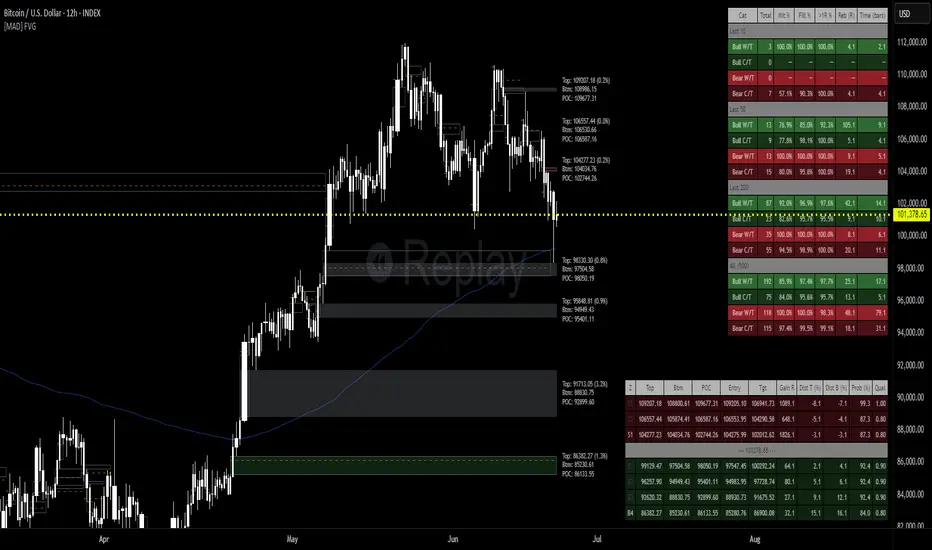
Cutrim TheoryCutrim Theory
Created by Dalpiaz-BR , this indicator is based on the Probabilistic Theory developed by the renowned Brazilian trader Ronal Cutrim. The indicator aims to provide a detailed analysis of market imbalances and candlestick patterns across different timeframes, utilizing multi-timeframe data and dynamic information tables. It is designed to help traders identify favorable market conditions and make informed decisions in their trades.
Indicator Description
The Cutrim Theory is an advanced indicator that combines candlestick pattern analysis, and market imbalances to give a clear view of market conditions. The tool uses multi-timeframe data and displays dynamic tables to facilitate visual analysis on the main chart and histogram.
Key Features:
Multi-Timeframe Imbalance Analysis:
The indicator calculates buy and sell imbalances based on the number of green and red candles in different timeframes.
Users can choose to display all imbalances, only the last imbalance, or turn off this feature.
Dynamic and Flexible Tables:
Main Table: Shows detailed data for different timeframes, such as the percentage of bullish and bearish candles, the size of the last candle, and the average candle size.
Dynamic Table Position: The table on the main chart can be set to automatically move based on the current price position (upper or lower). Users can also manually set the position.
Histogram Table: Displays a summary of key information in an additional table on the histogram.
Visualization of Averages and Candle Sizes:
Displays histograms and moving average lines for candle sizes, providing a clear visualization of current market volatility.
Imbalance Signals:
The indicator also adds "Buy" and "Sell" labels directly on the main chart when an imbalance is detected, helping traders spot trading opportunities.
Customizable Settings:
Imbalance Options: "Turn Off All," "Last Imbalance," or "All Imbalances."
Main Table Positions: "top_left," "top_right," "bottom_left," "bottom_right," or "Dynamic."
Signal Messages: Customize the "Buy" and "Sell" messages.
Benefits:
Provides a clear and intuitive view of market conditions across multiple timeframes.
Facilitates the detection of imbalances and market shifts.
Highly configurable to meet the needs of different types of traders.
This script is a powerful addition to any trader's toolbox who seeks a detailed and multi-timeframe analysis based on Ronal Cutrim's Probabilistic Theory. Enjoy and adjust according to your trading style!

[TehThomas] - ICT VI / FVG / IFVG / Liquidity📌 Overview
This TradingView indicator is designed to help traders spot key price inefficiencies and liquidity events based on ICT (Inner Circle Trader) concepts. The script automatically highlights important areas on the chart, such as Volume Imbalances (VI), Fair Value Gaps (FVG), Inverted Fair Value Gaps (IFVG), and Liquidity Sweeps, giving traders a clear view of where price might react.
By marking these zones visually, the indicator serves as a liquidity map, showing where smart money could be targeting orders or rebalancing price action.
🔑 How the Script Works
The indicator detects four major market inefficiencies and liquidity patterns, each offering valuable insights into how price might behave:
1️⃣ Volume Imbalance (VI)
Bullish VI: When the current candle has higher volume than the previous candle in an upward move, this suggests demand is pushing the price up, creating potential buying opportunities.
Bearish VI: When the current candle has higher volume than the previous candle in a downward move, this suggests supply is pushing the price down, highlighting potential selling opportunities.
How to take trades:
Buy: Enter a long position when a bullish VI appears and the price is near a support zone or key level (such as the previous swing low or FVG).
Sell: Enter a short position when a bearish VI appears and the price is near a resistance zone or key level (such as the previous swing high or FVG).
2️⃣ Fair Value Gap (FVG)
Bullish FVG: A gap in price action where the low of the second candle is higher than the high of the first candle. Price tends to return to fill these gaps before continuing upward.
Bearish FVG: A gap in price action where the high of the second candle is lower than the low of the first candle. Price tends to return to fill these gaps before continuing downward.
How to take trades:
Buy: Enter long after a pullback into a bullish FVG zone and if price action shows signs of rejection (such as bullish candlestick patterns or strong momentum).
Sell: Enter short after a pullback into a bearish FVG zone and if price action shows signs of rejection (such as bearish candlestick patterns or strong downward momentum).
3️⃣ Inverted Fair Value Gap (IFVG)
An Inverted Fair Value Gap (IFVG) refers to a Fair Value Gap (FVG) that has already been filled or broken through by price action. Essentially, it is a gap that has been revisited by price and has now been mitigated or broken.
Example:
For Continuation: After price fills the gap, it may continue in the same direction. If price breaks through a bullish FVG and shows continuation, it may signal that the market is still in a strong uptrend.
For Reversal: If the price returns to an inverted FVG after breaching it, and then starts showing signs of reversal (e.g., reversal candlestick patterns, or a shift in momentum), this could signal an entry point in the opposite direction.
How to take trades:
Buy: Consider entering long when price returns to an IFVG zone that aligns with other bullish confluences, such as a bullish VI or liquidity sweep.
Sell: Consider entering short when price returns to a bearish IFVG zone that aligns with other bearish confluences, such as a bearish VI or liquidity sweep.
4️⃣ Liquidity Sweeps
Liquidity sweeps occur when the market temporarily breaks a key high or low to trigger stop-loss orders or lure traders into the wrong direction before reversing.
How to take trades:
Buy: If a liquidity sweep breaks a key resistance or swing high but fails to close above it, enter long when price begins to reverse in the opposite direction, ideally near a previous support or FVG zone.
Sell: If a liquidity sweep breaks a key support or swing low but fails to close below it, enter short when price begins to reverse in the opposite direction, ideally near a previous resistance or FVG zone.
🎯 Trade Setup and Confirmation Strategy
Here’s how to combine these concepts for high-probability trade setups:
Liquidity Sweeps + Volume Imbalances:
If a liquidity sweep occurs in conjunction with a volume imbalance (especially on a higher timeframe), this can act as a confirmation signal to enter the trade.
Example: A liquidity sweep breaks a previous high, but the price fails to close above it. If this happens alongside a break of a Volume imbalance (VI) , it could be a strong signal to sell.
FVG/IFVG Mitigation + Liquidity Sweeps:
Price often returns to mitigate imbalances, and when a liquidity sweep occurs near an unfilled gap, it could trigger a reversal.
Example: After an upward trend, a bearish liquidity sweep breaks a previous swing low, and price then revisits a bearish FVG and creates an IFVG, signaling an opportunity to buy.
Directional Bias (Higher Timeframe Analysis):
Always consider the higher timeframe trend to confirm trade direction. A bullish FVG or bullish VI on the lower timeframe aligns with a bullish trend on the higher timeframe.
Confluence with Key Levels:
When these patterns align with important price levels such as support, resistance, or previously identified swing highs/lows, it enhances the probability of a successful trade.
⚙️ How It Helps in Trading Strategy
The indicator assists in several aspects of trading:
Liquidity Hunts: Price often sweeps liquidity before making major moves.
Entry Confirmation: Use imbalances or sweeps as extra confluence for trade entries.
Mitigation Zones: Price frequently returns to fill inefficiencies before reversing.
Directional Bias: Bullish or bearish gaps align with the higher timeframe narrative.
🔍 ICT Concepts Included
✅Volume Imbalance (VI): High-volume inefficiencies.
✅Fair Value Gap (FVG): Standard price gaps.
✅Inverted Fair Value Gap (IFVG): Filtered large price gaps.
✅Liquidity Sweeps: Stop-hunting patterns by smart money.
⚠️ Disclaimer
This indicator is built for educational purposes and should not be considered financial advice. Trading carries risk, and no tool guarantees profits. Always use proper risk management and perform your own analysis before entering any trade.

Structure Pro+ (BOS, CHoCH, FVG, OB)Structure Pro+ (BOS, CHoCH, FVG, OB)
Structure Pro+ is a comprehensive Pine Script indicator designed for traders who utilize Smart Money Concepts (SMC) in their analysis. This powerful tool automatically identifies and visualizes key market structure elements, helping you gain deeper insights into price action and potential institutional movements.
Key Features:
Break of Structure (BOS): Clearly identifies trend continuation by marking points where price breaks a previous swing high in an uptrend or a swing low in a downtrend.
Change of Character (CHoCH): Pinpoints potential trend reversals when price breaks a swing point against the prevailing trend, signaling a shift in market sentiment.
Fair Value Gap (FVG) / Imbalance: Automatically highlights areas where price has moved quickly, leaving behind "imbalances" that often act as magnet zones for future price action.
Mitigation Logic: FVGs are dynamically tracked and can be set to disappear from the chart once mitigated (when price returns to fill the gap).
Order Block (OB): Detects and marks potential institutional order blocks, which are crucial supply and demand zones that frequently act as strong support or resistance levels.
Customizable Settings: Tailor the indicator to your specific trading style with extensive input options, including:
Pivot sensitivity (leftBars, rightBars)
Color and line style for BOS/CHoCH
FVG display options, including color and mitigation behavior
Order Block display options and colors
Label sizing for clarity
Integrated Alerts: Stay informed with built-in alert functionalities for:
BOS occurrences (Bullish/Bearish)
CHoCH occurrences (Bullish/Bearish)
Confluent events: BOS + FVG and CHoCH + FVG, providing high-probability trade setups when structure breaks align with imbalances. The confluenceLookback setting allows you to define the maximum distance between these events for an alert.
Why Use Structure Pro+?
This indicator simplifies the complex process of identifying SMC concepts on your charts. By automatically drawing BOS, CHoCH, FVG, and OB, Structure Pro+ helps you:
Validate your directional bias with clear visual cues.
Identify potential entry and exit points around significant structural levels.
Enhance your market understanding based on institutional footprints.
Receive timely notifications for high-probability setups, so you never miss a critical market event.
Structure Pro+ is an invaluable tool for any trader looking to refine their analysis with Smart Money Concepts.
Mars Signals - Ultimate Institutional Suite v3.0(Joker)Comprehensive Trading Manual
Mars Signals – Ultimate Institutional Suite v3.0 (Joker)
## Chapter 1 – Philosophy & System Architecture
This script is not a simple “buy/sell” indicator.
Mars Signals – UIS v3.0 (Joker) is designed as an institutional-style analytical assistant that layers several methodologies into a single, coherent framework.
The system is built on four core pillars:
1. Smart Money Concepts (SMC)
- Detection of Order Blocks (professional demand/supply zones).
- Detection of Fair Value Gaps (FVGs) (price imbalances).
2. Smart DCA Strategy
- Combination of RSI and Bollinger Bands
- Identifies statistically discounted zones for scaling into spot positions or exiting shorts.
3. Volume Profile (Visible Range Simulation)
- Distribution of volume by price, not by time.
- Identification of POC (Point of Control) and high-/low-volume areas.
4. Wyckoff Helper – Spring
- Detection of bear traps, liquidity grabs, and sharp bullish reversals.
All four pillars feed into a Confluence Engine (Scoring System).
The final output is presented in the Dashboard, with a clear, human-readable signal:
- STRONG LONG 🚀
- WEAK LONG ↗
- NEUTRAL / WAIT
- WEAK SHORT ↘
- STRONG SHORT 🩸
This allows the trader to see *how many* and *which* layers of the system support a bullish or bearish bias at any given time.
## Chapter 2 – Settings Overview
### 2.1 General & Dashboard Group
- Show Dashboard Panel (`show_dash`)
Turns the dashboard table in the corner of the chart ON/OFF.
- Show Signal Recommendation (`show_rec`)
- If enabled, the textual signal (STRONG LONG, WEAK SHORT, etc.) is displayed.
- If disabled, you only see feature status (ON/OFF) and the current price.
- Dashboard Position (`dash_pos`)
Determines where the dashboard appears on the chart:
- `Top Right`
- `Bottom Right`
- `Top Left`
### 2.2 Smart Money (SMC) Group
- Enable SMC Strategy (`show_smc`)
Globally enables or disables the Order Block and FVG logic.
- Order Block Pivot Lookback (`ob_period`)
Main parameter for detecting key pivot highs/lows (swing points).
- Default value: 5
- Concept:
A bar is considered a pivot low if its low is lower than the lows of the previous 5 and the next 5 bars.
Similarly, a pivot high has a high higher than the previous 5 and the next 5 bars.
These pivots are used as anchors for Order Blocks.
- Increasing `ob_period`:
- Fewer levels.
- But levels tend to be more significant and reliable.
- In highly volatile markets (major news, war events, FOMC, etc.),
using values 7–10 is recommended to filter out weak levels.
- Show Fair Value Gaps (`show_fvg`)
Enables/disables the drawing of FVG zones (imbalances).
- Bullish OB Color (`c_ob_bull`)
- Color of Bullish Order Blocks (Demand Zones).
- Default: semi-transparent green (transparency ≈ 80).
- Bearish OB Color (`c_ob_bear`)
- Color of Bearish Order Blocks (Supply Zones).
- Default: semi-transparent red.
- Bullish FVG Color (`c_fvg_bull`)
- Color of Bullish FVG (upward imbalance), typically yellow.
- Bearish FVG Color (`c_fvg_bear`)
- Color of Bearish FVG (downward imbalance), typically purple.
### 2.3 Smart DCA Strategy Group
- Enable DCA Zones (`show_dca`)
Enables the Smart DCA logic and visual labels.
- RSI Length (`rsi_len`)
Lookback period for RSI (default: 14).
- Shorter → more sensitive, more noise.
- Longer → fewer signals, higher reliability.
- Bollinger Bands Length (`bb_len`)
Moving average period for Bollinger Bands (default: 20).
- BB Multiplier (`bb_mult`)
Standard deviation multiplier for Bollinger Bands (default: 2.0).
- For extremely volatile markets, values like 2.5–3.0 can be used so that only extreme deviations trigger a DCA signal.
### 2.4 Volume Profile (Visible Range Sim) Group
- Show Volume Profile (`show_vp`)
Enables the simulated Volume Profile bars on the right side of the chart.
- Volume Lookback Bars (`vp_lookback`)
Number of bars used to compute the Volume Profile (default: 150).
- Higher values → broader historical context, heavier computation.
- Row Count (`vp_rows`)
Number of vertical price segments (rows) to divide the total price range into (default: 30).
- Width (%) (`vp_width`)
Relative width of each volume bar as a percentage.
In the code, bar widths are scaled relative to the row with the maximum volume.
> Technical note: Volume Profile calculations are executed only on the last bar (`barstate.islast`) to keep the script performant even on higher timeframes.
### 2.5 Wyckoff Helper Group
- Show Wyckoff Events (`show_wyc`)
Enables detection and plotting of Wyckoff Spring events.
- Volume MA Length (`vol_ma_len`)
Length of the moving average on volume.
A bar is considered to have Ultra Volume if its volume is more than 2× the volume MA.
## Chapter 3 – Smart Money Strategy (Order Blocks & FVG)
### 3.1 What Is an Order Block?
An Order Block (OB) represents the footprint of large institutional orders:
- Bullish Order Block (Demand Zone)
The last selling region (bearish candle/cluster) before a strong upward move.
- Bearish Order Block (Supply Zone)
The last buying region (bullish candle/cluster) before a strong downward move.
Institutions and large players place heavy orders in these regions. Typical price behavior:
- Price moves away from the zone.
- Later returns to the same zone to fill unfilled orders.
- Then continues the larger trend.
In the script:
- If `pl` (pivot low) forms → a Bullish OB is created.
- If `ph` (pivot high) forms → a Bearish OB is created.
The box is drawn:
- From `bar_index ` to `bar_index`.
- Between `low ` and `high `.
- `extend=extend.right` extends the OB into the future, so it acts as a dynamic support/resistance zone.
- Only the last 4 OB boxes are kept to avoid clutter.
### 3.2 Order Block Color Guide
- Semi-transparent Green (`c_ob_bull`)
- Represents a Bullish Order Block (Demand Zone).
- Interpretation: a price region with a high probability of bullish reaction.
- Semi-transparent Red (`c_ob_bear`)
- Represents a Bearish Order Block (Supply Zone).
- Interpretation: a price region with a high probability of bearish reaction.
Overlap (Multiple OBs in the Same Area)
When two or more Order Blocks overlap:
- The shared area appears visually denser/stronger.
- This suggests higher order density.
- Such zones can be treated as high-priority levels for entries, exits, and stop-loss placement.
### 3.3 Demand/Supply Logic in the Scoring Engine
is_in_demand = low <= ta.lowest(low, 20)
is_in_supply = high >= ta.highest(high, 20)
- If current price is near the lowest lows of the last 20 bars, it is considered in a Demand Zone → positive impact on score.
- If current price is near the highest highs of the last 20 bars, it is considered in a Supply Zone → negative impact on score.
This logic complements Order Blocks and helps the Dashboard distinguish whether:
- Market is currently in a statistically cheap (long-friendly) area, or
- In a statistically expensive (short-friendly) area.
### 3.4 Fair Value Gaps (FVG)
#### Concept
When the market moves aggressively:
- Some price levels are skipped and never traded.
- A gap between wicks/shadows of consecutive candles appears.
- These regions are called Fair Value Gaps (FVGs) or Imbalances.
The market generally “dislikes” imbalance and often:
- Returns to these zones in the future.
- Fills the gap (rebalance).
- Then resumes its dominant direction.
#### Implementation in the Code
Bullish FVG (Yellow)
fvg_bull_cond = show_smc and show_fvg and low > high and close > high
if fvg_bull_cond
box.new(bar_index , high , bar_index, low, ...)
Core condition:
`low > high ` → the current low is above the high of two bars ago; the space between them is an untraded gap.
Bearish FVG (Purple)
fvg_bear_cond = show_smc and show_fvg and high < low and close < low
if fvg_bear_cond
box.new(bar_index , low , bar_index, high, ...)
Core condition:
`high < low ` → the current high is below the low of two bars ago; again a price gap exists.
#### FVG Color Guide
- Transparent Yellow (`c_fvg_bull`) – Bullish FVG
Often acts like a magnet for price:
- Price tends to retrace into this zone,
- Fill the imbalance,
- And then continue higher.
- Transparent Purple (`c_fvg_bear`) – Bearish FVG
Price tends to:
- Retrace upward into the purple area,
- Fill the imbalance,
- And then resume downward movement.
#### Trading with FVGs
- FVGs are *not* standalone entry signals.
They are best used as:
- Targets (take-profit zones), or
- Reaction areas where you expect a pause or reversal.
Examples:
- If you are long, a bearish FVG above is often an excellent take-profit zone.
- If you are short, a bullish FVG below is often a good cover/exit zone.
### 3.5 Core SMC Trading Templates
#### Reversal Long
1. Price trades down into a green Order Block (Demand Zone).
2. A bullish confirmation candle (Close > Open) forms inside or just above the OB.
3. If this zone is close to or aligned with a bullish FVG (yellow), the signal is reinforced.
4. Entry:
- At the close of the confirmation candle, or
- Using a limit order near the upper boundary of the OB.
5. Stop-loss:
- Slightly below the OB.
- If the OB is broken decisively and price consolidates below it, the zone loses validity.
6. Targets:
- The next FVG,
- Or the next red Order Block (Supply Zone) above.
#### Reversal Short
The mirror scenario:
- Price rallies into a red Order Block (Supply).
- A bearish confirmation candle forms (Close < Open).
- FVG/premium structure above can act as a confluence.
- Stop-loss goes above the OB.
- Targets: lower FVGs or subsequent green OBs below.
## Chapter 4 – Smart DCA Strategy (RSI + Bollinger Bands)
### 4.1 Smart DCA Concept
- Classic DCA = buying at fixed time intervals regardless of price.
- Smart DCA = scaling in only when:
- Price is statistically cheaper than usual, and
- The market is in a clear oversold condition.
Code logic:
rsi_val = ta.rsi(close, rsi_len)
= ta.bb(close, bb_len, bb_mult)
dca_buy = show_dca and rsi_val < 30 and close < bb_lower
dca_sell = show_dca and rsi_val > 70 and close > bb_upper
Conditions:
- DCA Buy – Smart Scale-In Zone
- RSI < 30 → oversold.
- Close < lower Bollinger Band → price has broken below its typical volatility envelope.
- DCA Sell – Overbought/Distribution Zone
- RSI > 70 → overbought.
- Close > upper Bollinger Band → price is extended far above the mean.
### 4.2 Visual Representation on the Chart
- Green “DCA” Label Below Candle
- Shape: `labelup`.
- Color: lime background, white text.
- Meaning: statistically attractive level for laddered spot entries or short exits.
- Red “SELL” Label Above Candle
- Warning that the market is in an extended, overbought condition.
- Suitable for profit-taking on longs or considering short entries (with proper confluence and risk management).
- Light Green Background (`bgcolor`)
- When `dca_buy` is true, the candle background turns very light green (high transparency).
- This helps visually identify DCA Zones across the chart at a glance.
### 4.3 Practical Use in Trading
#### Spot Trading
Used to build a better average entry price:
- Every time a DCA label appears, allocate a fixed portion of capital (e.g., 2–5%).
- Combining DCA signals with:
- Green OBs (Demand Zones), and/or
- The Volume Profile POC
makes the zone structurally more important.
#### Futures Trading
- Longs
- Use DCA Buy signals as low-risk zones for opening or adding to longs when:
- Price is inside a green OB, or
- The Dashboard already leans LONG.
- Shorts
- Use DCA Sell signals as:
- Exit zones for longs, or
- Areas to initiate shorts with stops above structural highs.
## Chapter 5 – Volume Profile (Visible Range Simulation)
### 5.1 Concept
Traditional volume (histogram under the chart) shows volume over time.
Volume Profile shows volume by price level:
- At which prices has the highest trading activity occurred?
- Where did buyers and sellers agree the most (High Volume Nodes – HVNs)?
- Where did price move quickly due to low participation (Low Volume Nodes – LVNs)?
### 5.2 Implementation in the Script
Executed only when `show_vp` is enabled and on the last bar:
1. The last `vp_lookback` bars (default 150) are processed.
2. The minimum low and maximum high over this window define the price range.
3. This price range is divided into `vp_rows` segments (e.g., 30 rows).
4. For each row:
- All bars are scanned.
- If the mid-price `(high + low ) / 2` falls inside a row, that bar’s volume is added to the row total.
5. The row with the greatest volume is stored as `max_vol_idx` (the POC row).
6. For each row, a volume box is drawn on the right side of the chart.
### 5.3 Color Scheme
- Semi-transparent Orange
- The row with the maximum volume – the Point of Control (POC).
- Represents the strongest support/resistance level from a volume perspective.
- Semi-transparent Blue
- Other volume rows.
- The taller the bar → the higher the volume → the stronger the interest at that price band.
### 5.4 Trading Applications
- If price is above POC and retraces back into it:
→ POC often acts as support, suitable for long setups.
- If price is below POC and rallies into it:
→ POC often acts as resistance, suitable for short setups or profit-taking.
HVNs (Tall Blue Bars)
- Represent areas of equilibrium where the market has spent time and traded heavily.
- Price tends to consolidate here before choosing a direction.
LVNs (Short or Nearly Empty Bars)
- Represent low participation zones.
- Price often moves quickly through these areas – useful for targeting fast moves.
## Chapter 6 – Wyckoff Helper – Spring
### 6.1 Spring Concept
In the Wyckoff framework:
- A Spring is a false break of support.
- The market briefly trades below a well-defined support level, triggers stop losses,
then sharply reverses upward as institutional buyers absorb liquidity.
This movement:
- Clears out weak hands (retail sellers).
- Provides large players with liquidity to enter long positions.
- Often initiates a new uptrend.
### 6.2 Code Logic
Conditions for a Spring:
1. The current low is lower than the lowest low of the previous 50 bars
→ apparent break of a long-standing support.
2. The bar closes bullish (Close > Open)
→ the breakdown was rejected.
3. Volume is significantly elevated:
→ `volume > 2 × volume_MA` (Ultra Volume).
When all conditions are met and `show_wyc` is enabled:
- A pink diamond is plotted below the bar,
- With the label “Spring” – one of the strongest long signals in this system.
### 6.3 Trading Use
- After a valid Spring, markets frequently enter a meaningful bullish phase.
- The highest quality setups occur when:
- The Spring forms inside a green Order Block, and
- Near or on the Volume Profile POC.
Entries:
- At the close of the Spring bar, or
- On the first pullback into the mid-range of the Spring candle.
Stop-loss:
- Slightly below the Spring’s lowest point (wick low plus a small buffer).
## Chapter 7 – Confluence Engine & Dashboard
### 7.1 Scoring Logic
For each bar, the script:
1. Resets `score` to 0.
2. Adjusts the score based on different signals.
SMC Contribution
if show_smc
if is_in_demand
score += 1
if is_in_supply
score -= 1
- Being in Demand → `+1`
- Being in Supply → `-1`
DCA Contribution
if show_dca
if dca_buy
score += 2
if dca_sell
score -= 2
- DCA Buy → `+2` (strong, statistically driven long signal)
- DCA Sell → `-2`
Wyckoff Spring Contribution
if show_wyc
if wyc_spring
score += 2
- Spring → `+2` (entry of strong money)
### 7.2 Mapping Score to Dashboard Signal
- score ≥ 2 → STRONG LONG 🚀
Multiple bullish conditions aligned.
- score = 1 → WEAK LONG ↗
Some bullish bias, but only one layer clearly positive.
- score = 0 → NEUTRAL / WAIT
Rough balance between buying and selling forces; staying flat is usually preferable.
- score = -1 → WEAK SHORT ↘
Mild bearish bias, suited for cautious or short-term plays.
- score ≤ -2 → STRONG SHORT 🩸
Convergence of several bearish signals.
### 7.3 Dashboard Structure
The dashboard is a two-column table:
- Row 0
- Column 0: `"Mars Signals"` – black background, white text.
- Column 1: `"UIS v3.0"` – black background, yellow text.
- Row 1
- Column 0: `"Price:"` (light grey background).
- Column 1: current closing price (`close`) with a semi-transparent blue background.
- Row 2
- Column 0: `"SMC:"`
- Column 1:
- `"ON"` (green) if `show_smc = true`
- `"OFF"` (grey) otherwise.
- Row 3
- Column 0: `"DCA:"`
- Column 1:
- `"ON"` (green) if `show_dca = true`
- `"OFF"` (grey) otherwise.
- Row 4
- Column 0: `"Signal:"`
- Column 1: signal text (`status_txt`) with background color `status_col`
(green, red, teal, maroon, etc.)
- If `show_rec = false`, these cells are cleared.
## Chapter 8 – Visual Legend (Colors, Shapes & Actions)
For quick reading inside TradingView, the visual elements are described line by line instead of a table.
Chart Element: Green Box
Color / Shape: Transparent green rectangle
Core Meaning: Bullish Order Block (Demand Zone)
Suggested Trader Response: Look for longs, Smart DCA adds, closing or reducing shorts.
Chart Element: Red Box
Color / Shape: Transparent red rectangle
Core Meaning: Bearish Order Block (Supply Zone)
Suggested Trader Response: Look for shorts, or take profit on existing longs.
Chart Element: Yellow Area
Color / Shape: Transparent yellow zone
Core Meaning: Bullish FVG / upside imbalance
Suggested Trader Response: Short take-profit zone or expected rebalance area.
Chart Element: Purple Area
Color / Shape: Transparent purple zone
Core Meaning: Bearish FVG / downside imbalance
Suggested Trader Response: Long take-profit zone or temporary supply region.
Chart Element: Green "DCA" Label
Color / Shape: Green label with white text, plotted below the candle
Core Meaning: Smart ladder-in buy zone, DCA buy opportunity
Suggested Trader Response: Spot DCA entry, partial short exit.
Chart Element: Red "SELL" Label
Color / Shape: Red label with white text, plotted above the candle
Core Meaning: Overbought / distribution zone
Suggested Trader Response: Take profit on longs, consider initiating shorts.
Chart Element: Light Green Background (bgcolor)
Color / Shape: Very transparent light-green background behind bars
Core Meaning: Active DCA Buy zone
Suggested Trader Response: Treat as a discount zone on the chart.
Chart Element: Orange Bar on Right
Color / Shape: Transparent orange horizontal bar in the volume profile
Core Meaning: POC – price with highest traded volume
Suggested Trader Response: Strong support or resistance; key reference level.
Chart Element: Blue Bars on Right
Color / Shape: Transparent blue horizontal bars in the volume profile
Core Meaning: Other volume levels, showing high-volume and low-volume nodes
Suggested Trader Response: Use to identify balance zones (HVN) and fast-move corridors (LVN).
Chart Element: Pink "Spring" Diamond
Color / Shape: Pink diamond with white text below the candle
Core Meaning: Wyckoff Spring – liquidity grab and potential major bullish reversal
Suggested Trader Response: One of the strongest long signals in the suite; look for high-quality long setups with tight risk.
Chart Element: STRONG LONG in Dashboard
Color / Shape: Green background, white text in the Signal row
Core Meaning: Multiple bullish layers in confluence
Suggested Trader Response: Consider initiating or increasing longs with strict risk management.
Chart Element: STRONG SHORT in Dashboard
Color / Shape: Red background, white text in the Signal row
Core Meaning: Multiple bearish layers in confluence
Suggested Trader Response: Consider initiating or increasing shorts with a logical, well-placed stop.
## Chapter 9 – Timeframe-Based Trading Playbook
### 9.1 Timeframe Selection
- Scalping
- Timeframes: 1M, 5M, 15M
- Objective: fast intraday moves (minutes to a few hours).
- Recommendation: focus on SMC + Wyckoff.
Smart DCA on very low timeframes may introduce excessive noise.
- Day Trading
- Timeframes: 15M, 1H, 4H
- Provides a good balance between signal quality and frequency.
- Recommendation: use the full stack – SMC + DCA + Volume Profile + Wyckoff + Dashboard.
- Swing Trading & Position Investing
- Timeframes: Daily, Weekly
- Emphasis on Smart DCA + Volume Profile.
- SMC and Wyckoff are used mainly to fine-tune swing entries within larger trends.
### 9.2 Scenario A – Scalping Long
Example: 5-Minute Chart
1. Price is declining into a green OB (Bullish Demand).
2. A candle with a long lower wick and bullish close (Pin Bar / Rejection) forms inside the OB.
3. A Spring diamond appears below the same candle → very strong confluence.
4. The Dashboard shows at least WEAK LONG ↗, ideally STRONG LONG 🚀.
5. Entry:
- On the close of the confirmation candle, or
- On the first pullback into the mid-range of that candle.
6. Stop-loss:
- Slightly below the OB.
7. Targets:
- Nearby bearish FVG above, and/or
- The next red OB.
### 9.3 Scenario B – Day-Trading Short
Recommended Timeframes: 1H or 4H
1. The market completes a strong impulsive move upward.
2. Price enters a red Order Block (Supply).
3. In the same zone, a purple FVG appears or remains unfilled.
4. On a lower timeframe (e.g., 15M), RSI enters overbought territory and a DCA Sell signal appears.
5. The main timeframe Dashboard (1H) shows WEAK SHORT ↘ or STRONG SHORT 🩸.
Trade Plan
- Open a short near the upper boundary of the red OB.
- Place the stop above the OB or above the last swing high.
- Targets:
- A yellow FVG lower on the chart, and/or
- The next green OB (Demand) below.
### 9.4 Scenario C – Swing / Investment with Smart DCA
Timeframes: Daily / Weekly
1. On the daily or weekly chart, each time a green “DCA” label appears:
- Allocate a fixed fraction of your capital (e.g., 3–5%) to that asset.
2. Check whether this DCA zone aligns with the orange POC of the Volume Profile:
- If yes → the quality of the entry zone is significantly higher.
3. If the DCA signal sits inside a daily green OB, the probability of a medium-term bottom increases.
4. Always build the position laddered, never all-in at a single price.
Exits for investors:
- Near weekly red OBs or large purple FVG zones.
- Ideally via partial profit-taking rather than closing 100% at once.
### 9.5 Case Study 1 – BTCUSDT (15-Minute)
- Context: Price has sold off down towards 65,000 USD.
- A green OB had previously formed at that level.
- Near the lower boundary of this OB, a partially filled yellow FVG is present.
- As price returns to this region, a Spring appears.
- The Dashboard shifts from NEUTRAL / WAIT to WEAK LONG ↗.
Plan
- Enter a long near the OB low.
- Place stop below the Spring low.
- First target: a purple FVG around 66,200.
- Second (optional) target: the first red OB above that level.
### 9.6 Case Study 2 – Meme Coin (PEPE – 4H)
- After a strong pump, price enters a corrective phase.
- On the 4H chart, RSI drops below 30; price breaks below the lower Bollinger Band → a DCA label prints.
- The Volume Profile shows the POC at approximately the same level.
- The Dashboard displays STRONG LONG 🚀.
Plan
- Execute laddered buys in the combined DCA + POC zone.
- Place a protective stop below the last significant swing low.
- Target: an expected 20–30% upside move towards the next red OB or purple FVG.
## Chapter 10 – Risk Management, Psychology & Advanced Tuning
### 10.1 Risk Management
No signal, regardless of its strength, replaces risk control.
Recommendations:
- In futures, do not expose more than 1–3% of account equity to risk per trade.
- Adjust leverage to the volatility of the instrument (lower leverage for highly volatile altcoins).
- Place stop-losses in zones where the idea is clearly invalidated:
- Below/above the relevant Order Block or Spring, not randomly in the middle of the structure.
### 10.2 Market-Specific Parameter Tuning
- Calmer Markets (e.g., major FX pairs)
- `ob_period`: 3–5.
- `bb_mult`: 2.0 is usually sufficient.
- Highly Volatile Markets (Crypto, news-driven assets)
- `ob_period`: 7–10 to highlight only the most robust OBs.
- `bb_mult`: 2.5–3.0 so that only extreme deviations trigger DCA.
- `vol_ma_len`: increase (e.g., to ~30) so that Spring triggers only on truly exceptional
volume spikes.
### 10.3 Trading Psychology
- STRONG LONG 🚀 does not mean “risk-free”.
It means the probability of a successful long, given the model’s logic, is higher than average.
- Treat Mars Signals as a confirmation and context system, not a full replacement for your own decision-making.
- Example of disciplined thinking:
- The Dashboard prints STRONG LONG,
- But price is simultaneously testing a multi-month macro resistance or a major negative news event is imminent,
- In such cases, trade smaller, widen stops appropriately, or skip the trade.
## Chapter 11 – Technical Notes & FAQ
### 11.1 Does the Script Repaint?
- Order Blocks and Springs are based on completed pivot structures and confirmed candles.
- Until a pivot is confirmed, an OB does not exist; after confirmation, behavior is stable under classic SMC assumptions.
- The script is designed to be structurally consistent rather than repainting signals arbitrarily.
### 11.2 Computational Load of Volume Profile
- On the last bar, the script processes up to `vp_lookback` bars × `vp_rows` rows.
- On very low timeframes with heavy zooming, this can become demanding.
- If you experience performance issues:
- Reduce `vp_lookback` or `vp_rows`, or
- Temporarily disable Volume Profile (`show_vp = false`).
### 11.3 Multi-Timeframe Behavior
- This version of the script is not internally multi-timeframe.
All logic (OB, DCA, Spring, Volume Profile) is computed on the active timeframe only.
- Practical workflow:
- Analyze overall structure and key zones on higher timeframes (4H / Daily).
- Use lower timeframes (15M / 1H) with the same tool for timing entries and exits.
## Conclusion
Mars Signals – Ultimate Institutional Suite v3.0 (Joker) is a multi-layer trading framework that unifies:
- Price structure (Order Blocks & FVG),
- Statistical behavior (Smart DCA via RSI + Bollinger),
- Volume distribution by price (Volume Profile with POC, HVN, LVN),
- Liquidity events (Wyckoff Spring),
into a single, coherent system driven by a transparent Confluence Scoring Engine.
The final output is presented in clear, actionable language:
> STRONG LONG / WEAK LONG / NEUTRAL / WEAK SHORT / STRONG SHORT
The system is designed to support professional decision-making, not to replace it.
Used together with strict risk management and disciplined execution,
Mars Signals – UIS v3.0 (Joker) can serve as a central reference manual and operational guide
for your trading workflow, from scalping to swing and investment positioning.

GAPs and AVPIs by BULL┃NETThe B | N - GAPA (GAPs and AVPIs by BULL|NET)
indicator helps traders to identify gaps between bars and imbalances in price and
volume.
read the 2 Disclaimers before use!
Disclaimer BullNett:
The information provided in this document is for educational and informational purposes only and does not constitute financial, investment, or trading advice. Any use of the content is at your own risk. No liability is assumed for any losses or damages resulting from reliance on this information. Trading financial instruments involves significant risks, including the potential loss of all invested capital. There is no guarantee of profits or specific outcomes. Please conduct your own research and consult a professional financial advisor if needed.
Disclaimer TradingView:
According to the www.tradingview.com
Gaps and imbalances are considered important price levels or ranges because the
price usually tends to close gaps and to get rid of imbalances sooner or later. At the
same time, gaps can deliver support or resistance and tell you a lot about market
sentiment.
Knowing where gaps and imbalances are or have been is vital for successful trading.
Read bevor use!!
Concepts and Functionality:
AVPI: Assumed Volume Price Imbalance
The price curve on a chart is like waves on the ocean. It goes up and
down and sometimes it is smooth. More wind means higher waves and if
the wind slows down the waves get smaller. An under sea earthquake
can cause a tsunami which is the exception of the rule: Extremely higher
waves without more wind.
This is what we consider an AVPI. The price is rising or falling sharply at
a single bar with only slightly increased or even decreased volume. The
change in price seems to be rather the result of a single event than of a
broader change in market sentiment. Such an imbalance is subject to be
corrected sooner or later: the price will return to where the imbalance
started. The Gap will get closed.
AVPIs can be spotted in any timeframe across any asset. And most
importantly you will usually see them at any broker for the same asset.
No matter whether you look i.e. at the original Nasdaq (NASDAQ:NDX)
chart or at the corresponding charts of CFD brokers.
Using the historical display feature of the indicator you will spot price
ranges where a couple of bearish and bullish AVPIs take turns. This is
usually the result of bears and bulls fighting for dominance. Play with the
historical display and the replay feature of TradingView to get a feeling
how things developed depending on who won the fight.
Candle Gaps
If the high and low of two consecutive candles do not overlap we talk
about a candle gap. Other than AVPIs which can be spotted across any
broker Candle Gaps are specific to a broker, the asset and the chart.
If you spot the same Candle Gap across different brokers and the original
chart, i.e. NASDAQ:NDX if you trade the Nasdaq, the Gap can be
considered meaningful and important because it marks a price range in
the market that hasn’t been traded at all (nobody was willing to sell or
buy in that price range).
Candle Gaps are usually closed within a very
short time. Often, you can see these gaps being filled on the same day,
but depending on the asset, they can also remain open for days.
Body Gaps
If you compare the high or low of the current bar with the open or close
of the bar before you will see there are times where the current extreme
does not overlap with the body of the previous bar. This is called a Body
Gap.
If the Body Gap extends a Candle Gap (see impressions section below)
to the body of the previous bar you should consider the Body Gap to be
a bigger Candle Gap.
If several Body Gaps occur in quick succession in a trend they indicate
acceleration and maybe an upcoming exhaustion of the trend.
Combined with the B | N – TREX by BULL|NETT you might find a good trend entry (see
impressions section below).
Single Body Gaps usually do not have much impact other than indicating
the price will likely turn quickly to close the Gap.
It is important to note Body Gaps should always be verified in the 1
minute time frame. You might see a body gap in the 3 minute timeframe
but not below because of the calculation of the Body in the higher time
frame. (see impressions section below)
AVPI OPTIONS
Default assumption for an AVPI:
• If the current bar height (high – low) is at least three times bigger
(growth >= 200%) than the height of the bar before (high –
low )
• And the current bar body (open – close or close – open) measures
at least 70% of its total height (high - low)
• And the growth of volume since the last bar (volume – volume ) is
not bigger than 1.5 times (growth <= 50%) the growth of the current
bar height
Example:
Current bar height: 13205.10 Previous bar height: 2500.60 Growth of
height = 13205.10 / 2500.60 = 5.28 times bigger Growth of height in
percent (GoH) = 13205.10 * 100 / 2500.60 – 100 = 428.08%
Current bar height: 13205.10 Current bar body: 11007.72 Proportion of
body (PoB): 11007.72 * 100 / 13205.10 = 83.36%
Current bar volume: 608470.00 Previous bar volume: 357365.00 Change
in volume: 608470 * 100 / 357365 – 100 = 70.27% Max. change in
volume allowed: 428.08 * 50% = 214%
Condition check: Growth of height (GoH) in percent 428.08% > 200%
Proportion of body 83.36% > 70% Growth of volume (GoV) 70.27% <
214%
All conditions are true and we can assume a volume to price imbalance.
The following settings allow you to modify the calculation parameters.
The defaults deliver highly reliable results across all markets and assets.
Any changes may end in displaying false results.
Settings:
● Maximum GoV in percent The default maximum growth of volume is
50% of the growth of height. You can change it down to 25% in steps of
1%. This setting decreases the allowed maximum growth of volume. The
calculation becomes more strict.
● Minimum GoH in percent The default minimum growth of height of the
current bar compared to the previous bar is 200%. You can change the
setting between 150% and 250%. The previous bar is taken as 100%. A
growth by 100% means the current bar height is two times the height of
the previous bar. If the previous bar has a height of 50 points, a growth of
200% expects the current height to be 150 (50 + 2 * 50) points. A setting
of 150% results in 125 (50 + 50 + 25) points, and 250% gives 175 (50 +
2 * 50 + 25) points.
● Minimum PoB in percent The default minimum proportion of the current
bar's body of its height is 70%. You can choose a value between 65%
and 90%. The height of the bar (high – low) is always 100%. If you
reduce the setting, you allow a smaller body (larger wicks). If you raise
the setting, you demand a larger body (less wicks).
● AVPIs By default, AVPI calculation and display are enabled. For
backtesting purposes, you can switch them off.
The two color fields allow you to differentiate between AVPIs with
increasing and decreasing volume. A lower volume at the current bar
than at the previous bar while the bar height is growing can tell you
something about the market sentiment in higher timeframes.
The text color field allows you to change the color of the range display in
the AVPI box.
● AVPI Insight By default, you will see a small 🛈 in the middle of the
AVPI bar. The tooltip of the label contains all parameters as shown in the
example calculation above. If you don’t need it, you can disable this
feature. The other two fields determine the color and size of the 🛈.
— Body and Candle Gap Options
● Body Gaps By default, the display of Body Gaps is enabled. You can
disable it for backtesting purposes. Change the color of the box and text
to your liking.
● Candle Gaps By default, the display of Candle Gaps is enabled. You
can disable it for backtesting purposes. Change the color of the box and
text to your liking.
— HISTORICAL OPTIONS
All historical options are for backtesting and learning purposes only.
● Show past AVPIs If enabled, the live display of AVPIs is switched off.
Select the number of the latest AVPIs to display. You can differentiate
between bullish (up) and bearish (down) AVPIs. Past AVPIs will be
displayed in their dimension at the moment they occurred.
● Show past Body Gaps If enabled, the live display of Body Gaps is
switched off. Select the number of the latest Body Gaps to display. You
can differentiate between bullish (up) and bearish (down) Body Gaps.
Past Body Gaps will be displayed in their dimension at the moment they
occurred.
● Show past Candle Gaps If enabled, the live display of Candle Gaps is
switched off. Select the number of the latest Candle Gaps to display. You
can differentiate between bullish (up) and bearish (down) Candle Gaps.
Past Candle Gaps will be displayed in their dimension at the moment
they occurred.
— DISPLAY OPTIONS
● 2 Decimals To streamline the appearance of prices, they are set to
display two decimals only. Numbers get rounded! However, trading
currency pairs or crypto assets might need to display the full amount of
decimals. In this case, simply disable the setting “2 Decimals.”
● Show Gap Range By default, each Gap Box will contain its range.
Depending on the direction (up/down), the range is displayed from
Bottom to Top or vice versa. If you want a cleaner chart, you can disable
the range.
— NERDS ONLY
These options are for nerdy pro-traders. For most of them, you need
knowledge about the Pine Protocol Console. If you have no idea what I
am talking about, these features are not for you.
● Bar Details In replay mode, you will see the details of the current bar in
the pine protocol.
_____________________________________________
Disclaimer BullNett:
The information provided in this document is for educational and informational purposes only and does not constitute financial, investment, or trading advice. Any use of the content is at your own risk. No liability is assumed for any losses or damages resulting from reliance on this information. Trading financial instruments involves significant risks, including the potential loss of all invested capital. There is no guarantee of profits or specific outcomes. Please conduct your own research and consult a professional financial advisor if needed.
Disclaimer TradingView:
According to the www.tradingview.com
Copyright: 2025-BULLNET - All rights reserved/b]
Roadmap:
Version 1.0 28.02.2025
[TehThomas] - Fair Value GapsThis script is designed to automatically detect and visualize Fair Value Gaps (FVGs) on your chart in a clean, intuitive, and highly responsive way. It’s built with active traders in mind, offering both dynamic updates and customization options that help you stay focused on price action without being distracted by outdated or irrelevant information.
What Are Fair Value Gaps?
Fair Value Gaps are areas on a chart where there’s an inefficiency in price, typically formed when price moves aggressively in one direction, leaving a gap between the wicks of consecutive candles. These gaps represent imbalanced price action where not all buy or sell orders were efficiently matched. As a result, they often become magnet zones where price returns later to "fill" the imbalance before continuing in its intended direction. Many traders use them as points of interest for entries, re-entries, or anticipating reversals and consolidations.
This concept is frequently used in Smart Money and ICT-based trading models, where understanding how price seeks efficiency is crucial to anticipating future moves. When combined with concepts like liquidity, displacement, and market structure, FVGs become powerful tools for technical decision-making.
Script Features & Functionality
1. Live Updating Gaps (Dynamic Shrinking)
One of the core features of this script is its ability to track and dynamically shrink Fair Value Gaps as price trades into them. Instead of leaving a static zone on your chart, the gap will adjust in real-time, reflecting the portion that has been filled. This gives you a much more accurate picture of remaining imbalance and avoids misleading zones.
2. Automatic Cleanup After Fill
Once price fully fills an FVG, the script automatically removes it from the chart. This helps keep your workspace clean and focused only on relevant price zones. There’s no need to manually manage your gaps, everything is handled behind the scenes to reduce clutter and distraction.
3. Static Mode Option
While dynamic updating is the default, some traders may prefer to keep the original size of the gap visible even after partial fills. For that reason, the script includes a toggle to switch from live-updating (shrinking) mode to static mode. In static mode, FVGs stay fixed from the moment they are drawn, giving you a more traditional visual reference point.
4. Multi-Timeframe Support (MTF)
You can now view higher timeframe FVGs, such as those from the 1H or 4H chart, while analyzing lower timeframes like the 5-minute. This allows you to see key imbalances from broader market context without having to flip between charts. FVGs from higher timeframes will be drawn distinctly so you can differentiate them at a glance.
5. Cleaner Visualization
The script is designed with clarity in mind. All drawings are streamlined, and filled gaps are removed to maintain a minimal, distraction-free chart. This makes it easier to combine this tool with other indicators or price-action-based strategies without overloading your workspace.
6. Suitable for All Market Types
This script can be used on any asset that displays candlestick-based price action — including crypto, forex, indices, and stocks. Whether you're scalping low-timeframe setups or swing trading with a higher timeframe bias, FVGs remain a useful concept and this script adapts to your trading style.
Use Case Examples
On a 5-minute chart, display 1-hour FVGs to catch major imbalance zones during intraday trading.
Combine the FVGs with liquidity levels and inducement patterns to build ICT-style trade setups.
Use live-updating gaps to monitor in-progress fills and evaluate whether a zone still holds validity.
Set the script to static mode to perform backtesting or visual replay with historical setups.
Final Notes
Fair Value Gaps are not a standalone trading signal, but when used with market structure, liquidity, displacement, and order flow concepts, they provide high-probability trade locations that align with institutional-style trading models. This script simplifies the visualization of those zones so you can react faster, stay focused on clean setups, and eliminate unnecessary distractions.
Whether you’re trading high volatility breakouts or patiently waiting for retracements into unfilled imbalances, this tool is designed to support your edge with precision and flexibility.

IU Smart Flow SystemDESCRIPTION
The IU Smart Flow System is a powerful and dynamic order flow-based strategy designed to capture high-probability trades by analyzing bullish and bearish imbalances, trend direction, and RSI strength. It identifies trading opportunities by aligning order flow conditions with the prevailing trend and momentum, making it suitable for trend-following and momentum-based trading.
This system utilizes a unique combination of:
- Order flow score to gauge market imbalance
- Trend filter using SMA and ATR to confirm market direction
- RSI to ensure entry only during strong momentum
USER INPUTS:
- Imbalance Length: Defines the lookback period for calculating bullish and bearish imbalances. (Default: 10)
- Trend Length: Determines the length of the SMA to evaluate the trend direction. (Default: 50)
- RSI Length: Specifies the RSI period to assess momentum strength. (Default: 14)
LONG CONDITIONS:
Long entries are triggered when:
- Order flow score is positive, indicating bullish imbalance
- Price is above the bullish trend level (SMA + ATR), confirming an uptrend
- RSI is above 50, indicating bullish momentum
- No active short position is currently open
SHORT CONDITIONS:
Short entries are triggered when:
- Order flow score is negative, indicating bearish imbalance
- Price is below the bearish trend level (SMA - ATR), confirming a downtrend
- RSI is below 50, indicating bearish momentum
- No active long position is currently open
WHY IT IS UNIQUE:
- Imbalance-Based Approach: Unlike traditional strategies that rely solely on price action, this system evaluates bullish and bearish imbalances to anticipate order flow direction.
- Adaptive Trend Filter: The combination of SMA and ATR dynamically adjusts to market volatility, providing a reliable trend confirmation mechanism.
- Momentum Validation with RSI: Ensures that entries are taken only in the direction of strong momentum, reducing false signals.
HOW USERS CAN BENEFIT FROM IT:
- Enhanced Trade Accuracy: Aligning order flow, trend, and momentum reduces false signals and improves trade success rates.
- Versatile Application: Suitable for various markets and timeframes, making it adaptable to different trading styles.
- Clear Trade Signals: Provides clear entry labels and alerts, ensuring traders never miss a potential opportunity.
- Visual Clarity: The filled region between bullish and bearish trends highlights trend direction, enhancing decision-making.

MACD Pro Suite (Zeiierman)█ Overview
MACD Pro Suite (Zeiierman) redefines the classical MACD by transforming it into an adaptive market-behavior engine, instead of relying on a static fast–slow EMA configuration, the suite channels price through an efficiency matrix, a momentum acceleration core, and a multi-regime normalization layer. The result is a MACD architecture capable of shifting seamlessly between a volatility-conditioned oscillator, a probabilistic compression model, or a smooth, distribution-aware trend profiler, all emerging from the same underlying structure.
The MACD Pro Suite extends far beyond traditional MACD behavior by interpreting market structure in real time and adapting its responses to shifting conditions. It can detect subtle momentum transitions, quantify trend stability, reveal hidden inefficiencies in price movement, and highlight early regime shifts that standard oscillators completely overlook. Its dynamic normalization engine ensures consistency across different market environments, allowing the signal to remain clear during high volatility, low volatility, compression phases, expansions, and trend accelerations.
The system is designed to identify high-quality momentum turns, confirm trend continuity, and expose weakening market pressure before it becomes visible in price. It also reveals imbalances, impulses, and structural breaks with a level of precision that makes it valuable for discretionary traders seeking refined context and for systematic traders building rule-based models.
A built-in dashboard consolidates these behavioral states into an intuitive visual panel, making it easy to read market conditions at a glance and convert complex internal analysis into actionable insight.
⚪ Why This One Is Unique
MACD Pro Suite runs on a Hybrid Efficiency–Momentum engine that reshapes how the MACD responds to trend quality, noise, and impulse strength. This engine can operate in three distinct modes, letting the indicator shift between efficiency-driven behavior, momentum-driven behavior, or a balanced hybrid.
A multi-regime normalization system transforms the MACD into a stable, adaptive signal. It can operate as a volatility-balanced measure, a probability-styled compression model, a distribution-aware signal, or an ultra-smooth structural trend reader, all from the same core data. A real-time acceleration mechanism continuously adjusts the internal smoothing weights based on momentum intensity, giving the engine dynamic responsiveness as market conditions evolve.
Additional layers enhance this behavioral core:
Divergence mapping
Price inefficiency detection
Impulse markers
Adaptive exit structures
Significant move gradient zones
A multi-timeframe dashboard for immediate state awareness
█ Main Features
⚪ Efficiency Sources
Each efficiency source delivers a different style of structural interpretation, letting the MACD engine emphasize trend, pressure, or cyclical rotation depending on the chosen configuration and market environment.
Hybrid Efficiency–Momentum Core
In this mode, the MACD engine blends an efficiency-weighted price stream with momentum-based acceleration. The indicator adapts simultaneously to trend cleanliness, directional strength, and impulse intensity, giving it a balanced and highly reactive behavior profile.
Enhanced Momentum Core
Here, the engine uses raw price as the base input but applies a dynamic acceleration mechanism that adjusts internal EMA responsiveness in real time. The MACD becomes more reactive during strong momentum phases and more controlled during choppy, low-quality movement.
Efficiency Core
This framework routes the input through an efficiency pipeline where price, directional strength, or cyclic momentum is transformed into a cumulative efficiency path before MACD is calculated. It emphasizes structural clarity by suppressing noise and amplifying meaningful movement within the market.
⚪ MACD Shaping & Normalization Framework
Volatility Balanced Modes
These modes transform the MACD into a volatility-adjusted signal that automatically adapts to changing market conditions. The result is a cleaner and more stable read that adjusts naturally to expanding and contracting volatility while still preserving clear directional intent.
Tight Compression Modes
These shaping options re-scale MACD into compact 0 to 1 style ranges that are re-centered into a clean negative one to positive one structure. They produce a tightly controlled oscillator that highlights relative movement rather than raw amplitude.
Position Centered Modes
Here, the MACD is normalized using distribution-based scaling, allowing it to understand where it sits within its own movement range. This makes shifts in pressure and momentum easier to read and highlights when the indicator is moving into unusually strong or weak conditions.
Distribution Aware
These modes apply distribution-based transforms and robust statistical scaling. They stabilize MACD during irregular or skewed market conditions while preserving high-quality turning points
Volatility Filtered and Ultra Smooth Modes
These variants use multi-component volatility estimates and smoothed normalization to produce an exceptionally smooth MACD line. They maintain structure and trend behavior while filtering out low-value noise.
Robust Volatility Filtered
Ultra-Smooth Volatility Filter
⚪ Significant MACD Move
The Significant MACD module identifies when the MACD line enters a meaningful high-importance zone by evaluating its recent amplitude and confirming that momentum has held inside a defined activity region. Once active, a thicker overlay highlights periods where MACD is operating within this significant regime, while neutral phases use a base color for clear visual separation.
These highlights show when MACD is pressing into one of its internal pressure zones, helping you distinguish between ordinary momentum rotation and moments when the underlying push becomes strong enough to deserve attention. It is especially useful for spotting expansion phases, confirming breakouts, or identifying trend legs with real follow-through potential.
⚪ Signals
The suite includes directional signals that track meaningful shifts in market pressure and help highlight emerging turns or continuation strength, offering clear guidance when the market begins to turn or strengthen.
⚪ Divergences
When enabled, the suite automatically scans for regular bullish and bearish divergence between MACD and price. It identifies and marks structural pivot points where momentum and price begin to disagree. Because the MACD engine is built on efficiency and momentum rather than raw price alone, it can surface uncommon or non-traditional divergence structures that do not appear on standard indicators, often with noticeably higher accuracy.
Regular Bullish Divergence
MACD forms a higher low while price sets a lower low, signaling potential upward rotation.
Regular Bearish Divergence
MACD forms a lower high while price sets a higher high, indicating possible weakening momentum.
⚪ Price Inefficiency
The Price Inefficiency engine evaluates how balanced or imbalanced market movement is by analyzing a composite stream built from price, normalized MACD, normalized Signal, and smoothed structure. It measures how efficiently the market is progressing and identifies when movement becomes unstable, irregular, or out of sync with its underlying trend profile.
Blue diamonds plotted along the MACD zero line highlight periods where inefficiency is detected. This layer exposes subtle structural imbalances that often precede volatility bursts, failed moves, or regime transitions, giving traders early insight into when the market is behaving cleanly and when it is slipping into disorder.
⚪ Impulse Markers
The Impulse module identifies statistically extreme expansions in a smoothed, price-derived momentum stream. It highlights moments when momentum surges beyond normal behavior, marking them as either positive or negative impulses.
⚪ Visual Multi-Timeframe Dashboard
Along the right edge of the pane, a compact dashboard summarizes the MACD environment across 5M, 15M, 1H, 2H, 4H, and 1D. Each column reflects a key behavioral element derived from the MACD Pro Suite:
MACD Value – raw MACD pressure showing strength, weakness, or extreme displacement
MACD Signals – directional bias such as Long, Short, or neutral transitions
Histogram Signals – bull/bear momentum pulses extracted from the histogram structure
Divergence – bullish or bearish conflicts between MACD behavior and price movement
Inefficiency – imbalance zones where price behaves unstably or inefficiently
Impulse Moves – active bullish or bearish momentum bursts detected in real time
Think of it as a “MACD climate map.” Instead of flipping through multiple charts, you get an instant visual read on whether lower timeframes support the higher-timeframe environment or move against it. This makes multi-timeframe alignment straightforward and helps you decide when conditions favor aggressiveness, patience, or stepping aside entirely.
█ How to Use
The MACD Pro Suite is built to be exceptionally flexible. Because its core engine adapts to trend quality, volatility conditions, structural efficiency, and momentum strength, it can be shaped into almost any style of MACD behavior you need. From smooth trend-profiling to tight compression signals, from volatility-balanced structure to aggressive momentum tracking, the suite can be tuned to match your strategy, timeframe, and market environment.
Rather than forcing you into one interpretation of MACD, the framework gives you a set of behavioral modes that respond intelligently to changing conditions. It can act as a trend tool, a reversal detector, a structure mapper, or a regime classifier depending on how you configure it. This agility is what makes the suite useful for discretionary traders and system builders alike.
⚪ Classic MACD Trading
In its traditional form, MACD is used to track shifts in momentum and trend direction. The MACD line crossing above the Signal line often signals upward pressure, while crossing below suggests momentum is weakening or rotating downward. The histogram shows the distance between the two, making acceleration or deceleration easy to see at a glance.
These same interpretations apply directly within the MACD Pro Suite. Even with its advanced engines and normalization layers, the MACD and Signal lines still behave intuitively: crossovers mark directional shifts, zero-line transitions indicate broader trend bias, and histogram contractions or expansions reveal early momentum changes. This means you can trade it just like a classic MACD while benefiting from a far more adaptive and stable internal engine.
⚪ Fading Momentum Trading
MACD helps you spot fading momentum by watching the MACD line lose its slope and drift back toward the signal line. When the line stops accelerating and starts flattening, it’s a clear sign the trend is running out of strength. You also see fading momentum when both lines start moving back toward the midline, showing the impulse behind the trend is weakening even if the price hasn’t reversed yet.
Fading Momentum + Signals
If you spot fading momentum together with one of our Signals, it becomes a much stronger confirmation that the move is losing strength. When MACD momentum fades at the same time a Signal fires, the probability of a pullback or reversal increases significantly.
Fading Momentum + Divergences
The same applies when fading momentum aligns with divergences. If price makes a new high or low but the MACD line or histogram makes a weaker high/low, the divergence confirms that momentum is not supporting the move. Combined with fading MACD momentum, this is one of the strongest early warnings of an upcoming reversal.
⚪ Volatility and Breakout Trading
Volatility and breakout trading focus on how the market expands and contracts rather than on direction alone, and MACD Pro reacts beautifully to these shifts. When volatility increases, the MACD line tends to widen, steepen, or oscillate more aggressively. This makes it easier to see when the market is entering a high-energy phase that can lead to sharp breakouts or fast directional moves. As volatility cools, the MACD Pro begins to tighten and compress, with both the line and histogram pulling back toward equilibrium. This compression signals a contraction phase, often the calm before the next expansion.
You can spot volatility expansion when the MACD line or histogram behaves noticeably differently from recent behavior, such as sudden widening, rapid swings, or strong impulse signatures. These changes often highlight a volatility burst building beneath the surface. When that burst fades and the MACD compresses again, the market is usually preparing for a decisive move.
Settings used for Volatility and Breakout Trading:
Example Setting 1
MACD Moving average type: WMA
MACD Shaping: Raw MACD Behaviour
Momentum Multiplier: 6
Example Settings 2
MACD Shaping: Robust Volatility Filter
Momentum Multiplier: Increase toward 5
Example Setting 3
MACD Shaping: Distribution Balanced
Increase Momentum Multiplier: to exaggerate volatility bursts
Increase Efficiency Length: to filter minor fluctuations
⚪ Overbought / Oversold Trading
Overbought and oversold trading focuses on identifying when the price has stretched too far and is likely to rotate back toward balance. With the right shaping, the MACD can behave more like a bounded oscillator, making it easier to spot exhaustion on both sides of the range. When using tighter shaping or position-weighted behavior, the MACD becomes more responsive to market extremes while suppressing noise.
You can interpret overbought conditions when the MACD begins pressing into the upper region of its shaping range, showing that bullish momentum is becoming stretched. When it leans into the lower region, it signals oversold conditions and weakening bearish pressure. These zones help highlight exhaustion points, mean-reversion opportunities, and areas where a reversal or rotation is becoming increasingly likely.
Example settings:
MACD Shaping: Volatility Balanced
MACD Shaping: Tight 0–1 Band
MACD Shaping: Position Weighted
█ How It Works
⚪ Hybrid Efficiency–Momentum Engine
The core engine blends efficiency analysis with momentum dynamics, creating an adaptive MACD input stream that shifts between efficiency-centric, momentum-driven, or hybrid behavior depending on the selected mode.
Calculation: Builds the MACD input from either an efficiency-weighted cumulative path or a momentum-driven price stream, chosen by the engine mode.
⚪ Adaptive Momentum Response
A real-time responsiveness layer adjusts how quickly MACD reacts based on changes inside its structure. It becomes more responsive during fast-moving phases and naturally smooths itself during slower or noisy conditions.
Calculation: Computes a normalized responsiveness factor from structural deviation and injects it into the smoothing weights of the MACD EMAs.
⚪ Normalization & Behavior Shaping
A multi-regime shaping system re-scales and re-centers MACD using volatility filters, distribution transforms, compression modes, and ultra-smooth normalization to create consistent behavior across assets and volatility regimes.
Calculation: Applies shaping formulas to both MACD and Signal, then re-centers outputs to zero for unified interpretation.
⚪ Directional Signals
A lightweight structural reversal system highlights meaningful directional shifts, assisting with entries, exits, and bias confirmation during momentum transitions.
Calculation: Uses volatility-adjusted logic to detect directional flips and plot Up or Down markers.
⚪ Divergence Layer
The divergence engine detects structural disagreement between MACD and price, often surfacing uncommon divergence patterns thanks to the efficiency–momentum architecture.
Calculation: Identifies MACD pivots, aligns them with price pivots, and validates divergence through comparative structural thresholds.
⚪ Price Inefficiency Engine
This module evaluates imbalance in market structure by merging price behavior with internal MACD signals, highlighting unstable or disordered movement phases.
Calculation: Computes an inefficiency score from a blended composite source and maps imbalance intensity through adaptive thresholds.
⚪ Impulse Module
A momentum-intensity detector reveals statistically significant bursts in directional pressure, marking early expansion phases or exhaustion points.
Calculation: Extracts local extremes from a smoothed momentum field and confirms persistent surges through a cluster-based filter.
⚪ Significant MACD
This layer isolates high-importance momentum zones, making strong structural moves stand out clearly against routine oscillation.
Calculation: Evaluates MACD’s recent amplitude range and confirms when it enters a significant activity region, then applies enhanced visual styling.
-----------------
Disclaimer
The content provided in my scripts, indicators, ideas, algorithms, and systems is for educational and informational purposes only. It does not constitute financial advice, investment recommendations, or a solicitation to buy or sell any financial instruments. I will not accept liability for any loss or damage, including without limitation any loss of profit, which may arise directly or indirectly from the use of or reliance on such information.
All investments involve risk, and the past performance of a security, industry, sector, market, financial product, trading strategy, backtest, or individual's trading does not guarantee future results or returns. Investors are fully responsible for any investment decisions they make. Such decisions should be based solely on an evaluation of their financial circumstances, investment objectives, risk tolerance, and liquidity needs.

Open Interest Footprint IQ [TradingIQ]Hello Traders!
Th e Open Interest Footprint IQ indicator is an advanced visualization tool designed for cryptocurrency markets. It provides a granular, real-time breakdown of open interest changes across different price levels, allowing traders to see how aggressive market participation is distributed within each bar.
Unlike standard footprint charts that rely solely on volume, this indicator offers unique insights by focusing on the interaction between price action and changes in open interest (OI) — a leading metric often used to infer trader intent and positioning.
How it works
The Open Interest Footprint IQ processes lower timeframe price and open interest data to build a footprint-style chart that shows how traders are positioning themselves within each candle.
Here’s a breakdown of the process:
1. Granular OI & Price Sampling
The script retrieves lower-timeframe data (1-minute, 1-second, or 1-tick, based on your setting).
For each candle, it captures:
High and low prices
Price change direction
Change in open interest (OI)
2. Classifying Trader Behavior
For each lower-timeframe segment, the indicator determines the type of positioning occurring based on price movement and OI change:
If price is moving up and open interest is increasing, it suggests that long positions are being opened. This is considered a "Longs Opening" event, labeled as UU (Up/Up).
If price is moving up but open interest is decreasing, it indicates that short positions are being closed. This is referred to as UD (Up/Down), or "Shorts Closing."
If price is moving down and open interest is increasing, it signals that short positions are being opened. This is known as DU (Down/Up), or "Shorts Opening."
If price is moving down while open interest is also decreasing, it means that long positions are being closed. This is labeled as DD (Down/Down), or "Longs Closing."
These are stored in separate arrays and displayed at specific price levels.
It is particularly useful for identifying:
Where longs or shorts are opening/closing positions
Stacked imbalances (indicative of potential absorption or exhaustion)
Value area zones and POC (Point of Control) based on OI, not volume
This footprint runs on your choice of sub-bar granularity and is ideal for high-frequency trading, scalping, and entries based on order flow dynamics.
Key Features
Footprint Visualization
At each price level within a candle:
Long/short opening and closing behavior is broken down.
Delta (net open interest change) is displayed both numerically and color-coded.
Optional gradient coloring shows intensity and type of flow (longs/shorts opened/closed).
Cumulative or per-bar reset modes allow you to track OI evolution over time.
The image above explains the information that each Footprint box shows across a candlestick!
Each footprint box shows:
OI Delta
OI Delta %
Longs Opened (LO)
Longs Closed (LC)
Shorts Opened (SO)
Shorts Closed (SC)
The image above explains the color-coding feature of the indicator.
Boxes are color coded to show which position action
dominated at the price area.
For this example:
Green boxes = Long positions being opened dominated
Purple boxes = Long positions being closed dominated
Red boxes = Short positions being opened dominated
Yellow boxes = Short positions being closed dominated
All colors are customizable.
Additionally, for traders who are only interested in whether OI increased/decreased, a "two-color" option is available in the settings.
For the two-color option, footprint boxes can be one of two colors. Showing whether OI increased or decreased at the level.
Cumulative Levels
Open Interest Footprint IQ contains a "Cumulative Levels" feature that tracks/stores open interest change at tick levels over time, rather than resetting per bar.
With the "Cumulative Levels" feature enabled, traders can see open interest changes persist across all candlesticks. This feature is useful for determining whether longs opening, longs closing, shorts opening, or shorts closing are dominating at particular price areas over time rather than on a single bar.
A useful feature to see if shorts/longs are favoring certain price throughout the day, week, month, etc.
Input Settings Explained
Granularity (Dropdown: Granularity)
Options: 1-Minute, 1-Second, 1-Tick
Determines how finely the script samples the lower timeframe data to construct the footprint.
For precision:
1-Tick = Highest accuracy, but more resource-intensive.
1-Second/1-Minute = Suitable for broader or more zoomed-out analysis.
Tick Level Distance (Tick Level Distance (0 = Auto))
Defines the vertical spacing between levels in the footprint chart.
If 0, the script uses an automatic calculation based on ATR to adapt to volatility.
Set a manual value (e.g., 5) to control the height granularity of each level in ticks.
Cumulative Levels (Toggle)
If enabled, the footprint builds cumulatively over time, rather than resetting per candle.
Use case: Visualize ongoing buildup of OI activity across a session or day.
Cumulative Levels Reset TF (Timeframe)
Sets the reset interval for the cumulative view (e.g., reset daily, hourly, etc.)
Works only when Cumulative Levels is enabled.
Delta Box Display Settings
Show Delta Percentage
Toggles the display of the percentage change in OI across the footprint level.
Helpful to gauge how aggressive positioning is relative to total OI at that level.
Show Longs/Shorts (Opened/Closed)
Show Longs Opened: Displays OI increase in up candles (price ↑, OI ↑).
Show Longs Closed: Displays OI decrease in down candles (price ↓, OI ↓).
Show Shorts Opened: OI increase in down candles (price ↓, OI ↑).
Show Shorts Closed: OI decrease in up candles (price ↑, OI ↓).
These behaviors are color-coded to give traders instant context:
Blue-green for longs opening.
Purple for longs closing.
Red for shorts opening.
Yellow for shorts closing.
Value Area & POC
Value Area % (Value Area %)
Controls how much cumulative open interest is used to define the value area.
Example: 70% means the smallest range of prices that contains 70% of total OI in that bar will be marked.
Helps identify zones of interest, support/resistance, and institutional levels.
The image above explains how to identify the VAH/VAL/POC shown by Open Interest Footprint IQ.
VAH = Upper 🞂
POC = ●
VAL = Lower 🞂
Imbalances
Imbalance Percentage
Defines the minimum delta % required at a level to be marked as an imbalance.
If the net open interest change at a level exceeds this threshold, a visual marker appears.
Stacked Imbalance Count
If the number of consecutive imbalance levels meets this count, a “Stacked Imbalance” alert will trigger.
This can signal aggressive buying or selling pressure, potential breakout zones, or institutional absorption.
Color Settings
Longs Opened / Closed, Shorts Opened / Closed
Customize the color palette for each order flow behavior.
These colors appear in the background gradient of the footprint boxes.
Up/Down Only Mode
Toggle to override all behavior-based colors with a single Up Color and Down Color.
Useful if you prefer a simple bull/bear view.
Up Color / Down Color
If "Up/Down Only" is enabled, these two colors are used to represent all net positive or negative deltas.
Special Notes
Crypto only: This script works only with crypto tickers on TradingView.
For other assets (stocks, futures), a warning message will appear instead.
OI data must be available from the exchange (many perpetual pairs support this).
If the footprint is too small or invisible, increase your tick level spacing in the settings.
Alerts
When a stacked imbalance is detected, an alert is fired ("Stacked Imbalance").
This feature is useful for automated systems, bots, or simply staying informed of potential trade setups.
And that's all for now!
If you have any questions or features you'd like to see feel free to share them in the comments below!
Thank you traders!
Multitimeframe Fair Value Gap – FVG (Zeiierman)█ Overview
The Multitimeframe Fair Value Gap – FVG (Zeiierman) indicator provides a dynamic and customizable visualization of institutional imbalances (Fair Value Gaps) across multiple timeframes. Built for traders who seek to analyze price inefficiencies, this tool helps highlight potential entry points, unmitigated gaps, and directional bias using smart volume logic and adaptive visual elements.
A Fair Value Gap (FVG) forms when there's a three-candle sequence in which a market imbalance leaves a "gap" between the wicks of candle 1 and candle 3. These areas are often considered footprints of institutional activity, and this indicator gives you the tools to track them with surgical precision across any timeframe you choose—regardless of the one you're viewing.
This indicator also includes a trend filter powered by a low-pass Butterworth filter, enabling traders to distinguish between countertrend vs. trend-aligned FVGs for more intelligent decision-making. On top of that, it features a dynamic FVG table for live tracking and bull/bear volume power visualization inside each gap, adding powerful clarity to market intent.
█ How It Works
The indicator analyzes the open, high, low, close, and volume of candles from a user-selected timeframe. It identifies Fair Value Gaps based on wick logic and only confirms those that meet customizable strength criteria. Once detected, the indicator visualizes each FVG with dynamically extending boxes, optional buy/sell volume bars, and a real-time mitigation check.
⚪ Multitimeframe Logic
Users can analyze FVGs from a higher or lower timeframe regardless of their current chart.
This is achieved using request.security() to fetch OHLCV data from the chosen timeframe.
⚪ Wick Sensitivity & Impulse Filter
The script measures the wick size of potential FVG candles and compares them to a running average. Only FVGs with wick sizes above a certain sensitivity threshold (user-controlled) are plotted. This ensures only meaningful price dislocations (e.g., strong impulsive moves) are shown, reducing noise.
⚪ Midpoint Mitigation Logic
FVGs are marked as "mitigated" when the price revisits the gap area. Traders can choose whether full gap closure or just a midpoint touch is required. This allows faster reactivity in real-time trading environments.
⚪ Bull & Bear Power – Volume-Weighted Visualization
Every Fair Value Gap box includes sub-bars representing the estimated buy and sell effort that created the gap. These are calculated using the candle's close in relation to its high/low range and volume:
Buy Volume % ≈ effort from low to close
Sell Volume % ≈ effort from high to close
Each sub-bar inside the FVG:
Is color-coded (UpCol for bullish, DnCol for bearish)
Is drawn proportionally to the strength of buyers or sellers
Visually displays who was in control during the imbalance
⚪ FVG Table – Dynamic On-Chart Overview
The indicator includes an optional on-chart table that displays all currently active (unmitigated) FVGs in a side panel format:
Automatic updates as gaps are formed and mitigated
Color-coded rows to show bullish vs. bearish FVGs
Timestamps to know precisely when the gap formed
User-controlled position via Table Left and Table Right
This is a gap watchlist overlay, giving traders a concise view of current inefficiencies without manually scanning the chart.
⚪ FVG Trend Filter (Butterworth Smoother)
Using a two-pole Butterworth low-pass filter, the indicator computes a trendline based on average FVG values, offering a smooth but responsive directional signal.
Passband Ripple (dB): Controls sensitivity and overshoot tolerance
Cutoff Frequency (0–0.5): Sets how quickly the trendline reacts
The trendline helps categorize each FVG:
Trend up → favor bullish FVGs
Trend down → favor bearish FVGs
It adds an extra dimension to FVG entries, helping distinguish between trend-aligned and countertrend signals.
█ How to Use
⚪ Identify Institutional Gaps
Use this tool to identify areas where institutions may have left imbalances behind quickly.
These areas often become:
Strong support/resistance zones
Areas where price might react sharply
Targets for liquidity sweeps or retracements
⚪ React to Trend or Countertrend
The built-in trendline helps categorize each FVG:
Trend up → Bullish FVGs have higher validity
Trend down → Bearish FVGs have higher validity
⚪ Volume Context via Bull/Bear Power
Each Fair Value Gap is more than just a price imbalance — it’s a story of effort and intent. The Bull/Bear Power feature visualizes the buy and sell pressure behind each FVG, helping you understand how the gap was formed and who was in control.
A bullish FVG with a strong buy effort suggests continuation potential — buyers dominated the move.
A bullish FVG with a dominant sell effort could signal a trap or reversal — sellers may have overwhelmed the breakout.
These insights allow you to confirm imbalance strength, spot traps early, and add confidence to entries based on dominant volume profiles.
Instead of viewing gaps as static zones, this feature turns each into a live volume map — a visual breakdown of who moved the market and whether that move had conviction.
⚪ Plan with the FVG Table
The FVG Table acts as your on-chart control center for tracking active imbalances. When enabled, it provides a clear summary of all unmitigated Fair Value Gaps, helping you stay organized and focused during fast-moving sessions.
Track live and historical gaps: See exactly when and where each FVG formed.
Monitor older, still-valid zones: Gaps off-screen but not mitigated remain in play — perfect for anticipating future reactions.
Gauge market bias at a glance: The balance of bullish vs. bearish FVGs helps you understand overall directional pressure.
Plan entries confidently: Use the table to reference all zones for risk management, confluence stacking, or layered execution strategies.
Instead of manually scanning your chart, the FVG Table offers a clean, at-a-glance overview of the market’s inefficiencies — giving you the structure needed to act with precision.
█ Settings
FVG Timeframe
Select any timeframe to source FVGs independent of your current chart.
Sensitivity
Filter FVGs by how impulsive the move is — it helps you eliminate weak gaps.
Mitigated on Mid
Control whether gaps are removed at midpoint touch or full fill.
Table Settings
Control the table position and width. Cleanly view all active FVGs.
FVG Style
Customize gap box colors, length, and bullish/bearish overlays.
Trend Filter
Enable or disable the smoothed FVG-based trendline with customizable smoothing controls.
-----------------
Disclaimer
The content provided in my scripts, indicators, ideas, algorithms, and systems is for educational and informational purposes only. It does not constitute financial advice, investment recommendations, or a solicitation to buy or sell any financial instruments. I will not accept liability for any loss or damage, including without limitation any loss of profit, which may arise directly or indirectly from the use of or reliance on such information.
All investments involve risk, and the past performance of a security, industry, sector, market, financial product, trading strategy, backtest, or individual's trading does not guarantee future results or returns. Investors are fully responsible for any investment decisions they make. Such decisions should be based solely on an evaluation of their financial circumstances, investment objectives, risk tolerance, and liquidity needs.

FVG Zones with Signals█ OVERVIEW
"FVG Zones with Signals" is a technical analysis tool that identifies Fair Value Gaps (FVG) on the chart and draws customizable zones in the form of boxes. It is ideal for traders using price action and market structure strategies, helping to identify potential imbalance zones and trading opportunities based on breakout and exit signals. With flexible size filter settings, box styles, and signal options, the indicator ensures clarity and precision on the chart.
█ CONCEPTS
The indicator is designed to identify potential entry points for trades based on FVG breakouts or retests. For chart clarity, a size filter for FVGs is included, based on a multiplier of the average candle size over a specified period.
Why are FVGs important? FVG zones represent areas of market imbalance, often attracting price back to "fill" the gap. Larger gaps (with a higher size multiplier) have a greater chance of being retested, as they indicate deeper imbalances—leaving more unexecuted orders in those zones, which attracts liquidity. Market makers and institutions often return to these levels to "refresh" liquidity before further moves. However, not every large FVG is retested quickly—in strong trends, smaller imbalances may be ignored, and the location (e.g., near swing highs/lows) is critical for retest probability.
█ FEATURES
- FVG Detection: Identifies bullish and bearish FVGs based on size filters (Candle Size Period and FVG Size Multiplier), with automatic initialization of historical gaps up to 500 candles back.
- Customizable Boxes: Draws FVG boxes with adjustable border colors, background gradients, border styles (solid, dashed, dotted), border widths, and transparency for both the background and the 50% FVG midline.
- Breakout and Exit Signals: Generates "Break" signals (green upward triangle for breakouts above bearish FVG, red downward triangle for breakouts below bullish FVG) and "Exit" signals (circles for exiting the zone), with options to select signal types (Break, Exit, or Both). A break signal causes the box to disappear, leaving a triangle as a trace of the breakout, which may serve as a signal to open a position. Exit signals (circles) may also indicate entry opportunities but require additional confirmation, such as alignment with the main trend.
- Midline: Automatically draws a dashed line at the 50% FVG level with adjustable transparency, aiding in assessing price reactions within the zone.
- Box Limitation: Automatically removes old or inactive FVGs after 500 candles to avoid chart clutter.
- Alerts: Built-in alerts for all signal types, including price and FVG type descriptions.
█ HOW TO USE
Add to Chart: Apply the indicator to your TradingView chart via the Pine Editor or Indicators menu.
Configure Settings:
- FVG Settings: Adjust Candle Size Period (default 20) and FVG Size Multiplier (default 1) to filter out small gaps—higher values generate fewer but more significant FVGs.
- Box Settings: Configure colors and styles for bullish (green) and bearish (red) boxes, including background transparency (default 80) and midline transparency.
- Signal Settings: Select signal types (Break, Exit, or Both) in Signal Type. Breakout signals appear after a candle closes outside the zone, while exit signals appear when exiting an FVG without a full breakout.
- Styling: Customize signal colors (green for buy/up, red for sell/down) and shape sizes.
Interpreting Signals:
- Break Up Signal: A green triangle below the bar indicates a breakout above a bearish FVG, suggesting potential continuation of an uptrend.
- Break Down Signal: A red triangle above the bar indicates a breakout below a bullish FVG, suggesting potential continuation of a downtrend.
- Exit Up/Down Signal: A green/red circle indicates an exit from an FVG without a full breakout, which may signal the end of a correction or preparation for a reversal.
- FVG Zones: If the price returns to an FVG and fills the gap, it may indicate equilibrium; an unfilled gap often leads to a retest.
- Use signals in conjunction with other technical analysis tools for confirmation, such as RSI (to identify overbought/oversold conditions) or MACD (to confirm momentum). Analyze FVGs from higher timeframes—these zones act as stronger imbalance levels and carry greater structural significance.
Exit signals (retests without breakouts) tend to be most effective when traded in line with the current trend.
█ APPLICATIONS
- Price Action Trading: Use FVG zones as dynamic support and resistance levels. In an uptrend, look for buying opportunities in bullish FVGs, where price often tests the gap before continuing. Combining with RSI, MACD, or Fibonacci levels enhances the significance of zones.
- Breakout Strategies: Trade based on breakout signals from FVGs. A buy signal after breaking a bearish FVG may indicate a strong upward impulse, especially when supported by a rising MACD or RSI exiting oversold conditions.
Larger FVG gaps (higher multiplier) have a greater chance of retest, as they indicate deeper imbalances.
█ NOTES
- Test the indicator across different timeframes and markets (stocks, forex, crypto) to optimize size filters for your trading style.
- The indicator initializes historical FVGs up to 500 candles back, which may slow loading on longer charts.
- For best results, use on high-liquidity markets where FVGs are more frequently retested.
- In consolidation zones, the indicator may generate more false signals, so additional confirmation is recommended.

XSN Liquidity & VoidsThis indicator is a powerful tool for traders using Smart Money Concepts (SMC). It automatically identifies and plots key areas of liquidity and price imbalances directly on your chart, helping you to visualize the market's structure with ease and precision.
Core Concept: The Liquidity-Imbalance Relationship
This tool is built on the SMC principle of the relationship between the engineering of liquidity and resulting market imbalances. The script visualizes this critical process by:
Plotting key liquidity pools (Major and Internal swing points) from user-defined timeframes.
Showing when this liquidity is 'swept' by price action.
Highlighting Fair Value Gaps (FVGs), or imbalances, that often form immediately after a liquidity sweep.
By combining liquidity lines and FVGs into a single tool, traders can more easily identify high-probability setups where a liquidity grab leads to a market reversal or continuation into an FVG.
Key Features
Multi-Timeframe Major & Internal Liquidity: Automatically plot significant swing highs and lows (pivots) from any timeframe you choose (e.g., 15m, 1H, 4H) onto your current chart.
Automatic Sweep Detection: Lines are automatically marked as 'swept' when price trades through them. Unswept lines extend to the right, while swept lines are fixed in time and change their style for a clean chart.
Recent Sweep Highlighting : The indicator keeps the last few major liquidity sweeps highlighted in their original bright color to help you focus on the most recent price action.
Historical Confluence Labels: Automatically adds labels (e.g., D-HIGH, W-LOW) to liquidity lines that align with previous Daily, Weekly, or 4-Hour highs and lows, signifying areas of major historical importance.
Liquidity Voids / FVGs (Current Timeframe): Instantly identifies and draws Fair Value Gaps (FVGs) on your current chart timeframe, highlighting areas where price may be drawn to.
How to Use This Indicator
Identify Targets: Watch for price to gravitate towards the red (major) and purple (internal) liquidity lines. These represent pools of buy-side and sell-side liquidity.
Confirm Sweeps: A 'sweep' occurs when price wicks through a line, which then changes its appearance. This often signals a reversal or continuation.
Find Confluence: Pay close attention to the historical labels (D-HIGH, W-LOW, etc.). Sweeps of these levels are often significant market events.
Analyze Voids: Use the FVG boxes to identify price imbalances. Price will often seek to fill these voids, making them excellent targets or areas of interest for entries.
An enhanced version of this tool with real-time alerts and auto multi-timeframe FVG analysis is also available.

[GetSparx] Lacuna Pro⚡ Lacuna Pro – Institutional Liquidity Framework
This indicator is a premium Smart Money Concepts (SMC) trading toolkit designed to help traders identify high-probability entry and exit zones by visualizing real-time market inefficiencies. It combines Fair Value Gaps (FVGs), Break of Structure (BOS), Change of Character (CHoCH), and Supply & Demand Zones into a unified, configurable framework.
Unlike many public indicators that simply "overlay concepts", this indicator implements strict internal validation to filter out noise and provide only institutional-grade levels — making it a valuable execution layer for SMC-based strategies.
🧠 What the Script Does – and Why the Combination Matters
This is more than just a combination of known SMC tools — it's a complete workflow assistant:
-FVGs highlight where liquidity is likely resting due to institutional imbalance.
-BOS & CHoCH define structural context: whether the market is trending or shifting.
-Supply & Demand Zones show where institutions are likely to react.
-Each component works together to create a layered confluence system:
-FVG inside a Demand Zone after a Bullish CHoCH → High-probability Long Setup
-Bearish BOS into a Supply Zone + fresh Bearish FVG → High-probability Short Setup
📘 Core Concepts Explained
Fair Value Gap (FVG)
FVGs occur when price moves with strong momentum and leaves a gap between candles — suggesting inefficiency. Bullish FVGs lie below price; bearish ones above. Price often returns to these levels before continuing.
An FVG is detected when a three-candle sequence reveals a price imbalance:
- Bullish : Candle 2’s low is higher than Candle 1’s high
- Bearish : Candle 2’s high is lower than Candle 1’s low
These setups indicate a sudden burst of institutional momentum, often causing price to revisit the gap for rebalancing.
Break of Structure (BOS)
A BOS signals trend continuation when price breaks the previous swing high or low in the direction of the current trend.
The script uses a 3-bar pivot system to detect local swing highs and lows — a swing high forms when the highest candle is flanked by two lower highs on each side (and vice versa for swing lows).
A BOS is confirmed when price closes beyond the most recent swing point in alignment with the current trend direction.
Change of Character (CHoCH)
A CHoCH signals a potential trend reversal by breaking a structure level in the opposite direction of the prevailing trend.
It is detected when price breaks the most recent opposing swing and simultaneously flips the internal trend state.
CHoCH events always take precedence over BOS to avoid conflicting signals.
The internal trend engine ensures that these structural shifts are valid and not caused by random volatility.
Supply & Demand Zones
These zones mark institutional interest and are formed using precise price action rules — not arbitrary support/resistance.
A valid zone begins when a small-bodied base candle (such as a star or doji) appears at a local swing point. This candle must be followed by a strong impulse candle — either a bullish engulfing (for demand) or bearish breakout (for supply).
- Demand Zone : From the base candle's low to the impulse candle's high
- Supply Zone : From the base candle's high to the impulse candle's low
These zones represent likely institutional entries or exits, often acting as magnets or rejection areas. Once price decisively breaks through a zone, it is automatically removed — keeping the chart clean and relevant.
Zone Detection Logic – When a Zone Is Drawn or Skipped
Below are the precise rules used to determine whether a Supply or Demand Zone is valid and shown on the chart
A Supply or Demand Zone is only drawn if all of the following conditions are met:
-A small-bodied base candle forms at a local high or low (body size below threshold)
-The base candle is followed by a strong impulse candle (engulfing or breakout)
-The impulse direction matches the expected context (e.g., bearish impulse from swing high = Supply)
-The candle wicks do not invalidate the structure (e.g., no long opposing wick that retraces the move)
-The zone meets the minimum size threshold based on % or ATR filter
If any of these criteria are not satisfied, the zone is skipped to avoid false or weak levels.
This ensures only clean, institutional-grade Supply & Demand Zones are shown on the chart.
(e.g. small-bodied star + bullish engulfing at swing low = Demand Zone, or bearish breakout at swing high = Supply Zone).
🔍 Core Functionality & Original Features
1. 📉 Fair Value Gaps (FVGs) – Dynamic, Validated, and Clean
Unlike scripts that draw every gap, this script applies strict quality control to ensure only meaningful FVGs appear:
Minimum Threshold Filtering
Filters out small or noisy gaps by requiring each FVG to exceed a % or ATR-based size threshold. Prevents micro-gap clutter on lower timeframes.
Momentum Candle Verification
Requires a strong middle candle (candle 2) between two extremes. Large opposing wicks invalidate the setup.
Partial Fill Adjustment
When price partially fills a gap, the FVG box automatically shrinks to show only the remaining imbalance. If fully filled, the box is removed.
Multi-Timeframe Overlays
View institutional gaps from 15m, 1H, 4H, or Daily overlaid onto any chart for top-down analysis and entry refinement.
2. 🧱 Structural Shifts – BOS & CHoCH
Structural logic is built around pivot detection with real-time trend state awareness:
Pivot Logic (Customizable Strength)
Local highs/lows are detected using pivot length (default: 3 bars left/right). Breaks are only confirmed if they align with the internal trend state.
BOS = Continuation
Breaks a swing in trend direction (e.g., HL → HH → BOS at previous HH)
CHoCH = Reversal
Breaks a structure against trend (e.g., HH → HL → break of HL = Bearish CHoCH)
Conflict Resolution
If both BOS and CHoCH could trigger, CHoCH takes priority. This avoids false positives and ensures a single, clear structure signal per swing.
Styling & Visibility
All structure lines and labels are customizable — colors, line style (solid/dashed), and which signals to display (BOS/CHoCH/both).
3. 🧠 Supply & Demand Zones – Smart Detection & Maintenance
These zones are generated using strict price action logic, not arbitrary support/resistance lines:
-Formation Conditions
-Small-bodied "base candle" at a local high/low
-Followed by an impulse candle (bullish/bearish engulfing or breakout)
-Zone Bounds
- Demand : From base candle low to impulse high
- Supply : From base candle high to impulse low
Automatic Cleanup
Once price decisively pierces a zone, it’s automatically removed from the chart. This keeps the display relevant and clutter-free.
Multi-Timeframe Zones
Toggle zones from your current timeframe or overlay from 1H, 4H, and Daily — ideal for confluence stacking.
Zone Compression Filtering
Optional compression % ensures overlapping zones are combined logically to reduce redundancy.
🧩 How It Works Together – Practical Usage Flow
This indicator is designed to follow a structured workflow used by institutional-style traders:
Trend Structure
Identify trend using BOS and CHoCH on your timeframe.
Liquidity Zones
Look for supply/demand zones aligning with the structural bias.
Execution Areas
Wait for an unfilled FVG in confluence with the above conditions.
📸 Screenshot Captions
Screenshot 1: CHoCH + Demand Zone + Bullish FVG
📌 Reversal Setup with Confluence
A Bullish CHoCH confirms a structural shift. Price enters a Demand Zone and reacts from an unfilled Bullish FVG, creating a high-probability long opportunity.
Screenshot 2: Bearish BOS + FVG Fill
📌 Trend Continuation Confirmation
Price breaks a swing low, triggering a Bearish BOS. A Bearish FVG forms and price returns to fill it before continuing lower — validating the trend and the gap.
Screenshot 3: Multi-Timeframe Overlay (FVGs from 1H and 4H)
📌 Top-Down Liquidity Mapping
Overlaid 1H and 4H FVGs provide institutional-level insight on lower timeframes. Combined with structure signals, this supports precise entry alignment across timeframes.
As price partially fills a bullish gap, the FVG box auto-adjusts to show only the remaining imbalance. Fully filled zones are automatically removed, keeping the chart clean.
Screenshot 4: Supply Zone Rejection
📌 Institutional Supply in Action
Price enters a Supply Zone formed from a base candle + bearish impulse. A sharp rejection confirms active sell-side interest at this level. Zone opgevuld box verdwijnt
Screenshot 5: Bullish BOS + Internal Trend Logic
📌 Trend Continuation with Structure Awareness
A Higher Low forms, followed by a Higher High, triggering a Bullish BOS. The internal trend engine confirms direction and filters false reversals.
Screenshot 6: Zone Compression Logic
📌 Smart Zone Consolidation
Closely overlapping supply zones are merged using compression logic to prevent clutter. Only the strongest institutional levels remain visible.
⚙ Full Customization Panel
You can configure:
-FVG display per timeframe + color scheme
-BOS/CHoCH styling, label text, and detection toggles
-Zone settings: visibility, compression %, length
-Auto-cleanup behavior for FVGs and zones
🔐 Why Invite-Only?
This indicator contains original logic not available in public indicators, including:
-Momentum-candle verified FVGs
-Real-time partial fill trimming
-Auto-removal of invalidated structure/zones
-Conflict-aware BOS/CHoCH logic
-Multi-timeframe overlays with internal state tracking
-Proprietary compression-based zone filtering
This script is part of a private paid offering. It is not based on reused or repackaged educational code. The logic and structure management are exclusive to this implementation.
⚠ Disclaimer
This tool is for educational and analytical use only. It does not provide financial advice or trading signals. Always use proper risk management and do your own due diligence.

ICT Institutional Order Flow (fadi)ICT Institutional Order Flow indicator is intended to provide wholistic view to better analyze order flow and where price may go to next. The concept follows ICT principles.
ICT Market Structure
ICT breaks down Pivot points into three categories:
Short Term High/Low (STH/STL) is a 3 candle pattern with a low with higher low on each side (STL), or a high with lower high on each side (STH)
Intermediate Term High/Low (ITH/ITL) uses the calculated STH/STL and marks any STH that has lower or STH on each side, and STL that has higher STL on each side
Long Term High/Low (LTH/LTL) uses the calculated ITH/ITL and marks any ITH that has lower or ITH on each side, and ITL that has higher ITL on each side
Note: ICT also states that if a STH wicks into and closes (almost?) a FVG, he marks it as ITH even if it does not have STH on reach side. This scenario is not covered by this indicator
Liquidity
liquidity is usually present under pivot points. The more prominent the pivot point, the more likely higher values liquidity pools reside under/above it. Liquidity under ITL and LTL as an example, will have better indication of which liquidity the price may seek next.
Displacement
Displacement registers above average move in the price resulting in strong visible move. If requiring a FVG is enabled (in settings), then the displacement could possibly (but never guaranteed) be used to visually recognize a move as it develops.
Full Credit: The calculation for Displacement is derived from TFO's Visualizing Displacement
Imbalances
Imbalances can come in different forms. This indicator identifies three type of imbalances:
1. FVG
2. Volume Imbalance
3. Open Gaps
Imbalances completes the picture by help visualize strong moves, where possible pivot points may develop, and how to enter or manage a trade.
