Cari dalam skrip untuk "low"


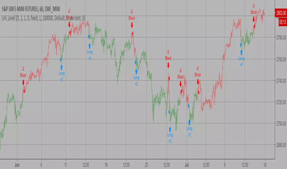
Higher Lows / Lower Highs AlertsSet an alert with this indicator for greater than 0.99 which will notify you of when a higher low or lower high is printed on the chart
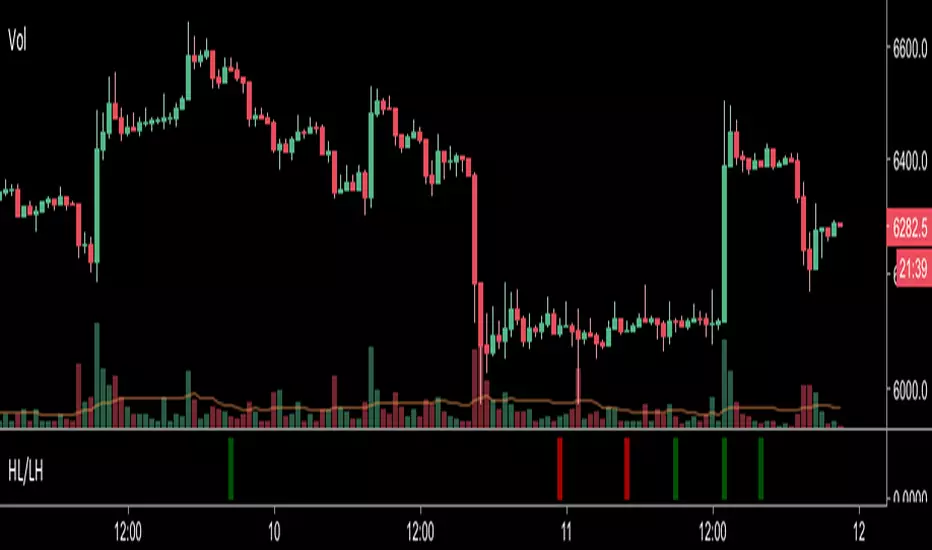
Consecutive Highs/LowsTrack consecutive new highs/lows outside the Donchian range. Fans of the oldschool Turtle Strategy should enjoy the visualization.
Same logic as my "Walking the Bands" script, just with Donchian breaks instead of Bollinger tags.

Multiple EMA 34(low-close-high)/89 by EricThis script supports for multiple EMA 34(low-close-high)/89 indicator.
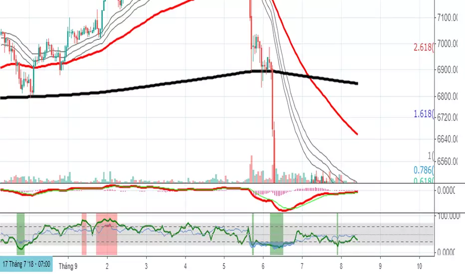
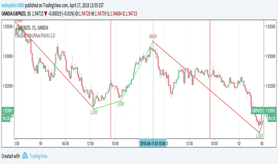
Last High and Low Level Backtest This script shows a high and low period value.
SelectPeriod - Day or Week or Month and etc.
LookBackPeriods - Shift levels 0 - current period, 1 - previous and etc.
You can change long to short in the Input Settings
WARNING:
- For purpose educate only
- This script to change bars colors.
Last High and Low Level Strategy This script shows a high and low period value.
SelectPeriod - Day or Week or Month and etc.
LookBackPeriods - Shift levels 0 - current period, 1 - previous and etc.
WARNING:
- This script to change bars colors

High and Low Levels Backtest This script shows a high and low period value.
Width - width of lines
SelectPeriod - Day or Week or Month and etc.
LookBack - Shift levels 0 - current period, 1 - previous and etc.
You can change long to short in the Input Settings
WARNING:
- For purpose educate only
- This script to change bars colors.

High and Low Levels Strategy This script shows a high and low period value.
Width - width of lines
SelectPeriod - Day or Week or Month and etc.
LookBack - Shift levels 0 - current period, 1 - previous and etc.
WARNING:
- This script to change bars colors.
Chad Swing High/Low (Prophet)Marks swing highs and lows (e.g: a high with a lower high on either side), to simplify counting CBLs.
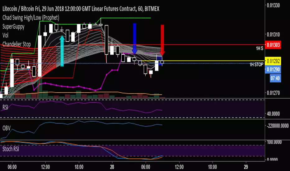
Chart Mojo Noiz Day High/LowThis is an intraday indicator that indicates days high, low, mid range (50%), and vwap. I use it on a 5 min chart or under. Its for range trading, also breakouts, and I use the zone between the 50% of range and vwap as a target during the day at certain times..it has "gravity" ..when traders unwind and or position ahead of something, news or certain time zones with tendencies etc price is drawn towards it. Thanks to Noiz for working on the script. Hope it gives you some Chartmojo.


Projecting From Stability & Low RSIStable periods that are projected can be found using Bollinger Band Percent Width Crossing historically low RSI.

YTC - Swing Highs & LowsThis Indicator Plots Swing Highs & Swing Lows based on Lance Beggs of (Your Trading Coach) definition:
A Swing High (SH) is a price bar high preceed by two lower highs (LH) and followed by two lower highs (LH)
In the event of multiple candles forming equal highs, this will still be defined as a swing high, provided that there are two candles with lower highs both preceding and following the multiple candle formation.

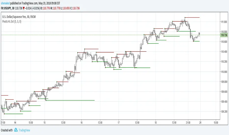
Pivot Points High Low ExtensionPivot Points High Low Extension
See Also:
- A Simple 1-2-3 Method for Trading Forex
- The Classic 1-2-3 Pattern: An Underestimated Powerhouse
- Bulkowski's 1-2-3 Trend Change


Yesterday Line: Lines at Yesterday's Open, Close, High, and Lowcreated by AutemOx
twitter: @joyrider5
reddit: /u/joyrider5
This creates lines at yesterdays open, close, high, and low. It is pretty amazing use of the timenow and dayofweek variables if I say so myself 8)

ka66: Period-Bounded High/Low LinesIndicator: Period-Bounded High/Low Lines
There's a few similar ones on TradingView already (as expected), nothing particularly special about this, was just fun to write the logic for it, and understand how it might be used to trade.
Interestingly, I just came across the idea from watching Adam Grimes' Chartschool video, "Anticipating Intraday Action":
www.youtube.com
Thought it was pretty neat. Use the "Daily" bound (default) with intra-day interval charts to get the same effect as in the video.
Now, to watch the video for its actual purpose. ;-)
