Cari dalam skrip untuk "low"


Bollinger Band with Touch Alerts and Disappear on Low TimeframesModified Bollinger Band with Touch Alerts and Disappear on Low Timeframes

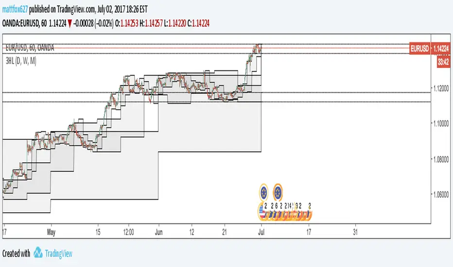
Last High and Low Level (Daily, Weekly or Monthly) This script shows a high and low period value.
Width - width of lines
SelectPeriod - Day or Week or Month and etc.
LookBackPeriods - Shift levels 0 - current period, 1 - previous and etc.
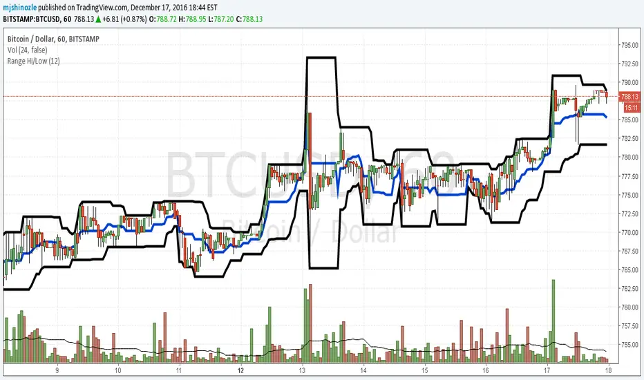
High and Low Levels This script shows a high and low period value.
Width - width of lines
SelectPeriod - Day or Week or Month and etc.
LookBack - Shift levels 0 - current period, 1 - previous and etc.
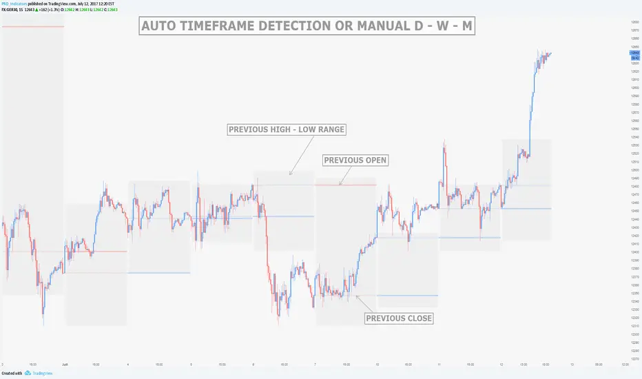
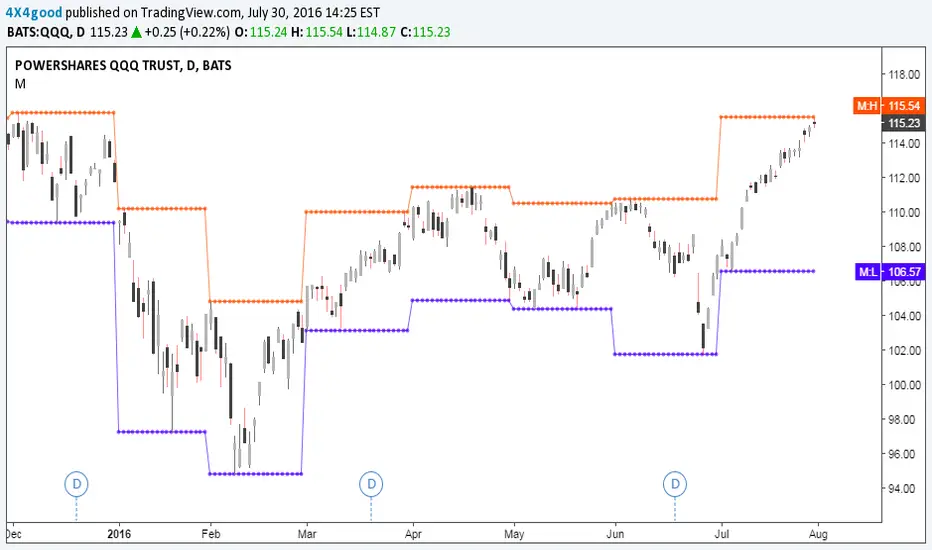
MTF Previous Open/Close/RangeThis indicator will simply plot on your chart the Daily/Weekly/Monthly previous candle levels.
The "Auto" mode will allow automatic adjustment of timeframe displayed according to your chart.
Otherwise you can select manually.
Indicator plots the open/close and colors the high-low range area in the background.
Hope this simple indicator will help you !
You can check my indicators via my TradingView's Profile : @PRO_Indicators

HalHighest High and Lowest Low within a given length. Default is 260 bars (approx 1 year)
Separated in 3 thirds with 2 middle lines. Lowest third, middle third and highest third.
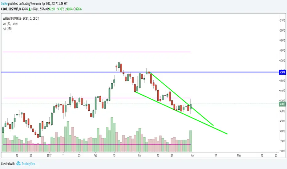
Highest High and Lowest Low channel Backtest Highest High and Lowest Low channel Strategy
You can change long to short in the Input Settings
Please, use it only for learning or paper trading. Do not for real trading.


hi/low levels and fibsSlight development on previous range hi/low script. Plots highest lowest price over x periods, and the mid-point. Added to this are 2 sets of fib lines. That's it! :)

Hi Low and fibsSlight development on previous simple range hi/low script. Plots the highest and lowest of x periods, plus the mid point and 2 sets of fibs. That's it. :)

Simple Range Hi/LowSimple script and my first. Plots the high/low of x periods, and the mid-point. That's it.
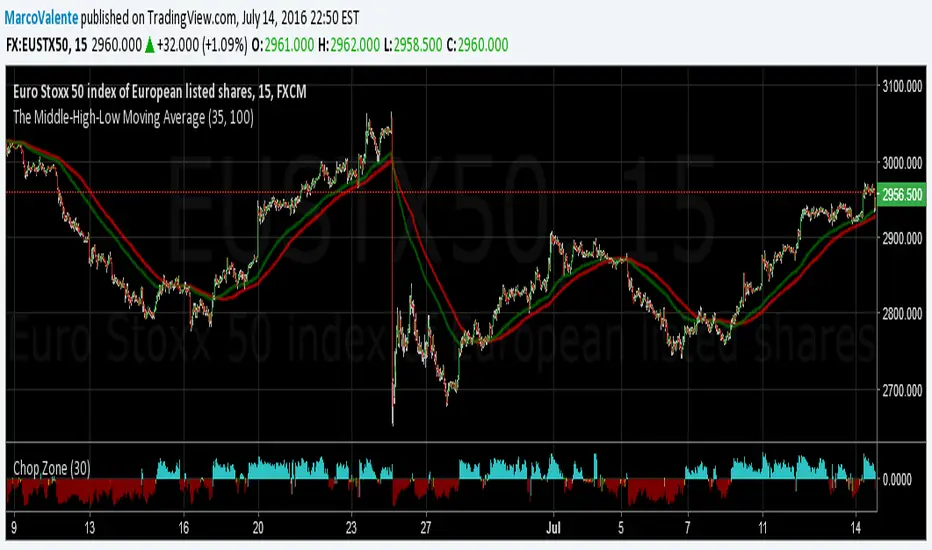
The Middle-High-Low Moving AverageA standard EMA and a Middle-High-Low EMA give a good signal when they cross
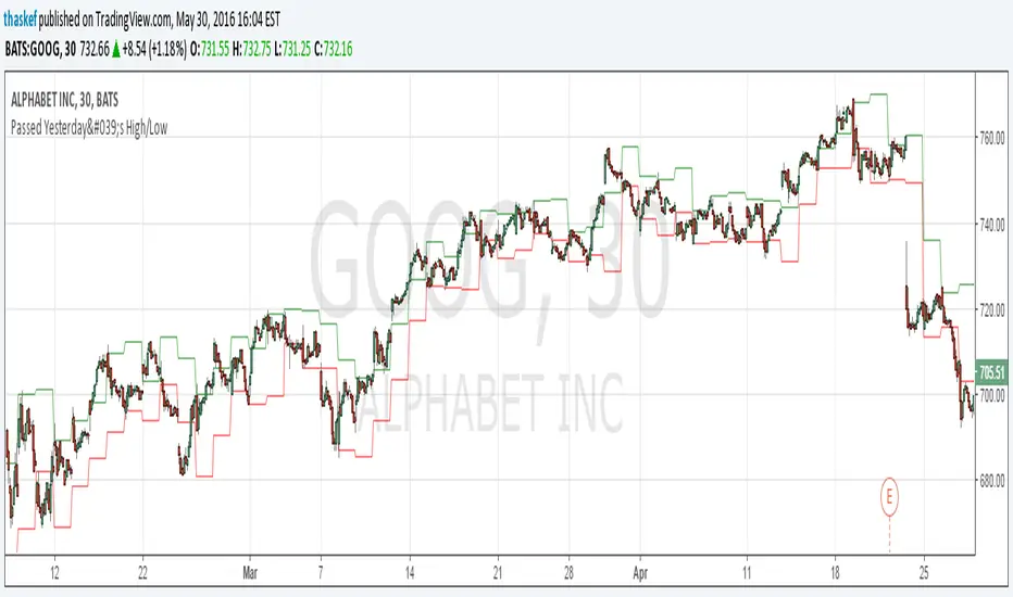
ALERT: Passed Yesterday's High/LowThis is just a simple script to show if the current price passed yesterday's high or low price. It will create an alert if so (which can be set up to notify you via email or text).
blog.tradingview.com
Kay_High_LowPrevious High low plotting.
COPIED from Chris Moody's script and adjusted it for my needs.

CD_Average Daily Range Zones- highs and lows of the dayUses daily average ranges of 5 and 10 (most used) as buy (support) and highs (resistance) areas - half ranges used in calculations for a more accurate "forecast" of the H and L . Uses open but not close, so it does not repaint - experimental
