Candles Trend 1ok so i republish this indicator again. first version had some repaint issue so it been removed
here the script does not suppuse to have this issue
so it basic 1 day MTF candles over 1 week MTF candles
blue color is bullish , orange is berrish
the signal and alert are produced by the crossing of the daily over the weekly close (in the case of the weekly it non security type of MTF.
for stocks I use 1 week over 1 month MTF on lower TF
Cari dalam skrip untuk "mtf"
Security issuesource of code of no repaint by Duyck
source of code fix by i Think Quansium ( please correct me if i am wrong) ,great reading I have to say
please read what he suggest . i try his way but sadly it did not work as i wish . that why i change to this soulution
docs.google.com
Here i just took the great work of this two folks (amazing geniuses)
and try to combine them so the non repaint, no security source of the close MTF will look exact as the repaint one.
so this soultion try to create realible source with no security that look exact as the repaint source with the security
all thanks to the above authors
I just put here so maybe someone in the TV comunity move forward the issue how to fix the security issue
and by that we can create great indicators if it fix
so the no repaint named no security (red color)
repaint is green color
as you see they aligh very nice with no different
sadly if I try to put barmerge on this solution does not work (need to find why??)
so maybe you have better solutions?
I hope thios would help coders to make better MTF until TV fix the issue with security

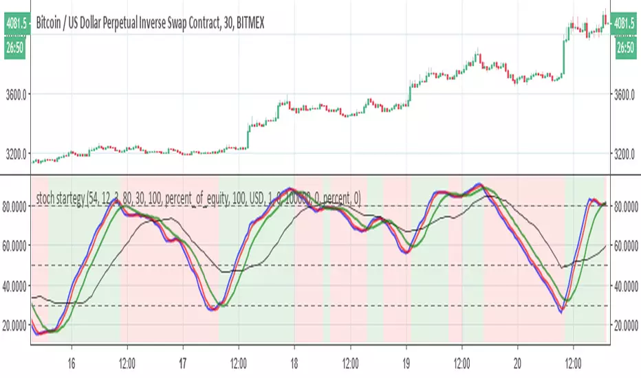
stoch startegyStoch strategy that try to buy in uptrend and to sell in low trend
the bearish and bullish zones are based on regular K stoch over MTF D (3X or timeX3) and vice versa .
The buy and sell rule based on conditions
2- when mtf stochastic cross above 50 and current is rising, buy
3- when mtf stochastic cross bellow 50 and current isfalling, sell
the main script was written by
03.freeman
I just change some settings to improve it
VolumeS as stochv1just to show a concept . I use volume S to make it as stoch and add to it MTF function
B=buy
S=sell
D=down
if you do not like the MTF fuction just remove it from code or put the time frame of graph to be exact as MTF one
I did not add alert as it just a concept idea , to make it more complex it easy if you add more indicators to it and then compare the signals
have fun

Ichimoku Bounce on Tenkan-Sen by YellowKumaIchimoku Bounce (Long/Short) on Tenkan-Sen by YellowKuma
Pure bounce signals off the Tenkan-sen • No MTF • No noise
🌊 What It Does
This indicator spots high-probability reversal zones where price reacts off the Tenkan-sen (9-period conversion line) — the fastest Ichimoku component acting as dynamic support/resistance.
✅ Long signal → Price bounces up from Tenkan-sen while trading above the cloud
✅ Short signal → Price rejects down from Tenkan-sen while trading below the cloud
✅ Kijun-sen is used only as a trend filter (Tenkan > Kijun for longs / Tenkan < Kijun for shorts) — never as a bounce level
✅ Zero MTF complexity — runs purely on your chart's native timeframe, no repainting
Signals appear as:
🟢 "L" label below the bar → Bullish Tenkan bounce
🔴 "S" label above the bar → Bearish Tenkan bounce
⏱️ Timeframe Matters — A Lot
This strategy shines on higher timeframes and struggles on low ones. Why?
📈 H4 / Daily / Weekly
→ Tenkan-sen aligns with real institutional pivot zones
→ Cloud represents weeks of consensus value — strong trend filter
→ Bounces carry momentum → larger winners, fewer whipsaws
📉 M5 / M15 / M30
→ Tenkan-sen reacts to micro-noise, not structure
→ Cloud too thin — price slices through easily
→ False bounces dominate → shallow moves, poor R:R
💡 Rule of thumb:
• Use H4 for swing entries
• Use Daily for core trend trades
• Keep a Weekly chart open to confirm macro trend (only trade bounces with the Weekly cloud)
• Avoid M15/M30 entirely — signal quality degrades sharply
⚙️ Settings (Simple & Clean)
• Tenkan-sen Period → 9 (standard) — shorter = more sensitive, longer = smoother
• Kijun-sen Period → 26 (standard) — trend filter only
• Senkou Span B Period → 52 (standard) — defines cloud thickness
• Show Long Bounces → Toggle ON/OFF
• Show Short Bounces → Toggle ON/OFF
Cloud colors:
🟢 Green fill → Bullish cloud (Senkou Span A > B)
🔴 Red fill → Bearish cloud (Senkou Span A < B)
🎯 How to Trade the Signals
1️⃣ Wait for confirmation
→ Never enter mid-bar. Wait for candle close beyond the Tenkan-sen.
2️⃣ Check cloud alignment
→ Longs only when price > cloud top
→ Shorts only when price < cloud bottom
3️⃣ Add price action confirmation (optional but recommended)
→ Bullish engulfing / hammer at Tenkan → stronger long signal
→ Bearish engulfing / shooting star at Tenkan → stronger short signal
4️⃣ Risk management
→ Stop-loss: 1–2 pips beyond bounce bar extreme OR 2×ATR(14)
→ Take-profit: Target Kijun-sen (near-term) or opposite cloud boundary (swing)
→ Minimum reward:risk = 1:3
5️⃣ Avoid these situations
→ Choppy markets (Tenkan/Kijun flat, cloud thin)
→ Major news events (FOMC, NFP) — volatility distorts Tenkan touches
→ Bounces within 15 pips of strong horizontal resistance/support against your direction
🔔 Alerts
Built-in alert conditions:
• "Long Bounce" → triggers when green "L" appears
• "Short Bounce" → triggers when red "S" appears
→ Right-click indicator → Add Alert → choose condition
💡 Pro Tips for TradingView Users
✨ Session timing: Avoid first 60 mins of London/NY open — volatility creates false Tenkan touches
✨ Combine with Weekly trend: Disable short signals when price > Weekly cloud (and vice versa)
✨ Less is more: Expect 2–5 high-quality signals per week on H4 — that's normal. Quality > quantity.
⚠️ Important
This is a price-structure tool, not a magic bullet.
Always:
• Respect the trend (trade bounces with the cloud, not against it)
• Use proper position sizing (0.5–1% risk per trade)
• Keep a trading journal — track which bounces worked and why
✨ Bottom Line
Pure. Simple. Effective.
By focusing only on Tenkan-sen bounces — and enforcing strict cloud alignment — this indicator cuts through noise and delivers clean reversal zones where institutions actually place orders.
Works best on H4 and higher.
Add it. Switch to H4. Trade the bounce. 🚀 @YellowKumo

PSAR Laboratory [DAFE]PSAR Laboratory : The Ultimate Adaptive Trailing Stop & Reversal Engine
23 Advanced Algorithms. Adaptive Acceleration. Smart Flip Logic. Parabolic SAR Reimagined.
█ PHILOSOPHY: WELCOME TO THE LABORATORY
The standard Parabolic SAR, created by the legendary J. Welles Wilder Jr., is a tool of beautiful simplicity. But in today's complex, algorithm-driven markets, its simplicity is its fatal flaw. Its fixed acceleration and rigid flip logic cause it to fail precisely when you need it most: it whipsaws in choppy conditions and gives back too much profit in strong trends.
The PSAR Laboratory was not created to be just another PSAR. It was engineered to be the definitive evolution of Wilder's original concept. This is not an indicator; it is a powerful, interactive research environment. It is a sandbox where you, the trader, can move beyond the static "one-size-fits-all" approach and forge a PSAR that is perfectly adapted to your specific market, timeframe, and trading style.
We have deconstructed the very DNA of the Parabolic SAR and rebuilt it from the ground up, infusing it with modern quantitative techniques. The result is an institutional-grade suite of 23 distinct, mathematically diverse algorithms that dynamically control every aspect of the PSAR's behavior.
█ WHAT MAKES THIS A "LABORATORY"? THE CORE INNOVATIONS
This tool stands in a class of its own. It is a collection of what could be 23 separate indicators, all seamlessly integrated into one powerful engine.
The 23 Algorithm Engine: This is the heart of the Laboratory. Instead of one rigid formula, you have a library of 23 unique mathematical engines at your command. These algorithms are not simple tweaks; they are complete re-imaginings of how the PSAR should behave, based on concepts from information theory, digital signal processing, fractal geometry, and institutional analysis.
Truly Adaptive Acceleration (AF): The standard PSAR's "gas pedal" (the AF) is dumb; it accelerates at a fixed rate. Our algorithms make it intelligent. The AF can now speed up in clean, trending environments to lock in profits, and automatically slow down in choppy, chaotic conditions to avoid whipsaws.
Advanced Flip Confirmation Logic: Say goodbye to noise-driven flips. You are no longer at the mercy of a single wick touching the SAR. The Laboratory provides multiple layers of flip confirmation, including requiring a bar close beyond the SAR, a volume spike to validate the reversal, or even a multi-bar confirmation .
Comprehensive Noise Filtering Core: In a revolutionary step, you can apply one of over 30 advanced signal processing filters directly to the SAR output itself. From ultra-low-lag filters like the Hull MA and DAFE Spectral Laguerre to adaptive filters like KAMA and FRAMA , you can surgically remove noise while preserving the responsiveness of the core signal.
Integrated Performance Engine: How do you know which of the 23 algorithms is best for your market? You test it. The built-in Performance Dashboard is a comprehensive backtesting and analytics engine that tracks every trade, providing real-time data on Win Rate, Profit Factor, Max Drawdown, and more. It allows you to scientifically validate your chosen configuration.
█ A GUIDED TOUR OF THE ALGORITHMS: 23 PATHS TO AN EDGE
b]These 23 algorithms are not simple settings; they are distinct mathematical philosophies for how a Parabolic SAR should adapt to the market. They are grouped into three primary categories: those that adapt the Acceleration Factor (AF) , those that enhance the Extreme Point (EP) detection, and those that redefine the Flip Logic .
CATEGORY A: ACCELERATION FACTOR (AF) ADAPTATION
These algorithms dynamically change the "gas pedal" of the PSAR.
1. Volatility-Scaled AF
Core Concept: Treats volatility as market friction. The PSAR should be more forgiving in high-volatility environments.
How It Works: It calculates a Volatility Ratio by comparing the short-term ATR to the long-term ATR. If current volatility is high (ratio > 1), it reduces the AF Step. If volatility is low (ratio < 1), it increases the AF Step to trail tighter.
Ideal Use Case: The best all-rounder. Excellent for any market, especially those with clear shifts between high and low volatility regimes (like indices and crypto).
2. Efficiency Ratio (ER) AF
Core Concept: The PSAR should accelerate aggressively in clean, efficient trends and slow down dramatically in choppy, inefficient markets.
How It Works: It uses Kaufman's Efficiency Ratio (ER), which measures the net directional movement versus the total price movement. A high ER (near 1.0) signifies a pure trend, triggering a high AF multiplier. A low ER (near 0.0) signifies chop, triggering a low AF multiplier.
Ideal Use Case: Markets that alternate between strong trends and sideways chop. It is exceptionally good at surviving ranging periods.
3. Shannon Entropy AF
Core Concept: Uses Information Theory to measure market disorder. The PSAR should be conservative in chaos and aggressive in order.
How It Works: It calculates the Shannon Entropy of recent price changes. High entropy means the market is unpredictable ("chaotic"), causing the AF to slow down. Low entropy means the market is organized and trending, causing the AF to speed up.
Ideal Use Case: Advanced traders looking for a mathematically pure way to distinguish between a tradable trend and random noise.
4. Fractal Dimension (FD) AF
Core Concept: Measures the "jaggedness" or complexity of the price path. A smooth path is a trend; a jagged, space-filling path is chop.
How It Works: It calculates the Fractal Dimension of the price series. An FD near 1.0 is a smooth line (high AF). An FD near 1.5 is a random walk (low AF).
Ideal Use Case: Visually identifying the moment a smooth trend begins to break down into chaotic, unpredictable movement.
5. ADX-Gated AF
Core Concept: Uses the classic ADX indicator to confirm the presence of a trend before allowing the PSAR to accelerate.
How It Works: If the ADX value is above a "Strong" threshold (e.g., 25), the AF accelerates normally. If the ADX is below a "Weak" threshold (e.g., 15), the AF is "frozen" and will not increase, preventing the SAR from tightening up in a non-trending market.
Ideal Use Case: For classic trend-following purists who trust the ADX as their primary regime filter.
6. Kalman AF Estimator
Core Concept: A sophisticated signal processing algorithm that predicts the "true" optimal AF by filtering out price "noise."
How It Works: It treats the PSAR's AF as a state to be estimated. It makes a prediction, then corrects it based on how far the actual price deviates. It's like a GPS constantly refining its position. The "Process Noise" input controls how fast it thinks the AF can change, while "Measurement Noise" controls how much it trusts the price data.
Ideal Use Case: Smooth, high-inertia markets like commodities or major forex pairs. It creates an incredibly smooth and responsive AF.
7. Volume-Momentum AF
Core Concept: A trend's acceleration is only valid if confirmed by both volume and price momentum.
How It Works: The AF will only increase if a new Extreme Point is made on above-average volume AND the Rate of Change (ROC) of the price is aligned with the trend's direction.
Ideal Use Case: Any market with reliable volume data (stocks, futures, crypto). It's excellent for filtering out low-conviction moves.
8. Garman-Klass (GK) AF
Core Concept: Uses a more advanced, statistically efficient measure of volatility (Garman-Klass, which uses OHLC data) to adapt the AF.
How It Works: It modulates the AF based on whether the current GK volatility is higher or lower than its historical average. Unlike the standard Volatility-Scaled algo, it tends to slow down more in high volatility and speed up less in low volatility, making it more conservative.
Ideal Use Case: Traders who want a volatility-adaptive model that is more focused on risk reduction during volatile periods.
9. RSI-Modulated AF
Core Concept: The RSI can identify points of potential trend exhaustion or strong momentum.
How It Works: If a trend is bullish but the RSI enters the "Overbought" zone, the AF slows down, anticipating a pullback. Conversely, if the RSI is in the strong momentum mid-range (40-60), the AF is boosted to trail more aggressively.
Ideal Use Case: Mean-reversion traders or those who want to automatically loosen their trail stop near potential exhaustion points.
10. Bollinger Squeeze AF
Core Concept: A Bollinger Band Squeeze signals a period of volatility compression, often preceding an explosive breakout.
How It Works: When the algorithm detects that the Bollinger Band Width is in a "Squeeze" (below a certain historical percentile), it boosts the AF in anticipation of a fast move, allowing the PSAR to catch the breakout quickly.
Ideal Use Case: Breakout traders. This algorithm primes the PSAR to be maximally responsive right at the moment a breakout is most likely.
11. Keltner Adaptive AF
Core Concept: Keltner Channels provide a robust measure of a trend's "normal" volatility channel.
How It Works: When price is trading strongly outside the Keltner Channel, it's considered a powerful trend, and the AF is boosted. When price falls back inside the channel, it's considered a consolidation or pullback, and the AF is slowed down.
Ideal Use Case: Trend followers who use channel breakouts as their primary confirmation.
12. Choppiness-Gated AF
Core Concept: Uses the Choppiness Index to quantify whether the market is trending or consolidating.
How It Works: If the Choppiness Index is below the "Trend" threshold (e.g., 38.2), the AF is boosted. If it's above the "Range" threshold (e.g., 61.8), the AF is significantly reduced.
Ideal Use Case: A more responsive alternative to the ADX-Gated algorithm for distinguishing between trending and ranging markets.
13. VIDYA-Style AF
Core Concept: Uses a Chande Momentum Oscillator (CMO) to create a variable-speed acceleration factor.
How It Works: The absolute value of the CMO is used to create a dynamic smoothing constant. Strong momentum (high absolute CMO) results in a faster, more responsive AF. Weak momentum results in a slower, smoother AF.
Ideal Use Case: Momentum traders who want their trailing stop's speed directly tied to the momentum of the price itself.
14. Hilbert Cycle AF
Core Concept: Uses Ehlers' Hilbert Transform to extract the dominant cycle period of the market and synchronizes the PSAR with it.
How It Works: It dynamically adjusts the AF based on the detected cycle period (shorter cycles = faster AF) and can also modulate it based on the current phase within that cycle (e.g., accelerate faster near cycle tops/bottoms).
Ideal Use Case: Markets with clear cyclical behavior, like commodities and some forex pairs.
CATEGORY B: EXTREME POINT (EP) ENHANCEMENT
These algorithms make the detection of new highs/lows more intelligent.
15. Volume-Weighted EP
Core Concept: A new high or low is more significant if it occurs on high volume.
How It Works: It can be configured to only accept a new EP if the volume on that bar is above average. It can also "weight" the EP by volume, pushing it further out on high-volume bars.
Ideal Use Case: Filtering out weak, low-conviction price probes in markets with reliable volume.
16. Wavelet Filtered EP
Core Concept: Uses wavelet decomposition (a signal processing technique) to separate the underlying trend from high-frequency noise.
How It Works: It calculates a smoothed, wavelet-filtered version of the price. A new EP is only registered if the actual high/low significantly exceeds this smoothed baseline, effectively ignoring minor noise spikes.
Ideal Use Case: Noisy markets where small, insignificant wicks can cause the AF to accelerate prematurely.
17. ATR-Validated EP
Core Concept: A new EP should represent a meaningful move, not just a one-tick poke.
How It Works: It requires a new high/low to exceed the previous EP by a minimum amount, defined as a multiple of the current ATR. This ensures only volatility-significant advances are counted.
Ideal Use Case: A simple, robust way to filter out "noise" EPs and slow down the AF's acceleration in choppy conditions.
18. Statistical EP Filter
Core Concept: A new EP is only valid if the price change that created it is statistically significant.
How It Works: It calculates the Z-Score of the bar's price change relative to recent history. A new EP is only accepted if its Z-Score exceeds a certain threshold (e.g., 1.5 sigma), meaning it was an unusually strong move.
Ideal Use Case: For quantitative traders who want to ensure their trailing stop only tightens in response to statistically meaningful price action.
CATEGORY C: FLIP LOGIC & CONFIRMATION
These algorithms change the very rules of when and why the PSAR reverses.
19. Dual-PSAR Gate
Core Concept: Uses two PSARs—one fast and one slow—to confirm a reversal.
How It Works: A flip signal for the main PSAR is only considered valid if both the fast (sensitive) PSAR and the slow (structural) PSAR have flipped. This acts as a powerful trend filter.
Ideal Use Case: An excellent method for reducing whipsaws. It forces the PSAR to wait for both short-term and longer-term momentum to align before signaling a reversal.
20. MTF Coherence PSAR
Core Concept: Do not flip against the higher timeframe macro trend.
How It Works: It pulls PSAR data from two higher timeframes. A flip is only allowed if the new direction does not contradict the trend on at least one (or both) of those higher timeframes. It also boosts the AF when all timeframes are aligned.
Ideal Use Case: The ultimate tool for multi-timeframe traders who want to ensure their entries and exits are in sync with the bigger picture.
21. Momentum-Gated Flip
Core Concept: A reversal is only valid if it is supported by a significant surge of momentum.
How It Works: A price cross of the SAR is not enough. The script also requires the Rate of Change (ROC) to exceed a certain threshold for a set number of bars, confirming that there is real force behind the reversal.
Ideal Use Case: Filtering out weak, drifting reversals and only taking signals that are initiated with explosive power.
22. Close-Only PSAR
Core Concept: Wicks are noise; the bar's close is the final decision.
How It Works: This algorithm modifies the flip logic to ignore wicks. A flip only occurs if one or more bars close beyond the SAR line.
Ideal Use Case: One of the most effective and simple ways to reduce false signals from volatile wicks. A fantastic default choice for any trader.
23. Ultimate PSAR Consensus
Core Concept: The highest conviction signal comes from the agreement of multiple, diverse mathematical models.
How It Works: This is the capstone algorithm. It runs a "vote" between a selection of the top-performing algorithms (e.g., Volatility-Scaled, Efficiency Ratio, Dual-PSAR). A flip is only signaled if a majority consensus is reached. It can even weight the votes based on each algorithm's recent performance.
Ideal Use Case: For traders who want the absolute highest level of confirmation and are willing to accept fewer, but more robust, signals.
█ PART II: THE NOISE FILTERING CORE - The Shield
This is a revolutionary feature that allows you to apply a second layer of signal processing directly to the SAR line itself, surgically removing noise before the flip logic is even considered.
FILTER CATEGORIES
Basic Filters (SMA, EMA, WMA, RMA): The classic moving averages. They provide basic smoothing but introduce significant lag. Best used for educational purposes.
Low-Lag Filters (DEMA, TEMA, Hull MA, ZLEMA): A family of filters designed to reduce the lag inherent in basic moving averages. The Hull MA is a standout, offering a superb balance of smoothness and responsiveness.
Adaptive Filters (KAMA, VIDYA, FRAMA): These are "smart" filters. They automatically adjust their smoothing level based on market conditions. They will be very smooth in choppy markets and become highly responsive in trending markets.
Advanced DSP & DAFE Filters: This is the pinnacle of signal processing.
Ehlers Filters (SuperSmoother, 2-Pole, 3-Pole): Based on the work of John Ehlers, these use digital signal processing techniques to remove high-frequency noise with minimal lag.
Gaussian & ALMA: These use a bell-curve weighting, giving the most importance to recent data in a smooth, non-linear fashion.
DAFE Spectral Laguerre: A proprietary, non-linear filter that uses a feedback loop and adapts its "gamma" based on volatility, providing exceptional tracking in all market conditions.
How to Choose a Filter
Start with "None": First, find an algorithm you like with no filtering to understand its raw behavior.
Introduce Low Lag: If you are getting too many whipsaws from noise, apply a short-length Hull MA (e.g., 5-8). This is often the best solution.
Go Adaptive: If your market has very distinct trend/chop regimes, try an Adaptive KAMA .
Maximum Purity: For the smoothest possible output with excellent responsiveness, use the DAFE Spectral Laguerre or Ehlers SuperSmoother .
█ THE VISUAL EXPERIENCE: DATA AS ART
The PSAR Laboratory is not just functional; it is beautiful. The visualization engine is designed to provide you with an intuitive, at-a-glance understanding of the market's state.
Algorithm-Specific Theming: Each of the 23 algorithms comes with its own unique, professionally designed color palette. This not only provides visual variety but allows you to instantly recognize which engine is active.
Dynamic Glow Effects: For many algorithms, the PSAR dots will emit a soft "glow." The brightness and color of this glow are not random; they are tied to a key metric of the active algorithm (e.g., trend strength, volatility, consensus), providing a subtle, visual cue about the health of the trend.
Adaptive Volatility Bands: Certain algorithms will display dynamic bands around the PSAR. These are not standard deviation bands; their width is controlled by the specific logic of the active algorithm, showing you a visual representation of the market's expected range or energy level.
Secondary Reference Lines: For algorithms like the Dual-PSAR or MTF Coherence, a secondary line will be plotted on the chart, giving you a clear visual of the underlying data (e.g., the slow PSAR, the HTF trend) that is driving the decision-making process.
█ THE MASTER DASHBOARD: YOUR MISSION CONTROL
The comprehensive dashboard is your unified command center for analysis and performance tracking.
Engine Status: See the currently selected Algorithm, the active Noise Filter, the Trend direction, and a real-time progress bar of the current Acceleration Factor (AF).
Algorithm-Specific Metrics: This is the most powerful section. It displays the key real-time data from the currently active algorithm. If you're using "Shannon Entropy," you'll see the Entropy score. If you're using "ADX-Gated," you'll see the ADX value. This gives you a direct, quantitative look under the hood.
Performance Readout: When enabled, this section provides a full breakdown of your backtesting results, including Win Rate, Profit Factor, Net P&L, Max Drawdown, and your current trade status.
█ DEVELOPMENT PHILOSOPHY
The PSAR Laboratory was born from a deep respect for Wilder's original work and a relentless desire to push it into the 21st century. We believe that in modern markets, static tools are obsolete. The future of trading lies in adaptation. This indicator is for the serious trader, the tinkerer, the scientist—the individual who is not content with a black box, but who seeks to understand, test, and refine their edge with surgical precision. It is a tool for forging, not just following.
The PSAR Laboratory is designed to be the ultimate tool for that evolution, allowing you to discover and codify the rules that truly fit you.
█ DISCLAIMER AND BEST PRACTICES
THIS IS A TOOL, NOT A STRATEGY: This indicator provides a sophisticated trailing stop and reversal signal. It must be integrated into a complete trading plan that includes risk management, position sizing, and your own contextual analysis.
TEST, DON'T GUESS: The power of this tool is its adaptability. Use the Performance Dashboard to rigorously test different algorithms and settings on your chosen asset and timeframe. Find what works, and build your strategy around that data.
START SIMPLE: Begin with the "Volatility-Scaled AF" algorithm, as it is a powerful and intuitive all-rounder. Once you are comfortable, begin experimenting with other engines.
RISK MANAGEMENT IS PARAMOUNT: All trading involves substantial risk. The backtesting results are hypothetical and do not account for slippage or psychological factors. Never risk more capital than you are prepared to lose.
"I don't think traders can follow rules for very long unless they reflect their own trading style. Eventually, a breaking point is reached and the trader has to quit or change, or find a new set of rules he can follow. This seems to be part of the process of evolution and growth of a trader."
— Ed Seykota, Market Wizard
Taking you to school. - Dskyz, Trade with Volume. Trade with Density. Trade with DAFE

Dow-Granville Sync SuiteEnglish Description (English Section)
Name: Dow-Granville Sync Suite
The Dow-Granville Sync Suite is an analysis tool that integrates trend determination based on Dow Theory with price positioning relative to the 20SMA (Simple Moving Average) across multiple timeframes (MTF).
It is designed to organize information across various timeframes, allowing users to understand the status from higher to lower timeframes without switching charts.
Multi-Timeframe Dow Analysis Analyzes highs and lows for each timeframe to determine the current trend state (Bullish, Bearish, or Consolidation).
SMA Position Analysis Determines whether the price is above or below the 20SMA for all timeframes. This is used to identify price positioning based on Granville's Law.
Synchronization Signals Displays ★ icons on the chart when the Dow direction and SMA position align across 4 or 5 consecutive timeframes.
Status Dashboard Displays a summary table on the right side of the screen showing the trend status for each timeframe.
Squeeze Detection Detects low volatility periods caused by the convergence of highs and lows, indicating them with specific markers on the chart.
Check the trend direction of higher timeframes, such as Daily or 4-Hour charts, on the right-hand dashboard.
Use the synchronization signals (★) on lower timeframes, when they align with the higher timeframe trend, as a reference for decision-making.
This tool is intended as an analytical aid and does not constitute investment advice.
Results based on historical data do not guarantee future performance.
日本語説明文 (Japanese Section)
名称:Dow-Granville Sync Suite
【概要】 Dow-Granville Sync Suiteは、ダウ理論によるトレンド判定と、20SMA(単純移動平均線)に対する価格の位置関係を、複数の時間軸(MTF)で統合して表示する解析ツールです。
各時間軸の情報を整理し、チャートを切り替えることなく上位足から下位足までの状態を把握することを目的としています。
【主な機能】
マルチタイムフレーム・ダウ分析 各時間軸の高値・安値を参照し、現在のトレンド(上昇・下降・保合い)を自動で判定します。
SMA位置解析 価格が20SMAの上にあるか下にあるかを全時間軸で判定します。これはグランビルの法則における価格の偏りを把握するために利用します。
同調シグナル 4つ、または5つの連続した時間軸において、ダウの方向とSMAに対する位置関係がすべて一致した際に、チャート上に★印を表示します。
ステータス・ダッシュボード 画面右側に、各時間軸のトレンド状況を一覧表で表示します。
スクイーズ検知 高値・安値の収束によるボラティリティの低下を検知し、チャート上にマークを表示します。
【使い方】
右側のダッシュボードで、日足や4時間足などの上位足のトレンド方向を確認します。
下位足において、上位足と同方向の同調シグナル(★)が発生した際の状態を、判断の材料として利用します。
【免責事項】
本ツールは分析の補助を目的としたものであり、投資助言ではありません。
過去のデータによる結果は、将来の利益を保証するものではありません。

Donchian Channels (Multi Time Frame) x 3)📊 MTF Donchian Channels Pro — Triple Timeframe Structure
MTF Donchian Channels Pro is a professional-grade multi-timeframe market structure indicator designed to help traders visualize trend, momentum, and execution zones on a single chart.
This tool allows you to plot up to three independent Donchian Channels, each with its own configurable timeframe and lookback length, giving you instant insight into multi-timeframe alignment and breakout conditions.
By stacking higher, medium, and lower timeframe channels, traders can eliminate noise, improve timing, and trade in the direction of dominant market structure.
🔧 Key Features
✅ Up to 3 independent Donchian Channels
✅ Individual timeframe selection for each channel
✅ Adjustable lookback length per channel
✅ Optional show/hide per channel
✅ Midline (basis) for structure reference
✅ Clean visual fills for fast interpretation
✅ Works on all markets and timeframes
🎯 How to Use
This indicator is designed to support multi-timeframe trading systems.
Example configuration:
• Channel 1 → Lower timeframe (Execution)
• Channel 2 → Medium timeframe (Momentum)
• Channel 3 → Higher timeframe (Structure)
Long Bias Example
Price above higher timeframe channel
Pullback into mid timeframe range
Breakout on lower timeframe channel
Short Bias Example
Price below higher timeframe channel
Retrace into structure
Breakdown on execution timeframe
When all channels align, probability increases.
📈 Best Use Cases
✔ Futures Scalping
✔ Options Day Trading
✔ Forex & Crypto
✔ Swing Trading
✔ Prop Firm Evaluations
✔ Trend-Following Systems
⚠️ Risk Disclaimer
This indicator is a market structure visualization tool and does not provide financial advice. Always use proper risk management and confirm with your own strategy.

Auto Supply and Demand and ICT ExecutionsAuto Supply and Demand and ICT Executions is a professional-grade technical analysis suite designed to automate the visualization of institutional market structure and "Smart Money" execution signals. By combining automated Supply/Demand zoning with key ICT (Inner Circle Trader) concepts, this indicator provides a complete roadmap for identifying high-probability reversal and continuation setups on any timeframe.
Core Features:
Auto Supply & Demand Zones:
Automatically identifies and plots active Supply (Red) and Demand (Green) zones based on significant market structure pivots.
Persistent Logic: Zones remain active on the chart until price "mitigates" (closes beyond) them, ensuring you never miss a retest of a key level.
ATR Clutter Filter: Uses an Average True Range (ATR) algorithm to prevent zones from overlapping, keeping your chart clean and readable.
ICT Execution Signals (MSS):
Market Structure Shifts (MSS): Automatically detects valid shifts in market structure when price breaks a key structural high or low following a liquidity sweep.
Instant Signal Labels: clearly labels breakout points with "MSS ↑" (Bullish) or "MSS ↓" (Bearish) tags.
Auto Risk/Reward Projections:
Upon detecting an MSS signal, the indicator instantly projects a Risk/Reward (R:R) Box (default 1:2) anchored to the breakout candle.
This provides immediate, visual Take Profit (Green) and Stop Loss (Red) targets, allowing for instant trade assessment without manual measuring.
Multi-Timeframe (MTF) Confluence:
Projects Higher Timeframe (HTF) Zones (default: 15-minute) directly onto your current chart.
This allows you to align your lower-timeframe entries (e.g., 1-minute) with the dominant institutional trend without switching screens.
Institutional Concepts:
Liquidity Sweeps: Highlights "Stop Hunt" pivots where price briefly breaches a recent swing high/low to trap traders before reversing.
Fair Value Gaps (FVG): Visualizes historical price imbalances (gaps) where aggressive institutional buying or selling occurred.
Silver Bullet Session: Automatically highlights the high-probability 10:00 AM - 11:00 AM NY trading window.
How to Trade with This Indicator:
Identify Structure: Wait for price to approach a Supply or Demand Zone (especially if it overlaps with an MTF Zone).
Confirm the Sweep: Look for the "Sweep" label, indicating liquidity has been grabbed.
Execute on Signal: Enter the trade when the "MSS" label appears, confirming the reversal.
Manage the Trade: Use the automated R:R Box to set your Stop Loss and Take Profit levels.

ATR Volatility RegimeATR Volatility Regime
A volatility classification indicator that uses ATR (Average True Range) percentile ranking to identify LOW , NORMAL , HIGH , or EXTREME volatility conditions.
Displayed as a separate pane oscillator (0–100 scale) with colored zones.
━━━━━━━━━━━━━━━━━━━━━━━━━━━━━━
💡 WHY THIS INDICATOR?
Most volatility indicators show raw ATR — a number without context. Is ATR = 50 high or low? Depends on the asset and recent history.
This indicator answers: "Is current volatility high or low for THIS asset, right now?"
What it adds over standard ATR:
Percentile context — Compares current ATR to its own history
Regime classification — Actionable labels instead of raw numbers
Visual zones — Instant read without interpretation
Optional MTF — Lock to a fixed timeframe while viewing another
Auto-adapts — Works on any asset without manual threshold tuning
━━━━━━━━━━━━━━━━━━━━━━━━━━━━━━
📐 CORE CONCEPTS
ATR (Average True Range)
Measures volatility in price units — how much an asset typically moves per bar. Directionless (magnitude only, not direction).
Calculation:
True Range = the greatest of:
High − Low (current bar's range)
|High − Previous Close| (gap up captured)
|Low − Previous Close| (gap down captured)
ATR = Moving average of True Range over N bars (default: 14)
Percentile Rank (Pctl)
Answers: "What percentage of historical values is the current value greater than?"
Pctl = 0% → Lowest ATR in lookback period (extreme compression)
Pctl = 50% → Median ATR (typical volatility)
Pctl = 100% → Highest ATR in lookback period (extreme expansion)
━━━━━━━━━━━━━━━━━━━━━━━━━━━━━━
🎯 WHAT IT DOES
Classifies current volatility into four regimes:
LOW (< 25th percentile) — Compression, breakout likely brewing
NORMAL (25th–50th percentile) — Typical market conditions
HIGH (50th–75th percentile) — Elevated volatility, use caution
EXTREME (> 75th percentile) — Rare expansion, tighten stops or stay flat
━━━━━━━━━━━━━━━━━━━━━━━━━━━━━━
📊 DISPLAY COMPONENTS
Oscillator Line (0–100)
ATR percentile rank over time. Color matches regime:
Blue = LOW
Gray = NORMAL
Orange = HIGH
Red = EXTREME
Zone Backgrounds
Colored bands at threshold levels for instant visual reference.
Status Label
VOL — Current regime
ATR — Raw ATR value (for stop sizing)
Pctl — Percentile rank (0–100%)
TF — Active timeframe (chart or fixed)
━━━━━━━━━━━━━━━━━━━━━━━━━━━━━━
📈 HOW TO USE
LOW Volatility (Pctl < 25%):
Market compressed — "calm before the storm"
Watch for breakout setups
Pctl = 0% often precedes significant moves
NORMAL Volatility (Pctl 25–50%):
Typical conditions
Standard position sizing and stops
HIGH Volatility (Pctl 50–75%):
Elevated movement — reduce size
Widen stops to avoid noise
EXTREME Volatility (Pctl > 75%):
Rare, intense conditions
Avoid new entries or tighten risk
━━━━━━━━━━━━━━━━━━━━━━━━━━━━━━
⚙️ SETTINGS
ATR Settings:
ATR Length (default: 14) — Period for ATR calculation
Percentile Lookback (default: 100) — Bars for percentile ranking
Timeframe:
Use Fixed Timeframe (default: off) — Lock calculation to specific TF
Fixed Timeframe (default: D) — TF to use when fixed mode enabled
Thresholds:
Low Threshold (default: 25)
High Threshold (default: 50)
Extreme Threshold (default: 75)
Display:
Show Zone Background — Toggle colored fills
Show Status Label — Toggle info label
━━━━━━━━━━━━━━━━━━━━━━━━━━━━━━
📋 SUGGESTED LOOKBACK BY ASSET
Crypto — 100 bars (fast regime shifts)
Stocks — 252 bars (one trading year)
Forex — 100–150 bars
Commodities — 150–200 bars (seasonal patterns)
━━━━━━━━━━━━━━━━━━━━━━━━━━━━━━
🔔 ALERTS
Vol → EXTREME
Vol → HIGH
Vol → LOW
Vol exits HIGH
━━━━━━━━━━━━━━━━━━━━━━━━━━━━━━
💡 PRACTICAL APPLICATIONS
Stop-Loss Sizing:
Use raw ATR for stops. Example: Stop = Entry − (1.5 × ATR)
Position Sizing:
Reduce size when percentile is HIGH or EXTREME.
Entry Filtering:
LOW regime = prepare for breakout
EXTREME regime = avoid new entries
━━━━━━━━━━━━━━━━━━━━━━━━━━━━━━
📝 NOTES
Works on any timeframe — adapts to chart or locks to fixed TF
ATR is non-directional — magnitude only
Percentile auto-adapts to each asset's volatility profile
Not a standalone signal — combine with trend/regime filters
━━━━━━━━━━━━━━━━━━━━━━━━━━━━━━
🏷️ TAGS
volatility, ATR, average-true-range, percentile, regime, risk-management, position-sizing, swing-trading, MTF

ABCD Strategy (v7 Ready)//@version=6
indicator("ABCD Strategy v7 – MTF S/R Filter", overlay=true, max_lines_count=300, max_labels_count=300)
//━━━━━━━━━━━━━━━━━━━━━
// INPUTS
//━━━━━━━━━━━━━━━━━━━━━
pivotLen = input.int(5, "Swing Strength", minval=2)
bcMin = input.float(0.618, "BC Min Fib")
bcMax = input.float(0.786, "BC Max Fib")
cdMin = input.float(1.272, "CD Min Extension")
cdMax = input.float(1.618, "CD Max Extension")
htfTF = input.timeframe("240", "Higher Timeframe (S/R)")
srLookback = input.int(200, "HTF S/R Lookback")
srTolerance = input.float(0.002, "S/R Zone Tolerance (0.2%)")
showSR = input.bool(true, "Show HTF S/R Zones")
showTargets = input.bool(true, "Show Targets")
//━━━━━━━━━━━━━━━━━━━━━
// HIGHER TF SUPPORT / RESISTANCE
//━━━━━━━━━━━━━━━━━━━━━
htfHigh = request.security(syminfo.tickerid, htfTF, ta.highest(high, srLookback))
htfLow = request.security(syminfo.tickerid, htfTF, ta.lowest(low, srLookback))
srHighZoneTop = htfHigh * (1 + srTolerance)
srHighZoneBottom = htfHigh * (1 - srTolerance)
srLowZoneTop = htfLow * (1 + srTolerance)
srLowZoneBottom = htfLow * (1 - srTolerance)
//━━━━━━━━━━━━━━━━━━━━━
// DRAW HTF ZONES
//━━━━━━━━━━━━━━━━━━━━━
if showSR
box.new(bar_index - 5, srHighZoneTop, bar_index + 5, srHighZoneBottom,
bgcolor=color.new(color.red, 85), border_color=color.red)
box.new(bar_index - 5, srLowZoneTop, bar_index + 5, srLowZoneBottom,
bgcolor=color.new(color.green, 85), border_color=color.green)
//━━━━━━━━━━━━━━━━━━━━━
// SWING DETECTION
//━━━━━━━━━━━━━━━━━━━━━
ph = ta.pivothigh(high, pivotLen, pivotLen)
pl = ta.pivotlow(low, pivotLen, pivotLen)
var float A = na
var float B = na
var float C = na
var float D = na
var int Ab = na
var int Bb = na
var int Cb = na
var int Db = na
if not na(pl)
A := B
Ab := Bb
B := C
Bb := Cb
C := low
Cb := bar_index
if not na(ph)
A := B
Ab := Bb
B := C
Bb := Cb
C := high
Cb := bar_index
//━━━━━━━━━━━━━━━━━━━━━
// ABCD LOGIC
//━━━━━━━━━━━━━━━━━━━━━
ab = math.abs(B - A)
bc = math.abs(C - B)
bcFib = bc / ab
validBC = bcFib >= bcMin and bcFib <= bcMax
bull = C > B
cdMinPrice = bull ? C - bc * cdMin : C + bc * cdMin
cdMaxPrice = bull ? C - bc * cdMax : C + bc * cdMax
inDzone = low <= cdMaxPrice and high >= cdMinPrice
//━━━━━━━━━━━━━━━━━━━━━
// MTF STRUCTURE FILTER
//━━━━━━━━━━━━━━━━━━━━━
nearResistance = close <= srHighZoneTop and close >= srHighZoneBottom
nearSupport = close <= srLowZoneTop and close >= srLowZoneBottom
structureOK =
(bull and nearSupport) or
(not bull and nearResistance)
//━━━━━━━━━━━━━━━━━━━━━
// FINAL D CONFIRMATION
//━━━━━━━━━━━━━━━━━━━━━
if validBC and inDzone and structureOK
D := close
Db := bar_index
//━━━━━━━━━━━━━━━━━━━━━
// TARGETS
//━━━━━━━━━━━━━━━━━━━━━
tp1 = bull ? D + math.abs(D - C) * 0.382 : D - math.abs(D - C) * 0.382
tp2 = bull ? D + math.abs(D - C) * 0.618 : D - math.abs(D - C) * 0.618
//━━━━━━━━━━━━━━━━━━━━━
// DRAW PATTERN
//━━━━━━━━━━━━━━━━━━━━━
if not na(D)
line.new(Ab, A, Bb, B, width=2, color=color.blue)
line.new(Bb, B, Cb, C, width=2, color=color.orange)
line.new(Cb, C, Db, D, width=2, color=color.green)
label.new(Db, D, "D (HTF CONFIRMED)", style=label.style_label_down, color=color.yellow)
if showTargets
line.new(Db, tp1, Db + 12, tp1, color=color.green)
line.new(Db, tp2, Db + 12, tp2, color=color.teal)
alertcondition(validBC and inDzone and structureOK,
"ABCD v7 Confirmed",
"ABCD Pattern confirmed at Higher-Timeframe Support/Resistance — wait for price action.")

ABCD Strategy (v6 Ready)//@version=6
indicator("ABCD Strategy v7 – MTF S/R Filter", overlay=true, max_lines_count=300, max_labels_count=300)
//━━━━━━━━━━━━━━━━━━━━━
// INPUTS
//━━━━━━━━━━━━━━━━━━━━━
pivotLen = input.int(5, "Swing Strength", minval=2)
bcMin = input.float(0.618, "BC Min Fib")
bcMax = input.float(0.786, "BC Max Fib")
cdMin = input.float(1.272, "CD Min Extension")
cdMax = input.float(1.618, "CD Max Extension")
htfTF = input.timeframe("240", "Higher Timeframe (S/R)")
srLookback = input.int(200, "HTF S/R Lookback")
srTolerance = input.float(0.002, "S/R Zone Tolerance (0.2%)")
showSR = input.bool(true, "Show HTF S/R Zones")
showTargets = input.bool(true, "Show Targets")
//━━━━━━━━━━━━━━━━━━━━━
// HIGHER TF SUPPORT / RESISTANCE
//━━━━━━━━━━━━━━━━━━━━━
htfHigh = request.security(syminfo.tickerid, htfTF, ta.highest(high, srLookback))
htfLow = request.security(syminfo.tickerid, htfTF, ta.lowest(low, srLookback))
srHighZoneTop = htfHigh * (1 + srTolerance)
srHighZoneBottom = htfHigh * (1 - srTolerance)
srLowZoneTop = htfLow * (1 + srTolerance)
srLowZoneBottom = htfLow * (1 - srTolerance)
//━━━━━━━━━━━━━━━━━━━━━
// DRAW HTF ZONES
//━━━━━━━━━━━━━━━━━━━━━
if showSR
box.new(bar_index - 5, srHighZoneTop, bar_index + 5, srHighZoneBottom,
bgcolor=color.new(color.red, 85), border_color=color.red)
box.new(bar_index - 5, srLowZoneTop, bar_index + 5, srLowZoneBottom,
bgcolor=color.new(color.green, 85), border_color=color.green)
//━━━━━━━━━━━━━━━━━━━━━
// SWING DETECTION
//━━━━━━━━━━━━━━━━━━━━━
ph = ta.pivothigh(high, pivotLen, pivotLen)
pl = ta.pivotlow(low, pivotLen, pivotLen)
var float A = na
var float B = na
var float C = na
var float D = na
var int Ab = na
var int Bb = na
var int Cb = na
var int Db = na
if not na(pl)
A := B
Ab := Bb
B := C
Bb := Cb
C := low
Cb := bar_index
if not na(ph)
A := B
Ab := Bb
B := C
Bb := Cb
C := high
Cb := bar_index
//━━━━━━━━━━━━━━━━━━━━━
// ABCD LOGIC
//━━━━━━━━━━━━━━━━━━━━━
ab = math.abs(B - A)
bc = math.abs(C - B)
bcFib = bc / ab
validBC = bcFib >= bcMin and bcFib <= bcMax
bull = C > B
cdMinPrice = bull ? C - bc * cdMin : C + bc * cdMin
cdMaxPrice = bull ? C - bc * cdMax : C + bc * cdMax
inDzone = low <= cdMaxPrice and high >= cdMinPrice
//━━━━━━━━━━━━━━━━━━━━━
// MTF STRUCTURE FILTER
//━━━━━━━━━━━━━━━━━━━━━
nearResistance = close <= srHighZoneTop and close >= srHighZoneBottom
nearSupport = close <= srLowZoneTop and close >= srLowZoneBottom
structureOK =
(bull and nearSupport) or
(not bull and nearResistance)
//━━━━━━━━━━━━━━━━━━━━━
// FINAL D CONFIRMATION
//━━━━━━━━━━━━━━━━━━━━━
if validBC and inDzone and structureOK
D := close
Db := bar_index
//━━━━━━━━━━━━━━━━━━━━━
// TARGETS
//━━━━━━━━━━━━━━━━━━━━━
tp1 = bull ? D + math.abs(D - C) * 0.382 : D - math.abs(D - C) * 0.382
tp2 = bull ? D + math.abs(D - C) * 0.618 : D - math.abs(D - C) * 0.618
//━━━━━━━━━━━━━━━━━━━━━
// DRAW PATTERN
//━━━━━━━━━━━━━━━━━━━━━
if not na(D)
line.new(Ab, A, Bb, B, width=2, color=color.blue)
line.new(Bb, B, Cb, C, width=2, color=color.orange)
line.new(Cb, C, Db, D, width=2, color=color.green)
label.new(Db, D, "D (HTF CONFIRMED)", style=label.style_label_down, color=color.yellow)
if showTargets
line.new(Db, tp1, Db + 12, tp1, color=color.green)
line.new(Db, tp2, Db + 12, tp2, color=color.teal)
alertcondition(validBC and inDzone and structureOK,
"ABCD v7 Confirmed",
"ABCD Pattern confirmed at Higher-Timeframe Support/Resistance — wait for price action.")

ABCD Strategy (v7 Ready)//@version=6
indicator("ABCD Strategy v7 – MTF S/R Filter", overlay=true, max_lines_count=300, max_labels_count=300)
//━━━━━━━━━━━━━━━━━━━━━
// INPUTS
//━━━━━━━━━━━━━━━━━━━━━
pivotLen = input.int(5, "Swing Strength", minval=2)
bcMin = input.float(0.618, "BC Min Fib")
bcMax = input.float(0.786, "BC Max Fib")
cdMin = input.float(1.272, "CD Min Extension")
cdMax = input.float(1.618, "CD Max Extension")
htfTF = input.timeframe("240", "Higher Timeframe (S/R)")
srLookback = input.int(200, "HTF S/R Lookback")
srTolerance = input.float(0.002, "S/R Zone Tolerance (0.2%)")
showSR = input.bool(true, "Show HTF S/R Zones")
showTargets = input.bool(true, "Show Targets")
//━━━━━━━━━━━━━━━━━━━━━
// HIGHER TF SUPPORT / RESISTANCE
//━━━━━━━━━━━━━━━━━━━━━
htfHigh = request.security(syminfo.tickerid, htfTF, ta.highest(high, srLookback))
htfLow = request.security(syminfo.tickerid, htfTF, ta.lowest(low, srLookback))
srHighZoneTop = htfHigh * (1 + srTolerance)
srHighZoneBottom = htfHigh * (1 - srTolerance)
srLowZoneTop = htfLow * (1 + srTolerance)
srLowZoneBottom = htfLow * (1 - srTolerance)
//━━━━━━━━━━━━━━━━━━━━━
// DRAW HTF ZONES
//━━━━━━━━━━━━━━━━━━━━━
if showSR
box.new(bar_index - 5, srHighZoneTop, bar_index + 5, srHighZoneBottom,
bgcolor=color.new(color.red, 85), border_color=color.red)
box.new(bar_index - 5, srLowZoneTop, bar_index + 5, srLowZoneBottom,
bgcolor=color.new(color.green, 85), border_color=color.green)
//━━━━━━━━━━━━━━━━━━━━━
// SWING DETECTION
//━━━━━━━━━━━━━━━━━━━━━
ph = ta.pivothigh(high, pivotLen, pivotLen)
pl = ta.pivotlow(low, pivotLen, pivotLen)
var float A = na
var float B = na
var float C = na
var float D = na
var int Ab = na
var int Bb = na
var int Cb = na
var int Db = na
if not na(pl)
A := B
Ab := Bb
B := C
Bb := Cb
C := low
Cb := bar_index
if not na(ph)
A := B
Ab := Bb
B := C
Bb := Cb
C := high
Cb := bar_index
//━━━━━━━━━━━━━━━━━━━━━
// ABCD LOGIC
//━━━━━━━━━━━━━━━━━━━━━
ab = math.abs(B - A)
bc = math.abs(C - B)
bcFib = bc / ab
validBC = bcFib >= bcMin and bcFib <= bcMax
bull = C > B
cdMinPrice = bull ? C - bc * cdMin : C + bc * cdMin
cdMaxPrice = bull ? C - bc * cdMax : C + bc * cdMax
inDzone = low <= cdMaxPrice and high >= cdMinPrice
//━━━━━━━━━━━━━━━━━━━━━
// MTF STRUCTURE FILTER
//━━━━━━━━━━━━━━━━━━━━━
nearResistance = close <= srHighZoneTop and close >= srHighZoneBottom
nearSupport = close <= srLowZoneTop and close >= srLowZoneBottom
structureOK =
(bull and nearSupport) or
(not bull and nearResistance)
//━━━━━━━━━━━━━━━━━━━━━
// FINAL D CONFIRMATION
//━━━━━━━━━━━━━━━━━━━━━
if validBC and inDzone and structureOK
D := close
Db := bar_index
//━━━━━━━━━━━━━━━━━━━━━
// TARGETS
//━━━━━━━━━━━━━━━━━━━━━
tp1 = bull ? D + math.abs(D - C) * 0.382 : D - math.abs(D - C) * 0.382
tp2 = bull ? D + math.abs(D - C) * 0.618 : D - math.abs(D - C) * 0.618
//━━━━━━━━━━━━━━━━━━━━━
// DRAW PATTERN
//━━━━━━━━━━━━━━━━━━━━━
if not na(D)
line.new(Ab, A, Bb, B, width=2, color=color.blue)
line.new(Bb, B, Cb, C, width=2, color=color.orange)
line.new(Cb, C, Db, D, width=2, color=color.green)
label.new(Db, D, "D (HTF CONFIRMED)", style=label.style_label_down, color=color.yellow)
if showTargets
line.new(Db, tp1, Db + 12, tp1, color=color.green)
line.new(Db, tp2, Db + 12, tp2, color=color.teal)
alertcondition(validBC and inDzone and structureOK,
"ABCD v7 Confirmed",
"ABCD Pattern confirmed at Higher-Timeframe Support/Resistance — wait for price action.")

Accumulation/Distribution Oscillator [MarkitTick]💡 This script presents a statistically normalized evolution of the classic Accumulation/Distribution (A/D) indicator, designed to transform unbounded volume flow into a bounded, actionable oscillator. By integrating Relative Volume (RVOL) weighting and Z-Score standardization, this tool isolates genuine institutional buying and selling pressure from market noise, offering a clear view of volume momentum regimes.
✨ Originality and Utility
The standard Accumulation/Distribution line is a cumulative total of volume flow, which often results in an unbounded line that drifts indefinitely with price trends. This makes it difficult for traders to identify overextended conditions or specific turning points.
This script solves that problem through a three-stage quantitative process:
Smart Volume Weighting: Instead of treating all volume equally, this indicator amplifies the impact of high-volume nodes using a Relative Volume (RVOL) filter. This ensures that significant institutional activity carries more weight than low-liquidity chopping.
Detrending: It subtracts a smoothed average (using ALMA, EMA, or others) from the raw A/D line to create a raw oscillator.
Normalization: Finally, it applies a Z-Score calculation to normalize the data. This bounds the oscillator around a zero mean, allowing for the application of Bollinger Bands to detect statistical extremes (2 or 3 standard deviations).
🔬 Methodology and Concepts
The calculation logic follows a strict quantitative pipeline:
● Money Flow Multiplier (MFM)
The core engine is the classic MFM calculation, which determines the location of the Close relative to the High-Low range. A Close near the High results in +1, while a Close near the Low results in -1.
● Advanced Volume Filtering
Before accumulation, the volume is processed through two filters:
RVOL Multiplier: If the current bar's volume exceeds its simple moving average (`rvol_len`), the volume is multiplied by a user-defined factor (`rvol_mult`). This emphasizes breakout candles.
Candle Strength (Optional): If enabled, weight is increased based on how close the price closes to the absolute high or low, rewarding decisive candle shapes.
● Z-Score Standardization
The script calculates the "Raw Oscillator" by subtracting a moving average (Signal Line) from the cumulative A/D Line. It then calculates the Z-Score of this raw value over a lookback period (`z_len`).
Formula: Z = (Value - Mean) / Standard Deviation
🎨 Visual Guide
The indicator renders a complex data set into an easy-to-read interface:
• The Oscillator (Line & Histogram)
The primary output is the Z-Score value.
Teal Histogram/Line: Represents Bullish momentum (Accumulation). Darker Teal indicates accelerating momentum (`osc > previous`), while lighter Teal indicates decaying momentum.
Red Histogram/Line: Represents Bearish momentum (Distribution). Darker Red indicates accelerating selling pressure, while lighter Red indicates exhaustion.
Gray: If the Trend Filter (200 EMA) or VWAP Filter is enabled and the signal opposes the trend, the histogram turns Gray to indicate a low-probability counter-trend signal.
• Bollinger Bands (Blue Bands)
These bands wrap around the oscillator line.
Upper Band: Usually set to +2 Standard Deviations. When the oscillator pierces this band, accumulation is statistically extreme (potential mean reversion or strong breakout).
Lower Band: Usually set to -2 Standard Deviations. Indicates statistically extreme distribution.
• Divergences
The script automatically detects and plots structural divergences:
Green Lines/Labels: Bullish Divergence. Price makes a Lower Low while the Oscillator makes a Higher Low.
Red Lines/Labels: Bearish Divergence. Price makes a Higher High while the Oscillator makes a Lower High.
• Multi-Timeframe (MTF) Dashboard
Located in the top right, this table displays the momentum status (BULL/BEAR) of the oscillator across three user-defined timeframes (default: 60min, 240min, Daily), allowing for fractal trend analysis.
📖 How to Use
This tool is best used for identifying trend exhaustion and hidden volume strength.
1. Trend Continuation
In a strong uptrend, look for the Histogram to remain Teal and above the Zero line. A pullback to the Zero line that bounces back up suggests buyers are stepping in to defend the trend.
2. Statistical Extremes
When the oscillator line breaks outside the Bollinger Bands, volume flow is significantly deviated from the norm.
If price is ranging, this often signals a reversal (Reversion to Mean).
If price is breaking out, this confirms strong impulse participation.
3. Divergence Reversals
A divergence is a leading signal. If price is pushing new highs but the A/D Oscillator fails to make a new high (Red Divergence Line), it indicates that the volume supporting the move is drying up, often preceding a correction.
⚙️ Inputs and Settings
● Oscillator Settings
Smoothing Type/Length: Choose between ALMA, EMA, SMA, etc., to smooth the A/D line. ALMA is default for its zero-lag properties.
ALMA Offset/Sigma: Fine-tune the responsiveness of the Arnaud Legoux Moving Average.
● Quant Filters
RVOL Lookback & Multiplier: Determines the threshold for "High Volume." Default is 1.5x average volume.
Z-Score Lookback: The period used to establish statistical significance (Default: 100).
Use VWAP/Trend Filter: Logical switches to gray out signals that contradict the macro trend (200 EMA) or the intraday mean (VWAP).
● Dashboard
Customize the three timeframes displayed in the MTF table to match your trading horizon (e.g., Scalpers might use 5m, 15m, 1h).
🔍 Deconstruction of the Underlying Scientific and Academic Framework
This indicator relies on the Law of Supply and Demand quantified through Standard Score (Z-Score) Statistics .
Standard Accumulation/Distribution is derived from the work of Marc Chaikin, positing that the proximity of the close to the high/low on high volume indicates the "smart money" flow. However, raw cumulative data suffers from heteroscedasticity (varying variance).
By applying Z-Score normalization:
Z = (x - μ) / σ
We transform the data into a standard normal distribution. This allows us to apply probability theory to volume analysis. A value of +2.0 is not merely "high"; it represents a volume flow intensity that falls within the top 2.2% of the data set (assuming normal distribution), providing a mathematically robust definition of "Overbought" or "Oversold" volume conditions.
⚠️ Disclaimer
All provided scripts and indicators are strictly for educational exploration and must not be interpreted as financial advice or a recommendation to execute trades. I expressly disclaim all liability for any financial losses or damages that may result, directly or indirectly, from the reliance on or application of these tools. Market participation carries inherent risk where past performance never guarantees future returns, leaving all investment decisions and due diligence solely at your own discretion.

Reversal RadarReversal Radar
Unified exhaustion detection across 5 distinct reversal patterns — see confluence at a glance.
What It Does
Reversal Radar consolidates 5 independent reversal detection algorithms into a single indicator with a stacked diamond visualization. When any detector fires, you see a vertical stack of diamonds — colored diamonds show which specific patterns triggered, ghost (white) diamonds show which didn't.
More colored diamonds = stronger confluence = higher conviction setup.
The 5 Detectors
Diamond Detector What It Finds
🔴 Red Liquidity Trap Pivot reversal with wick rejection, liquidity sweep, and momentum trap (fading trapped traders)
🟠 Orange Structural Divergence Pivot at new extreme with RSI divergence against major structure
🔵 Light Blue Band Rejection Full candle body outside Bollinger Bands with rejection wick
🟢 Green Panic Snap 5-bar waterfall (consecutive lower lows) snapping back during VIX spike — Long only
🟣 Purple Capitulation Engulf Bullish engulfing at lower BB with steep band decline during elevated VIX — Long only
How To Read It
Long Signals (below bar): 5-diamond stack
• Bottom to top: Liquidity Trap → Structural Divergence → Band Rejection → Panic Snap → Capitulation Engulf
Short Signals (above bar): 3-diamond stack
• Bottom to top: Band Rejection → Structural Divergence → Liquidity Trap
Ghost diamonds (faded white) = that detector did NOT fire Colored diamonds = that detector fired
Colors are consistent between long and short — same detector = same color regardless of direction.
Key Features
• Confluence visualization — instantly see how many independent patterns agree
• No parameter tweaking — all detector settings are pre-tuned and hardcoded
• VIX-aware — the two "capitulation" detectors (Panic Snap, Capitulation Engulf) only fire during elevated VIX conditions
• Session filtering — built-in BOD/EOD blocking to avoid noisy open/close periods
• MTF Bias Table — optional multi-timeframe trend bias display (5m/15m/1H/4H/D)
• Detector Legend — on-chart reference showing what each color means (adjustable size and position)
• Bollinger Bands — optional BB overlay display
Settings
Module Toggles — Enable/disable each of the 5 detectors independently:
• Enable Liquidity Trap
• Enable Structural Divergence
• Enable Band Rejection
• Enable Panic Snap (Long Only)
• Enable Capitulation Engulf (Long Only)
Session Blocking — Define trading session and minutes to block at open/close
Display — Toggle Bollinger Bands, MTF Bias Table position
Legend — Toggle detector legend, adjust position and text size (tiny/small/normal)
Best Used For
• Identifying high-probability reversal zones where multiple exhaustion signatures align
• Filtering out weak signals (single detector) vs strong setups (2-3+ detectors)
• Spotting capitulation bottoms during VIX spikes (Panic Snap + Capitulation Engulf)
• Mean reversion plays at Bollinger Band extremes
Notes
• This indicator is designed for intraday reversal trading on liquid instruments (SPY, QQQ, ES, NQ, etc.)
• The VIX-gated detectors (Panic Snap, Capitulation Engulf) are long-only by design — they're specifically tuned for capitulation bottoms
• Works best on 3m-15m timeframes
• All detector parameters are locked to tested values — this is intentional to keep the indicator simple and consistent
"When multiple exhaustion patterns converge, the market is telling you something."

Linear Regression Channel with Multi Sigma and Multi Time FrameThis indicator applies multi-sigma linear regression across multiple institutional time horizons to quantify the line of best fit in equities and index markets. By combining multi-timeframe presets with statistically derived deviation bands, it highlights trend structure, volatility expansion, and regime transitions with clarity.
Features
Auto-Multi-Timeframe presets map directly to institutional trend horizons (daily, weekly, monthly) for accurate regime detection.
Multi-Sigma bands (+/-1, +/-2, +/-3) reveal volatility structure, trend strength, and statistical extremes.
The regression line uses a true least-squares calculation, recalculated each bar for precise trend alignment.
Deviation mode allows switching between standard deviation and max deviation to support different volatility models.
A linked PDF on GitHub provides full documentation, derivations, and institutional use-case examples.
More Information Can Be Found Here:
github.com

Support & Resistance with MA Ribbons LITE Support & Resistance with MA Ribbon LITE
Overview
Support & Resistance with MA Ribbon LITE is a technical analysis indicator for TradingView that combines a flexible Moving Average (MA) Ribbon with a dynamic Support & Resistance (S/R) system.
The indicator is designed as a visual decision-support tool, allowing traders to evaluate trend structure, momentum context, and key price reaction zones within a single, uncluttered chart overlay.
This script is published as open source under the Mozilla Public License 2.0 , encouraging transparency, learning, and community-driven development.
Core Components
1. Moving Average Ribbon System
The MA Ribbon consists of two configurable moving averages (Fast and Slow) with multiple calculation and smoothing options, including:
EMA, SMA, WMA, VWMA
DEMA, TEMA, Zero-Lag EMA
Hull MA, Linear Regression MA
Super Smoother, Smoothed MA, Laguerre MA
Key features include:
Trend-aware ribbon fill (bullish / bearish)
Optional candle coloring aligned with ribbon state
Minute-based anchor timeframe logic for consistent trend structure
Optional MA cross, swing, and continuation markers
Alert support for MA-related events
The MA Ribbon is intended to provide trend context , not standalone trade signals.
2. Support & Resistance Engine
The Support & Resistance system is based on pivot structure analysis and dynamically adapts to new price data.
Features include:
Main and strong support/resistance levels
Up to 12 active levels displayed on the chart
Preset sensitivities (Scalp, Intraday, Swing) and custom configuration
Optional multi-timeframe (MTF) level detection
Adaptive labels with automatic contrast handling
Optional strength filtering based on historical interactions
Optional heat map visualization reflecting level interaction frequency
All levels are plotted directly on the price chart for immediate contextual reference.
Alert System
The script includes a configurable alert framework covering:
Main and strong level touches
Breakouts and breakdowns
Retests of broken levels
Optional rejection detection (wick beyond a level with close back inside)
Cooldown logic to limit repeated alerts in consolidation phases
Alerts are informational only and should always be confirmed visually.
Customization & Performance
Unified color presets (Classic, Aqua, Cosmic, Ember, Neon, Custom)
Independent opacity control for MA Ribbon and candles
Modular on/off controls for MA Ribbon and S/R components
Optimized plotting to remain within TradingView limits
Designed for stable performance across lower and higher timeframes
Intended Use
This indicator is designed to assist with chart interpretation and market structure analysis. It may help users:
Identify prevailing trend conditions
Observe price behavior around structurally relevant levels
Combine trend context with horizontal market structure
Reduce chart clutter by consolidating multiple concepts into one script
This indicator is not a trading strategy, does not provide financial advice, and should be used alongside independent analysis and appropriate risk management.
How to Use
1. Chart Setup
Add the indicator to any chart and timeframe.
Both the MA Ribbon and Support & Resistance systems are enabled by default and can be managed independently via the Master Controls section.
General guidance:
Higher timeframes for structural context
Lower timeframes for execution and refinement
Applicable across different markets and instruments
2. Using the MA Ribbon
The MA Ribbon visualizes trend direction and momentum context.
General interpretation:
Price above both MAs → bullish bias
Price below both MAs → bearish bias
Ribbon color reflects trend alignment
Ribbon compression may indicate consolidation or transition
Optional features include candle coloring, MA cross markers, and filtered continuation arrows.
Best practice:
Use the MA Ribbon to identify the market regime before reacting to support or resistance levels.
MA Ribbon – Minute-Based Timeframe Logic
Anchor Timeframe (Minutes)
Anchors MA calculations to a fixed timeframe expressed in minutes.
Examples:
60 = 1 hour
240 = 4 hours
0 = use current chart timeframe
How It Works
The anchor automatically scales MA lengths so that the same trend structure is preserved across different chart timeframes.
Example (Anchor = 60):
5-minute chart → follows 1-hour structure
15-minute chart → follows the same 1-hour structure
1-hour chart → standard calculation
Show Ribbon Only If Chart TF > Anchor
Optionally hides the MA Ribbon on chart timeframes lower than the anchor to reduce visual noise.
3. Using Support & Resistance Levels
Support and resistance levels are derived from pivot structures and update dynamically.
Level types:
Main Support / Resistance (most recent and relevant)
Strong Support / Resistance (confirmed pivots)
Additional historical levels (up to 12 total)
Usage guidelines:
Focus on price behavior around levels rather than exact prices
Combine level reactions with MA Ribbon trend context
Use strength filtering to reduce weaker levels
Heat map mode highlights frequently interacted zones
4. Combining Trend and Structure
The indicator is most effective when both systems are used together:
In uptrends, focus on reactions near support
In downtrends, focus on reactions near resistance
Breakouts are more relevant when aligned with trend context
Retests gain importance when structure and trend agree
Customization Tips
Use preset sensitivities (Scalp / Intraday / Swing) for quick setup
Enable MTF S/R to reference higher-timeframe structure
Adjust label size, offset, and precision for readability
Disable unused components to improve performance on lower-end systems
This combined view helps improve contextual clarity and reduce noise.
5. Alerts Usage
Alerts are optional and fully configurable.
Cooldown settings can be used to limit repeated notifications during ranging conditions.
All alerts are informational and should be visually validated.
Open Source & Credits
This script is released as open source under the Mozilla Public License 2.0.
Parts of the MA Ribbon logic and conceptual inspiration are derived from publicly shared work by JustUncleL on TradingView.
Respect and thanks are extended for these contributions.
You are free to:
Study the code
Modify it for personal use
Share improvements under the same license terms
Disclaimer
This indicator is provided for educational and informational purposes only.
No guarantees are made regarding accuracy, performance, or outcomes.
Use at your own discretion.

SMC + Dual UT Bot buy and sell AlertsMise a jour avec un EMA 20/50 et vwap
his script is a composite indicator for TradingView (Pine Script v5) that merges Smart Money Concepts (SMC) with a Dual-instance UT Bot. It has been styled with a high-contrast "Neon Cyberpunk" theme (Cyan/Pink) and is fully compliant with the CC BY-NC-SA 4.0 license.
Here is a breakdown of its two main components:
1. Smart Money Concepts (SMC)
This portion, originally by LuxAlgo, is designed to identify institutional price levels and structural market shifts. It provides a detailed map of market structure rather than simple entry/exit signals.
Market Structure (BOS & CHoCH):
BOS (Break of Structure): Marks trend continuation (e.g., breaking a higher high in an uptrend).
CHoCH (Change of Character): Marks potential trend reversals (e.g., the first time a higher low is broken in an uptrend).
Order Blocks (OB):
Highlights specific candles where institutional buying or selling likely occurred. These act as high-probability support/resistance zones.
Neon Blue/Cyan for Bullish OBs.
Neon Pink for Bearish OBs.
Fair Value Gaps (FVG):
Identifies imbalances (gaps) in price action where the market often returns to "fill" orders.
Neon Mint for Bullish FVGs.
Neon Red for Bearish FVGs.
Premium/Discount Zones: Automatically plots the range equilibrium (50% level) to help you buy in "Discount" (low) and sell in "Premium" (high) areas.
Liquidity (EQH/EQL): Automatically detects "Equal Highs" and "Equal Lows," which are magnets for price as they represent liquidity pools (stop losses).
2. Dual UT Bot Alerts
This portion provides the actual Entry Signals. It runs two separate instances of the "UT Bot" strategy simultaneously with different sensitivity settings to filter noise.
Instance 1 (Buy Only):
Settings: Key Value = 4, ATR Period = 10 (Faster, more sensitive).
Visual: Plots a Neon Cyan "Buy" label.
Function: Looks for bullish reversals earlier to catch the start of a move.
Instance 2 (Sell Only):
Settings: Key Value = 7, ATR Period = 20 (Slower, smoother).
Visual: Plots a Neon Pink "Sell" label.
Function: Uses a wider ATR band to avoid getting shaken out of shorts too early, focusing on major downtrends.
How to Use It
The strength of this script is confluence.
Wait for a Signal: Look for a UT Bot "Buy" or "Sell" tag.
Confirm with SMC: Check if the signal aligns with SMC concepts.
Example Buy: Did the UT Bot give a "Buy" signal while price was bouncing off a Bullish Order Block?
Example Buy: Did price just sweep Liquidity (EQL) before the Buy signal?
Example Sell: Is the "Sell" signal happening inside a Premium Zone or a Bearish Fair Value Gap?
avant-hier
Notes de version
1. "Pro" Badge Buy/Sell Labels
The standard text signals have been replaced with modern, professional Badge Labels that provide more information at a glance.
Visuals: Instead of simple text, the script now uses label.new to create high-visibility badges.
BUY: A Neon Cyan badge with a Rocket icon (🚀).
SELL: A Neon Pink badge with a Chart icon (📉).
Price Details: Each badge displays the exact Entry Price directly on the label.
Tooltips: If you hover your mouse over a Buy or Sell badge, a tooltip will appear showing the exact Take Profit (TP) and Stop Loss (SL) prices calculated for that trade.
2. Dynamic Take Profit (TP)
The script now automatically calculates a profit target for every trade the moment a signal is generated.
Calculation: It measures the distance between your Entry Price and the initial Stop Loss (the ATR Trailing Stop).
Risk:Reward: It multiplies that distance by your chosen Risk:Reward Ratio (default is 1.5) to project a TP target.
Visual Line: A Green Line is drawn on the chart at the TP level. It remains active until price hits it or the stop loss.
3. Active Trailing Stop Loss (SL)
The Stop Loss is no longer static; it is now "alive" and manages the trade for you.
Trailing Logic: If Use Trailing SL? is enabled (default), the SL line will automatically move up (for longs) or move down (for shorts) as the trend continues in your favor. It locks in profit by following the UT Bot's ATR trailing band.
Visual Line: A Red Line is drawn at the SL level. You can see it physically step up or down on the chart as the trend progresses.
4. Real-Time Trade Simulation
The script now simulates the lifecycle of a trade directly on the chart:
Active State: When a trade is live, the TP and SL lines extend to the right of the current candle (bar_index + 1), showing you exactly where your exit points are in real-time.
Closed State: Once the price hits either the Green TP line or the Red SL line, the script detects the "Exit." The lines stop extending and turn dotted, indicating that the trade is closed and waiting for the next signal.
Summary of New Settings
You will find a new group in the settings panel called "UT Bot: Trade Management":
TP Risk:Reward Ratio: Adjust this to change how far the Green TP line is placed (e.g., set to 2.0 for 2x return).
Use Trailing SL?: Uncheck this if you want the Red SL line to stay fixed at the initial entry risk level.
avant-hier
Notes de version
1. Live Strategy Performance Dashboard (Backtester)
Since this is an indicator, TradingView does not automatically calculate PnL (Profit and Loss). I have built a custom Simulation Engine inside the script that tracks every UT Bot signal as if you had taken the trade.
Location: Bottom Right of your chart.
Win Rate: Displays the percentage of trades that hit the Take Profit target versus the Stop Loss.
Trades (W/L): Shows the total number of signals generated, broken down by Wins and Losses.
Net Profit (R): Calculates your theoretical profit in "R-Multiples" (Risk Units).
Example: If you set your Risk:Reward to 2.0, every win adds +2R, and every loss subtracts -1R.
Dynamic Colors: The Win Rate and Profit cells turn Neon Cyan if positive (>50% or >0R) and Neon Pink if negative.
2. Multi-Timeframe Trend Dashboard
A new panel at the Top Right gives you an instant "Market Bias" reading so you don't have to scan the whole chart.
SMC Trend: Reads the Smart Money structure (Break of Structure/Change of Character) to determine if the high-level timeframe is BULLISH or BEARISH.
UT Bot Status: Displays the current active signal state:
BUY (Active): You are currently in a Long trade.
SELL (Active): You are currently in a Short trade.
NEUTRAL: No active signal or the last trade hit TP/SL.
3. Integrated Alert System
I have connected the visual lines to the alert system. You can now set a single alert on this indicator, and it will trigger for:
Entry Signals: "UT Long Entry" / "UT Short Entry"
Exits: "Take Profit Hit" / "Stop Loss Hit"
4. Consolidated Settings
To make the script easier to manage, I organized the settings into clear groups:
Dashboards: Toggle the visibility of the new panels or move the Performance Panel to a different corner.
UT Bot: Trade Management: Quickly adjust your Risk:Reward Ratio (e.g., change from 1.5 to 2.0) to see how it affects your Win Rate in real-time on the dashboard.
avant-hier
Notes de version
1. Multi-Timeframe (MTF) Trend Scanner
I have replaced the basic "Market Bias" panel with a comprehensive MTF Trend Dashboard located at the Top Right of your chart.
What it tracks: It simultaneously monitors the trend direction on 5 distinct timeframes:
15 Minute
1 Hour
4 Hour
Daily
Weekly
How it works: It runs a background calculation (using UT Bot settings Key=5, ATR=15) on these higher timeframes without you needing to switch charts.
Visuals:
BULLISH: Highlighted in Neon Cyan.
BEARISH: Highlighted in Neon Pink.
2. Strategic Confluence (How to use it)
This new dashboard transforms the script from a simple "signal generator" into a complete trading system by allowing you to filter trades based on the bigger picture.
The "All-Green" Rule: If you are scalping on a 5-minute chart and you get a BUY signal, check the dashboard. If the 1H, 4H, and Daily are all Neon Cyan (Bullish), that trade has a significantly higher probability of success.
Avoid Counter-Trend Trades: If your main chart says BUY, but the dashboard shows the 4H and Daily are Neon Pink (Bearish), you are trading against the major trend. You might want to skip that trade or reduce your risk size.
3. Summary of Dashboards
You now have two professional-grade panels on your screen:
Bottom Right (Performance): Shows the past results of the strategy on your current timeframe (Win Rate, Profit Factor).
Top Right (Trend): Shows the current state of the market across all timeframes.

AiQ Drama Channel [VIP MEMBER ONLY]AiQ PREMIUM Designed by KS
AiQ PREMIUM is not just an indicator; it is a complete, visually immersive trading ecosystem designed for traders who demand precision, aesthetics, and data-driven confidence.
Built upon advanced Fractal Adaptive Moving Average (FRAMA) logic and fused with a proprietary volatility engine, AiQ PREMIUM filters out market noise to reveal high-probability institutional setups.
💎 Core Features
1. DRAMA Volatility Engine (D-FRAMA) Unlike standard Moving Averages, our adaptive algorithm adjusts to market fractal dimensions. It tightens during consolidation to avoid false signals and expands during trends to capture the full move.
2. Multi-Timeframe (MTF) Matrix Stop guessing the trend. The built-in "Trend Matrix" scans M5, M15, M30, H1, and H4 timeframes in real-time. Signals are only generated when there is a confluence of momentum.
3. AiQ Confidence Score & Win Rate The dashboard calculates a dynamic Confidence Score (1-5 Stars) based on historical performance, trend alignment, and volatility strength.
⭐⭐⭐⭐⭐ = Strong Institutional Alignment
⭐ = Risky / Counter-trend
4. Auto-Fibonacci Extensions & Risk Management
Smart Entries: Clear visual signals with glassmorphism UI.
Dynamic Risk: SL/TP are calculated using ATR (Average True Range) to adapt to market volatility.
Auto Targets: Automatically projects TP1, TP2, TP3 (Fib 2.618), and TP4 (Fib 4.236).
5. Premium Visual Experience Choose your trading personality with our Theme Engine:
🏆 Black Gold: Luxury, high-contrast dark mode.
🦄 Cyber Neon: Modern, vibrant aesthetics.
⚪ Clean Quant: Minimalist institutional look.
🛠️ How to Use
Wait for the Signal: Look for the 🚀 LONG SETUP or 🚀 SHORT SETUP badge.
Check the Stars: Ideally, take trades with 3 stars or above on the dashboard.
Confirm with Matrix: Ensure the MTF Matrix (Top Right) shows "BULL" for Longs or "BEAR" for Shorts on higher timeframes (H1/H4).
Manage the Trade:
Secure partial profits at ✅ TP1.
Move SL to Breakeven at ✅ TP2.
Let runners fly to ✅ TP3 and ✅ TP4.
⚠️ Disclaimer - Trading involves high risk. This tool is designed to assist your analysis, not to replace it. Past performance is not indicative of future results. Always use proper risk management.

MATATABI SP Ver.1Specifications & Features
This indicator is a comprehensive tool designed to monitor trend inception (Squeeze), key reversal zones (Smart SR), and market context (Range Analysis) on a single chart. It is updated for Pine Script v6.
1. 10 Moving Averages (MA)
Spec: Displays a total of 10 Moving Averages.
Defaults: All set to EMA (Exponential Moving Average) with periods 20, 25, 30, 35, 40, 45, 50, 55, 60, 65 (increments of 5).
Customization: Period, type (SMA, EMA, SMMA, WMA), color, and width for each line can be adjusted in the settings.
Visibility: MA01-MA08 are visible by default; MA09-MA10 are hidden by default.
2. MA Squeeze Detection Alert
Feature: Detects when all 10 MAs contract (cluster together) and flatten out, indicating potential energy buildup for a move.
Behavior: No background color change on the chart; it functions purely as an Alert condition configurable in TradingView.
Logic: Triggered when the spread between the highest and lowest MA is below a specific ATR threshold AND the slope of the longest MA is near zero.
3. Smart Support & Resistance (Smart SR)
Zone Display: Draws Support/Resistance as zones (bands) rather than thin lines. The width adapts automatically based on volatility (ATR).
Auto-Removal on Break: When price breaks through a zone, the line stops extending to the right automatically. This ensures only currently active/unbroken levels remain visible on the chart.
Significance Filter: Filters out minor noise, using a longer Pivot length (15) to identify only significant peaks and troughs. It also prevents drawing duplicate zones near existing ones.
Multi-Timeframe (MTF): Can display SR zones from a higher timeframe (e.g., 4H SR on a 15m chart) alongside current timeframe zones.
4. Range Analysis
Range Detection: Visualizes consolidation areas (boxes) based on price deviation and volume analysis.
Info Dashboard: Displays a table (top-right) showing the range strength and a statistical "Directional Probability (Bullish/Bearish %)" for the potential breakout.
Breakout Signals: Highlights the box border and triggers alerts when price breaks out of the detected range.
仕様と特徴
このインジケーターは、トレンドの初動(スクイーズ)、重要な反発ポイント(レジサポ)、**現在の相場環境(レンジ解析)**を1つのチャートで監視するための複合ツールです。Pine Script v6に対応しています。
1. 10本の移動平均線 (MA)
仕様: 合計10本の移動平均線を表示します。
初期設定: すべて**EMA(指数平滑移動平均線)**で、期間は 20, 25, 30, 35, 40, 45, 50, 55, 60, 65(5刻み)に設定されています。
カスタマイズ: 各ラインの期間、種類(SMA, EMA, SMMA, WMA)、色、太さは設定画面から変更可能です。
表示制御: MA01〜MA08はデフォルトで表示、MA09〜MA10は非表示設定です。
2. MA収縮(スクイーズ)検知アラート
特徴: 10本のMAが密集し、かつ傾きが平坦になった状態(エネルギーが溜まっている状態)を検知します。
動作: チャートの背景色は変更せず、アラート通知のみを行う仕様です(設定画面でアラート条件を作成可能)。
判定ロジック: 「MA全体の最大幅がATRの一定倍率以下」かつ「長期MAの傾きがほぼゼロ」の場合に検知します。
3. スマート・レジサポ (Smart Support & Resistance)
ゾーン表示: 単なる線ではなく、価格帯(ゾーン)として描画されます。幅はボラティリティ(ATR)に基づいて自動調整されます。
ブレイクで自動消去: 価格がゾーンを実体でブレイク(上抜け/下抜け)すると、そのラインは「役割を終えた」と判断され、右側への延長が自動的に停止します。これにより、チャート上には「現在有効なレジサポ」のみが残ります。
重要度フィルター: 小さな値動きを除外し、目立つ山や谷(Pivot期間15)のみを抽出して描画します。また、既存のラインと近い場合は重複して描画しません。
マルチタイムフレーム (MTF): 現在足のレジサポに加え、上位足(例: 15分足チャートに4時間足のレジサポ)を同時に表示可能です。
4. レンジ解析 (Range Analyzer)
レンジ検出: 価格の乱高下と出来高を分析し、レンジ相場をボックスで可視化します。
情報テーブル: チャート右上に、レンジの強度や、過去の統計に基づいた**「ブレイク方向の確率(強気/弱気 %)」**を表示します。
ブレイクアウト: レンジを抜けた際に、ボックスの色を変化させ、アラートを通知します。

Dow Theory Cockpit1. Evolution History
The system has reached its final form through five distinct development phases:
Phase 1: Logic Development (V1–V6)
Established four core logics: BREAK and DIP (Dow Theory), SNIPER (Reversal), and PUSH (Trend continuation).
Implemented the Multi-Timeframe (MTF) panel and Market Scanner.
Phase 2: Strategy Transition (V7–V9)
Integrated backtesting features, but found the Pine Script calculation load too heavy for real-time charting.
Phase 3: Optimization & Performance (V10–V11)
Prioritized smooth real-time execution by returning to a lightweight indicator format.
Introduced the on-chart stats panel for Win Rate and P&L tracking.
Phase 4: Visual Completion (V12–V13)
High-Vis Fib: Bold orange lines highlighting the Golden Zone (38.2%/61.8%).
Visual Zones: Introduced Green and Red bands for intuitive trade tracking.
Phase 5: Smart Adjust Implementation (V14 - Current)
Barrier Avoidance: Automatically detects nearby Support/Resistance boxes and shortens the TP to secure profits before a potential reversal.
Dynamic RR Optimization: Automatically adjusts the SL in tandem with the shortened TP to maintain a healthy Risk-Reward ratio.
2. Specifications
Name: Dow Theory Cockpit
Format: Indicator
Trading Style: Scalping to Day Trading
Timeframes: 5M, 15M (Recommended), 1H
Assets: All pairs (Gold, Crypto, Forex, Indices)
3. Features
① Quad-Logic Entry Signals
🎯 SNIPER: Reversal logic targeting "Tops and Bottoms" when the market is overextended.
🌊 DIP: Trend-following logic for "Deep Pullbacks" with clean Moving Average alignment.
⚡ PUSH: Scalping logic for "Shallow Pullbacks" during high-momentum trends.
🚀 BREAK: Classic Dow Theory momentum entry on recent High/Low breakouts.
② Visual Analysis Tools
S/R BOX: Displays key price levels as shaded zones to account for market noise and wick volatility.
High-Vis Auto Fib: Automatically plots Fibonacci levels, highlighting the Golden Zone with bold lines.
③ Bulletproof Money Management
Calculated Lot Size: Displays the precise lot size based on your account balance and Risk % directly on the signal label.
TP/SL Zones: Dynamic Green and Red bands show exactly where your profit and loss targets lie.
④ Smart Adjust Function (NEW)
Logic: Automatically scans for strong S/R walls near your entry.
Normal Condition: Displays TP/SL at your default Risk-Reward ratio.
Wall Detected: Automatically pulls the TP to the edge of the barrier and tightens the SL to maintain the ratio.
Alert: A "⚠️Adj" warning appears on the label when this adjustment is active.
⑤ Integrated Info Panel
Main Panel: Trends across all timeframes, real-time Win Rate, and Period Net P&L.
Scanner: Constant monitoring of Gold/JPY/BTC and major US/JP economic data.
4. How to Use
Configuration: In the settings under , input your balance and Risk %. Set your start date in .
Entry Decision: Wait for the "★ BUY" or "★ SELL" label.
"⚠️Adj" displayed: The system has detected a nearby barrier and narrowed the TP/SL for safety. This results in a higher win rate with smaller gains.
No warning: No barriers detected. Targets the default wide Risk-Reward ratio.
Execution: Enter using the exact Lot size on the label. Set your Limit/Stop orders at the provided TP/SL prices.
Exit: The trade concludes when the price reaches the Green or Red zone. Smart Adjust ensures you exit the market before a potential bounce.
1. 大幅なアップデート履歴 (Evolution History)
このシステムは、以下の5つのフェーズを経て完成しました。
フェーズ1:ロジック構築期 (V1〜V6)
ダウ理論に基づく「BREAK」「DIP」に加え、逆張り「SNIPER」、順張り追撃「PUSH」の4つのロジックを搭載。
マルチタイムフレーム(MTF)パネル、市場監視スキャナーの実装。
フェーズ2:ストラテジー化への挑戦 (V7〜V9)
バックテスト機能を搭載したが、Pine Scriptの計算負荷増大によりチャート動作が重くなる問題が発生。
フェーズ3:軽量化と原点回帰 (V10〜V11)
**「実戦での快適さ」**を最優先し、indicator 形式へ戻して超軽量化。
期間損益や勝率を、チャート上のパネルで簡易確認できる仕様に変更。
フェーズ4:視認性の完成 (V12〜V13)
High-Vis Fib: フィボナッチの重要ライン(38.2%/61.8%)を太いオレンジ実線で強調。
Visual Zone: トレード中、チャート上に「緑(利益)/赤(損失)」の帯を表示し、直感的な判断を可能に。
フェーズ5:スマート・アジャスト実装 (V14 - Current)
障害物回避機能: エントリー方向の直近に「逆側のレジサポBOX(壁)」がある場合、TPをその手前に自動短縮し、反発による含み益消滅リスクを回避。
RR自動最適化: TPの短縮に合わせて、最低限のリスクリワード(RR)を維持するようSLも自動調整する機能を搭載。
2. 全体の仕様 (Specifications)
名称: Dow Theory Cockpit
形式: インジケーター (Indicator)
※TradingViewの「ストラテジーテスター」タブは使用しません。
推奨スタイル: スキャルピング 〜 デイトレード
推奨時間足: 5分足、15分足(推奨)、1時間足
通貨ペア: 全通貨対応(Gold, Crypto, Forex, Index)
3. 特徴と機能 (Features)
① 4つの「高期待値」エントリーロジック
相場の状況に合わせて最適なサインが点灯します。
🎯 SNIPER: 行き過ぎた相場の反転(天底)を狙う逆張り。
🌊 DIP: 移動平均線の並びが良い状態での「深い押し目」を拾う順張り。
⚡ PUSH: 強いトレンド(ADX上昇中)の「浅い押し目」で飛び乗るスキャルピング用。
🚀 BREAK: ダウ理論の基本、直近高値・安値ブレイクでのエントリー。
② 視覚的環境認識ツール
レジサポ BOX: 重要価格帯を「面(ボックス)」で表示。ヒゲのダマシを許容します。
High-Vis Auto Fib: 直近の波を検知し、38.2%/61.8%(ゴールデンゾーン)を太線で強調表示。
③ 鉄壁の資金管理 (Money Management)
推奨ロット表示: 口座資金と許容リスク(%)に基づき、適正ロット数を自動計算して表示します。
TP/SL ゾーン: エントリー中、チャート上に「利確までの緑の帯」と「損切までの赤の帯」が表示され、価格の進行度合いが一目で分かります。
④ スマート・アジャスト機能 (Smart Adjust) ★NEW
機能: エントリー時、目標地点の手前に「強力なレジサポBOX」があるかを自動検知します。
動作:
通常時: 設定通りのRR(2.5倍など)でTP/SLを表示。
壁がある時: **「壁の手前」**にTPを引き下げ、それに合わせてSLも浅く調整します。
表示: 調整が行われた場合、ラベルに 「⚠️Adj(調整済み)」 と警告が出ます。
⑤ 情報集約パネル
Main Panel: 全時間足のトレンド方向、直近の勝率、期間内の純損益を表示。
Scanner: Gold / JPY / BTC の動向と、日米経済指標を常時監視。
4. 使い方 (How to Use)
STEP 1: 初期設定
インジケーター設定の 【F. 資金管理】 を開き、口座資金 と リスク(%) を入力します。
【T. バックテスト期間】 で損益計算を開始したい日付を設定します。
STEP 2: エントリー判断
チャートに 「★ BUY」 または 「★ SELL」 のラベルが出現するのを待ちます。
ラベルの確認:
「⚠️Adj」 と出ている場合 → 「近くに壁があるため、TP/SLを狭く調整しました」という意味です。勝率は上がりますが、値幅は小さくなります。
何も出ていない場合 → 「障害物なし。通常のRRで大きく狙います」という意味です。
STEP 3: 注文 (Execution)
ラベルの数値を信頼して注文を出します。
Lot: 表示された数量を入力。
TP/SL: 表示された価格に指値・逆指値を置く。
STEP 4: 決済 (Exit)
チャート上の 「緑の帯(TP)」 か 「赤の帯(SL)」 にローソク足が到達したら決済です。
**「スマートアジャスト」により、壁の手前で利確設定されているため、「反発して戻ってくる前に逃げ切る」**ことができます。

Dow Theory Cockpit [Final Fixed V15]1. Evolution History
The system has reached its final form through five distinct development phases:
Phase 1: Logic Development (V1–V6)
Established four core logics: BREAK and DIP (Dow Theory), SNIPER (Reversal), and PUSH (Trend continuation).
Implemented the Multi-Timeframe (MTF) panel and Market Scanner.
Phase 2: Strategy Transition (V7–V9)
Integrated backtesting features, but found the Pine Script calculation load too heavy for real-time charting.
Phase 3: Optimization & Performance (V10–V11)
Prioritized smooth real-time execution by returning to a lightweight indicator format.
Introduced the on-chart stats panel for Win Rate and P&L tracking.
Phase 4: Visual Completion (V12–V13)
High-Vis Fib: Bold orange lines highlighting the Golden Zone (38.2%/61.8%).
Visual Zones: Introduced Green and Red bands for intuitive trade tracking.
Phase 5: Smart Adjust Implementation (V14 - Current)
Barrier Avoidance: Automatically detects nearby Support/Resistance boxes and shortens the TP to secure profits before a potential reversal.
Dynamic RR Optimization: Automatically adjusts the SL in tandem with the shortened TP to maintain a healthy Risk-Reward ratio.
2. Specifications
Name: Dow Theory Cockpit
Format: Indicator
Trading Style: Scalping to Day Trading
Timeframes: 5M, 15M (Recommended), 1H
Assets: All pairs (Gold, Crypto, Forex, Indices)
3. Features
① Quad-Logic Entry Signals
🎯 SNIPER: Reversal logic targeting "Tops and Bottoms" when the market is overextended.
🌊 DIP: Trend-following logic for "Deep Pullbacks" with clean Moving Average alignment.
⚡ PUSH: Scalping logic for "Shallow Pullbacks" during high-momentum trends.
🚀 BREAK: Classic Dow Theory momentum entry on recent High/Low breakouts.
② Visual Analysis Tools
S/R BOX: Displays key price levels as shaded zones to account for market noise and wick volatility.
High-Vis Auto Fib: Automatically plots Fibonacci levels, highlighting the Golden Zone with bold lines.
③ Bulletproof Money Management
Calculated Lot Size: Displays the precise lot size based on your account balance and Risk % directly on the signal label.
TP/SL Zones: Dynamic Green and Red bands show exactly where your profit and loss targets lie.
④ Smart Adjust Function (NEW)
Logic: Automatically scans for strong S/R walls near your entry.
Normal Condition: Displays TP/SL at your default Risk-Reward ratio.
Wall Detected: Automatically pulls the TP to the edge of the barrier and tightens the SL to maintain the ratio.
Alert: A "⚠️Adj" warning appears on the label when this adjustment is active.
⑤ Integrated Info Panel
Main Panel: Trends across all timeframes, real-time Win Rate, and Period Net P&L.
Scanner: Constant monitoring of Gold/JPY/BTC and major US/JP economic data.
4. How to Use
Configuration: In the settings under , input your balance and Risk %. Set your start date in .
Entry Decision: Wait for the "★ BUY" or "★ SELL" label.
"⚠️Adj" displayed: The system has detected a nearby barrier and narrowed the TP/SL for safety. This results in a higher win rate with smaller gains.
No warning: No barriers detected. Targets the default wide Risk-Reward ratio.
Execution: Enter using the exact Lot size on the label. Set your Limit/Stop orders at the provided TP/SL prices.
Exit: The trade concludes when the price reaches the Green or Red zone. Smart Adjust ensures you exit the market before a potential bounce.
1. 大幅なアップデート履歴 (Evolution History)
このシステムは、以下の5つのフェーズを経て完成しました。
フェーズ1:ロジック構築期 (V1〜V6)
ダウ理論に基づく「BREAK」「DIP」に加え、逆張り「SNIPER」、順張り追撃「PUSH」の4つのロジックを搭載。
マルチタイムフレーム(MTF)パネル、市場監視スキャナーの実装。
フェーズ2:ストラテジー化への挑戦 (V7〜V9)
バックテスト機能を搭載したが、Pine Scriptの計算負荷増大によりチャート動作が重くなる問題が発生。
フェーズ3:軽量化と原点回帰 (V10〜V11)
**「実戦での快適さ」**を最優先し、indicator 形式へ戻して超軽量化。
期間損益や勝率を、チャート上のパネルで簡易確認できる仕様に変更。
フェーズ4:視認性の完成 (V12〜V13)
High-Vis Fib: フィボナッチの重要ライン(38.2%/61.8%)を太いオレンジ実線で強調。
Visual Zone: トレード中、チャート上に「緑(利益)/赤(損失)」の帯を表示し、直感的な判断を可能に。
フェーズ5:スマート・アジャスト実装 (V14 - Current)
障害物回避機能: エントリー方向の直近に「逆側のレジサポBOX(壁)」がある場合、TPをその手前に自動短縮し、反発による含み益消滅リスクを回避。
RR自動最適化: TPの短縮に合わせて、最低限のリスクリワード(RR)を維持するようSLも自動調整する機能を搭載。
2. 全体の仕様 (Specifications)
名称: Dow Theory Cockpit
形式: インジケーター (Indicator)
※TradingViewの「ストラテジーテスター」タブは使用しません。
推奨スタイル: スキャルピング 〜 デイトレード
推奨時間足: 5分足、15分足(推奨)、1時間足
通貨ペア: 全通貨対応(Gold, Crypto, Forex, Index)
3. 特徴と機能 (Features)
① 4つの「高期待値」エントリーロジック
相場の状況に合わせて最適なサインが点灯します。
🎯 SNIPER: 行き過ぎた相場の反転(天底)を狙う逆張り。
🌊 DIP: 移動平均線の並びが良い状態での「深い押し目」を拾う順張り。
⚡ PUSH: 強いトレンド(ADX上昇中)の「浅い押し目」で飛び乗るスキャルピング用。
🚀 BREAK: ダウ理論の基本、直近高値・安値ブレイクでのエントリー。
② 視覚的環境認識ツール
レジサポ BOX: 重要価格帯を「面(ボックス)」で表示。ヒゲのダマシを許容します。
High-Vis Auto Fib: 直近の波を検知し、38.2%/61.8%(ゴールデンゾーン)を太線で強調表示。
③ 鉄壁の資金管理 (Money Management)
推奨ロット表示: 口座資金と許容リスク(%)に基づき、適正ロット数を自動計算して表示します。
TP/SL ゾーン: エントリー中、チャート上に「利確までの緑の帯」と「損切までの赤の帯」が表示され、価格の進行度合いが一目で分かります。
④ スマート・アジャスト機能 (Smart Adjust) ★NEW
機能: エントリー時、目標地点の手前に「強力なレジサポBOX」があるかを自動検知します。
動作:
通常時: 設定通りのRR(2.5倍など)でTP/SLを表示。
壁がある時: **「壁の手前」**にTPを引き下げ、それに合わせてSLも浅く調整します。
表示: 調整が行われた場合、ラベルに 「⚠️Adj(調整済み)」 と警告が出ます。
⑤ 情報集約パネル
Main Panel: 全時間足のトレンド方向、直近の勝率、期間内の純損益を表示。
Scanner: Gold / JPY / BTC の動向と、日米経済指標を常時監視。
4. 使い方 (How to Use)
STEP 1: 初期設定
インジケーター設定の 【F. 資金管理】 を開き、口座資金 と リスク(%) を入力します。
【T. バックテスト期間】 で損益計算を開始したい日付を設定します。
STEP 2: エントリー判断
チャートに 「★ BUY」 または 「★ SELL」 のラベルが出現するのを待ちます。
ラベルの確認:
「⚠️Adj」 と出ている場合 → 「近くに壁があるため、TP/SLを狭く調整しました」という意味です。勝率は上がりますが、値幅は小さくなります。
何も出ていない場合 → 「障害物なし。通常のRRで大きく狙います」という意味です。
STEP 3: 注文 (Execution)
ラベルの数値を信頼して注文を出します。
Lot: 表示された数量を入力。
TP/SL: 表示された価格に指値・逆指値を置く。
STEP 4: 決済 (Exit)
チャート上の 「緑の帯(TP)」 か 「赤の帯(SL)」 にローソク足が到達したら決済です。
**「スマートアジャスト」により、壁の手前で利確設定されているため、「反発して戻ってくる前に逃げ切る」**ことができます。

Strategy Grid Optimizer (Trend & Risk)Description:
This tool transforms your chart into a powerful backtesting engine that runs hundreds of simulations per second. It is designed to solve the "Parameter Stability" problem: finding the settings that work robustly, rather than curve-fitting to a single number.
How It Works:
Instead of testing one setting at a time, this script uses Pine Script Arrays to run a "Grid Search" on your chart history:
Trend Filter: It iterates through a range of EMA Lengths (e.g., 20, 30, 40... to 200).
Risk Management: It iterates through a range of ATR Multipliers (e.g., 1.0, 1.5, 2.0...) for the trailing stop.
The Result: It ranks every combination based on Net Profit, Drawdown, and Win Rate, instantly highlighting the "Sweet Spot" for the current asset.
Strategy Logic (Fully Customizable):
By default, this script demonstrates a standard EMA 9/21 Crossover.
Developers & Traders: This script is designed as a Template. You can easily open the Source Code and replace the entry_signal logic with any strategy you wish (e.g., RSI, MACD, Bollinger Bands, or your own proprietary logic). The optimizer engine will work with whatever signal you provide.
Workflow:
Use the MTF Scanner to find the best Timeframe.
Load this Grid Optimizer on that timeframe.
Adjust the "Start" and "End" ranges in settings.
The table will reveal the optimal Trend/Risk combination for your strategy.
