MTF EMA Trend Table (20/50) - stableDisplays various EMA results in a table.
The EMA 20 and 50 are fixed.
If the EMA 20 is above the EMA 50, the table displays Up and Blue in the respective time frame, and if the EMA 20 is below the EMA 50, it displays Red and Down.
TF= M1/M5/M15/M30/H4/D
Cari dalam skrip untuk "mtf"

MTF Stoch RSI + RSI Signalsthis script will provide Buy and sell signals considering RSI and price action

MTF Slow Stochastic Buy/Sellcompare between 2 timeframe 1 minute and 3 minute, if both 1 and 3 minute time frame value %K is greater then %D then display BUY text.
if both timeframe value %D is greater then %K, display SELL text

MTF Trend Avcısı ema ve supertrendi birleştirip h2-h3-h4 uyumlu olduğu zaman al sat sinyali üreten indikatördür

MTF RSI + MACD Bullish Confluencethis based on rsi more then 50 and macd line bullish crossover or above '0' and time frame 15 min, 1 hour, 4 hour , 1 day and 1 week

MTF Levels (Gerchik Style v6)This indicator highlights key multi-timeframe levels that traders typically monitor to understand market structure and potential price behavior. It displays daily, weekly, and monthly high/low ranges, helping you quickly see where price is positioned relative to major levels. The visualization makes it easier to track important zones, observe how price interacts with them, and evaluate possible scenarios based on market reactions such as breakouts, retests, or consolidations. This tool is designed to support decision-making by providing a clear context of significant levels across different timeframes.

MTF Trend Alignment (4H, 1H, 15M)This indicator tells you about market direction by analyzing the trend on 4H, 1H, and 15M time frame. This is best suitable when you want to do multi timeframe analysis to identify the trend

MTF EMA Directional Bias -1hr and 4hr A compact, fixed-position table (bottom-right corner) that shows the current slope direction of two higher-timeframe EMAs:
4H EMA 50 → direction over the last 2 bars (UP ↑, DOWN ↓, or FLAT ⏸)
1H EMA 21 → direction over the last 2 bars (UP ↑, DOWN ↓, or FLAT ⏸)
Background color logic:
Green → both 4H and 1H EMAs are sloping upward
Red → both 4H and 1H EMAs are sloping downward
Gray → mixed or flat directions (no confluence)
Additionally draws the actual 1H EMA-21 (purple) and 4H EMA-50 (red) as step-lines on the chart.

MTF VWAP + Candlestick VWAP Reactions (Bounce + Score)It’s an intraday VWAP + candlestick confluence tool that:
Draws daily, weekly, monthly, yearly VWAPs.
Detects textbook candlestick patterns, classed as BuH/BuM (bullish high/moderate) and BeH/BeM (bearish high/moderate) with colored boxes.
Triggers long/short arrows only when price bounces off a VWAP by at least 0.15% AND there’s a recent matching pattern.
Grades every signal as A / B / C with a score 1–10:
A (8–10) = high-reliability pattern (BuH/BeH) + strong 2-candle body reaction (your A+ setups).
B (5–8) = moderate pattern (BuM/BeM) + one solid bounce.
C (1–5) = weaker / mixed context (scalpy or gamble).

MTF-SumTabThis is Summary Table of different Time Frames, and this gives an insight into the Trend...

MTF Supertrend by Rakesh Sharma📊 MULTI-TIMEFRAME SUPERTREND INDICATOR
Get clear buy and sell signals from the powerful Supertrend indicator across three critical timeframes - all on one chart!
🎯 WHAT IT DOES:
This indicator analyzes the Supertrend across Monthly, Weekly, and Daily timeframes simultaneously, giving you a complete picture of market trends from short-term to long-term perspectives.
✨ KEY FEATURES:
- 📍 Visual Signal Labels: Clear buy/sell labels appear directly on your chart when Supertrend changes direction
- Daily signals (D-BUY/D-SELL) - Small green/red labels
- Weekly signals (W-BUY/W-SELL) - Medium blue/orange labels
- Monthly signals (M-BUY/M-SELL) - Large lime/maroon labels
- 📋 Live Summary Table: Real-time dashboard showing:
- Current trend direction for each timeframe (Bullish ▲ or Bearish ▼)
- Supertrend price levels
- Color-coded for quick reading
- 🎨 Visual Trend Confirmation:
- Supertrend line plotted on current timeframe
- Background color indicating current trend
- ⚙️ Fully Customizable:
- Adjustable ATR Period (default: 10)
- Adjustable Factor (default: 3.0)
- Toggle any timeframe on/off
- Show/hide summary table
🚀 HOW TO USE:
1. **Best Trades**: Look for alignment across multiple timeframes
- All 3 timeframes bullish = Strong buy opportunity
- All 3 timeframes bearish = Strong sell opportunity
2. **Signal Strength**:
- Monthly signals = Strongest, least frequent (major trend changes)
- Weekly signals = Medium strength, moderate frequency
- Daily signals = Most frequent, good for entries/exits
3. **Risk Management**:
- Use Supertrend levels as stop-loss points
- Higher timeframe trends act as confirmation for lower timeframe trades
4. **Settings Optimization**:
- Lower ATR period (7-8) = More sensitive, more signals
- Higher ATR period (12-14) = Less sensitive, fewer false signals
- Lower Factor (2.0-2.5) = Tighter stops, more signals
- Higher Factor (3.5-4.0) = Wider stops, fewer signals
💡 TRADING STRATEGY EXAMPLES:
**Conservative Approach:**
- Only take trades when all 3 timeframes align
- Use monthly trend as overall direction filter
- Enter on daily signals in direction of weekly/monthly trend
**Aggressive Approach:**
- Trade daily signals independently
- Use weekly/monthly as confirmation
- Quick entries and exits
**Swing Trading:**
- Focus on weekly signals
- Use monthly for trend direction
- Use daily for precise entry timing
⚠️ IMPORTANT NOTES:
- This is a trend-following indicator - works best in trending markets
- May generate whipsaws in choppy/sideways markets
- Always use proper risk management and position sizing
- Combine with volume analysis and support/resistance for best results
- Past performance does not guarantee future results
📈 BEST MARKETS:
Works on all markets: Stocks, Forex, Crypto, Commodities, Indices
⏰ BEST TIMEFRAMES:
Can be applied to any chart timeframe, but works best on:
- 1H to 4H charts for intraday trading
- Daily charts for swing trading
- Weekly charts for position trading
🔧 DEFAULT SETTINGS:
- ATR Period: 10
- Factor: 3.0
- All timeframes enabled
- Summary table visible
Feel free to adjust settings based on your trading style and the asset's volatility!
📚 ABOUT SUPERTREND:
Supertrend is a trend-following indicator that uses ATR (Average True Range) to plot dynamic support and resistance levels. It helps identify the current trend direction and potential reversal points.
---
💬 Questions or suggestions? Leave a comment below!
⭐ If you find this indicator helpful, please give it a boost!
Happy Trading! 🎯


MTF-CPR TableTable gives you CPR values based on Camarilla calculation with S&R 3 & 4 Levels...
Highlights the cell green when Price is in range and marks the Pivot Red when we have a Narrow CPR range...
Enjoy!!

3TF Supertrend Resonance— 4H/1H/15m+ 3TP/SLMTF Supertrend — 4H / 1H / 15m Confluence + Dynamic TP/SL + Adaptive Trend/Range Filters
This script is a multi-timeframe Supertrend confluence system designed for traders who operate on lower timeframes (15m / 1m) but want higher-timeframe structure, trend confirmation, and dynamic TP/SL projections.
It combines 4H + 1H + 15m Supertrend, trend alignment detection, range filtering, and auto-projected risk-based targets, providing a complete directional framework for both scalping and intraday swing entries.
👉1. Multi-Timeframe Supertrend Framework (4H / 1H / 15m)
The script calculates Supertrend levels and direction on three major timeframes:
-4H Supertrend
-1H Supertrend
-15m Supertrend
Users can choose between:
-Confirmed HTF values (no repaint)
-Live HTF values (more sensitive but may repaint)
Each Supertrend level is plotted on the current chart as a horizontal line, extended far to the left and slightly to the right, with optional lightweight labels showing direction and price.
These levels function as HTF dynamic support/resistance during intraday trading.
👉2. Confluence Detection (4H = 1H = 15m)
A trend confluence occurs when:
-4H direction = 1H direction = 15m direction
When the three timeframes align:
A full-height vertical line marks the first candle of confluence (color-coded bullish/bearish).
An alert is triggered:
“Triple-TF Trend Confluence — First Candle”
This identifies the earliest moment when the market shifts into unified directional behavior.
👉3. Trend Background Coloring (15m + 1m)
When confluence is active:
-Bullish confluence → Green background
-Bearish confluence → Red background
Background visualization is applied on:
-15m timeframe (main directional chart)
-1m timeframe (scalping entries with HTF alignment)
This ensures lower-timeframe decisions always stay aligned with higher-timeframe direction.
👉4. Weak-Trend / Range Detection (Only on 15m)
Even if all three timeframes are aligned, momentum may be weak.
Range/weak-trend detection activates when:
-Confluence = true
-AND (ADX < threshold OR Choppiness > threshold)
On 15m charts:
A grey overlay appears, covering green/red confluence colors.
First candle entering range shows a vertical grey mark (optional).
Alert:
“Confluence but Weak Momentum — First Candle”
This identifies moments where the market is aligned but lacking trend strength — a “trend that doesn’t move.”
👉5. Dynamic TP/SL Projection (1.5R / 3R / 4.5R)
Using the current timeframe’s Supertrend as a structural stop-loss:
SL = current Supertrend line
Risk = | Close - SL |
The script auto-calculates:
TP1 = 1.5 × risk
TP2 = 3.0 × risk
TP3 = 4.5 × risk
All projected upward for bullish trends and downward for bearish trends.
Displayed visually:
Dotted short-range lines for SL, TP1, TP2, TP3
Lightweight left-side labels showing:
SL price + distance
Individual TP prices
This provides an immediate R-multiple framework for trade planning.
👉6. 15m Supertrend Flip Indicator (Minimalistic)
When the 15m Supertrend changes direction:
A tiny circle marker is plotted:
-Bullish flip → below the bar, green
-Bearish flip → above the bar, red
Alerts:
“15m ST Flip Up (Bear → Bull)”
“15m ST Flip Down (Bull → Bear)”
This highlights early shifts in short-term structure before confluence or major trend changes occur.
👉7. Alerts Included
The script provides alerts for:
-Triple-TF Trend Confluence — First Candle
-Weak Trend / Range Start
-15m Supertrend Flip Up
-15m Supertrend Flip Down
These are practical for automated notifications when key structural conditions appear.
Summary
This script provides:
✅ Higher-Timeframe Context
4H, 1H, and 15m Supertrend levels + direction.
✅ Directional Certainty
Triple-timeframe confluence with visual + alert confirmation.
✅ Smart Background Guidance
Color-coded trend zones for 15m & 1m.
✅ Range / Weak Trend Filtering
Avoid false trends using ADX + Choppiness.
✅ Actionable TP/SL Framework
Auto-projected 1.5R / 3R / 4.5R + SL lines based on Supertrend structure.
✅ Precise Intraday Signals
15m Supertrend flips marked with minimalistic dots.

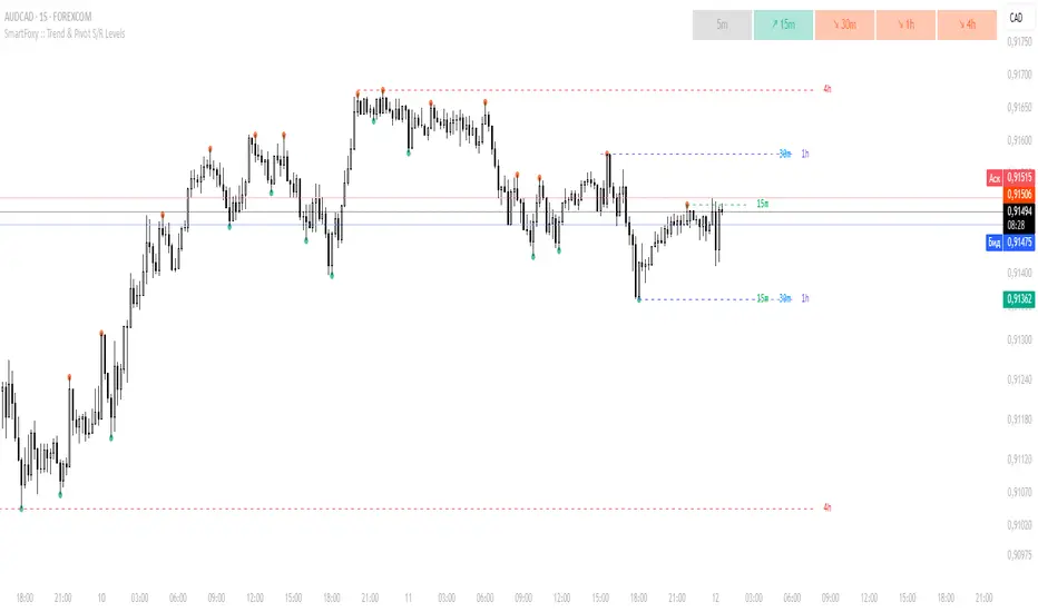
MTF Trend Analyzer with Swing Pivots & S/R Levels [SmartFoxy]Indicator “Multi-Timeframe Trend Analyzer with Swing Pivots & S/R Levels”
📌 Overview
Trend & Pivot S/R Levels is a multi-timeframe market structure analyzer that identifies trend direction, detects swing highs/lows, and plots higher-timeframe support/resistance levels directly on your chart.
Designed for traders who want fast, clean, and accurate trend context without constantly switching timeframes.
________________________________________________________________________________
✨ Core Features
1. Multi-Timeframe Trend Analyzer .
Analyze up to five higher timeframes simultaneously — for example:
5m, 1H, 4H, 1D, 1W , etc.
For each timeframe, the indicator detects:
a) Trend direction:
🡕 Uptrend;
🡖 Downtrend.
b) Breakouts of recent pivot highs/lows to determine trend shifts.
c) Automatic graying-out of timeframes lower than the current chart TF .
d) A clean visual Trend Panel that shows:
Arrow direction;
Timeframe label (1D, 1W, etc.);
Trend color (bullish, bearish, neutral).
________________________________________________________________________________
2. Swing Pivot Detection (Current TF)
The script detects local swing points using customizable lookback parameters:
a) Pivot Type:
High/Low — classic swing structure;
Close — smoother swing detection using closing prices.
b) Left/Right Bars Lookback — the number of bars required on both sides to validate the pivot.
c) Multiple marker styles :
Built-in plot shapes (circle, cross, histogram, etc.);
Custom visual labels (▲▼, ◉, ✖, 🡇🡅, ◆, ◼, etc.).
This makes it easy to visually confirm that your swing settings are correct.
________________________________________________________________________________
3. Higher-Timeframe Support/Resistance
The indicator automatically draws HTF S/R lines based on the latest pivot highs/lows from each selected timeframe.
Each timeframe has:
Separate Support / Resistance colors ;
Adjustable line width ;
Selectable line style (solid, dashed, dotted, arrows);
Optional HTF labels displayed on the lines.
This allows you to see major market structure levels from higher timeframes without switching charts.
________________________________________________________________________________
4. Smart Timeframe Safety Checks
If a selected timeframe is lower than your current chart timeframe , its data is:
Disabled for S/R plotting ;
Shown in gray inside the Trend Panel;
Prevents invalid S/R calculations and ensures stable chart performance.
________________________________________________________________________________
⚙️ Customization Options :
Show/Hide the Trend Panel;
Panel placement anywhere on the chart;
Swing pivot type: High/Low or Close ;
Pivot lookback (left/right bars);
Choose five HTFs to analyze;
Enable/Disable HTF S/R;
Configure S/R color for each timeframe;
Line style + line width;
Pivot marker type + size;
Custom label styles + text scaling.
________________________________________________________________________________
✅ Benefits :
Perfect for traders who need instant multi-timeframe structure awareness ;
Reduces the need to constantly switch charts;
Works on all markets : crypto, stocks, forex, indices, futures;
Clean, modern, and intuitive visualization;
Helps confirm trend direction and key S/R levels at a glance.
________________________________________________________________________________
⚠️ Note
The indicator only displays S/R and trend data from higher timeframes relative to the current chart timeframe.

MTF Support & Resistance (Optimized)🧠 Smart Multi-Timeframe Support & Resistance (4H / 1H)
This advanced indicator automatically detects, clusters, and visualizes high-probability support and resistance levels across multiple timeframes — giving traders a clean and intelligent market map that adapts to price action in real time.
🔍 How It Works
The script scans historical 4-hour and 1-hour charts to identify swing highs and lows using pivot logic.
It then applies ATR-based clustering to merge nearby levels, filters weak or irrelevant zones, and highlights the most significant price reaction areas based on the number of touches and proximity to the current price.
Each level’s thickness and transparency are dynamically adjusted by strength:
Thicker lines = more confirmations (stronger level)
Fainter lines = weaker, less-tested level
⚙️ Main Features
✅ Multi-Timeframe Analysis (4H + 1H)
✅ Automatic pivot detection and level clustering
✅ Smart filtering based on ATR, proximity, and touch count
✅ Dynamic line width and opacity that scale with level strength
✅ Minimal clutter — only the most relevant nearby levels are displayed
✅ Color-coded visualization for quick interpretation
🔴 Red = 4H Resistance
🟢 Lime = 4H Support
🟠 Orange = 1H Resistance
🟦 Aqua = 1H Support
🎯 Ideal For
Scalpers, swing traders, and intraday analysts who want:
A clear visual map of major reaction zones
Automatic detection of high-confluence levels
A smart, adaptive system that works across assets and timeframes
📈 Usage Tips
Combine with volume, order-flow, or market-structure tools for confluence.
Use higher-strength levels (thicker lines) as bias zones for entries and exits.
Enable or disable 4H/1H visibility to match your trading style.
Built with precision and performance in mind — this Smart S&R system transforms raw swing data into a readable, multi-layered price map for confident trading decisions.

MTF EMA200 Dashboard (No Trend Column)Show ema200 position on multiple timeframe, so that in run time we can see price strength and weekness

MTF POWER OF 3 TNF💻Types of Candlesticks in the Indicator
• Strong/Valid Candles: Identified by small asterisks below and above the candlestick body; Those with a body larger than 55% of the candle's total range.
• Tailed Candles: Are not marked by asterisks.
( onedrive.live.com)]! ( onedrive.live.com)
The General Idea of the Indicator's Signals
The indicator generates signals based on specific candlestick patterns. It identifies valid candlesticks (those with a body larger than 55% of the total candlestick range) and marks them with asterisks above and below the body. Candlesticks with significant tails (long wicks) that do not meet the criteria are not marked.
These signals help traders spot potential trend reversals or continuation patterns, depending on the context and location of the marked candles within the broader price action.
(onedrive.live.com)]! (onedrive.live.com)
Daily time frame conditions
( onedrive.live.com)]! ( onedrive.live.com)
Weekly and monthly time frame conditions
( onedrive.live.com)]! ( onedrive.live.com)
( onedrive.live.com)]! ( onedrive.live.com)
(onedrive.live.com)]! (onedrive.live.com)
(onedrive.live.com)]! (onedrive.live.com)
Best Trading Conditions
- Condition 1: (the best)
• Daily Timeframe: Buy
• Weekly Timeframe: Positive (Bullish)
• Monthly Timeframe: Positive (Bullish)
( onedrive.live.com)]- ! ( onedrive.live.com)
- Condition 2:
• Daily Timeframe: Buy
• Weekly Timeframe: Positive (Bullish)
• Monthly Timeframe: Negative (Bearish) (with the condition that monthly resistance is distant)
(onedrive.live.com)]- ! (onedrive.live.com)
- Confirmatory trend line
( onedrive.live.com)]- ! ( onedrive.live.com)
- Volume detection by candle colors;
- ! (onedrive.live.com)
MTF Stochastic Range FinderThis indicator compares Stochastic RSI from 2 timeframes to signal possible reversals. Default 5 minute and 2 minute. Both Stochastic RSIs are customizable.
Allows for 6 support/resistance lines and allows a tolerance to filter proximity to levels for entry.
Can filter price level by manual support/resistance levels and/or VWAP

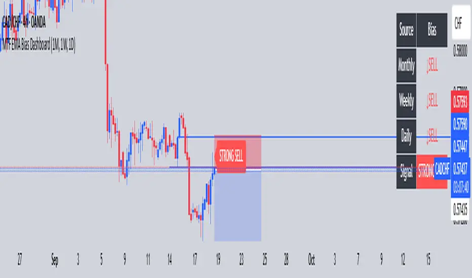
MTF-- K FOSU FX (1M, 1W, 1D)Quickly identify Weekly, Monthly, and Daily bias for stronger confluence
MTF Levels [OmegaTools]📖 Introduction
The Ω Levels Indicator is a complete market structure and level-mapping framework designed to help traders identify key zones where price is likely to react.
It blends classic technical anchors (VWAP, pivots, means, standard deviations) with modern statistical pattern recognition to dynamically project areas of manipulation, extension, and equilibrium.
At its core, Ω Levels creates an evolving map of market balance vs. imbalance, showing traders where liquidity is most likely to build and where price could pivot or accelerate.
But what makes it truly unique is the Pivot Forecaster — an embedded predictive engine that applies machine-learning inspired logic to recognize conditions that historically precede market turning points.
🔎 Key Features
Customizable Levels Framework
Define up to three levels (manipulation, extensions, VWAP, pivots, stdev bands, or prior extremes).
Choose mean references such as Open, VWAP, Pivot Mean, or Previous Session Mean.
Style controls (solid, dotted, dashed) and fill modes (internal, external, ranges) allow you to adapt the chart to your visual workflow.
Dynamic Zone Highlighting
Automatic fills between internal/external levels, or between specific level pairs (1–2, 1–3, 2–3).
Makes it easy to visualize value areas, expansions, and compression zones at a glance.
Multi-Timeframe Anchoring
Works on any timeframe, but calculations can be anchored to a higher timeframe (e.g., show daily VWAP & pivots on a 15m chart).
This allows traders to align intraday execution with higher timeframe context.
Pivot Forecaster (Machine Learning / Pattern Recognition)
This is the advanced predictive component.
The algorithm collects historical conditions observed around pivot highs and lows (volume state, ATR state, % candle expansion, oscillator conditions).
It then builds statistical “profiles” of typical pivot behavior and compares them in real-time against current market conditions.
When conditions match the “signature” of a pivot, the indicator highlights a Forecast Pivot High or Forecast Pivot Low (displayed as small diamond markers).
This functions as a pattern-recognition system, effectively learning from past pivots to anticipate where the next turning point is more likely to occur.
⚡ How Traders Can Use It
Intraday Execution: Use VWAP, manipulation, and extension levels to frame trades around liquidity zones.
Swing Context: Overlay higher timeframe pivots and means to guide medium-term positioning.
Fade Setups: Forecasted pivots often coincide with exhaustion zones where fading momentum carries edge.
Breakout Validation: When price breaks a structural level but the forecaster does not confirm a pivot, continuation probability is higher.
Risk Management: Levels provide natural stop/target placements, while pivot forecasts serve as warning signals for potential reversals.
⚙️ Settings Overview
Timeframe: Choose the anchor timeframe for calculations (default: Daily).
Means: Two selectable mean references (Open, VWAP, Pivot Point, Previous Mean).
Levels: Three levels can be customized (Manipulation, Extension, 1–2 StDev, Pivot Point, VWAP, Previous Extremes).
Fill Modes: Highlight zones between internal/external levels or custom ranges.
Visual Customization: Colors, line styles, fill opacity, and toggle for old levels.
Pivot Forecaster: Fully automated — no settings required, it adapts to instrument and timeframe.
🧭 Best Practices
Align Levels With Market Profile: Treat the levels as dynamic S/R zones and watch how price interacts with them.
Use Forecaster as Confirmation: The diamonds are not standalone signals; they are context filters that help you decide whether a move has higher reversal odds.
Higher Timeframe Anchoring: On intraday charts, set the timeframe to Daily or Weekly to trade with institutional levels.
Combine With ATR: Pair with the Ω ATR Indicator to size positions according to volatility while Ω Levels provides the structural roadmap.
📌 Summary
The Ω Levels Indicator is more than a level plotter — it’s a market map + predictive engine.
By combining traditional levels with an intelligent pivot forecaster, it gives traders both the static structure of where price should react, and the dynamic signal of where it is likely to react next.
This dual-layer approach — structural + predictive — makes it an invaluable tool for discretionary intraday traders, swing traders, and anyone who wants to anticipate price behavior instead of just reacting to it.
