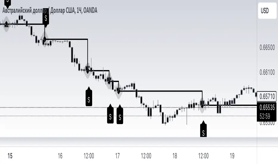
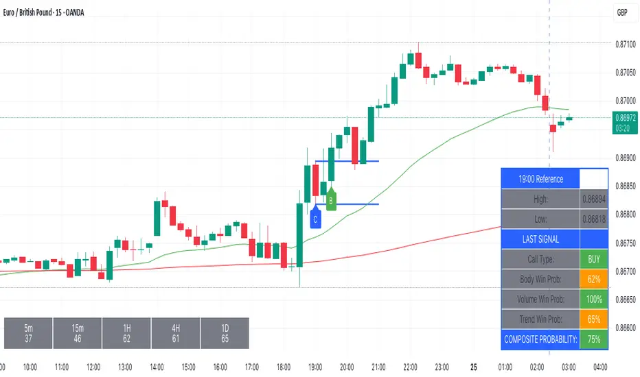
Candle 2 (C2 Engulfing) [ArionAlgo]Candle 2 (C2 Engulfing)
This indicator focuses on Candle 2 (C2) as the primary displacement event within a structured engulfing framework. Instead of treating Candle 3 as the main expansion, this model emphasizes C2 as the true momentum shift — highlighting where liquidity is taken and price begins delivering in the new direction.
🔹 Core Concept
• Candle 2 represents displacement: the decisive shift in order flow that signals potential continuation or reversal.
• Candle 3 serves as optional follow-through expansion, confirming momentum after displacement occurs.
• An optional Strict C2 rule enforces higher-probability structure by requiring the close to occur inside or beyond the Candle 1 body on the correct side.
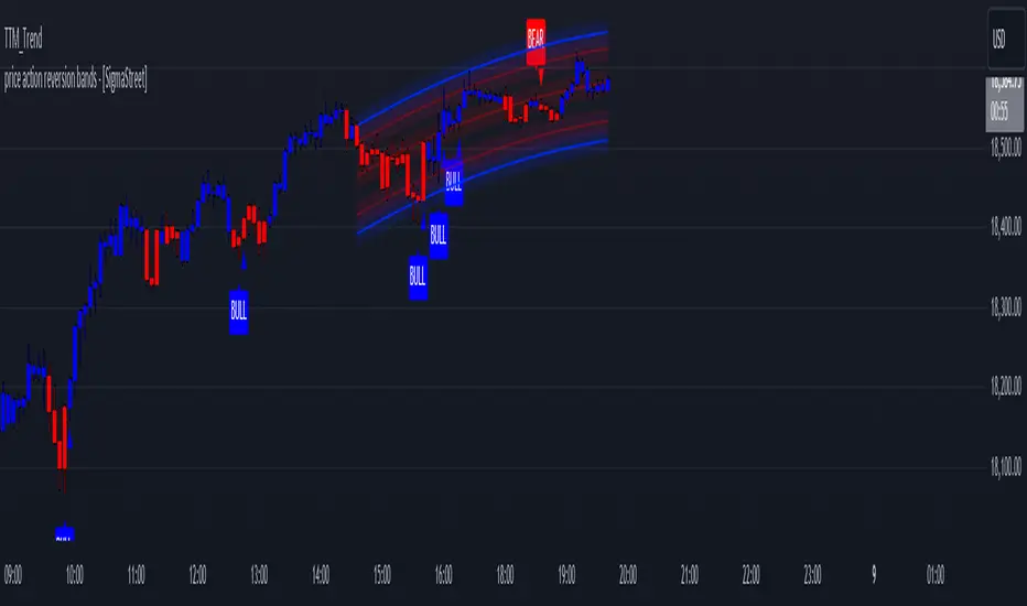
🔹 What the Script Does
• Detects bullish and bearish C2 displacement conditions based on engulfing behavior and structural rules.
• Marks C2 and C3 events directly on the chart with clear visual labels.
• Builds dynamic zones from candle structure to help traders frame reaction areas and refine entries.
• Plots optional levels derived from prior candle structure for additional context.
🔹 Customization & Control
• Independent toggles for Candle 2 displacement and Candle 3 expansion.
• Optional reversal filter using swing extremes.
• Wick-threshold filtering to avoid weak or inefficient candles.
• Adjustable colors, transparency, levels, and zone visibility for clean integration into any chart style.
🔹 Alerts
Built-in alerts trigger on confirmed C2 displacement and C3 expansion at bar close, making it easy to integrate into discretionary or rule-based workflows.
This script is shared freely with the trading community in hopes it helps someone refine their understanding of price delivery and create meaningful opportunities through disciplined trading. It is a visual framework — not financial advice — so always apply sound risk management.
— ArionAlgo
Penunjuk Pine Script®