Reversal Finder [SMRT Algo]The Reversal Indicator is designed for traders who use contrarian strategies, focusing on identifying potential reversal points in the market. This indicator leverages mean and deviation calculations, along with bar pattern movements, to provide insights into price movements and potential turning points.
Features:
The Reversal Indicator is tailored for contrarian trading, which involves taking positions against the trend to capitalize on potential reversals. This approach is inherently riskier, as it aims to identify precise highs and lows in the market.
Configurable Sensitivity: Traders can adjust the sensitivity of the indicator, which determines how many confirmation candles are required before a signal is generated. Higher sensitivity values mean more confirmation candles, resulting in later but more reliable signals. This feature allows traders to balance between early entries and signal accuracy.
Separate Buy & Sell Sensitivities: Buy and sell sensitivities can be adjusted separately which provides greater flexibility, enabling traders to fine-tune the indicator based on market conditions or personal trading preferences.
Reversal Bands: The indicator features color-coded bands (green, yellow, red) that represent different levels of price overextension. The dynamic nature of these bands, which adjust based on real-time market data, provides a constantly updated visual representation of potential reversal zones.
- Green Band: Indicates the initial phase where price is starting to get overextended.
- Yellow Band: Suggests a moderate level of overextension.
- Red Band: Signals a high likelihood of reversal due to significant overextension.
Signal Generation: The indicator only searches for buy or sell signals when the price enters these reversal bands, thereby focusing on zones with a higher probability of a reversal.
Take Profit (TP) & Stop Loss (SL) Features: The indicator includes predefined TP and SL levels, calculated based on a risk-to-reward ratio with respect to the stop loss. For instance, TP1 corresponds to a 1:1 ratio, up to TP3, allowing traders to manage risk effectively and set realistic profit targets.
Band-Based Take Profit: In addition to standard TP levels, traders can use the reversal bands themselves as take profit zones, targeting the green, yellow, or red areas to close trades. This dual-layered approach provides more nuanced trade management options.
Alert System: The indicator allows traders to set alerts for when signals are generated, ensuring they do not miss potential trading opportunities.
A signal is generate when we have x-consecutive bullish/bearish bars for a buy or sell signal respectively. This is what the 'Sensitivity' input controsl for in the settings. A signal is only generated when price enters the deviation bands, as those are areas where a reversal is of higher probability.
The Reversal indicator uses mean and deviation calculations, which are fundamental to the Reversal Indicator, providing a statistical baseline for identifying overextended price movements. By measuring how far price deviates from its mean, the indicator identifies conditions where a reversal is more likely. This statistical foundation ensures that the signals are based on objective data, rather than subjective judgment.
The integration of bar pattern analysis with mean and deviation calculations allows the indicator to add a layer of context to the raw data. Bar patterns are used to confirm potential reversals by analyzing the formation of candles and the overall structure of the price action. This component enhances the accuracy of signals by ensuring they are not only statistically significant but also contextually relevant.
The Reversal Indicator’s unique sensitivity adjustment feature allows traders to fine-tune the responsiveness of the signals. This flexibility means the indicator can be adapted to various market conditions, enhancing its utility across different trading environments. The separate adjustment for buy and sell sensitivities further allows traders to customize the indicator based on their specific trading strategies, whether they are more conservative or aggressive in their approach.
The Reversal Indicator's unique combination of statistical and pattern-based analysis, customizable settings, and dynamic real-time components offers significant added value compared to standard indicators.
The SMRT Algo Suite, which the Reversal Finder is a part of, offers a comprehensive set of tools and features that extend beyond the capabilities of standard or open-source indicators, providing significant additional value to users.
What you also get with the SMRT Algo Suite:
Advanced Customization: Users can customize various aspects of the indicator, such as toggling the confirmation signals on or off and adjusting the parameters of the MA Filter. This customization enhances the adaptability of the tool to different trading styles and market conditions.
Enhanced Market Understanding: The combination of pullback logic, dynamic S/R zones, and MA filtering offers traders a nuanced understanding of market dynamics, helping them make more informed trading decisions.
Unique Features: The specific combination of pullback logic, dynamic S/R, and multi-level TP/SL management is unique to SMRT Algo, offering features that are not readily available in standard or open-source indicators.
Educational and Support Resources: As with other tools in the SMRT Algo suite, this indicator comes with comprehensive educational resources and access to a supportive trading community, as well as 24/7 Discord support.
The educational resources and community support included with SMRT Algo ensure that users can maximize the indicators’ potential, offering guidance on best practices and advanced usage.
SMRT Algo believe that there is no magic indicator that is able to print money. Indicator toolkits provide value via their convinience, adaptibility and uniqueness. Combining these items can help a trader make more educated; less messy, more planned trades and in turn hopefully help them succeed.
RISK DISCLAIMER
Trading involves significant risk, and most day traders lose money. All content, tools, scripts, articles, and educational materials provided by SMRT Algo are intended solely for informational and educational purposes. Past performance is not indicative of future results. Always conduct your own research and consult with a licensed financial advisor before making any trading decisions.
Cari dalam skrip untuk "reversal"

Reversal Probability Meter PRO [optimized for Xau/Usd m5]🎯 Reversal Probability Meter PRO
A powerful multi-factor reversal probability detector that calculates the likelihood of bullish or bearish reversals using RSI, EMA bias, ATR spikes, candle patterns, volume spikes, and higher timeframe (HTF) trend alignment.
🧩 MAIN FEATURES
1. Reversal Probability (Bullish & Bearish)
Displays two key metrics:
Bull % — probability of bullish reversal
Bear % — probability of bearish reversal
These are computed using RSI, EMAs, ATR, demand/supply zones, candle confirmations, and volume spikes.
📊 Interpretation:
Bull % > 70% → Buying pressure building up
Bull % > 85% → Strong bullish reversal confirmed
Bear % > 70% → Selling pressure building up
Bear % > 85% → Strong bearish reversal confirmed
2. Alert Probability Threshold
Adjustable via alertThreshold (default = 85%).
Alerts trigger only when probability ≥ threshold, and confirmed by zone + volume spike + candle pattern.
🔔 Alerts Available:
✅ Bullish Smart Reversal
🔻 Bearish Smart Reversal
To activate: Right-click chart → “Add alert” → choose the alert condition from the indicator.
3. Demand / Supply Zone Detection
The script determines the price position within the last zoneLook (default 30) bars:
🟢 DEMAND → Lower 35% of range (potential bounce zone)
🔴 SUPPLY → Upper 35% of range (potential rejection zone)
⚪ MID → Neutral area
📘 Purpose: Validates reversals based on context:
Bullish only valid in Demand zones
Bearish only valid in Supply zones
4. Higher Timeframe (HTF) Trend Alignment
Reads EMA bias from a higher timeframe (default = 15m) for trend confirmation.
Reversals against HTF trend are automatically weighted down prevents false countertrend signals.
📈 Example:
M5 chart under M15 downtrend → Bullish probability is reduced.
5. Candle Confirmation Patterns
Two key price action confirmations:
Bullish: Engulfing or Pin Bar
Bearish: Engulfing or Pin Bar
A valid reversal requires both a candle confirmation and a volume spike.
6. Volume & ATR Spike Filters
Volume Spike: volume > SMA(20) × 1.3
ATR Spike: ATR > SMA(ATR, 50) × volMult
🎯 Ensures that only strong market moves with real energy are considered valid reversals.
7. Reversal Momentum Histogram
A color-gradient oscillator showing the momentum difference:
Green = bullish dominance
Red = bearish dominance
Flat near 0 = neutral
Controlled by showOscillator toggle.
8. Smart Info Panel
A compact dashboard displayed on the top-right with 4 rows:
Row Info Description
1 Bull % Bullish reversal probability
2 Bear % Bearish reversal probability
3 Zone Market context (DEMAND / SUPPLY / MID)
4 Signal Strength Current signal intensity (probability %)
Dynamic Colors:
90% → Bright (strong signal)
75–90% → Yellow/Orange (medium)
<75% → Gray (weak)
9. Sensitivity Mode
Fine-tunes indicator reactivity:
🟥 Aggressive: Detects reversals early (more signals, less accurate)
🟨 Normal: Balanced, default mode
🟩 Conservative: Filters only strongest reversals (fewer but more reliable)
10. Custom Color Options
Customize bullish and bearish colors via bullBaseColor and bearBaseColor inputs for your preferred chart theme.
⚙️ HOW TO USE
Add to Chart
→ Paste the script into Pine Editor → “Add to chart”.
Select Timeframe
→ Best for M5–M30 (scalping/intraday).
→ H1–H4 for swing trading.
Monitor the Info Panel:
Bull % ≥ 85% + Zone = Demand → Strong bullish reversal signal
Bear % ≥ 85% + Zone = Supply → Strong bearish reversal signal
Watch the Histogram:
Rising green bars = bullish momentum gaining
Deep red bars = bearish momentum gaining
Enable Alerts:
Right-click chart → “Add alert”
Choose Bullish Smart Reversal or Bearish Smart Reversal
🧠 TRADING TIPS
Use Conservative mode for noisy lower timeframes (M5–M15).
Use Aggressive mode for higher timeframes (H1–H4).
Combine with manual support/resistance or zone boxes for precision entries. Personally i use Order Block.
Best reversal setups occur when all align:
Bull % > 85%
Zone = DEMAND
Volume spike present
Candle = Bullish engulfing
HTF trend supportive

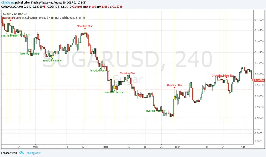
Reversal Patterns Collection:Invertad Hammer and Shooting StarScript contains Inverted Hammer and Shooting Star models. User can select period for candle size calculation (for distinguish short and long candles), on/off highlighting of pattern candles.
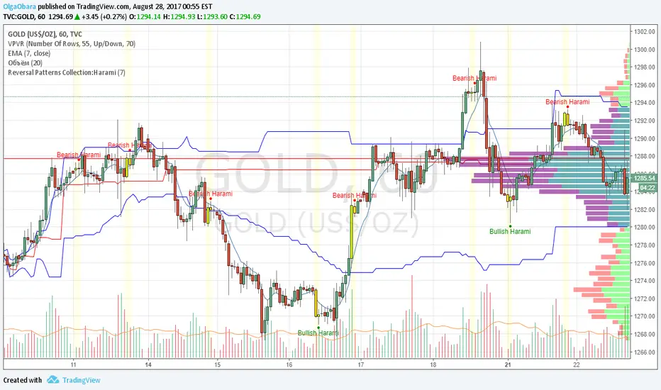
Reversal Patterns Collection:HaramiScript contains pattern Harami. User can select period for candle size calculation (for distinguish short and long candles), on/off highlighting of pattern candles.
Reversal Point Dynamics⇋ Reversal Point Dynamics (RPD)
This is not an indicator; it is a complete system for deconstructing the mechanics of a market reversal. Reversal Point Dynamics (RPD) moves far beyond simplistic pattern recognition, venturing into a deep analysis of the underlying forces that cause trends to exhaust, pause, and turn. It is engineered from the ground up to identify high-probability reversal points by quantifying the confluence of market dynamics in real-time.
Where other tools provide a static signal, RPD delivers a dynamic probability. It understands that a true market turning point is not a single event, but a cascade of failing momentum, structural breakdown, and a shift in market order. RPD's core engine meticulously analyzes each of these dynamic components—the market's underlying state, its velocity and acceleration, its degree of chaos (entropy), and its structural framework. These forces are synthesized into a single, unified Probability Score, offering you an unprecedented, transparent view into the conviction behind every potential reversal.
This is not a "black box" system. It is an open-architecture engine designed to empower the discerning trader. Featuring real-time signal projection, an integrated Fibonacci R2R Target Engine, and a comprehensive dashboard that acts as your Dynamics Control Center , RPD gives you a complete, holistic view of the market's state.
The Theoretical Core: Deconstructing Market Dynamics
RPD's analytical power is born from the intelligent synthesis of multiple, distinct theoretical models. Each pillar of the engine analyzes a different facet of market behavior. The convergence of these analyses—the "Singularity" event referenced in the dashboard—is what generates the final, high-conviction probability score.
1. Pillar One: Quantum State Analysis (QSA)
This is the foundational analysis of the market's current state within its recent context. Instead of treating price as a random walk, QSA quantizes it into a finite number of discrete "states."
Formulaic Concept: The engine establishes a price range using the highest high and lowest low over the Adaptive Analysis Period. This range is then divided into a user-defined number of Analysis Levels. The current price is mapped to one of these states (e.g., in a 9-level system, State 0 is the absolute low, and State 8 is the absolute high).
Analytical Edge: This acts as a powerful foundational filter. The engine will only begin searching for reversal signals when the market has reached a statistically stretched, extreme state (e.g., State 0 or 8). The Edge Sensitivity input allows you to control exactly how close to this extreme edge the price must be, ensuring you are trading from points of maximum potential exhaustion.
2. Pillar Two: Price State Roc (PSR) - The Dynamics of Momentum
This pillar analyzes the kinetic forces of the market: its velocity and acceleration. It understands that it’s not just where the price is, but how it got there that matters.
Formulaic Concept: The psr function calculates two derivatives of price.
Velocity: (price - price ). This measures the speed and direction of the current move.
Acceleration: (velocity - velocity ). This measures the rate of change in that speed. A negative acceleration (deceleration) during a strong rally is a critical pre-reversal warning, indicating momentum is fading even as price may be pushing higher.
Analytical Edge: The engine specifically hunts for exhaustion patterns where momentum is clearly decelerating as price reaches an extreme state. This is the mechanical signature of a weakening trend.
3. Pillar Three: Market Entropy Analysis - The Dynamics of Order & Chaos
This is RPD's chaos filter, a concept borrowed from information theory. Entropy measures the degree of randomness or disorder in the market's price action.
Formulaic Concept: The calculateEntropy function analyzes recent price changes. A market moving directionally and smoothly has low entropy (high order). A market chopping back and forth without direction has high entropy (high chaos). The value is normalized between 0 and 1.
Analytical Edge: The most reliable trades occur in low-entropy, ordered environments. RPD uses the Entropy Threshold to disqualify signals that attempt to form in chaotic, unpredictable conditions, providing a powerful shield against whipsaw markets.
4. Pillar Four: The Synthesis Engine & Probability Calculation
This is where all the dynamic forces converge. The final probability score is a weighted calculation that heavily rewards confluence.
Formulaic Concept: The calculateProbability function intelligently assembles the final score:
A Base Score is established from trend strength and entropy.
An Entropy Score adds points for low entropy (order) and subtracts for high entropy (chaos).
A significant Divergence Bonus is awarded for a classic momentum divergence.
RSI & Volume Bonuses are added if momentum oscillators are in extreme territory or a volume spike confirms institutional interest.
MTF & Adaptive Bonuses add further weight for alignment with higher timeframe structure.
Analytical Edge: A signal backed by multiple dynamic forces (e.g., extreme state + decelerating momentum + low entropy + volume spike) will receive an exponentially higher probability score. This is the very essence of analyzing reversal point dynamics.
The Command Center: Mastering the Inputs
Every input is a precise lever of control, allowing you to fine-tune the RPD engine to your exact trading style, market, and timeframe.
🧠 Core Algorithm
Predictive Mode (Early Detection):
What It Is: Enables the engine to search for potential reversals on the current, unclosed bar.
How It Works: Analyzes intra-bar acceleration and state to identify developing exhaustion. These signals are marked with a ' ? ' and are tentative.
How To Use It: Enable for scalping or very aggressive day trading to get the earliest possible indication. Disable for swing trading or a more conservative approach that waits for full bar confirmation.
Live Signal Mode (Current Bar):
What It Is: A highly aggressive mode that plots tentative signals with a ' ! ' on the live bar based on projected price and momentum. These signals repaint intra-bar.
How It Works: Uses a linear regression projection of the close to anticipate a reversal.
How To Use It: For advanced users who use intra-bar dynamics for execution and understand the nature of repainting signals.
Adaptive Analysis Period:
What It Is: The main lookback period for the QSA, PSR, and Entropy calculations. This is the engine's "memory."
How It Works: A shorter period makes the engine highly sensitive to local price swings. A longer period makes it focus only on major, significant market structure.
How To Use It: Scalping (1-5m): 15-25. Day Trading (15m-1H): 25-40. Swing Trading (4H+): 40-60.
Fractal Strength (Bars):
What It Is: Defines the strength of the pivot detection used for confirming reversal events.
How It Works: A value of '2' requires a candle's high/low to be more extreme than the two bars to its left and right.
How To Use It: '2' is a robust standard. Increase to '3' for an even stricter definition of a structural pivot, which will result in fewer signals.
MTF Multiplier:
What It Is: Integrates pivot data from a higher timeframe for confluence.
How It Works: A multiplier of '4' on a 15-minute chart will pull pivot data from the 1-hour chart (15 * 4 = 60m).
How To Use It: Set to a multiple that corresponds to your preferred higher timeframe for contextual analysis.
🎯 Signal Settings
Min Probability %:
What It Is: Your master quality filter. A signal is only plotted if its score exceeds this threshold.
How It Works: Directly filters the output of the final probability calculation.
How To Use It: High-Quality (80-95): For A+ setups only. Balanced (65-75): For day trading. Aggressive (50-60): For scalping.
Min Signal Distance (Bars):
What It Is: A noise filter that prevents signals from clustering in choppy conditions.
How It Works: Enforces a "cooldown" period of N bars after a signal.
How To Use It: Increase in ranging markets to focus on major swings. Decrease on lower timeframes.
Entropy Threshold:
What It Is: Your "chaos shield." Sets the maximum allowable market randomness for a signal.
How It Works: If calculated entropy is above this value, the signal is invalidated.
How To Use It: Lower values (0.1-0.5): Extremely strict. Higher values (0.7-1.0): More lenient. 0.85 is a good balance.
Adaptive Entropy & Aggressive Mode:
What It Is: Toggles for dynamically adjusting the engine's core parameters.
How It Works: Adaptive Entropy can slightly lower the required probability in strong trends. Aggressive Mode uses more lenient settings across the board.
How To Use It: Keep Adaptive on. Use Aggressive Mode sparingly, primarily for scalping highly volatile assets.
📊 State Analysis
Analysis Levels:
What It Is: The number of discrete "states" for the QSA.
How It Works: More levels create a finer-grained analysis of price location.
How To Use It: 6-7 levels are ideal. Increasing to 9 can provide more precision on very volatile assets.
Edge Sensitivity:
What It Is: Defines how close to the absolute top/bottom of the range price must be.
How It Works: '0' means price must be in the absolute highest/lowest state. '3' allows a signal within the top/bottom 3 states.
How To Use It: '3' provides a good balance. Lower it to '1' or '0' if you only want to trade extreme exhaustion.
The Dashboard: Your Dynamics Control Center
The dashboard provides a transparent, real-time view into the engine's brain. Use it to understand the context behind every signal and to gauge the current market environment at a glance.
🎯 UNIFIED PROB SCORE
TOTAL SCORE: The highest probability score (either Peak or Valley) the engine is currently calculating. This is your main at-a-glance conviction metric. The "Singularity" header refers to the event where market dynamics align—the event RPD is built to detect.
Quality: A human-readable interpretation of the Total Score. "EXCEPTIONAL" (🌟) is a rare, A+ confluence event. "STRONG" (💪) is a high-quality, tradable setup.
📊 ORDER FLOW & COMPONENT ANALYSIS
Volume Spike: Shows if the current volume is significantly higher than average (YES/NO). A 'YES' adds major confirmation.
Peak/Valley Conf: This breaks down the probability score into its directional components, showing you the separate confidence levels for a potential top (Peak) versus a bottom (Valley).
🌌 MARKET STRUCTURE
HTF Trend: Shows the direction of the underlying trend based on a Supertrend calculation.
Entropy: The current market chaos reading. "🔥 LOW" is an ideal, ordered state for trading. "😴 HIGH" is a warning of choppy, unpredictable conditions.
🔮 FIB & R2R ZONE (Large Dashboard)
This section gives you the status of the Fibonacci Target Engine. It shows if an Active Channel (entry zone) or Stop Zone (invalidation zone) is active and displays the precise price levels for the static entry, target, and stop calculated at the time of the signal.
🛡️ FILTERS & PREDICTIVES (Large Dashboard)
This panel provides a status check on all the bonus filters. It shows the current RSI Status, whether a Divergence is present, and if a Live Pending signal is forming.
The Visual Interface: A Symphony of Data
Every visual element is designed for instant, intuitive interpretation of market dynamics.
Signal Markers: These are the primary outputs of the engine.
▼/▲ b: A fully confirmed signal that has passed all filters.
? b: A tentative signal generated in Predictive Mode, indicating developing dynamics.
◈ b: This diamond icon replaces the standard triangle when the signal is confirmed by a strong momentum divergence, highlighting it as a superior setup where dynamics are misaligned with price.
Harmonic Wave: The flowing, colored wave around the price.
What It Represents: The market's "flow dynamic" and volatility.
How to Interpret It: Expanding waves show increasing volatility. The color is tied to the "Quantum Color" in your theme, representing the underlying energy field of the market.
Entropy Particles: The small dots appearing above/below price.
What They Represent: A direct visualization of the "order dynamic."
How to Interpret Them: Their presence signifies a low-entropy, ordered state ideal for trading. Their color indicates the direction of momentum (PSR velocity). Their absence means the market is too chaotic (high entropy).
The Fibonacci Target Engine: The dynamic R2R system appearing post-signal.
Static Fib Levels: Colored horizontal lines representing the market's "structural dynamic."
The Green "Active Channel" Box: Your zone of consideration. An area to manage a potential entry.
Development Philosophy
Reversal Point Dynamics was engineered to answer a fundamental question: can we objectively measure the forces behind a market turn? It is a synthesis of concepts from market microstructure, statistics, and information theory. The objective was never to create a "perfect" system, but to build a robust decision-support tool that provides a measurable, statistical edge by focusing on the principle of confluence.
By demanding that multiple, independent market dynamics align simultaneously, RPD filters out the vast majority of market noise. It is designed for the trader who thinks in terms of probability and risk management, not in terms of certainties. It is a tool to help you discount the obvious and bet on the unexpected alignment of market forces.
"Markets are constantly in a state of uncertainty and flux and money is made by discounting the obvious and betting on the unexpected."
— George Soros
Trade with insight. Trade with anticipation.
— Dskyz, for DAFE Trading Systems

Reversal Trend Identifier (Reversal Colors)Hello TradingView Community!
This is an indicator designed to help traders identify potential trend reversals and visualize the current market trend through intuitive bar coloring.
The Bar Coloring Logic
The main feature of this indicator is its unique bar coloring system, which helps you instantly see the market state:
🟥 Red Bar: Signals a new bullish reversal. This appears on the exact bar that the price crosses above the Bull Trend Line, indicating a fresh potential uptrend.
🟦 Dark Blue Bar: Signals a bullish trend continuation. These bars appear after a red bar, showing that the price remains in a bullish state.
🟨 Yellow Bar: Signals a new bearish reversal. This appears on the exact bar that the price crosses below the Bear Trend Line, indicating a fresh potential downtrend.
📉 Light Blue Bar: Signals a bearish trend continuation. These bars appear after a yellow bar, showing that the price remains in a bearish state.
How to Use It
Look for Red or Yellow bars as potential entry signals for a new trend.
Use the Dark Blue or Light Blue bars to confirm that the trend is still active.
You can also enable the "Bull Trend Line" and "Bear Trend Line" in the settings to use them as dynamic support or resistance levels.
Settings
Barcolor: (Default On) Easily toggle the bar coloring on or off.
Show Trend Lines : (Default Off) The lines are hidden by default to keep your chart clean. You can check this box to make them visible.
This script was converted from a strategy to a standalone indicator for cleaner chart analysis. As with any tool, it works best when combined with other forms of analysis and your own trading strategy.
Hope you find it useful!
Disclaimer: This is not financial advice. Please test any indicator or strategy thoroughly before trading.

Reversal Knockout v1.1\ Reversal Knockout v1.1 — User Manual \
Reversal Knockout is a technical indicator designed to detect potential price turning points using a dual approach: a reversal logic with bar coloring and a combined sequence of setups, countdowns, and exhaustion patterns.
\ What does this indicator do?\
\ Colors candles\ based on the relationship between two smoothed moving averages (T3).
\ Identifies overextension conditions\ based on a sequence of 9 consecutive closes aligned with price direction.
\ Confirms exhaustion\ if, after that setup, 13 follow-through conditions (countdown) are met.
\ Highlights special signals called “Knockouts”\ , which represent strong potential reversal scenarios.
\ Candle Coloring\
Candles are automatically colored to make trend and potential reversal points visually easier to interpret:
🔵 Bull Trend: User-defined color (default light blue)
🔴 Bear Trend: User-defined color (default light red)
🟡 Bullish Reversal: When price crosses below the slower average (default yellow)
🟡 Bearish Reversal: When price crosses above the slower average (default yellow)
This logic is based on the relationship between two T3 moving averages (one fast, one slow), calculated with a customizable smoothing factor.
\ Setup and Countdown Logic\
Setups (9):
A bullish setup forms if the price closes below the close from 4 bars earlier for 9 consecutive candles.
A bearish setup forms if the price closes above the close from 4 bars earlier for 9 consecutive candles.
When the ninth close is completed, a green “9” (buy) or purple “9” (sell) is displayed.
Countdowns (13):
After a setup, a follow-through phase begins.
If 13 additional conditions are met (price < low\ for buys or > high\ for sells), a purple “13” is shown, signaling potential exhaustion.
\ Knockout: Explosive Reversal Potential\
The indicator also identifies special reversal patterns called \ Knockout\ .
These signals appear when, in addition to a “9”, the price shows technical excess behavior near key support or resistance zones:
Knockout ▲ (buy): Appears below the candle when a buy signal is detected with specific downside pressure conditions.
Knockout ▼ (sell): Appears above the candle when a sell signal is detected with upside pressure conditions.
These signals stand out as high-probability reversal opportunities.
\ Usage Recommendations\
The indicator is designed to work on any timeframe, but it is recommended to use it alongside market structure and volume analysis.
“Knockout” signals may be used as high-probability trend change alerts, especially after a “13”.
Can be combined with momentum indicators and moving averages for greater effectiveness.

Reversal Money Flow Indicator (RMFI)
This indicator is for tracking trend following of altcoins movement based on asset movement (RMFI, Reversal of Money Flow Indicator)
RMFI is specialized for the cryptocurrency market and can detect asset movement when altcoins, which previously showed similar price momentum as Bitcoin, begin to move independently
I have made many efforts to predict the independent volatility of altcoins that do not follow the price momentum of Bitcoin by modifying trading strategies and searching for patterns, but have faced many inefficiencies and disappointments. The time I spent constantly trying to simplify elements to consider between indicators according to the market conditions led me to create something truly innovative t I believe.
As the Market Cap of cryptocurrency has recently increased, liquidity has also increased, allowing for the classification of more patterns. Instead of considering many complex indicators, I focused on a single indicator to obtain clearer signals and were able to increase the reliability of patterns.
RMFI is not accurate in finding the reversal of independent momentum of all 8,000 altcoins (as of 2021), it is ideal for assets with slightly higher liquidity.
Education on all indicator functions will be provided through separate videos in my Telegram community space (refer to Instructions), and I would like to regularly research with users to provide better trading discoveries.
Introduction: It is very easy to read. The basic setting shows a divided view of positive and negative values, which is useful for finding independent trend reversals of altcoins. There are colors that need to be continuously watched, colors that indicate high possibility of trend reversal, and colors that indicate the start of trend reversal.
'Orange : indicates a monitoring signal
Sky blue : indicates an attempt of trend reversal after sufficient pressure
Green : Approaching independent trend reversal
Yellow : indicates a sudden trend reversal
Pink : overheating
Red : Weakness starts
I will explain the functions of RMFI indicator through below following chart.
'Orange candlesticks indicate a signal that assets are starting to move to the specific altcoin, while the blue candlesticks indicate that the asset movement has progressed enough to try for an independent trend reversal (It is not always the case that blue candles will be followed by 'orange candles in a specific order)
The green candles indicate that altcoin is nearing independent trend reversal, which is a BUY signal. The yellow candles indicate that, even though sufficient asset movement has not been confirmed, it is a signal for following the trend as the trend reversal has begun.
The green and yellow candles' signals must be evaluated by user. The first evaluation is to check that movement is sufficient by looking at the minus area's columns and blue columns. Additional details will be provided through a separate video in my Telegram community space (refer to Instructions)
*Buy signal evaluation (Sky blue) : Columns indicating trend reversal, which should be blue, is 'orange, indicating that assets are still in transit
*Buy signal evaluation (Green candle) : Blue column and green candle
*Buy signal evaluation (Yellow candle) : 'Orange column, indicating assets in transit and accumulation, is not visible, but minus area columns (blue) are confirmed and Columns cross into the plus area, indicating the start of a strong uptrend
Signals generated in the sequence of 'orange, blue, green, yellow are not always in order and can occur in the form of two signals or a single signal. I will explain further by looking at other example charts.
It is not the case that the candles' signals send a buy signal in all cases. However, by monitoring columns, user can identify when the trend is reversing and make good trades.
As previously explained, it is important for the user to pay attention to the changes in columns (ongoing : 'Orange columns / near completion of asset movement : Blue columns) when evaluating signals after a buy signal. Below is an example chart and detailed information on signal interpretation is provided in a separate video.
Pink candles indicate that assets that were previously inflow through altcoins are now being leaked. Signal of pink color implies that the upward trend may gradually decrease and price adjustments could occur. Red candles, on the other hand, indicate the start of a bearish momentum.
"Life dedicated to giving the best for the loved ones" Wishing luck to traders.
Expressing gratitude to all.

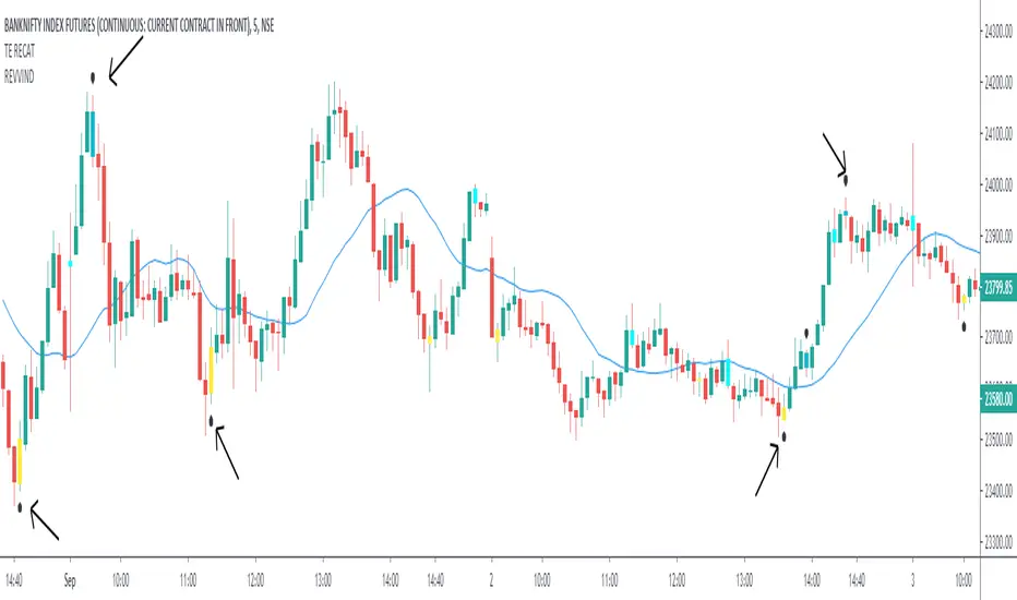
REVERSAL INDICATOR - TE REVVINDTHE REVVIND TOOL helps you IDENTIFY & TRADE REVERSALS in the live market.
This indicator uses a completely different strategy than TE RECAT to highlight the reversals.
Rules are similar to that of RECAT TOOL with the only difference that in REVVIND, the candles formed adjacent to the DAY/LOW candles can/must be considered as well.
HOW TO USE:
AFTER YOU APPLY THE SCRIPT.
1. WAIT FOR THE FORMATION BLUE/YELLOW COLOURED BARS NEAR DAY HIGH/LOW.
Accuracy is highest when the REVERSALS are caught near DAY HIGH/LOW. I would suggest you to work only on near-DAY HIGH/LOW candles.
Do not jump into the trade. Wait for the candle to close.
2. BLUE represents the start of a BEARISH TREND or simply "SELL SIGNAL".
YELLOW represents the beginning of a BULLISH TREND or simply "BUY SIGNAL".
3. If the BLUE candle is formed at/near DAY HIGH.
SELL below it's LOW with DAY HIGH as Stoploss. (Keep some BUFFER).
If the YELLOW candle is formed at/near DAY LOW.
BUY above it's HIGH with DAY LOW as Stoploss. (Keep some BUFFER).
4. TARGET
Risk : Reward = 1:1
Trail Stoploss for 1:2, 1:2.5, 1:3
FOR ACCESS - SEND ME A PRIVATE MESSAGE (DETAILS IN SIGNATURE)
AS PER TRADINGVIEW POLICY PLEASE DON'T ASK FOR ACCESS IN THE COMMENT SECTION.
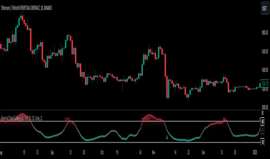
Reversal Zones [UAlgo]🔶Description:
"Reversal Zones " aims to identify potential reversal zones in price movements. The indicator provides visual signals on the chart, indicating potential overbought and oversold conditions based on the calculated values. It offers traders insights into possible turning points in the market, aiding in decision-making processes regarding entry and exit points.
🔶Key Features:
Bollinger Bands Percentile (BB Percentile):
Bollinger Bands Percentile is utilized in this script to gauge the current price position relative to its recent volatility. By calculating the percentile rank of the current price within the Bollinger Bands, traders can identify extreme price levels. This assists in recognizing potential overbought or oversold conditions, where price may be due for a reversal.
Choppiness Index (CI):
The Choppiness Index is employed here to measure the market's trendiness or choppiness. By evaluating the efficiency of the price movement, CI helps traders determine whether the market is trending or consolidating.
Commodity Channel Index (CCI):
The Commodity Channel Index is integrated into this script to capture price momentum. CCI quantifies the relationship between the current price, a moving average, and standard deviation. Traders use CCI to identify overbought or oversold conditions and potential trend reversals.
By averaging and smoothing these values, traders can obtain a clearer picture of potential turning points in the market. The final smoothed combination signal aims to reduce noise and provide more reliable insights.
🔶Disclaimer:
Please note that this script is provided for informational and educational purposes only and should not be considered as financial advice.
Trading in financial markets involves risk, and past performance is not necessarily indicative of future results.
Users should conduct their own research and analysis or consult with a qualified financial advisor before making any investment decisions based on this indicator.
The creators of this script are not liable for any losses incurred from trading activities.
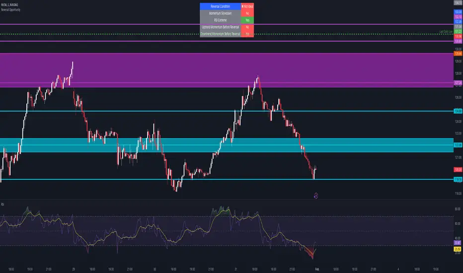
Reversal Opportunity📌 Indicator Description – Reversal Opportunity 🎯
🔍 General Overview
The Reversal Opportunity indicator is designed to identify ideal conditions for Reversal Trading, but it does not provide trade entry signals. Instead, it helps traders determine whether the market conditions are favorable for a potential reversal.
It is specifically designed for traders who execute Reversal trades (Long or Short) and want a clear indication of whether the market is currently suitable for such setups.
💡 What does this indicator do?
- Identifies strong momentum before a reversal (a sharp upward or downward move).
- Detects momentum slowdown (decreasing volume and smaller candles).
- Checks if the RSI is at an extreme level (above 70 or below 30), indicating potential overbought or oversold conditions.
- Displays a table at the top center of the screen with the following key data:
- Are the conditions for a reversal met?
- Is there a slowdown in momentum?
- Is RSI at an extreme level?
- Was there strong uptrend momentum before a possible Short Reversal?
- Was there strong downtrend momentum before a possible Long Reversal?
⚙️ How Does the Indicator Work?
The indicator displays a table in the center of the screen, updating every 5 candles to indicate whether the market conditions are ideal for a reversal trade.
📊 Main Status Row:
- ✔ Ideal Reversal Setup → Conditions for a reversal trade are met (not a trade recommendation).
- ✖ Not Ideal → Reversal conditions are not met; it may be better to wait.
📌 Key Criteria Displayed in the Table:
1. ⚠️ Momentum Slowdown
- Yes → Momentum is weakening (a good sign for reversal trades).
- No → The market is still moving strongly, and a reversal might not be ready yet.
2. 📈 RSI Extreme
- Yes → RSI is above 70 (overbought) or below 30 (oversold), indicating a potential reversal.
- No → RSI is still in a normal range, suggesting that waiting for further confirmation might be wise.
3. 📊 Uptrend Momentum Before Reversal
- Yes → There was a strong uptrend over multiple consecutive candles, potentially setting up for a Short Reversal.
- No → No strong upward momentum was detected, meaning conditions for a Short Reversal may not be ideal.
4. 📉 Downtrend Momentum Before Reversal
- Yes → There was a strong downtrend over multiple consecutive candles, potentially setting up for a Long Reversal.
- No → No strong downward momentum was detected, meaning conditions for a Long Reversal may not be ideal.
🛠️ How to Use the Indicator?
- If "✔ Ideal Reversal Setup" appears, there is a high probability of a market reversal – use your personal entry strategy for further confirmation.
- If Momentum Slowdown = Yes, RSI Extreme = Yes, and strong momentum occurred beforehand, this is an ideal setup for a reversal trade.
- If any conditions are missing ("No"), it may be better to wait for further confirmation instead of entering too early.
- The indicator does NOT provide trade entries! Use your existing trading system for confirmation before entering a trade.
👥 Who Is This Indicator For?
- Reversal traders (entering against the current trend after a strong move).
- Intraday traders looking for reversal trades at extreme market levels.
- Technical traders who rely on Price Action and Volume for trade setups.
⚠️ Disclaimer:
This indicator does not recommend trade entries but provides insight into market conditions. The trader is responsible for risk management and decision-making.
It is best used in combination with additional confirmations such as reversal candles, Order Flow, Bookmap, or Volume Profile to improve accuracy.
🚀 The indicator is ready to use – add it to TradingView and get instant feedback on whether the market is ideal for a Reversal trade!
Reversal Finder by nnamWhat does this indicator do?
In short, this indicator looks for patterns using Relative Directional Strength and plots potential Reversal Areas on the chart. Candlesticks are shaded by a Gradient. This gradient is based on whether or not the market is currently experiencing a positive or negative sentiment.
In the screenshot below you can see that the market is experiencing positive sentiment, but also shows areas of possible resistance and reversal. The example shows the 1 minute timeframe which is very volatile and can show inconsistent results due to inherent volatility. It is recommended to trade the 15min timeframe or higher.
In the screenshot below we see the candle colors are varied with regards to shading. As moves become "stronger" in a particular direction, the candle colors actually switch from standard red/green to Pink and Yellow. This usually indicates an Oversold or Overbought condition.
In the example below, you can see that if an overbought condition no longer exists and the direction of the movement changes, a plotted arrow and line appear on the chart. This indicates a "potential" resistance or support area and "possibly" a reversal in price. (during strong trends, these are usually simple pullback areas and not reversals).
As seen in the screenshot below, an option to extend the lines is included (disabled by default in the settings). Turning this option ON allows the trader to better visualize potential resistance / support areas on the chart by extending the lines to the right.
Used in conjunction with other indicators, this indicator becomes a powerful confirmation tool for your arsenal.
Many settings are fully customizable including gradient color, bar color, line width etc.
I hope you enjoy the indicator and... HAPPY TRADING!

Reversal (Heikin Ashi-ready)This indicator detects bullish and bearish reversal patterns based purely on price action relative to prior candles. It is designed to be Heikin Ashi–compatible, meaning it can optionally use HA OHLC values rather than standard candles.
The script identifies:
Bullish reversals (V Up triangles)
Bearish reversals (V Down triangles)
It uses a two-stage system:
Context detection (a potential reversal setup forms).
Confirmation detection (price breaks a key level within a specified number of bars).

Reversal Map [psyll]The Reversal Map is a dynamic confluence tool that visualizes potential market reversals through adaptive volatility mapping, RSI divergences, and multi-dimensional momentum alignment.
It combines advanced moving average geometry with RSI structure analysis, generating a visual "map" of overextended zones, exhaustion candles and hidden divergences.
Concept
The indicator constructs a volatility-based framework around a central moving average (customizable across multiple algorithms).
It generates layered deviation zones (called BHD Units), each representing incremental volatility distance from the equilibrium line. These zones create a heatmap that intuitively shows the market's deviation intensity - helping identify exhaustion points, trend continuation zones, and sharp reversal structures.
Within this framework, the system integrates a divergence-based reversal detector powered by RSI pivots.
By comparing price action against RSI structure (both regular and hidden divergences), the tool marks potential inflection points with color-coded annotations - visualizing where momentum and structure begin to desynchronize.
Core Mechanics
BHD Mapping: - Calculates upper and lower deviation bands using adaptive volatility units derived from the average range. The resulting Reversal Grid represents how far the price has stretched from its statistical mean, allowing the detection of extreme movements and likely reversal areas.
RSI Divergence Detection: - Automatically identifies both regular and hidden bullish/bearish divergences between price and RSI, drawing solid or dotted lines to indicate structural momentum shifts.
Candle Threshold Logic: - Detects significant candle expansions relative to previous bars, filtering out noise and highlighting meaningful volatility transitions.
Reversal Markers: - Plots reversal dots near candles that align both volatility expansion and RSI exhaustion, providing high-confidence reversal signal
Multi-Timeframe Support
Reversal Map integrates a flexible multi-timeframe (MTF) framework.
Users can operate in Static or Custom mode, allowing the indicator to synchronize its moving average and volatility structure to higher-timeframe data without repainting.
This enables clearer macro-level reversal mapping - ideal for aligning lower-timeframe setups with broader structural signals.
Customization
Every element of the indicator can be fine-tuned - from moving average type and RSI settings to the depth of the volatility layers and visibility of the heatmap or background shading.
Colors for bullish and bearish expansions are independently customizable, and divergence logic can be adjusted or filtered based on RSI threshold levels.

Reversal pickerIs a tool used to determine market reversals, this tool is built of RSI and Moving Averages. Main aim of this tool is to help make market analysis easier by catching market reversal zones and alerting traders and investors about the market reversing and whether they should buy or sell.
What the tool do
- The tool catches market reversals
- The tool draw new support and resistance line for that period
- The tool alert you whether to buy or sell
How to use the tool
- Sell below resistance line and buy above support line
- The labels will guide you whether to buy or sell
- By default a red line is a resistance line and a green line is a support line
- By default a red label tells you to place a sell position and a green label tells you to place a buy position

Reversal MagictrendThis indicator combine multiple indicator in one pine script : Main indicator is Exponential Moving Average (EMA), Commodity Channel Index (CCI), Average True Range (ATR), Crossover Signal & Alert.
1)
For Exponential Moving Average (EMA) have 5 type :
EMA 7 : Green Color (Transparent)
EMA 21 : Red Color (Transparent)
EMA 34 : Orange Color (Faint)
EMA 50 : Purple Color (Transparent)
EMA 90 : Aqua Color (Faint)
Trendband / Background Color in between EMA line :
EMA 7 Cross up EMA 21 : Green
EMA 7 Cross down EMA 21 : Red
EMA 21 Cross up EMA : Yellow
Crossover Signal :
EMA 7 Cross up EMA 21 = Golden Cross : Blue Diamond
EMA 7 Cross down EMA 21 = Death Cross : Red Diamond
Example :
2)
Commodity Channel Index (CCI) :
Have background color : Green for positive value
CCI Signal = Anchor / Hook
- As a signal of reversal. Strong reversal when appear on weekly chart
Example :
Weekly :
Daily :
I am inspired from : www.tradingview.com
Check out his indicator here :
3)
Average True Range (ATR) as Supertrend
Green (Start) New Start for uptrend
Red (End) New Start for downtrend
Also Add on value for each signal.
Example :
I am inspired from : www.tradingview.com
Check out his Supertrend here :
4)
For this indicator, user have option to turn on / off :
- Previous Signal as a backtest
- Previous Trend as a backtest
- ATR to make chart more clean.

Reversal Wick with Volume, S/R, LogReg Channel & EMAsThis uses a Log Regression channel and tries to identify potential reversals based on price action

Reversal Reactor - Multi-Pattern Candle Reversal ScannerReversal Reactor - Multi-Pattern Candle Reversal Scanner
⚪ Overview
Reversal Reactor is a comprehensive candle-pattern and volume-pressure detection engine designed to highlight possible reversal environments.
It identifies abnormal volume surges, major single-candle reversal structures, and multi-candle formations such as Morning/Evening Stars — all refined through adjustable shadow-to-body ratios and adaptive lookback logic.
⚪ Core Features
Big-Volume Candle Detection : green or red full body.
Flags candles with unusually high volume relative to a volume EMA. These moments often reflect climactic pushes, absorption, forced liquidations, or rapid sentiment flips.
Reversal Candle Pattern Suite
A unified engine that detects major reversal structures with individual on/off control:
• Engulfing — Strong directional assertion via body-wide engulfing of prior candle.
• Morning Star — Three-stage bullish reversal following sustained selling.
• Evening Star — Bearish transition structure after an extended advance.
• Hammer — Long lower or upper wick showing strong rejection from one side of the market..
• Shooting Star — Long upper wick showing aggressive upside rejection.
• Hanging Man — Bearish exhaustion signal forming near range highs.
• Doji — Neutral indecision candle marking potential transition zones.
Shadow-to-Body Ratio Control
Fine-tunes wick-dominant pattern detection (hammer/star types) by requiring the shadow to exceed the body by a customizable multiplier, reducing low-quality signals.
Adaptive Lookback Logic
Allows users to adjust historical evaluation depth, improving sensitivity across different volatility regimes and asset behaviors. Default setting is recommended.
⚪ How Traders Use It
• Spot exhaustion near key support/resistance.
• Validate reversal attempts with volume confirmation.
• Filter for clean candle structures before entering momentum shifts.
Disclaimer
This indicator is intended for educational and informational purposes only. It does not constitute financial advice, nor does it guarantee performance or profitability. Always conduct your own analysis and manage risk appropriately when trading.

Reversal 2 Bar + W%R🇺🇸 English Description
Reversal 2 Bar + W%R is a clean and powerful price-action indicator designed to detect momentum-based reversal signals by combining multi-bar structure with Williams %R exhaustion zones.
🔍 Core Logic
A reversal signal is triggered when:
Bullish Reversal
The current candle closes above the highest price of the previous 2 candles,
AND Williams %R entered Oversold (≤ OS level) within the last N bars (user-defined window).
Bearish Reversal
The current candle closes below the lowest price of the previous 2 candles,
AND Williams %R entered Overbought (≥ OB level) within the last N bars.
This approach captures real momentum shifts rather than simple wick touches and gives “credit” to signals shortly after the market hits OB/OS zones — ideal for traders who want price-action confirmation after exhaustion.
🎯 Why It Works
Confirms trend exhaustion using W%R OB/OS
Confirms breakout strength using 2-Bar structure
Avoids weak signals by requiring close-based confirmation
The user-defined window (5–10 bars) allows flexibility for different volatility environments
📈 What You Get
Clear bullish/bearish reversal markers (REV↑ / REV↓)
Auto-colored candles for quick trend bias
Optional W%R filtering
Alerts for automated trading or notifications
This indicator is ideal for scalpers, day traders, and swing traders who rely on clean PA signals + strong exhaustion confirmation.
============================================================================
🇹🇭 คำอธิบายภาษาไทย
Reversal 2 Bar + W%R คืออินดิเคเตอร์ Price Action แบบเรียบง่ายแต่ทรงพลัง ที่ออกแบบมาเพื่อหา “สัญญาณกลับตัวที่มีโมเมนตัมจริง” โดยใช้โครงสร้างแท่งเทียน 2 แท่งร่วมกับโซน Overbought/Oversold ของ Williams %R
🔍 หลักการทำงาน
อินดิเคเตอร์จะให้สัญญาณกลับตัวเมื่อ:
ขาขึ้น (Bullish Reversal)
แท่งปัจจุบัน ปิดสูงกว่า high ของ 2 แท่งก่อนหน้า
และ Williams %R เคยเข้าโซน Oversold ภายในช่วง N แท่งล่าสุด (ตั้งค่าได้)
ขาลง (Bearish Reversal)
แท่งปัจจุบัน ปิดต่ำกว่า low ของ 2 แท่งก่อนหน้า
และ Williams %R เคยเข้าโซน Overbought ภายในช่วง N แท่งล่าสุด
วิธีนี้ทำให้สัญญาณกลับตัว “มีความหมาย” กว่าแค่โดนไส้แทง เพราะใช้การปิดทะลุระดับราคา พร้อมยืนยันว่าโมเมนตัมฝั่งตรงข้ามเริ่มหมดแรงจากการเข้าโซน OB/OS แล้ว
🎯 จุดเด่น
ใช้ W%R ช่วยยืนยันว่าเกิด “ภาวะหมดแรง” จริง
ใช้โครงสร้าง 2 Bar เพื่อยืนยัน “การเบรกโครงสร้าง”
เน้นสัญญาณคุณภาพสูงด้วยเงื่อนไข close-based
มีหน้าต่างให้เครดิต 5–10 แท่งหลังเข้าโซน เพื่อไม่ให้สัญญาณกลับตัวหลุดโอกาส
📈 สิ่งที่อินดี้แสดงให้คุณ
จุดกลับตัว REV↑ / REV↓ ชัดเจน
ระบายสีแท่งเพื่อบอก bias
แจ้งเตือน (Alert) ตั้งค่าได้
เลือกเปิด/ปิดการใช้ W%R filter ได้
เหมาะกับเทรดเดอร์ทุกรูปแบบที่ต้องการสัญญาณกลับตัวที่แม่นยำ เข้าใจง่าย และไม่รกจอ

Reversal Zones// This indicator identifies likely reversal zones above and below current price by aggregating multiple technical signals:
// • Prior Day High/Low
// • Opening Range (9:30–10:00)
// • VWAP ±2 standard deviations
// • 60‑minute Bollinger Bands
// It draws shaded boxes for each base level, then computes a single upper/lower reversal zone (closest level from combined signals),
// with configurable zone width based on the expected move (EM). Within those reversal zones, it highlights an inner “strike zone”
// (percentage of the box) to suggest optimal short-option strikes for credit spreads or iron condors.
// Additional features:
// • Optional Expected Move lines from the RTH open
// • 15‑minute RSI/Mean‑Reversion and Trend‑Day confluence flags displayed in a dashboard
// • Toggles to include/exclude each signal and adjust styling
// How to use:
// 1. Adjust inputs to select which levels to include and set the expected move parameters.
// 2. Reversal boxes (red above, green below) show zones where price is most likely to reverse.
// 3. Inner strike zones (darker shading) guide optimal short-strike placement.
// 4. Dashboard confirms whether mean-reversion or trend-day conditions are active.
// Customize colors and visibility in the settings panel. Enjoy disciplined, confluence-based trade entries!
Reversal Zones — entry + anchored exit + alerts (fixed)Script Description — Reversal Zones (Entry + Anchored Exit + Alerts)
This indicator automatically identifies potential reversal points in price action using a pattern of 4–5 consecutive candles in one direction followed by a reversal candle.
It then calculates dynamic Buy and Sell Zones based on the average range of recent candles and plots them visually on the chart — helping you identify ideal entry and exit zones with clean precision.
⚙️ How It Works
Pattern Detection:
Looks for 4–5 consecutive candles of the same color (bullish or bearish).
When the next candle reverses direction, that point becomes the reference candle.
Zone Calculation:
Takes the average of the last N candle ranges (default = 5).
X = Average candle range
Y = X ÷ Divisor (default = 10)
Plots:
BUY Zone – Below the low of the bullish reversal candle
(two lines: Low - X and Low - X - Y)
SELL Zone – Above the high of the bearish reversal candle
(two lines: High + X and High + X + Y)
Anchored Zones:
After a Buy signal, the indicator monitors for a new swing high and anchors a Sell zone there.
After a Sell signal, it monitors for a swing low and anchors a Buy zone there.
The original entry zone remains visible and is never overwritten.
Zone Extension:
Each zone extends to the right for a configurable number of bars (extendBars, default = 20).
🔔 Alerts
The script includes built-in alert conditions:
Buy Zone Hit → Triggers when price enters/touches any Buy Zone (entry or anchored).
Sell Zone Hit → Triggers when price enters/touches any Sell Zone (entry or anchored).
You can create alerts by:
Clicking Add Alert (🔔) on the chart.
Selecting this script as the condition.
Choosing Buy Zone Hit or Sell Zone Hit.
Setting alert frequency to “Once Per Bar Close”.
🎨 Customizable Inputs
Candle count (N) → Number of candles used to calculate average range.
Divisor → Controls Y distance (refines zone width).
Extend lines right → Number of bars to extend each zone line.
Minimum / Maximum consecutive candles → Controls pattern sensitivity.
Colors, line width, and label visibility are all adjustable.
💡 Best Use Cases
Identify reversal entry zones in trend exhaustion areas.
Combine with volume spikes or RSI divergence for confluence.
Use alerts for potential option writing or countertrend setups.
🧩 Credits
Created by Neeraj Sakharkarr
Designed for traders who want clean, rule-based reversal setups with automatic entry/exit zones.
