Multi-Average Trend Indicator (MATI)[FibonacciFlux]Multi-Average Trend Indicator (MATI)
Overview
The Multi-Average Trend Indicator (MATI) is a versatile technical analysis tool designed for traders who aim to enhance their market insights and streamline their decision-making processes across various timeframes. By integrating multiple advanced moving averages, this indicator serves as a robust framework for identifying market trends, making it suitable for different trading styles—from scalping to swing trading.
MATI 4-hourly support/resistance
MATI 1-hourly support/resistance
MATI 15 minutes support/resistance
MATI 1 minutes support/resistance
Key Features
1. Diverse Moving Averages
- COVWMA (Coefficient of Variation Weighted Moving Average) :
- Provides insights into price volatility, helping traders identify the strength of trends in fast-moving markets, particularly useful for 1-minute scalping .
- DEMA (Double Exponential Moving Average) :
- Minimizes lag and quickly responds to price changes, making it ideal for capturing short-term price movements during volatile trading sessions .
- EMA (Exponential Moving Average) :
- Focuses on recent price action to indicate the prevailing trend, vital for day traders looking to enter positions based on current momentum.
- KAMA (Kaufman's Adaptive Moving Average) :
- Adapts to market volatility, smoothing out price action and reducing false signals, which is crucial for 4-hour day trading strategies.
- SMA (Simple Moving Average) :
- Provides a foundational view of the market trend, useful for swing traders looking at overall price direction over longer periods.
- VIDYA (Variable Index Dynamic Average) :
- Adjusts based on market conditions, offering a dynamic perspective that can help traders capture emerging trends.
2. Combined Moving Average
- The MATI's combined moving average synthesizes all individual moving averages into a single line, providing a clear and concise summary of market direction. This feature is especially useful for identifying trend continuations or reversals across various timeframes .
3. Dynamic Color Coding
- Each moving average is visually represented with color coding:
- Green indicates bullish conditions, while Red suggests bearish trends.
- This visual feedback allows traders to quickly assess market sentiment, facilitating faster decision-making.
4. Signal Generation and Alerts
- The indicator generates buy signals when the combined moving average crosses above its previous value, indicating a potential upward trend—ideal for quick entries in scalping.
- Conversely, sell signals are triggered when the combined moving average crosses below its previous value, useful for exiting positions or entering short trades.
Insights and Applications
1. Scalping on 1-Minute Charts
- The MATI excels in fast-paced environments, allowing scalpers to identify quick entry and exit points based on short-term trends. With dynamic signals and alerts, traders can react swiftly to price movements, maximizing profit potential in brief price fluctuations.
2. Day Trading on 4-Hour Charts
- For day traders, the MATI provides essential insights into intraday trends. By analyzing the combined moving average and its relation to individual moving averages, traders can make informed decisions on when to enter or exit positions, capitalizing on daily price swings.
3. Swing Trading on Daily Charts
- The MATI also serves as a valuable tool for swing traders. By evaluating longer-term trends through the combined moving average, traders can identify potential swing points and adjust their strategies accordingly. The flexibility of adjusting the lengths of the moving averages allows for tailored approaches based on market volatility.
Benefits
1. Clarity and Insight
- The combination of diverse moving averages offers a clear visual representation of market trends, aiding traders in making informed decisions across multiple timeframes.
2. Flexibility and Customization
- With adjustable parameters, traders can adapt the MATI to their specific strategies, making it suitable for various market conditions and trading styles.
3. Real-Time Alerts and Efficiency
- Built-in alerts minimize response times, allowing traders to capitalize on opportunities as they arise, regardless of their trading style.
Conclusion
The Multi-Average Trend Indicator (MATI) is an essential tool for traders seeking to enhance their technical analysis capabilities. By seamlessly integrating multiple moving averages with dynamic color coding and real-time alerts, this indicator provides a comprehensive approach to understanding market trends. Its versatility makes it an invaluable asset for scalpers, day traders, and swing traders alike.
Important Note
As with any trading tool, thorough analysis and risk management are crucial when using this indicator. Past performance does not guarantee future results, and traders should always be prepared for market fluctuations.
Cari dalam skrip untuk "scalping"

ADX with Donchian Channels
The "ADX with Donchian Channels" indicator combines the Average Directional Index (ADX) with Donchian Channels to provide traders with a powerful tool for identifying trends and potential breakouts.
Features:
Average Directional Index (ADX):
The ADX is used to quantify the strength of a trend. It helps traders determine whether a market is trending or ranging.
Adjustable parameters for ADX smoothing and DI length allow traders to fine-tune the sensitivity of the trend strength measurement.
Donchian Channels on ADX:
Donchian Channels are applied directly to the ADX values to highlight the highest high and lowest low of the ADX over a specified period.
The upper and lower Donchian Channels can signal potential trend breakouts when the ADX value moves outside these bounds.
The middle Donchian Channel provides a reference for the average trend strength.
Visualization:
The indicator plots the ADX line in red to clearly display the trend strength.
The upper and lower Donchian Channels are plotted in blue, with a green middle line to represent the average.
The area between the upper and lower Donchian Channels is filled with a blue shade to visually emphasize the range of ADX values.
Default Settings for Scalping:
Donchian Channel Length: 10
Standard Deviation Multiplier: 1.58
ADX Length: 2
ADX Smoothing Length: 2
These default settings are optimized for scalping, offering a quick response to changes in trend strength and potential breakout signals. However, traders can adjust these settings to suit different trading styles and market conditions.
How to Use:
Trend Strength Identification: Use the ADX line to identify the strength of the current trend. Higher ADX values indicate stronger trends.
Breakout Signals: Monitor the ADX value in relation to the Donchian Channels. A breakout above the upper channel or below the lower channel can signal a potential trend continuation or reversal.
Range Identification: The filled area between the Donchian Channels provides a visual representation of the ADX range, helping traders identify when the market is ranging or trending.
This indicator is designed to enhance your trading strategy by combining trend strength measurement with breakout signals, making it a versatile tool for various market conditions.

Traders Dynamic Index Pro by YardleyRosetteThis is an excellent indicator thanks to the code author LazyBear!
I have modified to a more appealing colors visually representing market condition.
2 Backgrounds
Uptrend/Sell: Uptrend above Orange line, Sell potential area.
Downtrend/Buy: Downtrend under Orange line, Buy potential area.
I have modified by adding previously unrecognized upper and lower channels of support/resistance zones within Traders Dynamic Index which will be of great use in previously confusing situations.
The Traders Dynamic Index, observes trend direction , market strength , and market volatility .
To be used by the "elite", the Pro accounts.
Multiple Time Frames are ABSOLUTELY required. I'm sorry for those who aren't. I can refer you who don't, to try out KK_Traders Dynamic Index Higher Timeframe (by Kurbelklaus).
Multiple Time Frames are necessary or else technical analysis using this one chart alone will give false reasoning as I have witnessed a few who do attempt to use this time machine, including me when I had not used multiple time frame charts since I did not have the PRO account.
Problems, for example low time frame indicates 'overbought' yet higher time frame indicates it had been oversold. Which are you to agree with? The higher time frame absolutely.
In this condition though an overall retracement will very likely occur in the short-term.
Here is my clever explanation of the rules:
Use of time frames: Traders' choice of combination.
For example, 180, 90, and 45 minute charts may be useful for example with Bitcoin
You can see what may confuse others. Apparently rising as a buy signal for having green line cross up from below orange line, but 90 minute time frame thanks to this support/ resistance channel coded within T.D.I. can be observed as an alerting condition. Then observing 45 minute time frame notice the blue lines ("Bands") are 'squeezing' the other components you can then expect a breakout , and if its in the overbought side, at least above 56, and the 240 time frame can identify current downtrend... you know how to connect the data given by the charts: Ranging Overbought in a downtrend will breakout. 1) Overbought in downtrend: Sell, 2) Ranging to breakout, set entry order according to pattern. With probability on your side, you can set a sell stop under the tricky uptrend line when all others are wondering what will happen, you are ahead.
According to range scalping: Great Scalping
Only if orange (MBL) line steady within upper and lower midlines 40 and 60
Long, when green and red line are under 44 with green crossing over red.
The green line is above the red line
The green line is above the orange line
Short, when green and red line are above 56 with red crossing over green.
The green line is below the red line
The green line is below the orange line
Close when opposite signal is about to occur

Reflexivity Resonance Factor (RRF) - Quantum Flow Reflexivity Resonance Factor (RRF) – Quantum Flow
See the Feedback Loops. Anticipate the Regime Shift.
What is the RRF – Quantum Flow?
The Reflexivity Resonance Factor (RRF) – Quantum Flow is a next-generation market regime detector and energy oscillator, inspired by George Soros’ theory of reflexivity and modern complexity science. It is designed for traders who want to visualize the hidden feedback loops between market perception and participation, and to anticipate explosive regime shifts before they unfold.
Unlike traditional oscillators, RRF does not just measure price momentum or volatility. Instead, it models the dynamic feedback between how the market perceives itself (perception) and how it acts on that perception (participation). When these feedback loops synchronize, they create “resonance” – a state of amplified reflexivity that often precedes major market moves.
Theoretical Foundation
Reflexivity: Markets are not just driven by external information, but by participants’ perceptions and their actions, which in turn influence future perceptions. This feedback loop can create self-reinforcing trends or sudden reversals.
Resonance: When perception and participation align and reinforce each other, the market enters a high-energy, reflexive state. These “resonance” events often mark the start of new trends or the climax of existing ones.
Energy Field: The indicator quantifies the “energy” of the market’s reflexivity, allowing you to see when the crowd is about to act in unison.
How RRF – Quantum Flow Works
Perception Proxy: Measures the rate of change in price (ROC) over a configurable period, then smooths it with an EMA. This models how quickly the market’s collective perception is shifting.
Participation Proxy: Uses a fast/slow ATR ratio to gauge the intensity of market participation (volatility expansion/contraction).
Reflexivity Core: Multiplies perception and participation to model the feedback loop.
Resonance Detection: Applies Z-score normalization to the absolute value of reflexivity, highlighting when current feedback is unusually strong compared to recent history.
Energy Calculation: Scales resonance to a 0–100 “energy” value, visualized as a dynamic background.
Regime Strength: Tracks the percentage of bars in a lookback window where resonance exceeded the threshold, quantifying the persistence of reflexive regimes.
Inputs:
🧬 Core Parameters
Perception Period (pp_roc_len, default 14): Lookback for price ROC.
Lower (5–10): More sensitive, for scalping (1–5min).
Default (14): Balanced, for 15min–1hr.
Higher (20–30): Smoother, for 4hr–daily.
Perception Smooth (pp_smooth_len, default 7): EMA smoothing for perception.
Lower (3–5): Faster, more detail.
Default (7): Balanced.
Higher (10–15): Smoother, less noise.
Participation Fast (prp_fast_len, default 7): Fast ATR for immediate volatility.
5–7: Scalping.
7–10: Day trading.
10–14: Swing trading.
Participation Slow (prp_slow_len, default 21): Slow ATR for baseline volatility.
Should be 2–4x fast ATR.
Default (21): Works with fast=7.
⚡ Signal Configuration
Resonance Window (res_z_window, default 50): Z-score lookback for resonance normalization.
20–30: More reactive.
50: Medium-term.
100+: Very stable.
Primary Threshold (rrf_threshold, default 1.5): Z-score level for “Active” resonance.
1.0–1.5: More signals.
1.5: Balanced.
2.0+: Only strong signals.
Extreme Threshold (rrf_extreme, default 2.5): Z-score for “Extreme” resonance.
2.5: Major regime shifts.
3.0+: Only the most extreme.
Regime Window (regime_window, default 100): Lookback for regime strength (% of bars with resonance spikes).
Higher: More context, slower.
Lower: Adapts quickly.
🎨 Visual Settings
Show Resonance Flow (show_flow, default true): Plots the main resonance line with glow effects.
Show Signal Particles (show_particles, default true): Circular markers at active/extreme resonance points.
Show Energy Field (show_energy, default true): Background color based on resonance energy.
Show Info Dashboard (show_dashboard, default true): Status panel with resonance metrics.
Show Trading Guide (show_guide, default true): On-chart quick reference for interpreting signals.
Color Mode (color_mode, default "Spectrum"): Visual theme for all elements.
“Spectrum”: Cyan→Magenta (high contrast)
“Heat”: Yellow→Red (heat map)
“Ocean”: Blue gradients (easy on eyes)
“Plasma”: Orange→Purple (vibrant)
Color Schemes
Dynamic color gradients are used for all plots and backgrounds, adapting to both resonance intensity and direction:
Spectrum: Cyan/Magenta for bullish/bearish resonance.
Heat: Yellow/Red for bullish, Blue/Purple for bearish.
Ocean: Blue gradients for both directions.
Plasma: Orange/Purple for high-energy states.
Glow and aura effects: The resonance line is layered with multiple glows for depth and signal strength.
Background energy field: Darker = higher energy = stronger reflexivity.
Visual Logic
Main Resonance Line: Shows the smoothed resonance value, color-coded by direction and intensity.
Glow/Aura: Multiple layers for visual depth and to highlight strong signals.
Threshold Zones: Dotted lines and filled areas mark “Active” and “Extreme” resonance zones.
Signal Particles: Circular markers at each “Active” (primary threshold) and “Extreme” (extreme threshold) event.
Dashboard: Top-right panel shows current status (Dormant, Building, Active, Extreme), resonance value, energy %, and regime strength.
Trading Guide: Bottom-right panel explains all states and how to interpret them.
How to Use RRF – Quantum Flow
Dormant (💤): Market is in equilibrium. Wait for resonance to build.
Building (🌊): Resonance is rising but below threshold. Prepare for a move.
Active (🔥): Resonance exceeds primary threshold. Reflexivity is significant—consider entries or exits.
Extreme (⚡): Resonance exceeds extreme threshold. Major regime shift likely—watch for trend acceleration or reversal.
Energy >70%: High conviction, crowd is acting in unison.
Above 0: Bullish reflexivity (positive feedback).
Below 0: Bearish reflexivity (negative feedback).
Regime Strength: % of bars in “Active” state—higher = more persistent regime.
Tips:
- Use lower lookbacks for scalping, higher for swing trading.
- Combine with price action or your own system for confirmation.
- Works on all assets and timeframes—tune to your style.
Alerts
RRF Activation: Resonance crosses above primary threshold.
RRF Extreme: Resonance crosses above extreme threshold.
RRF Deactivation: Resonance falls below primary threshold.
Originality & Usefulness
RRF – Quantum Flow is not a mashup of existing indicators. It is a novel oscillator that models the feedback loop between perception and participation, then quantifies and visualizes the resulting resonance. The multi-layered color logic, energy field, and regime strength dashboard are unique to this script. It is designed for anticipation, not confirmation—helping you see regime shifts before they are obvious in price.
Chart Info
Script Name: Reflexivity Resonance Factor (RRF) – Quantum Flow
Recommended Use: Any asset, any timeframe. Tune parameters to your style.
Disclaimer
This script is for research and educational purposes only. It does not provide financial advice or direct buy/sell signals. Always use proper risk management and combine with your own strategy. Past performance is not indicative of future results.
Trade with insight. Trade with anticipation.
— Dskyz , for DAFE Trading Systems

FXC Candle strategyFxc candle strategy for Gold scalping.
Scalping is a fast-paced trading strategy focusing on capturing small, frequent price movements for incremental profits. High market liquidity and tight spreads are needed for scalping, minimizing execution risks. Scalpers should trade during peak liquidity to avoid slippage

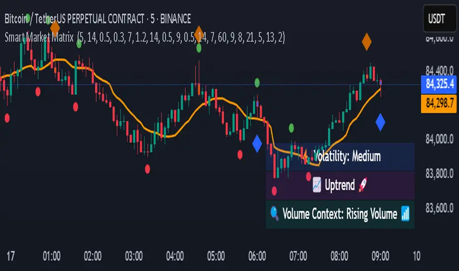
Smart Market Matrix Smart Market Matrix
This indicator is designed for intraday, scalping, providing automated detection of price pivots, liquidity traps, and breakout confirmations, along with a context dashboard featuring volatility, trend, and volume.
## Summary Description
### Menu Settings & Their Roles
- **Swing Pivot Strength**: Controls the sensitivity for detecting High/Low pivots.
- **Show Pivot Points**: Toggles the display of HH/LL markers on the chart.
- **VWMA Length for Trap Volume** & **Volume Spike Multiplier**: Identify concentrated volume spikes for liquidity traps.
- **Wick Ratio Threshold** & **Max Body Size Ratio**: Detect candles with disproportionate wicks and small bodies (doji-ish) for traps.
- **ATR Length for Trap**: Measures volatility specific to trap detection.
- **VWMA Length for Breakout Volume**, **ATR Multiplier for Breakout**, **ATR Length for Breakout**, **Min Body/Range Ratio**: Set adaptive breakout thresholds based on volatility and volume.
- **OBV Smooth Length**: Smooths OBV momentum for breakout confirmation.
- **Enable VWAP Filter for Confirmations**: Optionally validate breakouts against the VWAP.
- **Enable Higher-TF Trend Filter** & **Trend Filter Timeframe**: Align breakout signals with the 1h/4h/Daily trend.
- **ADX Length**, **EMA Fast/Slow Length for Context**: Parameters for the context dashboard (Volatility, Trend, Volume).
- **Show Intraday VWAP Line**, **VWAP Line Color/Width**: Display the intraday VWAP line with custom style.
### Signal Interpretation Map
| Signal | Description | Recommended Action |
|--------------------------------|-----------------------------------------------------------|-------------------------------------------|
| 📌 **HH / LL (pivot)** | Market structure (support/resistance) | Note key levels |
| **Bull Trap(green diamond)** | Sweep down + volume spike + wick + rejection | Go long with trend filter
| **Bear Trap(red diamond)** | Sweep up + volume spike + wick + rejection | Go short with trend filter
| 🔵⬆️ **Breakout Confirmed Up** | Close > ATR‑scaled high + volume + OBV↑ | Go long with trend filter |
| 🔵⬇️ **Breakout Confirmed Down** | Close < ATR‑scaled low + volume + OBV↓ | Go short with trend filter |
| 📊 **VWAP Line** | Intraday reference to guide price | Use as dynamic support/resistance |
| ⚡ **Volatility** | ATR ratio High/Med/Low | Adjust position size |
| 📈 **Trend Context** | ADX+EMA Strong/Moderate/Weak | Confirm trend direction |
| 🔍 **Volume Context** | Breakout / Rising / Falling / Calm | Check volume momentum |
*This summary gives you a quick overview of the key settings and how to interpret signals for efficient intraday scalping.*
### Suggested Settings
- **Intraday Scalping (5m–15m)**
- `Swing Pivot Strength = 5`
- `VWMA Length for Trap Volume = 10`, `Volume Spike Multiplier = 1.6`
- `ATR Length for Trap = 7`
- `VWMA Length for Breakout Volume = 12`, `ATR Length for Breakout = 9`, `ATR Multiplier for Breakout = 0.5`
- `Min Body/Range Ratio for Breakout = 0.5`, `OBV Smooth Length = 7`
- `Enable Higher-TF Trend Filter = true` (TF = 60)
- `Show Intraday VWAP Line = true` (Color = orange, Width = 2)
- **Swing Trading (4h–Daily)**
- `Swing Pivot Strength = 10`
- `VWMA Length for Trap Volume = 20`, `Volume Spike Multiplier = 2.0`
- `ATR Length for Trap = 14`
- `VWMA Length for Breakout Volume = 30`, `ATR Length for Breakout = 14`, `ATR Multiplier for Breakout = 0.8`
- `Min Body/Range Ratio for Breakout = 0.7`, `OBV Smooth Length = 14`
- `Enable Higher-TF Trend Filter = true` (TF = D)
- `Show Intraday VWAP Line = false`
*Adjust these values based on the symbol and market volatility for optimal performance.*
Supply And DemandThis supply and demand indicator uses sessions, volume spikes, higher timeframe price action and other volume calculations to spot areas on the chart where price will likely react. From the 1 minute and below charts to the daily and up charts, you can get excellent levels for any timeframe.
Why Use Supply And Demand?
One of the safest ways to trade is to wait for price to enter an area of interest where price should react. When we play reversals off of these areas, you increase the likelihood that your trade will be profitable because there was previous price action that told you that the current level is one where price will react. So we look for reversals at or very near these levels to enter into scalp or swing trade positions and look to exit that position when price is at or near the next major supply and demand level.
How To Use
The strategy with this indicator is to wait for price action to reach the levels shown by this supply and demand indicator and then enter trades at these levels, looking for a reversal. The thicker lines and the lines that are from the highest timeframes will be the most important levels on the chart. There is a table on the chart that will help you identify what timeframe the levels are using, with the color of that line next to it for easy identification.
The default settings are designed for scalping the 1-5 minute charts, so there are more levels turned on than necessary if you are using higher timeframes than 5 minutes. If you are using higher timeframes, make sure to turn off some of the lower timeframe levels so that it doesn’t clog up your charts. On the daily timeframe and above, many of the levels are coded to not turn on so that you don’t have to turn them off manually, but be aware that you will need to adjust your charts to suit your preferences, especially if you are on anything above the 5 minute chart.
For scalping, wait for price to react from the supply and demand levels by showing wicks, struggling to break through or getting reversal candles at those levels. Ride those moves to the next major supply and demand area before taking profit. You may want to turn on sessions and some of the lower timeframe levels as well if there are big gaps on the chart that are not suitable for scalping.
For swing trading, you will want to turn some of the lower timeframe and session levels off. Leave it to only higher timeframe OHLC lines and volume spike levels. Then you can swing moves that reverse off of the supply and demand lines.
Customization
This indicator is fully customizable. You can turn on or off any of the levels as well as increase the number specific levels so your charts suit your preferences.
All of the levels used are color coded individually so you can easily tell which type of level it is and these colors can be changed within the settings to suit your preferences. These colors are also reflected in the line identification table that show you exactly which color each type of level is.
There are toggles for the line identification table and session identification table as well if you don’t want them on your chart.
Types Of Levels Used
This indicator uses 4 different types of levels that I have found to be extremely influential on the price action. They are: volume spikes, higher timeframe price action, country based trading sessions and the VWAP. All of these levels have proven to be very important levels in my testing and are very helpful in spotting reversal areas.
Volume Spikes
This indicator is looking for the largest volume spikes and plotting the levels where that volume came in. It checks for the highest volume spikes across multiple different lengths of candles so that you get recent levels as well as the most important levels in the past. There are volume spike calculations for your current chart timeframe, 1 hour charts, 4 hour charts, daily charts, weekly charts, and monthly charts. Each of these looks for volume spikes across various lengths of candles for each timeframe and is color coded so you can identify which levels are which easily. The weekly and monthly volume spike levels are fatter than the normal volume spike levels with a line width of 2 to signify their importance.
OHLC Higher Timeframe Candles
This script plots levels of higher timeframe candles since price usually reacts very strongly to these levels. The levels it will produce are the high, low, open and close of the most recent closed candle of each higher timeframe. You can adjust these to show as many or as few previous HTF candles as you would like. The higher timeframe candles available to use are as follows: 1 hour, 4 hour, daily, 3 day, weekly, monthly, quarterly and yearly. The monthly, quarterly and yearly levels are fatter than the normal levels with a line width of 2 to signify their importance.
Trading Sessions
Trading sessions are very important levels because the market makers of different parts of the world are typically positioning themselves at these specific times. The number of each trading session line can be adjusted to show more or less levels depending on your preference. When you adjust the number, it will affect all lines that are enabled for that specific session. The levels available for each Tokyo, London & New York session are as follows: session premarket open, regular session open, session close, and session high & low. The session close boxes are fatter than the others with a line width of 2 to signify its importance.
VWAP & Previous Close
We all know that the VWAP aka Volume Weighted Average Price is a very important level on any chart, so we included this level as a default. However, we decided to take this a step further and include the previous daily session’s VWAP closing price and plot those levels. These are extremely important levels that you should pay very close attention to, along with the other levels mentioned above. The market makers are hedging their positions based on these levels and you will typically see very strong reactions to these levels, especially in the first hour when the markets open up. The VWAP and previous session VWAP close levels can be turned on or off and the default for the number of previous VWAP session close prices is set to 5. These levels are fatter lines because they are extremely important, so make sure to pay attention to them!
Line & Session Identification Tables
There are two tables to help you identify what is on the chart. The first is a large table in the top right that shows you the color and type of each line that is turned on so you can easily identify which lines are which. The second table is a small one at the bottom center of the chart that tells you which trading session we are currently in and what color that session is on the chart. These tables can be turned on or off and you can also change where they are on the chart by adjusting them at the bottom of the settings page.
Markets
This Supply And Demand indicator can be used on any market with price data such as stocks, crypto, forex and futures.
Timeframes
This Supply And Demand indicator can be used on any timeframe, from the second charts all the way up to the yearly charts.

Futures SignalThis is a Futures Signal Indictor works using support & resistance and market trend, it is designed for all type of markets (crypto, forex, stock etc.) and works on all commonly used timeframes (preferably on 5 Min, 15 Min Candles).
How it works Futures Signal Indictor :
Core logic behind this indicator is to finding the Support and Resistance , we find the Lower High (LH) and Higher Low (HL) to find the from where the price reversed (bounced back) and also we use a custom logic for figuring out the peak price in the last few candles. Based on the multiple previous Support and Resistance (HH, HL, LL LH) we calculate a price level, this price level is used a major a factor for entering the trade. Once we have the price level we check if the current price crosses that price level, if it crossed then we consider that as a long/short entry (based on whether it crosses resistance or support line that we calculated). Once we have pre long/short signals we further filter it based on the market trend to prevent too early/late signals. Along with this if we don't see a clear trend we do the filtering by checking how many support or resistance level the price has bounced off.
Stop Loss and Take Profit: We have also added printing SL and TP levels on the chart to make the it easier for everyone to find the SL/TP values. Script calculates the SL value by checking the previous support level for LONG trade and previous resistance level for SHORT trades. Take profit are calculated in 0.5 ratio as of now.

Bollinger Bands Scalper + VWAPGet more consistent scalps by trading in-between Bollinger Band Deviations.
FEATURES:
1) 3 Bollinger Bands with default settings to 1, 2, and 3 deviations for more consistent scalps
2) Trendicator: a dynamic color changing moving average that helps you see trend quickly
3) Robust VWAP tool with up to 3 different deviations as well as different anchor points to help you see strong support and resistances
4) Calming "purple cloud" color palette helps you focus on price action
5) Discover new trading strategies with a wide range of customizability
Market Maker Indicator V2 [tecnocrypto]This indicator is based on the idea that prices are generated by the interaction between a Market Maker on one side (sometimes also called the "Composite Man") and Retail Traders on the other side (Retail Traders include simple retail, professional traders, whales, institutions...as a single entity). These two opposite entities "play" the trading game on trading platforms/exchanges (crypto), which are neutral to the game.
Market makers are liquidity providers, and make profits either by charging a spread between buy and sell prices, and (also) by trapping retail traders into specific positions.
Trading is a "zero sum" game in the sense that it generates a transfer of resources between these two specific players, which are indeed the Market Maker and Retail Traders. If Retail Traders are in profit, Market Maker is (temporarily) in loss, and viceversa. Market Maker goal is to squeeze profits out of Retail Traders, by inducing them to take wrong positions.
The Market Maker Method Indicator executes the following:
1) Identifies and plots candles that are generated by the Market Maker's moves (called "Shift Candles"); shift candles are "artificial" price/volumes moves, generated to induce retail traders into specific zones which are, essentially, traps. They are called Shift Candles as they generate abnormal (and mostly unexpected) price movements in either direction. They move the price from one zone to the next to execute the Market Maker strategy. Observe how often sudden (apparent) prices increases are followed by price crashes (stop hunt rise, drop); and observe how often sudden (apparent) price collapses are followed by price uptrends (stop hunt low, rise); sometimes these movements are made in progressive steps (generally, 3).
2) Plots open long/open short alerts based on the assumption that when Market Maker plots upwards shift candles, vivid green color, they are preparing for an upcoming price reversal (down); same, but opposite sign, for downwards shift candles. This is a counterintuitive logic for Retail Traders, that generally open long when price is rising, and open shorts when price is falling - jumping into Market Makers traps.
3) Plots the areas where price is expected to return (upwards or downwards) based on previous shift candles (called "Recovery Zones")
You can use this indicator on any timeframe and for any asset.
The Market Maker indicator V2 provides long / short entry signals based upon the market maker manipulative moves described above.
Long alerts are triggered by manipulative price push-downs by the marker maker, which will be followed by price increases (while price was decreasing, market maker was purchasing from retail). Additional factors are taken into consideration to plot long entry signals, , mainly volume build up and mean reversion, around this basic concept.
Short alerts are triggered by manipulative price push-ups by the marker maker, which will be followed by price drops (while price was increasing, market maker was selling to retail). Additional factors are taken into consideration to plot short entry signals, mainly volume build up and mean reversion, around this basic concept.
The indicator is based on the Traders Reality indicator, but improved with alerts, that can be used with trading bots, and additional possibilities to customize the behavior of the indicator.
A strategy associated with this indicator is also available.
Best results on the 1H timeframe.
Contact me for further info.
[BT] - ScalpMaster [ALERTS] v1Go easy on this script as it's my first, hopefully more to come!
ScalpMaster - V1
It's main feature is catch a bull run for volatile markets. Two main selling triggers (CCI and TSSL) with an option to only sell after fees are met (for profit).
Built in Statistics and Back-testing
I've introduced my own version of backtesting built into the main script. You can disable it if it's too much, just makes it easier to dial the settings in and compare with alert triggering. I've included this on all of my scripts.
***You will get a warning that this script repaints, however you can easily compare alerts against the labels. I'm not entirely sure, but I believe the repainting is due to the Global Stats Label at the end gets repainted to keep in the front. ***
Directions
Buy: When dialing in the script, watch the purple line above the source, when the current price crosses above this purple line then the buying trigger sets.
Sell: TSSL - Trailing Stop / Stop Limit, use available settings to manipulate behavior. It's meant to trail the bull run and sell once the price crosses the bottom tssl bar
Sell: CCI - Modify the FastMA and SlowMA settings
Sell: P+ - Above won't trigger until you are in the positive after the fees x2 are met. Great to keep your losses minimal. Combine this with a high Stop Loss for great results but might be waiting awhile for a profit.

Scalp Master V 1.0The Scalp Master is designed for new and experienced trainers to get a better understanding of sudden direction changes in the cryptocurrencies markets, by displaying just 2 basic signals: "Up" or "Down".
It combines the T.A of a group of indicators to give you the most sensitive tool to catch a Pump or Dump before it happens. It also includes one of the most basic and powerful tools to understand how the market is going to behave: Bollinger Bands, if we get an "Up" signal near the lower Bollinger band, we might be close to a good pump and if we get a "Down" signal near the top Bollinger band a dump in the price will most likely happen.
Enjoy!!!

TraderTroys 5MMSRTraderTroys 5 Minute Major Support / Resistance Indicator
This is to only be used on the 5 minute time frame. It's sole purpose is to reveal up coming major support and resistance.
Green = Less reliable
Yellow = More reliable
Red = Very reliable
However, I would recommend back testing this *by applying it to your chart and watching how price action plays with the lines.*
I would not recommend only trading based off this indicator, but use it as a form of confluence with others.
It's built around multiplications of the average price.
Here is a great example of it working:

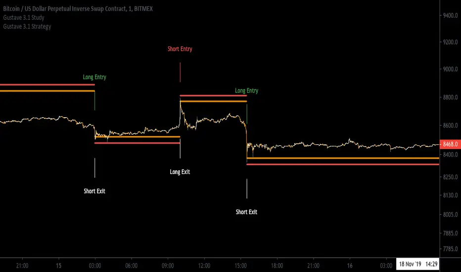
[Aill3urs V.1.0.P] Study GustaveIt's the Study of the this Strategy-Gustave you can find below.
For any info DM me.
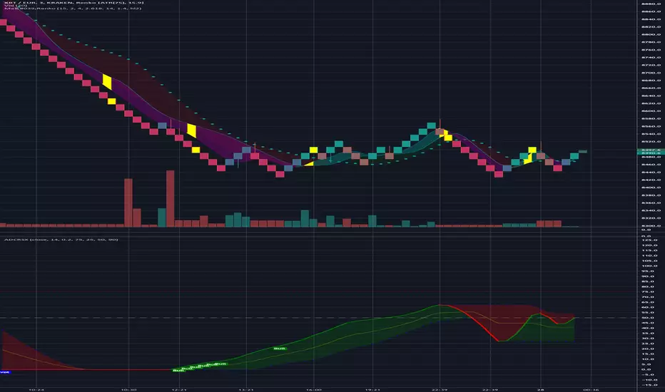
Ma'RenkoMa'Renko is simple, yet powerful trading system designed to help scalpers who use Renko charts (including ATR-based, but it should work with any type of candles as well). The thickness of color bands represents different trend characteristics (mostly volume and speed of price changing) which allow a trader to filter out false pivot points, enter and exit more wisely. The chart speaks for itself.
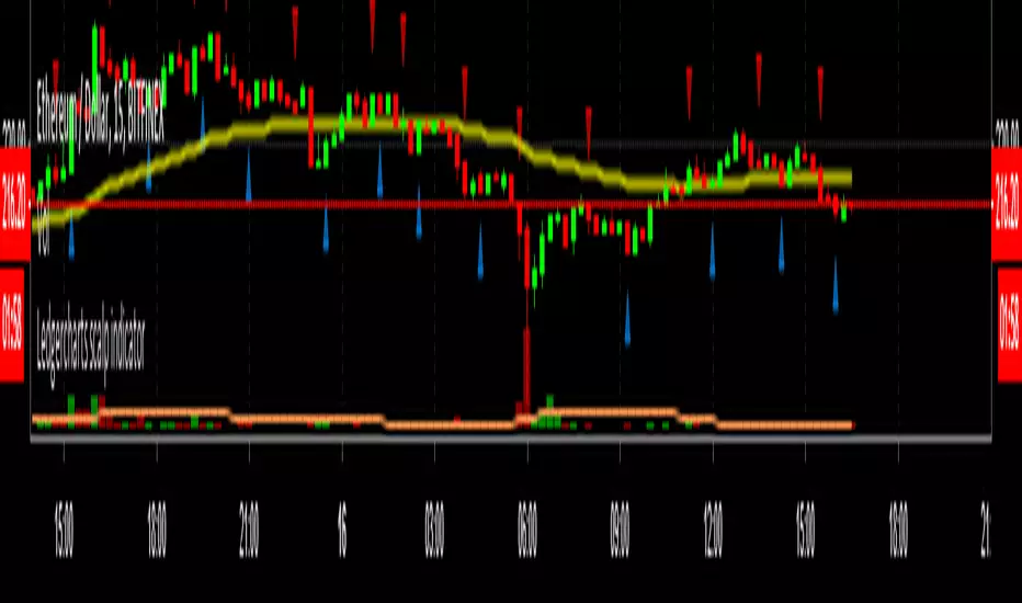
Ledgercharts scalp indicatorI'm using this indicator for finding scalp opportunities with high volume crypto coins. To be used in combination with support & resistance levels and/or other indicators.
Works best on a 15-minute timeframe.
DISCLAIMER:
This script is not intended as financial advice and is for educational purposes only. Do your own research by verifying the accuracy of the information and know that your decisions are your own.
MPO4 Lines – Modal Engine█ OVERVIEW
MPO4 Lines – Modal Engine is an advanced multi-line modal oscillator for TradingView, designed to detect momentum shifts, trend strength, and reversal points through candle-based pressure analysis with multiple fast lines and a reference slow line. It features divergence detection on Fast Line A, overbought/oversold return signals, dynamic coloring modes, and layered gradient visualizations for enhanced clarity and decision-making.
█ CONCEPT
The indicator is built upon the Market Pressure Oscillator (MPO) and serves as its expanded evolution, aimed at enabling broader market analysis through multiple lines with varying parameters. It calculates modal pressure using candle body size and direction, weighted against average body size over a lookback period, then normalized and smoothed via EMA. It generates four distinct oscillator lines: a heavily smoothed Slow Line (trend reference), two Fast Lines (A & B) for momentum and support/resistance, and an optional Line 4 for additional confirmation. Divergence is calculated solely on Fast Line A, with visual gradients between lines and bands for intuitive interpretation.
█ WHY USE IT?
- Multi-Layer Momentum: Combines slow trend reference with dual fast lines for precise entry/exit timing.
- Divergence Precision: Bullish/bearish divergences on Fast Line A with labeled confirmation.
- OB/OS Return Signals: Clear buy/sell markers when Fast Line A exits oversold/overbought zones.
- Dynamic Visuals: Gradient fills, line-to-line shading, and band gradients for instant market state recognition.
- Flexible Coloring: Slow Line color by direction or zero-position; fast lines by sign.
- Full Customization: Independent lengths, smoothing, visibility, and transparency — by adjusting the lengths of different lines, you can tailor results for various strategies; for example, enabling Line 4 and tuning its length allows trading based on crossovers between different lines.
█ HOW IT WORKS?
- Candle Pressure Calculation: Body = math.abs(close - open); avgBody = ta.sma(body, len). Direction = +1 (bull), –1 (bear), 0 (neutral). Weight = body / avgBody. Contribution = direction × weight.
- Rolling Sum & Normalization: Sums contributions over lookback, normalizes to ±100 scale (÷ (len × 2) × 100).
Smoothing: Applies primary EMA (smoothLen), with extra EMA on Slow Line for stability.
Line Structure:
- Slow Line = calcCPO(len1=20, smoothLen1=5) → extra EMA (5)
- Fast Line A = calcCPO(len2=6, smoothLen2=7)
- Fast Line B = calcCPO(len3=6, smoothLen3=10)
- Line 4 = calcCPO(len4=14, smoothLen4=1)
Divergence Detection: Uses ta.pivothigh/low on price and Fast Line A (pivotLength left/right). Bullish: lower price low + higher osc low. Bearish: higher price high + lower osc high. Valid within 5–60 bar window.
Signals:
- Buy: Fast Line A crosses above oversold (–30)
- Sell: Fast Line A crosses below overbought (+30)
- Slow Line color flip (direction or zero-cross)
- Divergence labels ("Bull" / "Bear")
- Band Coloring as Momentum Signal:
When Fast Line A ≤ Fast Line B → Overbought band turns red (bearish pressure building)
When Fast Line A > Fast Line B → Oversold band turns green (bullish pressure building) This dynamic coloring serves as visual confirmation of momentum shift following fast line crossovers
Visualization:
- Gradients: Fast B → Zero (multi-layer fade), Fast A ↔ B fill, OB/OS bands
- Dynamic colors: Green/red based on sign or trend
- Zero line + dashed OB/OS thresholds
Alerts: Trigger on OB/OS returns, Slow Line changes, and divergences.
█ SETTINGS AND CUSTOMIZATION
- Line Visibility: Toggle Slow, Fast A, Fast B, Line 4 independently.
Line Lengths:
- Slow Line: Base (20), Primary EMA (5), Extra EMA (5)
- Fast A: Lookback (6), EMA (7)
- Fast B: Lookback (6), EMA (10)
- Line 4: Lookback (14), EMA (1)
- Slow Line Coloring Mode: “Direction” (trend-based) or “Position vs Zero”.
- Bands & Thresholds: Overbought (+30), Oversold (–30), step 0.1.
- Signals: Enable Fast A OB/OS return markers (default: on).
- Divergence: Enable/disable, Pivot Length (default: 2, min 1).
- Colors & Appearance: Full control over bullish/bearish hues for all lines, zero, bands, divergence, and text.
Gradients & Transparency:
- Fast B → Zero: 75 (default)
- Fast A ↔ B fill: 50
- Band gradients: 40
- Toggle each gradient independently
█ USAGE EXAMPLES
The indicator allows users to configure various strategies manually, though no built-in alerts exist for them. Entry signals can include color of fast lines, crossovers between different lines, alignment of colors across lines, or consistency in direction.
- Trend Confirmation: Slow Line above zero + green = bullish bias; below + red = bearish.
- Entry Timing: Buy on Fast A crossing above –30 (circle marker), especially if Slow Line is rising or near zero.
- Reversal Setup: Bullish divergence (“Bull” label) + Fast A in oversold + green gradient band = high-probability long.
- Scalping: Fast A vs Fast B crossover in direction of Slow Line trend.
- Noise Reduction: Increase extraSmoothLen on Slow Line
█ USER NOTES
- Best combined with volume, support/resistance, or trend channels.
- Adjust lookback and smoothing to asset volatility.
- Divergence delay = pivotLength; plan entries accordingly.

PTM Dashboard v1.4 (GI)PTM Dashboard v1.4 (GI): Your Multi-Timeframe Command Center
The PTM Dashboard is a revolutionary "Great Idea" (GI) designed to solve one of the biggest challenges traders face: tunnel vision. By consolidating and analyzing critical data across four key timeframes simultaneously, this dashboard acts as your command center, giving you a complete, top-down view of the market in a single glance.
Version 1.4 (GI) is the culmination of extensive development, integrating the powerful Quant Score engine into a dynamic, style-focused, multi-timeframe framework.
Key Features of PTM Dashboard v1.4 (GI):
1. Trading Style Focus: The Right Timeframes, Automatically
The dashboard's most powerful feature is its ability to adapt to your personal trading style. Simply select your focus, and the dashboard will automatically display the four most relevant timeframes for your analysis:
* Scalping: H1, M15, M5, M1
* Day Trading: D1, H4, H1, M15
* Swing Trading: W1, D1, H4, H1
Value and Benefit: This ensures you are always analyzing the market through the correct lens, aligning your short-term actions with the dominant long-term flow, and eliminating the manual work of switching between charts.
2. The 4-Pillar Analysis Matrix
For each timeframe, the dashboard provides a clear, color-coded analysis across four critical pillars:
* Trend (Heikin Ashi): Identifies the underlying structural trend (Bull/Bear).
* Momentum (Quant Score): Measures the strength of the current momentum (Very Bull, Bull, Neutral, Bear, Very Bear).
* Confidence (Quant Score): Measures the reliability of the momentum signal (Low, Medium, High).
* Align: Instantly shows whether the Trend and Momentum are in agreement (🟢/🔴) or conflict (🟠), providing a powerful confluence check.
3. The "Summary" Bar: Your Ultimate Decision Filter
The most critical feature of the dashboard. The Summary bar analyzes the "Align" scores from all four timeframes and distills them into a single, actionable conclusion:
* Strong Bull / Bullish: The majority of timeframes are aligned to the upside. The market has a clear bullish consensus.
* Strong Bear / Bearish: The majority of timeframes are aligned to the downside. The market has a clear bearish consensus.
* Wait: The timeframes are in conflict. The market is uncertain, choppy, or consolidating. This is a powerful signal to stay out and preserve capital.
Rationale for Integration: The Summary bar acts as a master filter, guiding you to trade only when the odds are in your favor (Bullish/Bearish consensus) and protecting you from uncertain market conditions (Wait).
Why Every Trader Needs PTM Dashboard
The PTM Dashboard transforms your trading process from a narrow, single-chart view into a holistic, top-down analysis. It enables you to:
* Trade with the "smart money" by always being aware of the dominant trend in higher timeframes.
* Improve entry timing by waiting for lower timeframes to align with the larger trend.
* Avoid costly mistakes by recognizing and staying out of choppy, uncertain markets identified by the "Wait" signal.
Value of an Invite-Only Script: The PTM Dashboard is far more than a simple MTF indicator. It is a complete, integrated analytical framework. The proprietary logic that powers the Trading Style focus, the Quant Score calculations, and the final Summary bar provides a strategic overview and decision-making clarity that is simply unavailable in free community scripts. This comprehensive system provides a distinct, professional edge that justifies its value as a premium, invite-only tool.
Gain market clarity and trade with confidence using the PTM Dashboard v1.4 (GI) today

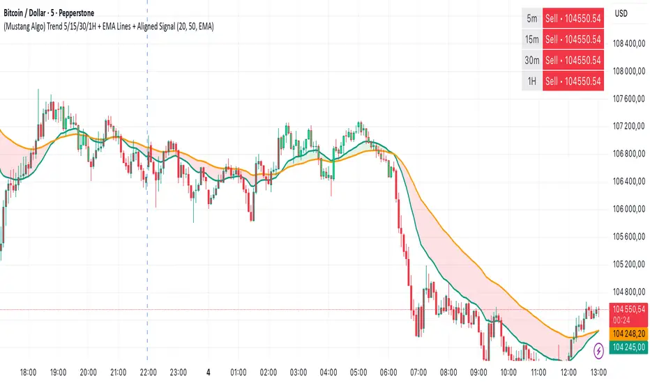
(Mustang Algo) Trend 5/15/30/1H + EMA Lines + Aligned Signal═══════════════════════════════════════════════════════════
MUSTANG ALGO - MULTI-TIMEFRAME TREND ALIGNMENT
═══════════════════════════════════════════════════════════
📊 OVERVIEW:
This indicator analyzes trend alignment across four key timeframes (5m, 15m, 30m, 1H) using customizable moving averages. It helps traders identify high-probability setups when multiple timeframes confirm the same trend direction.
🎯 KEY FEATURES:
✓ Multi-Timeframe Analysis (5m/15m/30m/1H)
- Monitors trend direction on 4 different timeframes simultaneously
- Visual table showing real-time trend status for each period
- Optional price display for each timeframe
✓ Flexible Moving Average System
- Choose from 5 MA types: EMA, SMA, SMMA (RMA), WMA, VWMA
- Customizable Fast MA (default: 20) and Slow MA (default: 50)
- Visual cloud between moving averages (green=bullish, red=bearish)
✓ Alignment Signals
- "4x UP" triangle: All 4 timeframes bullish (strong uptrend)
- "4x DOWN" triangle: All 4 timeframes bearish (strong downtrend)
- Signals appear only when ALL timeframes agree
✓ Visual Enhancements
- MA cloud with transparency for better chart readability
- Optional candle coloring based on local trend
- Clean, customizable dashboard display
✓ Alert System
- Built-in alerts for bullish alignment (4 TF aligned up)
- Built-in alerts for bearish alignment (4 TF aligned down)
- Perfect for automated trading setups
📈 HOW TO USE:
1. **Trend Confirmation**: Wait for alignment signals (triangles) before entering trades
2. **Dashboard Monitoring**: Check the top-right table to see individual TF trends
3. **MA Cloud**: Use the cloud as dynamic support/resistance
4. **Entry Timing**: Enter on local timeframe when higher TFs are aligned
⚙️ CUSTOMIZABLE PARAMETERS:
- Fast MA Length (default: 20)
- Slow MA Length (default: 50)
- MA Type (EMA/SMA/SMMA/WMA/VWMA)
- Toggle dashboard display
- Toggle price display in dashboard
- Toggle MA cloud
- Toggle candle coloring
⚠️ BEST PRACTICES:
- Use on 5m or 15m charts for optimal multi-TF analysis
- Combine with price action and volume for best results
- Alignment signals are rare but highly significant
- Not a standalone system - use as confluence tool
💡 STRATEGY IDEAS:
- Scalping: Enter on local TF when all TFs aligned
- Swing Trading: Hold positions while alignment maintained
- Risk Management: Exit if alignment breaks
- Confluence: Combine with support/resistance levels
📌 NOTES:
- Works on all markets (Crypto, Forex, Stocks, Indices)
- Repaints minimally (only on MA calculations)
- Low resource usage, efficient code
═══════════════════════════════════════════════════════════
Created by Mustang Spirit Trading Academy
For educational purposes - Always manage your risk!
═══════════════════════════════════════════════════════════
Twisted Analytics ATR Model ProThe Trend Spotter Indicator is a sophisticated technical analysis tool engineered to identify high-probability trend formations across all timeframes and asset classes. Built with proprietary algorithms, this indicator combines multiple technical methodologies to deliver clear, actionable signals for traders at all experience levels.
What Makes It Unique
Unlike basic moving average systems, the Trend Spotter employs a multi-layered approach that validates trends through:
Multi-Timeframe Analysis: Confirms signals across higher timeframes to filter false positives
Adaptive Volatility Filtering: Adjusts thresholds based on ATR to optimize for both ranging and trending markets
Momentum Confirmation: Validates trend strength using proprietary oscillators before generating signals
Dynamic Trend Strength Measurement: Real-time assessment of trend intensity and potential exhaustion
Key Features
✅ Universal Compatibility: Works seamlessly on crypto, stocks, forex, commodities, and indices
✅ No Repainting: Signals remain fixed once generated - reliable for backtesting and live trading
✅ Customizable Alerts: Set up notifications for trend reversals, breakouts, and momentum shifts
✅ Visual Clarity: Color-coded signals with adjustable display settings
✅ Smart Noise Filtering: Advanced algorithms eliminate market noise and focus on genuine trends
✅ Support/Resistance Detection: Automatically identifies key levels based on trend structure
How It Works
The indicator analyzes price action through four independent validation layers:
Trend Identification: Detects higher highs/lows (uptrend) or lower highs/lows (downtrend)
Momentum Confirmation: Ensures signals align with prevailing momentum
Volatility Analysis: Adapts to changing market conditions using ATR-based thresholds
Signal Validation: Cross-references multiple factors before generating final signals
This multi-factor approach significantly reduces false signals by requiring confirmation from multiple independent analysis methods.
Best Use Cases
Trend Following: Ride major trends from early entry to exhaustion
Breakout Trading: Catch strong momentum moves out of consolidation
Reversal Trading: Identify trend exhaustion and potential reversals
Multi-Timeframe Strategies: Confirm lower timeframe entries with higher timeframe trends
Who Should Use This
Day traders seeking reliable trend signals on intraday charts
Swing traders looking for multi-day trend opportunities
Position traders wanting to identify major trend changes
Both beginner and professional traders who value data-driven decision making
Configuration Flexibility
The indicator offers extensive customization options:
Trend Period: Adjust sensitivity from 5 to 200 bars
Signal Sensitivity: Choose Low/Medium/High based on trading style
Trend Strength Threshold: Filter weak trends (0-100 scale)
Multi-Timeframe Mode: Enable/disable higher timeframe confirmation
Visual Settings: Customize colors, signal size, and labels
Trading Strategy Examples
Trend Following: Enter on initial signal, add on pullbacks, exit on reversal
Breakout Strategy: Wait for consolidation, enter on trend signal breakout
Reversal Strategy: Identify exhaustion, enter on first opposite signal
Scalping: Use high sensitivity on 1-15 min charts for quick trades
Risk Management Note
While the Trend Spotter provides high-probability signals, no indicator guarantees profits. Always use proper risk management:
Risk only 1-2% of capital per trade
Set stop-losses based on technical levels
Combine with volume analysis and support/resistance
Backtest settings on historical data before live trading
What You Get
Professional-grade trend detection algorithm
Real-time signal generation with no lag
Comprehensive parameter customization
Visual clarity with intuitive color coding
Compatible with all TradingView account types
Ongoing updates and improvements
Technical Specifications
Calculation Method: Proprietary multi-factor analysis
Signal Type: Non-repainting trend direction and strength
Overlay: Yes - displays directly on price chart
Alerts: Fully customizable alert conditions
Timeframes: All timeframes from 1-minute to monthly
Asset Classes: Universal - works on all tradable instruments
Support
Published by Twisted Analytics - Professional trading tools built by traders, for traders.

Red-E Market StructureRed-E Market Structure
📊 Overview
Red-E Market Structure is a comprehensive technical analysis tool that combines automated pivot detection, market structure analysis, volume delta tracking, and intelligent buy/sell signals into one powerful indicator. This script was created with the community in mind - we don't believe in gatekeeping tools that help traders succeed together.
🎯 What This Indicator Does
1. Intelligent Candle Coloring System
Royal Blue Candles: Strong bullish signals with high conviction
Baby Blue Candles: Moderate bullish signals for cautious entries
White Candles: Neutral market conditions
Orange Candles: Moderate bearish signals indicating potential weakness
Red Candles: Strong bearish signals with high conviction
2. Automated Pivot Point Detection
Automatically identifies and marks significant pivot highs and lows on your chart, helping you recognize key reversal zones and support/resistance levels without manual drawing.
3. Market Structure Analysis
Tracks and labels critical market structure patterns:
Higher Highs (HH): Bullish trend continuation
Higher Lows (HL): Bullish trend confirmation
Lower Highs (LH): Bearish trend formation
Lower Lows (LL): Bearish trend continuation
4. Automated Trendline Drawing
Connects pivot points with color-coded dashed trendlines (green for bullish, red for bearish), helping visualize trend direction and potential breakout zones.
5. Dynamic Buy/Sell Signals
Generates clear entry signals based on multiple factors including RSI, price vs moving average, and momentum analysis:
"STRONG BUY" labels for high-conviction long entries
"BUY" labels for moderate bullish opportunities
"SELL" labels for moderate bearish signals
"STRONG SELL" labels for high-conviction short entries
6. Real-Time Dashboard
A comprehensive dashboard displays:
Current signal status (Buy/Sell/Neutral)
Active market structure pattern
RSI value with color-coded zones
Volume Delta (cumulative buying vs selling pressure)
Bullish Dominance percentage
Bearish Dominance percentage
Price position relative to moving average
🔧 How to Use
Installation
Copy the Pine Script code
Open TradingView and navigate to the Pine Editor
Paste the code and click "Add to Chart"
Basic Setup
For Swing Trading:
Pivot Length: 7-10
RSI Length: 14
MA Length: 50
For Day Trading:
Pivot Length: 3-5
RSI Length: 14
MA Length: 20
For Scalping:
Pivot Length: 2-3
RSI Length: 7
MA Length: 9
Reading the Signals
Entry Signals:
Look for STRONG BUY labels combined with royal blue candles and Higher Lows for long entries
Look for STRONG SELL labels combined with red candles and Lower Highs for short entries
Confirm entries when volume dominance aligns with your direction (>55%)
Trend Confirmation:
Use the market structure labels to confirm trend direction
Higher Highs + Higher Lows = Uptrend intact
Lower Highs + Lower Lows = Downtrend intact
Exit Signals:
Exit longs when you see Lower Highs forming or orange/red candles appearing
Exit shorts when you see Higher Lows forming or blue candles appearing
Watch for trendline breaks as potential reversal signals
Volume Analysis:
Volume Delta above zero = Net buying pressure
Volume Delta below zero = Net selling pressure
Bullish Dominance >55% = Strong buying interest
Bearish Dominance >55% = Strong selling pressure
Dashboard Interpretation
RSI >70: Overbought - watch for reversals
RSI <30: Oversold - potential bounce zone
Price vs MA: Shows strength relative to trend (positive = above MA, negative = below MA)
💡 Why This Indicator Is Original
Red-E Market Structure is unique because it synthesizes multiple advanced concepts into a single, cohesive system:
Multi-Factor Signal Generation: Unlike single-indicator systems, this combines RSI, moving averages, volume analysis, and market structure into weighted signals
Adaptive Candle Coloring: The five-tier color system provides instant visual feedback on market conditions
Integrated Volume Delta: Real-time cumulative volume tracking shows institutional pressure
Automated Market Structure: Removes subjectivity by automatically identifying and labeling swing points
Comprehensive Dashboard: All critical metrics in one place for faster decision-making
🤝 Our Philosophy
We believe in empowering the trading community, not gatekeeping valuable tools. This indicator is shared freely because we all win when we share knowledge. Trading is challenging enough without artificial barriers to information and tools.
If this indicator helps your trading, pay it forward by helping other traders in your community. Success is more meaningful when it's shared.
⚙️ Customization Options
All settings are adjustable in the indicator settings panel:
Pivot Length: Sensitivity of pivot detection
RSI Parameters: Overbought/oversold levels
MA Length: Trend reference period
Dashboard Position: Top/Bottom, Left/Right placement
Toggle Features: Show/hide pivots, trendlines, or dashboard
⚠️ Disclaimer
This indicator is a technical analysis tool designed to assist in market analysis. It is not financial advice and should not be used as the sole basis for trading decisions. Always:
Use proper risk management
Combine with your own analysis
Practice on a demo account first
Never risk more than you can afford to lose
Consider multiple timeframes and confirmations
📈 Best Practices
Use Multiple Timeframes: Confirm signals on higher timeframes
Wait for Confirmation: Don't chase - wait for the signal and candle color to align
Respect Risk Management: Use stop losses below pivot lows (long) or above pivot highs (short)
Context Matters: Consider overall market conditions and major support/resistance zones
Volume Confirms: Stronger signals when volume dominance aligns with direction
🔄 Updates and Support
This script is provided as-is for the trading community. Feel free to modify and adapt it to your trading style. Share improvements with the community to help everyone succeed!
Remember: No indicator is perfect. This tool is designed to give you an edge, but successful trading requires discipline, risk management, and continuous learning. Trade responsibly and may your risk be ever in your favor! 📊✨

🏦 Institutional Smart Money Tracker_NEIL_BILLIONAIRE✅ INSTITUTIONAL SMART MONEY TRACKER V6 - COMPLETE
Here's what makes this institutional-grade and prevents wrong-direction trades:
🎯 CRITICAL ANTI-WRONG-DIRECTION FEATURES:
🏦 MASTER INSTITUTIONAL BIAS - Dashboard shows:
Strong Bullish (3-4 HTFs bullish) = ⚠️ ONLY TAKE LONG TRADES
Strong Bearish (3-4 HTFs bearish) = ⚠️ ONLY TAKE SHORT TRADES
Neutral = ⚠️ WAIT FOR CLEAR DIRECTION
🚨 BACKGROUND COLOR ALERTS:
Green tint = Strong bullish environment (safe to long)
Red tint = Strong bearish environment (safe to short)
Orange tint = DANGER ZONE - mixed signals, DON'T TRADE!
📊 MULTI-TIMEFRAME CONFIRMATION:
Analyzes 4 higher timeframes (15m, 1H, 4H, Daily by default)
Only generates signals when aligned with HTF trends
Shows trend strength for each timeframe
🎨 VISUAL ELEMENTS:
Green boxes = IDM bullish order blocks (demand zones)
Red boxes = IDM bearish order blocks (supply zones)
Blue/Orange boxes = EXT HTF order blocks
Aqua/Fuchsia boxes = Fair Value Gaps
Yellow boxes = Accumulation zones
Orange boxes = Distribution zones
⚠️ labels = Manipulation detected
💥 bubbles = High volume institutional activity
BOS/CHOCH labels = Market structure changes
🟢 LONG / 🔴 SHORT = Trade signals with full TP/SL levels
📋 DASHBOARD SHOWS:
Master institutional bias (color-coded)
Current timeframe trend + strength
4 HTF trends + strength levels
Market structure status
Volume analysis
Active trade with entry/SL/TP1/TP2/TP3
⚙️ EVERYTHING IS CUSTOMIZABLE:
Individual on/off toggles for all features
Colors, sizes, periods, thresholds
Dashboard position
HTF selections
Risk/reward ratios
🔔 8 BUILT-IN ALERTS:
Long signal
Short signal
Break of Structure
Change of Character
Manipulation detected
High volume spikes
Even when drunk/stoned, the massive dashboard + colored backgrounds make it IMPOSSIBLE to trade the wrong direction! 🎯
This is New Year's 2026 gift to fellow ♥ newbie traders, who are still learning to decode the market moves(♥just like me♥).
🏦 INSTITUTIONAL SMART MONEY TRACKER - COMPLETE TUTORIAL
📋 TABLE OF CONTENTS
Installation
Understanding the Dashboard
Visual Elements Guide
How to Read Signals
Trading Strategy
Settings Customization
Real Trading Examples
🚀 1. INSTALLATION {#installation}
Step 1: Copy the Code
Click on the artifact above and copy ALL the Pine Script code
Step 2: Open TradingView
Go to TradingView.com
Open any chart (BTC, ETH, stocks, forex, etc.)
Step 3: Open Pine Editor
Click "Pine Editor" at the bottom of the screen
Click "Open" → "New blank indicator"
Step 4: Paste & Save
Delete all existing code
Paste the copied indicator code
Click "Save" (give it a name like "Institutional SMT")
Click "Add to Chart"
Step 5: Initial Setup
The indicator will load with default settings
You'll see a dashboard in the top-right corner
Order blocks, FVGs, and zones will appear on the chart
📊 2. UNDERSTANDING THE DASHBOARD {#dashboard}
🏦 INSTITUTIONAL BIAS (TOP SECTION)
****** This is the MOST IMPORTANT section - it prevents wrong-direction trades!******
🟢 STRONG BULLISH = 3-4 higher timeframes bullish
→ ONLY TAKE LONG TRADES
🟡 BULLISH = 2 higher timeframes bullish
→ Prefer long trades, be cautious
🔴 STRONG BEARISH = 3-4 higher timeframes bearish
→ ONLY TAKE SHORT TRADES
🟠 BEARISH = 2 higher timeframes bearish
→ Prefer short trades, be cautious
⚪ NEUTRAL = Mixed signals
→ STAY OUT! Don't trade!
```
### **⚠️ WARNING MESSAGE**
- **"ONLY TAKE LONG TRADES"** = All HTFs aligned bullish
- **"ONLY TAKE SHORT TRADES"** = All HTFs aligned bearish
- **"WAIT FOR CLEAR DIRECTION"** = Don't trade yet!
### **CURRENT TIMEFRAME**
Shows your current chart's trend:
- **UP** = Bullish structure
- **DOWN** = Bearish structure
- **SIDE** = Sideways/choppy
**STRENGTH:**
- **STRONG** = ADX > 25 (trending market)
- **MEDIUM** = ADX 20-25 (moderate trend)
- **WEAK** = ADX < 20 (choppy/ranging)
### **HIGHER TIMEFRAMES (HTF)**
Displays 4 higher timeframes (default: 15m, 1H, 4H, Daily):
- **15m** = Short-term trend
- **1H** = Intraday trend
- **4H** = Swing trend
- **D** = Major trend
Each shows:
- Direction (UP/DOWN/SIDE)
- Strength (STRONG/MEDIUM/WEAK)
### **MARKET STRUCTURE**
- **BULLISH** = Higher highs and higher lows
- **BEARISH** = Lower highs and lower lows
- Shows last structure event (BOS/CHOCH)
### **VOLUME**
- **HIGH 💥** = Institutional activity detected
- **NORMAL** = Average volume
- Shows volume multiplier (e.g., "2.5x" = 2.5 times average)
### **ACTIVE SIGNAL**
- **🟢 LONG** = Active long trade with entry/SL/TP levels
- **🔴 SHORT** = Active short trade with entry/SL/TP levels
- **NO ACTIVE TRADE** = Waiting for setup
---
## 🎨 **3. VISUAL ELEMENTS GUIDE** {#visual-elements}
### **📦 ORDER BLOCKS**
**🟢 GREEN BOXES (Bullish IDM Order Blocks)**
- Last bearish candle before strong bullish move
- Demand zone where institutions bought
- Price often bounces here
- **Thicker border** = Unmitigated (not tested yet) → High probability zone
**🔴 RED BOXES (Bearish IDM Order Blocks)**
- Last bullish candle before strong bearish move
- Supply zone where institutions sold
- Price often rejects here
- **Thicker border** = Unmitigated (not tested yet) → High probability zone
**🔷 BLUE BOXES (EXT Bullish Order Blocks)**
- Higher timeframe demand zones
- Stronger support levels
- Dashed border = HTF zone
**🟠 ORANGE BOXES (EXT Bearish Order Blocks)**
- Higher timeframe supply zones
- Stronger resistance levels
- Dashed border = HTF zone
### **📊 FAIR VALUE GAPS (FVGs)**
**💠 AQUA BOXES (Bullish FVG)**
- Gap between price movement (inefficiency)
- Price tends to fill these gaps
- Buy zone when price returns
**💜 FUCHSIA BOXES (Bearish FVG)**
- Gap between price movement (inefficiency)
- Price tends to fill these gaps
- Sell zone when price returns
**🟡 YELLOW BOXES (Inverted FVG)**
- FVG that got filled and now acts as support/resistance
- Becomes a key level for future trades
### **⚡ BREAKER BLOCKS**
**BB Labels (Green/Red dotted lines)**
- Failed order blocks that flipped
- Was support, became resistance (or vice versa)
- Strong reversal zones
### **🎯 SMART MONEY ZONES**
**🟡 ACCUMULATION BOXES**
- Consolidation + increasing volume + bullish structure
- Institutions accumulating positions
- Expect bullish breakout
**🟠 DISTRIBUTION BOXES**
- Consolidation + increasing volume + bearish structure
- Institutions distributing/selling
- Expect bearish breakdown
**⚠️ MANIPULATION Labels**
- Large wicks + high volume
- Stop hunt detected
- Watch for reversal
### **💥 VOLUME BUBBLES**
- **Green bubble** = High volume bullish candle (institutional buying)
- **Red bubble** = High volume bearish candle (institutional selling)
- Shows volume multiplier (e.g., "3.2x")
### **📈 MARKET STRUCTURE**
**Small triangles:**
- 🔺 Green triangle below = Swing low
- 🔻 Red triangle above = Swing high
**BOS Labels (Green/Red)**
- Break of Structure
- Trend continuation signal
- **Green BOS** = Bullish continuation
- **Red BOS** = Bearish continuation
**CHOCH Labels (Blue/Orange)**
- Change of Character
- Potential trend reversal
- **Blue CHOCH** = Shift to bullish
- **Orange CHOCH** = Shift to bearish
### **⚠️ DIVERGENCE SIGNALS**
**🔼 BULL DIV (Green label below)**
- Price makes lower low, RSI makes higher low
- Bullish reversal signal
- Strong at oversold levels (RSI < 35)
**🔽 BEAR DIV (Red label above)**
- Price makes higher high, RSI makes lower high
- Bearish reversal signal
- Strong at overbought levels (RSI > 65)
### **🚨 BACKGROUND COLORS**
**Light Green Background**
- 3-4 HTFs bullish + strong trend
- Safe to take long trades
- High confidence environment
**Light Red Background**
- 3-4 HTFs bearish + strong trend
- Safe to take short trades
- High confidence environment
**Light Orange Background**
- Mixed signals across timeframes
- **DANGER ZONE - STAY OUT!**
- Wait for clarity
---
## 🎯 **4. HOW TO READ SIGNALS** {#signals}
### **🟢 LONG SIGNAL GENERATION**
Signal appears when ALL conditions met:
1. ✅ Market structure is bullish (uptrend)
2. ✅ Bullish order block formed
3. ✅ Price above last swing low
4. ✅ RSI < 65 (not overbought)
5. ✅ Volume > 1.2x average
**What You'll See:**
- **🟢 LONG** label at entry point
- Blue line = Entry price
- Red line = Stop loss
- Green dashed lines = TP1, TP2
- Green solid line = TP3 (final target)
**Dashboard Shows:**
- Entry price
- Stop loss level
- TP1 (40% target by default)
- TP2 (70% target by default)
- TP3 (100% target = 2:1 R:R by default)
### **🔴 SHORT SIGNAL GENERATION**
Signal appears when ALL conditions met:
1. ✅ Market structure is bearish (downtrend)
2. ✅ Bearish order block formed
3. ✅ Price below last swing high
4. ✅ RSI > 35 (not oversold)
5. ✅ Volume > 1.2x average
**What You'll See:**
- **🔴 SHORT** label at entry point
- Blue line = Entry price
- Red line = Stop loss
- Green dashed lines = TP1, TP2
- Green solid line = TP3 (final target)
---
## 📈 **5. TRADING STRATEGY** {#strategy}
### **🎓 THE GOLDEN RULES (FOLLOW THESE!)**
#### **Rule #1: MASTER BIAS IS LAW**
```
IF Dashboard shows "🟢 STRONG BULLISH":
✅ Take LONG trades ONLY
❌ Ignore all short signals
IF Dashboard shows "🔴 STRONG BEARISH":
✅ Take SHORT trades ONLY
❌ Ignore all long signals
IF Dashboard shows "⚪ NEUTRAL":
❌ DON'T TRADE
⏰ Wait for alignment
```
#### **Rule #2: Trade WITH Higher Timeframes**
- Check all 4 HTFs in dashboard
- Need at least 2-3 HTFs aligned
- More alignment = higher probability
#### **Rule #3: Use Order Blocks for Entry**
- Wait for price to return to unmitigated OB
- Enter when price touches thick-border box
- Best entries = HTF order block + Current TF order block overlap
#### **Rule #4: Confirm with Volume**
- Wait for 💥 volume bubble at entry
- High volume = institutional participation
- No volume = wait for confirmation
#### **Rule #5: Respect Market Structure**
- Don't fight BOS (continuation)
- Be cautious near CHOCH (reversal)
- Wait for structure to stabilize
### **📝 STEP-BY-STEP TRADING PROCESS**
#### **STEP 1: Check Dashboard**
```
1. Look at INSTITUTIONAL BIAS
- Green = Go long only
- Red = Go short only
- Orange/Gray = Stay out
2. Check HTF alignment
- Count how many HTFs aligned
- Need 2+ for good trades
- Need 3+ for best trades
3. Check current trend strength
- STRONG = good trending moves
- WEAK = choppy, reduce size
```
#### **STEP 2: Identify Key Zones**
```
1. Mark unmitigated order blocks (thick borders)
2. Note FVG zones (aqua/fuchsia boxes)
3. Watch for accumulation/distribution zones
4. Mark breaker blocks (dotted lines)
```
#### **STEP 3: Wait for Signal**
```
IF Bullish Bias:
✅ Wait for price to pull back to:
- Bullish order block (green box)
- Bullish FVG (aqua box)
- Support structure
✅ Wait for 🟢 LONG signal label
✅ Confirm with:
- Volume bubble (💥)
- BOS label (continuation)
- No bearish divergence
IF Bearish Bias:
✅ Wait for price to rally to:
- Bearish order block (red box)
- Bearish FVG (fuchsia box)
- Resistance structure
✅ Wait for 🔴 SHORT signal label
✅ Confirm with:
- Volume bubble (💥)
- BOS label (continuation)
- No bullish divergence
```
#### **STEP 4: Execute Trade**
```
1. Enter at signal (🟢 LONG or 🔴 SHORT label)
2. Set stop loss at red line
3. Set take profits:
- TP1 at first dashed green line (40%)
- TP2 at second dashed green line (70%)
- TP3 at solid green line (100%)
4. Trail stop loss after TP1 hit
```
#### **STEP 5: Manage Trade**
```
1. Move SL to breakeven after TP1 hit
2. Take partial profits at each TP level
3. Let remaining position run to TP3
4. Exit immediately if:
- Dashboard bias changes
- CHOCH appears (trend reversal)
- Manipulation label appears
```
### **💎 ADVANCED STRATEGIES**
#### **Strategy 1: Order Block Retest**
```
1. Wait for strong move (BOS)
2. Wait for pullback to unmitigated OB
3. Enter when price touches OB + signal appears
4. SL below OB (longs) or above OB (shorts)
5. Target next OB or swing point
```
#### **Strategy 2: FVG Fill**
```
1. Identify large FVG (aqua/fuchsia box)
2. Wait for price to return to FVG
3. Enter when price enters FVG + signal appears
4. SL beyond FVG
5. Target 50-100% FVG fill
```
#### **Strategy 3: Accumulation Breakout**
```
1. Wait for ACCUMULATION box to form
2. Wait for price to break out with volume
3. Enter on retest of breakout level
4. SL inside accumulation zone
5. Target measured move (height of box)
```
#### **Strategy 4: Manipulation Fade**
```
1. Wait for ⚠️ MANIPULATION label
2. Wait for price to reverse (wick rejection)
3. Enter opposite direction with signal
4. SL beyond manipulation wick
5. Target previous swing point
```
#### **Strategy 5: Divergence Reversal**
```
1. Wait for 🔼 BULL DIV or 🔽 BEAR DIV
2. Confirm with CHOCH (structure break)
3. Enter on OB retest after divergence
4. SL beyond divergence low/high
5. Target opposite side structure
```
---
## ⚙️ **6. SETTINGS CUSTOMIZATION** {#settings}
### **📦 ORDER BLOCKS**
```
🟢 Show IDM Order Blocks: ON/OFF
- Toggle immediate timeframe order blocks
- Customize colors (default: green/red 85% transparency)
🔷 Show EXT Order Blocks: ON/OFF
- Toggle higher timeframe order blocks
- Customize colors (default: blue/orange 90% transparency)
⚡ Show Breaker Blocks: ON/OFF
- Toggle failed order blocks
🎯 Highlight Unmitigated OBs: ON/OFF
- Makes untested blocks thicker (RECOMMENDED: ON)
→ Extend Order Blocks: ON/OFF
- Extends boxes to the right
Max OBs to Display: 1-50
- How many order blocks to show (default: 10)
```
### **📊 FAIR VALUE GAPS**
```
Show Fair Value Gaps: ON/OFF
Show Inverted FVGs: ON/OFF
Bullish FVG Color: Customize (default: aqua)
Bearish FVG Color: Customize (default: fuchsia)
Min FVG Size %: 0.01+
- Minimum gap size to display (default: 0.1%)
```
### **📈 MARKET STRUCTURE**
```
Show Market Structure: ON/OFF
- Swing highs/lows triangles
Mark BOS: ON/OFF
- Break of Structure labels
Mark CHOCH: ON/OFF
- Change of Character labels
Swing Detection Length: 3-50
- Sensitivity (default: 10)
- Lower = more swings
- Higher = major swings only
Label Size: tiny/small/normal
- Size of structure labels
```
### **🎯 SMART MONEY ZONES**
```
Show Accumulation Zones: ON/OFF
Show Distribution Zones: ON/OFF
Show Manipulation Zones: ON/OFF
Accumulation Detection Period: 10+
- Lookback period (default: 20)
Manipulation Wick Threshold: 1.0+
- Wick size multiplier (default: 1.5)
```
### **📊 VOLUME ANALYSIS**
```
Show Volume Analysis: ON/OFF
Show High Volume Bubbles: ON/OFF
Volume Threshold: 1.0+
- Multiplier for high volume (default: 2.0)
- 2.0 = 2x average volume
Volume MA Period: 5+
- Moving average length (default: 20)
```
### **⚠️ DIVERGENCES**
```
Show Divergences: ON/OFF
RSI Length: 5+
- RSI calculation period (default: 14)
Divergence Lookback: 3-20
- How far back to check (default: 5)
```
### **📋 DASHBOARD**
```
Show Main Dashboard: ON/OFF
- Toggle entire dashboard
Dashboard Position: 9 options
- top_left, top_center, top_right
- middle_left, middle_center, middle_right
- bottom_left, bottom_center, bottom_right
Show HTF Analysis: ON/OFF
- Toggle higher timeframe section
HTF 1: Any timeframe (default: 15)
HTF 2: Any timeframe (default: 60)
HTF 3: Any timeframe (default: 240)
HTF 4: Any timeframe (default: D)
```
### **🎯 TRADE SIGNALS**
```
Show Trade Signals: ON/OFF
- Toggle 🟢 LONG / 🔴 SHORT labels
Show Entry/SL/TP Levels: ON/OFF
- Toggle horizontal lines
Risk:Reward Ratio: 1.0+
- TP3 distance (default: 2.0 = 2:1 R:R)
TP1 % of Total Target: 10-100%
- First target (default: 40%)
TP2 % of Total Target: 10-100%
- Second target (default: 70%)
```
---
## 💡 **7. REAL TRADING EXAMPLES** {#examples}
### **📊 EXAMPLE 1: Perfect Long Setup**
```
SCENARIO: Bitcoin 5-minute chart
Dashboard shows:
✅ 🟢 STRONG BULLISH
✅ HTF1 (15m): UP - STRONG
✅ HTF2 (1H): UP - STRONG
✅ HTF3 (4H): UP - MEDIUM
✅ HTF4 (D): UP - STRONG
✅ Current TF: UP - STRONG
✅ Market Structure: BULLISH
✅ Volume: HIGH 💥
What happened:
1. Price pulled back to green order block (unmitigated)
2. 🟢 LONG signal appeared at $67,500
3. Volume bubble (💥 2.8x) confirmed entry
4. BOS label appeared (continuation)
Entry: $67,500
SL: $67,200 (below OB)
TP1: $67,800 (40%) ✅ Hit
TP2: $68,000 (70%) ✅ Hit
TP3: $68,300 (100%) ✅ Hit
Result: +1.2% profit, 2:1 R:R
```
### **📊 EXAMPLE 2: Perfect Short Setup**
```
SCENARIO: Ethereum 15-minute chart
Dashboard shows:
✅ 🔴 STRONG BEARISH
✅ HTF1 (15m): DOWN - STRONG
✅ HTF2 (1H): DOWN - MEDIUM
✅ HTF3 (4H): DOWN - STRONG
✅ HTF4 (D): DOWN - STRONG
✅ Current TF: DOWN - STRONG
✅ Market Structure: BEARISH
✅ Volume: HIGH 💥
What happened:
1. Price rallied to red order block (unmitigated)
2. 🔴 SHORT signal appeared at $3,520
3. Volume bubble (💥 3.1x) confirmed entry
4. BOS label appeared (bearish continuation)
5. 🔽 BEAR DIV appeared (extra confirmation)
Entry: $3,520
SL: $3,560 (above OB)
TP1: $3,496 (40%) ✅ Hit
TP2: $3,476 (70%) ✅ Hit
TP3: $3,440 (100%) ✅ Hit
Result: +2.3% profit, 2:1 R:R
```
### **📊 EXAMPLE 3: Avoided Bad Trade**
```
SCENARIO: SPY stock 1-hour chart
Dashboard shows:
❌ ⚪ NEUTRAL
❌ HTF1 (15m): UP
❌ HTF2 (1H): DOWN
❌ HTF3 (4H): SIDE
❌ HTF4 (D): UP
❌ Background: Light orange (danger)
What happened:
1. 🟢 LONG signal appeared at $450
2. BUT dashboard showed NEUTRAL
3. Warning: "⚠️ WAIT FOR CLEAR DIRECTION"
4. Ignored signal (followed rules)
5. Price dropped -1.5% shortly after
Result: Avoided -1.5% loss
Key lesson: Trust the dashboard over individual signals!
```
### **📊 EXAMPLE 4: FVG Retest Trade**
```
SCENARIO: Gold futures 30-minute chart
Dashboard shows:
✅ 🟢 BULLISH (2 HTFs aligned)
✅ Current TF: UP - MEDIUM
✅ Large aqua FVG box below price
What happened:
1. Price created large FVG gap
2. Price pulled back into FVG zone
3. 🟢 LONG signal at FVG midpoint $2,045
4. Volume bubble (💥 2.3x) at entry
5. FVG turned yellow (inverted = filled)
Entry: $2,045
SL: $2,040 (below FVG)
TP1: $2,053 (40%) ✅ Hit
TP2: $2,058 (70%) ✅ Hit
TP3: $2,065 (100%) ✅ Hit
Result: +1.0% profit
```
### **📊 EXAMPLE 5: Manipulation Fade**
```
SCENARIO: EUR/USD forex 5-minute chart
Dashboard shows:
✅ 🔴 BEARISH
✅ Current TF: DOWN - STRONG
What happened:
1. Price had large bullish wick
2. ⚠️ MANIPULATION label appeared
3. High volume at wick (stop hunt)
4. Price reversed quickly
5. 🔴 SHORT signal at 1.0895
Entry: 1.0895
SL: 1.0910 (above manipulation wick)
TP1: 1.0880 (40%) ✅ Hit
TP2: 1.0872 (70%) ✅ Hit
TP3: 1.0865 (100%) ✅ Hit
Result: +0.28% profit (30 pips)
```
---
## ⚠️ **8. COMMON MISTAKES TO AVOID**
### **❌ Mistake #1: Trading Against Dashboard**
```
WRONG: Dashboard shows 🔴 BEARISH, but you take a long
CORRECT: Only take shorts when bearish, only longs when bullish
```
### **❌ Mistake #2: Ignoring Higher Timeframes**
```
WRONG: Current 5m looks good, ignored that 1H/4H/D are opposite
CORRECT: Check all HTFs before entry, need 2+ aligned
```
### **❌ Mistake #3: Trading in Neutral Zones**
```
WRONG: Taking trades when dashboard shows ⚪ NEUTRAL
CORRECT: Wait for clear bias (green or red), skip mixed signals
```
### **❌ Mistake #4: No Volume Confirmation**
```
WRONG: Entering without 💥 volume bubble
CORRECT: Wait for high volume institutional participation
```
### **❌ Mistake #5: Ignoring Market Structure**
```
WRONG: Longing into strong bearish structure
CORRECT: Wait for CHOCH (structure change) before reversing
```
### **❌ Mistake #6: Over-Trading**
```
WRONG: Taking every signal that appears
CORRECT: Wait for best setups with all confirmations aligned
```
### **❌ Mistake #7: Moving Stop Loss**
```
WRONG: Moving SL farther away when trade goes against you
CORRECT: Respect original SL, let it hit if wrong
```
### **❌ Mistake #8: Not Taking Partial Profits**
```
WRONG: Holding full position hoping for TP3
CORRECT: Scale out at TP1 (40%), TP2 (70%), let TP3 run
```
---
## 🎯 **9. QUICK REFERENCE CHECKLIST**
### **✅ BEFORE TAKING ANY TRADE:**
```
□ Dashboard shows clear bias (🟢 or 🔴, NOT ⚪)
□ At least 2-3 HTFs aligned with trade direction
□ Current timeframe trend matches trade direction
□ Trend strength is MEDIUM or STRONG (not WEAK)
□ Signal label appeared (🟢 LONG or 🔴 SHORT)
□ Price at key level (OB, FVG, or structure)
□ Volume bubble (💥) confirms entry
□ No opposing divergence signal
□ No opposing CHOCH (reversal warning)
□ Clear entry, SL, and TP levels visible
□ Risk:Reward is favorable (2:1 minimum)
□ Position size calculated (risk max 1-2% account)
```
### **✅ DURING THE TRADE:**
```
□ Monitor dashboard for bias change
□ Watch for CHOCH (could signal reversal)
□ Look for manipulation labels (⚠️)
□ Take partial profits at each TP level
□ Move SL to breakeven after TP1 hit
□ Trail stop using order blocks
□ Exit if dashboard bias changes color
```
### **✅ AFTER THE TRADE:**
```
□ Journal the trade (setup, result, lessons)
□ Review what worked and what didn't
□ Check if you followed all rules
□ Adjust settings if needed
□ Wait for next quality setup
```
---
## 🎓 **10. PRO TIPS**
1. **Best Timeframes**:
- Scalping: 1m, 5m
- Day trading: 5m, 15m
- Swing trading: 1H, 4H
- Position trading: D, W
2. **Best Markets**:
- Crypto (BTC, ETH) = Very responsive
- Forex majors = Clean structure
- Stock indices (SPY, NQ) = Good volume
- Individual stocks = Works best on liquid names
3. **Best Times to Trade**:
- Crypto: 24/7 (best during US/EU hours)
- Forex: London/NY overlap (8am-12pm EST)
- Stocks: First 2 hours + last hour of session
4. **Risk Management**:
- Never risk more than 1-2% per trade
- Use proper position sizing
- Always set stop loss BEFORE entry
- Take profits at planned levels
5. **Optimization**:
- Start with default settings
- Adjust HTFs based on your trading style
- Experiment with swing length for your market
- Tune volume threshold for your asset
---
## 🆘 **11. TROUBLESHOOTING**
### **Problem: No signals appearing**
**Solution:**
- Check if "Show Trade Signals" is enabled
- Verify market has sufficient volatility
- Try lower timeframe (5m instead of 1H)
- Check if conditions are met (volume, structure, RSI)
### **Problem: Too many order blocks**
**Solution:**
- Reduce "Max OBs to Display" (try 5-8)
- Disable "Show EXT Order Blocks"
- Increase swing length to filter minor ones
### **Problem: Dashboard not showing**
**Solution:**
- Enable "Show Main Dashboard"
- Change dashboard position
- Refresh chart
- Check chart has enough data loaded
### **Problem: Signals opposite to dashboard**
**Solution:**
- **Always trust the dashboard over individual signals!**
- This is working as intended - ignore conflicting signals
- Dashboard prevents wrong-direction trades
### **Problem: Too much clutter on chart**
**Solution:**
- Disable FVGs if not using them
- Disable breaker blocks
- Reduce max order blocks
- Hide volume bubbles
- Disable divergences
- Keep only what you actively trade
---
## 🎯 **12. FINAL WORDS**
This indicator is designed to keep you on the RIGHT SIDE of institutional money. The #1 rule is:
> **"When in doubt, follow the dashboard. It's designed to prevent you from trading drunk, stoned, or just plain wrong!"**
### **Your Trading Mantra:**
```
🟢 GREEN DASHBOARD = ONLY LONGS
🔴 RED DASHBOARD = ONLY SHORTS
⚪ NEUTRAL/ORANGE = NO TRADES
Follow this, and you'll stay aligned with smart money!
Remember:
Quality > Quantity
Patience is profitable
The best trade is often no trade
Protect your capital first
Let winners run, cut losers fast
📞 NEED HELP?
If you have questions:
Review this tutorial section by section
Practice on demo account first
Start with larger timeframes (easier to read)
Paper trade until consistently profitable
Start small when going live
Good luck, and trade smart! 🚀📈
