GOD MODE HUNT v2.0 — SCREENER ULTIME 2025test screener pour détecter les crypto basée sur des règles strict
Cari dalam skrip untuk "screener"

Daily Oversold Swing ScreenerThat script is a **Pine Script Indicator** designed to identify potential **swing trade entry points** on a daily timeframe by looking for stocks that are **oversold** but still in a **healthy long-term uptrend**.
It screens for a high-probability reversal setup by combining four specific technical conditions.
Here is a detailed breakdown of the script's purpose and logic:
---
## 📝 Script Description: Daily Oversold Swing Screener
This Pine Script indicator serves as a **momentum and trend confirmation tool** for active traders seeking short-to-intermediate-term long entries. It uses data calculated on the **Daily** timeframe to generate signals, regardless of the chart resolution you are currently viewing.
The indicator is designed to filter out stocks that are in a strong downtrend ("falling knives") and only signal pullbacks within an established uptrend, which significantly increases the probability of a successful swing trade bounce.
### 🔑 Key Conditions for a Signal:
The indicator generates a buy signal when **all four** of the following conditions are met on the Daily timeframe:
#### 1. Oversold Momentum
* **Condition:** `rsiD < rsiOS` (Daily RSI is below the oversold level, typically **30**).
* **Purpose:** Confirms that the selling pressure has been extreme and the stock is temporarily out of favor, setting up a potential bounce.
#### 2. Momentum Turning Up
* **Condition:** `rsiD > rsiPrev` (Current Daily RSI value is greater than the previous day's Daily RSI value).
* **Purpose:** This is the most crucial filter. It confirms that the momentum has **just started to shift upward**, indicating that the low may be in and the stock is turning away from the oversold region.
#### 3. Established Uptrend (No Falling Knives)
* **Condition:** `sma50 > sma200 and closeD > sma50` (50-day SMA is above the 200-day SMA, AND the current daily close is above the 50-day SMA).
* **Purpose:** This is a **long-term trend filter**. It ensures that the current oversold condition is just a **pullback** within a larger, structurally bullish market (50 > 200), and that the price is still holding above the short-term trend line (Close > 50 SMA). This effectively screens out weak stocks in continuous downtrends.
#### 4. Price at Support (Bollinger Bands)
* **Condition:** `closeD <= lowerBB` (Daily Close is less than or equal to the lower Bollinger Band).
* **Purpose:** Provides a secondary measure of extreme price deviation. When the price touches or breaches the lower band, it suggests a significant move away from the mean (basis), often signaling strong statistical support where price is likely to revert.
### 📌 Summary of Signal
The final signal (`signal`) is triggered only when the market is confirmed to be **in a healthy long-term trend (Condition 3)**, the price is at an **extreme support level (Condition 4)**, the momentum is **oversold (Condition 1)**, and most importantly, the **momentum has begun to reverse (Condition 2)**.

Nifty 500 Liquidity Momentum ScreenerTesting screener for momentum stocks in nifty 500 weekly time frame

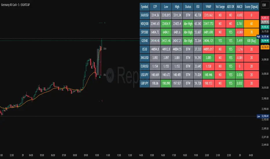
RSI Screener TF + HTF (20 symbols, S/R + $Volume + ATR, Toggles)This script builds a table-style screener for up to 20 symbols and shows:
RSI (TF + HTF)
Uses a configurable intraday timeframe (default 1H) and a higher timeframe (default 1D)
RSI is displayed relative to the 50 line:
Above 50 → shown as a positive value (e.g. 56)
Below 50 → shown as a negative value (e.g. -45)
Cells are color-coded for overbought / oversold / neutral
Support / Resistance Proximity (TF + HTF)
Calculates recent support and resistance using a lookback window
Shows a 0–100% “S&R” value:
100% = price sitting on support
0% = price sitting at resistance
Mid values are neutral
Background color shifts for support zone / resistance zone / neutral
ATR % Regime (TF + HTF)
Converts ATR into a percentage of price
Colors the cell to show low / normal / high volatility regimes (quiet vs explosive conditions)
Dollar Volume (TF)
Uses close × volume and displays dollar volume in millions ($M)
Heat-colored based on relative volume vs its own average (hot / neutral / cold)
Sorting & Layout
Table can be sorted by:
RSI TF, RSI HTF
S&R TF, S&R HTF
ATR TF, ATR HTF
Volume TF
Sort direction: Ascending / Descending
Option to show full mode (Symbol + Price + all metrics) or compact mode (metrics only)
All columns (RSI, S&R, ATR, Volume, HTF columns) can be toggled on/off per your needs
Customization
Fully configurable colors, text size, table position (left/center/right)
User can adjust the RSI period, S/R lookback, ATR period, volume lookback and thresholds
Default setup is optimized for 1H + 1D swing/active trading, but timeframes are editable
This tool is meant as a dashboard to quickly see:
Which names have bullish vs bearish RSI regimes (signed vs 50)
Which ones are sitting on support or resistance
Where volatility is contracting or expanding
Where money/volume is flowing right now.

MTRA Pro+ ScreenerMTRA Pro+ Screener an analysis tool that provides traders with critical market structure information on up to 10 instruments simultaneously. This indicator consolidates momentum direction, trend analysis, range relationships, and volatility metrics into a single dashboard.
## Key Features
- Customizable display with adjustable positioning, colors, and sizing
**Momentum & Trend Tracking**
- Real-time momentum direction via 5-period SMA slope analysis
- Short-term trend direction using 10-period SMA slope analysis
- Color-coded visual representation for quick interpretation
**Range Relationship Analysis**
- Current bar analysis relative to previous period (Inside, Outside, 2Up, 2Dn)
- Three-period historical view of recent price action patterns
- Immediate identification of breakout and consolidation scenarios
**ATR-Based Volatility Analysis**
- Real-time ATR percentage calculations showing current range vs. average
- Visual distinction between normal (<100% ATR) and extended (>100% ATR) conditions
- Identification of potential exhaustion zones for risk management
**Intraday ATR Levels**
- Dynamic support/resistance levels based on current timeframe ATR
- Real-time upper and lower boundaries for precise entries/exits
- Customizable line styles integrated with price scale
## Practical Applications
- **Context Assessment**: Quickly gauge market conditions across multiple intraday timeframes
- **Exhaustion Detection**: Identify overextended moves when ATR exceeds 100%
- **Confluence Analysis**: Spot potential setups when timeframes align
- **Risk Management**: Some traders will use ATR levels for dynamic stops and position sizing
- **Breakout Confirmation**: Distinguish false breakouts from genuine momentum shifts
## Configuration Options
- Full dashboard positioning and color customization
- Individual timeframe toggles
- Adjustable ATR periods and sensitivity thresholds
- Multiple line styles for level visualization

Recent Comparative RS and Screener by Munjal PatelThis script shows relative strength of Stock Compared to NIFTY 500
If stock has relative strength and has gone up too much, it will say Failed (Too Old:X Days)
If stock has just got relative strength in last 60 days, it was say PASS
This indicator is also useful for screening stocks,
Select your Watchlist, select this indicator and Data Filter Outout Above or Equal, Value, 1 and SCAN
You will have list of stock which have just started to show Relative Strength.

NIFTY FNO Stock Screener Sector-wiseNSE FNO STOCK SCREENER SECTOR WISE. Open indicator and select sector. find which sector is moving upward or downward today. select specific sector and you will see all stock list in selected sector. you will show buy and sell signal in particular sector. open stock which show buy or sell signal and check your requirement for buy or sell . you can also used for options also to buy as per required signal
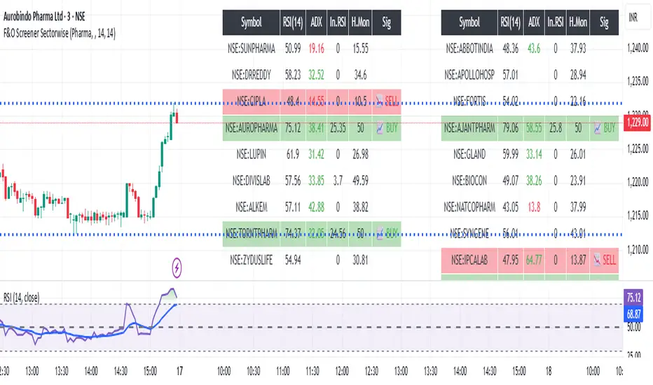
Nifty FNO Stock Screener Sector wise (Protected)NSE FNO STOCK SCREENER SECTOR WISE. Open indicator and select sector. find which sector is moving upward or downward today. select specific sector and you will see all stock list in selected sector. you will show buy and sell signal in particular sector. open stock which show buy or sell signal and check your requirement for buy or sell . you can also used for options also to buy as per required signal

TFU Multi-Symbol Screener + VWAP + Table Size Option + Blank RowTFU Multi-Symbol Screener + VWAP + Table Size Option + Blank Row

ADX Below 13 ScreenerSimple indicator made for use in Pine Screener that sets value to "1" if ADX has gone below 13 in the last 5 trading bars.


Market Screener - NarwingThis is a 20 cryptocurrency market screener, it's goal is to provide a broad view of the state of cryptocurrencies using 4 key components
1. ROC
2. Sharpe Ratio
3. Sortino Ratio
4. Omega Ratio
All these metrics are calculated twice with two different lengths, 7 day and 30 days
This allows for broad market screening instead of focusing on one particular asset
This tool is meant for research purposes only, never invest money you can't afford to lose

Days Above MA Since Last Breach (10/20/50/200) — v6 ScreenerIt identifies the number of days above a certain MA since the last breach. Mostly helpful for use with pine screener
MCX RSI Screener (5m,15m,1D)A complete multi-timeframe RSI screener designed for MCX commodities.
It automatically fetches RSI values from 5-minute, 15-minute, and 1-day timeframes for up to 10 selected MCX symbols — all in one compact table.
Market Structure ICT Screener [TradingFinder] BoS ChoCh🔵 Introduction
Market Structure is the foundation of every Smart Money and ICT based trading model. It describes how price moves through a sequence of highs and lows, forming clear phases of expansion, retracement and reversal. Understanding this structure allows traders to read institutional order flow and align their positions with the true direction of liquidity.
Two of the most critical components in Market Structure are the Break of Structure (BOS) and Change of Character (CHOCH). A BOS represents trend continuation, confirming strength within the current direction. In contrast, CHOCH also known as a Market Structure Shift (MSS) signals the first sign of a trend reversal or liquidity shift where order flow begins to change from bullish to bearish or vice versa.
Because the market is fractal, structure can exist at multiple levels known as Major (External) and Minor (Internal). Major structure defines the overall trend on higher timeframes while minor or internal structure reveals short term swings and early reversals within that larger move.
🔵 How to Use
Understanding Market Structure starts with identifying how price interacts with previous swing highs and swing lows. Every trend in the market, whether bullish or bearish, is built from a sequence of impulsive and corrective moves. Impulsive legs show strong displacement in the direction of liquidity flow, while corrective legs represent temporary pullbacks as the market rebalances before the next expansion. Recognizing these sequences is essential for reading the story of price and anticipating what may happen next.
A Break of Structure (BOS) occurs when price decisively moves beyond a previous structural point by breaking above the last high in an uptrend or falling below the last low in a downtrend. This event confirms that the current trend remains intact and that liquidity has been successfully taken from one side of the market. A BOS acts as confirmation of continuation and reflects strength within the existing directional bias.
A Change of Character (CHOCH) appears when price violates structure in the opposite direction of the prevailing trend. This is the first signal that market sentiment and order flow may be shifting. For example, during a downtrend if price breaks above a previous high, it indicates that sellers are losing control and a potential bullish reversal may be developing. In an uptrend, when price drops below a recent low, it suggests a possible bearish transition.
Because the market is fractal, structure exists across multiple layers. Major structure reflects the dominant movement visible on higher timeframes and defines the broader directional bias. Minor or internal structure represents smaller swings within that move and helps identify early transitions before they appear on the higher timeframe. When internal and external structures align, they offer a high probability signal for trend continuation or reversal.
By observing BOS and CHOCH across both internal and external structures, traders can clearly visualize when the market is expanding, contracting or preparing to shift direction. This structured understanding of price movement forms the foundation for precise trend analysis and high quality decision making in any Smart Money or ICT based trading approach.
🔵 Settings
🟣 Display Settings
Table on Chart : Allows users to choose the position of the signal dashboard either directly on the chart or below it, depending on their layout preference.
Number of Symbols : Enables users to control how many symbols are displayed in the screener table, from 10 to 20, adjustable in increments of 2 symbols for flexible screening depth.
Table Mode : This setting offers two layout styles for the signal table :
Basic : Mode displays symbols in a single column, using more vertical space.
Extended : Mode arranges symbols in pairs side-by-side, optimizing screen space with a more compact view.
Table Size : Lets you adjust the table’s visual size with options such as: auto, tiny, small, normal, large, huge.
Table Position : Sets the screen location of the table. Choose from 9 possible positions, combining vertical (top, middle, bottom) and horizontal (left, center, right) alignments.
🟣 Symbol Settings
Each of the 20 symbol slots comes with a full set of customizable parameters :
Symbol : Define or select the asset (e.g., XAUUSD, BTCUSD, EURUSD, etc.).
Timeframe : Set your desired timeframe for each symbol (e.g., 15, 60, 240, 1D).
Pivot Period : Set the length used to detect swing highs and lows. Shorter values increase sensitivity, longer ones focus on major structures.
🔵 Conclusion
Mastering Market Structure and understanding the relationship between BOS and CHOCH allows traders to see the market with greater clarity and confidence. These two elements reveal how liquidity moves through different phases of expansion and retracement and how institutional order flow shifts between accumulation and distribution.
By analyzing both internal and external structures, traders can align short term and long term perspectives and anticipate where price is most likely to react. The ability to read these structural shifts helps identify continuation points, reversals and areas where liquidity is engineered or collected.
Incorporating Market Structure into a consistent trading process transforms the way a trader views the chart. Instead of reacting to random movements, each swing, break and shift becomes part of a logical framework that reflects the true behavior of the market. Understanding BOS and CHOCH is not just a concept but a complete language of price that guides every professional decision in Smart Money and ICT based trading.

Multi-Strategy Trading Screener SummaryI only combined famous scripts, all thanks to wonderful scripts and community out there .
ThankYou !
------
Core Architecture
Multi-Symbol Analysis: Tracks up to 5 configurable tickers simultaneously
Multi-Timeframe Support: Each symbol can use different timeframes
Real-Time Dashboard: Color-coded table displaying all signals and analysis
Trend Validation: All signals include trend alignment confirmation
Integrated Trading Strategies
1. Breaker Blocks (Order Blocks)
Detects institutional order blocks using swing analysis
Tracks when blocks are broken and become "breaker blocks"
Monitors retests of broken levels
Shows trend alignment (✓ aligned, ⚠️ misaligned)
2. Chandelier Exit
ATR-based trend-following exit system
Provides BUY/SELL signals based on dynamic stop levels
Uses configurable ATR multiplier and lookback period
3. Smart Money Breakout
Channel breakout detection with volatility normalization
Identifies accumulation/distribution phases
Generates persistent BUY/SELL signals on breakouts
4. Trendline Breakout
Dynamic trendline detection using pivot highs/lows
Calculates trendline slopes and breakout points
Provides BUY signals on upward breaks, SELL on downward breaks
Dashboard Columns Explained
Symbol: Ticker being analyzed
Trend: Overall SuperTrend direction (🟢 UP / 🔴 DOWN / ⚪ FLAT)
Timeframe: Analysis timeframe with clock icon
Breaker Block: Type (Bullish/Bearish) with trend alignment indicator
Status: Price position relative to breaker block (Inside/Approaching/Far)
Retests: Number of times the broken level was retested (indicates level strength)
Volume: Volume associated with the order block formation
Chandelier: BUY/SELL signals from Chandelier Exit strategy
Smart Money: BUY/SELL signals from breakout detection
Trendline: BUY/SELL signals from trendline breakouts
Key Features
No HOLD States: All signals show definitive BUY (🟢) or SELL (🔴) only
Persistent Signals: Signals remain active until opposite conditions trigger
Color Coding: Visual distinction between bullish (green) and bearish (red) signals
Trend Alignment: Enhanced accuracy through trend confirmation logic
This screener provides a comprehensive view of market conditions across multiple strategies, helping identify high-probability trading opportunities when signals align.

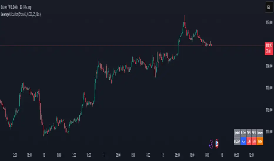
Margin Cost Calculator Screener - Taylor V1.2# Leverage Position Cost Calculator & Stop Lose Cost Screener #
Designed to provide traders with crucial insights into their leveraged positions directly on the TradingView chart.
Key Features:
> Dynamic Display: Choose to view only the estimated entry cost, or a comprehensive overview including potential losses at specific stop-loss levels, and a custom remark.
> Contract Size Input: Easily specify the contract size for your trades.
> Leverage Level Input: Set your desired leverage level, with helpful tooltips explaining the margin requirements for various leverage ratios (e.g., 25x, 10x, 5x) and an included fee estimate.
> Cost Calculation: Accurately calculates the estimated entry cost for your position based on the current market price, contract size, and leverage.
> Stop-Loss Projections: It projects potential losses for stop-loss orders set at 3% and 5% below the entry price, helping you manage risk effectively.
> Clear Table Visualization: All calculated data is presented in a clean, organized table anchored to the bottom-left of your chart, making it easy to reference at a glance.
> Symbol Identification: Automatically displays the short ticker symbol for the asset you are analyzing.
This tool is invaluable for traders who utilize leverage and need a quick, visual way to understand their financial exposure and potential outcomes before entering or managing a trade.
Aggressive Phase + Daily Buy Visual Screener — v6Aggressive Phase + Daily Buy Visual Screener — v6 for bullish, neutral and bearish zone identification

ORB Screener-Multiple Indicators [Marin adjusted]ORB Screener for multiple instruments
You can select the range of the ORB and see different indicators for the selected instruments
Weekly % Change Screener (5% Sell Threshold)This is a weekly screener for a 5% change in the stock value. If it increases by 5%, we sell and if it decreases by 5% we buy the stock. Good for stable high value stocks. Buy before testing.
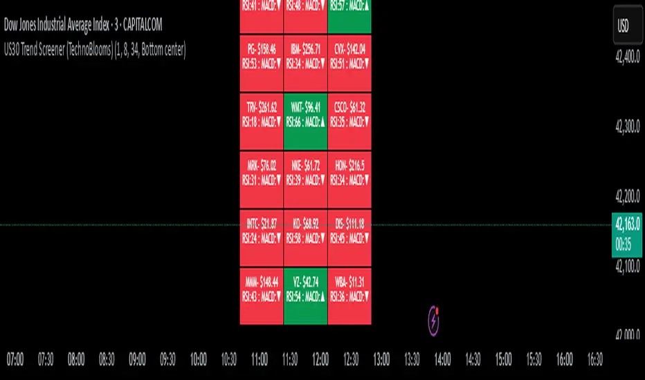
US30 Trend Screener (TechnoBlooms)Identify Index Trends Before the Move Starts.
The US30 Trend Screener is a powerful tool designed to help traders understand the internal dynamics of the Dow Jones Industrial Average (US30) by analyzing the trends of its weighted component stocks in real time.
📊 How It Works
This indicator uses EMA crossovers, RSI, and MACD signals from the 30 Dow Jones stocks and visualizes them in a compact, color-coded dashboard overlay on your chart.
You can choose your preferred lower timeframe (e.g., 1min, 5min, 15min) to analyze intraday momentum before the US30 index reflects the shift.
⏱ Timeframe Input
Select any minute-based timeframe (1–240 min) to suit your trading strategy.
Each stock’s trend data is fetched using your selected timeframe, so you can zoom in or out on price action dynamics.
It is recommended to select the timeframe closer to the chart timeframe in the indicator.
🚀 Key Features
✅ Component-Based Analysis: Tracks all 30 Dow stocks like MSFT, AAPL, GS, etc., with real-time price and indicator updates.
✅ Trend Detection: Uses EMA (8/34) crossover to determine bullish or bearish trends per stock.
✅ Momentum Signals: Shows RSI (14) values and MACD direction (▲ / ▼) for each stock.
✅ Color-Coded Dashboard:
🟩 Green = Bullish trend
🟥 Red = Bearish trend
✅ Compact Display: See 30 stocks in a 3-column grid format, updated every few bars for performance.
🧠 Pro Tips
🔍 Use shorter timeframes (1–5 min) to detect early trend shifts—perfect for scalping and intraday entries.
💼 Watch high-weight stocks like GS, MSFT, UNH. A shift in their trend often precedes index movement.
🎯 Combine with price action or SMC tools to confirm institutional moves and breakouts.
🚦 If most of the dashboard turns green/red at once, it often signals a strong momentum breakout or reversal.
💡 Ideal For:
Index traders (US30/DJI futures or CFDs)
Scalpers & day traders
Momentum and trend-following strategies
Traders who want to see the story behind the index move
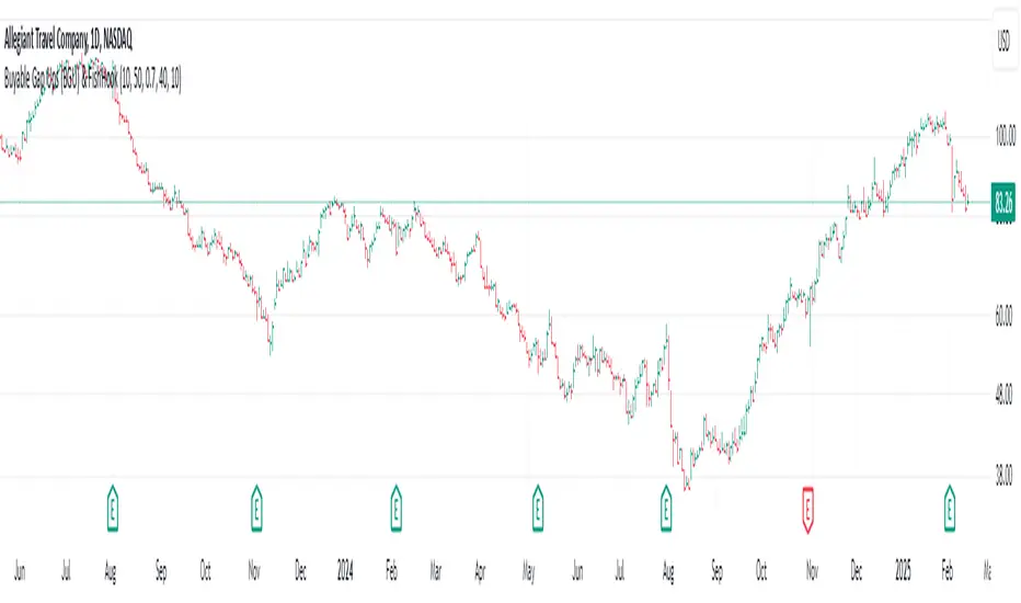
Buyable Gap Ups (BGU) ScreenerBuyable Gap Ups (BGU) Screener
This custom indicator detects Buyable Gap Ups (BGU), designed to identify stocks with significant price movements driven by gap-ups, often signaling strong bullish momentum. It helps traders spot potential opportunities where a stock has gapped up above the previous day's high with increased volume, suggesting the possibility of continued price strength.
Key Features:
Gap Percentage Threshold: Set a minimum gap percentage required for a valid buyable gap-up.
Volume Change Threshold: Identifies gap-ups accompanied by a significant increase in volume compared to the 50-day average.
ATR-Based Gap Detection (Optional): Use Average True Range (ATR) to determine whether the gap is large enough, factoring in recent volatility.
Customizable Lookback Period: Adjust the number of recent bars to track the frequency of BGU occurrences.
Volume Confirmation: Only signals buyable gaps when volume surpasses a defined threshold above the 50-day average.
Input Parameters:
Gap Percentage Threshold: Adjusts the minimum percentage gap for a valid signal.
Volume Change Threshold: Determines the minimum percentage increase in volume compared to the 50-day moving average.
Use ATR Gap: Option to use ATR to determine the minimum gap size instead of the percentage gap.
ATR Multiplier for Gap: Customizes the gap size based on the ATR.
ATR Length: Adjusts the lookback period for calculating ATR.
Lookback Period for BGU: Set the number of bars over which to calculate the BGU count.
Alerts & Signals:
The script will plot signals below bars where a valid BGU condition is met.
Alerts can be set for when a BGU is detected, giving real-time notifications for potential trading opportunities.
This indicator is designed to help traders find stocks showing strong bullish momentum, especially after earnings or other market-moving events, with the potential for continued uptrend. It is ideal for those looking to incorporate gap-based strategies in their trading.
[Spinn] ATH ScreenerThe indicator helps visualize the market’s state as a kind of heatmap, showing how far coins are from their all-time highs (ATH).
Since TradingView has a limitation on the number of coins processed simultaneously (no more than 40), all coins are divided into sets of 40 coins per set. If you place multiple copies of the indicator on the chart and assign a different set number in each copy, you can see the full picture for the exchange or the entire market.
The screener displays a table indicating the set number and the base currency (default is USDT).
For each coin, the following data is provided:
its name;
the distance from the current price to the ATH in percentage;
a 🔹 icon marks new coins (with a short price history);
coins that recently reached their ATH or ATL are highlighted in bold;
the background is colored as follows:
green — when less than 40% remains to the ATH;
red — when more than 60% remains;
blue — between 40% and 60%;
gray — when no data is available.
Hovering over a coin displays its name, current price, ATH and ATL values, and how many days ago they were reached.
Settings
Coin set number
Base currency (USDT)
Exchange
List of all coins on the exchange (comma-separated)*
No overlaps — if this option is enabled, tables with different sets will be placed one below the other.
Sorted — if this option is enabled, coins in the set will be sorted by their distance from ATH.
Colorize — whether to color the cell background with the specified colors or leave it light gray.
Bold ATH or ATL, days back — highlight coins in bold that recently reached an extreme (number of days is configurable).
New coins (🔹), days — mark young coins with a short price history using an icon (number of days is configurable).
Table width, % — approximate table width as a percentage of screen width.
Text size — text size in the table, from 1 to 3.
*Note: The default list was up-to-date at the time of the indicator’s publication. If certain coins are no longer traded, they will be marked with a dark gray background (no data).
Recommendation: to prevent the graph from obscuring the data, I recommend hiding it. This is done in the Object Tree, on the right side of the panel.
—
Индикатор помогает увидеть состояние рынка в виде своеобразной тепловой карты — как далеко монеты находятся от своих исторических максимумов (ATH).
Поскольку у TradingView есть ограничение на количество одновременно обрабатываемых монет (не более 40), все монеты разбиты на наборы по 40 монет в каждом. Если разместить на графике несколько копий индикатора и в каждой копии задать свой номер набора монет, можно видеть всю картину по бирже или рынку целиком.
Скринер выводит на экран таблицу с указанием номера набора монет и базовой валюты (по умолчанию — USDT).
Для каждой монеты указаны следующие данные:
её название;
расстояние от текущей цены до ATH в процентах;
значком 🔹 выделены новые монеты (с короткой историей графика);
жирным шрифтом выделены монеты, у которых ATH или ATL был достигнут недавно;
фон окрашен в такие оттенки:
зелёные — когда до ATH осталось менее 40%;
красные — более 60%;
голубые — между 40% и 60%;
серые — когда нет данных.
Если навести курсор на монету, будут показаны её название, текущая цена, значения ATH и ATL, а также сколько дней назад они были достигнуты.
Настройки
Номер набора монет
Базовая монета (USDT)
Биржа
Список всех монет на бирже (через запятую)*
No overlaps — если эта опция выделена, таблицы с разными наборами будут размещены одна под другой.
Sorted — если эта опция отмечена, монеты в наборе будут отсортированы по удалению от ATH.
Colorize — окрашивать ли фон ячеек в указанные выше цвета или оставить его светло-серым.
Bold ATH or ATL, days back — выделять жирным монеты, у которых недавно был достигнут экстремум (задаётся количество дней).
New coins (🔹), days — выделять значком молодые монеты, история графика которых небольшая (задаётся количество дней).
Table width, % — задаётся приблизительная ширина таблицы в процентах от ширины экрана.
Text size — размер текста в таблице, от 1 до 3.
*Примечание: заданный по умолчанию список был актуален на момент публикации индикатора. Если какие-то монеты перестали торговаться, они будут отмечены тёмно-серым фоном (нет данных).
Рекомендация: для того, чтобы график не заслонял данные, рекомендую его скрыть. Делается это в Дереве объектов, справа на панели.
