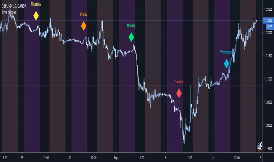
Time rangesThis script visualizes the different time sessions during the day.
The time ranges are set to the default Frankfurt, London, NY, Sydney and Tokyo, but can be
freely modified and turned off (I personally use to display only Tokyo and NY).
If you are a day trader, e.g. you trade with the Market Makers, this tool is a "must have".
It also displays the day of the week, which can be set off as well.
vitelot/yanez/Vts Sept 2019
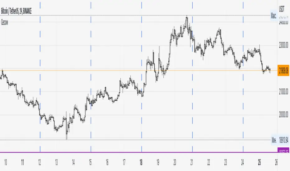
PS I chose this script to belong to the "volatility" category since it can be used to highlight the Asian session,
and there was no suitable category available.
Cari dalam skrip untuk "sessions"
Fx220 Market Sessions IndicatorFx220 NATION! Welcome. Here's a script to add the Market Sessions without altering any settings! Enjoy - Brian

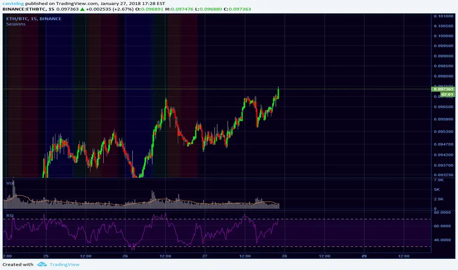
Fx Sessions For CryptoFx Sessions for crypto traders. High Volatility occurs at weekends, and NY-Assia overlap in week days.


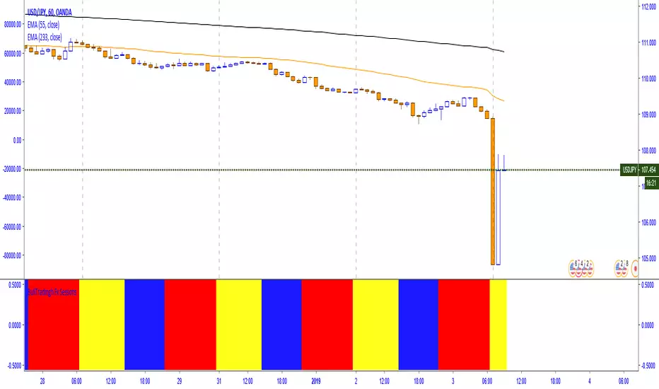

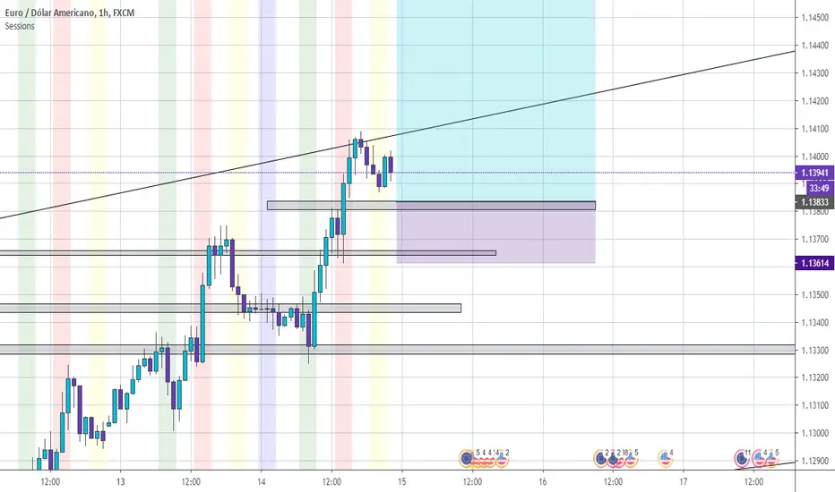
Fx SessionsThis script displays a lower strip to be aware of Fx Sessions (London, NY and Tokyo). Please pay attention to the pre London "Kill Zone" which comprehends the Gap between the Tokyo close (End of Yellow Strip) and the London open (Beginning of Aqua Strip).
Courtesy from Kevin Prudhom from Octopus Fx Academy.

Trading Sessions v.2 - Max WarrenUpdated to work with Pine updates:
London DST timezone still broken. Will fix later.
As always full customization visually, with London fix I'll add more options.
Keep in mind the render resolution option

BO_EXPIRY_VDUB_v1Set Background to custom Trading sessions & set custom Binary Options expiry times.

SessionsThis indicator highlights the New York After Hours and Pre-Market session and visually defines its structure on the chart.
The session runs from 18:00 to 09:30 New York time, covering the full overnight and pre-market trading window leading into the regular cash open.
During this period, the script tracks and marks the high and low of the New York pre-market, allowing traders to clearly see the overnight range that often acts as key liquidity, support, and resistance during the regular trading session.
The session range can be displayed as a shaded background or as a high/low range, depending on user preference.
For clarity and precision, the indicator is visible only on intraday timeframes:
5-minute
30-minute
1-hour
This makes it especially useful for futures, index, and intraday traders who incorporate pre-market structure into their trading plans.

SessionsA very simple indicator that draws vertical lines on the chart to visually indicate session boundaries. You can set any target timeframe that is larger than the current one and is a multiple of it.
--
Очень простой индикатор, который строит вертикальные линии на графике, чтобы визуально указать границы сессий. Можно задавать любой целевой таймфрейм, который больше текущего и кратен ему.

TedAlpha – Structure / FVG / OB Sessions:
Only looks for trades when price is inside your defined London or NY time blocks.
CHOCH:
Uses pivots to track swing highs/lows, then flags a bullish CHOCH when structure flips from LL/LH to HH/HL, and vice versa for bearish.
FVG:
Detects 3-candle imbalance and keeps the zone “active” for fvgLookback bars, then checks if price trades back into it.
Order Blocks:
On a CHOCH, grabs the last opposite candle (bearish before bull CHOCH = bullish OB, bullish before bear CHOCH = bearish OB) and marks its body as the OB zone.
Signal:
A valid long = bull CHOCH + in session + (price inside bullish FVG and/or bullish OB, depending on toggles).
Short is the mirror image.
RR 1:3:
SL uses the last swing low (for longs) or last swing high (for shorts), TP is auto-set at 3× that distance and plotted as lines.

Sessions + EMAS + Nube (Mini Table)This indicator is designed to help traders analyze market trends and identify potential trading opportunities.
It provides clear visual signals based on price behavior and technical calculations, allowing traders to better understand market structure, momentum, and direction.
The indicator can be used on any market and timeframe, making it suitable for both intraday and swing trading.
It is intended as a decision-support tool and should be used in combination with proper risk management and other forms of analysis.


Sessions High/LowIndicator lines to show the prior days NY high/low, overnight Asian high/low, and recent London high/low. Time frame variables are included as well as the option to change colors for both the high and low. Good luck.

Sessions RangesAn indicator that displays each trading session. Each box represents a single session (Asian, London and NY) and their respective overlaps.

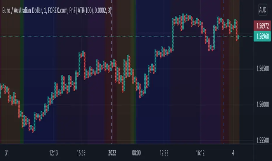
Sessions Rainbow EST with overlapsThis script displays the trading zones with overlaps based on the color of the rainbow. It is used with a Point&Figure chart to show trends associated with trading periods and overlapping trading periods.