Simple EMA Trading SignalUse it on:
1. Heiken Ashi, Bitstamp: BTCUSD , M15
2. Heiken Ashi, Bitstamp: BTCUSD, D1
3. USOIL Candlesticks H1
4. EURUSD Daily Candlesticks
5. GBPUSD Daily Candlesticks
6. SPX W1 Candlesticks
7. SPX H1 Heiken Ashi
8. XAUUSD Daily
Cari dalam skrip untuk "spx"

Mansfield Relative Strength indicatorUse this indicator to compare how security is performing in compare with preferred index (SPX by default).
> 0 outperforming
< 0 underperforming
Works best for weekly, but can be applied to monthly and daily charts. It will be rather useless to use it in smaller timeframes
Apply it to SPX, industry index, sector index or other security in similar sector

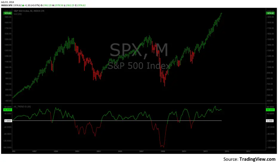
AK TREND ID v1.00Hello,
"Are we at the top yet ? "........ " Is it a good time to invest ? " ......." Should I buy or sell ? " These are the many questions I hear and get on the daily basis. 1000's of investors do not know when to go in and out of the market. Most of them rely on the opinion of "experts" on television to make their investment decisions. Bad idea.Taking a systematic approach when investing, could save you a lot of time and headache. If there was only a way to know when to get in and out of the market !! hmmmm. The good news is that there many ways to do that. The bad news is , are you disciplined enough to follow it ?
I coded the AK_TREND ID specifically to identified trends in the SPX or SPY only . How does it work ? very simply , I simply plot the spread between the 3 month and 8 month moving average on the chart.
If the spread > 0 @ month end = BUY
if the spread < 0 @ month end = SELL
The AK TREND ID is a LAGGING Indicator , so it will not get you in at the very bottom or get you out at the very top. I did a backtest on the SPX from 1984 to 7/2/2014 (yesterday), The rule was to buy only when the AK TREND ID was green. let's look at the result:
14 trades : 11 W 3 L , 78.75 % winning %
Biggest winner (%) = 108 %
Biggest loser (%) = -10.7 %
Average Return = 27 %
Total Return since 1984 = 351.3 %
You can see the result in detail here : docs.google.com
Although the backtesting results are good, the AK TREND ID is not to be used as a trading system. It is simply design to let you know when to invest and when to get out. I'm working a more accurate version of this Indicator , that will use both technical and fundamental data. In the mean time , I hope this will give some of you piece of mind, and eliminate emotions from your trading decision. Feel free to modify the code as you wish, but please share your finding with the rest of Trading View community.
All the best
Algo
Superbank Grid The Superbank Grid automatically plots institutional-grade price zones across Forex, Indices, and Crypto, giving traders a consistent framework for identifying major liquidity areas, psychological levels, and high-probability reaction zones — on any timeframe.
This indicator is designed to eliminate guesswork by anchoring price to repeatable, whole-number structures used by professional traders.
What It Draws
Forex (All FX Pairs)
Major Zones: Every 1,000 pips
Median Levels: 500 pips
Quarter Levels: 250 & 750 pips
Minor Grid: 100-pip intervals
Examples:
EURUSD:
Major → 0.7000 · 0.8000 · 0.9000 · 1.0000 · 1.1000
Quarters → 0.7250 · 0.7500 · 0.7750
USDJPY:
Major → 60 · 70 · 80 · 90 · 100 · 110
Quarters → 62.5 · 65.0 · 67.5 · 122.5 · 125.0 · 127.5
Indices & Crypto
Major “Superbank” Zones: $10,000
Median Levels: $5,000
Minor Grid: $1,000
Ideal for:
NAS100
US30
SPX
BTC
ETH
Key Features
Works on all timeframes
Auto-adapts to Forex, JPY pairs, Indices, and Crypto
Prevents chart auto-scale distortion (“screen squish”)
Displays only relevant zones near current price
Adjustable colors, line weights, and label sizes
Optional visibility toggles for Major, Median, Quarter, and Minor levels
Best Use Cases
Identifying institutional liquidity pools
Marking reaction zones and decision points
Structuring entries, targets, and stop placement
Aligning price action with Big Money levels
Swing trading, position trading, and intraday execution
Important Notes
This indicator is a context and structure tool, not a signal generator.
Best used in combination with market structure, order flow, and risk management.
Designed to reflect how professional traders segment price, not retail indicators.
Who This Is For
Traders who think in zones, liquidity, and scale — not random indicators.
If you trade:
Forex
Indices
Crypto
and want a repeatable framework for understanding where price matters…
This tool belongs on your chart.

DATA BOX - Market Overview (18 Key Assets)Market sentiment dashboard - know what's hot, what's not, instantly!
Real-time dashboard showing 18 key assets across Indices, Crypto, Metals, Bonds & Forex
📊 ONE GLANCE MARKET SENTIMENT
BTC, ETH, SOL, SPX, Nasdaq, DJ30, Russell2000, Gold, Silver, Nikkei, UK100, EU50, GER40, HK50, NIFTY, SSE Composite, US10Y, DXY
Current Prices - Live updating
Daily 50 SMA - Price above = 🟢 BULL | Below = 🔴 BEAR
4H SMA - Short-term trend direction - Price above = 🟢 BULL | Below = 🔴 BEAR
RSI Daily/4H - Momentum extremes highlighted
----------------------------------------------------------------------------------------------------------------------
🎨 VISUAL POWER RANKING
text
🟢 GREEN ROW = Both D50 + 4H Bullish (STRONG BUY)
🟠 ORANGE ROW = Mixed signals (CAUTION)
🔴 RED ROW = Both Bearish (STRONG SELL)
----------------------------------------------------------------------------------------------------------------------
⚙️ FULLY CUSTOMIZABLE
3 Sizes: Small/Medium/Large
6 Color Pickers: Bull/Bear/Mixed + Headers/RSI/Price BG
Toggle RSI columns independently
----------------------------------------------------------------------------------------------------------------------
🚀 PERFECT FOR:
Day traders needing a multi-asset overview
Swing traders checking daily trend alignment
Portfolio managers monitoring global risk.

Pittillo A+ Scanner (Move + Volume + VWAP/EMA + No-Chop)Pittillo A+ Scanner — Move + Volume + VWAP/EMA + No-Chop
Pittillo A+ Scanner is a high-selectivity intraday scanner designed to surface A+ trade conditions only — filtering out chop, low-volume noise, and random price action that destroys consistency.
This indicator is built for traders who value patience, structure, and confirmation, not constant signals.
🔍 What It Looks For
An A+ signal will only appear when ALL of the following are present:
• Market Movement
• ATR expansion vs baseline (no dead tape)
• Real Participation
• Relative volume above average
• Trend Alignment
• 8/20 EMA structure
• VWAP confirmation (above for longs, below for shorts)
• Strength Confirmation
• ADX filter to avoid range-bound chop
• Price Structure
• Clean candles (filters dojis / overlapping garbage)
• Valid Trigger
• Breakout continuation or
• VWAP rejection with strong candle close
• Session Awareness
• Optional time-window filter to avoid low-quality hours
If conditions are not objectively favorable, the scanner stays quiet by design.
⸻
🎯 A+ Scoring System
Each setup is graded with an internal A+ score (0–100) based on:
• ATR expansion
• Relative volume
• ADX strength
• Bollinger Band expansion
• Candle quality
• Trend alignment
Signals only trigger when the score meets or exceeds the user-defined A+ threshold, ensuring quality over quantity.
⸻
🟢 Visual Signals
• A+ LONG → Triangle up + green background
• A+ SHORT → Triangle down + red background
• EMAs (8/20) and VWAP plotted for full context
No signal = no trade.
⸻
🧠 Philosophy
This indicator is intentionally conservative.
It is designed to:
• Protect capital during chop
• Reduce overtrading
• Encourage discipline
If you’re looking for constant alerts, this is not for you.
If you’re looking for clean, repeatable opportunities, this is exactly that.
⸻
📌 Best Use Cases
• Index futures (ES, NQ, MNQ, MES)
• SPX / SPY / QQQ intraday trading
• Traders who already respect VWAP + EMA structure
Works best on 2m–15m timeframes during active market hours.
⸻
⚠️ Disclaimer
This indicator does not predict markets or guarantee profits.
It is a filtering and confirmation tool, not a substitute for risk management or a trading plan.

Macro 6-PackMacro 6-Pack dashboard: SPX momentum, VIX, HY credit spread, 10Y yield shifts, DXY trend, and 2s10s curve.

Gold Inverse Correlation TrackerGold Inverse Correlation Tracker - Professional Multi-Asset Analysis
What This Indicator Does:
This indicator monitors the real-time correlation between Gold and five key financial assets that historically move inversely (opposite) to gold prices. It displays these relationships across three different timeframes simultaneously, giving you both short-term trading signals and long-term trend confirmation.
The indicator tracks:
US Dollar Index (DXY) - Historical correlation: -0.63
Real Interest Rates (TIPS) - Historical correlation: -0.82 (strongest inverse relationship)
10-Year Treasury Yield - Nominal interest rate proxy
S&P 500 (SPX) - Equity market sentiment (variable correlation)
VIX - Volatility index (optional, flight-to-safety indicator)
Why Inverse Correlations Matter for Gold Trading:
Understanding inverse correlations is critical for gold traders because:
Predictive Power - When assets move opposite to gold consistently, you can use their strength/weakness to predict gold's next move
Hedging Opportunities - Strong inverse correlations let you hedge gold positions by trading the inverse asset
Regime Detection - When correlations break down, it signals a market regime change or increased uncertainty
Confirmation Signals - Multiple strong inverse correlations validate your gold trade thesis
Risk Management - Knowing what moves against gold helps you understand your portfolio's true exposure
The Science Behind the Numbers:
Real interest rates have the strongest inverse correlation to gold (approximately -0.82) because:
Gold pays no yield or dividend
When real rates rise, the opportunity cost of holding gold increases
Investors shift to interest-bearing assets when they offer positive real returns
When real rates go negative, gold becomes relatively more attractive
The US Dollar shows strong inverse correlation (approximately -0.63) because:
Gold is priced in US dollars globally
A stronger dollar makes gold more expensive for foreign buyers, reducing demand
A weaker dollar makes gold cheaper internationally, increasing demand
Both compete as reserve assets and stores of value
Why the Indicator is Weighted This Way:
Three Timeframe Approach:
Short-term (20 periods) - Captures recent correlation shifts for day trading and swing trading
Medium-term (50 periods) - The primary signal - balances noise reduction with responsiveness
Long-term (100 periods) - Confirms structural correlation trends for position trading
Correlation Thresholds:
Strong Inverse (<-0.7) - Statistically significant inverse relationship; highest confidence for inverse trades
Moderate Inverse (<-0.3) - Meaningful inverse relationship; still useful but less reliable
Weak Inverse (<0.0) - Slight inverse tendency; correlation may be breaking down
Positive (>0.0) - Assets moving together; inverse relationship has failed
How to Use This Indicator:
For Inverse Trading Strategies:
When DXY shows RED correlation (<-0.7), consider shorting DXY when gold is strong
When Real Rates show RED correlation, rising rates = falling gold (and vice versa)
When multiple assets show strong inverse correlation, confidence is highest
For Regime Detection:
All RED = Classic gold market behavior; correlations intact
Mixed colors = Transitional market; be cautious
All GREEN/GRAY = Correlation breakdown; paradigm shift occurring
For Hedging:
Use assets with strong inverse correlation to hedge gold positions
When correlation weakens, reduce hedge size
When correlation strengthens, increase hedge effectiveness
Alert System:
The indicator includes built-in alerts for:
Individual assets crossing strong inverse threshold
Multiple assets simultaneously showing strong inverse correlation (highest probability setup)
Correlation breakdowns that may signal regime changes
Color Guide:
RED - Strong inverse correlation (<-0.7) - Best inverse trading opportunity
ORANGE - Moderate inverse (<-0.3) - Useful but less reliable
YELLOW - Weak inverse (<0.0) - Correlation weakening
GRAY - Weak positive (0.0 to 0.7) - Assets moving together
GREEN - Strong positive (>0.7) - Inverse relationship broken
Recommended Settings:
Day Trading (1H-4H charts):
Short: 14 periods
Medium: 30 periods
Long: 60 periods
Swing Trading (Daily charts):
Short: 20 periods (default)
Medium: 50 periods (default)
Long: 100 periods (default)
Position Trading (Weekly charts):
Short: 10 periods
Medium: 20 periods
Long: 50 periods
Pro Tips:
Watch for divergences - when gold moves but correlations don't confirm
Correlation breakdowns often precede major trend reversals
The Medium-term (50p) correlation is plotted on the chart as your primary reference
Use the Status column for quick assessment of each asset's relationship
Set alerts for "Multiple Strong Inverse" to catch highest-probability setups
Important Notes:
This indicator is designed for Gold charts only (XAUUSD, GLD, GC1!, etc.)
Correlations are not static - they change over time based on market conditions
A correlation of -0.82 means 82% of gold's price movements can be explained by real interest rates
Always combine with other technical analysis and fundamental factors
Past correlations do not guarantee future relationships
Based on Research:
The correlation coefficients used in this indicator are based on peer-reviewed research:
Erb & Harvey (1997-2012): Real rates to gold correlation of -0.82
World Gold Council (2024): US Dollar to gold correlation of -0.63
Multiple academic studies confirming gold's inverse relationship with opportunity cost assets
Use this indicator to trade smarter, hedge better, and understand the macro forces driving gold prices.

Daily maximum price range for Credit SpreadsVolatility & Momentum for Credit Spreads
It is a specialized mean-reversion tool designed primarily for options traders focusing on Credit Spreads (specifically 0DTE on SPX) and intraday reversals. By combining Volume Weighted Average Price (VWAP) with VIX-adjusted volatility bands, this indicator identifies statistical extremes where price is likely to revert.
Unlike standard Bollinger Bands or Keltner Channels, TITAN adapts its width based on real-time implied volatility (VIX), ensuring that your "overextended" zones are accurate whether the market is calm or chaotic.
🎯 Core Concept
The indicator relies on the principle that price moves within a definable "Daily Range" relative to the VWAP. When price pushes to the outer limits of this range while simultaneously hitting RSI extremes; it signals a high-probability reversal setup ideal for selling premium.
🛠 How It Works
The engine is built on three pillars:
Volatility-Adaptive Bands: The bands are calculated using a 14-day Average Daily Range (ADR), which is then dynamically scaled by the current VIX relative to a baseline. If VIX spikes, the bands widen instantly to keep you safe from premature entries.
Momentum Triggers: Signals are generated only when the RSI (14) hits extreme Overbought (>70) or Oversold (<30) levels.
"Golden Hour" Filtering: To avoid market open noise or late-day chop, the indicator includes a customizable time filter (Default: 10:15 – 11:30 AM EST). Signals outside this window are suppressed to enforce trading discipline.
🚀 Key Features
Visual Strategy Simulation: The indicator now includes a built-in "Strike Simulator." Upon the first valid signal of the session, it automatically plots a horizontal "Strike Line" at the Outer Band ± a user-defined buffer (e.g., 10 points). This helps you visualize your theoretical strike price for the rest of the day.
Bull & Bear Zones: Color-coded fills (Green for Bullish Buy Zones, Red for Bearish Sell Zones) make it easy to see market context at a glance.
Live Dashboard: A Heads-Up Display (HUD) in the bottom right shows real-time RSI values, Golden Hour status, and current signal state.
Unified Alert System: A single master alert condition triggers if price hits an RSI extreme OR touches a volatility band during your active trading window.
📉 How to Trade It (Example Strategy)
Wait for the Window: Ensure the "Golden Hour" on the dashboard reads ACTIVE (Default 10:15 AM EST).
Identify the Zone: Short Setup (Call Credit Spread): Price pushes into the Red Zone (Outer High). Long Setup (Put Credit Spread): Price pushes into the Green Zone (Outer Low).
Confirm the Signal: Look for the Diamond Icon. This confirms RSI has hit the extreme threshold.
Check the "Strike Line": Use the simulated horizontal line to identify where your short strike would be (Outer Band + Buffer) to verify it is at a safe distance from current price.
⚙️ Settings
ADR Length: Lookback period for daily range calculation (Default: 10).
Baseline VIX:* The standard VIX level used for normalization (Default: 15.0).
Inner/Outer Multipliers: Controls the width of the bands.
Golden Hour: The specific time window for valid signals.
Strike Buffer: Points added to the outer band to simulate your option strike price.
⚠️ Disclaimer
This tool is for informational purposes only. Trading options, especially 0DTE credit spreads, involves significant risk. Always backtest strategies and manage risk accordingly.

jaems_Double BB[Alert]/W-Bottom/Dashboard// This Pine Script® code is subject to the terms of the Mozilla Public License 2.0 at mozilla.org
// © Kingjmaes
//@version=6
strategy("jaems_Double BB /W-Bottom/Dashboard", shorttitle="jaems_Double BB /W-Bottom/Dashboard", overlay=true, commission_type=strategy.commission.percent, commission_value=0.05, slippage=1, process_orders_on_close=true)
// ==========================================
// 1. 사용자 입력 (Inputs)
// ==========================================
group_date = "📅 백테스트 기간 설정"
startTime = input.time(timestamp("2024-01-01 00:00"), "시작일", group=group_date)
endTime = input.time(timestamp("2099-12-31 23:59"), "종료일", group=group_date)
group_bb = "📊 더블 볼린저 밴드 설정"
bb_len = input.int(20, "길이 (Length)", minval=5, group=group_bb)
bb_mult_inner = input.float(1.0, "내부 밴드 승수 (Inner A)", step=0.1, group=group_bb)
bb_mult_outer = input.float(2.0, "외부 밴드 승수 (Outer B)", step=0.1, group=group_bb)
group_w = "📉 W 바닥 패턴 설정"
pivot_left = input.int(3, "피벗 좌측 봉 수", minval=1, group=group_w)
pivot_right = input.int(1, "피벗 우측 봉 수", minval=1, group=group_w)
group_dash = "🖥️ 대시보드 설정"
show_dash = input.bool(true, "대시보드 표시", group=group_dash)
comp_sym = input.symbol("NASDAQ:NDX", "비교 지수 (GS Trend)", group=group_dash, tooltip="S&P500은 'SP:SPX', 비트코인은 'BINANCE:BTCUSDT' 등을 입력하세요.")
rsi_len = input.int(14, "RSI 길이", group=group_dash)
group_risk = "🛡 리스크 관리"
use_sl_tp = input.bool(true, "손절/익절 사용", group=group_risk)
sl_pct = input.float(2.0, "손절매 (%)", step=0.1, group=group_risk) / 100
tp_pct = input.float(4.0, "익절매 (%)", step=0.1, group=group_risk) / 100
// ==========================================
// 2. 데이터 처리 및 계산 (Calculations)
// ==========================================
// 기간 필터
inDateRange = time >= startTime and time <= endTime
// 더블 볼린저 밴드
basis = ta.sma(close, bb_len)
dev_inner = ta.stdev(close, bb_len) * bb_mult_inner
dev_outer = ta.stdev(close, bb_len) * bb_mult_outer
upper_A = basis + dev_inner
lower_A = basis - dev_inner
upper_B = basis + dev_outer
lower_B = basis - dev_outer
percent_b = (close - lower_B) / (upper_B - lower_B)
// W 바닥형 (W-Bottom) - 리페인팅 방지
pl = ta.pivotlow(low, pivot_left, pivot_right)
var float p1_price = na
var float p1_pb = na
var float p2_price = na
var float p2_pb = na
var bool is_w_setup = false
if not na(pl)
p1_price := p2_price
p1_pb := p2_pb
p2_price := low
p2_pb := percent_b
// 패턴 감지
bool cond_w = (p1_price < lower_B ) and (p2_price > p1_price) and (p2_pb > p1_pb)
is_w_setup := cond_w ? true : false
w_bottom_signal = is_w_setup and close > open and close > lower_A
if w_bottom_signal
is_w_setup := false
// GS 트렌드 (나스닥 상대 강도)
ndx_close = request.security(comp_sym, timeframe.period, close)
rs_ratio = close / ndx_close
rs_sma = ta.sma(rs_ratio, 20)
gs_trend_bull = rs_ratio > rs_sma
// RSI & MACD
rsi_val = ta.rsi(close, rsi_len)
= ta.macd(close, 12, 26, 9)
macd_bull = macd_line > signal_line
// ==========================================
// 3. 전략 로직 (Strategy Logic)
// ==========================================
long_cond = (ta.crossover(close, lower_A) or ta.crossover(close, basis) or w_bottom_signal) and inDateRange and barstate.isconfirmed
short_cond = (ta.crossunder(close, upper_B) or ta.crossunder(close, upper_A) or ta.crossunder(close, basis)) and inDateRange and barstate.isconfirmed
// 진입 실행 및 알람 발송
if long_cond
strategy.entry("Long", strategy.long, comment="Entry Long")
alert("Long Entry Triggered | Price: " + str.tostring(close), alert.freq_once_per_bar_close)
if short_cond
strategy.entry("Short", strategy.short, comment="Entry Short")
alert("Short Entry Triggered | Price: " + str.tostring(close), alert.freq_once_per_bar_close)
// 청산 실행
if use_sl_tp
if strategy.position_size > 0
strategy.exit("Exit Long", "Long", stop=strategy.position_avg_price * (1 - sl_pct), limit=strategy.position_avg_price * (1 + tp_pct), comment_loss="L-SL", comment_profit="L-TP")
if strategy.position_size < 0
strategy.exit("Exit Short", "Short", stop=strategy.position_avg_price * (1 + sl_pct), limit=strategy.position_avg_price * (1 - tp_pct), comment_loss="S-SL", comment_profit="S-TP")
// 별도 알람: W 패턴 감지 시
if w_bottom_signal
alert("W-Bottom Pattern Detected!", alert.freq_once_per_bar_close)
// ==========================================
// 4. 대시보드 시각화 (Dashboard Visualization)
// ==========================================
c_bg_head = color.new(color.black, 20)
c_bg_cell = color.new(color.black, 40)
c_text = color.white
c_bull = color.new(#00E676, 0)
c_bear = color.new(#FF5252, 0)
c_neu = color.new(color.gray, 30)
get_trend_color(is_bull) => is_bull ? c_bull : c_bear
get_pos_text() => strategy.position_size > 0 ? "LONG 🟢" : strategy.position_size < 0 ? "SHORT 🔴" : "FLAT ⚪"
get_pos_color() => strategy.position_size > 0 ? c_bull : strategy.position_size < 0 ? c_bear : c_neu
var table dash = table.new(position.top_right, 2, 7, border_width=1, border_color=color.gray, frame_color=color.gray, frame_width=1)
if show_dash and (barstate.islast or barstate.islastconfirmedhistory)
table.cell(dash, 0, 0, "METRIC", bgcolor=c_bg_head, text_color=c_text, text_size=size.small)
table.cell(dash, 1, 0, "STATUS", bgcolor=c_bg_head, text_color=c_text, text_size=size.small)
table.cell(dash, 0, 1, "GS Trend", bgcolor=c_bg_cell, text_color=c_text, text_halign=text.align_left, text_size=size.small)
table.cell(dash, 1, 1, gs_trend_bull ? "Bullish" : "Bearish", bgcolor=c_bg_cell, text_color=get_trend_color(gs_trend_bull), text_size=size.small)
rsi_col = rsi_val > 70 ? c_bear : rsi_val < 30 ? c_bull : c_neu
table.cell(dash, 0, 2, "RSI (14)", bgcolor=c_bg_cell, text_color=c_text, text_halign=text.align_left, text_size=size.small)
table.cell(dash, 1, 2, str.tostring(rsi_val, "#.##"), bgcolor=c_bg_cell, text_color=rsi_col, text_size=size.small)
table.cell(dash, 0, 3, "MACD", bgcolor=c_bg_cell, text_color=c_text, text_halign=text.align_left, text_size=size.small)
table.cell(dash, 1, 3, macd_bull ? "Bullish" : "Bearish", bgcolor=c_bg_cell, text_color=get_trend_color(macd_bull), text_size=size.small)
w_status = w_bottom_signal ? "DETECTED!" : is_w_setup ? "Setup Ready" : "Waiting"
w_col = w_bottom_signal ? c_bull : is_w_setup ? color.yellow : c_neu
table.cell(dash, 0, 4, "W-Bottoms", bgcolor=c_bg_cell, text_color=c_text, text_halign=text.align_left, text_size=size.small)
table.cell(dash, 1, 4, w_status, bgcolor=c_bg_cell, text_color=w_col, text_size=size.small)
table.cell(dash, 0, 5, "Position", bgcolor=c_bg_cell, text_color=c_text, text_halign=text.align_left, text_size=size.small)
table.cell(dash, 1, 5, get_pos_text(), bgcolor=c_bg_cell, text_color=get_pos_color(), text_size=size.small)
last_sig = long_cond ? "BUY SIGNAL" : short_cond ? "SELL SIGNAL" : "HOLD"
last_col = long_cond ? c_bull : short_cond ? c_bear : c_neu
table.cell(dash, 0, 6, "Signal", bgcolor=c_bg_cell, text_color=c_text, text_halign=text.align_left, text_size=size.small)
table.cell(dash, 1, 6, last_sig, bgcolor=c_bg_cell, text_color=last_col, text_size=size.small)
// ==========================================
// 5. 시각화 (Visualization)
// ==========================================
p_upper_B = plot(upper_B, "Upper B", color=color.new(color.red, 50))
p_upper_A = plot(upper_A, "Upper A", color=color.new(color.red, 0))
p_basis = plot(basis, "Basis", color=color.gray)
p_lower_A = plot(lower_A, "Lower A", color=color.new(color.green, 0))
p_lower_B = plot(lower_B, "Lower B", color=color.new(color.green, 50))
fill(p_upper_B, p_upper_A, color=color.new(color.red, 90))
fill(p_lower_A, p_lower_B, color=color.new(color.green, 90))
plotshape(long_cond, title="Long", style=shape.triangleup, location=location.belowbar, color=color.green, size=size.small)
plotshape(short_cond, title="Short", style=shape.triangledown, location=location.abovebar, color=color.red, size=size.small)

GEX Walls + Market Open Shading### Overview
This Pine Script (version 6) creates a TradingView indicator called **"GEX Walls + Market Open Shading"**. It overlays directly on the price chart and is designed for intraday trading, particularly for indices like SPX or ES futures. The script combines two main features:
- **GEX Walls**: Visual boxes and labels highlighting "Gamma Exposure" (GEX) levels—key support (Put Wall) and resistance (Call Wall) zones based on options gamma. It includes approach alerts.
- **Market Open Shading**: A semi-transparent background shade during a customizable post-market-open session (e.g., first 2 hours after 9:30 AM EST).
It uses up to 20 boxes and 20 labels, with right-scale positioning for better visibility on the price axis. The script detects new trading days to reset visuals dynamically.
### Key Inputs
The script is highly customizable via inputs grouped into sections:
#### GEX Walls Inputs
- **Call Wall** (default: 6900.0): Upper resistance level.
- **Put Wall** (default: 6850.0): Lower support level.
- **Buffer** (default: 3.0 points): Vertical padding around each wall for box thickness.
- **Alert Distance** (default: 10.0 points): Threshold for triggering "approach" alerts.
- **Colors**: Semi-transparent yellow for Call Wall boxes (#ffeb3b at 80% opacity), orange for Put Wall (#ff9800 at 80%).
- **Toggles**: Show/hide boxes; enable/disable alerts; restrict alerts to shaded session only.
- **Labels**: Text color (white), offset (bars to the right, default -2), size (tiny/small/normal/large).
#### Market Open Shading Inputs
- **Shade Color** (default: white at 90% transparency): Background fill during session.
- **Transparency** (0-100, default: 90): Opacity level.
- **Open Time** (default: 9:30 EST): Hour/minute for session start.
- **Duration**: Dropdown with pre-formatted options (e.g., "120 min: 11:30a EST / 8:30a PST" up to 195 min), showing both EST and PST end times for convenience.
- **Toggle**: Show/hide shading.
### How It Works
#### 1. Market Open Shading
- Calculates end time from open hour/minute + selected duration (e.g., 120 minutes from 9:30 AM EST = 11:30 AM EST).
- Builds a session string (e.g., "0930-1130") for TradingView's `time()` function.
- Detects if the current bar is within the session using `not na(time("", sessionString))`.
- Applies `bgcolor()` with the user-defined color/transparency only during the session.
- Helper functions format times in 12-hour AM/PM style (e.g., "11:30a") for labels, with EST/PST variants.
#### 2. Day Detection
- Uses `time("D")` to track daily changes (`ta.change(dayTime) != 0` signals a new day).
- Maintains variables for the current day's start bar index (`todayStartIndex`) and previous day's start (`prevStartIndex`).
- This ensures boxes span exactly from yesterday's open to today (intraday reset on new days).
#### 3. GEX Walls Visualization
- **Boxes**: Drawn once `prevStartIndex` is known (i.e., on the second day onward).
- Left edge: Previous day's start bar.
- Right edge: Current bar (extends live).
- Height: Wall level ± buffer (e.g., Call Wall box from 6900-3 to 6900+3).
- Updated dynamically with `box.set_*` functions; hidden (100% transparent) if toggled off.
- **Labels**: Placed at exact wall levels, offset to the right (e.g., 2 bars ahead for readability).
- Text: "CALL WALL: 6900.0" or "PUT WALL: 6850.0".
- Style: Right-aligned, black background (transparent), user-defined text color/size.
- Deleted if toggled off.
- All visuals use `xloc.bar_index` for bar-based positioning.
#### 4. Alerts
- **Call Wall Approach**: Triggers when close enters within `alertDistance` below the wall, but prior bar was further away (rising toward resistance). Message: "Price approaching Call Wall at from below (within points)".
- **Put Wall Approach**: Symmetric for falling toward support (within distance above wall).
- Filtered optionally to shaded session only.
- Uses `alertcondition()` with hidden plots (`display=display.none`) for dynamic message placeholders (e.g., `{{plot_0}}` inserts wall level).
### Notable Features & Behaviors
- **Intraday Focus**: Boxes/labels reset daily, making it ideal for day trading without historical clutter.
- **Time Zone Handling**: Defaults to EST for market open but shows PST equivalents in dropdowns (subtracts 3 hours).
- **Efficiency**: Uses `var` declarations for persistent objects (boxes/labels) to avoid recreation on every bar.
- **Edge Cases**: Handles label offsets (clamped -10 to 50 bars); session wrapping (e.g., overnight via %24); new chart loads (initializes on first bar).
- **Customization Depth**: 20+ inputs allow fine-tuning without code edits. Alerts integrate seamlessly with TradingView's system.
- **Limitations**: Relies on bar_index for historical spanning (best on lower timeframes like 1-5 min); no historical backfill for walls (live-only).
This script is a practical tool for options-aware traders monitoring gamma squeezes or pinning levels during market open volatility. To use it, paste into TradingView's Pine Editor, adjust inputs for your asset (e.g., update walls for current GEX data), and add to chart.

Entry ChecklistEntry Checklist
A comprehensive multi-factor analysis tool for stock and crypto entry decisions, combining fundamental, technical, and market sentiment indicators in a dynamic table display.
🎯 Overview
This advanced Pine Script indicator provides traders and investors with a systematic checklist for evaluating potential entry points. It consolidates critical market data into a clean, color-coded table that adapts based on asset type and data availability.
📊 Key Features
Market Context Analysis:
Seasonality: Historical S&P 500 monthly return patterns with strength/weakness labels
Market Breadth (S5TH): Percentage of S&P 500 stocks above their 50-day moving average
Fear/Greed Index (VIX): Market sentiment indicator with threshold-based color coding
Fundamental Analysis (Stocks Only):
Earnings Dates: Upcoming earnings announcement tracking with 14-day warning
Growth Metrics: Year-over-year sales and EPS growth rates
Acceleration: Quarter-over-quarter growth acceleration analysis
Sector & Industry Analysis:
Sector Relative Strength: 20-day performance vs SPY benchmark
Industry Relative Strength: Granular industry ETF performance comparison
120+ Industry ETF Mappings: Comprehensive sector and industry classifications
Technical Analysis:
IBD-Style RS Rating: Multi-timeframe relative strength scoring (1-99 scale)
RS vs SPX: Stock performance relative to S&P 500
RS vs Sector: Performance relative to sector ETF
RS vs Industry: Performance relative to industry ETF
🎨 Visual Design
Dynamic Table: Bottom-right overlay with professional dark theme
Color-Coded Signals: Green (bullish), red (bearish), neutral (white)

Ichimoku + EMA + RSI [Enhanced]# **Ichimoku + EMA + RSI Strategy - User Instructions**
---
## **📋 TABLE OF CONTENTS**
1. (#installation)
2. (#strategy-overview)
3. (#parameter-configuration)
4. (#understanding-the-dashboard)
5. (#entry--exit-rules)
6. (#best-practices)
7. (#optimization-guide)
8. (#troubleshooting)
---
## **🚀 INSTALLATION**
### **Step 1: Add to TradingView**
1. Open TradingView.com
2. Click **Pine Editor** (bottom of screen)
3. Click **"New"** → Select **"Blank indicator"**
4. Delete all default code
5. **Copy and paste** the complete script
6. Click **"Save"** (give it a name: "Ichimoku EMA RSI Strategy")
7. Click **"Add to Chart"**
### **Step 2: Verify Installation**
✅ You should see:
- Orange **200 EMA** line
- Blue **Tenkan** line
- Red **Kijun** line
- Green/Red **Cloud** (Ichimoku cloud)
- **Dashboard** in top-right corner
- **Strategy Tester** tab at bottom
---
## **📊 STRATEGY OVERVIEW**
### **What This Strategy Does**
Combines three powerful technical indicators to identify high-probability trades:
| Component | Purpose |
|-----------|---------|
| **200 EMA** | Determines overall trend direction |
| **Ichimoku Cloud** | Provides support/resistance and momentum |
| **RSI** | Filters momentum strength |
| **Dashboard** | Real-time signal analysis |
### **Trading Logic**
- **LONG**: Enter when all bullish conditions align
- **SHORT**: Enter when all bearish conditions align
- **EXITS**: Automatic via trailing stops, cloud breach, or TK cross reversal
---
## **⚙️ PARAMETER CONFIGURATION**
### **🔵 Trend Filter Settings**
```
EMA Length: 200 (default)
```
- **Lower (100-150)**: More sensitive, faster signals
- **Higher (250-300)**: More stable, slower signals
- **Recommendation**: Keep at 200 for most timeframes
---
### **🟢 RSI Settings**
```
RSI Length: 14 (default)
RSI Long Minimum: 55
RSI Short Maximum: 45
```
**Adjustment Guide:**
- **Aggressive** (more signals): Long=50, Short=50
- **Balanced** (default): Long=55, Short=45
- **Conservative** (fewer signals): Long=60, Short=40
---
### **🟡 Ichimoku Settings**
```
Tenkan Period: 9
Kijun Period: 26
Senkou B Period: 52
Displacement: 26
```
**Standard Configurations:**
| Timeframe | Tenkan | Kijun | Senkou B |
|-----------|--------|-------|----------|
| **1H - 4H** | 9 | 26 | 52 |
| **15m - 1H** | 7 | 22 | 44 |
| **Daily** | 9 | 26 | 52 |
**Filters:**
- ✅ **Require Chikou Confirmation**: Adds extra validation (recommended)
- ✅ **Require Cloud Position**: Price must be above/below cloud (recommended)
---
### **🔴 Risk Management**
```
ATR Length: 14
ATR Stop Loss Multiplier: 2.0
ATR Take Profit Multiplier: 3.0
Min Bars Between Trades: 3
```
**Risk/Reward Profiles:**
| Profile | SL Multiplier | TP Multiplier | Description |
|---------|---------------|---------------|-------------|
| **Conservative** | 2.5 | 4.0 | Wider stops, higher R:R |
| **Balanced** | 2.0 | 3.0 | Default settings |
| **Aggressive** | 1.5 | 2.5 | Tighter stops, faster exits |
---
### **🎨 Display Settings**
```
Show Dashboard: ON
Show Entry Signals: ON
```
- **Dashboard**: Shows real-time analysis
- **Entry Signals**: Green/Red arrows on chart
---
## **📈 UNDERSTANDING THE DASHBOARD**
### **Dashboard Components**
```
┌─────────────────────┬──────────┐
│ Component │ Status │
├─────────────────────┼──────────┤
│ EMA Trend │ BULL/BEAR│
│ Cloud │ ABOVE/BELOW/INSIDE│
│ TK Cross │ BULL/BEAR│
│ RSI │ 55.3 │
│ Chikou │ BULL/BEAR│
│ Signal │ STRONG LONG│
└─────────────────────┴──────────┘
```
### **Signal Interpretation**
| Signal | Score | Meaning | Action |
|--------|-------|---------|--------|
| **STRONG LONG** | 7+ | All conditions aligned | High confidence LONG |
| **LONG** | 4-6 | Most conditions met | Moderate confidence |
| **NEUTRAL** | <4 | Mixed signals | Wait for clarity |
| **SHORT** | 4-6 | Bearish bias | Moderate SHORT |
| **STRONG SHORT** | 7+ | All bearish conditions | High confidence SHORT |
---
## **📍 ENTRY & EXIT RULES**
### **✅ LONG ENTRY CONDITIONS**
All must be TRUE:
1. ✅ Price **above** 200 EMA
2. ✅ Price **above** Ichimoku Cloud
3. ✅ Tenkan **crosses above** Kijun (TK Bull Cross)
4. ✅ RSI **above** 55
5. ✅ Chikou **above** price 26 bars ago
6. ✅ Minimum bars since last trade met
**Visual Confirmation:**
- 🟢 Green triangle **below** candle
- Dashboard shows **"STRONG LONG"**
---
### **❌ LONG EXIT CONDITIONS**
Any ONE triggers exit:
1. ❌ Price closes **below** cloud bottom
2. ❌ Tenkan **crosses below** Kijun
3. ❌ ATR trailing stop hit (2.0 × ATR)
4. ❌ Take profit hit (3.0 × ATR)
---
### **✅ SHORT ENTRY CONDITIONS**
All must be TRUE:
1. ✅ Price **below** 200 EMA
2. ✅ Price **below** Ichimoku Cloud
3. ✅ Tenkan **crosses below** Kijun (TK Bear Cross)
4. ✅ RSI **below** 45
5. ✅ Chikou **below** price 26 bars ago
6. ✅ Minimum bars since last trade met
**Visual Confirmation:**
- 🔴 Red triangle **above** candle
- Dashboard shows **"STRONG SHORT"**
---
### **❌ SHORT EXIT CONDITIONS**
Any ONE triggers exit:
1. ❌ Price closes **above** cloud top
2. ❌ Tenkan **crosses above** Kijun
3. ❌ ATR trailing stop hit (2.0 × ATR)
4. ❌ Take profit hit (3.0 × ATR)
---
## **💡 BEST PRACTICES**
### **Recommended Timeframes**
| Timeframe | Trading Style | Signals/Week |
|-----------|---------------|--------------|
| **15m** | Scalping | 20-30 |
| **1H** | Day Trading | 10-15 |
| **4H** | Swing Trading | 5-10 |
| **Daily** | Position Trading | 2-5 |
---
### **Asset Classes**
✅ **Best Performance:**
- Major Forex pairs (EUR/USD, GBP/USD)
- Crypto (BTC/USD, ETH/USD)
- Major indices (SPX, NAS100)
⚠️ **Use Caution:**
- Low liquidity pairs
- Highly volatile altcoins
- Stocks with gaps
---
### **Risk Management Rules**
```
1. Never risk more than 2% per trade
2. Use the built-in ATR stops (don't override)
3. Respect the "Min Bars Between Trades" cooldown
4. Don't trade during major news events
5. Monitor dashboard - only trade STRONG signals
```
---
## **🔧 OPTIMIZATION GUIDE**
### **Step 1: Run Initial Backtest**
1. Open **Strategy Tester** tab (bottom of screen)
2. Set date range (minimum 6 months)
3. Review:
- **Net Profit**
- **Win Rate** (target: >50%)
- **Profit Factor** (target: >1.5)
- **Max Drawdown** (target: <20%)
---
### **Step 2: Optimize Parameters**
**If Win Rate is Low (<45%):**
- Increase RSI thresholds (Long=60, Short=40)
- Enable both Chikou + Cloud filters
- Increase "Min Bars Between Trades" to 5
**If Too Few Signals:**
- Decrease RSI thresholds (Long=50, Short=50)
- Reduce EMA to 150
- Adjust Ichimoku to faster settings (7/22/44)
**If Drawdown is High (>25%):**
- Increase ATR Stop Loss Multiplier to 2.5
- Add longer cooldown period (5+ bars)
- Trade only STRONG signals
---
### **Step 3: Forward Test**
```
1. Paper trade for 2-4 weeks
2. Compare results to backtest
3. Adjust if live results differ significantly
4. Only go live after consistent paper trading success
```
---
## **🛠️ TROUBLESHOOTING**
### **Problem: No Signals Appearing**
**Solutions:**
- Check RSI levels aren't too restrictive
- Verify timeframe is appropriate (try 1H or 4H)
- Ensure both filters aren't enabled on ranging markets
- Review dashboard - components may be conflicting
---
### **Problem: Too Many Losing Trades**
**Solutions:**
- Enable **both** Chikou + Cloud filters
- Increase RSI thresholds (more conservative)
- Only trade when dashboard shows "STRONG" signals
- Increase cooldown period to avoid overtrading
---
### **Problem: Dashboard Not Showing**
**Solutions:**
- Verify "Show Dashboard" is enabled in settings
- Check chart isn't zoomed out too far
- Refresh chart (F5)
- Re-add indicator to chart
---
### **Problem: Stops Too Tight/Wide**
**Solutions:**
- **Too Tight**: Increase ATR Stop Loss Multiplier to 2.5-3.0
- **Too Wide**: Decrease to 1.5-1.8
- Verify ATR Length is appropriate for timeframe
- Consider asset volatility (crypto needs wider stops)
---
## **📞 QUICK REFERENCE CARD**
```
═══════════════════════════════════════════════════
STRATEGY QUICK REFERENCE
═══════════════════════════════════════════════════
BEST TIMEFRAMES: 1H, 4H, Daily
BEST ASSETS: Major Forex, BTC, ETH, Indices
RISK PER TRADE: 1-2% of capital
LONG ENTRY:
✓ Price > 200 EMA
✓ Price > Cloud
✓ TK Bull Cross
✓ RSI > 55
✓ Dashboard = STRONG LONG
SHORT ENTRY:
✓ Price < 200 EMA
✓ Price < Cloud
✓ TK Bear Cross
✓ RSI < 45
✓ Dashboard = STRONG SHORT
EXITS:
× Cloud breach
× TK reverse cross
× ATR trailing stop
× Take profit (3:1 R:R)
═══════════════════════════════════════════════════
```
---
## **⚠️ DISCLAIMER**
This strategy is for **educational purposes only**. Always:
- Backtest thoroughly on your specific assets
- Paper trade before going live
- Never risk more than you can afford to lose
- Past performance ≠ future results
- Consider market conditions and your risk tolerance
---
**Happy Trading! 📈**
TradingView — Track All Markets
Where the world charts, chats, and trades markets. We're a supercharged super-charting platform and social network for traders and investors. Free to sign up.

Spearman Correlation🔗 Spearman Correlation – Ranked Relationship Tracker
Overview:
This indicator calculates and plots the Spearman Rank Correlation Coefficient between the current chart’s asset and a custom comparison ticker (the example shown is BTC vs the OTHERS market cap for crypto). Unlike Pearson correlation, which measures linear relationships, Spearman correlation captures monotonic (ranked) relationships—making it better suited for analysing assets that move in sync but not necessarily in a linear fashion.
🧠 What It Does:
Computes ranked correlation between two assets over a user-defined lookback period
Smooths the correlation curve for better readability
Visually shades the background by correlation strength and direction:
🟩 Strong Positive (+0.5 to +1)
🟨 Weak Positive (+0.1 to +0.5)
⬜ No Correlation (–0.1 to +0.1)
🟧 Weak Negative (–0.5 to –0.1)
🟥 Strong Negative (–1 to –0.5)
⚙️ User Inputs:
Lookback Period: Number of bars used to calculate correlation
Comparison Ticker: Choose any asset to compare against
Shading Toggles: Customize which correlation zones are highlighted
📈 Use Cases:
Identify evolving relationships between assets (e.g., BTC vs DXY, ETH vs SPX)
Spot when assets become inversely correlated or lose correlation entirely
Track regime shifts where traditional relationships break down or re-align
Use alongside trend or momentum strategies to add a cross-asset confirmation layer
🔍 Interpreting the Correlation:
+1 → Perfect positive (ranks match exactly)
+0.5 to +1 → Strong positive relationship
+0.1 to +0.5 → Weak but positive relationship
–0.1 to +0.1 → Essentially uncorrelated
–0.5 to –0.1 → Weak negative correlation
–1 to –0.5 → Strong inverse relationship
–1 → Perfect negative (rankings are completely opposite)
🧪 Technical Notes:
Calculation uses ranked returns to better reflect monotonic relationships
Smoothed with a simple moving average (SMA) for stability
Arrays are managed internally to maintain performance and adaptability
This script is ideal for traders seeking deeper insight into cross-asset dynamics, portfolio hedging, or timing divergence-based strategies.

Directional Comparisons - Two Tickers📊 Directional Comparisons – Two Tickers
Overview:
This tool allows you to visually and statistically compare the directional behaviour of any two assets on any chart timeframe. It identifies and color-codes each bar based on how both the current asset and your chosen comparison asset performed in that period (e.g., both up, both down, diverging). A statistical summary table dynamically updates in the corner of your chart, tracking the probability and streak performance of each condition.
🛠 How It Works:
Each candle is analysed and color-coded based on the relationship between the current chart's asset and a comparison asset of your choice:
✅ Green – Both tickers closed higher (bullish alignment)
🔻 Red – Both tickers closed lower (bearish alignment)
🔷 Blue – Current ticker up, comparison ticker down (positive divergence)
🟧 Orange – Current ticker down, comparison ticker up (negative divergence)
You can toggle each colour condition on/off independently.
📈 Statistical Table (Top Right):
For the candles in the visible chart range, the indicator displays:
The frequency (probability) of each condition
Longest, shortest, and average streaks for each condition
Average % change for both the current and comparison asset under each scenario
All stats auto-update as you zoom or scroll through the chart.
🔧 User Inputs:
Comparison Ticker: Choose any ticker symbol to compare against the current chart
Toggle Conditions: Enable or disable individual directional conditions (color-coded)
✅ Use Cases:
Spot high-probability alignment zones between two assets (e.g., BTC vs ETH, SPX vs VIX)
Identify divergence opportunities for trading signals
Analyse historical relationships and co-movements between assets
Perform correlation streak studies directly on the chart
🔍 Notes:
The script works across all timeframes (1min to monthly).
Stats only consider visible bars on your chart for responsiveness.
Ideal for pair traders, macro analysts, or anyone interested in cross-asset relationships.

MA Zone Candle Color 8.0This indicator plots a selected moving average (any type: EMA, VWAP, HMA, ALMA, custom composites, RVWAP, etc.) and creates a symmetrical grid of horizontal levels/bands spaced at precise, predefined increments around it. The spacing between levels can be set in two modes:
Percent (%) of the current MA value
Points (fixed price units)
The available increment sizes follow a specific geometric-like sequence (very similar to Gann square-of-9 derived steps), giving you clean, repeatable distance choices such as 0.61, 1.22, 2.44, 4.88, 9.77 points (or their percentage equivalents).
Core purpose
It visually marks exactly how far price has moved away from your chosen moving average — in multiples of the increment you selected.
Main practical use cases -
1. Measuring distance from key reference level
VWAP or EMA(20–89), Points mode, 1.22–4.88 incr.
"Price is currently 3.5 increments above VWAP" → quick context for context
2. Identifying structured price levels
Points mode + 2.44 or 4.88 increment
Treat every band as potential support/resistance or target zone
3. Comparing extension size across instruments
Percent mode, same increment value across symbols
Makes extensions visually comparable (BTC vs ETH vs SPX vs NQ)
4. Session / intraday structure mapping
RVWAP or session VWAP + Points mode
See how many "steps" price has made since session open / reset
5. Setting objective take-profit / scale-out levels
Any MA + medium increment (4.88–19.53 points)
"I'll take partials at +2×, +4×, +6× increment" — very mechanical
6. Volatility-adjusted grid (crypto/forex)
Points mode with larger increments
Prevents bands from becoming too wide/narrow during huge volatility swings
Most common combo
MA: VWAP or RVWAP (session/day reset)
Mode: Points
Increment: 1.220704 or 2.441408 or 4.8828125
Bands per side: 30–60
→ Creates a clean, evenly-spaced ladder of levels around the daily/intraday average that traders can use purely for distance measurement and objective level marking.
In short:
It's a very precise, repeatable distance ruler built around any moving average you choose — nothing more, nothing less.

Guac's MAs, BBs, and ADX (SMA/EMA/BB + ADX/DI + Daily ATR)As someone who browses through numerous TradingView scripts, I find many ideas/functions that I find useful. However, sometimes I find certain features that I don't find useful or that could be added to make something more useful. Because of this I designed this script to collectively encompass functionality of the items/indicators I find useful when looking at an index/equity chart.
This script was desgined/inspired to keep the chart clean while providing signal context for trend, volatility, price action, and regime conditions.
Summary of what this script does:
Plots a compact, customizable set of SMAs + EMAs for structure and trend layering.
Adds Bollinger Bands with expansion/contraction coloring to visualize volatility state.
Optionally overlays ADX/DI regime context, including:
• an ADX-based “regime fill” (temperature-style colors) on the BB fill
• optional DI+ / DI- cross markers for directional shift awareness
• expanded ADX regime labels (Dead Chop → Very Strong/Extended)
• optional “ADX momentum” (smoothed ADX slope) in the status label to show regime acceleration/decay
Provides a small corner “Regime Status Label” that summarizes ADX regime (with numeric ADX) when enabled.
Optionally appends Daily ATR (value + momentum) to the same label for range/volatility context that is consistent across intraday timeframes.
I always find it frustrating when I am testing or playing with someones indicator and they don't have tooltips implemented so that I can understand the purpose of their parameters and the inputs. I have specifically tried to implement tooltip info bubbles next to every parameter input to give a short explanation of the parameter and it's purpose


IV Rank & Percentile Suite V1.0What This Indicator Does
The IV Rank & Percentile Suite provides the volatility context options traders need to time entries. It calculates two complementary metrics—IV Rank and IV Percentile—using historical volatility as a proxy, then displays clear visual zones to identify favorable conditions for premium selling strategies.
Stop guessing if volatility is "high" or "low." This indicator tells you exactly where current volatility sits relative to recent history.
The Two Metrics Explained
IV Rank (0-100) Measures where current volatility sits within its 52-week high-low range.
IV Rank = (Current HV - 52w Low) / (52w High - 52w Low) × 100
70 means current volatility is 70% of the way between the yearly low and high
Sensitive to extreme spikes (a single high reading affects the range)
IV Percentile (0-100) Measures what percentage of days in the lookback period had lower volatility than today.
IV Percentile = (Days with lower HV / Total days) × 100
70 means volatility was lower than today on 70% of days in the past year
More stable, less affected by outlier spikes
Why Both?
IV Rank reacts faster to volatility changes. IV Percentile is more stable and statistically robust. When both agree (e.g., both above 50), you have stronger confirmation. Divergence between them can signal transitional periods.
Zone System
The indicator divides readings into three zones:
Zone ------- Default Range ---- Meaning ------------------ Premium Selling
🟢 High ≥ 50 Elevated volatility Favorable
🟡 Neutral 25-50 Normal volatility Selective
🔴 Low ≤ 25 Compressed volatility Avoid
An additional Extreme threshold (default 75) highlights prime conditions when volatility is significantly elevated.
Zone thresholds are fully customizable in settings.
How to Use It
For Premium Sellers (Iron Condors, Credit Spreads, Strangles)
Wait for IV Rank to enter the green zone (≥50)
Confirm IV Percentile agrees (also elevated)
Enter premium selling positions when both metrics align
Avoid initiating new positions when in the red zone
For Premium Buyers (Long Options, Debit Spreads)
Low IV Rank/Percentile means cheaper options
Red zone can favor directional debit strategies
Avoid buying premium when both metrics are in the green zone
General Principle:
Sell premium when volatility is high (it tends to revert to mean). Buy premium when volatility is low (if you have a directional thesis).
Inputs
Volatility Calculation
HV Period — Lookback for historical volatility calculation (default: 20)
Trading Days/Year — 252 for stocks, 365 for crypto
Lookback Periods
IV Rank Lookback — Period for high/low range (default: 252 = 1 year)
IV Percentile Lookback — Period for percentile calculation (default: 252)
Zone Thresholds
High IV Zone — Readings above this are highlighted green (default: 50)
Low IV Zone — Readings below this are highlighted red (default: 25)
Extreme High — Threshold for "prime" conditions alert (default: 75)
Display Options
Toggle IV Rank, IV Percentile, and raw HV display
Show/hide zone backgrounds
Show/hide info panel
Panel position selection
Info Panel
The panel displays:
Field ------- Description
IV Rank ------- Current reading with color coding
IV Pctl ------- Current percentile with color coding
HV 20d ------- Raw historical volatility percentage
52w Range ------- Lowest to highest HV in lookback period
Zone ------- Current zone status
Premium ------- Signal quality for premium selling
Lookback ------- Days used for calculations
R/P Spread ------- Difference between Rank and Percentile
Alerts
Six alerts are available:
Zone Transitions
IV Entered High Zone — Favorable for premium selling
IV Reached Extreme Levels — Prime conditions
IV Dropped to Low Zone — Caution for premium sellers
Threshold Crosses
IV Rank Crossed Above High Threshold
IV Rank Crossed Below Low Threshold
IV Percentile Above 75
IV Percentile Below 25
Set up alerts to get notified when conditions change without watching charts.
Technical Notes
Volatility Calculation Method
This indicator uses close-to-close historical volatility as an IV proxy:
Calculate log returns: ln(Close / Previous Close)
Take standard deviation over HV Period
Annualize: multiply by √(Trading Days)
This method correlates well with implied volatility for most liquid instruments. On highly liquid options underlyings (SPY, QQQ, major stocks), HV and IV tend to move together, making this a reliable proxy for IV Rank analysis.
Non-Repainting
All calculations use confirmed bar data. Values are fixed once a bar closes.
Lookback Requirement
The indicator needs sufficient history to calculate accurately. For a 252-day lookback, ensure your chart has at least 300+ bars of data.
Best Used On
ETFs: SPY, QQQ, IWM, DIA
Indices: SPX, NDX
High-volume stocks: AAPL, TSLA, NVDA, AMD, META
Timeframe: Daily (recommended), Weekly for longer-term view
The indicator works on any instrument but is most meaningful on underlyings with active options markets.
Important Notes
⚠️ This indicator uses historical volatility as a proxy for implied volatility. While HV and IV are correlated, they are not identical. For precise IV data, consult your options broker's platform.
⚠️ High IV Rank does not guarantee profitable premium selling. It indicates favorable conditions, not guaranteed outcomes. Position sizing and risk management remain essential.
⚠️ Past volatility patterns do not guarantee future behavior. Volatility regimes can shift, and historical ranges may not predict future ranges.
Suggested Workflow
Add to daily chart of your preferred underlying
Set up alert for "IV Entered High Zone"
When alerted, check both IV Rank and IV Percentile
If both elevated, evaluate premium selling opportunities
Use your broker's actual IV data for final entry decisions
Questions? Leave a comment below.

MAG7 Market Cap Weighted Index [Reflex]Summary
A synthetic intraday index built from the MAG7, weighted by market cap and plotted as true OHLC candles.
Usage
This indicator was designed for market breadth analyses. Since it uses market cap weighting, it behaves like any other index (eg. SPX).
It shows where mega-cap leadership is actually trading, making it useful for trend confirmation, divergence analysis versus NQ/ES, and contextualizing the breadth of the market.
The index is intentionally gated to the NY RTH session to avoid distorted behavior when component data is unavailable.

The Blessed Trader Ph. | Double EMA + RSI (20) Strategy v1.0📊 The Blessed Trader Ph.
Double EMA + RSI (20) Strategy — v1.0
1️⃣ Strategy Overview
This is a trend-following breakout strategy designed to:
Catch strong directional moves
Filter out weak trades using momentum confirmation
Control risk with ATR-based stop-loss and take-profit
It works best in trending markets such as:
Crypto (BTC, ETH, altcoins)
Forex (major & minor pairs)
Indices (NAS100, US30, SPX)
2️⃣ Indicators Used
🔹 Double EMA Channel
EMA 20 High → Dynamic resistance
EMA 20 Low → Dynamic support
These two EMAs create a price channel:
Break above → bullish strength
Break below → bearish weakness
Unlike a single EMA on close, using High & Low EMAs helps:
Reduce fake breakouts
Confirm real price expansion
🔹 RSI (20)
Measures momentum strength
RSI > 50 → bullish momentum
RSI < 50 → bearish momentum
RSI is used only as a filter, not as an overbought/oversold signal.
🔹 ATR (14)
Measures market volatility
Used to calculate:
Stop Loss (1.5 × ATR)
Take Profit (3.0 × ATR)
This makes the strategy:
Adaptive to any market
Effective across timeframes
3️⃣ Trade Rules (Very Important)
✅ BUY (LONG) Conditions
A buy trade is opened only when all conditions are met:
Price closes above EMA 20 High
RSI (20) is above 50
Candle is confirmed (bar close)
➡️ This means:
“Price has broken resistance with strong momentum.”
❌ SELL / EXIT Conditions
The long trade is closed when:
Price closes below EMA 20 Low
RSI (20) is below 50
➡️ This signals:
“Trend strength is weakening or reversing.”
🛑 Stop Loss & 🎯 Take Profit
Stop Loss = Entry − (ATR × 1.5)
Take Profit = Entry + (ATR × 3.0)
Risk–Reward ≈ 1 : 2
This protects capital and lets winners run.
4️⃣ Why This Strategy Works
✔ Trades with the trend
✔ Avoids ranging markets
✔ Uses confirmation, not prediction
✔ Non-repainting (bar close only)
✔ Works on any timeframe
5️⃣ 🔥 Why Heikin Ashi Candles Improve Results
What are Heikin Ashi candles?
Heikin Ashi candles smooth price action by averaging price data instead of using raw OHLC values.
Benefits for THIS strategy:
✅ 1. Cleaner Trend Detection
Fewer false EMA breakouts
Smoother closes above EMA High
Stronger continuation signals
✅ 2. Reduced Whipsaws
RSI stays more stable
Fewer fake buy signals during consolidation
✅ 3. Better Trade Holding
Keeps you in trends longer
Avoids early exits caused by noise
6️⃣ How to Use Heikin Ashi with This Strategy
On TradingView:
Open your chart
Click Candles
Select Heikin Ashi
Apply the strategy
📌 Important Tip
EMAs & RSI will now be calculated using Heikin Ashi data
This is ideal for trend-following, not scalping ranges
7️⃣ Best Settings & Recommendations
⏱ Timeframes
5m / 15m → Crypto & Forex intraday
1H / 4H → Swing trading
Daily → Position trading
📈 Market Conditions
Best in strong trends
Avoid low-volatility ranges
🎯 Pro Tip
Combine with:
Higher-timeframe trend bias
Session filter (London / New York)
Volume confirmation
8️⃣ Final Advice from
🙏 The Blessed Trader Ph.
“This strategy doesn’t predict — it confirms.
Be patient. Wait for clean Heikin Ashi closes.
Trade less, but trade better.”

Options Liquidity Meter (OLM)❓ The question behind this indicator
When trading options, it is common to experience situations where price moves in the expected direction, yet the option contract does not increase in value as anticipated.
This typically happens when one or more of the following conditions is missing:
Insufficient liquidity participation
Lack of volatility expansion
Weak or passive order flow
Options Liquidity Meter (OLM) was created to address this specific question:
“If price moves from here, are there conditions for option premiums to actually expand?”
🎯 What this indicator does
Options Liquidity Meter is a context tool, not a trading system.
It evaluates whether the current market environment is favorable for option premium expansion , based on three core engines:
Liquidity (Relative Volume)
Measures whether price movement is supported by meaningful participation.
Volatility State
Identifies compression, release, and expansion phases, where options tend to respond differently.
Order Flow Activity (OBV-based)
Acts as a proxy for active vs. passive participation, helping filter hollow moves.
These components are combined into a single, easy-to-read options context.
🟢🟡🔴 Options Context Output
The indicator displays one consolidated state:
RED — NO EXPANSION
Price may move, but option premiums often do not respond.
YELLOW — BUILDING
Liquidity or volatility is developing. Conditions are improving but not fully aligned.
GREEN — EXPANSION LIKELY
Liquidity, volatility expansion, and active flow are aligned.
This is a favorable environment for option premium expansion.
The same logic is reflected visually through the background color and summarized in the dashboard.
📊 How to read the dashboard
The dashboard shows:
Liquidity: LOW / OK / HIGH
Volatility: COMPRESSED / RELEASED / EXPANDING
Order Flow: FLAT / ACTIVE
Options Context: NO EXPANSION / BUILDING / EXPANSION LIKELY
Below, a Background Color Meaning section explains what each color represents, making the indicator intuitive and educational.
📍 Where to apply this indicator
Options Liquidity Meter must be applied to the underlying asset chart, such as:
Indices (SPY, SPX, QQQ, etc.)
Stocks
Futures
ETFs
It is not designed to be applied to option contracts themselves.
The indicator evaluates the market conditions of the underlying, which are the drivers that influence option premium behavior.
Contract selection (strike, delta, gamma, expiration) remains the trader’s responsibility.
🧠 How to use it
Use your own methodology to define:
Direction
Structure
Entries and exits
Use Options Liquidity Meter to evaluate:
Whether the current environment supports option premium expansion
If the context is RED, be cautious — price may move without rewarding options.
If the context is GREEN, the environment is statistically more favorable for options responsiveness.
🔗 Complementary tools
Options Liquidity Meter is designed to complement, not replace, other tools.
It works well alongside:
Opening Path Selector (EMA200 Context Tool)
For deciding which asset offers the cleanest directional context.
Multi-Tool VWAP + EMAs (Multi-Timeframe) + Key Levels
For in-chart structure, bias, and reference levels.
Each tool addresses a different stage of the decision process and can be used independently.
⚠️ Important notes
This indicator provides context only
It does not generate trading signals
No indicator guarantees results
Use at your own risk.

RRR EMA Ignition BUY & SELL (Sideways-Proof)🔹 Description
RRR EMA Ignition Buy & Sell is a trend-following, non-repainting indicator designed to capture high-probability trend ignition points while filtering out sideways market noise.
Unlike basic EMA crossover systems that generate frequent false signals, this indicator uses a state-based trend engine, volatility filters, and trend strength confirmation to ensure signals appear only when a real directional move is underway.
It is optimized for swing trading and positional trading on stocks and indices.
🔹 Core Logic
🔼 BUY Signal (Bullish Ignition)
A BUY signal is generated only when all of the following conditions are met:
EMA 21 confirms bullish regime above EMA 55
EMA 9 shows momentum above EMA 21
Price is trading above EMA 55
Candle closes bullish (confirmation)
Trend strength is validated using ADX
EMA 55 is sloping upward
Price is sufficiently far from EMA 55 (ATR-based distance filter)
Only one BUY per bullish trend leg (no repeated signals)
🔽 SELL Signal (Bearish Ignition)
A SELL signal is the exact reverse of the BUY logic:
EMA 21 confirms bearish regime below EMA 55
EMA 9 shows bearish momentum below EMA 21
Price is trading below EMA 55
Candle closes bearish
ADX confirms trend strength
EMA 55 is sloping downward
ATR distance filter blocks sideways chop
Only one SELL per bearish trend leg
🔹 Key Features
✅ Non-repainting (signals appear only after candle close)
✅ Sideways-market protection using ATR + ADX
✅ State-based logic (prevents repeated BUY/SELL spam)
✅ Handles strong V-reversals using trend re-arm logic
✅ Clean signals suitable for alerts and automation
✅ Works across stocks, indices, and ETFs
🔹 Best Use Cases
📈 Swing trading on Daily / 4H charts
📊 Large-cap stocks and indices (Nifty, Bank Nifty, SPX, NASDAQ)
🚫 Not intended for low-timeframe scalping
🎯 Designed for trend capture, not range trading
🔹 Recommended Settings
Indian Stocks
ADX Minimum: 18
ATR Multiplier: 0.6 – 0.8
US Indices
ADX Minimum: 22
ATR Multiplier: 0.5
(Default settings work well for most instruments.)
🔹 How to Trade (Simple Guide)
Use BUY signals to enter or add to long positions
Use SELL signals to enter short positions or exit longs
Combine with:
Support/resistance
Higher-timeframe bias
Position sizing & risk management
🔹 Disclaimer
This indicator is a decision-support tool, not financial advice.
Always apply proper risk management and confirm signals with your own analysis.
