BTC 1D Alerts V1This script contains a variety of key indicator for bitcoin all-in-one and they can be activated individually in the menu. These are meant to be used on the 1D chart for Bitcoin.
1457 Day Moving Average: the bottom of the bitcoin price and arguably the rock bottom price target.
Ichimoku Cloud: a common useful indicator for bitcoin support and resistance.
350ma fibs (21 8 5 3 2 and 1.6) : Signify the tops of each logarthmic rise in bitcoin price. They are generally curving higher over the long term. For halvening #3, the predicted market crash would be after hitting the 350ma x3 fib. Also the 350 ma / 111 ma cross signifies bull market top within about 3 days as well. Using the combination of the 350ma fibs and the 350/111 crosses, reasonably identify when market top is about to occur.
50,120,200 ma: Common moving averages that bitcoin retests during bull market runs. Also, the 50/200 golden and death crosses.
1D EMA Superguppy Ribbons: green = bull market, gray is indeterminate, red = bear market. Very high specificity indicator of bull runs, especially for bitcoin. You can change to 3D candle for even more specificity for a bull market start. Use the 1W for even more specificity. 1D Superguppy is recommended for decisionmaking.
1W EMA21: a very good moving average programmed to be shown on both the daily and weekly candle time. Bitcoin commonly corrects to this repeatedly during past bull runs. Acts as support during bull run and resistance during a bear market.
Steps to identifying a bull market:
1. 50/200 golden cross
2. 1D EMA superguppy green
3. 3D EMA superguppy green (if you prefer more certainty than step 2).
4. Hitting the 1W EMA21 and bouncing off during the bull run signifies corrections.
Once a bull market is identified,
Additional recommended buying and selling techniques:
Indicators:
- Fiblines - to determine retracements from peaks (such as all time high or recent highs)
- Stochastic RSI - 1d, 3d, and 1W SRSI are great time to buy, especially the 1W SRSI which comes much less frequently.
- volumen consolidado - for multi exchange volumes compiled into a single line. I prefer buying on the lowest volume days which generally coincide with dips.
- MACD - somewhat dubious utility but many algorithms are programmed to buy or sell based on this.
Check out the Alerts for golden crosses and 350ma Fib crosses which are invaluable for long term buying planning.
I left this open source so that all the formulas can be understood and verified. Much of it hacked together from other sources but all indicators that are fundamental to bitcoin. I apologize in advance for not attributing all the articles and references... but then again I am making no money off of this anyway.
Cari dalam skrip untuk "top"
OSC_SpecialK Beta_Pine3A multiple signals|oscillators indicator based on custom stochrsi, custom BB% , CoG, Standard ChandeMoM,Standard overload RSI.
Work with all symbols. Requiert a correct volume source for SpK_Shadow and Fastsignal. (Some index have bad volume)
Legend :
Black Line : Standard ChandeMoM
Blue/Red Line : 14|9|3 StochRSI with sma called SpK
Black Squares : A fast and reactive signal (often a faster retracement, can be relativly horizontal or continuity trend with acceleration ) Really reactive with low interval. (!!Volume dependance!!) called FastSignal.
Red/Green Squares : Need other signal for confirmation. Can be slow to trigger, especially with low interval.(It is important to be in the right trend) Called Signal T1|T2 (!!Volume dependance!!)
Tiny diamond (top/bottom of both section) : Standard RSI saturation
Tiny diamond (middle line of top section) : Center of Gravity signal (standard value I think). Can help to confirm an other signal.
Histogram|area : Work as a difference because it is. Called SpK_Shadow (It's like Peter Pan shadow's ) Can help to see the FastSignal end (when hist arrives near the middle). || In combination with SignalT1/T2 : When shadow is on the middle and you have T1|T2 signals a strong impulsion is possible. (Keep in mind the trend with the LargeTimeFrame ) (!!Volume dependance!!)
Bottom Section is a Large TimeFrame of the top section, with a ratio. I use it to see the level of risk on the interval, according to the targets displayed by my overlay indicator. (OVL_Kikoocycle Beta_Pine3 )
By combining signals and oscillators, it is relatively easy to deduce good opportunities or avoid certain pitfalls. (Keep in mind this script was designed to be used with an overlay indicator, particulary my other script called OVL_Kikoocycle Beta_Pine3 (soon published ) )
Sorry if I do not use traders' common vocabulary...And for my dirty english.
S73 RSI & Stoch RSIRSI and Stoch RSI combined into 1.
Get 2 for the price of 1.
Stoch RSI has two extra h lines, 10 an 90, as well as the traditional 20 and 80.
Remember, High Stoch RSI can mark the strength of a trend, doesn't necessarily mean there will be a change in trend once top and bottom levels are hit.
Click here to see how BTC has been topped out between levels of 90-100 for 14 weeks on the weekly chart.
EASY SYSTEM v1So here I try to make the easy system better using different scripts
I keep the donchian % channel from easy first version --this good for setting your take profit or your stop loss use it wisely
I add the top and bottom finder - here I advise to use also another indicator to verify the spots , the last one always be the bottom but in dump it will show few bottom until it find the true bottom
I add bullish area zone and bearish area zone with colors which is optional if you want to see the trend that you are now
add pivot system with MTF for also helping to see the tops and the bottom
I suggest you to add linear channel of 200 length on top it so it will be more easy to see where the asset is going
Also see the volumes (I have many volumes indicators or any volume indicator of your choice
your Aim is to buy the lowest - and sell the highest so patience sometime can save you allot of money
most of mistakes is because we want to win and we enter either too early or too late .
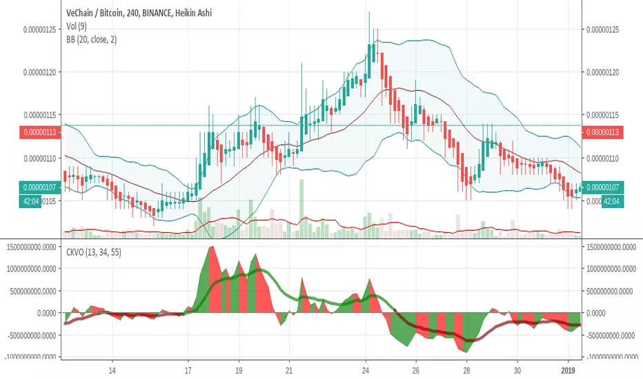
Colored Klinger Volume Oscillator (CKVO)This is a color enhanced version of Klinger Volume Oscillator. I specially designed this to get maximum profit from highly volatile coins. This indicator is based on volume.
xTrigger (the line) shows if trend is bullish or bearish. It is the average of the area. You can clearly see the trend.
xKVO (the area) shows how buy and sell orders change. It rises while buys are increasing against sells, decreases while sells are increasing against buys.
The color or the area provides buy and sell signals. Green: buy. Red: sell. Gray: Undecided.
Of course there are false signals. You should use other indicators to confirm them.
I like to use RSI and Bollinger Bands along with it to eliminate false signals. Also check for double bottom and top, etc.
Its wise to check the general direction of coin using a bigger time frame using Heikin Aishi. For example 1W Heikin Ashi if you are trading on 1D.
In addition to buy signals the most important indication is divergence with the price. Before a trend change 2 kinds of divergences happen
- Trend line moves reverse to the price line
- Are a tops moves revers to the price tops. For example while there is a higher price top, there is a lower area top. Then its time to escape.
Motivation
It is common to suffer from failures while trading highly profitable but volatile coins like NULLS, REP, DLT, LRC, MFT, HOT, OAX, KEY, etc.
- Traders sell too early to ensure a profit. Sell at 10% and it goes 200%
- Traders buy too early. Traders buy and it drops yet another 50%
- Wrong patience. The trader keeps the faith and waits for days for the glorious days. And nothing happens.
I believe with this indicator I am able to solve those problems most of the time.
Aggregated Volume BTCAggregates the Bitcoin volume from multiple exchanges into a single indicator.
# Exchanges and Pairs
Included are only exchanges supported by TradingView:
* Binance
* Bitstamp
* Bittrex
* Coinbase
* Gemini
* itBit
* Bitfinex
* Kraken
* Poloniex
* HitBTC
* OKCoin
* BitMEX
Excluded low volume exchanges (not in CMC Top):
* CEX.IO
* Coinfloor
Excluded low volume pairs (not in CMC Top):
* KRAKEN:XBTCAD, COINBASE:BTCUSDC, ITBIT:BTCEUR, ITBIT:BTCSGD, BITFINEX:BTCJPY, BITFINEX:BTCGBP, POLONIEX:BTCUSDC, OKCOIN:BTCUSD, OKCOIN:BTCCNY
Many other top exchanges are not included, because they are not supported by TradingView.
# Inputs
By default the spot exchanges are selected. You can select also the other margin trading and derivatives exchanges.
# Contribute
Feel free to share any ideas and issues you have.
# Open Source
The code is open source @ github.com and uses the commonpine library github.com

RSI / Stoch / SRSI / MFI / Aroon Overlay [SigmaDraconis]Combines 4 popular indicators (RSI, Stoch, SRSI, MFI) and 1 peculiar one (Aroon) in 1 for those who want to save indicators but not only.
This is an evolution of my (simpler) "RSI / Stoch / Stoch RSI (SRSI) Overlay " that you can find on my scripts.
Added bands for oversold/overbought areas (70/30 common for RSI and 80/20 for SRSI and MFI), as well as a middle 50 horizontal line.
Neutral bands around 55-45 added as well that can be hidden for less clutter. I also recommend a more transparent coloring for these since Pine script doesn't allow default transparency for horizontal lines.
By default only RSI and Stoch are activated, you can activate Aroon, MFI and SRSI on the inputs window.
Some extra notes:
* RSI, Stoch and MFI can help to strengthen one's decision as well as Aroon to predict a possible trend reversal, SRSI can show when RSI has high probability of being topped or bottomed when oversold/overbought but don't forget to look at volume and how the trend progresses that can keep SRSI above 80 or below 20 while RSI and price continues to trend, divergences are most helpful here to find possible reversal areas.
* This chart depicts some interesting divergences, as well as Stoch tops and bottoms and confluences between RSI/MFI and Stoch on some over-extended tops and bottoms that shown being good reversal zones.
RSI resistances are shown as well, failing to break above 60 or the neutral zone (this is a bearish BTC trend chart after all) or failing to gain support to break up certain levels (RSI notes a more bullish trend when consistently above 60 and more bearish below 40).
If you like it and use it to profit, please tip me below :)
Tip jars:
BTC: 15nMBiEGVrdGcu9C1h6QRcTNRvugHkqrMQ
ETH: 0xC33845946c48B61fBCbEA0367ec2238CaF2b73bc
BTS: sigma-draconis

CMYK RYTHM ◊ Introduction
This script makes use of a sliding matrix, to search the highest/lowest point in the slider, it then counts the amount of times it was high/low, giving the distance from a previous high/low.
Every High/low are granted values, being a lower value for shorted periods, and a larger value for Longer periods.
This reveals the different period lengths of active frequencies.
Doing this with different slider lenghts would result in measuring with different mean period lenghts.
◊ Origin
From my dream last night.
This is a part of Project XIAM.
◊ Theoretical Approach
Philosophy β :: Rythmic
Searching for the period lenght of several frequencys at once.
◊ Usage
This is an alalythical tool, to be used for Automatically adjusting settings on Indicators that presume a period length for calculation.
Calculations are based on Past values, and no reversal measures or fail-safes are applied, so it will only be useful during a continuation of trend.
◊ Features
Matrix Calculation of Lowest/Highest points in a sliding series with Steady Length.
In the future Several slider lenghts will be applied to search for Frequencies of different magnitudes.
Lenght between TOPS, DIPS , and an SMA that smoothens this.
BIAS Is TOP to DIP Minus DIP to TOP, to uncover Bullish/Bearish index of market movements.
◊ Community
CMYK :: discord.gg
AUTOVIEW :: discordapp.com
TRADINGVIEW UNOFFICIAL :: discord.gg
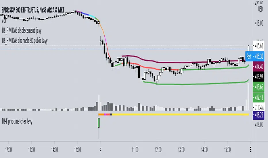
Topfinder Bottomfinder pivot matcher Midas- jayyMidas Technical Analysis: A VWAP Approach to Trading and Investing in Today’s Markets by
Andrew Coles, David G. Hawkins Copyright © 2011 by Andrew Coles and David G. Hawkins.
Appendix C: TradeStation Code for the MIDAS Topfinder/Bottomfinder Curves ported to tradingview
This code is used to assist in adjusting D volume to intersect pivot candle at a pivot candle when using this script: Top Bottom Finder Public version- Jayy found here:
The "n" number entered into the TB-F script is the topfinder/bottomfinder starting point or anchor
Be sure to enter the correct number in the "Topfinder bottomfinder initiation/anchor candle: 1 for CANDLE low - top finder, 2 for CANDLE high - bottom finder, 3 for CANDLE MIDPOINT (hl2) dialogue box
The location of the match point of the pivot candle is extremely important in the: "Match to PIVOT CANDLE: use 1 for CANDLE low, 2 for midtail of the candle below the BODY, 3 for candle BODY low, 4 for CANDLE HIGH, 5 for midpoint of candletail above body, 6 for candle BODY high". Do not
confuse body high with candle high. The body low will either be the candle open or close. The body high will be either the open or close.
If you expect a trend up the pivot candle is likely the low of the pivot candle ie 1 (2 and 3 are alternatives).
In a trend down the high of the pivot candle is often selected ie 4 (5 or 6 are alternatives)
If the candle body is aqua increase D volume if it is orange reduce D volume. Adjust iteratively until the candle body turns yellow. That will mean that the TB-F line passes through the pivot candle at the selected point.
Jayy
ElectroVanga v2.0The new free indicator "ElectroVanga 2.0" is better than my old indicator "ElectroVanga 1.0". Buy and sell signals.
Plots:
Red plot = hightrend
Lime plot = lowtrend
Blue plot = centertrend = (hightrend + lowtrend) / 2
Arrows:
Red arrow (down only) = market top = short entry (long exit)
Lime arrow (up only) = market bottom = long entry (short exit)
Blue arrow (up or down) = long or short entry (long or short exit) *
* If the blue arrow is against you, it is better to liquidate the position
Background:
Red background = more likely downtrend
Lime background = more likely uptrend
NA color background = 50/50
TimeFrames:
- 1D
- 1W
- 1MN
Hints:
A down arrow on a red background is a more reliable prediction than an down arrow on a lime background.
A up arrow on a lime background is a more reliable prediction than an up arrow on a red background.
The logic of this system
The price usually moves either in the upper zone (between the red plot and blue plot) or in the lower zone (between the lime plot and blue plot).
If the price is in the upper zone, then this is the uptrend. If the price is in the lower zone, then this is the downtrend.
If now the uptrend, then the red plot is the top of the market, and the blue plot is the bottom of the market.
If now the downtrend, then the blue plot is the top of the market, and the lime plot is the bottom of the market.

The Always Winning Holy Grail Strategy - Not (by ChartArt)How to win all the time if 1+1 = 2
The most upvoted strategies on Tradingview are those which seemingly work 100%, but they actually don't at all because they are repainting and would not work in live trading reality. They are using the multi-time-frame strategy testing bug and thereby trade during the backtest on close prices before the bar has closed in reality.
Top list of these cheating repainting strategies:
1569 upvotes ANN Strategy
877 upvotes Vdub FX SniperVX3 Strategy
481 upvotes Get Trend Strategy
I guess there are much more strategies among the top upvoted strategies on Tradingview which cheat with a multi-time-frame close price, but three examples are enough. The ANN Strategy uses the daily close price as multi-time-frame and cheats with that. The Vdub FX SniperVX3 Strategy uses the half-day (720 minute) close price to cheat and the Get Trend Strategy uses the 160 minute bar close for repaint cheating (at least here the author of this strategy explains that his strategy is only demo and would not work, which might be the reason why it has 1000 less upvotes than the ANN Strategy. I already wrote months ago a comment underneat these strategies to explain this issue but it hasn't stopped these strategies from getting more and more upvotes and staying in the top list.
I thought this way of cheating is lame, so I invented a new way to cheat my way to seemingly reach 100% profitable trades all the time by going long if 1+1 is equal to 2. Welcome to super wide stop losses. Simply use a extreme unrealistic large stop loss and take profit after a realistic amount of pips and according to Tradingview's current backtest module you win 100% all the time. Yay! :)
My recommendation for the Tradingview team is to add a function to let the user define a stop out and margin call level and maybe set a realistic setting as default, like 100%.
Please don't trade with this strategy!

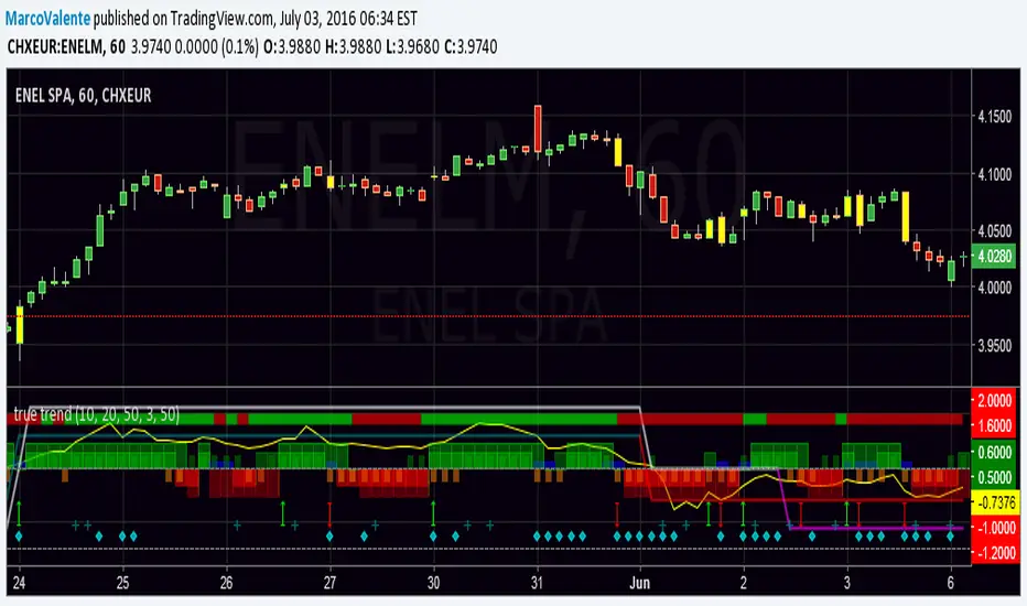
true trendEasy way to look at the Trend , but still accurate. Top bar is DI +, DI - , bars change in yellow when a swing happen, histogram show the increase/decrease of Min and Max and Open-Close; 2 lines moving between +1 and - 1 folloiwng 3 Ema crossing ; a Dot (diamond shape) appear on the botton when volatility increase and finally a " + " show when volume are much bigger the usually. Yellow line on top is Willams % and help us to find top and bottom of the market.
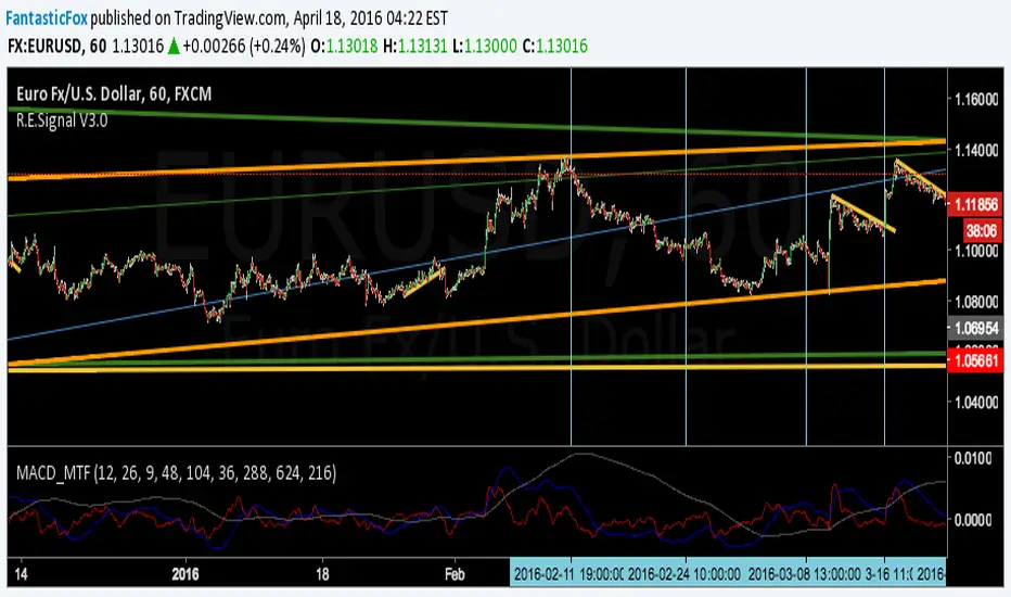
MACD MultiTimeFrame 1h4h1D [Fantastic Fox]Please insert the indicator into 1h time-frame, otherwise you need to change the lengths' inputs.
When there are tops for two of the MACDs and they are near and close* to each other, there is a big opportunity of a "Major Top" for the security, and vice versa for "Major Bottom".
This indicator can be used for tracing multi time-frame divergence. Also, it could help traders to identify the waves of Elliott Wave, and as a signal for confirmation of an impulse after a correction or retracement.
* They should be on top of each others head, not crossing each other. not necessarily touching, but not so far from each other.
EMA_ConvergenceFirst I have to give kudos to my son who I asked to take a shot at creating this little indicator. Nice work son!
While trading, one of the things I look for is when price or certain EMA's approach another EMA. The example that I use on this 1 minute SPY chart is an 8 EMA and 20 EMA. I am looking for when the 8 and 20 are within' 3 cents of each other. Many times when they are getting close, price is approaching a top or bottom. I am looking for a candlestick reversal around that area. You may want to know when PRICE is near the 50 EMA: Use EMA 1 and 50 for that. Having it light up on top of the page, or elsewhere, makes it easier to look for the convergence when it occurs. If it lights up for a long period, price may be going sideways. I don't enter into a trade until the EMA starts separating, usually with another candlestick formation.
You are able to change the distance for convergence and two EMA's. Unfortunately you will have to adjust the convergence number up as you increase in time frames. This is designed to see when they are close, not when they cross.
The bars on top of this example are lit up purple due to the 8 and 20 EMA are within' 3 cents of each other.
If you want to overlay the price bars, instead of having it separate, just change overlay to "true"
Enjoy.
SuperBands: Smart Pullback StrategyIndicator Name: SuperBands (Smart Pullback Strategy)
1. Core Concept (The Philosophy)
This indicator represents a smart fusion of two powerful trading methodologies: Trend Following and Mean Reversion. Instead of trying to predict market tops or bottoms, it focuses on joining an established trend at a "Discount Price."
In short: "Buy the dips in an Uptrend, and Sell the rallies in a Downtrend."
2. Technical Components
The indicator consists of two main engines working in harmony:
First: The Trend Filter (Supertrend):
Settings: (ATR 20 / Factor 6.0).
Function: Identifies the long-term market direction. The high Factor (6.0) is deliberately used to filter out noise and minor fluctuations, ensuring the trend direction only changes when there is a significant market shift.
Rule: If the line is Green, only Long trades are allowed. If Red, only Short trades are allowed.
Second: The Sniper (Bollinger Bands):
Settings: (Length 20 / StdDev 2.0).
Function: Identifies temporary Overbought and Oversold zones within the trend.
Rule: The Lower Band acts as a "Value Zone" for buying, while the Upper Band acts as a "Premium Zone" for selling.
3. Signal Logic (How it Works)
The indicator scans the market for specific, high-probability conditions:
A. Buy Signal (Green Triangle):
Appears only when both conditions are met:
Trend is Bullish: Supertrend is Green.
Price is "Cheap": Price drops to touch or break the Lower Bollinger Band.
Logic: The general trend is Up, and the price has pulled back to a dynamic support level. This is a buying opportunity.
B. Sell Signal (Red Triangle):
Appears only when both conditions are met:
Trend is Bearish: Supertrend is Red.
Price is "Expensive": Price rises to touch or break the Upper Bollinger Band.
Logic: The general trend is Down, and the price has rallied to a dynamic resistance level. This is a selling opportunity.
4. User Guide (How to Trade It)
To achieve the best results, consider the following approach when a signal appears:
A. Entry:
Enter the trade immediately upon the close of the candle where the triangle appears (or place a pending order slightly above/below the signal candle for confirmation).
B. Stop Loss (SL):
Conservative: Place the SL at the Supertrend line (if this line breaks, the trend is invalid).
Aggressive: Place the SL slightly below the signal candle's low or the most recent Swing Low.
C. Take Profit (TP):
Target 1: The Bollinger Bands Middle Line (Basis/SMA 20).
Target 2: The Opposite Band (Upper Band for Buy signals, Lower Band for Sell signals).
5. Key Strengths & Limitations
Main Advantage: This indicator prevents a common trader mistake: "FOMO" (Fear Of Missing Out). It stops you from buying at the top or selling at the bottom. It psychologically forces you to wait for the price to come to you.
Best Use Case: The wide Supertrend settings make this highly effective for Crypto and Volatile Stocks where trends are strong and pullbacks are deep.
Limitation: In tight, ranging markets (choppy markets), the price might not touch the bands often, or it might generate a signal followed by sideways movement.
Summary for the Trader:
This indicator tells you: "The trend is Up, but don't chase the price... wait for it to drop to the Lower Band, then strike."
اسم المؤشر: SuperBands (Smart Pullback Strategy)
1. الفكرة الأساسية (الفلسفة وراء المؤشر)
هذا المؤشر هو دمج ذكي بين استراتيجيتين شهيرتين: تتبع الاتجاه (Trend Following) و اقتناص الارتدادات (Mean Reversion). هو لا يحاول التنبؤ بقمة أو قاع السوق، بل يحاول الدخول مع الاتجاه العام القوي ولكن من "نقطة سعرية مخفضة" (Discount Price).
باختصار: "اشترِ الانخفاضات في الاتجاه الصاعد، وبع الارتفاعات في الاتجاه الهابط".
2. المكونات التقنية
يتكون المؤشر من جزأين رئيسيين يعملان كفريق واحد:
أولاً: الحارس (Supertrend):
الإعدادات: (ATR 20 / Factor 6.0).
الوظيفة: تحديد الاتجاه العام "طويل المدى". استخدام العامل 6.0 (وهو رقم كبير) يجعل المؤشر يتجاهل التذبذبات الصغيرة ولا يغير لونه إلا إذا تغير الاتجاه الحقيقي للسوق بقوة.
القاعدة: إذا كان الخط أخضر، يُسمح بالشراء فقط. إذا كان أحمر، يُسمح بالبيع فقط.
ثانياً: القناص (Bollinger Bands):
الإعدادات: (Length 20 / StdDev 2.0).
الوظيفة: تحديد مناطق ذروة البيع والشراء المؤقتة (Overbought/Oversold) داخل الاتجاه.
القاعدة: الحد السفلي يعتبر منطقة "رخيصة" للشراء، والحد العلوي منطقة "غالية" للبيع.
3. كيف تتكون الإشارة (آلية العمل)
يقوم المؤشر بمسح السوق بحثاً عن شروط محددة بدقة:
A. إشارة الشراء (المثلث الأخضر):
تظهر فقط عند تحقق الشرطين معاً:
الاتجاه صاعد: السوبر تريند لونه أخضر.
سعر مغري: السعر هبط ليلامس أو يكسر الحد السفلي للبولنجر باند (Lower Band).
المنطق: الاتجاه العام صاعد، والسعر قام بعمل تصحيح (Pullback) لمستوى دعم ديناميكي، إذن هي فرصة للشراء بسعر أفضل.
B. إشارة البيع (المثلث الأحمر):
تظهر فقط عند تحقق الشرطين معاً:
الاتجاه هابط: السوبر تريند لونه أحمر.
سعر مرتفع: السعر صعد ليلامس أو يخترق الحد العلوي للبولنجر باند (Upper Band).
المنطق: الاتجاه العام هابط، والسعر قام بعمل تصحيح صعودي لمقاومة ديناميكية، إذن هي فرصة للبيع من مكان مرتفع.
4. كيفية الاستفادة منه (دليل المستخدم)
لتحقيق أفضل نتائج، يُنصح باتباع الخطوات التالية عند ظهور الإشارة:
أ. نقاط الدخول (Entry):
ادخل الصفقة بمجرد إغلاق الشمعة التي ظهر عليها المثلث (أو ضع أمر معلق فوق/تحت الشمعة لتأكيد الحركة).
ب. وقف الخسارة (Stop Loss):
الخيار الآمن: ضع الوقف عند خط السوبر تريند (لأنه إذا كُسر الخط، يعني أن الاتجاه تغير).
الخيار المغامر: ضع الوقف أسفل قاع الشمعة السابقة بمسافة بسيطة، أو أسفل آخر قاع (Swing Low).
ج. جني الأرباح (Take Profit):
الهدف الأول: خط المنتصف للبولنجر باند (الخط البرتقالي الخفي أو متوسط 20).
الهدف الثاني: الحد المعاكس للبولنجر باند (الحد العلوي في حالة الشراء، والسفلي في حالة البيع).
5. مميزات وعيوب يجب الانتباه لها
الميزة القوية: يمنعك هذا المؤشر من ارتكاب خطأ شائع وهو "الشراء في القمة" أو "البيع في القاع". هو يجبرك نفسياً على انتظار السعر ليأتي إليك في مناطق التصحيح.
نقطة القوة: إعدادات السوبر تريند (6.0) تجعل الإشارات قوية جداً في العملات الرقمية (Crypto) والأسهم ذات الاتجاه الواضح (Trending Markets).
نقطة الضعف: في الأسواق العرضية المملة (Ranging Markets) ذات النطاق الضيق جداً، قد لا تلمس الأسعار حدود البولنجر كثيراً، أو قد يعطي إشارات دخول والسوق لا يتحرك بعدها بقوة.
ملخص للمتداول:
هذا المؤشر يقول لك: "السوق صاعد، لكن لا تطارد السعر.. انتظر حتى يهبط السعر إليك عند الخط السفلي ثم اشترِ".

Risk & Lot Calculator PanelFXMANS Risk & Lot Panel
Smart Risk Management Tool for TradingView
- Overview
FXMANS Risk & Lot Panel is a lightweight and professional risk management tool designed to help traders calculate position size (lot) and take-profit levels directly on the chart, without cluttering the screen.
The panel is displayed as a minimal table in the top-right corner of the chart and automatically adapts to the currently opened symbol.
This tool focuses on clarity, precision, and usability, making it suitable for scalpers, day traders, and swing traders.
- Key Features
Automatic Direction Detection
The script can automatically determine BUY or SELL direction based on:
Entry Price
Stop Loss Price
Logic:
Stop Loss below Entry → BUY
Stop Loss above Entry → SELL
Manual override is available if auto direction is disabled.
Risk-Based Lot Size Calculation
Calculates position size based on:
User-defined risk amount in USD
Distance between Entry and Stop Loss
Symbol-specific tick size and point value
Ensures consistent risk management across all markets.
Automatic Take Profit (RR Based)
Take Profit is calculated automatically using a predefined Risk / Reward (RR) ratio.
Supports both BUY and SELL scenarios.
- Symbol-Aware Calculation
Uses TradingView’s built-in symbol properties:
syminfo.mintick
syminfo.pointvalue
Works correctly on:
Forex
Indices
Metals
Crypto
- Minimal & Non-Intrusive UI
Small, fixed panel located at the top-right corner
Designed to avoid covering price action
Clean FXMANS-style color palette
- Safe Panel Size Control
Panel size can be adjusted from settings:
Small
Medium
Large
Size changes are handled without modifying layout geometry, preventing UI bugs.
- How It Works
Enter your Entry Price and Stop Loss Price
Define your Risk Amount ($)
Set your desired Risk / Reward ratio
The script automatically calculates:
Trade Direction (BUY / SELL)
Lot Size
Take Profit Level
All results are displayed instantly in the panel
- Example Use Case
Risk: $100
Entry: 1.0850
Stop Loss: 1.0800
RR: 2.0
- The panel will automatically display:
Direction: BUY
Lot Size adjusted to risk exactly $100
Take Profit at 2R
- Important Notes
Entry and Stop Loss prices must be valid (greater than zero).
The tool does not place trades automatically.
Calculations are for position sizing only and may vary slightly depending on broker specifications.
- Disclaimer
This script is intended for educational and analytical purposes only.
Trading involves risk, and users are responsible for their own trading decisions.
- Ideal For
Traders who follow strict risk management rules
Forex, crypto, and index traders
Scalpers and intraday traders
Anyone who wants clean and fast position sizing on TradingView

Stock ScreenerMissing great trade opportunities is annoying, and unless you have 12 screens or only trade one market, you are missing a lot of trades. To fix that, we created this stock screener so you get notified instantly of potential great trading conditions in real time, right on your chart.
You get notified of trading benchmarks being met by the value being displayed on the scanner as well as a color change so that it grabs your attention and makes you aware that you should take a look at the other market and look for a potential trade. It also has built in alerts so you can have an alert notification go off when any of your trading conditions are met instead of needing to watch the scanner for color changes.
The screener will change the ticker symbol background color to red green when price is above or below the previous daily range and above or below both VWAPs. This signals that the ticker is trending, which typically means it is a great time to trade that market and follow the trend.
This stock screener allows you to scan up to 10 different markets at the same time for various different conditions so you always know what is going on with your favorite trading symbols. If you want to scan more tickers, just add the indicator to your chart again and change the table position to the other side of the screen and update the tickers on the 2nd screener, allowing you to have 20 tickers at a time.
The scanner can be fully customized by changing the markets that it screens and turning on or off as many of them as you would like. You can also turn on or off any of the different data sets so that you only get information about trading conditions that matter to you.
The screener can provide data on any type of market, such as stocks, crypto, futures, forex and more. Each ticker can be adjusted to whatever market you would like it to scan for data in the settings panel, the only limitation is that it will not provide data for the VWAP and volume trend score if the ticker you are screening does not provide volume data.
Screener Features
The scanner will provide the following types of data for each ticker that is turned on:
Volume - Provides a volume score compared to the average volume and notifies you of higher than normal volume and volume spikes on individual bars by changing colors.
Volatility - Provides a volatility score compared to the average volatility and notifies you of higher than normal volatility by changing colors.
Oscillator - Choose between the RSI or CCI. The value of that oscillator will be displayed and will notify you when values are in extreme ranges such as overbought or oversold conditions according to the threshold values you enter in the settings panel. When those thresholds have been breached, you will be notified by it changing color.
Big Candles - Compares the current candle to average previous candle sizes, and changes color to notify you of big candles including a big top wick, big bottom wick, big candle body and big candle high to low range.
Daily Level Touches & Trends - Calculates and displays various daily candle and intraday open price levels that act as support and resistance. Notifies you when price is touching any of the daily levels that are turned on. The levels you can have on are as follows: previous day high, previous day low or previous day open. It also will notify you when price is touching the current day’s open, NY 930am open, Asia 8pm open, London 2am open and NY midnight 12am open. It will also say “Above” if price is above the previous day’s high or it will say “Below” if price is below the previous day’s low. The color of the cell will also change when a level touch is happening or price is above the previous day high or below the previous day low.
VWAP - Choose from 2 different VWAP lengths, default settings are daily and weekly VWAPs. You will get notified if price touches either of the VWAPs and they will also say “Above” or “Below” if price is currently above or below each VWAP.
How To Use The Screener To Help You Trade
The main purpose of the screener is to scan other markets and notify you of potential good trading opportunities such as price bouncing off of the daily levels or VWAPs. It can also be used to know when price is trending according to the VWAPs and daily levels. Lastly, you can use it to know how the volume and volatility trends are currently which gives you more confidence in taking a trade with this data when volume and volatility are present.
Volume Score
When volume is high, this represents a good time to trade because there are many market participants and price is likely to be volatile while there is high volume which can present a lot of good trade setups for you to take.
The volume score shown on the screener measures the current volume trend compared to previous volume trends and calculates that into a score based on 100 being the same as the previous volume trend. So any value above 100 means it is high volume and any value less than 100 means it is lower volume than normal.
In the settings panel, you can adjust the volume threshold that needs to be met for a volume notification to show up. The default setting is at 120, so you will get notified when the current volume trend score is 120 or higher or you can adjust that threshold value to whatever value you prefer.
It also will notify you when there is a volume spike on the current bar. This is determined by calculating an average of the recent volume totals and then checking to see if the current bar is greater than or equal to that average multiplied by 3. So if a single bar has volume that is greater than 3 times what the average volume is, then you will get a notification that says “Spike” to make you aware of that volume spike.
The volume trend threshold, volume spike multiplier and lookback length for the average volume used in volume spike calculations can all be adjusted in the settings panel to fit your desired preferences.
Volatility Score
High volatility can mean it is a great time to trade because the market is moving quickly and providing large enough movements that you can get in and out in a short amount of time, while still accruing decent sized trade PnL.
The volatility score will calculate the current volatility for each market compared to previous conditions and then divide the current volatility by the average volatility to give you a volatility score. Anything over 100 means the market is decently volatile and you should look at that market to find potential trade setups to execute on. Anything below 100 means the market is not very volatile and it is usually best to just wait until volatility returns before you start trading again.
The screener will notify you when the volatility score is above the threshold you set. The default value is set to 90, but can be adjusted to your preference. Pay attention to any market that shows an alert and take a look at that chart because the high volatility may present a good trade setup for you in the near future.
Oscillator Score
The oscillator data can be switched between Relative Strength Index(RSI) and Commodity Channel Index(CCI).
The RSI provides a value between 0 and 100 that indicates the momentum and strength of the recent price action. Many traders use the extremes of the 0-100 range to signal overbought or oversold conditions and use that as a sign to look for price to reverse in the near future. The typical values used for this and the default settings to provide notifications are: 70 for overbought and 30 for oversold. The scanner will notify you when the RSI value is considered overbought or oversold so you know to take a look at the chart and analyze if it is ready for a trade to be taken.
The CCI provides a value that can be used to determine the trend strength of the underlying asset when the oscillator moves above 100 or below -100. These extreme values are outside of the normal accumulation range and signify that price is moving strongly in that direction so it may be a good time to take a trade in the direction of the trend. The scanner will show you the value of the CCI for each market and notify you if that value is above 100 or below -100.
Both RSI and CCI settings can be adjusted in the settings panel to your desired settings so you have the exact oscillator settings you prefer to use as well as the exact values that you want to use for being notified.
Big Candles
Big candles can mean that many traders are buying or selling at the same time and many times indicate a good signal to trade in that same direction. That is why we included this calculation in the screener, so you are always aware when a large candle prints.
It calculates the average size of the recent candles and then uses that average as the benchmark to determine if the current candle is considered big and worthy of notifying you to take a look at that chart.
You can adjust the multiplier used for the big candle threshold to whatever you desire, but the default setting is 3 which means the candle will be considered big and notify you if it is 3 times as large as an average candle.
The big candles data will track the following candle values and notify you with these labels:
High to Low candle size = HL
Candle Body from open to close candle size = OC
Top Wick size = TW
Bottom Wick size = BW
Daily Level Touches & Trend
Daily level touches are excellent levels to watch for price to bounce because they often act as support and resistance levels for intraday trading. The scanner will track each market and notify you when the current candle is touching any of the daily levels that you have turned on in the settings panel.
The main levels that are turned on by default and are useful for all markets and how they will be labeled on the scanner are as follows:
Previous Day High = High
Previous Day Low = Low
Previous Day Open = < Open
Previous Day Close = Close
Current Day Open = Open
We also included some extra levels that are useful for futures traders. They are as follows:
NY 930am Open = 930am
NY 12am Midnight Open = 12am
Asia Open at 8pm NY time = Asia
London Open at 2am NY Time = London
Watch how price reacts to these levels and then trade the bounces off of these levels if the price action confirms that it is going to respect that level.
When price is currently above the previous day high, the scanner will say “Above” and show a green color, indicating a bullish trend and that price is above the previous daily candle’s high.
When price is currently below the previous day low, the scanner will say “Below” and show a red color, indicating a bearish trend and that price is below the previous daily candle’s low.
Pay attention to when price is trending above or below the previous daily candle as those trends can provide excellent trend trading opportunities.
The daily levels that you have turned on in the settings will also show as lines on the chart and include a label next to them, identifying each level so you know what each line represents. You can turn on or off all of the lines shown on the chart in the main settings or turn them off one by one in the style panel of the settings. Labels can also be turned on or off for all of the lines in the main settings panel. You can adjust the label positioning in the Label Offset section of the settings panel.
VWAP Touches & Trend
VWAP stands for volume weighted average price and is a very popular tool that traders use to determine trend direction based on volume as well as an excellent level to trade price bounces off of.
The typical VWAP time period used is Daily, which means the volume weighted average price will reset at the beginning of a new day. We set the first VWAP to be the daily VWAP by default and the second one to be the weekly VWAP. You can adjust both of the time periods to be any of the provided time lengths that you choose.
The screener will show “Above” with a green background color when price is above the VWAP, indicating a bullish trend. It will show “Below” with a red background color when price is below the VWAP, indicating a bearish trend. When both VWAPs are showing Above or Below, you can expect price to trend in that direction, so look for pullbacks you can trade in the direction of the trend. If the VWAPs are showing different directions, then you should expect to bounce back and forth between the VWAPs, but be careful and watch out for price to break beyond either one and start a trend.
When the current candle is touching the VWAP, the scanner will change colors and say VWAP to notify you that price is touching the VWAP and you should look at that chart and analyze the market for a potential bounce off of the VWAP to trade.
Trending Market Signals
Strong trends are excellent markets to trade and can many times provide excellent trading opportunities that don’t require expert price action reading skills to be able to take winning trades from. That is why we included a signal to notify you of a strong trending market.
The strong trending market will show up as a green or red background color for the ticker name. If the color of the ticker name is green, it is notifying you that the price is above the previous daily high, above VWAP 1 and above VWAP 2 and is a good market to look for bullish trend trades. If the color of the ticker name is red, it is notifying you that the price is below the previous daily low, below VWAP 1 and below VWAP 2 and is a good market to look for bearish trend trades.
Changing The Tickers It Scans
To change the tickers that the indicator scans, scroll near the bottom of the settings panel and select the ticker symbol you want to update and then search for the exact symbol you want to use. If you want to scan less tickers, then just turn some of the tickers off that you don’t need.
Scanning More Than 10 Tickers
If you want to scan more than 10 tickers, you can add the scanner to your chart again and then just change the table position to the other side of the screen. This will allow you to scan 10 more tickers that will show up separately. Then if you want even more, just add the indicator to your chart again and update the table position until you have as many markets as you want. The table position setting can be found at the bottom of the main settings panel.
Alerts
The screener has alerts that can be used to notify you when any of the data set thresholds have been met or if price is touching one of the levels. You can set alerts for the following events:
Bullish Trend Alert - Price is above the previous daily high and above both VWAPs.
Bearish Trend Alert - Price is below the previous daily low and below both VWAPs.
High Volume Alert - Volume is higher than the threshold or a volume spike is detected.
High Volatility Alert - Volatility is higher than the threshold.
Oscillator Is Extended Alert - Oscillator value has exceeded the upper or lower threshold.
Big Candle Alert - A big candle has been detected.
Daily Level Touch Alert - One of the daily levels that is turned on is being touched.
VWAP Touch Alert - One of the 2 VWAPs are being touched.
An alert will trigger when any one of tickers on your scanner meets the alert conditions, so when you see the alert, you will need to go to your chart and look at the scanner to see which ticker it was and then navigate to that chart to look for potential trade setups.
The alerts will use the exact same settings you have configured in the settings panel to send you alert notifications. With normal settings, this could give you a lot of alerts, so if you only want alerts to fire when abnormal conditions are being met, try setting up a second screener on your chart that has very high threshold values and only has the most important level touches on. Then turn the setting "Do Not Show The Screener On The Chart" to off so the calculations will still run and fire alerts, but won't clog up your charts. This way you can only get alert notifications when major events happen but still have your normal screener settings available on your chart.
Markets This Can Be Used On
This screener uses the price action and volume data so you can use it to scan any type of market you would like as long as the ticker you are scanning has price and volume data feeds. If a market does not have volume data, then it will just show NaN in the volume row and the VWAP rows will not show anything.

PSAR Laboratory [DAFE]PSAR Laboratory : The Ultimate Adaptive Trailing Stop & Reversal Engine
23 Advanced Algorithms. Adaptive Acceleration. Smart Flip Logic. Parabolic SAR Reimagined.
█ PHILOSOPHY: WELCOME TO THE LABORATORY
The standard Parabolic SAR, created by the legendary J. Welles Wilder Jr., is a tool of beautiful simplicity. But in today's complex, algorithm-driven markets, its simplicity is its fatal flaw. Its fixed acceleration and rigid flip logic cause it to fail precisely when you need it most: it whipsaws in choppy conditions and gives back too much profit in strong trends.
The PSAR Laboratory was not created to be just another PSAR. It was engineered to be the definitive evolution of Wilder's original concept. This is not an indicator; it is a powerful, interactive research environment. It is a sandbox where you, the trader, can move beyond the static "one-size-fits-all" approach and forge a PSAR that is perfectly adapted to your specific market, timeframe, and trading style.
We have deconstructed the very DNA of the Parabolic SAR and rebuilt it from the ground up, infusing it with modern quantitative techniques. The result is an institutional-grade suite of 23 distinct, mathematically diverse algorithms that dynamically control every aspect of the PSAR's behavior.
█ WHAT MAKES THIS A "LABORATORY"? THE CORE INNOVATIONS
This tool stands in a class of its own. It is a collection of what could be 23 separate indicators, all seamlessly integrated into one powerful engine.
The 23 Algorithm Engine: This is the heart of the Laboratory. Instead of one rigid formula, you have a library of 23 unique mathematical engines at your command. These algorithms are not simple tweaks; they are complete re-imaginings of how the PSAR should behave, based on concepts from information theory, digital signal processing, fractal geometry, and institutional analysis.
Truly Adaptive Acceleration (AF): The standard PSAR's "gas pedal" (the AF) is dumb; it accelerates at a fixed rate. Our algorithms make it intelligent. The AF can now speed up in clean, trending environments to lock in profits, and automatically slow down in choppy, chaotic conditions to avoid whipsaws.
Advanced Flip Confirmation Logic: Say goodbye to noise-driven flips. You are no longer at the mercy of a single wick touching the SAR. The Laboratory provides multiple layers of flip confirmation, including requiring a bar close beyond the SAR, a volume spike to validate the reversal, or even a multi-bar confirmation .
Comprehensive Noise Filtering Core: In a revolutionary step, you can apply one of over 30 advanced signal processing filters directly to the SAR output itself. From ultra-low-lag filters like the Hull MA and DAFE Spectral Laguerre to adaptive filters like KAMA and FRAMA , you can surgically remove noise while preserving the responsiveness of the core signal.
Integrated Performance Engine: How do you know which of the 23 algorithms is best for your market? You test it. The built-in Performance Dashboard is a comprehensive backtesting and analytics engine that tracks every trade, providing real-time data on Win Rate, Profit Factor, Max Drawdown, and more. It allows you to scientifically validate your chosen configuration.
█ A GUIDED TOUR OF THE ALGORITHMS: 23 PATHS TO AN EDGE
b]These 23 algorithms are not simple settings; they are distinct mathematical philosophies for how a Parabolic SAR should adapt to the market. They are grouped into three primary categories: those that adapt the Acceleration Factor (AF) , those that enhance the Extreme Point (EP) detection, and those that redefine the Flip Logic .
CATEGORY A: ACCELERATION FACTOR (AF) ADAPTATION
These algorithms dynamically change the "gas pedal" of the PSAR.
1. Volatility-Scaled AF
Core Concept: Treats volatility as market friction. The PSAR should be more forgiving in high-volatility environments.
How It Works: It calculates a Volatility Ratio by comparing the short-term ATR to the long-term ATR. If current volatility is high (ratio > 1), it reduces the AF Step. If volatility is low (ratio < 1), it increases the AF Step to trail tighter.
Ideal Use Case: The best all-rounder. Excellent for any market, especially those with clear shifts between high and low volatility regimes (like indices and crypto).
2. Efficiency Ratio (ER) AF
Core Concept: The PSAR should accelerate aggressively in clean, efficient trends and slow down dramatically in choppy, inefficient markets.
How It Works: It uses Kaufman's Efficiency Ratio (ER), which measures the net directional movement versus the total price movement. A high ER (near 1.0) signifies a pure trend, triggering a high AF multiplier. A low ER (near 0.0) signifies chop, triggering a low AF multiplier.
Ideal Use Case: Markets that alternate between strong trends and sideways chop. It is exceptionally good at surviving ranging periods.
3. Shannon Entropy AF
Core Concept: Uses Information Theory to measure market disorder. The PSAR should be conservative in chaos and aggressive in order.
How It Works: It calculates the Shannon Entropy of recent price changes. High entropy means the market is unpredictable ("chaotic"), causing the AF to slow down. Low entropy means the market is organized and trending, causing the AF to speed up.
Ideal Use Case: Advanced traders looking for a mathematically pure way to distinguish between a tradable trend and random noise.
4. Fractal Dimension (FD) AF
Core Concept: Measures the "jaggedness" or complexity of the price path. A smooth path is a trend; a jagged, space-filling path is chop.
How It Works: It calculates the Fractal Dimension of the price series. An FD near 1.0 is a smooth line (high AF). An FD near 1.5 is a random walk (low AF).
Ideal Use Case: Visually identifying the moment a smooth trend begins to break down into chaotic, unpredictable movement.
5. ADX-Gated AF
Core Concept: Uses the classic ADX indicator to confirm the presence of a trend before allowing the PSAR to accelerate.
How It Works: If the ADX value is above a "Strong" threshold (e.g., 25), the AF accelerates normally. If the ADX is below a "Weak" threshold (e.g., 15), the AF is "frozen" and will not increase, preventing the SAR from tightening up in a non-trending market.
Ideal Use Case: For classic trend-following purists who trust the ADX as their primary regime filter.
6. Kalman AF Estimator
Core Concept: A sophisticated signal processing algorithm that predicts the "true" optimal AF by filtering out price "noise."
How It Works: It treats the PSAR's AF as a state to be estimated. It makes a prediction, then corrects it based on how far the actual price deviates. It's like a GPS constantly refining its position. The "Process Noise" input controls how fast it thinks the AF can change, while "Measurement Noise" controls how much it trusts the price data.
Ideal Use Case: Smooth, high-inertia markets like commodities or major forex pairs. It creates an incredibly smooth and responsive AF.
7. Volume-Momentum AF
Core Concept: A trend's acceleration is only valid if confirmed by both volume and price momentum.
How It Works: The AF will only increase if a new Extreme Point is made on above-average volume AND the Rate of Change (ROC) of the price is aligned with the trend's direction.
Ideal Use Case: Any market with reliable volume data (stocks, futures, crypto). It's excellent for filtering out low-conviction moves.
8. Garman-Klass (GK) AF
Core Concept: Uses a more advanced, statistically efficient measure of volatility (Garman-Klass, which uses OHLC data) to adapt the AF.
How It Works: It modulates the AF based on whether the current GK volatility is higher or lower than its historical average. Unlike the standard Volatility-Scaled algo, it tends to slow down more in high volatility and speed up less in low volatility, making it more conservative.
Ideal Use Case: Traders who want a volatility-adaptive model that is more focused on risk reduction during volatile periods.
9. RSI-Modulated AF
Core Concept: The RSI can identify points of potential trend exhaustion or strong momentum.
How It Works: If a trend is bullish but the RSI enters the "Overbought" zone, the AF slows down, anticipating a pullback. Conversely, if the RSI is in the strong momentum mid-range (40-60), the AF is boosted to trail more aggressively.
Ideal Use Case: Mean-reversion traders or those who want to automatically loosen their trail stop near potential exhaustion points.
10. Bollinger Squeeze AF
Core Concept: A Bollinger Band Squeeze signals a period of volatility compression, often preceding an explosive breakout.
How It Works: When the algorithm detects that the Bollinger Band Width is in a "Squeeze" (below a certain historical percentile), it boosts the AF in anticipation of a fast move, allowing the PSAR to catch the breakout quickly.
Ideal Use Case: Breakout traders. This algorithm primes the PSAR to be maximally responsive right at the moment a breakout is most likely.
11. Keltner Adaptive AF
Core Concept: Keltner Channels provide a robust measure of a trend's "normal" volatility channel.
How It Works: When price is trading strongly outside the Keltner Channel, it's considered a powerful trend, and the AF is boosted. When price falls back inside the channel, it's considered a consolidation or pullback, and the AF is slowed down.
Ideal Use Case: Trend followers who use channel breakouts as their primary confirmation.
12. Choppiness-Gated AF
Core Concept: Uses the Choppiness Index to quantify whether the market is trending or consolidating.
How It Works: If the Choppiness Index is below the "Trend" threshold (e.g., 38.2), the AF is boosted. If it's above the "Range" threshold (e.g., 61.8), the AF is significantly reduced.
Ideal Use Case: A more responsive alternative to the ADX-Gated algorithm for distinguishing between trending and ranging markets.
13. VIDYA-Style AF
Core Concept: Uses a Chande Momentum Oscillator (CMO) to create a variable-speed acceleration factor.
How It Works: The absolute value of the CMO is used to create a dynamic smoothing constant. Strong momentum (high absolute CMO) results in a faster, more responsive AF. Weak momentum results in a slower, smoother AF.
Ideal Use Case: Momentum traders who want their trailing stop's speed directly tied to the momentum of the price itself.
14. Hilbert Cycle AF
Core Concept: Uses Ehlers' Hilbert Transform to extract the dominant cycle period of the market and synchronizes the PSAR with it.
How It Works: It dynamically adjusts the AF based on the detected cycle period (shorter cycles = faster AF) and can also modulate it based on the current phase within that cycle (e.g., accelerate faster near cycle tops/bottoms).
Ideal Use Case: Markets with clear cyclical behavior, like commodities and some forex pairs.
CATEGORY B: EXTREME POINT (EP) ENHANCEMENT
These algorithms make the detection of new highs/lows more intelligent.
15. Volume-Weighted EP
Core Concept: A new high or low is more significant if it occurs on high volume.
How It Works: It can be configured to only accept a new EP if the volume on that bar is above average. It can also "weight" the EP by volume, pushing it further out on high-volume bars.
Ideal Use Case: Filtering out weak, low-conviction price probes in markets with reliable volume.
16. Wavelet Filtered EP
Core Concept: Uses wavelet decomposition (a signal processing technique) to separate the underlying trend from high-frequency noise.
How It Works: It calculates a smoothed, wavelet-filtered version of the price. A new EP is only registered if the actual high/low significantly exceeds this smoothed baseline, effectively ignoring minor noise spikes.
Ideal Use Case: Noisy markets where small, insignificant wicks can cause the AF to accelerate prematurely.
17. ATR-Validated EP
Core Concept: A new EP should represent a meaningful move, not just a one-tick poke.
How It Works: It requires a new high/low to exceed the previous EP by a minimum amount, defined as a multiple of the current ATR. This ensures only volatility-significant advances are counted.
Ideal Use Case: A simple, robust way to filter out "noise" EPs and slow down the AF's acceleration in choppy conditions.
18. Statistical EP Filter
Core Concept: A new EP is only valid if the price change that created it is statistically significant.
How It Works: It calculates the Z-Score of the bar's price change relative to recent history. A new EP is only accepted if its Z-Score exceeds a certain threshold (e.g., 1.5 sigma), meaning it was an unusually strong move.
Ideal Use Case: For quantitative traders who want to ensure their trailing stop only tightens in response to statistically meaningful price action.
CATEGORY C: FLIP LOGIC & CONFIRMATION
These algorithms change the very rules of when and why the PSAR reverses.
19. Dual-PSAR Gate
Core Concept: Uses two PSARs—one fast and one slow—to confirm a reversal.
How It Works: A flip signal for the main PSAR is only considered valid if both the fast (sensitive) PSAR and the slow (structural) PSAR have flipped. This acts as a powerful trend filter.
Ideal Use Case: An excellent method for reducing whipsaws. It forces the PSAR to wait for both short-term and longer-term momentum to align before signaling a reversal.
20. MTF Coherence PSAR
Core Concept: Do not flip against the higher timeframe macro trend.
How It Works: It pulls PSAR data from two higher timeframes. A flip is only allowed if the new direction does not contradict the trend on at least one (or both) of those higher timeframes. It also boosts the AF when all timeframes are aligned.
Ideal Use Case: The ultimate tool for multi-timeframe traders who want to ensure their entries and exits are in sync with the bigger picture.
21. Momentum-Gated Flip
Core Concept: A reversal is only valid if it is supported by a significant surge of momentum.
How It Works: A price cross of the SAR is not enough. The script also requires the Rate of Change (ROC) to exceed a certain threshold for a set number of bars, confirming that there is real force behind the reversal.
Ideal Use Case: Filtering out weak, drifting reversals and only taking signals that are initiated with explosive power.
22. Close-Only PSAR
Core Concept: Wicks are noise; the bar's close is the final decision.
How It Works: This algorithm modifies the flip logic to ignore wicks. A flip only occurs if one or more bars close beyond the SAR line.
Ideal Use Case: One of the most effective and simple ways to reduce false signals from volatile wicks. A fantastic default choice for any trader.
23. Ultimate PSAR Consensus
Core Concept: The highest conviction signal comes from the agreement of multiple, diverse mathematical models.
How It Works: This is the capstone algorithm. It runs a "vote" between a selection of the top-performing algorithms (e.g., Volatility-Scaled, Efficiency Ratio, Dual-PSAR). A flip is only signaled if a majority consensus is reached. It can even weight the votes based on each algorithm's recent performance.
Ideal Use Case: For traders who want the absolute highest level of confirmation and are willing to accept fewer, but more robust, signals.
█ PART II: THE NOISE FILTERING CORE - The Shield
This is a revolutionary feature that allows you to apply a second layer of signal processing directly to the SAR line itself, surgically removing noise before the flip logic is even considered.
FILTER CATEGORIES
Basic Filters (SMA, EMA, WMA, RMA): The classic moving averages. They provide basic smoothing but introduce significant lag. Best used for educational purposes.
Low-Lag Filters (DEMA, TEMA, Hull MA, ZLEMA): A family of filters designed to reduce the lag inherent in basic moving averages. The Hull MA is a standout, offering a superb balance of smoothness and responsiveness.
Adaptive Filters (KAMA, VIDYA, FRAMA): These are "smart" filters. They automatically adjust their smoothing level based on market conditions. They will be very smooth in choppy markets and become highly responsive in trending markets.
Advanced DSP & DAFE Filters: This is the pinnacle of signal processing.
Ehlers Filters (SuperSmoother, 2-Pole, 3-Pole): Based on the work of John Ehlers, these use digital signal processing techniques to remove high-frequency noise with minimal lag.
Gaussian & ALMA: These use a bell-curve weighting, giving the most importance to recent data in a smooth, non-linear fashion.
DAFE Spectral Laguerre: A proprietary, non-linear filter that uses a feedback loop and adapts its "gamma" based on volatility, providing exceptional tracking in all market conditions.
How to Choose a Filter
Start with "None": First, find an algorithm you like with no filtering to understand its raw behavior.
Introduce Low Lag: If you are getting too many whipsaws from noise, apply a short-length Hull MA (e.g., 5-8). This is often the best solution.
Go Adaptive: If your market has very distinct trend/chop regimes, try an Adaptive KAMA .
Maximum Purity: For the smoothest possible output with excellent responsiveness, use the DAFE Spectral Laguerre or Ehlers SuperSmoother .
█ THE VISUAL EXPERIENCE: DATA AS ART
The PSAR Laboratory is not just functional; it is beautiful. The visualization engine is designed to provide you with an intuitive, at-a-glance understanding of the market's state.
Algorithm-Specific Theming: Each of the 23 algorithms comes with its own unique, professionally designed color palette. This not only provides visual variety but allows you to instantly recognize which engine is active.
Dynamic Glow Effects: For many algorithms, the PSAR dots will emit a soft "glow." The brightness and color of this glow are not random; they are tied to a key metric of the active algorithm (e.g., trend strength, volatility, consensus), providing a subtle, visual cue about the health of the trend.
Adaptive Volatility Bands: Certain algorithms will display dynamic bands around the PSAR. These are not standard deviation bands; their width is controlled by the specific logic of the active algorithm, showing you a visual representation of the market's expected range or energy level.
Secondary Reference Lines: For algorithms like the Dual-PSAR or MTF Coherence, a secondary line will be plotted on the chart, giving you a clear visual of the underlying data (e.g., the slow PSAR, the HTF trend) that is driving the decision-making process.
█ THE MASTER DASHBOARD: YOUR MISSION CONTROL
The comprehensive dashboard is your unified command center for analysis and performance tracking.
Engine Status: See the currently selected Algorithm, the active Noise Filter, the Trend direction, and a real-time progress bar of the current Acceleration Factor (AF).
Algorithm-Specific Metrics: This is the most powerful section. It displays the key real-time data from the currently active algorithm. If you're using "Shannon Entropy," you'll see the Entropy score. If you're using "ADX-Gated," you'll see the ADX value. This gives you a direct, quantitative look under the hood.
Performance Readout: When enabled, this section provides a full breakdown of your backtesting results, including Win Rate, Profit Factor, Net P&L, Max Drawdown, and your current trade status.
█ DEVELOPMENT PHILOSOPHY
The PSAR Laboratory was born from a deep respect for Wilder's original work and a relentless desire to push it into the 21st century. We believe that in modern markets, static tools are obsolete. The future of trading lies in adaptation. This indicator is for the serious trader, the tinkerer, the scientist—the individual who is not content with a black box, but who seeks to understand, test, and refine their edge with surgical precision. It is a tool for forging, not just following.
The PSAR Laboratory is designed to be the ultimate tool for that evolution, allowing you to discover and codify the rules that truly fit you.
█ DISCLAIMER AND BEST PRACTICES
THIS IS A TOOL, NOT A STRATEGY: This indicator provides a sophisticated trailing stop and reversal signal. It must be integrated into a complete trading plan that includes risk management, position sizing, and your own contextual analysis.
TEST, DON'T GUESS: The power of this tool is its adaptability. Use the Performance Dashboard to rigorously test different algorithms and settings on your chosen asset and timeframe. Find what works, and build your strategy around that data.
START SIMPLE: Begin with the "Volatility-Scaled AF" algorithm, as it is a powerful and intuitive all-rounder. Once you are comfortable, begin experimenting with other engines.
RISK MANAGEMENT IS PARAMOUNT: All trading involves substantial risk. The backtesting results are hypothetical and do not account for slippage or psychological factors. Never risk more capital than you are prepared to lose.
"I don't think traders can follow rules for very long unless they reflect their own trading style. Eventually, a breaking point is reached and the trader has to quit or change, or find a new set of rules he can follow. This seems to be part of the process of evolution and growth of a trader."
— Ed Seykota, Market Wizard
Taking you to school. - Dskyz, Trade with Volume. Trade with Density. Trade with DAFE

Luminous Market Flux [Pineify]Luminous Market Flux - Dynamic Volatility Channel with Breakout Detection
The Luminous Market Flux indicator is a sophisticated volatility-based trading tool that combines dynamic channel analysis with breakout detection and squeeze identification. This indicator helps traders visualize market conditions by creating an adaptive envelope around price action, highlighting periods of compression (low volatility) and expansion (high volatility) while generating actionable buy and sell signals at key breakout moments.
Key Features
Dynamic volatility channel that adapts to changing market conditions using ATR-based calculations
Visual squeeze detection system that warns traders when volatility is contracting
Automatic breakout signal generation for both bullish and bearish scenarios
Luminous gradient fill that provides instant visual feedback on price position within the channel
Bar coloring feature that highlights strong volatility breakouts
Built-in alert conditions for automated trading notifications
How It Works
The indicator operates on three core calculation layers:
1. Baseline Calculation (Central Tendency)
The foundation uses a Running Moving Average (RMA) of the closing price over the specified Flux Length period. RMA was specifically chosen over SMA or EMA because it provides smoother trend detection similar to how RSI and ATR calculations work, reducing noise while maintaining responsiveness to genuine price movements.
2. Volatility Measurement
The channel width is determined by the Average True Range (ATR) multiplied by the Flux Expansion Factor. ATR captures the true volatility of the market by accounting for gaps and limit moves, making the channel responsive to actual market conditions rather than just closing price variations.
3. Squeeze Detection Logic
The indicator compares the current channel width against a 100-period simple moving average of historical channel widths. When the current range falls below 80% of this average, a squeeze condition is identified, signaling that volatility is compressing and a significant move may be imminent.
Trading Ideas and Insights
Breakout Trading: Enter long positions when price breaks above the upper flux channel with a BUY signal, and short positions when price breaks below the lower channel with a SELL signal. These breakouts indicate strong momentum in the direction of the move.
Squeeze Anticipation: When squeeze circles appear at the top of the chart, prepare for a potential explosive move. Squeezes often precede significant breakouts as the market coils before releasing energy in one direction.
Trend Confirmation: Use the bar coloring feature to confirm trend strength. Colored bars indicate that price is trading outside the volatility envelope, suggesting strong directional momentum.
Mean Reversion: When price is within the channel (no bar coloring), the gradient fill helps identify whether price is closer to the upper or lower boundary, potentially useful for mean-reversion strategies.
How Multiple Indicators Work Together
This indicator integrates several technical concepts into a cohesive system:
The RMA baseline provides the trend anchor, while the ATR-based envelope adapts to volatility conditions. These two components work together to create a channel that expands during volatile periods and contracts during quiet markets. The squeeze detection layer adds a third dimension by comparing current volatility to historical norms, alerting traders when the market is unusually quiet.
The visual elements reinforce this analysis: the gradient fill shows price position within the channel at a glance, bar coloring confirms breakout strength, and shape markers provide discrete entry signals. This multi-layered approach ensures traders receive consistent information across different visualization methods.
Unique Aspects
The "Luminous" visual design uses color gradients that dynamically shift based on price position, creating an intuitive heat-map effect within the channel
Unlike traditional Bollinger Bands that use standard deviation, this indicator uses ATR for volatility measurement, making it more responsive to actual price range movements
The squeeze detection compares current volatility to a longer-term average (100 periods), providing context-aware compression signals rather than arbitrary thresholds
Signal generation uses proper state tracking to ensure breakout signals only fire on the initial breakout, not on every bar during an extended move
How to Use
Add the indicator to your chart. It will overlay directly on price with the volatility channel visible.
Watch for BUY labels appearing below bars when price breaks above the upper channel - these indicate bullish breakout opportunities.
Watch for SELL labels appearing above bars when price breaks below the lower channel - these indicate bearish breakout opportunities.
Monitor for small circles at the top of the chart indicating squeeze conditions - prepare for potential breakouts when these appear.
Use the colored bars as confirmation of breakout strength - green bars confirm bullish momentum, red bars confirm bearish momentum.
Set up alerts using the built-in alert conditions to receive notifications for buy signals, sell signals, and squeeze warnings.
Customization
Flux Length (default: 20): Controls the lookback period for both the baseline and ATR calculations. Lower values create more responsive but noisier channels; higher values create smoother but slower-reacting channels.
Flux Expansion Factor (default: 2.0): Multiplier for the ATR value that determines channel width. Higher values create wider channels with fewer signals; lower values create tighter channels with more frequent signals.
Smooth Signal : Toggle for signal smoothing preference.
Bullish Energy : Customize the color for bullish breakouts and upper channel highlights.
Bearish Energy : Customize the color for bearish breakouts and lower channel highlights.
Compression/Neutral : Customize the color for squeeze indicators and neutral channel states.
Conclusion
The Luminous Market Flux indicator provides traders with a comprehensive volatility analysis tool that combines channel-based trend detection, squeeze identification, and breakout signaling into a single, visually intuitive package. By using ATR-based volatility measurement and RMA smoothing, the indicator adapts to changing market conditions while filtering out noise. Whether you are a breakout trader looking for momentum entries or a swing trader waiting for volatility expansion after compression periods, this indicator offers the visual clarity and signal precision needed to make informed trading decisions.

Pivot Points (PP/BC/TC)A) Central Pivot (CP)
The Central Pivot is the main equilibrium level for the session. It represents fair value where buyers and sellers are balanced. Price above CP shows bullish bias; price below CP shows bearish bias.
B) Top Central (TC)
The Top Central is the upper boundary of the CPR. It acts as short-term resistance in normal conditions and support in strong bullish trends. Acceptance above TC suggests upside continuation.
C) Bottom Central (BC)
The Bottom Central is the lower boundary of the CPR. It acts as short-term support in normal conditions and resistance in strong bearish trends. Acceptance below BC suggests downside continuation.

Sequential 9(Setup Count)- KoRCThis indicator is a simplified Sequential 9-count (Setup 9) tool inspired by widely known “sequential counting” concepts. It detects potential exhaustion points by counting consecutive closes relative to the close 4 bars earlier:
Buy Setup (DIP): close < close for 9 consecutive bars (optional strict mode: <=)
Sell Setup (TOP): close > close for 9 consecutive bars (optional strict mode: >=)
Enhancements / Filters (optional):
Trend filter (default ON): uses EMA(200) as a macro trend filter and EMA(20) as a fast context filter.
Volatility filter (optional): ignores signals in low-volatility regimes using ATR% threshold.
Dedupe (default ON): prevents repeated signals within a short window (one-shot per swing concept).
Perfected highlight:
Signals are visually emphasized when a simple “perfected” condition is met (bar 8 or 9 extends beyond recent reference highs/lows), displayed with brighter colors.
How to use:
Use DIP/TOP labels as potential exhaustion alerts, not standalone trade signals. Combine with your own risk management and confirmation tools.
Disclaimer:
Not affiliated with or endorsed by any third-party. This script is provided for educational/visualization purposes only and does not constitute financial advice.
