DCA Investment Tracker Pro [tradeviZion]DCA Investment Tracker Pro: Educational DCA Analysis Tool
An educational indicator that helps analyze Dollar-Cost Averaging strategies by comparing actual performance with historical data calculations.
---
💡 Why I Created This Indicator
As someone who practices Dollar-Cost Averaging, I was frustrated with constantly switching between spreadsheets, calculators, and charts just to understand how my investments were really performing. I wanted to see everything in one place - my actual performance, what I should expect based on historical data, and most importantly, visualize where my strategy could take me over the long term .
What really motivated me was watching friends and family underestimate the incredible power of consistent investing. When Napoleon Bonaparte first learned about compound interest, he reportedly exclaimed "I wonder it has not swallowed the world" - and he was right! Yet most people can't visualize how their $500 monthly contributions today could become substantial wealth decades later.
Traditional DCA tracking tools exist, but they share similar limitations:
Require manual data entry and complex spreadsheets
Use fixed assumptions that don't reflect real market behavior
Can't show future projections overlaid on actual price charts
Lose the visual context of what's happening in the market
Make compound growth feel abstract rather than tangible
I wanted to create something different - a tool that automatically analyzes real market history, detects volatility periods, and shows you both current performance AND educational projections based on historical patterns right on your TradingView charts. As Warren Buffett said: "Someone's sitting in the shade today because someone planted a tree a long time ago." This tool helps you visualize your financial tree growing over time.
This isn't just another calculator - it's a visualization tool that makes the magic of compound growth impossible to ignore.
---
🎯 What This Indicator Does
This educational indicator provides DCA analysis tools. Users can input investment scenarios to study:
Theoretical Performance: Educational calculations based on historical return data
Comparative Analysis: Study differences between actual and theoretical scenarios
Historical Projections: Theoretical projections for educational analysis (not predictions)
Performance Metrics: CAGR, ROI, and other analytical metrics for study
Historical Analysis: Calculates historical return data for reference purposes
---
🚀 Key Features
Volatility-Adjusted Historical Return Calculation
Analyzes 3-20 years of actual price data for any symbol
Automatically detects high-volatility stocks (meme stocks, growth stocks)
Uses median returns for volatile stocks, standard CAGR for stable stocks
Provides conservative estimates when extreme outlier years are detected
Smart fallback to manual percentages when data insufficient
Customizable Performance Dashboard
Educational DCA performance analysis with compound growth calculations
Customizable table sizing (Tiny to Huge text options)
9 positioning options (Top/Middle/Bottom + Left/Center/Right)
Theme-adaptive colors (automatically adjusts to dark/light mode)
Multiple display layout options
Future Projection System
Visual future growth projections
Timeframe-aware calculations (Daily/Weekly/Monthly charts)
1-30 year projection options
Shows projected portfolio value and total investment amounts
Investment Insights
Performance vs benchmark comparison
ROI from initial investment tracking
Monthly average return analysis
Investment milestone alerts (25%, 50%, 100% gains)
Contribution tracking and next milestone indicators
---
📊 Step-by-Step Setup Guide
1. Investment Settings 💰
Initial Investment: Enter your starting lump sum (e.g., $60,000)
Monthly Contribution: Set your regular DCA amount (e.g., $500/month)
Return Calculation: Choose "Auto (Stock History)" for real data or "Manual" for fixed %
Historical Period: Select 3-20 years for auto calculations (default: 10 years)
Start Year: When you began investing (e.g., 2020)
Current Portfolio Value: Your actual portfolio worth today (e.g., $150,000)
2. Display Settings 📊
Table Sizes: Choose from Tiny, Small, Normal, Large, or Huge
Table Positions: 9 options - Top/Middle/Bottom + Left/Center/Right
Visibility Toggles: Show/hide Main Table and Stats Table independently
3. Future Projection 🔮
Enable Projections: Toggle on to see future growth visualization
Projection Years: Set 1-30 years ahead for analysis
Live Example - NASDAQ:META Analysis:
Settings shown: $60K initial + $500/month + Auto calculation + 10-year history + 2020 start + $150K current value
---
🔬 Pine Script Code Examples
Core DCA Calculations:
// Calculate total invested over time
months_elapsed = (year - start_year) * 12 + month - 1
total_invested = initial_investment + (monthly_contribution * months_elapsed)
// Compound growth formula for initial investment
theoretical_initial_growth = initial_investment * math.pow(1 + annual_return, years_elapsed)
// Future Value of Annuity for monthly contributions
monthly_rate = annual_return / 12
fv_contributions = monthly_contribution * ((math.pow(1 + monthly_rate, months_elapsed) - 1) / monthly_rate)
// Total expected value
theoretical_total = theoretical_initial_growth + fv_contributions
Volatility Detection Logic:
// Detect extreme years for volatility adjustment
extreme_years = 0
for i = 1 to historical_years
yearly_return = ((price_current / price_i_years_ago) - 1) * 100
if yearly_return > 100 or yearly_return < -50
extreme_years += 1
// Use median approach for high volatility stocks
high_volatility = (extreme_years / historical_years) > 0.2
calculated_return = high_volatility ? median_of_returns : standard_cagr
Performance Metrics:
// Calculate key performance indicators
absolute_gain = actual_value - total_invested
total_return_pct = (absolute_gain / total_invested) * 100
roi_initial = ((actual_value - initial_investment) / initial_investment) * 100
cagr = (math.pow(actual_value / initial_investment, 1 / years_elapsed) - 1) * 100
---
📊 Real-World Examples
See the indicator in action across different investment types:
Stable Index Investments:
AMEX:SPY (SPDR S&P 500) - Shows steady compound growth with standard CAGR calculations
Classic DCA success story: $60K initial + $500/month starting 2020. The indicator shows SPY's historical 10%+ returns, demonstrating how consistent broad market investing builds wealth over time. Notice the smooth theoretical growth line vs actual performance tracking.
MIL:VUAA (Vanguard S&P 500 UCITS) - Shows both data limitation and solution approaches
Data limitation example: VUAA shows "Manual (Auto Failed)" and "No Data" when default 10-year historical setting exceeds available data. The indicator gracefully falls back to manual percentage input while maintaining all DCA calculations and projections.
MIL:VUAA (Vanguard S&P 500 UCITS) - European ETF with successful 5-year auto calculation
Solution demonstration: By adjusting historical period to 5 years (matching available data), VUAA auto calculation works perfectly. Shows how users can optimize settings for newer assets. European market exposure with EUR denomination, demonstrating DCA effectiveness across different markets and currencies.
NYSE:BRK.B (Berkshire Hathaway) - Quality value investment with Warren Buffett's proven track record
Value investing approach: Berkshire Hathaway's legendary performance through DCA lens. The indicator demonstrates how quality companies compound wealth over decades. Lower volatility than tech stocks = standard CAGR calculations used.
High-Volatility Growth Stocks:
NASDAQ:NVDA (NVIDIA Corporation) - Demonstrates volatility-adjusted calculations for extreme price swings
High-volatility example: NVIDIA's explosive AI boom creates extreme years that trigger volatility detection. The indicator automatically switches to "Median (High Vol): 50%" calculations for conservative projections, protecting against unrealistic future estimates based on outlier performance periods.
NASDAQ:TSLA (Tesla) - Shows how 10-year analysis can stabilize volatile tech stocks
Stable long-term growth: Despite Tesla's reputation for volatility, the 10-year historical analysis (34.8% CAGR) shows consistent enough performance that volatility detection doesn't trigger. Demonstrates how longer timeframes can smooth out extreme periods for more reliable projections.
NASDAQ:META (Meta Platforms) - Shows stable tech stock analysis using standard CAGR calculations
Tech stock with stable growth: Despite being a tech stock and experiencing the 2022 crash, META's 10-year history shows consistent enough performance (23.98% CAGR) that volatility detection doesn't trigger. The indicator uses standard CAGR calculations, demonstrating how not all tech stocks require conservative median adjustments.
Notice how the indicator automatically detects high-volatility periods and switches to median-based calculations for more conservative projections, while stable investments use standard CAGR methods.
---
📈 Performance Metrics Explained
Current Portfolio Value: Your actual investment worth today
Expected Value: What you should have based on historical returns (Auto) or your target return (Manual)
Total Invested: Your actual money invested (initial + all monthly contributions)
Total Gains/Loss: Absolute dollar difference between current value and total invested
Total Return %: Percentage gain/loss on your total invested amount
ROI from Initial Investment: How your starting lump sum has performed
CAGR: Compound Annual Growth Rate of your initial investment (Note: This shows initial investment performance, not full DCA strategy)
vs Benchmark: How you're performing compared to the expected returns
---
⚠️ Important Notes & Limitations
Data Requirements: Auto mode requires sufficient historical data (minimum 3 years recommended)
CAGR Limitation: CAGR calculation is based on initial investment growth only, not the complete DCA strategy
Projection Accuracy: Future projections are theoretical and based on historical returns - actual results may vary
Timeframe Support: Works ONLY on Daily (1D), Weekly (1W), and Monthly (1M) charts - no other timeframes supported
Update Frequency: Update "Current Portfolio Value" regularly for accurate tracking
---
📚 Educational Use & Disclaimer
This analysis tool can be applied to various stock and ETF charts for educational study of DCA mathematical concepts and historical performance patterns.
Study Examples: Can be used with symbols like AMEX:SPY , NASDAQ:QQQ , AMEX:VTI , NASDAQ:AAPL , NASDAQ:MSFT , NASDAQ:GOOGL , NASDAQ:AMZN , NASDAQ:TSLA , NASDAQ:NVDA for learning purposes.
EDUCATIONAL DISCLAIMER: This indicator is a study tool for analyzing Dollar-Cost Averaging strategies. It does not provide investment advice, trading signals, or guarantees. All calculations are theoretical examples for educational purposes only. Past performance does not predict future results. Users should conduct their own research and consult qualified financial professionals before making any investment decisions.
---
© 2025 TradeVizion. All rights reserved.
Cari dalam skrip untuk "track"

Portfolio Tracker ARJO (V-01)Portfolio Tracker ARJO (V-01)
This indicator is a user-friendly portfolio tracking tool designed for TradingView charts. It overlays a customizable table on your chart to monitor up to 15 stocks or symbols in your portfolio. It calculates real-time metrics like current market price (CMP), gains/losses, and stoploss breaches, helping you stay on top of your investments without switching between multiple charts. The table uses color-coding for quick visual insights: green for profits, red for losses, and highlights breached stoplosses in red for alerts. It also shows portfolio-wide totals for overall performance.
Key Features
Supports up to 15 Symbols: Enter stock tickers (e.g., NSE:RELIANCE or BSE:TCS) with details like buy price, date, units, and stoploss.
Symbol: The stock ticker and description.
Buy Date: When you purchased it.
Units: Number of shares/units held.
Buy Price: Your entry price.
Stop Loss: Your set stoploss level (highlighted in red if breached by CMP).
CMP: Current market price (fetched from the chart's timeframe).
% Gain/Loss: Percentage change from buy price (color-coded: green for positive, red for negative).
Gain/Loss: Total monetary gain/loss based on units.
Optional Timeframe Columns: Toggle to show % change over 1 Week (1W), 1 Month (1M), 3 Months (3M), and 6 Months (6M) for historical performance.
Portfolio Summary: At the top of the table, see total % gain/loss and absolute gain/loss for your entire portfolio.
Visual Customizations: Adjust table position (e.g., Top Right), size, colors for positive/negative values, and intensity cutoff for gradients.
Benchmark Index-Based Header: The title row's background color reflects NIFTY's weekly trend (green if above 10-week SMA, red if below) for market context.
Benchmark Index-Based Header: The title row's background color reflects NIFTY's weekly trend (green if above 10-week SMA, red if below) for market context.
How to Use It: Step-by-Step Guide
Add the Indicator to Your Chart: Search for "Portfolio Tracker ARJO (V-01)" in TradingView's indicator library and add it to any chart (preferably Daily timeframe for accuracy).
Input Your Portfolio Symbols:
Open the indicator settings (gear icon).
In the "Symbol 1" to "Symbol 15" groups, fill in:
Symbol: Enter the ticker (e.g., NSE:INFY).
Year/Month/Day: Select your buy date (e.g., 2024-07-01).
Buy Price: Your purchase price per unit.
Stoploss: Your exit price if things go south.
Units: How many shares you own.
Only fill what you need—leave extras blank. The table auto-adjusts to show only entered symbols.
Customize the Table (Optional):
In "Table settings":
Choose position (e.g., Top Right) and size (% of chart).
Toggle "Show Timeframe Columns" to add 1W/1M/3M/6M performance.
In "Color settings":
Pick colors for positive (green) and negative (red) cells.
Set "Color intensity cutoff (%)" to control how strong the colors get (e.g., 10% means changes above 10% max out the color).
Interpret the Table on Your Chart:
The table appears overlaid—scan rows for each symbol's stats.
Look at colors: Greener = better gains; redder = bigger losses.
Check CMP cell: Red means stoploss breached—consider selling!
Portfolio Gain/Loss at the top gives a quick overall health check.
For Best Results:
Use on a Daily chart to avoid CMP errors (the script will warn if on Weekly/Monthly).
Refresh the chart or wait for a new bar if data doesn't update immediately.
For Indian stocks, prefix with NSE: or BSE: (e.g., BSE:RELIANCE).
This is for tracking only—not trading signals. Combine with your strategy.
If no symbols show, ensure inputs are valid (e.g., buy price > 0, valid date).
Finally, this tool makes it quite easy for beginners to track their portfolios, while also giving advanced traders powerful and customizable insights. I'd love to hear your feedback—happy trading!

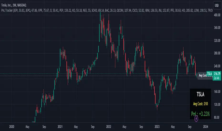
Portfolio PnL Tracker
This is a personal portfolio tracker that helps you track your daily profits and losses. You can track up to 64 stocks or cryptocurrencies. You can set them by specifying the symbol and average price.
FEATURES
- Set up to 64 stock or crypto symbols.
- Shows the average price line
- Show profit or loss as a percentage
- Shows only when on the chart that matches the symbol settings.
HOW TO USE
1. Double click the PnL Tracker indicator at the top left of the chart
2. Enter your symbol and average cost
The average cost line shows your current position.
PnL is calculated based on the average cost you input.
The Profit and Loss (PnL) box and the average cost line will only be displayed when your input symbol matches the chart you are currently viewing.
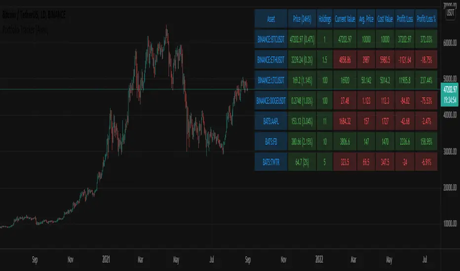
Portfolio Tracker [Anan]█ OVERVIEW
A simple Portfolio Tracker to track your Profit/Loss for any ticker in any market (stock, futures, index, forex, crypto, fund, dr.).
You just need to input (Asset / Quantity / Avg. Buy/Sell Price) and the script will calculate everything.
Also, you can use it for paper trading, or even what-if cases..
█ FEATURES
- Up to 10 positions
- Track your position real-time price and 24H change %
- Calculate your position current value
- Calculate your position cost value
- Calculate Profit/Loss
- Calculate Profit/Loss %
- Change every color in the table as you like.
Correlation TrackerCorrelation Tracker Indicator
The Correlation Tracker indicator calculates and visualizes the correlation between two symbols on a chart. It helps traders and investors understand the relationship and strength of correlation between the selected symbol and another symbol of their choice.
Indicator Features:
- Correlation Calculation: The indicator calculates the correlation between two symbols based on the provided lookback period.
- Correlation Scale: The correlation value is normalized to a scale ranging from 0 to 1 for easy interpretation.
- Table Display: A table is displayed on the chart showing the correlation value and a descriptive label indicating the strength of the correlation.
- Customization Options: Users can customize the text color, table background color, and choose whether to display the Pearson correlation value.
- The Correlation Tracker indicator utilizes a logarithmic scale calculation, making it particularly suitable for longer timeframes such as weekly charts, thereby providing a more accurate and balanced measure of correlations across a wide range of values.
How to Use:
1. Select the symbol for which you want to track the correlation (default symbol is "SPX").
2. Adjust the lookback period to define the historical data range for correlation calculation.
3. Customize the text color and table background color according to your preference.
4. Choose whether to display the Pearson correlation value or a descriptive label for correlation strength.
5. Observe the correlation line on the chart, which changes color based on the strength of the correlation.
6. Refer to the correlation table for the exact correlation value or the descriptive label indicating the correlation strength.
Note: The indicator can be applied to any time frame chart and is not limited to logarithmic scale.

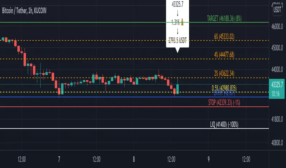
[TT$] Trade Tracker - By BlueJayBirdUSE:
- For visually tracking your trades in a floating pane (label).
- Most of the features are described in the image.
MAIN FEATURES:
- Better long-position and short-position tool wannabe.
- Visual data for tracking your trade position.
- Automatic setting of some common values in trades risk management.
- Switching from long-position to short-position can be done by just dragging the target or the entry point around.
EMOJIS:
- ⏰ Entry time: : Confirmed manually when the tool is added to the chart.
- 🎲 Entry: Confirmed manually when the tool is added to the chart.
- 🎯 Target: Confirmed manually when the tool is added to the chart.
- ⛔ Stop-Loss: Set automatically by the code.
- 🪓 Break Even: Set automatically by the code.
- 👻 Else: Set manually from the settings.
- 💲 Current: Automatic.
NOTES:
- Be aware of the "time zone" feature. Change it to the time you're currently using for your trades.
- QUOTE use is really optional. I'd rather not use it.
- The 👻 is just an extra feature. Do whatever you want with it (example: for pointing out a dangerous zone).
- 💱: "Fee" feature is not working, but it will. Sorry for that.

ATH/ATL Tracker [LuxAlgo]The ATH/ATL Tracker effectively displays changes made between new All-Time Highs (ATH)/All-Time Lows (ATL) and their previous respective values, over the entire history of available data.
The indicator shows a histogram of the change between a new ATH/ATL and its respective preceding ATH/ATL. A tooltip showing the price made during a new ATH/ATL alongside its date is included.
🔶 USAGE
By tracking the change between new ATHs/ATLs and older ATHs/ATLs, traders can gain insight into market sentiment, breadth, and rotation.
If many stocks are consistently setting new ATHs and the number of new ATHs is increasing relative to old ATHs, it could indicate broad market participation in a rally. If only a few stocks are reaching new ATHs or the number is declining, it might signal that the market's upward momentum is decreasing.
A significant increase in new ATHs suggests optimism and willingness among investors to buy at higher prices, which could be considered a positive sentiment. On the other hand, a decrease or lack of new ATHs might indicate caution or pessimism.
By observing the sectors where stocks are consistently setting new ATHs, users can identify which sectors are leading the market. Sectors with few or no new ATHs may be losing momentum and could be identified as lagging behind the overall market sentiment.
🔶 DETAILS
The indicator's main display is a histogram-style readout that displays the change in price from older ATH/ATLs to Newer/Current ATH/ATLs. This change is determined by the distance that the current values have overtaken the previous values, resulting in the displayed data.
The largest changes in ATH/ATLs from the ticker's history will appear as the largest bars in the display.
The most recent bars (depending on the selected display setting) will always represent the current ATH or ATL values.
When determining ATH & ATL values, it is important to filter out insignificant highs and lows that may happen constantly when exploring higher and lower prices. To combat this, the indicator looks to a higher timeframe than your chart's timeframe in order to determine these more significant ATHs & ATLs.
For Example: If a user was on a 1-minute chart and 5 highs-new highs occur across 5 adjacent bars, this has the potential to show up as 5 new ATHs. When looking at a higher timeframe, 5 minutes, only the highest of the 5 bars will indicate a new ATH. To assist with this, the indicator will display warnings in the dashboard when a suboptimal timeframe is selected as input.
🔹 Dashboard
The dashboard displays averages from the ATH/ATL data to aid in the anticipation and expectations for new ATH/ATLs.
The average duration is an average of the time between each new ATH/ATL, in this indicator it is calculated in "Days" to provide a more comprehensive understanding.
The average change is the average of all change data displayed in the histogram.
🔶 SETTINGS
Duration: The designated higher timeframe to use for filtering out insignificant ATHs & ATLs.
Order: The display order for the ATH/ATL Bars, Options are to display in chronological (oldest to newest) or reverse chronological order (newest to oldest).
Bar Width: Sets the width for each ATH/ATL bar.
Bar Spacing: Sets the # of empty bars in between each ATH/ATL bar.
Dashboard Settings: Parameters for the dashboard's size and location on the chart.

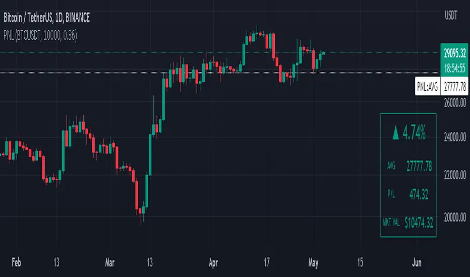
Manual PnL (Profit and Loss) % Tracker - spot long only
This is a manual profit and loss tracker. It takes the user's manual input of total cost and quantity, and then outputs a table on the bottom right of the chart showing the profit or loss %, average purchase price, gross profit or loss, and market value.
Instructions:
1. Double click the indicator title at the top left of the chart
2. Select the "Inputs" tab and click the empty field next to "Symbol" to enter the traded symbol+exchange. This entry MUST be the same as the chart you are on, for example BTCUSDT/BINANCE (indicator will not display otherwise)
3. Enter the Total Cost and Qty of shares/coins owned
4. Optional - change positive or negative colors
5. Optional - under the "Style" tab, change the color of the average price (AVG) line
Note that for the average price (AVG) line to be shown/hidden you must enable/disable "Indicator and financials labels" in the scales settings.
For crypto or other tickers that have prices in many decimal places I would suggest, for the sake of accuracy, adjusting the decimal places in the code so that for prices under $1 you will display more info.
For example let's say you purchase x number of crypto at a price of 0.031558 you should change the code displaying "0.00" on line 44 to "0.000000"
This will ensure that the output table and plotted line will calculate an average price with the same number of decimals.
Profit Percentage TrackerThis script provides a quick and easy way to visualize profits in a chart, based on the given entry date and price.
Optionally, alerts can be sent when profits cross up the given " profit unit ".
In short:
Tracks how much profit one could take based on the input " entry date " and the input " entry price "
These inputs are interactive (www.tradingview.com)
Displays the result in a label on top of the last candle
(Optional) Sends alerts based on the given " profit unit ", that is: if ' 0.5 ' is given, then an alert is triggered every time the profit is raised by that number
(Be careful with low values, as TradingView could stop an alert if it triggers too much.)
For alerts to be displayed, a " script alert " must be created right after the script was added to the chart:
- www.tradingview.com
(Choose ' Profits ' as condition and ' Any alert() function call ')
Good to know: if you check " Notify on app ", alerts can be delivered directly to your phone:
i.imgur.com
Prerequirements :
The chart's timezone has to be set to " Exchange " (this is required in order to support the alert's logic):
- kodify.net
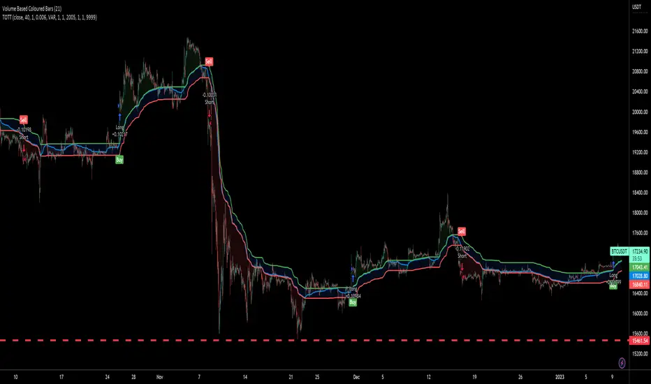
Twin Optimized Trend Tracker Strategy TOTTAnıl Özekşi's new strategy which is a combination of 2 Optimized Trend Tracker lines which are vertical displaced from original version with a COEFFICIENT to cope with sideways' false signals which he explained in "Toy Borsacı İçin OTT Kullanım Kılavuzu 2"
original version of OTT:
OTT Strategy and Screener:
You can find a detailed explanation with subtitles from the developer of OTT Anıl Özekşi himself as: "Toy Borsacı İçin OTT Kullanım Kılavuzu 2"

15minMAThis script lets you plot a simple or exponential moving average from a specific time frame that you can select. For example, if you always want the Daily 50MA on your chart, regardless of what resolution your chart is on, this will do it. It's also color coded to show if it's rising or falling.

ADX and RSI ComboThis indicator combines two separate Simple RSI indicators so you can show different periods together, as well as an ADX indicator with DI+ and DI-. I prefer to use one indicator to show the whole thing, instead of stacking the individual indicators.
Triple eMA cross trackerTracks 3 emas, colorizing background:
Green - 1 on top of 2 on top of 3;
Blue - 1 on top of 3, but 2 below 3;
Red - 1 below 2 below 3;
Orange - 1 below 3, 2 above 3.
Nutshell: allows a quick and always apparent check for strategies like the old 8e, 13e, 21e strategy you see online, customizeable by any emas of your choosing.
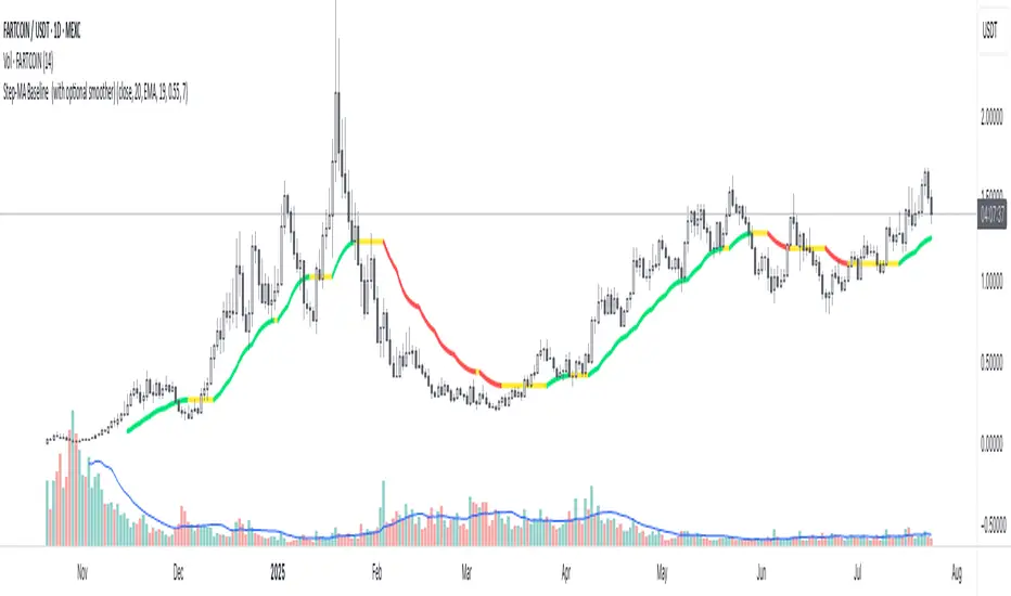
Step-MA Baseline (with optional smoother)Trackline – Trend-Following Baseline with Confirmation Zones
A clean trend-following baseline that adapts to price action while filtering noise. Built on a smoothed moving average (EMA or HMA), Trackline highlights directional bias, with optional zone coloring to indicate breakout alignment or pullback opportunities. Use it to identify trend direction, validate entries, or act as dynamic support/resistance in trending environments.
Features:
• Customizable length & smoothing method (EMA, HMA, or WMA)
• Optional signal coloring (bullish/bearish/neutral)
• Works on all timeframes and assets
• Pairs well with momentum or liquidity tools
CME Gap Tracker [captainua]CME Gap Tracker - Advanced Gap Detection & Tracking System
Overview
This indicator provides comprehensive gap detection and tracking capabilities for both consecutive bar gaps and weekly CME trading session gaps. It automatically detects gaps, tracks their fill progress in real-time, provides detailed statistics, and includes backtesting features to validate gap trading strategies. The script is optimized for CME futures trading but works with any instrument, automatically handling ticker conversion between CME futures and spot markets.
Gap Detection Types
Consecutive Bar Gaps:
Detects gaps between any two consecutive bars on the current timeframe. Two detection modes are available:
- High/Low Mode: Detects gaps when current bar's low > previous bar's high (gap up) or current bar's high < previous bar's low (gap down). This is more sensitive and detects more gaps.
- Close/Open Mode: Detects gaps when current bar's open > previous bar's close (gap up) or current bar's open < previous bar's close (gap down). This is more conservative.
Weekly CME Gaps:
Detects gaps between weekly trading sessions, specifically designed for CME futures markets. The script automatically detects the first bar of each new week and compares the current week's open with the previous week's close/high/low. This is particularly useful for tracking weekend gaps in CME futures markets where price can gap significantly between Friday close and Monday open.
Smart Ticker Detection
The script automatically converts between CME futures tickers (e.g., BTC1!, ETH1!) and spot tickers (e.g., BTCUSDT, ETHUSDT). When viewing a CME futures chart, it can automatically detect and use the corresponding spot ticker for gap analysis, and vice versa. This allows traders to:
- View CME futures but track spot market gaps
- View spot markets but track CME futures gaps
- Manually override with custom ticker specification
The ticker validation system uses caching to prevent race conditions during initial script load, ensuring reliable ticker resolution.
Gap Filtering & Tolerance
Static Tolerance:
Set minimum and maximum gap sizes as percentages (default: show only gaps > 0.333% and < 100%). This filters out noise and focuses on significant gaps.
Dynamic Tolerance:
When enabled, tolerance is calculated dynamically based on ATR (Average True Range). The formula: Dynamic Tolerance = (ATR × ATR Multiplier / Close Price) × 100%. This adapts to market volatility - in volatile markets, only larger gaps are shown; in calm markets, smaller gaps are displayed. This is particularly useful for instruments with varying volatility.
Absolute Size Filtering:
In addition to percentage filtering, gaps can be filtered by absolute price size (e.g., show only gaps > $100). This is useful for instruments where percentage alone doesn't capture significance (e.g., high-priced stocks).
Fill Confirmation System
To reduce false gap closure signals, the script requires multiple consecutive bars to confirm gap closure. The default is 2 bars, but can be adjusted from 1-10 bars. Lower values (1) confirm faster but may produce false signals from temporary wicks. Higher values (3-5) reduce false fill signals but delay confirmation. This prevents temporary price spikes from triggering false gap closure alerts.
Gap Fill Tracking
The script tracks gap fill progress in real-time:
- Fill Percentage: How much of the gap has been filled (0-100%)
- Fill Speed: Whether fill is accelerating, decelerating, or constant
- Time to Fill: For closed gaps, how many bars it took to fill
- Fill Status: Unfilled, partially filled, or fully filled
Visual Features
Heatmap Colors:
Gap colors can be adjusted based on gap size, with larger gaps appearing more intense and smaller gaps more faded.
Adaptive Line Width:
Line thickness automatically adjusts based on gap size, making larger gaps more prominent.
Age-Based Coloring:
Gaps can be color-coded by age, with newer gaps appearing brighter and older gaps more faded.
Confluence Zones:
Areas where multiple gaps overlap are highlighted with enhanced visuals, indicating stronger support/resistance zones.
Gap Statistics
A comprehensive statistics table provides:
- Total gaps created, open, and closed
- Fill rates by direction (up vs down) and size category (small, medium, large)
- Average fill time, fastest fill, slowest fill
- Oldest gap and oldest unfilled gap
- Backtesting results: success rate, reversal rate, average move after fill
- CME gap expiration statistics: Gaps expired unfilled (for Weekly CME gaps only)
Statistics can be filtered by period (All Time, Last 100/500/1000/5000 bars) and can be reset via toggle button.
Backtesting
When enabled, the script tracks price movement after gap fills:
- Price after fill: Captures price when gap closes
- Move after fill: Percentage price movement after closure
- Success/Reversal tracking: Determines if price continued in fill direction or reversed
- Success rate: Percentage of gaps where price continued in fill direction
This data helps validate gap trading strategies and understand gap fill behavior.
Gap Re-opening Detection
When enabled, the script detects when a previously filled gap reopens (price gaps back through the filled gap zone). This is useful for identifying when support/resistance levels break and can signal trend reversals.
CME-Specific Features
Monday Opening Volume Analysis:
For Weekly CME gaps detected on Monday openings, the script tracks Monday opening volume relative to average volume. Higher Monday volume ratios indicate stronger gap significance. This ratio is integrated into gap strength calculations and can be displayed in gap labels. Gaps with Monday volume > 1.5x average receive priority score boosts.
CME Gap Expiration Tracking:
Weekly CME gaps that remain unfilled beyond a configurable threshold (default 1000 bars) are automatically marked as "expired" and tracked separately in statistics. This helps identify gaps that act as strong support/resistance levels and never fill. Expired gaps are displayed with special labeling and counted in the "Gaps Expired (CME)" statistic.
CME Gap Priority Scoring Enhancement:
The priority scoring system includes special boosts for CME gaps:
- Monday gaps: +10 points (gaps detected on Monday openings)
- High Monday volume gaps: +15 points (Monday volume ratio > 1.5x average)
- Gaps at key weekly levels: +10 points (gaps aligning with previous week's high, low, or close within 0.5% tolerance)
These enhancements help prioritize the most significant CME gaps for trading decisions.
Custom Gap Zones
Traders can manually mark custom gap zones by specifying top and bottom levels. These zones are tracked like automatically detected gaps, allowing traders to:
- Mark historical gaps that weren't detected
- Create support/resistance zones based on other analysis
- Track specific price levels of interest
Multi-Timeframe Support
The script can detect gaps on higher timeframes simultaneously. For example, when viewing a 1-hour chart, it can also detect and display gaps from the weekly timeframe. This provides multi-timeframe context for gap analysis.
Alert System
Comprehensive alert system with multiple trigger types:
- Gap Creation: Alert when new gaps are detected
- Gap Closure: Alert when gaps are fully filled
- Partial Fill: Alert when gaps reach specific fill percentages (e.g., 25%, 50%, 75%, 90%)
- Approaching Closure: Alert when gaps reach high fill levels (e.g., 90%, 95%) before closing
- Gap Re-opening: Alert when previously filled gaps reopen
Alerts can be filtered to trigger only on Mondays (useful for CME weekly gaps) or any day.
Filtering Options
Gaps can be filtered by:
- Fill Status: Show all, unfilled only, partially filled only, or fully filled only
- Fill Percentage Range: Show gaps within specific fill percentage ranges
- Gap Age: Show only gaps within specific age ranges (bars)
- Gap Expiration: Automatically remove gaps older than specified number of bars (for Weekly CME gaps, uses separate CME expiration threshold)
Performance & Safety
The script includes several safety features:
- Safe array operations to prevent index out-of-bounds errors
- Memory leak prevention through proper visual object cleanup
- Ticker validation caching to prevent race conditions
- Week boundary detection for accurate CME gap identification
- Fill confirmation system to reduce false signals
- Monday opening volume analysis for CME gap strength assessment
- CME gap expiration tracking with configurable thresholds
- Priority scoring enhancement for Monday gaps, high Monday volume, and key weekly levels
Usage Recommendations
For CME Weekly Gaps:
1. Set "Gap Detection Type" to "Weekly CME"
2. View a CME futures chart (e.g., BTC1!) or enable auto-detect spot ticker
3. Set tolerance to filter gap size (default 0.333%)
4. Enable statistics to track fill rates
5. Configure alerts for gap creation/closure
For Consecutive Bar Gaps:
1. Set "Gap Detection Type" to "Consecutive Bars"
2. Choose "High/Low" for more gaps or "Close/Open" for fewer gaps
3. Adjust tolerance based on instrument volatility
4. Enable fill confirmation (2-3 bars) for more reliable signals
5. Use filtering to focus on specific gap types
For Gap Trading Strategies:
1. Enable backtesting to validate strategy performance
2. Review statistics to understand gap fill patterns
3. Use confluence zones to identify strong support/resistance
4. Configure alerts for gap events matching your strategy
5. Use custom zones to mark important levels
Technical Details:
• Pine Script v6 | Overlay indicator
• Safe array operations with index validation
• Memory leak prevention through proper object cleanup
• Ticker validation caching for reliable ticker resolution
• Works on all timeframes and instruments
• Comprehensive edge case handling
• Week boundary detection using ta.change(weekofyear)
• Fill confirmation system with configurable bars
For detailed documentation and usage instructions, see the script comments.

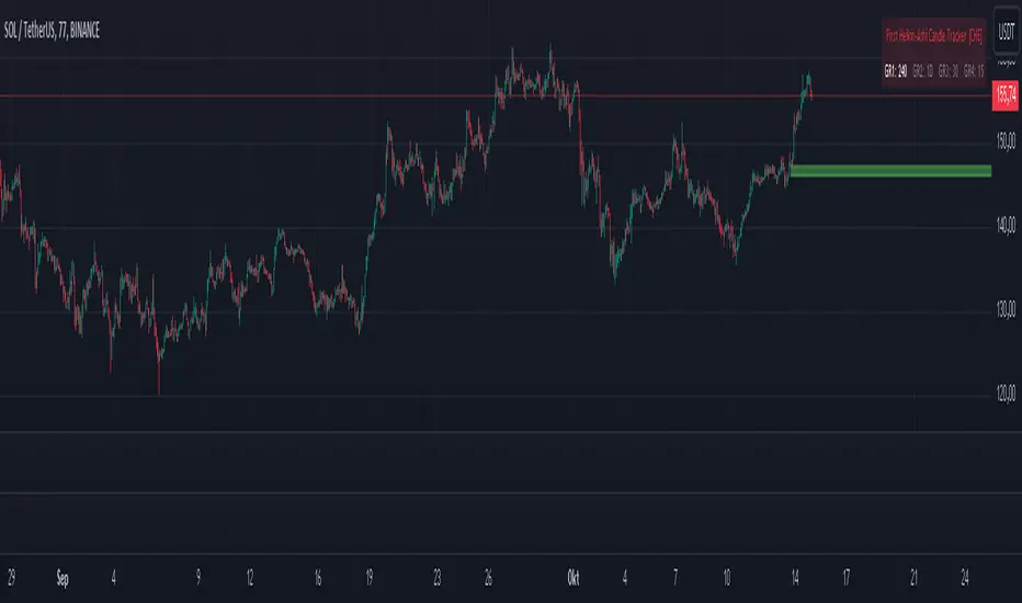
First Heikin-Ashi Candle Tracker [CHE] First Heikin-Ashi Candle Tracker
"A Heikin-Ashi Candle Rarely Comes Alone"
1. Introduction
Fundamental Observation
- "A Heikin-Ashi Candle Rarely Comes Alone"
- This principle highlights the tendency of Heikin-Ashi candles to appear in sequences, indicating sustained trends rather than isolated movements.
- Recognizing these patterns can significantly enhance trading strategies by identifying stronger and more reliable entry points.
2. Understanding Heikin-Ashi Candles
What Are Heikin-Ashi Candles?
- Heikin-Ashi is a type of candlestick chart used to identify market trends more clearly.
- Calculation Method:
- Ha_Close: (Open + High + Low + Close) / 4
- Ha_Open: (Previous Ha_Open + Previous Ha_Close) / 2
- Ha_High: Maximum of High, Ha_Open, Ha_Close
- Ha_Low: Minimum of Low, Ha_Open, Ha_Close
- Visual Differences:
- Smoother appearance compared to traditional candlesticks.
- Helps in filtering out market noise and highlighting the prevailing trend.
Benefits of Heikin-Ashi Candles
- Trend Clarity: Easier identification of uptrends and downtrends.
- Reduced Noise: Minimizes the impact of insignificant price movements.
- Visual Appeal: Cleaner charts enhance decision-making processes.
3. Introducing the First Heikin-Ashi Candle Tracker [CHE ]
Purpose of the Indicator
- Track First Heikin-Ashi Candles: Identifies the initial appearance of Heikin-Ashi candles across multiple timeframes.
- Enhance Trading Decisions: Provides visual cues for potential long and short entries based on trend confirmations.
Key Features
- Multi-Timeframe Support: Monitor Heikin-Ashi candles across different timeframes (e.g., 240, 60, 30, 15 minutes).
- Customizable Visuals: Adjustable colors and line widths for better chart integration.
- User-Friendly Interface: Easy-to-configure settings tailored to individual trading preferences.
- Max Line Management: Controls the number of displayed lines to maintain chart clarity.
4. How to Use the First Heikin-Ashi Candle Tracker
Step-by-Step Guide
1. Enable Desired Groups:
- Activate up to four groups, each representing a different timeframe.
- Customize each group's settings according to your trading strategy.
2. Configure Timeframes:
- Select timeframes that align with your trading style (e.g., short-term vs. long-term).
3. Set Candle Types to Track:
- Choose to monitor Both, Green (Bullish), or Red (Bearish) Heikin-Ashi candles.
- Focus on specific candle types to streamline entry signals.
4. Customize Visual Indicators:
- Adjust Green Line Color and Red Line Color for clear distinction.
- Modify Line Width to ensure visibility without cluttering the chart.
5. Manage Line Limits:
- Set the Max Number of Lines to prevent overcrowding.
- The indicator will automatically remove the oldest lines when the limit is exceeded.
6. Interpret Signals:
- Green Lines: Indicate potential Long entry points.
- Red Lines: Indicate potential Short entry points.
- Observe the sequence and frequency of candles to assess trend strength.
Practical Example
- Uptrend Identification:
- Consecutive green Heikin-Ashi candles with corresponding green lines signal a strong upward trend.
- Consider entering a Long position when the first green candle appears.
- Downtrend Identification:
- Consecutive red Heikin-Ashi candles with corresponding red lines signal a strong downward trend.
- Consider entering a Short position when the first red candle appears.
5. Benefits and Utility
Enhanced Trend Detection
- Early Signals: Identify the beginning of new trends promptly.
- Confirmation: Multiple timeframes provide robust confirmation of trend direction.
Improved Entry Points
- Precision: Pinpoint optimal moments to enter trades, reducing the risk of false signals.
- Flexibility: Suitable for both Long and Short strategies across various markets.
User-Friendly Operation
- Intuitive Settings: Easily configurable to match individual trading preferences.
- Visual Clarity: Clear lines and color-coding facilitate quick decision-making.
Time Efficiency
- Automated Tracking: Saves time by automatically identifying and marking relevant candles.
- Multi-Timeframe Analysis: Consolidates information from different timeframes into a single view.
6. Why Use the First Heikin-Ashi Candle Tracker ?
Strategic Advantages
- Market Insight: Gain deeper understanding of market dynamics through Heikin-Ashi analysis.
- Risk Management: Improved entry points contribute to better risk-reward ratios.
- Versatility: Applicable to various trading instruments, including stocks, forex, and cryptocurrencies.
Why Heikin-Ashi for Entries?
- Trend Reliability: Heikin-Ashi candles smooth out price data, providing more reliable trend indicators.
- Reduced Whipsaws: Fewer false signals compared to traditional candlestick charts.
- Clarity in Decision-Making: Simplifies the process of identifying and acting on market trends.
Conclusion
- The First Heikin-Ashi Candle Tracker is an essential tool for traders seeking to enhance their trend analysis and improve entry strategies.
- By leveraging the power of Heikin-Ashi candles, this indicator offers a clear, user-friendly approach to identifying profitable trading opportunities.
7. Getting Started
Installation
1. Add the Indicator:
- Open TradingView and navigate to the Pine Script editor.
- Paste the translated Pine Script code for the First Heikin-Ashi Candle Tracker .
- Save and add the indicator to your chart.
2. Configure Settings:
- Enable desired groups and set appropriate timeframes.
- Customize colors and line widths as per your preference.
- Adjust the maximum number of lines to maintain chart clarity.
3. Start Trading:
- Monitor the chart for green and red lines indicating potential Long and Short entries.
- Combine with other analysis tools for enhanced trading decisions.
Support and Resources
- Documentation: Refer to the included comments within the Pine Script for detailed explanations.
- Community Forums: Join TradingView communities for tips and shared experiences.
- Customer Support: Reach out for assistance with installation or configuration issues.
8. Disclaimer
The content provided, including all code and materials, is strictly for educational and informational purposes only. It is not intended as, and should not be interpreted as, financial advice, a recommendation to buy or sell any financial instrument, or an offer of any financial product or service. All strategies, tools, and examples discussed are provided for illustrative purposes to demonstrate coding techniques and the functionality of Pine Script within a trading context.
Any results from strategies or tools provided are hypothetical, and past performance is not indicative of future results. Trading and investing involve high risk, including the potential loss of principal, and may not be suitable for all individuals. Before making any trading decisions, please consult with a qualified financial professional to understand the risks involved.
By using this script, you acknowledge and agree that any trading decisions are made solely at your discretion and risk.
Happy Trading!
Best regards
Chervolino (Volker)
BuyPrice TrackerDescription:
This custom indicator is designed to help traders and investors track the performance of multiple stocks relative to their specified buy prices. It offers a visual representation of price changes and percentage gains or losses, making it easier to monitor your portfolio at a glance.
Key Features:
1. Multiple Stock Tracking: Monitor up to 15 different stocks simultaneously.
2. Custom Buy Prices: Set individual buy prices for each stock you're tracking.
3. Dynamic Price Line: A yellow dotted line appears on the chart to mark your buy price.
4. Real-time Updates: The indicator updates with each new price bar, providing current information.
5. Percentage Change Display: Clearly shows the percentage change from your buy price to the current price.
6. Color-Coded Labels: Green for positive changes, red for negative, allowing for quick visual assessment.
7. Customizable Label Position: Choose between top-right or top-left corner of the chart for the information label.
8. Adjustable Text Size: Customize the size of the text in the label for better visibility.
9. Buy Price Scale Label: Displays your buy price directly on the price scale for easy reference.
How It Works:
Enter your stock symbols and corresponding buy prices in the indicator settings.
The indicator will display a yellow dotted line at your buy price for the current chart.
A label will appear showing the stock symbol, your buy price, and the current percentage change.
The label updates in real-time as prices change, allowing you to monitor performance instantly.
Benefits:
Effortlessly track multiple positions in your portfolio.
Quickly identify which stocks are performing well and which might need attention.
Make informed decisions about holding, selling, or buying more based on clear visual cues.
Customize the display to suit your trading style and chart setup.
This indicator is perfect for active traders managing multiple positions, long-term investors tracking their portfolio performance, or anyone looking to keep a close eye on specific price levels in the market.
Note: This indicator works best when applied to the specific stock charts you're tracking. Make sure to input the correct stock symbols and buy prices in the indicator settings for accurate results.

Investment Tracker Profit/lossThe Investment Tracker is a custom-built indicator designed to help traders and investors track their performance in real time. With this tool, you can easily monitor the gains or losses from your initial investment based on the price movement of a specific token. The indicator dynamically updates to show how much you've earned or lost, providing valuable insights into your investment strategy.
Key Features:
Profit/Loss Tracking: Instantly see whether you're in profit (green) or loss (red) based on the token's price movement.
Current Value Calculation: Tracks your investment’s current value by comparing the price at which you bought the token with its current price.
Visual Representation: Displays your initial investment, current value, and profit/loss on the chart with dynamic color coding (green for profit, red for loss).
Top-Right Display: Profit/loss data is conveniently displayed in the top-right corner of the chart, providing a clean and non-intrusive way to monitor your position.
Transparency: The indicator's lines have reduced opacity, allowing you to view your position without obstructing the price action.
How to Use:
Input your initial investment amount (in USD or your desired currency).
Set the buy price of the token when you made the purchase.
Watch the indicator update as the price of the token changes, providing real-time tracking of your profit or loss.
Whether you're holding a single position or monitoring multiple investments, this tracker gives you a clear and up-to-date view of how your portfolio is performing.
Perfect For:
Crypto traders who want to monitor their positions in real time.
Long-term investors looking to track the performance of their investments.
Anyone who wants a simple, visual way to measure their gains and losses in the market.

Forex Session TrackerForex Session Tracker - Professional Trading Session Indicator
The Forex Session Tracker is a comprehensive and visually intuitive indicator designed specifically for forex traders who need precise tracking of major global trading sessions. This powerful tool helps traders identify active market sessions, monitor session-specific price ranges, and capitalize on volatility patterns unique to each trading period.
Understanding when major financial centers are active is crucial for forex trading success. This indicator provides real-time visualization of the Tokyo, London, New York, and Sydney trading sessions, allowing traders to align their strategies with peak liquidity periods and avoid low-volatility trading windows.
---
Key Features
📊 Four Major Global Trading Sessions
The indicator tracks all four primary forex trading sessions with precision:
- Tokyo Session (Asian Market) - Captures the Asian trading hours, ideal for JPY, AUD, and NZD pairs
- London Session (European Market) - Monitors the most liquid trading period, perfect for EUR, GBP pairs
- New York Session (American Market) - Tracks US market hours, essential for USD-based currency pairs
- Sydney Session (Pacific Market) - Identifies the opening of the trading week and AUD/NZD activity
Each session is fully customizable with individual color schemes, making it easy to distinguish between different market periods at a glance.
🎯 Session Range Visualization
For each active trading session, the indicator automatically:
- Draws rectangular boxes that highlight the session's time period
- Tracks and displays session HIGH and LOW price levels in real-time
- Creates horizontal lines at session extremes for easy reference
- Positions session labels at the center of each trading period
- Updates dynamically as new highs or lows are formed within the session
This visual approach helps traders quickly identify:
- Session breakout opportunities
- Support and resistance zones formed during specific sessions
- Range-bound vs. trending session behavior
- Key price levels that institutional traders are watching
📱 Live Information Dashboard
A sleek, professional information panel displays:
- Real-time session status - Instantly see which sessions are currently active
- Color-coded indicators - Green dots for active sessions, gray for closed sessions
- Timezone information - Confirms your current timezone settings
- Customizable positioning - Place the dashboard anywhere on your chart (Top Left, Top Right, Bottom Left, Bottom Right)
- Adjustable size - Choose from Tiny, Small, Normal, or Large text sizes for optimal visibility
The dashboard provides at-a-glance awareness of market conditions without cluttering your chart analysis.
⚙️ Extensive Customization Options
Every aspect of the indicator can be tailored to your trading preferences:
Session-Specific Controls:
- Enable/disable individual sessions
- Customize colors for each trading period
- Adjust session times to match your broker's server time
- Toggle background highlighting on/off
- Show/hide session high/low lines independently
General Settings:
- UTC Offset Control - Adjust timezone from UTC-12 to UTC+14
- Exchange Timezone Option - Automatically use your chart's exchange timezone
- Background Transparency - Fine-tune the opacity of session highlighting (0-100%)
- Session Labels - Show or hide session name labels
- Information Panel - Toggle the live status dashboard on/off
Style Settings:
- Turn session backgrounds ON/OFF directly from the Style tab
- Maintain clean charts while keeping all analytical features active
🔔 Built-in Alert System
Stay informed about session openings with customizable alerts:
- Tokyo Session Started
- London Session Started
- New York Session Started
- Sydney Session Started
Set up notifications to never miss important market opening periods, even when you're away from your charts.
---
How to Use This Indicator
For Day Traders:
1. Identify High-Volatility Periods - Focus your trading during London and New York session overlaps for maximum liquidity
2. Monitor Session Breakouts - Watch for price breaks above/below session highs and lows
3. Avoid Low-Volume Periods - Recognize when major sessions are closed to avoid false signals
For Swing Traders:
1. Mark Key Levels - Use session highs and lows as support/resistance zones
2. Track Multi-Session Patterns - Observe how price behaves across different trading sessions
3. Plan Entry/Exit Points - Time your trades around session openings for better execution
For Currency-Specific Traders:
1. JPY Pairs - Focus on Tokyo session movements
2. EUR/GBP Pairs - Monitor London session activity
3. USD Pairs - Track New York session volatility
4. AUD/NZD Pairs - Watch Sydney and Tokyo sessions
---
Technical Specifications
- Pine Script Version: 5
- Overlay Indicator: Yes (displays directly on price chart)
- Maximum Bars Back: 500
- Drawing Objects: Up to 500 lines, boxes, and labels
- Performance: Optimized for real-time data processing
- Compatibility: Works on all timeframes (recommended: 5m to 1H for session tracking)
---
Installation & Setup
1. Add to Chart - Click "Add to Chart" after copying the script to Pine Editor
2. Configure Timezone - Set your UTC offset or enable "Use Exchange Timezone"
3. Customize Colors - Choose your preferred color scheme for each session
4. Adjust Display - Enable/disable features based on your trading style
5. Set Alerts - Create alert notifications for session starts
---
Best Practices
✅ Combine with Price Action - Use session ranges alongside candlestick patterns for confirmation
✅ Watch Session Overlaps - The London-New York overlap (1300-1600 UTC) typically shows highest volatility
✅ Respect Session Highs/Lows - These levels often act as intraday support and resistance
✅ Adjust for Your Broker - Verify session times match your broker's server clock
✅ Use Multiple Timeframes - View sessions on both lower (15m) and higher (1H) timeframes for context
---
Why Choose Forex Session Tracker Pro?
✨ Professional Grade Tool - Built with clean, efficient code following TradingView best practices
✨ Beginner Friendly - Intuitive design with clear visual cues
✨ Highly Customizable - Adapt every feature to match your trading style
✨ Performance Optimized - Lightweight code that won't slow down your charts
✨ Actively Maintained - Regular updates and improvements
✨ No Repainting - All visual elements are fixed once the session completes
---
Support & Updates
This indicator is designed to provide reliable, accurate session tracking for forex traders of all experience levels. Whether you're a scalper looking for high-volatility windows or a position trader marking key institutional levels, the Forex Session Tracker Pro delivers the insights you need to make informed trading decisions.
Happy Trading! 📈
---
Disclaimer
This indicator is a tool for technical analysis and should be used as part of a comprehensive trading strategy. Past performance does not guarantee future results. Always practice proper risk management and never risk more than you can afford to lose. Trading forex carries a high level of risk and may not be suitable for all investors.

AlphaEdge Crypto Tracker [CHE]AlphaEdge Crypto Tracker
Efficiently Identify Top Performers and Underperformers Among 40 Crypto Assets at a Glance
In the fast-paced world of cryptocurrency trading, staying ahead requires the ability to quickly assess the performance of multiple assets simultaneously. AlphaEdge Crypto Tracker is an advanced Pine Script™ indicator designed for TradingView that empowers traders to effortlessly monitor and evaluate 40 different crypto assets in real-time.
This tool is my Christmas gift to all traders. I wish you all a Merry Christmas and successful trades in the coming year!
Why It’s Important to Identify Winners and Losers Among 40 Assets at a Glance:
1. Time Efficiency: Managing a diverse portfolio can be overwhelming. With AlphaEdge Crypto Tracker, traders can swiftly identify which assets are performing exceptionally well (winners) and which are underperforming (losers) without the need to analyze each asset individually.
2. Informed Decision-Making: By having a clear overview of top gainers and losers, traders can make strategic decisions such as reallocating investments, taking profits, or cutting losses, thereby optimizing their trading strategies.
3. Risk Management: Quickly spotting underperforming assets helps in mitigating potential losses and adjusting positions to maintain a balanced and profitable portfolio.
4. Opportunity Identification: Recognizing top-performing assets allows traders to capitalize on emerging trends and maximize their returns by focusing on the most promising opportunities.
Key Features of AlphaEdge Crypto Tracker :
- Comprehensive Asset Tracking: Monitors 40 crypto assets simultaneously, providing a broad view of the market landscape.
- Max Gain and Adjusted Max Loss Calculations: Utilizes a 14-bar (configurable) period to calculate the highest gains and the adjusted maximum losses for each asset, offering insights into potential profitability and risk.
- Dynamic Ranking: Automatically sorts and ranks assets based on their performance, highlighting the top 10 gainers and top 10 losers for easy comparison.
- Customizable Display:
- Table Settings: Adjust the size, position, and colors of the performance table to fit your chart layout.
- Interactive Tooltips: Hover over asset names to view detailed tooltips, enhancing usability and information accessibility.
- Visual Alerts: Changes in asset performance are visually indicated through background color updates, allowing for immediate recognition of significant shifts.
- User-Friendly Interface: Intuitive table layout with clear headers and organized data presentation, making it easy for traders of all levels to interpret the information.
How It Works:
1. Data Calculation: For each of the 40 tracked assets, AlphaEdge Crypto Tracker calculates the maximum gain and adjusted maximum loss over the defined trading period.
2. Sorting and Ranking: The assets are sorted based on their maximum gains and adjusted maximum losses, automatically updating to reflect the latest market movements.
3. Real-Time Display: The top 10 gainers and losers are displayed in a neatly organized table directly on your TradingView chart, providing immediate visual insights.
4. Customization: Users can tailor the tracking period, select specific assets to monitor, and adjust the table’s appearance to match their trading style and preferences.
Conclusion:
AlphaEdge Crypto Tracker is an essential tool for cryptocurrency traders seeking to enhance their market analysis and decision-making processes. By providing a comprehensive and customizable overview of multiple assets, it enables traders to efficiently identify profitable opportunities and manage risks effectively. Whether you’re a seasoned trader or just starting, AlphaEdge Crypto Tracker equips you with the insights needed to navigate the dynamic crypto market with confidence.
Get Started Today:
Integrate AlphaEdge Crypto Tracker into your TradingView setup and take control of your crypto trading strategy with unparalleled clarity and precision.
Disclaimer:
The content provided, including all code and materials, is strictly for educational and informational purposes only. It is not intended as, and should not be interpreted as, financial advice, a recommendation to buy or sell any financial instrument, or an offer of any financial product or service. All strategies, tools, and examples discussed are provided for illustrative purposes to demonstrate coding techniques and the functionality of Pine Script within a trading context.
Any results from strategies or tools provided are hypothetical, and past performance is not indicative of future results. Trading and investing involve high risk, including the potential loss of principal, and may not be suitable for all individuals. Before making any trading decisions, please consult with a qualified financial professional to understand the risks involved.
By using this script, you acknowledge and agree that any trading decisions are made solely at your discretion and risk.
License Information:
This Pine Script™ code is subject to the terms of the Mozilla Public License 2.0. You can view the full license (mozilla.org).
© chervolino

Wickless Candle Revisit TrackerWickless Candle Revisit Tracker
Identifies wickless candles (strong momentum candles) and tracks whether price revisits their opening level, providing statistical insights into price behavior patterns.
WHAT ARE WICKLESS CANDLES?
• Green wickless: Open = Low (no lower wick) - opened at the low and moved only upward
• Red wickless: Open = High (no upper wick) - opened at the high and moved only downward
These candles represent strong directional momentum, and their opening levels often act as support/resistance zones that price may revisit.
KEY FEATURES:
• Automatic Detection: Identifies wickless candles with configurable tolerance for broker spread
• Real-time Tracking: Monitors each wickless candle until price revisits its opening level
• Visual Indicators:
- Labels show "WL↑" or "WL↓" with bars count when revisited (or "N/A" if pending)
- Horizontal lines mark price levels (gray dashed = pending, green solid = revisited)
• Comprehensive Statistics Table:
- Total wickless candles detected
- Revisit rate percentage
- Min/Max/Average bars until revisit
- Pending count
• History Limit: Configure how far back to analyze (default: 500 bars)
• Customizable: Adjust colors, toggle labels/lines/table, reposition statistics
USE CASES:
• Identify potential support/resistance levels from momentum candles
• Measure how often price fills "fair value gaps" or inefficiencies
• Track mean reversion patterns after strong momentum moves
• Backtest the reliability of wickless candle levels as trading zones
SETTINGS:
• Wick Tolerance: Allow small wicks due to broker spread (e.g., 0.0001 for forex)
• History Limit: Number of bars to analyze (older candles are hidden)
• Visual Controls: Toggle labels, lines, and statistics table
• Color Customization: Adjust line colors for pending/revisited states
ALERTS:
Built-in alerts for wickless candle detection (green, red, or both).
Perfect for traders analyzing price inefficiencies, fair value gaps, and momentum-based support/resistance levels.
