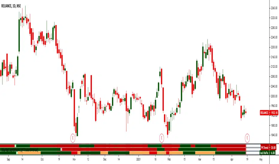
Drawdown from 22-Day High (Daily Anchored)This Pine Script indicator, titled "Drawdown from 22-Day High (Daily Anchored)," is designed to plot various drawdown levels from the highest high over the past 22 days. This helps traders visualize the performance and potential risk of the security in terms of its recent high points.
Key Features:
Daily High Data:
Fetches daily high prices using the request.security function with a daily timeframe.
Highest High Calculation:
Calculates the highest high over the last 22 days using daily data. This represents the highest price the security has reached in this period.
Drawdown Levels:
Computes various drawdown levels from the highest high:
2% Drawdown
5% Drawdown
10% Drawdown
15% Drawdown
25% Drawdown
45% Drawdown
50% Drawdown
Dynamic Line Coloring:
The color of the 2% drawdown line changes dynamically based on the current closing price:
Green (#02ff0b) if the close is above the 2% drawdown level.
Red (#ff0000) if the close is below the 2% drawdown level.
Plotting Drawdown Levels:
Plots each drawdown level on the chart with specific colors and line widths for easy visual distinction:
2% Drawdown: Green or Red, depending on the closing price.
5% Drawdown: Orange.
10% Drawdown: Blue.
15% Drawdown: Maroon.
25% Drawdown: Purple.
45% Drawdown: Yellow.
50% Drawdown: Black.
Labels for Drawdown Levels:
Adds labels at the end of each drawdown line to indicate the percentage drawdown:
Labels display "2% WVF," "5% WVF," "10% WVF," "15% WVF," "25% WVF," "45% WVF," and "50% WVF" respectively.
The labels are positioned dynamically at the latest bar index to ensure they are always visible.
Explanation of Williams VIX Fix (WVF)
The Williams VIX Fix (WVF) is a volatility indicator designed to replicate the behavior of the VIX (Volatility Index) using price data instead of options prices. It helps traders identify market bottoms and volatility spikes.
Key Aspects of WVF:
Calculation:
The WVF measures the highest high over a specified period (typically 22 days) and compares it to the current closing price.
It is calculated as:
WVF
=
highest high over period
−
current close
highest high over period
×
100
This formula provides a percentage measure of how far the price has fallen from its recent high.
Interpretation:
High WVF Values: Indicate increased volatility and potential market bottoms, suggesting oversold conditions.
Low WVF Values: Suggest lower volatility and potentially overbought conditions.
Usage:
WVF can be used in conjunction with other indicators (e.g., moving averages, RSI) to confirm signals.
It is particularly useful for identifying periods of significant price declines and potential reversals.
In the script, the WVF concept is incorporated into the drawdown levels, providing a visual representation of how far the price has fallen from its 22-day high.
Example Use Cases:
Risk Management: Quickly identify significant drawdown levels to assess the risk of current positions.
Volatility Monitoring: Use the WVF-based drawdown levels to gauge market volatility.
Support Levels: Utilize drawdown levels as potential support levels where price might find buying interest.
This script offers traders and analysts an efficient way to visualize and track important drawdown levels from recent highs, helping in better risk management and decision-making. The dynamic color and label features enhance the readability and usability of the indicator.
Cari dalam skrip untuk "vix"

Z-Score + Valuation BTC | JeffreyTimmermansBTC Valuation Indicator with Z-Score Analysis
The BTC Valuation Indicator is a sophisticated tool designed to offer traders and analysts a deeper understanding of Bitcoin’s market valuation, empowering them to make more informed decisions. By utilizing a combination of key moving averages and a logarithmic trendline, along with advanced statistical analysis through the Z-Score Indicator, this tool provides a comprehensive view of Bitcoin’s potential undervaluation or overvaluation.
Key Features:
200MA/P (200-Day Moving Average to Price Ratio)
This component compares Bitcoin’s current price to its 200-day Simple Moving Average (SMA), offering insights into the long-term trend. A positive value signals a potential undervaluation of Bitcoin, while a negative value may indicate overvaluation.
Use case: Identifying long-term price trends to forecast potential buying or selling opportunities.
50MA/P (50-Day Moving Average to Price Ratio)
This ratio focuses on the short-term dynamics of Bitcoin’s price, comparing it to its 50-day SMA. It helps traders detect bullish or bearish trends in the immediate future.
Use case: Spotting short-term market movements and adjusting strategies accordingly.
LTL/P (Logarithmic TrendLine to Price Ratio)
This ratio incorporates Bitcoin’s historical age, using a logarithmic trendline to measure price movements against long-term expectations. A divergence from this trendline can signal potential overvaluation or undervaluation, assisting in aligning trading decisions with broader market trends.
Use case: Evaluating the overall trajectory of Bitcoin’s value over time and predicting significant market shifts.
Z-Score Indicator Integration:
The BTC Valuation Indicator utilizes the Z-Score, a powerful statistical measure, to assess how far each of the aforementioned ratios deviates from the mean. Z-Scores help standardize these ratios, allowing traders to gauge the severity of under or overvaluation compared to historical averages.
What is a Z-Score?
A Z-score measures how far a data point is from the mean in terms of standard deviations. A Z-score of 0 indicates the value is exactly at the mean, while a positive or negative score shows how much the value deviates from it. A higher Z-score signals a more significant deviation, potentially pointing to a market anomaly, while a Z-score near 0 indicates normal conditions.
For instance:
A Z-score above +2 indicates that Bitcoin may be overvalued, with the likelihood of a market correction or reversion to the mean.
A Z-score below -2 signals possible undervaluation, suggesting an upward trend may be on the horizon.
Z-Score and Market Volatility
The Z-Score Indicator can be used in conjunction with volatility measures, such as the CBOE Volatility Index (VIX), to forecast potential market volatility. Just as a Z-scored VIX above +2 suggests decreasing volatility and the possibility of an upward trend, a Z-scored VIX below -2 indicates increasing volatility and a potential downward trend. This parallel can be used to predict Bitcoin’s potential movements in times of market uncertainty.
How to Use:
The BTC Valuation Indicator, when paired with the Z-Score, provides a more refined statistical framework to analyze Bitcoin’s market conditions. This integration allows traders to assess the severity of potential trends and price anomalies, assisting in the identification of profitable entry and exit points.
Important Considerations:
No Guarantee of Market Predictions: While this indicator is a valuable tool for assessing market conditions, no indicator can guarantee future performance. Always consider multiple factors and use the indicator as part of a comprehensive strategy.
Market Dynamics:
As market conditions evolve, continuously refine your approach. Historical performance may not be indicative of future results, and traders should remain vigilant to changing trends and developments.
By combining the power of moving averages, logarithmic trend lines, and Z-scores, the BTC Valuation Indicator equips investors with a robust, data-driven approach to Bitcoin valuation, enhancing decision-making and enabling a more nuanced understanding of market dynamics.
-Jeffrey

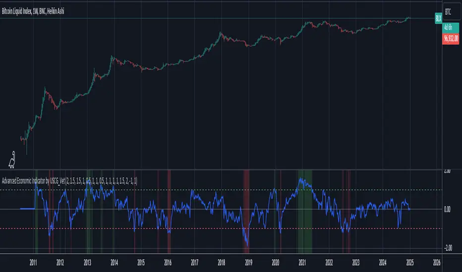
Advanced Economic Indicator by USCG_VetAdvanced Economic Indicator by USCG_Vet
tldr:
This comprehensive TradingView indicator combines multiple economic and financial metrics into a single, customizable composite index. By integrating key indicators such as the yield spread, commodity ratios, stock indices, and the Federal Reserve's QE/QT activities, it provides a holistic view of the economic landscape. Users can adjust the components and their weights to tailor the indicator to their analysis, aiding in forecasting economic conditions and market trends.
Detailed Description
Overview
The Advanced Economic Indicator is designed to provide traders and investors with a powerful tool to assess the overall economic environment. By aggregating a diverse set of economic indicators and financial market data into a single composite index, it helps identify potential turning points in the economy and financial markets.
Key Features:
Comprehensive Coverage: Includes 14 critical economic and financial indicators.
Customizable Components: Users can select which indicators to include.
Adjustable Weights: Assign weights to each component based on perceived significance.
Visual Signals: Clear plotting with threshold lines and background highlights.
Alerts: Set up alerts for when the composite index crosses user-defined thresholds.
Included Indicators
Yield Spread (10-Year Treasury Yield minus 3-Month Treasury Yield)
Copper/Gold Ratio
High Yield Spread (HYG/IEF Ratio)
Stock Market Performance (S&P 500 Index - SPX)
Bitcoin Performance (BLX)
Crude Oil Prices (CL1!)
Volatility Index (VIX)
U.S. Dollar Index (DXY)
Inflation Expectations (TIP ETF)
Consumer Confidence (XLY ETF)
Housing Market Index (XHB)
Manufacturing PMI (XLI ETF)
Unemployment Rate (Inverse SPY as Proxy)
Federal Reserve QE/QT Activities (Fed Balance Sheet - WALCL)
How to Use the Indicator
Configuring the Indicator:
Open Settings: Click on the gear icon (⚙️) next to the indicator's name.
Inputs Tab: You'll find a list of all components with checkboxes and weight inputs.
Including/Excluding Components
Checkboxes: Check or uncheck the box next to each component to include or exclude it from the composite index.
Default State: By default, all components are included.
Adjusting Component Weights:
Weight Inputs: Next to each component's checkbox is a weight input field.
Default Weights: Pre-assigned based on economic significance but fully adjustable.
Custom Weights: Enter your desired weight for each component to reflect your analysis.
Threshold Settings:
Bearish Threshold: Default is -1.0. Adjust to set the level below which the indicator signals potential economic downturns.
Bullish Threshold: Default is 1.0. Adjust to set the level above which the indicator signals potential economic upswings.
Setting the Timeframe:
Weekly Timeframe Recommended: Due to the inclusion of the Fed's balance sheet data (updated weekly), it's best to use this indicator on a weekly chart.
Changing Timeframe: Select 1W (weekly) from the timeframe options at the top of the chart.
Interpreting the Indicator:
Composite Index Line
Plot: The blue line represents the composite economic indicator.
Movement: Observe how the line moves relative to the threshold lines.
Threshold Lines
Zero Line (Gray Dotted): Indicates the neutral point.
Bearish Threshold (Red Dashed): Crossing below suggests potential economic weakness.
Bullish Threshold (Green Dashed): Crossing above suggests potential economic strength.
Background Highlights
Red Background: When the composite index is below the bearish threshold.
Green Background: When the composite index is above the bullish threshold.
No Color: When the composite index is between the thresholds.
Understanding the Components
1. Yield Spread
Description: The difference between the 10-year and 3-month U.S. Treasury yields.
Economic Significance: An inverted yield curve (negative spread) has historically preceded recessions.
2. Copper/Gold Ratio
Description: The price ratio of copper to gold.
Economic Significance: Copper is tied to industrial demand; gold is a safe-haven asset. The ratio indicates risk sentiment.
3. High Yield Spread (HYG/IEF Ratio)
Description: Ratio of high-yield corporate bonds (HYG) to intermediate-term Treasury bonds (IEF).
Economic Significance: Reflects investor appetite for risk; widening spreads can signal credit stress.
4. Stock Market Performance (SPX)
Description: S&P 500 Index levels.
Economic Significance: Broad measure of U.S. equity market performance.
5. Bitcoin Performance (BLX)
Description: Bitcoin Liquid Index price.
Economic Significance: Represents risk appetite in speculative assets.
6. Crude Oil Prices (CL1!)
Description: Front-month crude oil futures price.
Economic Significance: Influences inflation and consumer spending.
7. Volatility Index (VIX)
Description: Market's expectation of volatility (fear gauge).
Economic Significance: High VIX indicates market uncertainty; inverted in the indicator to align directionally.
8. U.S. Dollar Index (DXY)
Description: Value of the U.S. dollar relative to a basket of foreign currencies.
Economic Significance: Affects international trade and commodity prices; inverted in the indicator.
9. Inflation Expectations (TIP ETF)
Description: iShares TIPS Bond ETF prices.
Economic Significance: Reflects market expectations of inflation.
10. Consumer Confidence (XLY ETF)
Description: Consumer Discretionary Select Sector SPDR Fund prices.
Economic Significance: Proxy for consumer confidence and spending.
11. Housing Market Index (XHB)
Description: SPDR S&P Homebuilders ETF prices.
Economic Significance: Indicator of the housing market's health.
12. Manufacturing PMI (XLI ETF)
Description: Industrial Select Sector SPDR Fund prices.
Economic Significance: Proxy for manufacturing activity.
13. Unemployment Rate (Inverse SPY as Proxy)
Description: Inverse of the SPY ETF price.
Economic Significance: Represents unemployment trends; higher inverse SPY suggests higher unemployment.
14. Federal Reserve QE/QT Activities (Fed Balance Sheet - WALCL)
Description: Total assets held by the Federal Reserve.
Economic Significance: Indicates liquidity injections (QE) or withdrawals (QT); impacts interest rates and asset prices.
Customization and Advanced Usage
Adjusting Weights:
Purpose: Emphasize components you believe are more predictive or relevant.
Method: Increase or decrease the weight value next to each component.
Example: If you think the yield spread is particularly important, you might assign it a higher weight.
Disclaimer
This indicator is for educational and informational purposes only. It is not financial advice. Trading and investing involve risks, including possible loss of principal. Always conduct your own analysis and consult with a professional financial advisor before making investment decisions.
Enhanced Economic Composite with Dynamic WeightEnhanced Economic Composite with Dynamic Weight
Overview of the Indicator :
The "Enhanced Economic Composite with Dynamic Weight" is a comprehensive tool that combines multiple economic indicators, technical signals, and dynamic weighting to provide insights into market and economic health. It adjusts based on current volatility and recession risk, offering a detailed view of market conditions.
What This Indicator Does :
Tracks Economic Health: Uses key economic and market indicators to assess overall market conditions.
Dynamic Weighting: Adjusts the importance of components like stock indices, gold, and bonds based on volatility (VIX) and yield curve inversion.
Technical Signals: Identifies market momentum shifts through key crossovers like the Golden Cross, Death Cross, Silver Cross, and Hospice Cross.
Recession Shading: Marks known recessions for historical context.
Economic Factors Considered :
TIP (Treasury Inflation-Protected Securities): Reflects inflation expectations.
Gold: A safe-haven asset, increases in weight during volatility or rising momentum.
US Dollar Index (DXY): Measures USD strength, fixed weight of 10%, smoothed with EMA.
Commodities (DBC): Indicates global demand; weight increases with momentum or volatility.
Volatility Index (VIX): Reflects market risk, inversely related to market confidence.
Stock Indices (S&P 500, DJIA, NASDAQ, Russell 2000): Represent market performance, with weights reduced during high volatility or negative yield spread.
Yield Spread (10Y - 2Y Treasuries): Predicts recessions; negative spread reduces stock weighting.
Credit Spread (HYG - TLT): Indicates market risk through corporate vs. government bond yields.
How and Why Factors are Weighted:
Stock Indices get more weight in stable markets (low VIX, positive yield spread), while safe-haven assets like gold and bonds gain weight in volatile markets or during yield curve inversions. This dynamic adjustment ensures the composite reflects current market sentiment.
Technical Signals:
Golden Cross: 50 EMA crossing above 200 SMA, signaling bullish momentum.
Death Cross: 50 EMA below 200 SMA, indicating bearish momentum.
Silver Cross: 21 EMA crossing above 50 EMA, plotted only if below the 200-day SMA, signaling potential upside in downtrend conditions.
Hospice Cross: 50 EMA crosses below 21 EMA, plotted only if 21 EMA is below 200 SMA, a leading bearish signal.
Recession Shading:
Recession periods like the Great Recession, Early 2000s Recession, and COVID-19 Recession are shaded to provide historical context.
Benefits of Using This Indicator:
Comprehensive Analysis: Combines economic fundamentals and technical analysis for a full market view.
Dynamic Risk Adjustment: Weights shift between growth and safe-haven assets based on volatility and recession risk.
Early Signals: The Silver Cross and Hospice Cross provide early warnings of potential market shifts.
Recession Forecasting: Helps predict downturns through the yield curve and recession indicators.
Who Can Benefit:
Traders: Identify market momentum shifts early through crossovers.
Long-term Investors: Use recession warnings and dynamic adjustments to protect portfolios.
Analysts: A holistic tool for analyzing both economic trends and market movements.
This indicator helps users navigate varying market conditions by dynamically adjusting based on economic factors and providing early technical signals for market momentum shifts.

Implied Volatility WallsThe Implied Volatility Walls (IVW) indicator is a powerful and advanced trading tool designed to help traders identify key market zones where price may encounter significant resistance or support based on volatility. Using implied volatility, historical volatility, and machine learning models, IVW provides traders with a comprehensive understanding of market dynamics. This indicator is especially useful for those who wish to forecast volatility-driven price movements and adjust their trading strategies accordingly.
How the Implied Volatility Walls (IVW) Works:
The Implied Volatility Walls (IVW) indicator uses a combination of historical price data and advanced machine learning algorithms to calculate key volatility levels and forecast future market conditions. It tracks cumulative volatility, identifies support and resistance zones, and detects liquidation bubbles to highlight critical price areas.
The main concept behind this tool is that price tends to move most of the time by the same amount, making it possible to average the past maximum excursion in order to obtain a validated area where traders can be able to see clearly that the price is moving more than normal.
This indicator primarily focuses on:
1. Volatility Zones: Potential support and resistance levels based on implied and historical volatility.
2. Machine Learning Volatility Forecast: A machine learning model that predicts high, medium, or low volatility for future market conditions.
3. Liquidation Detection: Highlights key areas of potential forced liquidations, where market participants may be forced out of their positions, often leading to significant price movements.
4. Backtesting and Win Rate: The indicator continuously monitors how effective its volatility-based predictions are, offering insights into the performance of its predictions.
Key Features:
1. Volatility Tracking:
- The IVW indicator calculates cumulative volatility by analyzing the range between the high and low prices over time. It also tracks volatility percentiles and separates the market conditions into high, medium, or low volatility zones, enabling traders to gauge how volatile the market is.
2. Volatility Walls (Upper and Lower Zones):
- Upper Volatility Wall (Red Zones): Represent resistance levels where the price might encounter difficulty moving higher due to excess in volatility. This zone is calculated based on the chosen percentile in the settings.
- Lower Volatility Wall (Blue Zones): Represent support levels where price may find buying support.
- These walls help traders visualize potential zones where reversals or breakouts could occur based on volatility conditions.
3. Machine Learning Forecast:
- One of the standout features of the IVW indicator is its machine learning algorithm that estimates future volatility levels. It categorizes volatility into high, medium, and low based on recent data and provides forecasts on what the next market condition is likely to be.
- This forecast helps traders anticipate market conditions and adapt their strategies accordingly. It is displayed on the chart as "Exp. Vol", providing insight into the future expected volatility.
4. VIX Adjustments:
- The indicator can be adjusted using the well-known **VIX (Volatility Index)** to further refine its volatility predictions. This enables traders to incorporate market sentiment into their analysis, improving the accuracy of the predictions for different market conditions.
5. Liquidation Bubbles:
- The Liquidation Bubbles feature highlights areas where large forced selling or buying events may occur, which are usually accompanied by spikes in volatility and volume. These bubbles appear when price deviates significantly from moving averages with substantial volume increases, alerting traders to potential volatile moves.
- Red dots indicate likely forced liquidations on the upside, and blue dots indicate forced liquidations on the downside. These bubbles can help traders spot moments of market stress and potential price swings due to liquidations.
6. Dynamic Volatility Zones:
- IVW dynamically adjusts support and resistance levels as market conditions evolve. This allows traders to always have up-to-date and relevant information based on the latest volatility patterns.
7. Cumulative Volatility Histogram:
- At the bottom of the chart, the purple histogram represents cumulative volatility over time, giving traders a visual cue of whether volatility is building up or subsiding. This can provide early signals of market transitions from low to high volatility, aiding traders in timing their entries and exits more accurately.
8. Backtesting and Win Rate:
- The IVW indicator includes a backtesting function that monitors the success of its volatility predictions over a selected period. It shows a Win Rate (WR) percentage (with 33% meaning that the machine learning algorithm does not bring any edge), representing how often the indicator's predictions were correct. This metric is crucial for assessing the reliability of the model’s forecasts.
9. Opening Range:
- At the beginning of a new session, the indicator will plot two lines indicating the high and the low of the first candle of the new time frame chosen.
Chart Breakdown:
Below is a description of what users see when using the Implied Volatility Walls (IVW) indicator on the chart:
Volatility Walls:
- Red shaded zones at the top represent upper volatility walls (resistance zones), while blue shaded zones at the bottom represent lower volatility walls (support zones). These areas show where price is likely to react due to high or low volatility conditions.
Liquidation Bubbles:
- Red and blue dots plotted above and below the price represent **liquidation bubbles**, indicating moments of market stress where volatility and volume spikes may force market participants to exit positions.
Cumulative Volatility Histogram:
- The purple histogram at the bottom of the chart reflects the buildup of cumulative volatility over time. Higher bars suggest increased volatility, signaling the potential for large price movements, while smaller bars represent calmer market conditions.
Real-Time Support and Resistance Levels:
- Solid and dashed lines represent current and historical support and resistance levels, helping traders identify price zones that have historically acted as volatility-driven turning points.
Gradient Bar Colors:
- The price bars change color based on their proximity to the volatility walls, with different colors representing how close the price is to these key levels. This color gradient provides a quick visual cue of potential market turning points.
Data Tables Explained:
Table 1: **Volatility Information Table (Top Right Corner):
- EV: Expected Volatility (based on the VIX FIX calculation from Larry Williams).
- +V and -V: Represents the adjusted volatility for upward (+V) and downward (-V) movements.
- Exp. Vol: Shows the expected volatility condition for the next period (High, Medium, or Low) based on the machine learning algorithm.
- WR: The Win Rate based on the backtesting of previous volatility predictions (three outcomes, so base Win rate is 33%, and not 50%).
Table 2: Expected Cumulative Range (Top Right Corner of the separated pane):
- Exp. CR: Expected Cumulative Range based on a machine learning algorithm that calculate the most likely outcome (cumulative range) based on the past days and metrics.
How to Use the Indicator:
1. Identify Key Support and Resistance Levels:
- Use the upper (red) and lower (blue) volatility walls to identify zones where the price is likely to face resistance or support due to volatility dynamics.
2. Forecast Future Volatility:
- Pay attention to the Expected Vol field in the table to understand whether the machine learning model predicts high, medium, or low volatility for the next trading session.
3. Monitor Liquidation Bubbles:
- Watch for red and blue bubbles as they can signal significant market events where volatility and volume spikes may lead to sudden price reversals or continuations.
4. Use the Histogram to Gauge Market Conditions:
- The cumulative volatility histogram shows whether the market is entering a high or low volatility phase, helping you adjust your risk accordingly and making you able to identify the potential of the rest of the chosen session.
5. Backtesting Confidence:
- The Win Rate (WR) provides insight into how reliable the indicator’s predictions have been over the backtested period, giving you additional confidence in its future forecasts, remember that considering the 3 scenarios possible (high volatility, medium and low volatility), the standard win rate is 33%, and not 50%!.
Final Notes:
The Implied Volatility Walls (IVW) indicator is a powerful tool for volatility-based analysis, providing traders with real-time data on potential support and resistance levels, liquidation bubbles, and future market conditions. By leveraging a machine learning model for volatility forecasting, this tool helps traders stay ahead of the market’s volatility patterns and make informed decisions.
Disclaimer: This tool is for educational purposes only and should not be solely relied upon for trading decisions. Always perform your own research and risk management when trading.

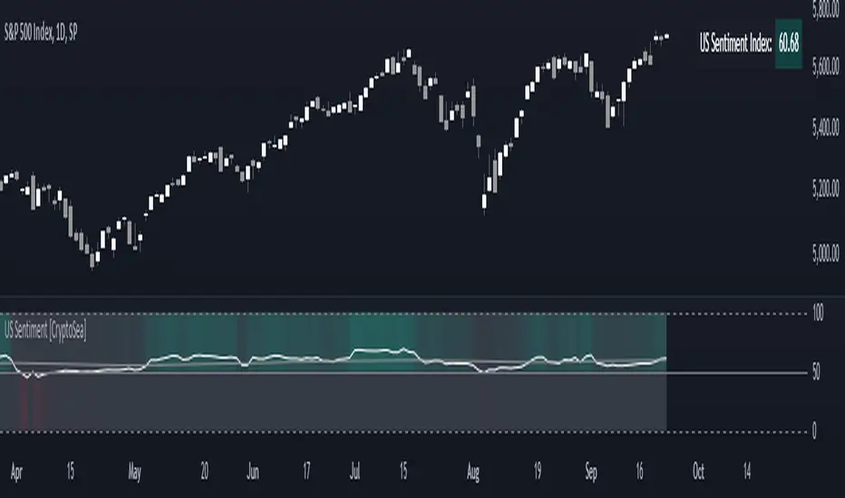
US Sentiment Index [CryptoSea]The US Sentiment Index is an advanced analytical tool designed for traders seeking to uncover patterns, correlations, and potential leading signals across key market tickers. This indicator surpasses traditional sentiment measures, providing a data-driven approach that offers deeper insights compared to conventional indices like the Fear and Greed Index.
Key Features
Multi-Ticker Analysis: Integrates data from a diverse set of market indicators, including gold, S&P 500, U.S. Dollar Index, Volatility Index, and more, to create a comprehensive view of market sentiment.
Customisable Sensitivity Settings: Allows users to adjust the moving average period to fine-tune the sensitivity of sentiment calculations, adapting the tool to various market conditions and trading strategies.
Detailed Sentiment Scaling: Utilises a 0-100 scale to quantify sentiment strength, with colour gradients that visually represent bearish, neutral, and bullish conditions, aiding in quick decision-making.
Below is an example where the sentiment index can give leading signals. We see a first sign of wekaness in the index as it drops below its moving average. Shortly after we see it dip below our median 50 level, another sign of weakeness. We see the SPX price action to take a hit following the sentiment index decrease.
Tickers Used and Their Impact on Sentiment
The impact of each ticker on sentiment can be bullish or bearish, depending on their behaviour:
Gold (USGD): Typically seen as a safe-haven asset, rising gold prices often indicate increased market fear or bearish sentiment. Conversely, falling gold prices can signal reduced fear and a shift towards bullish sentiment in riskier assets.
S&P 500 (SPX): A rising S&P 500 is usually a sign of bullish sentiment, reflecting confidence in economic growth and market stability. A decline, however, suggests bearish sentiment and a potential move towards risk aversion.
U.S. Dollar Index (DXY): A strengthening U.S. Dollar can be a sign of fear as investors seek safety in the dollar, which is bearish for risk assets. A weakening dollar, on the other hand, can signal bullish sentiment as capital flows into riskier assets.
Volatility Index (VIX): Known as the "fear gauge," a rising VIX indicates increased market fear and bearish sentiment. A falling VIX suggests a calm, bullish market environment.
Junk Bonds (JNK): Rising junk bond prices often reflect bullish sentiment as investors take on more risk for higher returns. Conversely, falling junk bond prices signal increased fear and bearish sentiment.
Long-Term Treasury Bonds (TLT): Higher prices for long-term treasuries usually indicate a flight to safety, reflecting bearish sentiment. Lower prices suggest a shift towards riskier assets, indicating bullish sentiment.
Financial Sector ETF (XLF): Strength in the financial sector is typically bullish, indicating confidence in economic conditions. Weakness in this sector can reflect bearish sentiment and concerns about financial stability.
Unemployment Rate (USUR): A rising unemployment rate is a bearish signal, indicating economic weakness. A declining unemployment rate is bullish, reflecting economic strength and job growth.
U.S. Interest Rates (USINTR, USIRYY): Higher interest rates can be bearish, as they increase borrowing costs and reduce spending. Lower rates are generally bullish, promoting economic growth and risk-taking.
How it Works
Sentiment Calculation: The US Sentiment Index combines data from multiple tickers, calculating sentiment by scaling the distance from their respective moving averages. Each asset's behaviour is interpreted within the context of market fear or greed, providing a refined sentiment reading that adjusts dynamically.
Market Strength Analysis: When the index is above 50 and also above its moving average, it indicates particularly strong or bullish market conditions, driven by greed. Conversely, when the index is below 50 and under its moving average, it signals bearish or weak market conditions, associated with fear.
Correlation and Pattern Detection: The indicator analyses correlations among the included assets to detect patterns that might signal potential market movements, giving traders a leading edge over simpler sentiment measures.
Adaptive Background Colouring: Utilises a colour gradient that dynamically adjusts based on sentiment values, highlighting extreme fear, neutral, and extreme greed levels directly on the chart.
Flexible Display Options: Offers settings to toggle the moving average plot and adjust its period, giving users the ability to tailor the indicator's sensitivity and display to their specific needs.
In this example below, we can see the Sentiment rise above the Moving Average (MA). Price action goes on to follow this, although there is an instance where it dips below the MA, it quickly rises back above again as a sign of strength.
Another way you can use this index is by simply using the MA, if its trending up, we know the macro sentiment is bullish.
Application
Data-Driven Insights: Offers traders a detailed, data-driven approach to sentiment analysis, incorporating a broad spectrum of market indicators to deliver actionable insights.
Pattern Recognition: Helps identify patterns and correlations that may lead to market reversals or continuations, providing a nuanced view that goes beyond simple sentiment gauges.
Enhanced Decision-Making: Equips traders with a robust tool to validate trading strategies and make informed decisions based on comprehensive sentiment analysis.
The US Sentiment Index by is an essential addition to the toolkit of any trader looking to navigate market complexities with precision and confidence. Its advanced features and data-driven approach offer unparalleled insights into market sentiment, setting it apart from conventional sentiment indicators.
Volatility Projection Levels (VPL)### Indicator Name: **Volatility Projection Levels (VPL)**
### Description:
The **Volatility Projection Levels (VPL)** indicator is a powerful tool designed to help traders anticipate key support and resistance levels for the E-mini S&P 500 (ES) by leveraging the CBOE Volatility Index (^VIX). This indicator utilizes historical volatility data to project potential price movements for the upcoming month, offering clear visual cues that enhance swing trading strategies.
### Key Features:
- **Volatility-Based Projections**: The VPL indicator uses the previous month’s closing value of the VIX, normalizing it for monthly analysis by dividing by the square root of 12. This calculated percentage is then applied to the E-mini S&P 500’s closing price from the last day of the previous month.
- **Upper and Lower Projection Levels**: The indicator calculates two essential levels:
- **Upper Projection Level**: The previous month’s closing price of the E-mini S&P 500 plus the calculated volatility percentage.
- **Lower Projection Level**: The previous month’s closing price of the E-mini S&P 500 minus the calculated volatility percentage.
- **Continuous Visualization**: The VPL indicator plots these projection levels on the chart throughout the entire month, providing traders with a consistent reference for potential support and resistance zones. This continuous visualization allows for better anticipation of market movements.
- **Previous Month's Close Reference**: Additionally, the indicator plots the previous month’s closing price as a reference point, offering further context for current price action.
### Use Cases:
- **Swing Trading**: The VPL indicator is ideal for swing traders looking to exploit predicted price ranges within a monthly timeframe.
- **Support & Resistance Identification**: It aids traders in identifying critical levels where the market may encounter support or resistance, thus informing entry and exit decisions.
- **Risk Management**: By forecasting potential price levels, traders can set more strategic stop-loss and take-profit levels, enhancing risk management.
### Summary:
The **Volatility Projection Levels (VPL)** indicator equips traders with a forward-looking tool that incorporates volatility data into market analysis. By projecting key price levels based on historical VIX data, the VPL indicator enhances decision-making, helping traders anticipate market movements and optimize their trading strategies.
Made by Serpenttrading

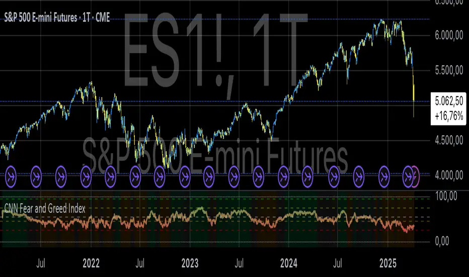
CNN Fear and Greed IndexThe “CNN Fear and Greed Index” indicator in this context is designed to gauge market sentiment based on a combination of several fundamental indicators. Here’s a breakdown of how this indicator works and what it represents:
Components of the Indicator:
1. Stock Price Momentum:
• Calculates the momentum of the S&P 500 index relative to its 125-day moving average. Momentum is essentially the rate of acceleration or deceleration of price movements over time.
2. Stock Price Strength:
• Measures the breadth of the market by comparing the number of stocks hitting 52-week highs versus lows. This provides insights into the overall strength or weakness of the market trend.
3. Stock Price Breadth:
• Evaluates the volume of shares trading on the rise versus the falling volume. Higher volume on rising days suggests positive market breadth, while higher volume on declining days indicates negative breadth.
4. Put and Call Options Ratio (Put/Call Ratio):
• This ratio indicates the sentiment of investors in the options market. A higher put/call ratio typically signals increased bearish sentiment (more puts relative to calls) and vice versa.
5. Market Volatility (VIX):
• Also known as the “fear gauge,” the VIX measures the expected volatility in the market over the next 30 days. Higher VIX values indicate higher expected volatility and often correlate with increased fear or uncertainty in the market.
6. Safe Haven Demand:
• Compares the returns of stocks (represented by S&P 500) versus safer investments like 10-year Treasury bonds. Higher returns on bonds relative to stocks suggest a flight to safety or risk aversion.
7. Junk Bond Demand:
• Measures the spread between yields on high-yield (junk) bonds and investment-grade bonds. Widening spreads may indicate increasing risk aversion as investors demand higher yields for riskier bonds.
Normalization and Weighting:
• Normalization: Each component is normalized to a scale of 0 to 100 using a function that adjusts the range based on historical highs and lows of the respective indicator.
• Weighting: The user can adjust the relative importance (weight) of each component using input parameters. This customization allows for different interpretations of market sentiment based on which factors are considered more influential.
Fear and Greed Index Calculation:
• The Fear and Greed Index is calculated as a weighted average of all normalized components. This index provides a single numerical value that summarizes the overall sentiment of the market based on the selected indicators.
Usage:
• Visualization: The indicator plots the Fear and Greed Index and its components on the chart. This allows traders and analysts to visually assess the sentiment trends over time.
• Analysis: Changes in the Fear and Greed Index can signal shifts in market sentiment. For example, a rising index may indicate increasing greed and potential overbought conditions, while a falling index may suggest increasing fear and potential oversold conditions.
• Customization: Traders can customize the indicator by adjusting the weights assigned to each component based on their trading strategies and market insights.
By integrating multiple fundamental indicators into a single index, the “CNN Fear and Greed Index” provides a comprehensive snapshot of market sentiment, helping traders make informed decisions about market entry, exit, and risk management strategies.
GKD-M Stepped Baseline Optimizer [Loxx]The Giga Kaleidoscope GKD-M Stepped Baseline Optimizer is a Metamorphosis module included in the "Giga Kaleidoscope Modularized Trading System."
█ Introduction
The GKD-M Stepped Baseline Optimizer is an advanced component of the Giga Kaleidoscope Modularized Trading System (GKD), designed to enhance trading strategy development by dynamically optimizing Baseline moving averages. This tool allows traders to evaluate over 65 moving averages, adjusting them across multiple periods to identify which settings yield the highest win rates for their trading strategies. The optimizer systematically tests these moving averages across specified timeframes and intervals, offering insights into net profit, total closed trades, win percentages, and other critical metrics for both long and short positions. Traders can define the initial period and incrementally adjust this value to explore a wide range of periods, thus fine-tuning their strategies with precision. What sets the GKD-M Stepped Baseline Optimizer apart is its unique capability to adapt the baseline moving average according to the highest win rates identified during backtesting, at each trading candle. This win-rate adaptive approach ensures that the trading system is always aligned with the most effective period settings for the selected moving average, enhancing the system's overall performance. Moreover, the 'stepped' aspect of this optimizer introduces a filtering process based ons, significantly reducing market noise and ensuring that identified trends are both significant and reliable. This feature is critical for traders looking to mitigate the risks associated with volatile market conditions and to capitalize on genuine market movements.In essence, the GKD-M Stepped Baseline Optimizer is tailored for traders who utilize the GKD trading system, offering a sophisticated tool to refine their baseline indicators dynamically, ensuring that their trading strategies are continuously optimized for maximum efficacy.
**the backtest data rendered to the chart above uses $5 commission per trade and 10% equity per trade with $1 million initial capital. Each backtest result for each ticker assumes these same inputs. The results are NOT cumulative, they are separate and isolated per ticker and trading side, long or short**
█ Core Features
Stepped Baseline for Noise Reduction
One of the hallmark features of the GKD-M Stepped Baseline Optimizer is its stepped baseline capability. This advanced functionality employs volatility filters to refine the selection of moving averages, significantly reducing market noise. The optimizer ensures that only substantial and reliable trends are considered, eliminating the false signals often caused by minor price fluctuations. This stepped approach to baseline optimization is critical for traders aiming to develop strategies that are both resilient and responsive to genuine market movements.
Dynamic Win Rate Adaptive Capability
Another cornerstone feature is the optimizer’s dynamic win rate adaptive capability. This unique aspect allows the optimizer to adjust the moving average period settings in real-time, based on the highest win rates derived from backtesting over a predefined range. At every trading candle, the optimizer evaluates a comprehensive set of backtesting data to ascertain the optimal period settings for the moving average in use. To perform the backtesting, the trader selects an initial period input (default is 60) and a skip value that increments the initial period input up to seven times. For instance, if a skip value of 5 is chosen, the Baseline Optimizer will run the backtest for the selected moving average on periods such as 60, 65, 70, 75, and so on, up to 90. If the user selects an initial period input of 45 and a skip value of 2, the Baseline Optimizer will conduct backtests for the chosen moving average on periods like 45, 47, 49, 51, and so forth, up to 57. The GKD-M Stepped Baseline Optimizer then exports the baseline with the highest cumulative win rate per candle to any baseline-enabled GKD backtest. This ensures that the baseline indicator remains continually aligned with the most efficacious parameters, dynamically adapting to changing market conditions.
Comprehensive Moving Averages Evaluation
The optimizer’s ability to test over 65 different moving averages across multiple periods stands as a testament to its comprehensive analytical capability. Traders have the flexibility to explore a wide array of moving averages, from traditional ones like the Simple Moving Average (SMA) and Exponential Moving Average (EMA) to more complex types such as the Hull Moving Average (HMA) and Adaptive Moving Average (AMA). This extensive evaluation allows traders to pinpoint the moving average that best aligns with their trading strategy and market conditions, further enhancing the system’s adaptability and effectiveness.
Volatility Filtering and Ticker Volatility Types
Incorporating a wide range of volatility types, including the option to utilize external volatility tickers like the VIX for filtering, adds another layer of sophistication to the optimizer. This feature allows traders to calibrate their baseline according to externals, providing an additional dimension of customization. Whether using standard deviation, ATR, or external volatility indices, traders can fine-tune their strategies to be responsive to the broader market sentiment and volatility trends.
█ Key Inputs
Baseline Settings
• Baseline Source: Determines the price data (Open, High, Low, Close) used for moving average calculations.
• Baseline Period: The starting period for moving average calculation.
• Backtest Skip: Incremental steps for period adjustments in the optimization process.
• Baseline Filter Type: Selection from over 65 moving averages for baseline calculation.
Volatility and Filter Settings
• Price Filter Type & Moving Average Filter Type: Defines thement applied to the price or the moving average, enhancing filter specificity.
• Filter Options: Allows users to select the application area of the volatility filter (price, moving average, or both).
• Filter Multiplier & Period: Configures the intensity and temporal scope of the filter, fine-tuning sensitivity to market volatility.
Backtest Configuration
• Window Period: Specifies the length of the backtesting window in days.
• Backtest Type: Chooses between a fixed window or cumulative data approach for backtesting.
• Initial Capital, Order Size, & Type: Sets the financial parameters for backtesting, including starting equity and the scale of trades.
• Commission per Order: Accounts for trading costs within backtest profitability calculations.
Date and Time Range
• From/Thru Year/Month/Day: Defines the historical period for strategy testing.
• Entry Time: Specifies the time frame during which trades can be initiated, crucial for strategies sensitive to market timing.
Volatility Measurements for Goldie Locks Volatility Qualifiers
• Mean Type & Period: Chooses the moving average type and period for volatility assessment.
• Inner/Outer Volatility Qualifier Multipliers: Adjusts the boundaries for volatility-based trade qualification.
• Activate Qualifier Boundaries: Enables or disables the upper and lower volatility qualifiers.
Advanced Volatility Inputs
• Volatility Ticker Selection & Trading Days: Incorporates external volatility indices (e.g., VIX) into the strategy, adjusting for market volatility.
• Static Percent, MAD Internal Filter Period, etc.: Provides fixed or adaptive volatility thresholds for filtering.
UI Customization
• Baseline Width & Table Display Options: Customizes the visual representation of the baseline and the display of optimization results.
• Table Header/Content Color & Text Size: Enhances readability and user interface aesthetics.
Export Options
• Export Data: Selects the specific metric to be exported from the script, such as net profit or average profit per trade.
Moving Average Specific Parameters
Specific inputs tailored to the characteristics of selected moving averages (e.g., Fractal Adjusted (FRAMA), Least Squares Moving Average (LSMA), T3, etc.), allowing users to fine-tune the behavior of these averages based on unique formula requirements.
█ Indicator UI
• Long and Short Baselines: The optimizer differentiates trends through two distinct baselines: a green line for long (uptrend) baselines and a red line for short (downtrend) baselines. These baselines alternate activation based on the current trend direction as determined by the moving average plus length combination for the candle in view.
Ambiguity in market direction, when an uptrend and downtrend are concurrently indicated, is visually represented by yellow lines.
• Stepping Mechanism for Trend Visualization: Adjusting the source input and the moving average output based on volatility, the indicator exhibits a stepped appearance on the chart. This mechanism ensures that only substantial market movements, surpassing a specified volatility threshold, are recognized as trend changes.
Stepping Activated
• Goldilocks Zone: Beyond the long and short baselines, the Goldilocks zone introduces a distinct moving average that closely follows the selected price or source input, aiming to strike the perfect balance between not too much and not too little market movement for trading. The upper limit of the Goldilocks zone indicates a market stretch too far for advantageous trading (overextension), while the lower limit suggests inadequate market movement for entry (underextension). Trading within the Goldilocks zone is deemed optimal, as it signifies sufficient but not excessive volatility for entering trades, aligning with either the long or short baseline recommendations. Moreover, the mean of the Goldilocks zone serves as a critical indicator, offering a median reference point that aligns closely with the market's current state. This mean is pivotal for traders, as it represents a 'just right' condition for market entry, embodying the essence of the Goldilocks principle in financial trading strategies.
• Signal Indicators and Entry Points: The chart includes with green or red dots to signify valid price points within the Goldilocks zone, indicative of conducive trading conditions. Furthermore, small directional arrows at the chart's bottom highlight potential long or short entry points, validated by the Goldilocks zone's parameters.
• Data Table: A table presenting real-time statistics from the current candle backward through the chosen range offers insights into win rates and other relevant data, aiding in informed decision-making. This table adapts with each new candle, highlighting the most favorable win rates for both long and short positions.
█ Optimizing Strategy with Backtesting
Optimizing a trading strategy with backtesting involves rigorously testing the strategy on historical data to evaluate its performance and robustness before applying it in live markets. The GKD-M Stepped Baseline Optimizer incorporates advanced backtesting capabilities, offering both cumulative and rolling window types of backtests. Here's how each backtest type operates and the insights they provide for refining trading strategies:
Cumulative Backtest
• Overview: A cumulative backtest evaluates a strategy's performance over a continuous period without resetting the strategy parameters or the simulated trading capital at the beginning of each new period.
• Utility: This type is useful for understanding a strategy's long-term viability, assessing how it adapts to different market conditions over an extended timeframe.
• Interpreting Statistics: Cumulative backtest results often focus on overall return, drawdowns, win rate, and the Sharpe ratio. A strategy with consistent returns, manageable drawdowns, a high win rate, and a favorable Sharpe ratio is considered robust.
Rolling Window Backtest
• Overview: Unlike the cumulative approach, a rolling window backtest divides the historical data into smaller, overlapping or non-overlapping periods (windows), running the strategy separately on each. After each window, the strategy parameters and simulated trading capital are reset.
• Utility: This method is invaluable for assessing a strategy's consistency and adaptability to various market phases. It helps identify if the strategy's performance is dependent on specific market conditions.
• Interpreting Statistics: For rolling window backtests, consistency is key. Look for similar performance metrics (returns, drawdowns, win rate) across different windows. Variability in performance indicates sensitivity to market conditions, suggesting the need for strategy adjustments.
Strategy Refinement Through Backtest Statistics
• Net Profit and Loss: Measures the strategy’s overall effectiveness. Consistent profitability across different market conditions is a positive indicator.
• Win Rate and Profit Factor: High win rates and profit factors indicate a strategy's efficiency in capturing gains over losses.
• Average Profit per Trade: Understanding the strategy's ability to generate profit on a per-trade basis can highlight its operational efficiency.
• Average Number of Bars in Trade: This metric helps understand the strategy's market exposure and timing efficiency.
█ Exporting Data and Integration with GKD Backtests
The GKD-M Stepped Baseline Optimizer seamlessly integrates with the broader GKD trading system, allowing traders to export the optimization data and leverage it within the various GKD backtest modules. This feature allows users to forward the GKD-M Stepped Baseline Optimizer adaptive signals to a GKD backtest to be used as a Baseline component in a GKD trading system.
█ Moving Averages included in the Stepped Baseline Optimizer
The GKD-M Stepped Baseline Optimizer incorporates an extensive array of over 65 moving averages, each with unique characteristics and implications for trading strategy development. This comprehensive suite enables traders to conduct nuanced analysis and optimization, ensuring the selection of the most effective moving average for Baseline input into their GKD trading system.
Adaptive Moving Average - AMA
ADXvma - Average Directional Volatility Moving Average
Ahrens Moving Average
Alexander Moving Average - ALXMA
Coral
Deviation Scaled Moving Average - DSMA
Donchian
Double Exponential Moving Average - DEMA
Double Smoothed Exponential Moving Average - DSEMA
Double Smoothed FEMA - DSFEMA
Double Smoothed Range Weighted EMA - DSRWEMA
Double Smoothed Wilders EMA - DSWEMA
Double Weighted Moving Average - DWMA
Ehlers Optimal Tracking Filter - EOTF
Exponential Moving Average - EMA
Fast Exponential Moving Average - FEMA
Fractal Adaptive Moving Average - FRAMA
Generalized DEMA - GDEMA
Generalized Double DEMA - GDDEMA
Geometric Mean Moving Average
Hull Moving Average (Type 1) - HMA1
Hull Moving Average (Type 2) - HMA2
Hull Moving Average (Type 3) - HMA3
Hull Moving Average (Type 4) - HMA4
IE/2 - Early T3 by Tim Tilson
Integral of Linear Regression Slope - ILRS
Instantaneous Trendline
Kalman Filter
Kaufman Adaptive Moving Average - KAMA
Laguerre Filter
Leader Exponential Moving Average
Linear Regression Value - LSMA (Least Squares Moving Average)
Linear Weighted Moving Average - LWMA
McGinley Dynamic
McNicholl EMA
Non-Lag Moving Average
Ocean NMA Moving Average - ONMAMA
One More Moving Average - OMA
Parabolic Weighted Moving Average
Probability Density Function Moving Average - PDFMA
Quadratic Regression Moving Average - QRMA
Range Filter
Range Weighted EMA - RWEMA
Recursive Moving Trendline
Regularized EMA - REMA
Simple Decycler - SDEC
Simple Loxx Moving Average - SLMA
Simple Moving Average - SMA
Sine Weighted Moving Average
Smoothed LWMA - SLWMA
Smoothed Moving Average - SMMA
Smoother
Super Smoother
T3
Tether Lines
Three-pole Ehlers Butterworth
Three-pole Ehlers Smoother
Triangular Moving Average - TMA
Triangle Moving Average Generalized
Triple Exponential Moving Average - TEMA
Two-pole Ehlers Butterworth
Two-pole Ehlers smoother
Ultimate Smoother
Variable Index Dynamic Average - VIDYA
Variable Moving Average - VMA
Volume Weighted EMA - VEMA
Volume Weighted Moving Average - VWMA
Zero-Lag DEMA - Zero Lag Double Exponential Moving Average
Zero-Lag Moving Average
Zero Lag TEMA - Zero Lag Triple Exponential Moving Average
█ Volatility Types and Filtering
The GKD-M Stepped Baseline Optimizer features a comprehensive selection of over 15 volatility types, each tailored to capture different aspects of market behavior and risk.
Volatility Ticker Selection: Enables direct incorporation of external volatility indicators like VIX and EUVIX into the script for market sentiment analysis, signal filtering enhancement, and real-time risk management adjustments.
Standard Deviation of Logarithmic Returns: Quantifies asset volatility using the standard deviation applied to logarithmic returns, capturing symmetric price movements and financial returns' compound nature.
Exponential Weighted Moving Average (EWMA) for Volatility: Focuses on recent market information by applying exponentially decreasing weights to squared logarithmic returns, offering a dynamic view of market volatility.
Roger-Satchell Volatility Measure: Estimates asset volatility by analyzing the high, low, open, and close prices, providing a nuanced view of intraday volatility and market dynamics.
Close-to-Close Volatility Measure: Calculates volatility based on the closing prices of stocks, offering a streamlined but limited perspective on market behavior.
Parkinson Volatility Measure: Enhances volatility estimation by including high and low prices of the trading day, capturing a more accurate reflection of intraday market movements.
Garman-Klass Volatility Measure: Incorporates open, high, low, and close prices for a comprehensive daily volatility measure, capturing significant price movements and market activity.
Yang-Zhang Volatility Measure: Offers an efficient estimation of stock market volatility by combining overnight and intraday price movements, capturing opening jumps and overall market dynamics.
Garman-Klass-Yang-Zhang Volatility Measure: Merges the benefits of Garman-Klass and Yang-Zhang measures, providing a fuller picture of market volatility including opening market reactions.
Pseudo GARCH(2,2) Volatility Model: Mimics a GARCH(2,2) process using exponential moving averages of squared returns, highlighting volatility shocks and their future impact.
ER-Adaptive Average True Range (ATR): Adjusts the ATR period length based on market efficiency, offering a volatility measure that adapts to changing market conditions.
Adaptive Deviation: Dynamically adjusts its calculation period to offer a nuanced measure of volatility that responds to the market's intrinsic rhythms.
Median Absolute Deviation (MAD): Provides a robust measure of statistical variability, focusing on deviations from the median price, offering resilience against outliers.
Mean Absolute Deviation (MAD): Measures the average magnitude of deviations from the mean price, facilitating a straightforward understanding of volatility.
ATR (Average True Range): Finds the average of true ranges over a specified period, indicating the expected price movement and market volatility.
True Range Double (TRD): Offers a nuanced view of volatility by considering a broader range of price movements, identifying significant market sentiment shifts.

Normalized Market IndicatorsExplanation of the Code:
Data Retrieval: The script retrieves the closing prices of the S&P 500 (sp500) and VIX (vix).
Normalization: The script normalizes these values using a simple z-score normalization (subtracting the 50-period simple moving average and dividing by the 50-period standard deviation). This makes the scales of the two datasets more comparable.
Plotting with Secondary Axis: The normalized values of the S&P 500 and VIX are plotted on the same chart. They will share the same y-axis scale as the main chart (e.g. Netflix, GOLD, Forex).
Points to Note:
Normalization Method: The method of normalization (z-score in this case) is a choice and can be adjusted based on your needs. The idea is to bring the data to a comparable scale.
Timeframe and Symbol Codes: Ensure the timeframe and symbol codes are appropriate for your data source and trading strategy.
Overlaying on Price Chart: Since these values are normalized and plotted on a seperate chart, they won't directly correspond to the price levels of the main chart (e.g. Netflix, GOLD, Forex).
COSTAR [SS]This idea came to me after I wrote the post about Co-Integration and pair trading. I wondered if you could use pair trading principles as a way to determine overbought and oversold conditions in a more neutral way than RSI or Stochastics.
The results were promising and this indicator resulted :-)!
About:
COSTAR provides another, more neutral way to determine whether an equity is overbought or oversold.
Instead of relying on the traditional oscillator based ways, such as using RSI, Stochastics and MFI, which can be somewhat biased and narrow sided, COSTAR attempts to take a neutral, unbiased approached to determine overbought and oversold conditions. It does this through using a co-integrated partner, or "pair" that is closely linked to the underlying equity and succeeds on both having a high correlation and a high t-statistic on the ADF test. It then references this underlying, co-integrated partner as the "benchmark" for the co-integration relationship.
How this succeeds as being "unbiased" and "neutral" is because it is responsive to underlying drivers. If there is a market catalyst or just general bullish or bearish momentum in the market, the indicator will be referencing the integrated relationship between the two pairs and referencing that as a baseline. If there is a sustained rally on the integrated partner of the underlying ticker that is holding, but the other ticker is lagging, it will indicate that the other ticker is likely to be under-valued and thus "oversold" because it is underperforming its benchmark partner.
This is in contrast to traditional approaches to determining overbought and oversold conditions, which rely completely on a single ticker, with no external reference to other tickers and no control over whether the move could potentially be a fundamental move based on an industry or sector, or whether it is a fluke or a squeeze.
The control for this giving "false" signals comes from its extent of modelling and assessment of the degree of integration of the relationship. The parameters are set by default to assess over a 1 year period, both the correlation and the integration. Anything that passes this degree of integration is likely to have a solid, co-integrated state and not likely to be a "fluke". Thus, the reliability of the assessment is augmented by the degree of statistical significance found within the relationship. The indicator is not going to prompt you to rely on a relationship that is statistically weak, and will warn you of such.
The indicator will show you all the information you require regarding the relationship and whether it is reliable or not, so you do not need to worry!
How to Use
The first step to use COSTAR is identifying which ticker has a strong relationship with the current ticker. In the main chart, you will see that SPY is overlaid with VIX. There is a strong, negative correlation between the VIX and SPY. When VIX is entered as the paired ticker, the indicator returns the data as stationary, indicating a compatible match.
Now you have 3 ways of viewing this relationship, 2 of which are going to be directly applicable to trading.
You can view them as
Price to Price Ratio (Not very useful for trading, but if you are curious)
Z-Score: Helpful for trading
Co-integration: Helpful for trading
Here is an example of all three:
Example of Z-Score Chart:
Example of Price Ratio:
Example of Co-Integration Pair:
Using for Trading
As stated above, the two best ways to use this for trading is to either use the Z-Score Chart or the Co-Integrated Pair chart.
The Z-Score chart is based off of the price ratio data and provides an assessment of both the independent and dependent data.
The co-integration shows the dependent (the ticker you are trading) in yellow and the independent (the ticker you are referencing) in teal. When teal is above yellow, you will see it is green. This means, based on your benchmark pair, there is still more up room and the ticker you are trading is actually lagging behind.
When the yellow crosses up, it will turn red. This means that your ticker is out-performing the benchmark pair and you likely will see pullback and a "regression to the mean" through re-integration.
The indicator is capable of plotting out entries and exits, which are guided by the z-score:
How Effective is it?
I created a basic strategy in Pinescript, and the back-test results vary. Trading ES1! using NQ1! as the co-integrated pair, results were around 78% effective.
With VIX, results were around 50% effective, but with a net profit.
Generally, the efficacy surpassed that of both stochastics and RSI.
I will be releasing the strategy version of this in the coming days, still just cleaning up that code and making it more "public use" friendly.
Other Applications
If you are a pair trader, you can technically use this for pair trading as well. That's essentially all this is doing :-).
Tips
If you are trading a ticker such as MSFT, AMD, KO etc., it's best to try to find an ETF or index that has that particular ticker as a large holding and use that as your benchmark. You will see on the indicator whether there is a high correlation and whether the data is indeed stationary.
If the indicator returns "Non-stationary", you can attempt to extend your regression range from 252 to 500. If this fixes the issue, ensure that the correlation is still >= 0.5 or <= -0.5. If this does not work still, you will need to find another pair, as its likely the result of incompatibility and an insignificant relationship.
To help you identify tickers with strong relationships, consider using a correlation heatmap indicator. I have one available and I think there are a couple of other similar ish ones out there. You want to make sure the relationship is stable over time (a correlation of >= 0.50 or <= -0.5 over the past 252 to 500 days).
IMPORTANT: The long and short exits delete the signal after one is signaled. Therefore, when you look back in the chart you will notice there are no signals to exit long or short. That is because they signal as they happen. This is to keep the chart clean.
'Tis all my friends!
Hope you enjoy and let me know your questions and suggestions below!
Side note:
COSTAR stands for Co-integration Statistical Analysis and Regression. ;)

Fear & Greed Index (Zeiierman)█ Overview
The Fear & Greed Index is an indicator that provides a comprehensive view of market sentiment. By analyzing various market factors such as market momentum, stock price strength, stock price breadth, put and call options, junk bond demand, market volatility, and safe haven demand, the Index can depict the overall emotions driving market behavior, categorizing them into two main sentiments: Fear and Greed.
Fear: Indicates a market scenario where investors are scared, possibly leading to a sell-off or a stagnant market. In such conditions, the indicator helps in identifying potential buying opportunities as assets may be undervalued.
Greed: Represents a state where investors are overly confident and buying aggressively, which can lead to inflated asset prices. The indicator in such cases can signal overbought conditions, advising caution or potential short opportunities.
█ How It Works
The Fear & Greed Index is an aggregate of seven distinct indicators, each gauging a specific dimension of stock market activity. These indicators include market momentum, stock price strength, stock price breadth, put and call options, junk bond demand, market volatility, and safe haven demand. The Index assesses the deviation of each individual indicator from its average, in relation to its typical fluctuations. In compiling the final score, which ranges from 0 to 100, the Index assigns equal weight to each indicator. A score of 100 denotes the highest level of Greed, while a score of 0 represents the utmost level of fear.
S&P 500's Momentum: The Index monitors the S&P 500's position relative to its 125-day moving average. Positive momentum (price above the average) signals growing confidence among investors (Greed), while negative momentum (price below the average) indicates rising fear.
Stock Price Strength: By comparing the number of stocks hitting 52-week highs to those at 52-week lows on the NYSE, the Index gauges market breadth. An extreme number of highs indicates Greed, whereas an extreme number of lows suggests Fear.
Stock Price Breadth (Market Volume): Using the McClellan Volume Summation Index, which considers the volume of advancing versus declining stocks, the Index assesses whether the market is broadly participating in a trend, or if a smaller subset of stocks is driving it.
Put and Call Options: The put/call ratio helps gauge investor sentiment. A rising ratio, particularly above 1, indicates increasing fear, as more investors are buying puts to protect against a decline. A falling ratio suggests growing confidence.
Market Volatility (VIX): The VIX measures expected market volatility. Higher values generally indicate Fear, while lower values point to Greed. The Fear & Greed Index compares the VIX to its 50-day moving average to understand its trend.
Safe Haven Demand: The performance of stocks versus bonds over a 20-day period helps understand where investors are putting their money. Bonds outperforming stocks is a sign of Fear, while the opposite suggests Greed.
Junk Bond Demand: By comparing the yields on junk bonds to safer investment-grade bonds, the Index gauges risk appetite. A narrower yield spread suggests Greed (investors are taking more risk), while a wider spread indicates Fear.
The Fear & Greed Index combines these components, scales, and averages them to produce a single value between 0 (Extreme Fear) and 100 (Extreme Greed).
█ How to Use
The Fear & Greed Index serves as a tool to evaluate the prevailing sentiments in the market. Investors, often driven by emotions, can react impulsively, and sentiment indicators like the Fear & Greed Index aim to highlight these emotional states, helping investors recognize personal biases that might impact their investment choices. When integrated with fundamental analysis and additional analytical instruments, the Index becomes a valuable resource for understanding and interpreting market moods and tendencies.
The Fear & Greed Index operates on the principle that excessive fear can result in stocks trading well below their intrinsic values,
while uncontrolled Greed can push prices above what they should be.
-----------------
Disclaimer
The information contained in my Scripts/Indicators/Ideas/Algos/Systems does not constitute financial advice or a solicitation to buy or sell any securities of any type. I will not accept liability for any loss or damage, including without limitation any loss of profit, which may arise directly or indirectly from the use of or reliance on such information.
All investments involve risk, and the past performance of a security, industry, sector, market, financial product, trading strategy, backtest, or individual's trading does not guarantee future results or returns. Investors are fully responsible for any investment decisions they make. Such decisions should be based solely on an evaluation of their financial circumstances, investment objectives, risk tolerance, and liquidity needs.
My Scripts/Indicators/Ideas/Algos/Systems are only for educational purposes!

Omega MacroThe Omega Macro is an indicator part of the Omega Toolkit. The purpose of this tool is to provide a clear vision and a lot of useful indicators to analyze the market in the long term with more macro analysis.
The script has different features:
- Rating evaluator: this feature allow traders to have an overview of all the indicator inside of this script at once giving the asset you’re on a rating above or below zero.
- Option to select the chosen indicator to display
- Option to insert a benchmark symbol to analyze the correlation between the two assets. By default, if you enable the compared symbol, you’ll get a modification on the rating evaluator, the detrended spread, the value at risk, and on the sentiment oscillator. The benchmark can even be used in reverse, allowing for example traders to change the asset from USDJPY to JPYUSD.
- Option to activate the only long rating, useful to adjust the formula of the rating estimator for only long strategies.
- Settings to change the length of the indicator: between “Fast”, “Normal” and “Slow”. This setting is designed to use the indicator mainly on the Daily chart, analyzing respectively a month, a semester, and an entire year.
- Clear and easy visuals: users can adjust the color of all the indicators to have a common aesthetics and select the gradient mode for a different color mode of the rating evaluator
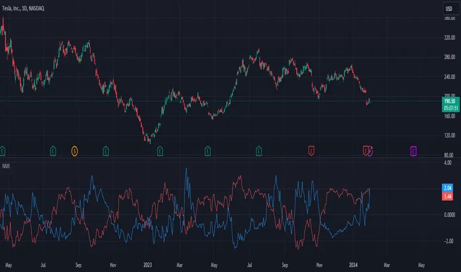
The Commitment of Traders (COT) report is a widely followed weekly publication in the futures market that provides a breakdown of the positions held by various market participants. It offers valuable insights into the market sentiment and helps traders and analysts assess the positioning of different market players, including commercial traders, non-commercial traders, and non-reportable traders. On this indicator you’ll see a colored line, indicating the Large traders, and the gray histogram, which displays the difference between the large traders and the commercial hedgers.
The VIX, also known as the CBOE Volatility Index, is a popular measure of market risk and investor sentiment. It is often referred to as the "fear gauge" or "fear index" because it is designed to reflect the market's expectation of future volatility over the next 30 days. On this indicator, we have designed a formula that allows traders to see an indicator that gives an output very similar to the standard Vix and can be calculated on any market.
Additionally, as shown in the picture, this indicator has two lines and a histogram, the upper line reflects the inverted vix, useful to analyze potential long reversal, meanwhile, the one below the zero line is calculated to detect the short price reversal and inversion. Together, they originate the gray histogram, which acts like a midpoint of the two lines.
The Detrended Spread indicator allows traders to analyze whether one asset outperforms or not the chosen benchmark, and also to detect clear price cycles and overbought or oversold levels thanks to the color coding of the main line.
The Value at Risk (VaR) is a widely used risk management tool that provides an estimate of the potential loss in value of a portfolio or assets over a specified time horizon, under normal market conditions, at a given confidence level. VaR helps traders assess and quantify the potential downside risk associated with their investments and portfolios.
With this script you’ll have both the short-term and the long-term VAR lines, being able to detect periods that allow traders to have less estimated risk on the market. The VAR does not provide any indication of the potential direction of the market, but it’s important data for risk management and volatility.
The Sentiment estimator is a tool that aims to give an indication about the sentiment of the markets, allowing traders both to have an indication about the direction of the market by timings and to have useful pieces of information about areas that can lead to a reversal of the price.
Risk Disclaimer:
All content and scripts provided are purely for informational & educational purposes only and do not constitute financial advice or a solicitation to buy or sell any securities of any type. Past performance does not guarantee future results. Trading can lead to a loss of the invested capital in the financial markets. I will not accept liability for any loss or damage, including without limitation any loss of profit, which may arise directly or indirectly from the use of or reliance on such information. All investments involve risk, and the past performance of a security, industry, sector, market, financial product, trading strategy, backtest, or individual's trading does not guarantee future results or returns. Investors are fully responsible for any investment decisions they make. Such decisions should be based solely on an evaluation of their financial circumstances, investment objectives, risk tolerance, and liquidity needs.

VOLATILITY BANDS BY ISHUThis is the simple trading system based on volatility where these bands are used as entry points and trailing stops . A brief explanation of the system is as below.
Because the volatility of a stock is its standard deviation, we can statistically establish “confidence Intervals” of the price moves. In statistics, a one standard deviation range means that there is a 68-
percent likelihood the stock price will stay within the range (a 67-percent confidence interval). The confidence value for different standard deviations are
1.00 - 68%
1.28 - 80%
1.50 - 88%
2.00 - 95%
So, we draw bands at various standard deviation levels like 0.25, 0.5, 1, 1.28, 1.65 and 2 from the previous day’s close. Entry is made once the price cross above a Band and the same band because the stop loss. When the price crosses above the next band the stop loss is shifted to this band value. This point can be also a “ADD ON” point. In the same way trading can be done on the down side as well.
The current formula uses the VIX values of the previous day which is available from NSE web site. The High Value of the VIX is used for the higher Bands and the Low value of the VIX is use for the lower Bands. This is Intraday Trading system only. The system is ideally suited for the Index as it is based on the VIX.
This system belongs solely to @karthikmarar , all credits goes to Mr.karthik , i am feeling very grateful blessed and privileged at same time as i came across his huge sea of knowledge. Please give a visit on his page, follow him and show your support !🙏🏻
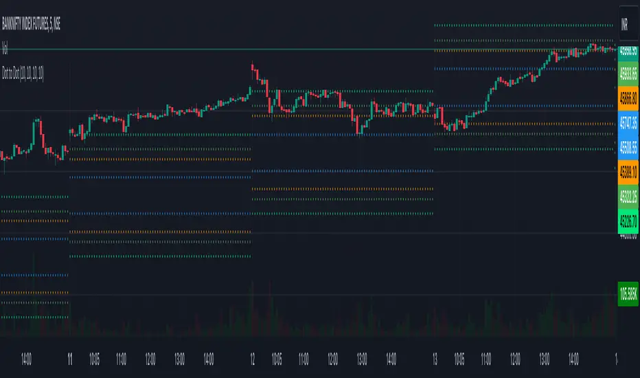
Magic LevelsPS MODS : This indicator calculate the levels based on IndiaVIX, volumes on FnO, cofficient and factor to reach on the level. Hope this can help you to understand the functionality of this Indicator
This indicator is used for draw levels or "Magic Levels/Lines" for Nifty, Bank Nifty and FnO futures, based on volatility (indiavix) calculations. This powerful tool is designed to provide insights into market volatility and assist traders and investors in making informed decisions in the Indian stock market.
As of now the indicator draws levels only on Bank Nifty and Nifty. Soon we'll publish the next update supporting all FnO Futures and stocks.
The India VIX, often referred to as the "Fear Index," is a popular measure of market volatility and investor sentiment. It quantifies the market's expectations of near-term volatility by calculating the implied volatility of NIFTY options. The VIX Levels Indicator utilizes these calculations to draw key levels on price charts, enhancing traders' understanding of potential market movements.
The indicator's main function is to identify critical support and resistance levels derived from IndiaVIX data. We considered to volatility of all the FnO instruments and calculated the mean value keeping the day into consideration while performing the calculations. These levels serve as significant reference points that can help traders gauge potential price reversals, breakouts, and trends. By integrating the Magic Levels Indicator into their analysis, traders can gain a comprehensive view of market dynamics and improve their timing for entering or exiting positions.
Traders can customize the VIX Levels Indicator to suit their preferences, adjusting parameters such as time period where the default is 1 day. This flexibility allows traders to adapt the indicator to different trading strategies and timeframes. Whether a trader focuses on intraday scalping or swing trading, the Magic Levels Indicator can be a valuable addition to their technical analysis toolkit.
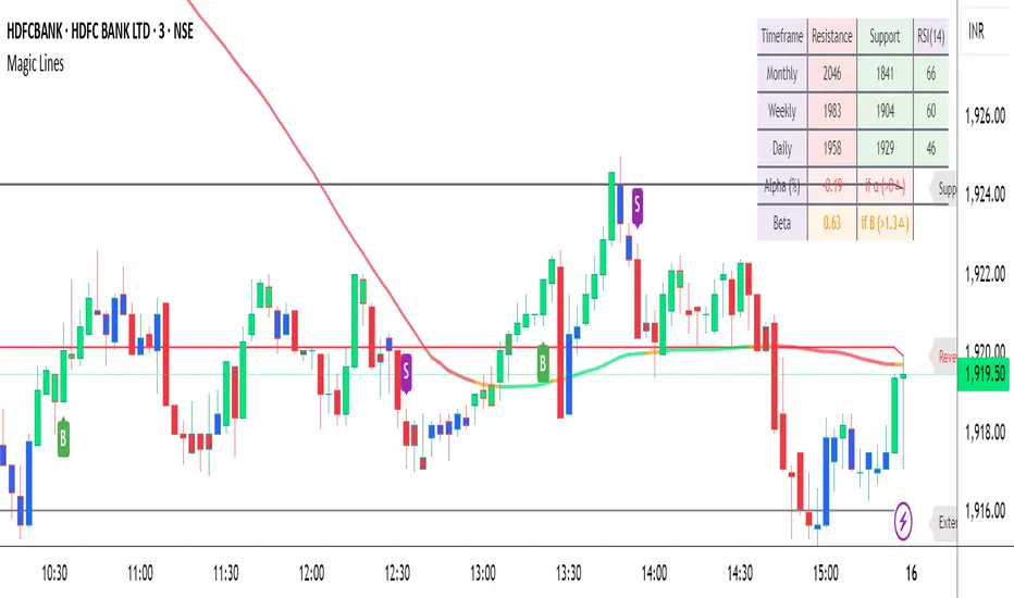
Expected VolatilityExpected Volatility
Hello and welcome to my first indicator! I'm publishing this indicator as free to use and modify because I think it's a great place to learn and I hope I can teach you something.
There are some terms which you need to understand before I begin explaining this indicator and what it does for you:
Daily Settlement - The price at which a market closes when the trading day closes (RTH or Regular Trading Hours close)
Standard Deviation - A measure in statistics that declares how far away a data point is from the mean when compared with all the data points before it to an extent
Now for the history behind this indicator:
Rule of 16. This goes back to the VIX, or S&P 500 volatility index. The idea behind the volatility index is to determine what magnitude of movement could be expected from the market the following day based on recent movement. The rule of 16 is an easier way to refer to the square root of the number of trading days in a year. There are 252 trading days in a year and the square root of 252 is approximately 15.87. We estimate it to be 16 because it's easier to talk about when it's easier to say and therefore easier to remember.
The relevance of this rule is that when the VIX is at 16, we can expect a market movement of 1% or so unless some special circumstances overrule this estimate. To get the expected market movement, we take 16 and divide by 16 and get 1, or 1%. If the VIX is trading at 24, we get 24/16 or 1.5 which is 1.5% movement. This indicator seeks to simplify the math and lay it out in a visual way to show the highest probability of range the market is expected to trade.
Thanks for taking the time to read my description, I hope you like my indicator.
Special thanks to my trading friends and coaches for helping me complete this indicator.
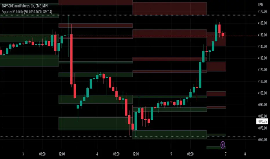
Nifty SentiMeterThis meter displays a colour code based sentiment for the Nifty50 Index.
In order to do so, it uses the IndiaVix, that is the standard for determining the broader market Investor sentiment. The IndiaVix and the Nifty50 are inversely correlated. A spiking Vix on the upside indicates panic and fear in the market, that is reflected in price of the Nifty50, usually accompanied by steep falls. On the other hand, a stabilised and low volatile Vix, creates an atmosphere conducive for positive investor activity.
This indicator, uses this concept of inverse correlation between the Vix and the Benchmark, to plot the changes of investor sentiments over a period of time and the current sentiment.
This indicator should be used only on the DAILY timeframe for best results.
The best way to analyse the NiftyMeter is to observe the colour changes, that will help in understanding the changing investor sentiments.
A quick guide is as follows:
Blue to Red, Green to Red - Indicates the positive investor sentiment has turned into bear - fear.
Red and getting Stronger Red - Indicates that the fear is sustained.
Blue to Green, Red to Green - Indicates that positive investor sentiment is back. It is now time for bulls to be active again.
In general, Red indicates fear, Blue indicates a transitioning phase of sentiment (bull to bear or bear to bull), Green indicates bullish sentiment.
A stronger shade of the colour will indicate a stronger sentiment.
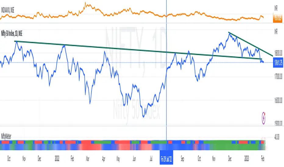
SPX Expected MoveThis indicator plots the "expected move" of SPX for today's trading session. Expected move is the amount that SPX is predicted to increase or decrease from its current price, based on the current level of implied volatility. The implied volatility in this indicator is computed from the current value of the VIX (or one of several volatility symbols available on Trading view). The computation is done using standard formula. The resulting plots are labeled as 1 and 2 standard deviations. The default values are to use VIX as well as 252 trading days in the years.
Use the square root of (days to expiration, or in this case a fraction of the day remaining) divided but the square root of (252, or number of trading days in a year).
timeRemaining = math.sqrt(DTE) / math.sqrt(252)
Standard deviation move = SPX bar closing price * (VIX/100) * timeRemaining

Daily/Weekly ExtremesBACKGROUND
This indicator calculates the daily and weekly +-1 standard deviation of the S&P 500 based on 2 methodologies:
1. VIX - Using the market's expectation of forward volatility, one can calculate the daily expectation by dividing the VIX by the square root of 252 (the number of trading days in a year) - also know as the "rule of 16." Similarly, dividing by the square root of 50 will give you the weekly expected range based on the VIX.
2. ATR - We also provide expected weekly and daily ranges based on 5 day/week ATR.
HOW TO USE
- This indicator only has 1 option in the settings: choosing the ATR (default) or the VIX to plot the +-1 standard deviation range.
- This indicator WILL ONLY display these ranges if you are looking at the SPX or ES futures. The ranges will not be displayed if you are looking at any other symbols
- The boundaries displayed on the chart should not be used on their own as bounce/reject levels. They are simply to provide a frame of reference as to where price is trading with respect to the market's implied expectations. It can be used as an indicator to look for signs of reversals on the tape.
- Daily and Weekly extremes are plotted on all time frames (even on lower time frames).
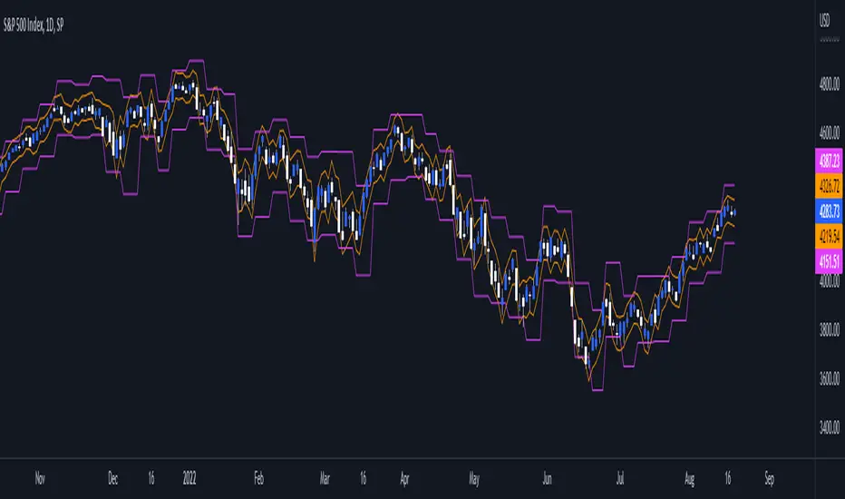
Volatility PercentileIn this script, we look at 3 volatility indicators percentile distribution
1. VIX
2. VIX/VIX3M
3. VVIX/VIX
Default value of percentile lookback is 1 month = 21 periods on the daily chart.
A general observation is when the percentile drags along the 0th/100th mark, is when we get the "trend" part of the volatility move, before a reversal. This is not a set-in-stone observation, and should not be used as a guidance for trade entries/exits.
Feel free to use, and comment if any observations.

WVF - OscillatorAnother attempt on making use of CM-Williams-Vix-Fix-Finds-Market-Bottoms from Chris Moody - which is arguably one of the best indicator available on pine and tradingview platform. Every time I revisit this, I get new ideas on applying this method.
I have slightly altered formula to
highest(source)-source/highest(source)
from the original formula
highest(close)-low/highest(close)
Process is simple:
Calculate WVF for OHLC values separately
Calculate momentum on each of the WVF values based on distance from moving average
Plot the candles based on OHLC momentum.
Candle color depends on whether close, open and previous close. If close is higher than open and previous close, we get green coloured candles. If close is lower than previous close and open then we get red coloured candles. In all other cases, we will have silver candles.
High/Low bands are calculated based on median of highest and lowest values of VixFix. We also plot median of close which can be used in some cases.
How to use this to find market bottom. Look for one of the below conditions:
First red candle above high band - which signals momentum of vix fix is about to fall.
First red candle above median line - can be used only if upward momentum of wvf candles are trending well.
Crossunder of wvf candles under high band.
Possible exit scenarios
Green WVF candle formed above WVF high line
Entry is taken on first red candle above median line - but, candles turned green before WVF crossing under median line - may signal our thesis is wrong and price may drop further.
Some examples.

Crypto Volume/Strength ComparatorHello Traders,
Here is an attempt to perform comparative analysis between top cryptos based on strength (oscillator) and volume. Methodology used here is similar to Magic Number formula described in the post : Enhanced Magic Formula for fundamental analysis . But, instead of using fundamentals, we are making use of few technicals to derive similar outcome. Usage of the available stats will not be same as Magic number since we are using technicals.
⬜ Process
▶ Get crypto exchange based on prefix of instrument being used.
▶ For the given exchange, get data for all the tickers available in input fields.
▶ Calculate Oscillator, Momentum based on price for each tickers.
▶ Calculate Oscillator, Momentum based on volume for each tickers.
▶ Calculate Volatility for each tickers.
▶ Rank Price-Oscillator, Price-Momentum, Volume-Oscillator, Volume-Momentum, Volatility for each tickers.
▶ Calculate combined rank by adding up individual ranks.
▶ Calculate movement of rankings from bar to bar
▶ Sort tickers based on rank and populate them on table. Display direction of rankings.
⬜ Components
Display components are as follows:
⬜ Settings
Settings are pretty simple and straightforward
⬜ Calculations
▶ Oscillators : High values of oscillators are considered as ideal as the process is intended towards finding trend.
▶ Momentum : Momentum is calculated on the basis of Squeeze Momentum Indicator by @LazyBear.
▶ Volatility : Volatility is calculated on the basis of Williams Vix Fix by @ChrisMoody. Here too since we are in trend following mode, lower vix fix is considered ideal.
⬜ Few Notes
Tickers will show data only if selected exchange has them. Some tickers are not available in all exchanges. In that case, it will show NAN. This is kind of unavoidable as we need to have fixed size arrays for any calculations.
Indicator works only on crypto tickers which has valid exchange.
Tickers move through the rankings in real time. Background of all stats are based on gradient from green to red.
Tickers on top may not always have better long opportunity or tickers at bottom may not always be optimal for shorting. We need to consider how long the instrument may stay in the position or how fast it is moving in opposite direction. Hence, directions of the ranking movement are also shown on the table.

Market Sentiment [@TradersVenue]This majorly combines 3 indicators. More detailed usage will be taught to the subscribers as part of webinars to understand how to use these along with VSA to improve the trading results.
1)Mean Revert Indicator (M.Revert) - Most useful for intraday. When M.Revert bar turns red its ideally a sell signal. When M.Revert bar turns green its buy signal.
2)PV.Trend is nothing but price volume trend. Green bullish, red bearish.
3) Ind.VIxFix - Its India VIX. When its red it means VIX is shooting up and chances of fall is higher. When VIX turns green VIX is cooling down and market may consolidate or go higher.
When VIXFIX turns green its a good time to sell straddle or strangles and avoid neutral strategies when red. Additionally when VIXFix turns red, simply exit the losing leg holding the other leg of the neutral strategy. It helps.