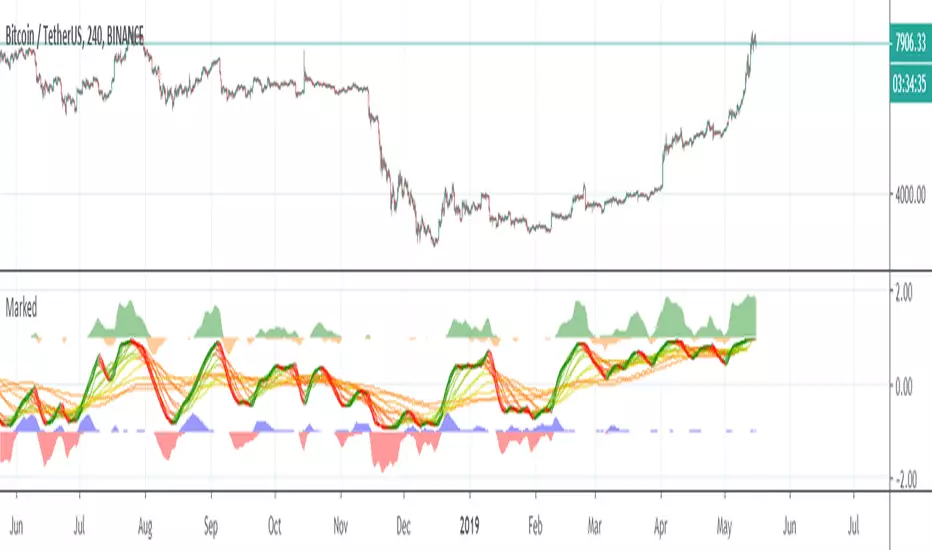
LSMAsThis indicator calculates and plots two Least Squares Moving Averages (LSMA) based on different lengths and a Smoothed Moving Average (SMMA) of the longer LSMA.
Inputs
lengthA : Period length for the first, longer LSMA.
lengthB : Period length for the second, shorter LSMA.
signAl : Signal period used in SMMA smoothing.
Calculations
LSMA-A and LSMA-B : Calculates the linear regression (least squares) of source over lengthA and lengthB respectively, with no offset. These represent two LSMAs, one slow and one fast.
SMMA : This is a smoothed moving average of the longer LSMA (LSMA-A).
Purpose
This indicator helps traders identify trend directions and momentum by using two least squares regression lines of different lengths to capture short- and long-term trends in price. The SMMA smoothing of the longer LSMA may be used as a signal or confirmation line to reduce noise and produce smoother signals.
It generates buy and sell signals based on the intersection of the LSMA-A and SMMA. If the LSMA-A crosses the SMMA upwards, a BUY signal is generated; if it crosses the SMMA downwards, a SELL signal is generated.
The LSMA-B, which is short-term, can be used for wave analysis. When a peak forms, a high is observed on the chart, and when a valley forms, a low is observed. This allows us to determine whether the wave is rising or falling.
Summary
Two LSMAs are calculated: one slow (lengthA), one fast (lengthB).
A smoothed moving average (SMMA) of the slow LSMA is computed using the signal length (signAl).
All three curves are overlaid on the price chart for visual trend and momentum analysis.
Cari dalam skrip untuk "wave"

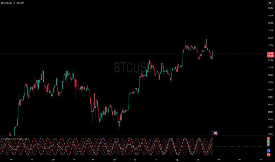
Sinusoidal Cycles OscillatorTitle: Sinusoidal Cycles Oscillator – Multi-Cycle Market Indicator
Description:
Discover market rhythm with the Sinusoidal Cycles Oscillator, a powerful tool for technical analysis and cyclical trading.
Three customizable cycles track short, medium, and long-term market oscillations.
Cycle 1 serves as the main reference wave with an optional mirror envelope.
Cycles 2 & 3 provide supporting harmonics for deeper insight.
Composite wave averages all cycles to reveal overall market phase.
Features:
Fully adjustable periods and amplitude.
Visualize tops, bottoms, and turning points at a glance.
Oscillator ranges from -1 to +1 with clear threshold guides.
Ideal for traders using cycle analysis, harmonic trading, or market timing.
Easy-to-read visual overlay and separate panel option.
Use it to:
Identify potential price reversals.
Compare market cycles across multiple timeframes.
Enhance timing and entry/exit decisions.
Polaris Trend All-in-One📘 Polaris Trend Indicator: Trading Rules & Strategy
Guide
The Polaris Trend Indicator is designed to simplify trading decisions by identifying key entry
and exit signals without the need for excessive technical analysis. This system combines the
Polaris Trend with the Polaris Golden Wave and Market Bias tools to give you confidence
across multiple timeframes.
This guide outlines clear trading rules for two use cases:
● Swing Trading
● Long-Term Investing and Holding
⚡ Swing Trading Strategy
Swing trading can be challenging when the market direction is unclear. The Polaris Trend helps
traders stay on the right side of momentum with straightforward visual signals. This approach is
best used on the Daily or Weekly chart.
✅ Entry Criteria (Bullish Trades)
● A solid green column appears above the zero line.
● A green upward arrow confirms bullish momentum.
● Enter your trade immediately when the green column first appears.
● Hold the trade until a red column appears, signaling a shift in momentum.
🚫 Exit Criteria (Bullish Trades)
● The first appearance of a red column after a green run.
● Multiple green columns followed by a red column.
● Do not enter trades mid-trend; always enter on the first green flip.
***Recommended Swing Strategy
● When a new daily green column appears but the weekly columns are still red, stay
nimble. Enter your position when the Polaris Trend Indicator turns green and displays an
upward-pointing arrow.
● If the price pulls back to a higher low but a red daily column forms, sell 50% of your
position and move your stop loss to your original entry. Then, wait for the next daily
green column and arrow to reappear, this is your signal to reenter the 50% you exited.
● If the price continues to rise and the weekly columns also turn green, shift your focus
to the weekly chart. Ignore daily signals and hold the trade until the weekly column
turns red, which will be your cue to exit. The weekly green column is your confirmation of
a stronger uptrend and a potential longer hold.
🔻 Entry Criteria (Bearish Trades)
● A solid red column appears below the zero line.
● A red downward arrow confirms bearish momentum.
● Enter your short trade immediately when the red column first appears.
● Hold until a green column appears, indicating momentum has shifted.
🔁 Exit Criteria (Bearish Trades)
● The first green column that follows a red sequence.
● Same rule applies: enter only on the initial flip, not mid-trend.
Note: The first color flip is the most reliable entry point. Avoid entering positions
deep into a trend, wait for the clear signal from Polaris.
🧭 Long-Term Investing Strategy
This approach combines the Polaris Golden Wave, Polaris Trend, and Market Bias to help
long-term investors buy at deep value levels and scale into positions over time.
📉 Ideal Entry: Golden Zone + Polaris Trend Signal
● Use the Golden Wave to identify the monthly 0.618–0.826 retracement zone
(significant discount levels).
● When price enters the Golden Zone and the Polaris Trend shows a green column on
the Daily or Weekly, this is your optimal entry point.
● If the trend turns red inside the zone, consider trimming positions and re-entering on the
next bullish signal.
If price drops below the Golden Zone, the stock becomes even more undervalued,
wait for the next green Polaris Trend signal to enter.
💰 Secondary Entry: Market Bias Rebounds
● If you miss the Golden Zone entry or are dollar-cost averaging:
○ Use the Market Bias on a Weekly timeframe.
○ Wait for price to retrace into the Market Bias band after moving higher.
○ Look for a red Polaris Trend column, then wait for price to enter the Market
Bias band and once it enters, wait for Polaris Trend signal to flip back to green
for your entry. If the trend turns red inside the zone, consider trimming positions
and re-entering on the next bullish signal.
Think of the Market Bias like a lake and price like a skipping stone—you want to
buy when the stone comes down and touches the surface.
📊 Indicator Explanations
🔶 Golden Wave (Monthly Fibonacci Retracement Zones)
● Highlights key monthly retracement zones (0.618 to 0.826).
● Helps identify deep-value entries on longer timeframes.
● Visible across all chart timeframes for consistent macro reference.
🔴 Market Bias (Smoothed Heikin-Ashi Trend Filter)
● Measures trend direction and strength using smoothed Heikin-Ashi candles and
oscillation logic.
● Customizable smoothing, oscillator period, and timeframe inputs.
● Option to display trend signals in a separate pane with dynamic coloring.
This combined approach empowers traders to make high-quality decisions with clarity and
discipline. Whether you're entering short-term swings or building long-term positions, the
Polaris Trend system guides you with timely, data-driven signals.

Wave Hunter [BRTLab]🔍 Overview
BRTLab - Wave Hunter is an advanced trading indicator that combines custom Average True Range (ATR) levels and a custom Exponential Moving Average (EMA) trend filter to pinpoint trending movements and reversal points with high accuracy. Designed for traders in volatile markets, particularly cryptocurrencies, where precise signaling is crucial, Wave Hunter dynamically adjusts its entry and exit signals to align with changing market conditions, filtering out noise and focusing on significant trends.
The indicator features customizable parameters, such as Hunter Strength and Wave Strength, both of which respond dynamically to price volatility. Hunter Strength, based on an adaptive ATR calculation, adjusts to volatility, helping traders recognize critical market shifts, while Wave Strength leverages a custom EMA that adapts to recent price movements for enhanced trend detection. This dual adaptability helps traders capture high-probability trades and align with broader market trends, reducing the risk of false entries.
Wave Hunter stands out from other indicators due to the seamless interaction between its components. The tool adjusts dynamically according to current market behavior, offering a precise method for identifying trends and momentum shifts. Customizable settings further enhance flexibility and accuracy, enabling traders to fine-tune the indicator to suit individual trading strategies.
🔑 Key Features and Parameters
Hunter Strength (Custom ATR): This parameter is based on an adaptive ATR calculation that directly responds to price volatility, dynamically adjusting ATR levels to capture critical market movements.
Increased Volatility: When volatility rises, Hunter Strength becomes more responsive, adjusting ATR levels closer to current prices. This responsiveness helps traders identify emerging, high-momentum moves, enabling prompt positioning in fast-changing conditions.
Decreased Volatility: During low-volatility periods, Hunter Strength smooths out ATR levels, reducing sensitivity to minor price changes and allowing traders to focus on more substantial, sustained trends.
Wave Strength (Custom EMA): This parameter is built upon a custom EMA calculation that enhances trend detection by adjusting its smoothing factor (alpha) based on volatility. By comparing recent price changes with average volatility, it adapts its responsiveness:
Increased Volatility: In periods of high volatility, the EMA’s adjusted alpha increases, making it more reactive to recent price trends. This responsiveness helps traders capture emerging trends promptly.
Decreased Volatility: When volatility is lower, the adjusted alpha reduces, smoothing the EMA to filter out minor fluctuations. This helps align the EMA with broader, sustained trends and reduces the occurrence of false signals.
The adaptability of both Custom ATR and Custom EMA components ensures that Wave Hunter aligns closely with current market conditions, providing a nuanced, high-precision approach to trend and reversal detection.
Candle Color Indication: Green for uptrends and red for downtrends, offering clear visual confirmation of trend directions and critical levels.
These features make Wave Hunter an adaptable tool, allowing traders to minimize noise and focus on key market movements.
⚙️ Signals and Logic
Wave Hunter generates Buy/Sell signals by integrating adaptive ATR and custom EMA filtering:
Buy Signal: Triggered when the price crosses the Custom ATR level upwards, confirmed by the bullish custom EMA.
Sell Signal: Occurs when the price crosses the Custom ATR level downwards, confirmed by the bearish custom EMA.
This multi-tiered confirmation system enables traders to act on high-probability signals, reducing risk and optimizing entry and exit points.
🌟 Why It's Unique
ATR and Custom EMA Integration: The combination of Custom ATR and Custom EMA components creates a robust framework for detecting market trends. ATR captures significant market movements, while the Custom EMA provides trend confirmation, ensuring signals are triggered only when both align. This reduces the likelihood of responding to minor fluctuations and false signals.
Customizable Sensitivity: Hunter Strength and Wave Strength parameters give traders control over the indicator’s responsiveness. Hunter Strength dictates Custom ATR reactivity to price movements, while Wave Strength adjusts the custom EMA for trend confirmation. This adaptability ensures effectiveness across different market scenarios, enhancing usability for both short-term and long-term strategies.
🔶 Usage
For Example trading with Wave Hunter can be approached in two primary ways:
Signal-Based Trading: Enter trades based on buy and sell signals triggered by price crossing adaptive ATR levels.
Support and Resistance Trading: Use trend lines as support and resistance levels to enter trades as price approaches these lines, provided the trend suggests continuation. Traders should remember that the longer a trend persists, the higher the reversal risk as the price nears trend levels.
✅ Conclusion
BRTLab - Wave Hunter is a powerful and flexible indicator for identifying significant trends across various market conditions. By combining custom ATR levels and custom EMA filtering, it provides precise signals for entry and exit, making it suitable for diverse trading strategies—from short-term trades to swing positions. This comprehensive approach supports traders in making informed, data-driven decisions.
⚠️ Risk Disclaimer
Trading involves significant risk, and most day traders experience losses. All content, tools, scripts, articles, and educational materials provided by BRTLab are for informational and educational purposes only. Past performance does not guarantee future results.

NEoWave Chart Free VersionAn automated wave chart for NEoWave wave analysis. This is an automated wave chart plotter that help you to find the current psychological trend and forecast the next one. This Indicator uses the concept of plotting wave charts as per the NeoWave method invented by Glenn Neely in 1990 in the “Mastering Elliott Wave” book. NEoWave is a advanced version of elliott wave theory, which solve the lots of drawback's and issues' of elliott wave theory.
The Logic and Concept used in Indicator
This indictor uses the logic of plotting wave chart as discussed in “Mastering Elliott Wave” book, According to “Mastering Elliott Wave” book to draw a wave chart draw a line from high to low or low to high in order that they occurred, and this indicator plot the line accurately from high to low or low to high in order they occurred.
Some Important Features
1. This indicator can draw wave chart from 5 Seconds to 5 Year or use any custom timeframe of your choice.
2. Use any timeframe wave chart on any timeframe cash data, like use monthly cash data to draw 2.5 years or 5 years wave chart.
3. Do the easy back testing with easy drag tool.
4. Customize wave chart settings based on your requirement.
5. Wave chart will be plotted on any type of charts like candlestick or bar chart.
6. Custom settings to hide other charts, like you can hide bar or candlestick chart, while using wave analysis.
7. Realtime plotting of wave chart from 5 seconds to 5 year.
Features to be added in future update
1. Show Monowave Counts.
2. Show Complexity levels.
3. Show Price and Time.
4. Show Starting point of patterns.
How to use this wave chart?
1. Use the log scale on wave chart. Use Alt + L to use logarithmic scale on chart.
2. Use log Fibonacci on wave chart, just open the settings of Fibonacci channel and check on "Fib channel based on log scale"
3. Find the correct starting point to mark the neowave patterns.
4. Apply the neowave rules as discussed in “Mastering Elliott Wave” book and forecast the market.
Note
If you want to check Daily or any higher timeframe wave chart use cash chart and if you want to check any other timeframe from 5 seconds to any intraday timeframe then use future's data as suggested by Mr. Glen Neely.

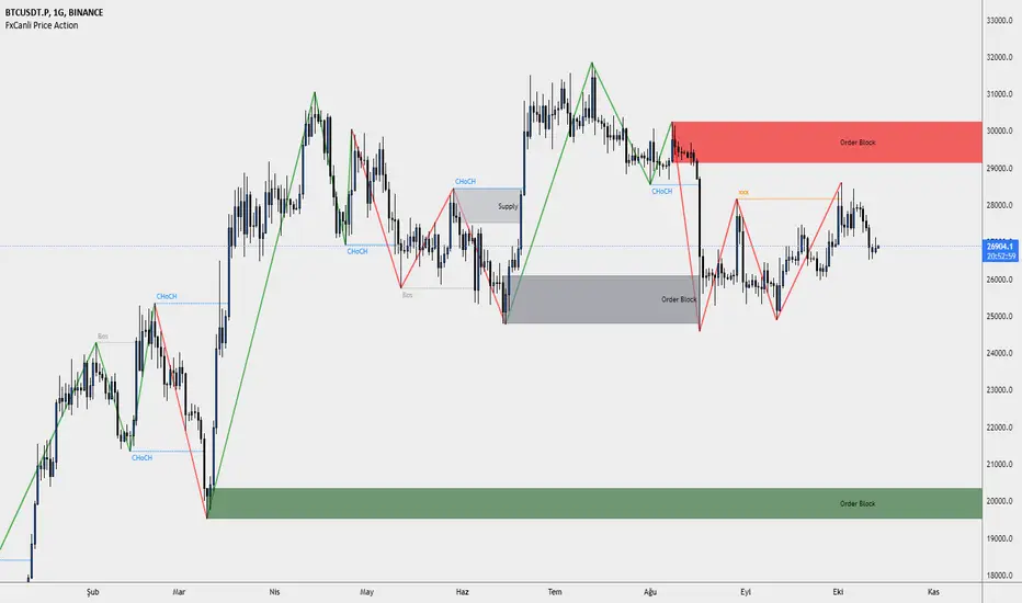
FxCanli Price ActionEN - FxCanli TradingView Price Action indicator can draw and alert at;
Break of Structure (BOS),
Change of Character (CHoCH),
Liquidity,
Order Block,
Power Zone.
TR - FxCanli TradingView Price Action indikatörü grafiklerinizde;
Break of Structure (BOS)
Change of Characte (CHoCH)
Liquidity
Order Block
Power Zone seviyelerini otomatik olarak çizer ve alarm verir.
FEATURES & EXAMPLES / ÖZELLİKLER & ÖRNEKLER
**************************************************************
Market Structure;
EN - You can easly follow market structure, Up Trend with green waves, Down trend with Red waves
TR - Market yapısını kolayca takip edebilirsiniz. Yukarı trendi yeşil dalgalar ile, Aşağı trendi kırmızı dalgalar ile.
Change of Character (CHoCH)
*************************************
EN - Shows trend reversals
TR - Trend dönüşümlerini gösterir
Break of Structure (BOS)
******************************
EN - Shows trend continuations
TR - Devam eden trendleri gösterir
Liquidity
***********
EN - Shows Liquidity levels
TR - Likidite seviyelerini gösterir
Order Block
***************
EN - Shows Order Block levels which is a technical analysis technique that tracks the accumulation of orders (when bullish) and distribution of orders (when bearish) of banks and institutional traders.
TR - Bankaların ve kurumsalların emir birikimini (yükseliş olduğunda) ve emir dağılımını (düşüş olduğunda) Order Block olarak gösterir.
NEoWave Cash Data Pro by ArshiaRahimiNEoWave Cash Data Pro by ArshiaRahimi (Cash Data Display Indicator)
By using this indicator, you can see cash data in the Trading View Charts. Cash Data is NEoWave approach data and is used for wave counting of this type. Analysts of Elliot Wave approach can also benefit from this data.
In Cash Data, the state of high and low of the candles or in other words their chronology will be determined and the path of price movement will be indicated clearly.
You will have no limit to view cash data using this indicator and you will be able to view the cash data of any part of the chart you would like with a 100 percent precision. By default, Indicator shows MonoWave 500 in the ending part of the chart but in order to view the cash data of other parts, you only need to activate the option “ Custom Start” and by adjusting the date of drawing the cash data, you can make the cash data of the part you want to be displayed.
The cash data of each chart is displayed in 20 different timeframes including:
• Annual timeframe
• Monthly, 3month, 6 month timeframe
• weekly, 2 week timeframe
• daily, 2 day, 3 day timeframe
• 6 hour, 12 hour timeframe
• 4 hour, 8 hour timeframe
• 1 hour, 2 hour, 3 hour timeframe
• 5 minute, 10 minute, 15 minute, 30 minute timeframe
Other features are also incorporated in this indicator including:
• determination of cash data thickness
• determination of ascending MonoWaves color
• determination of descending MonoWaves color
• determination of connecting MonoWaves color
• displaying the MonoWaves which might be in question (when high and low occur in a candle)
• determination of the questionable MonoWaves color
• determination of the date and starting time of cash data drawing
• Drawing of the last cash data live and the possibility of determining its drawing delay.
• Displaying time slot separator lines
• Determination of separator lines color and transparency
• Displaying Fade Chart behind cash data
• determination of fade chart candles color and transparency
• displaying information table of cash data in the corner of the chart which include displaying time frame of the cash data and the number of MonoWaves that exist in the chart.
This indicator is designed by Arshia Rahimi of Iran NEoWave Institute. You can be in touch through “ArshiaRahimi” ID.
The Indicator will continuously receive its new updates. after publishing, each update will replace the previous version by trading view.

Neowave Chart PlotterThis Indicator is applicable to plot wave charts as per the NeoWave method (Neely Extension of Wave Theory). NeoWave is a scientific, objective and revolutionary style of Elliott Wave Theory that was invented by Glenn Neely in 1990 in the “Mastering Elliott Wave” book.
To start analyzing with this method, we need a particular chart called the Wave Chart or Cash Data chart. This is the first step for a good wave analysis. To draw this chart, Highs and Lows should be plotted in the order that they occurred. This could be a very challenging and time-consuming task to do for any symbol on any Timeframe.
This Indicator can accurately Find High and low in each Period and draw them in the order that they occurred. for any Symbol on any Timeframe automatically and in real-time.
For example on Monthly timeframe, indicator separates each year and find high and low on the period. Then it recognizes which occurred early and plot them in order that occurred. this called "Yearly Wave Chart" and you can start to analysis it, base on Neowave method.
Important : This Indicator Works on All Type of Accounts
Some features of this Expert Adviser are:
- Draw Wave Chart on yearly, monthly, weekly, daily, hourly and minutely timeframes
- Draw Wave Chart on any integer multiples of above timeframes
- Switch between Wave Chart and Candlestick Chart simultaneously
- Online auto updating Wave Charts
- Possibility of putting watermarks
- Show Monowaves count
- Show Suspicions Monowave (where high and low occur on same Bar)
- Show Triple Monowave (where high or low occur twice on a period)
- Show Monowaves count
- plotting wave chart base on Calendar and bar count
- Show Monowaves count
- plotting wave chart on Equal distances

waves and limitsEnglish:
This indicator helps to visualize the status and location of the price within its standard limits; as well as its trend and momentum.
Blue wave for long entries, Red wave for short entries.
As most Indicators have lag, you must be very aware of the price action to enter and exit the trades.
Español:
Este indicador ayuda a visualizar el estado y la ubicación del precio dentro de sus límites estándar; así como su tendencia e impulso.
Onda azul para entradas largas, Onda roja para entradas cortas.
Como la mayoría de los indicadores tienen retrasos, debe estar muy atento a la acción del precio para entrar y salir de las operaciones.

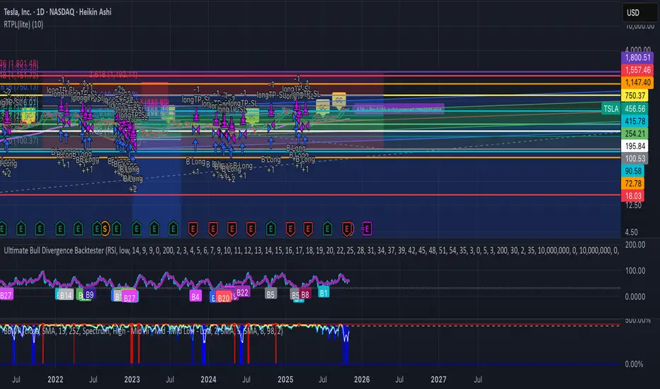
RTPL(lite)RTPL(lite) — Free
Simple, powerful, no cost.
• Auto-detects Wave 5
• Shows TP target
• 400D EMA line
• Golden Cross alert
• Gaussian channel
Works on any chart. No subscription needed.
Full version ($109) → rtpl.gumroad.com/l/rtpl-plus
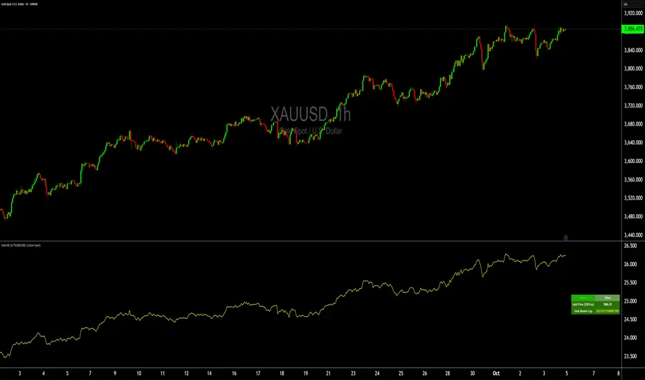
Gold Total Market Cap By Wave Trader Gold Total Market Cap (Updated 2025)
Overview
This indicator calculates and visualizes the total market capitalization of gold in real-time, based on the current XAUUSD spot price and the estimated above-ground gold supply. It transforms the raw gold price into a scaled "market cap" view (in trillions USD), helping traders contextualize gold's global value—often compared to stocks, crypto, or fiat reserves. As of October 2025, gold's cap hovers around $26–27T, underscoring its status as a premier safe-haven asset.
How It Works
Core Formula: Market Cap = Gold Price (USD/oz) × Total Supply (troy oz), scaled to trillions for chart readability.
Supply Data: Defaults to the World Gold Council (WGC) mid-2025 estimate of ~218,000 metric tonnes (~7.01B troy oz), but customizable for scenarios like historical or projected figures.
Plotted as a smooth yellow line below the price pane, mirroring gold's price movements but in cap terms.
Key Features
Dynamic Label: A real-time label on the yellow line displays the exact market cap (e.g., "26.8") for instant reference, styled like popular TradingView cap indicators.
Reference Line: Horizontal dashed line at 25T USD to highlight key thresholds (e.g., surpassing Bitcoin's cap).
Info Table: Top-right panel shows current gold price and full market cap (e.g., "26.8T USD") for quick stats.
Overlay-Free: Designed for a separate pane to avoid cluttering your main XAUUSD chart.
Data Sources & Customization
Relies on live XAUUSD close prices from TradingView.
Supply input: Switch between "WGC Mid-2025" (default) or custom values—ideal for sensitivity analysis (e.g., adding future mining output).
No external API calls; fully self-contained for fast performance.
Usage Tips
For Gold Traders: Spot divergences between price momentum and cap growth to gauge overbought/oversold conditions.
Portfolio Context: Compare to S&P 500 cap (~$50T) or BTC (~$2T) by adding multi-symbol alerts.
Timeframes: Best on daily/weekly for long-term trends; works on 1H+ for intraday macro views.
Alerts: Set notifications for cap milestones (e.g., "Gold Cap > 28T") via TradingView's alert system.
Track gold's "infinite market cap" evolution—because unlike stocks, gold's supply grows slowly, amplifying price impact. Updated for 2025 data; feedback welcome! 🚀
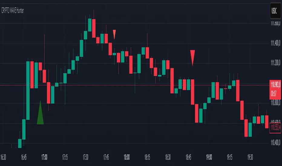
CRYPTO WAVE HUNTERWAVE HUNTER This indicator is designed to identify price movements across different time frames. Its purpose is to identify hourly, 2-hour, and 4-hour price movements on 3-minute candlestick charts. It is suitable for use on a 3-minute chart.
Volume Wave AnalyzerWave Buy vs Sell Volume (with Box) analyzes the buying and selling volume within a selected range of past candles. It sums volume from bullish bars (where close > open) as buy volume, bearish bars (close < open) as sell volume, and splits volume evenly for neutral (doji) bars. The indicator displays:
Buy Volume and Sell Volume totals over the chosen candle range
Delta (difference between buy and sell volumes)
Buy Percentage representing buying pressure strength
A visual box on the chart highlighting the selected candle range
This helps traders quickly assess market sentiment and volume dominance during recent price movements, supporting more informed trading decisions.

Head-on-CorrelationThis is a simple wrapper script to generate 40 different series of information along an increasing candle length. It plots the last data point, and repaints on each new candle, allowing one to see variations within series' values as the timeframe increases. This POV is looking not across a depth of field, but the wave as if it were moving towards you. The goal ultimately is to find correlations on various timeframes in the y-plane, and the z-plane, as well as patterns of variation preceding price action.
As a wrapper, the switch case and engine can and should be modified to suit your indicator of choice. Additionally, It is possible to string these indicators together to perform multiple calculations and output a single series ultimately.
If watched on smaller timeframes (eg 1s) or bar replay, it is an entertaining addition to the chart.

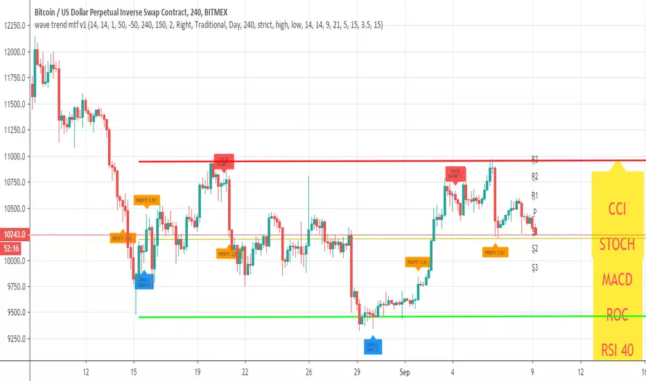
Wave Trend MTF웨이브트렌드의 멀티타임프레임 지표입니다.
더 큰 프레임에서의 움직임을 확인하여 낮은 프레임에서 대응이 가능해 집니다.
낮은 프레임에서 상하향 방향을 찾기 어려운 분들께서는 MTF기능으로 상위프레임의 움직임은 어떠한지 미리 파악하실 수 있습니다.
단순한 지표이므로 하나만 보는것이 아니라, 다른 지표들도 같이 참고하심이 좋습니다.
이 지표의 사용을 원하신다면 메세지나 댓글을 남겨주세요~!
Wave Trend is a multi-time frame indicator.
By checking the movement in a larger frame, you can respond in a lower frame.
For those who are unable to find the up-down direction in the low frame, the MTF function allows you to know in advance how the upper frame moves.
Since it is a simple indicator, it is good to refer to other indicators as well.
If you want to use this indicator, please leave a message or comment~!

Wave-PMThe Wave-PM (Whistler Active Volatility Energy - Price Mass) indicator is an oscillator described in Mark Whistler's book 'Volatility Illuminated'.
The Wave PM was specifically designed to help read cycles of volatility. Read when a strong trend is about to start and end, along with the potential duration of lateral chop. By using concepts of probability and volatility, which anyone can understand, retail traders can learn to think about 'risk' more like an institutional trader. With Wave-PM and an understanding of institutional risk-based trading, at home traders are able to start seeing volatility as opportunity, not an 'out of the blue' hindrance.
Price Mass is not a directional oscillator it's more of a gauge of potential energy left in the distribution cycle.

Wave Ribbon [ChuckBanger]This is a very easy script to build. Indicators like this can be very nice to use to spot trends. I just wanted to share it if someone to trade with it or wants to build on it further. The oscillator is my TRIX script:
Wave Momentumthankyou to the original author of this script Vkn422
Very simple , shows momentum and changes candle colors to match
You only short when negative
you only long when positive
Must have confluence with other forms of analysis like Elliott Wave
This indicator was built with EW in mind and would excel in the hands of those who practice the wave analysis.

Wave Period Oscillator by KIVANC fr3762WPO – Wave Period Oscillator
A Time Cycle Oscillator – Published on IFTA Journal 2018 by Akram El Sherbini (pages 68-77)
(http:www.ftaa.org.hk/Files/2018130101754DGQ1JB2OUG. pdf )
Bullish signals are generated when WPO crosses over 0
Bearish signals are generated when WPO crosses under 0
OverBought level is 2
OverSold level is -2
ExtremeOB level is 2.7
ExtremeOS level is -2.7
As with most oscillators, divergences can be taken advantage of.
via PROREALCODE
Here's the link to a complete list of all my indicators:
tr.tradingview.com
Şimdiye kadar Tradingview'a eklediğim tüm indikatörlerin tam listesi için:
tr.tradingview.com

wave trend mtf v1This Lazy Bear wave trend in MTF version with take profit and stop loss rebuy
you can change the MTF using the security call
and many nice option to see insid3e
so you can play with it, modify it or make it better