Momentum ArrowsThis simple indicators paints the Momentum based on Stochastic, RSI or WaveTrend onto the Price Chart by showing Green or Red arrows.
In the settings it can be selected which indicator is used, Stochastic is selected by default.
Length of the arrows is determined by the strength of the momentum:
Stochastic: Difference between D and K
RSI: Difference from RSI-50
WaveTrend: Difference between the Waves
(Thanks to @LazyBear for the WaveTrend inspiration)
PS:
If anyone has an idea how to conditionally change the color of the arrows, then please let me know - that would be the icing on the cake. Then it would be possible to indicate Overbought/Oversold levels with different colors.
Unfortunately it currently seems not to be possible to dynamically change the arrow colour.
Cari dalam skrip untuk "wave"
WWV_LB pivotfix histogram jayy
This is a modification of LazyBear's WWV_LB which plots cumulative volume of waves. The reversal points are defined through relative closing prices. I made adjustments to the script to show waves turning on actual/true low or high pivots as opposed to the bar/candle identified in the LazyBear script. What I mean by that is that the actual/true low or high pivots are in fact the true WWV_LB pivots. The original WWV_LB script calculates cumulative volume from reversal confirmation bar to reversal confirmation bar as opposed to the true WWV_LB pivot bar to pivot bar. As such the waves can have slightly different start and end points. As such the cumulative volume can also be different from te WWV_LB script. This is because confirmation of a wave reversal can lag a few bars after the true reversal pivot bar. In the script notes, you will see the original key WWV_LB script lines that identify the true high or low pivots and confirm the wave direction has reversed. I have taken these lines from LazyBear's original script. I have included the LazyBear script within the script notes so that the original can be compared to what I have added/changed. Instead of "trendDetectionLength" I have inserted "Trend Detection Length". You can of course change the descriptor to what you wish by editing script line 33 to the original term or whatever you wish. You might also wish to set the default to the value "2" as per the original script. I have set the default to "3". This script should be used in conjunction with "WWV-LB zigzag pivot fix jayy" script which is shown on this screen for comparison.
Here is a link to the original LazyBear histogram script which can be used for comparison. The differences are subtle, however, the histograms will regularly be different by a bar or two:
The lowest panel has the original LazyBear WWV_LB script for comparison. All three scripts have been set to a Trend Detection Length of 3.jayy

Vegas tunnelHi all,
This is the first step in putting together a more comprehensive suite of indicators and strategies based around the original Vegas tunnel method.
You will need to know what that is before trying to use this indicator. I would implore you to take the time to read the document. It's free to the universe and is a very valuable piece of work in my opinion.
Here is the link to the original documentation dl.fxf1.com
This indicator is set up to use the original levels as described by Vegas. Future releases will allow for more custom levels.
A note on the target waves. Vegas gives us the levels of 55, 89 and 233...all in FX pips. You will need to adjust that for your instrument and it is your personal preference. If you are using BTC , you might use $55, $89 etc, for ETH $5.50, $8.90 etc, for S+P 55, 89, 233 or for FX, the number might be 0.0055 etc
The indicator has been left blank so you can fill the target waves in yourself.
A note on the templates
The original template is simply as Vegas described it in his document, change it as you wish
The TD template comes from where I first was introduced to the concept. I can't mention the full source here, but some of you will know to what I am referring to. A massive thanks to TD for all the material they have provided the world.
The HH (Hero Hedge) template is just my way of looking at the wave. It's green when the faster MA is above the slower MA and red for the opposite. It doesn't really mean much, it's just a visual reference. Perhaps you can use it to filter signals if you so wish.
Finally, some of you may notice that I am an amateur coder at best. If you think you can improve or tidy up the code, then by all means, please reach out and collaborate with me.
I am trying to produce something to the benefit of all. I hope this can help you. If it does, then please pay it forward as I am trying to do.
Hero Hedge.
GA - Value at RiskGA Value at Risk is a multifunctional tool. Its main purpose is to plot on the chart the Value at Risk . But it shows also integrated features related to the Volatility.
Value at Risk is a measure of the risk of loss for investments, given normal market conditions, in a period.
It measures and quantifies the level of financial risk. In this case, the risk is within position over a specific time frame.
Defining p as VaR, the probability of a loss greater than VaR is p, at most. Instead, the probability of loss that is less than VaR is 1-p, at least.
The VaR Breach occurs when a loss exceeds the VaR threshold .
For this case, VaR calculation uses the volatility estimation in a time interval. It defines the Probability Confidence according to the Normal Distribution. VaR is a percentile of the Normal Distribution. This is a multiplier of the Standard Deviation that define a Volatility Range.
The Normal Distribution Area around +- the Standard Deviation gives 68% of Confidence. 2 times the Standard Deviation returns a 95% of probability area. 3 time the Standard Deviation the Area returns 99.7% of Confidence.
Knowing VaR modeling, it is possible to determine the amount of a potential loss . Then, it is possible to know if there is enough capital to cover losses. In the same way, higher-than-acceptable risks forces reducing exposure in a financial instrument.
One of its practical use is to estimate the risk of an investment that is already at portfolio. Indeed, this is the purpose of the Value at Risk calculated in this script.
At the VaR Breach that investment has reached its worst scenario. Then, it can be the case to manage that investment into the balanced portfolio.
The Value at Risk does not tell when to enter the market.
Moving Averages
GA Value at Risk bases its calculations on a set of Moving Averages. Every feature of the script uses one of these Moving Averages for its algorithm.
Moving Averages from MA0 to MA8, are the core of each feature of the script.
By default, from MA0 to MA8, Moving Averages use the Fibonacci Series to define their lengths. This happens because of the power of the Golden Ratio in the market behavior.
Instead, the first moving average is an extra resource. Its purpose is to plot a Signal Line on the chart.
The script does not consider plotting every Moving Average on the chart. But it lets you enable the plotting of 7 Moving Averages (from MA0 to MA5 + Signal Line).
It is possible to select the Moving Average Formula to use in the script. This is a setting that affects every Moving Average. Then, it changes also the result of every feature of the script.
The selection is between:
Exponential Moving Average.
Simple Moving Average.
Weighted moving Average.
Simple Moving Averages and Pointers - Full Visibility
Moving Averages and Partial Visibility
The plotting of each Moving Average can be total or partial.
By default, the plotting of Moving Averages and Signal Line is partial.
When the price approaches a Moving Average a little part of the curve becomes visible. This highlights supports or resistances.
Besides, this tracking remains on the chart. Then it shows supports and resistances that the price reached during its progression.
The Partial Visibility Algorithm is a great advantage, ruling how to plot curves. It uses a parameter to set how much of the curves is to plot.
Exponential Moving Averages and Pointers - Partial Visibility
Exponential Moving Averages and Pointers - Full Visibility
Moving Averages and Pointers
As it is clear, it is not necessary to plot entire curves of Moving Averages on the chart. But it becomes relevant to plot Pointers to Moving Averages.
Indeed, the script plots horizontal segments that point to the latest Average Prices.
Every segment has a Label that shows Average Price, Length, and its related Moving Average (from MA0 to MA8). Besides, it is possible to extend the segment to right.
These pointers are a very useful automatization. They point to the Moving Averages. In this way, they show Dynamic Supports and Resistances as horizontal segments.
They are adaptive. Used together with the Volume Profile their progression approaches Edges of High Nodes.
This adaptive behavior makes easy to see when the price reaches Volume High Nodes and slows down.
Moving Average Pointers use the Partial Visibility Algorithm. In this case, the algorithm shows pointers with higher frequency than curves.
Moving Averages Pointers have:
Horizontal Segment as a Pointer with Arrow.
Label with details.
Circle to the current Average Price.
Weighted Moving Averages and Pointers - Full Visibility
Volatility Channels
Having Moving Averages, from MA0 to MA8, it is possible to plot 9 Volatility Channels.
Each Volatility Channel uses one of the Moving Averages, from MA0 to MA8.
Indeed, each Volatility Channel has the same designation of the Moving Average used.
The Standard Deviation defines the Volatility Range. It uses the length of the Moving Average related to the Volatility Channel.
The Volatility Range is unique for each Volatility Channel. In the same way, each Volatility Channel is unique because of its relation to only one Moving Average.
By default, each volatility channel has the 2 value as Standard Deviation Multiplier. This gives 95% of Confidence that the price will stay into the Volatility Range.
Using the Simple Moving Average, each Volatility Channel becomes a Bollinger Bands envelop.
Volatility Channels work very well even using Exponential or Weighted Moving Averages.
MA0 - Volatility Channel
Volatility Channels - From MA0 to MA8
Value at Risk (VaR)
GA Value at Risk plots VaR according to the volatility. The VaR plotting follows the Trend Momentum or Buying-Selling Waves.
By default, VaR follows the Trend Momentum by 2 times the Standard Deviation of MA0. Where MA0 is the first Moving Average and Volatility Channel of the set.
Besides, by default, the calculation of the Value at Risk is adaptive. It does not follow the Volatility Channel Bands. But it changes according to the fast reaction of the price into the Volatility Range.
By default, VaR follows the main momentum even if the price is moving in opposition to it. This occurs as long as the Trend Momentum persists.
In the settings box, It is possible to select the following of the latest Buying Wave or Selling Wave.
In this case, VaR changes according to the change of Buying Wave or Selling Wave. This means that, on these conditions, VaR follows main swings. Then it follows the weakening and the strengthening of the trend momentum as long as it persists.
The plotting of the Value at Risk can show these features:
Red cycle to show the Value at Risk at the current price.
Look Back Red Line that shows the progression of the Value at Risk.
Label with details.
MA0 - Value at Risk - Not Adaptive
MA0 - Value at Risk - Adaptive
It is possible to use a different Moving Average and Volatility Channel from the set. This affects the calculation and the plotting of the Value at Risk. In this way, the algorithm return the Value at Risk for the short, middle, or long-term.
Then, you can get the Value at Risk for that Financial Instrument, calculated for ~1 year or more so as for 1 month.
The Value at Risk does not tell you when to enter the market. Besides, it does not show you that the trend is changing.
MA3 - Value at Risk - Adaptive
Value at Profit (VaP)
The Value at Profit has a descriptive purpose. It points the Volatility Band that is opposite to the Value at Risk.
I chose Value at Profit as a designation for this feature. It does not tell you where to exit the market.
But is shows what the price progression is pointing on. This happens following the switching between Volatility Ranges.
The VaP follows the Volatility Band where the price tends to converge.
An outperforming or underperforming price is running faster than the average trend. Then when the price runs enough to converge to the Volatility Band, it is over extended or under extended.
At these conditions, the increased buying or selling pressure affects the price behavior. This slows down the price progression.
The Algorithm behind the Value at Profit is adaptive. Then the pointer jumps up and down the Volatility Bands of the 9 Volatility Channels. This occurs according to the price progression, following the switching between Volatility Ranges.
So, the VaP points a Volatility Band as long as the price can have chances to converges on it. Instead, when the price has chances to exceed the Volatility Band, the VaP points to the next one.
The plotting of the Value at Profit occurs enabling its Label with details.
Value at Profit - MA0 Volatility Channel Upper Band
Value at Profit - MA6 Volatility Channel Upper Band
Price Extension
When the price runs far away from the average trend price, GA Value at Risk can plot the price extension.
It shows the distance in percentage of the price from a Moving Average of the set. This tends to highlight conditions where the price is over or under extended.
An overbought or oversold condition precedes the shortening of the Trust. It is a cause of the hesitation of the price to continue its progression. This includes also Climactic Points and Signs of Dominance.
The Price Extension plotting uses a variation of the Partial Visibility Algorithm. It plots the Price Extension Arrow only when there are specific volatility conditions.
When the Partial Visibility is set to 0, the Price Extension Arrow is always visible on the chart.
The plotting of the Price Extension includes a Label with details.
Over Extension - The Price is Outperforming MA0
Under Extension - The Price is Underperforming MA0
Price Extension Coloring for Bars and Line Chart
GA Value at Risk lets you enable the coloring of vertical charts. Green and Red colors mark the over and under extended price on bars, candle sticks, and also on the Line Chart.
The Price Extension Algorithm colors Bars and Line Chart by a momentum function.
Indeed, the coloring happens following Relative Strength Index or Bollinger Bands %B.
These 2 Momentum functions are different. Indeed, they color the chart according to the purpose of their curves.
Coloring the Line Chart, it is necessary to put on front the script visibility.
Overbought and Oversold Conditions on Line Chart by Bollinger Bands %B
Overbought and Oversold Conditions on Candlesticks Chart by Relative Strength Index
Note: I restrict access to the tool. Use the links in my signature field to gain access to the script. Feel free to send me a PM for any question.
Thank you
Girolamo Aloe
Founder of Profiting Me Finance Analytics
-
Disclaimer
Nobody in Girolamo Aloe websites and trading view profile is a Financial Advisor. Nothing therein is intended to be constructed as Financial Advice. The content on his websites is for information and educational purposes only.
Trading carries high risk. You should not invest money that you cannot afford to lose. Past performance is not an indication of future results.

MarketDecryptor BThis is a private indicator available to MarketDecryptor members.
Purple wave : Momentum slow wave
Light blue wave: Momentum fast wave
Yellow/Red line: VWAP oscillator
Orange/Gray wave: Directional strength indicator
Green dot: Bullish cross
Red Dot: Bearish cross

Weis zig zag vol JayyI have had a few requests to publish the script I used here: in May 2015. I have been reluctant because it was a very cumbersome script. However, for those few people who actually want to play with this script here it is. I have cleaned it up to make the script more usable. Read my notes associated with "Weis Wave Jayy" for more details on the use of the Weis wave. There are some additional inputs to show the correct volume range on the screen. I think a short video is the best way to convey the information.
The traditional way of displaying Weis Wave as developed by David Weis is to use price. This is a bit of a tricky concept. I hope my video helps to clarify.
In a nutshell to use: open the script. The default is the traditional method used by Weis. Change the value to a wave size of interest in the "Select Weis Wave size" dialogue box. To use "What percent of avg price to set wave size" first click on "Use percent of avg price to set wave size". To use "What percent of last leg to determine reverse" click on "Use percent of last leg?" and be sure that "Use percent of avg price to set wave size" is unclicked.
To display volume correctly as three digits it is necessary to take a number such as 176,895,570 to value that can be displayed within three digits. The number must also be relative to other numbers in the field. If the highest volume on the page is: 2,654,763,889 and with only three numbers available to display the result. The values shown must be 18 and 265 respectively so that the relative magnitudes are understood. Therefore, all numbers in the field of view must be truncated by the same factor.
To do this make sure that "input multiplication factor to show volume must be non zero, if zero multiplication factors shown " is set at 0. Then click on ok at the bottom of the dialogue box. you should see various numbers across the screen each at a pivot point. Scan and select the highest number visible. I some red zeros are visible you should go back to the dialogue box and choose a smaller wave size.
Go back to the dialogue box and replace the 0 in the "input multiplication factor to show volume must be non zero, if zero multiplication factors shown " box with the value you have chosen, Click ok. You should now see the wave with volume. Represented as 1, 2 or 3 numbers read vertically.
Lastly, you can toggle between what I call a lagged wave or a no lag version using "Show weis wave (lagged pivots) unclick to show the no lag version?". What does this mean? The no lag version has a wave that turns at the actual top or bottom. However, price lags the turning point. Price is printed above or below the point at which a new wave is confirmed. What I mean by this is as follows. Suppose that closing prices are in a downward wave over several bars. Each new bar is examined relative to the "Weis wave size". Suppose the current bar closes at a new low, within the current down wave, at $30.00. If the Weis wave size is $0.10 then the algorithm will remember the $30.00 close and compare it to the close of the next bar. If the price goes lower to $29.99, for example, that is the new low and price is continuing down. If price climbs back up to a close of $30.11 then because price has moved more than $0.10 (the Weis wave size) then that is a wave reversal with a new wave starting up.
However if instead of rising by 11 cents it rose only 5 cents $30.05. Since price did not rise 10 cents The wave is still in a downward trend and the trend is not reversed. It is a bit in limbo. As long a closing price on the ensuing bars does not close at or below $30.00 or at or above $30.10 the wave remains in limbo. Suppose price closes for 5 bars between $30.00 and $30.10 and then on the 6th bar closes at or below $30.00. In that case, the downward trend is confirmed and the wave continues. The bars that closed in limbo are part of the downward trend. On the other hand, if the 6th bar close is 30.11 this means that a trend reversal is confirmed - now the trend is up. The turning point of the wave is 6 bars before at the $30.00 closing bar.
As such, turning points of waves can take some time to be confirmed to reverse in direction. Turning points can be 1, 2, 3 or more bars ahead of wave confirmation. A nice straight line for waves connecting highs and lows as used by Weis is not possible since series are not allowed in the plot statement for offsets. As such price is plotted above or below the point at which the wave was confirmed not the actual turning point. The Weis wave turning points plot at the same place as price. The "no lag" wave plot is not a straight line but does show the actual turning points. The volume is the volume for the actual turning point, not the point at which it is plotted.
The smaller the "Weis wave size" the less the lag will be.
If you have questions message me.
Jayy

AOT Red Storm V25 Adaptive EditionOverview
AOT Red Storm V25 is an invite-only, institutional-style trend suite designed for intraday and swing traders.
It does not try to predict exact tops or bottoms. Instead, it focuses on:
Multi-timeframe trend alignment
Smart 8-minute internal timeframe for cleaner structure
Adaptive support/resistance zones
Volatility and volume-based risk filtering
A compact HUD to summarize market state in one glance
Core Components
This script is not a simple mashup of public indicators.
It integrates several classic building blocks into a single, coherent decision framework:
Adaptive Supertrend Core:
Supertrend is calculated on an internal 8-minute timeframe (for intraday charts up to 60m), which we found offers a better balance between noise and structure for crypto futures.
WaveTrend Tactical Radar:
WaveTrend is only used for exit timing and risk-off zones (overheat / exhaustion), not as a standalone entry trigger. It works together with the trend core and cooldown logic.
Dual-Layer Support & Resistance:
Local SR zones are drawn on the current chart for execution precision, while 30m-level zones track higher-timeframe liquidity and turning areas.
Trendlines & Structural BOS:
Automatic trendlines and BOS (Break of Structure) are derived from pivot points, to visualize trend continuation vs. potential reversals.
Volatility & Volume Risk Filter:
Abnormal range bars and daily volume completion are monitored to help traders avoid chasing dangerous moves.
AI-style HUD Panel:
The on-chart HUD summarizes trend, momentum, volatility, and volume completion into a compact dashboard so traders don’t need to open multiple indicators.
How it works in practice
The 8-minute engine drives the main trend color and entry markers.
Local & 30m SR zones provide execution context and profit-taking areas.
WaveTrend helps identify when to reduce risk or take partial profits during extended moves.
The HUD acts as a “mission control” view to keep the trader aligned with the dominant state of the market.
Intended Use
For traders who already understand risk management and position sizing.
As a decision support tool, not as an auto-trading holy grail.
Best used on BTC/ETH futures from 1m–30m charts.
What it is NOT
It is not a guaranteed-profit system.
It is not an AI that predicts the future.
It does not replace your own risk control or psychology.
Risk Notice
Trading and investing involve risk. Historical behavior of any logic or visual structure does not guarantee future results. This script is for informational and educational purposes only and does not constitute financial advice.
概览
AOT Red Storm V25 是一套面向实盘交易员的“机构级趋势可视化套件”,采用封闭源码 + 邀请制。
它不是在“预测行情”,而是帮助你:
对齐多周期趋势结构
用 8 分钟内部周期做更干净的趋势骨架
叠加本地 + 30m 双重支撑阻力
利用波动率和成交量过滤危险行情
用一个 HUD 面板把核心信息集中展示
核心模块
8m SuperTrend 趋势骨架:内部固定使用 8 分钟周期来做趋势与结构识别,减少噪音。
WaveTrend 战术雷达:只用于辅助止盈/减仓,而不是单独进场信号。
本地 + 30m 支撑阻力区:当前周期做精确执行,30m 负责定位大级别流动性区域。
自动趋势线 + BOS:用结构高低点标记 HH/LL / BOS,辅助趋势延续与反转识别。
波动 & 量能风控:用异常大K / 当日量能进度,提示极端风险。
AI 风格 HUD 面板:把趋势、动能、波动率、量能等压缩在一个信息面板中。
适用人群
有一定交易经验,重视风控与执行纪律的交易员;
用作决策辅助,而不是“闭眼跟随”的圣杯系统;
建议用于 BTC/ETH 永续 1–30m 等周期。
不是什么
不保证稳定盈利;
不预测未来;
不替代你的仓位管理与心理建设。

Sk Macd TrendSk Macd Trend + Hidden Bullish MACD Divergence (Enhanced)
Original Author: Sujeetjeet1705
Enhanced by: Community Contribution (MACD-style Hidden Bullish Signal)
A powerful and widely respected WaveTrend-based oscillator with all the original premium features intact:
• Laguerre-smoothed WaveTrend (WT1 & WT2)
• Professional 4-color momentum histogram (strong/weak bull & bear)
• Filled MACD/Signal area for instant trend bias
• Built-in regular + hidden divergences (signal & histogram)
• Smart trailing stop system with ATR-based dynamic stops
• Clean buy/sell cross signals with overbought/oversold filtering
NEW POWERFUL ADDITION:
Hidden Bullish MACD-Style Divergence Detector
(Exactly like institutional MACD hidden bullish setups)
The indicator now highlights — with a bright blue histogram bar and a blue square below the price candle — when ALL three high-probability conditions are met simultaneously:
1. WaveTrend Histogram (wt3) is below zero (still in bearish territory)
2. Histogram is rising (wt3 > wt3 ) → momentum turning up
3. Price makes a higher low (low > low ) → bullish hidden divergence
This is one of the strongest early-reversal signals in technical analysis and often marks the exact bottom before explosive bounces.
Key Features:
• Blue square appears directly on the main chart (overlay)
• Histogram turns solid blue only on valid setups (very easy to spot)
• No repainting — 100% real-time reliable
• Works perfectly on all timeframes and assets
• All original features, colors, and logic preserved
Perfect for swing traders, reversal hunters, and anyone looking to catch major turns early.
Use with confidence — this is now one of the most complete and visually intuitive WaveTrend oscillators available on TradingView.
Enjoy the edge!

Book of Fish: Universal Deep DiveAhoy, Captain. 🏴☠️
Here is your official Angler’s Manual for the Book of Fish: Universal Deep Dive. This guide translates every pixel on your TradingView chart into nautical instruction so you can navigate the currents and land the big catch.
Print this out, tape it to your monitor, and respect the code of the sea.
________________________________________
📖 The Angler’s Manual: How to Fish
A Guide to the "Universal Deep Dive" Indicator
🌊 1. Check the Current (Background Color)
Before you cast a line, you must know which way the river is flowing.
• Green Water (Background): The tide is coming in. The broad market (Advancers) is beating the losers.
o The Rule: We prefer Longs (Calls). Swimming upstream against the green current is dangerous.
• Red Water (Background): The tide is going out. The market is heavy.
o The Rule: We prefer Shorts (Puts). Don't fight the gravity.
Captain’s Note: If your specific fish (stock) is Green while the water is Red, that’s a Monster Fish (Relative Strength). It’s strong, but keep a tight drag—if it gets tired, the current will drag it down fast.
________________________________________
🐟 2. Identify the Species (Candle Colors)
The color of your bars tells you exactly what strategy to deploy.
🟢 The Marlin (Ultra Bull)
• Visual: Green Candles. Price is riding above the Yellow Wave (20 EMA), and the Yellow Wave is above the White Whale (200 EMA).
• Strategy: Trend Following.
• How to Fish:
o Wait for the fish to swim down and touch the Yellow Wave.
o If it bounces? CAST! (Enter Long).
o Target: Let it run until the trend bends.
🔴 The Barracuda (Ultra Bear)
• Visual: Red Candles. Price is diving below the Yellow Wave, and the Yellow Wave is below the White Whale.
• Strategy: Trend Following (Short).
• How to Fish:
o Wait for the fish to jump up and hit the Yellow Wave.
o If it rejects? CAST! (Enter Short).
🟠 The Bottom Feeder (No Man’s Zone)
• Visual: Orange or Lime Candles. The price is fighting the trend (e.g., Price is below Yellow, but Yellow is still above White).
• Strategy: Reversion to Mean (Scalping).
• How to Fish:
o You are catching small fry here.
o Target: The Purple Anchor (VWAP) or the White Whale (200 EMA).
o Rule: As soon as it hits the Anchor or the Whale, cut the line and take your profit. Do not hold for a home run.
________________________________________
🎣 3. The Tackle Box (Signals & Icons)
These shapes are your triggers. They tell you when to strike.
Icon Name Meaning Action
▲ (Green Triangle) 3-Bar Play THE STRIKE. Momentum is breaking out after a rest. ENTER NOW. This is the sharpest hook in the box. Trend is resuming.
🔷 (Blue Diamond) Inside Bar The Nibble. Price is coiling/resting. Set a trap. Place a stop-entry slightly above the diamond (for longs).
⚫ (Black Dots) The Squeeze Calm Waters. Volatility has died. DO NOT CAST. Wait. When the dots disappear, the storm (and the move) begins.
9️⃣ (Red/Green Number) Exhaustion Full Net. The school has swum too far in one direction. Take Profits. A Red 9 at the top means the bull run is tired. A Green 9 at the bottom means the bear dive is ending.
✖️ (Purple Cross) RSI Snag Hazard. The engine is overheated (Overbought/Oversold). Don't add weight. The line might snap if you buy here.
________________________________________
🗺️ 4. The Map (The Lines)
• The Yellow Wave (20 EMA): Your surfboard. In a strong trend, price should surf this line. If it closes below it, the surf is over.
• The White Whale (200 EMA): The deep ocean trend. This is massive support/resistance. We generally do not short above the Whale or long below it.
• The Purple Anchor (VWAP): The average price. Prices love to return here when they get lost in the No Man's Zone.
• The Dotted Lines (PDH/PDL): The Horizon. Previous Day High (Green) and Low (Red). Crossing these means you are entering open ocean (Discovery Mode).
⚓ The Captain's Code
1.Don't force the fish. If the chart is chopping (Gray candles), stay on the dock.
2.Respect the '9'. When you see that number, lock in some gains.
3.The Trend is your Friend. Green Candles + Green Background = Smooth Sailing.
Fair winds and following seas.

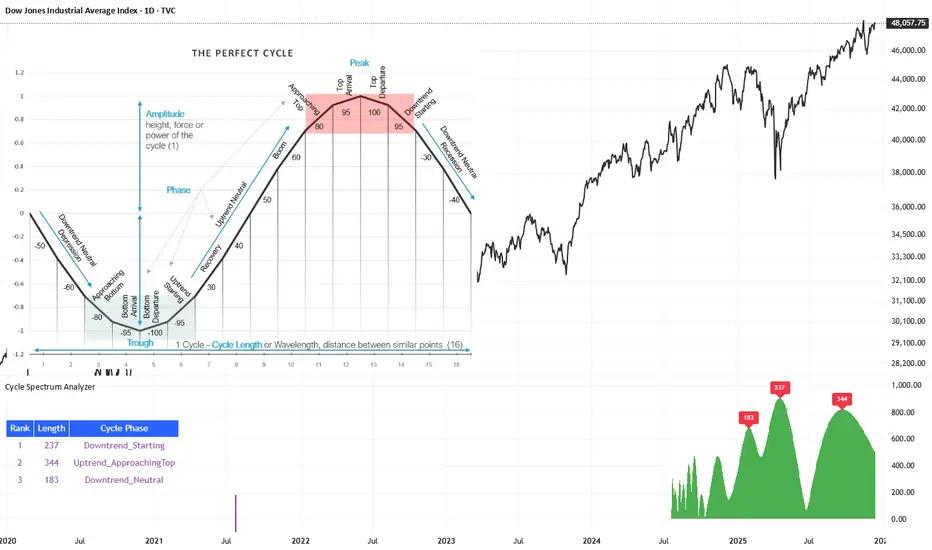
Cycle Spectrum AnalyzerCycle Spectrum Indicator — Short Description
This indicator computes a visual Fourier cycle spectrum from the input price data to reveal the market’s dominant cyclical behaviour. The price series is first detrended using a Hodrick–Prescott filter, after which a specialized Fourier analysis variant extracts the cycle components.
The resulting spectrum displays peaks that represent the dominant cycles present in the data, where each peak’s cycle length and amplitude indicate the strength and duration of the underlying rhythm. The most significant peaks are ranked, highlighting the top cycles currently driving market movement. Each detected cycle also includes a phase value, describing the cycle’s position at the most recent bar (e.g., topping, bottoming, rising, falling).
The indicator can be used to:
Identify the top 3 dominant cycles with their length and phase.
Analyze the current market state by interpreting these phases.
Feed the dominant cycle lengths—often half the primary cycle—into other technical indicators for improved parameter tuning.
Project cycles forward to estimate upcoming turning points and anticipate potential trend shifts.
Additional Explanation of the included visual example image
Left Area – The Theoretical “Perfect Cycle”
The left part of the illustration presents a theoretical, perfectly smooth sine-wave cycle. This serves as a reference model to explain the core cycle parameters:
Cycle Length – The full wavelength of one complete oscillation (from trough to trough or peak to peak).
Phase – The current position within that cycle, expressed both numerically and as an easy-to-read text label such as Bottom_Departure, Uptrend_Neutral, Approaching Top, or Top_Departure.
The diagram highlights visually how a cycle progresses through bottoming, rising, peaking, and declining phases, matching the phase descriptions used in the indicator’s output. This helps translate raw phase angles into intuitive market-state labels (e.g., recovery, boom, topping, recession).
Right Area – The Price Series Used for Analysis
On the right, the actual price chart (e.g., Dow Jones Industrial Average) is displayed. This is the dataset from which the Fourier cycle spectrum is computed.
At the bottom of this chart section, a purple bar indicates the amount of historical data included in the cycle analysis. Because Fourier-based methods depend strongly on sample size, this visual cue shows how far back the indicator collected and processed data before generating the spectrum.
Bottom Area – The Cycle Spectrum Output Pane
The lower pane contains the Cycle Spectrum Analyzer output:
It displays the cycle spectrum at the most recent bar, where each green peak corresponds to a detected cycle.
Peak height = amplitude (strength) of the cycle
Peak position (horizontal) = dominant cycle length
The largest peaks represent the strongest cycles currently present in the detrended price series.
Next to the spectrum, a ranked table lists the Top 3 dominant cycles, showing:
Rank (1 = strongest)
Cycle Length (in bars)
Phase Description (interpreting where that cycle is right now)
This concise summary allows users to quickly understand:
Which cycles are strongest,
How long they are,
And whether they are currently bottoming, topping, rising, or falling.
How the Indicator Works & How It Can Be Adjusted
Calculation Only at the Last Bar
The indicator performs its full Fourier-based cycle decomposition exclusively on the most recent bar. This ensures that the spectrum always reflects the current market state without repeatedly recalculating historical spectra. The result is an efficient, real-time snapshot of the dominant cycles influencing the price at the latest point in time.
Works on Any Symbol and Any Timeframe
Because the analysis operates directly on the provided price series, the indicator is compatible with all markets and all timeframes—stocks, indices, forex, crypto, futures, and intraday charts alike.
The detected cycle lengths always refer to the selected chart’s bar interval (e.g., 240-bar cycle on a 1h chart ≈ 240 hours; same cycle on a daily chart ≈ 240 days).
Adjustable Historical Lookback (Default: 1100 Bars)
The accuracy of cycle detection depends on the amount of historical data used. The indicator provides a parameter allowing you to specify how many past bars should be included in the Fourier calculation.
Standard value: 1100 bars
Increasing the lookback allows detection of longer cycles, but may dilute short-term characteristics.
Decreasing it focuses on shorter and medium-term cycles, increasing responsiveness but reducing visibility of long-duration rhythms.
By tuning this lookback parameter and choosing an appropriate timeframe, traders can adapt the cycle spectrum to match their analytical style—short-term, medium-term, or long-term cycle interpretation.
Skrip berbayar
Ultimate Multi-Asset Correlation System by able eiei Ultimate Multi-Asset Correlation System - User Guide
Overview
This advanced TradingView indicator combines WaveTrend oscillator analysis with comprehensive multi-asset correlation tracking. It helps traders understand market relationships, identify regime changes, and spot high-probability trading opportunities across different asset classes.
Key Features
1. WaveTrend Oscillator
Main Signal Lines: WT1 (blue) and WT2 (red) plot momentum and its moving average
Overbought/Oversold Zones: Default levels at +60/-60
Cross Signals:
🟢 Bullish: WT1 crosses above WT2 in oversold territory
🔴 Bearish: WT1 crosses below WT2 in overbought territory
Higher Timeframe (HTF) Analysis: Shows WT1 from 4H, Daily, and Weekly timeframes for trend confirmation
2. Multi-Asset Correlation Tracking
Monitors relationships between:
Major Assets: Gold (XAUUSD), Dollar Index (DXY), US 10-Year Yield, S&P 500
Crypto Assets: Bitcoin, Ethereum, Solana, BNB
Cross-Asset Analysis: Correlation between traditional markets and crypto
3. Market Regime Detection
Automatically identifies market conditions:
Risk-On: High correlation + positive sentiment (🟢 Green background)
Risk-Off: High correlation + negative sentiment (🔴 Red background)
Crypto-Risk-On: Strong crypto correlations (🟠 Orange background)
Low-Correlation: Divergent market behavior (⚪ Gray background)
Neutral: Mixed signals (🟡 Yellow background)
How to Use
Basic Setup
Add to Chart: Apply the indicator to any chart (works on all timeframes)
Choose Display Mode (Display Options):
All: Shows everything (recommended for comprehensive analysis)
WaveTrend Only: Focus on momentum signals
Correlation Only: View market relationships
Heatmap Only: Simplified correlation view
Enable Asset Groups:
✅ Major Assets: Traditional markets (stocks, bonds, commodities)
✅ Crypto Assets: Digital currencies
Mix and match based on your trading focus
Reading the Charts
WaveTrend Section (Bottom Panel)
Above 0 = Bullish momentum
Below 0 = Bearish momentum
Above +60 = Overbought (potential reversal)
Below -60 = Oversold (potential bounce)
Lighter lines = Higher timeframe trends
Correlation Histogram (Colored Bars)
Blue bars: Major asset correlations
Orange bars: Crypto correlations
Purple bars: Cross-asset correlations
Bar height: Correlation strength (-50 to +50 scale)
Background Color
Intensity reflects correlation strength
Color shows market regime
Dashboard Elements
🎯 Market Regime Analysis (Top Left)
Current Regime: Overall market condition
Average Correlation: Strength of relationships (0-1 scale)
Risk Sentiment: -100% (risk-off) to +100% (risk-on)
HTF Alignment: Multi-timeframe trend agreement
Signal Quality: Confidence level for current signals
📊 Correlation Matrix (Top Right)
Shows correlation values between asset pairs:
1.00: Perfect positive correlation
0.75+: Strong correlation (🟢 Green)
0.50+: Medium correlation (🟡 Yellow)
0.25+: Weak correlation (🟠 Orange)
Below 0.25: Negative/no correlation (🔴 Red)
🔥 Correlation Heatmap (Bottom Right)
Visual matrix showing:
Gold vs. DXY, BTC, ETH
DXY vs. BTC, ETH
BTC vs. ETH
Color-coded strength
📈 Performance Tracker (Bottom Left)
Tracks individual asset momentum:
WT1 Values: Current momentum reading
Status: OB (overbought) / OS (oversold) / Normal
Trading Strategies
1. High-Probability Trend Following
✅ Entry Conditions:
WaveTrend bullish/bearish cross
HTF Alignment matches signal direction
Signal Quality > 70%
Correlation supports direction
2. Regime Change Trading
🎯 Watch for regime shifts:
Risk-Off → Risk-On = Consider long positions
High correlation → Low correlation = Reduce position size
Crypto-Risk-On = Focus on crypto longs
3. Divergence Trading
🔍 Look for:
Strong correlation breakdown = Potential volatility
Cross-asset correlation surge = Follow the leader
Volume-price correlation extremes = Trend confirmation
4. Overbought/Oversold Reversals
⚡ Trade reversals when:
WT crosses in extreme zones (-60/+60)
HTF alignment shows opposite trend weakening
Correlation confirms mean reversion setup
Customization Tips
Fine-Tuning Parameters
WaveTrend Core:
Channel Length (10): Lower = more sensitive, Higher = smoother
Average Length (21): Adjust for your timeframe
Correlation Settings:
Length (50): Longer = more stable, Shorter = more responsive
Smoothing (5): Reduce noise in correlation readings
Market Regime:
Risk-On Threshold (0.6): Lower = earlier regime signals
High Correlation Threshold (0.75): Adjust sensitivity
Custom Asset Selection
Replace default symbols with your preferred markets:
Major Assets: Any forex, indices, bonds
Crypto: Any digital currencies
Must use correct exchange prefix (e.g., BINANCE:BTCUSDT)
Alert System
Enable "Advanced Alerts" to receive notifications for:
✅ Market regime changes
✅ Correlation breakdowns/surges
✅ Strong signals with high correlation
✅ Extreme volume-price correlation
✅ Complete HTF alignment
Correlation Interpretation Guide
ValueMeaningTrading Implication+0.75 to +1.0Strong positiveAssets move together+0.5 to +0.75Moderate positiveGenerally aligned+0.25 to +0.5Weak positiveLoose relationship-0.25 to +0.25No correlationIndependent movements-0.5 to -0.25Weak negativeSlight inverse relationship-0.75 to -0.5Moderate negativeTend to move opposite-1.0 to -0.75Strong negativeStrongly inversely correlated
Best Practices
Use Multiple Timeframes: Check HTF alignment before trading
Confirm with Correlation: Strong signals work best with supportive correlations
Watch Regime Changes: Adjust strategy based on market conditions
Volume Matters: Enable volume-price correlation for confirmation
Quality Over Quantity: Trade only high-quality setups (>70% signal quality)
Common Patterns to Watch
🔵 Risk-On Environment:
Gold-BTC positive correlation
DXY negative correlation with risk assets
High crypto correlations
🔴 Risk-Off Environment:
Flight to safety (Gold up, stocks down)
DXY strength
Correlation breakdowns
🟡 Transition Periods:
Low correlation across assets
Mixed HTF signals
Use caution, reduce position sizes
Technical Notes
Calculation Period: Uses HLC3 (average of high, low, close)
Correlation Window: Rolling correlation over specified length
HTF Data: Accurately calculated using security() function
Performance: Optimized for real-time calculation on all timeframes
Support
For optimal performance:
Use on 15-minute to daily timeframes
Enable only needed asset groups
Adjust correlation length based on trading style
Combine with your existing strategy for confirmation
Enjoy comprehensive multi-asset analysis! 🚀

BTC Future CME Cross-Market DetectorProject Spec: BTC CME Cross-Market Detector
1. Project Overview
Indicator Name
CME Cross-Market Detector
Objective
To identify high-probability trade setups by detecting and confirming "smart money" activity across two distinct market venues simultaneously: a primary crypto exchange (e.g., Bybit, Binance) and the institutional CME futures market.
Core Philosophy
Price movements are often preceded by the positioning of large, institutional players ("smart money"). While their activity can be seen on any single exchange, the signal becomes exceptionally reliable when the same footprint appears at the same time in both the broader crypto derivatives market and the highly regulated institutional futures market. This dual-market confirmation acts as a powerful noise filter, isolating signals that have a higher probability of follow-through.
2. Key Concepts & Signal Logic
The indicator's entire foundation rests on confirming that specific conditions are met on two datasets at the same time: (1) The user's current chart (e.g., BYBIT:BTCUSDT) and (2) The CME Bitcoin Futures chart (CME:BTC1!).
Smart Volume Analysis
To gauge buying vs. selling pressure, the total volume of a single candle is algorithmically split. This is not a perfect science but an effective estimation based on the candle's structure.
Buying Pressure is considered proportional to the distance the price closed from the low. Buying Pressure ≈ Total Volume × ((Close - Low) / (High - Low))
Selling Pressure is considered proportional to the distance the price closed from the high. Selling Pressure ≈ Total Volume × ((High - Close) / (High - Low))
Signal Trigger Conditions
For a potential signal to be identified on each market independently, two conditions must be met:
Volume Spike: The volume of the current candle must be significantly higher than the recent average volume (e.g., >150% of the 20-period moving average). This shows a sudden, high level of interest.
Pressure Imbalance: The estimated buying pressure must overwhelm the selling pressure by a certain factor (e.g., 3x), or vice versa for a sell signal. This indicates a clear directional intent.
The Final Confirmed Signal
A signal is only considered valid and plotted on the chart when the Signal Trigger Conditions (both Volume Spike and Pressure Imbalance) are met on both the primary chart and the CME chart on the very same candle.
3. Signal Strength Calculation
The percentage shown on the chart is a Signal Strength Score (0-100%), which rates the quality and conviction of the confirmed signal.
The score is calculated as follows:
Base Score Calculation (0-100 points): A base score is calculated for each market (primary and CME) by combining two factors:
Volume Component (0-50 pts): Measures the intensity of the volume spike. A 300% volume spike will score higher than a 150% spike.
Imbalance Component (0-50 pts): Measures the intensity of the buy/sell pressure ratio. A 5x imbalance will score higher than a 3x imbalance.
Advanced Modifiers (Bonus Points): The base score is then enhanced with bonus points for favorable conditions:
Trend Alignment (+10 pts): A buy signal that occurs during a clear uptrend receives extra points.
Candle Structure (+10 pts): A buy signal on a candle with a long lower wick (indicating rejection of lower prices) receives extra points.
Final Averaged Score: The final percentage you see is the average of the two individual strength scores calculated for the primary exchange and the CME market.
4. Visualization
Energy Waves: Signals are displayed as circles. Green for Buy Signals (below the candle) and Red for Sell Signals (above the candle).
Dynamic Sizing: The size of the circle directly reflects the Signal Strength Score, categorized into four distinct levels (e.g., 10%+, 40%+, 60%+, and 80%+) for at-a-glance interpretation.
Percentage Labels: Each signal is plotted with its precise, final strength score for clear analysis.
5. Summary: Steps to Replicate the Logic
To recreate this indicator, follow these high-level steps for each candle on the chart:
Gather Data: Fetch the Open, High, Low, Close, and Volume data for the primary chart asset AND for the corresponding CME Bitcoin Futures symbol (CME:BTC1!).
Calculate Buy/Sell Pressure: For both datasets, use the "Smart Volume Analysis" formula to estimate the buying and selling pressure for the current candle.
Check for Volume Spikes: For both datasets, calculate a simple moving average of the volume. Check if the current candle's volume exceeds this average by a set threshold (e.g., 150%).
Check for Pressure Imbalance: For both datasets, check if the buying pressure is greater than the selling pressure by a set multiplier (e.g., 3.0), or vice versa.
Confirm the Signal: A final signal is only valid if the conditions from both Step 3 and Step 4 are true for both datasets on the same candle.
Calculate Strength: If a signal is confirmed, compute a strength score (0-100) for each dataset based on the intensity of the volume spike and pressure imbalance. Add bonus points for confluence factors like trend alignment.
Finalize and Plot: Average the two strength scores from each market. Plot a colored, sized circle on the chart that visually represents this final averaged score, and display the score as a text label.
Last but not least, the idea of the indicator is inspired by 52SIGNAL

SimpleAlgo V2.1SimpleAlgo V2.1 – Momentum and Volatility Framework
Overview
SimpleAlgo V2.1 combines momentum waves, volatility envelopes, key price levels, and optional entry markers to provide a structured view of market behavior. The tool is designed to help traders interpret trend conditions, momentum shifts, and volatility expansion or compression through a clean set of visual components.
Momentum Waves
The indicator calculates multiple smoothed momentum waves using adaptive EMA logic. These waves highlight short and medium-term momentum behavior.
Color fills between waves help visualize momentum changes and transitions in trend strength.
Entry Signals (Optional)
Potential long or short markers can appear when a momentum shift aligns with a wave crossover. These are visual aids intended to highlight moments of interest on the chart. They are not standalone trade signals and should be confirmed with additional analysis.
Volatility Envelope (Optional)
A multi-band volatility envelope constructed from smoothed true range helps identify overextension zones and expansion phases. This framework can be useful when evaluating price deviations and potential exhaustion areas.
Key Price Levels (Optional)
Pivot-based levels identify potential support and resistance areas. These levels are projected forward to help visualize structure points without repainting.
Momentum Cloud and Bar Shading
The script includes cloud shading and bar coloring to help illustrate the strength and direction of momentum. These visuals help clarify trend conditions at a glance.
Position Management Tools (Optional)
When enabled, V2.1 can display hypothetical entry, stop, and target levels based on ATR-derived risk measurements. These elements provide a visual framework for trade planning only and do not execute or manage trades.
Alerts
Alert conditions are available for potential long and short entries based on the internal wave-cross and momentum logic.
Customization
Users can adjust responsiveness, volatility settings, level lookback, cloud visibility, shading, bar coloring, and all position-management parameters. Every layer can be enabled or disabled depending on preference and trading style.
Recommended Use
This tool is most effective when combined with a broader analysis approach that incorporates higher timeframe context, structure, and risk management principles. It should not be used as a standalone trading system.
Disclaimer
This indicator is for technical analysis and educational purposes only. It does not predict future price movement or guarantee results. All trading involves risk.

FLD 3DFLD 3D - Future Lines of Demarcation Indicator
═══════════════════════════════════════════════════
THEORETICAL FOUNDATION
═══════════════════════════════════════════════════
This indicator implements Future Lines of Demarcation (FLD), a key concept from J.M. Hurst's cyclic analysis theory. FLDs are price-based lines displaced forward in time by half the wavelength of a dominant cycle, creating a predictive framework for price movement analysis.
The core principle: when price crosses an FLD line, it indicates a potential change in the current cycle phase. FLDs act as dynamic support/resistance levels that "anticipate" where price should be based on the dominant cycle's rhythm.
═══════════════════════════════════════════════════
CALCULATION METHODOLOGY
═══════════════════════════════════════════════════
The indicator calculates three FLD lines:
1. FLD HIGH: Takes the bar's high price and shifts it forward by offset bars
2. FLD LOW: Takes the bar's low price and shifts it forward by offset bars
3. FLD MEDIAN: Calculates a median price using the selected method, then shifts forward
The offset is calculated as: offset = Period / 2
This displacement represents the half-cycle concept: if a cycle has a period of 48 bars, the FLD will be displaced 24 bars into the future. This creates a "lead" indicator that shows where price should theoretically be based on the cycle's wave pattern.
PRICE METHODS AVAILABLE:
- HL2: (High + Low) / 2 - Simple midpoint
- HLC3: (High + Low + Close) / 3 - Weighted with close
- HLCC4: (High + Low + Close + Close) / 4 - Close has double weight
- OHLC4: (Open + High + Low + Close) / 4 - Full bar average
- VWAP-like: Volume-weighted high/low average
- True Range: Uses previous close for range calculation
═══════════════════════════════════════════════════
AUTO-PERIOD ADJUSTMENT FEATURE
═══════════════════════════════════════════════════
The indicator includes multi-timeframe adaptation logic. When "Auto Period" is enabled:
1. Detects current chart timeframe (minutes, hours, days, weeks)
2. Compares it to the reference timeframe setting
3. Calculates adjustment ratio: Reference TF / Current TF
4. Applies ratio to base period: Adjusted Period = Base Period × Ratio
Example: If Base Period = 48, Reference TF = 60min, Current chart = 15min
→ Ratio = 60/15 = 4
→ Adjusted Period = 48 × 4 = 192 bars
This ensures the indicator tracks the same real-time cycle length across different chart timeframes, maintaining consistency in cycle analysis.
═══════════════════════════════════════════════════
VISUAL COMPONENTS
═══════════════════════════════════════════════════
- RED LINE: FLD High (upper boundary)
- BLUE LINE: FLD Low (lower boundary)
- ORANGE LINE: FLD Median (centerline)
- GRAY AREA: Fills between High and Low FLDs
- RIGHT LABEL: Shows FLD identifier and period used (asterisk indicates auto-adjustment)
All lines extend into the future by the calculated offset, creating a "projection zone" ahead of current price.
═══════════════════════════════════════════════════
ACKNOWLEDGMENTS
═══════════════════════════════════════════════════
This work is inspired by the Italian cyclic analysis community and dedicated educators. Due to TradingView's House Rules on promotional content, I cannot mention specific names or groups, but my gratitude goes to those who know they contributed to this development through their teaching and guidance. Thank Emiliano!

Information-Geometric Market Dynamics + MLInformation-Geometric Market Dynamics + ML (IGMD-ML)
Foreword: Beyond the Shadows on the Wall
If you have traded for any length of time, you understand the frustration of a perfect setup that fails, the whipsaw that stops you out just before a major move, or the persistent feeling that the price chart is only telling you half the story. For decades, technical analysis has focused on interpreting the shadows—the patterns left behind by price. We draw lines, apply indicators, and hope to derive future movement from this historical data.
But what if we could stop analyzing the shadows and instead measure the object casting them?
This script, Information-Geometric Market Dynamics (IGMD), introduces a new paradigm for market analysis. Its core premise is that the price chart is merely a one-dimensional projection of a much richer, higher-dimensional reality—an "information field" generated by the collective actions, beliefs, and emotions of all market participants.
This is not just another collection of indicators. It is a unified framework for measuring the geometry of this information field—its memory, its complexity, its uncertainty, its causal flows—and making high-probability decisions based on that deeper reality.
The IGMD Framework: A Multi-Kernel Approach
At the heart of IGMD are mathematical "kernels"—specialized engines that transform raw price data into meaningful measurements of abstract market properties. The framework's power lies in its ability to fuse the outputs of five distinct kernels, synthesizing their diverse perspectives into a single, coherent picture of the market's state.
The Five Core Kernels of Market Dynamics:
1. The Wavelet Kernel (The "Microscope"): Decomposes price into different frequency scales, separating short-term noise from the underlying market "thesis."
2. The Hurst Exponent Kernel (The "Memory Gauge"): Measures the market's "long-term memory" to determine if it is in a trending, mean-reverting, or random state.
3. The Fractal Dimension Kernel (The "Complexity Compass"): Quantifies the geometric complexity of the price path, acting as a primary filter for tradable vs. untradable conditions.
4. The Shannon Entropy Kernel (The "Uncertainty Meter"): Provides a pure measure of information and uncertainty, gauging market conviction and predictability.
5. The Transfer Entropy Kernel (The "Causality Probe"): Moves beyond correlation to measure the directed flow of information, assessing if a driver (like volume) is genuinely leading price.
Major Update: The Intelligence Layer & Machine Learning Integration
This version of IGMD introduces a significant advancement: an integrated machine learning (ML) engine that acts as an intelligent decision-making layer on top of the core five-kernel analysis. This is not a "black box" system but a transparent, adaptive filter designed to improve signal quality by learning from the market in real time.
How the ML Engine Works
The ML model processes the outputs from all five IGMD kernels and other market variables (like RSI and Volume) to build a comprehensive, multi-dimensional understanding of the current market state.
Core Technology: The engine uses an online logistic regression model. "Online" means it learns and updates its parameters with every new bar of data, allowing it to adapt continuously to changing market dynamics without needing to be retrained.
Non-Linear Pattern Recognition: To capture the market's complex behavior, the model projects the kernel data into a higher-dimensional space using Random Fourier Features (RFF) . This technique allows a linear model to recognize highly intricate patterns that would otherwise be invisible.
Probabilistic Filtering: The ML engine’s primary function is to act as a final confirmation filter. For every signal generated by the core IGMD system, the ML model calculates a probability score—its confidence that the price will move in the predicted direction. Signals are only displayed if they pass this confidence check.
Key Features of the ML Engine
Automated Regime Filter: The ML engine uses the Fractal Dimension and Shannon Entropy kernels to identify choppy, unpredictable markets. During these periods, the system automatically pauses new signal generation to help preserve capital.
Adaptive Confidence Threshold: To optimize performance, the ML engine features an optional self-adjusting confidence threshold. This system tracks its own rolling accuracy and adjusts its selectivity accordingly, becoming more cautious in uncertain periods and more opportunistic when its accuracy is high.
Feature Importance Monitoring: The dashboard displays which of the core IGMD features (e.g., Wave, Hurst, Entropy) the ML model is currently relying on most. This provides valuable insight into the market's character and what is driving the model's decisions.
Advanced Adaptation: The Reinforcement Learning Bandit (Experimental)
For advanced users, this version includes an experimental feature based on a Multi-Armed Bandit , a concept from reinforcement learning. When enabled, this system can automatically switch between different parameter presets (e.g., Conservative, Balanced, Aggressive) based on the current market regime. It learns over time which preset performs best under specific conditions by balancing the exploitation of known successful strategies with the exploration of others.
Fusion & Interpretation: The Field Score & Enhanced Dashboard
The Field Score: The outputs of the five kernels are fused into a single, comprehensive "Field Score" ranging from -1 (maximum bearish alignment) to +1 (maximum bullish alignment). This remains the ultimate at-a-glance metric for the market's net state.
The Enhanced Dashboard: Your mission control has been upgraded to include the ML engine's analysis. Alongside the core kernel readouts, you can now monitor:
ML Status: See if the model is active, warming up, or disabled.
ML Probability: View the model's real-time confidence for a bullish move.
Regime Status: Instantly know if the market is "Trending," "Normal," or "Choppy (Paused)."
Top Feature: Identify the most influential IGMD kernel according to the ML model.
Signal Status: See the final, ML-vetted signal.
Mastering the Controls: A Guide to the Inputs
The inputs menu gives you full control over the IGMD and ML engines.
🤖 Machine Learning Engine:
Enable ML Probability Model: The master switch for the entire ML layer.
Prediction Horizon: Set how many bars ahead you want the ML model to predict. This should align with your trading style.
ML Confidence Threshold: The minimum probability required for the ML model to approve a signal. This is your primary tool for adjusting signal quality versus frequency.
Pause in Choppy Regimes: Enable or disable the automated filter that stops trading in unfavorable conditions.
Auto-Adjust Threshold: Allow the system to self-optimize its confidence threshold based on recent accuracy.
🎰 Adaptive Parameter Bandit:
Enable Parameter Bandit: Activate the experimental reinforcement learning agent to manage strategy presets automatically.
Reading the Battlefield: On-Chart Visuals
In addition to the established pattern boxes, RR rails, and signal markers, a new visual element has been added:
ML Rejection Markers (✗): An orange '✗' will appear on the chart when the core IGMD system identifies a potential setup, but the ML model's confidence is below your defined threshold. This provides crucial feedback, showing you which signals were intelligently filtered out by the intelligence layer for having a lower probability of success.
A Methodological Distinction: What Sets IGMD Apart **
What sets this framework apart is its foundational approach. Instead of relying on traditional technical indicators, IGMD is architected as a multi-disciplinary engine that fuses concepts from signal processing, chaos theory, and information theory. It moves beyond analyzing simple price action to measure the market's underlying "information field"—quantifying its memory, complexity, and causal flows into a single, unified score. The integrated machine learning layer builds on this foundation, creating a transparent, adaptive filter that learns from market conditions in real-time. This combination of a fused, multi-dimensional analysis with a live, probabilistic intelligence layer offers a more dynamic and nuanced perspective than static, single-purpose indicators.
Development Philosophy & A Final Word
This script was designed to answer a single question: "What is the market *really* doing?" The addition of a transparent, adaptive machine learning layer is the next logical step in this pursuit—using computational intelligence to navigate the vast amount of information the core kernels provide.
This tool is offered for educational and analytical purposes and does not constitute financial advice. Its goal is to elevate market analysis from interpreting flat shadows to measuring the rich, geometric reality of the market's information field.
As the great mathematician Benoit Mandelbrot, father of fractal geometry, noted:
"Clouds are not spheres, mountains are not cones, coastlines are not circles, and bark is not smooth, nor does lightning travel in a straight line."
Neither does the market. IGMD is a tool designed to help navigate that beautiful, complex, and fractal reality.
— Dskyz, Trade with insight. Trade with anticipation.

Cora Combined Suite v1 [JopAlgo]Cora Combined Suite v1 (CCSV1)
This is an 2 in 1 indicator (Overlay & Oscillator) the Cora Combined Suite v1 .
CCSV1 combines a price-pane Overlay for structure/trend with a compact Oscillator for timing/pressure. It’s designed to be clear, beginner-friendly, and largely automatic: you pick a profile (Scalp / Intraday / Swing), choose whether to run as Overlay or Oscillator, and CCSV1 tunes itself in the background.
What’s inside — at a glance
1) Overlay (price pane)
CoRa Wave: a smooth trend line based on a compound-ratio WMA (CRWMA).
Green when the slope rises (bull bias), Red when it falls (bear bias).
Asymmetric ATR Cloud around the CoRa Wave
Width expands more up when buyer pressure dominates and more down when seller pressure dominates.
Fill is intentionally light, so candlesticks remain readable.
Chop Guard (Range-Lock Gate)
When the cloud stays very narrow versus ATR (classic “dead water”), pullback alerts are muted to avoid noise.
Visuals don’t change—only the alerting logic goes quiet.
Typical Overlay reads
Trend: Follow the CoRa color; green favors long setups, red favors shorts.
Value: Pullbacks into/through the cloud in trend direction are higher-quality than chasing breaks far outside it.
Dominance: A visibly asymmetric cloud hints which side is funding the move (buyers vs sellers).
2) Oscillator (subpane or inline preview)
Stretch-Z (columns): how far price is from the CoRa mean (mean-reversion context), clipped to ±clip.
Near 0 = equilibrium; > +2 / < −2 = stretched/extended.
Slope-Z (line): z-score of CoRa’s slope (momentum of the trend line).
Crossing 0 upward = potential bullish impulse; downward = potential bearish impulse.
VPO (stepline): a normalized Volume-Pressure read (positive = buyers funding, negative = sellers).
Rendered as a clean stepline to emphasize state changes.
Event Bands ±2 (subpane): thin reference lines to spot extension/exhaustion zones fast.
Floor/Ceiling lines (optional): quiet boundaries so the panel doesn’t feel “bottomless.”
Inline vs Subpane
Inline (overlay): the oscillator auto-anchors and scales beneath price, so it never crushes the price scale.
Subpane (raw): move to a new pane for the classic ±clip view (with ±2 bands). Recommended for systematic use.
Why traders like it
Two in one: Structure on the chart, timing in the panel—built to complement each other.
Retail-first automation: Choose Scalp / Intraday / Swing and let CCSV1 auto-tune lengths, clips, and pressure windows.
Robust statistics: On fast, spiky markets/timeframes, it prefers outlier-resistant math automatically for steadier signals.
Optional HTF gate: You can require higher-timeframe agreement for oscillator alerts without changing visuals.
Quick start (simple playbook)
Run As
Overlay for structure: assess trend direction, where value is (the cloud), and whether chop guard is active.
Oscillator for timing: move to a subpane to see Stretch-Z, Slope-Z, VPO, and ±2 bands clearly.
Profile
Scalp (1–5m), Intraday (15–60m), or Swing (4H–1D). CCSV1 adjusts length/clip/pressure windows accordingly.
Overlay entries
Trade with CoRa color.
Prefer pullbacks into/through the cloud (trend direction).
If chop guard is active, wait; let the market “breathe” before engaging.
Oscillator timing
Look for Funded Flips: Slope-Z crossing 0 in the direction of VPO (i.e., momentum + funded pressure).
Use ±2 bands to manage risk: stretched conditions can stall or revert—better to scale or wait for a clean reset.
Optional HTF gate
Enable to green-light only those oscillator alerts that align with your chosen higher timeframe.
What each signal means (plain language)
CoRa turns green/red (Overlay): trend bias shift on your chart.
Cloud width tilts asymmetrically: one side (buyers/sellers) is dominating; extensions on that side are more likely.
Stretch-Z near 0: fair value around CoRa; pullback timing zone.
Stretch-Z > +2 / < −2: extended; watch for slowing momentum or scale decisions.
Slope-Z cross up/down: new impulse starting; combine with VPO sign to avoid unfunded crosses.
VPO positive/negative: net buying/selling pressure funding the move.
Alerts included
Overlay
Pullback Long OK
Pullback Short OK
Oscillator
Funded Flip Up / Funded Flip Down (Slope-Z crosses 0 with VPO agreement)
Pullback Long Ready / Pullback Short Ready (near equilibrium with aligned momentum and pressure)
Exhaustion Risk (Long/Short) (Stretch-Z beyond ±2 with weakening momentum or pressure)
Tip: Keep chart alerts concise and use strategy rules (TP/SL/filters) in your trade plan.
Best practices
One glance workflow
Read Overlay for direction + value.
Use Oscillator for trigger + confirmation.
Pairing
Combine with S/R or your preferred execution framework (e.g., your JopAlgo setups).
The suite is neutral: it won’t force trades; it highlights context and quality.
Markets
Works on crypto, indices, FX, and commodities.
Where real volume is available, VPO is strongest; on synthetic volume, treat VPO as a soft filter.
Timeframes
Use the Profile preset closest to your style; feel free to fine-tune later.
For multi-TF trading, enable the HTF gate on the oscillator alerts only.
Inputs you’ll actually use (the rest can stay on Auto)
Run As: Overlay or Oscillator.
Profile: Scalp / Intraday / Swing.
Oscillator Render: “Subpane (raw)” for a classic panel; “Inline (overlay)” only for a quick preview.
HTF gate (optional): require higher-timeframe Slope-Z agreement for oscillator alerts.
Everything else ships with sensible defaults and auto-logic.
Limitations & tips
Not a strategy: CCSV1 is a decision support tool; you still need your entry/exit rules and risk management.
Non-repainting design: Signals finalize on bar close; intrabar graphics can adjust during the bar (Pine standard).
Very flat sessions: If price and volume are extremely quiet, expect fewer alerts; that restraint is intentional.
Who is this for?
Beginners who want one clean overlay for structure and one simple oscillator for timing—without wrestling settings.
Intermediates seeking a coherent trend/pressure framework with HTF confirmation.
Advanced users who appreciate robust stats and clean engineering behind the visuals.
Disclaimer: Educational purposes only. Not financial advice. Trading involves risk. Use at your own discretion.

Curvature Tensor Pivots🌀 Curvature Tensor Pivots
Curvature Tensor Pivots: Geometric Pivot Detection Through Differential Geometry
Curvature Tensor Pivots applies mathematical differential geometry to market price analysis, identifying pivots by measuring how price trajectories bend through space. Unlike traditional pivot indicators that rely solely on price highs and lows, this system calculates the actual geometric curvature of price paths and detects inflection points where the curvature changes sign or magnitude—the mathematical hallmarks of directional transitions.
The indicator combines three components: precise curvature measurement using second-derivative calculus, tensor weighting that multiplies curvature by volatility and momentum, and a tension-based prediction system that identifies compression before pivots form. This creates a forward-looking pivot detector with built-in confirmation mechanics.
What Makes This Original
Pure Mathematical Foundation
This indicator implements the classical differential geometry curvature formula κ = |y''| / (1 + y'²)^(3/2), which measures how sharply a curve bends at any given point. In price analysis, high curvature indicates sharp directional changes (active pivots), while curvature approaching zero indicates straight-line motion (inflection points forming). This mathematical approach is fundamentally different from pattern recognition or statistical pivots—it measures the actual geometry of price movement.
Tensor Weighting System
The core innovation is the tensor scoring mechanism, which multiplies geometric curvature by two market-state variables: volatility (ATR expansion/compression) and momentum (rate of change strength). This creates a multi-dimensional strength metric that distinguishes between meaningful pivots and noise. A high tensor score means high curvature is occurring during significant volatility with strong momentum—a genuine structural turning point. Low tensor scores during high curvature indicate choppy, low-conviction moves.
Tension-Based Prediction
The system calculates tension as the inverse of curvature (Tension = 1 - κ). When curvature is low, tension is high, indicating price is moving in a straight line and approaching an inflection point where it must curve. The tension cloud visualizes this compression, tightening before pivots form and expanding after they complete. This provides anticipatory signals rather than purely reactive confirmation.
Integrated Confirmation Architecture
Rather than simply flagging high curvature, the system requires convergence of four elements: geometric inflection detection (sign changes in second derivative or curvature extrema), traditional price structure pivots (pivot highs/lows), tensor strength above threshold, and minimum spacing between signals. This multi-layer confirmation prevents false signals while maintaining sensitivity to genuine turning points.
This is not a combination of existing indicators—it's an application of pure mathematical concepts (differential calculus and tensor algebra) to market geometry, creating a unique analytical framework.
Core Components and How They Work Together
1. Differential Geometry Engine
The foundation is calculus-based trajectory analysis. The system treats price as a function y(t) and calculates:
First derivative (y'): The slope of the price trajectory, representing directional velocity
Second derivative (y''): The acceleration of slope change, representing how quickly direction is shifting
Curvature (κ): The normalized geometric bend, calculated using the formula κ = |y''| / (1 + y'²)^(3/2)
This curvature value is then normalized to a 0-1 range using adaptive statistical bounds (mean ± 2 standard deviations over a rolling window). High κ values indicate sharp bends (active pivots), while κ approaching zero indicates inflection points where the trajectory is straightening before changing concavity.
2. Tensor Weighting Components
The raw curvature is weighted by market dynamics to create the tensor score:
Volatility Component: Calculated as current ATR divided by baseline ATR (smoothed average). Values above 1.0 indicate expansion (higher conviction moves), while values below 1.0 indicate compression (lower reliability). This ensures pivots forming during volatile periods receive higher scores than those in quiet conditions.
Momentum Component: Measured using rate of change (ROC) strength normalized by recent average. High momentum indicates sustained directional pressure, confirming that curvature changes represent genuine trend shifts rather than noise.
Tensor Score Fusion: The final tensor score = κ × Volatility × Momentum × Direction × Gain. This creates a directional strength metric ranging from -1 (strong bearish curvature) to +1 (strong bullish curvature). The magnitude represents conviction, while the sign represents direction.
These components work together by filtering geometric signals through market-state context. A high curvature reading during low volatility and weak momentum produces a low tensor score (likely noise), while the same curvature during expansion and strong momentum produces a high tensor score (likely genuine pivot).
3. Inflection Point Detection System
Inflection points occur where the second derivative changes sign (concave to convex or vice versa) or where curvature reaches local extrema. The system detects these through multiple methods:
Sign change detection: When y'' crosses zero, the price trajectory is transitioning from curving upward to downward (or vice versa)
Curvature extrema: When κ reaches a local maximum or minimum, indicating peak bend intensity
Near-zero curvature: When κ falls below an adaptive threshold, indicating straight-line motion before a directional change
These geometric signals are combined with traditional pivot detection (pivot highs and lows using configurable lookback/lookahead periods) to create confirmed inflection zones. The geometric math identifies WHERE inflections are forming, while price structure confirms WHEN they've completed.
4. Tension Cloud Prediction
Tension is calculated as 1 - κ, creating an inverse relationship where low curvature produces high tension. This represents the "straightness" of price trajectory—when price moves in a straight line, it's building tension that must eventually release through a curved pivot.
The tension cloud width adapts to this tension value: it tightens (narrows) when curvature is low and tension is high, providing visual warning that a pivot is forming. After the pivot completes and curvature increases, tension drops and the cloud expands, confirming the turn.
This creates a leading indicator component within the system: watch for the cloud to compress, then wait for the pivot marker and tensor direction confirmation to enter trades.
5. Multi-Layer Visualization System
The visual components work hierarchically:
Curvature ribbons (foundation): Width expands with curvature magnitude, color shifts with tensor direction (green bullish, red bearish)
Tension cloud (prediction): Purple overlay that compresses before pivots and expands after
Tensor waves (context): Harmonic oscillating layers driven by three phase accumulators (curvature, tensor magnitude, volatility), creating visual texture that becomes erratic before pivots and smooth during trends
Inflection zones (timing): Golden background highlighting when geometric conditions indicate inflection points forming
Pivot markers (confirmation): Triangles marking confirmed pivots where geometric inflection + price structure + tensor strength all align
Each layer adds information without redundancy: ribbons show current state, tension shows prediction, waves show regime character, zones show geometric timing, and markers show confirmed entries.
Calculation Methodology
Phase 1 - Derivative Calculations
Price is normalized by dividing by a 50-period moving average to improve numerical stability. The first derivative is calculated as the bar-to-bar change, then smoothed using a configurable smoothing length (default 3 bars) to reduce noise while preserving structure.
The second derivative is calculated as the bar-to-bar change in the first derivative, also smoothed. This represents the acceleration of directional change—positive values indicate price is curving upward (concave up), negative values indicate curving downward (concave down).
Phase 2 - Curvature Formula
The classical curvature formula is applied:
Calculate y'² (first derivative squared)
Calculate (1 + y'²)^1.5 as the denominator
Divide |y''| by this denominator to get raw curvature κ
This formula ensures curvature is properly normalized regardless of the steepness of the trajectory. A vertical line with high slope (large y') can still have low curvature (straight), while a gradual slope with changing direction produces high curvature (curved).
The raw curvature is then normalized to 0-1 range using adaptive bounds (rolling mean ± 2 standard deviations), allowing the system to adapt to different market volatility regimes.
Phase 3 - Tensor Weighting
ATR is calculated over the specified volatility length (default 14). Current ATR is divided by smoothed ATR to create the volatility ratio. Momentum is calculated as the rate of change over the momentum length (default 10), normalized by recent average ROC.
The tensor score is computed as: Curvature × Volatility × Momentum × Tensor Gain × Direction Sign
This creates the final directional strength metric used for ribbon coloring and signal generation.
Phase 4 - Inflection Detection
Multiple conditions are evaluated simultaneously:
Second derivative sign changes (y'' × y'' < 0)
Curvature local maxima (previous bar κ > current bar κ AND previous bar κ > two bars ago κ)
Curvature local minima (opposite condition)
Low curvature threshold (current κ < adaptive threshold)
Any of these conditions triggers inflection zone highlighting. For confirmed pivot signals, inflection detection must coincide with traditional pivot highs/lows AND tensor magnitude must exceed threshold AND minimum spacing since last signal must be satisfied.
Phase 5 - Tension Calculation
Tension = 1 - κ (smoothed)
This inverse relationship creates the compression/expansion dynamic. When curvature approaches zero (straight trajectory), tension approaches 1 (maximum compression). When curvature is high (sharp bend), tension approaches zero (released).
The tension cloud bands are calculated as: Basis ± (Ribbon Width × Tension)
This creates the visual tightening effect before pivots.
Phase 6 - Wave Generation
Three phase accumulators are maintained:
Phase 1: Accumulates based on curvature magnitude (0.1 × κ per bar)
Phase 2: Accumulates based on tensor magnitude (0.15 × tensor per bar)
Phase 3: Accumulates based on volatility (0.08 × volatility per bar)
For each wave layer (2-8 configurable), a unique frequency is used (layer number × 0.6). The wave offset is calculated as:
Amplitude × (sin(phase1 × frequency) × 0.4 + sin(phase2 × frequency × 1.2) × 0.35 + sin(phase3 × frequency × 0.8) × 0.25)
This creates complex harmonic motion that reflects the interplay of curvature, strength, and volatility. When these components are aligned, waves are smooth; when misaligned (pre-pivot conditions), waves become chaotic.
All calculations are deterministic and execute on closed bars only—there is no repainting.
How to Use This Indicator
Setup and Configuration
Apply the indicator to your chart with default settings initially
Enable the main dashboard (top right recommended) to monitor curvature, tensor, and tension metrics in real-time
Enable the curvature matrix (bottom right) to see historical patterns in the heatmap
Choose your ribbon mode: "Dual Ribbon" shows both bullish and bearish zones, "Tension Cloud" emphasizes the compression zones
For your first session, observe how the tension cloud behaves before confirmed pivots—you'll notice it consistently tightens (narrows) before pivot markers appear, then expands after.
Signal Interpretation
High Pivot (Bearish) - Red triangle above price:
Occurs when price makes a pivot high (local maximum)
Second derivative is negative (concave down curvature)
Tensor magnitude exceeds threshold (strong confirmation)
Minimum spacing requirement met (noise filter)
Interpretation: A confirmed bearish inflection point has formed. Price trajectory has curved over and is transitioning from upward to downward movement.
Low Pivot (Bullish) - Blue triangle below price:
Occurs when price makes a pivot low (local minimum)
Second derivative is positive (concave up curvature)
Tensor magnitude exceeds threshold
Spacing requirement met
Interpretation: A confirmed bullish inflection point has formed. Price trajectory has curved upward and is transitioning from downward to upward movement.
Dashboard Metrics
κ (Curvature): 0-100% reading. Above 70% = sharp active pivot, 40-70% = moderate curve, below 40% = gentle or approaching inflection
Tensor: Directional strength. Arrow indicates bias (⬆ bullish, ⬇ bearish, ⬌ neutral). Magnitude indicates conviction.
Volatility: Current ATR expansion state. Above 70% = high volatility (pivots more significant), below 40% = compressed (pivots less reliable)
Momentum: Directional strength. High values confirm trend continuation, low values suggest exhaustion
Tension: 0-100% reading. Above 70% = pivot forming soon (high compression), below 40% = pivot recently completed (expanded)
State: Real-time regime classification:
"🟢 STABLE" = normal trending conditions
"🟡 TENSION" = pivot forming (high compression)
"🔴 HIGH κ" = active sharp pivot in progress
"⚠ INFLECTION" = geometric inflection zone (critical transition)
Curvature Matrix Heatmap
The matrix shows the last 30 bars (configurable 10-100) of historical data across five metrics:
κ row: Curvature evolution (green = low, yellow = moderate, red = high)
Tension row: Purple intensity shows compression building
Tensor row: Strength evolution (green = strong, yellow = moderate, red = weak)
Volatility row: Expansion state
Momentum row: Directional conviction
Pattern recognition: Look for purple clustering in the tension row followed by red spikes in the κ row—this shows compression → release pivot sequence.
Trading Workflow
Step 1 - Monitor Tension:
Watch the tension cloud and dashboard tension metric. When tension rises above 60-70% and the cloud visibly tightens, a pivot is building. The matrix will show purple bands clustering.
Step 2 - Identify Inflection Zone:
Wait for the golden background glow (inflection zone) to appear. This indicates the geometric conditions are met: curvature is approaching zero, second derivative is near sign change, or curvature extrema detected. The dashboard state will show "⚠ INFLECTION ZONE".
Step 3 - Confirm Direction:
Check the tensor arrow in the dashboard:
⬆ (bullish tensor) = expect bullish pivot
⬇ (bearish tensor) = expect bearish pivot
Also verify the y'' status in the dashboard:
"🔵↑ Concave Up" = bullish curvature forming
"🔴↓ Concave Down" = bearish curvature forming
Step 4 - Wait for Pivot Marker:
Do not enter on inflection zones alone—wait for the confirmed pivot marker (triangle). This ensures all confirmation layers have aligned: geometric inflection + price structure pivot + tensor strength + spacing filter.
Step 5 - Execute Entry:
Long entry: Blue triangle below price + ⬆ tensor + tension releasing (dropping)
Short entry: Red triangle above price + ⬇ tensor + tension releasing
Step 6 - Manage Risk:
Initial stop: Place beyond the opposite ribbon edge plus one ATR buffer
Trailing stop: Follow the ribbon edge (basis ± adaptive width) as curvature sustains in your direction
Exit signal: If tension spikes again quickly (another inflection forming), consider taking profit—the trend may be reversing
Best Practices
Use multiple timeframe confirmation: Check that higher timeframe tensor aligns with your trade direction
Respect the spacing filter: If a pivot just fired, wait for minimum spacing before taking another signal
Distinguish regime: In "🔴 HIGH κ" state (choppy), reduce position size; in "🟢 STABLE" state, full confidence
Combine with support/resistance: Pivots near key levels have higher probability
Watch particle density: Clustering of particles indicates rising curvature intensity
Observe wave texture: Smooth flowing waves = trending environment (pivots are reversals); chaotic erratic waves = reversal environment (pivots are trend starts)
Ideal Market Conditions
Best Performance
Liquid markets with clear swing structure (forex majors, large-cap stocks, major indices)
Timeframes from 15-minute to daily (the system adapts across timeframes)
Markets with periodic swings and clear directional phases (where geometric curvature is meaningful)
Trending markets with consolidation phases (where tension builds before breakouts)
Challenging Conditions
Extremely choppy/sideways markets for extended periods (high curvature but low tensor magnitude—system will reduce signals appropriately)
Very low liquidity instruments (erratic price action creates false geometric signals)
Ultra-low timeframes (1-minute or below) where spread and noise dominate structure
Markets in deep consolidation (the system will show high tension but no clean pivot confirmation)
The indicator is designed to adapt: in poor conditions, tensor scores remain low and signals reduce naturally. In optimal conditions, tension compression → inflection → pivot confirmation sequences occur cleanly.
Parameter Optimization by Trading Style
Scalping (5-15 Minute Charts)
Curvature Window: 3-5 (faster response)
Curvature Smoothing: 2 (minimal lag)
Volatility Length: 10-14
Momentum Length: 8-10
Tensor Gain: 1.2-1.5 (moderate sensitivity)
Inflection Threshold: 0.10-0.15 (more sensitive)
Min Pivot Spacing: 3-5 bars
Pivot Mode: Aggressive
Ribbon Mode: Dual Ribbon (clearer entries)
Day Trading (15-60 Minute Charts)
Curvature Window: 5 (default)
Curvature Smoothing: 3 (balanced)
Volatility Length: 14
Momentum Length: 10
Tensor Gain: 1.5 (default)
Inflection Threshold: 0.15 (default)
Min Pivot Spacing: 5-8 bars
Pivot Mode: Normal or Adaptive
Ribbon Mode: Dual Ribbon
Swing Trading (4-Hour to Daily Charts)
Curvature Window: 7-10 (smoother)
Curvature Smoothing: 4-5 (noise reduction)
Volatility Length: 20-30
Momentum Length: 14-20
Tensor Gain: 1.8-2.5 (higher conviction requirement)
Inflection Threshold: 0.20-0.30 (more selective)
Min Pivot Spacing: 8-12 bars
Pivot Mode: Conservative
Ribbon Mode: Tension Cloud (focus on compression zones)
Performance Optimization
If you experience lag on lower-end systems:
Reduce Wave Layers: 4 → 2 (50% reduction in calculations)
Lower Particle Density: 3 → 1 (66% reduction in label creation)
Decrease Matrix History: 30 → 15 bars (50% reduction in table size)
Disable Tensor Waves entirely if not needed for your trading
Important Disclaimers
- This indicator is a technical analysis tool designed to identify potential pivot points through mathematical analysis of price trajectory geometry. It should not be used as a standalone trading system. Always combine with proper risk management, position sizing, and additional confirmation methods (support/resistance, volume analysis, multi-timeframe alignment).
- The curvature and tensor calculations are deterministic mathematical formulas applied to historical price data—they do not predict future price movements with certainty. Past geometric patterns do not guarantee future pivot behavior. The tension-based prediction system identifies conditions where pivots are likely to form based on trajectory straightness, but market conditions can change rapidly.
- All trading involves risk. Use appropriate stop losses and never risk more than you can afford to lose. The signal spacing filters and tensor confirmation layers are designed to reduce noise, but no indicator can eliminate false signals entirely.
This system is most effective when combined with sound trading principles, market context awareness, and disciplined execution.
Technical Notes
All calculations execute on closed bars only (no repainting)
Lookback functions limited to 5000 bars maximum
Arrays are fixed-size (waves) or hard-capped (particles at 80 labels)
Dashboard and matrix update only on the last bar to minimize computational load
Particle generation throttled to every 2 bars
Phase accumulators use modulo operations to prevent overflow
Statistical normalization (mean ± 2σ) automatically adapts to different volatility regimes
— Dskyz, Trade with insight. Trade with anticipation.
Qabas systemQabas System — Multi-Layered Smart Trading Framework
The Qabas System is an advanced all-in-one Pine Script indicator designed to combine institutional-grade analysis, smart entry/exit detection, and adaptive risk management into a single framework. It integrates multiple professional trading concepts into one ecosystem, making it suitable for intraday, swing, and position trading.
⸻
Core Components
1. VSA Engine (Volume Spread Analysis)
Detects institutional footprints (accumulation, distribution, no-demand, supply tests) by analyzing the relationship between candle spread, volume, and close location.
2. Order Blocks (Supply & Demand Zones)
Automatically highlights bullish and bearish order blocks with customizable transparency, showing where institutions left unfilled orders.
3. Smart Traps (Liquidity Traps)
Identifies bull and bear traps by detecting abnormal wicks and volume exhaustion near highs/lows — a common reversal signal.
4. Fibonacci Golden Levels
Draws adaptive retracement levels (23.6%, 38.2%, 50%, 61.8%, 78.6) aligned with the current market trend.
5. CPR (Central Pivot Range)
Daily pivot zones acting as magnets for price, helping detect high-probability reversal and breakout areas.
6. Liquidity Zones
Detects liquidity sweeps above highs and below lows combined with strong volume confirmation.
7. Market Structure (Chanlun Waves)
Tracks higher-highs / lower-lows to outline bullish or bearish structural waves.
8. Breakout Engine (Duanxian Gate)
Confirms valid breakouts using EMA/Donchian/Linear Regression baselines with ATR and volume filters.
9. Adaptive Resonance Oscillator (ARO)
A proprietary entry/exit system based on Hilbert transform and RSI resonance, plotting BUY/SELL arrows only when conditions are valid and alternating (to avoid duplicate signals).
⸻
Risk & Trade Management
• Smart ATR / Fibonacci / Structure-based stop loss options.
• Fibonacci / Risk-Reward / Structure-based take profit logic.
• Built-in auto-risk engine with position sizing (% risk per trade).
• ATR-based adaptive targets for breakout scenarios.
⸻
Visualization & Dashboard
• Multiple color themes (Neon, Professional, Matrix, Gold).
• Smart candle coloring for volume spikes and weak drops.
• Order Block boxes with custom transparency.
• A dynamic Arabic/RTL dashboard showing:
• Decision (Buy/Sell/Strong Buy/Strong Sell/Wait)
• Trend strength (across multiple timeframes)
• Volume pressure (Accumulation / Distribution / Neutral)
• Range & Breakout probabilities
⸻
Dynamic Probabilities Engine
The system records historical outcomes near supply/demand boundaries and continuously adapts breakout probability calculations. This enables it to dynamically project probability of ranging vs breaking out, and update targets accordingly.
⸻
How It Works (Step-by-Step)
1. Market Context: Multi-timeframe EMAs define overall trend score.
2. Institutional Clues: VSA, order blocks, traps, CPR, liquidity, and Fibonacci generate signals.
3. Structural Confirmation: Breakouts and wave analysis validate directional bias.
4. Decision Engine: Weighted scoring system fuses all signals into a single decision (BUY / SELL / WAIT) with confidence level.
5. Execution: ARO entry/exit signals provide precise timing inside the broader context.
6. Risk Management: Adaptive stop loss and take profit methods are applied automatically.
⸻
👉 In summary:
The Qabas System acts like an institutional trading toolkit inside one indicator — combining price action, smart volume, liquidity, structure, and adaptive risk to deliver context-aware, probability-driven trade signals with a clear visual dashboard.

Sniper-2025 Sniper-2025 Indicator Explanation
Overview
The Sniper-2025 indicator is a versatile technical analysis tool designed for TradingView, combining a Hyper Wave oscillator, Smart Money Flow analysis, divergence detection, reversal signals, confluence visualization, and a machine learning-based k-Nearest Neighbors (k-NN) prediction model. It provides traders with actionable buy and sell signals, trend insights, and confluence indicators to enhance decision-making across various trading strategies. The indicator is highly customizable, allowing users to adjust sensitivity, colors, and display options to suit their preferences.
Key Features
1. Hyper Wave Oscillator: A normalized oscillator based on price data, smoothed with either a Simple Moving Average (SMA) or Exponential Moving Average (EMA), highlighting momentum and potential reversal points.
2. Smart Money Flow: Tracks bullish and bearish money flow using a smoothed Money Flow Index (MFI), providing insights into market strength and direction.
3. Divergence Detection: Identifies bullish and bearish divergences between price and the oscillator, with optional labels displaying price levels.
4. Reversal Signals: Detects major and minor reversal conditions based on volume, oscillator values, and RSI, visualized as triangles and circles on the chart.
5. Confluence Meter and Areas: Visualizes alignment between the oscillator and MFI, indicating bullish or bearish confluence with customizable colors and shaded areas.
6. Signal and Divergence Labels: Displays labels for key oscillator levels (e.g., Z-Buy, Z-V-Sell) and money flow conditions (e.g., C-Buy, T-Sell) with customizable visibility and sizes.
7. Trend and Control Table: Shows the current trend (Bullish/Bearish) and control (Bull/Bear) in a customizable table positioned on the chart.
8. k-NN Prediction: Uses a k-Nearest Neighbors algorithm to predict price movement direction based on RSI indicators, with adjustable prediction sensitivity.
9. Gradient Fills and Alerts: Visualizes overbought and oversold zones with gradient fills and provides alert conditions for key crossovers and crossunders.
How It Works
- Hyper Wave Oscillator: The oscillator is calculated by normalizing the close price relative to the highest, lowest, and average prices over a user-defined length (default: 15). It is smoothed using SMA or EMA (default: SMA, length 3) to generate a signal line. Crossovers and crossunders of the oscillator and signal line are plotted as circles, indicating potential buy or sell signals.
- Smart Money Flow: The MFI is calculated over a user-defined length (default: 10) and smoothed (default: 6). It tracks bullish (positive) or bearish (negative) money flow, with colors changing based on direction (blue for bullish, red for bearish). The indicator compares current MFI to its historical average to identify strong trends.
- Divergence Detection: The script identifies divergences by comparing oscillator peaks/troughs with price highs/lows. Bullish divergences (price makes lower lows, oscillator does not) and bearish divergences (price makes higher highs, oscillator does not) are plotted as lines, with optional labels showing the divergence type and price.
- Reversal Signals: Major reversals are detected when volume exceeds a threshold (based on a 7-period SMA and reversal factor, default: 4) and the oscillator exceeds ±4. Minor reversals consider RSI (±20) and oscillator crossovers. Signals are plotted as triangles (major) or circles (minor), with blue for bullish and red for bearish.
- Confluence Meter and Areas: The confluence meter, displayed on the right, shows alignment between the oscillator and MFI using a gradient from red (bearish) to blue (bullish). Shaded areas at ±55 highlight strong bullish or bearish confluence when both indicators align.
- Signal and Divergence Labels: Labels are plotted on the candlestick chart when the oscillator crosses key levels (±20, ±40) or when money flow conditions are met (e.g., MFI crossing 0 or ±20/±40). Users can toggle label visibility and adjust sizes (Small, Normal, Large, Huge).
- Trend and Control Table: A table displays the trend (based on oscillator SMA) and control (based on MFI direction), with customizable position (default: Top Right), text color, and background color. Sensitivity for trend and control calculations can be adjusted.
- k-NN Prediction: The k-NN algorithm predicts price movement direction by comparing current RSI values (5-period and 20-period WMAs) to historical data. The number of neighbors (default: 200) and trend length (default: 20) control prediction sensitivity. A green line shows the prediction, with gradient fills indicating overbought (lime) and oversold (red) zones.
- Gradient Fills and Alerts: Gradient fills highlight the prediction's position relative to overbought/oversold zones, calculated using a 2000-period lookback and standard deviation. Alerts are triggered for crossovers/crossunders of the prediction line with its WMA, overbought/oversold levels, or the zero line.
Usage Instructions
1. Add the Sniper-2025 indicator to your TradingView chart.
2. Interpret signals:
- Z-Buy/Z-V-Buy (green labels): Potential buy signals when the oscillator crosses below -20/-40.
- Z-Sell/Z-V-Sell (red labels): Potential sell signals when the oscillator crosses above 20/40.
- C-Buy/C-Sell (green/red labels): Money flow shifts to bullish/bearish when MFI crosses 0.
- T-Buy/T-Sell (green/red labels): Money flow crosses ±20, indicating stronger trends.
- T-V-Buy/T-V-Sell (green/red labels): Money flow crosses ±40, indicating very strong trends.
- Divergence Labels: Green (D-Bullish) or red (D-Bearish) labels indicate potential reversals.
- Reversal Signals: Blue triangles/circles for bullish reversals, red for bearish.
- Confluence Meter: Blue (bullish) or red (bearish) gradient indicates alignment strength.
- Table: Check "Trend" and "Control" for market direction (🟩/🟥 for trend, 🟢/🔴 for control).
- k-NN Prediction: Green line above 0 suggests bullish momentum; below 0 suggests bearish. Watch for crossovers with the WMA or overbought/oversold zones.
3. Set alerts for crossovers/crossunders of the prediction line, oscillator, or MFI to automate trading signals.
Customization Options
- Hyper Wave: Adjust Main Length (mL, default: 15) for oscillator sensitivity, Signal Type (sT, SMA/EMA), and Signal Length (sLHW, default: 3). Customize colors and transparency.
- Smart Money Flow: Set Money Flow Length (mfL, default: 10) and Smooth (mfS, default: 6) for MFI sensitivity. Choose bullish/bearish colors.
- Divergence: Modify Divergence Sensibility (dvT, default: 20) for short-term (lower) or long-term (higher) divergences. Toggle visibility and price display on labels.
- Reversal: Adjust Reversal Factor (rsF, default: 4) for signal strength (higher = fewer, stronger signals). Set colors for bullish/bearish signals.
- Confluence: Toggle Confluence Meter (sCNF) and Areas (sCNB), and customize colors.
- Labels: Enable/disable specific signal labels (e.g., showZBuy, showHSell) and adjust Label Size (default: Normal).
- Table: Toggle Trend and Control display, adjust sensitivities, and set position and colors.
- k-NN Prediction: Adjust Prediction Data (numNeighbors, default: 200) for sensitivity and Trend Length (momentumWindow, default: 20) for responsiveness.
Conclusion
The Sniper-2025 indicator is a powerful tool for traders seeking a comprehensive analysis of price momentum, money flow, divergences, reversals, and predictive signals. Its customizable settings and clear visualizations make it suitable for both novice and experienced traders. Use the indicator to identify high-probability trading opportunities, monitor market trends, and refine strategies with its machine learning-driven predictions.

Zabbo Confluence Indicator + DashboardDescription
This script combines the power of multiple proven swing trend indicators into a single, unified confluence system. A trade signal is generated when the specified number of indicators align in the same bullish or bearish direction, helping traders identify high-probability long or short opportunities.
The script includes an on-chart dashboard that displays the current status of each individual indicator, along with the overall confluence score, allowing you to visually track trend alignment as market conditions evolve.
Included Indicators:
Xtreme Trend – View Script
MACD (12-26-9) – View Script
MACD (144-34-9) Histogram – View Script
WaveTrend Oscillator – View Script
QQE MT4 (Glaz-Modified by JustUncleL) – View Script
Signal Conditions:
A BUY signal is triggered when:
Xtreme Trend is Bullish
MACD (12-26-9) shows a bullish cross
MACD (144-34-9) histogram is increasing
WaveTrend Oscillator is bullish
QQE MT4 line crosses above its signal
A SELL signal is triggered when:
Xtreme Trend is Bearish
MACD (12-26-9) shows a bearish cross
MACD (144-34-9) histogram is decreasing
WaveTrend Oscillator is bearish
QQE MT4 line crosses below its signal
Users can enable or disable individual indicators in the settings and adjust the confluence threshold (from 1 to 5) to suit their trading style. They also have the ability to toggle off the Xtrend indicator, the 200 EMA, and the confluence dashboard.
Best Use
Performs best on higher timeframes such as 1H, 4H, and Daily.
Lower timeframes (<1H) and choppy, sideways markets may produce frequent signals with smaller spreads.
Increasing the confluence requirement reduces the number of signals, but increases the reliability of potential market tops and bottoms.
Key Features
Five popular trend/trading indicators in one script
Adjustable confluence threshold (1–5)
On-chart dashboard for quick signal confirmation
Customizable indicator inclusion/exclusion
Works across any market (forex, crypto, stocks, commodities)
Fundur - Market Sentiment A Fundur - Market Sentiment A: Complete Trading Indicator Guide
Indicator Overview
The Fundur - Market Sentiment A is a revolutionary multi-timeframe sentiment analysis indicator that combines advanced ZigZag pivot detection, wave-based structure analysis, and comprehensive market sentiment evaluation into one powerful trading tool. This indicator is designed to identify high-probability reversal points and trend continuations by analyzing market sentiment across 11 different timeframes simultaneously.
What Makes Market Sentiment A Unique?
Market Sentiment A is a sophisticated ZigZag system that utilizes the Market Sentiment B oscillator to perform advanced on-chart analysis against price action. By introducing Histogram-Correlated ZigZag Analysis - a breakthrough methodology that correlates sentiment histogram waves with actual price pivots to identify validated market extremes. Unlike static pivot indicators, Market Sentiment A provides dynamic analysis that adapts to changing market conditions while maintaining precise accuracy in pivot identification.
Core Methodology
The indicator operates on the principle that market sentiment oscillates in measurable waves that precede price movements. By analyzing sentiment patterns across multiple timeframes and correlating them with histogram wave behavior, traders can identify precise entry and exit points with quantifiable strength ratings and comprehensive wave event analysis.
Key Features
🎯 Revolutionary ZigZag System
Histogram-Correlated Detection : Unique correlation between sentiment waves and price pivots
Dynamic Speed Control : High, Medium, Low sensitivity settings for different market conditions
Validated Extremes : Only confirmed pivots are marked with comprehensive validation system
Real-Time Correlation : Live correlation between histogram turns and price extremes
📊 Multi-Timeframe Sentiment Engine
11 Timeframe Analysis : Simultaneous analysis across periods from 8 to 987 bars
Advanced Sentiment Calculation : Proprietary algorithm combining multiple sentiment factors
Momentum Wave Integration : 34-period momentum waves for trend context
Dynamic Smoothing : Optional smoothing for cleaner signals
🧠 Intelligent Wave Event Tracking
Green Wave Events : Bullish histogram wave analysis with comprehensive event detection
Red Wave Events : Bearish histogram wave analysis with detailed event tracking
Event Deduplication : Advanced system prevents duplicate event detection
10+ Event Types : MPIV, HTURN, TRI, SW, VOL, MDIV, HDIV, PDIV and more
⚖️ Advanced Strength Rating System
0-100 Strength Score : Comprehensive strength calculation for every pivot
Multi-Factor Analysis : Based on wave events, trend context, structure, and sentiment
Real-Time Calculation : Dynamic strength scoring as conditions change
Strength Breakdown : Detailed tooltip showing strength components
🎨 Sophisticated Visual System
Validated Pivot Labels : Clear ✓ markers for confirmed extremes
Structure Analysis : HH/HL/LH/LL structure identification with trend context
Dynamic ZigZag Lines : Connecting validated extremes with trend-based coloring
Bar Coloring Options : Momentum swings and market sentiment bar coloring
Comprehensive Tooltips : Detailed information on hover for every pivot
Setup Guide
Step 1: Adding the Indicator
Open TradingView and navigate to your desired chart
Click the "Indicators" button or press "/" key
Search for "Fundur - Market Sentiment A"
Add the indicator to your chart
Step 2: Core System Configuration
ZigZag System Settings
✅ Enable ZigZag System: ON (Core functionality)
ZigZag Speed : Choose based on your trading style:
High Speed : Most sensitive, fastest detection (2-bar lookback) - Best for scalping
Medium Speed : Balanced approach (3-bar lookback) - Recommended for most traders
Low Speed : Most reliable, slower detection (4-bar lookback) - Best for swing trading
✅ Show ZigZag Lines: ON (Visual connection of validated pivots)
Bar Coloring Settings
⚠️ Momentum Swings: OFF (Avoid visual clutter initially)
✅ Market Sentiment: ON (Primary sentiment-based bar coloring)
Step 3: Label Display Configuration
Essential Labels (Recommended Settings)
✅ Show Validated Pivots (✓): ON (Core validated extremes)
⚠️ Show Potential Turns (●): OFF (Reduces noise - enable once familiar)
⚠️ Show Structure Labels: OFF (Start clean, enable for advanced analysis)
⚠️ Include Trend in Structure Labels: OFF (Advanced feature)
✅ Show Strength Rating (💪): ON (Critical for trade quality assessment)
⚠️ Show Market Sentiment Wave Events: OFF (Advanced feature for later)
Label Visual Customization
Label Coloring : Standard (Highs=Red, Lows=Green)
Label Size : Normal
Label Transparency : 0%
Text Transparency : 0%
Step 4: Alert System Setup
✅ Enable Alerts: ON
⚠️ Alert Potential Bullish Turns: OFF (Disabled by design to prevent noise)
⚠️ Alert Potential Bearish Turns: OFF (Disabled by design to prevent noise)
✅ Alert ONLY on Confirmed Extremes: ON (High-quality signals only)
✅ Include Wave Events in Confirmed Alerts: ON (Comprehensive context)
Basic Trading Guide
Understanding the Dynamic ZigZag System
Market Sentiment A is fundamentally a Dynamic ZigZag System that displays validated highs and lows on your price chart. The indicator uses Market Sentiment B wave calculations internally to determine when sentiment waves finish, but these histograms and oscillators are NOT displayed on your chart .
What You See on Your Chart:
✓ Validated Highs : Red checkmarks marking confirmed resistance levels
✓ Validated Lows : Green checkmarks marking confirmed support levels
ZigZag Lines : Connecting validated extremes to show market structure
💪 Strength Ratings : 0-100 scores indicating signal quality
Structure Labels : HH/HL/LH/LL showing trend context
How Validation Works (Behind the Scenes):
High Validation : Uses Market Sentiment B wave analysis to confirm when a price high represents a true resistance level
Low Validation : Uses Market Sentiment B wave analysis to confirm when a price low represents a true support level
Dynamic Detection : Continuously monitors sentiment waves to validate extremes in real-time
Quality Filtering : Only displays the most significant highs and lows based on wave completion
Key Trading Concept:
Focus entirely on the validated highs and lows displayed on your chart. These represent dynamic support and resistance levels that have been confirmed by underlying sentiment analysis. The histogram and oscillator calculations happen internally - your trading decisions should be based on price action around these validated levels.
Entry Strategies
Primary Strategy: Dynamic Support/Resistance Reversals
Setup : Wait for validated pivot with ✓ marker and strength rating displayed on chart
Entry Timing : Enter on the bar when validation occurs or on pullback to the validated level
Direction : Counter-trend to the validated extreme (buy at validated lows/support, sell at validated highs/resistance)
Confirmation : Look for strength rating above 60 for higher probability setups
Structure Context : Consider overall trend using HH/HL/LH/LL structure labels
Secondary Strategy: ZigZag Trend Continuation
Setup : Identify trend direction using consecutive validated highs and lows
Entry : Enter in trend direction when price pulls back to previous validated level
Confirmation : Look for structure labels confirming trend (HH/HL for uptrend, LH/LL for downtrend)
Strength Filter : Use strength ratings above 70 for trend continuation entries
Stop Loss Methodology
For Long Positions (Validated Lows) : Place stop below the validated low price level
For Short Positions (Validated Highs) : Place stop above the validated high price level
Alternative Method : Use previous validated extreme in opposite direction as stop level
Structure-Based Method : Use significant validated levels that would invalidate the trade setup
Buffer Consideration : Add small buffer beyond validated level to account for wicks and spread
Profit Taking Strategy
For Long Positions (Validated Low Entries):
Target 1 : Previous validated high shown on chart (75% of position)
Target 2 : Next significant validated high or key resistance level (50% of remaining 25% = 12.5% of original position)
Target 3 : Extended targets using ZigZag structure analysis and trend context (remaining 12.5% of original position)
Management : Move stop loss to breakeven once first target (TP1) is executed
For Short Positions (Validated High Entries):
Target 1 : Previous validated low shown on chart (75% of position)
Target 2 : Next significant validated low or key support level (50% of remaining 25% = 12.5% of original position)
Target 3 : Extended targets using ZigZag structure analysis and trend context (remaining 12.5% of original position)
Management : Move stop loss to breakeven once first target (TP1) is executed
ZigZag Structure Trading Approach
Sideways Markets : Trade between validated highs and lows - buy at support, sell at resistance
Trending Markets : Use validated levels as pullback entry points in trend direction
Structure Breaks : Watch for breaks of significant validated levels to signal trend changes
Range Identification : Use consecutive validated highs and lows to identify trading ranges
Breakout Trading : Enter when price breaks beyond validated levels with strong momentum
Strength Rating Interpretation
Understanding the 0-100 Strength Score
The strength rating combines multiple factors:
Base Strength (25 points) : Fundamental pivot validation
Wave Events (12 points each) : Number and quality of wave events detected
Trend Context (5-10 points) : Alignment with overall trend direction
Structure Quality (3-8 points) : HH/HL/LH/LL structure strength
Sentiment Position (5-10 points) : Extreme sentiment readings
Momentum Context (5 points) : Momentum divergence confirmation
Strength Categories
90-100 : Exceptional strength - Highest probability setups
75-89 : Strong signal - High confidence trades
60-74 : Good signal - Solid trading opportunities
45-59 : Moderate signal - Use additional confirmation
30-44 : Weak signal - Proceed with caution
Below 30 : Very weak - Generally avoid
Wave Event Reference (Calculation Background)
Understanding Wave Events in Strength Calculations
Wave events are used internally by Market Sentiment A to calculate strength ratings and validate pivots. While these events may appear in alert messages or tooltips, they are not meant for direct trading decisions - they are calculation components that contribute to the overall strength score.
Key Wave Events (For Reference Only)
MPIV↑/MPIV↓ : Momentum pivot detection used in validation process
HTURN : Histogram turn identification used for wave completion
TRI↑/TRI↓ : Triangle pattern detection contributing to strength calculation
SW : Small wave indication affecting pivot quality assessment
VOL : Volume spike detection adding to strength scoring
MDIV↑/MDIV↓ : Momentum divergence contributing to validation strength
HDIV↑/HDIV↓ : Histogram divergence used in pivot confirmation
PDIV↑/PDIV↓ : Price divergence analysis for strength enhancement
How Wave Events Affect Your Trading
Strength Score Impact : More events generally result in higher strength ratings for validated pivots
Alert Context : Events may be mentioned in alerts to provide background on signal quality
Focus on Results : Instead of analyzing individual events, focus on the final strength rating and validated pivot levels
Trust the System : The indicator processes these events automatically - your job is to trade the validated highs and lows
Analysis Setups
Setup 1: Scalping Configuration (1-5 minute charts)
Core Settings:
ZigZag Speed: High (fastest detection for quick scalps)
Show Validated Pivots: ON
Show Strength Rating: ON
Bar Coloring: Market Sentiment
Visual Settings:
Label Size: Small (reduce visual clutter)
ZigZag Lines: ON
Potential Turns: ON (for immediate signals)
Trading Approach:
Focus on strength ratings above 70 for scalp entries
Quick entries at validated highs/lows with immediate execution
Tight stops just beyond validated levels
Target previous validated pivots shown on chart for quick profits
Use ZigZag structure to identify rapid reversal opportunities
Setup 2: Day Trading Configuration (5-15 minute charts)
Core Settings:
ZigZag Speed: Medium (balanced approach)
Show Validated Pivots: ON
Show Strength Rating: ON
Include Wave Events: ON (for context)
Visual Settings:
Label Size: Normal
Show Structure Labels: ON (for trend context)
ZigZag Lines: ON with trend coloring
Trading Approach:
Wait for strength ratings above 60 for quality setups
Use HH/HL/LH/LL structure labels for trend bias
Combine reversal trades at extremes with trend continuation at pullbacks
Hold positions targeting next validated pivot levels
Use ZigZag structure analysis for entry timing and market context
Setup 3: Swing Trading Configuration (1-4 hour charts)
Core Settings:
ZigZag Speed: Low (most reliable signals)
Show Validated Pivots: ON
Show Structure Labels: ON
Include Trend Analysis: ON
Visual Settings:
Label Size: Normal
Show all wave events for comprehensive analysis
Enable all alert types
Trading Approach:
Focus on strength ratings above 75 for swing positions
Emphasize trend continuation using ZigZag structure
Use validated level breaks for major position adjustments
Hold positions across multiple sessions targeting distant validated levels
Use comprehensive structure analysis (HH/HL/LH/LL) for entries/exits
Setup 4: Position Trading Configuration (4H-Daily charts)
Core Settings:
ZigZag Speed: Low (maximum reliability)
Show Validated Pivots: ON
Show Structure Labels: ON
Show all analysis features
Visual Settings:
Clean, comprehensive labeling
Full wave event display
Trend-based coloring for major bias
Trading Approach:
Only trade strength ratings above 80 for position entries
Focus on major ZigZag structure changes and validated level breaks
Use long-term structure analysis (HH/HL/LH/LL) for bias
Hold positions for weeks to months targeting major validated levels
Align with fundamental analysis and major market structure
Setup 5: Multi-Asset Analysis Configuration
For Forex Pairs:
Use Medium to Low speed settings
Focus on major session changes
Pay attention to news event correlation
Use strength ratings above 70
For Crypto Assets:
Medium speed for 24/7 market adaptation
Higher volatility requires strength above 75
Monitor weekend behavior patterns
Consider market sentiment cycles
For Stock Markets:
Align with market hours
Consider earnings and economic events
Use sector-specific analysis
Respect market close/open dynamics
Visual Components
Core Visual Elements
✓ Validated Pivots : Green checkmarks for confirmed lows, red for confirmed highs
● Potential Turns : Small dots showing histogram turn correlations (optional)
ZigZag Lines : Connecting validated extremes with trend-based coloring
💪 Strength Ratings : Numerical strength scores from 0-100
Structure Labels : HH/HL/LH/LL with trend context (optional)
Bar Coloring System
Market Sentiment Coloring : Based on sentiment oscillator position and momentum
Extreme Conditions : Special coloring for extreme overbought/oversold conditions
Momentum Swing Coloring : Alternative coloring based on momentum analysis
Advanced Visual Features
Wave Event Labels : Comprehensive event display within pivot labels
Trend Context : Dynamic trend identification and display
Strength Breakdown : Detailed tooltips showing strength components
Custom Coloring Modes : Standard vs trend-based coloring options
Alert System
Core Alert Types
Validated High Confirmed : When red wave validates ultimate high with full context
Validated Low Confirmed : When green wave validates ultimate low with full context
Trend Change Detected : When structure analysis detects trend shifts
Alert Message Structure
Each alert includes:
Timeframe identification
Signal type (BULLISH/BEARISH)
Structure context (HH/HL/LH/LL)
Strength score with 💪 rating
Exact price level
Wave events context (if enabled)
Setting Up Alerts
Enable desired alert types in indicator settings
Focus on "Confirmed Extremes" alerts for quality
Enable wave events for comprehensive context
Test alerts on historical data first
Set up multiple notification methods
Risk Management Framework
Strength-Based Position Sizing
Strength 90-100 : Maximum position size (3-5% risk)
Strength 75-89 : Large position size (2-3% risk)
Strength 60-74 : Standard position size (1-2% risk)
Strength 45-59 : Small position size (0.5-1% risk)
Below 45 : Avoid or minimal size (0.25% risk maximum)
Stop Loss Guidelines
Primary Method : Always use validated pivot levels for stops
Buffer Method : Add small buffer beyond validation level
Multiple Timeframe : Consider higher timeframe validated levels
Wave Event Context : Adjust stops based on event confluence
Risk-Reward Optimization
Minimum R:R : 1.5:1 for all trades
Preferred R:R : 2:1 or better for strength above 70
Exceptional Setups : 3:1+ for strength above 85
Position Management : Take 75% at TP1, 50% of remaining at TP2, close remaining at TP3
Stop Management : Move stop to breakeven after TP1 execution
Best Practices
Signal Quality Assessment
Always wait for validated pivots with ✓ checkmarks displayed on chart
Prioritize strength ratings above 60 for trade quality
Focus on the validated high/low levels rather than underlying calculations
Consider HH/HL/LH/LL structure labels for directional bias
Use ZigZag line connections to understand market structure flow
Entry Timing Optimization
Enter on validation bar or immediate pullback to validated level
Use lower timeframes for precise entry refinement around validated levels
Wait for strength score calculation completion before entry
Monitor price action around validated highs and lows
Consider multiple timeframe validated level alignment
Exit Strategy Management
Use opposite validated pivots displayed on chart as primary targets
Execute Fundur 3-stage exit: 75% at TP1, 12.5% at TP2, 12.5% at TP3
Move stop loss to breakeven immediately after TP1 execution
Monitor strength ratings of new validated levels that could reverse remaining position
Watch for structure changes (trend breaks) via HH/HL/LH/LL labels for early exit consideration
Common Mistakes to Avoid
Signal Interpretation Errors
Don't trade potential turns without ✓ validation markers
Never ignore strength ratings below 45 - they indicate weak signals
Don't chase signals after significant movement away from validated levels
Avoid overriding clear ZigZag structure and trend context
Don't ignore the relationship between consecutive validated highs and lows
Risk Management Failures
Never risk more than the strength score suggests for position sizing
Don't move stops against validated levels - they represent key structure
Avoid oversizing on "sure thing" setups - even high-strength signals can fail
Don't ignore multiple timeframe validated level context
Never trade without clear invalidation levels (validated highs/lows for stops)
System Usage Mistakes
Don't enable all features immediately - start simple
Avoid changing speed settings mid-session
Don't ignore alert system capabilities
Never disable core validation features
Don't overlook customization for your chart setup
Advanced Techniques
Multi-Timeframe ZigZag Analysis
Use higher timeframe validated levels for major bias and targets
Align lower timeframe entries with higher timeframe validated structure
Look for validated level confluence across timeframes
Monitor strength rating consistency of validated levels across periods
Advanced Structure Pattern Recognition
Identify recurring validated level patterns and their outcomes
Recognize high-probability ZigZag structure sequences
Use historical validated level patterns for target projection
Combine ZigZag analysis with other Fundur technical analysis tools
Advanced Alert Utilization
Create custom alert combinations based on strength thresholds
Use validated level break alerts for position management
Combine strength rating filters with validated pivot alerts
Develop systematic responses to different validated level types
Conclusion
The Fundur - Market Sentiment A indicator represents a breakthrough in technical analysis, providing a dynamic ZigZag system that displays validated highs and lows with unprecedented accuracy. By following the methodologies outlined in this guide and adapting the settings to your trading style, you can harness the full power of this sophisticated system for more precise and profitable trading decisions.
The key to success with Market Sentiment A lies in understanding that it is fundamentally a dynamic support and resistance system. Focus on the validated highs and lows displayed on your chart, use the strength ratings to assess signal quality, and leverage the structure analysis for trend context. Start with conservative settings, focus on high-strength signals, and gradually incorporate advanced features as you become familiar with the system's behavior across different market conditions.
Remember that this indicator provides the tools for identification and analysis - successful trading still requires proper risk management, psychological discipline, and continuous learning. Use the strength rating system as your primary guide, respect the validated pivot methodology, and always prioritize capital preservation over profit maximization.
WT + Stoch RSI Reversal Combo📊MR.Z RSI : WT + Stochastic RSI Reversal Combo
This custom indicator combines WaveTrend oscillator and Stochastic RSI to detect high-confidence market reversal points, filtering signals so they only appear when both indicators align.
🔍 Core Components:
✅ WaveTrend Oscillator
Based on smoothed deviation from EMA (similar to TCI logic)
Plots:
WT1 (main line)
WT2 (signal line = SMA of WT1)
Uses overbought/oversold thresholds (default: ±53) to filter signals
✅ Stochastic RSI
Momentum oscillator based on RSI's stochastic value
Plots:
%K: smoothed Stoch of RSI
%D: smoothed version of %K
Adjustable oversold/overbought thresholds (default: 20/80)
🔁 Combined Reversal Signal Logic:
🔼 Buy Signal
WT1 crosses above WT2 below WT oversold level (e.g., -53)
%K crosses above %D below Stoch RSI oversold level (e.g., 20)
🔽 Sell Signal
WT1 crosses below WT2 above WT overbought level (e.g., 53)
%K crosses below %D above Stoch RSI overbought level (e.g., 80)
🔔 Signals are only plotted and alerted if both conditions are true.
📌 Features:
Toggle on/off:
WaveTrend lines and histogram
Stochastic RSI
Combined Buy/Sell signals
Horizontal reference lines (±100, OB/OS)
Fully customizable smoothing lengths and thresholds
Signal plots:
✅ Green up-triangle = Combo Buy
✅ Red down-triangle = Combo Sell
Optional: Circle/cross markers for WT-only and Stoch-only signals
🔔 Built-in alerts for Buy/Sell signals
📈 Use Cases:
Reversal Trading: Wait for both indicators to confirm momentum shift
Entry Filter: Use in combination with trend indicators (like EMA)
Scalping or Swing: Works on intraday and higher timeframes