Cari dalam skrip untuk "weekly"

DAYOFWEEK performance1 -Objective
"What is the ''best'' day to trade .. Monday, Tuesday...."
This script aims to determine if there are different results depending on the day of the week.
The way it works is by dividing data by day of the week (Monday, Tuesday, Wednesday ... ) and perform calculations for each day of the week.
1 - Objective
2 - Features
3 - How to use (Examples)
4 - Inputs
5 - Limitations
6 - Notes
7 - Final Tooughs
2 - Features
AVG OPEN-CLOSE
Calculate de Percentage change from day open to close
Green % (O-C)
Percentage of days green (open to close)
Average Change
Absolute day change (O-C)
AVG PrevD. Close-Close
Percentage change from the previous day close to the day of the week close
(Example: Monday (C-C) = Friday Close to Monday close
Tuesday (C-C) = Monday C. to Tuesday C.
Green % (C1-C)
Percentage of days green (open to close)
AVG Volume
Day of the week Average Volume
Notes:
*Mon(Nº) - Nº = Number days is currently calculated
Example: Monday (12) calculation based on the last 12 Mondays. Note: Discrepancies in numbers example Monday (12) - Friday (11) depend on the initial/end date or the market was closed (Holidays).
3 - How to use (Examples)
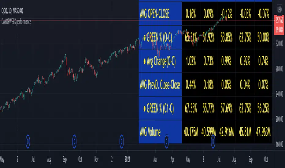
For the following example, NASDAQ:AAPL from 1 Jan 21 to 1 Jul 21 the results are following.
The highest probability of a Close being higher than the Open is Monday with 52.17 % and the Lowest Tuesday with 38.46 %. Meaning that there's a higher chance (for NASDAQ:AAPL ) of closing at a higher value on Monday while the highest chance of closing is lower is Tuesday. With an average gain on Tuesday of 0.21%
Long - The best day to buy (long) at open (on average) is Monday with a 52.2% probability of closing higher
Short - The best day to sell (short) at open (on average) is Tuesday with a 38.5% probability of closing higher (better chance of closing lower)
Since the values change from ticker to ticker, there is a substantial change in the percentages and days of the week. For example let's compare the previous example ( NASDAQ:AAPL ) to NYSE:GM (same settings)
For the same period, there is a substantial difference where there is a 62.5% probability Friday to close higher than the open, while Tuesday there is only a 28% probability.
With an average gain of 0.59% on Friday and an average loss of -0.34%
Also, the size of the table (number of days ) depends if the ticker is traded or not on that day as an example COINBASE:BTCUSD
4 - Inputs
DATE RANGE
Initial Date - Date from which the script will start the calculation.
End Date - Date to which the script will calculate.
TABLE SETTINGS
Text Color - Color of the displayed text
Cell Color - Background color of table cells
Header Color - Color of the column and row names
Table Location - Change the position where the table is located.
Table Size - Changes text size and by consequence the size of the table
5 - LIMITATIONS
The code determines average values based on the stored data, therefore, the range (Initial data) is limited to the first bar time.
As a consequence the lower the timeframe the shorter the initial date can be and fewer weeks can be calculated. To warn about this limitation there's a warning text that appears in case the initial date exceeds the bar limit.
Example with initial date 1 Jan 2021 and end date 18 Jul 2021 in 5m and 10 m timeframe:
6 - Notes and Disclosers
The script can be moved around to a new pane if need. -> Object Tree > Right Click Script > Move To > New pane
The code has not been tested in higher subscriptions tiers that allow for more bars and as a consequence more data, but as far I can tell, it should work without problems and should be in fact better at lower timeframes since it allows more weeks.
The values displayed represent previous data and at no point is guaranteed future values
7 - Final Tooughs
This script was quite fun to work on since it analysis behavioral patterns (since from an abstract point a Tuesday is no different than a Thursday), but after analyzing multiple tickers there are some days that tend to close higher than the open.
PS: If you find any mistake ex: code/misspelling please comment.
Nick_OS RangesUNDERSTANDING THE SCRIPT:
TIMEFRAME RESOLUTION:
* You have the option to choose Daily , Weekly , or Monthly
LOOKBACK WINDOW:
* This number represents how far back you want the data to pull from
- Example: "250" would represent the past 250 Days, Weeks, or Months depending on what is selected in the Timeframe Resolution
RANGE 1 nth (Gray lines):
* This number represents the range of the nth biggest day, week, or month in the Lookback Window
- Example: "30" would represent the range of the 30th biggest day in the past 250 days. (If the Lookback Window is "250")
RANGE 2 nth (Blue lines):
* This number represents the range of the nth biggest day, week, or month in the Lookback Window
- Example: "10" would represent the range of the 10th biggest day in the past 250 days. (If the Lookback Window is "250")
RANGE 3 nth (Pink lines):
* This number represents the range of the nth biggest day, week, or month in the Lookback Window
- Example: "3" would represent the range of the 3rd biggest day in the past 250 days. (If the Lookback Window is "250")
YELLOW LINES:
* The yellow lines are the average percentage move of the inputted number in the Lookback Window
SUGGESTED INPUTS:
FOR DAILY:
Lookback Window: 250
Range 1 nth: 30
Range 2 nth: 10
Range 3 nth: 3
FOR WEEKLY:
Lookback Window: 50
Range 1 nth: 10
Range 2 nth: 5
Range 3 nth: 2
FOR MONTHLY:
Lookback Window: 12
Range 1 nth: 3
Range 2 nth: 2
Range 3 nth: 1
TIMEFRAMES TO USE (If You Have TradingView Premium):
Daily: 5 minute timeframe and higher (15 minute timeframe and higher for Futures)
Weekly: 15 minute timeframe and higher
Monthly: Daily timeframe and higher (Monthly still has issues)
TIMEFRAMES TO USE (If You DO NOT Have TradingView Premium):
Daily: 15 minute timeframe and higher
Weekly: 30 minute timeframe and higher
Monthly: Daily timeframe and higher (Monthly still has issues)
IMPORTANT RELATED NOTE:
If you decide to use a higher Lookback Window, the ranges might be off and the timeframes listed above might not apply
ISSUES THAT MIGHT BE RESOLVED IN THE FUTURE
1. If it is a shortened week (No Monday or Friday), then the Weekly Ranges will show the same ranges as last week
2. Monthly ranges will change based on any timeframe used

RRG Sector Snapshot RRG Sector Snapshot · Clear UI — User Guide
What this indicator does
Purpose: Visualize sector rotation by comparing each sector’s Relative Strength (RS-Ratio) and RS-Momentum versus a benchmark (e.g., VNINDEX).
Output: A quadrant map (table overlay) that positions each sector into one of four regimes:
LEADING (top-right): Strong and accelerating — leadership zone.
WEAKENING (bottom-right): Strong but decelerating — may be topping or consolidating.
LAGGING (bottom-left): Weak and decelerating — avoid unless mean-reverting.
IMPROVING (top-left): Weak but accelerating — candidates for next rotation into leadership.
How it works (under the hood)
X-axis (Strength): RS-Ratio = Sector Close / Benchmark Close, then normalized with a Z-Score over a lookback (normLen).
Y-axis (Momentum): Linear-regression slope of RS-Ratio over rsLen, then normalized with a Z-Score (normLen).
Mapping to grid: Both axes are Z-Scores scaled to a square grid (rrgSize × rrgSize) using a zoom factor (rrgScale). The center is neutral (0,0). Momentum increases upward (Y=0 is the top row in the table).
Quick start (3 minutes)
Add to chart:
TradingView → Pine Editor → paste the script → Save → Add to chart.
Set a benchmark: In inputs, choose Benchmark (X axis) — default INDEX:VNINDEX. Use VN30 or another index if it better reflects your universe.
Load sectors: Fill S1..S10 with sector or index symbols you track (up to 10). Set Slots to Use to the number you actually use.
Adjust view:
rrgSize (grid cells): 18–24 is a good starting point.
rrgScale (zoom): 2.5–3.5 typically; decrease to “zoom out” (points cluster near center), increase to “zoom in” (points spread to edges).
Read the map:
Prioritize sectors in LEADING; shortlist sectors in IMPROVING (could rotate into LEADING).
WEAKENING often marks late-cycle strength; LAGGING is typically avoid.
Inputs — what they do and how to change them
General
Analysis TF: Timeframe used to compute RRG (can be different from chart’s TF). Daily for swing, 1H/4H for tactical rotation, Weekly for macro view.
Benchmark (X axis): The index used for RS baseline (e.g., INDEX:VNINDEX, INDEX:VN30, major ETFs, or a custom composite).
RRG Calculation
RS Lookback (rsLen): Bars used for slope of RS (momentum).
Daily: 30–60 (default 40)
Intraday (1H/4H): 20–40
Weekly: 26–52
Normalization Lookback (Z-Score) (normLen): Window for Z-Score on both axes.
Daily: 80–120 (default 100)
Intraday: 40–80
Weekly: 52–104
Tip: Shorter lookbacks = more responsive but noisier; longer = smoother but slower.
RRG HUD (Table)
Show RRG Snapshot (rrgEnable): Toggle the table on/off.
Position (rrgPos): top_right | top_left | bottom_right | bottom_left.
Grid Size (Cells) (rrgSize): Table dimensions (N×N). Larger = more resolution but takes more space.
Z-Scale (Zoom) (rrgScale): Maps Z-Scores to the grid.
Smaller (2.0–2.5): Zoom out (more points near center).
Larger (3.5–4.0): Zoom in (emphasize outliers).
Appearance
Tag length (tagLen): Characters per sector tag. Use 4–6 for clarity.
Text size (textSizeOp): Tiny | Small | Normal | Large. Use Large for presentation screens or dense lists.
Axis thickness (axisThick): 1 = thin axis; 2 = thicker double-strip axis.
Quadrant alpha (bgAlpha): Transparency of quadrant backgrounds. 80–90 makes text pop.
Sectors (Max 10)
Slots to Use (sectorSlots): How many sector slots are active (≤10).
S1..S10: Each slot is a symbol (index, sector index, or ETF). Replace defaults to fit your market/universe.
How to interpret the map
Quadrants:
Leading (top-right): Relative strength above average and improving — trend-follow candidates.
Weakening (bottom-right): Still strong but momentum cooling — watch for distribution or pauses.
Lagging (bottom-left): Underperforming and still losing momentum — avoid unless doing mean-reversion.
Improving (top-left): Early recovery — candidates to transition into Leading if the move persists.
Overlapping sectors in one cell: The indicator shows “TAG +n” where TAG is the first tag, +n is the number of additional sectors sharing that cell. If many overlap:
Increase rrgSize, or
Decrease rrgScale to zoom out, or
Reduce Slots to Use to a smaller selection.
Suggested workflows
Daily swing
Benchmark: VNINDEX or VN30
rsLen 40–60, normLen 100–120, rrgSize 18–24, rrgScale 2.5–3.5
Routine:
Identify Leading sectors (top-right).
Spot Improving sectors near the midline moving toward top-right.
Confirm with price/volume/breakout on sector charts or top components.
Intraday (1H/4H) tactical
rsLen 20–40, normLen 60–100, rrgScale 2.0–3.0
Expect faster rotations and more noise; tighten filters with your own entry rules.
Weekly (macro rotation)
rsLen 26–52, normLen 52–104, rrgScale 3.0–4.0
Great for portfolio tilts and sector allocation.
Tuning tips
If everything clusters near center: Increase rrgScale (zoom in) or reduce normLen (more contrast).
If points are too spread: Decrease rrgScale (zoom out) or increase normLen (smoother normalization).
If the table is too big/small: Change rrgSize (cells).
If tags are hard to read: Increase textSizeOp to Large, tagLen to 5–6, and consider bgAlpha ~80–85.
Troubleshooting
No table on chart:
Ensure Show RRG Snapshot is enabled.
Change Position to a different corner.
Reduce Grid Size if the table exceeds the chart area.
Many sectors “missing”:
They’re likely overlapping in the same cell; the cell will show “TAG +n”.
Increase rrgSize, decrease rrgScale, or reduce Slots to Use.
Early bars show nothing:
You need enough data for rsLen and normLen. Scroll back or reduce lookbacks temporarily.
Best practices
Use RRG for context and rotation scouting, then confirm with your execution tools (trend structure, breakouts, volume, risk metrics).
Benchmark selection matters. If most of your watchlist tracks VN30, use INDEX:VN30 as the benchmark to get a truer relative read.
Revisit settings per timeframe. Intraday needs more responsiveness (shorter lookbacks, smaller Z-Scale); weekly needs stability (longer lookbacks, larger Z-Scale).
FAQ
Can I use ETFs or custom indices as sectors? Yes. Any symbol supported by TradingView works.
Can I track individual stocks instead of sectors? Yes (up to 10); just replace the S1..S10 symbols.
Why Z-Score? It standardizes each axis to “how unusual” the value is versus its own history — more robust than raw ratios across different scales.
[ i]
How to Set Up (Your Market Template)
This is the most important part for customizing the indicator to any market.
Step 1: Choose Your TF & Benchmark
Open the indicator's Settings.
Analysis TF: Set the timeframe you want to analyze (e.g., D for medium-term, W for long-term).
Benchmark (Trục X): This is the index you want to compare against.
Vietnamese Market: Leave the default INDEX:VNINDEX.
US Market: Change to SP:SPX or NASDAQ:NDX.
Crypto Market: Change to TOTAL (entire market cap) or BTC.D (Bitcoin Dominance).
Step 2: Input Your "Universe" (The 10 Slots)
This is where you decide what to track. You have 10 slots (S1 to S10).
For Vietnamese Sectors (Default):
Leave the default sector codes like INDEX:VNFINLEAD (Finance), INDEX:VNREAL (Real Estate), INDEX:VNIND (Industry), etc.
Template for Crypto "Sectors":
S1: BTC.D
S2: ETH.D
S3: TOTAL2 (Altcoin Market Cap)
S4: TOTAL.DEFI (DeFi)
S5: CRYPTOCAP:GAME (GameFi)
...and so on.
Template for Blue Chip Stocks:
Benchmark: INDEX:VN30
S1: HOSE:FPT
S2: HOSE:VCB
S3: HOSE:HPG
S4: HOSE:MWG
...and so on.
Template for Commodities:
Benchmark: TVC:DXY (US Dollar Index)
S1: TVC:GOLD
S2: TVC:USOIL
S3: TVC:SILVER
S4: COMEX:HG1! (Copper)
...and so on.
Step 3: Fine-Tuning
RS Lookback: A larger number (e.g., 100) gives a smoother, long-term view. A smaller number (e.g., 20) is more sensitive to short-term changes.
Z-Scale (Zoom): This is the "magnification" of the map.
If all your sectors are crowded in the middle, increase this number (e.g., 4.0) to "zoom in."
If your sectors are stuck on the edges, decrease this number (e.g., 2.0) to "zoom out."
Tag length: How many letters to display for the ticker (e.g., 4 will show VNFI).

Composite Time ProfileComposite Time Profile Overlay (CTPO) - Market Profile Compositing Tool
Automatically composite multiple time periods to identify key areas of balance and market structure
What is the Composite Time Profile Overlay?
The Composite Time Profile Overlay (CTPO) is a Pine Script indicator that automatically composites multiple time periods to identify key areas of balance and market structure. It's designed for traders who use market profile concepts and need to quickly identify where price is likely to find support or resistance.
The indicator analyzes TPO (Time Price Opportunity) data across different timeframes and merges overlapping profiles to create composite levels that represent the most significant areas of balance. This helps you spot where institutional traders are likely to make decisions based on accumulated price action.
Why Use CTPO for Market Profile Trading?
Eliminate Manual Compositing Work
Instead of manually drawing and compositing profiles across different timeframes, CTPO does this automatically. You get instant access to composite levels without spending time analyzing each individual period.
Spot Areas of Balance Quickly
The indicator highlights the most significant areas of balance by compositing overlapping profiles. These areas often act as support and resistance levels because they represent where the most trading activity occurred across multiple time periods.
Focus on What Matters
Rather than getting lost in individual session profiles, CTPO shows you the composite levels that have been validated across multiple timeframes. This helps you focus on the levels that are most likely to hold.
How CTPO Works for Market Profile Traders
Automatic Profile Compositing
CTPO uses a proprietary algorithm that:
- Identifies period boundaries based on your selected timeframe (sessions, daily, weekly, monthly, or auto-detection)
- Calculates TPO profiles for each period using the C2M (Composite 2 Method) row sizing calculation
- Merges overlapping profiles using configurable overlap thresholds (default 50% overlap required)
- Updates composite levels as new price action develops in real-time
Key Levels for Market Profile Analysis
The indicator displays:
- Value Area High (VAH) and Value Area Low (VAL) levels calculated from composite TPO data
- Point of Control (POC) levels where most trading occurred across all composited periods
- Composite zones representing areas of balance with configurable transparency
- 1.618 Fibonacci extensions for breakout targets based on composite range
Multiple Timeframe Support
- Sessions: For intraday market profile analysis
- Daily: For swing trading with daily profiles
- Weekly: For position trading with weekly structure
- Monthly: For long-term market profile analysis
- Auto: Automatically selects timeframe based on your chart
Trading Applications for Market Profile Users
Support and Resistance Trading
Use composite levels as dynamic support and resistance zones. These levels often hold because they represent areas where significant trading decisions were made across multiple timeframes.
Breakout Trading
When composite levels break, they often lead to significant moves. The indicator calculates 1.618 Fibonacci extensions to give you clear targets for breakout trades.
Mean Reversion Strategies
Value Area levels represent the price range where most trading activity occurred. These levels often act as magnets, drawing price back when it moves too far from the mean.
Institutional Level Analysis
Composite levels represent areas where institutional traders have made significant decisions. These levels often hold more weight than traditional technical analysis levels because they're based on actual trading activity.
Key Features for Market Profile Traders
Smart Compositing Logic
- Automatic overlap detection using price range intersection algorithms
- Configurable overlap thresholds (minimum 50% overlap required for merging)
- Dead composite identification (profiles that become engulfed by newer composites)
- Real-time updates as new price action develops using barstate.islast optimization
Visual Customization
- Customizable colors for active, broken, and dead composites
- Adjustable transparency levels for each composite state
- Premium/Discount zone highlighting based on current price vs composite range
- TPO aggression coloring using TPO distribution analysis to identify buying/selling pressure
- Fibonacci level extensions with 1.618 target calculations based on composite range
Clean Chart Presentation
- Only shows the most relevant composite levels (maximum 10 active composites)
- Eliminates clutter from individual session profiles
- Focuses on areas of balance that matter most to current price action
Real-World Trading Examples
Day Trading with Session Composites
Use session-based composites to identify intraday areas of balance. The VAH and VAL levels often act as natural profit targets and stop-loss levels for scalping strategies.
Swing Trading with Daily Composites
Daily composites provide excellent swing trading levels. Look for price reactions at composite zones and use the 1.618 extensions for profit targets.
Position Trading with Weekly Composites
Weekly composites help identify major trend changes and long-term areas of balance. These levels often hold for months or even years.
Risk Management
Composite levels provide natural stop-loss levels. If a composite level breaks, it often signals a significant shift in market sentiment, making it an ideal place to exit losing positions.
Why Composite Levels Work
Composite levels work because they represent areas where significant trading decisions were made across multiple timeframes. When price returns to these levels, traders often remember the previous price action and make similar decisions, creating self-fulfilling prophecies.
The compositing process uses a proprietary algorithm that ensures only levels validated across multiple time periods are displayed. This means you're looking at levels that have proven their significance through actual market behavior, not just random technical levels.
Technical Foundation
The indicator uses TPO (Time Price Opportunity) data combined with price action analysis to identify areas of balance. The C2M row sizing method ensures accurate profile calculations, while the overlap detection algorithm (minimum 50% price range intersection) ensures only truly significant composites are displayed. The algorithm calculates row size based on ATR (Average True Range) divided by 10, then converts to tick size for precise level calculations.
How the Code Actually Works
1. Period Detection and ATR Calculation
The code first determines the appropriate timeframe based on your chart:
- 1m-5m charts: Session-based profiles
- 15m-2h charts: Daily profiles
- 4h charts: Weekly profiles
- 1D charts: Monthly profiles
For each period type, it calculates the number of bars needed for ATR calculation:
- Sessions: 540 minutes divided by chart timeframe
- Daily: 1440 minutes divided by chart timeframe
- Weekly: 7 days worth of minutes divided by chart timeframe
- Monthly: 30 days worth of minutes divided by chart timeframe
2. C2M Row Size Calculation
The code calculates True Range for each bar in the determined period:
- True Range = max(high-low, |high-prevClose|, |low-prevClose|)
- Averages all True Range values to get ATR
- Row Size = (ATR / 10) converted to tick size
- This ensures each TPO row represents a meaningful price movement
3. TPO Profile Generation
For each period, the code:
- Creates price levels from lowest to highest price in the range
- Each level is separated by the calculated row size
- Counts how many bars touch each price level (TPO count)
- Finds the level with highest count = Point of Control (POC)
- Calculates Value Area by expanding from POC until 68.27% of total TPO blocks are included
4. Overlap Detection Algorithm
When a new profile is created, the code checks if it overlaps with existing composites:
- Calculates overlap range = min(currentVAH, prevVAH) - max(currentVAL, prevVAL)
- Calculates current profile range = currentVAH - currentVAL
- Overlap percentage = (overlap range / current profile range) * 100
- If overlap >= 50%, profiles are merged into a composite
5. Composite Merging Logic
When profiles overlap, the code creates a new composite by:
- Taking the earliest start bar and latest end bar
- Using the wider VAH/VAL range (max of both profiles)
- Keeping the POC from the profile with more TPO blocks
- Marking the composite as "active" until price breaks through
6. Real-Time Updates
The code uses barstate.islast to optimize performance:
- Only recalculates on the last bar of each period
- Updates active composite with live price action if enabled
- Cleans up old composites to prevent memory issues
- Redraws all visual elements from scratch each bar
7. Visual Rendering System
The code uses arrays to manage drawing objects:
- Clears all lines/boxes arrays on every bar
- Iterates through composites array to redraw everything
- Uses different colors for active, broken, and dead composites
- Calculates 1.618 Fibonacci extensions for broken composites
Getting Started with CTPO
Step 1: Choose Your Timeframe
Select the period type that matches your trading style:
- Use "Sessions" for day trading
- Use "Daily" for swing trading
- Use "Weekly" for position trading
- Use "Auto" to let the indicator choose based on your chart timeframe
Step 2: Customize the Display
Adjust colors, transparency, and display options to match your charting preferences. The indicator offers extensive customization options to ensure it fits seamlessly into your existing analysis.
Step 3: Identify Key Levels
Look for:
- Composite zones (blue boxes) - major areas of balance
- VAH/VAL lines - value area boundaries
- POC lines - areas of highest trading activity
- 1.618 extension lines - breakout targets
Step 4: Develop Your Strategy
Use these levels to:
- Set entry points near composite zones
- Place stop losses beyond composite levels
- Take profits at 1.618 extension levels
- Identify trend changes when major composites break
Perfect for Market Profile Traders
If you're already using market profile concepts in your trading, CTPO eliminates the manual work of compositing profiles across different timeframes. Instead of spending time analyzing each individual period, you get instant access to the composite levels that matter most.
The indicator's automated compositing process ensures you're always looking at the most relevant areas of balance, while its real-time updates keep you informed of changes as they happen. Whether you're a day trader looking for intraday levels or a position trader analyzing long-term structure, CTPO provides the market profile intelligence you need to succeed.
Streamline Your Market Profile Analysis
Stop wasting time on manual compositing. Let CTPO do the heavy lifting while you focus on executing profitable trades based on areas of balance that actually matter.
Ready to Streamline Your Market Profile Trading?
Add the Composite Time Profile Overlay to your charts today and experience the difference that automated profile compositing can make in your trading performance.

Volume Flow RatioVolume Flow Ratio (VFR) Indicator
Overview
The Volume Flow Ratio (VFR) is a sophisticated volume analysis tool that measures current trading volume relative to the maximum volume of the previous period. Unlike traditional volume indicators that show raw volume or simple moving averages, VFR provides context by comparing current activity to recent maximum activity levels.
Core Features
1. Split Period Analysis
- Multiple Timeframe Options:
- Daily: Compares to previous day's maximum
- Weekly: Week-to-week comparison
- NYSE Weekly: Specialized for stock market trading (Monday-Friday only)
- Monthly: Month-to-month analysis
- Quarterly: Quarter-to-quarter perspective
- Yearly: Year-over-year volume comparison
2. Ratio-Based Measurement
- Displays volume as a ratio (0 to 1+) rather than raw numbers
- 1.0 represents volume equal to previous period's maximum
- Example: If previous max was 50,000 contracts:
- Current volume of 25,000 shows as 0.5
- Current volume of 75,000 shows as 1.5
3. Triple Coloring Modes
- Moving Average Based:
- Compares current ratio to its moving average
- Customizable MA period
- Green: Above MA (higher than average activity)
- Red: Below MA (lower than average activity)
- Previous Candle Comparison:
- Simple increase/decrease from previous bar
- Green: Higher than previous bar
- Red: Lower than previous bar
- Candle Color Based:
- Syncs with price action
- Green: Bullish candles (close > open)
- Red: Bearish candles (close < open)
Primary Use Cases
1. Volume Profile Analysis
- Perfect for traders who need to understand when markets are most active
- Helps identify unusual volume spikes relative to recent history
- Useful for timing entries and exits based on market participation
2. Market Activity Traders
Ideal for traders who:
- Need to identify high-liquidity periods
- Want to avoid low-volume periods
- Look for volume breakouts or divergences
- Trade based on institutional participation levels
3. Mean Reversion Traders
Helps identify:
- Overextended volume conditions (potential reversals)
- Volume exhaustion points
- Return to normal volume levels after spikes
4. Momentum Traders
Useful for:
- Confirming trend strength through volume
- Identifying potential trend exhaustion
- Validating breakouts with volume confirmation
Advantages Over Traditional Volume Indicators
1. Contextual Analysis
- Shows relative strength rather than raw numbers
- Easier to compare across different time periods
- Automatically adjusts to changing market conditions
2. Period-Specific Insights
- Respects natural market cycles (daily, weekly, monthly)
- Special handling for NYSE trading days
- Eliminates weekend noise in stock market analysis
3. Flexible Visualization
- Three distinct coloring methods for different trading styles
- Clear reference line at 1.0 for quick analysis
- Histogram style for easy pattern recognition
Best Practices
For Day Traders
- Use Daily split for intraday volume patterns
- MA coloring mode with shorter periods (5-10)
- Focus on ratios during market hours
For Swing Traders
- Weekly or NYSE Weekly splits
- Longer MA periods (15-20)
- Look for sustained volume patterns
For Position Traders
- Monthly or Quarterly splits
- Candle color mode for trend confirmation
- Focus on major volume shifts
Limitations
- Requires one full period to establish baseline
- May be less effective in extremely low volume conditions
- NYSE Weekly mode specific to stock market hours
This indicator is particularly valuable for traders who understand that volume is a crucial component of price action but need a more sophisticated way to analyze it than simple volume bars. It's especially useful for those who trade based on market participation levels and need to quickly identify whether current volume is significant relative to recent history.

Hellenic EMA Matrix - Α Ω PremiumHellenic EMA Matrix - Alpha Omega Premium
Complete User Guide
Table of Contents
Introduction
Indicator Philosophy
Mathematical Constants
EMA Types
Settings
Trading Signals
Visualization
Usage Strategies
FAQ
Introduction
Hellenic EMA Matrix is a premium indicator based on mathematical constants of nature: Phi (Phi - Golden Ratio), Pi (Pi), e (Euler's number). The indicator uses these universal constants to create dynamic EMAs that adapt to the natural rhythms of the market.
Key Features:
6 EMA types based on mathematical constants
Premium visualization with Neon Glow and Gradient Clouds
Automatic Fast/Mid/Slow EMA sorting
STRONG signals for powerful trends
Pulsing Ribbon Bar for instant trend assessment
Works on all timeframes (M1 - MN)
Indicator Philosophy
Why Mathematical Constants?
Traditional EMAs use arbitrary periods (9, 21, 50, 200). Hellenic Matrix goes further, using universal mathematical constants found in nature:
Phi (1.618) - Golden Ratio: galaxy spirals, seashells, human body proportions
Pi (3.14159) - Pi: circles, waves, cycles
e (2.71828) - Natural logarithm base: exponential growth, radioactive decay
Markets are also a natural system composed of millions of participants. Using mathematical constants allows tuning into the natural rhythms of market cycles.
Mathematical Constants
Phi (Phi) - Golden Ratio
Phi = 1.618033988749895
Properties:
Phi² = Phi + 1 = 2.618
Phi³ = 4.236
Phi⁴ = 6.854
Application: Ideal for trending movements and Fibonacci corrections
Pi (Pi) - Pi Number
Pi = 3.141592653589793
Properties:
2Pi = 6.283 (full circle)
3Pi = 9.425
4Pi = 12.566
Application: Excellent for cyclical markets and wave structures
e (Euler) - Euler's Number
e = 2.718281828459045
Properties:
e² = 7.389
e³ = 20.085
e⁴ = 54.598
Application: Suitable for exponential movements and volatile markets
EMA Types
1. Phi (Phi) - Golden Ratio EMA
Description: EMA based on the golden ratio
Period Formula:
Period = Phi^n × Base Multiplier
Parameters:
Phi Power Level (1-8): Power of Phi
Phi¹ = 1.618 → ~16 period (with Base=10)
Phi² = 2.618 → ~26 period
Phi³ = 4.236 → ~42 period (recommended)
Phi⁴ = 6.854 → ~69 period
Recommendations:
Phi² or Phi³ for day trading
Phi⁴ or Phi⁵ for swing trading
Works excellently as Fast EMA
2. Pi (Pi) - Circular EMA
Description: EMA based on Pi for cyclical movements
Period Formula:
Period = Pi × Multiple × Base Multiplier
Parameters:
Pi Multiple (1-10): Pi multiplier
1Pi = 3.14 → ~31 period (with Base=10)
2Pi = 6.28 → ~63 period (recommended)
3Pi = 9.42 → ~94 period
Recommendations:
2Pi ideal as Mid or Slow EMA
Excellently identifies cycles and waves
Use on volatile markets (crypto, forex)
3. e (Euler) - Natural EMA
Description: EMA based on natural logarithm
Period Formula:
Period = e^n × Base Multiplier
Parameters:
e Power Level (1-6): Power of e
e¹ = 2.718 → ~27 period (with Base=10)
e² = 7.389 → ~74 period (recommended)
e³ = 20.085 → ~201 period
Recommendations:
e² works excellently as Slow EMA
Ideal for stocks and indices
Filters noise well on lower timeframes
4. Delta (Delta) - Adaptive EMA
Description: Adaptive EMA that changes period based on volatility
Period Formula:
Period = Base Period × (1 + (Volatility - 1) × Factor)
Parameters:
Delta Base Period (5-200): Base period (default 20)
Delta Volatility Sensitivity (0.5-5.0): Volatility sensitivity (default 2.0)
How it works:
During low volatility → period decreases → EMA reacts faster
During high volatility → period increases → EMA smooths noise
Recommendations:
Works excellently on news and sharp movements
Use as Fast EMA for quick adaptation
Sensitivity 2.0-3.0 for crypto, 1.0-2.0 for stocks
5. Sigma (Sigma) - Composite EMA
Description: Composite EMA combining multiple active EMAs
Composition Methods:
Weighted Average (default):
Sigma = (Phi + Pi + e + Delta) / 4
Simple average of all active EMAs
Geometric Mean:
Sigma = fourth_root(Phi × Pi × e × Delta)
Geometric mean (more conservative)
Harmonic Mean:
Sigma = 4 / (1/Phi + 1/Pi + 1/e + 1/Delta)
Harmonic mean (more weight to smaller values)
Recommendations:
Enable for additional confirmation
Use as Mid EMA
Weighted Average - most universal method
6. Lambda (Lambda) - Wave EMA
Description: Wave EMA with sinusoidal period modulation
Period Formula:
Period = Base Period × (1 + Amplitude × sin(2Pi × bar / Frequency))
Parameters:
Lambda Base Period (10-200): Base period
Lambda Wave Amplitude (0.1-2.0): Wave amplitude
Lambda Wave Frequency (10-200): Wave frequency in bars
How it works:
Period pulsates sinusoidally
Creates wave effect following market cycles
Recommendations:
Experimental EMA for advanced users
Works well on cyclical markets
Frequency = 50 for day trading, 100+ for swing
Settings
Matrix Core Settings
Base Multiplier (1-100)
Multiplies all EMA periods
Base = 1: Very fast EMAs (Phi³ = 4, 2Pi = 6, e² = 7)
Base = 10: Standard (Phi³ = 42, 2Pi = 63, e² = 74)
Base = 20: Slow EMAs (Phi³ = 85, 2Pi = 126, e² = 148)
Recommendations by timeframe:
M1-M5: Base = 5-10
M15-H1: Base = 10-15 (recommended)
H4-D1: Base = 15-25
W1-MN: Base = 25-50
Matrix Source
Data source selection for EMA calculation:
close - closing price (standard)
open - opening price
high - high
low - low
hl2 - (high + low) / 2
hlc3 - (high + low + close) / 3
ohlc4 - (open + high + low + close) / 4
When to change:
hlc3 or ohlc4 for smoother signals
high for aggressive longs
low for aggressive shorts
Manual EMA Selection
Critically important setting! Determines which EMAs are used for signal generation.
Use Manual Fast/Slow/Mid Selection
Enabled (default): You select EMAs manually
Disabled: Automatic selection by periods
Fast EMA
Fast EMA - reacts first to price changes
Recommendations:
Phi Golden (recommended) - universal choice
Delta Adaptive - for volatile markets
Must be fastest (smallest period)
Slow EMA
Slow EMA - determines main trend
Recommendations:
Pi Circular (recommended) - excellent trend filter
e Natural - for smoother trend
Must be slowest (largest period)
Mid EMA
Mid EMA - additional signal filter
Recommendations:
e Natural (recommended) - excellent middle level
Pi Circular - alternative
None - for more frequent signals (only 2 EMAs)
IMPORTANT: The indicator automatically sorts selected EMAs by their actual periods:
Fast = EMA with smallest period
Mid = EMA with middle period
Slow = EMA with largest period
Therefore, you can select any combination - the indicator will arrange them correctly!
Premium Visualization
Neon Glow
Enable Neon Glow for EMAs - adds glowing effect around EMA lines
Glow Strength:
Light - subtle glow
Medium (recommended) - optimal balance
Strong - bright glow (may be too bright)
Effect: 2 glow layers around each EMA for 3D effect
Gradient Clouds
Enable Gradient Clouds - fills space between EMAs with gradient
Parameters:
Cloud Transparency (85-98): Cloud transparency
95-97 (recommended)
Higher = more transparent
Dynamic Cloud Intensity - automatically changes transparency based on EMA distance
Cloud Colors:
Phi-Pi Cloud:
Blue - when Pi above Phi (bullish)
Gold - when Phi above Pi (bearish)
Pi-e Cloud:
Green - when e above Pi (bullish)
Blue - when Pi above e (bearish)
2 layers for volumetric effect
Pulsing Ribbon Bar
Enable Pulsing Indicator Bar - pulsing strip at bottom/top of chart
Parameters:
Ribbon Position: Top / Bottom (recommended)
Pulse Speed: Slow / Medium (recommended) / Fast
Symbols and colors:
Green filled square - STRONG BULLISH
Pink filled square - STRONG BEARISH
Blue hollow square - Bullish (regular)
Red hollow square - Bearish (regular)
Purple rectangle - Neutral
Effect: Pulsation with sinusoid for living market feel
Signal Bar Highlights
Enable Signal Bar Highlights - highlights bars with signals
Parameters:
Highlight Transparency (88-96): Highlight transparency
Highlight Style:
Light Fill (recommended) - bar background fill
Thin Line - bar outline only
Highlights:
Golden Cross - green
Death Cross - pink
STRONG BUY - green
STRONG SELL - pink
Show Greek Labels
Shows Greek alphabet letters on last bar:
Phi - Phi EMA (gold)
Pi - Pi EMA (blue)
e - Euler EMA (green)
Delta - Delta EMA (purple)
Sigma - Sigma EMA (pink)
When to use: For education or presentations
Show Old Background
Old background style (not recommended):
Green background - STRONG BULLISH
Pink background - STRONG BEARISH
Blue background - Bullish
Red background - Bearish
Not recommended - use new Gradient Clouds and Pulsing Bar
Info Table
Show Info Table - table with indicator information
Parameters:
Position: Top Left / Top Right (recommended) / Bottom Left / Bottom Right
Size: Tiny / Small (recommended) / Normal / Large
Table contents:
EMA list - periods and current values of all active EMAs
Effects - active visual effects
TREND - current trend state:
STRONG UP - strong bullish
STRONG DOWN - strong bearish
Bullish - regular bullish
Bearish - regular bearish
Neutral - neutral
Momentum % - percentage deviation of price from Fast EMA
Setup - current Fast/Slow/Mid configuration
Trading Signals
Show Golden/Death Cross
Golden Cross - Fast EMA crosses Slow EMA from below (bullish signal) Death Cross - Fast EMA crosses Slow EMA from above (bearish signal)
Symbols:
Yellow dot "GC" below - Golden Cross
Dark red dot "DC" above - Death Cross
Show STRONG Signals
STRONG BUY and STRONG SELL - the most powerful indicator signals
Conditions for STRONG BULLISH:
EMA Alignment: Fast > Mid > Slow (all EMAs aligned)
Trend: Fast > Slow (clear uptrend)
Distance: EMAs separated by minimum 0.15%
Price Position: Price above Fast EMA
Fast Slope: Fast EMA rising
Slow Slope: Slow EMA rising
Mid Trending: Mid EMA also rising (if enabled)
Conditions for STRONG BEARISH:
Same but in reverse
Visual display:
Green label "STRONG BUY" below bar
Pink label "STRONG SELL" above bar
Difference from Golden/Death Cross:
Golden/Death Cross = crossing moment (1 bar)
STRONG signal = sustained trend (lasts several bars)
IMPORTANT: After fixes, STRONG signals now:
Work on all timeframes (M1 to MN)
Don't break on small retracements
Work with any Fast/Mid/Slow combination
Automatically adapt thanks to EMA sorting
Show Stop Loss/Take Profit
Automatic SL/TP level calculation on STRONG signal
Parameters:
Stop Loss (ATR) (0.5-5.0): ATR multiplier for stop loss
1.5 (recommended) - standard
1.0 - tight stop
2.0-3.0 - wide stop
Take Profit R:R (1.0-5.0): Risk/reward ratio
2.0 (recommended) - standard (risk 1.5 ATR, profit 3.0 ATR)
1.5 - conservative
3.0-5.0 - aggressive
Formulas:
LONG:
Stop Loss = Entry - (ATR × Stop Loss ATR)
Take Profit = Entry + (ATR × Stop Loss ATR × Take Profit R:R)
SHORT:
Stop Loss = Entry + (ATR × Stop Loss ATR)
Take Profit = Entry - (ATR × Stop Loss ATR × Take Profit R:R)
Visualization:
Red X - Stop Loss
Green X - Take Profit
Levels remain active while STRONG signal persists
Trading Signals
Signal Types
1. Golden Cross
Description: Fast EMA crosses Slow EMA from below
Signal: Beginning of bullish trend
How to trade:
ENTRY: On bar close with Golden Cross
STOP: Below local low or below Slow EMA
TARGET: Next resistance level or 2:1 R:R
Strengths:
Simple and clear
Works well on trending markets
Clear entry point
Weaknesses:
Lags (signal after movement starts)
Many false signals in ranging markets
May be late on fast moves
Optimal timeframes: H1, H4, D1
2. Death Cross
Description: Fast EMA crosses Slow EMA from above
Signal: Beginning of bearish trend
How to trade:
ENTRY: On bar close with Death Cross
STOP: Above local high or above Slow EMA
TARGET: Next support level or 2:1 R:R
Application: Mirror of Golden Cross
3. STRONG BUY
Description: All EMAs aligned + trend + all EMAs rising
Signal: Powerful bullish trend
How to trade:
ENTRY: On bar close with STRONG BUY or on pullback to Fast EMA
STOP: Below Fast EMA or automatic SL (if enabled)
TARGET: Automatic TP (if enabled) or by levels
TRAILING: Follow Fast EMA
Entry strategies:
Aggressive: Enter immediately on signal
Conservative: Wait for pullback to Fast EMA, then enter on bounce
Pyramiding: Add positions on pullbacks to Mid EMA
Position management:
Hold while STRONG signal active
Exit on STRONG SELL or Death Cross appearance
Move stop behind Fast EMA
Strengths:
Most reliable indicator signal
Doesn't break on pullbacks
Catches large moves
Works on all timeframes
Weaknesses:
Appears less frequently than other signals
Requires confirmation (multiple conditions)
Optimal timeframes: All (M5 - D1)
4. STRONG SELL
Description: All EMAs aligned down + downtrend + all EMAs falling
Signal: Powerful bearish trend
How to trade: Mirror of STRONG BUY
Visual Signals
Pulsing Ribbon Bar
Quick market assessment at a glance:
Symbol Color State
Filled square Green STRONG BULLISH
Filled square Pink STRONG BEARISH
Hollow square Blue Bullish
Hollow square Red Bearish
Rectangle Purple Neutral
Pulsation: Sinusoidal, creates living effect
Signal Bar Highlights
Bars with signals are highlighted:
Green highlight: STRONG BUY or Golden Cross
Pink highlight: STRONG SELL or Death Cross
Gradient Clouds
Colored space between EMAs shows trend strength:
Wide clouds - strong trend
Narrow clouds - weak trend or consolidation
Color change - trend change
Info Table
Quick reference in corner:
TREND: Current state (STRONG UP, Bullish, Neutral, Bearish, STRONG DOWN)
Momentum %: Movement strength
Effects: Active visual effects
Setup: Fast/Slow/Mid configuration
Usage Strategies
Strategy 1: "Golden Trailing"
Idea: Follow STRONG signals using Fast EMA as trailing stop
Settings:
Fast: Phi Golden (Phi³)
Mid: Pi Circular (2Pi)
Slow: e Natural (e²)
Base Multiplier: 10
Timeframe: H1, H4
Entry rules:
Wait for STRONG BUY
Enter on bar close or on pullback to Fast EMA
Stop below Fast EMA
Management:
Hold position while STRONG signal active
Move stop behind Fast EMA daily
Exit on STRONG SELL or Death Cross
Take Profit:
Partially close at +2R
Trail remainder until exit signal
For whom: Swing traders, trend followers
Pros:
Catches large moves
Simple rules
Emotionally comfortable
Cons:
Requires patience
Possible extended drawdowns on pullbacks
Strategy 2: "Scalping Bounces"
Idea: Scalp bounces from Fast EMA during STRONG trend
Settings:
Fast: Delta Adaptive (Base 15, Sensitivity 2.0)
Mid: Phi Golden (Phi²)
Slow: Pi Circular (2Pi)
Base Multiplier: 5
Timeframe: M5, M15
Entry rules:
STRONG signal must be active
Wait for price pullback to Fast EMA
Enter on bounce (candle closes above/below Fast EMA)
Stop behind local extreme (15-20 pips)
Take Profit:
+1.5R or to Mid EMA
Or to next level
For whom: Active day traders
Pros:
Many signals
Clear entry point
Quick profits
Cons:
Requires constant monitoring
Not all bounces work
Requires discipline for frequent trading
Strategy 3: "Triple Filter"
Idea: Enter only when all 3 EMAs and price perfectly aligned
Settings:
Fast: Phi Golden (Phi³)
Mid: e Natural (e²)
Slow: Pi Circular (3Pi)
Base Multiplier: 15
Timeframe: H4, D1
Entry rules (LONG):
STRONG BUY active
Price above all three EMAs
Fast > Mid > Slow (all aligned)
All EMAs rising (slope up)
Gradient Clouds wide and bright
Entry:
On bar close meeting all conditions
Or on next pullback to Fast EMA
Stop:
Below Mid EMA or -1.5 ATR
Take Profit:
First target: +3R
Second target: next major level
Trailing: Mid EMA
For whom: Conservative swing traders, investors
Pros:
Very reliable signals
Minimum false entries
Large profit potential
Cons:
Rare signals (2-5 per month)
Requires patience
Strategy 4: "Adaptive Scalper"
Idea: Use only Delta Adaptive EMA for quick volatility reaction
Settings:
Fast: Delta Adaptive (Base 10, Sensitivity 3.0)
Mid: None
Slow: Delta Adaptive (Base 30, Sensitivity 2.0)
Base Multiplier: 3
Timeframe: M1, M5
Feature: Two different Delta EMAs with different settings
Entry rules:
Golden Cross between two Delta EMAs
Both Delta EMAs must be rising/falling
Enter on next bar
Stop:
10-15 pips or below Slow Delta EMA
Take Profit:
+1R to +2R
Or Death Cross
For whom: Scalpers on cryptocurrencies and forex
Pros:
Instant volatility adaptation
Many signals on volatile markets
Quick results
Cons:
Much noise on calm markets
Requires fast execution
High commissions may eat profits
Strategy 5: "Cyclical Trader"
Idea: Use Pi and Lambda for trading cyclical markets
Settings:
Fast: Pi Circular (1Pi)
Mid: Lambda Wave (Base 30, Amplitude 0.5, Frequency 50)
Slow: Pi Circular (3Pi)
Base Multiplier: 10
Timeframe: H1, H4
Entry rules:
STRONG signal active
Lambda Wave EMA synchronized with trend
Enter on bounce from Lambda Wave
For whom: Traders of cyclical assets (some altcoins, commodities)
Pros:
Catches cyclical movements
Lambda Wave provides additional entry points
Cons:
More complex to configure
Not for all markets
Lambda Wave may give false signals
Strategy 6: "Multi-Timeframe Confirmation"
Idea: Use multiple timeframes for confirmation
Scheme:
Higher TF (D1): Determine trend direction (STRONG signal)
Middle TF (H4): Wait for STRONG signal in same direction
Lower TF (M15): Look for entry point (Golden Cross or bounce from Fast EMA)
Settings for all TFs:
Fast: Phi Golden (Phi³)
Mid: e Natural (e²)
Slow: Pi Circular (2Pi)
Base Multiplier: 10
Rules:
All 3 TFs must show one trend
Entry on lower TF
Stop by lower TF
Target by higher TF
For whom: Serious traders and investors
Pros:
Maximum reliability
Large profit targets
Minimum false signals
Cons:
Rare setups
Requires analysis of multiple charts
Experience needed
Practical Tips
DOs
Use STRONG signals as primary - they're most reliable
Let signals develop - don't exit on first pullback
Use trailing stop - follow Fast EMA
Combine with levels - S/R, Fibonacci, volumes
Test on demo before real
Adjust Base Multiplier for your timeframe
Enable visual effects - they help see the picture
Use Info Table - quick situation assessment
Watch Pulsing Bar - instant state indicator
Trust auto-sorting of Fast/Mid/Slow
DON'Ts
Don't trade against STRONG signal - trend is your friend
Don't ignore Mid EMA - it adds reliability
Don't use too small Base Multiplier on higher TFs
Don't enter on Golden Cross in range - check for trend
Don't change settings during open position
Don't forget risk management - 1-2% per trade
Don't trade all signals in row - choose best ones
Don't use indicator in isolation - combine with Price Action
Don't set too tight stops - let trade breathe
Don't over-optimize - simplicity = reliability
Optimal Settings by Asset
US Stocks (SPY, AAPL, TSLA)
Recommendation:
Fast: Phi Golden (Phi³)
Mid: e Natural (e²)
Slow: Pi Circular (2Pi)
Base: 10-15
Timeframe: H4, D1
Features:
Use on daily for swing
STRONG signals very reliable
Works well on trending stocks
Forex (EUR/USD, GBP/USD)
Recommendation:
Fast: Delta Adaptive (Base 15, Sens 2.0)
Mid: Phi Golden (Phi²)
Slow: Pi Circular (2Pi)
Base: 8-12
Timeframe: M15, H1, H4
Features:
Delta Adaptive works excellently on news
Many signals on M15-H1
Consider spreads
Cryptocurrencies (BTC, ETH, altcoins)
Recommendation:
Fast: Delta Adaptive (Base 10, Sens 3.0)
Mid: Pi Circular (2Pi)
Slow: e Natural (e²)
Base: 5-10
Timeframe: M5, M15, H1
Features:
High volatility - adaptation needed
STRONG signals can last days
Be careful with scalping on M1-M5
Commodities (Gold, Oil)
Recommendation:
Fast: Pi Circular (1Pi)
Mid: Phi Golden (Phi³)
Slow: Pi Circular (3Pi)
Base: 12-18
Timeframe: H4, D1
Features:
Pi works excellently on cyclical commodities
Gold responds especially well to Phi
Oil volatile - use wide stops
Indices (S&P500, Nasdaq, DAX)
Recommendation:
Fast: Phi Golden (Phi³)
Mid: e Natural (e²)
Slow: Pi Circular (2Pi)
Base: 15-20
Timeframe: H4, D1, W1
Features:
Very trending instruments
STRONG signals last weeks
Good for position trading
Alerts
The indicator supports 6 alert types:
1. Golden Cross
Message: "Hellenic Matrix: GOLDEN CROSS - Fast EMA crossed above Slow EMA - Bullish trend starting!"
When: Fast EMA crosses Slow EMA from below
2. Death Cross
Message: "Hellenic Matrix: DEATH CROSS - Fast EMA crossed below Slow EMA - Bearish trend starting!"
When: Fast EMA crosses Slow EMA from above
3. STRONG BULLISH
Message: "Hellenic Matrix: STRONG BULLISH SIGNAL - All EMAs aligned for powerful uptrend!"
When: All conditions for STRONG BUY met (first bar)
4. STRONG BEARISH
Message: "Hellenic Matrix: STRONG BEARISH SIGNAL - All EMAs aligned for powerful downtrend!"
When: All conditions for STRONG SELL met (first bar)
5. Bullish Ribbon
Message: "Hellenic Matrix: BULLISH RIBBON - EMAs aligned for uptrend"
When: EMAs aligned bullish + price above Fast EMA (less strict condition)
6. Bearish Ribbon
Message: "Hellenic Matrix: BEARISH RIBBON - EMAs aligned for downtrend"
When: EMAs aligned bearish + price below Fast EMA (less strict condition)
How to Set Up Alerts:
Open indicator on chart
Click on three dots next to indicator name
Select "Create Alert"
In "Condition" field select needed alert:
Golden Cross
Death Cross
STRONG BULLISH
STRONG BEARISH
Bullish Ribbon
Bearish Ribbon
Configure notification method:
Pop-up in browser
Email
SMS (in Premium accounts)
Push notifications in mobile app
Webhook (for automation)
Select frequency:
Once Per Bar Close (recommended) - once on bar close
Once Per Bar - during bar formation
Only Once - only first time
Click "Create"
Tip: Create separate alerts for different timeframes and instruments
FAQ
1. Why don't STRONG signals appear?
Possible reasons:
Incorrect Fast/Mid/Slow order
Solution: Indicator automatically sorts EMAs by periods, but ensure selected EMAs have different periods
Base Multiplier too large
Solution: Reduce Base to 5-10 on lower timeframes
Market in range
Solution: STRONG signals appear only in trends - this is normal
Too strict EMA settings
Solution: Try classic combination: Phi³ / Pi×2 / e² with Base=10
Mid EMA too close to Fast or Slow
Solution: Select Mid EMA with period between Fast and Slow
2. How often should STRONG signals appear?
Normal frequency:
M1-M5: 5-15 signals per day (very active markets)
M15-H1: 2-8 signals per day
H4: 3-10 signals per week
D1: 2-5 signals per month
W1: 2-6 signals per year
If too many signals - market very volatile or Base too small
If too few signals - market in range or Base too large
4. What are the best settings for beginners?
Universal "out of the box" settings:
Matrix Core:
Base Multiplier: 10
Source: close
Phi Golden: Enabled, Power = 3
Pi Circular: Enabled, Multiple = 2
e Natural: Enabled, Power = 2
Delta Adaptive: Enabled, Base = 20, Sensitivity = 2.0
Manual Selection:
Fast: Phi Golden
Mid: e Natural
Slow: Pi Circular
Visualization:
Gradient Clouds: ON
Neon Glow: ON (Medium)
Pulsing Bar: ON (Medium)
Signal Highlights: ON (Light Fill)
Table: ON (Top Right, Small)
Signals:
Golden/Death Cross: ON
STRONG Signals: ON
Stop Loss: OFF (while learning)
Timeframe for learning: H1 or H4
5. Can I use only one EMA?
No, minimum 2 EMAs (Fast and Slow) for signal generation.
Mid EMA is optional:
With Mid EMA = more reliable but rarer signals
Without Mid EMA = more signals but less strict filtering
Recommendation: Start with 3 EMAs (Fast/Mid/Slow), then experiment
6. Does the indicator work on cryptocurrencies?
Yes, works excellently! Especially good on:
Bitcoin (BTC)
Ethereum (ETH)
Major altcoins (SOL, BNB, XRP)
Recommended settings for crypto:
Fast: Delta Adaptive (Base 10-15, Sensitivity 2.5-3.0)
Mid: Pi Circular (2Pi)
Slow: e Natural (e²)
Base: 5-10
Timeframe: M15, H1, H4
Crypto market features:
High volatility → use Delta Adaptive
24/7 trading → set alerts
Sharp movements → wide stops
7. Can I trade only with this indicator?
Technically yes, but NOT recommended.
Best approach - combine with:
Price Action - support/resistance levels, candle patterns
Volume - movement strength confirmation
Fibonacci - retracement and extension levels
RSI/MACD - divergences and overbought/oversold
Fundamental analysis - news, company reports
Hellenic Matrix:
Excellently determines trend and its strength
Provides clear entry/exit points
Doesn't consider fundamentals
Doesn't see major levels
8. Why do Gradient Clouds change color?
Color depends on EMA order:
Phi-Pi Cloud:
Blue - Pi EMA above Phi EMA (bullish alignment)
Gold - Phi EMA above Pi EMA (bearish alignment)
Pi-e Cloud:
Green - e EMA above Pi EMA (bullish alignment)
Blue - Pi EMA above e EMA (bearish alignment)
Color change = EMA order change = possible trend change
9. What is Momentum % in the table?
Momentum % = percentage deviation of price from Fast EMA
Formula:
Momentum = ((Close - Fast EMA) / Fast EMA) × 100
Interpretation:
+0.5% to +2% - normal bullish momentum
+2% to +5% - strong bullish momentum
+5% and above - overheating (correction possible)
-0.5% to -2% - normal bearish momentum
-2% to -5% - strong bearish momentum
-5% and below - oversold (bounce possible)
Usage:
Monitor momentum during STRONG signals
Large momentum = don't enter (wait for pullback)
Small momentum = good entry point
10. How to configure for scalping?
Settings for scalping (M1-M5):
Base Multiplier: 3-5
Source: close or hlc3 (smoother)
Fast: Delta Adaptive (Base 8-12, Sensitivity 3.0)
Mid: None (for more signals)
Slow: Phi Golden (Phi²) or Pi Circular (1Pi)
Visualization:
- Gradient Clouds: ON (helps see strength)
- Neon Glow: OFF (doesn't clutter chart)
- Pulsing Bar: ON (quick assessment)
- Signal Highlights: ON
Signals:
- Golden/Death Cross: ON
- STRONG Signals: ON
- Stop Loss: ON (1.0-1.5 ATR, R:R 1.5-2.0)
Scalping rules:
Trade only STRONG signals
Enter on bounce from Fast EMA
Tight stops (10-20 pips)
Quick take profit (+1R to +2R)
Don't hold through news
11. How to configure for long-term investing?
Settings for investing (D1-W1):
Base Multiplier: 20-30
Source: close
Fast: Phi Golden (Phi³ or Phi⁴)
Mid: e Natural (e²)
Slow: Pi Circular (3Pi or 4Pi)
Visualization:
- Gradient Clouds: ON
- Neon Glow: ON (Medium)
- Everything else - to taste
Signals:
- Golden/Death Cross: ON
- STRONG Signals: ON
- Stop Loss: OFF (use percentage stop)
Investing rules:
Enter only on STRONG signals
Hold while STRONG active (weeks/months)
Stop below Slow EMA or -10%
Take profit: by company targets or +50-100%
Ignore short-term pullbacks
12. What if indicator slows down chart?
Indicator is optimized, but if it slows:
Disable unnecessary visual effects:
Neon Glow: OFF (saves 8 plots)
Gradient Clouds: ON but low quality
Lambda Wave EMA: OFF (if not using)
Reduce number of active EMAs:
Sigma Composite: OFF
Lambda Wave: OFF
Leave only Phi, Pi, e, Delta
Simplify settings:
Pulsing Bar: OFF
Greek Labels: OFF
Info Table: smaller size
13. Can I use on different timeframes simultaneously?
Yes! Multi-timeframe analysis is very powerful:
Classic scheme:
Higher TF (D1, W1) - determine global trend
Wait for STRONG signal
This is our trading direction
Middle TF (H4, H1) - look for confirmation
STRONG signal in same direction
Precise entry zone
Lower TF (M15, M5) - entry point
Golden Cross or bounce from Fast EMA
Precise stop loss
Example:
W1: STRONG BUY active (global uptrend)
H4: STRONG BUY appeared (confirmation)
M15: Wait for Golden Cross or bounce from Fast EMA → ENTRY
Advantages:
Maximum reliability
Clear timeframe hierarchy
Large targets
14. How does indicator work on news?
Delta Adaptive EMA adapts excellently to news:
Before news:
Low volatility → Delta EMA becomes fast → pulls to price
During news:
Sharp volatility spike → Delta EMA slows → filters noise
After news:
Volatility normalizes → Delta EMA returns to normal
Recommendations:
Don't trade at news release moment (spreads widen)
Wait for STRONG signal after news (2-5 bars)
Use Delta Adaptive as Fast EMA for quick reaction
Widen stops by 50-100% during important news
Advanced Techniques
Technique 1: "Divergences with EMA"
Idea: Look for discrepancies between price and Fast EMA
Bullish divergence:
Price makes lower low
Fast EMA makes higher low
= Possible reversal up
Bearish divergence:
Price makes higher high
Fast EMA makes lower high
= Possible reversal down
How to trade:
Find divergence
Wait for STRONG signal in divergence direction
Enter on confirmation
Technique 2: "EMA Tunnel"
Idea: Use space between Fast and Slow EMA as "tunnel"
Rules:
Wide tunnel - strong trend, hold position
Narrow tunnel - weak trend or consolidation, caution
Tunnel narrowing - trend weakening, prepare to exit
Tunnel widening - trend strengthening, can add
Visually: Gradient Clouds show this automatically!
Trading:
Enter on STRONG signal (tunnel starts widening)
Hold while tunnel wide
Exit when tunnel starts narrowing
Technique 3: "Wave Analysis with Lambda"
Idea: Lambda Wave EMA creates sinusoid matching market cycles
Setup:
Lambda Base Period: 30
Lambda Wave Amplitude: 0.5
Lambda Wave Frequency: 50 (adjusted to asset cycle)
How to find correct Frequency:
Look at historical cycles (distance between local highs)
Average distance = your Frequency
Example: if highs every 40-60 bars, set Frequency = 50
Trading:
Enter when Lambda Wave at bottom of sinusoid (growth potential)
Exit when Lambda Wave at top (fall potential)
Combine with STRONG signals
Technique 4: "Cluster Analysis"
Idea: When all EMAs gather in narrow cluster = powerful breakout soon
Cluster signs:
All EMAs (Phi, Pi, e, Delta) within 0.5-1% of each other
Gradient Clouds almost invisible
Price jumping around all EMAs
Trading:
Identify cluster (all EMAs close)
Determine breakout direction (where more volume, higher TFs direction)
Wait for breakout and STRONG signal
Enter on confirmation
Target = cluster size × 3-5
This is very powerful technique for big moves!
Technique 5: "Sigma as Dynamic Level"
Idea: Sigma Composite EMA = average of all EMAs = magnetic level
Usage:
Enable Sigma Composite (Weighted Average)
Sigma works as dynamic support/resistance
Price often returns to Sigma before trend continuation
Trading:
In trend: Enter on bounces from Sigma
In range: Fade moves from Sigma (trade return to Sigma)
On breakout: Sigma becomes support/resistance
Risk Management
Basic Rules
1. Position Size
Conservative: 1% of capital per trade
Moderate: 2% of capital per trade (recommended)
Aggressive: 3-5% (only for experienced)
Calculation formula:
Lot Size = (Capital × Risk%) / (Stop in pips × Pip value)
2. Risk/Reward Ratio
Minimum: 1:1.5
Standard: 1:2 (recommended)
Optimal: 1:3
Aggressive: 1:5+
3. Maximum Drawdown
Daily: -3% to -5%
Weekly: -7% to -10%
Monthly: -15% to -20%
Upon reaching limit → STOP trading until end of period
Position Management Strategies
1. Fixed Stop
Method:
Stop below/above Fast EMA or local extreme
DON'T move stop against position
Can move to breakeven
For whom: Beginners, conservative traders
2. Trailing by Fast EMA
Method:
Each day (or bar) move stop to Fast EMA level
Position closes when price breaks Fast EMA
Advantages:
Stay in trend as long as possible
Automatically exit on reversal
For whom: Trend followers, swing traders
3. Partial Exit
Method:
50% of position close at +2R
50% hold with trailing by Mid EMA or Slow EMA
Advantages:
Lock profit
Leave position for big move
Psychologically comfortable
For whom: Universal method (recommended)
4. Pyramiding
Method:
First entry on STRONG signal (50% of planned position)
Add 25% on pullback to Fast EMA
Add another 25% on pullback to Mid EMA
Overall stop below Slow EMA
Advantages:
Average entry price
Reduce risk
Increase profit in strong trends
Caution:
Works only in trends
In range leads to losses
For whom: Experienced traders
Trading Psychology
Correct Mindset
1. Indicator is a tool, not holy grail
Indicator shows probability, not guarantee
There will be losing trades - this is normal
Important is series statistics, not one trade
2. Trust the system
If STRONG signal appeared - enter
Don't search for "perfect" moment
Follow trading plan
3. Patience
STRONG signals don't appear every day
Better miss signal than enter against trend
Quality over quantity
4. Discipline
Always set stop loss
Don't move stop against position
Don't increase risk after losses
Beginner Mistakes
1. "I know better than indicator"
Indicator says STRONG BUY, but you think "too high, will wait for pullback"
Result: miss profitable move
Solution: Trust signals or don't use indicator
2. "Will reverse now for sure"
Trading against STRONG trend
Result: stops, stops, stops
Solution: Trend is your friend, trade with trend
3. "Will hold a bit more"
Don't exit when STRONG signal disappears
Greed eats profit
Solution: If signal gone - exit!
4. "I'll recover"
After losses double risk
Result: huge losses
Solution: Fixed % risk ALWAYS
5. "I don't like this signal"
Skip signals because of "feeling"
Result: inconsistency, no statistics
Solution: Trade ALL signals or clearly define filters
Trading Journal
What to Record
For each trade:
1. Entry/exit date and time
2. Instrument and timeframe
3. Signal type
Golden Cross
STRONG BUY
STRONG SELL
Death Cross
4. Indicator settings
Fast/Mid/Slow EMA
Base Multiplier
Other parameters
5. Chart screenshot
Entry moment
Exit moment
6. Trade parameters
Position size
Stop loss
Take Profit
R:R
7. Result
Profit/Loss in $
Profit/Loss in %
Profit/Loss in R
8. Notes
What was right
What was wrong
Emotions during trade
Lessons
Journal Analysis
Analyze weekly:
1. Win Rate
Win Rate = (Profitable trades / All trades) × 100%
Good: 50-60%
Excellent: 60-70%
Exceptional: 70%+
2. Average R
Average R = Sum of all R / Number of trades
Good: +0.5R
Excellent: +1.0R
Exceptional: +1.5R+
3. Profit Factor
Profit Factor = Total profit / Total losses
Good: 1.5+
Excellent: 2.0+
Exceptional: 3.0+
4. Maximum Drawdown
Track consecutive losses
If more than 5 in row - stop, check system
5. Best/Worst Trades
What was common in best trades? (do more)
What was common in worst trades? (avoid)
Pre-Trade Checklist
Technical Analysis
STRONG signal active (BUY or SELL)
All EMAs properly aligned (Fast > Mid > Slow or reverse)
Price on correct side of Fast EMA
Gradient Clouds confirm trend
Pulsing Bar shows STRONG state
Momentum % in normal range (not overheated)
No close strong levels against direction
Higher timeframe doesn't contradict
Risk Management
Position size calculated (1-2% risk)
Stop loss set
Take profit calculated (minimum 1:2)
R:R satisfactory
Daily/weekly risk limit not exceeded
No other open correlated positions
Fundamental Analysis
No important news in coming hours
Market session appropriate (liquidity)
No contradicting fundamentals
Understand why asset is moving
Psychology
Calm and thinking clearly
No emotions from previous trades
Ready to accept loss at stop
Following trading plan
Not revenging market for past losses
If at least one point is NO - think twice before entering!
Learning Roadmap
Week 1: Familiarization
Goals:
Install and configure indicator
Study all EMA types
Understand visualization
Tasks:
Add indicator to chart
Test all Fast/Mid/Slow settings
Play with Base Multiplier on different timeframes
Observe Gradient Clouds and Pulsing Bar
Study Info Table
Result: Comfort with indicator interface
Week 2: Signals
Goals:
Learn to recognize all signal types
Understand difference between Golden Cross and STRONG
Tasks:
Find 10 Golden Cross examples in history
Find 10 STRONG BUY examples in history
Compare their results (which worked better)
Set up alerts
Get 5 real alerts
Result: Understanding signals
Week 3: Demo Trading
Goals:
Start trading signals on demo account
Gather statistics
Tasks:
Open demo account
Trade ONLY STRONG signals
Keep journal (minimum 20 trades)
Don't change indicator settings
Strictly follow stop losses
Result: 20+ documented trades
Week 4: Analysis
Goals:
Analyze demo trading results
Optimize approach
Tasks:
Calculate win rate and average R
Find patterns in profitable trades
Find patterns in losing trades
Adjust approach (not indicator!)
Write trading plan
Result: Trading plan on 1 page
Month 2: Improvement
Goals:
Deepen understanding
Add additional techniques
Tasks:
Study multi-timeframe analysis
Test combinations with Price Action
Try advanced techniques (divergences, tunnels)
Continue demo trading (minimum 50 trades)
Achieve stable profitability on demo
Result: Win rate 55%+ and Profit Factor 1.5+
Month 3: Real Trading
Goals:
Transition to real account
Maintain discipline
Tasks:
Open small real account
Trade minimum lots
Strictly follow trading plan
DON'T increase risk
Focus on process, not profit
Result: Psychological comfort on real
Month 4+: Scaling
Goals:
Increase account
Become consistently profitable
Tasks:
With 60%+ win rate can increase risk to 2%
Upon doubling account can add capital
Continue keeping journal
Periodically review and improve strategy
Share experience with community
Result: Stable profitability month after month
Additional Resources
Recommended Reading
Technical Analysis:
"Technical Analysis of Financial Markets" - John Murphy
"Trading in the Zone" - Mark Douglas (psychology)
"Market Wizards" - Jack Schwager (trader interviews)
EMA and Moving Averages:
"Moving Averages 101" - Steve Burns
Articles on Investopedia about EMA
Risk Management:
"The Mathematics of Money Management" - Ralph Vince
"Trade Your Way to Financial Freedom" - Van K. Tharp
Trading Journals:
Edgewonk (paid, very powerful)
Tradervue (free version + premium)
Excel/Google Sheets (free)
Screeners:
TradingView Stock Screener
Finviz (stocks)
CoinMarketCap (crypto)
Conclusion
Hellenic EMA Matrix is a powerful tool based on universal mathematical constants of nature. The indicator combines:
Mathematical elegance - Phi, Pi, e instead of arbitrary numbers
Premium visualization - Neon Glow, Gradient Clouds, Pulsing Bar
Reliable signals - STRONG BUY/SELL work on all timeframes
Flexibility - 6 EMA types, adaptation to any trading style
Automation - auto-sorting EMAs, SL/TP calculation, alerts
Key Success Principles:
Simplicity - start with basic settings (Phi/Pi/e, Base=10)
Discipline - follow STRONG signals strictly
Patience - wait for quality setups
Risk Management - 1-2% per trade, ALWAYS
Journal - document every trade
Learning - constantly improve skills
Remember:
Indicator shows probability, not guarantee
Important is series statistics, not one trade
Psychology more important than technique
Quality more important than quantity
Process more important than result
Acknowledgments
Thank you for using Hellenic EMA Matrix - Alpha Omega Premium!
The indicator was created with love for mathematics, markets, and beautiful visualization.
Wishing you profitable trading!
Guide Version: 1.0
Date: 2025
Compatibility: Pine Script v6, TradingView
"In the simplicity of mathematical constants lies the complexity of market movements"

SUPER EMA SMA 16x [GUSLM]█ Author's Note:
After extensively reviewing the EMA and SMA consolidation tools in the TradingView library, I found that none fully met my expectations or those of friends and colleagues. Some tools were too specific or not configurable enough, with varying sensitivities. Others lacked options or produced many invalid and incorrect ranges when viewed across different timeframes. Some were fixed in their options, others did not allow visualization on different timeframes or lacked crossover signals and customization options for turning each option on or off. Additionally, there was no custom function to view one or more configurable moving averages from different timeframes in the current view, serving as a time-saving shortcut to avoid switching between timeframes to record values. Consequently, I decided to develop my own tool. I hope that you, fellow traders, find it valuable and enjoy using it.
█ Description:
The GUSLM SUPER EMA SMA 16x allows traders to configure and visualize multiple labeled trendlines for various periods on a single chart, all at once. highlighting how prices move over time. It enables simultaneous display of trendlines for different timeframes, with customizable colors and thicknesses. Designed for traders who use moving averages in their strategies, it simplifies the analysis of key moving averages like the 200-period, 100 50 12 26 and 20-period etc, offering a clear, configurable tool to try to identify reactions, trends, supports, and resistances.. This indicator employs algorithms to detect and show signals where price movements are confined, all that can be usefull for helping traders spot potential breakout zones and make informed trading decisions.
█ Key Features:
► Customizable Timeframes: Display in one, multiple moving averages and exponential moving averages across various timeframes (weekly, daily, hourly, and 4-hour) to tailor analysis to your trading strategy.
► Adjustable Display Settings: Choose which moving averages to display and customize their visual characteristics, including color and line width, to match your chart preferences.
► Dynamic Alerts: Activate signals for different timeframes with customizable visual cues, including background color changes and shape indicators to highlight key trading signals.
► Clear Visual Indicators: Enhance chart readability with distinct colors and shapes for different types of moving averages and also crossover events, providing immediate visual feedback for trading decisions.
█ User-Defined Inputs:
► Moving Averages Display Options:
Weekly: MA 200, EMA 200, EMA 100, EMA 50, EMA 20, EMA 12, EMA 26
Daily: MA 200, EMA 200, EMA 100, EMA 50, EMA 20, EMA 12, EMA 26
Hourly: MA 200, EMA 200, EMA 100, EMA 50, EMA 20, EMA 12, EMA 26
4-Hour: MA 200, EMA 200, EMA 100, EMA 50, EMA 20, EMA 12, EMA 26
► Line Width Adjustments:
Hourly, Daily, Weekly, 4-Hour
► Color Options for each range and or individually
► Options for type and Signal; Weekly: On/Off Daily: On/Off Hourly: On/Off 4-Hour: On/Off
► Background color change and arrow shapes for crossover and crossunder signals
█ How It Works:
► Range Detection: The indicator scans the charts in different timeframes of the same asset, based on options, and plot them on the actual view, even if they are from another timeframe. And label it based on configuration, telling wich one is from where as H 4h W etc, and its lenght and range. also for collors widths etc. It calculates the average or exponential average price from other timeframes, and plot it in the current view.
► Visualization: Validated ranges and lines are highlighted on the chart with colored optimized lines, providing a clear visual cue of potential zones.
█ Usage Examples:
► Example 1:
You can configure the ranges you want and timeframes you want and see how it interact with the prices. and can expect eventual future reactions.
█ Practical Applications:
► Identify and Confirm Breakout Zones: Use the lines to identify potential breakout zones and limits, Ex: if is there a key level above your breakout, you may expect a reaction, maybe changing your plan to make an entrance above the initial resistance, you can see eventual resistance and support zones. helping to anticipate significant price movements.
► Identify Key Price Levels: The tool helps in pointing key price levels where there is a high probability of significant price reactions, providing crucial insights for trading strategies.
► Enhance Technical Analysis: Integrate the SUPER EMA SMA 16x into your existing technical analysis toolkits to improve the accuracy of your trading decisions.
█ Conclusion:
The SUPER EMA SMA 16x is a powerful tool, for traders looking to identify periods of price consolidation, support and resistance levels and potential confirmation for breakout zones. Serving as a time-saving shortcut with its customizable settings and algorithms, it provides a reliable and visual method to enhance your trading strategy. Whether you're a beginner or an experienced trader, this indicator can add significant value to your technical analysis.
█ Cautionary Note:
While the SUPER EMA SMA 16x is a powerful tool to see many relevant SMAS and EMAS and signals, it's important to combine it with other indicators and analysis methods for comprehensive trading decisions. Always consider market context and external factors when interpreting detected consolidation ranges.
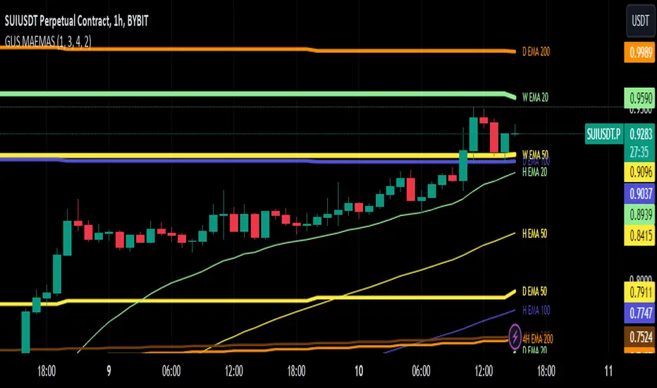
CandelaCharts - Liquidity Key Zones (LKZ)// This source code is subject to the terms of the Mozilla Public License 2.0 at mozilla.org
// © CandelaCharts
//@version=6
indicator("CandelaCharts - Liquidity Key Zones (LKZ)", shorttitle = "CandelaCharts - Liquidity Key Zones (LKZ)", overlay = true, max_lines_count = 500, max_labels_count = 500, max_boxes_count = 500, max_bars_back = 500, max_polylines_count = 100)
// # ========================================================================= #
// # | Colors |
// # ========================================================================= #
//#region
// # Core -------------------------------------------------------------------- #
colors_orange = color.orange
colors_blue = color.blue
colors_aqua = color.aqua
colors_red = color.red
colors_green = color.green
colors_maroon = color.maroon
colors_purple = color.purple
colors_gray = color.gray
colors_transparent = color.new(color.white,100)
//#endregion
// # ========================================================================= #
// # | End |
// # ========================================================================= #
// # ========================================================================= #
// # | Inputs |
// # ========================================================================= #
//#region
// # General ----------------------------------------------------------------- #
general_font = input.string("Monospace", "Text ", options = , inline = "5", group = "General")
general_text = input.string("Tiny", "", options = , inline = "5", group = "General", tooltip = "Customize global text size and style")
general_brand_show = input.bool(false, "Hide Brand", group = "General")
// # LKZ --------------------------------------------------------------------- #
hl_daily = input.bool(true, "Day ", inline = "1", group = "HTF Levels")
hl_weekly = input.bool(false, "Week ", inline = "2", group = "HTF Levels")
hl_monthly = input.bool(false, "Month ", inline = "3", group = "HTF Levels")
hl_quartely = input.bool(false, "Quarter ", inline = "4", group = "HTF Levels")
hl_yearly = input.bool(false, "Year ", inline = "5", group = "HTF Levels")
hl_css_daily = input.color(colors_blue, "", inline = "1", group = "HTF Levels")
hl_css_weekly = input.color(colors_green, "", inline = "2", group = "HTF Levels")
hl_css_monthly = input.color(colors_purple, "", inline = "3", group = "HTF Levels")
hl_css_quaterly = input.color(colors_maroon, "", inline = "4", group = "HTF Levels")
hl_css_yearly = input.color(colors_gray, "", inline = "5", group = "HTF Levels")
hl_line_daily = input.string('⎯⎯⎯', '', inline = '1', group = "HTF Levels", options = )
hl_line_weekly = input.string('⎯⎯⎯', '', inline = '2', group = "HTF Levels", options = )
hl_line_monthly = input.string('⎯⎯⎯', '', inline = '3', group = "HTF Levels", options = )
hl_line_quaterly = input.string('⎯⎯⎯', '', inline = '4', group = "HTF Levels", options = )
hl_line_yearly = input.string('⎯⎯⎯', '', inline = '5', group = "HTF Levels", options = )
hl_line_width_daily = input.int(1, '', inline = '1', group = "HTF Levels", minval = 1, maxval = 5)
hl_line_width_weekly = input.int(1, '', inline = '2', group = "HTF Levels", minval = 1, maxval = 5)
hl_line_width_monthly = input.int(1, '', inline = '3', group = "HTF Levels", minval = 1, maxval = 5)
hl_line_width_quaterly = input.int(1, '', inline = '4', group = "HTF Levels", minval = 1, maxval = 5)
hl_line_width_yearly = input.int(1, '', inline = '5', group = "HTF Levels", minval = 1, maxval = 5)
hl_midline = input.bool(true, "Show Average ", inline = "6" , group = "HTF Levels")
hl_midline_css = input.color(colors_aqua, "", inline = "6", group = "HTF Levels")
hl_midline_type = input.string("----", "", inline = "6", group = "HTF Levels", options = , tooltip = "Show highs & lows mid-line")
hl_midline_width = input.int(1, "", inline = "6", group = "HTF Levels", tooltip = "Change mid-line highs & lows width")
hl_openline = input.bool(true, "Show Open ", inline = "7" , group = "HTF Levels")
hl_openline_css = input.color(colors_orange, "", inline = "7", group = "HTF Levels")
hl_openline_type = input.string("····", "", inline = "7", group = "HTF Levels", options = , tooltip = "Show highs & lows mid-line")
hl_openline_width = input.int(1, "", inline = "7", group = "HTF Levels", tooltip = "Change mid-line highs & lows width")
//#endregion
// # ========================================================================= #
// # | End |
// # ========================================================================= #
// # ========================================================================= #
// # | UDTs |
// # ========================================================================= #
//#region
type UDT_Store
line hl_ln
label hl_lbl
type UDT_MTF
int x1 = na
int x2 = na
float y1 = na
float y2 = na
type UDT_HTF_Candle
string tf
// real coordinates of HTF candle
float o
float c
float h
float l
int ot
int ct
int ht
int lt
bool bull
//#endregion
// # ========================================================================= #
// # | End |
// # ========================================================================= #
// # ========================================================================= #
// # | Functions |
// # ========================================================================= #
//#region
method text_size(string size) =>
out = switch size
"Tiny" => size.tiny
"Small" => size.small
"Normal" => size.normal
"Large" => size.large
"Huge" => size.huge
"Auto" => size.auto
out
method line_style(string line) =>
out = switch line
'⎯⎯⎯' => line.style_solid
'----' => line.style_dashed
'····' => line.style_dotted
method font_style(string font) =>
out = switch font
'Default' => font.family_default
'Monospace' => font.family_monospace
shift_to_right(int current, int length, string tf) =>
current + timeframe.in_seconds(tf) * 1000 * (length + 1)
shift_to_left(int current, int prev, int length) =>
current - (current - prev) * length + 1
shift_bars_to_right(int bars) =>
bars + 20
//#endregion
// # ========================================================================= #
// # | End |
// # ========================================================================= #
// # ========================================================================= #
// # | Store |
// # ========================================================================= #
//#region
var UDT_Store bin = UDT_Store.new(hl_ln = array.new(), hl_lbl = array.new())
method clean_hl(UDT_Store store) =>
for obj in store.hl_ln
obj.delete()
for obj in store.hl_lbl
obj.delete()
store.hl_ln.clear()
store.hl_lbl.clear()
//#endregion
// # ========================================================================= #
// # | End |
// # ========================================================================= #
// # ========================================================================= #
// # | Highs & Lows MTF |
// # ========================================================================= #
//#region
method draw_pivots_ol_line(UDT_MTF mtf) =>
ol = line.new(
x1 = mtf.x1
, y1 = mtf.y1
, x2 = mtf.x2
, y2 = mtf.y2
, xloc = xloc.bar_time
, color = hl_openline_css
, style = line_style(hl_openline_type)
, width = hl_openline_width
)
bin.hl_ln.push(ol)
mtf
method draw_pivots_hl_line(UDT_MTF mtf, color css, string pdhl_style, int line_width) =>
hl = line.new(
x1 = mtf.x1
, y1 = mtf.y1
, x2 = mtf.x2
, y2 = mtf.y2
, xloc = xloc.bar_time
, color = css
, style = line_style(pdhl_style)
, width = line_width
)
bin.hl_ln.push(hl)
mtf
method draw_pivots_mid_line(UDT_MTF mtf) =>
ml = line.new(
x1 = mtf.x1
, y1 = mtf.y1
, x2 = mtf.x2
, y2 = mtf.y2
, xloc = xloc.bar_time
, color = hl_midline_css
, style = line_style(hl_midline_type)
, width = hl_midline_width
)
bin.hl_ln.push(ml)
mtf
method draw_pivots_ll_line(UDT_MTF mtf, color css, string pdhl_style, int line_width) =>
ll = line.new(
x1 = mtf.x1
, y1 = mtf.y1
, x2 = mtf.x2
, y2 = mtf.y2
, xloc = xloc.bar_time
, color = css
, style = line_style(pdhl_style)
, width = line_width
)
bin.hl_ln.push(ll)
mtf
method draw_pivots_label(UDT_MTF mtf, string fmt, string tf, color css) =>
lbl = label.new(
x = mtf.x2
, y = mtf.y2
, xloc = xloc.bar_time
, text = str.format(fmt, tf)
, color = colors_transparent
, textcolor = css
, size = text_size(general_text)
, style = label.style_label_left
, text_font_family = font_style(general_font)
)
bin.hl_lbl.push(lbl)
mtf
method mtf_pivots(UDT_HTF_Candle candle, tf, css, pdhl_style, line_width) =>
h_mtf = UDT_MTF.new(x1 = candle.ht, x2 = candle.ct, y1 = candle.h, y2 = candle.h)
l_mtf = UDT_MTF.new(x1 = candle.lt, x2 = candle.ct, y1 = candle.l, y2 = candle.l)
// validate high/low detections, if no candle is detected on the levels, set x1 to open
if na(h_mtf.x1)
h_mtf.x1 := candle.ot
if na(l_mtf.x1)
l_mtf.x1 := candle.ot
// position
extension = shift_to_right(time, 10, timeframe.period)
h_mtf.x2 := extension
l_mtf.x2 := extension
// Draw high line
h_mtf.draw_pivots_hl_line(css, pdhl_style, line_width)
.draw_pivots_label('P{0}H', tf, css)
// Draw low line
l_mtf.draw_pivots_ll_line(css, pdhl_style, line_width)
.draw_pivots_label('P{0}L', tf, css)
if hl_openline
o_mtf = UDT_MTF.new(x1 = candle.ot, x2 = candle.ct, y1 = candle.o, y2 = candle.o)
o_mtf.x2 := extension
// Draw open line
o_mtf.draw_pivots_ol_line()
.draw_pivots_label('P{0}O', tf, hl_openline_css)
if hl_midline
m_mtf = UDT_MTF.new()
midline_y = (h_mtf.y1 + l_mtf.y1) / 2
m_mtf.x1 := candle.ot
m_mtf.x2 := extension
m_mtf.y1 := midline_y
m_mtf.y2 := midline_y
// Draw midline
m_mtf.draw_pivots_mid_line()
.draw_pivots_label('P{0}A', tf, hl_midline_css)
candle
method session_begins(string tf, string ses, string tz) =>
ta.change(time(tf, ses, na(tz) ? "" : tz))!= 0
session_begins_2(string tf, string ses, string tz) =>
t = time(tf, ses, na(tz) ? "" : tz)
ct = time_close(tf, ses, na(tz) ? "" : tz)
not na(t) and not na(ct) and (na(t ) or t > t )
method in_session(string tf, string ses, string tz) =>
t = time(tf, ses, na(tz) ? "" : tz)
ct = time_close(tf, ses, na(tz) ? "" : tz)
not na(t) and not na(ct)
is_bullish_candle(float c, float o, float h, float l) =>
// Doji candle
if c == o
math.abs(o - h) < math.abs(o - l)
else
c > o
method detect_htf_candle(array candles, string tf, int buffer) =>
if session_begins(tf, "", na)or candles.size()==0
// log.info("session begins " + " open=" + str.format_time(time, "yyyy-MM-dd HH:mm"))
candle = UDT_HTF_Candle.new(tf = 'D')
candle.o := open
candle.c := close
candle.h := high
candle.l := low
candle.ot := time
candle.ct := time
candle.ht := time
candle.lt := time
candle.bull := is_bullish_candle(candle.c, candle.o, candle.h, candle.l)
if candles.size() >= buffer
candles.pop()
candles.unshift(candle)
else if in_session(tf, "", na) and candles.size()>0
candle = candles.first()
candle.c := close
candle.ct := time
if high > candle.h
candle.h := high
candle.ht := time
// log.info("h=" + str.tostring(high) + " l=" + str.tostring(low) + " o=" + str.tostring(open) + " c=" + str.tostring(close))
if low < candle.l
candle.l := low
candle.lt := time
// log.info("h=" + str.tostring(high) + " l=" + str.tostring(low) + " o=" + str.tostring(open) + " c=" + str.tostring(close))
candle.bull := is_bullish_candle(candle.c, candle.o, candle.h, candle.l)
// log.info("in session " + " time=" + str.format_time(time, "yyyy-MM-dd HH:mm") + " o=" + str.tostring(candle.o) + " c=" + str.tostring(candle.c))
candles
bin.clean_hl()
const int buffer = 2
if hl_daily
var htf_daily_candles = array.new()
htf_daily_candles.detect_htf_candle('D', buffer)
if htf_daily_candles.size() == buffer
prev_day = htf_daily_candles.get(1)
prev_day.mtf_pivots('D', hl_css_daily, hl_line_daily, hl_line_width_daily)
if hl_weekly
var htf_weekly_candles = array.new()
htf_weekly_candles.detect_htf_candle('W', buffer)
if htf_weekly_candles.size() == buffer and barstate.islast
prev_week = htf_weekly_candles.get(1)
prev_week.mtf_pivots('W', hl_css_weekly, hl_line_weekly, hl_line_width_weekly)
if hl_monthly
var htf_monthly_candles = array.new()
htf_monthly_candles.detect_htf_candle('M', buffer)
if htf_monthly_candles.size() == buffer and barstate.islast
prev_month = htf_monthly_candles.get(1)
prev_month.mtf_pivots('M', hl_css_monthly, hl_line_monthly, hl_line_width_monthly)
if hl_quartely
var htf_quartely_candles = array.new()
htf_quartely_candles.detect_htf_candle('3M', buffer)
if htf_quartely_candles.size() == buffer and barstate.islast
prev_quarter = htf_quartely_candles.get(1)
prev_quarter.mtf_pivots('3M', hl_css_quaterly, hl_line_quaterly, hl_line_width_quaterly)
if hl_yearly
var htf_yearly_candles = array.new()
htf_yearly_candles.detect_htf_candle('12M', buffer)
if htf_yearly_candles.size() == buffer and barstate.islast
prev_year = htf_yearly_candles.get(1)
prev_year.mtf_pivots('12M', hl_css_yearly, hl_line_yearly, hl_line_width_yearly)
//#endregion
// # ========================================================================= #
// # | End |
// # ========================================================================= #
// # ========================================================================= #
// # | Brand |
// # ========================================================================= #
//#region
if barstate.isfirst and general_brand_show == false
var table brand = table.new(position.bottom_right, 1, 1, bgcolor = chart.bg_color)
table.cell(brand, 0, 0, "© CandelaCharts", text_color = colors_gray, text_halign = text.align_center, text_size = text_size(general_text), text_font_family = font_style(general_font))
//#endregion
// # ========================================================================= #
// # | End |
// # ========================================================================= #
// Constants
color CLEAR = color.rgb(0,0,0,100)
eq_threshold = input.float(0.3, '', minval = 0, maxval = 0.5, step = 0.1, group = 'Market Structure',inline = 'equilibrium_zone')
showSwing = input.bool(false, 'Swing Points', group="Market Structure",inline="3")
swingSize_swing = input.int(10, "Swing Point Period",inline="4", group="Market Structure")
label_sizes_s =input.string("Medium", options= , title="Label Size",inline="4", group="Market Structure")
label_size_buysell_s = label_sizes_s == "Small" ? size.tiny : label_sizes_s == "Medium" ? size.small : label_sizes_s == "Large" ? size.normal : label_sizes_s == "Medium2" ? size.normal : label_sizes_s == "Large2" ? size.large : size.huge
label_size_buysell = label_sizes_s == "Small" ? size.tiny : label_sizes_s == "Medium" ? size.small : label_sizes_s == "Large" ? size.normal : label_sizes_s == "Medium2" ? size.normal : label_sizes_s == "Large2" ? size.large : size.huge
swingColor = input.color(#787b86 , '', group="Market Structure",inline="3")
swingSize = 3
length_eqh = 3
//----------------------------------------}
//Key Levels
//----------------------------------------{
var Show_4H_Levels = input.bool(defval=false, title='4H', group='Key Levels', inline='4H')
Color_4H_Levels = input.color(title='', defval=color.orange, group='Key Levels', inline='4H')
Style_4H_Levels = input.string('Dotted', ' Style', , group="Key Levels",inline="4H")
Text_4H_Levels = input.bool(defval=false, title='Shorten', group='Key Levels', inline='4H')
labelsize = input.string(defval='Medium', title='Text Size', options= ,group = "Key Levels", inline='H')
displayStyle = 'Standard'
distanceright = 25
radistance = 250
linesize = 'Small'
linestyle = 'Solid'
var untested_monday = false
bosConfType = 'Candle High'//input.string('Candle Close', 'BOS Confirmation', , tooltip='Choose whether candle close/wick above previous swing point counts as a BOS.')
MSS = true//input.bool(false, 'Show MSS', tooltip='Renames the first counter t_MS BOS to MSS' )
// showSwing = false//input.bool(true, 'Show Swing Points', tooltip='Show or hide HH, LH, HL, LL')
// Functions
lineStyle(x) =>
switch x
'Solid' => line.style_solid
'Dashed' => line.style_dashed
'Dotted' => line.style_dotted
pivot_high_found = ta.pivothigh(high, swingSize_swing, swingSize_swing)
pivot_low_found = ta.pivotlow(low, swingSize_swing, swingSize_swing)
var float prevHigh_s = na,var float prevLow_s = na,var int prevHighIndex_s = na,var int prevLowIndex_s = na
bool higher_highs = false, bool lower_highs = false, bool higher_lows = false, bool lower_lows = false
var int prevSwing_s = 0
if not na(pivot_high_found)
if pivot_high_found >= prevHigh_s
higher_highs := true
prevSwing_s := 2
else
lower_highs := true
prevSwing_s := 1
prevHigh_s := pivot_high_found
prevHighIndex_s := bar_index - swingSize_swing
if not na(pivot_low_found)
if pivot_low_found >= prevLow_s
higher_lows := true
prevSwing_s := -1
else
lower_lows := true
prevSwing_s := -2
prevLow_s := pivot_low_found
prevLowIndex_s := bar_index - swingSize_swing
// ———————————————————— Global data {
//Using current bar data for HTF highs and lows instead of security to prevent future leaking
var htfH = open
var htfL = open
if close > htfH
htfH:= close
if close < htfL
htfL := close
//---------------------------------------------------------------------------------------------------------------------------------------------------------------------------------------------
//--------------------------------------------------------------- Key Levels
//---------------------------------------------------------------------------------------------------------------------------------------------------------------------------------------------
var monday_time = time
var monday_high = high
var monday_low = low
= request.security(syminfo.tickerid, 'W', , lookahead=barmerge.lookahead_on)
= request.security(syminfo.tickerid, 'W', [time , high ], lookahead=barmerge.lookahead_on)
= request.security(syminfo.tickerid, 'W', [time , low ], lookahead=barmerge.lookahead_on)
= request.security(syminfo.tickerid, 'M', , lookahead=barmerge.lookahead_on)
= request.security(syminfo.tickerid, 'M', [time , high ], lookahead=barmerge.lookahead_on)
= request.security(syminfo.tickerid, 'M', [time , low ], lookahead=barmerge.lookahead_on)
= request.security(syminfo.tickerid, '240', [time , high ], lookahead=barmerge.lookahead_on)
= request.security(syminfo.tickerid, '240', [time , low ], lookahead=barmerge.lookahead_on)
= request.security(syminfo.tickerid, '3M', , lookahead=barmerge.lookahead_on)
= request.security(syminfo.tickerid, '3M', [time , high ], lookahead=barmerge.lookahead_on)
= request.security(syminfo.tickerid, '3M', [time , low ], lookahead=barmerge.lookahead_on)
= request.security(syminfo.tickerid, '12M', , lookahead=barmerge.lookahead_on)
= request.security(syminfo.tickerid, '12M', , lookahead=barmerge.lookahead_on)
if weekly_time != weekly_time
untested_monday := false
untested_monday
untested_monday := true
monday_low
linewidthint = 1
if linesize == 'Small'
linewidthint := 1
linewidthint
if linesize == 'Medium'
linewidthint := 2
linewidthint
if linesize == 'Large'
linewidthint := 3
linewidthint
var linewidth_def = linewidthint
fontsize = size.small
if labelsize == 'Small'
fontsize := size.small
fontsize
if labelsize == 'Medium'
fontsize := size.normal
fontsize
if labelsize == 'Large'
fontsize := size.large
fontsize
linestyles = line.style_solid
if linestyle == 'Dashed'
linestyles := line.style_dashed
linestyles
if linestyle == 'Dotted'
linestyles := line.style_dotted
linestyles
var DEFAULT_LABEL_SIZE = fontsize
var DEFAULT_LABEL_STYLE = label.style_none
var Rigth_Def = distanceright
var arr_price = array.new_float(0)
var arr_label = array.new_label(0)
Combine_Levels(arr_price, arr_label, currentprice, currentlabel, currentcolor) =>
if array.includes(arr_price, currentprice)
whichindex = array.indexof(arr_price, currentprice)
labelhold = array.get(arr_label, whichindex)
whichtext = label.get_text(labelhold)
label.set_text(labelhold, label.get_text(currentlabel) + ' / ' + whichtext)
label.set_text(currentlabel, '')
label.set_textcolor(labelhold, currentcolor)
else
array.push(arr_price, currentprice)
array.push(arr_label, currentlabel)
extend_to_current(bars) =>
timenow + (time - time ) * bars
if barstate.islast
arr_price := array.new_float(0)
arr_label := array.new_label(0)
if Show_4H_Levels
limit_4H_right = extend_to_current(Rigth_Def)
intrah_limit_right = extend_to_current(Rigth_Def)
intral_limit_right = extend_to_current(Rigth_Def)
var intrah_line = line.new(x1=intrah_time, x2=intrah_limit_right, y1=intrah_open, y2=intrah_open, color=Color_4H_Levels, width=linewidth_def, xloc=xloc.bar_time, style=lineStyle(Style_4H_Levels))
var intral_line = line.new(x1=intral_time, x2=intral_limit_right, y1=intral_open, y2=intral_open, color=Color_4H_Levels, width=linewidth_def, xloc=xloc.bar_time, style=lineStyle(Style_4H_Levels))
line.set_xy1(intrah_line,intrah_time,intrah_open)
line.set_xy2(intrah_line,intrah_limit_right,intrah_open)
line.set_x1(intral_line, intral_time)
line.set_x2(intral_line, intral_limit_right)
line.set_y1(intral_line, intral_open)
line.set_y2(intral_line, intral_open)
daily_limit_right = extend_to_current(Rigth_Def)
dailyh_limit_right = extend_to_current(Rigth_Def)
dailyl_limit_right = extend_to_current(Rigth_Def)
type Candle
float o
float c
float h
float l
int o_idx
int c_idx
int h_idx
int l_idx
box body
line wick_up
line wick_down
type Imbalance
box b
int idx
type CandleSettings
bool show
string htf
int max_display
type Settings
int max_sets
color bull_body
color bull_border
color bull_wick
color bear_body
color bear_border
color bear_wick
int offset
int buffer
int htf_buffer
int width
bool trace_show
color trace_o_color
string trace_o_style
int trace_o_size
color trace_c_color
string trace_c_style
int trace_c_size
color trace_h_color
string trace_h_style
int trace_h_size
color trace_l_color
string trace_l_style
int trace_l_size
string trace_anchor
bool label_show
color label_color
string label_size
bool htf_label_show
color htf_label_color
string htf_label_size
bool htf_timer_show
color htf_timer_color
string htf_timer_size
type CandleSet
Candle candles
Imbalance imbalances
CandleSettings settings
label tfName
label tfTimer
type Helper
string name = "Helper"
Settings settings = Settings.new()
var CandleSettings SettingsHTF1 = CandleSettings.new()
var CandleSettings SettingsHTF2 = CandleSettings.new()
var CandleSettings SettingsHTF3 = CandleSettings.new()
var Candle candles_1 = array.new(0)
var Candle candles_2 = array.new(0)
var Candle candles_3 = array.new(0)
var CandleSet htf1 = CandleSet.new()
htf1.settings := SettingsHTF1
htf1.candles := candles_1
var CandleSet htf2 = CandleSet.new()
htf2.settings := SettingsHTF2
htf2.candles := candles_2
var CandleSet htf3 = CandleSet.new()
htf3.settings := SettingsHTF3
htf3.candles := candles_3
//+------------------------------------------------------------------------------------------------------------+//
//+--- Settings ---+//
//+------------------------------------------------------------------------------------------------------------+//
htf1.settings.show := input.bool(true, "HTF 1 ", inline="htf1")
htf_1 = input.timeframe("15", "", inline="htf1")
htf1.settings.htf := htf_1
htf1.settings.max_display := input.int(4, "", inline="htf1")
htf2.settings.show := input.bool(true, "HTF 2 ", inline="htf2")
htf_2 = input.timeframe("60", "", inline="htf2")
htf2.settings.htf := htf_2
htf2.settings.max_display := input.int(4, "", inline="htf2")
htf3.settings.show := input.bool(true, "HTF 3 ", inline="htf3")
htf_3 = input.timeframe("1D", "", inline="htf3")
htf3.settings.htf := htf_3
htf3.settings.max_display := input.int(4, "", inline="htf3")
settings.max_sets := input.int(6, "Limit to next HTFs only", minval=1, maxval=6)
settings.bull_body := input.color(color.new(#39d23e, 3), "Body ", inline="body")
settings.bear_body := input.color(color.new(#ec0d0d, 4), "", inline="body")
settings.bull_border := input.color(color.rgb(206, 216, 216), "Borders", inline="borders")
settings.bear_border := input.color(color.new(#e5e9ea, 0), "", inline="borders")
settings.bull_wick := input.color(color.new(#e9eeee, 10), "Wick ", inline="wick")
settings.bear_wick := input.color(#f7f9f9, "", inline="wick")
settings.offset := input.int(25, "padding from current candles", minval = 1)
settings.buffer := input.int(1, "space between candles", minval = 1, maxval = 4)
settings.htf_buffer := input.int(10, "space between Higher Timeframes", minval = 1, maxval = 10)
settings.width := input.int(1, "Candle Width", minval = 1, maxval = 4)*2
settings.htf_label_show := input.bool(true, "HTF Label ", inline="HTFlabel")
settings.htf_label_color := input.color(color.new(#e6eef0, 10), "", inline='HTFlabel')
settings.htf_label_size := input.string(size.large, "", , inline="HTFlabel")
// ---------------- إعدادات ----------------
atrPeriod = input.int(10, "ATR Period", minval=1)
factor = input.float(3.0, "Supertrend Multiplier", minval=0.1, step=0.1)
rsiLength = input.int(14, "RSI Length", minval=2)
macdFast = input.int(12, "MACD Fast Length", minval=1)
macdSlow = input.int(26, "MACD Slow Length", minval=1)
macdSig = input.int(9, "MACD Signal Length", minval=1)
emaLen1 = input.int(20, "EMA 20 Length")
emaLen2 = input.int(50, "EMA 50 Length")
tablePos = input.string("top_right", "Table Position",
options= )
// ---------------- Supertrend ----------------
atr = ta.atr(atrPeriod)
upperBand = hl2 - factor * atr
lowerBand = hl2 + factor * atr
var float trend = na
if (close > nz(trend , hl2))
trend := math.max(upperBand, nz(trend , upperBand))
else
trend := math.min(lowerBand, nz(trend , lowerBand))
bull = close > trend
bear = close < trend
buySignal = ta.crossover(close, trend)
sellSignal = ta.crossunder(close, trend)
// ---------------- EMA ----------------
ema20 = ta.ema(close, emaLen1)
ema50 = ta.ema(close, emaLen2)
emaBull = ema20 > ema50
emaBear = ema20 < ema50
// ---------------- RSI ----------------
rsi = ta.rsi(close, rsiLength)
rsiBull = rsi > 50
// ---------------- MACD ----------------
macd = ta.ema(close, macdFast) - ta.ema(close, macdSlow)
signal = ta.ema(macd, macdSig)
macdBull = macd > signal
// ---------------- VWAP ----------------
vwapValue = ta.vwap(close)
vwapBull = close > vwapValue
vwapBear = close < vwapValue
// ---------------- Dashboard ----------------
// نحتاج 8 صفوف: (العنوان + Supertrend + EMA + RSI + MACD + VWAP + FINAL + السعر الحالي)
var table dash = table.new(position=tablePos, columns=2, rows=8, border_width=1)
if barstate.islast
// العناوين
table.cell(dash, 0, 0, "Indicator", text_color=color.white, bgcolor=color.blue)
table.cell(dash, 1, 0, "Signal", text_color=color.white, bgcolor=color.blue)
// Supertrend
table.cell(dash, 0, 1, "Supertrend", text_color=color.white, bgcolor=color.rgb(79, 97, 148))
table.cell(dash, 1, 1, buySignal ? "كول ✅" : sellSignal ? "انعكاس المسار ❌" : bull ? "كول" : "بوت",
text_color=color.white,
bgcolor= buySignal ? color.green : sellSignal ? color.red : bull ? color.green : color.red)
// EMA
table.cell(dash, 0, 2, "EMA 20/50", text_color=color.white, bgcolor=color.rgb(71, 91, 144))
table.cell(dash, 1, 2, emaBull ? "كول" : "بوت",
text_color=color.white, bgcolor=emaBull ? color.green : color.red)
// RSI
table.cell(dash, 0, 3, "RSI", text_color=color.white, bgcolor=color.rgb(66, 85, 139))
table.cell(dash, 1, 3, rsiBull ? "كول" : "بوت",
text_color=color.white, bgcolor=rsiBull ? color.green : color.red)
// MACD
table.cell(dash, 0, 4, "MACD", text_color=color.white, bgcolor=color.rgb(94, 111, 159))
table.cell(dash, 1, 4, macdBull ? "كول" : "بوت",
text_color=color.white, bgcolor=macdBull ? color.green : color.red)
// VWAP
table.cell(dash, 0, 5, "VWAP", text_color=color.white, bgcolor=color.rgb(89, 106, 153))
table.cell(dash, 1, 5, vwapBull ? "كول" : "بوت",
text_color=color.white, bgcolor=vwapBull ? color.green : color.red)
// السعر الحالي
table.cell(dash, 0, 7, "السعر", text_color=color.white, bgcolor=color.rgb(78, 89, 121))
table.cell(dash, 1, 7, str.tostring(close, format.mintick),
text_color=color.white, bgcolor=color.gray)
mohvip//@version=5
indicator(" Fmfm250 ", overlay = true, max_bars_back = 5000, max_lines_count = 500, max_boxes_count = 500, max_labels_count = 500)
// User inputs
prd = input.int(defval=30, title=' Period for Pivot Points', minval=1, maxval=50)
max_num_of_pivots = input.int(defval=6, title=' Maximum Number of Pivots', minval=5, maxval=10)
max_lines = input.int(defval=1, title=' Maximum number of trend lines', minval=1, maxval=10)
show_lines = input.bool(defval=true, title=' Show trend lines')
show_pivots = input.bool(defval=false, title=' Show Pivot Points')
sup_line_color = input(defval = color.lime, title = "Colors", inline = "tcol")
res_line_color = input(defval = color.red, title = "", inline = "tcol")
float ph = ta.pivothigh(high, prd, prd)
float pl = ta.pivotlow(low, prd, prd)
plotshape(ph and show_pivots, style=shape.triangledown, location=location.abovebar, offset=-prd, size=size.tiny)
plotshape(pl and show_pivots, style=shape.triangleup, location=location.belowbar, offset=-prd, size=size.tiny)
// Creating array of pivots
var pivots_high = array.new_float(0)
var pivots_low = array.new_float(0)
var high_ind = array.new_int(0)
var low_ind = array.new_int(0)
if ph
array.push(pivots_high, ph)
array.push(high_ind, bar_index - prd)
if array.size(pivots_high) > max_num_of_pivots // limit the array size
array.shift(pivots_high)
array.shift(high_ind)
if pl
array.push(pivots_low, pl)
array.push(low_ind, bar_index - prd)
if array.size(pivots_low) > max_num_of_pivots // limit the array size
array.shift(pivots_low)
array.shift(low_ind)
// Create arrays to store slopes and lines
var res_lines = array.new_line()
var res_slopes = array.new_float()
len_lines = array.size(res_lines)
if (len_lines >= 1)
for ind = 0 to len_lines - 1
to_delete = array.pop(res_lines)
array.pop(res_slopes)
line.delete(to_delete)
count_slope(ph1, ph2, pos1, pos2) => (ph2 - ph1) / (pos2 - pos1)
if array.size(pivots_high) == max_num_of_pivots
index_of_biggest_slope = 0
for ind1 = 0 to max_num_of_pivots - 2
for ind2 = ind1 + 1 to max_num_of_pivots - 1
p1 = array.get(pivots_high, ind1)
p2 = array.get(pivots_high, ind2)
pos1 = array.get(high_ind, ind1)
pos2 = array.get(high_ind, ind2)
k = count_slope(p1, p2, pos1, pos2)
b = p1 - k * pos1
ok = true
if ind2 - ind1 >= 1 and ok
for ind3 = ind1 + 1 to ind2 - 1
p3 = array.get(pivots_high, ind3)
pos3 = array.get(high_ind, ind3)
if p3 > k * pos3 + b
ok := false
break
pos3 = 0
p_val = p2 + k
if ok
for ind = pos2 + 1 to bar_index
if close > p_val
ok := false
break
pos3 := ind + 1
p_val += k
if ok
if array.size(res_slopes) < max_lines
line = line.new(pos1, p1, pos3, p_val, color=res_line_color)//, extend=extend.right)
array.push(res_lines, line)
array.push(res_slopes, k)
else
max_slope = array.max(res_slopes)
max_slope_ind = array.indexof(res_slopes, max_slope)
if max_lines == 1
max_slope_ind := 0
if k < max_slope
line_to_delete = array.get(res_lines, max_slope_ind)
line.delete(line_to_delete)
new_line = line.new(pos1, p1, pos3, p_val, color=res_line_color)//, extend=extend.right)
array.insert(res_lines, max_slope_ind, new_line)
array.insert(res_slopes, max_slope_ind, k)
array.remove(res_lines, max_slope_ind + 1)
array.remove(res_slopes, max_slope_ind + 1)
if not show_lines
len_l = array.size(res_lines)
if (len_l >= 1)
for ind = 0 to len_l - 1
to_delete = array.pop(res_lines)
array.pop(res_slopes)
line.delete(to_delete)
var sup_lines = array.new_line()
var sup_slopes = array.new_float()
len_lines1 = array.size(sup_lines)
if (len_lines1 >= 1)
for ind = 0 to len_lines1 - 1
to_delete = array.pop(sup_lines)
array.pop(sup_slopes)
line.delete(to_delete)
if array.size(pivots_low) == max_num_of_pivots
for ind1 = 0 to max_num_of_pivots - 2
for ind2 = ind1 + 1 to max_num_of_pivots - 1
p1 = array.get(pivots_low, ind1)
p2 = array.get(pivots_low, ind2)
pos1 = array.get(low_ind, ind1)
pos2 = array.get(low_ind, ind2)
k = count_slope(p1, p2, pos1, pos2)
b = p1 - k * pos1
ok = true
// check if pivot points in the middle of two points is lower
if ind2 - ind1 >= 1 and ok
for ind3 = ind1 + 1 to ind2 - 1
p3 = array.get(pivots_low, ind3)
pos3 = array.get(low_ind, ind3)
if p3 < k * pos3 + b
ok := false
break
pos3 = 0
p_val = p2 + k
if ok
for ind = pos2 + 1 to bar_index
if close < p_val
ok := false
break
pos3 := ind + 1
p_val += k
if ok
if array.size(sup_slopes) < max_lines
line = line.new(pos1, p1, pos3, p_val, color=sup_line_color)//, extend=extend.right)
array.push(sup_lines, line)
array.push(sup_slopes, k)
else
max_slope = array.min(sup_slopes)
max_slope_ind = array.indexof(sup_slopes, max_slope)
if max_lines == 1
max_slope_ind := 0
if k > max_slope
line_to_delete = array.get(sup_lines, max_slope_ind)
line.delete(line_to_delete)
new_line = line.new(pos1, p1, pos3, p_val, color=sup_line_color)//, extend=extend.right)
array.insert(sup_lines, max_slope_ind, new_line)
array.insert(sup_slopes, max_slope_ind, k)
array.remove(sup_lines, max_slope_ind + 1)
array.remove(sup_slopes, max_slope_ind + 1)
if not show_lines
len_l = array.size(sup_lines)
if (len_l >= 1)
for ind = 0 to len_l - 1
to_delete = array.pop(sup_lines)
array.pop(sup_slopes)
line.delete(to_delete)
plotLiq = input.bool(defval=true, title='Liquidity Highs/Lows', group='Enable/Disable Section---------------------------------------------', inline = '01')
/////////////////////////////////////////////////////////////////////////Liquidity Equal Highs
pvtTopColor = input.color(defval=color.new(color.green,85), title='Top Color', group='Liquidity-------------------------------------------------', inline='1')
pvtBtmColor = input.color(defval=color.new(color.red,85), title='Bottom Color', group='Liquidity-------------------------------------------------',inline = '1')
pvtStyle = line.style_solid
pvtMax = input.int(defval=30, title='Maximum Liquidity Displayed', minval=1, maxval=500, group='Liquidity-------------------------------------------------', tooltip='Minimum = 1, Maximum = 500')
delline = input.bool(defval=true, title='Delete After X Bars Through Line', group='Liquidity-------------------------------------------------')
mitdel = input.int(defval=15, title='Mitigated+Line Delete (X Bars)', minval=1, maxval=100, group='Liquidity-------------------------------------------------', tooltip='Line will remain on chart until this many bars after first broken through. Minimum = 1, Maximum = 500')
linebrk = input.bool(defval=true, title='Color After Close Through Line', group='Liquidity-------------------------------------------------')
mitdelcol = input.color(defval=(color.new(#34eb40,0)), title='Mitigated Color', group='Liquidity-------------------------------------------------', tooltip = 'Once broken, line will change to this colour until deleted. Line deletion is controlled by (Mitigated+Line Delete) input control')
//del_pc = input.bool(defval=false, title='', group='Liquidity-------------------------------------------------', inline="m")
//mitdel_pc = input.int(defval=300, title='Only show lines within x% of current price', minval=1, maxval=500, step=50, group='Liquidity-------------------------------------------------', inline="m")
//
brkstyle = line.style_dashed
var line _lowLiqLines = array.new_line()
var line _highLiqLines = array.new_line()
//Functions
isPvtHigh(_index, __high) =>
__high < __high and __high > __high
// | <-- pivot high
// ||| <-- candles
// 210 <-- candle index
isPvtLow(_index, __low) =>
__low > __low and __low < __low
// ||| <-- candles
// | <-- pivot low
// 210 <-- candle index
//Function to Calculte Line Length
_controlLine(_lines, __high, __low) =>
if array.size(_lines) > 0
for i = array.size(_lines) - 1 to 0 by 1
_line = array.get(_lines, i)
_lineLow = line.get_y1(_line)
_lineHigh = line.get_y2(_line)
_lineRight = line.get_x2(_line)
if na or (bar_index == _lineRight and not((__high > _lineLow and __low < _lineLow) or (__high > _lineHigh and __low < _lineHigh)))
line.set_x2(_line, bar_index + 1)
//deletes line if not within X% of current last price
//pch = (mitdel_pc/100) + 1
//pcl = 1 - (mitdel_pc/100)
//cprice = close
//highpc = (cprice * pch)
//lowpc = (cprice * pcl)
//if del_pc
//if _lineLow < close + mitdel_pc //) and > (close*0.98)) //if Y2 < close*1.05
//line.set_color(_line, color.new(color.white,50))
//line.delete(_line)
///deletes line if more than X bars pass through
if _lineRight > bar_index and _lineRight < bar_index and linebrk
line.set_color(_line,mitdelcol)
line.set_style(_line, brkstyle)
if _lineRight < bar_index and delline
line.delete(_line)
//Pivot Low Line Plotting
if isPvtLow(0, low) and plotLiq
_lowPVT = line.new(x1=bar_index - 1, y1=low , x2=bar_index, y2=low , extend=extend.none, color=pvtBtmColor, style=pvtStyle)
if array.size(_lowLiqLines) >= pvtMax
line.delete(array.shift(_lowLiqLines))
array.push(_lowLiqLines, _lowPVT)
//Pivot High Line Plotting
if isPvtHigh(0, high) and plotLiq
_highPVT = line.new(x1=bar_index - 1, y1=high , x2=bar_index, y2=high , extend=extend.none, color=pvtTopColor, style=pvtStyle)
if array.size(_highLiqLines) >= pvtMax
line.delete(array.shift(_highLiqLines))
array.push(_highLiqLines, _highPVT)
if plotLiq
_controlLine(_lowLiqLines, high, low)
_controlLine(_highLiqLines, high, low)
//////////////////////////////////////////////////////////////////////////////////////////////////////////////////////////////////
//@version=5
// indicator("ابو فيصل 12", overlay=true, max_labels_count=500,explicit_plot_zorder = 1000,max_lines_count = 500,max_boxes_count = 500,precision = 10)
// Control Colors
sky = color.new(color.rgb(0, 219, 255), 60)
PunkCyan = #2157f3
PunkPink = #ff1100
PunkBuy = color.new(color.rgb(0, 255, 100), 50)
PunkSell = color.new(color.rgb(255, 17, 0), 50)
// Get user settings
showBuySell = input(true, "Smart Signals", group="Smart Signals", tooltip="Confirm that the price will move strongly in the direction that the trend points")
sensitivity = 1.3
float percentStop = na
offsetSignal = 5
smooth1 = 35
smooth2 = 45
lineColor = sky
labelColor = sky
showEmas = false
srcEma1 = close
lenEma1 = 55
srcEma2 = close
lenEma2 = 200
//showSwing = input(false, "Show SFP Signals", group="SFP SIGNALS")
//prdSwing = input.int(10, "SFP Period", 2, group="SFP SIGNALS")
colorPos = input(color.new(PunkBuy, 50), "Buy Signal Color")
colorNeg = input(color.new(PunkSell, 50), "Sell Signal Color")
showDashboard = input(true, "Show Dashboard", group="TREND DASHBOARD")
locationDashboard = input.string("Top Right", "Table Location", , group="TREND DASHBOARD")
tableTextColor = input(color.white, "Table Text Color", group="TREND DASHBOARD")
tableBgColor = input(#48419f, "Table Background Color", group="TREND DASHBOARD")
sizeDashboard = input.string("Small", "Table Size", , group="TREND DASHBOARD")
// Functions
smoothrng(x, t, m) =>
wper = t * 2 - 1
avrng = ta.ema(math.abs(x - x ), t)
smoothrng = ta.ema(avrng, wper) * m
rngfilt(x, r) =>
rngfilt = x
rngfilt := x > nz(rngfilt ) ? x - r < nz(rngfilt ) ? nz(rngfilt ) : x - r : x + r > nz(rngfilt ) ? nz(rngfilt ) : x + r
percWidth(len, perc) => (ta.highest(len) - ta.lowest(len)) * perc / 100
securityNoRep(sym, res, src) => request.security(sym, res, src, barmerge.gaps_off, barmerge.lookahead_on)
swingPoints(prd) =>
pivHi = ta.pivothigh(prd, prd)
pivLo = ta.pivotlow (prd, prd)
last_pivHi = ta.valuewhen(pivHi, pivHi, 1)
last_pivLo = ta.valuewhen(pivLo, pivLo, 1)
hh = pivHi and pivHi > last_pivHi ? pivHi : na
lh = pivHi and pivHi < last_pivHi ? pivHi : na
hl = pivLo and pivLo > last_pivLo ? pivLo : na
ll = pivLo and pivLo < last_pivLo ? pivLo : na
f_chartTfInMinutes() =>
float _resInMinutes = timeframe.multiplier * (
timeframe.isseconds ? 1 :
timeframe.isminutes ? 1. :
timeframe.isdaily ? 60. * 24 :
timeframe.isweekly ? 60. * 24 * 7 :
timeframe.ismonthly ? 60. * 24 * 30.4375 : na)
f_kc(src, len, sensitivity) =>
basis = ta.sma(src, len)
span = ta.atr(len)
wavetrend(src, chlLen, avgLen) =>
esa = ta.ema(src, chlLen)
d = ta.ema(math.abs(src - esa), chlLen)
ci = (src - esa) / (0.015 * d)
wt1 = ta.ema(ci, avgLen)
wt2 = ta.sma(wt1, 3)
f_top_fractal(src) => src < src and src < src and src > src and src > src
f_bot_fractal(src) => src > src and src > src and src < src and src < src
f_fractalize (src) => f_top_fractal(src) ? 1 : f_bot_fractal(src) ? -1 : 0
f_findDivs(src, topLimit, botLimit) =>
fractalTop = f_fractalize(src) > 0 and src >= topLimit ? src : na
fractalBot = f_fractalize(src) < 0 and src <= botLimit ? src : na
highPrev = ta.valuewhen(fractalTop, src , 0)
highPrice = ta.valuewhen(fractalTop, high , 0)
lowPrev = ta.valuewhen(fractalBot, src , 0)
lowPrice = ta.valuewhen(fractalBot, low , 0)
bearSignal = fractalTop and high > highPrice and src < highPrev
bullSignal = fractalBot and low < lowPrice and src > lowPrev
// Get components
source = close
smrng1 = smoothrng(source, 27, 1.5)
smrng2 = smoothrng(source, 55, sensitivity)
smrng = (smrng1 + smrng2) / 2
filt = rngfilt(source, smrng)
up = 0.0, up := filt > filt ? nz(up ) + 1 : filt < filt ? 0 : nz(up )
dn = 0.0, dn := filt < filt ? nz(dn ) + 1 : filt > filt ? 0 : nz(dn )
bullCond = bool(na), bullCond := source > filt and source > source and up > 0 or source > filt and source < source and up > 0
bearCond = bool(na), bearCond := source < filt and source < source and dn > 0 or source < filt and source > source and dn > 0
lastCond = 0, lastCond := bullCond ? 1 : bearCond ? -1 : lastCond
bull = bullCond and lastCond == -1
bear = bearCond and lastCond == 1
countBull = ta.barssince(bull)
countBear = ta.barssince(bear)
trigger = nz(countBull, bar_index) < nz(countBear, bar_index) ? 1 : 0
rsi = ta.rsi(close, 21)
rsiOb = rsi > 70 and rsi > ta.ema(rsi, 10)
rsiOs = rsi < 30 and rsi < ta.ema(rsi, 10)
dHigh = securityNoRep(syminfo.tickerid, "D", high )
dLow = securityNoRep(syminfo.tickerid, "D", low )
dClose = securityNoRep(syminfo.tickerid, "D", close )
ema1 = ta.ema(srcEma1, lenEma1)
ema2 = ta.ema(srcEma2, lenEma2)
ema = ta.ema(close, 144)
emaBull = close > ema
equal_tf(res) => str.tonumber(res) == f_chartTfInMinutes() and not timeframe.isseconds
higher_tf(res) => str.tonumber(res) > f_chartTfInMinutes() or timeframe.isseconds
too_small_tf(res) => (timeframe.isweekly and res=="1") or (timeframe.ismonthly and str.tonumber(res) < 10)
var dashboard_loc = locationDashboard == "Top Center" ? position.top_right : locationDashboard == "Middle Right" ? position.middle_right : locationDashboard == "Bottom Right" ? position.bottom_right : locationDashboard == "Top Right" ? position.top_center : locationDashboard == "Middle Center" ? position.middle_center : locationDashboard == "Bottom Center" ? position.bottom_center : locationDashboard == "Top Left" ? position.top_left : locationDashboard == "Middle Left" ? position.middle_left : position.bottom_left
var dashboard_size = sizeDashboard == "Large" ? size.tiny : sizeDashboard == "Normal" ? size.normal : sizeDashboard == "Small" ? size.small : size.tiny
var dashboard = showDashboard ? table.new(dashboard_loc, 2, 15, tableBgColor, #000000, 2, tableBgColor, 1) : na
dashboard_cell(column, row, txt, signal=false) => table.cell(dashboard, column, row, txt, 0, 0, signal ? #000000 : tableTextColor, text_size=dashboard_size)
dashboard_cell_bg(column, row, col) => table.cell_set_bgcolor(dashboard, column, row, col)
if barstate.islast and showDashboard
dashboard_cell(0, 1 , "المتوقع")
dashboard_cell(0, 2 ," الحالي")
dashboard_cell(0, 3 , "فوليوم")
dashboard_cell(1, 1 , trigger ? "كول" : "بوت", true), dashboard_cell_bg(1, 1, trigger ? color.rgb(89, 255, 12) : color.rgb(255, 7, 7))
dashboard_cell(1, 2 , emaBull ?"كول":"بوت", true), dashboard_cell_bg(1, 2, emaBull ? color.rgb(107, 255, 8) : color.rgb(248, 11, 3))
dashboard_cell(1, 3 , str.tostring(volume))
// Constants
color CLEAR = color.rgb(0,0,0,100)
eq_threshold = input.float(0.3, '', minval = 0, maxval = 0.5, step = 0.1, group = 'Market Structure',inline = 'equilibrium_zone')
showSwing = input.bool(false, 'Swing Points', group="Market Structure",inline="3")
swingSize_swing = input.int(10, "Swing Point Period",inline="4", group="Market Structure")
label_sizes_s =input.string("Medium", options= , title="Label Size",inline="4", group="Market Structure")
label_size_buysell_s = label_sizes_s == "Small" ? size.tiny : label_sizes_s == "Medium" ? size.small : label_sizes_s == "Large" ? size.normal : label_sizes_s == "Medium2" ? size.normal : label_sizes_s == "Large2" ? size.large : size.huge
label_size_buysell = label_sizes_s == "Small" ? size.tiny : label_sizes_s == "Medium" ? size.small : label_sizes_s == "Large" ? size.normal : label_sizes_s == "Medium2" ? size.normal : label_sizes_s == "Large2" ? size.large : size.huge
swingColor = input.color(#787b86 , '', group="Market Structure",inline="3")
swingSize = 3
length_eqh = 3
//----------------------------------------}
//Key Levels
//----------------------------------------{
var Show_4H_Levels = input.bool(defval=false, title='4H', group='Key Levels', inline='4H')
Color_4H_Levels = input.color(title='', defval=color.orange, group='Key Levels', inline='4H')
Style_4H_Levels = input.string('Dotted', ' Style', , group="Key Levels",inline="4H")
Text_4H_Levels = input.bool(defval=false, title='Shorten', group='Key Levels', inline='4H')
labelsize = input.string(defval='Medium', title='Text Size', options= ,group = "Key Levels", inline='H')
var pihtext = Text_4H_Levels ? '-4H-' :'مقاومة 4'
displayStyle = 'Standard'
distanceright = 25
radistance = 250
linesize = 'Small'
linestyle = 'Solid'
var untested_monday = false
bosConfType = 'Candle High'//input.string('Candle Close', 'BOS Confirmation', , tooltip='Choose whether candle close/wick above previous swing point counts as a BOS.')
MSS = true//input.bool(false, 'Show MSS', tooltip='Renames the first counter t_MS BOS to MSS' )
// showSwing = false//input.bool(true, 'Show Swing Points', tooltip='Show or hide HH, LH, HL, LL')
// Functions
lineStyle(x) =>
switch x
'Solid' => line.style_solid
'Dashed' => line.style_dashed
'Dotted' => line.style_dotted
pivot_high_found = ta.pivothigh(high, swingSize_swing, swingSize_swing)
pivot_low_found = ta.pivotlow(low, swingSize_swing, swingSize_swing)
var float prevHigh_s = na,var float prevLow_s = na,var int prevHighIndex_s = na,var int prevLowIndex_s = na
bool higher_highs = false, bool lower_highs = false, bool higher_lows = false, bool lower_lows = false
var int prevSwing_s = 0
if not na(pivot_high_found)
if pivot_high_found >= prevHigh_s
higher_highs := true
prevSwing_s := 2
else
lower_highs := true
prevSwing_s := 1
prevHigh_s := pivot_high_found
prevHighIndex_s := bar_index - swingSize_swing
if not na(pivot_low_found)
if pivot_low_found >= prevLow_s
higher_lows := true
prevSwing_s := -1
else
lower_lows := true
prevSwing_s := -2
prevLow_s := pivot_low_found
prevLowIndex_s := bar_index - swingSize_swing
// ———————————————————— Global data {
//Using current bar data for HTF highs and lows instead of security to prevent future leaking
var htfH = open
var htfL = open
if close > htfH
htfH:= close
if close < htfL
htfL := close
//---------------------------------------------------------------------------------------------------------------------------------------------------------------------------------------------
//--------------------------------------------------------------- Key Levels
//---------------------------------------------------------------------------------------------------------------------------------------------------------------------------------------------
var monday_time = time
var monday_high = high
var monday_low = low
= request.security(syminfo.tickerid, 'W', , lookahead=barmerge.lookahead_on)
= request.security(syminfo.tickerid, 'W', [time , high ], lookahead=barmerge.lookahead_on)
= request.security(syminfo.tickerid, 'W', [time , low ], lookahead=barmerge.lookahead_on)
= request.security(syminfo.tickerid, 'M', , lookahead=barmerge.lookahead_on)
= request.security(syminfo.tickerid, 'M', [time , high ], lookahead=barmerge.lookahead_on)
= request.security(syminfo.tickerid, 'M', [time , low ], lookahead=barmerge.lookahead_on)
= request.security(syminfo.tickerid, '240', [time , high ], lookahead=barmerge.lookahead_on)
= request.security(syminfo.tickerid, '240', [time , low ], lookahead=barmerge.lookahead_on)
= request.security(syminfo.tickerid, '3M', , lookahead=barmerge.lookahead_on)
= request.security(syminfo.tickerid, '3M', [time , high ], lookahead=barmerge.lookahead_on)
= request.security(syminfo.tickerid, '3M', [time , low ], lookahead=barmerge.lookahead_on)
= request.security(syminfo.tickerid, '12M', , lookahead=barmerge.lookahead_on)
= request.security(syminfo.tickerid, '12M', , lookahead=barmerge.lookahead_on)
if weekly_time != weekly_time
untested_monday := false
untested_monday
untested_monday := true
monday_low
linewidthint = 1
if linesize == 'Small'
linewidthint := 1
linewidthint
if linesize == 'Medium'
linewidthint := 2
linewidthint
if linesize == 'Large'
linewidthint := 3
linewidthint
var linewidth_def = linewidthint
fontsize = size.small
if labelsize == 'Small'
fontsize := size.small
fontsize
if labelsize == 'Medium'
fontsize := size.normal
fontsize
if labelsize == 'Large'
fontsize := size.large
fontsize
linestyles = line.style_solid
if linestyle == 'Dashed'
linestyles := line.style_dashed
linestyles
if linestyle == 'Dotted'
linestyles := line.style_dotted
linestyles
var DEFAULT_LABEL_SIZE = fontsize
var DEFAULT_LABEL_STYLE = label.style_none
var Rigth_Def = distanceright
var arr_price = array.new_float(0)
var arr_label = array.new_label(0)
Combine_Levels(arr_price, arr_label, currentprice, currentlabel, currentcolor) =>
if array.includes(arr_price, currentprice)
whichindex = array.indexof(arr_price, currentprice)
labelhold = array.get(arr_label, whichindex)
whichtext = label.get_text(labelhold)
label.set_text(labelhold, label.get_text(currentlabel) + ' / ' + whichtext)
label.set_text(currentlabel, '')
label.set_textcolor(labelhold, currentcolor)
else
array.push(arr_price, currentprice)
array.push(arr_label, currentlabel)
extend_to_current(bars) =>
timenow + (time - time ) * bars
if barstate.islast
arr_price := array.new_float(0)
arr_label := array.new_label(0)
if Show_4H_Levels
limit_4H_right = extend_to_current(Rigth_Def)
intrah_limit_right = extend_to_current(Rigth_Def)
intral_limit_right = extend_to_current(Rigth_Def)
var intrah_line = line.new(x1=intrah_time, x2=intrah_limit_right, y1=intrah_open, y2=intrah_open, color=Color_4H_Levels, width=linewidth_def, xloc=xloc.bar_time, style=lineStyle(Style_4H_Levels))
var intrah_label = label.new(x=intrah_limit_right, y=intrah_open, text=pihtext, style=DEFAULT_LABEL_STYLE, textcolor=Color_4H_Levels, size=DEFAULT_LABEL_SIZE, xloc=xloc.bar_time)
var intral_line = line.new(x1=intral_time, x2=intral_limit_right, y1=intral_open, y2=intral_open, color=Color_4H_Levels, width=linewidth_def, xloc=xloc.bar_time, style=lineStyle(Style_4H_Levels))
line.set_xy1(intrah_line,intrah_time,intrah_open)
line.set_xy2(intrah_line,intrah_limit_right,intrah_open)
label.set_xy(intrah_label,intrah_limit_right,intrah_open)
label.set_text(intrah_label, pihtext)
line.set_x1(intral_line, intral_time)
line.set_x2(intral_line, intral_limit_right)
line.set_y1(intral_line, intral_open)
line.set_y2(intral_line, intral_open)
Combine_Levels(arr_price, arr_label, intrah_open, intrah_label, Color_4H_Levels)
daily_limit_right = extend_to_current(Rigth_Def)
dailyh_limit_right = extend_to_current(Rigth_Def)
dailyl_limit_right = extend_to_current(Rigth_Def)
type Candle
float o
float c
float h
float l
int o_idx
int c_idx
int h_idx
int l_idx
box body
line wick_up
line wick_down
type Imbalance
box b
int idx
type CandleSettings
bool show
string htf
int max_display
type Settings
int max_sets
color bull_body
color bull_border
color bull_wick
color bear_body
color bear_border
color bear_wick
int offset
int buffer
int htf_buffer
int width
bool trace_show
color trace_o_color
string trace_o_style
int trace_o_size
color trace_c_color
string trace_c_style
int trace_c_size
color trace_h_color
string trace_h_style
int trace_h_size
color trace_l_color
string trace_l_style
int trace_l_size
string trace_anchor
bool label_show
color label_color
string label_size
bool htf_label_show
color htf_label_color
string htf_label_size
bool htf_timer_show
color htf_timer_color
string htf_timer_size
type CandleSet
Candle candles
Imbalance imbalances
CandleSettings settings
label tfName
label tfTimer
type Helper
string name = "Helper"
Settings settings = Settings.new()
var CandleSettings SettingsHTF1 = CandleSettings.new()
var CandleSettings SettingsHTF2 = CandleSettings.new()
var CandleSettings SettingsHTF3 = CandleSettings.new()
var Candle candles_1 = array.new(0)
var Candle candles_2 = array.new(0)
var Candle candles_3 = array.new(0)
var CandleSet htf1 = CandleSet.new()
htf1.settings := SettingsHTF1
htf1.candles := candles_1
var CandleSet htf2 = CandleSet.new()
htf2.settings := SettingsHTF2
htf2.candles := candles_2
var CandleSet htf3 = CandleSet.new()
htf3.settings := SettingsHTF3
htf3.candles := candles_3
//+------------------------------------------------------------------------------------------------------------+//
//+--- Settings ---+//
//+------------------------------------------------------------------------------------------------------------+//
htf1.settings.show := input.bool(true, "HTF 1 ", inline="htf1")
htf_1 = input.timeframe("15", "", inline="htf1")
htf1.settings.htf := htf_1
htf1.settings.max_display := input.int(4, "", inline="htf1")
htf2.settings.show := input.bool(true, "HTF 2 ", inline="htf2")
htf_2 = input.timeframe("60", "", inline="htf2")
htf2.settings.htf := htf_2
htf2.settings.max_display := input.int(4, "", inline="htf2")
htf3.settings.show := input.bool(true, "HTF 3 ", inline="htf3")
htf_3 = input.timeframe("1D", "", inline="htf3")
htf3.settings.htf := htf_3
htf3.settings.max_display := input.int(4, "", inline="htf3")
settings.max_sets := input.int(6, "Limit to next HTFs only", minval=1, maxval=6)
settings.bull_body := input.color(color.new(#0efd16, 3), "Body ", inline="body")
settings.bear_body := input.color(color.new(#ec0808, 0), "", inline="body")
settings.bull_border := input.color(color.rgb(159, 159, 169), "Borders", inline="borders")
settings.bear_border := input.color(color.new(#e5e9ea, 0), "", inline="borders")
settings.bull_wick := input.color(color.new(#e9eeee, 10), "Wick ", inline="wick")
settings.bear_wick := input.color(#f7f9f9, "", inline="wick")
settings.offset := input.int(25, "padding from current candles", minval = 1)
settings.buffer := input.int(1, "space between candles", minval = 1, maxval = 4)
settings.htf_buffer := input.int(10, "space between Higher Timeframes", minval = 1, maxval = 10)
settings.width := input.int(1, "Candle Width", minval = 1, maxval = 4)*2
settings.htf_label_show := input.bool(true, "HTF Label ", inline="HTFlabel")
settings.htf_label_color := input.color(color.new(color.black, 10), "", inline='HTFlabel')
settings.htf_label_size := input.string(size.large, "", , inline="HTFlabel")
//+------------------------------------------------------------------------------------------------------------+//
//+--- Variables ---+//
//+------------------------------------------------------------------------------------------------------------+//
Helper helper = Helper.new()
color color_transparent = #ffffff00
//+------------------------------------------------------------------------------------------------------------+//
//+--- Internal Functions ---+//
//+------------------------------------------------------------------------------------------------------------+//
method LineStyle(Helper helper, string style) =>
helper.name := style
out = switch style
'----' => line.style_dashed
'····' => line.style_dotted
=> line.style_solid
method ValidTimeframe(Helper helper, string HTF) =>
helper.name := HTF
if timeframe.in_seconds(HTF) >= timeframe.in_seconds("D") and timeframe.in_seconds(HTF) > timeframe.in_seconds()
true
else
n1 = timeframe.in_seconds()
n2 = timeframe.in_seconds(HTF)
n3 = n1 % n2
(n1 < n2 and math.round(n2/n1) == n2/n1)
method HTFName(Helper helper, string HTF) =>
helper.name := "HTFName"
formatted = HTF
seconds = timeframe.in_seconds(HTF)
if seconds < 60
formatted := str.tostring(seconds) + "s"
else if (seconds / 60) < 60
formatted := str.tostring((seconds/60)) + "m"
else if (seconds/60/60) < 24
formatted := str.tostring((seconds/60/60)) + "H"
formatted
method HTFEnabled(Helper helper) =>
helper.name := "HTFEnabled"
int enabled =0
enabled += htf1.settings.show ? 1 : 0
enabled += htf2.settings.show ? 1 : 0
enabled += htf3.settings.show ? 1 : 0
int last = math.min(enabled, settings.max_sets)
last
method CandleSetHigh(Helper helper, Candle candles, float h) =>
helper.name := "CandlesSetHigh"
float _h = h
if array.size(candles) > 0
for i = 0 to array.size(candles)-1
Candle c = array.get(candles, i)
if c.h > _h
_h := c.h
_h
method CandlesHigh(Helper helper, Candle candles) =>
helper.name := "CandlesHigh"
h = 0.0
int cnt = 0
int last = helper.HTFEnabled()
if htf1.settings.show and helper.ValidTimeframe(htf1.settings.htf)
h := helper.CandleSetHigh(htf1.candles, h)
cnt += 1
if htf2.settings.show and helper.ValidTimeframe(htf2.settings.htf) and cnt < last
h := helper.CandleSetHigh(htf2.candles, h)
cnt +=1
if htf3.settings.show and helper.ValidTimeframe(htf3.settings.htf) and cnt < last
h := helper.CandleSetHigh(htf3.candles, h)
cnt += 1
if array.size(candles) > 0
for i = 0 to array.size(candles)-1
Candle c = array.get(candles, i)
if c.h > h
h := c.h
h
method Reorder(CandleSet candleSet, int offset) =>
size = candleSet.candles.size()
if size > 0
for i = size-1 to 0
Candle candle = candleSet.candles.get(i)
t_buffer = offset + ((settings.width+settings.buffer)*(size-i-1))
box.set_left(candle.body, bar_index + t_buffer)
box.set_right(candle.body, bar_index + settings.width + t_buffer)
line.set_x1(candle.wick_up, bar_index+((settings.width)/2) + t_buffer)
line.set_x2(candle.wick_up, bar_index+((settings.width)/2) + t_buffer)
line.set_x1(candle.wick_down, bar_index+((settings.width)/2) + t_buffer)
line.set_x2(candle.wick_down, bar_index+((settings.width)/2) + t_buffer)
candleSet
top = helper.CandlesHigh(candleSet.candles)
left = bar_index + offset + ((settings.width+settings.buffer)*(size-1))/2
if settings.htf_label_show
var label l = candleSet.tfName
string lbl = helper.HTFName(candleSet.settings.htf)
if settings.htf_timer_show
lbl += "\n"
if not na(l)
label.set_xy(l, left, top)
else
l := label.new(left, top, lbl, color=color_transparent, textcolor = settings.htf_label_color, style=label.style_label_down, size = settings.htf_label_size)
if settings.htf_timer_show
var label t = candleSet.tfTimer
if not na(t)
label.set_xy(t, left, top)
candleSet
method FindImbalance(CandleSet candleSet) =>
if barstate.isrealtime or barstate.islast
if candleSet.imbalances.size() > 0
for i = candleSet.imbalances.size()-1 to 0
Imbalance del = candleSet.imbalances.get(i)
box.delete(del.b)
candleSet.imbalances.pop()
if candleSet.candles.size() > 3
for i = 1 to candleSet.candles.size() -3
candle1 = candleSet.candles.get(i)
candle2 = candleSet.candles.get(i+2)
candle3 = candleSet.candles.get(i+1)
method Monitor(CandleSet candleSet) =>
HTFBarTime = time(candleSet.settings.htf)
isNewHTFCandle = ta.change(HTFBarTime)
if isNewHTFCandle
Candle candle = Candle.new()
candle.o := open
candle.c := close
candle.h := high
candle.l := low
candle.o_idx := bar_index
candle.c_idx := bar_index
candle.h_idx := bar_index
candle.l_idx := bar_index
bull = candle.c > candle.o
candle.body := box.new(bar_index, math.max(candle.o, candle.c), bar_index+2, math.min(candle.o, candle.c), bull ? settings.bull_border : settings.bear_border, 1, bgcolor = bull ? settings.bull_body : settings.bear_body)
candle.wick_up := line.new(bar_index+1, candle.h, bar_index, math.max(candle.o, candle.c), color=bull ? settings.bull_wick : settings.bear_wick)
candle.wick_down := line.new(bar_index+1, math.min(candle.o, candle.c), bar_index, candle.l, color=bull ? settings.bull_wick : settings.bear_wick)
candleSet.candles.unshift(candle)
if candleSet.candles.size() > candleSet.settings.max_display
Candle delCandle = array.pop(candleSet.candles)
box.delete(delCandle.body)
line.delete(delCandle.wick_up)
line.delete(delCandle.wick_down)
candleSet
method Update(CandleSet candleSet, int offset, bool showTrace) =>
if candleSet.candles.size() > 0
Candle candle = candleSet.candles.first()
candle.h_idx := high > candle.h ? bar_index : candle.h_idx
candle.h := high > candle.h ? high : candle.h
candle.l_idx := low < candle.l ? bar_index : candle.l_idx
candle.l := low < candle.l ? low : candle.l
candle.c := close
candle.c_idx := bar_index
bull = candle.c > candle.o
box.set_top(candle.body, candle.o)
box.set_bottom(candle.body, candle.c)
box.set_bgcolor(candle.body, bull ? settings.bull_body : settings.bear_body)
box.set_border_color(candle.body, bull ? settings.bull_border : settings.bear_border)
line.set_color(candle.wick_up, bull ? settings.bull_wick : settings.bear_wick)
line.set_color(candle.wick_down, bull ? settings.bull_wick : settings.bear_wick)
line.set_y1(candle.wick_up, candle.h)
line.set_y2(candle.wick_up, math.max(candle.o, candle.c))
line.set_y1(candle.wick_down, candle.l)
line.set_y2(candle.wick_down, math.min(candle.o, candle.c))
if barstate.isrealtime or barstate.islast
candleSet.Reorder(offset)
candleSet
int cnt = 0
int last = helper.HTFEnabled()
int offset = settings.offset
if htf1.settings.show and helper.ValidTimeframe(htf1.settings.htf)
bool showTrace = false
if settings.trace_anchor == "First Timeframe"
showTrace := true
if settings.trace_anchor == "Last Timeframe" and settings.max_sets == 1
showTrace := true
htf1.Monitor().Update(offset, showTrace)
cnt +=1
offset += cnt > 0 ? (htf1.candles.size() * settings.width) + (htf1.candles.size() > 0 ? htf1.candles.size()-1 * settings.buffer : 0) + settings.htf_buffer : 0
if htf2.settings.show and helper.ValidTimeframe(htf2.settings.htf) and cnt < last
bool showTrace = false
if settings.trace_anchor == "First Timeframe" and cnt == 0
showTrace := true
if settings.trace_anchor == "Last Timeframe" and cnt == last-1
showTrace := true
htf2.Monitor().Update(offset, showTrace)
cnt+=1
offset += cnt > 0 ? (htf2.candles.size() * settings.width) + (htf2.candles.size() > 0 ? htf2.candles.size()-1 * settings.buffer : 0) + settings.htf_buffer : 0
if htf3.settings.show and helper.ValidTimeframe(htf3.settings.htf) and cnt < last
bool showTrace = false
if settings.trace_anchor == "First Timeframe" and cnt == 0
showTrace := true
if settings.trace_anchor == "Last Timeframe" and cnt == last-1
showTrace := true
htf3.Monitor().Update(offset, showTrace)
cnt+=1
offset += cnt > 0 ? (htf3.candles.size() * settings.width) + (htf3.candles.size() > 0 ? htf3.candles.size()-1 * settings.buffer : 0) + settings.htf_buffer : 0
// =======================
// إعدادات مناطق العرض والطلب
// =======================
zigzagLen = input.int(9, 'ZigZag Length', group = 'Order Block Settings')
numberObShow = input.int(1, 'عدد مناطق العرض والطلب المعروضة', group = 'Order Block Settings', minval = 1, maxval = 10)
bearishOrderblockColor = input.color(color.new(#dc1515, 18), title = 'لون منطقة العرض', group = 'Order Block Settings')
bullishOrderblockColor = input.color(color.new(#58bd0f, 10), title = 'لون منطقة الطلب', group = 'Order Block Settings')
// إعدادات نسبة القوة
showStrengthLabels = input.bool(true, 'عرض نسبة القوة', group = 'Strength Settings')
strengthThreshold = input.int(60, 'حد التنبيه', group = 'Strength Settings', minval = 50, maxval = 90)
enableAlert = input.bool(true, 'تفعيل التنبيهات', group = 'Strength Settings')
// أنواع البيانات
type orderblock
float value
int barStart
int barEnd
box block
bool broken
label supplyLabel
label demandLabel
// المصفوفات
var array bullishOrderblock = array.new()
var array bearishOrderblock = array.new()
var array highValIndex = array.new()
var array lowValIndex = array.new()
var array highVal = array.new_float()
var array lowVal = array.new_float()
// المتغيرات
var bool drawUp = false
var bool drawDown = false
var string lastState = na
var bool to_up = false
var bool to_down = false
var int trend = 1
atr = ta.atr(14)
// حساب الاتجاه
to_up := high >= ta.highest(high, zigzagLen)
to_down := low <= ta.lowest(low, zigzagLen)
trend := trend == 1 and to_down ? -1 : trend == -1 and to_up ? 1 : trend
// تحديد تغيير الاتجاه للأعلى
if ta.change(trend) != 0 and trend == 1
array.push(highValIndex, time )
array.push(highVal, high )
if array.size(lowVal) > 1
drawUp := false
// تحديد تغيير الاتجاه للأسفل
if ta.change(trend) != 0 and trend == -1
array.push(lowValIndex, time )
array.push(lowVal, low )
if array.size(highVal) > 1
drawDown := false
// دالة حساب نسبة القوة (من إجمالي 100)
calculateStrengthRatio() =>
float supplyStrength = 0.0
float demandStrength = 0.0
// حساب قوة العرض
int supplyTouches = 0
for i = 1 to 20
if i < bar_index
if close < open
supplyTouches += 1
// حساب قوة الطلب
int demandTouches = 0
for i = 1 to 20
if i < bar_index
if close > open
demandTouches += 1
// حساب النسب من إجمالي الحجم
float avgVolume = ta.sma(volume, 20)
float volumeRatio = volume / avgVolume
// حساب قوة الاتجاه
float rsiValue = ta.rsi(close, 14)
if rsiValue > 50
demandStrength := rsiValue
supplyStrength := 100 - rsiValue
else
supplyStrength := 100 - rsiValue
demandStrength := rsiValue
// إنشاء منطقة عرض (Bearish Order Block)
if array.size(lowVal) > 1 and drawDown == false
if close < array.get(lowVal, array.size(lowVal) - 1)
drawDown := true
lastState := 'down'
orderblock newOrderblock = orderblock.new()
float max = 0
int bar = na
for i = (time - array.get(lowValIndex, array.size(lowValIndex) - 1) - (time - time )) / (time - time ) to 0 by 1
if high > max
max := high
bar := time
newOrderblock.barStart := bar
newOrderblock.barEnd := time
newOrderblock.broken := false
newOrderblock.value := max
// جعل الخط نحيف بدلاً من صندوق
newOrderblock.block := box.new(
left = newOrderblock.barStart,
top = newOrderblock.value,
right = newOrderblock.barEnd,
bottom = newOrderblock.value - atr * 0.20,
xloc = xloc.bar_time,
bgcolor = bearishOrderblockColor,
border_width = 1,
border_color = color.new(#cd1212, 0))
// حساب النسب
= calculateStrengthRatio()
newOrderblock.supplyLabel := na
newOrderblock.demandLabel := na
if showStrengthLabels
// قوة العرض فوق الخط
newOrderblock.supplyLabel := label.new(
x = time,
y = newOrderblock.value + atr * 0.5,
text = "عرض: "+ str.tostring(supplyStr, "#") + "%",
xloc = xloc.bar_time,
yloc = yloc.price,
color = supplyStr >= strengthThreshold ? color.new(color.red, 0) : color.new(color.orange, 0),
textcolor = color.white,
style = label.style_label_down,
size = size.normal)
// قوة الطلب تحت الخط
newOrderblock.demandLabel := label.new(
x = time,
y = newOrderblock.value - atr * 0.5,
text = " طلب" + str.tostring(demandStr, "#") + "%",
xloc = xloc.bar_time,
yloc = yloc.price,
color = color.new(color.gray, 30),
textcolor = color.white,
style = label.style_label_up,
size = size.small)
// تنبيه عند تجاوز الحد
if enableAlert and supplyStr >= strengthThreshold
alert("تنبيه: قوة العرض " + str.tostring(supplyStr, "#") + "% - تجاوزت " + str.tostring(strengthThreshold) + "%", alert.freq_once_per_bar)
array.push(bearishOrderblock, newOrderblock)
if array.size(bearishOrderblock) > 20
oldBlock = array.shift(bearishOrderblock)
if not na(oldBlock.supplyLabel)
label.delete(oldBlock.supplyLabel)
if not na(oldBlock.demandLabel)
label.delete(oldBlock.demandLabel)
// إنشاء منطقة طلب (Bullish Order Block)
if array.size(highVal) > 1 and drawUp == false
if close > array.get(highVal, array.size(highVal) - 1)
drawUp := true
lastState := 'up'
orderblock newOrderblock = orderblock.new()
float min = 999999999
int bar = na
for i = (time - array.get(highValIndex, array.size(highValIndex) - 1) - (time - time )) / (time - time ) to 0 by 1
if low < min
min := low
bar := time
newOrderblock.barStart := bar
newOrderblock.barEnd := time
newOrderblock.broken := false
newOrderblock.value := min
// جعل الخط نحيف بدلاً من صندوق
newOrderblock.block := box.new(
left = newOrderblock.barStart,
top = newOrderblock.value + atr *0.30,
right = newOrderblock.barEnd,
bottom = newOrderblock.value,
xloc = xloc.bar_time,
bgcolor = bullishOrderblockColor,
border_width = 1,
border_color = color.new(#52ae10, 0))
// حساب النسب
= calculateStrengthRatio()
newOrderblock.supplyLabel := na
newOrderblock.demandLabel := na
if showStrengthLabels
// قوة الطلب تحت الخط
newOrderblock.demandLabel := label.new(
x = time,
y = newOrderblock.value - atr * 0.5,
text = "طلب: " + str.tostring(demandStr, "#") + "%",
xloc = xloc.bar_time,
yloc = yloc.price,
color = demandStr >= strengthThreshold ? color.new(color.green, 0) : color.new(color.blue, 0),
textcolor = color.white,
style = label.style_label_up,
size = size.normal)
// تنبيه عند تجاوز الحد
if enableAlert and demandStr >= strengthThreshold
alert("تنبيه: قوة الطلب " + str.tostring(demandStr, "#") + "% - تجاوزت " + str.tostring(strengthThreshold) + "%", alert.freq_once_per_bar)
array.push(bullishOrderblock, newOrderblock)
if array.size(bullishOrderblock) > 20
oldBlock = array.shift(bullishOrderblock)
if not na(oldBlock.supplyLabel)
label.delete(oldBlock.supplyLabel)
if not na(oldBlock.demandLabel)
label.delete(oldBlock.demandLabel)
// متغيرات العداد
var int activeBullishCount = 0
var int activeBearishCount = 0
// تحديث مناطق الطلب
if array.size(bullishOrderblock) > 0
orderblock testOrderblock = na
int counter = 0
activeBullishCount := 0
for i = array.size(bullishOrderblock) - 1 to 0 by 1
testOrderblock := array.get(bullishOrderblock, i)
if counter < numberObShow
testOrderblock.block.set_right(time)
// تحديث النسب المتحركة
= calculateStrengthRatio()
if showStrengthLabels
if not na(testOrderblock.demandLabel)
label.set_x(testOrderblock.demandLabel, time)
label.set_text(testOrderblock.demandLabel, "طلب: " + str.tostring(demandStr, "#") + "%")
label.set_color(testOrderblock.demandLabel, demandStr >= strengthThreshold ? color.new(color.green, 0) : color.new(color.blue, 0))
if not na(testOrderblock.supplyLabel)
label.set_x(testOrderblock.supplyLabel, time)
label.set_text(testOrderblock.supplyLabel, "عرض: " + str.tostring(supplyStr, "#") + "%")
if close < testOrderblock.value
testOrderblock.block.delete()
if not na(testOrderblock.demandLabel)
label.delete(testOrderblock.demandLabel)
if not na(testOrderblock.supplyLabel)
label.delete(testOrderblock.supplyLabel)
array.remove(bullishOrderblock, i)
else
activeBullishCount += 1
counter := counter + 1
else
testOrderblock.block.set_right(testOrderblock.barStart)
if not na(testOrderblock.demandLabel)
label.delete(testOrderblock.demandLabel)
if not na(testOrderblock.supplyLabel)
label.delete(testOrderblock.supplyLabel)
// تحديث مناطق العرض
if array.size(bearishOrderblock) > 0
orderblock testOrderblock = na
int counter = 0
activeBearishCount := 0
for i = array.size(bearishOrderblock) - 1 to 0 by 1
testOrderblock := array.get(bearishOrderblock, i)
if counter < numberObShow
testOrderblock.block.set_right(time)
// تحديث النسب المتحركة
= calculateStrengthRatio()
if showStrengthLabels
if not na(testOrderblock.supplyLabel)
label.set_x(testOrderblock.supplyLabel, time)
label.set_text(testOrderblock.supplyLabel," عرض " + str.tostring(supplyStr, "#") + "%")
label.set_color(testOrderblock.supplyLabel, supplyStr >= strengthThreshold ? color.new(color.red, 0) : color.new(color.orange, 0))
if not na(testOrderblock.demandLabel)
label.set_x(testOrderblock.demandLabel, time)
label.set_text(testOrderblock.demandLabel,"طلب " + str.tostring(demandStr, "#") + "%")
if close > testOrderblock.value
testOrderblock.block.delete()
if not na(testOrderblock.supplyLabel)
label.delete(testOrderblock.supplyLabel)
if not na(testOrderblock.demandLabel)
label.delete(testOrderblock.demandLabel)
array.remove(bearishOrderblock, i)
else
activeBearishCount += 1
counter := counter + 1
else
testOrderblock.block.set_right(testOrderblock.barStart)
if not na(testOrderblock.supplyLabel)
label.delete(testOrderblock.supplyLabel)
if not na(testOrderblock.demandLabel)
label.delete(testOrderblock.demandLabel)
// ========== إعدادات FVG ==========
showFVG = input.bool(defval = true, title = "Show Fair Value Gaps", group = "FVG")
contract = input.bool(defval = false, title = "Contract Violated FVG", group = "FVG")
closeOnly = input.bool(defval = false, title = "Show Closest Up/Down FVG Only", group = "FVG")
fvgcol = input.color(defval = #f2da07, title = "FVG Color", group = "FVG")
fvgtra = input.int(defval = 80, minval = 0, maxval = 100, title = "FVG Transparency", group = "FVG")
// ========== دالة FVG ==========
fvg(direction) =>
var fvgMat = matrix.new(5)
var fvgDrawings = array.new()
fvgMat.add_col(0, array.from(math.sign(close - open), close, high, low, time))
if fvgMat.columns() > 3
fvgMat.remove_col(fvgMat.columns() - 1)
if fvgMat.row(0).sum() == direction
getDir = math.sign(direction)
= switch getDir
-1 =>
=>
col = switch closeOnly
true => #00000000
=> color.new(fvgcol, fvgtra)
fvgDrawings.push(
box.new(int(fvgMat.get(4, 1)), y, last_bar_time, y1, xloc = xloc.bar_time,
border_color = col, bgcolor = col)
)
fvgDrawings
// ========== تنفيذ FVG ==========
if showFVG
fvgDn = fvg(-3)
fvgUp = fvg(3)
// معالجة FVG الهابط
if fvgDn.size() > 0
for i = fvgDn.size() - 1 to 0
getfvg = fvgDn.get(i)
if high >= getfvg.get_top()
getfvg.delete()
fvgDn.remove(i)
else if contract
if high > getfvg.get_bottom()
getfvg.set_bottom(high)
// معالجة FVG الصاعد
if fvgUp.size() > 0
for i = fvgUp.size() - 1 to 0
getfvg = fvgUp.get(i)
if low <= getfvg.get_bottom()
getfvg.delete()
fvgUp.remove(i)
else if contract
if low < getfvg.get_top()
getfvg.set_top(low)
// إظهار أقرب FVG فقط
if closeOnly and barstate.islast
minDist = matrix.new(1, 2, 20e20)
if fvgDn.size() > 0
for i = fvgDn.size() - 1 to 0
getBottom = fvgDn.get(i).get_bottom()
minDist.set(0, 1, math.min(minDist.get(0, 1), math.abs(close - getBottom)))
if math.abs(close - getBottom) == minDist.get(0, 1)
minDist.set(0, 0, i)
fvgDn.get(i).set_right(fvgDn.get(i).get_left())
fvgDn.get(int(minDist.get(0, 0))).set_bgcolor(color.new(fvgcol, fvgtra))
fvgDn.get(int(minDist.get(0, 0))).set_border_color(color.new(fvgcol, fvgtra))
fvgDn.get(int(minDist.get(0, 0))).set_right(last_bar_time)
minDist.set(0, 0, 0)
minDist.set(0, 1, 20e20)
if fvgUp.size() > 0
for i = fvgUp.size() - 1 to 0
getTop = fvgUp.get(i).get_top()
minDist.set(0, 1, math.min(minDist.get(0, 1), math.abs(close - getTop)))
if math.abs(close - getTop) == minDist.get(0, 1)
minDist.set(0, 0, i)
fvgUp.get(i).set_right(fvgUp.get(i).get_left())
fvgUp.get(int(minDist.get(0, 0))).set_bgcolor(color.new(fvgcol, fvgtra))
fvgUp.get(int(minDist.get(0, 0))).set_border_color(color.new(fvgcol, fvgtra))
fvgUp.get(int(minDist.get(0, 0))).set_right(last_bar_time)
//==============================
// إعدادات العرض والألوان
//==============================
Show_Middle_Line_4H = input.bool(true, "عرض خط المنتصف 4H")
Show_Middle_Line_D = input.bool(true, "عرض خط المنتصف Daily")
Color_Middle_Below_4H = input.color(color.red, "لون المنتصف (تحت السعر) 4H")
Color_Middle_Above_4H = input.color(color.green, "لون المنتصف (فوق السعر) 4H")
Color_Middle_Below_D = input.color(color.new(color.red, 0), "لون المنتصف (تحت السعر) Daily")
Color_Middle_Above_D = input.color(color.new(color.green, 0), "لون المنتصف (فوق السعر) Daily")
//==============================
// دالة امتداد الخط إلى اليمين
//==============================
extendToCurrentBar(int offset_bars) =>
timenow + (time - time ) * offset_bars
//==============================
// حساب خط المنتصف 4H
//==============================
= request.security(syminfo.tickerid, "240", [time , high ], lookahead=barmerge.lookahead_on)
= request.security(syminfo.tickerid, "240", [time , low ], lookahead=barmerge.lookahead_on)
float middle_price_4h = (intrah_value_4h + intral_value_4h) / 2
//==============================
// حساب خط المنتصف Daily
//==============================
= request.security(syminfo.tickerid, "D", [time , high ], lookahead=barmerge.lookahead_on)
= request.security(syminfo.tickerid, "D", [time , low ], lookahead=barmerge.lookahead_on)
float middle_price_d = (intrah_value_d + intral_value_d) / 2
//==============================
// رسم خط المنتصف 4H
//==============================
if barstate.islast and Show_Middle_Line_4H
int distance_right = 25
color middle_color_4h = close < middle_price_4h ? Color_Middle_Below_4H : Color_Middle_Above_4H
string middle_text_4h = close < middle_price_4h ? "سلبي 🔴 (4H)" : "إيجابي 🟢 (4H)"
var line middle_line_4h = line.new(na, na, na, na, xloc=xloc.bar_time, width=2, style=line.style_solid)
var label middle_label_4h = label.new(na, na, text="", xloc=xloc.bar_time, style=label.style_none)
line.set_xy1(middle_line_4h, intrah_time_4h, middle_price_4h)
line.set_xy2(middle_line_4h, extendToCurrentBar(distance_right), middle_price_4h)
line.set_color(middle_line_4h, middle_color_4h)
label.set_xy(middle_label_4h, extendToCurrentBar(distance_right), middle_price_4h)
label.set_text(middle_label_4h, str.tostring(middle_price_4h, format.mintick) + " " + middle_text_4h)
label.set_textcolor(middle_label_4h, middle_color_4h)
//==============================
// رسم خط المنتصف Daily
//==============================
if barstate.islast and Show_Middle_Line_D
int distance_right = 25
color middle_color_d = close < middle_price_d ? Color_Middle_Below_D : Color_Middle_Above_D
string middle_text_d = close < middle_price_d ? "سلبي 🔴 (يومي)" : "إيجابي 🟢 (يومي)"
var line middle_line_d = line.new(na, na, na, na, xloc=xloc.bar_time, width=2, style=line.style_dotted)
var label middle_label_d = label.new(na, na, text="", xloc=xloc.bar_time, style=label.style_none)
line.set_xy1(middle_line_d, intrah_time_d, middle_price_d)
line.set_xy2(middle_line_d, extendToCurrentBar(distance_right), middle_price_d)
line.set_color(middle_line_d, middle_color_d)
label.set_xy(middle_label_d, extendToCurrentBar(distance_right), middle_price_d)
label.set_text(middle_label_d, str.tostring(middle_price_d, format.mintick) + " " + middle_text_d)
label.set_textcolor(middle_label_d, middle_color_d)
// ========== الإعدادات ==========
length = input.int(14, "فترة", minval=1)
threshold = input.int(55, "حد القوة", minval=0, maxval=100)
// اختيار موقع الجدول
tablePositionInput = input.string("Top Right", "موضع الجدول", options= )
// ========== حساب قوة الطلب والعرض ==========
buyingPressure = close > open ? close - open : 0
sellingPressure = close < open ? open - close : 0
sumBuyingPressure = math.sum(buyingPressure, length)
sumSellingPressure = math.sum(sellingPressure, length)
totalPressure = sumBuyingPressure + sumSellingPressure
demandStrength = totalPressure > 0 ? (sumBuyingPressure / totalPressure) * 100 : 0
supplyStrength = totalPressure > 0 ? (sumSellingPressure / totalPressure) * 100 : 0
// ========== مؤشرات مساعدة ==========
volumeMA = ta.sma(volume, length)
volumeStrength = volume > volumeMA
ema_fast = ta.ema(close, 8)
ema_slow = ta.ema(close, 21)
// ========== شروط الإشارات ==========
callCondition = demandStrength >= threshold and rsi < 70 and close > open and volumeStrength
putCondition = supplyStrength >= threshold and rsi > 30 and close < open and volumeStrength
// ========== إنشاء جدول حسب الموقع ==========
var table infoTableTopLeft = table.new(position.top_left, 2, 5, border_width=1, frame_color=color.gray, frame_width=1)
var table infoTableTopRight = table.new(position.top_right, 2, 5, border_width=1, frame_color=color.gray, frame_width=1)
var table infoTableBottomLeft = table.new(position.bottom_left, 2, 5, border_width=1, frame_color=color.gray, frame_width=1)
var table infoTableBottomRight = table.new(position.bottom_right, 2, 5, border_width=1, frame_color=color.gray, frame_width=1)
var table infoTable = tablePositionInput == "Top Left" ? infoTableTopLeft :
tablePositionInput == "Top Right" ? infoTableTopRight :
tablePositionInput == "Bottom Left" ? infoTableBottomLeft :
infoTableBottomRight
// ========== تعبئة الجدول ==========
if barstate.islast
table.cell(infoTable, 0, 0, "مؤشر", bgcolor=color.new(color.blue, 80), text_color=color.white)
table.cell(infoTable, 1, 0, "قيمة", bgcolor=color.new(color.blue, 80), text_color=color.white)
demandColor = demandStrength >= threshold ? color.new(#5ced61, 52) : color.new(color.gray, 90)
supplyColor = supplyStrength >= threshold ? color.new(#ff4b4b, 62) : color.new(color.gray, 90)
signalColor = callCondition ? color.new(color.green, 70) : (putCondition ? color.new(color.red, 70) : color.new(color.gray, 90))
currentSignal = callCondition ? "CALL" : (putCondition ? "PUT" : "-")
table.cell(infoTable, 0, 1, "طلب", bgcolor=demandColor, text_color=color.white)
table.cell(infoTable, 1, 1, str.tostring(math.round(demandStrength, 0)) + "%", bgcolor=demandColor, text_color=color.white)
table.cell(infoTable, 0, 2, "عرض", bgcolor=supplyColor, text_color=color.white)
table.cell(infoTable, 1, 2, str.tostring(math.round(supplyStrength, 0)) + "%", bgcolor=supplyColor, text_color=color.white)
table.cell(infoTable, 0, 3, "RSI", bgcolor=color.new(#5c646a, 90), text_color=color.white)
table.cell(infoTable, 1, 3, str.tostring(math.round(rsi, 0)), bgcolor=color.new(#8c8995, 95), text_color=color.white)
table.cell(infoTable, 0, 4, "إشاره", bgcolor=signalColor, text_color=color.white)
table.cell(infoTable, 1, 4, currentSignal, bgcolor=signalColor, text_color=color.white)
// الإعدادات
atrPeriod = input.int(10, "ATR Period")
factor = input.float(3.0, "Supertrend Factor")
rsiLength = input.int(14, "RSI Length")
tablePos = input.string("top_right", "Table Position", options= )
// حساب Supertrend
atrVal = ta.atr(atrPeriod)
hl2Value = (ta.highest(high, atrPeriod) + ta.lowest(low, atrPeriod)) / 2
upperBand = hl2Value + factor * atrVal
lowerBand = hl2Value - factor * atrVal
var float supertrendLine = na
var int trendDirection = 1
previousST = nz(supertrendLine , close)
previousDir = nz(trendDirection , 1)
if na(atrVal)
supertrendLine := close
trendDirection := 1
else
if previousDir == 1
supertrendLine := close < previousST ? upperBand : math.max(lowerBand, previousST)
else
supertrendLine := close > previousST ? lowerBand : math.min(upperBand, previousST)
trendDirection := close > supertrendLine ? 1 : -1
isBullish = trendDirection == 1
buySignal = trendDirection == 1 and previousDir == -1
sellSignal = trendDirection == -1 and previousDir == 1
// حساب VWAP
vwapLine = ta.vwap(close)
vwapBullish = close > vwapLine
// حساب RSI
rsiValue = ta.rsi(close, rsiLength)
// تحديد رمز Flow بناءً على RSI
rsiFlowSymbol = rsiValue > 55 ? "🟢" : rsiValue < 40 ? "🔴" : "⚪"
// حساب قوة الطلب والعرض
demandPressure = close > open ? (close - open) * volume : 0.0
supplyPressure = close < open ? (open - close) * volume : 0.0
avgDemand = ta.sma(demandPressure, 14)
avgSupply = ta.sma(supplyPressure, 14)
demandPercent = totalPressure > 0 ? (avgDemand / totalPressure) * 100 : 50.0
supplyPercent = totalPressure > 0 ? (avgSupply / totalPressure) * 100 : 50.0
demandSymbol = demandPercent > 55 ? "🟢" : "⚪"
supplySymbol = supplyPercent > 55 ? "🔴" : "⚪"
// حساب الاتجاهات متعددة الأطر الزمنية
getTrendSymbol() =>
emaValue = ta.ema(close, 50)
emaValue > emaValue ? "🟢" : "🔴"
trend3min = request.security(syminfo.tickerid, "3", getTrendSymbol())
trend5min = request.security(syminfo.tickerid, "5", getTrendSymbol())
trend15min = request.security(syminfo.tickerid, "15", getTrendSymbol())
trend1hour = request.security(syminfo.tickerid, "60", getTrendSymbol())
// الإشارة النهائية
// تحديد موقع الجدول
tablePosition = tablePos == "top_right" ? position.top_right : tablePos == "top_left" ? position.top_left : tablePos == "bottom_right" ? position.bottom_right : position.bottom_left
// إنشاء الجدول
var mainTable = table.new(tablePosition, 2, 12, border_width=1)
// تحديث الجدول
if barstate.islast
textSize = size.tiny
// الإشارة النهائية
table.cell(mainTable, 0, 0, "إشارة", text_color=color.white, bgcolor=color.blue, text_size=textSize)
// Supertrend
stText = buySignal ? "✅" : sellSignal ? "❌" : isBullish ? "🟢" : "🔴"
stColor = buySignal ? color.green : sellSignal ? color.red : isBullish ? color.new(color.green, 60) : color.new(color.red, 60)
table.cell(mainTable, 0, 1, "ST", text_color=color.white, bgcolor=color.new(color.blue, 60), text_size=textSize)
table.cell(mainTable, 1, 1, stText, text_color=color.white, bgcolor=stColor, text_size=textSize)
// RSI - تحديد اللون بناءً على القيمة
rsiGreenCondition = rsiValue > 55
rsiRedCondition = rsiValue < 40
rsiBgColor = rsiGreenCondition ? color.new(color.green, 60) : rsiRedCondition ? color.new(color.red, 60) : color.new(color.gray, 60)
table.cell(mainTable, 0, 5, "RSI", text_color=color.white, bgcolor=color.new(color.blue, 60), text_size=textSize)
table.cell(mainTable, 1, 5, str.tostring(rsiValue, "#.0") + " " + rsiFlowSymbol, text_color=color.white, bgcolor=rsiBgColor, text_size=textSize)
// الطلب (Demand)
demandBgColor = demandPercent > 55 ? color.new(color.green, 60) : color.new(color.gray, 60)
table.cell(mainTable, 0, 6, "طلب", text_color=color.white, bgcolor=color.new(color.blue, 60), text_size=textSize)
table.cell(mainTable, 1, 6, str.tostring(demandPercent, "#") + "% " + demandSymbol, text_color=color.white, bgcolor=demandBgColor, text_size=textSize)
// العرض (Supply)
supplyBgColor = supplyPercent > 55 ? color.new(color.red, 60) : color.new(color.gray, 60)
table.cell(mainTable, 0, 7, "عرض", text_color=color.white, bgcolor=color.new(color.blue, 60), text_size=textSize)
table.cell(mainTable, 1, 7, str.tostring(supplyPercent, "#") + "% " + supplySymbol, text_color=color.white, bgcolor=supplyBgColor, text_size=textSize)
// الأطر الزمنية
table.cell(mainTable, 0, 8, "3m", text_color=color.white, bgcolor=color.new(color.gray, 70), text_size=textSize)
table.cell(mainTable, 1, 8, trend3min, text

Elliott Wave - Impulse + Corrective Detector (Demo) เทคนิคการใช้
สำหรับมือใหม่
ดูเฉพาะ Impulse Wave ก่อน
เทรดตาม direction ของ impulse
ใช้ Fibonacci เป็น support/resistance
สำหรับ Advanced
ใช้ Corrective Wave หาจุด reversal
รวม Triangle กับ breakout strategy
ใช้ Complex correction วางแผนระยะยาว
⚙️ การปรับแต่ง
ถ้าเจอ Pattern น้อยเกินไป
ลด Swing Length เป็น 3-4
เพิ่ม Max History เป็น 500
ถ้าเจอ Pattern เยอะเกินไป
เพิ่ม Swing Length เป็น 8-12
ปิด patterns ที่ไม่ต้องการ
สำหรับ Timeframe ต่างๆ
H1-H4: Swing Length = 5-8
Daily: Swing Length = 3-5
Weekly: Swing Length = 2-3
⚠️ ข้อควรระวัง
Elliott Wave เป็น subjective analysis
ใช้ร่วมกับ indicators อื่นๆ
Backtest ก่อนใช้เงินจริง
Pattern อาจเปลี่ยนได้ตลอดเวลา
🎓 สรุป
โค้ดนี้เป็นเครื่องมือช่วยวิเคราะห์ Elliott Wave ที่:
✅ ใช้งานง่าย
✅ ตรวจจับอัตโนมัติ
✅ มี confidence scoring
✅ แสดงผล Fibonacci levels
✅ ส่ง alerts เรียลไทม์
เหมาะสำหรับ: Trader ที่ต้องการใช้ Elliott Wave ในการวิเคราะห์เทคนิค แต่ไม่มีเวลานั่งหา pattern เอง
💡 Usage Tips
For Beginners
Focus on Impulse Waves first
Trade in the direction of impulse
Use Fibonacci as support/resistance levels
For Advanced Users
Use Corrective Waves to find reversal points
Combine Triangles with breakout strategies
Use Complex corrections for long-term planning
⚙️ Customization
If You See Too Few Patterns
Decrease Swing Length to 3-4
Increase Max History to 500
If You See Too Many Patterns
Increase Swing Length to 8-12
Turn off unwanted pattern types
For Different Timeframes
H1-H4: Swing Length = 5-8
Daily: Swing Length = 3-5
Weekly: Swing Length = 2-3
⚠️ Important Warnings
Elliott Wave is subjective analysis
Use with other technical indicators
Backtest before using real money
Patterns can change at any time
🔧 Troubleshooting
No Patterns Showing
Check if you have enough price history
Adjust Swing Length settings
Make sure pattern detection is enabled
Too Many False Signals
Increase confidence threshold requirements
Use higher timeframes
Combine with trend analysis
Performance Issues
Reduce Max History setting
Turn off unnecessary visual elements
Use on liquid markets only
📈 Trading Applications
Entry Strategies
Wave 3 Entry: After Wave 2 completion (61.8%-78.6% retracement)
Wave 5 Target: Equal to Wave 1 or Fibonacci extensions
Corrective Bounce: Trade reversals at C wave completion
Risk Management
Stop Loss: Beyond pattern invalidation levels
Take Profit: Fibonacci extension targets
Position Sizing: Based on pattern confidence
🎓 Summary
This code is an Elliott Wave analysis tool that offers:
✅ Easy to use interface
✅ Automatic pattern detection
✅ Confidence scoring system
✅ Fibonacci level display
✅ Real-time alerts
Perfect for: Traders who want to use Elliott Wave analysis but don't have time to manually identify patterns.
📚 Quick Reference
Pattern Hierarchy (Most to Least Reliable)
Impulse Waves (90% confidence)
Expanded Flats (85% confidence)
Zigzags (80% confidence)
Triangles (75% confidence)
Complex Corrections (70% confidence)
Best Practices
Start with higher timeframes for main trend
Use lower timeframes for precise entries
Always confirm with volume and momentum
Don't trade against strong fundamental news
Keep a trading journal to track performance
Remember: Elliott Wave is an art as much as a science. This tool helps identify potential patterns, but always use your judgment and additional analysis before making trading decisions.

AlgoCados x ICT ToolkitAlgoCados x ICT Toolkit is a TradingView tool designed to integrate ICT (Inner Circle Trader) Smart Money Concepts (SMC) into a structured trading framework.
It provides traders with institutional liquidity insights, precise price level tracking, and session-based analysis, making it an essential tool for intraday, swing, and position trading.
Optimized for Forex, Futures, and Crypto, this toolkit offers multi-timeframe liquidity tracking, killzone mapping, RTH analysis, standard deviation projections, and dynamic price level updates, ensuring traders stay aligned with institutional market behavior.
# Key Features
Multi-Timeframe Institutional Price Levels
The indicator provides a structured approach to analyzing liquidity and market structure across different time horizons, helping traders understand institutional order flow.
- Previous Day High/Low (PDH/PDL) – Tracks the Previous Day’s High/Low, crucial for intraday liquidity analysis.
- Previous Week High/Low (PWH/PWL) – Monitors the Previous Week’s High/Low, aiding in higher timeframe liquidity zone tracking.
- Previous Month High/Low (PMH/PML) – Highlights the Previous Month’s High/Low, critical for swing trading and long-term bias confirmation.
- True Day Open (TDO) – Marks the NY Midnight Opening Price, providing a reference point for intraday bias and liquidity movements.
- Automatic Level Cleanup – When enabled. pxHigh/pxLow levels gets automatically deleted when raided, keeping the chart clean and focused on valid liquidity zones.
- Monthly, Weekly, Daily Open Levels – Identifies HTF price action context, allowing traders to track institutional order flow and potential liquidity draws.
# Regular Trading Hours (RTH) High, Low & Mid-Equilibrium (EQ)
For futures traders, the toolkit accurately identifies RTH liquidity zones to align with institutional trading behavior.
- RTH High/Low (RTH H/L) – Defines the RTH Gap high and low dynamically, marking key liquidity levels.
- RTH Equilibrium (EQ) – Calculates the midpoint of the RTH range, acting as a mean reversion level where price often reacts.
# Killzones & Liquidity Mapping
The indicator provides a time-based liquidity structure that helps traders anticipate market movements during high-impact trading windows.
ICT Killzones (Visible on 30-minute timeframe or lower)
- Asia Killzone (Asia) – Tracks overnight liquidity accumulation.
- London Open Killzone (LOKZ) – Marks early European liquidity grabs.
- New York Killzone (NYKZ) – Captures US session volatility.
- New York PM Session (PMKZ) – Available only for futures markets, tracking late-day liquidity shifts.
Forex-Specific Killzones (Visible on 30-minute timeframe or lower)
- London Close Killzone (LCKZ) – Available only for Forex, marks the European end of Day liquidity Points of Interests (POI).
- Central Bank Dealers Range (CBDR) – Available only for Forex, providing a liquidity framework used by central banks.
- Flout (CBDR + Asian Range) – Available only for Forex, extending CBDR with Asian session liquidity behavior.
- Killzone History Option – When enabled, Killzones remain visible beyond the current day; otherwise, they reset daily.
- Customizable Killzone Boxes – Modify opacity, colors, and border styles for seamless integration into different trading styles.
CME_MINI:NQH2025 FOREXCOM:EURUSD
# Standard Deviation (STDV) Liquidity Projections
A statistical approach to forecasting price movements based on Standard Deviations of HOTD (High of the Day) and LOTD (Low of the Day).
- Asia, CBDR, and Flout STDV Calculations (Visible on 30-minute timeframe or lower) – Predicts liquidity grabs based on price expansion behavior.
- Customizable Display Modes – Choose between Compact (e.g., "+2.5") or Verbose (e.g., "Asia +2.5") labels.
- Real-Time STDV Updates – Projections dynamically adjust as new price data is formed, allowing traders to react to developing market conditions.
CME_MINI:NQH2025
# Daily Session Dividers
- Visualizes Trading Days (Visible on 1-hour timeframe or lower) – Helps segment the trading session for better structure analysis.
- Daily Divider History Option – When enabled, dividers remain visible beyond the current trading week; otherwise, they reset weekly.
# Customization & User Experience
- Flexible Label Options – Adjust label size, font type, and color for improved readability.
- Intraday-Optimized Data – Killzones (30m or lower), STDV (30m or lower), and Daily Dividers (1H or lower) ensure efficient use of chart space.
- Configurable Line Styles – Customize solid, dotted, or dashed styles for various levels, making charts aesthetically clean and data-rich.
# Usage & Configurations
The AlgoCados x ICT Toolkit is designed to seamlessly fit different trading methodologies.
Scalping & Intraday Trading
- Track PDH/PDL levels for liquidity sweeps and market reversals.
- Utilize Killzones & Session Open levels to identify high-probability entry zones.
- Analyze RTH High/Low & Mid-EQ for potential liquidity targets and reversals.
- Enable STDV projections for potential price expansion and reversals.
Swing & Position Trading
- Use PWH/PWL and PMH/PML levels to determine HTF liquidity shifts.
- Monitor RTH Gap, TDO, and session liquidity markers for trade confirmation.
- Combine HTF bias with LTF liquidity structures for optimized entries and exits.
# Inputs & Configuration Options
Customizable Parameters
- Offset Adjustment – Allows users to shift displayed data horizontally for better visibility.
- Killzone Box Styling – Customize colors, opacity, and border styles for session boxes.
- Session Dividers – Modify line styles and colors for better time segmentation.
- Killzone & Daily Divider History Toggle – Enables users to view past killzones and dividers instead of resetting them daily/weekly.
- Label Formatting – Toggle between Compact and Verbose display modes for streamlined analysis.
# Advanced Features
Real-Time Data Processing & Dynamic Object Management
- Auto Cleanup of pxLevels – Prevents clutter by removing invalidated levels upon liquidity raids.
- Session History Control – Users can toggle historical data for daily dividers and killzones to maintain a clean chart layout.
- Daily & Weekly Resets – Ensures accurate session tracking by resetting daily dividers at the start of each new trading week.
CME_MINI:NQH2025
# Example Use Cases
- Day Traders & Scalpers – Utilize Killzones, PDH/PDL, DO and TDO levels for precise liquidity-based trading opportunities.
- Swing Traders – Leverage HTF Open Levels, PWH/PWL liquidity mapping, and TDO for trend-based trade execution.
- Futures Traders – Optimize trading with RTH High/Low, Mid-EQ, and PMKZ for session liquidity tracking.
- Forex Traders – Use CBDR, Flout, and session liquidity mapping to align with institutional order flow.
CME_MINI:ESH2025
"By integrating institutional concepts, liquidity mapping, and smart money methodologies, the AlgoCados x ICT Toolkit empowers traders with a data-driven approach to market inefficiencies and liquidity pools."
# Disclaimer
This tool is designed to assist in trading decisions but should be used in conjunction with other analysis methods and proper risk management. Trading involves significant risk, and traders should ensure they understand market conditions before executing trades.

Trend Score with Dynamic Stop Loss HTF
How the Trend Score System Works
This indicator uses a Trend Score (TS) to measure price momentum over time. It tracks whether price is breaking higher or lower, then sums these moves into a cumulative score to define trend direction.
⸻
1. Trend Score (+1 / -1 Mechanism)
On each new bar:
• +1 point: if the current bar breaks the previous bar’s high.
• −1 point: if the current bar breaks the previous bar’s low.
• If both happen in the same bar, they cancel each other out.
• If neither happens, the score does not change.
This creates a simple running measure of bullish vs bearish pressure.
⸻
2. Cumulative Trend Score
The Trend Score is cumulative, meaning each new +1 or -1 is added to the total score, building a continuous count.
• Rising scores = buyers are consistently pushing price to higher highs.
• Falling scores = sellers are consistently pushing price to lower lows.
This smooths out noise and helps identify persistent momentum rather than single-bar spikes.
⸻
3. Trend Flip Trigger (default = 3)
A trend flip occurs when the cumulative Trend Score changes by 3 points (default setting) in the opposite direction of the current trend.
• Bullish Flip:
• Cumulative TS rises 3 points from its most recent low pivot.
• Marks a potential start of a new uptrend.
• A bullish stop-loss (SL) is set at the most recent swing low.
• Bearish Flip:
• Cumulative TS falls 3 points from its most recent high pivot.
• Marks a potential start of a new downtrend.
• A bearish SL is set at the most recent swing high.
Example:
• TS is at -2, then climbs to +1.
• That’s a +3 change, triggering a bullish flip.
⸻
4. Visual Summary
• Green background: Active bullish trend.
• Red background: Active bearish trend.
• ▲ Triangle Up: A bullish flip occurred this bar.
• Stop Loss Line: Shows the structural low used for risk management.
⸻
Why This Matters
The Trend Score measures trend pressure simply and objectively:
• +1 / -1 mechanics track real price behavior (breakouts of highs and lows).
• Cumulative changes of 3 points act like a momentum filter, ignoring small reversals.
• This helps you see true regime shifts on higher timeframes, which is especially useful for swing trades and investing decisions.
⸻
Key Takeaways
• Only flips after meaningful swings: prevents overreacting to single-bar noise.
• SL shows invalidation point: helps you know where a trend thesis fails.
• Works best on Daily or Weekly charts: for smoother, more reliable signals. Using Trend Score for Long-Term Investing
This indicator is designed to support decision-making for higher timeframe investing, such as swing trades, multi-month positions, or even multi-year holds.
It helps you:
• Identify major bullish regimes.
• Decide when to add to winning positions (DCA up).
• Know when to pause buying or consider trimming during weak periods.
• Stay disciplined while holding long-term winners.
Important Note:
These are suggestions for context. Always combine them with your own analysis, portfolio allocation rules, and risk tolerance.
⸻
1. Start With the Higher Timeframe
• Use Weekly charts for a broad investing view.
• Use Daily charts only for fine-tuning entry points or deciding when to add.
• A Bullish Flip on Weekly suggests the market may be entering a major uptrend.
• If Weekly is bullish and Daily also turns bullish, it’s extra confirmation of strength.
⸻
2. Building a Position with DCA
Goal: Grow your position gradually during strong bullish regimes while staying aware of risk.
A. Initial Buy
• Start with a small initial allocation when a Bullish Flip appears on Weekly or Daily.
• This is just a starter position to get exposure while the new trend develops.
B. Adding Through Strength (DCA Up)
• Consider adding during pullbacks, as long as price stays above the active SL line.
• Each add should be smaller or equal to your first buy.
• Spread out adds over time or price levels, instead of going all-in at once.
C. Pause Buying When:
• Price approaches or touches the SL level (trend invalidation).
• A Bearish Flip appears on Weekly or Daily — this signals potential weakness.
• Your total position size reaches your maximum allocation limit for that asset.
⸻
3. Holding Winners
When a position grows in profit:
• Stay in the trend as long as the Weekly regime remains bullish.
• The indicator’s green background acts as a reminder to hold, not panic sell.
• Use the SL bubble to monitor where the trend could potentially break.
• Avoid selling just because of small pullbacks — focus on big-picture trend health.
⸻
4. Taking Partial Profits
While this tool is designed to help hold long-term winners, there may be times to lighten risk:
• After large, rapid moves far above the SL, consider trimming a small portion of your position.
• When MFE (Maximum Favorable Excursion) in the table reaches unusually high levels, it may signal overextension.
• If the Weekly chart turns Neutral or Bearish, you can gradually reduce exposure while waiting for the next Bullish Flip.
⸻
5. Using the Stop Loss Line for Awareness
The Dynamic SL line represents a structural level that, if broken, may suggest the bullish trend is weakening.
How to think about it:
• Above SL: Market remains structurally healthy — continue holding or adding gradually.
• Close to SL: Pause adds. Be cautious and consider tightening your risk.
• Below SL: Treat this as a potential signal to reassess your position, especially if the break is confirmed on Weekly.
The SL is not a hard stop — it’s a visual guide to help you manage expectations.
⸻
6. Example Use Case
Imagine you are investing in a growth stock:
• Weekly Bullish Flip: You open a small starter position.
• Price pulls back slightly but stays above SL: You add a second, smaller tranche.
• Trend continues up for months: You hold and stop adding once your desired allocation is reached.
• Price doubles: You trim 10–20% to lock some profits, but continue holding the majority.
• Price later dips below SL: You slow down, reassess, and decide whether to reduce exposure.
This keeps you:
• Participating in major uptrends.
• Avoiding overcommitment during weak phases.
• Making adjustments gradually, not emotionally.
⸻
7. Suggested Workflow
1. Check Weekly chart → is it Bullish?
2. If yes, review Daily chart to fine-tune entry or adds.
3. Build exposure gradually while Weekly remains bullish.
4. Watch SL bubbles as awareness points for risk management.
5. Use partial trims during big rallies, but avoid exiting entirely too soon.
6. Reassess if Weekly turns Neutral or Bearish.
⸻
Key Takeaways
• Use this as a compass, not a command system.
• Weekly flips = big picture direction.
• Daily flips = timing and precision.
• Add gradually (DCA) while above SL, pause near SL, reassess below SL.
• Hold winners as long as Weekly remains bullish.
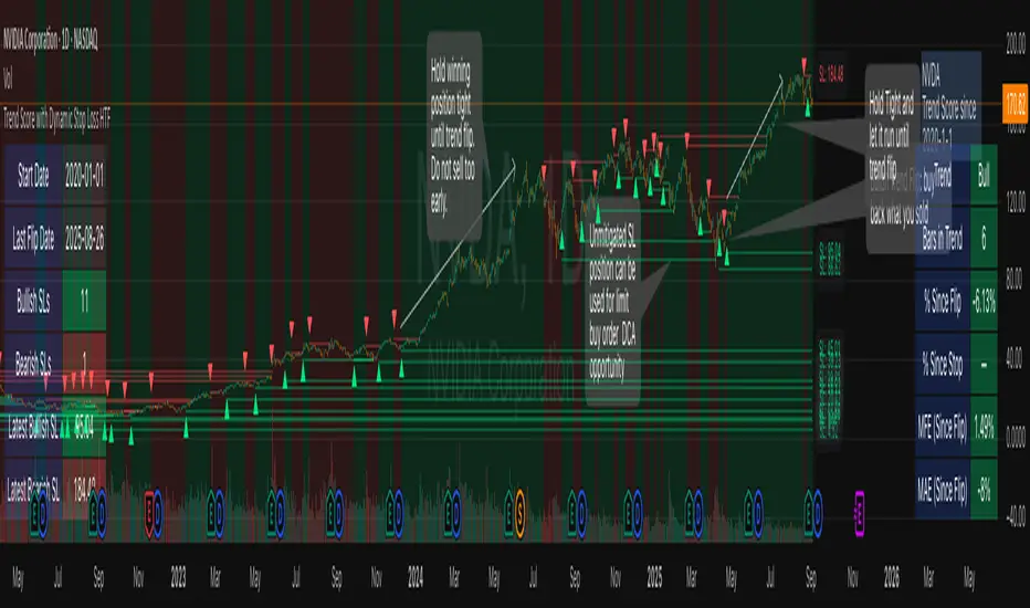
Highs & Lows - Multi TimeFrame### **📌 HL-MWD (Highs & Lows - Multi Timeframe Indicator) – Community Release**
#### **🔹 Overview**
The **HL-MWD Indicator** is a **multi-timeframe support & resistance tool** that plots **historical highs and lows** from **daily, weekly, and monthly timeframes** onto an intraday chart. It helps traders **identify key levels of support and resistance** that have influenced price action over different timeframes.
This indicator is useful for **day traders, swing traders, and position traders** who rely on **multi-timeframe analysis** to spot critical price levels.
---
### **🔥 Key Features**
✅ **Plots Highs & Lows for Daily, Weekly, and Monthly Timeframes**
✅ **Customizable Lookback Periods for Each Timeframe**
✅ **Adjustable Line Colors, Styles (Solid, Dotted, Dashed), and Widths**
✅ **Extend Lines into the Future to Identify Key Price Levels**
✅ **Option to Display Price Labels for Each Level**
✅ **Gradient Option to Highlight Recent Highs & Lows (Disabled by Default)**
✅ **Compatible with Intraday, Daily, and Weekly Charts**
---
### **📈 How It Works**
- **Daily Highs & Lows:** Captures the **highest and lowest prices** within the selected lookback period (default: **14 bars**).
- **Weekly Highs & Lows:** Marks the **highest and lowest prices** within the chosen weekly lookback (default: **52 bars**).
- **Monthly Highs & Lows:** Displays the **high and low points** from the monthly timeframe (default: **36 bars**).
- **Extended Lines:** Project past highs and lows **into the future** to help identify **potential support & resistance zones**.
---
### **⚠️ TradingView Lookback Limitations**
🔹 **TradingView has a limit on how many historical bars can be accessed per timeframe**, which affects how far back the indicator can retrieve data.
🔹 **Intraday charts (e.g., 5m, 15m) have a limited number of past bars**, meaning:
- **You won’t be able to view 36 months' worth of monthly levels** on a **5-minute chart**, because TradingView doesn’t store that much data in lower timeframes.
- **If multiple timeframes (e.g., weekly + monthly) are enabled at the same time**, some historical data may **not be available on shorter timeframes**.
🔹 **Recommendation:**
- If using **monthly lookbacks (36 months+), view them on a daily or higher timeframe**.
- If using **weekly lookbacks (52 weeks+), higher intraday timeframes (e.g., 1-hour, 4-hour) are better suited**.
- **Lower timeframes (1m, 5m, 15m) may miss some levels** if TradingView's bar limit is exceeded.
---
### **⚙️ Customization Options**
| **Setting** | **Default Value** | **Description** |
|------------------|----------------|----------------|
| **Daily Lookback** | `14` | Number of bars used to calculate daily highs/lows. |
| **Weekly Lookback** | `52` | Number of bars used to calculate weekly highs/lows. |
| **Monthly Lookback** | `36` | Number of bars used to calculate monthly highs/lows. |
| **Line Colors** | Daily: `Blue` Weekly: `Green` Monthly: `Red` | Customizable colors for each timeframe. |
| **Line Style** | `Solid` | Options: Solid, Dashed, Dotted. |
| **Line Width** | `1` | Thickness of the plotted lines. |
| **Extend Line** | `1` | Controls how far the highs/lows extend into the future. |
| **Display Price Labels** | `Enabled` | Shows price labels on each level. |
---
### **🛠️ How to Use It**
- **Enable/disable different timeframes** based on your strategy.
- **Customize colors, line styles, and widths** to match your charting style.
- **Use extended lines to identify support & resistance zones.**
- **Watch price reactions at these levels** for potential entries, exits, and stop-loss placements.
---
### **🚀 Final Thoughts**
The **HL-MWD Indicator** is a **powerful multi-timeframe tool** that helps traders **visualize key support & resistance levels** from higher timeframes on an intraday chart.
⚠️ **However, TradingView’s lookback limits apply—so for longer-term levels, higher timeframes are recommended.**
📌 **Now published for the community!** Let me know if you need any last-minute tweaks! 🔥
TrendPredator PROThe TrendPredator PRO
Stacey Burke, a seasoned trader and mentor, developed his trading system over the years, drawing insights from influential figures such as George Douglas Taylor, Tony Crabel, Steve Mauro, and Robert Schabacker. His popular system integrates select concepts from these experts into a consistent framework. While powerful, it remains highly discretionary, requiring significant real-time analysis, which can be challenging for novice traders.
The TrendPredator indicators support this approach by automating the essential analysis required to trade the system effectively and incorporating mechanical bias and a multi-timeframe concept. They provide value to traders by significantly reducing the time needed for session preparation, offering all relevant chart analysis and signals for live trading in real-time.
The PRO version offers an advanced pattern identification logic that highlights developing context as well as setups related to the constellation of the signals provided. It provides real-time interpretation of the multi-timeframe analysis table, following an extensive underlying logic with more than 150 different setup variations specifically developed for the system and indicator. These setups are constantly back- and forward-tested and updated according to the results. This version is tailored to traders primarily trading this system and following the related setups in detail.
The former TrendPredator ES version does not provide that option. It is significantly leaner and is designed for traders who want to use the multi-timeframe logic as additional confluence for their trading style. It is very well suited to support many other trading styles, including SMC and ICT.
The Multi-timeframe Master Pattern
Inspired by Taylor’s 3-day cycle and Steve Mauro’s work with “Beat the Market Maker,” Burke’s system views markets as cyclical, driven by the manipulative patterns of market makers. These patterns often trap traders at the extremes of moves above or below significant levels with peak formations, then reverse to utilize their liquidity, initiating the next phase. Breakouts away from these traps often lead to range expansions, as described by Tony Crabel and Robert Schabacker. After multiple consecutive breakouts, especially after the psychological number three, overextension might develop. A break in structure may then lead to reversals or pullbacks. The TrendPredator Indicator and the related multi-timeframe trading system are designed to track these cycles on the daily timeframe and provide signals and trade setups to navigate them.
Bias Logic and Multi-Timeframe Concept
The indicator covers the basic signals of Stacey Burke's system:
- First Red Day (FRD): Bearish break in structure, signalling weak longs in the market.
- First Green Day (FGD): Bullish break in structure signalling weak shorts in the markt.
- Three Days of Longs (3DL): Overextension signalling potential weak longs in the market.
- Three Days of Shorts (3DS): Overextension signalling potential weak shorts in the market.
- Inside Day (ID): Contraction, signalling potential impulsive reversal or range expansion move.
It enhances the original system by introducing:
Structured Bias Logic:
Tracks bias by following how price trades concerning the last previous candle high or low that was hit. For example if the high was hit, we are bullish above and bearish below.
- Bullish state: Breakout (BO), Fakeout Low (FOL)
- Bearish state: Breakdown (BD), Fakeout High (FOH)
Multi-Timeframe Perspective:
- Tracks all signals across H4, H8, D, W, and M timeframes, to look for alignment and follow trends and momentum in a mechanical way.
Developing Context:
- Identifies specific predefined context states based on the monthly, weekly and daily bias.
Developing Setups:
- Identifies specific predefined setups based on context and H8 bias as well as SB signals.
The indicator monitors the bias and signals of the system across all relevant timeframes and automates the related graphical chart analysis as well as context and setup zone identification. In addition to the master pattern, the system helps to identify the higher timeframe situation and follow the moves driven by other timeframe traders to then identify favourable context and setup situations for the trader.
Example: Full Bullish Cycle on the Daily Timeframe with Multi-Timeframe Signals
- The Trap/Peak Formation
The market breaks down from a previous day’s and maybe week’s low—potentially after multiple breakdowns—but fails to move lower and pulls back up to form a peak formation low and closes as a first green day.
MTF Signals: Bullish daily and weekly fakeout low; three consecutive breakdown days (1W Curr FOL, 1D Curr FOL, BO 3S).
Context: Reversal (REV)
Setup: Fakeout low continuation low of day (FOL Cont LOD)
- Pullback and Consolidation
The next day pulls further up after first green day signal, potentially consolidates inside the previous day’s range.
MTF Signals: Fakeout low and first green day closing as an inside day (1D Curr IS, Prev FOL, First G).
Context: Reversal continuation (REV Cont)
Setup: Previous fakeout low continuation low handing fruit (Prev FOL Cont LHF)
- Range Expansion/Trend
The following day breaks up through the previous day’s high, launching a range expansion away from the trap.
MTF Signals: Bullish daily breakout of an inside day (1D Curr BO, Prev IS).
Context: Uptrend healthy (UT)
Setup: Breakout continuation low hanging fruit (BO Cont LHF)
- Overextension
After multiple consecutive breakouts, the market reaches a state of overextension, signalling a possible reversal or pullback.
MTF Signals: Three days of breakout longs (1D Curr BO, Prev BO, BO 3L).
Context: Uptrend extended (UT)
- Reversal
After a breakout of previous days high that fails, price pulls away from the high showing a rollover of momentum across all timeframes and a potential short setup.
MTF Signals: Three days of breakout longs, daily fakeout high (1D 3L, FOH)
Context: Reversal countertrend (REV)
Setup: Fakeout high continuation high of day (FOH Cont HOD)
Note: This is only one possible illustrative scenario; there are many variations and combinations.
Example Chart: Full Bullish Cycle with Correlated Signals
Multi-Timeframe Signals examples:
Context and Setups examples:
Note: The signals shown along the move are manually added illustrations. The indicator shows these in realtime in the table at top and bottom right. This is only one possible scenario; there are many variations and combinations.
Due to the fractal nature of markets, this cycle can be observed across all timeframes. The strongest setups occur when there is multi-timeframe alignment. For example, a peak formation and potential reversal on the daily timeframe have higher probability and follow-through when they align with bearish signals on higher timeframes (e.g., weekly/monthly BD/FOH) and confirmation on lower timeframes (H4/H8 FOH/BD). With this perspective, the system enables the trader to follow the trend and momentum while identifying rollover points in a highly differentiated and precise way.
Using the Indicator for Trading
The automated analysis provided by the indicator can be used for thesis generation in preparation for a session as well as for live trading, leveraging the real-time updates as well as the context and setup indicated or alerted. It is recommended to customize the settings deeply, such as hiding the lower timeframes for thesis generation or the specific alert time window and settings to the specific trading schedule and playbook of the trader.
1. Context Assessment:
Evaluate alignment of higher timeframes (e.g., Month/Week, Week/Day). More alignment → Stronger setups.
- The context table offers an interpretation of the higher timeframe automatically. See below for further details.
2. Setup Identification:
Follow the bias of daily and H8 timeframes. A setup mostly requires alignment of these.
Setup Types:
- Trend Trade: Trade in alignment with the previous day’s trend.
Example: Price above the previous day’s high → Focus on long setups (dBO, H8 FOL) until overextension or reversal signs appear (H8 BO 3L, First R).
- Reversal Trade: Identify reversal setups when lower timeframes show rollovers after higher timeframe weakness.
Example: Price below the previous day’s high → Look for reversal signals at the current high of day (H8 FOH, BO 3L, First R).
- The setup table shows potential setups for the specific price zone in the table automatically. See below for further details.
3. Entry Confirmation:
Confirm entries based on H8 and H4 alignment, candle closes and lower timeframe fakeouts.
- H8 and H4 should always align for a final confirmation, meaning the breach lines should be both in the back of a potential trade setup.
- M15/ 5 candle close can be seen as acceptance beyond a level or within the setup zone.
- M15/5 FOH/ FOL signals lower timeframe traps potentially indicating further confirmation.
Example Chart Reversal Trade:
Context: REV (yellow), Reversal counter trend, Month in FOL with bearish First R, Week in BO but bearishly overextended with BO 3L, Day in Fakeout high reversing bearishly.
Setup: FOH Cont HOD (red), Day in Fakeout high after BO 3L overextension, confirmed by H8 FOH high of day, First R as further confluence. Two star quality and countertrend.
Entry: H4 BD, M15 close below followed by M15 FOH.
Detailed Features and Options
1. Context and Setup table
The Context and Setup Table is the core feature of the TrendPredator PRO indicator. It delivers real-time interpretation of the multi-timeframe analysis based on an extensive underlying logic table with over 150 variations, specifically developed for this system and indicator. This logic is continuously updated and optimized to ensure accuracy and performance.
1.1. Developing Context
States for developing higher timeframe context are determined based on signals from the monthly, weekly, and daily timeframes.
- Green and Red indicate alignment and potentially interesting developing setups.
- Yellow signals a mixed or conflicting bias, suggesting caution when taking trades.
The specific states are:
- UT (yellow): Uptrend extended
- UT (green): Uptrend healthy
- REV (yellow): Reversal day counter trend
- REV (green): Reversal day mixed trend
- REV Cont (green): Reversal continuation mixed trend
- REV Cont (yellow): Reversal continuation counter trend
- REV into UT (green): Reversal day into uptrend
- REV Cont into UT (green): Reversal continuation into uptrend
- UT Pullback (yellow): Counter uptrend breakdown day
- Conflicting (yellow): Conflicting signals
- Consolidating (yellow): Consolidating sideways
- Inside (yellow): Trading inside after an inside week
- DT Pullback (yellow): Counter downtrend breakout day
- REV Cont into DT (red): Reversal continuation into downtrend
- REV into DT (red): Reversal day into downtrend
- REV Cont (yellow): Reversal continuation counter trend
- REV Cont (red): Reversal continuation mixed trend
- REV (red): Reversal day mixed trend
- REV (yellow): Reversal day countertrend
- DT (red): Downtrend healthy
- DT (yellow): Downtrend extended
Example: Uptrend
The Uptrend Context (UT, green) indicates a healthy uptrend with all timeframes aligning bullishly. In this case, the monthly is in a Fakeout Low (FOL) and currently inside the range, while the weekly and daily are both in Breakout (BO) states. This context is favorable for developing long setups in the direction of the trend.
Example: Uptrend pullback
The Uptrend Pullback Context (UT Pullback, yellow) indicates a Breakdown (BD) on the daily timeframe against a higher timeframe uptrend. In this case, the monthly is in a Fakeout Low (FOL) and currently inside its range, the weekly is in Breakout (BO) and also currently inside, while the daily is in Breakdown (BD). This context reflects a conflicting situation—potentially signaling either an early reversal back into the uptrend or, if the breakdown extends, the beginning of a possible trend change.
Example: Reversal into Uptrend
The Reversal into Uptrend Context (REV into UT, green) indicates a lower timeframe reversal aligning with a higher timeframe uptrend. In this case, the monthly is in Breakout (BO), the weekly is in Breakout (BO) and currently inside its range, while the daily is showing a bullish Fakeout Low (FOL) reversal. This context is potentially very favorable for long setups, as it signals a strong continuation of the uptrend supported across multiple timeframes.
Example: Reversal
The Bearish Reversal Context indicates a lower timeframe rollover within an ongoing higher timeframe uptrend. In this case, the monthly remains in Breakout (BO), the weekly has shifted into a Fakeout High (FOH) after three weeks of breakout longs, and the daily is already in Breakdown (BD). This context suggests a potentially favorable developing short setup, as early signs of weakness appear across timeframes.
1.2. Developing Setup
The states for specific setups are based on the context and the signals from the daily timeframe and H8, indicating that price is in the zone of alignment. The setup description refers to the state of the daily timeframe, while the suffix relates to the H8 timeframe. For example, "prev FOH Cont LHF" means that the previous day is in FOH (Fakeout High) relative to yesterday's breakout level, currently trading inside, and we are in an H8 breakdown, indicating a potential LHF (Lower High Formation) short trade if the entry confirms. The suffix HOD means that H8 is in FOH or BO (Breakout).
The specific states are:
- REV HOD (red): Reversal high of day
- REV Cont LHF (red): Reversal continuation low hanging fruit
- BO Cont LHF (green): Breakout continuation low hanging fruit
- BO Cont LOD (green): Breakout continuation low of day
- FOH Cont HOD (red): Fakeout high continuation high of day
- FOH Cont LHF ((red): Fakeout high continuation low hanging fruit
- prev BD Cont HOD (red): Previous breakdown continuation high of day
- prev BD Cont LHF (red): Previous breakdown continuation low hanging fruit
- prev FOH Cont HOD (red): Previous fakeout high continuation high of day
- prev FOH Cont LHF (red): Previous fakeout high continuation low hanging fruit
- prev FOL Cont LOD (green): Previous fakeout low continuation low of day
- prev FOL Cont LHF (green): Previous fakeout low continuation low hanging fruit
- prev BO Cont LOD (green): Previous breakout continuation low of day
- prev BO Cont LHF (green): Previous breakout continuation low hanging fruit
- FOL Cont LHF (green): Fakeout low continuation low hanging fruit
- FOL Cont LOD (green): Fakeout low continuation low of day
- BD Cont LHF (red): BD continuation low hanging fruit
- BD Cont LOD (red): Breakdown continuation low of day
- REV Cont LHF (green): Reversal continuation low hanging fruit
- REV LOD (green): Reversal low of day
- Inside: Trading inside after an inside day
Type: Indicates the situation of the indicated setup concerning:
- Trend: Following higher timeframe trend
- Mixed: Mixed higher timeframe signals
- Counter: Against higher timeframe bias
Quality: Indicates the quality of the indicated setup according to the specified logic table
No star: Very low quality
* One star: Low quality
** Two star: Medium quality
*** Three star: High quality
Example: Breakout Continuation Trend Setup
This setup highlights a healthy uptrend where the month is in a breakout, the week is in a fakeout low, and the day is in a breakout after a first green day. As the H8 breaks out to the upside, a long setup zone is triggered, presenting a breakout continuation low-hanging fruit trade. This is a trend trade in an overextended situation on the H8, with an H8 3L, resulting in an overall quality rating of one star.
Example: Fakeout Low Continuation Trend Setup
This setup shows a reversal into uptrend, with the month in a breakout, the week in a breakout, and the day in a fakeout low after breaking down the previous day and now reversing back up. As H8 breaks out to the upside, a long setup zone is triggered, presenting a previous fakeout low continuation, low-hanging fruit trade. This is a medium-quality trend trade.
Example: Reversal Setup - Mixed Trend
This setup shows a reversal setup in line with the weekly trend, with the month in a fakeout low, the week in a fakeout high, and the day in a fakeout high after breaking out earlier in the day and now reversing back down. As H8 loses the previous breakout level after 3 breakouts (with H8 3L), a short setup zone is triggered, presenting a fakeout high continuation at the high of the day. This is a high-quality trade in a mixed trend situation.
Setup Alerts:
Alerts can be activated for setups freshly triggered on the chart within your trading window.
Detailed filter logic for setup alerts:
- Setup quality: 1-3 star
- Setup type: Counter, Mixed and Trend
- Setup category: e.g. Reversal Bearish, Breakout, Previous Fakeout High
- 1D BO and First signals: 3DS, 3DL, FRD, FGD, ID
Options:
- Alerts on/ off
- Alert time window (from/ to)
- Alert filter customization
Note: To activate alerts from a script in TradingView, some settings need to be adjusted. Open the "Create Alert" dialog and select the option "Any alert() function call" in the "Condition" section. Choose "TrendPredator PRO" to ensure that alerts trigger properly from the code. Alerts can be activated for entire watchlists or individual pairs. Once activated, the alerts run in the background and notify the user whenever a setup is freshly triggered according to the filter settings.
2. Multi-Timeframe Table
Provides a real-time view of system signals, including:
Current Timeframe (Curr): Bias states.
- Breakout (green BO): Bullish after breaking above the previous high.
- Fakeout High (red FOH): Bearish after breaking above the previous high but pulling back down.
- Breakdown (red BD): Bearish after breaking below the previous low.
- Fakeout Low (green FOL): Bullish after breaking below the previous low but pulling back up.
- Inside (IS): Price trading neutral inside the previous range, taking the previous bias (color indicates the previous bias).
Previous Timeframe (Prev): Tracks last candle bias state and transitions dynamically.
- Bias for last candle: BO, FOH, BD, FOL in respective colors.
- Inside bar (yellow IS): Indicated as standalone signal.
Note: Also previous timeframes get constantly updated in real time to track the bias state in relation to the level that was hit. This means a BO can still lose the level and become a FOH, and vice versa, and a BD can still become a FOL, and vice versa. This is critical to see for example if traders that are trapped in that timeframe with a FOH or FOL are released. An inside bar stays fixed, though, since no level was hit in that timeframe.
Breakouts (BO): Breakout count 3 longs and 3 shorts.
- 3 Longs (red 3L): Bearish after three breakouts without hitting a previous low.
- 3 Shorts (green 3S): Bullish after three breakdowns without hitting a previous high.
First Countertrend Close (First): Tracks First Red or Green Day.
- First Green (G): After two consecutive red closes.
- First Red (R): After two consecutive green closes.
Options: Customizable font size and label colors.
3. Historic Highs and Lows
Displays historic highs and lows per timeframe for added context, enabling users to track sequences over time.
Timeframes: H4, H8, D, W, M
Options: Customize for timeframes shown, number of historic candles per timeframe, colors, formats, and labels.
4. Previous High and Low Extensions
Displays extended previous levels (high, low, and close) for each timeframe to assess how price trades relative to these levels.
H4: P4H, P4L, P4C
H8: P8H, P8L, P8C
Daily: PDH, PDL, PDC
Weekly: PWH, PWL, PWC
Monthly: PMH, PML, PMC
Options: Fully customizable for timeframes shown, colors, formats, and labels.
5. Breach Lines
Tracks live market reactions (e.g., breakouts or fakeouts) per timeframe for the last previous high or low that was hit, highlighting these levels originating at the breached candle to indicate bias (color-coded).
Red: Bearish below
Green: Bullish above
H4: 4FOL, 4FOH, 4BO, 4BD
H8: 8FOL, 8FOH, 8BO, 8BD
D: dFOL, dFOH, dBO, dBD
W: wFOL, wFOH, wBO, wBD
M: mFOL, mFOH, mBO, mBD
Options: Fully customizable for timeframes shown, colors, formats, and labels.
Overall Options:
Toggle single feature groups on/off.
Customize H8 open/close time as an offset to UTC to be provider independent.
Colour settings con be adjusted for dark or bright backgrounds.
Higher Timeframe Use Case Examples
Example Use Case: Weekly Template Analysis
The Weekly Template is a core concept in Stacey Burke’s trading style. The analysis is conducted on the daily timeframe, focusing on the higher timeframe bias and identifying overextended conditions within the week—such as multiple breakouts and peak formations signaling potential reversals.
In this example, the candles are colored by the TrendPredator FO indicator, which highlights the state of individual candles. This allows for precise evaluation of both the trend state and the developing weekly template. It is a valuable tool for thesis generation before a trading session and for backtesting purposes.
Example Use Case: High Timeframe 5-Star Setup Analysis (Stacey Burke "ain't coming back" ACB Template)
This analysis identifies high-probability trade opportunities when daily breakout or breakdown closes occur near key monthly levels mid-week, signaling overextensions and potentially large parabolic moves. The key signal to look for is a breakout or breakdown close on a Wednesday. This is useful for thesis generation before a session and also for backtesting.
In this example, the TrendPredator FO indicator colors the candles to highlight individual candle states, particularly those that close in breakout or breakdown. Additionally, an indicator is shown on the chart shading every Wednesday, making it easier to visually identify the signals.
5 Star Alerts:
Alerts can be activated for this potential 5-Star setup constellation. The alert is triggered when there is a breakout or breakdown close on a Wednesday.
Further recommendations:
- Higher timeframe context: TPO or volume profile indicators can be used to gain an even better overview.
- Late session trading: Entries later in the session, such as during the 3rd hour of the NY session, offer better analysis and follow-through on setups.
- Entry confirmation: Momentum indicators like VWAP, Supertrend, or EMA are helpful for increasing precision. Additionally, tracking lower timeframe fakeouts can provide powerful confluence. To track those the TrendPredator Fakeout Highlighter (FO), that has been specifically developed for this can be of great help:
Limitations:
Data availability using TradingView has its limitations. The indicator leverages only the real-time data available for the specific timeframe being used. This means it cannot access data from timeframes lower than the one displayed on the chart. For example, if you are on a daily chart, it cannot use H8 data. Additionally, on very low timeframes, the historical availability of data might be limited, making higher timeframe signals unreliable.
To address this, the indicator automatically hides the affected columns in these specific situations, preventing false signals.
Disclaimer
This indicator is for educational purposes only and does not guarantee profits.
None of the information provided shall be considered financial advice.
The indicator does not provide final buy or sell signals but highlights zones for potential setups.
Users are fully responsible for their trading decisions and outcomes.
Multiple Naked LevelsPURPOSE OF THE INDICATOR
This indicator autogenerates and displays naked levels and gaps of multiple types collected into one simple and easy to use indicator.
VALUE PROPOSITION OF THE INDICATOR AND HOW IT IS ORIGINAL AND USEFUL
1) CONVENIENCE : The purpose of this indicator is to offer traders with one coherent and robust indicator providing useful, valuable, and often used levels - in one place.
2) CLUSTERS OF CONFLUENCES : With this indicator it is easy to identify levels and zones on the chart with multiple confluences increasing the likelihood of a potential reversal zone.
THE TYPES OF LEVELS AND GAPS INCLUDED IN THE INDICATOR
The types of levels include the following:
1) PIVOT levels (Daily/Weekly/Monthly) depicted in the chart as: dnPIV, wnPIV, mnPIV.
2) POC (Point of Control) levels (Daily/Weekly/Monthly) depicted in the chart as: dnPoC, wnPoC, mnPoC.
3) VAH/VAL STD 1 levels (Value Area High/Low with 1 std) (Daily/Weekly/Monthly) depicted in the chart as: dnVAH1/dnVAL1, wnVAH1/wnVAL1, mnVAH1/mnVAL1
4) VAH/VAL STD 2 levels (Value Area High/Low with 2 std) (Daily/Weekly/Monthly) depicted in the chart as: dnVAH2/dnVAL2, wnVAH2/wnVAL2, mnVAH1/mnVAL2
5) FAIR VALUE GAPS (Daily/Weekly/Monthly) depicted in the chart as: dnFVG, wnFVG, mnFVG.
6) CME GAPS (Daily) depicted in the chart as: dnCME.
7) EQUILIBRIUM levels (Daily/Weekly/Monthly) depicted in the chart as dnEQ, wnEQ, mnEQ.
HOW-TO ACTIVATE LEVEL TYPES AND TIMEFRAMES AND HOW-TO USE THE INDICATOR
You can simply choose which of the levels to be activated and displayed by clicking on the desired radio button in the settings menu.
You can locate the settings menu by clicking into the Object Tree window, left-click on the Multiple Naked Levels and select Settings.
You will then get a menu of different level types and timeframes. Click the checkboxes for the level types and timeframes that you want to display on the chart.
You can then go into the chart and check out which naked levels that have appeared. You can then use those levels as part of your technical analysis.
The levels displayed on the chart can serve as additional confluences or as part of your overall technical analysis and indicators.
In order to back-test the impact of the different naked levels you can also enable tapped levels to be depicted on the chart. Do this by toggling the 'Show tapped levels' checkbox.
Keep in mind however that Trading View can not shom more than 500 lines and text boxes so the indocator will not be able to give you the complete history back to the start for long duration assets.
In order to clean up the charts a little bit there are two additional settings that can be used in the Settings menu:
- Selecting the price range (%) from the current price to be included in the chart. The default is 25%. That means that all levels below or above 20% will not be displayed. You can set this level yourself from 0 up to 100%.
- Selecting the minimum gap size to include on the chart. The default is 1%. That means that all gaps/ranges below 1% in price difference will not be displayed on the chart. You can set the minimum gap size yourself.
BASIC DESCRIPTION OF THE INNER WORKINGS OF THE INDICTATOR
The way the indicator works is that it calculates and identifies all levels from the list of levels type and timeframes above. The indicator then adds this level to a list of untapped levels.
Then for each bar after, it checks if the level has been tapped. If the level has been tapped or a gap/range completely filled, this level is removed from the list so that the levels displayed in the end are only naked/untapped levels.
Below is a descrition of each of the level types and how it is caluclated (algorithm):
PIVOT
Daily, Weekly and Monthly levels in trading refer to significant price points that traders monitor within the context of a single trading day. These levels can provide insights into market behavior and help traders make informed decisions regarding entry and exit points.
Traders often use D/W/M levels to set entry and exit points for trades. For example, entering long positions near support (daily close) or selling near resistance (daily close).
Daily levels are used to set stop-loss orders. Placing stops just below the daily close for long positions or above the daily close for short positions can help manage risk.
The relationship between price movement and daily levels provides insights into market sentiment. For instance, if the price fails to break above the daily high, it may signify bearish sentiment, while a strong breakout can indicate bullish sentiment.
The way these levels are calculated in this indicator is based on finding pivots in the chart on D/W/M timeframe. The level is then set to previous D/W/M close = current D/W/M open.
In addition, when price is going up previous D/W/M open must be smaller than previous D/W/M close and current D/W/M close must be smaller than the current D/W/M open. When price is going down the opposite.
POINT OF CONTROL
The Point of Control (POC) is a key concept in volume profile analysis, which is commonly used in trading.
It represents the price level at which the highest volume of trading occurred during a specific period.
The POC is derived from the volume traded at various price levels over a defined time frame. In this indicator the timeframes are Daily, Weekly, and Montly.
It identifies the price level where the most trades took place, indicating strong interest and activity from traders at that price.
The POC often acts as a significant support or resistance level. If the price approaches the POC from above, it may act as a support level, while if approached from below, it can serve as a resistance level. Traders monitor the POC to gauge potential reversals or breakouts.
The way the POC is calculated in this indicator is by an approximation by analysing intrabars for the respective timeperiod (D/W/M), assigning the volume for each intrabar into the price-bins that the intrabar covers and finally identifying the bin with the highest aggregated volume.
The POC is the price in the middle of this bin.
The indicator uses a sample space for intrabars on the Daily timeframe of 15 minutes, 35 minutes for the Weekly timeframe, and 140 minutes for the Monthly timeframe.
The indicator has predefined the size of the bins to 0.2% of the price at the range low. That implies that the precision of the calulated POC og VAH/VAL is within 0.2%.
This reduction of precision is a tradeoff for performance and speed of the indicator.
This also implies that the bigger the difference from range high prices to range low prices the more bins the algorithm will iterate over. This is typically the case when calculating the monthly volume profile levels and especially high volatility assets such as alt coins.
Sometimes the number of iterations becomes too big for Trading View to handle. In these cases the bin size will be increased even more to reduce the number of iterations.
In such cases the bin size might increase by a factor of 2-3 decreasing the accuracy of the Volume Profile levels.
Anyway, since these Volume Profile levels are approximations and since precision is traded for performance the user should consider the Volume profile levels(POC, VAH, VAL) as zones rather than pin point accurate levels.
VALUE AREA HIGH/LOW STD1/STD2
The Value Area High (VAH) and Value Area Low (VAL) are important concepts in volume profile analysis, helping traders understand price levels where the majority of trading activity occurs for a given period.
The Value Area High/Low is the upper/lower boundary of the value area, representing the highest price level at which a certain percentage of the total trading volume occurred within a specified period.
The VAH/VAL indicates the price point above/below which the majority of trading activity is considered less valuable. It can serve as a potential resistance/support level, as prices above/below this level may experience selling/buying pressure from traders who view the price as overvalued/undervalued
In this indicator the timeframes are Daily, Weekly, and Monthly. This indicator provides two boundaries that can be selected in the menu.
The first boundary is 70% of the total volume (=1 standard deviation from mean). The second boundary is 95% of the total volume (=2 standard deviation from mean).
The way VAH/VAL is calculated is based on the same algorithm as for the POC.
However instead of identifying the bin with the highest volume, we start from range low and sum up the volume for each bin until the aggregated volume = 30%/70% for VAL1/VAH1 and aggregated volume = 5%/95% for VAL2/VAH2.
Then we simply set the VAL/VAH equal to the low of the respective bin.
FAIR VALUE GAPS
Fair Value Gaps (FVG) is a concept primarily used in technical analysis and price action trading, particularly within the context of futures and forex markets. They refer to areas on a price chart where there is a noticeable lack of trading activity, often highlighted by a significant price movement away from a previous level without trading occurring in between.
FVGs represent price levels where the market has moved significantly without any meaningful trading occurring. This can be seen as a "gap" on the price chart, where the price jumps from one level to another, often due to a rapid market reaction to news, events, or other factors.
These gaps typically appear when prices rise or fall quickly, creating a space on the chart where no transactions have taken place. For example, if a stock opens sharply higher and there are no trades at the prices in between the two levels, it creates a gap. The areas within these gaps can be areas of liquidity that the market may return to “fill” later on.
FVGs highlight inefficiencies in pricing and can indicate areas where the market may correct itself. When the market moves rapidly, it may leave behind price levels that traders eventually revisit to establish fair value.
Traders often watch for these gaps as potential reversal or continuation points. Many traders believe that price will eventually “fill” the gap, meaning it will return to those price levels, providing potential entry or exit points.
This indicator calculate FVGs on three different timeframes, Daily, Weekly and Montly.
In this indicator the FVGs are identified by looking for a three-candle pattern on a chart, signalling a discrete imbalance in order volume that prompts a quick price adjustment. These gaps reflect moments where the market sentiment strongly leans towards buying or selling yet lacks the opposite orders to maintain price stability.
The indicator sets the gap to the difference from the high of the first bar to the low of the third bar when price is moving up or from the low of the first bar to the high of the third bar when price is moving down.
CME GAPS (BTC only)
CME gaps refer to price discrepancies that can occur in charts for futures contracts traded on the Chicago Mercantile Exchange (CME). These gaps typically arise from the fact that many futures markets, including those on the CME, operate nearly 24 hours a day but may have significant price movements during periods when the market is closed.
CME gaps occur when there is a difference between the closing price of a futures contract on one trading day and the opening price on the following trading day. This difference can create a "gap" on the price chart.
Opening Gaps: These usually happen when the market opens significantly higher or lower than the previous day's close, often influenced by news, economic data releases, or other market events occurring during non-trading hours.
Gaps can result from reactions to major announcements or developments, such as earnings reports, geopolitical events, or changes in economic indicators, leading to rapid price movements.
The importance of CME Gaps in Trading is the potential for Filling Gaps: Many traders believe that prices often "fill" gaps, meaning that prices may return to the gap area to establish fair value.
This can create potential trading opportunities based on the expectation of gap filling. Gaps can act as significant support or resistance levels. Traders monitor these levels to identify potential reversal points in price action.
The way the gap is identified in this indicator is by checking if current open is higher than previous bar close when price is moving up or if current open is lower than previous day close when price is moving down.
EQUILIBRIUM
Equilibrium in finance and trading refers to a state where supply and demand in a market balance each other, resulting in stable prices. It is a key concept in various economic and trading contexts. Here’s a concise description:
Market Equilibrium occurs when the quantity of a good or service supplied equals the quantity demanded at a specific price level. At this point, there is no inherent pressure for the price to change, as buyers and sellers are in agreement.
Equilibrium Price is the price at which the market is in equilibrium. It reflects the point where the supply curve intersects the demand curve on a graph. At the equilibrium price, the market clears, meaning there are no surplus goods or shortages.
In this indicator the equilibrium level is calculated simply by finding the midpoint of the Daily, Weekly, and Montly candles respectively.
NOTES
1) Performance. The algorithms are quite resource intensive and the time it takes the indicator to calculate all the levels could be 5 seconds or more, depending on the number of bars in the chart and especially if Montly Volume Profile levels are selected (POC, VAH or VAL).
2) Levels displayed vs the selected chart timeframe. On a timeframe smaller than the daily TF - both Daily, Weekly, and Monthly levels will be displayed. On a timeframe bigger than the daily TF but smaller than the weekly TF - the Weekly and Monthly levels will be display but not the Daily levels. On a timeframe bigger than the weekly TF but smaller than the monthly TF - only the Monthly levels will be displayed. Not Daily and Weekly.
CREDITS
The core algorithm for calculating the POC levels is based on the indicator "Naked Intrabar POC" developed by rumpypumpydumpy (https:www.tradingview.com/u/rumpypumpydumpy/).
The "Naked intrabar POC" indicator calculates the POC on the current chart timeframe.
This indicator (Multiple Naked Levels) adds two new features:
1) It calculates the POC on three specific timeframes, the Daily, Weekly, and Monthly timeframes - not only the current chart timeframe.
2) It adds functionaly by calculating the VAL and VAH of the volume profile on the Daily, Weekly, Monthly timeframes .

ICT Killzones & FVG// This source code is subject to the terms of the Mozilla Public License 2.0 at mozilla.org
// © Mutharasan12
//@version=5
indicator("ICT Killzones & FVG", "ICT Killzones & FVG", overlay = true, max_labels_count = 500, max_lines_count = 500, max_boxes_count = 500)
// ---------------------------------------- Constant Functions --------------------------------------------------
get_line_type(_style) =>
result = switch _style
'Solid' => line.style_solid
'Dotted' => line.style_dotted
'Dashed' => line.style_dashed
result
get_size(x) =>
result = switch x
'Auto' => size.auto
'Tiny' => size.tiny
'Small' => size.small
'Normal' => size.normal
'Large' => size.large
'Huge' => size.huge
get_table_pos(pos) =>
result = switch pos
"Bottom Center" => position.bottom_center
"Bottom Left" => position.bottom_left
"Bottom Right" => position.bottom_right
"Middle Center" => position.middle_center
"Middle Left" => position.middle_left
"Middle Right" => position.middle_right
"Top Center" => position.top_center
"Top Left" => position.top_left
"Top Right" => position.top_right
get_font_style(s) =>
result = switch s
'Monospace' => font.family_monospace
'Default' => font.family_default
// ---------------------------------------- Constant Functions --------------------------------------------------
// ---------------------------------------- Inputs --------------------------------------------------
gmt_tz = input.string('America/New_York', "Timezone", options = , tooltip = "Note GMT is not adjusted to reflect Daylight Saving Time changes", group = 'Time Zone')
DWM_profile = input.bool(true,"Show All Profile",inline="Show",group = 'Profile')
D_profile = input.bool(true,"Show Daily",inline = "Show",group = 'Profile')
hide_lines_DO = input.timeframe("60","Daily:",inline = "Hide",group = 'Hide Above')
W_profile = input.bool(true,"Weekly",inline="Show",group = 'Profile')
hide_lines_WO = input.timeframe("240","Weekly:",inline="Hide",group = 'Hide Above')
M_profile = input.bool(true,"Monthly",inline="Show",group = 'Profile')
hide_lines_MO = input.timeframe("1D","Monthly:",inline="Hide",group = 'Hide Above')
show_kz = input.bool(false, "Show Killzone Boxes", inline = "skz", group = 'Hide KillZone')
var g_SETTINGS = "Settings"
max_days = input.int(60, "Drawing Limit", 1, inline = 'dl', tooltip = "Only this many drawings will be kept on the chart, for each selected drawing type (killzone boxes, pivot lines, open lines, etc.)", group = g_SETTINGS)
tf_limit = input.timeframe("30", "Timeframe Limit", inline = 'dl', tooltip = "Drawings will not appear on timeframes greater than or equal to this", group = g_SETTINGS)
lbl_size = get_size(input.string('Tiny', "Label Size", inline = 'sc', options = , tooltip = "The size of all labels", group = g_SETTINGS))
font_style = get_font_style(input.string('Monospace', "Font Style", inline = 'sc', group = g_SETTINGS, options = ))
txt_color = input.color(#000000, "Text Color", inline = 'sc', tooltip = "The color of all label and table text", group = g_SETTINGS)
use_cutoff = input.bool(true, "Drawing Cutoff Time", inline = "CO", tooltip = "When enabled, all pivots and open price lines will stop extending at this time", group = g_SETTINGS)
cutoff = input.session("1700-1701", "", inline = "CO", group = g_SETTINGS)
var g_KZ = "Killzones"
show_kz_text = input.bool(false, "Display Text", inline = "KZ", group = g_KZ)
box_transparency = input.int(85, "Box Transparency", 0, 100, group = g_KZ)
text_transparency = input.int(50, "Text Transparency", 0, 100, group = g_KZ)
use_asia = input.bool(true, "", inline = "ASIA", group = g_KZ)
as_txt = input.string("ASIA", "", inline = "ASIA", group = g_KZ)
asia = input.session("2000-0000", "", inline = "ASIA", group = g_KZ)
as_color = input.color(#9598a1, "", inline = "ASIA", group = g_KZ)
use_london = input.bool(true, "", inline = "LONDON", group = g_KZ)
lo_txt = input.string("OPEN", "", inline = "LONDON", group = g_KZ)
london = input.session("0200-0500", "", inline = "LONDON", group = g_KZ)
lo_color = input.color(#9598a1, "", inline = "LONDON", group = g_KZ)
use_nyam = input.bool(true, "", inline = "NYAM", group = g_KZ)
na_txt = input.string("NYAM", "", inline = "NYAM", group = g_KZ)
nyam = input.session("0700-1000", "", inline = "NYAM", group = g_KZ)
na_color = input.color(#9598a1, "", inline = "NYAM", group = g_KZ)
use_nylu = input.bool(false, "", inline = "NYLU", group = g_KZ)
nl_txt = input.string("Lunch", "", inline = "NYLU", group = g_KZ)
nylu = input.session("1200-1300", "", inline = "NYLU", group = g_KZ)
nl_color = input.color(#9598a1, "", inline = "NYLU", group = g_KZ)
use_nypm = input.bool(false, "", inline = "NYPM", group = g_KZ)
np_txt = input.string("NYPM", "", inline = "NYPM", group = g_KZ)
nypm = input.session("1300-1600", "", inline = "NYPM", group = g_KZ)
np_color = input.color(#9598a1, "", inline = "NYPM", group = g_KZ)
use_loop = input.bool(true, "", inline = "LOOP", group = g_KZ)
op_txt = input.string("CBDR", "", inline = "LOOP", group = g_KZ)
loop = input.session("1400-2000", "", inline = "LOOP", group = g_KZ)
op_color = input.color(#9598a1, "", inline = "LOOP", group = g_KZ)
use_locl = input.bool(true, "", inline = "LOCL", group = g_KZ)
cl_txt = input.string("CLOSE", "", inline = "LOCL", group = g_KZ)
locl = input.session("1000-1200", "", inline = "LOCL", group = g_KZ)
cl_color = input.color(#9598a1, "", inline = "LOCL", group = g_KZ)
use_sb1 = input.bool(false, "", inline = "SB1", group = g_KZ)
m1_txt = input.string("London SB", "", inline = "SB1", group = g_KZ)
sb1 = input.session("0300-0400", "", inline = "SB1", group = g_KZ)
m1_color = input.color(#9598a1, "", inline = "SB1", group = g_KZ)
use_sb2 = input.bool(false, "", inline = "SB2", group = g_KZ)
m2_txt = input.string("NewYork AM SB", "", inline = "SB2", group = g_KZ)
sb2 = input.session("1000-1100", "", inline = "SB2", group = g_KZ)
m2_color = input.color(#9598a1, "", inline = "SB2", group = g_KZ)
use_sb3 = input.bool(false, "", inline = "SB3", group = g_KZ)
m3_txt = input.string("NewYork PM SB", "", inline = "SB3", group = g_KZ)
sb3 = input.session("1400-1500", "", inline = "SB3", group = g_KZ)
m3_color = input.color(#9598a1, "", inline = "SB3", group = g_KZ)
var g_LABELS = "Killzone Pivots"
use_alerts = input.bool(false, "Alert Broken Pivots", inline = "PV", group = g_LABELS)
show_pivots = input.bool(false, "Show Pivots", inline = "SV", group = g_LABELS)
show_labels = input.bool(false, "Pivots Labels", inline = "SV", group = g_LABELS)
show_midpoints = input.bool(false, "Pivots Midpoints",inline = "SV", group = g_LABELS)
ext_pivots = input.string("Until Mitigated", "Extend Pivots...", options = , group = g_LABELS)
ext_which = input.string("Most Recent", "...From Which Sessions", options = , group = g_LABELS)
ash_str = input.string("AS.H", "Killzone 01 Labels", inline = "L_AS", group = g_LABELS)
asl_str = input.string("AS.L", "", inline = "L_AS", group = g_LABELS)
loh_str = input.string("LO.H", "Killzone 02 Labels", inline = "L_LO", group = g_LABELS)
lol_str = input.string("LO.L", "", inline = "L_LO", group = g_LABELS)
nah_str = input.string("NYAM.H", "Killzone 03 Labels", inline = "L_NA", group = g_LABELS)
nal_str = input.string("NYAM.L", "", inline = "L_NA", group = g_LABELS)
nlh_str = input.string("NYL.H", "Killzone 04 Labels", inline = "L_NL", group = g_LABELS)
nll_str = input.string("NYL.L", "", inline = "L_NL", group = g_LABELS)
nph_str = input.string("NYPM.H", "Killzone 05 Labels", inline = "L_NP", group = g_LABELS)
npl_str = input.string("NYPM.L", "", inline = "L_NP", group = g_LABELS)
oph_str = input.string("LOOP.H", "Killzone 06 Labels", inline = "L_OP", group = g_LABELS)
opl_str = input.string("LOOP.L", "", inline = "L_OP", group = g_LABELS)
clh_str = input.string("LOCL.H", "Killzone 07 Labels", inline = "L_CL", group = g_LABELS)
cll_str = input.string("LOCL.L", "", inline = "L_CL", group = g_LABELS)
m1h_str = input.string("SB1.H", "Killzone 08 Labels", inline = "L_M1", group = g_LABELS)
m1l_str = input.string("SB1.L", "", inline = "L_M1", group = g_LABELS)
m2h_str = input.string("SB2.H", "Killzone 09 Labels", inline = "L_M2", group = g_LABELS)
m2l_str = input.string("SB2.L", "", inline = "L_M2", group = g_LABELS)
m3h_str = input.string("SB3.H", "Killzone 10 Labels", inline = "L_M3", group = g_LABELS)
m3l_str = input.string("SB3.L", "", inline = "L_M3", group = g_LABELS)
kzp_style = get_line_type(input.string(defval = 'Solid', title = "Pivot Style", options = , inline = "KZP", group = g_LABELS))
kzp_width = input.int(1, "", inline = "KZP", group = g_LABELS)
kzm_style = get_line_type(input.string(defval = 'Dotted', title = "Midpoint Style", options = , inline = "KZM", group = g_LABELS))
kzm_width = input.int(1, "", inline = "KZM", group = g_LABELS)
var g_RNG = "Killzone Range"
show_range = input.bool(false, "Show Killzone Range", tooltip = "Show the most recent ranges of each selected killzone, from high to low", group = g_RNG)
show_range_avg = input.bool(true, "Show Average", tooltip = "Show the average range of each selected killzone", group = g_RNG)
range_avg = input.int(5, "Average Length", 0, tooltip = "This many previous sessions will be used to calculate the average. If there isn't enough data on the current chart, it will use as many sessions as possible", group = g_RNG)
range_pos = get_table_pos(input.string('Top Right', "Table Position", options = , group = g_RNG))
range_size = get_size(input.string('Normal', "Table Size", options = , group = g_RNG))
var g_DWM = "Day - Week - Month"
dow_labels = input.bool(false, "Day of Week Labels", inline = "DOW", group = g_DWM)
dow_yloc = input.string('Bottom', "", options = , inline = "DOW", group = g_DWM)
dow_xloc = input.string('Midnight', "", options = , inline = "DOW", group = g_DWM)
sep_unlimited = input.bool(true, "Unlimited", tooltip = "Unlimited will show as many of the selected lines as possible. Otherwise, the session drawing limit will be used", group = g_DWM)
show_d_open = input.bool(true, "D Open", inline = "DO", group = g_DWM)
dhl = input.bool(true, "High/Low", inline = "DO", tooltip = "", group = g_DWM)
ds = input.bool(true, "Separators", inline = "DO", tooltip = "Mark where a new day begins", group = g_DWM)
d_color = input.color(color.blue, "", inline = "DO", group = g_DWM)
show_w_open = input.bool(true, "W Open", inline = "WO", group = g_DWM)
whl = input.bool(true, "High/Low", inline = "WO", tooltip = "", group = g_DWM)
ws = input.bool(true, "Separators", inline = "WO", tooltip = "Mark where a new week begins", group = g_DWM)
w_color = input.color(#089981, "", inline = "WO", group = g_DWM)
show_m_open = input.bool(true, "M Open", inline = "MO", group = g_DWM)
mhl = input.bool(true, "High/Low", inline = "MO", tooltip = "", group = g_DWM)
ms = input.bool(true, "Separators", inline = "MO", tooltip = "Mark where a new month begins", group = g_DWM)
m_color = input.color(color.red, "", inline = "MO", group = g_DWM)
htf_style = get_line_type(input.string(defval = 'Dotted', title = "Style", options = , inline = "D0", group = g_DWM))
htf_width = input.int(1, "", inline = "D0", group = g_DWM)
var g_OPEN = "Opening Prices"
open_unlimited = input.bool(true, "Unlimited", tooltip = "Unlimited will show as many of the selected lines as possible. Otherwise, the session drawing limit will be used", group = g_OPEN)
hide_hline = input.bool(true,"Show Opening Price",group = g_OPEN)
hide_lines_h = input.timeframe("60","Hide Above Time Frame",group = g_OPEN)
use_h1 = input.bool(true, "", inline = "H1", group = g_OPEN)
h1_text = input.string("00:00", "", inline = "H1", group = g_OPEN)
h1 = input.session("0000-0001", "", inline = "H1", group = g_OPEN)
h1_color = input.color(#000000, "", inline = "H1", group = g_OPEN)
use_h2 = input.bool(true, "", inline = "H2", group = g_OPEN)
h2_text = input.string("08:30", "", inline = "H2", group = g_OPEN)
h2 = input.session("0830-0831", "", inline = "H2", group = g_OPEN)
h2_color = input.color(#000000, "", inline = "H2", group = g_OPEN)
use_h3 = input.bool(false, "", inline = "H3", group = g_OPEN)
h3_text = input.string("10:00", "", inline = "H3", group = g_OPEN)
h3 = input.session("1000-1001", "", inline = "H3", group = g_OPEN)
h3_color = input.color(#000000, "", inline = "H3", group = g_OPEN)
use_h4 = input.bool(false, "", inline = "H4", group = g_OPEN)
h4_text = input.string("14:00", "", inline = "H4", group = g_OPEN)
h4 = input.session("1400-1401", "", inline = "H4", group = g_OPEN)
h4_color = input.color(#000000, "", inline = "H4", group = g_OPEN)
hz_style = get_line_type(input.string(defval = 'Dotted', title = "Style", options = , inline = "H0", group = g_OPEN))
hz_width = input.int(1, "", inline = "H0", group = g_OPEN)
var g_VERTICAL = "Timestamps"
hide_vline = input.bool(true,"Show Timestamp",group = g_VERTICAL)
hide_lines_v = input.timeframe("60","Hide Above Time Frame",group = g_VERTICAL)
use_v1 = input.bool(true, "", inline = "V1", group = g_VERTICAL)
v1 = input.session("0000-0001", "", inline = "V1", group = g_VERTICAL)
v1_color = input.color(#000000, "", inline = "V1", group = g_VERTICAL)
use_v2 = input.bool(false, "", inline = "V2", group = g_VERTICAL)
v2 = input.session("0800-0801", "", inline = "V2", group = g_VERTICAL)
v2_color = input.color(#000000, "", inline = "V2", group = g_VERTICAL)
use_v3 = input.bool(false, "", inline = "V3", group = g_VERTICAL)
v3 = input.session("1000-1001", "", inline = "V3", group = g_VERTICAL)
v3_color = input.color(#000000, "", inline = "V3", group = g_VERTICAL)
use_v4 = input.bool(false, "", inline = "V4", group = g_VERTICAL)
v4 = input.session("1200-1201", "", inline = "V4", group = g_VERTICAL)
v4_color = input.color(#000000, "", inline = "V4", group = g_VERTICAL)
vl_style = get_line_type(input.string(defval = 'Dotted', title = "Style", options = , inline = "V0", group = g_VERTICAL))
vl_width = input.int(1, "", inline = "V0", group = g_VERTICAL)
// ---------------------------------------- Inputs --------------------------------------------------
// ---------------------------------------- Variables & Constants --------------------------------------------------
type kz
string _title
box _box
line _hi_line
line _md_line
line _lo_line
label _hi_label
label _lo_label
bool _hi_valid
bool _md_valid
bool _lo_valid
float _range_store
float _range_current
type hz
line LN
label LB
bool CO
type dwm_hl
line hi_line
line lo_line
label hi_label
label lo_label
type dwm_info
string tf
float o = na
float h = na
float l = na
float ph = na
float pl = na
var as_kz = kz.new(as_txt, array.new_box(), array.new_line(), array.new_line(), array.new_line(), array.new_label(), array.new_label(), array.new_bool(), array.new_bool(), array.new_bool(), array.new_float())
var lo_kz = kz.new(lo_txt, array.new_box(), array.new_line(), array.new_line(), array.new_line(), array.new_label(), array.new_label(), array.new_bool(), array.new_bool(), array.new_bool(), array.new_float())
var na_kz = kz.new(na_txt, array.new_box(), array.new_line(), array.new_line(), array.new_line(), array.new_label(), array.new_label(), array.new_bool(), array.new_bool(), array.new_bool(), array.new_float())
var nl_kz = kz.new(nl_txt, array.new_box(), array.new_line(), array.new_line(), array.new_line(), array.new_label(), array.new_label(), array.new_bool(), array.new_bool(), array.new_bool(), array.new_float())
var np_kz = kz.new(np_txt, array.new_box(), array.new_line(), array.new_line(), array.new_line(), array.new_label(), array.new_label(), array.new_bool(), array.new_bool(), array.new_bool(), array.new_float())
var op_kz = kz.new(op_txt, array.new_box(), array.new_line(), array.new_line(), array.new_line(), array.new_label(), array.new_label(), array.new_bool(), array.new_bool(), array.new_bool(), array.new_float())
var cl_kz = kz.new(cl_txt, array.new_box(), array.new_line(), array.new_line(), array.new_line(), array.new_label(), array.new_label(), array.new_bool(), array.new_bool(), array.new_bool(), array.new_float())
var m1_kz = kz.new(m1_txt, array.new_box(), array.new_line(), array.new_line(), array.new_line(), array.new_label(), array.new_label(), array.new_bool(), array.new_bool(), array.new_bool(), array.new_float())
var m2_kz = kz.new(m2_txt, array.new_box(), array.new_line(), array.new_line(), array.new_line(), array.new_label(), array.new_label(), array.new_bool(), array.new_bool(), array.new_bool(), array.new_float())
var m3_kz = kz.new(m3_txt, array.new_box(), array.new_line(), array.new_line(), array.new_line(), array.new_label(), array.new_label(), array.new_bool(), array.new_bool(), array.new_bool(), array.new_float())
var hz_1 = hz.new(array.new_line(), array.new_label(), array.new_bool())
var hz_2 = hz.new(array.new_line(), array.new_label(), array.new_bool())
var hz_3 = hz.new(array.new_line(), array.new_label(), array.new_bool())
var hz_4 = hz.new(array.new_line(), array.new_label(), array.new_bool())
var d_hl = dwm_hl.new(array.new_line(), array.new_line(), array.new_label(), array.new_label())
var w_hl = dwm_hl.new(array.new_line(), array.new_line(), array.new_label(), array.new_label())
var m_hl = dwm_hl.new(array.new_line(), array.new_line(), array.new_label(), array.new_label())
var d_info = dwm_info.new("D")
var w_info = dwm_info.new("W")
var m_info = dwm_info.new("M")
t_as = not na(time("", asia, gmt_tz))
t_lo = not na(time("", london, gmt_tz))
t_na = not na(time("", nyam, gmt_tz))
t_nl = not na(time("", nylu, gmt_tz))
t_np = not na(time("", nypm, gmt_tz))
t_op = not na(time("", loop, gmt_tz))
t_cl = not na(time("", locl, gmt_tz))
t_m1 = not na(time("", sb1, gmt_tz))
t_m2 = not na(time("", sb2, gmt_tz))
t_m3 = not na(time("", sb3, gmt_tz))
t_co = not na(time("", cutoff, gmt_tz))
t_h1 = not na(time("", h1, gmt_tz))
t_h2 = not na(time("", h2, gmt_tz))
t_h3 = not na(time("", h3, gmt_tz))
t_h4 = not na(time("", h4, gmt_tz))
t_v1 = not na(time("", v1, gmt_tz))
t_v2 = not na(time("", v2, gmt_tz))
t_v3 = not na(time("", v3, gmt_tz))
t_v4 = not na(time("", v4, gmt_tz))
var d_sep_line = array.new_line()
var w_sep_line = array.new_line()
var m_sep_line = array.new_line()
var d_line = array.new_line()
var w_line = array.new_line()
var m_line = array.new_line()
var d_label = array.new_label()
var w_label = array.new_label()
var m_label = array.new_label()
var v1_line = array.new_line()
var v2_line = array.new_line()
var v3_line = array.new_line()
var v4_line = array.new_line()
var transparent = #ffffff00
var ext_current = ext_which == 'Most Recent'
var ext_past = ext_pivots == 'Past Mitigation'
update_dwm_info(dwm_info n) =>
if timeframe.change(n.tf)
n.ph := n.h
n.pl := n.l
n.o := open
n.h := high
n.l := low
else
n.h := math.max(high, n.h)
n.l := math.min(low, n.l)
if dhl or show_d_open
update_dwm_info(d_info)
if whl or show_w_open
update_dwm_info(w_info)
if mhl or show_m_open
update_dwm_info(m_info)
// ---------------------------------------- Variables & Constants --------------------------------------------------
// ---------------------------------------- Functions --------------------------------------------------
get_box_color(color c) =>
result = color.new(c, box_transparency)
get_text_color(color c) =>
result = color.new(c, text_transparency)
// ---------------------------------------- Functions --------------------------------------------------
// ---------------------------------------- Core Logic --------------------------------------------------
dwm_sep(string tf, bool use, line arr, color col) =>
if use
if timeframe.change(tf)
arr.unshift(line.new(bar_index, high*1.0001, bar_index, low, style = htf_style, width = htf_width, extend = extend.both, color = col))
if not sep_unlimited and arr.size() > max_days
arr.pop().delete()
dwm_open(string tf, bool use, line lns, label lbls, dwm_info n, color col) =>
if use
if timeframe.change(tf)
lns.unshift(line.new(time, n.o, time, n.o, xloc = xloc.bar_time, style = htf_style, width = htf_width, color = col))
lbls.unshift(label.new(time, n.o, tf + " OPEN", xloc = xloc.bar_time, style = label.style_label_left, color = transparent, textcolor = txt_color, size = lbl_size, text_font_family = font_style))
if not sep_unlimited and lns.size() > max_days
lns.pop().delete()
lbls.pop().delete()
else if lns.size() > 0
lns.get(0).set_x2(time)
lbls.get(0).set_x(time)
dwm_hl(string tf, bool use, dwm_hl hl, dwm_info n, color col) =>
if use
if timeframe.change(tf)
hl.hi_line.unshift(line.new(time, n.ph, time, n.ph, xloc = xloc.bar_time, style = htf_style, width = htf_width, color = col))
hl.lo_line.unshift(line.new(time, n.pl, time, n.pl, xloc = xloc.bar_time, style = htf_style, width = htf_width, color = col))
hl.hi_label.unshift(label.new(time, n.ph, "P"+tf+"H", xloc = xloc.bar_time, style = label.style_label_left, color = transparent, textcolor = txt_color, size = lbl_size, text_font_family = font_style))
hl.lo_label.unshift(label.new(time, n.pl, "P"+tf+"L", xloc = xloc.bar_time, style = label.style_label_left, color = transparent, textcolor = txt_color, size = lbl_size, text_font_family = font_style))
if not sep_unlimited and hl.hi_line.size() > max_days
hl.hi_line.pop().delete()
hl.lo_line.pop().delete()
hl.hi_label.pop().delete()
hl.lo_label.pop().delete()
else if hl.hi_line.size() > 0
hl.hi_line.get(0).set_x2(time)
hl.lo_line.get(0).set_x2(time)
hl.hi_label.get(0).set_x(time)
hl.lo_label.get(0).set_x(time)
dwm() =>
//if timeframe.in_seconds() <= hide_lines_sessions *60
if DWM_profile
if D_profile and timeframe.in_seconds("") <= timeframe.in_seconds(hide_lines_DO)
// Draw Daily separators, open lines, and high/low lines
dwm_sep("D", ds, d_sep_line, d_color)
dwm_open("D", show_d_open, d_line, d_label, d_info, d_color)
dwm_hl("D", dhl, d_hl, d_info, d_color)
// Draw Weekly and Monthly only if Daily profile allows it
if W_profile and timeframe.in_seconds("") <= timeframe.in_seconds(hide_lines_WO)
dwm_sep("W", ws, w_sep_line, w_color)
dwm_open("W", show_w_open, w_line, w_label, w_info, w_color)
dwm_hl("W", whl, w_hl, w_info, w_color)
if M_profile and timeframe.in_seconds("") <= timeframe.in_seconds(hide_lines_MO)
dwm_sep("M", ms, m_sep_line, m_color)
dwm_open("M", show_m_open, m_line, m_label, m_info, m_color)
dwm_hl("M", mhl, m_hl, m_info, m_color)
else if W_profile and timeframe.in_seconds("") <= timeframe.in_seconds(hide_lines_WO)
// Draw Weekly separators, open lines, and high/low lines
dwm_sep("W", ws, w_sep_line, w_color)
dwm_open("W", show_w_open, w_line, w_label, w_info, w_color)
dwm_hl("W", whl, w_hl, w_info, w_color)
// Draw Monthly only if Weekly profile allows it
if M_profile and timeframe.in_seconds("") <= timeframe.in_seconds(hide_lines_MO)
dwm_sep("M", ms, m_sep_line, m_color)
dwm_open("M", show_m_open, m_line, m_label, m_info, m_color)
dwm_hl("M", mhl, m_hl, m_info, m_color)
else if M_profile and timeframe.in_seconds("") <= timeframe.in_seconds(hide_lines_MO)
// Draw Monthly separators, open lines, and high/low lines
dwm_sep("M", ms, m_sep_line, m_color)
dwm_open("M", show_m_open, m_line, m_label, m_info, m_color)
dwm_hl("M", mhl, m_hl, m_info, m_color)
vline(bool use, bool t, line arr, color col) =>
if use
if t and not t
arr.unshift(line.new(bar_index, high*1.0001, bar_index, low, style = vl_style, width = vl_width, extend = extend.both, color = col))
vlines() =>
if hide_vline
if timeframe.in_seconds("") <= timeframe.in_seconds(hide_lines_v)
vline(use_v1, t_v1, v1_line, v1_color)
vline(use_v2, t_v2, v2_line, v2_color)
vline(use_v3, t_v3, v3_line, v3_color)
vline(use_v4, t_v4, v4_line, v4_color)
hz_line(bool use, bool t, hz hz, string txt, color col) =>
if use
if t and not t
hz.LN.unshift(line.new(bar_index, open, bar_index, open, style = hz_style, width = hz_width, color = col))
hz.LB.unshift(label.new(bar_index, open, txt, style = label.style_label_left, color = transparent, textcolor = txt_color, size = lbl_size, text_font_family = font_style))
array.unshift(hz.CO, false)
if not open_unlimited and hz.LN.size() > max_days
hz.LN.pop().delete()
hz.LB.pop().delete()
hz.CO.pop()
if not t and hz.CO.size() > 0
if not hz.CO.get(0)
hz.LN.get(0).set_x2(bar_index)
hz.LB.get(0).set_x(bar_index)
if (use_cutoff ? t_co : false)
hz.CO.set(0, true)
hz_lines() =>
if hide_hline
if timeframe.in_seconds("") <= timeframe.in_seconds(hide_lines_h)
hz_line(use_h1, t_h1, hz_1, h1_text, h1_color)
hz_line(use_h2, t_h2, hz_2, h2_text, h2_color)
hz_line(use_h3, t_h3, hz_3, h3_text, h3_color)
hz_line(use_h4, t_h4, hz_4, h4_text, h4_color)
del_kz(kz k) =>
if k._box.size() > max_days
k._box.pop().delete()
if k._hi_line.size() > max_days
k._hi_line.pop().delete()
k._lo_line.pop().delete()
k._hi_valid.pop()
k._lo_valid.pop()
if show_midpoints
k._md_line.pop().delete()
k._md_valid.pop()
if k._hi_label.size() > max_days
k._hi_label.pop().delete()
k._lo_label.pop().delete()
adjust_in_kz(kz kz, bool t) =>
if t
kz._box.get(0).set_right(time)
kz._box.get(0).set_top(math.max(kz._box.get(0).get_top(), high))
kz._box.get(0).set_bottom(math.min(kz._box.get(0).get_bottom(), low))
kz._range_current := kz._box.get(0).get_top() - kz._box.get(0).get_bottom()
if show_pivots and kz._hi_line.size() > 0
if high > kz._hi_line.get(0).get_y1()
kz._hi_line.get(0).set_xy1(time, high)
kz._hi_line.get(0).set_xy2(time, high)
if low < kz._lo_line.get(0).get_y1()
kz._lo_line.get(0).set_xy1(time, low)
kz._lo_line.get(0).set_xy2(time, low)
if show_midpoints
kz._md_line.get(0).set_xy1(time, math.avg(kz._hi_line.get(0).get_y2(), kz._lo_line.get(0).get_y2()))
kz._md_line.get(0).set_xy2(time, math.avg(kz._hi_line.get(0).get_y2(), kz._lo_line.get(0).get_y2()))
if show_labels and kz._hi_label.size() > 0
if high > kz._hi_label.get(0).get_y()
kz._hi_label.get(0).set_xy(time, high)
if low < kz._lo_label.get(0).get_y()
kz._lo_label.get(0).set_xy(time, low)
adjust_out_kz(kz kz, bool t) =>
if not t and kz._box.size() > 0
if t
array.unshift(kz._range_store, kz._range_current)
if kz._range_store.size() > range_avg
kz._range_store.pop()
if kz._box.size() > 0 and show_pivots
for i = 0 to kz._box.size() - 1
if not ext_current or (ext_current and i == 0)
if ext_past ? true : (kz._hi_valid.get(i) == true)
kz._hi_line.get(i).set_x2(time)
if high > kz._hi_line.get(i).get_y1() and kz._hi_valid.get(i) == true
if use_alerts and i == 0
alert("Broke "+kz._title+" High", alert.freq_once_per_bar)
kz._hi_valid.set(i, false)
else if (use_cutoff ? t_co : false)
kz._hi_valid.set(i, false)
if ext_past ? true : (kz._lo_valid.get(i) == true)
kz._lo_line.get(i).set_x2(time)
if low < kz._lo_line.get(i).get_y1() and kz._lo_valid.get(i) == true
if use_alerts and i == 0
alert("Broke "+kz._title+" Low", alert.freq_once_per_bar)
kz._lo_valid.set(i, false)
else if (use_cutoff ? t_co : false)
kz._lo_valid.set(i, false)
if show_midpoints
kz._md_line.get(i).set_x2(time)
else
break
manage_kz(kz kz, bool use, bool t, color c, string box_txt, string hi_txt, string lo_txt) =>
if timeframe.in_seconds("") <= timeframe.in_seconds(tf_limit) and use
if t and not t
_c = get_box_color(c)
_t = get_text_color(c)
kz._box.unshift(box.new(time, high, time, low, xloc = xloc.bar_time, border_color = show_kz ? _c : na, bgcolor = show_kz ? _c : na, text = (show_kz and show_kz_text) ? box_txt : na, text_color = _t))
if show_pivots
kz._hi_line.unshift(line.new(time, high, time, high, xloc = xloc.bar_time, style = kzp_style, color = c, width = kzp_width))
kz._lo_line.unshift(line.new(time, low, time, low, xloc = xloc.bar_time, style = kzp_style, color = c, width = kzp_width))
if show_midpoints
kz._md_line.unshift(line.new(time, math.avg(high, low), time, math.avg(high, low), xloc = xloc.bar_time, style = kzm_style, color = c, width = kzm_width))
array.unshift(kz._md_valid, true)
array.unshift(kz._hi_valid, true)
array.unshift(kz._lo_valid, true)
if show_labels
kz._hi_label.unshift(label.new(time, high, hi_txt, xloc = xloc.bar_time, color = transparent, textcolor = txt_color, style = label.style_label_down, size = lbl_size))
kz._lo_label.unshift(label.new(time, low, lo_txt, xloc = xloc.bar_time, color = transparent, textcolor = txt_color, style = label.style_label_up, size = lbl_size))
del_kz(kz)
adjust_in_kz(kz, t)
adjust_out_kz(kz, t)
manage_kz(as_kz, use_asia, t_as, as_color, as_txt, ash_str, asl_str)
manage_kz(lo_kz, use_london, t_lo, lo_color, lo_txt, loh_str, lol_str)
manage_kz(na_kz, use_nyam, t_na, na_color, na_txt, nah_str, nal_str)
manage_kz(nl_kz, use_nylu, t_nl, nl_color, nl_txt, nlh_str, nll_str)
manage_kz(np_kz, use_nypm, t_np, np_color, np_txt, nph_str, npl_str)
manage_kz(op_kz, use_loop, t_op, op_color, op_txt, oph_str, opl_str)
manage_kz(cl_kz, use_locl, t_cl, cl_color, cl_txt, clh_str, cll_str)
manage_kz(m1_kz, use_sb1, t_m1, m1_color, m1_txt, m1h_str, m1l_str)
manage_kz(m2_kz, use_sb2, t_m2, m2_color, m2_txt, m2h_str, m2l_str)
manage_kz(m3_kz, use_sb3, t_m3, m3_color, m3_txt, m3h_str, m3l_str)
dwm()
vlines()
hz_lines()
new_dow_time = dow_xloc == 'Midday' ? time - timeframe.in_seconds("D") / 2 * 1000 : time
new_day = dayofweek(new_dow_time, gmt_tz) != dayofweek(new_dow_time, gmt_tz)
var dow_top = dow_yloc == 'Top'
var sunday = "SUNDAY"
var monday = "MONDAY"
var tuesday = "TUESDAY"
var wednesday = "WEDNESDAY"
var thursday = "THURSDAY"
var friday = "FRIDAY"
plotchar(dow_labels and timeframe.isintraday and dayofweek(new_dow_time, gmt_tz) == 1 and new_day, location = dow_top ? location.top : location.bottom, char = "", textcolor = txt_color, text = sunday)
plotchar(dow_labels and timeframe.isintraday and dayofweek(new_dow_time, gmt_tz) == 2 and new_day, location = dow_top ? location.top : location.bottom, char = "", textcolor = txt_color, text = monday)
plotchar(dow_labels and timeframe.isintraday and dayofweek(new_dow_time, gmt_tz) == 3 and new_day, location = dow_top ? location.top : location.bottom, char = "", textcolor = txt_color, text = tuesday)
plotchar(dow_labels and timeframe.isintraday and dayofweek(new_dow_time, gmt_tz) == 4 and new_day, location = dow_top ? location.top : location.bottom, char = "", textcolor = txt_color, text = wednesday)
plotchar(dow_labels and timeframe.isintraday and dayofweek(new_dow_time, gmt_tz) == 5 and new_day, location = dow_top ? location.top : location.bottom, char = "", textcolor = txt_color, text = thursday)
plotchar(dow_labels and timeframe.isintraday and dayofweek(new_dow_time, gmt_tz) == 6 and new_day, location = dow_top ? location.top : location.bottom, char = "", textcolor = txt_color, text = friday)
get_min_days_stored() =>
store = array.new_int()
if as_kz._range_store.size() > 0
store.push(as_kz._range_store.size())
if lo_kz._range_store.size() > 0
store.push(lo_kz._range_store.size())
if na_kz._range_store.size() > 0
store.push(na_kz._range_store.size())
if nl_kz._range_store.size() > 0
store.push(nl_kz._range_store.size())
if np_kz._range_store.size() > 0
store.push(np_kz._range_store.size())
if op_kz._range_store.size() > 0
store.push(op_kz._range_store.size())
if cl_kz._range_store.size() > 0
store.push(cl_kz._range_store.size())
if m1_kz._range_store.size() > 0
store.push(m1_kz._range_store.size())
if m2_kz._range_store.size() > 0
store.push(m2_kz._range_store.size())
if m3_kz._range_store.size() > 0
store.push(m3_kz._range_store.size())
result = store.min()
set_table(table tbl, kz kz, int row, string txt, bool use, bool t, color col) =>
if use
table.cell(tbl, 0, row, txt, text_size = range_size, bgcolor = get_box_color(col), text_color = txt_color)
table.cell(tbl, 1, row, str.tostring(kz._range_current), text_size = range_size, bgcolor = t ? get_box_color(col) : na, text_color = txt_color)
if show_range_avg
table.cell(tbl, 2, row, str.tostring(kz._range_store.avg()), text_size = range_size, text_color = txt_color)
if show_range and barstate.islast
var tbl = table.new(range_pos, 10, 10, chart.bg_color, chart.fg_color, 2, chart.fg_color, 1)
table.cell(tbl, 0, 0, "Killzone", text_size = range_size, text_color = txt_color)
table.cell(tbl, 1, 0, "Range", text_size = range_size, text_color = txt_color)
if show_range_avg
table.cell(tbl, 2, 0, "Avg ("+str.tostring(get_min_days_stored())+")", text_size = range_size, text_color = txt_color)
set_table(tbl, as_kz, 1, as_txt, use_asia, t_as, as_color)
set_table(tbl, lo_kz, 2, lo_txt, use_london, t_lo, lo_color)
set_table(tbl, na_kz, 3, na_txt, use_nyam, t_na, na_color)
set_table(tbl, nl_kz, 4, nl_txt, use_nylu, t_nl, nl_color)
set_table(tbl, np_kz, 5, np_txt, use_nypm, t_np, np_color)
set_table(tbl, op_kz, 6, op_txt, use_loop, t_op, op_color)
set_table(tbl, cl_kz, 7, cl_txt, use_locl, t_cl, cl_color)
set_table(tbl, m1_kz, 8, m1_txt, use_sb1, t_m1, m1_color)
set_table(tbl, m2_kz, 9, m2_txt, use_sb2, t_m2, m2_color)
set_table(tbl, m3_kz, 10, m3_txt, use_sb3, t_m3, m3_color)
// ---------------------------------------- Core Logic --------------------------------------------------
//-----------------------------------------------------------------------------------------------------------------------------------------------//
// This source code is subject to the terms of the Mozilla Public License 2.0 at mozilla.org
// ©Mutharasan2
// Prev Published: 608
// Curr Published: 907
//@version=5
//2nd indicator("ICT HTF Candles (fadi)", overlay=true, max_boxes_count = 500, max_lines_count = 500, max_bars_back = 5000)
type Candle
float o
float c
float h
float l
int o_idx
int c_idx
int h_idx
int l_idx
box body
line wick_up
line wick_down
type Trace
line o
line c
line h
line l
label o_l
label c_l
label h_l
label l_l
type Imbalance
box b
int idx
type CandleSettings
bool show
string htf
int max_display
type Settings
int max_sets
color bull_body
color bull_border
color bull_wick
color bear_body
color bear_border
color bear_wick
int offset
int buffer
int htf_buffer
int width
bool trace_show
color trace_o_color
string trace_o_style
int trace_o_size
color trace_c_color
string trace_c_style
int trace_c_size
color trace_h_color
string trace_h_style
int trace_h_size
color trace_l_color
string trace_l_style
int trace_l_size
string trace_anchor
bool label_show
color label_color
string label_size
bool fvg_show
color fvg_color
bool vi_show
color vi_color
bool htf_label_show
color htf_label_color
string htf_label_size
bool htf_timer_show
color htf_timer_color
string htf_timer_size
string level
string liquidity_open_style
string liquidity_claimed_style
color liquidity_open_color
color liquidity_claimed_color
int liquidity_open_size
int liquidity_claimed_size
int max_lines
int extend
type CandleSet
Candle candles
Imbalance imbalances
CandleSettings settings
label tfName
label tfTimer
type Helper
string name = "Helper"
Settings settings = Settings.new()
var CandleSettings SettingsHTF1 = CandleSettings.new()
var CandleSettings SettingsHTF2 = CandleSettings.new()
var CandleSettings SettingsHTF3 = CandleSettings.new()
var CandleSettings SettingsHTF4 = CandleSettings.new()
var CandleSettings SettingsHTF5 = CandleSettings.new()
var CandleSettings SettingsHTF6 = CandleSettings.new()
var Candle candles_1 = array.new(0)
var Candle candles_2 = array.new(0)
var Candle candles_3 = array.new(0)
var Candle candles_4 = array.new(0)
var Candle candles_5 = array.new(0)
var Candle candles_6 = array.new(0)
var Imbalance imbalances_1 = array.new()
var Imbalance imbalances_2 = array.new()
var Imbalance imbalances_3 = array.new()
var Imbalance imbalances_4 = array.new()
var Imbalance imbalances_5 = array.new()
var Imbalance imbalances_6 = array.new()
var CandleSet htf1 = CandleSet.new()
htf1.settings := SettingsHTF1
htf1.candles := candles_1
htf1.imbalances := imbalances_1
var CandleSet htf2 = CandleSet.new()
htf2.settings := SettingsHTF2
htf2.candles := candles_2
htf2.imbalances := imbalances_2
var CandleSet htf3 = CandleSet.new()
htf3.settings := SettingsHTF3
htf3.candles := candles_3
htf3.imbalances := imbalances_3
var CandleSet htf4 = CandleSet.new()
htf4.settings := SettingsHTF4
htf4.candles := candles_4
htf4.imbalances := imbalances_4
var CandleSet htf5 = CandleSet.new()
htf5.settings := SettingsHTF5
htf5.candles := candles_5
htf5.imbalances := imbalances_5
var CandleSet htf6 = CandleSet.new()
htf6.settings := SettingsHTF6
htf6.candles := candles_6
htf6.imbalances := imbalances_6
//+------------------------------------------------------------------------------------------------------------+//
//+--- Settings ---+//
//+------------------------------------------------------------------------------------------------------------+//
htf1.settings.show := input.bool(false, "HTF 1 ", inline="htf1")
htf_1 = input.timeframe("60", "", inline="htf1")
htf1.settings.htf := htf_1
htf1.settings.max_display := input.int(1, "", inline="htf1")
htf2.settings.show := input.bool(false, "HTF 2 ", inline="htf2")
htf_2 = input.timeframe("240", "", inline="htf2")
htf2.settings.htf := htf_2
htf2.settings.max_display := input.int(1, "", inline="htf2")
htf3.settings.show := input.bool(true, "HTF 3 ", inline="htf3")
htf_3 = input.timeframe("1D", "", inline="htf3")
htf3.settings.htf := htf_3
htf3.settings.max_display := input.int(1, "", inline="htf3")
htf4.settings.show := input.bool(true, "HTF 4 ", inline="htf4")
htf_4 = input.timeframe("1W", "", inline="htf4")
htf4.settings.htf := htf_4
htf4.settings.max_display := input.int(1, "", inline="htf4")
htf5.settings.show := input.bool(true, "HTF 5 ", inline="htf5")
htf_5 = input.timeframe("1M", "", inline="htf5")
htf5.settings.htf := htf_5
htf5.settings.max_display := input.int(1, "", inline="htf5")
htf6.settings.show := input.bool(false, "HTF 6 ", inline="htf6")
htf_6 = input.timeframe("3M", "", inline="htf6")
htf6.settings.htf := htf_6
htf6.settings.max_display := input.int(1, "", inline="htf6")
settings.max_sets := input.int(6, "Limit to next HTFs only", minval=1, maxval=6)
settings.bull_body := input.color(color.rgb(76, 175, 80), "Body ", inline="body")
settings.bear_body := input.color(color.rgb(0, 0, 0), "", inline="body")
settings.bull_border := input.color(color.rgb(93, 96, 107), "Borders", inline="borders")
settings.bear_border := input.color(color.rgb(0, 0, 0), "", inline="borders")
settings.bull_wick := input.color(color.rgb(93, 96, 107), "Wick ", inline="wick")
settings.bear_wick := input.color(color.rgb(93, 96, 107), "", inline="wick")
settings.offset := input.int(10, "padding from current candles", minval = 1)
settings.buffer := input.int(1, "space between candles", minval = 1, maxval = 4)
settings.htf_buffer := input.int(10, "space between Higher Timeframes", minval = 1, maxval = 10)
settings.width := input.int(4, "Candle Width", minval = 1, maxval = 10)*2
settings.htf_label_show := input.bool(false, "HTF Label ", inline="HTFlabel")
settings.htf_label_color := input.color(color.rgb(0, 0, 0), "", inline='HTFlabel')
settings.htf_label_size := input.string(size.tiny, "", , inline="HTFlabel")
settings.htf_timer_show := input.bool(false, "Remaining time ", inline="timer")
settings.htf_timer_color := input.color(color.rgb(0, 0, 0), "", inline='timer')
settings.htf_timer_size := input.string(size.tiny, "", , inline="timer")
settings.fvg_show := input.bool(true, "Fair Value Gap ", group="Imbalance", inline="fvg")
settings.fvg_color := input.color(color.new(color.gray, 80), "", inline='fvg', group="Imbalance")
settings.vi_show := input.bool(true, "Volume Imbalance", group="Imbalance", inline="vi")
settings.vi_color := input.color(color.new(color.red, 50), "", inline='vi', group="Imbalance")
settings.trace_show := input.bool(false, "Trace lines", group="trace")
settings.trace_o_color := input.color(color.rgb(0, 0, 0), "Open ", inline='1', group="trace")
settings.trace_o_style := input.string('····', '', options = , inline='1', group="trace")
settings.trace_o_size := input.int(1, '', options = , inline='1', group="trace")
settings.trace_c_color := input.color(color.rgb(0, 0, 0), "Close ", inline='2', group="trace")
settings.trace_c_style := input.string('····', '', options = , inline='2', group="trace")
settings.trace_c_size := input.int(1, '', options = , inline='2', group="trace")
settings.trace_h_color := input.color(color.rgb(0, 0, 0), "High ", inline='3', group="trace")
settings.trace_h_style := input.string('····', '', options = , inline='3', group="trace")
settings.trace_h_size := input.int(1, '', options = , inline='3', group="trace")
settings.trace_l_color := input.color(color.rgb(0, 0, 0), "Low ", inline='4', group="trace")
settings.trace_l_style := input.string('····', '', options = , inline='4', group="trace")
settings.trace_l_size := input.int(1, '', options = , inline='4', group="trace")
settings.trace_anchor := input.string("First Timeframe", "Anchor to", options= , group="trace")
settings.label_show := input.bool(false, "Price Label ", inline="label")
settings.label_color := input.color(color.rgb(0, 0, 0), "", inline='label')
settings.label_size := input.string(size.small, "", , inline="label")
//+------------------------------------------------------------------------------------------------------------+//
//+--- Variables ---+//
//+------------------------------------------------------------------------------------------------------------+//
Helper helper = Helper.new()
var Trace trace = Trace.new()
color color_transparent = #ffffff00
//+------------------------------------------------------------------------------------------------------------+//
//+--- Internal Functions ---+//
//+------------------------------------------------------------------------------------------------------------+//
method LineStyle(Helper helper, string style) =>
helper.name := style
out = switch style
'----' => line.style_dashed
'····' => line.style_dotted
=> line.style_solid
method ValidTimeframe(Helper helper, string HTF) =>
helper.name := HTF
if timeframe.in_seconds(HTF) >= timeframe.in_seconds("D") and timeframe.in_seconds(HTF) > timeframe.in_seconds()
true
else
n1 = timeframe.in_seconds()
n2 = timeframe.in_seconds(HTF)
n3 = n1 % n2
(n1 < n2 and math.round(n2/n1) == n2/n1)
method RemainingTime(Helper helper, string HTF) =>
helper.name := HTF
if barstate.isrealtime
timeRemaining = (time_close(HTF) - timenow)/1000
days = math.floor(timeRemaining / 86400)
hours = math.floor((timeRemaining - (days*86400)) / 3600)
minutes = math.floor((timeRemaining - (days*86400) - (hours*3600))/ 60)
seconds = math.floor(timeRemaining - (days*86400) - (hours*3600) - (minutes*60))
r = str.tostring(seconds, "00")
if minutes > 0 or hours > 0 or days > 0
r := str.tostring(minutes, "00") + ":" + r
if hours > 0 or days > 0
r := str.tostring(hours, "00") + ":" + r
if days > 0
r := str.tostring(days) + "D " + r
r
else
"n/a"
method HTFName(Helper helper, string HTF) =>
helper.name := "HTFName"
formatted = HTF
seconds = timeframe.in_seconds(HTF)
if seconds < 60
formatted := str.tostring(seconds) + "s"
else if (seconds / 60) < 60
formatted := str.tostring((seconds/60)) + "m"
else if (seconds/60/60) < 24
formatted := str.tostring((seconds/60/60)) + "H"
formatted
method HTFEnabled(Helper helper) =>
helper.name := "HTFEnabled"
int enabled =0
enabled += htf1.settings.show ? 1 : 0
enabled += htf2.settings.show ? 1 : 0
enabled += htf3.settings.show ? 1 : 0
enabled += htf4.settings.show ? 1 : 0
enabled += htf5.settings.show ? 1 : 0
enabled += htf6.settings.show ? 1 : 0
int last = math.min(enabled, settings.max_sets)
last
method CandleSetHigh(Helper helper, Candle candles, float h) =>
helper.name := "CandlesSetHigh"
float _h = h
if array.size(candles) > 0
for i = 0 to array.size(candles)-1
Candle c = array.get(candles, i)
if c.h > _h
_h := c.h
_h
method CandlesHigh(Helper helper, Candle candles) =>
helper.name := "CandlesHigh"
h = 0.0
int cnt = 0
int last = helper.HTFEnabled()
if htf1.settings.show and helper.ValidTimeframe(htf1.settings.htf)
h := helper.CandleSetHigh(htf1.candles, h)
cnt += 1
if htf2.settings.show and helper.ValidTimeframe(htf2.settings.htf) and cnt < last
h := helper.CandleSetHigh(htf2.candles, h)
cnt +=1
if htf3.settings.show and helper.ValidTimeframe(htf3.settings.htf) and cnt < last
h := helper.CandleSetHigh(htf3.candles, h)
cnt += 1
if htf4.settings.show and helper.ValidTimeframe(htf4.settings.htf) and cnt < last
h := helper.CandleSetHigh(htf4.candles, h)
cnt += 1
if htf5.settings.show and helper.ValidTimeframe(htf5.settings.htf) and cnt < last
h := helper.CandleSetHigh(htf5.candles, h)
cnt += 1
if htf6.settings.show and helper.ValidTimeframe(htf6.settings.htf) and cnt < last
h := helper.CandleSetHigh(htf6.candles, h)
h
if array.size(candles) > 0
for i = 0 to array.size(candles)-1
Candle c = array.get(candles, i)
if c.h > h
h := c.h
h
method Reorder(CandleSet candleSet, int offset) =>
size = candleSet.candles.size()
if size > 0
for i = size-1 to 0
Candle candle = candleSet.candles.get(i)
t_buffer = offset + ((settings.width+settings.buffer)*(size-i-1))
box.set_left(candle.body, bar_index + t_buffer)
box.set_right(candle.body, bar_index + settings.width + t_buffer)
line.set_x1(candle.wick_up, bar_index+((settings.width)/2) + t_buffer)
line.set_x2(candle.wick_up, bar_index+((settings.width)/2) + t_buffer)
line.set_x1(candle.wick_down, bar_index+((settings.width)/2) + t_buffer)
line.set_x2(candle.wick_down, bar_index+((settings.width)/2) + t_buffer)
candleSet
top = helper.CandlesHigh(candleSet.candles)
left = bar_index + offset + ((settings.width+settings.buffer)*(size-1))/2
if settings.htf_label_show
var label l = candleSet.tfName
string lbl = helper.HTFName(candleSet.settings.htf)
if settings.htf_timer_show
lbl += "\n"
if not na(l)
label.set_xy(l, left, top)
else
l := label.new(left, top, lbl, color=color_transparent, textcolor = settings.htf_label_color, style=label.style_label_down, size = settings.htf_label_size)
if settings.htf_timer_show
var label t = candleSet.tfTimer
string tmr = "(" + helper.RemainingTime(candleSet.settings.htf) + ")"
if not na(t)
label.set_xy(t, left, top)
else
t := label.new(left, top, tmr, color=color_transparent, textcolor = settings.htf_timer_color, style=label.style_label_down, size = settings.htf_timer_size)
candleSet
method FindImbalance(CandleSet candleSet) =>
if barstate.isrealtime or barstate.islast
if candleSet.imbalances.size() > 0
for i = candleSet.imbalances.size()-1 to 0
Imbalance del = candleSet.imbalances.get(i)
box.delete(del.b)
candleSet.imbalances.pop()
if candleSet.candles.size() > 3 and settings.fvg_show
for i = 1 to candleSet.candles.size() -3
candle1 = candleSet.candles.get(i)
candle2 = candleSet.candles.get(i+2)
candle3 = candleSet.candles.get(i+1)
if (candle1.l > candle2.h and math.min(candle1.o, candle1.c) > math.max(candle2.o, candle2.c))
Imbalance imb = Imbalance.new()
imb.b := box.new(box.get_left(candle2.body), candle2.h, box.get_right(candle1.body), candle1.l, bgcolor=settings.fvg_color, border_color = color_transparent, xloc=xloc.bar_index)
candleSet.imbalances.push(imb)
if (candle1.h < candle2.l and math.max(candle1.o, candle1.c) < math.min(candle2.o, candle2.c))
Imbalance imb = Imbalance.new()
imb.b := box.new(box.get_right(candle1.body), candle1.h, box.get_left(candle2.body), candle2.l, bgcolor=settings.fvg_color, border_color = color_transparent)
candleSet.imbalances.push(imb)
box temp = box.copy(candle3.body)
box.delete(candle3.body)
candle3.body := temp
if candleSet.candles.size() > 2 and settings.vi_show
for i = 1 to candleSet.candles.size() -2
candle1 = candleSet.candles.get(i)
candle2 = candleSet.candles.get(i+1)
if (candle1.l < candle2.h and math.min(candle1.o, candle1.c) > math.max(candle2.o, candle2.c))
Imbalance imb = Imbalance.new()
imb.b := box.new(box.get_left(candle2.body), math.min(candle1.o, candle1.c), box.get_right(candle1.body), math.max(candle2.o, candle2.c), bgcolor=settings.vi_color, border_color = color_transparent)
candleSet.imbalances.push(imb)
if (candle1.h > candle2.l and math.max(candle1.o, candle1.c) < math.min(candle2.o, candle2.c))
Imbalance imb = Imbalance.new()
imb.b := box.new(box.get_right(candle1.body), math.min(candle2.o, candle2.c), box.get_left(candle2.body), math.max(candle1.o, candle1.c), bgcolor=settings.vi_color, border_color = color_transparent)
candleSet.imbalances.push(imb)
candleSet
method Monitor(CandleSet candleSet) =>
HTFBarTime = time(candleSet.settings.htf)
isNewHTFCandle = ta.change(HTFBarTime)
if isNewHTFCandle
Candle candle = Candle.new()
candle.o := open
candle.c := close
candle.h := high
candle.l := low
candle.o_idx := bar_index
candle.c_idx := bar_index
candle.h_idx := bar_index
candle.l_idx := bar_index
bull = candle.c > candle.o
candle.body := box.new(bar_index, math.max(candle.o, candle.c), bar_index+2, math.min(candle.o, candle.c), bull ? settings.bull_border : settings.bear_border, 1, bgcolor = bull ? settings.bull_body : settings.bear_body)
candle.wick_up := line.new(bar_index+1, candle.h, bar_index, math.max(candle.o, candle.c), color=bull ? settings.bull_wick : settings.bear_wick)
candle.wick_down := line.new(bar_index+1, math.min(candle.o, candle.c), bar_index, candle.l, color=bull ? settings.bull_wick : settings.bear_wick)
candleSet.candles.unshift(candle)
if candleSet.candles.size() > candleSet.settings.max_display
Candle delCandle = array.pop(candleSet.candles)
box.delete(delCandle.body)
line.delete(delCandle.wick_up)
line.delete(delCandle.wick_down)
candleSet
method Update(CandleSet candleSet, int offset, bool showTrace) =>
if candleSet.candles.size() > 0
Candle candle = candleSet.candles.first()
candle.h_idx := high > candle.h ? bar_index : candle.h_idx
candle.h := high > candle.h ? high : candle.h
candle.l_idx := low < candle.l ? bar_index : candle.l_idx
candle.l := low < candle.l ? low : candle.l
candle.c := close
candle.c_idx := bar_index
bull = candle.c > candle.o
box.set_top(candle.body, candle.o)
box.set_bottom(candle.body, candle.c)
box.set_bgcolor(candle.body, bull ? settings.bull_body : settings.bear_body)
box.set_border_color(candle.body, bull ? settings.bull_border : settings.bear_border)
line.set_color(candle.wick_up, bull ? settings.bull_wick : settings.bear_wick)
line.set_color(candle.wick_down, bull ? settings.bull_wick : settings.bear_wick)
line.set_y1(candle.wick_up, candle.h)
line.set_y2(candle.wick_up, math.max(candle.o, candle.c))
line.set_y1(candle.wick_down, candle.l)
line.set_y2(candle.wick_down, math.min(candle.o, candle.c))
if barstate.isrealtime or barstate.islast
candleSet.Reorder(offset)
if settings.trace_show and showTrace
if bar_index - candle.o_idx < 5000
if na(trace.o)
trace.o := line.new(candle.o_idx, candle.o, box.get_left(candle.body), candle.o, xloc= xloc.bar_index, color=settings.trace_o_color, style= helper.LineStyle(settings.trace_o_style), width=settings.trace_o_size)
else
line.set_xy1(trace.o, candle.o_idx, candle.o)
line.set_xy2(trace.o, box.get_left(candle.body), candle.o)
if settings.label_show
if na(trace.o_l)
trace.o_l := label.new(box.get_right(candle.body), candle.o, str.tostring(candle.o), textalign = text.align_center, style=label.style_label_left, size=settings.label_size, color=color_transparent, textcolor=settings.label_color)
else
label.set_xy(trace.o_l, box.get_right(candle.body), candle.o)
label.set_text(trace.o_l, str.tostring(candle.o))
if bar_index - candle.c_idx < 5000
if na(trace.c)
trace.c := line.new(candle.c_idx, candle.c, box.get_left(candle.body), candle.c, xloc= xloc.bar_index, color=settings.trace_c_color, style=helper.LineStyle(settings.trace_c_style), width=settings.trace_c_size)
else
line.set_xy1(trace.c, candle.c_idx, candle.c)
line.set_xy2(trace.c, box.get_left(candle.body), candle.c)
if settings.label_show
if na(trace.c_l)
trace.c_l := label.new(box.get_right(candle.body), candle.c, str.tostring(candle.c), textalign = text.align_center, style=label.style_label_left, size=settings.label_size, color=color_transparent, textcolor=settings.label_color)
else
label.set_xy(trace.c_l, box.get_right(candle.body), candle.c)
label.set_text(trace.c_l, str.tostring(candle.c))
if bar_index - candle.h_idx < 5000
if na(trace.h)
trace.h := line.new(candle.h_idx, candle.h, line.get_x1(candle.wick_up), candle.h, xloc= xloc.bar_index, color=settings.trace_h_color, style=helper.LineStyle(settings.trace_h_style), width=settings.trace_h_size)
else
line.set_xy1(trace.h, candle.h_idx, candle.h)
line.set_xy2(trace.h, line.get_x1(candle.wick_up), candle.h)
if settings.label_show
if na(trace.h_l)
trace.h_l := label.new(box.get_right(candle.body), candle.h, str.tostring(candle.h), textalign = text.align_center, style=label.style_label_left, size=settings.label_size, color=color_transparent, textcolor=settings.label_color)
else
label.set_xy(trace.h_l, box.get_right(candle.body), candle.h)
label.set_text(trace.h_l, str.tostring(candle.o))
if bar_index - candle.l_idx < 5000
if na(trace.l)
trace.l := line.new(candle.l_idx, candle.l, line.get_x1(candle.wick_down), candle.l, xloc= xloc.bar_index, color=settings.trace_l_color, style=helper.LineStyle(settings.trace_l_style), width=settings.trace_l_size)
else
line.set_xy1(trace.l, candle.l_idx, candle.l)
line.set_xy2(trace.l, line.get_x1(candle.wick_down), candle.l)
if settings.label_show
if na(trace.l_l)
trace.l_l := label.new(box.get_right(candle.body), candle.l, str.tostring(candle.l), textalign = text.align_center, style=label.style_label_left, size=settings.label_size, color=color_transparent, textcolor=settings.label_color)
else
label.set_xy(trace.l_l, box.get_right(candle.body), candle.l)
label.set_text(trace.l_l, str.tostring(candle.o))
candleSet
int cnt = 0
int last = helper.HTFEnabled()
int offset = settings.offset
if htf1.settings.show and helper.ValidTimeframe(htf1.settings.htf)
bool showTrace = false
if settings.trace_anchor == "First Timeframe"
showTrace := true
if settings.trace_anchor == "Last Timeframe" and settings.max_sets == 1
showTrace := true
htf1.Monitor().Update(offset, showTrace).FindImbalance()
cnt +=1
offset += cnt > 0 ? (htf1.candles.size() * settings.width) + (htf1.candles.size() > 0 ? htf1.candles.size()-1 * settings.buffer : 0) + settings.htf_buffer : 0
if htf2.settings.show and helper.ValidTimeframe(htf2.settings.htf) and cnt < last
bool showTrace = false
if settings.trace_anchor == "First Timeframe" and cnt == 0
showTrace := true
if settings.trace_anchor == "Last Timeframe" and cnt == last-1
showTrace := true
htf2.Monitor().Update(offset, showTrace).FindImbalance()
cnt+=1
offset += cnt > 0 ? (htf2.candles.size() * settings.width) + (htf2.candles.size() > 0 ? htf2.candles.size()-1 * settings.buffer : 0) + settings.htf_buffer : 0
if htf3.settings.show and helper.ValidTimeframe(htf3.settings.htf) and cnt < last
bool showTrace = false
if settings.trace_anchor == "First Timeframe" and cnt == 0
showTrace := true
if settings.trace_anchor == "Last Timeframe" and cnt == last-1
showTrace := true
htf3.Monitor().Update(offset, showTrace).FindImbalance()
cnt+=1
offset += cnt > 0 ? (htf3.candles.size() * settings.width) + (htf3.candles.size() > 0 ? htf3.candles.size()-1 * settings.buffer : 0) + settings.htf_buffer : 0
if htf4.settings.show and helper.ValidTimeframe(htf4.settings.htf) and cnt < last
bool showTrace = false
if settings.trace_anchor == "First Timeframe" and cnt == 0
showTrace := true
if settings.trace_anchor == "Last Timeframe" and cnt == last-1
showTrace := true
htf4.Monitor().Update(offset, showTrace).FindImbalance()
cnt+=1
offset += cnt > 0 ? (htf4.candles.size() * settings.width) + (htf4.candles.size() > 0 ? htf4.candles.size()-1 * settings.buffer : 0) + settings.htf_buffer : 0
if htf5.settings.show and helper.ValidTimeframe(htf5.settings.htf) and cnt < last
bool showTrace = false
if settings.trace_anchor == "First Timeframe" and cnt == 0
showTrace := true
if settings.trace_anchor == "Last Timeframe" and cnt == last-1
showTrace := true
htf5.Monitor().Update(offset, showTrace).FindImbalance()
cnt+=1
offset += cnt > 0 ? (htf5.candles.size() * settings.width) + (htf5.candles.size() > 0 ? htf5.candles.size()-1 * settings.buffer : 0) + settings.htf_buffer : 0
if htf6.settings.show and helper.ValidTimeframe(htf6.settings.htf) and cnt < last
bool showTrace = false
if settings.trace_anchor == "First Timeframe" and cnt == 0
showTrace := true
if settings.trace_anchor == "Last Timeframe"
showTrace := true
htf6.Monitor().Update(offset, showTrace).FindImbalance()
//------------------------------------------------------------------------------------------------//
// This Pine Script™ code is subject to the terms of the Mozilla Public License 2.0 at mozilla.org
// ©Mutharasan12
//@version=5
//indicator("Notes, Watermark",overlay = true)
// STICKY NOTES #BEGIN --------------------------------------------------------------------------------------------------------------------------------------------------------//
var StickyNote_settings = "STICKY NOTES --------------------------------------------------"
showStickyNotes = input.bool(false, "Show Sticky Notes?", group = StickyNote_settings)
if showStickyNotes
stickynote01 = input.text_area("Your Note Here","NOTES",group = StickyNote_settings)
tl1 = input.string("top", title = "Sticky Note Position (Vertical)", options = , group = StickyNote_settings)
tl2 = input.string("right", title = "Sticky Note Position (Horizontal)", options = , group = StickyNote_settings)
font_size = input.string("Normal", title = "Sticky Note Text Size", options = , group = StickyNote_settings)
font_type = input.string("Default", title = "Font Type", options = , group = StickyNote_settings)
font_color = input.color(color.rgb(0,0,0,0), title = "Note Color", inline = 'nc', group = StickyNote_settings)
note_color = input.color(color (color.rgb(0,0,0,100)), title = "Note Background", inline='nc', group = StickyNote_settings)
selected_font = font_type == "Default" ? font.family_default : font.family_monospace
selected_size = font_size == "Auto" ? size.auto : font_size == "Huge" ? size.huge : font_size == "Large" ? size.large : font_size == "Normal" ? size.normal : font_size == "Small" ? size.small : font_size == "Tiny" ? size.tiny : na
var table t1 = table.new(tl1 + "_" + tl2, 1, 10)
if barstate.islast
if not na(stickynote01) and stickynote01 != ""
table.cell(t1,0,0, text = stickynote01 , bgcolor = note_color, text_color = font_color, text_halign = text.align_left, text_size = selected_size, text_font_family = selected_font)
// STICKY NOTES #END ----------------------------------------------------------------------------------------------------------------------------------------------------------//
// WATERMARK #BEGIN --

INDEX TRADING SecretWD Gann Indices Level Calculation with VWAP Confirmation for Intraday Trading
Overview
This Pine Script indicator unveils a powerful "secret" strategy inspired by WD Gann's principles for calculating support and resistance levels across multiple timeframes (daily, weekly, monthly, and yearly). It is designed specifically for intraday trading in Indian indices such as NIFTY, BANKNIFTY, FINNIFTY, and SENSEX. By leveraging Gann's Square of Nine methodology, the script derives key static support and resistance levels from significant highs and lows in each timeframe. These levels act as vibrational points where price is likely to react, based on Gann's geometric and mathematical insights into market cycles.
The script integrates Volume Weighted Average Price (VWAP) as a trend confirmation tool, helping traders filter signals and align with the prevailing market momentum. VWAP serves as a dynamic benchmark: prices above VWAP indicate bullish bias, while prices below suggest bearish conditions.
This approach combines Gann's time-price squaring with modern volume analysis, enabling precise entry/exit decisions in volatile intraday sessions. The levels are plotted as horizontal lines for easy visualization on lower timeframes (e.g., 5-min or 15-min charts), with options to toggle visibility for each timeframe to avoid clutter.
Key Features
Gann Level Calculation (Square of Nine Method):
For each timeframe (daily, weekly, monthly, yearly), the script identifies a pivot price, typically the square root of a key value like the previous period's high, low, or close.
Support levels are calculated by subtracting angular increments (e.g., 45°, 90°, 135°, 180°) from the square root of the pivot, then squaring the result:Support Level = (√Pivot - (Angle / 360))²
Resistance levels are calculated by adding the increments:Resistance Level = (√Pivot + (Angle / 360))²
Common angles used: 45° (0.125 increment), 90° (0.25), 135° (0.375), 180° (0.5), 225° (0.625), 270° (0.75), 315° (0.875), 360° (1.0).
Timeframe-specific pivots:
Daily: Based on previous day's high/low/close.
Weekly: Based on previous week's high/low/close (using security() function for higher timeframe data).
Monthly: Based on previous month's high/low/close.
Yearly: Based on previous year's high/low/close, ideal for long-term cycle analysis.
The script automatically fetches higher timeframe data via Pine's security() function, ensuring levels update in real-time on intraday charts.
VWAP Integration:
Plots the standard VWAP line (using ta.vwap for accuracy), resetting at session open for intraday focus.
VWAP acts as a trend filter: It confirms bullish conditions when price is above it and bearish when below.
Plotting and Customization:
Support levels plotted in green, resistance in red, with labels showing timeframe (e.g., "Daily S1", "Weekly R2").
User inputs for selecting which timeframes to display, line styles, and angular increments.
Alerts can be set for price crossing key levels or VWAP.
Trading Strategy: Intraday Rules Using Gann Levels and VWAP
This strategy focuses on confluence between Gann levels and VWAP for high-probability trades in Indian indices. Trade on intraday charts (e.g., 5-min) during market hours (9:15 AM - 3:30 PM IST). Always use risk management: Position size 1-2% of capital, with stops beyond the nearest Gann level.
Buy Signals:
Price above a Gann support level and above VWAP: Indicates upward momentum with support holding. Enter long, targeting the next resistance.
Price above a Gann resistance level and above VWAP: Suggests a breakout. Enter long for continuation, targeting higher timeframe resistance.
Sell Signals:
Price below a Gann support level and below VWAP: Indicates downward momentum with support broken. Enter short, targeting the next support.
Price below a Gann resistance level and below VWAP: Suggests rejection at resistance. Enter short for reversal, targeting lower support.
Alternative Use: Daily Levels as Stop Loss:
For simpler setups, ignore higher timeframes and use only daily Gann support/resistance as protective stops.
Example: In a long trade, place stop below daily support; in a short, above daily resistance. This minimizes risk while letting winners run with VWAP as the trailing guide.
Example Usage
On NIFTY 5-min chart: Daily support at 24,500 (calculated from prior day's low via Square of Nine). If price bounces above 24,500 and crosses VWAP upward, buy with target at weekly resistance (e.g., 24,800).
Risk: If price falls below support and VWAP, exit or reverse to short.
Backtesting and Notes
Backtest on historical Indian index data to validate. Gann levels work best in trending markets; combine with volume spikes or RSI for filters. Remember, markets are cyclical—yearly levels often define major turns, while daily/weekly handle intraday noise. This is not financial advice; test thoroughly

KI-StageSpot V1KI-StageSpot V1 – Stage & Base Structure Analysis
Concept & Purpose
KI-StageSpot identifies Stage 1 to Stage 3 transitions by quantifying weekly base structures instead of relying only on moving average crossovers. Each base is derived from confirmed weekly pivot highs and lows that meet predefined duration and depth criteria. When a new low undercuts the prior base, the logic automatically merges the bases to preserve structural continuity. This framework is designed for traders studying trend evolution and Stage 2 continuation patterns.
Why this combination matters:
The script integrates structural (base tracking) and momentum (EMA Cloud) signals within one visual system. Weekly pivots and SMA-based stage markers outline the long-term structure, while the Daily EMA(10/20) Cloud reveals shorter-term momentum shifts inside each base. This cross-timeframe alignment helps confirm whether a breakout is supported by real strength or not.
How it works (conceptual overview)
•Weekly logic isolates each confirmed pivot high as a Base High (BH) and tracks the Base Low (BL) dynamically.
•Once price breaks above a BH, a Breakout (BO) label is triggered, and the base statistics freeze.
•Base statistics include Depth % and Duration (weeks), with optional color alerts for extended or deep corrections.
•Stage arrows derive from SMA(50/150/200) interactions to signal ST–MT–LT trend transitions.
•Timeframe-aware plotting ensures EMA clouds appear only on Daily, while SMAs and base logic stay internally synchronized on Weekly.
Key Features
•Automatic detection of Base Highs / Breakouts
•Base depth % and duration (weeks) labels
•Merge logic for undercut bases
•Daily EMA(10/20) Cloud for momentum tracking
•SMA 50 / 150 / 200 with stage arrows
•Customizable labels, offsets, and alerts
•Clean multi-TF plotting (Daily + Weekly)
Usage
•Start / End Date: Define your back-test window (e.g., post Stage 1 lockout or pre-Stage 2 base).
•Base Stats: Enable Depth % + Weeks; use alert levels Depth ≥ 30 %, Weeks > 12.
•EMA Cloud: Show = ON, Fast = 10, Slow = 20.
•SMAs: Show = ON (50 / 150 / 200 Daily; auto ≈ 10 / 30 / 40 Weekly).
•Labels: Compact or Expanded View per preference.
Analyze the structural setup on the Weekly chart and confirm early momentum through the Daily EMA cloud. When a breakout forms above a validated base high with supportive momentum, it often marks a Stage 2 expansion.
Grandoc's MTF SeparatorsOverviewThis indicator, known as Grandoc's MTF Separators, draws vertical lines to mark key period boundaries across multiple timeframes (MTF—standing for "Multi-Timeframe," which allows visualization of higher-timeframe structures like daily or weekly pivots directly on lower-timeframe charts, such as 15-minute views). It helps traders align intraday decisions with broader market cycles. Additionally, it includes optional session open/close lines and closing price ranges for major forex sessions (Sydney, Tokyo, Frankfurt, London, New York). By combining customizable timeframe separators with session-specific visuals, it provides a comprehensive tool for multi-timeframe analysis without cluttering the chart. The script is optimized for efficiency, using arrays to manage drawings and respect TradingView's limits.© grandoc
Created: October 12, 2025
Last Modified: October 12, 2025
Version: 1.4 (Improved: Added Frankfurt session with independent toggles for open/close lines and closing range)Key FeaturesMulti-Timeframe (MTF) Separators: Configurable lines for up to four timeframes (e.g., daily, weekly, monthly), plotted as vertical lines extending across the chart. Supports periods from seconds to years—ideal for spotting MTF confluences, like a weekly open aligning with a London session start.
Session Management: Independent toggles for open/close lines and 30-minute closing ranges for five major sessions. Opens use dotted lines by default; closes use solid lines. Frankfurt session added for European traders.
Customization: Select reference points (session start or midnight day start), timezones, colors, line styles, and lookback limits to control visibility and performance.
Efficiency: Arrays limit drawings to user-defined lookback periods, preventing overload on historical data.
Originality and UsefulnessThis script extends standard timeframe detection by integrating session visuals with granular controls, including the new Frankfurt session for better European market coverage. Unlike generic separators, it uses a modular drawSeparator() function for consistent rendering across MTF and sessions, reducing code redundancy. Closing ranges highlight volatility in the final 30 minutes of each session, serving as dynamic support/resistance—unique for session-based strategies.Ideal for forex traders on instruments like EURUSD futures, where aligning intraday trades with higher-timeframe pivots and session transitions reduces noise. For instance, on a 15-minute EURUSD futures chart, daily separators mark session-aligned opens, while London closing ranges flag potential reversal zones before New York handover. The MTF aspect shines here: A weekly separator (orange solid line) crossing a NY open (blue dotted) signals a high-probability setup.How It WorksMulti-Timeframe SeparatorsDetection: Uses ta.change(time(tf, sess, tzz)) to identify period starts, where tf is the timeframe string (e.g., "1D"), sess is "0000-0000" for day-midnight or empty for session-start, and tzz is the timezone.
Drawing: On change, drawSeparator() creates a vertical line via line.new(x1=x_time, x2=x_time, y1=open, y2=open + syminfo.mintick, extend=extend.both). The mintick offset ensures it's a line, not a point. Lines extend both ways for full visibility.
Management: Pushed to dedicated arrays (e.g., sepArray1); excess trimmed with array.shift() and line.delete() based on lookback.
Visibility: Only plots if higher timeframe (timeframe.in_seconds(tf) > timeframe.in_seconds()).
Session Open and Close LinesDetection: For each session (e.g., Sydney: "2200-0700:1234567"), inSession = not na(time(timeframe.period, sessionStr, sessionTz)). Opens trigger on inSession and not inSession ; closes on not inSession and inSession .
Drawing Opens: Calls drawSeparator(true, sessionColor, sessionOpenWidth, sessionOpenStyle, sessionLookback, sessLinesArray) at time (bar open time). Uses global dotted style/width by default for easy identification of new sessions.
Drawing Closes: Similar call, but at time_close (previous bar close) for precise end-time alignment. Uses global solid style/width. All shared in one sessLinesArray for unified trimming.
Navigation Benefit: Dotted opens act as "entry gates" for session momentum; solid closes as "exit signals." Colors differentiate sessions (e.g., green for Sydney), enabling quick scans—e.g., spot Tokyo open overlaps on EURUSD futures for Asian bias.
Closing RangesDetection: For each closing window (e.g., London: "1630-1700:1234567"), inClose = not na(time(timeframe.period, closeStr, sessionTz)).
Tracking: On entry (inClose and not inClose ), initializes high/low at current bar's values and stores bar_index. During session, updates with math.max/min(nz(var, high/low), high/low).
Drawing: On exit (not inClose and inClose ), creates box.new(left=startBar, right=bar_index-1, top=high, bottom=low, border_color=sessionColor, bgcolor=color.new(sessionColor, 80)). 80% transparency for subtle shading; border matches session color.
Management: Pushed to rangeBoxesArray; trimmed like lines. Only draws if toggle enabled (defaults off to avoid clutter).
Navigation Benefit: Ranges visually encapsulate end-of-session volatility—e.g., on EURUSD futures, a tight NY range signals low-risk continuation, while wide ones warn of gaps. Ideal for range-break trades or as next-session S/R.
All session elements use the dedicated sessionTz for consistency, independent of separator timezone.Installation and UsageAdd via TradingView's Public Library (search "Grandoc's MTF Separators").
Settings Navigation: Separators (#1-4): Toggle/enable timeframes (e.g., D1 default); lookback hidden for simplicity.
Style: Per-separator colors/widths/styles (hidden widths); global open/close styles for sessions.
Preferences: "Session" vs. "Day" reference (tooltips explain EURUSD example); timezone (hidden, Day-only).
Session Settings: Unified timezone for all sessions.
Open Lines (g4): Per-session toggles (all on default).
Close Lines (g7): Per-session toggles (all on default).
Closing Ranges (g5): Per-session toggles (all off default—enable for S/R focus).
Session Times (g8): Edit strings (e.g., adjust for DST on EURUSD futures).
Colors & Lookback (g6): Session colors; shared lookback limits.
Apply to EURUSD futures (e.g., 15-min chart) with defaults: See green daily dots, orange weekly solids, session opens/closes in theme colors.
Pro Tip: On futures, set "Session" reference and exchange TZ for accurate rollover alignment; enable ranges for close-of-day liquidity plays. For MTF depth, layer #3 (monthly) over intraday for long-term bias.
LimitationsLines/ranges may cluster on low-timeframe charts; increase lookback or disable lower separators.
Session times are UTC defaults; manual DST tweaks needed for futures like EURUSD.
Time-based; avoid non-standard charts (e.g., Renko).
No built-in alerts—use TradingView's on line/box conditions.
Example Chart Open-source for community reuse (credit © grandoc). Published October 12, 2025. Questions? Comment below!
