BooRSI📘 BooRSI – Multi-Dimensional RSI Framework with Advanced Visual Context
BooRSI is not just another RSI overlay. It is a multi-layered momentum framework that blends traditional RSI dynamics with a set of enhanced visual and structural components to help traders identify market imbalances, momentum shifts, and confluence zones across multiple timeframes. The indicator was designed to assist both discretionary and systematic traders in spotting RSI-based inflection points with greater clarity and context.
🔍 What Makes BooRSI Different?
Unlike standard RSI tools, BooRSI provides a modular visualization layer that lets you:
View RSI in both candle format and classic line mode, making intrabar momentum shifts visible.
Plot dynamic or static Fibonacci retracement levels directly on the RSI scale — useful for identifying confluence between RSI pullbacks and trend continuation zones.
Activate a weekly RSI vs weekly RSI MA crossover highlight, enabling long-term trend filters directly within the intraday or daily RSI window.
Apply subtle gradient band fills to the 30–50–70 zones to enhance zone memory without overwhelming the visual space.
Toggle a custom RSI Moving Average for smoother signal interpretation.
🧠 Underlying Logic & Structure
RSI Calculation: Classic RSI with adjustable OHLC input (default: close). When in “Candle Mode,” it uses RSI(Open), RSI(High), RSI(Low), RSI(Close) to form OHLC candles for intrabar detail.
RSI MA Filter: A secondary SMA (default: 14) smooths RSI values to assist in trend determination.
Fibonacci Mapping: Based on a fixed or dynamic length (default: 55), key Fib levels (38.2%, 50%, 61.8%, etc.) are plotted on the RSI window to map out overreaction or pullback zones.
Multi-Timeframe Context: The system calculates weekly RSI and its moving average, then uses background highlights to show whether the current trend aligns with the higher timeframe momentum direction.
⚙️ Default Settings
Parameter Default Description
RSI Length 14 Base RSI period
RSI MA Length 14 SMA on RSI for trend filtering
Fibonacci Lookback 55 Length for Fibo level projections
Show 30/50/70 Bands True Gradient fill zones for RSI decision zones
Show Fibonacci Levels False Optional – static/dynamic Fib lines on RSI
Candle Mode False Switch between RSI line and RSI OHLC candles
Fibo Style Toggle True Switch between solid, dashed or dotted lines
🎯 Best Use Cases
Momentum Filters: For trend-based strategies, use RSI-MA and HTF background for filter alignment.
Reversal Signals: Use RSI candles to spot strong rejection patterns inside extreme zones.
Mean-Reversion Timing: Combine Fibonacci levels with 30–70 bands to fine-tune entries.
⚠️ Important Note
This is a closed-source indicator due to proprietary RSI candle mapping logic and unique Fibonacci interaction methods. However, this description fully discloses how the tool works and how it adds value beyond a basic RSI implementation.
BooRSI – Çok Katmanlı RSI Çerçevesi
BooRSI, klasik RSI göstergesini birden fazla katmanda zenginleştirerek momentum değişimlerini, aşırı alım/aşırı satım bölgelerini ve farklı zaman dilimi trendlerini daha net görmenizi sağlar:
Çubuk ve Çizgi Modu: RSI’yı hem OHLC mumları hem de klasik çizgi olarak gösterebilir, böylece intrabar hareketleri de izlenebilir.
RSI MA Filtreleme: RSI üzerine uygulanan SMA (varsayılan 14) trend yönünü belirlemenize yardımcı olur.
Fibonacci Seviyeleri: RSI ölçeği üzerinde dinamik veya sabit Fibonacci retracement çizgileri (38.2%, 50%, 61.8% vb.) ekleyerek dönüş ve devam bölgelerini tespit eder.
Haftalık Konteks: Günlük veya daha kısa zaman diliminde, haftalık RSI ve haftalık RSI MA kesişimlerini arka plan rengiyle vurgular.
Gradient 30/50/70 Bantları: Karar bölgelerini boğucu olmayan degradelerle öne çıkarır.
Bu kapalı kaynak gösterge, RSI mum haritalama ve Fib etkileşimindeki özgün mantığı nedeniyle gizlidir; açıklama ise nasıl çalıştığını tam olarak ortaya koyar.
Cari dalam skrip untuk "weekly"

Base Detector Pro [AletheiaTradeLab]This custom Trading View indicator combines William O’Neal “Base” patterns with several complementary tools—David Ryan’s ANT indicator, key pivot‐based price levels, index and earnings lines, relative strength (RS) line, and moving averages—to help you pinpoint base formations and validate whether each one merits a trade.
1. Bases (William O'Neal)
A “base” is simply a period of price consolidation following a significant run-up. During this phase, a stock moves mostly sideways within a defined trading range, forming clear support and resistance lines.
Key Criteria for a Valid Base
- Prior Uptrend
Before a base begins, the stock should already have a healthy advance—typically at least a 30% gain.
- Shapes of Bases
Bases can form in several distinct geometric patterns, each signaling a different kind of consolidation and potential breakout:
Flat Base
Shape : A horizontal rectangle bounded by nearly parallel support (bottom) and resistance (top) trendlines.
Minimum Length : 5 weeks
Maximum Length : 65 weeks
Depth : < 15%
Pivot Point : Left-side high of base
i.ibb.co i.ibb.co
Cup Base
Shape : A smooth, rounded “U” curve.
Minimum Length : 6 weeks
Maximum Length : 65 weeks
Minimum Depth : 8%
Maximum Depth : 50%
Pivot Point : Left-side high of base
i.ibb.co i.ibb.co
Sauce Base
Shape : A very gradual, broad “U” curve, often taking more length than cup bases.
Minimum Length : 6 weeks
Maximum Length : 65 weeks
Minimum Depth : 8%
Maximum Depth : 50%
Pivot Point : Left-side high of base
i.ibb.co i.ibb.co
Cup with Handle Base
Shape : A “U”‐shaped cup followed by a smaller downward-sloping flag or channel (the handle).
Minimum Length : 6 weeks
Maximum Length : 65 weeks
Minimum Depth : 8%
Maximum Depth : 50%
Pivot Point : High of the handle
i.ibb.co i.ibb.co
Saucer with Handle Base
Shape : Similar to cup with handle, but cup looks like the saucer base.
Minimum Length : 6 weeks
Maximum Length : 65 weeks
Minimum Depth : 8%
Maximum Depth : 50%
Pivot Point : High of the handle
i.ibb.co
Ascending Base
Shape : An upward-sloping channel or wedge with 3 pullbacks. Each pullback low should be higher than the previous one. It needs around 20% increase from a base to the other.
Minimum Length : 8 weeks
Maximum Length : 16 weeks
Minimum Depth : 8%
Maximum Depth : 50%
Pivot Point : Left-side high of third base
i.ibb.co i.ibb.co
Consolidation Base
Shape : Similar to flat base, but wider and fails to form any of the above bases.
Minimum Length : 8 weeks
Maximum Length : 16 weeks
Minimum Depth : 8%
Maximum Depth : 50%
Pivot Point : Left-side high of base
i.ibb.co i.ibb.co
- Base Stages
Once a stock has completed its initial 30% run-up and formed its first base, that pattern is labeled Stage 1.
After a breakout from Stage N, the stock must rally at least 20% above the Stage N pivot (the base’s resistance point). If it does, the next valid base becomes Stage N + 1.
When a breakout fails to advance at least 20% a base on base forms. This is considered an extension for the current base stage, and a letter is assigned after the stage number.
When a breakout fails and the price undercuts the low for the previous base, the base stages reset, and a rally of 30% will be needed to form a new stage 1 base.
Note that for IPO stocks, a 30% increase is not required to form the first base. As soon as it meets any of the shape of any of the available bases, it will be drawn.
- Base statistics
To help you determine how healthy is a base, some statistics are available when you hover on the small dot shown above the high-left side of each base.
i.ibb.co
Base : The specific pattern type (Flat, Cup, Sauce, etc.).
Stage : The stage number of the base (1, 2, 3 …) and, in parentheses, how many distinct bases have formed since the very first base (including base-on-base like 1a, 1b, etc.).
Pivot : The resistance level that defines the top of the base. A close above this price often signals a valid breakout and a potential entry point.
Length : The number of bars (days on a daily chart; weeks on a weekly chart) between the start of the base and the bar immediately before breakout. (The initial bar and the breakout bar themselves are not counted.)
Depth : How far, in percentage terms, the low of the base has fallen below its left-side high.
Prior Uptrend : The percent gain from the pivot of the previous base up to the start of the current base.
Blue/Red Count : The number of up days (Blue) and down days (Red) during the base where volume was above the 50-period moving average.
Price % : The percent change from the close at the end of the base to the close at the breakout bar.
Volume % : The percent difference between the volume on the breakout bar and the 50-period average volume at the end of the base.
2. ANT Indicator (David Ryan)
The ANT indicator, developed by David Ryan, is a momentum-based signal used to identify high-potential breakout candidates during a stock’s run-up phase. It complements the base patterns by flagging moments of unusually strong price and volume activity within an uptrend, helping confirm emerging strength before or during a base formation.
i.ibb.co
3. Key Price Levels (Pivots)
Plots recent pivot-based support and resistance levels.
i.ibb.co
4. Index Line Overlay
Overlays a chosen index (e.g. SPX) on the top portion of the chart to compare relative performance.
i.ibb.co
5. Relative Strength (RS) Line
Plots the price ratio of the symbol vs. an index (e.g. SPX) to identify outperformance.
i.ibb.co
6. Moving Averages (SMA & RS-MA)
Allows up to four simple (or exponential) moving averages on price (daily/weekly) and three on the RS line.
7. Earnings Line & EPS Change
Marks earnings events on daily/weekly charts and optionally plots YoY EPS change in a lower portion of the chart. The earnings line also shows a projection to estimated earnings. To maintain alignment with the price chart, the line and YoY EPS data are limited to the most recent 28 quarters on weekly charts and 8 quarters on daily charts. For analyzing older data, you can use the replay feature.
i.ibb.co
8. Bars
Since Trading View displays very thin bars when zoomed out, I added 2-pixel-wide vertical lines over the bars to make them easier to see.
9. Dark Theme
I added this for a quick workaround to adapt colors for dark theme. Enabling this overrides any custom settings. Uncheck to customize colors.
i.ibb.co

True Seasonal Pattern [tradeviZion]True Seasonal Pattern: Uncover Hidden Market Cycles
Markets have rhythms and patterns that repeat with surprising regularity. The True Seasonal Pattern indicator reveals these hidden cycles across different timeframes, helping you anticipate potential market movements based on historical seasonal tendencies.
What This Indicator Does
The True Seasonal Pattern analyzes years of historical price data to identify recurring seasonal trends. It then plots these patterns on your chart, showing you both the historical pattern and future projection based on past seasonal behavior.
Automatic Timeframe Detection: Works with Monthly, Weekly, and Daily charts
Historical Pattern Analysis: Analyzes up to 100 years of data (customizable)
Future Projection: Projects the seasonal pattern ahead on your chart
Smart Smoothing: Applies appropriate smoothing based on your timeframe
How to Use This Indicator
Add the indicator to a Daily, Weekly, or Monthly chart (not designed for intraday timeframes)
The indicator automatically detects your chart's timeframe
The blue line shows the historical seasonal pattern
Watch for potential turning points in the pattern that align with other technical signals
Seasonal patterns work best as a supporting factor in your analysis, not as standalone trading signals. They are particularly effective in markets with well-established seasonal influences.
Best Applications
Futures Markets: Commodities and futures often show strong seasonal tendencies due to production cycles, weather patterns, and economic factors
Stock Indices: Many stock markets demonstrate regular seasonal patterns (like the "Sell in May" phenomenon)
Individual Stocks: Companies with seasonal business cycles often show predictable price patterns
Practical Applications
Identify potential turning points based on historical seasonal patterns
Plan entries and exits around seasonal tendencies
Add seasonal context to your existing technical analysis
Understand why certain months or periods might show consistent behavior
Pro Tip: For best results, use this tool on instruments with at least 5+ years of historical data. Longer timeframes often reveal more reliable seasonal patterns.
Important Notes
This indicator works best on Daily, Weekly, and Monthly timeframes - not intraday charts
Seasonal patterns are tendencies, not guarantees
Always combine seasonal analysis with other technical tools
Past patterns may not repeat exactly in the future
// Sample of the seasonal calculation approach
float yearHigh = array.max(currentYearHighs)
float yearLow = array.min(currentYearLows)
// Calculate seasonality for each period
for i = 0 to array.size(currentYearCloses) - 1
float periodClose = array.get(currentYearCloses, i)
if not na(periodClose) and yearHigh != yearLow
float seasonality = (periodClose - yearLow) / (yearHigh - yearLow) * 100
I developed this indicator to help traders incorporate seasonal analysis into their trading approach without the complexity of traditional seasonal tools. Whether you're analyzing agricultural commodities, energy futures, or stock indices, understanding the seasonal context can provide valuable insights for your trading decisions.
Remember: Markets don't always follow seasonal patterns, but when they do, being aware of these tendencies can give you a meaningful edge in your analysis.
Cup & Handle Post-Breakout Correction FinderWhat This Script Tries to Do (Simple Summary)
Finds a Specific Setup: It looks for stocks that might be getting ready to move up again after a specific sequence:
A big "Cup & Handle" breakout happened 1-3 years ago.
The stock then pulled back (corrected) for at least a few months (~4 months by default) without crashing too hard (less than 35% drop by default).
The main weekly moving averages are now tightly bunched together (suggesting a pause or "squeeze").
The price just crossed above its 200-day moving average (a potential positive sign).
The price hasn't already broken above the high point of the recent pullback.
The Signal: If all these conditions are met, it places a small, bright green circle below the price bar on your chart.
Reference Line: It also shows the 200-period moving average (usually the 200-week, as this script is best on Weekly charts) as a red line.
Best Way to Use It (Simple Guide)
Use on Daily or Weekly Charts: The script's settings (like pullback in weeks) make it more suitable for the Weekly timeframe.
Look for the Green Circle: This is the main signal that the script found a potential setup matching all its rules.
Don't Trade Blindly! The green circle is just an alert, not a guaranteed buy signal. It means "This stock might fit the pattern, check it out!".
Confirm with Your Eyes & Other Tools:
Does the chart look like the pattern the script is searching for (past breakout, recent pullback, current tightening)?
Switch to the Daily chart to see how the cross above the 200-day EMA looks. Is it clean?
Check the volume. Is buying interest picking up as the signal appears? (Good sign).
Consider the overall market trend. Is it a good time to be buying stocks?
Customize (Optional): You can adjust the settings (gear icon ⚙️) to make the rules stricter or looser (e.g., change the pullback duration, allowed drop percentage, EMA tightness).
Manage Risk: If you decide to trade based on this signal (after confirming it), always know where you'll place your stop-loss in case the pattern fails.
MACD Multi-Timeframe x4 (Custom Params)■About this indicator
・This indicator can display 4 MACD lines for different time frames. (Multi-time framework)
・The color of the MACD line changes when the MACD has a golden or dead cross.
All MACDs can be set individually for long time period, short time period, and signal smoothing.
All MACDs can show/hide MACD lines, signal lines, histograms, and select colors.
■Explanation of effective usage
By displaying MACDs in multiple time frames, you can time the push.
For example, let's say you have three MACDs: one weekly, one daily, and one hour.
With the weekly and daily MACDs continuing to golden cross, the timing for the hourly MACD to golden cross is considered a push opportunity.
An example chart is attached below for your reference.
The area circled vertically is a push-buying opportunity.
Yellow-green: Weekly Green: Daily Light blue: Hourly
-------------------------------------------------------------------------------------------------------------
■このインジケーターについて
・このインジケーターは別の時間軸の4本のMACDを表示させることが出来ます。(マルチタイムフレームワーク)
・MACDがゴールデンクロス・デッドクロスした場合にMACDラインの色が変化します。
・全てのMACDについて個別に長期の期間・短期の期間・シグナルの平滑化を設定できます。
・全てのMACDはMACDライン・シグナルライン・ヒストグラムの表示/非表示、色の選択ができます。
■有効な使い方の説明
マルチタイムフレームでMACDを表示することで、押し目のタイミングを計ることが出来ます。
例えば、3本のMACDを1週間・1日・1時間とします。
週足と日足のMACDがゴールデンクロスを継続した状態で、1時間足のMACDがゴールデンクロスしてくるタイミングは押し目買いのチャンスと考えられます。
以下に例題のチャートを付けますので、参考にしてください。
縦に囲った辺りが押し目買いのチャンスになります。
黄緑:週足 緑:日足 水色:1時間足

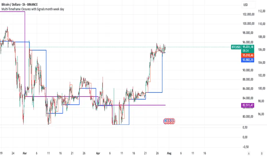
Multi-Timeframe Closures with Signals month week dayMulti-Timeframe Price Anchoring Indicator (Monthly, Weekly, Daily)
This indicator provides a powerful visual framework for analyzing price action across three major timeframes: monthly, weekly, and daily. It plots the closing prices of each timeframe directly on the chart to help traders assess where current price stands in relation to significant historical levels.
🔍 Core Features:
Monthly, Weekly, and Daily Close Lines: Automatically updated at the start of each new period.
Color-coded Price Anchors: Each timeframe is visually distinct for fast interpretation.
Multi-timeframe Awareness: Helps you identify trend alignment or divergence across different time horizons.
Long & Short Bias Signals: The script can optionally display long or short suggestions based on where the current price stands relative to the anchored closing prices.
📈 How to Use:
Trend Confirmation: If price is consistently above all three levels, it signals a strong bullish trend (potential long bias). If it’s below, the opposite applies (short bias).
Reversal or Pullback Zones: When price becomes extended far above/below the monthly and weekly closes, it may suggest overbought/oversold conditions and the possibility of a reversal or retracement.
Intraday Alignment: Useful for traders who want to enter positions on lower timeframes while being aware of higher timeframe trends.
This indicator is ideal for swing traders, day traders, and position traders who want to anchor their decisions to meaningful multi-timeframe reference points.
MTF Analysis Panel [Invesmate]MTF Analysis Panel
This indicator provides a compact Multi-Timeframe (MTF) view of trend and momentum conditions directly on the chart. It combines EMA trend checks, RSI momentum checks, and optional Relative Strength analysis to offer an intuitive overview of market structure across intraday, daily, weekly, and monthly timeframes.
Trend and Momentum Analysis
The script uses two primary methods for assessing the market:
Trend Detection: Based on price relation to a user-selected EMA for each timeframe.
Momentum Detection: Based on whether RSI is above or below 50 for each timeframe.
Users can independently toggle these modules through inputs to customize the panel for different analysis needs.
Trend and momentum are calculated separately to avoid bias, helping traders capture the real state of the market across multiple timeframes.
Relative Strength (Optional)
If enabled, when either Weekly or Monthly timeframes are selected, the panel will display Relative Strength (RS ) data.
RS measures the stock's performance relative to a benchmark symbol (like NSE:NIFTY).
This value shows the percent outperformance or underperformance over a user-defined period (default 55 days), allowing deeper market strength analysis.
Table and Display Logic
The indicator draws a neat panel on the chart using TradingView’s table functionality.
Each selected timeframe (15m, 1h, 4h, 1D, 1W, 1M) will display:
Trend (EMA): Green for bullish trend (Price > EMA), Red for bearish trend (Price < EMA), Gray if neutral or not applicable.
Momentum (RSI): Green if RSI > 50, Red if RSI < 50, Gray if neutral.
Symbols for trend and momentum can be customized between:
Emoji mode (e.g., 🟢, 🔴, 🟦, 🟥)
Text mode (e.g., UP, DOWN, NEUTRAL)
The panel is customizable for position (Top Left, Top Right, Bottom Left, Bottom Right) to fit user preference.
Color Codes
Strong Bullish: All selected timeframes are trending up and momentum is rising — shown with a light green background.
Strong Bearish: All selected timeframes are trending down and momentum is falling — shown with a light red background.
Mixed: Any mixed state (some up, some down) — shown with a neutral gray background.
This helps traders instantly recognize overall market sentiment without manually checking individual timeframes.
Summary Labels
At the bottom of the panel, two powerful summaries are displayed:
Trend Summary: Overall trend aggregation across selected timeframes ("STRONG BULLISH", "STRONG BEARISH", or "MIXED").
Momentum Summary: Overall momentum aggregation ("MOMENTUM UP", "MOMENTUM DOWN", or "MOMENTUM MIXED").
When Relative Strength is available (Weekly or Monthly enabled), it is also shown separately at the bottom, providing a complete strength-versus-benchmark view.
Input Controls
Enable EMA Trend Check: Toggle EMA-based trend detection.
Enable RSI Momentum Check: Toggle RSI-based momentum detection.
Timeframes to Display: 15m, 1h, 4h, 1D, 1W, 1M can be independently turned on or off.
EMA Length per Timeframe: Customize EMA lengths for different timeframes.
RSI Length: Set RSI calculation period.
Comparative Symbol: Select the benchmark symbol for Relative Strength calculations.
RS Period: Choose the lookback period for Relative Strength.
Emoji Display Toggle: Switch between emoji-based or text-based display styles.
Table Location: Choose where the analysis panel appears on the chart.
Special Features
Realtime Updating: The panel updates dynamically as bars close, maintaining real-time relevance.
Maximum Label Control : Designed to respect TradingView's maximum label limits to avoid runtime errors.
Optimized for Performance: Uses conditional requests and security calls efficiently, minimizing script execution load.
Known Limitations
Request.security limitations: Relative Strength is only calculated on Daily data for stability; lower timeframe RS is not implemented.
TradingView Table Size: On some screen sizes or with many timeframes selected, table may overlap candles. Adjust panel location accordingly.

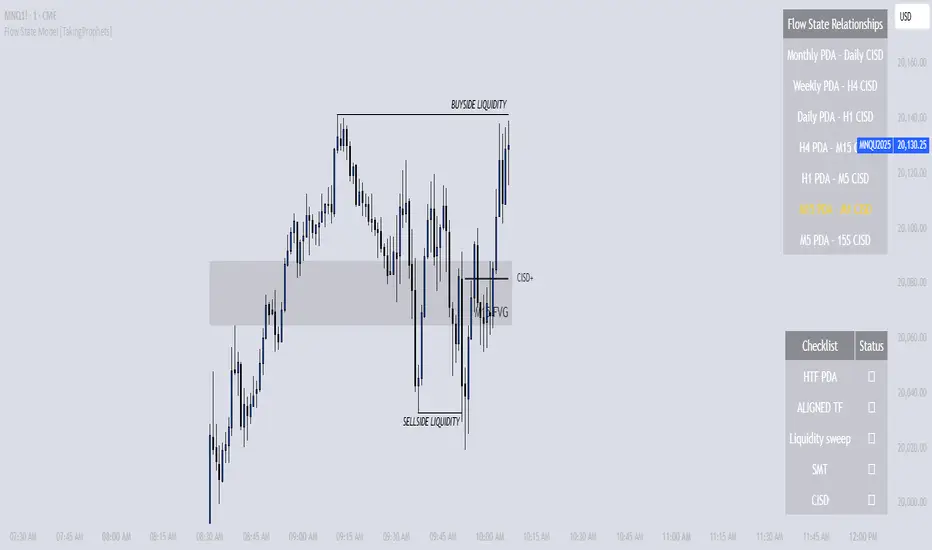
Flow State Model [TakingProphets]🧠 Indicator Purpose:
The "Flow State Model" by Taking Prophets is a precision-built trading framework based on the Inner Circle Trader (ICT) methodology. This script implements and automates the Flow State Model, a highly effective multi-timeframe trading system created and popularized by ITS Johnny.
It is designed to help traders systematically align higher timeframe liquidity draws with lower timeframe confirmation patterns, offering a clear roadmap for catching institutional moves with high confidence.
🌟 What Makes This Indicator Unique:
This is not a simple liquidity indicator or a basic FVG plotter. The Flow State Model executes a full multi-step process:
Higher Timeframe PD Array Detection: Automatically identifies and displays Fair Value Gaps (FVGs) from Daily, Weekly, and Monthly timeframes.
Liquidity Sweep Monitoring: Tracks swing highs and lows to detect Buyside or Sellside Liquidity sweeps into the HTF PD Arrays.
CISD Detection: Waits for a Change in State of Delivery (CISD) by monitoring bullish or bearish displacement after a sweep.
Full Trade Checklist: Visual checklist ensures all critical conditions are met before signaling a completed Flow State setup.
Sensitivity Control: Adapt detection strictness (High, Medium, Low) based on market volatility.
⚙️ How the Indicator Works (Detailed):
Fair Value Gap Mapping:
The indicator constantly scans higher timeframes (4H, Daily, Weekly) for valid bullish or bearish Fair Value Gaps that are large enough (based on ATR multiples) and not weekend gaps.
These FVGs are displayed on the current timeframe with full extension logic and mitigation handling (clearing when invalidated).
Liquidity Sweep Detection:
Swing highs and lows are identified using pivot logic (3-bar pivots). When price sweeps beyond a recent liquidity point into an active FVG, it flags the potential for a Flow State setup.
Change in State of Delivery (CISD) Confirmation:
After a sweep, the script monitors price action for a sequence of bullish or bearish candles followed by displacement (break in delivery).
Only after displacement closes beyond the initiating sequence does a CISD level plot, confirming the market's new delivery state.
Execution Checklist:
An optional table tracks whether critical components are present:
Higher Timeframe PD Array.
Aligned Timeframe Bias.
Liquidity Sweep into FVG.
SMT Divergence (optional manual confirmation).
CISD Confirmation.
Dynamic Management:
Active gaps are extended automatically.
Cleared gaps and mitigated CISDs are deleted to keep charts clean.
Distance-to-FVG prioritization keeps only the nearest active setups visible.
🎯 How to Use It:
Step 1: Identify the bias by locating active higher timeframe FVGs.
Step 2: Wait for a Liquidity Sweep into a PD Array (active FVG).
Step 3: Watch for a CISD event (the Flow State confirmation).
Step 4: Once all conditions are checked off, execute trades based on retracements to CISD levels or continuation after displacement.
Best Timing:
During ICT Killzones: London Open, New York AM.
After daily or weekly liquidity events.
🔎 Underlying Concepts:
Liquidity Theory: Markets seek to engineer liquidity for real institutional entries.
Fair Value Gaps: Imbalances where price is expected to react or rebalance.
Change in State of Delivery (CISD): Confirmation that the market's delivery mechanism has shifted, validating bias continuation.
Flow State Principle: Seamlessly aligning higher timeframe liquidity draws with lower timeframe confirmation to maximize trade probability.
🎨 Customization Options:
Adjust sensitivity (High / Medium / Low) for volatile or calm conditions.
Customize FVG visibility, CISD display, labels, line colors, and sizing.
Set checklist visibility and manual tracking of SMT or aligned bias.
✅ Recommended for:
Traders studying Inner Circle Trader (ICT) models.
Intraday scalpers and swing traders seeking confluence-driven setups.
Traders looking for a structured, checklist-based execution process.
ZenAlgo - RangerThe core of the indicator is the daily range, anchored around the 1-minute timeframe VWAP (volume-weighted average price), with ±2 standard deviations defining the upper and lower bounds. This range dynamically forms throughout the day and then gets “locked” at 23:59 each day to establish historical reference values.
The indicator calculates this locked VWAP and standard deviation per day, which serves two primary purposes:
Drawing today's real-time evolving range , updated each minute.
Plotting previous daily ranges , based on historical locked VWAPs and standard deviations, providing visual reference boxes on the chart.
This design enables the trader to identify mean-reversion zones and persistent directional biases based on volume-weighted price consensus.
Multiple Standard Deviation Layers
Beyond the ±2.0 deviation bounds, optional lines are available at half-step increments (e.g., ±0.5, ±1.5, ..., ±4.5) and full-step levels beyond ±2.0 (±3.0, ±4.0, ±5.0). These provide a customizable grid to visualize price extremes, tail behavior, or potential breakout zones relative to volume-adjusted price equilibrium.
Users can enable only the levels they need, offering flexibility depending on their strategy (e.g., scalping versus swing trading).
Historical Range Retention
The script stores up to 70 previous daily VWAP + standard deviation values (adjustable). For each, it draws a full range box and standard deviation lines in the past. This historical context helps in understanding how current price interacts with prior days’ balance zones.
These boxes are always drawn from 00:00 to 23:59 UTC , ensuring consistent alignment across instruments and avoiding session-based discrepancies.
Monday Range Reference (Drawn on Tuesdays)
On Tuesdays, the indicator plots the previous Monday's VWAP-based range across the rest of the week. This serves as a persistent contextual anchor for traders watching weekly unfolding behavior. The range is defined identically (VWAP ±2σ) and drawn from Monday 00:00 through the following Monday.
This method assumes Monday often sets the tone or structure for the week, and tracking this level through time may highlight support/resistance confluence or range expansion scenarios.
Each Monday range is extended over 7 days and includes dashed lines at the 25%, 50%, and 75% marks within the range. These midrange markers help traders assess microstructure behaviors (e.g., reversion to median, failure to hold midpoint, etc.).
Daily Volume Delta via 4H Candles
The indicator also integrates daily buy/sell volume deltas , derived from 4-hour candles of the regular session (non-Heikin Ashi). The logic categorizes volume as:
Buy volume when candle closes above the previous close.
Sell volume when it closes below.
Even split when the candle closes flat.
These volumes accumulate each day to derive net delta (buy - sell). This delta is recorded for each day and can optionally be displayed. A similar process tracks the delta for each Monday range on an ongoing basis.
This information quantifies the market’s aggressive buying vs. selling , correlating with price positions inside or outside the VWAP ranges. A strong delta in one direction may justify a price sustaining above/below VWAP, or diverging from the previous range.
Interpretation and Best Usage Practices
VWAP±2σ Range : Considered a high-probability area for consolidation or reversal. Mean-reverting strategies can benefit from signals within this area.
VWAP±3.0 and beyond : Extreme deviations may signal exhaustion or breakout potential, but are less frequent.
Previous Range Overlap : Overlap of today’s price with past VWAP zones may indicate support/resistance zones.
Monday Range on Tuesday : Persistent levels where the week may repeatedly pivot. Best used on instruments that exhibit weekly cyclical behavior (e.g., indices, forex).
Delta Behavior : Sharp positive or negative delta combined with price outside VWAP bands may suggest initiative participation and potential trend continuation.
Added Value Over Free Alternatives
While many free VWAP tools exist, this script differs in several specific and factual ways:
Anchored 1-minute VWAP lock at a consistent daily timestamp (23:59 UTC), enabling historical analysis.
Historical storage of previous VWAP ranges , with adjustable memory depth and visual continuity.
Flexible standard deviation plotting , down to 0.5 increments, tailored to the user's strategy needs.
Dedicated Monday range analysis , not common in freely available scripts.
Volume delta tracking per day and per Monday range , offering a directional volume view unavailable in standard VWAP implementations.
Persistent and visual interpretation framework using extended boxes and dashed lines for easier contextual navigation.
Each of these additions increases the script’s utility for methodical traders relying on volume-weighted statistics, without requiring additional configuration or external calculations.
Limitations and Disclaimers
VWAP based on 1-minute resolution : The indicator uses minute-level data to calculate daily VWAP and standard deviation. This offers high fidelity on liquid instruments but may produce noisy or unreliable levels on illiquid assets or during periods of low volume. For example, microcap stocks or thinly traded altcoins might not yield stable VWAP centers.
Inferred buy/sell volume : Volume delta is estimated using price movement from one candle to the next (close-to-close logic), rather than actual trade-level aggressor data (which is not accessible via TradingView). This approximation may misclassify volume in choppy or low-volatility environments, especially in assets where price changes do not correlate well with order flow (e.g., crypto during low-volume weekends).
Non-continuous markets and price gaps : For assets that do not trade continuously (e.g., stocks, futures), the VWAP calculation starts fresh every day at 00:00 UTC, regardless of the instrument’s official session start. As a result:
Pre-market/post-market trades may be included in VWAP when analyzing equities, even though they are often excluded in professional VWAP tools.
Opening gaps in equities and futures may distort early VWAP values due to lack of volume context, especially if the previous day's session was already closed when new data begins accumulating.
Weekend gaps in crypto, although less frequent due to 24/7 trading, can still influence delta accumulation if abrupt moves happen during low liquidity periods.
Daily session alignment : The VWAP anchoring and box drawing uses 00:00 UTC to 23:59 UTC windows. For instruments with different official session timings (e.g., US equities, CME futures), this may cause mismatches between expected session VWAPs and the ones shown in this script.
Conclusion
The ZenAlgo – Ranger script offers a systematic visualization of volume-adjusted price behavior, combining statistical VWAP ranges with volume delta overlays. By integrating daily and weekly reference zones, this tool supports structured decision-making in various market environments, particularly for traders prioritizing mean reversion, range expansion, or trend confirmation.

[Tradevietstock] Market Cycle Detector_Quantum Flux Best technical indicator to detect market cycles - Quantum Flux
Hello folks, it's Tradevietstock again! Today, I will introduce you to Quantum Flux Indicator, which can help you identify market cycle and find your best entry/exit effectively.
i. Overview
1. What is Market Cycle Detector_Quantum Flux?
The Quantum Flux Indicator is developed specifically to analyze and detect market cycles across a variety of asset classes. Whether you trade stocks, crypto, forex, or commodities, this indicator provides a consistent framework to track trends and time your positions.
2. Supported Markets:
Stock Market
Crypto Market
Commodities
Forex
You can apply the same cycle-based strategy across all these markets using QFI.
Depending on the platform you're using, here’s how you can start using Quantum Flux:
TradingView Users:
Once your invite is approved, the indicator will be added to your TradingView account. You can access it directly through the Indicators tab.
MT5 / Amibroker Users:
After your payment is completed, we will send you the QFI script. You can then import it manually into your MT5 or Amibroker trading platform.
ii. Setting Up the Indicator
1. Choose Your Setup
There are two ways to configure the Quantum Flux - The best indicator to detect market cycles
Default Setup (Recommended)
This includes both the Quantum Aroon and some of the Premium MACD signals. This full setup is ideal for traders who want a complete view of the market cycle with detailed signals. You just need to turn off the Premium MACD_Components as the image below
MACD-Only Setup
In this mode, the Quantum Aroon module is disabled. The indicator will rely solely on the Premium MACD Setting to generate signals. While this option is available, we recommend using the full setup for the most accurate performance.
2. Recognize the Market Cycle Phases
According to Tradevietstock’s theory , every trading asset typically moves through four distinct phases in a complete cycle:
Bearish Phase - Bear Market
First Bullish Wave - The Recovery
Strong Correction Phase
Final Bullish Wave
Quantum Flux generates visual and data-driven signals to help you time your trades accurately.
Green Dots: MACD crossover → Potential buy signal
Red Dots: MACD crossunder → Potential sell signal
Quantum Aroon Crossover: Confirms bullish trend or Buy Signals
Quantum Aroon Crossunder: Confirms bearish trend or Exit Signals
Green background: Extreme Bullish Phase
Red background: Extreme Bearish Phase
The Extreme Bullish/Bearish Phase is a unique feature of our system that enhances trading signals by capturing moments when the market moves aggressively—either in a strong uptrend or downtrend. This phase often represents the peak of Greed in bullish markets and Fear in bearish ones, offering a way to gauge market sentiment visually. The intensity of the background color helps interpret this: a bolder green indicates a more extreme bull market, while a deeper red signals an extreme bear market.
It's important to note that the Extreme Bullish/Bearish Phases are not direct entry or exit signals. Instead, they serve as enhancement signals that help traders make more informed decisions. These phases provide insight into whether it's wise to wait for additional confirmation before entering a trade, or to hold existing positions longer until clearer exit signals—like red dots or crosses—appear. By identifying the market's most intense emotional points, these signals help traders better align with momentum rather than react prematurely.
=> In summary, the Extreme Bullish/Bearish Phase provides valuable insight into market sentiment by highlighting emotional extremes, helping traders navigate aggressive trends with greater confidence. However, like all features in the indicator, its purpose is to complement, not replace, the core entry and exit signals—which are still based on crosses and dots. As always, green indicates bullish conditions, and red indicates bearish, but sentiment alone doesn't drive the trades—signals do.
3. The logic of the indicator and its trading strategy
Many traders are familiar with Wyckoff's theory, which, while foundational, can feel outdated and inefficient for real-life trading in today's fast-paced markets. It takes time to apply and may not be the most practical approach. That’s why many turn to day trading, but without the right tools and strategy, it can lead to account blow-ups.
The traditional market cycle consists of four stages: accumulation, markup, distribution, and markdown. While this is accurate, it's not always sufficient for modern trading. We need something more practical.
According to Tradevietstock's theory, the market cycle can be broken into four stages: a bear market, recovery, correction wave, and a bull market (the strongest uptrend). This new approach offers a shorter and more efficient timeline compared to Wyckoff's or other older cycle theories, making it a safer and more practical alternative to intraday trading.
To trade with market cycles, you need to remember these four stages:
Bearish Phase - Bear Market
First Bullish Wave - The Recovery
Strong Correction Phase
Final Bullish Wave
The logic for BUY/SELL (Entry/Exit) signals is built on a combination of crossover and crossunder events from the Quantum Aroon and Premium MACD indicators. Our Quantum Aroon is an enhanced version that applies a custom zero-lag smoothing function, making its trend signals more responsive and accurate than the traditional Aroon. It also includes a signal line for crossover alerts, along with visual enhancements like color-coded backgrounds, arrows, and gradient fills to highlight different market phases. Integrated with normalized MACD and RSI, it helps confirm signals and identify overbought or oversold conditions. Most importantly, it's aligned with Tradevietstock’s 4-phase market cycle—Bear Market, Recovery, Correction, and Bull Market—making it especially practical for real-world trading.
The Premium MACD differs from the standard version by introducing several key improvements. It normalizes the MACD line, signal line, and histogram for consistent interpretation across assets and timeframes, improving visual clarity. It also supports multi-timeframe analysis, allowing users to choose between the current chart resolution or a custom timeframe. The indicator includes color-coded histogram bars to show momentum changes and uses large dynamic circles to highlight crossover points.
=> These enhancements improve signal accuracy and make trend reversals easier to spot. Paired with the Quantum Aroon, it serves as a powerful confirmation tool within the Tradevietstock cycle framework.
4. Get to practice
In the example of NVDA, you can observe all four phases in action. For medium- to long-term traders, Phase 2 and Phase 4 usually present the strongest buying opportunities. Phase 1 and Phase 3 are accumulation phases — where prices are lower and preparations are made for the next bullish leg.
We can examine the following example to better understand Phase 1: The Bear Market . This phase only begins after a prior uptrend in the stock price . It’s crucial to remember that Phase 1 is not the start of the overall trend—it marks the reversal following a bullish run.
For instance, take the LMT stock: after a 50% rise, Quantum Flux displays a green background, indicating an 'Extreme Bullish Phase.' Once this bullish phase concludes, it sets the stage for a valid Phase 1—the beginning of the Bear Market.
The stock price declines sharply, triggering Quantum Flux to display a red background as the Aroon line crosses below the signal line.
Phase 1 concludes when we observe multiple crossover signals—most notably when the Aroon line crosses above the Signal line—and the red background, which signifies the Extreme Bearish Phase, disappears. Let's take a look at the image below:
Let’s move on to Phase 2: The Recovery. This phase follows the Bear Market—Phase 1. After a significant decline in the stock price, a recovery or pullback is expected.
Our signals for this phase include green dots and crosses, along with the confirmation signals that mark the end of Phase 1. This combination provides valid Buy signals and presents opportunities for mid-term investment strategies.
Phase 3 is a correction wave after the recovery . We also incorporate the cross and dot signals during this phase. In Phase 2, the strategy involves preparing to sell or take profits once the recovery phase matures. Whenever red dots or red crosses appear, they serve as indicators to consider taking profits, signaling the potential end of the upward move.
In Phase 3, known as the correction wave, the key objective is to take profits before the price begins to decline. This phase represents a temporary pullback following the recovery. Importantly, the end of Phase 3 often presents a strong buying opportunity—just before the onset of Phase 4, which is the strongest bullish wave. Whenever green dots and crosses appear at this stage, they serve as clear Buy signals, allowing us to position early for the upcoming bullish momentum.
Phase 4 is the strongest bullish wave—one that investors definitely don’t want to miss. Having entered at the end of Phase 3, the goal in Phase 4 is to maximize gains by targeting the highest highs.
During this phase, we closely monitor our exit signals, which include the appearance of red dots and red crosses, as well as the disappearance of the Extreme Bullish Phase indicator (green background). These signals help us lock in profits at the peak of the bullish momentum.
iii. Brief Conclusion on the Signals
End of Phase 1:
As Phase 1 nears completion, green dots start to appear. These serve as early entry signals, offering an opportunity to buy at lower prices before the trend reversal begins.
Phase 2 – Recovery:
Momentum begins to build during this phase. As it approaches its peak, red dots and Aroon line crossunders emerge—signaling that it's time to exit or reduce exposure in anticipation of a correction.
Phase 3 – Correction:
The indicator typically shows a red background, reflecting a bearish environment. This is a waiting phase—traders should remain cautious and avoid entering until green signals reappear.
Phase 4 – Strong Bullish Wave:
With the return of bullish signals (green dots, crosses, and green background), Phase 4 begins. After entering, the position is held to ride the strong momentum. Profit-taking signals include the appearance of red dots, red crosses, and the disappearance of the green background.
iv. Optimal Use by Market Type
Here’s how we suggest using QFI depending on what you trade:
Stocks: Best used on the Daily or Weekly chart for swing trades.
Cryptocurrency: Works well on BTC, ETH, or major altcoins using Daily and Weekly charts. Great for catching larger trend reversals.
CFDs and Forex: QFI is built for higher timeframes (H4, D1, W1), where it produces cleaner and more reliable signals.
Best Ways to Use It
🟢 Stocks
Works well on Weekly and Daily charts for swing entries
🟡 Crypto
Works best on Weekly and Daily charts
Good for trend-catching on BTC, ETH, or altcoins
🔴 CFDs
Designed with precision in mind — works on bigger timeframes, like H4, D1, and W1
The Quantum Flux Indicator is a flexible and powerful tool for anyone looking to navigate the full market cycle — from bottom to top and back again. With its ability to highlight key phases and generate timely signals, it becomes easier to plan your entries, hold through trends, and exit with confidence.
If you're serious about understanding market structure and improving your timing, Quantum Flux, the best Indicator to detect market cycles, can become a central part of your strategy — no matter what market you're in.

Aurora Flow Oscillator [QuantAlgo]The Aurora Flow Oscillator is an advanced momentum-based technical indicator designed to identify market direction, momentum shifts, and potential reversal zones using adaptive filtering techniques. It visualizes price momentum through a dynamic oscillator that quantifies trend strength and direction, helping traders and investors recognize momentum shifts and trading opportunities across various timeframes and asset class.
🟢 Technical Foundation
The Aurora Flow Oscillator employs a sophisticated mathematical approach with adaptive momentum filtering to analyze market conditions, including:
Price-Based Momentum Calculation: Calculates logarithmic price changes to measure the rate and magnitude of market movement
Adaptive Momentum Filtering: Applies an advanced filtering algorithm to smooth momentum calculations while preserving important signals
Acceleration Analysis: Incorporates momentum acceleration to identify shifts in market direction before they become obvious
Signal Normalization: Automatically scales the oscillator output to a range between -100 and 100 for consistent interpretation across different market conditions
The indicator processes price data through multiple filtering stages, applying mathematical principles including exponential smoothing with adaptive coefficients. This creates an oscillator that dynamically adjusts to market volatility while maintaining responsiveness to genuine trend changes.
🟢 Key Features & Signals
1. Momentum Flow and Extreme Zone Identification
The oscillator presents market momentum through an intuitive visual display that clearly indicates both direction and strength:
Above Zero: Indicates positive momentum and potential bullish conditions
Below Zero: Indicates negative momentum and potential bearish conditions
Slope Direction: The angle and direction of the oscillator provide immediate insight into momentum strength
Zero Line Crossings: Signal potential trend changes and new directional momentum
The indicator also identifies potential overbought and oversold market conditions through extreme zone markings:
Upper Zone (>50): Indicates strong bullish momentum that may be approaching exhaustion
Lower Zone (<-50): Indicates strong bearish momentum that may be approaching exhaustion
Extreme Boundaries (±95): Mark potentially unsustainable momentum levels where reversals become increasingly likely
These zones are displayed with gradient intensity that increases as the oscillator moves toward extremes, helping traders and investors:
→ Identify potential reversal zones
→ Determine appropriate entry and exit points
→ Gauge overall market sentiment strength
2. Customizable Trading Style Presets
The Aurora Flow Oscillator offers pre-configured settings for different trading approaches:
Default (80,150): Balanced configuration suitable for most trading and investing situations.
Scalping (5,80): Highly responsive settings for ultra-short-term trades. Generates frequent signals and catches quick price movements. Best for 1-15min charts when making many trades per day.
Day Trading (8,120): Optimized for intraday movements with faster response than default settings while maintaining reasonable signal quality. Ideal for 5-60min or 4h-12h timeframes.
Swing Trading (10,200): Designed for multi-day positions with stronger noise filtering. Focuses on capturing larger price swings while avoiding minor fluctuations. Works best on 1-4h and daily charts.
Position Trading (14,250): For longer-term position traders/investors seeking significant market trends. Reduces false signals by heavily filtering market noise. Ideal for daily or even weekly charts.
Trend Following (16,300): Maximum smoothing that prioritizes established directional movements over short-term fluctuations. Best used on daily and weekly charts, but can also be used for lower timeframe trading.
Countertrend (7,100): Tuned to detect potential reversals and exhaustion points in trends. More sensitive to momentum shifts than other presets. Effective on 15min-4h charts, as well as daily and weekly charts.
Each preset automatically adjusts internal parameters for optimal performance in the selected trading context, providing flexibility across different market approaches without requiring complex manual configuration.
🟢 Practical Usage Tips
1/ Trend Analysis and Interpretation
→ Direction Assessment: Evaluate the oscillator's position relative to zero to determine underlying momentum bias
→ Momentum Strength: Measure the oscillator's distance from zero within the -100 to +100 range to quantify momentum magnitude
→ Trend Consistency: Monitor the oscillator's path for sustained directional movement without frequent zero-line crossings
→ Reversal Detection: Watch for oscillator divergence from price and deceleration of movement when approaching extreme zones
2/ Signal Generation Strategies
Depending on your trading approach, multiple signal strategies can be employed:
Trend Following Signals:
Enter long positions when the oscillator crosses above zero
Enter short positions when the oscillator crosses below zero
Add to positions on pullbacks while maintaining the overall trend direction
Countertrend Signals:
Look for potential reversals when the oscillator reaches extreme zones (±95)
Enter contrary positions when momentum shows signs of exhaustion
Use oscillator divergence with price as additional confirmation
Momentum Shift Signals:
Enter positions when oscillator changes direction after establishing a trend
Exit positions when oscillator direction reverses against your position
Scale position size based on oscillator strength percentage
3/ Timeframe Optimization
The indicator can be effectively applied across different timeframes with these considerations:
Lower Timeframes (1-15min):
Use Scalping or Day Trading presets
Focus on quick momentum shifts and zero-line crossings
Be cautious of noise in extreme market conditions
Medium Timeframes (30min-4h):
Use Default or Swing Trading presets
Look for established trends and potential reversal zones
Combine with support/resistance analysis for entry/exit precision
Higher Timeframes (Daily+):
Use Position Trading or Trend Following presets
Focus on major trend identification and long-term positioning
Use extreme zones for position management rather than immediate reversals
🟢 Pro Tips
Price Momentum Period:
→ Lower values (5-7) increase sensitivity to minor price fluctuations but capture more market noise
→ Higher values (10-16) emphasize sustained momentum shifts at the cost of delayed response
→ Adjust based on your timeframe (lower for shorter timeframes, higher for longer timeframes)
Oscillator Filter Period:
→ Lower values (80-120) produce more frequent directional changes and earlier response to momentum shifts
→ Higher values (200-300) filter out shorter-term fluctuations to highlight dominant market cycles
→ Match to your typical holding period (shorter holding time = lower filter values)
Multi-Timeframe Analysis:
→ Compare oscillator readings across different timeframes for confluence
→ Look for alignment between higher and lower timeframe signals
→ Use higher timeframe for trend direction, lower for earlier entries
Volatility-Adaptive Trading:
→ Use oscillator strength to adjust position sizing (stronger = larger)
→ Consider reducing exposure when oscillator reaches extreme zones
→ Implement tighter stops during periods of oscillator acceleration
Combination Strategies:
→ Pair with volume indicators for confirmation of momentum shifts
→ Use with support/resistance levels for strategic entry and exit points
→ Combine with volatility indicators for comprehensive market context

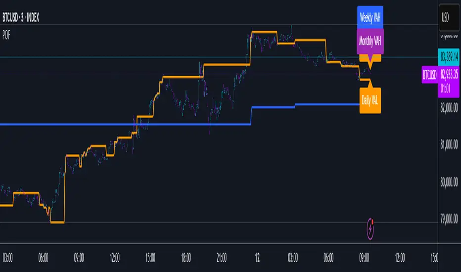
POF🔶 Smoothed POF Profile – Multi-Session Market Structure Tool 🔶
The Smoothed POF Profile is a precision-engineered market structure indicator that identifies the Point of Focus (POF) — the price level where market participation was most active — across Daily, Weekly, and Monthly sessions and plots them with smoothed over form to avoid whipsaws.
🔍 Powered by a custom-built algorithm for session profiling, this tool highlights:
🔶 POF: The most frequently traded or accepted price during a session
🟩 VAH / VAL: Dynamic Value Area High and Low markers (no cluttered lines — clean label-only display)
📐 The core logic utilizes a proprietary data refinement method that adapts to session volatility and filters out insignificant noise to avoid false shifts in structure. This results in smoothed POF readings that remain stable and meaningful — even during high-volatility periods.
🧠 Designed for traders who want to track evolving value, this tool provides a high-level view of where the market is finding agreement — and where price is likely to revert or expand from.
✅ Key Features:
Fully automated: Tracks Daily, Weekly, and Monthly sessions in real-time
Session-aware calculation of key structure levels
Elegant, non-obtrusive chart visuals (no histogram or volume bars)
Fully configurable Value Area % and display toggles
Multi-session color-coding (🟧 Daily, 🔵 Weekly, 🟣 Monthly)
🧭 Trading Applications:
POF Bias: Use POF as an evolving balance point. Price above = bullish lean, price below = bearish tilt
VAH/VAL Zones: Anticipate rejection or consolidation when price re-enters the value area. Use breakouts for continuation bias
Session Stack Confluence: When Daily, Weekly, and Monthly POFs cluster, it often signals strong interest zones and potential turning points
🧩 Use alongside your preferred price action, volume, or trend confirmation tools. This is not a signal-based system — it’s a contextual framework to help you align with market intent and structure.
⚠️ Disclaimer: This tool is intended for educational and informational purposes only. It is not financial advice. Use with proper risk management and your own due diligence.
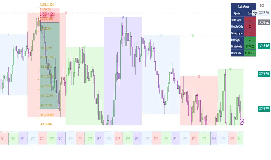
Quarterly Cycle Theory with DST time AdjustedThe Quarterly Theory removes ambiguity, as it gives specific time-based reference points to look for when entering trades. Before being able to apply this theory to trading, one must first understand that time is fractal:
Yearly Quarters = 4 quarters of three months each.
Monthly Quarters = 4 quarters of one week each.
Weekly Quarters = 4 quarters of one day each (Monday - Thursday). Friday has its own specific function.
Daily Quarters = 4 quarters of 6 hours each = 4 trading sessions of a trading day.
Sessions Quarters = 4 quarters of 90 minutes each.
90 Minute Quarters = 4 quarters of 22.5 minutes each.
Yearly Cycle: Analogously to financial quarters, the year is divided in four sections of three months each:
Q1 - January, February, March.
Q2 - April, May, June (True Open, April Open).
Q3 - July, August, September.
Q4 - October, November, December.
S&P 500 E-mini Futures (daily candles) — Monthly Cycle.
Monthly Cycle: Considering that we have four weeks in a month, we start the cycle on the first month’s Monday (regardless of the calendar Day):
Q1 - Week 1: first Monday of the month.
Q2 - Week 2: second Monday of the month (True Open, Daily Candle Open Price).
Q3 - Week 3: third Monday of the month.
Q4 - Week 4: fourth Monday of the month.
S&P 500 E-mini Futures (4 hour candles) — Weekly Cycle.
Weekly Cycle: Daye determined that although the trading week is composed by 5 trading days, we should ignore Friday, and the small portion of Sunday’s price action:
Q1 - Monday.
Q2 - Tuesday (True Open, Daily Candle Open Price).
Q3 - Wednesday.
Q4 - Thursday.
S&P 500 E-mini Futures (1 hour candles) — Daily Cycle.
Daily Cycle: The Day can be broken down into 6 hour quarters. These times roughly define the sessions of the trading day, reinforcing the theory’s validity:
Q1 - 18:00 - 00:00 Asia.
Q2 - 00:00 - 06:00 London (True Open).
Q3 - 06:00 - 12:00 NY AM.
Q4 - 12:00 - 18:00 NY PM.
S&P 500 E-mini Futures (15 minute candles) — 6 Hour Cycle.
6 Hour Quarters or 90 Minute Cycle / Sessions divided into four sections of 90 minutes each (EST/EDT):
Asian Session
Q1 - 18:00 - 19:30
Q2 - 19:30 - 21:00 (True Open)
Q3 - 21:00 - 22:30
Q4 - 22:30 - 00:00
London Session
Q1 - 00:00 - 01:30
Q2 - 01:30 - 03:00 (True Open)
Q3 - 03:00 - 04:30
Q4 - 04:30 - 06:00
NY AM Session
Q1 - 06:00 - 07:30
Q2 - 07:30 - 09:00 (True Open)
Q3 - 09:00 - 10:30
Q4 - 10:30 - 12:00
NY PM Session
Q1 - 12:00 - 13:30
Q2 - 13:30 - 15:00 (True Open)
Q3 - 15:00 - 16:30
Q4 - 16:30 - 18:00
S&P 500 E-mini Futures (5 minute candles) — 90 Minute Cycle.
Micro Cycles: Dividing the 90 Minute Cycle yields 22.5 Minute Quarters, also known as Micro Sessions or Micro Quarters:
Asian Session
Q1/1 18:00:00 - 18:22:30
Q2 18:22:30 - 18:45:00
Q3 18:45:00 - 19:07:30
Q4 19:07:30 - 19:30:00
Q2/1 19:30:00 - 19:52:30 (True Session Open)
Q2/2 19:52:30 - 20:15:00
Q2/3 20:15:00 - 20:37:30
Q2/4 20:37:30 - 21:00:00
Q3/1 21:00:00 - 21:23:30
etc. 21:23:30 - 21:45:00
London Session
00:00:00 - 00:22:30 (True Daily Open)
00:22:30 - 00:45:00
00:45:00 - 01:07:30
01:07:30 - 01:30:00
01:30:00 - 01:52:30 (True Session Open)
01:52:30 - 02:15:00
02:15:00 - 02:37:30
02:37:30 - 03:00:00
03:00:00 - 03:22:30
03:22:30 - 03:45:00
03:45:00 - 04:07:30
04:07:30 - 04:30:00
04:30:00 - 04:52:30
04:52:30 - 05:15:00
05:15:00 - 05:37:30
05:37:30 - 06:00:00
New York AM Session
06:00:00 - 06:22:30
06:22:30 - 06:45:00
06:45:00 - 07:07:30
07:07:30 - 07:30:00
07:30:00 - 07:52:30 (True Session Open)
07:52:30 - 08:15:00
08:15:00 - 08:37:30
08:37:30 - 09:00:00
09:00:00 - 09:22:30
09:22:30 - 09:45:00
09:45:00 - 10:07:30
10:07:30 - 10:30:00
10:30:00 - 10:52:30
10:52:30 - 11:15:00
11:15:00 - 11:37:30
11:37:30 - 12:00:00
New York PM Session
12:00:00 - 12:22:30
12:22:30 - 12:45:00
12:45:00 - 13:07:30
13:07:30 - 13:30:00
13:30:00 - 13:52:30 (True Session Open)
13:52:30 - 14:15:00
14:15:00 - 14:37:30
14:37:30 - 15:00:00
15:00:00 - 15:22:30
15:22:30 - 15:45:00
15:45:00 - 15:37:30
15:37:30 - 16:00:00
16:00:00 - 16:22:30
16:22:30 - 16:45:00
16:45:00 - 17:07:30
17:07:30 - 18:00:00
S&P 500 E-mini Futures (30 second candles) — 22.5 Minute Cycle.
Rotation Phase Signal OnlyHow to Use the “Rotation Phase Signal Only” Script
(Floating Dashboard Version)
This version gives you a clean, unobtrusive way to monitor the market regime and rotation instructions on any chart — whether you’re tracking your dividend ETFs, growth funds, or defensive positions.
✅ What It Does
This script tracks:
SPY:TLT — Stocks vs. Bonds (macro equity trend)
QQQ:XLU — Growth vs. Defensive (sector risk appetite)
It calculates weekly EMAs of these ratios to determine which phase we are in:
Phase Signal Interpretation Reallocation Action
GROWTH Stocks & growth sectors lead Add MTUM, VUN, XMTM / Trim income assets
INCOME Stocks weak, growth holding Add HHIS, HYLD, QQQY / Trim growth
DEFENSIVE Bonds and defensives lead Add HPYT, HPYT.U, ZGLD / Exit most equity
NEUTRAL Mixed or unclear signals Hold / minor rebalancing only
🧱 Key Features of This Version
Feature Description
📊 Floating Table Always visible in the top-right corner of the chart
🔄 Dynamic Updates Adjusts weekly as the regime changes
✅ Use On Any Ticker You can run this on DFN, QQQY, HYLD, etc.
🔔 Built-In Alerts Alerts trigger when the phase changes
🗓️ Weekly Workflow (Suggested)
Open Your Main Chart
Use this on any ticker — your dividend ETFs, growth ETF, or even individual stocks.
Check the Floating Table
PHASE: The current regime (GROWTH, INCOME, DEFENSIVE, or NEUTRAL)
ADD: What ETFs to accumulate
SELL: What ETFs or sectors to trim or rotate out of
Take Action
Rebalance or allocate new capital based on the table guidance.
Set Alerts (Optional)
Click “🔔 Alerts” in TradingView
Set up alerts for when the Phase changes
Example: “Alert me when Phase = DEFENSIVE”
🔔 Example Alert Setup
Click on Alerts
Choose:
Condition: Rotation Phase Signal Only
Value: GROWTH or INCOME or DEFENSIVE
Choose alert type: pop-up, email, webhook, etc.
💡 Pro Tips
Use this alongside your Dividend or Income Dashboards for smarter reinvestment decisions.

Rotation Phase TriggerHow to Use the Full Rotation Phase Trigger Tool (non-floating version)
This version is ideal for macro-level market context, helping you decide when to rotate between growth, income, and defensive positions using visual cues directly on the chart.
🧱 Components Recap (Non-Floating Version)
ROC Histograms:
SPY:TLT ROC (green bars): Measures equity strength vs. bonds
QQQ:XLU ROC (blue bars): Measures growth vs. defensive rotation
EMA Trend Filter:
Uses a fast/slow EMA crossover on both ratios to confirm the trend
When both are rising → confirms GROWTH phase
Phase Background Colors:
🟩 Green = GROWTH
🟧 Orange = INCOME
🟥 Red = DEFENSIVE
No color = NEUTRAL
Instruction Labels:
Show what sectors to add and what to sell (with ETF tickers)
Alert Conditions:
Can be linked to email, SMS, or app notifications
Triggered when phase changes
✅ Weekly Workflow
Every Monday (or Weekend Prep)
1. Open SPY on a Weekly Chart
This tool is designed around the U.S. equity vs bond regime
Always keep SPY as the main chart for best alignment
2. Check the Background Color
Instantly tells you what regime you're in:
Green → rotate into growth ETFs
Orange → stick to or buy income-generating ETFs
Red → get defensive, raise cash, or buy bond/hedge ETFs
3. Read the Labels
Top label = phase status (e.g., GROWTH)
Bottom label = action instructions:
What ETFs to accumulate (MTUM, VUN, HYLD, etc.)
What sectors or funds to rotate out of
4. Look at Momentum Histograms
Confirms whether the regime shift is gaining strength
Larger bars = stronger conviction
Diverging directions? Wait for confirmation
🔁 Tactical Rotation Plan
Phase Add Trim/Sell
GROWTH MTUM, VUN, XMTM, HXS, VTI HYLD, HHIS, HPYT
INCOME HYLD, HHIS, QQQY, DFN, DGS MTUM, VUN
DEFENSIVE HPYT, HPYT.U, ZGLD, GDE All equities
NEUTRAL Nothing new, rebalance if needed Excess risk positions
🔔 Alert Setup (Optional)
You can create alerts in TradingView using:
Right-click chart → "Add Alert"
Use condition: "Rotation Phase Trigger" → "GROWTH" / "INCOME" / "DEFENSIVE"
Choose notification method (popup, app, email, etc.)
💡 Pro Tips
Use this version on SPY weekly only — for best signal clarity

Multi-Timeframe Anchored VWAP Valuation# Multi-Timeframe Anchored VWAP Valuation
## Overview
This indicator provides a unique perspective on potential price valuation by comparing the current price to the Volume Weighted Average Price (VWAP) anchored to the start of multiple timeframes: Weekly, Monthly, Quarterly, and Yearly. It synthesizes these comparisons into a single oscillator value, helping traders gauge if the current price is potentially extended relative to significant volume-weighted levels.
## Core Concept & Calculation
1. **Anchored VWAP:** The script calculates the VWAP separately for the current Week, Month, Quarter (3 Months), and Year (12 Months), starting the calculation from the first bar of each period.
2. **Price Deviation:** It measures how far the current `close` price is from each of these anchored VWAPs. This distance is measured in terms of standard deviations calculated *within* that specific anchor period (e.g., how many weekly standard deviations the price is away from the weekly VWAP).
3. **Deviation Score (Multiplier):** Based on this standard deviation distance, a score is assigned. The further the price is from the VWAP (in terms of standard deviations), the higher the absolute score. The indicator uses linear interpolation to determine scores between the standard deviation levels (defaulted at 1, 2, and 3 standard deviations corresponding to scores of +/-2, +/-3, +/-4, with a score of 1 at the VWAP).
4. **Timeframe Weighting:** Longer timeframes are considered more significant. The deviation scores are multiplied by fixed scalars: Weekly (x1), Monthly (x2), Quarterly (x3), Yearly (x4).
5. **Final Valuation Metric:** The weighted scores from all four timeframes are summed up to produce the final oscillator value plotted in the indicator pane.
## How to Interpret and Use
* **Histogram (Indicator Pane):**
* The main output is the histogram representing the `Final Valuation Metric`.
* **Positive Values:** Suggest the price is generally trading above its volume-weighted averages across the timeframes, potentially indicating strength or relative "overvaluation."
* **Negative Values:** Suggest the price is generally trading below its volume-weighted averages, potentially indicating weakness or relative "undervaluation."
* **Values Near Zero:** Indicate the price is relatively close to its volume-weighted averages.
* **Histogram Color:**
* The color of the histogram bars provides context based on the metric's *own recent history*.
* **Green (Positive Color):** The metric is currently *above* its recent average plus a standard deviation band (dynamic upper threshold). This highlights potentially significant "overvalued" readings relative to its normal range.
* **Red (Negative Color):** The metric is currently *below* its recent average minus a standard deviation band (dynamic lower threshold). This highlights potentially significant "undervalued" readings relative to its normal range.
* **Gray (Neutral Color):** The metric is within its typical recent range (between the dynamic upper and lower thresholds).
* **Orange Line:** Plots the moving average of the `Final Valuation Metric` itself (based on the "Threshold Lookback Period"), serving as the centerline for the dynamic thresholds.
* **On-Chart Table:**
* Provides a detailed breakdown for transparency.
* Shows the calculated VWAP, the raw deviation multiplier score, and the final weighted (adjusted) metric for each individual timeframe (W, M, Q, Y).
* Displays the current price, the final combined metric value, and a textual interpretation ("Overvalued", "Undervalued", "Neutral") based on the dynamic thresholds.
## Potential Use Cases
* Identifying potential exhaustion points when the indicator reaches statistically high (green) or low (red) levels relative to its recent history.
* Assessing whether price trends are supported by underlying volume-weighted average prices across multiple timeframes.
* Can be used alongside other technical analysis tools for confirmation.
## Settings
* **Calculation Settings:**
* `STDEV Level 1`: Adjusts the 1st standard deviation level (default 1.0).
* `STDEV Level 2`: Adjusts the 2nd standard deviation level (default 2.0).
* `STDEV Level 3`: Adjusts the 3rd standard deviation level (default 3.0).
* **Interpretation Settings:**
* `Threshold Lookback Period`: Defines the number of bars used to calculate the average and standard deviation of the final metric for dynamic thresholds (default 200).
* `Threshold StDev Multiplier`: Controls how many standard deviations above/below the metric's average are used to set the "Overvalued"/"Undervalued" thresholds (default 1.0).
* **Table Settings:** Customize the position and colors of the data table displayed on the chart.
## Important Considerations
* This indicator measures price deviation relative to *anchored* VWAPs and its *own historical range*. It is not a standalone trading system.
* The interpretation of "Overvalued" and "Undervalued" is relative to the indicator's logic and calculations; it does not guarantee future price movement.
* Like all indicators, past performance is not indicative of future results. Use this tool as part of a comprehensive analysis and risk management strategy.
* The anchored VWAP and Standard Deviation values reset at the beginning of each respective period (Week, Month, Quarter, Year).

Correlation Heatmap█ OVERVIEW
This indicator creates a correlation matrix for a user-specified list of symbols based on their time-aligned weekly or monthly price returns. It calculates the Pearson correlation coefficient for each possible symbol pair, and it displays the results in a symmetric table with heatmap-colored cells. This format provides an intuitive view of the linear relationships between various symbols' price movements over a specific time range.
█ CONCEPTS
Correlation
Correlation typically refers to an observable statistical relationship between two datasets. In a financial time series context, it usually represents the extent to which sampled values from a pair of datasets, such as two series of price returns, vary jointly over time. More specifically, in this context, correlation describes the strength and direction of the relationship between the samples from both series.
If two separate time series tend to rise and fall together proportionally, they might be highly correlated. Likewise, if the series often vary in opposite directions, they might have a strong anticorrelation . If the two series do not exhibit a clear relationship, they might be uncorrelated .
Traders frequently analyze asset correlations to help optimize portfolios, assess market behaviors, identify potential risks, and support trading decisions. For instance, correlation often plays a key role in diversification . When two instruments exhibit a strong correlation in their returns, it might indicate that buying or selling both carries elevated unsystematic risk . Therefore, traders often aim to create balanced portfolios of relatively uncorrelated or anticorrelated assets to help promote investment diversity and potentially offset some of the risks.
When using correlation analysis to support investment decisions, it is crucial to understand the following caveats:
• Correlation does not imply causation . Two assets might vary jointly over an analyzed range, resulting in high correlation or anticorrelation in their returns, but that does not indicate that either instrument directly influences the other. Joint variability between assets might occur because of shared sensitivities to external factors, such as interest rates or global sentiment, or it might be entirely coincidental. In other words, correlation does not provide sufficient information to identify cause-and-effect relationships.
• Correlation does not predict the future relationship between two assets. It only reflects the estimated strength and direction of the relationship between the current analyzed samples. Financial time series are ever-changing. A strong trend between two assets can weaken or reverse in the future.
Correlation coefficient
A correlation coefficient is a numeric measure of correlation. Several coefficients exist, each quantifying different types of relationships between two datasets. The most common and widely known measure is the Pearson product-moment correlation coefficient , also known as the Pearson correlation coefficient or Pearson's r . Usually, when the term "correlation coefficient" is used without context, it refers to this correlation measure.
The Pearson correlation coefficient quantifies the strength and direction of the linear relationship between two variables. In other words, it indicates how consistently variables' values move together or in opposite directions in a proportional, linear manner. Its formula is as follows:
𝑟(𝑥, 𝑦) = cov(𝑥, 𝑦) / (𝜎𝑥 * 𝜎𝑦)
Where:
• 𝑥 is the first variable, and 𝑦 is the second variable.
• cov(𝑥, 𝑦) is the covariance between 𝑥 and 𝑦.
• 𝜎𝑥 is the standard deviation of 𝑥.
• 𝜎𝑦 is the standard deviation of 𝑦.
In essence, the correlation coefficient measures the covariance between two variables, normalized by the product of their standard deviations. The coefficient's value ranges from -1 to 1, allowing a more straightforward interpretation of the relationship between two datasets than what covariance alone provides:
• A value of 1 indicates a perfect positive correlation over the analyzed sample. As one variable's value changes, the other variable's value changes proportionally in the same direction .
• A value of -1 indicates a perfect negative correlation (anticorrelation). As one variable's value increases, the other variable's value decreases proportionally.
• A value of 0 indicates no linear relationship between the variables over the analyzed sample.
Aligning returns across instruments
In a financial time series, each data point (i.e., bar) in a sample represents information collected in periodic intervals. For instance, on a "1D" chart, bars form at specific times as successive days elapse.
However, the times of the data points for a symbol's standard dataset depend on its active sessions , and sessions vary across instrument types. For example, the daily session for NYSE stocks is 09:30 - 16:00 UTC-4/-5 on weekdays, Forex instruments have 24-hour sessions that span from 17:00 UTC-4/-5 on one weekday to 17:00 on the next, and new daily sessions for cryptocurrencies start at 00:00 UTC every day because crypto markets are consistently open.
Therefore, comparing the standard datasets for different asset types to identify correlations presents a challenge. If two symbols' datasets have bars that form at unaligned times, their correlation coefficient does not accurately describe their relationship. When calculating correlations between the returns for two assets, both datasets must maintain consistent time alignment in their values and cover identical ranges for meaningful results.
To address the issue of time alignment across instruments, this indicator requests confirmed weekly or monthly data from spread tickers constructed from the chart's ticker and another specified ticker. The datasets for spreads are derived from lower-timeframe data to ensure the values from all symbols come from aligned points in time, allowing a fair comparison between different instrument types. Additionally, each spread ticker ID includes necessary modifiers, such as extended hours and adjustments.
In this indicator, we use the following process to retrieve time-aligned returns for correlation calculations:
1. Request the current and previous prices from a spread representing the sum of the chart symbol and another symbol ( "chartSymbol + anotherSymbol" ).
2. Request the prices from another spread representing the difference between the two symbols ( "chartSymbol - anotherSymbol" ).
3. Calculate half of the difference between the values from both spreads ( 0.5 * (requestedSum - requestedDifference) ). The results represent the symbol's prices at times aligned with the sample points on the current chart.
4. Calculate the arithmetic return of the retrieved prices: (currentPrice - previousPrice) / previousPrice
5. Repeat steps 1-4 for each symbol requiring analysis.
It's crucial to note that because this process retrieves prices for a symbol at times consistent with periodic points on the current chart, the values can represent prices from before or after the closing time of the symbol's usual session.
Additionally, note that the maximum number of weeks or months in the correlation calculations depends on the chart's range and the largest time range common to all the requested symbols. To maximize the amount of data available for the calculations, we recommend setting the chart to use a daily or higher timeframe and specifying a chart symbol that covers a sufficient time range for your needs.
█ FEATURES
This indicator analyzes the correlations between several pairs of user-specified symbols to provide a structured, intuitive view of the relationships in their returns. Below are the indicator's key features:
Requesting a list of securities
The "Symbol list" text box in the indicator's "Settings/Inputs" tab accepts a comma-separated list of symbols or ticker identifiers with optional spaces (e.g., "XOM, MSFT, BITSTAMP:BTCUSD"). The indicator dynamically requests returns for each symbol in the list, then calculates the correlation between each pair of return series for its heatmap display.
Each item in the list must represent a valid symbol or ticker ID. If the list includes an invalid symbol, the script raises a runtime error.
To specify a broker/exchange for a symbol, include its name as a prefix with a colon in the "EXCHANGE:SYMBOL" format. If a symbol in the list does not specify an exchange prefix, the indicator selects the most commonly used exchange when requesting the data.
Note that the number of symbols allowed in the list depends on the user's plan. Users with non-professional plans can compare up to 20 symbols with this indicator, and users with professional plans can compare up to 32 symbols.
Timeframe and data length selection
The "Returns timeframe" input specifies whether the indicator uses weekly or monthly returns in its calculations. By default, its value is "1M", meaning the indicator analyzes monthly returns. Note that this script requires a chart timeframe lower than or equal to "1M". If the chart uses a higher timeframe, it causes a runtime error.
To customize the length of the data used in the correlation calculations, use the "Max periods" input. When enabled, the indicator limits the calculation window to the number of periods specified in the input field. Otherwise, it uses the chart's time range as the limit. The top-left corner of the table shows the number of confirmed weeks or months used in the calculations.
It's important to note that the number of confirmed periods in the correlation calculations is limited to the largest time range common to all the requested datasets, because a meaningful correlation matrix requires analyzing each symbol's returns under the same market conditions. Therefore, the correlation matrix can show different results for the same symbol pair if another listed symbol restricts the aligned data to a shorter time range.
Heatmap display
This indicator displays the correlations for each symbol pair in a heatmap-styled table representing a symmetric correlation matrix. Each row and column corresponds to a specific symbol, and the cells at their intersections correspond to symbol pairs . For example, the cell at the "AAPL" row and "MSFT" column shows the weekly or monthly correlation between those two symbols' returns. Likewise, the cell at the "MSFT" row and "AAPL" column shows the same value.
Note that the main diagonal cells in the display, where the row and column refer to the same symbol, all show a value of 1 because any series of non-na data is always perfectly correlated with itself.
The background of each correlation cell uses a gradient color based on the correlation value. By default, the gradient uses blue hues for positive correlation, orange hues for negative correlation, and white for no correlation. The intensity of each blue or orange hue corresponds to the strength of the measured correlation or anticorrelation. Users can customize the gradient's base colors using the inputs in the "Color gradient" section of the "Settings/Inputs" tab.
█ FOR Pine Script® CODERS
• This script uses the `getArrayFromString()` function from our ValueAtTime library to process the input list of symbols. The function splits the "string" value by its commas, then constructs an array of non-empty strings without leading or trailing whitespaces. Additionally, it uses the str.upper() function to convert each symbol's characters to uppercase.
• The script's `getAlignedReturns()` function requests time-aligned prices with two request.security() calls that use spread tickers based on the chart's symbol and another symbol. Then, it calculates the arithmetic return using the `changePercent()` function from the ta library. The `collectReturns()` function uses `getAlignedReturns()` within a loop and stores the data from each call within a matrix . The script calls the `arrayCorrelation()` function on pairs of rows from the returned matrix to calculate the correlation values.
• For consistency, the `getAlignedReturns()` function includes extended hours and dividend adjustment modifiers in its data requests. Additionally, it includes other settings inherited from the chart's context, such as "settlement-as-close" preferences.
• A Pine script can execute up to 40 or 64 unique `request.*()` function calls, depending on the user's plan. The maximum number of symbols this script compares is half the plan's limit, because `getAlignedReturns()` uses two request.security() calls.
• This script can use the request.security() function within a loop because all scripts in Pine v6 enable dynamic requests by default. Refer to the Dynamic requests section of the Other timeframes and data page to learn more about this feature, and see our v6 migration guide to learn what's new in Pine v6.
• The script's table uses two distinct color.from_gradient() calls in a switch structure to determine the cell colors for positive and negative correlation values. One call calculates the color for values from -1 to 0 based on the first and second input colors, and the other calculates the colors for values from 0 to 1 based on the second and third input colors.
Look first. Then leap.
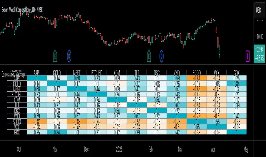
Emperor Pivot LevelsDescription:
Emperor Pivot Levels is a powerful and advanced Trading View indicator designed to help traders identify precise support and resistance zones in real-time. It combines Woodie and Camarilla pivot points across multiple timeframes, ranging from 15 min to decennial, providing a comprehensive market view. The indicator features color-coded buyer and seller zones, with a green background indicating bullish territory above the pivot and a red background highlighting bearish areas below it. With its real-time accuracy and multi-timeframe analysis, Emperor Levels of Pivot empowers traders to make informed decisions and capitalize on market trends effectively.
🔥Emperor Levels of Pivot is original because it is a unique and customized enhancement of the traditional Pivot Point Standard indicator. Unlike standard pivot indicators, Emperor Pivot offers:
Dual Pivot Calculation: It combines both Woodie and Camarilla pivot types, giving traders a broader and more versatile analysis of support and resistance levels.
Multi-Timeframe Accuracy: It displays pivot levels from 15 min to decennial timeframes, providing a comprehensive market view in a single indicator. Most standard pivot indicators are limited to fewer timeframes.
Real-Time Accuracy: Unlike many lagging indicators, Emperor Pivot shows real-time support and resistance zones, making it highly effective for live trading decisions.
Unique Color-Coded Zones: The indicator features a green buyer zone above the pivot and a red seller zone below it, offering clear visual cues to identify market bias instantly.
🚀 What the script does:
snapshot
✅ 1. Displays Pivots for Multiple Timeframes Simultaneously
The script calculates and shows pivot levels for 15 min, 30 min, 45 min, 1 hr, 2 hr, 3 hr, 4 hr, 5 hr, 6 hr, daily, weekly, monthly, quarterly, half-yearly, yearly, bi-yearly, tri-yearly, quinquennial, and decennial timeframes.
snapshot
This multi-timeframe analysis helps traders see both short-term and long-term trends without switching charts.
🎯 2. Plots Buyer and Seller Zones
snapshot
Above Pivot: The script fills the area with a green background, marking the buyer zone.
Below Pivot: The area is filled with a red background, indicating the seller zone.
This color coding provides a visual representation of market sentiment, helping traders quickly spot trends.
⚡ 3. Real-Time Updates Without Lag
The script uses real-time price data to update the pivot levels instantly. This ensures that traders get the most accurate support and resistance levels during live market conditions.
🎨 4. Visual and Customizable Display
The script offers clear and clean plotting with color-coded zones, making it easy to interpret.
It also includes distance labels from the current price to the nearest pivot, helping traders measure the market's potential movement.
🔥 5. Efficient and Lightweight
Despite its complex functionality, the script is optimized for speed and performance, ensuring it doesn’t slow down the TradingView platform, even when multiple timeframes are displayed.
🚀 In Summary:
The Emperor Levels of Pivot script is a powerful tool that:
✅ Displays multi-timeframe pivots in real time.
✅ Marks buyer and seller zones with clear color coding.
✅ Shows distance from pivots for precise trading insights.
✅ Updates instantly during live trading without time lag.
This makes it an essential and highly effective indicator for both intraday and long-term traders.
📊 🔥 HOW IT WORKS 🔥:
1. Buyer and Seller Zones
The script colors the background in two zones:
Green Background (Buyer Zone): When the price is above the pivot, indicating a bullish trend.
Red Background (Seller Zone): When the price is below the pivot, indicating a bearish trend.
These color-coded zones help traders quickly understand market sentiment.
2. Real-Time Updates
The indicator continuously updates pivot levels in real time as the price moves, ensuring that traders always have the most accurate information for decision-making.
3. Efficient Performance
Despite handling multiple timeframes and pivot calculations, the script is optimized for performance, ensuring that it runs smoothly without slowing down TradingView, even with many pivots being displayed.
In Summary:
Emperor Levels of Pivot works by calculating pivot levels using Woodie and Camarilla formulas, displaying them across multiple timeframes, and visualizing market sentiment with color-coded zones. It provides real-time, accurate, and dynamic support and resistance levels, helping traders make informed decisions quickly.
⚙️ HOW TO USE Emperor Levels of Pivot 🔥:
Here’s how you can use the Emperor Levels of Pivot to make more informed trading decisions:
1. Add the Indicator to Your Chart
First, add the Emperor Levels of Pivot indicator to your TradingView chart.
You will see pivot levels displayed for multiple timeframes (15 min, 1 hour, daily, weekly, etc.) with support and resistance levels.
2. Understand the Pivot Levels
The indicator will plot pivot levels, which act as key support and resistance levels for the market.
Support Levels (S1, S2, S3, etc.): These are price levels where the market could potentially find support and reverse or slow down.
Resistance Levels (R1, R2, R3, etc.): These are levels where the price could face resistance and reverse or stall.
3. Interpret the Color-Coded Zones
snapshot
Green Background (Buyer Zone): When the price is above the pivot, the background turns green, indicating a bullish trend. Traders may consider buying or looking for long positions in this zone.
Red Background (Seller Zone): When the price is below the pivot, the background turns red, indicating a bearish trend. Traders may consider selling or looking for short positions in this zone.
4. Monitor Multi-Timeframe Pivots
The indicator displays pivot levels for multiple timeframes. For example, a short-term (15-minute) pivot might be used for quick scalping, while a long-term (daily, weekly) pivot can provide a broader view of market sentiment.
You can compare pivot levels from different timeframes to get a better understanding of market trends. For example:
Short-term (15 min) may show immediate trends.
Long-term (daily, weekly) pivots help spot overall market direction.
5. React to Price Action
Watch for price reactions at key pivots:
If the price is approaching a resistance level and facing rejection, it may indicate a selling opportunity.
If the price is approaching a support level and bouncing back, it could signal a buying opportunity.
Reversals at key pivots often present high-probability trades.
6. Combine with Emperor RSI Candle
The Emperor Levels of Pivot indicator can be combined with other indicators, such as RSI, moving averages, or candlestick patterns, to confirm trading signals and increase the probability of a successful trade.
🔥 Key Tips for Using Emperor Levels of Pivot:
Adapt to your trading style: Whether you are scalping, day trading, or taking longer-term positions, use the appropriate timeframe pivots to match your strategy.
Set stop-loss and take-profit levels near key pivot points for better risk management.
Watch for price consolidations around pivot levels, as these often signal potential breakouts or reversals.
By following these steps, you can effectively use Emperor Levels of Pivot to guide your trading decisions, improve accuracy, and increase your chances of success in the market!
💡 HOW Emperor Levels of Pivot IMPROVES TRADING 🔥
Here’s how the Emperor Levels of Pivot can significantly enhance your trading experience and decision-making:
1. Clear Identification of Key Support & Resistance Levels
The pivot levels act as strong support and resistance zones, making it easier to identify where the price might reverse or consolidate.
By visually seeing these levels, traders can avoid getting trapped in breakouts that fail or entering trades at bad price points.
2. Real-Time Market Sentiment Understanding
The color-coded zones (green for buyer zone and red for seller zone) quickly show the market’s overall sentiment. This helps traders avoid counter-trend trades and only take positions aligned with the market's current momentum.
You’ll know instantly if the market is in a bullish or bearish phase, allowing you to align your trades accordingly.
3. Multi-Timeframe Insights for More Accurate Decisions
The multi-timeframe support allows you to view pivot levels for various timeframes (from 15 min to decennial). This means you can analyze both short-term trends and long-term market conditions, giving you a holistic view.
By combining short-term and long-term pivots, you can find the best entry points and avoid trading against the dominant trend.
4. Increased Trade Precision
The distance labels show how far the current price is from key pivot points (support/resistance), helping you assess whether the price is too far from the pivot or if a pullback is likely.
This precision allows you to set more accurate stop-loss and take-profit levels, optimizing your risk-to-reward ratio.
5. Faster Decision Making
The visual simplicity of the indicator’s color-coded zones and pivot levels allows for quick decision-making. Instead of spending time analyzing price action or trying to plot pivots manually, you can immediately spot trade setups that align with your strategy.
6. Helps Identify Breakouts and Reversals
By watching how price behaves near key support and resistance levels, you can spot potential breakouts or reversals earlier.
If price bounces off a support level (green zone) or gets rejected from a resistance level (red zone), it signals high-probability entry points.
7. Reduces Overtrading and Emotional Decisions
The clarity and structure provided by the Emperor Levels of Pivot indicator reduce the chance of overtrading. When you have a clear view of key levels, you'll be less likely to take impulsive trades based on emotions or random price movements.
8. Optimized for Intraday and Long-Term Trading
Whether you’re a scalper, day trader, or position trader, the multi-timeframe functionality provides flexibility. You can zoom into lower timeframes for quick trades or focus on higher timeframes for broader market trends.
🔥 In Summary:
Emperor Levels of Pivot improves trading by:
Providing clear, reliable support and resistance levels.
Offering a real-time view of market sentiment (buyer or seller zones).
Giving multi-timeframe insights, enhancing overall decision-making.
Increasing trade precision and optimal entry/exit points.
Enabling faster decisions for quicker execution.
Helping identify potential breakouts and reversals.
Reducing the chance of overtrading and emotional errors.
Being versatile for both intraday and long-term strategies.
By utilizing Emperor Levels of Pivot, traders can make more informed, precise, and effective trading decisions, leading to better risk management and higher success rates.

RSI Plus +
Description:
RSI Plus + is an enhanced Relative Strength Index (RSI) indicator that provides a multi-timeframe view of RSI values across various timeframes. It highlights overbought and oversold conditions for a more comprehensive analysis, with additional focus on the Relative RSI (RRSI), which compares the current RSI to the average RSI. This provides insight into relative market strength or weakness, giving traders a clear view of how the current market conditions compare to historical averages. The indicator is ideal for spotting potential market reversals, pullbacks, or trend continuations.
Overview
RSI Plus + offers a multi-timeframe RSI display across the following timeframes:
- 2m (2 minutes)
- 5m (5 minutes)
- 15m(15 minutes)
- 30m (30 minutes)
- 1h (1 hour)
- 4h (4 hours)
- 12h (12 hours)
- Daily (1 Day)
- Weekly (1 Week)
- Monthly (1 Month)
The indicator displays a table with RSI, Average RSI, and Relative RSI (RRSI) values for each selected timeframe. The table is color-coded to indicate overbought (RSI > 70) or oversold (RSI < 30) conditions. Additionally, visual triangle alerts are plotted on the chart to signal potential trade opportunities when all selected timeframes show either overbought or oversold conditions. The RRSI provides insight into the current market’s relative strength or weakness by comparing the current RSI to its historical average.
How to Use
1. Setting Up the Indicator:
- Add RSI Plus + to your TradingView chart.
- Enable or disable timeframes using the checkboxes (e.g., 2m, 5m, 15m, Daily, Weekly, etc.) to customise the timeframes you want to analyse.
2. Understanding the Table Layout:
The indicator displays a table in the top-right corner of the chart with the following columns:
- Row 0 Timeframes (2m, 5m, 15m, 30m, 1h, 4h, 12h, Daily, Weekly, Monthly).
- Row 1 RRSI (Relative RSI: the current RSI compared to the average RSI).
- Row 2 Average RSI (The average RSI for each timeframe).
- Row 3 Current RSI (The current RSI value for each timeframe).
The RRSI (Relative RSI) row compares the current RSI with the average RSI, offering insight into the current relative strength or weakness. This allows traders to gauge whether the market is stronger or weaker compared to its historical performance within the selected timeframe.
3. Interpreting the Relative RSI (RRSI)
- RRSI > 1: If the Relative RSI (RRSI)is greater than 1, it means the current RSI is stronger than its historical average, indicating stronger market strength. This could be a sign of momentum in the direction of the trend.
- RRSI < 1: If the RRSI is below 1, it means the current RSI is weaker than its historical average, signalling relative market weakness. This may indicate the possibility of a reversal or pullback before the trend resumes.
- RRSI ~ 1: When the RRSI is around 1, it indicates that the current RSI is in line with its historical average, suggesting neutral market conditions.
4. Using the Visual Cues (Triangle Shapes):
- Green Triangle: Plotted above the price bars when all selected timeframes show RSI values above 70 (overbought), signalling potential exhaustion and a short signal or a pullback before continuation.
- Red Triangle: Plotted below the price bars when all selected timeframes show RSI values below 30*(oversold), signalling potential market reversal and long signal or a pullback before continuation*
These triangle shapes are clear visual alerts for traders to act upon when all timeframes signal extreme conditions.
5. Overbought/Oversold Conditions as Signals:
Overbought Conditions: If all selected timeframes show RSI values above 70 (green triangles appear), it suggests that the market may be overbought, signalling a potential short trade opportunity or a pullback before continuation.
Oversold Conditions: If all selected timeframes show RSI values below 30 (red triangles appear), it suggests that the market may be oversold, signalling a potential long trade or short term bounce opportunity or a pullback before continuation.
6. Set alerts for when all selected timeframes turn overbought (green triangles) or all turn oversold (red triangles). This alert condition will notify you when all selected timeframes signal extreme market conditions, which could indicate a strong reversal or continuation in price.
Notes:
RRSI provides an additional layer of analysis by showing the current relative strength or weakness of the market. A higher RRSI indicates strength relative to historical performance, while a lower RRSI signals weakness.
RSI Plus + is best used alongside other technical tools to confirm trade setups.
RRSI can help traders determine whether the market is likely to continue its trend or if a correction or reversal is imminent.
Customisable Timeframes: The RSI Plus + indicator is fully customisable, allowing you to select RSI length (RSI Period), which timeframes to analyse, from as short as 2 minutes up to monthly intervals, a personally chosen selection This gives traders the flexibility to tailor the indicator to their preferred trading style and time horizon.

Relative Crypto Dominance Polar Chart [LuxAlgo]The Relative Crypto Dominance Polar Chart tool allows traders to compare the relative dominance of up to ten different tickers in the form of a polar area chart, we define relative dominance as a combination between traded dollar volume and volatility, making it very easy to compare them at a glance.
🔶 USAGE
The use is quite simple, traders just have to load the indicator on the chart, and the graph showing the relative dominance will appear.
The 10 tickers loaded by default are the major cryptocurrencies by market cap, but traders can select any ticker in the settings panel.
Each area represents dominance as volatility (radius) by dollar volume (arc length); a larger area means greater dominance on that ticker.
🔹 Choosing Period
The tool supports up to five different periods
Hourly
Daily
Weekly
Monthly
Yearly
By default, the tool period is set on auto mode, which means that the tool will choose the period depending on the chart timeframe
timeframes up to 2m: Hourly
timeframes up to 15m: Daily
timeframes up to 1H: Weekly
timeframes up to 4H: Monthly
larger timeframes: Yearly
🔹 Sorting & Sizing
Traders can sort the graph areas by volatility (radius of each area) in ascending or descending order; by default, the tickers are sorted as they are in the settings panel.
The tool also allows you to adjust the width of the chart on a percentage basis, i.e., at 100% size, all the available width is used; if the graph is too wide, just decrease the graph size parameter in the settings panel.
🔹 Set your own style
The tool allows great customization from the settings panel, traders can enable/disable most of the components, and add a very nice touch with curved lines enabled for displaying the areas with a petal-like effect.
🔶 SETTINGS
Period: Select up to 5 different time periods from Hourly, Daily, Weekly, Monthly and Yearly. Enable/disable Auto mode.
Tickers: Enable/disable and select tickers and colors
🔹 Style
Graph Order: Select sort order
Graph Size: Select percentage of width used
Labels Size: Select size for ticker labels
Show Percent: Show dominance in % under each ticker
Curved Lines: Enable/disable petal-like effect for each area
Show Title: Enable/disable graph title
Show Mean: Enable/disable volatility average and select color

Bitcoin Polynomial Regression ModelThis is the main version of the script. Click here for the Oscillator part of the script.
💡Why this model was created:
One of the key issues with most existing models, including our own Bitcoin Log Growth Curve Model , is that they often fail to realistically account for diminishing returns. As a result, they may present overly optimistic bull cycle targets (hence, we introduced alternative settings in our previous Bitcoin Log Growth Curve Model).
This new model however, has been built from the ground up with a primary focus on incorporating the principle of diminishing returns. It directly responds to this concept, which has been briefly explored here .
📉The theory of diminishing returns:
This theory suggests that as each four-year market cycle unfolds, volatility gradually decreases, leading to more tempered price movements. It also implies that the price increase from one cycle peak to the next will decrease over time as the asset matures. The same pattern applies to cycle lows and the relationship between tops and bottoms. In essence, these price movements are interconnected and should generally follow a consistent pattern. We believe this model provides a more realistic outlook on bull and bear market cycles.
To better understand this theory, the relationships between cycle tops and bottoms are outlined below:https://www.tradingview.com/x/7Hldzsf2/
🔧Creation of the model:
For those interested in how this model was created, the process is explained here. Otherwise, feel free to skip this section.
This model is based on two separate cubic polynomial regression lines. One for the top price trend and another for the bottom. Both follow the general cubic polynomial function:
ax^3 +bx^2 + cx + d.
In this equation, x represents the weekly bar index minus an offset, while a, b, c, and d are determined through polynomial regression analysis. The input (x, y) values used for the polynomial regression analysis are as follows:
Top regression line (x, y) values:
113, 18.6
240, 1004
451, 19128
655, 65502
Bottom regression line (x, y) values:
103, 2.5
267, 211
471, 3193
676, 16255
The values above correspond to historical Bitcoin cycle tops and bottoms, where x is the weekly bar index and y is the weekly closing price of Bitcoin. The best fit is determined using metrics such as R-squared values, residual error analysis, and visual inspection. While the exact details of this evaluation are beyond the scope of this post, the following optimal parameters were found:
Top regression line parameter values:
a: 0.000202798
b: 0.0872922
c: -30.88805
d: 1827.14113
Bottom regression line parameter values:
a: 0.000138314
b: -0.0768236
c: 13.90555
d: -765.8892
📊Polynomial Regression Oscillator:
This publication also includes the oscillator version of the this model which is displayed at the bottom of the screen. The oscillator applies a logarithmic transformation to the price and the regression lines using the formula log10(x) .
The log-transformed price is then normalized using min-max normalization relative to the log-transformed top and bottom regression line with the formula:
normalized price = log(close) - log(bottom regression line) / log(top regression line) - log(bottom regression line)
This transformation results in a price value between 0 and 1 between both the regression lines. The Oscillator version can be found here.
🔍Interpretation of the Model:
In general, the red area represents a caution zone, as historically, the price has often been near its cycle market top within this range. On the other hand, the green area is considered an area of opportunity, as historically, it has corresponded to the market bottom.
The top regression line serves as a signal for the absolute market cycle peak, while the bottom regression line indicates the absolute market cycle bottom.
Additionally, this model provides a predicted range for Bitcoin's future price movements, which can be used to make extrapolated predictions. We will explore this further below.
🔮Future Predictions:
Finally, let's discuss what this model actually predicts for the potential upcoming market cycle top and the corresponding market cycle bottom. In our previous post here , a cycle interval analysis was performed to predict a likely time window for the next cycle top and bottom:
In the image, it is predicted that the next top-to-top cycle interval will be 208 weeks, which translates to November 3rd, 2025. It is also predicted that the bottom-to-top cycle interval will be 152 weeks, which corresponds to October 13th, 2025. On the macro level, these two dates align quite well. For our prediction, we take the average of these two dates: October 24th 2025. This will be our target date for the bull cycle top.
Now, let's do the same for the upcoming cycle bottom. The bottom-to-bottom cycle interval is predicted to be 205 weeks, which translates to October 19th, 2026, and the top-to-bottom cycle interval is predicted to be 259 weeks, which corresponds to October 26th, 2026. We then take the average of these two dates, predicting a bear cycle bottom date target of October 19th, 2026.
Now that we have our predicted top and bottom cycle date targets, we can simply reference these two dates to our model, giving us the Bitcoin top price prediction in the range of 152,000 in Q4 2025 and a subsequent bottom price prediction in the range of 46,500 in Q4 2026.
For those interested in understanding what this specifically means for the predicted diminishing return top and bottom cycle values, the image below displays these predicted values. The new values are highlighted in yellow:
And of course, keep in mind that these targets are just rough estimates. While we've done our best to estimate these targets through a data-driven approach, markets will always remain unpredictable in nature. What are your targets? Feel free to share them in the comment section below.

Bitcoin Polynomial Regression OscillatorThis is the oscillator version of the script. Click here for the other part of the script.
💡Why this model was created:
One of the key issues with most existing models, including our own Bitcoin Log Growth Curve Model , is that they often fail to realistically account for diminishing returns. As a result, they may present overly optimistic bull cycle targets (hence, we introduced alternative settings in our previous Bitcoin Log Growth Curve Model).
This new model however, has been built from the ground up with a primary focus on incorporating the principle of diminishing returns. It directly responds to this concept, which has been briefly explored here .
📉The theory of diminishing returns:
This theory suggests that as each four-year market cycle unfolds, volatility gradually decreases, leading to more tempered price movements. It also implies that the price increase from one cycle peak to the next will decrease over time as the asset matures. The same pattern applies to cycle lows and the relationship between tops and bottoms. In essence, these price movements are interconnected and should generally follow a consistent pattern. We believe this model provides a more realistic outlook on bull and bear market cycles.
To better understand this theory, the relationships between cycle tops and bottoms are outlined below:https://www.tradingview.com/x/7Hldzsf2/
🔧Creation of the model:
For those interested in how this model was created, the process is explained here. Otherwise, feel free to skip this section.
This model is based on two separate cubic polynomial regression lines. One for the top price trend and another for the bottom. Both follow the general cubic polynomial function:
ax^3 +bx^2 + cx + d.
In this equation, x represents the weekly bar index minus an offset, while a, b, c, and d are determined through polynomial regression analysis. The input (x, y) values used for the polynomial regression analysis are as follows:
Top regression line (x, y) values:
113, 18.6
240, 1004
451, 19128
655, 65502
Bottom regression line (x, y) values:
103, 2.5
267, 211
471, 3193
676, 16255
The values above correspond to historical Bitcoin cycle tops and bottoms, where x is the weekly bar index and y is the weekly closing price of Bitcoin. The best fit is determined using metrics such as R-squared values, residual error analysis, and visual inspection. While the exact details of this evaluation are beyond the scope of this post, the following optimal parameters were found:
Top regression line parameter values:
a: 0.000202798
b: 0.0872922
c: -30.88805
d: 1827.14113
Bottom regression line parameter values:
a: 0.000138314
b: -0.0768236
c: 13.90555
d: -765.8892
📊Polynomial Regression Oscillator:
This publication also includes the oscillator version of the this model which is displayed at the bottom of the screen. The oscillator applies a logarithmic transformation to the price and the regression lines using the formula log10(x) .
The log-transformed price is then normalized using min-max normalization relative to the log-transformed top and bottom regression line with the formula:
normalized price = log(close) - log(bottom regression line) / log(top regression line) - log(bottom regression line)
This transformation results in a price value between 0 and 1 between both the regression lines.
🔍Interpretation of the Model:
In general, the red area represents a caution zone, as historically, the price has often been near its cycle market top within this range. On the other hand, the green area is considered an area of opportunity, as historically, it has corresponded to the market bottom.
The top regression line serves as a signal for the absolute market cycle peak, while the bottom regression line indicates the absolute market cycle bottom.
Additionally, this model provides a predicted range for Bitcoin's future price movements, which can be used to make extrapolated predictions. We will explore this further below.
🔮Future Predictions:
Finally, let's discuss what this model actually predicts for the potential upcoming market cycle top and the corresponding market cycle bottom. In our previous post here , a cycle interval analysis was performed to predict a likely time window for the next cycle top and bottom:
In the image, it is predicted that the next top-to-top cycle interval will be 208 weeks, which translates to November 3rd, 2025. It is also predicted that the bottom-to-top cycle interval will be 152 weeks, which corresponds to October 13th, 2025. On the macro level, these two dates align quite well. For our prediction, we take the average of these two dates: October 24th 2025. This will be our target date for the bull cycle top.
Now, let's do the same for the upcoming cycle bottom. The bottom-to-bottom cycle interval is predicted to be 205 weeks, which translates to October 19th, 2026, and the top-to-bottom cycle interval is predicted to be 259 weeks, which corresponds to October 26th, 2026. We then take the average of these two dates, predicting a bear cycle bottom date target of October 19th, 2026.
Now that we have our predicted top and bottom cycle date targets, we can simply reference these two dates to our model, giving us the Bitcoin top price prediction in the range of 152,000 in Q4 2025 and a subsequent bottom price prediction in the range of 46,500 in Q4 2026.
For those interested in understanding what this specifically means for the predicted diminishing return top and bottom cycle values, the image below displays these predicted values. The new values are highlighted in yellow:
And of course, keep in mind that these targets are just rough estimates. While we've done our best to estimate these targets through a data-driven approach, markets will always remain unpredictable in nature. What are your targets? Feel free to share them in the comment section below.

Super Cycle Low FinderHow the Indicator Works
1. Inputs
Users can adjust the cycle lengths:
Daily Cycle: Default is 40 days (within 36-44 days).
Weekly Cycle: Default is 26 weeks (182 days, within 22-31 weeks).
Yearly Cycle: Default is 4 years (1460 days).
2. Cycle Low Detection
Function: detect_cycle_low finds the lowest low over the specified period and confirms it with a bullish candle (close > open).
Timeframes: Daily lows are calculated directly; weekly and yearly lows use request.security to fetch data from higher timeframes.
3. Half Cycle Lows
Detected over half the cycle length, plotted to show mid-cycle strength or weakness.
4. Cycle Translation
Logic: Compares the position of the highest high to the cycle’s midpoint.
Output: "R" for right translated (bullish), "L" for left translated (bearish), displayed above bars.
5. Cycle Failure
Flags when a new low falls below the previous cycle low, indicating a breakdown.
6. Visualization
Cycle Lows: Diamonds below bars (yellow for daily, green for weekly, blue for yearly).
Half Cycle Lows: Circles below bars (orange, lime, aqua).
Translations: "R" or "L" above bars in distinct colors.
Failures: Downward triangles below bars (red, orange, purple).