Weekly Setup Scanner (Trend + Momentum + Squeeze)Trend → price above weekly 20 EMA.
Momentum → weekly MACD bullish (MACD > Signal).
Volatility → weekly squeeze (Bollinger Bands inside Keltner Channels).
If all 3 conditions align → it flags the setup
Cari dalam skrip untuk "weekly"

Weekly Fibonacci Pivot Levelsthis indicator in simple ways, draw the weekly fibo zones based on calculations
weekly zones are drawn automatically based on previous week, and are updated once a new week is opened
you can use it the way you like or adapt to your trading strategy
i really use it at extremes and when a divergence is occurring in these zones

Weekly pecentage tracker by PRIVATE
Settings Picture below this link: 👇
i.ibb.co
What it is
A lightweight “Weekly % Tracker” overlay that lets you manually enter weekly performance (in percent) for XAUUSD + up to 10 FX pairs, then shows:
a small table panel with each enabled symbol and its % result
one TOTAL row (Sum / Average / Compounded across all enabled symbols)
an optional mini badge showing the % for a single selected symbol
Nothing is auto-calculated from price—you type the % yourself.
Key settings
Panel: show/hide, position, number of decimals, colors (background, text, green/red).
Total mode:
Sum – adds percentages
Average – mean of enabled rows
Compounded –
(
∏
(
1
+
𝑝
/
100
)
−
1
)
×
100
(∏(1+p/100)−1)×100
Symbols:
XAUUSD (toggle + label + % input)
10 FX pairs (each has On/Off, label text, % input). You can rename labels to any symbol text you want.
Mini badge: show/hide, position, and symbol to display.
How it works
Overlay indicator: overlay=true; just draws UI on the chart (no plots).
Arrays (syms, vals, ons) collect the row data in order: XAU first, then FX1…FX10.
Helpers:
posFrom() converts a position string (e.g., “Top Right”) into a position.* constant.
wp_col() picks green/red/neutral based on the sign of the %.
wp_round() rounds values to the selected decimals.
calc_total() computes the TOTAL with the chosen mode over enabled rows only.
Table creation logic:
Counts how many rows are enabled.
If none enabled or panel is off: the panel table is deleted, so no box/background is visible.
If enabled and on: the panel is (re)created at the chosen position.
On each last bar (barstate.islast), it clears the table to transparent (bgcolor=na) and then fills one row per enabled symbol, followed by a single TOTAL row.
Mini badge:
Always (re)created on position change.
Shows selected symbol’s % (or “-” if that symbol isn’t enabled or has no value).
Colors text green/red by sign.
Notes & limits
It’s manual input—the script doesn’t read trades or P/L from price.
You can rename each row’s label to match any symbol name you want.
When no rows are enabled, the panel disappears entirely (no empty background).
Designed to be light: only draws tables; no heavy plotting.
If you want the TOTAL row to be optional, or different color thresholds, or CSV-style export/import of the values, say the word and I’ll add it.

Weekly 8 EMA Horizontal Linethis will automatically track the WEEKLY 8EMA on your chart so you can know where the Weekly 8EMA is on lower timeframes
Weekly Change(Green&Red) & Percentage Change(Blue&Yellow)Display bar chart of weekly price action. Use to determine the maximum price change in one week. It would be the possible strike price for a covered call option for weekly income.
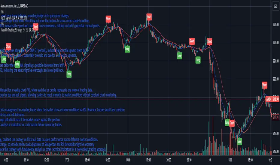
Weekly Trading StrategyStrategy Overview:
This trading strategy is designed for short-term trades over weekly intervals, utilizing the combination of Simple Moving Averages (SMA) for trend identification and the Relative Strength Index (RSI) for overbought/oversold conditions. It aims to capitalize on momentum shifts while mitigating the risk of entering a market at extreme points.
Key Components:
Fast SMA (9 periods): Acts as a short-term trend indicator, providing insights into quick price changes.
Slow SMA (21 periods): Represents a longer-term trend, smoothing out price fluctuations to show a more stable trend line.
RSI (14 periods): An oscillator that measures the speed and change of price movements, helping to identify potential reversal points.
Entry Signals:
Buy Signal:
Condition 1: The fast SMA (9 periods) crosses above the slow SMA (21 periods), indicating a potential upward trend shift.
Condition 2: RSI falls below 30, suggesting the asset is potentially oversold and due for a correction upwards.
Sell Signal:
Condition 1: The fast SMA crosses below the slow SMA, signaling a possible downward trend shift.
Condition 2: RSI climbs above 70, indicating the asset might be overbought and could pull back.
Strategy Execution:
Timeframe: This strategy is optimized for a weekly chart (W), where each bar or candle represents one week of trading data.
Alert System: Alerts can be set up for buy and sell signals, allowing traders to react promptly to market conditions without constant chart monitoring.
Risk Management:
This strategy includes inherent risk management by avoiding trades when the market shows extreme conditions via RSI. However, traders should also consider:
Position sizing based on account size and risk tolerance.
Setting stop-loss orders to manage potential losses if the market moves against the position.
Considering additional market analysis or indicators for confirmation before executing trades.
Considerations:
Backtesting: Before live trading, backtest the strategy on historical data to assess performance across different market conditions.
Adaptation: Market dynamics change, so periodic review and adjustment of SMA periods and RSI thresholds might be necessary.
Complementary Analysis: Enhance this strategy with fundamental analysis or other technical indicators for a more robust trading approach.
This strategy is suited for traders looking for weekly swings in the market, balancing between following the trend and spotting potential reversals. However, like all trading strategies, it should not be used in isolation but as part of a broader trading plan.
Weekly and daily separators - MKThis indicator is designed to provide easier usability and greater customization for traders. The update brings enhanced stability and reliability in detecting day, week, and month changes across various timeframes, ensuring consistent and accurate visuals on your charts.
Key Features:
Time Zone Customization: Select the time zone to determine when session changes are marked.
Adjustable Line Coverage: Lines can now be customized to only partially cover the top and bottom of the chart, offering a cleaner look.
Optional Labels: Enable labels to display the starting month, calendar week, or day. Day formats include:
Weekday name
Date in formats: dd.MM or MM.dd
Visual Enhancements:
Default line widths and colors now use an orange hue for better visibility.
Added a monthly separator line for better long-term trend tracking.
Higher time frame color options for clarity.
Independent customization of line styles and widths.
Additional Improvements:
Ability to hide daily lines on daily charts and higher timeframes. Similarly, weekly lines can be hidden on weekly charts and higher.
Secondary line width for weekly separators on daily and higher timeframes, ensuring cleaner chart aesthetics.
Updated color selection and default values for better readability.

Weekly Change % This script shows Weekly Change % in Histogram. Start date of Week is Friday and End date of Week is Thursday. This script is useful for trade who deal with Weekly Options in Nifty and Bank Nifty

Weekly Options Expiry CandleThis script shows weekly expiry candle on daily chart. In weekly expiry, week starts on Friday and end on next Thursday.
How the candle is constructed:
Open= Open price of Friday, if Friday is a holiday, next available open price
High= Highest high price of Friday, Monday, Tuesday, Wednesday, Thursday
Low= Lowest low price of Friday, Monday, Tuesday, Wednesday, Thursday
Close=Close price of Thursday, if Thursday is a holiday, previously available close price
I am very new to Pine script, so waiting for your comments and review.

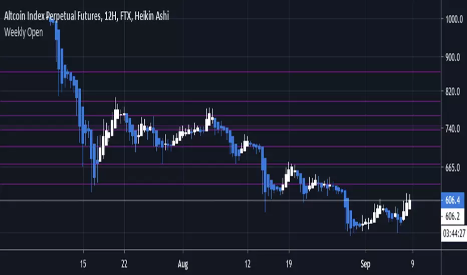
Weekly OpenHere we draw each weekly open using the new lines feature of Pine Script v4, inspired by Ultra Kzilla's Weekly Open strategy.
Pivot Points Weekly - bitcoin by Simon-RoseWeekly Version:
I have written 3 Indicators because i couldn't find what i was looking for in the library, so you can turn each one on and off individually for better visibility.
This are Daily, Weekly and Monthly Pivot Points with their Resistance and Support Points
and also on the Daily with the range between them.
I will also publish some Ideas to show you how to use them if you are not familiar with the traditional pivot points strategy already.
Unlike the usually 3 support & resistances i added 4 of them, specifically for trading bitcoin (on traditional markets this level of volatility usually never gets touched)
Here you can see which lines are what for reference, as the Feature to label lines is missing in Pinescript (if you have a workaround pls tell me ;) )
This is the basic calculation used :
PP = (xHigh+xLow+xClose) / 3
R1 = vPP+(vPP-Low)
R2 = vPP + (High - Low)
R3 = xHigh + 2 * (vPP - Low)
R4 = xHigh + 3 * (vPP - Low)
S1 = vPP-(High - vPP)
S2 = vPP - (High - Low)
S3 = xLow - 2 * (High - PP)
S4 = xLow - 3 * (High - PP)
If you have any questions or suggestions pls write me :)
Happy trading
Cheers
Daily Version:
Monthly Version:

Weekly Bias - High/Low/Close (Clean No Connections)Gives you the weekly bias candle on your 4 hour closing NY trading hours

Weekly Open Line (WOL) with selective ExtensionThis indicator tracks the Weekly Open Line (WOL) with a clean look.
Features:
Automatic WOL:
Draws a horizontal line at the start of every week (CET/Berlin time).
Historical Selector:
Choose any past week via the calendar settings and extend its level infinitely to the right. Perfect for identifying long-term support and resistance (S/R flips).
Clean Design:
High visibility (Width 3), labeled start points and no diagonal connections.
Quick Guide:
To extend an old level, check the "Extend Specific" box and pick any day of that week in the calendar.

Weekly Open Line This script draws a horizontal line on the first price of the week, the weekly open.

Weekly Swing Trading Signals - DP V1.0This script generates swing trading signals on weekly charts based on 200 SMA and RSI values.

Weekly Bullish Engulfing ScreenerThis is a weekly Bullish engulfing screener to find the stocks ready to breakout

Weekly Institutional Fib Pivots v1These Fibonacci levels act as institutional order zones, meaning price reacts more powerfully when it originates from them. Use them as a weekly roadmap to anticipate where price is likely to travel each day, including during overnight or automated trading sessions.
How to trade them:
• Take the previous weeks levels and use those levels to trade the current week.
• Enter and exit around the major fib levels
• Use the 50% midpoint between levels as your first take-profit or stop-loss zone
These levels provide structure, targets, and precision for both intraday and multi-session trading.
Strategy:
Place your order at one level, and exit before it reaches the next level or at the 50% area of the zone

Weekly expansion (CRT) This indicator is designed to be used primarily on the daily chart,to aid in spotting weekly expansions, its a blend of CRT Theory and some ICT concepts.

Weekly Fibonacci Pivot Signals (4H) - S1/R1 & S3/R3 rulesThis Indicator used weekly price range to calculate the pivot R1,R3,S1 and S3 ,when price crossed and closed below R3 in 4H timeframe the indicator gives sell signal, when the price crossed and close above the S3 the indicator gives buy signal. This indicator can give approximately 50% win Rate .

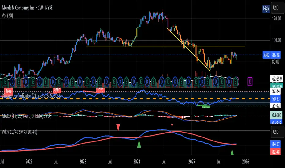
Weekly 10W / 40W SMA CrossoverSMA cross over for the Weekly Chart
The 10 week and 40 Week cross over has been found to be the better judge of buy/sell signals over the last 5 years
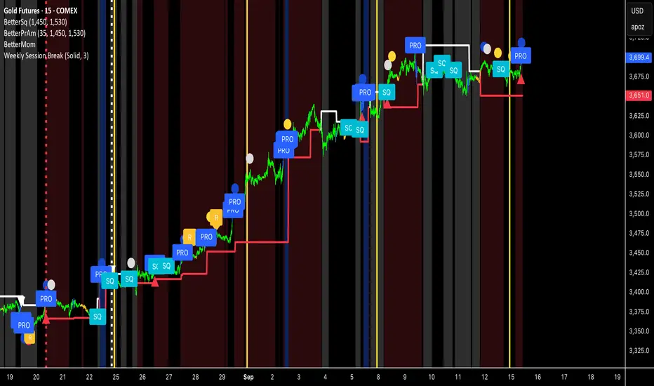
Weekly Session BreakThis indicator plots a vertical line at the end of the trading week (Friday) to mark the weekly session break. It is designed to be used on intraday charts (sub-1 hour timeframes).
The line's appearance is fully customizable via the Inputs tab, allowing you to change its color, style (solid, dotted, or dashed), and thickness.
Key Features:
End-of-Week Marker: Accurately draws a vertical line on the last bar of the trading week.
Timeframe Specific: Lines are only visible on intraday charts (1-minute to 59-minute timeframes) to prevent clutter on higher timeframes.
Customizable: Adjust the line's color, style, and thickness from the Inputs menu.
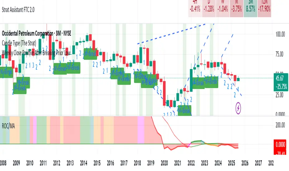
Weekly Close Positive After Breaking Prior LowClosing positive after breaking prior low on weekly basis