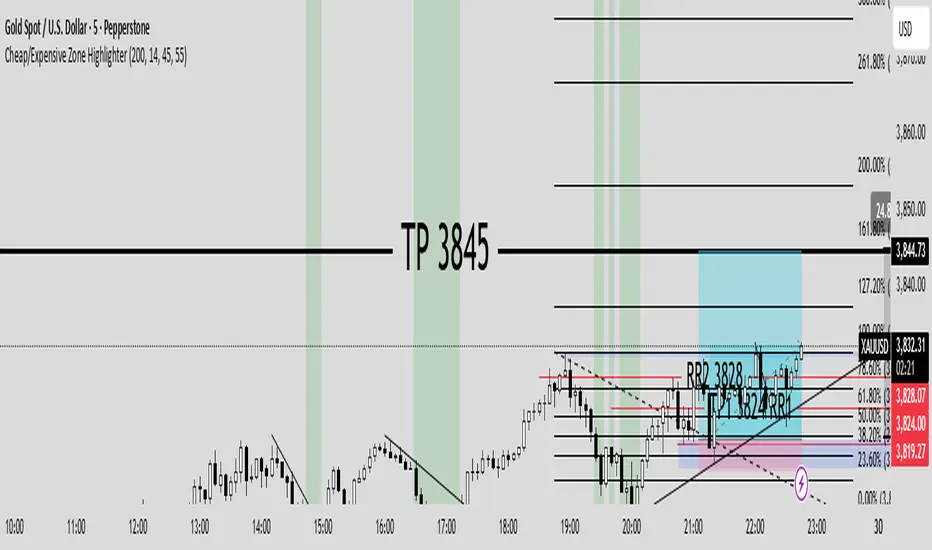
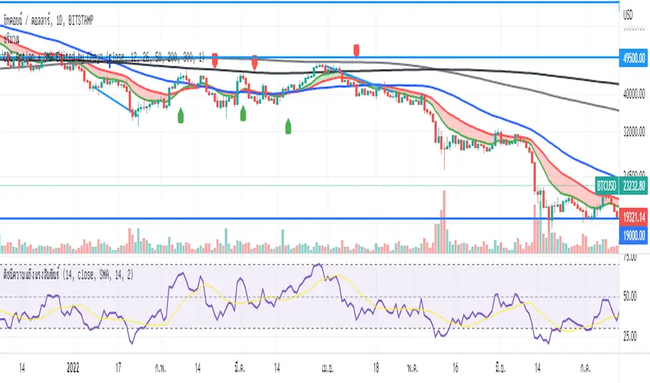
Cheap/Expensive Zone Highlighter V.2 Publicindicator Cheap/Expensive Zone Highlighter Ver2
Uptrend = Based on price> EMA200 (O+H+L+C)/4
Cheap zone = RSI<45
Dowtrend = Based on price< EMA200 (O+H+L+C)/4
Expensive Zone= RSI>55
Cari dalam skrip untuk "zone"
Cheap/Expensive Zone Highlighter V.2 indicator Cheap/Expensive Zone Highlighter Ver2
Uptrend = Based on price> EMA200 (O+H+L+C)/4
Cheap zone = RSI<45
Dowtrend = Based on price< EMA200 (O+H+L+C)/4
Expensive Zone= RSI>55

RSI(7) + MACD ZoneTitle: RSI(7) + MACD Zone Combo
Description:
This indicator combines RSI (7) and MACD (12,26,9) into a single panel with a unified scale for easier analysis.
RSI (7) is plotted in white and automatically turns red when the market reaches overbought (>70) or oversold (<30) conditions.
MACD is normalized to align with the RSI scale (0–100).
A value of 50 represents MACD = 0.
Above 50 (teal) indicates positive momentum.
Below 50 (red) indicates negative momentum.
This combination allows traders to quickly identify when short-term RSI conditions align with overall momentum shifts from MACD.
How to use:
Look for potential buy opportunities when RSI is oversold (<30) and MACD is above 50 (positive momentum).
Look for potential sell opportunities when RSI is overbought (>70) and MACD is below 50 (negative momentum).
Use in conjunction with price action and risk management — not as a standalone signal.

UpDownBow + BullBear ZoneUpDownBow + BullBear UpDownBow + BullBear ZoneUpDoUpDownBow + BullBear ZoneUpDownBow + BullBear ZoneUpDownBow + BullBear ZoneUpDownBow + BullBear ZoneUpDownBow + BullBear ZonewnBow + BullBear ZoneUpDownBow + BullBear UpDownBow + BullBear ZoneUpDoUpDownBow + BullBear ZoneUpDownBow + BullBear ZoneUpDownBow + BullBear ZoneUpDownBow + BullBear ZoneUpDownBow + BullBear ZonewnBow + BullBear ZoneUpDownBow + BullBear UpDownBow + BullBear ZoneUpDoUpDownBow + BullBear ZoneUpDownBow + BullBear ZoneUpDownBow + BullBear ZoneUpDownBow + BullBear ZoneUpDownBow + BullBear ZonewnBow + BullBear ZoneUpDownBow + BullBear UpDownBow + BullBear ZoneUpDoUpDownBow + BullBear ZoneUpDownBow + BullBear ZoneUpDownBow + BullBear ZoneUpDownBow + BullBear ZoneUpDownBow + BullBear ZonewnBow + BullBear ZoneUpDownBow + BullBear UpDownBow + BullBear ZoneUpDoUpDownBow + BullBear ZoneUpDownBow + BullBear ZoneUpDownBow + BullBear ZoneUpDownBow + BullBear ZoneUpDownBow + BullBear ZonewnBow + BullBear ZoneUpDownBow + BullBear UpDownBow + BullBear ZoneUpDoUpDownBow + BullBear ZoneUpDownBow + BullBear ZoneUpDownBow + BullBear ZoneUpDownBow + BullBear ZoneUpDownBow + BullBear ZonewnBow + BullBear ZoneUpDownBow + BullBear UpDownBow + BullBear ZoneUpDoUpDownBow + BullBear ZoneUpDownBow + BullBear ZoneUpDownBow + BullBear ZoneUpDownBow + BullBear ZoneUpDownBow + BullBear ZonewnBow + BullBear ZoneUpDownBow + BullBear UpDownBow + BullBear ZoneUpDoUpDownBow + BullBear ZoneUpDownBow + BullBear ZoneUpDownBow + BullBear ZoneUpDownBow + BullBear ZoneUpDownBow + BullBear ZonewnBow + BullBear Zone

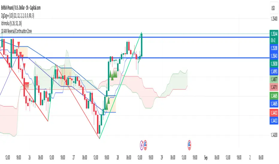
10 AM Reversal/Continuation Zone BY DAN GESPlots the high and low between 9.30 - 10:00am ET
Colours the zone between those two levels.
Highlights when price breaks above or below that zone after 10:00am
RSI (14) with Auto Zone Colors — Overbought/Oversold HighlighterThis indicator plots the Relative Strength Index (RSI 14) with dynamic color changes for instant visual clarity:
✅ Green line in overbought zone (≥70)
✅ Red line in oversold zone (≤30)
✅ White line in neutral range (30–70)
Includes reference lines at 70, 50, and 30 for quick decision-making. Perfect for spotting momentum extremes, divergences, and potential reversal points without squinting at numbers. Works on any timeframe.

Parabolic SAR Strategy with MACD Confirmation & Trend Zone Highl📝 Description (SEO + Follower-Friendly):
🚀 Powerful Trend Strategy Using Parabolic SAR + MACD
This advanced Pine Script combines the classic Parabolic SAR trend-following system with MACD crossover confirmation, improving entry precision and filtering out false signals. The script also features:
✅ Dynamic trend zone background highlighting when SAR is below price
✅ MACD filter ensures trades align with market momentum
✅ Custom SAR logic with adaptive acceleration
✅ Clean visual SAR plots for easy trend tracking
✅ Fully backtestable with strategy.entry logic
🔎 Ideal for traders seeking early trend entries, momentum confirmation, and visual clarity.
📈 Works on all timeframes and pairs — perfect for swing traders, scalpers, and crypto enthusiasts.
💡 Use it as a base strategy or combine with your favorite indicators.
❤️ If you find this helpful, don't forget to like, comment, and follow for more premium strategies!
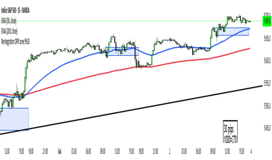
Reintegration OPR zone 9h30📝 Indicator Description (for TradingView):
Name: Reintegration OPR Zone – 9:30 AM EST (UTC-4)
Purpose:
This indicator is designed for US indices like NAS100, US30, or SPX500. It helps identify potential false breakouts or retests by tracking when the price re-enters the Opening Price Range (OPR) after an initial breakout.
🔍 How it works:
At 9:30 AM New York time (UTC-4), the script captures the high and low of the first 15-minute candle (which is key for the US session open).
It then draws a horizontal box (rectangle) from the high to the low of that candle.
The box extends horizontally for 7 hours (28 candles on a 15-minute chart).
The script tracks if price:
Breaks above or below the OPR zone
Then re-enters the zone (a potential "fakeout" or "retest" signal)
No label or text is displayed on the chart (you requested it to be hidden).
🕒 Timeframe:
Designed for the 15-minute chart (M15)
Assumes New York session open at 9:30 AM EST (UTC-4)
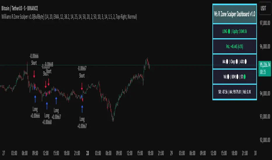
Williams R Zone Scalper v1.0[BullByte]Originality & Usefulness
Unlike standard Williams R cross-over scripts, this strategy layers five dynamic filters—moving-average trend, Supertrend, Choppiness Index, Bollinger Band Width, and volume validation —and presents a real-time dashboard with equity, PnL, filter status, and key indicator values. No other public Pine script combines these elements with toggleable filters and a custom dashboard. In backtests (BTC/USD (Binance), 5 min, 24 Mar 2025 → 28 Apr 2025), adding these filters turned a –2.09 % standalone Williams R into a +5.05 % net winner while cutting maximum drawdown in half.
---
What This Script Does
- Monitors Williams R (length 14) for overbought/oversold reversals.
- Applies up to five dynamic filters to confirm trend strength and volatility direction:
- Moving average (SMA/EMA/WMA/HMA)
- Supertrend line
- Choppiness Index (CI)
- Bollinger Band Width (BBW)
- Volume vs. its 50-period MA
- Plots blue arrows for Long entries (R crosses above –80 + all filters green) and red arrows for Short entries (R crosses below –20 + all filters green).
- Optionally sets dynamic ATR-based stop-loss (1.5×ATR) and take-profit (2×ATR).
- Shows a dashboard box with current position, equity, PnL, filter status, and real-time Williams R / MA/volume values.
---
Backtest Summary (BTC/USD(Binance), 5 min, 24 Mar 2025 → 28 Apr 2025)
• Total P&L : +50.70 USD (+5.05 %)
• Max Drawdown : 31.93 USD (3.11 %)
• Total Trades : 198
• Win Rate : 55.05 % (109/89)
• Profit Factor : 1.288
• Commission : 0.01 % per trade
• Slippage : 0 ticks
Even in choppy March–April, this multi-filter approach nets +5 % with a robust risk profile, compared to –2.09 % and higher drawdown for Williams R alone.
---
Williams R Alone vs. Multi-Filter Version
• Total P&L :
– Williams R alone → –20.83 USD (–2.09 %)
– Multi-Filter → +50.70 USD (+5.05 %)
• Max Drawdown :
– Williams R alone → 62.13 USD (6.00 %)
– Multi-Filter → 31.93 USD (3.11 %)
• Total Trades : 543 vs. 198
• Win Rate : 60.22 % vs. 55.05 %
• Profit Factor : 0.943 vs. 1.288
---
Inputs & What They Control
- wrLen (14): Williams R look-back
- maType (EMA): Trend filter type (SMA, EMA, WMA, HMA)
- maLen (20): Moving-average period
- useChop (true): Toggle Choppiness Index filter
- ciLen (12): CI look-back length
- chopThr (38.2): CI threshold (below = trending)
- useVol (true): Toggle volume-above-average filter
- volMaLen (50): Volume MA period
- useBBW (false): Toggle Bollinger Band Width filter
- bbwMaLen (50): BBW MA period
- useST (false): Toggle Supertrend filter
- stAtrLen (10): Supertrend ATR length
- stFactor (3.0): Supertrend multiplier
- useSL (false): Toggle ATR-based SL/TP
- atrLen (14): ATR period for SL/TP
- slMult (1.5): SL = slMult × ATR
- tpMult (2.0): TP = tpMult × ATR
---
How to Read the Chart
- Blue arrow (Long): Williams R crosses above –80 + all enabled filters green
- Red arrow (Short) : Williams R crosses below –20 + all filters green
- Dashboard box:
- Top : position and equity
- Next : cumulative PnL in USD & %
- Middle : green/white dots for each filter (green=passing, white=disabled)
- Bottom : Williams R, MA, and volume current values
---
Usage Tips
- Add the script : Indicators → My Scripts → Williams R Zone Scalper v1.0 → Add to BTC/USD chart on 5 min.
- Defaults : Optimized for BTC/USD.
- Forex majors : Raise `chopThr` to ~42.
- Stocks/high-beta : Enable `useBBW`.
- Enable SL/TP : Toggle `useSL`; stop-loss = 1.5×ATR, take-profit = 2×ATR apply automatically.
---
Common Questions
- * Why not trade every Williams R reversal?*
Raw Williams R whipsaws in sideways markets. Choppiness and volume filters reduce false entries.
- *Can I use on 1 min or 15 min?*
Yes—adjust ATR length or thresholds accordingly. Defaults target 5 min scalping.
- *What if all filters are on?*
Fewer arrows, higher-quality signals. Expect ~10 % boost in average win size.
---
Disclaimer & License
Trading carries risk of loss. Use this script “as is” under the Mozilla Public License 2.0 (mozilla.org). Always backtest, paper-trade, and adjust risk settings to your own profile.
---
Credits & References
- Pine Script v6, using TradingView’s built-in `ta.supertrend()`.
- TradingView House Rules: www.tradingview.com
Goodluck!
BullByte
Ben Adaji Time Zone CheckerIf you are trading from Nigeria, you need to set your TradingView timezone to West Africa Time (WAT, UTC+1). This ensures that your charts, market sessions, and time-based indicators align correctly with your local time.
To set this up on TradingView:
Click on the gear icon (Chart Settings).
Navigate to the Time Zone section.
Select UTC+1:00 West Africa Time (WAT) from the list.
This adjustment helps you track market movements accurately in sync with your local trading hours.
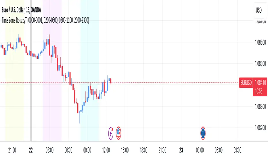
Time Zone RouzzyTNYC , London & Asia section
Each time-zone has a different color to be able to distinguish which section we are in at the moment.
These sessions have been identified to operate the EURUSD, apart from that it also works with the DXY.
London is identified with the color light purple.
NYC is identified with the color turquoise blue.
Asia is identified with the color yellow.
The beginnings of each Day are identified with the color gray.
London is from 2am to 5am
NYC from 8am to 11am
Asia from 8pm to 11pm
OANDA:EURUSD
FX:EURUSD
TVC:DXY
Optics Alert ZoneOptics Alert Zone shows price ranges for prices 17 days and 40 days ago. These can be adjusted based on asset class and volatility.
Bullish is when price is above 17 and 40 day.
Bearish is when price is below 17 and 40 day.

Simple Chop ZoneThe original Chop Zone indicator by Trading View is good, but has a few limitations which I've addressed in this one
Too many colors which confuse and/or overwhelm users like me
Inability to change the EMA period
This one has just 3 customizable colors for
Uptrend - default = Turquoise
Downtrend - default = red
Everything else - default = lime
And you can set your own EMA length. The default is 34 as per the original Chop Zone indicator

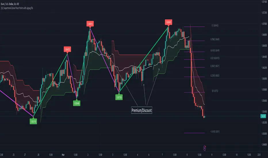
[JL] Supertrend Zone Pivot Point with zigzag fibThis is an open-source Pine script that generates a Supertrend Zone Pivot Point with Zigzag Fib indicator for TradingView. The indicator displays the Supertrend Zone, pivot points, and Fibonacci levels on the chart.
One of the unique features of this indicator is that it uses a Zigzag that does not repaint, ensuring accurate high and low points for the pivot points.
Another feature is that when the Supertrend is in an uptrend, only the highest points are taken as pivot points, and when it's in a downtrend, only the lowest points are taken as pivot points.
The Fibonacci levels are calculated based on the previous high and low pivot points, with labels displaying the corresponding levels on the chart.
The indicator also includes options to show/hide the Zigzag and Fibonacci levels.
Overall, this indicator is useful for identifying key pivot points and Fibonacci levels in the Supertrend Zone, providing valuable information for traders to make informed decisions.
Premium/Discount Zone Buy/Sell Indicator JMJThis indicator calculates whether the opening price is in a premium or discount zone, based on the specified premiumThreshold and discountThreshold values. A premium zone is defined as when the difference between the high price and the opening price divided by the opening price is greater than or equal to premiumThreshold. A discount zone is defined as when the difference between the opening price and the low price divided by the opening price is less than or equal to discountThreshold. The premium and discount signals are plotted as green and red triangles, respectively.

Trading Guidance institutional ZoneThis is the institutional zone indicator. it used in 5 Minute Timmeframe.

High volume zone█ OVERVIEW
Show high volume zone in a lower timeframe.
█ CONCEPTS
1- Choose an amount of volume (1 000 by default)
2- Choose a timeframe (1 minute by default)
3- It highlight every zone where volume was > 1000 in less than one minute
█ OTHER SECTIONS
Limitation:
- Unfortunately, I didn't find a way to make it in a lower timeframe than 1 minute with Pinescript
- It is truncate by minute so a high volume between two lower tf candles may not be count
If you have a solution for these, glad to hear it.

CDC Action Zone + 3MA Edited by Chayo// Edit from CDC Action Zone V3 2020
// Thanks you very much piriya33
Adaptive Price ZoneThe Adaptive Price Zone was developed by Lee Leibfarth in 2006, and it attempts to create a band for mean-reversal strategies. It works by taking the double-smoothed average of the volatility from 5 days and adding/subtracting it from the average price of the day (hl2).
If you are planning to use it, remember that it changes throughout the day , so you might want to use an offset. You can also choose to use the true range for the volatility instead of the high and low difference.

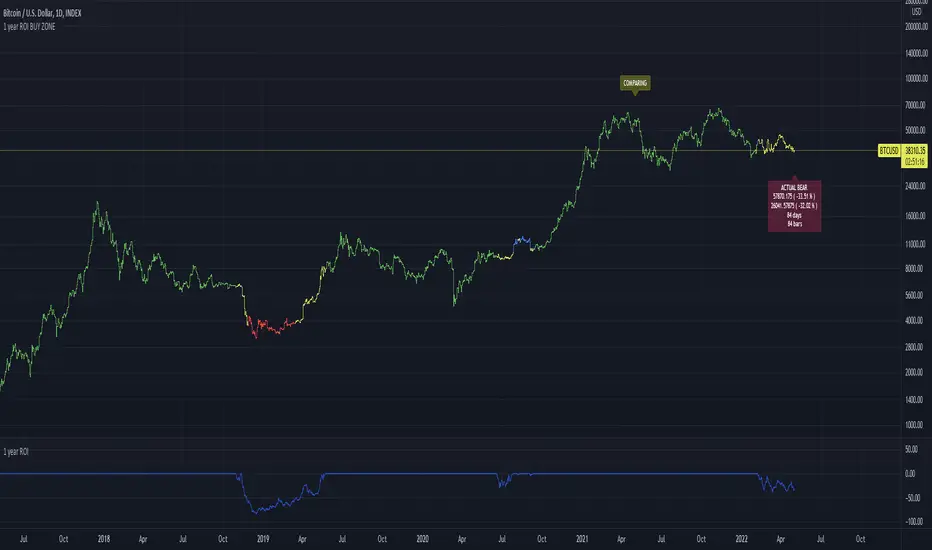
1 year ROI BUY ZONEThis indicator is comparing price with price 1 year ago. This will generate ROI which could be positive or negative.
If ROI switches from negative to positive or vice versa it will generate zone
This zone could have minimum days to filter false signals
Buy signal could be added when ROI reaches some value ( -65% for example)
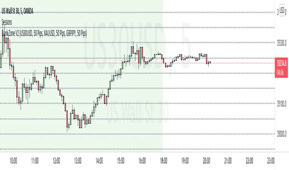
Bank Zone V2This indicator finds the current price and dynamically plots bank zone levels that's incremented by 50 or 100 pips.
Levels are displayed on all time frames and will work for ALL forex pairs and indices.
How to use this indicator.
Select Pair - Choose a pair that's in your watchlist
Increment By - Plots lines in increments of 50 or 100 pips
Combo 2/20 EMA & Adaptive Price Zone This is combo strategies for get a cumulative signal.
First strategy
This indicator plots 2/20 exponential moving average. For the Mov
Avg X 2/20 Indicator, the EMA bar will be painted when the Alert criteria is met.
Second strategy
The adaptive price zone (APZ) is a volatility-based technical indicator that helps investors
identify possible market turning points, which can be especially useful in a sideways-moving
market. It was created by technical analyst Lee Leibfarth in the article “Identify the
Turning Point: Trading With An Adaptive Price Zone,” which appeared in the September 2006 issue
of the journal Technical Analysis of Stocks and Commodities.
This indicator attempts to signal significant price movements by using a set of bands based on
short-term, double-smoothed exponential moving averages that lag only slightly behind price changes.
It can help short-term investors and day traders profit in volatile markets by signaling price
reversal points, which can indicate potentially lucrative times to buy or sell. The APZ can be
implemented as part of an automated trading system and can be applied to the charts of all tradeable assets.
WARNING:
- For purpose educate only
- This script to change bars colors.
