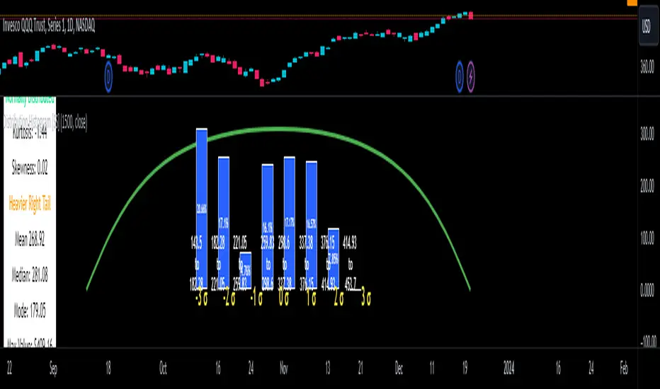
Distribution Histogram [SS]This is the frequency histogram indicator. It does just that—creates a frequency histogram distribution based on your desired lookback period. It then uses Pine's new Polyline function to plot a normal curve of the expected results for a normal distribution. This allows you to see quite a few things:
🎯 Firstly, it allows you to see where the accumulation rests in terms of a bell curve. The histogram represents a bell curve, and you can visually observe what the curve would look like.
🎯 Secondly, it will assess the normal distribution and the degree of skewness based on the curve itself. The indicator imports the SPTS statistics library to assess the distribution using Kurtosis and Skewness. However, it also adds functionality in this regard by making a qualitative assessment of the data. For example, if there are heavy left tails or heavier right tails present in the histogram, the indicator will alert you that a heavier left or right tail has been observed.
🎯 Thirdly, it provides you with the kurtosis and skewness of the dataset.
🎯 Fourthly, it provides the mean, median, and mode of the dataset, as well as the maximum and minimum values within the dataset.
🎯 Lastly, it provides you with the ability to toggle on tips/explanations of the curve itself. Simply toggle on "Show Distribution Explanation" in the settings menu:
How is the indicator helpful for trading?
If you are a mean reversion trader, this helps you identify the areas and price ranges of high and low accumulation. It also allows you to ascertain the probability by looking at the standard deviation of the bell curve. Remember, the majority of values should fall between -1 and 1 standard deviation of the mean (68%).
If it is revealed that the distribution has a heavier right or left tail, you will know that the stock is more likely to experience sudden drops and shifts in the curve in one direction or the other. Heavier left tails will tend to shift to the values on the far left, and vice versa for right tails.
Customization
You can turn off and on the following:
👉 The normal curve,
👉 The standard deviation levels, and
👉 The distribution explanations and tips.
Conclusion: And that is the indicator! Hope you enjoy it!
Cari dalam skrip untuk "半导体设备ETF"
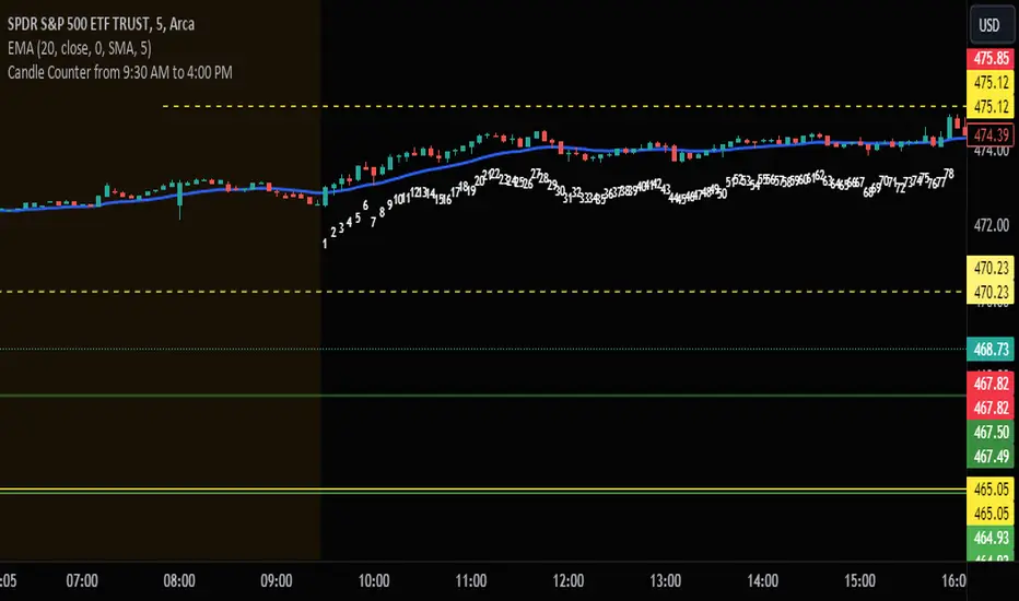
Candle Counter from 9:30 AM to 4:00 PMThis Pine Script, designed for TradingView, serves as a candle counter exclusively for a 5-minute chart. It operates within the specific market hours of 9:30 AM to 4:00 PM. Key features of the script include:
Market Hours Specification: The script is configured to track candles only during the trading hours from 9:30 AM to 4:00 PM.
Daily Reset: Each trading day, the candle counter resets, starting anew from the market opening at 9:30 AM.
Candle Counting: It increments a counter with each 5-minute candle during the specified market hours.
Label Display: The counter number for each candle is displayed as a label at the candle's low point. This label is in bright white color with large font size, ensuring clear visibility against various chart backgrounds.
5-Minute Chart Specificity: The script is tailored to function only when the chart is set to a 5-minute timeframe, making it ideal for traders focusing on intraday movements.
New Day Detection: Utilizes a function to identify the start of a new trading day, ensuring accurate daily counting.
This script is particularly useful for traders who focus on intraday trading within the standard stock market hours, providing a clear and easy-to-read candle count that resets daily.
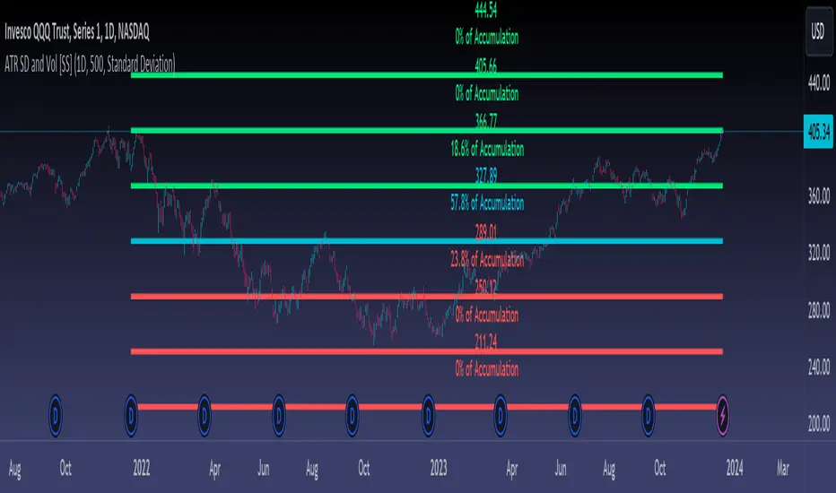
ATR Range Accumulation by Standard Deviation and Volume [SS]So, this is an indicator/premise I have been experimenting with, which mixes ATR with Z-Score and Volume metrics.
What does the indicator do?
The indicator, on the lower timeframes, uses an ATR approach to determine short-term ranges. It takes the average ATR range over a designated lookback period and plots out the levels like so:
It then calculates the Z-Score for these ATR targets (shown in the chart above) and calculates, over the designated lookback period, how often price accumulates at that standard deviation level.
The indicator is essentially a hybrid of my Z-Score Support and Resistance indicator and my frequency distribution indicator. It combines both concepts into one.
You also have the option of sorting by volume accumulation. This will display the accumulation of the ranges by volume accumulation, like so:
Larger Timeframes:
If you want to see the accumulation by volume or standard deviation on the larger timeframes, you can. Simply toggle on your preferred setting:
Show Total Accumulation Breakdown:
This will break down the levels, over the lookback period, by standard deviation. This is similar to the Z-Score support and resistance indicator. It will then show you how often price accumulates at these various standard deviation levels. Here is an example on the daily timeframe using the 1D chart settings:
Inversely, you can repeat this, with the Z-Score levels, but show accumulation by volume. This will print 5 boxes, which are between +3 Standard Deviations and -3 Standard Deviations, like so:
Here we can see that 61% of volume accumulation is between -1 and 1 standard deviation.
Using it to Trade:
For swing trading, I suggest using the larger timeframe information. However, for both swing and day traders, it is also helpful to use the ATR display. You can modify the ATR display to show the levels on any timeframe by selecting which timeframe you would like to see ATR ranges for. If you are trading on the 1 or 5-minute chart, I suggest leaving the levels at no shorter than a 60-minute timeframe.
You can also use these levels on the daily for the weekly levels, etc.
The accumulation being shown will be based on the current chart timeframe. This is a function of Pinescript, but in this case, it's actually advantageous because if you are trading on the shorter timeframe, and a level has 0% recent accumulation, it's unlikely we will see that level soon or overly quickly. Intraday retracements will generally happen to areas of high accumulation.
How this indicator is different:
The difference in this indicator comes from its focus on accumulation in relation to Standard Deviation. There is one thing that is consistent among retail traders, algorithms, market makers, and funds, and that is looking at the market in terms of standard deviation. Each person, market maker, and algorithm may be slightly nuanced in how it conceptualizes standard deviation (whether it be since the inception of the ticker (or IPO), or the previous 500 days, or the previous 100 days, etc.), but the premise remains consistent. Standard Deviation is a really important, if not the most important, metric to pay attention to. Another important metric is volume. Thus, the premise is that combining volume accumulation with standard deviation should, theoretically, be telling. We can see the extent of buying at various standard deviations and whether a stock is really a buy or not.
And that's the indicator! Hope you enjoy it. Leave your comments and questions below.
Safe trades!
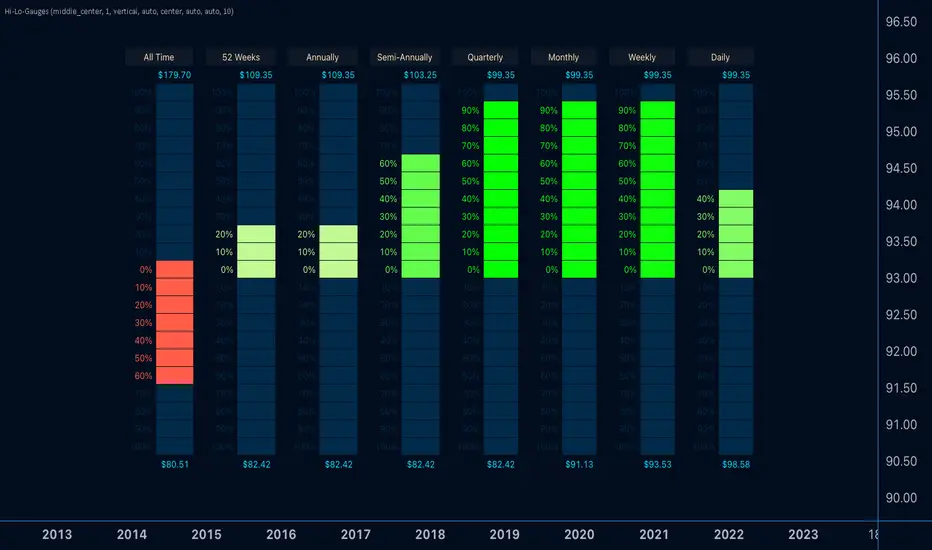
Hi-Lo-GaugesIntroducing the 'Hi-Lo-Gauges' indicator, a powerful tool designed to provide a comprehensive visual representation of key price metrics. This indicator leverages up to 8 preset gauges, each catering to a specific aspect of market data:
All-time high and low
Current 52 Weeks high and low
Current Annual High and Low
Current Semi-Annual High and Low
Current Quarterly High and Low
Current Monthly High and Low
Current Weekly High and Low
Current Daily High and Low
Users have the flexibility to choose all 8 or selectively display specific gauges. For each metric, the gauge dynamically adapts, with the low value set as the minimum and the high value as the maximum. Measurement options include utilizing the highest and lowest closes or the literal highest and lowest prices.
The active price of the underlying asset serves as the reference point, allowing users to gauge the percentage move on the scale between the chosen minimum and maximum. Complete customization is at the users' fingertips, enabling them to tailor the indicator's appearance to suit their preferences.
With 'Hi-Lo-Gauges,' traders and analysts can intuitively monitor and interpret diverse price metrics, fostering a deeper understanding of market dynamics and supporting more informed decision-making.
Note: 'Hi-Lo-Gauges' is visible and applicable exclusively on the daily timeframe due to the nature of the metrics used.
TASC 2024.01 Gap Momentum System█ OVERVIEW
TASC's January 2024 edition of Traders' Tips features an article titled “Gap Momentum” by Perry J. Kaufman. The article discusses how a trader might create a momentum strategy based on opening gap data. This script implements the Gap Momentum system presented therein.
█ CONCEPTS
In the article, Perry J. Kaufman introduces Gap Momentum as a cumulative series constructed in the same way as On-Balance Volume (OBV) , but using gap openings (today’s open minus yesterday’s close).
To smoothen the resulting time series (i.e., obtain the " signal line "), the author applies a simple moving average . Subsequently, he proposes the following two trading rules for a long-only trading system:
• Enter a long position when the signal line is moving higher.
• Exit when the signal line is moving lower.
█ CALCULATIONS
The calculation of Gap Momentum involves the following steps:
1. Calculate the ratio of the sum of positive gaps over the past N days to the sum of negative gaps (absolute values) over the same time period.
2. Add the resulting gap ratio to the cumulative time series. This time series is the Gap Momentum.
3. Keep moving forward, as in an N-day moving average.

Price PressureDescription:
The Price Pressure Indicator, developed by OmegaTools, is a robust and versatile tool designed to assist traders in analyzing market dynamics and identifying potential trend shifts. This open-source script, offers a unique approach to understanding price pressure over specified periods, enhancing the user's ability to make informed trading decisions.
Key Features:
1. Dynamic Length Configuration: The indicator allows users to customize the length parameter, ranging from 9 to 100, providing flexibility in adapting to different market conditions.
2. Extensions Control: Traders can fine-tune the extension levels (ob) between 50 and 90, allowing for precise adjustments based on their risk tolerance and trading preferences.
3. Normalization and Oscillation: The script employs a normalization function to standardize price data, offering a clearer representation of market pressure. The resulting oscillator visualizes the normalized pressure, highlighting potential market trends.
4. Pressure Calculation: The indicator calculates price pressure by considering the difference between the previous high and the current close, as well as the difference between the current close and the previous low. This innovative approach enhances the accuracy of pressure analysis.
5. Smoothing Option: While the script currently uses a simple moving average for smoothing, traders have the option to explore other smoothing methods by uncommenting the "smt" input line.
6. Visual Clarity: The indicator provides a visually intuitive representation of pressure and signal lines, aiding traders in quickly interpreting market conditions. The color-coded display enhances user experience, with the ability to discern bullish and bearish pressures.
7. Premium and Discount Zones: The script identifies premium and discount areas, assisting traders in spotting potential buying or selling opportunities. The premium and discount lines can be adjusted based on individual risk tolerance and strategy.
How to Use:
1. Adjust the length and extension parameters based on your trading preferences.
2. Interpret the oscillator and signal lines for insights into market pressure.
3. Utilize premium and discount zones to identify potential entry or exit points.
4. Experiment with different smoothing options for a customized analysis.
Concepts and Methodology:
The Price Pressure Indicator utilizes a normalization function and oscillation to quantify market pressure. By calculating the difference between highs and lows, the script provides a nuanced understanding of current market conditions. The smoothing option further refines the analysis, offering traders a comprehensive tool for trend identification.
Explore, experiment, and leverage the power of the Price Pressure Indicator to enhance your trading strategy on TradingView.

Perfect RSIOverview:
The "Enhanced RSI" is a comprehensive TradingView indicator designed to provide traders with a nuanced and detailed analysis of market conditions using the Relative Strength Index (RSI). It amalgamates various RSI calculation methods to offer a more robust and adaptable approach to technical analysis.
Originality:
This script is unique in its synthesis of multiple RSI calculation techniques, including Regular RSI, Dynamic RSI, DMI RSI, Wilder's RSI, TSI RSI, Momentum RSI, and PPO RSI. By combining these methods, the script creates a distinctive and versatile tool for traders seeking a holistic view of RSI dynamics.
How It Works:
Diverse RSI Calculations:
Regular RSI: Calculates standard RSI with user-defined length and source.
Dynamic RSI: Adjusts RSI dynamically based on price movement direction.
DMI RSI: Uses Directional Movement Index for RSI calculation.
Wilder's RSI: Implements Wilder's smoothing technique for RSI.
TSI RSI: Utilizes True Strength Index for RSI calculation.
Momentum RSI: Calculates RSI based on momentum.
PPO RSI: Applies Percentage Price Oscillator for RSI calculation.
Composite RSI:
Combines the individual RSIs into three composite indices (RSI1, RSI2, RSI) using a weighted average approach.
Dynamic Level Adjustment:
Uses the correlation coefficient to dynamically adjust overbought and oversold levels, enhancing adaptability to market changes.
Visualization and Background Coloring:
Visualizes overbought and oversold zones on the chart.
Adjusts background color based on these conditions for clearer interpretation.
How to Use:
Installation:
Copy and paste the script into the Pine Editor on TradingView.
Adjust parameters as needed.
Analysis:
Utilize the "Enhanced RSI" as a comprehensive analysis tool for RSI dynamics.
Consider it as a confirmation tool alongside other technical indicators.
Customization:
Experiment with different RSI lengths and methods to align with your trading strategy.
Backtest the script to validate its effectiveness.
Considerations:
Complexity:
The script is sophisticated; users are advised to understand each calculation method before reliance.
Parameter Sensitivity:
Effectiveness may vary based on chosen parameters; thorough backtesting and parameter optimization are recommended.
Chaos CypherOverview
Technically a smooth linear rate transformation, the "Chaos Cypher" drew some inspiration from the principles of Markov and chaos. Aside from price action, this combination provides a different lens through which to observe and interpret market movements. Markov models are based on the principle that future states depend only on the current state, not on the sequence of events that preceded it. Chaos theory deals with systems that are highly sensitive to initial conditions, a concept popularly referred to as the butterfly effect.
Efficient with Minimal Data: Designed to perform efficiently, the CC indicator is particularly useful in situations regardless of extensive historical data, except for obvious back testing, while still providing strength at identifying potential overbought/oversold zones and critical divergences.
Simplified Momentum Analysis: With further inspiration from the triple smoothed exponential rate, the CC actually uses linear regression for its calculations. This approach allows for a clear and more straightforward identification of deviations in momentum. The smoothing helps allow it to provide details while still operating at a fast pace due to the regression speed.
Adaptable to Various Timeframes: The transformation calculation then employed effectively narrows its scope in relation to the pace, enhancing its applicability across multiple timeframes and periods. This flexibility makes it a versatile tool suitable for various strategies and market conditions.
Fisher Transform Style Presentation: The indicator is presented in a style reminiscent of the Fisher Transform. However, this method of the script recalculates based on every individual dataset. To maintain efficiency, the adjustable length only applies to the regression rate.
The Chaos Cypher when compared to the Fisher Transform
Inversion Option for Leads: Lastly, an intriguing find when testing this script is the potential of the inversion option. This aspect proved particularly useful when searching for pullbacks on a trending market.
Conclusion
This indicator is designed to be forward-thinking and attempts to combine theoretical concepts with practicality. It has the ability to work with minimal data, adapt to various timeframes, and provide clear views of market movements. It back tested very well even when unrealistically used as a sole instrument.
"Two states differing by imperceptible amounts may eventually evolve into two considerably different states ... If, then, there is any error whatever in observing the present state—and in any real system such errors seem inevitable—an acceptable prediction of an instantaneous state in the distant future may well be impossible....In view of the inevitable inaccuracy and incompleteness of weather observations, precise very-long-range forecasting would seem to be nonexistent." -Edward Norton Lorenz

Pipe tops & bottoms v1.0This indicator detects Pipe Tops and Pipe Bottoms chart patterns, using the concept described by Thomas Bulkowski: Tops , Bottoms .
Pipe tops and bottoms patterns are marked on the chart. You can change the indicator sensitivity by using the main settings which define detected price variation boundaries. This will lead to more dense or sparse pattern detection.
Once the bar following each detected top or bottom pattern satisfies signal condition (the current close price must be higher than the high of the pipe bottom, or lower than the low of the pipe top), these bars are also marked on the chart and can be used to define potential long or short entry points.
You can optionally choose to show only signal marks on the chart (this is preferable to avoid visual cluttering), or both pattern and signal marks.
Script calculations are based on the 'Pipe Bottoms Indicator Based on Thomas Bulkowski's Theories' indicator developed by BoilderRoomColdCaller in 2020.
Comparative Relative Strength AutoselectComparative Relative Strength (CRS) is a relative momentum indicator, used to compare a security against an index, or against another security. The comparison is used to show the relative performance to each other.
This script is a Quality of Life improvement, which attempts to match the base symbol to its relevant index on the local stock exchange. Thus automagically selecting the best and most relevant comparative symbol.
Features:
*optional comparative symbol override, in case your favourite index is not included in this script, or you want to force it to function as as a traditional cRS script without the autoselect feature.
* optional moving average crossover line
* optional absolute momentum calculation, calculating the excess return of the basesymbol and comparativesymbol against its own simple moving average.
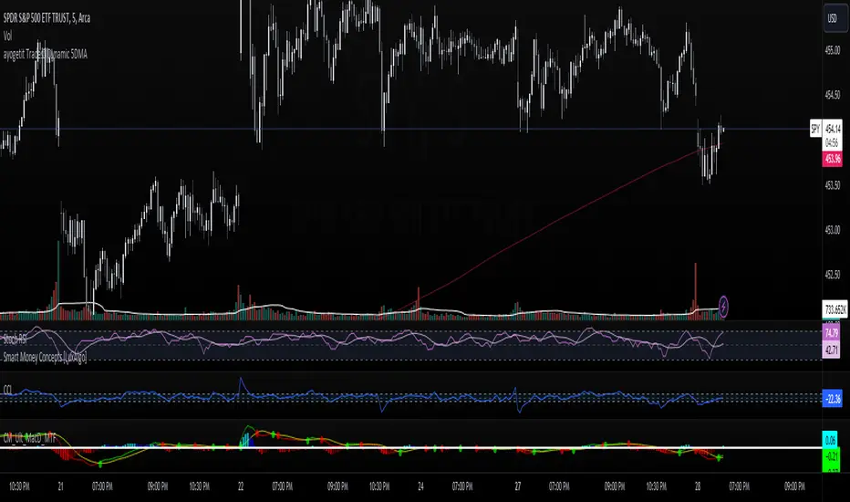
ayogetit Trades™ Dynamic 5DMAThe Dynamic 5-Day Moving Average (MA) indicator is designed to provide traders with a consistent, time-adjusted moving average line across various timeframes. This indicator is especially useful for traders who switch between multiple timeframes and want a moving average that represents a fixed 5-day period, ensuring that the MA reflects a consistent lookback period relative to the amount of trading time each candle represents.
Features:
Timeframe Adaptability: Automatically adjusts the MA period to correspond to a 5-day lookback, regardless of the selected timeframe.
Intraday Precision: For intraday charts (5m, 15m, 30m, 1h, 2h, 4h), the indicator calculates the number of periods within the 5-day span based on the chart's timeframe.
Daily and Weekly Timeframe Compatibility: Sets the period to 5 for daily charts to maintain the 5-day MA, and to 1 for weekly charts, where each candlestick represents a week's worth of trading days.
Calculation Logic:
The indicator begins by defining the total number of trading minutes in 5 days, based on a standard 6.5-hour trading day.
A dynamic period calculation function then determines the number of those intervals that fit into the 5-day minute total for the selected timeframe.
For daily charts, the period is a straightforward 5, while for weekly charts, the period is set to 1, reflecting the average of the past 5 trading days.
GuageLibrary "Gauge"
The gauge library utilizes a gaugeParams object, encapsulating crucial parameters for gauge creation. Essential attributes include num (the measured value) , min (the minimum value equating to 100% on the gauge's minimum scale) , and max (the maximum value equating to 100% on the gauge's maximum scale) . The size attribute (defaulting to 10) splits the scale into increments, each representing 100% divided by the specified size.
The num value dynamically shifts within the gauge based on its percentage move from the mathematical average between min and max . When num is below the average, the minimum portion of the scale activates, displaying the appropriate percentage based on the distance from the average to the minimum. The same principle applies when num exceeds the average. The 100% scale is reached at either end when num equals min or max .
The library offers full customization, allowing users to configure color schemes, labels, and titles. The gauge can be displayed either vertically (default) or horizontally. The colors employ a gradient, adapting based on the number's movement. Overall, the gauge library provides a flexible and comprehensive tool for visualizing and interpreting numerical values within a specified range.

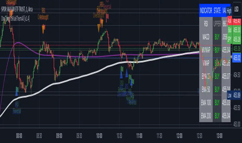
OneThingToRuleThemAll [v1.4]This script was created because I wanted to be able to display a contextual chart of commonly used indicators for scalping and swing traders, with the ability to control the visual representation on the charts as their cross-overs, cross-unders, or changes of state happen in real time. Additionally, I wanted the ability to control how or when they are displayed. While looking through other community projects, I found they lacked the ability to full customize the output controls and values used for these indicators.
The script leverages standard RSI/MACD/VWAP/MVWAP/EMA calculations to help a trader visually make more informed decisions on entering or exiting a trade, depending on their understanding on what the indicators represent. Paired with a table directly on the chart, it allows a trader to quickly reference values to make more informed decisions without having to look away from the price action or look through multiple indicator outputs.
The main functionality of the indicator is controlled within the settings directly on the chart. There a user can enable the visual representations, or disable, and configure how they are displayed on the charts by altering their values or style types.
Users have the ability to enable/disable visual representations of:
The indicator chart
RSI Cross-over and RSI Reversals
MACD Uptrends and Downtrends
VWAP Cross-overs and Cross-unders
VWAP Line
MVWAP Cross-overs and Cross-unders
MVWAP Line
EMA Cross-overs and Cross-unders
EMA Line
Some traders like to use these visual indications as thresholds to enter or exit trades. Its best to find out which ones work the best with the security you are trying to trade. Personally, I use the table as a reference in conjunction with the RSI chart indicators to help me decide a logical trailing stop if I am scalping. Some users might like the track EMA200 crossovers, and have visual representations on the chart for when that happens. However, users may use the other indicators in other methods, and this script provides the ability to be able to configure those both visually and by value.
The pine script code is open source and itself is fairly straightforward, it is mostly written to provide the ultimate level of control the the user of the various indicators. Please reach out to me directly if you would like a further understanding of the code and an explanation on anything that may be unclear.
Enjoy :)
-dead1.
SMA Cross with a Price FilterA moving average strategy generates an entry (buy) signal when the price goes above the moving average, and an exit (sell) signal when the price goes below the moving average. But it gives lots of whipsaws and noise depends on the moving average we use. A fast moving average gives more whipsaws and a slow moving average gives less whipsaws. To reduce the noise/whipsaws, we can add a filter on a fast/slow moving average. It will improve entry/exit performance significantly specially for those who don't want to watch the market actively.
I created this indicator with a price filter. This means the price of an underlying asset must be at least a specific percentage above its moving average to generate a buy signal and a specific percentage below its moving average to generate a sell signal. This price filter can also be a confirmation after the price crosses above/below its SMA. I couldn't find any indicator yet based on this idea. So I wrote this indicator and publishing it so it helps those who are interested.
I use 200 SMA and 3% price filter as default and using SPY as an example. So,
ENTRY signal when the closing price of SPY is 3% above its 200 SMA.
EXIT signal when the closing price of SPY is 3% below its 200 SMA.
Enjoy and let me know if it works.
** This chart only generates entry (buy) and exit (sell) signals. Please, do your own diligence to make any investment or trading decisions.

Capital Accumulation Plan (CAP) Simulator 2.0Description:
This indicator serves as a simulation tool for the Capital Accumulation Plan (CAP). The CAP is an investment strategy involving regular contributions of a fixed amount at consistent intervals, regardless of market fluctuations. This simulator allows you to visualize how your invested capital might grow over time, considering a fixed monthly investment in a given financial instrument.
How to Use:
Customize the monthly investment amount, the day of the month for the investment, and the simulation period. Also, input the percentage of taxation on potential dividends and the Total Expense Ratio (TER) of the financial instrument. The indicator calculates the portfolio value over time, the invested capital, and the average cost. If applicable, it also calculates the dividend amounts over time and the corresponding taxes to be paid.
The indicator displays how these metrics would change over time following the PAC strategy.
Important Notes:
Apply exclusively to the daily chart; a fix for the chosen day absence will be implemented shortly.

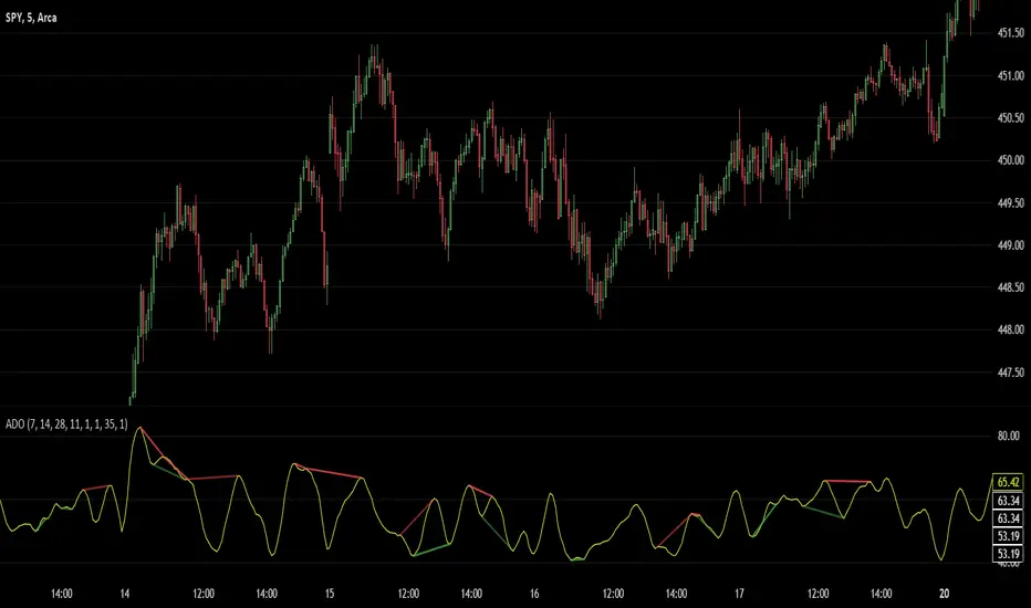
Advanced Divergence OscillatorIntroduction to ADO
The Advanced Divergence Oscillator (ADO) is a modern tool crafted for traders in various markets like stocks, forex, or cryptocurrencies. Imagine it as a smart gadget that helps you understand the ebb and flow of market prices. Unlike standard tools, ADO provides a more nuanced view, enabling you to grasp subtle changes in market trends.
Functionality of ADO
ADO operates by observing and comparing market price movements over different timeframes. Picture a racetrack where cars are moving at various speeds. Some are racing ahead, while others are gradually picking up pace. ADO keeps track of these varying 'speeds' in market prices.
By analyzing these movements, ADO generates a smooth, flowing line – the oscillator. This line moves in a wave-like pattern, offering hints about the market's momentum and possible future trends. When the line moves up, it suggests increasing prices, and when it moves down, it hints at falling prices.
How to Use ADO
Setup: You can easily integrate ADO into your trading platform, adjusting settings like length and color to suit your preference.
Reading the Oscillator: Watch for the oscillator's movement. Rising and falling patterns can indicate potential buying or selling opportunities.
Identifying Divergences: ADO excels in spotting divergences – situations where market prices and the oscillator don't align. For instance, if prices are climbing but the oscillator is falling, it might signal a potential price drop ahead.
Brief History of the Ultimate Oscillator
The concept of oscillators in trading isn’t new. The Ultimate Oscillator, developed by Larry Williams in the 1970s, is a foundational tool in this field. Williams' innovation was to combine short, intermediate, and long-term market trends into a single oscillator. This approach offered a more comprehensive market view, helping traders make informed decisions.
The ADO is a step further in this evolution. It takes the core principles of the Ultimate Oscillator and enhances them with proper smoothing and divergence detection methods. This evolution represents the continuous effort in the trading community to refine tools for better market analysis and decision-making.
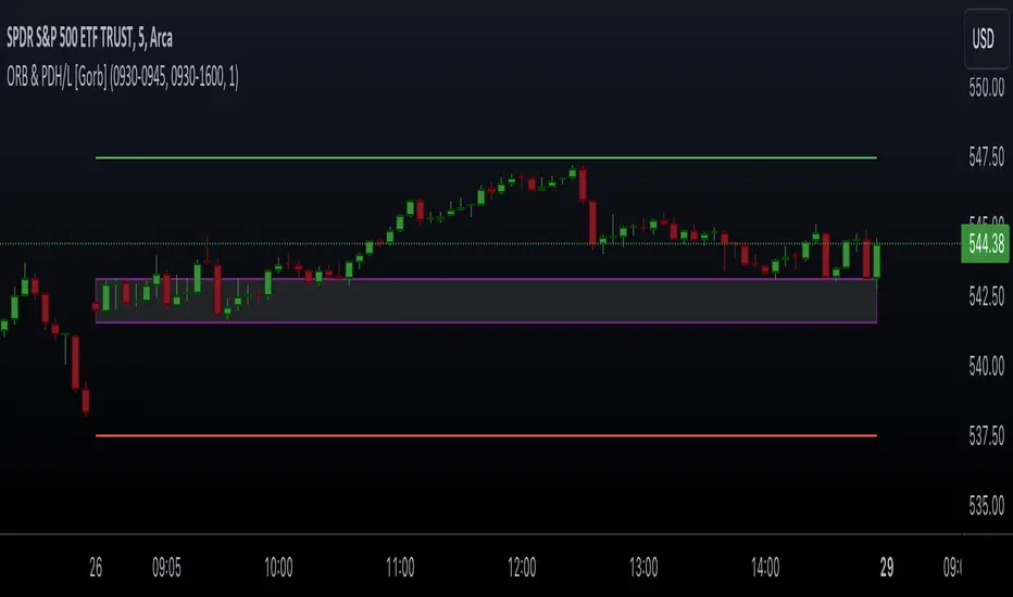
Opening Range & Prior Day High/Low [Gorb]Introduction:
Opening Range & Prior Day High/Low indicator is an easy to use day traders tool. This indicator automatically plots the previous days high and low, as well as drawing a box from the opening range that the user specifies in the settings. These two together can help provide an indication of market sentiment and price trends for the day. They are often used as a trading strategy for day traders.
Overview:
The Opening Range , draws a box from the high to the low of the user defined time period and is extended until the end of the trading session. Most common are the 5/15/30min opening ranges.
Prior Day High/Low , draws lines from the previous days high and low that extend across the current session. These are used as support/resistance and also a marker to see market sentiment by crossing one of these levels.
The indicator is designed for all kinds of traders, offering a simple approach to automatically plot levels for you.
Features:
All skill-level friendly presets, easy to enable with one-click
Opening Range: Allows user to choose what time the range starts and ends to measure the high & low.
Extend Range Lines: allows the user to choose when the box stops extending according to the trading session time.
Enable Opening Range Box: allows the user to choose to plot the opening range or not.
ORB Border Color: allows the user to change the box border color.
ORB Box Shade Color: allows the user to change the background of the opening range box.
ORB Line Width: allows users to chose the width of the opening range box lines.
Enable Previous Day High: allows users to enable the previous days high to be plotted.
Enable Previous Day Low: allows users to enable the previous days high to be plotted.
Previous Day High Color: allows users to choose the color for this line.
Previous Day Low Color: allows users to choose the color for this line.
All colors are changeable for the user to customize to their liking.
Usage Demonstration
In the image below, we can see a basic example of how these 3 features function.
As explained above, the opening range is customizable to meet the users needs and can be disabled with one click. Same goes for the prior day high(green) and low(red) lines. All 3 are plotted each day automatically for the user if enabled.
In the image below, we can see an example of using the opening range break and prior day high together for a trading strategy.
This is a great example of using the prior day high with the opening range to use as a day trading strategy. It provides the trader with levels to watch for price to break out from for possible trade setups.
In this next image, we can see a failed breakdown from the opening range that results in a bullish breakout.
The first move was a fake breakdown with the failed rejection on the retest of the opening range lows. This led to a breakout above the range and a confirmation bounce on the breakout retest. Price did break above the prior day high and confirmed with a retest bounce on that level as well.
In the image below, we can see how previous days levels can act as resistance to use with the opening range.
Price didn't reject the opening range low, but it did reject the prior day high for the second time. This could be used as an entry or once price breaks down out of the opening range again.
Conclusion:
We believe in providing user-friendly tools to help speed up traders technical analysis and implement easy trading strategies. The goal is to provide a user-friendly indicator to automatically draw opening ranges and previous days levels to suit the users needs and trading style.
RISK DISCLAIMER
All content, tools, scripts & education provided by Monstanzer or Gorb Algo LLC are for informational & educational purposes only. Trading is risk and most lose their money, past performance does not guarantee future results.
Cumulative New Highs - New LowsIndicator that plots the cumulative number of 52-Week New Highs minus New Lows with an added moving average. Settings allow the choice between S&P 500, Nasdaq 100 or the Overall Market as Index. You can also customize the length of the moving average.

Dynamic Trend Fusion (DTF)The "Dynamic Trend Fusion" (DTF) indicator is a powerful technical analysis tool for traders. It stands out from other indicators due to its adaptability and ability to provide insights into different trading styles. Users can choose from various trading options such as "Short-term Trading," "Long-term Trading," "Aggressive Short-term," "Conservative Long-term," "Balanced Approach," "High Sensitivity," "Low Sensitivity," "Day Trading," and "Swing Trading." These options allow traders to customize the indicator to suit their specific trading strategies.
DTF combines the Moving Average Convergence Divergence (MACD) and Relative Strength Index (RSI) indicators, normalizing them to a similar scale for a comprehensive view of market conditions. It then calculates a combined value and smoothes it using a moving average.
One of its standout features is the ability to identify bullish and bearish states, which is represented visually on the chart. When the indicator detects a transition from a bullish to a bearish state or vice versa, the color of the line changes.
Additionally, DTF offers alert conditions, notifying users when the market shifts into a bullish or bearish state, allowing for timely decision-making.
In summary, the DTF indicator sets itself apart by providing traders with a versatile tool that can be tailored to various trading styles and offers clear visual signals for trend changes, enhancing trading precision and efficiency.

MAC Spikes(Adam H Grimes)From Adam H Grimes: "Introducing a New Tool: The MAC Spike"
Mean Absolute Change Spikes (“MAC Spikes”).
Here are the steps to calculate it:
-Convert each day’s closing price to a change (difference) by subtracting it from the previous day’s closing price.
-Take the absolute value of that change.
-Average the past 20 days absolute values to create the baseline.
-Divide today’s change by yesterday’s baseline. (Still offsetting by one day.)
MAC Spikes- Indicator:
-Indicator Setup: The script defines an indicator with the name "MAC Spikes", not overlaying the main chart, and allows up to 99 lines to be plotted.
-User Inputs: It provides several user-configurable inputs, such as:
Length for standard deviation calculation (len).
-Type of spike to monitor (spikeType), with options for close, range, or open spikes.
-Option to filter spikes based on a threshold (filtered).
-The threshold value for spike significance (spike_thresh).
-Whether to display the spike histogram (disp_Spike).
-Line width for plotting (lw).

Market Pivot Levels [Past & Live]Market Levels provide a robust view of daily pivot points of markets such as high/low/close with both past and live values shown at the same time using the recently updated system of polylines of pinescript.
The main need for this script arose from not being able to use plots for daily points because plots are inherently once drawn can't be erased and because we can't plot stuff for previous bars after values are determined we can't use them reliably. And while we can use traditional lines, because we would have extremely high amount of lines and we would have to keep removing the previous ones it wouldn't be that effective way for us. So we try to do it with the new method of polylines .
Features of this script:
- Daily High/Low Points
- Yesterday High/Low/Close Points
- Pre-Market High-Low points.
Now let's preview some of the important points of code and see how we achieve this:
With the code below we make sure no matter which chart we are using we are getting the extended hours version of sessions so our calculations are made safely for viewing pre-market conditions.
// Let's get ticker extended no matter what the current chart is
tc = ticker.new(syminfo.prefix, syminfo.ticker, session.extended)
Coding our own function to calculate high's and low's because inbuilt pinescript function cannot take series and we send this function to retrieve our high's and lows.
// On the fly function to calculate daily highlows instead of tv inbuilt because tv's length cannot take series
f_highlow(int last) =>
bardiff = last
float _low = low, float _high = high
for i = bardiff to 0 by 1
if high > _high
_high := high
if low < _low
_low := low
With doing calculations at the bars of day ending points we can retrieve the correct points and values and push them for our polylines array so it can be used in best way possible.
// Daily change points
changeD = timeframe.change("D")
// When new day starts fill polyline arrays with previous day values for polylines to draw on chart
// We also update prevtime values with current ones after we pushed to the arrays
if changeD
f_arrFill(cpArrHigh, cpArrLow, prevArrh, prevArrl, prevArrc, prevMarh, prevMarl)
valHolder.unshift(valueHold.new(_high, _low, _high, _close, _low, time, pr_h, pr_l))
The rest of the code is annotated and commented. You can let me know in comments if you have any questions. Happy trading.

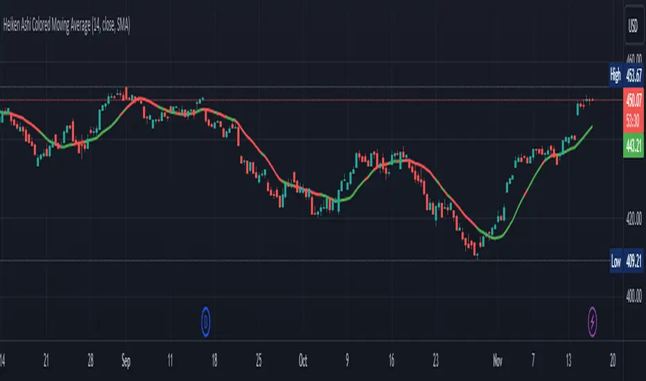
Heiken Ashi Colored Moving AverageThis indicator is meant to plot a moving average but the color of the moving average will change based on Heikin Ashi. Its seems to be slightly off, I would love any suggestions on improving this indicator.
Thanks
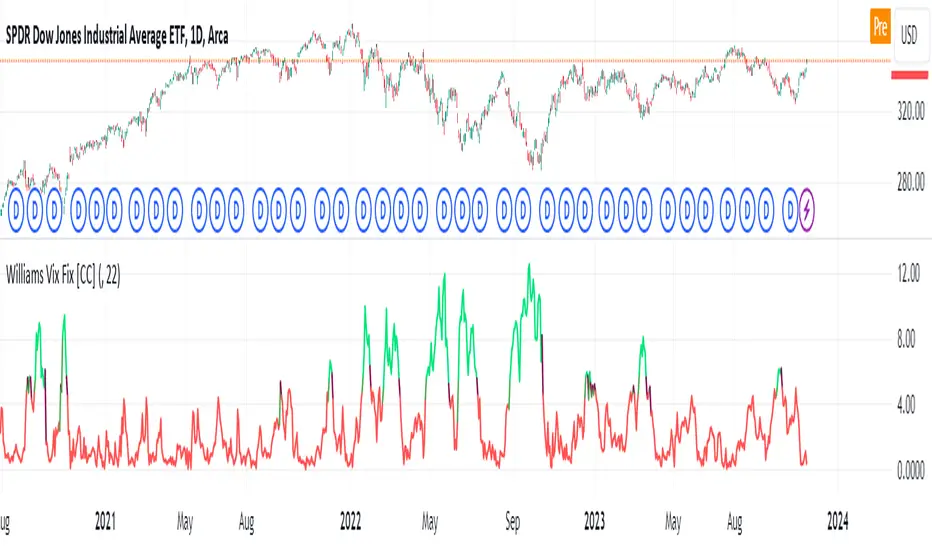
Williams Vix Fix [CC]The Vix Fix indicator was created by Larry Williams and is one of my giant backlog of unpublished scripts which I'm going to start publishing more of. This indicator is a great synthetic version of the classic Volatility Index and can be useful in combination with other indicators to determine when to enter or exit a trade due to the current volatility. The indicator creates this synthetic version of the Volatility Index by a fairly simple formula that subtracts the current low from the highest close over the last 22 days and then divides that result by the same highest close and multiplies by 100 to turn it into a percentage. The 22-day length is used by default since there is a max of 22 trading days in a month but this formula works well for any other timeframe. By itself, this indicator doesn't generate buy or sell signals but generally speaking, you will want to enter or exit a trade when the Vix fix indicator amount spikes and you get an entry or exit signal from another indicator of your choice. Keep in mind that the colors I'm using for this indicator are only a general idea of when volatility is high enough to enter or exit a trade so green colors mean higher volatility and red colors mean low volatility. This is one of the few indicators I have written that don't recommend to buy or sell when the colors change.
This was a custom request from one of my followers so please let me know if you guys have any other script requests you want to see!