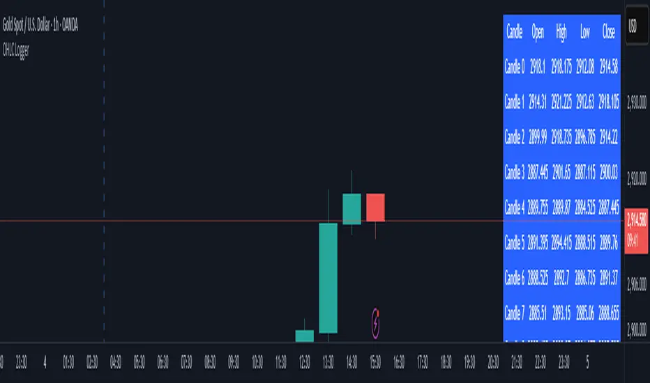
OHLC LoggerOHLC OG - 10 Candles
The OHLC OG - 10 Candles indicator provides a clear visualization of price action by analyzing the Open, High, Low, and Close (OHLC) data of the last 10 candles. Designed for traders who rely on structured price patterns, this indicator helps in identifying market trends, key support and resistance zones, and potential breakout points.
Features:
✅ Tracks the last 10 candles to highlight significant price movements.
✅ Visualizes Open, High, Low, and Close levels for improved market analysis.
✅ Customizable settings for enhanced adaptability to different strategies.
✅ Works across all timeframes and assets (forex, stocks, crypto, etc.).
✅ Ideal for price action traders looking for structured market insights.
This indicator is perfect for traders who prefer clean and reliable price action analysis without unnecessary complexity. Whether you trade breakouts, trend reversals, or continuation patterns, OHLC OG - 10 Candles helps you stay ahead of the market.
🔹 How to Use:
Apply the indicator to your chart and observe how the OHLC levels react to price movements.
Use it to confirm trends, identify potential breakout zones, or refine entry/exit points.
Combine it with other indicators or strategies for a more comprehensive trading approach.
📌 Disclaimer: This indicator is for educational purposes only. Always conduct proper risk management before trading.
Statistics
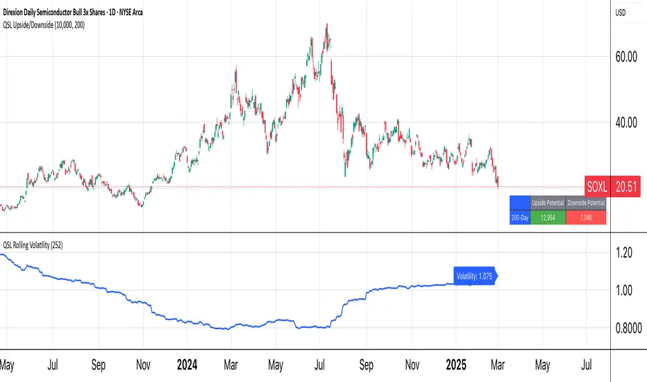
QSL Upside/DownsideThe QSL Upside/Downside Indicator helps traders estimate potential gains and losses using Conditional Value at Risk (cVaR), a statistical measure that assesses both downside risk and upside potential beyond standard volatility. Instead of fixed timeframes (daily, weekly, etc.), traders can set a custom lookback period (in days) to analyze market behavior over their preferred time frame.
How It Works
The indicator calculates cVaR over the chosen period to determine how much an investment could move up or down based on past price behavior. It does this by:
• Mean Return – The average price movement over the period.
• Standard Deviation – Measures price fluctuations from the average.
• cVaR Confidence Interval (95%) – Estimates worst-case losses, meaning the downside projection reflects the worst 5% of expected losses.
• Upside Potential (Best 5%) – Instead of only considering risk, this indicator also calculates the potential upside by measuring returns in the top 5% of past price movements.
This provides a more complete view of what traders can expect—both in terms of risk and potential reward.
Key Features
✅ Custom Lookback Period – Set any number of days to analyze.
✅ cVaR Calculation (95% Confidence Interval) – Identifies extreme downside risks.
✅ Upside Potential (Best 5%) – Estimates how much an investment could rise in a best-case scenario.
✅ Clear Table Display – Quickly see projected best and worst-case portfolio values.
Understanding Probabilities: Upside & Downside Potential
Most traders focus on risk, but it’s equally important to understand potential gains. This indicator provides a probability-based view of expected market moves:
• 95% Confidence Interval (Downside cVaR) – There’s a 5% chance that losses could exceed this level.
• 95% Confidence Interval (Upside cVaR) – There’s a 5% chance that gains could be greater than this level.
• The remaining 90% of expected returns fall between these two extremes.
By knowing both potential losses and gains, traders can make more balanced, data-driven decisions rather than only focusing on worst-case scenarios.
Why Use This Indicator?
🔹 Better Risk & Reward Assessment – Understand both downside risk and upside potential.
🔹 More Realistic Market Projections – Uses probabilities instead of simple historical averages.
🔹 Flexible & Customizable – Works with any asset and any time period.
With this tool, QSL members can strategically plan trades, knowing the expected best and worst-case outcomes with a 95% probability range. 🚀
Date Display with Bar Counter and EMA===== ENGLISH DESCRIPTION =====
OVERVIEW:
This is a multi-function indicator that combines three useful tools in one script:
1. Date Display - Shows current date and symbol information in a customizable table
2. Bar Counter - Displays sequential bar numbers at specified intervals
3. EMA (Exponential Moving Average) - Plots an EMA line with customizable settings
FEATURES:
1. DATE DISPLAY:
- Shows date in full format (e.g., "Mon ∙ January 1, 2023") or short format (e.g., "Mon ∙ 01.01.23")
- Option to show/hide day of week
- Option to show/hide symbol and timeframe information
- Customizable table position (top/middle/bottom, left/center/right)
- Automatic color adjustment based on chart background
2. BAR COUNTER:
- Displays sequential bar numbers below price bars
- Customizable display frequency (every X bars)
- Special handling for Hong Kong futures (resets at market open)
- Different reset logic based on timeframe (daily, weekly, monthly)
- Customizable text size and color
3. EMA INDICATOR:
- Customizable period length (default: 20)
- Option to use different timeframe for calculation
- Option to wait for timeframe close for more stable signals
- Customizable line color
USAGE INSTRUCTIONS:
- After adding the indicator to your chart, customize settings in the "Format" panel
- The Date Display table will appear at your chosen position on the chart
- Bar numbers will appear below price bars at your specified frequency
- The EMA line will be plotted on the chart with your chosen settings
- Colors automatically adjust to light/dark chart themes
===== 中文说明 =====
概述:
这是一个多功能指标,将三个实用工具合并为一个脚本:
1. 日期显示 - 在可自定义的表格中显示当前日期和交易品种信息
2. K线计数器 - 按指定间隔显示K线序号
3. EMA指数移动平均线 - 绘制可自定义设置的EMA线
功能特点:
1. 日期显示:
- 支持完整格式(如"Mon ∙ January 1, 2023")或简短格式(如"Mon ∙ 01.01.23")
- 可选择显示/隐藏星期几
- 可选择显示/隐藏交易品种和时间周期信息
- 可自定义表格位置(顶部/中部/底部,左侧/中间/右侧)
- 根据图表背景自动调整颜色
2. K线计数器:
- 在价格K线下方显示序号
- 可自定义显示频率(每X根K线)
- 对香港期货有特殊处理(在开市时重置)
- 根据时间周期(日线、周线、月线)使用不同的重置逻辑
- 可自定义文字大小和颜色
3. EMA指标:
- 可自定义周期长度(默认:20)
- 可选择使用不同的时间周期进行计算
- 可选择等待时间周期结束以获得更稳定的信号
- 可自定义线条颜色
使用说明:
- 将指标添加到图表后,在"格式"面板中自定义设置
- 日期显示表格将出现在您选择的图表位置
- K线序号将按您指定的频率显示在价格K线下方
- EMA线将根据您选择的设置绘制在图表上
- 颜色会根据浅色/深色图表主题自动调整
*/

Machine Learning + Geometric Moving Average 250/500Indicator Description - Machine Learning + Geometric Moving Average 250/500
This indicator combines password-protected market analysis levels with two powerful Geometric Moving Averages (GMA 250 & GMA 500).
🔒 Password-Protected Custom Levels
Access pre-defined long and short price levels for select assets (crypto, stocks, and more) by entering the correct password in the indicator settings.
Once the correct password is entered, the indicator automatically displays:
Green horizontal lines for long entry zones.
Red horizontal lines for short entry zones.
If the password is incorrect, a warning label will appear on the chart.
📈 Geometric Moving Averages (GMA)
This indicator calculates GMA 250 and GMA 500, two long-term trend-following tools.
Unlike traditional moving averages, GMAs use logarithmic smoothing to better handle exponential price growth, making them especially useful for assets with strong trends (e.g., crypto and tech stocks).
GMA 250 (white line) tracks the medium-term trend.
GMA 500 (gold line) tracks the long-term trend.
⚙️ Customizable & Flexible
Works on multiple assets, including cryptocurrencies, equities, and more.
Adaptable to different timeframes and trading styles — ideal for both swing traders and long-term investors.
This indicator is ideal for traders who want to blend custom support/resistance levels with advanced geometric trend analysis to better navigate both volatile and trending markets.

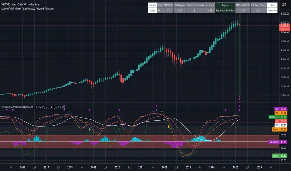
MacroJP: US Macro Conditions & Forward GuidanceMacroJP is a comprehensive, free-to-use TradingView indicator designed to provide a clear snapshot of the US macroeconomic environment. It consolidates key economic metrics into a single, interactive dashboard, allowing traders and investors to quickly assess current conditions and adjust their portfolio biases accordingly.
How It Works:
• Data Aggregation:
The indicator pulls monthly data from reputable free economic sources—specifically, ISM Manufacturing PMI, US CPI YoY, US M2 Money Supply, and US Treasury yields (10-year and 2-year). This robust dataset forms the backbone of the analysis.
• Composite Calculations:
By calculating a Composite Inflation Indicator (the average of CPI YoY and the yield spread) and evaluating the year-over-year change in M2, MacroJP gauges both the inflationary pressures and liquidity trends in the economy. These composite metrics offer a nuanced view that goes beyond single-indicator analysis.
Regime Classification:
The core strength of MacroJP lies in its quadrant classification system. It categorises the macro environment into four distinct regimes based on the direction of economic growth (derived from PMI) and inflation (from the Composite Inflation Indicator):
• Expansion (Reflation): Indicative of a recovering economy with rising production and moderate inflation—ideal for a bullish equity bias.
• Stagflation Risk: A scenario of weak growth coupled with high inflation, where a defensive posture is recommended.
• Slowdown (Deflationary): Characterised by contracting economic activity and falling prices, suggesting a move towards cash or high-quality bonds.
• Disinflationary Boom: Reflects strong growth with stable or falling inflation—an optimal environment for equities with some bond diversification.
Forward Guidance:
To enhance its predictive capability, MacroJP incorporates leading indicators by shifting key data points. For instance, it uses a forward-shifted M2 YoY value and a one-month shifted CPI proxy to offer insights into near-term trends. This approach helps in anticipating changes, providing a sort of “forward guidance” that can inform strategic asset allocation.
User Education:
The indicator features an intuitive table with on-hover tooltips that explain each metric, its relevance, and recommended investment biases. This educational layer is designed to empower users to not only monitor the economic pulse but also to understand the ‘why’ behind each reading, making it a valuable tool for both novice and experienced investors.
MacroJP brings clarity to complex macroeconomic dynamics, allowing users to make more informed decisions in volatile markets. Its seamless integration of free public data and detailed on-chart annotations makes it an indispensable tool for anyone looking to understand the broader economic context impacting their investments.
— Jaroslav
Pearson Correlation Best MA [victhoreb]Pearson Correlation Best MA is an innovative indicator designed to dynamically select the moving average that best aligns with price action based on the Pearson correlation coefficient. Here’s what it does:
- Multiple MA Evaluation: The indicator computes eight different moving averages — SMA, EMA, DEMA, TEMA, LSMA, RMA, WMA, and VWMA — using a user-defined period.
- Correlation Analysis: For each moving average, it calculates the Pearson correlation with the price (using the average of high and low) over a specified correlation length, then identifies the one with the highest correlation.
- Optional Smoothing: Users can opt to further smooth the selected best moving average for an even more refined signal.
- Visual Cues: The indicator plots the “Best MA” on the chart, colors it based on its direction (bullish or bearish), and also displays the correlation value. Additionally, it can color the price candles to reflect the trend indicated by the best moving average.
- Customizability: All key parameters such as moving average length, correlation length, smoothing options, and color settings are fully customizable.
This tool helps traders by automatically adapting to market conditions—highlighting the moving average that is most in sync with current price trends, potentially improving trade timing and decision-making.

ALN Sessions - for NQ2/24/25 - v1
This script does not calculate any stats.
It uses the sessions and stats from NQStats/ALNSessions
Option to draw boxes around the session times.
Options to adjust the table text/background colors/position.
The logic will determine how the Asia and London sessions interact.
Once the New York session starts (8am), it will then display the appropriate stats.
Script quirk...fyi. The script removes the stats table at 6PM.
That's just how it works. I used grok to assist with the code, and it got funky. It works, so I left it that way.
The appropriate stats table will then be displayed when the next New York session begins.
---
There is another table I used just for troubleshooting to show the values of the Asia/London session highs/lows. This can just be ignored.
3/3/25 - republished.

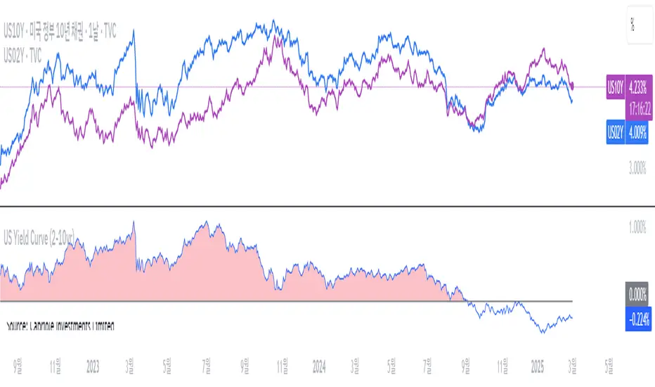
US Yield Curve (2-10yr)US Yield Curve (2-10yr) by oonoon
2-10Y US Yield Curve and Investment Strategies
The 2-10 year US Treasury yield spread measures the difference between the 10-year and 2-year Treasury yields. It is a key indicator of economic conditions.
Inversion (Spread < 0%): When the 2-year yield exceeds the 10-year yield, it signals a potential recession. Investors may shift to long-term bonds (TLT, ZROZ), gold (GLD), or defensive stocks.
Steepening (Spread widening): A rising 10-year yield relative to the 2-year suggests economic expansion. Investors can benefit by shorting bonds (TBT) or investing in financial stocks (XLF). The Amundi US Curve Steepening 2-10Y ETF can be used to profit from this trend.
Monitoring the curve: Traders can track US10Y-US02Y on TradingView for real-time insights and adjust portfolios accordingly.
Autocorrelation Price Forecasting [The Quant Science]Discover how to predict future price movements using autocorrelation and linear regression models to identify potential trading opportunities.
An advanced model to predict future price movements using autocorrelation and linear regression. This script helps identify recurring market cycles and calculates potential gains, with clear visual signals for quick and informed decisions.
Main function
This script leverages an autocorrelation model to estimate the future price of an asset based on historical price relationships. It also integrates linear regression on percentage returns to provide more accurate predictions of price movements.
Insights types
1) Red label on a green candle: Bearish forecast and swing trading opportunity.
2) Red label on a red candle: Bearish forecast and trend-following opportunity.
3) Green label on a red candle: Bullish forecast and swing trading opportunity.
4) Green label on a green candle: Bullish forecast and trend-following opportunity.
IMPORTANT!
The indicator displays a future price forecast. When negative, it estimates a future price drop.
When positive, it estimates a future price increase.
Key Features
Customizable inputs
Analysis Length: number of historical bars used for autocorrelation calculation. Adjustable between 1 and 200.
Forecast Colors: customize colors for bullish and bearish signals.
Visual insights
Labels: hypothetical gains or losses are displayed as labels above or below the bars.
Dynamic coloring: bullish (green) and bearish (red) signals are highlighted directly on the chart.
Forecast line: A continuous line is plotted to represent the estimated future price values.
Practical applications
Short-term Trading: identify repetitive market cycles to anticipate future movements.
Visual Decision-making: colored signals and labels make it easier to visualize potential profit or loss for each trade.
Advanced Customization: adjust the data length and colors to tailor the indicator to your strategies.
Limitations
Prediction price models have some limitations. Trading decisions should be made with caution, considering additional market factors and risk management strategies.

Price AltimeterThis indicator should help visualize the price, inspired by a Digital Altimeter in a Pilots HUD.
It's by default calibrated to Bitcoin, with the small levels showing every $100 and the larger levels setup to display on every $1000. But you can change this to whatever you want by changing the settings for: Small and Large Level Increments.
The default colors are grey, but can be changed to whatever you want, and there are two cause if you want they work as a gradient.
There are options to fade as the values go away from the current price action.
There are options for Forward and Backward Offsets, 0 is the current price and each value represents a candle on whatever time frame your currently on.
Other Options include the Fade Ratio, the Line Width and Style, which are all self explanatory.
Hope you Enjoy!
Backtest it in fast mode to see it in action a little better...
Known Issues:
For some reason it bug's out when either or are displaying more than 19 lines, unsure why so its limited to that for now.
Extra Note on what this may be useful for: I always wanted to make this, but didn't realize how to put things in front of the price action... Offset! Duh! Anyways, I thought of this one because I often it's hard on these charts to really get an idea for absolute price amounts across different time frames, this in an intuitive, at a glance way to see it because the regular price thing on the right always adds values between values when you zoom in and you can sometimes get lost figuring out the proportions of things.
Could also be useful for Scalping?
ATH & 52-Week High Tracker### **Indicator Name: ATH & 52-Week High Tracker**
📌 **Description:**
This indicator provides a **real-time table** displaying key stock statistics to help traders analyze price levels relative to historical highs. It includes:
✔️ **All-Time High (ATH)** price
✔️ **% Change from ATH**
✔️ **52-Week High** price
✔️ **% Change from 52-Week High**
By using this indicator, traders can quickly identify how far a stock has retraced from its **historical peaks**, which can be useful for momentum trading, breakout strategies, and trend analysis.
📊 **What You Get with This Indicator:**
✅ A clear **visual table** with important stock data
✅ Quick reference to **historical price levels**
✅ Helps in identifying potential **breakout or recovery zones**
✅ Useful for both **intraday and swing traders**
⚠️ **Disclaimer:**
This indicator is for **informational purposes only** and should not be considered **financial advice, a trading strategy, or a buy/sell signal.** Always conduct your own analysis and risk management before making trading decisions. 🚀📈
Let me know if you need any refinements! 😊

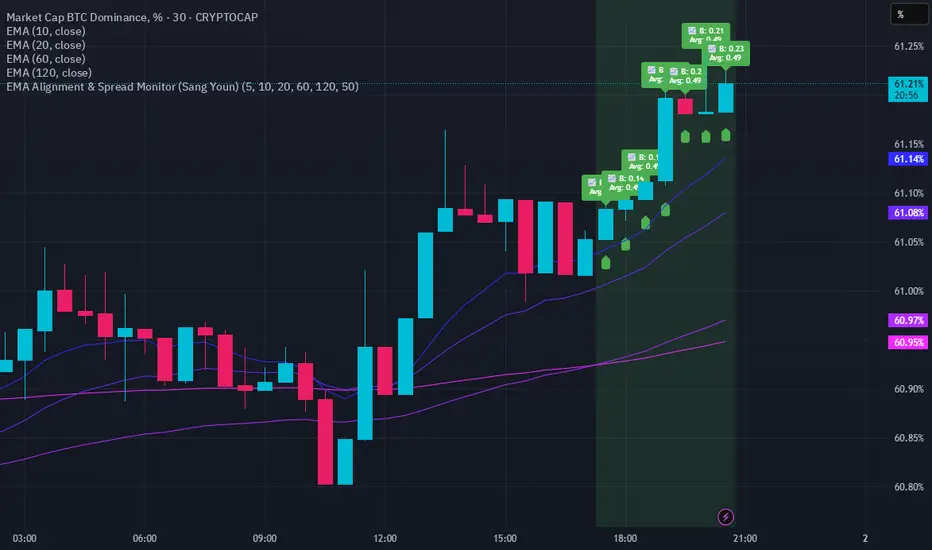
EMA Alignment & Spread Monitor (Sang Youn)Overview
The EMA Alignment & Spread Monitor is a dynamic trading script designed to monitor EMA (Exponential Moving Average) alignments, track spread deviations, and provide real-time alerts when significant conditions are met. This script allows traders to customize their EMA periods, analyze market trends based on EMA positioning, and receive visual and audio alerts when key spread conditions occur.
🔹 Key Features
✅ Customizable EMA Periods – Users can input their own EMA lengths to adapt the script to various market conditions. (Default: 5, 10, 20, 60, 120)
✅ EMA Alignment Detection – Identifies bullish alignment (all EMAs in ascending order) and bearish alignment (all EMAs in descending order).
✅ Spread Calculation & Monitoring – Computes the spread difference between each EMA and tracks the average spread over a user-defined period.
✅ Deviation Alerts – Notifies traders when:
Bullish Trend: The spread exceeds its average, indicating a potential strong uptrend.
Bearish Trend: The spread falls below its average, signaling a possible downtrend.
✅ Chart Annotations – Displays 📈 (green triangle) when bullish spread exceeds average and 📉 (red triangle) when bearish spread drops below average for easy visualization.
✅ Real-time Alerts – Sends alerts when spread conditions are met, helping traders react to market shifts efficiently.
✅ Spread Histogram – Visual representation of bullish and bearish spread levels for trend analysis.
🔹 How It Works
1️⃣ Set your EMA periods in the script settings (default: 5, 10, 20, 60, 120).
2️⃣ Define the spread average calculation length (default: 50 candles).
3️⃣ The script tracks EMA alignment to determine bullish or bearish trends.
4️⃣ If the spread deviates significantly from its average, the script:
Places a 📈 green triangle above candles in a bullish trend when spread > average.
Places a 📉 red triangle below candles in a bearish trend when spread < average.
Triggers an alert for timely decision-making.
5️⃣ Use the histogram & real-time alerts to stay ahead of market movements.
ICT Session by LasinsName: ICT Session by Lasins
Purpose: To visually identify and differentiate between the Asian, London, and New York trading sessions on the chart.
Features:
Highlights the background of the chart during each session.
Includes a mini dashboard in the top-right corner to show the active session.
Allows customization of time zones (exchange timezone or UTC).
Displays copyright and author information.
Key Components
Inputs:
useExchangeTimezone: A boolean input to toggle between using the exchange timezone or UTC for session times.
showDashboard: A boolean input to toggle the visibility of the mini dashboard.
Session Times:
The script defines three trading sessions:
Asian Session: 2000-0000 UTC (or adjusted for exchange timezone).
London Session: 0200-0500 UTC (or adjusted for exchange timezone).
New York Session: 0700-1000 UTC (or adjusted for exchange timezone).
Session Detection:
The is_session function checks if the current time falls within a specified session using the time function.
Background Coloring:
The bgcolor function is used to highlight the chart background during each session:
Asian Session: Red background.
London Session: Green background.
New York Session: Blue background.
Mini Dashboard:
A table is created in the top-right corner of the chart to display the active session and its corresponding color.
The dashboard includes:
A header row with "Session" and "Color".
Rows for each session (Asian, London, New York) with their respective colors.
Copyright and Author Information:
A label is added to the chart to display the copyright and author information ("© ICT Session by Lasins Raj").
How It Works
The script checks the current time and compares it to the predefined session times.
If the current time falls within a session, the chart background is highlighted with the corresponding color.
The mini dashboard updates to reflect the active session.
The copyright and author information is displayed at the bottom of the chart.
Customization
You can adjust the session times in the script to match your preferred timezone or trading hours.
The useExchangeTimezone input allows you to switch between UTC and the exchange timezone.
The showDashboard input lets you toggle the visibility of the mini dashboard.
Example Use Case
Traders who follow the ICT (Inner Circle Trader) methodology can use this indicator to identify key trading sessions and plan their trades accordingly.
The visual representation of sessions helps traders quickly recognize when major markets are open and active.

Market Snap Shot with Pine ScreenerMarket Snap Shot
The Market Snap Shot is a comprehensive technical analysis tool designed to track and display key price metrics across multiple timeframes, including daily, weekly, monthly, quarterly, and yearly data. This script provides a range of essential calculations for traders and investors, enabling them to assess price action, volatility, and market trends at a glance.
Features:
Daily Metrics: Includes the daily percentage change, closing range relative to the daily high/low.
Weekly Metrics: Tracks weekly open, close, range, and calculates week-to-date performance for a broader market view.
Monthly Metrics: Provides similar calculations for monthly price action, offering insights into monthly performance.
Quarter-to-Date (QTD): Displays performance for the current quarter, offering insights into quarterly price movements.
Year-to-Date (YTD): Calculates year-to-date price change, helping users track performance relative to the start of the year.
52-Week High/Low: Displays the current price's distance from the 52-week high and low, giving context to long-term price levels.
Usage:
Traders can use this screener to quickly assess the current market position and make informed decisions based on short-term and long-term trends.
Investors can leverage the 52-week and YTD metrics to gauge the overall strength of an asset in the market.
The tool is versatile for both active traders looking for real-time performance data and for those focusing on longer-term market trends.
Instructions:
This script displays multiple metrics such as percentage changes and range data for daily, weekly, monthly, quarterly, and yearly timeframes. It is designed to be used as a screener tool to assess price action and monitor performance across these key time periods.
Warning:
The "Market Snap Shot" does not provide buy or sell signals but rather serves as a performance tracking tool. Users are encouraged to use this data in conjunction with other technical and fundamental analysis tools.
Trend Detector [victhoreb]Trend Detector is a streamlined indicator that uses the Pearson correlation coefficient between the average price and time to determine market trends. It measures how closely price movement follows the progression of time over a user-defined period, providing a clear gauge of trend direction on a scale from -1 to 1.
How It Works:
The indicator calculates the correlation between price and time. A positive correlation means that as time advances, the price generally rises—signaling an uptrend. Conversely, a negative correlation indicates that the price tends to fall over time, highlighting a downtrend.
With its simple yet effective approach, Trend Detector offers traders an immediate visual and quantitative insight into prevailing market trends.

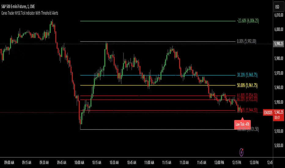
Ceres Trader NYSE Tick Indicator With Threshold AlertsThe Ceres Trader NYSE Tick Indicator provides real-time alerts for significant shifts in the NYSE Tick, empowering traders to identify potential overbought and oversold market conditions. It displays labels directly on the chart when the Tick reaches predefined thresholds, offering a clear and immediate visual representation of market sentiment.
Key Features:
Threshold-Based Alerts:
Highlights "High Tick" and "Low Tick" conditions when the Tick exceeds user-defined thresholds (default: 400 and -400).
Identifies "Extreme High Tick" and "Extreme Low Tick" conditions for more significant shifts (adjusted default: 800 and -800).
Visual Labels:
Displays colored labels directly on the price chart, indicating the type of Tick event and its value.
Green labels signal potential overbought conditions, while red labels indicate potential oversold conditions.
Low tick labels are placed below the price bar, and high tick labels are placed above the price bar for improved visibility.
Real-Time Data:
Utilizes the NYSE Tick symbol ("TICK") to provide up-to-the-minute market data.
User-Friendly Design:
Simple and intuitive design, suitable for traders of all experience levels.
How to Use:
Add the "Ceres Trader NYSE Tick Indicator with Threshold Alerts" to your TradingView chart.
Observe the colored labels that appear when the Tick reaches the specified thresholds.
Use these alerts to identify potential trading opportunities based on overbought or oversold market conditions.
Consider adjusting the threshold values within the indicator settings to align with your specific trading strategy.