Moving Average Structure ZigZag [Stable & Filtered]
(日本語説明)
このインジケーターは、移動平均線(MA)の転換に基づき、相場の「真の構造」を可視化するために開発されました。 通常のZigZagのように価格の単純な反転に依存せず、「MAのトレンド転換 + 指定した値幅の到達」という2つの条件を用いることで、レンジ相場の細かなノイズ(ダマシ)を排除し、ダウ理論に基づいた重要な高値・安値だけを結びます。
💡 主な機能
MAタイプの切り替え: SMA, EMA, HMA, VW-HMAなど、目的に合わせたトレンド感度を選択可能。
値幅フィルター(Min Deviation): 添付画像のように、小さな値動きをカットし、大きな市場構造だけを抽出します。
価格アクションへの追従: ラインはMAの数値ではなく、期間内の実最高値・最安値を正確に結び、高値更新時には自動で延伸されます。
🛠 活用シーン
環境認識: 上位足での大きな波形を確認し、現在のフェーズを定義。
ノイズ除去: 市場の主要な節目(レジサポ候補)の特定。
ダウ理論の視覚化: 高値・安値の切り上がり・切り下がりを明確化。
(English Description)
This indicator was developed to visualize the "True Market Structure" based on Moving Average (MA) reversals. Unlike standard ZigZag which relies solely on price reversals, this tool combines MA Trend Reversals and a Minimum Deviation filter to eliminate market noise and highlight significant swing highs and lows based on Dow Theory.
💡 Key Features
Multiple MA Types: Select from SMA, EMA, HMA, VW-HMA, etc., to match your preferred trend sensitivity.
Min Deviation Filter: As shown in the attached image, it filters out minor price fluctuations to extract only the major market waves.
Price Action Tracking: The lines connect the actual High/Low prices within the period, not the MA values themselves. Lines automatically extend when a trend continues to new highs/lows.
🛠 Use Cases
Market Context: Identify major wave patterns on higher timeframes to define the current phase.
Noise Reduction: Pinpoint key market levels and potential support/resistance.
Dow Theory Visualization: Clearly visualize higher highs/lows and trend shifts.
Settings
MA Type: Choose the type of Moving Average.
Moving Average Length: The lookback period for structure.
Min Deviation (Pips): The threshold to filter noise. Adjust according to the volatility of the pair.
Analisis Gelombang

Wedge Pattern [Kodexius]Wedge Pattern is a chart-overlay indicator designed to detect and manage classic Rising Wedge (bearish) and Falling Wedge (bullish) structures using strict, rules-based validation. The script focuses on producing clean, tradable wedge prints by building both boundaries from confirmed pivot swings, enforcing a mandatory “no closes outside the wedge” condition during formation, and requiring the wedge apex to be projected into the future to avoid premature or distorted patterns.
This implementation is built for practical execution charts. It continuously updates the active wedge boundaries in real time, clearly labels the pattern type, and reacts decisively when price confirms a valid breakout. When enabled, it also projects a measured-move target derived from the wedge geometry, so the trader can quickly evaluate reward potential without manual projection.
The detection logic is intentionally conservative. Rather than printing every possible converging structure, it aims to identify wedges that respect structural integrity: multiple touches on each boundary, controlled price action inside the converging range, and a valid convergence point (apex) ahead of the current bar. The result is a wedge tool that prioritizes quality, readability, and consistent behavior across symbols and timeframes.
🔹 Features
🔸 Rising and Falling Wedge Detection (Trendline Based)
The indicator detects two wedge types by constructing an upper trendline from pivot highs and a lower trendline from pivot lows:
Rising Wedge (Bearish): both lines slope upward, and the lower line rises faster than the upper line, creating a tightening upward channel that typically resolves with a downside break.
Falling Wedge (Bullish): both lines slope downward, and the upper line falls faster than the lower line, producing a tightening downward channel that typically resolves with an upside break.
This slope relationship is the core wedge classifier. It ensures the script is not just drawing random converging lines, but explicitly requires the characteristic “compression” geometry that defines wedges.
🔸 Pivot-Confirmed Structure with User Control
Wedges are built from confirmed pivots using:
Pivot Left and Pivot Right inputs to control how “strict” a pivot must be.
Min. Touches per Line to enforce multiple confirmations on each boundary.
Standard technical analysis commonly requires at least three touches to validate a trendline. This script supports that workflow by requiring a minimum number of pivot points before a wedge is eligible for drawing.
🔸 Mandatory Integrity Rule: No Closes Outside the Boundaries
A key quality filter is applied before a wedge can be accepted:
During formation, no candle close is allowed outside the upper or lower boundary.
If any close is detected above the upper line or below the lower line (with tick tolerance), the candidate wedge is rejected. This prevents patterns that already “broke” before they were formally detected and reduces false positives caused by messy price action.
🔸 Apex Validation to Avoid Distorted Prints
The wedge apex (the projected intersection point of the two trendlines) must be in the future. This avoids degenerate cases where lines intersect behind current price, which often indicates the structure is not a valid wedge or is already past its useful phase.
🔸 Live Updating Boundaries for Active Patterns
Once a wedge becomes active, its upper and lower lines are extended forward bar by bar. The script recalculates the boundary price at the current bar index using the stored slope, then updates the line endpoints so the wedge remains visually accurate as time advances.
🔸 Breakout Engine with Directional Confirmation
The script differentiates between:
Correct breakout: the wedge breaks in the expected direction.
Rising wedge breaks downward (close below the lower boundary).
Falling wedge breaks upward (close above the upper boundary).
When this happens, the wedge is marked as broken and labeled as BREAKOUT on the chart.
🔸 Invalidation and Failure Handling
If price violates the wedge in the wrong direction, or if the wedge collapses into an impossible structure (upper boundary falls below or equals the lower boundary), the wedge is flagged as FAILED. This keeps signals honest and prevents lingering drawings that no longer represent a valid pattern.
🔸 Optional Target Projection (Measured Move)
When Show Target Projection is enabled, the script plots a dashed target line and a target label after a valid breakout. The target is computed as a measured move using the wedge height, projected from the breakout boundary in the breakout direction. This provides an immediate objective reference for potential continuation.
🔸 Clean Object Management and Chart Readability
To maintain clarity, the script manages the “active” wedge per type:
If a new wedge is detected while an older one is still active and not broken or failed, the old drawings are removed and replaced with the newer valid pattern.
This prevents chart clutter and keeps the display focused on the most relevant wedge structures.
🔹 Calculations
1) Pivot Collection
The script uses pivot functions to confirm swing points:
float ph = ta.pivothigh(high, INPUT_PIVOT_LEFT, INPUT_PIVOT_RIGHT)
float pl = ta.pivotlow(low, INPUT_PIVOT_LEFT, INPUT_PIVOT_RIGHT)
if not na(ph)
pivot_highs.push(Coordinate.new(bar_index - INPUT_PIVOT_RIGHT, ph))
if not na(pl)
pivot_lows.push(Coordinate.new(bar_index - INPUT_PIVOT_RIGHT, pl))
Each pivot is stored as a Coordinate containing:
index: the bar index where the pivot is confirmed
price: the pivot high or pivot low value
The arrays are capped (for example, last 20 pivots) to control memory and keep selection relevant.
2) Trendline Construction and Slope
A wedge candidate uses the earliest and latest required pivot points for each line. For each boundary, slope is computed as:
method calc_slope(Trendline this) =>
(this.end.price - this.start.price) / (this.end.index - this.start.index)
With slope known, the trendline value at any bar index is:
method get_price_at(Trendline this, int bar_idx) =>
this.start.price + this.slope * (bar_idx - this.start.index)
This approach allows the script to update wedge boundaries consistently without re-fitting lines on every bar.
3) Wedge Type Classification (Geometry Rules)
After both slopes are calculated, wedge type is determined by slope direction and relative steepness:
Rising wedge requires both slopes positive and lower slope greater than upper slope.
Falling wedge requires both slopes negative and upper slope more negative than lower slope (upper line falls faster).
In code logic:
if tl_up.slope > 0 and tl_lo.slope > 0 and tl_lo.slope > tl_up.slope
w_type := 1 // Rising
if tl_up.slope < 0 and tl_lo.slope < 0 and tl_up.slope < tl_lo.slope
w_type := 2 // Falling
This enforces converging boundaries and avoids simple parallel channels.
4) Apex Projection (Trendline Intersection)
The apex is the projected intersection x-coordinate of the two trendlines:
method get_apex_index(Wedge this) =>
float m1 = this.upper.slope
float m2 = this.lower.slope
float y1 = this.upper.start.price
float y2 = this.lower.start.price
int x1 = this.upper.start.index
int x2 = this.lower.start.index
float apex_x = (y2 - y1 + m1 * x1 - m2 * x2) / (m1 - m2)
math.round(apex_x)
Validation requires:
apex_idx > bar_index (apex must be in the future)
This prevents late or structurally invalid wedges from being activated.
5) Mandatory “No Close Outside” Validation
Before activation, the script verifies the pattern has not been violated by candle closes:
method check_violation(Wedge this, int from_idx, int to_idx) =>
bool violated = false
for i = from_idx to to_idx
float up_p = this.upper.get_price_at(i)
float lo_p = this.lower.get_price_at(i)
float c_p = close
if c_p > up_p + syminfo.mintick or c_p < lo_p - syminfo.mintick
violated := true
break
violated
Interpretation:
For every bar from wedge start to current bar, the close must remain between the projected upper and lower boundary prices.
A tick tolerance (syminfo.mintick) is used to reduce micro false violations.
6) Live Update and Breakout Detection
Once active, lines are extended to the current bar and boundary prices are computed:
float u_p = w.upper.get_price_at(bar_index)
float l_p = w.lower.get_price_at(bar_index)
bool b_up = close > u_p
bool b_dn = close < l_p
Correct breakout conditions:
Rising wedge breakout: close below lower boundary.
Falling wedge breakout: close above upper boundary.
if (w.is_rising and b_dn) or (not w.is_rising and b_up)
w.is_broken := true
Invalidation rules include:
wrong-direction break
boundary crossover (upper <= lower)
7) Target Projection (Measured Move)
If target display is enabled, the script calculates wedge height and projects a target from the breakout side:
float m = math.abs(w.upper.start.price - w.lower.get_price_at(w.upper.start.index))
float t = w.is_rising ? l_p - m : u_p + m
Interpretation:
m represents the wedge height near the start of the formation.
t is the target price, projected in the breakout direction.
Rising wedge: target below the lower boundary.
Falling wedge: target above the upper boundary.
A dashed target line and label are then placed forward in time for readability.

Newton Pulse Pro AI Exclusive – Newton
Next-Generation Trend Intelligence & Smart Range Filtering
Introduction Newton is the newest powerhouse in the AI Exclusive series, specifically engineered to master trend dynamics. While most indicators fail during choppy, sideways markets, Newton uses advanced AI logic to distinguish between a true trending move and a high-risk range. It is designed for traders who value quality over quantity, providing signals only when the market has clear momentum.
Key Benefits
✅ Smart Range Filtering: Automatically detects sideways markets and remains silent to protect you from "choppy" price action.
✅ Pure Trend Following: Focuses exclusively on high-probability Buy and Sell entries within established trends.
✅ Noise Reduction: Eliminates false signals by ignoring minor price fluctuations that do not lead to real moves.
✅ Strategic Patience: Encourages disciplined trading by only appearing when the market conditions are optimal.
✅ Universal Application: Optimized for Forex, Crypto, Stocks, and Commodities.
General Specifications
Product Name: Newton (Powered by AI Exclusive)
Trading Style: Trend Following & Momentum
Signal Type: Non-Repaint (Signals are fixed once the candle closes)
Market Phase Detection: Intelligent Range/Trend differentiation
Visual Design: Clean, minimalist interface focused on entry execution
Individual Product Presentation: Newton (Trend Master)
Overview: An AI-driven indicator that specializes in identifying the "Law of Motion" in the market. It provides Buy/Sell signals only when a trend is confirmed, staying completely inactive during ranging phases to prevent capital erosion.
Benefits:
Avoids "Death by a Thousand Cuts" in sideways markets.
Provides clear, decisive entry points for Buy and Sell orders.
Simplifies the chart by removing unnecessary clutter and noise.
Features:
Proprietary Trend Logic: Analyzes market structure to ensure signals are backed by real volume and momentum.
Zero-Signal Range Mode: The indicator remains quiet when the market lacks a clear direction—one of its most powerful features.
Visual Precision: High-contrast labels and signals for instant decision-making.
Compatibility: Works seamlessly across all timeframes, from 1-minute scalping to weekly swing trading.
⚙️ Installation & Activation Guide
Secure Your License Purchase the Newton indicator or the full AI Exclusive Package through our official website.
Submit Your TradingView Details After purchase, send your TradingView email address to our support team for authorization.
Account Verification Our team will process your request and grant access to the proprietary script.
Activation & Use * Open TradingView.
Navigate to Indicators → Invite-Only Scripts.
Select AI Exclusive: Newton to apply it to your chart.
Pro Tip: When Newton is not showing signals, it is a signal in itself—it's telling you to stay on the sidelines and wait for a high-probability breakout.

High/Low ScalpingThis indicator is designed to identify reversal points at price extremums (Highs and Lows) over a specified lookback period. The algorithm combines ZigZag pivot logic, RSI filtering, and global price level analysis.
Key Features:
Dual Extremum Confirmation: A signal triggers only when a ZigZag pivot forms and that peak is the highest or lowest over the last N bars (Lookback).
RSI Filtering: Helps avoid mid-trend entries by confirming overbought or oversold conditions.
Smart Visualization: ZigZag lines are drawn using time-based coordinates to ensure accuracy across various timeframes.
Exit System: The indicator automatically marks exit points (EXIT) when an opposing local fractal is detected.
Settings:
Fast TF: The timeframe used for primary signal calculations.
Fast Depth: The sensitivity of pivot detection (higher values reduce noise).
Extremum Lookback: The historical depth for defining a "Global High/Low." Setting this to 150 on H1 will look for reversals only at weekly extremes.
RSI Filter: Customizable thresholds (60/40 or 70/30) to confirm reversal strength.
_ _ _ _ _ _ _ _ _ _ _ _ _ _ _ _ _ _ _ _ _ _ _ _ _ _ _ _ _ _ _ _ _ _ _ _ _ _ _ _ _ _ _ _ _ _ _ _ _ _ _ _
Этот индикатор предназначен для поиска разворотных точек в зонах экстремумов (максимумов и минимумов) за определенный период. Алгоритм сочетает в себе логику классического ZigZag, фильтрацию по RSI и анализ глобальных ценовых уровней.
Основные возможности:
Двойное подтверждение экстремума: Сигнал появляется только тогда, когда формируется фрактал (пивот) Зигзага, и этот пик является самым высоким или низким за последние N баров (Lookback).
Фильтрация по RSI: Помогает избежать входов в середине тренда, подтверждая перекупленность или перепроданность.
Умная визуализация : Линии Зигзага строятся с учетом времени, что исключает ошибки смещения на разных таймфреймах.
Система выходов: Индикатор автоматически отмечает точки выхода (EXIT) при формировании встречного локального фрактала.
Настройки:
Fast TF / Быстрый ТФ: Таймфрейм, на котором рассчитываются основные сигналы.
Fast Depth: Глубина поиска пивотов (чем больше, тем меньше шума).
Extremum Lookback: Глубина истории для определения «Глобального Хая/Лоя». Если поставить 150 на H1 — индикатор будет искать развороты только на экстремумах недели.
RSI Filter: Настройка порогов (60/40 или 70/30) для подтверждения силы разворота.

coins notice screenerif you can't decide the way of the coins, this can help you to decide. Hope it works for you

SM Analysis Rejection Based Supply and Demand Zones🔷 SM-Analysis | Rejection-Based Supply & Demand Zones (Smart Money)
📌 Smart Money Supply & Demand | Wick Rejection Zones | Institutional Levels
🔍 What This Indicator Does
SM-Analysis | Rejection-Based Supply & Demand Zones is a Smart Money Concept (SMC) indicator designed to automatically detect high-probability institutional Supply and Demand zones using strong wick rejection logic.
This tool highlights areas where price was aggressively rejected, often signalling the presence of large operators, liquidity grabs, and institutional defence zones.
Unlike traditional support & resistance indicators, this script filters weak levels and plots only meaningful rejection-based zones.
🚀 Key Features (SEO Optimized)
Smart Money Supply & Demand Zones
Wick Rejection Detection (Institutional Candles)
Non-Repainting Historical Zones
Intraday Noise Filter (Hide Current Day Zones)
Auto-Extending Zones
Supply (Red) & Demand (Green) Levels
Works on Forex, Crypto, Stocks, Indices, Futures
Suitable for Intraday, Swing & Positional Trading
🧠 Smart Money Logic Explained
This indicator analyses each candle and compares:
Upper Wick vs Body → Supply rejection
Lower Wick vs Body → Demand rejection
A zone is plotted only when wick rejection is statistically stronger than the candle body using a Wick Multiplier.
This logic helps identify:
Stop-hunt candles
Liquidity sweeps
Institutional order blocks (wick-based)
Price rejection zones
⏱ Intraday & Non-Repainting Behavior
🔘 Hide Current Day Boxes (Highly Recommended)
When enabled:
Zones created during the current trading day are hidden
Prevents incomplete or repaint-like zones
Only confirmed historical zones remain visible
If a zone is filled on the same day it was created, it is fully deleted to keep the chart clean and realistic.
🎯 How to Trade – Visual Examples
🟢 Demand Zone (Buy Setup)
Price forms a long lower wick → Demand zone is plotted
Wait for price to re-enter the green zone
Look for confirmation (bullish candle, structure support, RSI or volume)
Entry near zone bottom
Stop-loss below the zone
Targets at nearest supply zone or previous highs
🔴 Supply Zone (Sell Setup)
Price prints a long upper wick → Supply zone appears
Wait for price to retest the red zone
Look for bearish rejection or structure break
Entry near zone top
Stop-loss above the zone
Targets at nearest demand zone or liquidity lows
📊 Best Strategy Combinations
Market Structure (HH / HL / LL / LH)
Liquidity Sweeps
Trend Bias (EMA / VWAP)
RSI or Volume Confirmation
Multi-Timeframe Analysis
⚙️ Inputs Explained
Wick Multiplier – Controls rejection strength sensitivity
Hide Current Day Boxes – Filters intraday noise and repaint behaviour
📌 Best Timeframes
5m – 15m → Intraday Trading
30m – 1H → Swing Trading
4H – Daily → Institutional Zones
⚠️ Disclaimer
This indicator is a technical analysis tool and not a buy/sell signal. Always use proper risk management and confirmation.
🏷 Credits
Developed by: SM-Analysis
Institutional-grade Smart Money tools for precision traders.

Trend Strength Matrix [JOAT]Trend Strength Matrix — Multi-Timeframe Confluence Analysis System
This indicator addresses a specific analytical challenge: how to efficiently compare multiple technical measurements across different timeframes while accounting for their varying scales and interpretations. Rather than managing separate indicator windows with different scales, this tool normalizes four distinct analytical approaches to a common -1 to +1 scale and presents them in a unified matrix format.
Why This Combination Adds Value
The core problem this indicator solves is analytical fragmentation. Traders often use multiple indicators but struggle with:
1. **Scale Inconsistency**: RSI ranges 0-100, MACD has no fixed range, ADX ranges 0-100 but measures strength not direction
2. **Timeframe Coordination**: Checking multiple timeframes requires switching between charts or cramming multiple indicators
3. **Cognitive Load**: Processing different indicator types simultaneously creates mental overhead
4. **Confluence Assessment**: Determining when multiple approaches agree requires manual comparison
This indicator specifically addresses these issues by creating a standardized analytical framework where different measurement approaches can be directly compared both within and across timeframes.
Originality and Technical Innovation
While the individual components (RSI, MACD, ADX, Moving Average) are standard, the originality lies in:
1. **Unified Normalization System**: Each component is mathematically transformed to a -1 to +1 scale using component-specific normalization that preserves the indicator's core characteristics
2. **Multi-Timeframe Weighting Algorithm**: Higher timeframes receive proportionally more weight (40% current, 25% next, 20% third, 15% fourth) based on the principle that longer timeframes provide more significant context
3. **Real-Time Confluence Scoring**: The composite calculation provides an instant assessment of how much the different analytical approaches agree
4. **Adaptive Visual Encoding**: The heatmap format allows immediate pattern recognition of agreement/disagreement across both indicators and timeframes
How the Components Work Together
Each component measures a different aspect of market behavior, and their combination provides a more complete analytical picture:
**Momentum Component (RSI-based)**: Measures the velocity of price changes by comparing average gains to losses
**Trend Component (MACD-based)**: Measures the relationship between fast and slow moving averages, indicating trend acceleration/deceleration
**Strength Component (ADX-based)**: Measures trend strength regardless of direction, then applies directional bias
**Position Component (MA-based)**: Measures price position relative to a reference average
The mathematical relationship between these components creates a comprehensive view:
- When all four agree (similar colors), it suggests multiple analytical approaches are aligned
- When they disagree (mixed colors), it highlights analytical uncertainty or transition periods
- The composite score quantifies the degree of agreement numerically
Detailed Component Analysis
**1. Momentum Oscillator Component**
This component transforms RSI into a centered oscillator by subtracting 50 and dividing by 50, creating a -1 to +1 range where 0 represents equilibrium between buying and selling pressure.
// Momentum calculation normalized to -1 to +1 scale
float rsi = ta.rsi(close, rsiLength)
float rsiScore = (rsi - 50) / 50
// Result: 0 at equilibrium, +1 at extreme overbought, -1 at extreme oversold
**2. Moving Average Convergence Component**
MACD is normalized by its own volatility (standard deviation) to create a bounded oscillator. This prevents the unbounded nature of MACD from dominating the composite calculation.
// MACD normalized by its historical volatility
= ta.macd(close, macdFast, macdSlow, macdSignal)
float macdStdev = ta.stdev(macdLine, 100)
float macdScore = macdStdev != 0 ? math.max(-1, math.min(1, macdLine / (macdStdev * 2))) : 0
**3. Directional Movement Component**
This combines ADX (strength) with directional movement (+DI vs -DI) to create a directional strength measurement. ADX alone shows strength but not direction; this component adds directional context.
// ADX-based directional strength
= calcADX(adxLength)
float adxStrength = math.min(adx / 50, 1) // Normalize ADX to 0-1
float adxDirection = plusDI > minusDI ? 1 : -1 // Direction bias
float adxScore = adxStrength * adxDirection // Combine strength and direction
**4. Price Position Component**
This measures price deviation from a moving average, weighted by the magnitude of deviation to distinguish between minor and significant displacements.
// Price position relative to moving average
float ma = ta.sma(close, maLength)
float maDirection = close > ma ? 1 : -1
float maDeviation = math.abs(close - ma) / ma * 10 // Percentage deviation scaled
float maScore = math.max(-1, math.min(1, maDirection * math.min(maDeviation, 1)))
Multi-Timeframe Integration Logic
The multi-timeframe system uses a weighted average that gives more influence to higher timeframes:
// Timeframe weighting system
float currentTF = composite * 0.40 // Current timeframe: 40%
float higherTF1 = composite_tf2 * 0.25 // Next higher: 25%
float higherTF2 = composite_tf3 * 0.20 // Third higher: 20%
float higherTF3 = composite_tf4 * 0.15 // Fourth higher: 15%
float multiTFComposite = currentTF + higherTF1 + higherTF2 + higherTF3
This weighting reflects the principle that higher timeframes provide more significant context for market direction, while lower timeframes provide timing precision.
What the Dashboard Shows
The heatmap displays a grid where:
Each row represents a timeframe
Each column shows one component's normalized reading
Colors indicate the value: green shades for positive, red shades for negative, gray for neutral
The rightmost column shows the composite average for that timeframe
Visual Elements
Moving Average Line — A simple moving average plotted on the price chart
Background Tint — Subtle coloring based on the composite score
Shift Labels — Markers when the composite crosses threshold values
Dashboard Table — The main heatmap display
Inputs
Calculation Parameters:
Momentum Length (default: 14)
MACD Fast/Slow/Signal (default: 12/26/9)
Directional Movement Length (default: 14)
Moving Average Length (default: 50)
Timeframe Settings:
Enable/disable multi-timeframe analysis
Select additional timeframes to display
How to Read the Display
Similar colors across a row indicate the components are showing similar readings
Mixed colors indicate the components are showing different readings
The composite percentage shows the average of all four components
Alerts
Composite crossed above/below threshold values
Strong readings (above 50% or below -50%)
Important Limitations and Realistic Expectations
This indicator displays current analytical conditions—it does not predict future price movements
Agreement between components indicates current analytical alignment, not future price direction
All four components are based on historical price data and inherently lag price action
Market conditions can change rapidly, making current readings irrelevant
Different parameter settings will produce different readings and interpretations
No combination of technical indicators can reliably predict future market behavior
Strong readings in one direction do not guarantee continued movement in that direction
The composite score reflects mathematical relationships, not market fundamentals or sentiment
This tool should be used as one input among many in a comprehensive analytical approach
Appropriate Use Cases
This indicator is designed for:
- Analytical organization and efficiency
- Multi-timeframe confluence assessment
- Pattern recognition in indicator relationships
- Educational study of how different analytical approaches relate
- Supplementary analysis alongside other methods
This indicator is NOT designed for:
- Standalone trading signals
- Guaranteed profit generation
- Market timing precision
- Replacement of fundamental analysis
- Automated trading systems
— Made with passion by officialjackofalltrades

M & V Swing Analysis📌 Indicator Name
M & V Swing Analysis
(Momentum & Volume based Swing Strength Analyzer)
🧠 Indicator ka Objective
M & V Swing Analysis ek market structure + momentum + volume based indicator hai jo har swing ke 3 important stages ko clearly identify karta hai:
1️⃣ Swing Continue (SC)
2️⃣ Swing Weak (SW)
3️⃣ Swing End (SE)
Iska main goal hai trader ko ye batana ki:
Swing strong hai ya nahi
Swing continue karega ya weaken ho raha hai
Swing end hone ke kareeb hai ya nahi
🔍 Kaise Kaam Karta Hai (Logic Overview)
1️⃣ Market Structure (Swing Direction)
Pivot High & Pivot Low (default lookback = 20) use karke:
Up Swing
Down Swing
identify karta hai.
2️⃣ Momentum Analysis (MACD Histogram)
MACD Histogram ka use karke:
Momentum positive / negative zone
Momentum increase ho raha hai ya weaken
check karta hai.
Histogram smoothing (average) lagayi gayi hai taaki noise kam ho.
3️⃣ Volume Analysis
Volume MA (10 & 20) ke through:
Volume price ke saath support kar raha hai
Ya price move ke against ja raha hai
identify hota hai.
🚦 Swing Labels ka Matlab
🟢 SC – Swing Continue
Price direction ✔️
Volume support ✔️
Momentum support ✔️
👉 Trend healthy hai, swing smoothly continue ho raha hai.
🟠 SW – Swing Weak
Price move hai
Lekin ya to volume ya momentum weak hai
SW – U / D – V → Volume issue
SW – U / D – M → Momentum issue
👉 Alert stage ⚠️
Swing ab weak ho raha hai, partial booking / caution useful.
🔴 SE – Swing End
Volume ❌
Momentum ❌
👉 High probability swing end / reversal / consolidation zone.
Aggressive entries avoid karna better.

The KrakenFirst and foremost, you need to understand several concepts, such as what a trend reversal or continuation is, and be aware that everyone sees what has already happened; from there, they speculate about the future ("Give them a change and they already have a direction" ACE95). The third time's the charm, unless it reverses and doesn't enter the structure. Red - green > external and orange > internal. I can't be any clearer. Try to overcome the Tilt (defense mode) because discipline is the key to success.
Primero antes que nada deve conocer varios conceptos, como que es un cambio de tendencia o continuacion y tener claro que todos ven lo que ya sucedio antes , a partir de ahi especulan el futuro (" Dales un cambio y ya tienen una direncion "ACE95), a la tercera va la vencida exepto que gire y no entre a la estructura. Rojo - verde > externo y naranja > interno. Mas claro no puedo ser, intenta superar el Tilt(modo defenza) porque la disciplina es la clave del exito.

zenba kit basic
interaction between 9 moving average and 108 moving average.
gradient filled zones.
200 moving average with color change.
vwap & standard deviations +/- 1.01
retrowave auroral style coloring

[uPaSKaL] Adaptive Swing StructureOverview :
Adaptive Swing Structure identifies and labels swing structure using HH / HL / LH / LL and can optionally draw wave connectors between successive swing points.
The goal is to provide a clean, practical view of market structure that remains readable across different market conditions.
Instead of relying only on a classic fixed-window pivot scan (left/right bars), this indicator uses an adaptive swing-detection approach designed to better match how traders visually interpret legs and structure.
Why this approach (vs. a simple pivot scan)?
Classic pivot scans (e.g., “pivot high/low with left/right bars”) are simple and widely used, but they often have practical limitations:
They depend heavily on a fixed window size (too sensitive in chop, too slow in trends)
They can mark pivots that are locally valid but not always representative of the broader leg
They may produce frequent structure changes during ranges, reducing readability
What you get with this indicator
A more stable swing structure view that adapts to price movement
Cleaner HH / HL / LH / LL labeling for context and decision-making
Optional wave connectors to visually follow the swing path
Visual comparison:
The screenshots below illustrate the difference in how structure can appear when using a classic pivot scan versus Adaptive Swing Structure.
Classic Pivot Points (High / Low):
Adaptive Swing Structure (This Indicator):
How to read the labels
This indicator labels swing structure using the standard notation:
HH = Higher High
HL = Higher Low
LH = Lower High
LL = Lower Low
How to interpret Wave Lines
When enabled, wave lines connect successive swing points to help you visually track the current swing path and structural transitions.
Inputs guide
Tracer Line Len
Main sensitivity control. Adjust this to fit the instrument and timeframe.
Higher values → fewer swing points, smoother structure (macro view)
Lower values → more swing points, more detail (micro view)
Show Wick (High / Low) Line
Shows the wick-based tracer (visual reference).
More sensitive to extremes and wick behavior
Useful when wicks matter (liquidity spikes / stop-runs)
Show Body (Open / Close) Line
Shows the body-based tracer (visual reference).
Filters wick noise and often looks smoother
Useful when you prefer structure based on candle bodies
Show Slope Flip Labels
Shows small markers that highlight swing turning moments (study/verification).
Helpful for understanding where structure updates
Optional and can be disabled for a cleaner chart
Wave Labels (WICK)
Shows HH/HL/LH/LL labels using wick-based swings.
More responsive to wick extremes
Wave Lines (WICK)
Connects wick-based swing points with wave lines.
Improves visual continuity of swings
Wave Labels (BODY)
Shows HH/HL/LH/LL labels using body-based swings.
Typically smoother and less sensitive to wick spikes
Wave Lines (BODY)
Connects body-based swing points with wave lines.
Cleaner wave path for body-based structure
Max Wave Labels Kept (per Wick / Body)
Limits the number of labels kept on the chart (older ones are removed first).
Reduces clutter
Helps maintain performance
Max Wave Lines Kept (per Wick / Body)
Limits the number of wave lines kept on the chart (older ones are removed first).
Keeps the chart readable
Helps maintain performance
History Window (map size / scan clamp)
Performance / stability control for how much recent history is considered.
Higher values → more history considered, higher CPU usage
Lower values → lighter execution, structure limited to more recent swings
Usage / Tuning
1) Find “your number” for each market
There is no universal best setting. The optimal Tracer Line Len depends on:
Instrument volatility
Your trading timeframe
Whether you want micro structure or macro structure
2) Build a simple baseline
Choose your chart timeframe (e.g., 4H).
Start with a moderate Len (e.g., 10–30).
Increase or decrease Len until the swing structure matches how you would manually map it.
3) Practical “timeframe scaling” intuition
You can use Len to “zoom out” or “zoom in” structure without changing your chart timeframe.
Example on 4H :
If Len = 20 produces the swing structure you want for 4H decisions, keep it as your baseline.
If you increase it to something like Len = 120 , the structure becomes much smoother and swing points appear less frequently.
This means:
4H with a smaller Len → focuses on 4H-level swings (more detail).
4H with a much larger Len → filters many local swings and highlights broader legs (more “higher-timeframe-like” context).
This is not a strict mathematical replacement for switching timeframes, but it is a practical and effective way to compress or expand structure density on the same chart.
4) Wick vs Body (which one to choose?)
WICK : Choose when extreme wicks matter to your reading of structure.
BODY : Choose when you want smoother structure and less sensitivity to wick spikes.
5) Suggested workflow for active traders
Use one preset for local structure (entries / short-term decisions).
Use a second preset with a larger Len for higher-level context (major swings / directional bias).

LJ Parsons Adjustable expanding MRT FibBased on premium/discount/fair-value levels the indicator will expand with the market by settable dates.
The levels are not fib based as such but are resonant levels within an multiplicative /12 log scale using the LJ Parsons Market resonance hypothesis.

Falcon HeatWaveIntroducing the MyFXSchool Falcon HeatWave Leading Indicator™, a next-generation market prediction tool designed exclusively for traders who want accuracy, clarity, and early trend identification. Built using advanced price-action logic, institutional order-flow concepts, and dynamic volatility algorithms, this indicator gives you a true leading advantage—not just lagging signals.

Falcon 1Introducing the MyFXSchool Falcon 1Leading Indicator™, a next-generation market prediction tool designed exclusively for traders who want accuracy, clarity, and early trend identification. Built using advanced price-action logic, institutional order-flow concepts, and dynamic volatility algorithms, this indicator gives you a true leading advantage—not just lagging signals.

Falcon 2Introducing the MyFXSchool Falcon 2 Leading Indicator™, a next-generation market prediction tool designed exclusively for traders who want accuracy, clarity, and early trend identification. Built using advanced price-action logic, institutional order-flow concepts, and dynamic volatility algorithms, this indicator gives you a true leading advantage—not just lagging signals.

Frequency AnalyzerFREQUENCY ANALYZER
This indicator is called Frequency Analyzer to analyze the movement of volatility explosion, to detect exploding candles, before they explode. The indicator only describes large volatility would happen in the future, but we don't know, it's volatility as a buy or sell transaction. Of course this has an impact on whether the candle after that occurs a rally or a drop.
That this is useful for detecting exploding candles before exploding, to detect super bullish before bullish, or detect super bearish before bearish. If the candle is in the support position and there is the Spike Bar on Frequency Analyzer, that high probability the exploding volatility becomes a rally. Conversely, if the candle position is in the resistance and there is the Spike Bar on Frequency Analyzer, that high probability the exploding volatility becomes a drop. So this is an indicator to detect exploding candles before they explode, the candles become super rally or super drop.


Multi Stochastic OscillatorMulti Stochastic Oscillator provides three stochastic oscillators in one panel. Stochastic 1 with K period 15 and D period 3. Stochastic 2 with K period 32 and D period 3. Stochastic 3 with K period 50 and D period 3.

Low-High Waves for NeowaveOpen your chart at daily and hide the symbol graphic. Now you can see the waves. It’s including limited data sorry for this but I’m not a programmer and TradingView have limitations.

Bullish/Bearish Movement SumThis indicator calculates and displays the cumulative sum of bullish and bearish price movements over a specified period.
Features:
- Green line: Cumulative sum of all bullish movements
- Red line: Cumulative sum of all bearish movements (absolute value)
- Blue area: Net difference (bullish - bearish)
- Information table showing current values and bull/bear ratio
Settings:
- Calculation Period: Choose rolling window size (default: 100 bars) or 0 for cumulative from start
- Calculation Mode: Choose between "Points" (absolute price changes) or "Percentage" (% changes)
Use Cases:
- Identify market directional strength
- Compare bullish vs bearish pressure
- Spot divergences between price and directional momentum
- Ratio > 1 indicates more bullish than bearish movement
Developed with assistance from Claude (Anthropic)

Vel-SIGThis pine script will give you an idea about the markets are in trending or rangebound. based on this you can take your decision whether you can buy or sell or right option.

34L0TINV327INGEMA CISD HTF Confirmation is a visual TradingView indicator designed to support structured, rule-based market analysis using EMA alignment and CISD-style confirmation. The indicator highlights higher-timeframe bias and momentum conditions to help traders follow predefined rules and reduce discretionary decision-making.
This tool is intended for analytical and educational purposes only. It does not provide trade signals, predictions, or guarantees. Access is provided on an invite-only basis.

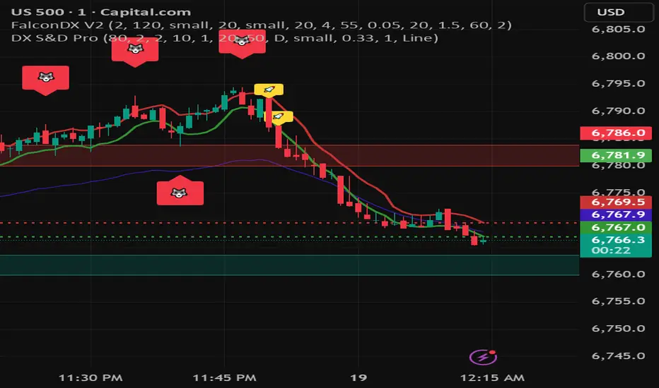
DX Supply and Demand Pro💎 DX Supply and Demand Pro: Adaptive Line and Zone Mastery
The DX Supply and Demand Pro indicator is an advanced, hybrid trading tool engineered for precision and context. It seamlessly integrates the proprietary Arbitor Line with dynamic, volume-weighted Supply and Demand Zones. This unique combination provides traders with a clear, adaptive view of both the current trend bias and critical structural price levels.
⚠️ Critical Trading Disclaimer 🛑
Trading is highly speculative and carries a substantial risk of loss. The use of this indicator does not guarantee profits, and you may lose more than your initial capital. Before using this tool in a live trading environment, you must test its performance thoroughly using paper trading or a simulated account.
Why Traders Need the DX S&D Pro 🎯
Proprietary Adaptive Intelligence: The Arbitor Line is a calculated price anchor derived from a complex, undisclosed combination of multiple market factors and proprietary equations. It automatically adjusts its sensitivity based on the chart's timeframe, effectively filtering out market noise to present an accurate, weighted average of the prevailing market bias.
Structural Clarity: It detects high-probability Supply and Demand Zones using pivot points, filtering them for strength based on volume, ATR (volatility), and High Volume Node (HVN) confirmation from a higher timeframe.
Actionable Confluence: The indicator combines dynamic trend bias (the Arbitor Line) with static structural levels (S&D Zones). This allows traders to identify high-conviction setups where the structural turning point is confirmed by the real-time bias of the Arbitor Line.
📚 How to Use DX Supply and Demand Pro
This indicator is best used as a confluence tool, where the Arbitor Line confirms the strength and direction of the setup identified by the Supply/Demand Zones.
Trading Confluence with the Arbitor Line:
Scenario: Buy Zone Rejection 🟢
Condition: Price touches a Demand Zone.
Confluence: The Arbitor Line is Above the zone.
Interpretation: Indicates a Bullish Bias is confirming the structural support. Focus on long entries.
Scenario: Sell Zone Rejection 🔴
Condition: Price touches a Supply Zone.
Confluence: The Arbitor Line is Below the zone.
Interpretation: Indicates a Bearish Bias is confirming the structural resistance. Focus on short entries.
Scenario: Momentum Break ⚡
Condition: Price Closes strongly beyond a zone.
Confluence: The Arbitor Line is Aligned with the Break.
Interpretation: Confirms market momentum and suggests the structural break is valid for directional continuation.
⚙️ Key Settings and Optimization Guide 🔧
Arbitor Line Settings (Trend Bias):
VWAP Weight: (Default: 0.33) — The weight applied to a key volume component within the proprietary Arbitor calculation.
Suggestion for High Volatility/Volume: Increase to 0.40 to emphasize volume's influence.
Suggestion for Clean Trends: Decrease to 0.25 to allow momentum components to dictate the line's position.
Supply & Demand Zone Settings (Structural Levels)
HVN Volume TF: (Default: D - Daily) — Crucial Context Setter. The higher timeframe used to look for High Volume Nodes (HVNs) to confirm zone strength.
For Scalping (1m-15m): Use 1H or 4H for validation.
For Day Trading (30m-1H): Use 4H or D. D is the recommended default.
For Swing Trading (4H-Daily): Use W (Weekly).
HVN Bonus %: (Default: 20) — The strength boost applied to a zone if it aligns with an HVN.
Max Supply/Demand Zones: (Default: 2) — Limits the number of active, displayed zones to keep the chart clean.
Retest Bonus %: (Default: 10) — Boosts a zone's strength score each time it is retested (up to max retests).
Time Decay Rate %: (Default: 1) — Reduces a zone's strength for every 10 bars it remains unbroken (stale zones weaken).
Flip Zone on Break: (Default: True) — Turns a broken Demand Zone into a Supply Zone (and vice versa), reflecting structural flip concepts.
💡 Suggestions for Power Users 🚀
Look for Flipped Zones: Pay attention to zones that have been broken and flipped (indicated by yellow text in the labels). Flipped zones that confirm the Arbitor direction often lead to high-momentum continuation moves.
Confirm HVN Strength: Always prioritize trading zones with a high strength score (e.g., 90% or higher), as this indicates maximum confluence of Volume, Volatility, and the HVN Bonus.
Adaptive Timeframes: Use the indicator on multiple timeframes to ensure the Arbitor bias aligns with your trade direction. If the Arbitor is bullish on both the 5-minute and the 1-hour chart, the conviction is exceptionally high.
Final Note: The DX S&D Pro combines the best of trend following with the best of structural trading. It's so good, we call it the Arbitor because it settles the arguments between buyers and sellers... until the next bar, of course! 😉
....................................................................................
💎 مؤشر DX Supply and Demand Pro: خط التكيّف وإتقان المناطق ✨
مؤشر DX Supply and Demand Pro هو أداة تداول هجينة ومتقدمة مصممة للدقة والسياق. إنه يدمج بسلاسة خط Arbitor الخاص بنا مع مناطق العرض والطلب الديناميكية المرجحة بالحجم. يوفر هذا المزيج الفريد للمتداولين رؤية واضحة ومتكيفة لكل من انحياز الاتجاه الحالي ومستويات الأسعار الهيكلية (Structural Price Levels) الحرجة.
⚠️ إخلاء مسؤولية حاسم بشأن التداول 🛑
التداول ينطوي على مخاطرة عالية للغاية ويحمل مخاطر خسارة كبيرة. استخدام هذا المؤشر لا يضمن الأرباح، وقد تخسر أكثر من رأس مالك الأولي. قبل استخدام هذه الأداة في بيئة تداول حقيقية، يجب عليك اختبار أدائها بشكل شامل باستخدام التداول الورقي (Paper Trading) أو حساب محاكاة.
لماذا يحتاج المتداولون إلى مؤشر DX S&D Pro 🎯
ذكاء تكيّفي خاص (Proprietary Adaptive Intelligence): خط Arbitor هو مرساة سعر محسوبة مشتقة من تركيبة معقدة وغير معلنة من عوامل سوق متعددة ومعادلات خاصة. يقوم بضبط حساسيته تلقائيًا بناءً على الإطار الزمني للرسم البياني، مما يزيل ضوضاء السوق بشكل فعال لتقديم متوسط مرجح ودقيق للانحياز السائد في السوق.
وضوح هيكلي (Structural Clarity): يكتشف مناطق العرض والطلب ذات الاحتمالية العالية باستخدام نقاط التحول (Pivot Points)، ويقوم بترشيحها وتحديد قوتها بناءً على الحجم، ATR (التقلب)، وتأكيد من عقدة الحجم العالية (HVN) من إطار زمني أعلى.
تضافر قابل للتطبيق (Actionable Confluence): يجمع المؤشر بين انحياز الاتجاه الديناميكي (خط Arbitor) ومستويات الهيكل الثابتة (مناطق العرض والطلب). يتيح ذلك للمتداولين تحديد إعدادات ذات قناعة عالية حيث يتم تأكيد نقطة التحول الهيكلية من خلال انحياز خط Arbitor في الوقت الفعلي.
📚 كيفية استخدام مؤشر DX Supply and Demand Pro
يُفضل استخدام هذا المؤشر كأداة تضافر، حيث يؤكد خط Arbitor قوة واتجاه الإعداد المحدد بواسطة مناطق العرض والطلب.
تضافر التداول مع خط Arbitor:
السيناريو: ارتداد منطقة الشراء 🟢
الحالة: يلامس السعر منطقة الطلب (Demand Zone).
التضافر: يقع خط Arbitor فوق المنطقة.
التفسير: يشير إلى أن انحياز صعودي (Bullish Bias) يؤكد الدعم الهيكلي. التركيز على صفقات الشراء (Long Entries).
السيناريو: ارتداد منطقة البيع 🔴
الحالة: يلامس السعر منطقة العرض (Supply Zone).
التضافر: يقع خط Arbitor أسفل المنطقة.
التفسير: يشير إلى أن انحياز هبوطي (Bearish Bias) يؤكد المقاومة الهيكلية. التركيز على صفقات البيع (Short Entries).
السيناريو: كسر الزخم ⚡
الحالة: يُغلق السعر بقوة خارج المنطقة.
التضافر: يتماشى خط Arbitor مع الكسر.
التفسير: يؤكد زخم السوق ويشير إلى أن الكسر الهيكلي صالح للاستمرار الاتجاهي.
⚙️ الإعدادات الرئيسية ودليل التحسين 🔧
إعدادات خط Arbitor (انحياز الاتجاه)
VWAP Weight (وزن VWAP): (افتراضي: 0.33) — الوزن المطبق على مكون حجم رئيسي ضمن حساب Arbitor الخاص بنا.
اقتراح للتقلب/الحجم العالي: زيادة إلى 0.40 للتأكيد على تأثير الحجم.
اقتراح للاتجاهات النظيفة: تقليل إلى 0.25 للسماح لمكونات الزخم بتحديد موقع الخط بشكل أقوى.
إعدادات مناطق العرض والطلب (المستويات الهيكلية)
HVN Volume TF (الإطار الزمني لحجم HVN): (افتراضي: D - يومي) — مُحدِد السياق الحاسم. الإطار الزمني الأعلى المستخدم للبحث عن عقد الحجم العالية (HVNs) لتأكيد قوة المنطقة.
للمضاربة اللحظية (1د-15د): استخدم 1س أو 4س للتحقق.
للتداول اليومي (30د-1س): استخدم 4س أو D. D هو الإعداد الافتراضي الموصى به.
للتداول المتأرجح (4س-يومي): استخدم W (أسبوعي).
HVN Bonus % (مكافأة HVN %): (افتراضي: 20) — تعزيز القوة المطبق على المنطقة إذا كانت تتماشى مع عقدة HVN.
Max Supply/Demand Zones (الحد الأقصى لمناطق العرض/الطلب): (افتراضي: 2) — يحد من عدد المناطق النشطة المعروضة للحفاظ على نظافة الرسم البياني.
Retest Bonus % (مكافأة إعادة الاختبار %): (افتراضي: 10) — يعزز درجة قوة المنطقة في كل مرة يتم فيها إعادة اختبارها (حتى الحد الأقصى لإعادة الاختبارات).
Time Decay Rate % (معدل الاضمحلال الزمني %): (افتراضي: 1) — يقلل من قوة المنطقة لكل 10 شمعات تبقى فيها دون كسر (المناطق القديمة تضعف).
Flip Zone on Break (قلب المنطقة عند الكسر): (افتراضي: True - صحيح) — يحول منطقة الطلب المكسورة إلى منطقة عرض (والعكس صحيح)، مما يعكس مفاهيم التحول الهيكلي.
💡 اقتراحات للمستخدمين المتقدمين 🚀
ابحث عن المناطق المقلوبة (Flipped Zones): انتبه بشكل خاص إلى المناطق التي تم كسرها وقلبها (يشار إليها بنص أصفر في التسميات). غالبًا ما تؤدي المناطق المقلوبة التي تؤكد اتجاه Arbitor إلى تحركات استمرارية ذات زخم عالٍ.
تأكيد قوة HVN: أعطِ الأولوية دائمًا لتداول المناطق ذات درجة القوة العالية (على سبيل المثال، 90% أو أعلى)، حيث يشير هذا إلى أقصى درجات التضافر بين الحجم والتقلب ومكافأة HVN.
الأطر الزمنية التكيفية: استخدم المؤشر على أطر زمنية متعددة للتأكد من توافق انحياز Arbitor مع اتجاه تداولك. إذا كان Arbitor صعوديًا على كل من الرسم البياني 5 دقائق والساعة الواحدة، تكون القناعة عالية بشكل استثنائي.
ملاحظة أخيرة: يجمع مؤشر DX S&D Pro أفضل ما في تتبع الاتجاه مع أفضل ما في التداول الهيكلي. إنه جيد جدًا، لدرجة أننا نطلق عليه اسم Arbitor لأنه يحسم الجدل بين المشترين والبائعين... حتى الشمعة التالية بالطبع! 😉
دعواتكم 🙏.